Category: Uncategorized

  • Where are my Lightroom Files?

    If you work in Lightroom a lot at some stage you’ll want to know where your Lightroom files are stored. Lightroom has plenty of pointers to help you find its files but these aren’t always as obvious as they might be. In this post, I’ll tell you where to find things such as your catalog, backups and presets.

    catalog.jpg

    Where is your Lightroom catalog?

    To find where your currently open Lightroom catalog is stored, in Windows click the Lightroom button in the top left corner of the screen or right click the title bar if the program is not set to full screen view and choose Show Catalog Location. Windows Explorer will open with the current catalog .lrcat file selected for you. On a Mac, Control + click the title bar.

    catalog2.jpg

    You can also find the location of your currently open catalog by choosing Edit > Catalog Settings (Lightroom > Catalog Settings on the Mac). From the General tab click the Show button and you’ll be taken to the folder that contains your Lightroom catalog. In this case however you will be taken a step higher up the folder hierarchy than you would be if you had used the first technique.

    presets_1.jpg

    Where are your Presets?

    To find where your Lightroom presets are stored, choose Edit > Preferences (Lightroom > Preferences on the Mac) and select the Presets tab. Click the Show Lightroom Presets Folder button to be taken to your Lightroom presets folder. This folder contains subfolders of presets for everything from Color Profiles through Develop Presets to Watermarks and Web Templates each of which is stored in a separate subfolder according to its type.

    presets_2.jpg

    You can also right click a preset and choose Show in Explorer (Show in Finder on the Mac) to see that preset on disk. This is useful for example when you’ve created your own preset and want to share it with others. You simply need to give them the .lrtemplate file for that particular preset.

    identity_plate.jpg

    So far so good, but what about my Identity Plates?

    Identity Plates are treated differently to presets and they are stored in the actual Lightroom catalog file. This means that unlike presets, identity plates you create aren’t available to every catalog if you have multiple catalogs. Presets, on the other hand, if they’re stored outside the catalog (the default setting) will be available regardless of which Lightroom catalog you are using.

    Unless you have skills at editing database files – which is more complex a process than most of us really want to do – you’ll need to create separate identity plates for every catalog that you use.

    Where are your photos?

    Lightroom is a catalog program and it references where your images are stored on disk – it doesn’t actually store your images.

    The images that you have imported into Lightroom are located where you asked for them to be placed when you imported them into Lightroom. If you have chosen Copy as DNG, Copy or Move when importing images into Lightroom then those images will be stored on your disk in the folder that you asked for them to be placed in. If you selected Add, then the images do not change location and are added to the Lightroom catalog in the folder in which they are currently stored.

    photos.jpg

    You can see where any image is stored on your disk by right clicking that image (or choose Photo on the menu bar) and then Show in Explorer (Show in Finder on the Mac).

    You can also see where any image in a Collection exists inside your Lightroom folder structure by right clicking on that image and choose Go to Folder in Library. This not only shows you the folder that the file is stored in but also switches to Library view.

    backups.jpg

    Where are your backups?

    When you backup your Lightroom Catalog, the actual catalog is backed up but not the previews or your photos. By default the backup of your catalog will be stored in the same location as your Lightroom catalog in a folder called Backups. You can check this location when next prompted to backup your catalog by clicking the Show button in the Back Up Catalog dialog.

    Post from: Digital Photography School – Photography Tips. Check out our resources on Portrait Photography Tips, Travel Photography Tips and Understanding Digital Cameras.

    NYIP_DPschool468x60.jpeg

    Where are my Lightroom Files?


    Digital Photography School

  • Easter Paddling on the Horsetooth Reservoir

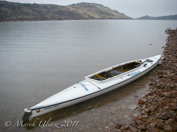
    Easter Day evening. 10+ miles of paddling with Sea Wind canoe on the Horsetooth Reservoir.

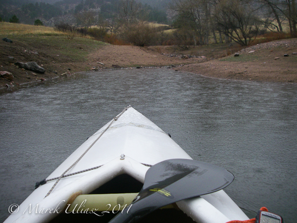
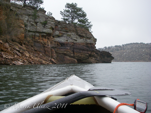
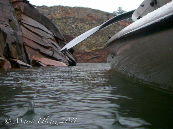
    It was raining all the time, but I enjoyed wet and calm scenery. Looking through rain at the Arthurs Rock and Lory State Park I was sure that I preferred paddling in that weather than hiking or biking. All pictures were shot with my Pentax Optio W30.

    I have also some picture with more Easter spirit. You are welcome to check my Variations on Eggs and Chives in Pixels Away blog or my stock portfolio.

    Horsetooth Reservoir, Fort Collins, Colorado
    Horsetooth Reservoir, Fort Collins, Colorado
    Horsetooth Reservoir, Fort Collins, Colorado
    Horsetooth Reservoir, Fort Collins, Colorado2

    ch_client = “mmuliasz”;
    ch_type = “mpu”;
    ch_width = 550;
    ch_height = 120;
    ch_color_title = “3c78a7”;
    ch_color_site_link = “3c78a7″;
    ch_non_contextual = 4;
    ch_vertical =”premium”;
    ch_sid = “Chitika Premium”;
    var ch_queries = new Array( );
    var ch_selected=Math.floor((Math.random()*ch_queries.length));
    if ( ch_selected < ch_queries.length ) { ch_query = ch_queries[ch_selected]; }

    Related posts:
    Fisheye Lens Perspective for Paddling?
    Springtime Paddling on the Horsetooth Reservoir
    Icy Horsetooth Reservoir – Opening Lake Paddling Season
    Paddling Horsetooth Reservoir in Winter Scenery
    Early Morning Shot of the Horsetooth Reservoir and Paddling Links
    160 Lakes and Reservoirs of Colorado
    Horsetooth Reservoir map


    paddling with a camera

  • Photographers, Support Japan

    My friend, Jared Polin of FroKnowsPhoto.com has decided to do something himself to help people in Japan after they lost everything in the recent tragic earthquake and subsequent tsunami devastation. It’s simple and it is effective – Jared has donated 0 out of his own pocket and he’s designed a t-shirt from which the profits will go directly to Red Cross for their JAPAN EARTHQUAKE AND PACIFIC TSUNAMI

    We all watched as the events unfolded in Japan, and I for one sat bewildered, wondering ‘what can I do to help‘ I was actually in Thailand at the time, right on (one of) the beaches where the horrific 2004 Tsunami struck – there were still remnants of destroyed buildings along the beach, so it was as real as it could have been to me, without actually being there. Still, I didn’t come up with an idea to raise some funds for a charity, and Jared has. I hope you will join Jared in supporting where we all can.

    Please follow this link to purchase your I SHOOT RAW tee to support Japan

    This message from Jared…

    Please follow this link to purchase your I SHOOT RAW tee to support Japan

    Post from: Digital Photography School – Photography Tips. Check out our resources on Portrait Photography Tips, Travel Photography Tips and Understanding Digital Cameras.

    NYIP_DPschool468x60.jpeg

    Photographers, Support Japan


    Digital Photography School

  • Road Trip! 19 Remarkable ‘Road’ Images

    Image by Sippanont Samchai

    Roads… they’re all around us but I’ve never really considered them to be in my most photogenic subjects list. But maybe I need to rethink that!

    Image by Ben Fredericson

    Image by fatboyke

    Image by Berenice Decados

    Image by Paolo Margari

    Image by Tambako the Jaguar

    Image by ecstaticist

    Image by Tricky

    Image by Etrusia UK

    Image by joiseyshowaa

    Image by Pörrö

    Image by Bartek Kuzia

    Image by Matthew Fang

    Image by gari.baldi

    Image by eir@si

    Image by Shahram Sharif

    Image by Martino’s doodles

    Image by purplemattfish

    Image by MSH*

    Share a link to your favorite ‘road’ photo in comments below.

    Post from: Digital Photography School – Photography Tips. Check out our resources on Portrait Photography Tips, Travel Photography Tips and Understanding Digital Cameras.

    NYIP_DPschool468x60.jpeg

    Road Trip! 19 Remarkable ‘Road’ Images


    Digital Photography School

  • Q&A: Thomas Hunter

    Lotsa good questions popped up in the comments section of last week’s On Assignment: Thomas Hunter post.
    Fair enough. Hit the jump for the A’s to your Q’s
    __________


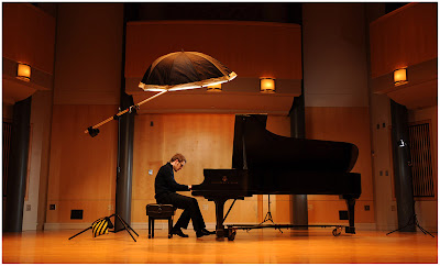
    Q: The kicker on his face – is that coming from the ‘photoshopped’ light, or the one at the opposite end of the piano?

    A: Yep, a little confusion about that one — coupla people asked. Thought it was obvious with the setup shot included, but obviously not. Sorry about that.

    The light at far right is the one lighting the background. It needs to be relatively far away to get a more even throw on the background. The light behind the piano (which I took out in post) is the little kicker on his face. That does not have to light evenly across distance, so it can be closer and more targeted.
    __________

    Q: If I may add something, don’t you think the front of the piano is a bit too dark and dull? Personally, I would have though of lighting it, maybe from camera right at an angle, to bring out its shiny surface and shape. Or maybe you didn’t want to bring it up to the viewer’s attention and to compete with the player. Can you explain a bit more about your choice here?

    A: You are right about it competing, IMO. Totally subjective, but I wanted it to be more of a shot of a pianist, rather than a piano.

    And that’s a black-lacquered piano, so even lit, it is gonna be black. If I wanted detail on the piano, I would hit it with a big, soft light — probably from camera right. Nice big source (maybe a speedlight thru a white sheet) and dialed *waaay* down.

    All I would be looking for in that case would be a specular highlight hitting on the curves of the piano to give shape. Reason is, you show shape and detail on very dark objects by using reflections. (And on light objects by using shadows.) But the black would be the dominant tone, with the specular highlights defining the curves — and thus the shape.
    __________

    Q: How do you keep the human subject tack sharp when you are working at such a low shutter speed as 1/30? ?I would have thought it impossible for a guy to keep his head perfectly still while playing the piano. Does it all come down to rear curtain sync?

    A: Ah, but he is not tack sharp. If you look at a blow-up of his hands, they are motion blurred. But he is pretty sharp otherwise.

    That’s a numbers game — shoot multiple frames and it’ll work itself out. Less so at 1/15th or 1/4th of a sec on the shutter, obviously. Remember, the flash is gonna freeze him. And the ambient is a couple stops below that exposure, so movement is minimized. You can see what movement there is, in this detail from the final photo.


    __________

    Q: I enjoyed hearing the story behind this shoot during the Flash Bus tour. It truly is proof that big, powerful studio strobes can be massive overkill when capturing a scene such as this. So when is Flash Bus 2.0 launching? 🙂

    A: TFB 2.0? Not anytime soon. And please do not even let Missus Strobist know you brought that up.
    __________

    Q: What type of umbrella is that with the additional cover on the bottom?

    A: That is a 60″ Photek Softlighter II. I like to think of it as a poor man’s octa, and I love it. I have a post on choosing soft light mods coming up soon. More detail (especially relative to the similarly priced Paul Buff “PLM”) then.
    __________

    Q: Did you move your stand around for easier post removal, or just clone it out?

    A: Just cloned it out. Moving my stand around would have forced me to abandon hand-holding the camera (which I am usually loathe to do) to be able to register the two images for layered erasing of the stand.
    __________

    Q: I shoot a lot of events in dimly lit environments like this, and would like to know your preferred method of reducing reds in post production. Thanks for this timely post.

    A: That’s an easy one. In Photoshop, Hue/Saturation, choose “Red,” and move the slider down. Incidentally, I generally remove about 10 units red (and 5 of yellow) to bring my D3’s chip closer to neutral.
    __________

    Q: So what if you are shooting this concert pianist “in action” – in the middle of a concert? Suggestions?

    A: I’d prolly jack that ISO up, and spray and pray. With a sound blimp, of course.
    __________

    Q: I was wondering, what is the Boom arm and Lighting modifier you are using in this shot?

    A: That’s a Paul Buff 13′ stand and boom. (The boom arm no longer is appearing on Paul Buff’s website, for some reason.) The build quality is not exactly confidence-inspiring, but it does the trick for me — especially when well-sandbagged.
    __________

    Q: Nice to see you, also on the new DVD, introducing the softbox umbrella on top of a boom. would a white translucent do the same?

    A: Hmm … kinda. The light would be less controlled. I like the beam edge that the SoftLighter gives me. Also, there would be some raw light spill around the umbrella (and thus onto the background) if you did not bury the flash head into the umbrella.
    __________

    Q: To avoid cloning away the flash stand behind the piano, could a gorillapod be put on top of the piano? I guess the rubbered feet would prevent sliding.

    A: Probably not — it would have been too close on axis to Thomas’ face. I would have needed it a little more behind him. The stand was a foot or two behind the piano.
    __________

    Q: Is it necessary to use gels to help blend the flash with the ambient light? Or is this achieved by using the slower shutter speed?

    A: I tend to work ~2 stops above the ambient, so the ambient color does not blend and/or contaminate the strobe too much. Remember, that ambient is supporting fill, and thus is muted. If I wanted to work at a tighter ratio (say, with the strobe just one stop over the ambient) I would probably have to go into tungsten WB and gel the strobes to compensate. As it is, the fact that the ambient is roughly 1/4 as powerful as the strobe (being two stops down) keeps the color shift in check.
    __________

    Q: You kinda skirted the issue on the light mod. Did you gel it for tungsten with, say a half CTO? If not, how long do you need to drag to have the whiter strobe warm up with the ambient?

    A: Again, nope. The overhead light does have a 1/8 CTO, but that’s just because that is my standard warming gel for the key. But that has nothing to do with the blending of the two light colors — I usually 1/8 CTO my key no matter what. “How long” on the ambient is not really an absolute answer. (It was 1/30th, I think.) But it is more of a relative thing — a 2 stop difference to the strobe.


    Strobist

  • Leading Your Viewers Through Your Photos

    When viewers take a look at your photos, they often want to go some place. And they don’t even know it. You can help take them on a journey within your photo by leading them in a number of ways. At times people love to be guided by art and not have to think too hard. That were is the technique of leading comes in.

    Paths

    The first tool, or trick, is to create an actual path in your photo to guide the viewer. Front to back, side to side, top to bottom. Make the path something distinguishable such an actual path (pictured here in Olympic National Forest in Washington state), road, valley or even a river course. With imagination, you can see other paths in nature as well as in the man-made world.
    If you are starting out in photography and are wondering how to use a path, start with one of the most basic techniques; The Rule Of Thirds. This rule is an easy way start getting your feet wet. Take the path from one point to another, often having it start or stop on one of the meridians of the Rule. A river starting in the distance from an intersection of the meridians on the upper right third then flowing towards the foreground and finishing in the bottom left third. Foot prints in the sand along the bottom third meridian.

    Action

    Action will lead your viewer through a photo as well. Take a look at this hippo for instance. It’s moving in one clear direction and you know where the photo is heading. Most people I’ve shown the picture to admit to not really seeing the tail but certainly remember what the head and nose looked like. That’s because the sense of action and motion gives viewer’s eyes some place to go. It also brings up another point about eyes.

    Looking

    Whether actual eyes are in the frame or not, having a subject which is looking off to one side or the other, even slightly, helps lead viewers inside the frame. It’s part of that ‘wanting to be lead’ mentality when we are viewing art for pleasure. Seeing someone, or something, looking off to a side will guide us.

    Here is where focus inside the frame becomes important. You may want to highlight what is being looked at by achieving a tight focus on it, or make it more abstract, as I did in the photo above of the Legal Nomad Jodi Ettenberg  (although you can obviously tell it is a sunrise). Focus can also be held on both near and far subjects if you desire. The choice is yours and, as always, experiment with picking one or the other to see how the finished image feels to you.

    Position

    Position inside the frame is also important to leading. Take a look at these two photos from Ngorongoro Crater in Tanzania.

    The first image is specifically cropped to place the safari truck at the intersection of two Rule Of Thirds meridians. It is also pointed to the open ground to the right. Viewing this, you know which direction the truck is traveling and what it’s going to encounter.

    The second, vertical shot is not framed as well. The truck is getting close to the edge of the frame and on a subconscious level, we don’t like not knowing what’s next. Most people get anxious when faced with a new, unknown situation and photographs often cause the reflex to inject itself into our like or dislike of a photo. There will be some who like the second photo more than the first, for sure, but for the majority, knowing where an object is going helps in enjoying a photo.

    Lines and Patterns

    I’m not going to use the tried and true (and maybe a bit pummeled) railroad track photo here. But I’m guessing just mentioning that image helps you to understand the use of lines. While lines can be considered a path (and certainly would be in the case of a railroad), they can be more abstract, such as railings or horizons as in this shot of a ferry boat on a gray Puget Sound day.

    Patterns are also used in the railing covers and the seats on the right side. Another example of patterns and lines, although in this case not pointing the way.

    Leading your viewer through your photo takes the forethought of setting up the shot when in the field (or studio). Rather than a static “Here’s a hippo,” photo, give your viewer some place to go inside the photo. It is one more tool to use to make your photography more engaging.

    Post from: Digital Photography School – Photography Tips. Check out our resources on Portrait Photography Tips, Travel Photography Tips and Understanding Digital Cameras.

    NYIP_DPschool468x60.jpeg

    Leading Your Viewers Through Your Photos


    Digital Photography School

  • What China Doesn’t Understand


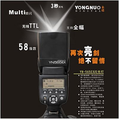
    Earlier this week, Chinese manufacturer YongNuo announced a new flash: the YN-565EX.

    It’s got full manual mode, a built-in slave, a PC jack, a modeling light — and is compatible with both Nikon and Canon’s proprietary light-based TTL triggering systems.

    It may well be a great flash — or it could be a piece of crap. But it won’t get any kind of a serious look here for one simple reason: China’s manufacturing and distribution system is sufficiently borked to make product quality control and customer service damn near impossible.

    Which is a shame, really, considering how well they could be doing…
    __________

    To explain what I mean by that, let’s start by looking at how a a manufacturing-to-retain ecosystem should work.

    Generally, a manufacturer designs a product, fronts some R&D and then makes a few thousand copies of it. They sell it to distributors at a reasonable profit, who in turn wholesale it to retailers who sell it to you. All along the way, the price goes up.

    Unpleasant tho this may sound, it is necessary. The manufacturers need to make a decent profit to survive to create the next generation of product. The distributors get the product out all over the world in sufficient diversity to ensure availability and fair pricing. That takes resources, and they need a profit, too.

    And the retailers are at the front lines in this food chain, selling to you and at the same time standing behind the product in terms of returns, etc.

    In some cases, manufacturers will also sell their products directly. But to preserve the profitability for the distributor/retailer system, any direct seller worth his or her salt will not undercut the end retailer when pricing their direct sales.

    The Real Problem

    Most Chinese flash manufacturers, who actually have the ability to create a pretty good product at an amazing price, do not understand this. They will frequently sell direct to the public at only a 2-3% profit margin on top of the actual manufacturing costs.

    Obviously, no retailer can compete with this. Some will order the flashes and build in a small margin for themselves in hopes that people will buy from a more convenient source. But there is nowhere near the margin to stand behind the products, let alone test them thoroughly.

    And since the whole system is built on as little margin as possible, quality control at the manufacturer is not what it could or should be, thus compounding the problem.

    Who is left holding the bag? The customer, with a higher-than-necessary failure rate and poor return options. So every time you roll the dice buying direct from China, you may well have to send it all they way back to China if things do not work out well. Which is slow and expensive.

    Trust me, I want to believe. But I have rolled the dice and lost — every time. And this is such a shame, because if the manufacturers would not compete with their own retailers, it would be better for everyone.

    Retailers would have enough margin to stand behind the products. Distributors would have enough margin to make them widely available on a geographic basis. And manufacturers could, by respecting retail pricing, make a substantial profit on each direct unit sold. That would fold back into more R&D and quality control.

    Yes, we would pay more than the current too-good-to-be-true prices for flashes that never live up to their promise. But the manufacturers would be more profitable — which would drive a positive vicious cycle toward better quality and faster innovation.

    And I am just talking about flashes. Remotes are even more borked. They have all of the issues of the flash ecosystem, but also suffer from one of the worst pieces of manufacturing logic I have ever encountered.

    Here it is: They change the frequency and coding year-to-year specifically to avoid backwards compatibility and to force you to re-buy entire systems rather than expand from year to year.

    Brilliant.

    By contrast, my PocketWizard transmitters can fire receivers that are nearly 20 years old. Which is one reason they hold their value so well. Which makes them a very low economic risk.

    Until a Chinese remote manufacturer shows a little respect for their long-term customer with generation-to-generation backwards compatibility, I would never consider (much less recommend) one of their remotes. It’s just silly.

    One day — maybe — the Chinese manufacturers will figure out that by respecting both their customers and their sellers’ food chain they can completely turn this quality cycle around.

    But I am not holding my breath.


    Strobist

  • Chris Crisman on Self-Investment, Reinvention and Reductive Lighting

    It’s Monday, and that means another guest post while I’m out on the road. This week’s entry is from Philly-based photog Chris Crisman, whom I finally got to meet a few days ago during our stop there.

    Kinda psyched, as Chris is writing not only about going out on a limb to add a new branch to his portfolio but also about changing up his lighting process. And this exact technique is something I have been wanting to try.

    Better to let him explain it…
    __________


    I suppose I just want my work to be great—I can definitely see greatness in the work of others, and I strive to reach that level with every picture I take and every opportunity presented to me. Coupling this idea with my personal mantra to enjoy this life, I set off to Florida with my crew to build a brand new lifestyle portfolio. It was a bit of a gamble investment, but it’s pretty late in the game to start behaving conservatively.

    My decision to develop an exclusive lifestyle body of images came on the heels of a number of missed commercial opportunities in 2010. On several occasions I’d been up for assignments where having a body of lifestyle images was crucial. In these situations, the agency was onboard with my work and excited to move forward, but the end client was not able to make the leap from the mood, style, and subject portrayed in my current portfolio, and needed to see something that translated more literally. At the time, this work just wasn’t on my menu. So naturally, I decided to expand that menu.

    With the help of my fantastic team, we started to pull the pieces together. Florida was a natural choice for our destination. It was still winter on the East Coast and I knew there was a chance I’d need to head to Clearwater for MLB spring training anyway (see the Philly Mag shoot). We ended up finding a huge villa on the Gulf of Mexico that we jokingly referred to as The Real World: Clearwater house, and began building our project around the idea “young, and in love.”

    Being that this was my first foray into this type of photography, I felt keeping the parameters tight was a must. I knew it wasn’t possible to capture every lifestyle variable: seniors, children, professionals, couples, couples with senior children, etc. Having a defined set of parameters would help keep the images more cohesive, and possibly help corral our production time and expenses … a bit.

    Before I delve into the lighting particulars, I wanted to take a moment to address a discussion that stemmed from my interview with David in the fall of 2010. In the article we spoke about the consistency in the look and feel of my work, and how I’ve developed this over time; my personal style, if you will. For me, it’s the combination of how I use my cameras; what lenses I work with; how I mix light between ambient and strobe; how I choose my subjects, and how I interact with my them; where I choose the location for each shot; how we process and finish my photos in post, etc. I could go on.

    As you might imagine, I am of the opinion that one’s personal style should transcend the work, no matter what you’re shooting. These decisions define you, the artist.

    Back to lighting, I’ll talk a little about how I treated this new body of work in contrast to my portraiture. For the better part of my career, I’ve approached making my photographs from darker to lighter—I started by visualizing my images against a black canvas. Using this method, I added light as a means to shape the image; this process could be called additive lighting. In this new body of lifestyle work, I decided to take the opposite approach, lighting reductively. Instead of adding artificial strobe to shape and build up my images, I was taking away the light from a white canvas.


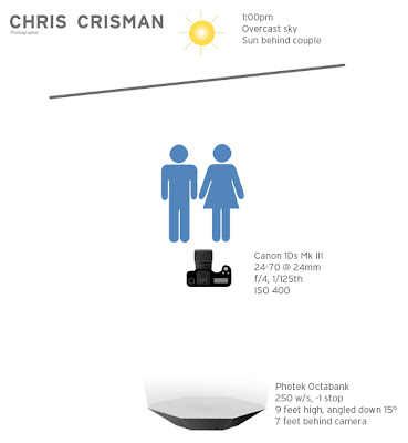
    To illustrate, take a look at the image above. In this instance, we had a relatively overcast day to work with. I placed my models with the diffused sun behind them, facing the camera. This created a gentle backlight on them, which in addition to being flattering, also served to create separation between them and the slightly darker Coca-Cola sign in the background. To maintain an exposure balance with the building and give the models some defining shape, I used one Dynalite 2040 head with Photek Illuminata Octabank as the modifier. The process was simple and subtle, but effective.


    If I had instead used an additive light method in this photo, the result would have been much different. My key light, although stationed in the same place, would have been dialed up about 3 stops brighter. I would have added a second Octabank to fill in the shadows created by the key light. My background building would have ended up much darker and would have read more as a blocky shadow presence, and the sky would have come down revealing that it was a cloudy day. The result would have changed the mood of the image drastically, and not supported the motivation, theme, and direction of the shoot.

    This reductive process wasn’t employed for all the photos on this trip. But as a rule of thumb, I tried my best to employ the white canvas analogy in creating these images. When trying to develop any new body of work, keep these rules in mind:

    • Stick to your guns in regards to your personal style.
    • Take the time and effort to develop your game plan and approach to the shoot.
    • Make sure you enjoy and value the work you are making.

    __________

    Ed Note: If you’d like to see a couple dozen other images Chris made on this shoot using the lighting technique described above, check out this video from the trip. There is a little BTS info in it, but it is primarily intended to be a promo vid for potential clients. Plenty of finals from the shoot at the end, tho — he came back with a lot of new work.

    Many thanks for Chris for the guest post — especially for one that is sticking so many ideas into my head as is this one. For those of you interested in following light-oriented commercial photogs on Twitter, Chris deals out a steady stream of BTS nuggets and notices of new work. Definitely worth a follow. And take a minute to look at his portfolio to see how these airy new lifestyles images both expand and compliment his other work.

    The palette may be different, but the style is consistent. (I’m such a geek about this kind of stuff…)
    __________

    :: Chris Chrisman Portfolio ::
    :: Chris Crisman’s Blog ::
    :: Follow Chris on Twitter ::


    Strobist

  • GPP Shootout, Part Deux

    We interrupt today’s regular programming, as the 2011 Gulf Photo Plus Shootout video featuring Zack Arias, JoeyL and Photographic Zenmaster Gregory Heisler (not shown) has just dropped into Vimeo.

    Confession time: Working in front of 300+ people? Been there. But I sure am glad I did not have to work under the pressure of Heisler’s blistering mic. Let’s set the stage, shall we?

    Following last year’s Polaroid Boy fiasco, JoeyL absolutely had to produce. And Zack, ever the stalwart, was gonna do his thing, of course. What they could not know was that Heisler, after dogging them during their shoots, would later decide to pick up a camera himself…
    __________

    So, who is Greg Heisler, and why do you not want him riding you while you are shooting? Well, because he makes photos like this, this and this. (Each opens in a new window if you have not seen these vids before.)

    So yeah, pretty decent photographer. But where’s Heisler still a newb? A rookie? A veritable babe-in-the-woods?

    On Twitter, that’s where.

    I think even with the above small taste in the video, you can see just how suited for the medium he is. And he actually has a twitter account, with over 500 followers, just waiting for him to get his ass in gear.

    As of this posting: One whole tweet.

    If we get him up to over a thousand followers, I say he pretty much has to join in the fun. So I am asking every one of you to follow Greg on Twitter and send an @reply to him, personally inviting him to tweet more than, well, once.

    I’m pretty sure he can take it.
    __________

    In all seriousness, these kind of fun, if sophomoric, competitions are just one of the many reasons GPP totally rocks. I can’t wait to get back there next year.

    -30-


    Strobist