The post How to Create Environmental Portraits (Tips and Examples) appeared first on Digital Photography School. It was authored by Darren Rowse.
Are you looking to capture stunning environmental portraits?
You’ve come to the right place.
In this article, I’m going to share everything you need to know about environmental portrait photography.
And by the time you’re finished, you’ll be ready to create some beautiful portraits of your own!
Let’s get started.
What is an environmental portrait?
An environmental portrait is a photo taken of a person in a place that says something about who they are. It is often a place where they work, rest, or play.
Why do I prefer environmental portraits?
Environmental portrait photography:
gives context to the subject you’re photographing
adds additional points of interest to compositions (though this is something you need to watch, as you don’t want to distract from your subject too much)
helps the subject relax
often gives the viewer real insight into the personality and lifestyle of your subject
Environmental portraits sit somewhere between the purposely posed shots of a studio portrait (environmental portraits are posed and are unmistakably portraits) and candid shots, which capture people almost incidentally as they go about their daily lives.
Now let’s turn our attention to some how-to tips for stunning environmental portraits:
Tips for beautiful environmental portrait photography
Capturing gorgeous environmental portraits can seem tough.
But there are actually a few simple ways to enhance your portrait photos, starting with:
Spend time getting to know your subject
Before you select a location and start shooting, spend some time getting to know your subject.
Find out where they spend their time, what the rhythm of their life is like, and how they behave.
This will not only help you find appropriate locations but will also help you get a feel for the style of shots that might be appropriate for the session.
Plus, you’ll begin the process of helping your subject relax! If you can, you might even want to accompany your subject to some possible locations; that way, you can see both whether the location suits them, as well as how they behave and interact there.
Choose the right location
Sometimes a location chooses you – but on other occasions, you need to be quite deliberate and purposeful when making your choice. It can take a lot of searching.
You ideally want to find a location that:
says something about your subject. After all, that’s what this style of photography is all about.
adds interest to the shot. As I’ve written in previous tutorials, every element in an image can add or detract from the overall look. The environment in which you place your subject needs to provide context and interest without overwhelming the composition.
doesn’t dominate the shot. Sometimes the location can dominate the image so much that it distracts your viewer from your main focal point (i.e., the subject). So try to avoid cluttered backgrounds (and foregrounds) and colors that are too bright, etc. Keep in mind that you might be able to remove the distractions with clever cropping, depth of field, and subject placement.
Use props naturally
Props can make or break an environmental portrait.
If your props are subtle and naturally fit in the environment, then they can be very appropriate and add to the image nicely.
But you’ll want to avoid any props that don’t quite fit or that distract the viewer.
The same goes for the clothes that your subject wears. Try to be true to the context without getting too outlandish.
Think about posing your subject
What sets an environmental portrait apart from a candid portrait is that you pose your subject.
(In truth, it’s a fine line between candid portraits and environmental portraits; you might end up doing a bit of both in any given shoot.)
Don’t be afraid to direct your subject to sit, stand, or act in a way that fits the environment. Some of the poses might seem slightly unnatural and dramatic, but it’s often these purposely posed shots that are more interesting and give a sense of style to your photography.
The expression on the face of your subject is also very important in environmental photography, and you should consider how it fits with the overall scene.
For example, if you’re shooting in a formal environment, it may not be appropriate to photograph your subject with a big, cheesy smile; you might prefer a more somber or serious look.
Ultimately, just mix it up to see what does and doesn’t work!
Deliberately choose your camera settings (especially your aperture!)
There is no right or wrong way to set up your camera for an environmental portrait. It will depend completely upon the effect you’re after and the shooting scenario.
You might find that shooting at a smaller aperture (i.e., a larger f-number) will be appropriate as it’ll help keep the foreground and background in focus.
I generally shoot environmental portraits with a wider focal length to give the environment prominence in the shot.
Of course, that doesn’t mean you can’t shoot with a longer lens or with a large aperture and shallow depth of field. In the end, anything goes – plus, you’ll probably want to mix up your shots a little.
How to photograph environmental portraits: conclusion
Environmental portrait photography is a great way to create unique and beautiful images.
So the next time you’re doing portrait photography, try applying some of these tips.
You’ll love the results!
Now over to you:
Have you done any environmental portrait photography? What tips would you give other readers? Feel free to share your tips (and images!) in the comments below.
The post How to Create Environmental Portraits (Tips and Examples) appeared first on Digital Photography School. It was authored by Darren Rowse.
Astrophotography is one of those types of photography that when done right can produce some stunning photos. Just like any type of photography, understanding the scene and subject matter that you are photographing enables you to capture better images. This is why more and more astrophotographers are turning to star planetarium projectors, as they allow you to learn the locations Continue Reading Photodoto
Comments Off on 20 Star Planetarium Projectors for Astrophotographers
The post Weekly Photo Challenge – Shadows appeared first on Digital Photography School. It was authored by Sime.
“Simply speaking, a shadow is an absence of light. If light cannot get through an object, the surface on the other side of that object (for example, the ground or a wall) will have less light reaching it” – Science Learning Hub
#dPSShadows
After the ‘lighting’ theme last week, this week we’re about the lack of light, or ‘shadow’ – and really, unless you live in a dark cave, void of light, you have no excuses to not go out and capture a shadow in some form – the idea behind these challenges being to make you think about what you’re photographing and work at getting better every time.
Camel Shadows by Simon Pollock
I remember the first time I took a specific shadow photograph, that’s it above, and it really was that orange in the late afternoon light of the amazing Sahara Desert in Morocco… It was a bit typical “People on camels” but it was an amazing experience and I loved the shadow photo (This was a Canon Powershot Pro 1… should tell you how long ago that was!) I’ve been noticing shadow to this day. SO, go forth and capture shadows! Share them in the comments below, on instagram or Facebook and make sure you tag us! (Details below)
Missed a Challenge? Don’t sweat it, find all of our previous challenges here!
Share on Instagram or Twitter and use the hashtag #dPSShadows so we can see them!
How do I upload my photo to the comments?
Simply upload your shot into the comments field (look for the little camera icon in the Disqus comments section) and they’ll get embedded for us all to see. Or, if you’d prefer, upload them to your favorite photo-sharing site and leave the link to them.
The post Weekly Photo Challenge – Shadows appeared first on Digital Photography School. It was authored by Sime.
The post Sony Unveils Three Compact Prime Lenses for E-Mount Cameras appeared first on Digital Photography School. It was authored by Jaymes Dempsey.
Last week, Sony announced three E-mount lenses:
The FE 24mm f/2.8 G, the FE 40mm f/2.5 G, and the FE 50mm f/2.5 G; all promise to deliver excellent optics in a compact form.
The three lenses will launch this May. Designed as a set, they offer a beautifully wide field of view on the 24mm end for scenic shots and environmental portraits, plus a standard perspective at the 40mm and 50mm focal lengths, perfect for portraits, street photography, and even detail shots.
Sony explains, “The lenses were designed for a wide range of photo and video uses including portraiture, landscape, street photography, and more…With these three dynamic lenses, our customers can capture a wide range of perspectives with the excellent resolution and beautiful bokeh that Sony’s G lenses are known for.”
And while we can’t currently confirm the resolution of these lenses with a hands-on review of our own, sample images look very nice, and Sony’s own tests show tack-sharp results especially when stopped down to f/8. If you’re an APS-C shooter who demands the highest optical quality, or you’re working full frame and want some compact-yet-capable prime lenses, the 24mm f/2.8, 40mm f/2.5, and 50mm f/2.5 will deliver.
Plus, all three lenses offer fast maximum apertures, which translates to lovely bokeh – especially on the 50mm f/2.5, but also on the 40mm f/2.5 and even the 24mm f/2.8 when shooting close-ups.
Of course, f/2.5 and f/2.8 maximum apertures will get you more than just creamy backgrounds. With a wide aperture, you can shoot indoors or at twilight while still maintaining a reasonable ISO, so you can photograph events and night portraits – or record low-light video – and come away with clean results.
Sony also promises “fast, precise AF with excellent tracking performance” and top-notch build quality (all three lenses are dust and moisture resistant).
But while strong build quality, image quality, and focusing do make for a powerful package, even more impressive are the lenses’ compact builds. Travel photographers, street photographers, and videographers will love the pocket-sized design, perfect for on-the-go shooting, long hours behind the camera, and international travel. In fact, all three lenses are identical in size, so you can pack them all without sacrificing weight or space. Check out the lenses next to one another:
And the prices are surprisingly reasonable. You can grab each lens for just $ 600 USD – not bad at all, given the optics, build quality, and AF capabilities.
So if you’re a Sony shooter in need of a new lens (or two, or three) for travel photography, portrait photography, street photography, or handheld videography, I highly recommend you take a closer look at these options. You can currently preorder the 40mm f/2.5 G here, the 50mm f/2.5 G here, and the 24mm f/2.8 G here.
Now over to you:
What do you think of Sony’s new bundle of prime lenses? Are you impressed? Are there any features that you wish Sony would’ve included? Share your thoughts in the comments below!
The post Sony Unveils Three Compact Prime Lenses for E-Mount Cameras appeared first on Digital Photography School. It was authored by Jaymes Dempsey.
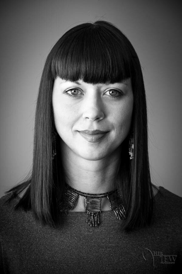
The post 10 Tips for Beautiful Black and White Headshots appeared first on Digital Photography School. It was authored by John McIntire.
Black and white has long been a popular way to capture headshots with impact and visual interest. The lack of color helps to emphasize the subject while discarding information that isn’t relevant.
And in this article, I’m going to share 10 black and white headshot tips to help you get the best results.
Let’s get started.
Headshots vs. portraits
A headshot is always a portrait, but a portrait (including a closely cropped portrait) is not always a headshot. Remember, headshots (no matter the type) come with a specific goal.
If you’re new to portrait photography, it might help to clear up what a headshot actually is before you try to create one.
Portraits: In general terms, a portrait photograph is a representation of a person. Portrait photography is a broad genre that encompasses nearly every subgenre that involves photographing people. It doesn’t matter if we’re talking studio portraits, street candids, or fashion photography. If it has a person in the frame, it’s probably a portrait.
Headshots: Headshots are a subgenre of portrait photography. The difference is that headshots serve a very specific purpose. Whether it’s actors’ headshots or corporate headshots, the purpose is to sell something. That something could be an actor’s ability to fit a role’s physical requirements, or it could be your business professionalism.
Headshots are limited to close-up images of the subject’s head. They can also include head and shoulders as well as half-length shots. Before capturing a headshot, it’s important you understand where and how the photo will be used so you can get the right shot for the right purpose.
Tips for black and white headshots
Canon 5D Mark III | Canon EF 50mm f/2.5 Macro | 50mm | 1/80s | f/5.6 | ISO 100
There are no hard and fast rules for creating headshots. However, following these tips will hopefully help!
And as always with photography, remember: There is no one way to do anything.
In other words, nothing listed here is a rule of any sort. If a tip fails to help you get the results you want or need, then discard or revamp it.
1. Remember that a headshot is different from a portrait
Yes, we’ve already discussed this – but when you’re in the middle of a session, it’s easy to get caught up and start changing your approach. This may not be a problem in a normal portrait session, but with headshots, you need to make sure you’re focused on the specific end result. If you change tack and the results aren’t showing your subject in the desired manner, you’ll have wasted time and effort on images that are unsuitable for the subject’s uses.
One way to help keep you on track is to ask your subject to share the purpose of their headshot. Allow them to be as specific and detailed as possible. Once you have an answer to that question, you should find it much easier to stay on track.
If you are photographing an actor with representation, ask them for their agency’s headshot guidelines (or ask the agency yourself). This will give you a strict set of limitations and help to ensure you get the required result.
2. Getting it right in-camera is just as important as ever
By shooting with black and white in mind and getting it right in-camera, you can help make the conversion process much easier. Canon 5D Mark III | Canon EF 50mm f/2.5 Macro | 50mm | 1/125s | f/5.6 | ISO 100
Depending on where your headshots are going to wind up, you might find that you can’t do any edits beyond basic retouching. You should be allowed a black and white conversion and some basic blemish removal, but much more than that might not be acceptable.
Therefore, do whatever you can to get your images right in the camera. Light your images well with good exposure and good contrast. Learn your lighting patterns and use a meter if you have to.
Get this step right, and you might find that you have little more editing to do beyond the actual black and white conversion.
3. Start in color
It might be tempting to set your camera to a black and white mode at the point of shooting. You can do this – but if you shoot JPEGs, I would advise against it.
By choosing this route, you will be discarding a huge amount of color information at the very beginning. For the best conversions, you’ll want to later manipulate your color information to get the very best black and white results.
(However, note that RAW shooters can use a black and white mode while still retaining color information.)
4. Avoid shooting to crop
By cropping down to a head-and-shoulders composition, you discard most of the information in the frame. Instead, try to get your compositions right at the shooting stage.
This might be controversial, but I’ll stand by it. When you are creating black and white headshots, try to get your composition as close as possible to how you want it to end up.
Doing this will ensure that your images are as big as possible and have as much detail as possible when you pass them on to your client. If you shoot before cropping out significant parts of your image, you will lose out on a large chunk of resolution.
5. Control contrast with light, not post-production
Using a medium-sized octabox up close allows for extremely soft light, thus controlling the contrast. Also, at camera right, you see a background light that reduces the overall contrast in the image.
This point goes back to getting it right in-camera, but specifically for lighting.
One of the quickest ways to ruin a portrait is to add a lot of unnatural contrast in the post-production phase.
Avoid this by setting up your lights to get the contrast you want from the very start.
You can do this through modifier selection and lighting ratios.
6. Use fill to control your contrast
Left: Without fill. Right: With fill. Here you can see how a fill light might help you lift the shadows and control the contrast in your images.
If you want to decrease contrast, make sure to do it in-camera.
You can do this with fill light. Whether you work with a dedicated second light source or a reflector, introducing fill into your images is a great way to control exactly how your black and white headshots turn out.
7. Think in values rather than color
In this image, you can see four distinct areas of value: The highlights of the skin, the midtones of the sweater, and two shadow areas for the hair and the background. Being able to see these at the time of shooting will help you design your black and white headshots better. Canon 5D Mark III | Canon EF 50mm f/2.5 Macro | 50mm | 1/160 sec | f/4 | ISO 100
Because you are starting in color, it can help to think of things in terms of values.
At its most basic, value simply describes where colors fall on a spectrum between pure white and pure black.
Now, once converted to black and white, almost everything in your images will appear as a shade of gray. If you can visualize how the colors you see with your eyes will be represented in a black and white conversion, you will be better able to design your lighting before your subject even arrives.
How do you learn to do this?
Practice. A lot of it.
Get out there and photograph anything and everything you can, then convert to black and white so you can build this skill.
Remember, different conversion techniques affect color and value in different ways, so be sure to practice with as many conversion methods as possible.
8. Minimize details in the frame
Because we are talking about headshots, you’ll need to remember that the entire point of the photograph is the person. Any extra details will only serve to detract from your subject.
So do what you can to minimize the impact of the background, the subject’s clothing, and other elements in the photo.
For backgrounds, you can focus your efforts on finding the cleanest, most non-distracting backdrop. For clothing, ask your subjects to dress without distracting elements that would take the focus off of them. Patterns can be fine, but it might be best if you avoided particularly bold choices like leopard-print and zebra-stripe tops.
9. Focus on form
When you are lighting your subject, take the time to ensure that you’re using the light to shape their features in the best way possible. Canon 5D Mark III | Canon EF 50mm f/2.5 Macro | 50mm | 1/100s | f/9 | ISO 100
This goes back to basic lighting skills.
You need to shape your subject’s face in a flattering way that also helps it stand out in the frame.
You are trying to minimize other details, so it is the subject’s features you must focus on. Make as much use of them as you can.
10. Eyes and expressions are more important than ever
With headshots, expressions and eye contact are more important than ever. Do what you can to develop a rapport with your subjects.
As the goal of a headshot is to make your subject look as good as possible, and as you have already reduced the impact of distracting elements, your subject’s eyes and expression become more important than ever.
Lighting for the eyes will keep them bright and prominent in the frame. Doing this also means you won’t have to spend time processing the eyes, which might work well for your client’s requirements.
Also, to get the best expressions, ensure that your subject is comfortable and that you have a good rapport with them.
Black and white headshots: (not) the end
On their own, headshot photography and black and white photography are broad topics that are truly impossible to distill into a short list of tips. However, I do hope that these ten tips for black and white headshots will help you get started on your journey.
As always, none of these tips are rules, just guidance. If you feel that something I said doesn’t suit you or your photography, that’s perfectly fine.
Now over to you:
Which of these black and white headshot tips did you like the most? Do you have any tips for black and white headshot photography? Share your thoughts (and photos) in the comments below!
Should I shoot headshots in black and white mode?
If you’re shooting in JPEG, no. But if you’re shooting in RAW, you can decide whether to shoot in black and white or color (you won’t lose any image information in either mode).
Is black and white a good option for headshots?
Yes. Black and white allows you to strip down the information in the photo to its key elements (in this case, the person whose headshot it is).
What kind of light should I use for headshots?
Any soft light that flatters your subject is a good choice.
How should I do black and white conversions for my headshot photography?
Use whatever method suits you and your workflow best. Photoshop and Lightroom both offer great options for black and white conversions.
The post 10 Tips for Beautiful Black and White Headshots appeared first on Digital Photography School. It was authored by John McIntire.
The post The 17 Best Photo-Editing Apps (in 2021) appeared first on Digital Photography School. It was authored by Ana Mireles.
Are you looking for the best photo-editing apps available in 2021? You’ve come to the right place.
In this article, I’m going to share my 17 favorite editing apps – including apps for general editing, apps for fun and filters, and apps for specialized editing.
So whether you’re a dedicated smartphone photographer or just looking to find some powerful ways to edit on the go, this list contains the perfect app for your needs.
Let’s get started.
The best photo-editing apps for general editing
In this section, you’ll discover the best photo-editing apps for general adjustments. With the apps on this list, you can adjust exposure, enhance colors, crop, sharpen, and more.
1. Snapseed
Cost: Free
Availability: iOS and Android
Snapseed is one of the most popular photo-editing apps on the market – and for good reason. It’s very intuitive and easy to use, which makes it great for beginners. At the same time, Snapseed offers a lot of control for more skilled users.
You don’t need to pay any fees for using Snapseed, nor are there in-app upgrades; it’s completely free. So if you’re after a beginner-friendly photo editor that can do pretty much anything, Snapseed is a great choice.
2. Lightroom
Cost: Limited version for free. Full version available with an Adobe subscription (from $ 9.99).
Availability: iOS and Android
The free version of Lightroom Mobile lets you do most basic editing tasks. You can also access and create presets.
However, if you decide to upgrade, you’ll gain access to a healing brush, selective adjustments, geometry tools, and RAW editing. You can also use the camera from the app to shoot RAW images.
If you want to use Lightroom Mobile to speed up your workflow, check out this article.
3. Photoshop Express
Cost: Free
Availability: iOS and Android
Adobe Photoshop is the industry standard for photo editing. Its mobile version is divided into three smaller and specialized apps; the basic editor is Photoshop Express.
Photoshop Express offers one-touch solutions such as an auto-fix option and filters. It also allows you to edit and retouch with total control. And it’s packed with many fun features such as stickers and collages.
You can crop to most platform’s formats and share directly from the app. While you don’t need an Adobe subscription to use Photoshop Express, you will need a free account.
4. Pixlr
Cost: Limited version for free
Availability: iOS and Android
Pixlr is a well-rounded editing app, offering all the post-processing essentials plus tons of presets and features to unleash your creativity.
There’s no need to create an account and you can download Pixlr for free, though you’ll be offered in-app purchases for overlays and stickers.
Pixlr also offers two great browser versions that you can use for free – or you can get a subscription for full access to both browser versions and other useful assets.
Best photo-editing apps for fun and filters
In this section, I’ll share the best photo-editing apps for filters and effects.
(In most cases, these apps also include a camera and some basic adjustments tools.)
5. VSCO
Cost: Free limited version. $ 19.99/year for the full version.
Availability: iOS and Android
VSCO works as a general photo editor, but it belongs in the fun and filter category thanks to its artsy, social-media-focused features.
To use VSCO, you will need to create a (free) account. After that, you can continue to use VSCO for free, but most of the filters are sold separately.
Alternatively, you can grab a yearly subscription for $ 19.99 that includes 200 filters (and you have a 7-day trial to make sure it’s worth it).
Your creations can then be shared with the community, which is like- and comments-free. In other words, the VSCO community is more about the quality of the work. You can also share VSCO creations directly from the app to other social networks such as Instagram or Snapchat.
6. Prisma Photo Editor
Cost: Free limited version or free 3-day trial. Full version is $ 29.99/year.
Availability: iOS and Android
Prisma is designed for art lovers. It’s more than just filters; Prisma uses artificial intelligence to turn your photos into artworks inspired by the greatest artists in history. And unlike other apps, Prisma adds new filters every day.
General editing is also possible (as it is with most filter apps). Though I do miss the rotation tool to correct the horizon if needed.
7. PicsArt Photo Editor
Cost: 7-day free trial, then $ 34.99/year.
Availability: iOS and Android
PicsArt Photo Editor is one of the most versatile editing apps on the market. You have a powerful in-app camera, plus tools and presets to no end. You can do anything with PicsArt, from professional applications like time-lapse photography to fun stickers and drawing.
PicsArt Photo Editor also has social media integration, as well as thematic contests that will spark your creativity.
8. A Color Story
Cost: Free
Availability: iOS and Android
A Color Story is the perfect app to manage your Instagram account. You can do some basic editing and apply filters to your images and videos.
New filter collections based on current trends are added often, although most do need to be purchased separately.
You can even plan your Instagram feed with the Grid feature. In fact, you can use this just to see how the feed looks after each picture you add, or you can connect it to your Instagram account for scheduling posts. That’s why A Color Story is great for maintaining a unified Instagram feed – whether you are a photographer, influencer, or community manager.
9. Afterlight Photo Editor
Cost: Free
Availability: iOS and Android
Afterlight boasts 59 filters, 66 textures, and 77 frames for you to transform your images in a single click. Some of these tools are offered for a small fee, but there is also a wide variety of free, high-quality effects to choose from.
Afterlight can also handle basic editing tasks; the app has 15 tools to make most of the adjustments you’ll need.
The Crop tool is also quite versatile; it allows you to straighten, flip, and crop freehand and to many standard ratios.
10. Photo Lab Picture Editor
Cost: 3-day free trial, then $ 9.99/year or $ 4.99/month.
Availability: iOS and Android
Photo Lab is full of filters and effects; you can have fun or do some professional-looking work. You can even turn your photos into cartoons, and you can swap faces and make collages.
Photo Lab is an app designed to give free rein to your creativity. It’s also a social app with a big community of followers that’ll help you stay inspired.
Best apps for specialized editing
If you’re looking for the best photo-editing apps with dedicated features, this is the list for you:
11. Foodie
Cost: Free
Availability: iOS and Android
Although it has all the standard photo-editing tools, Foodie is designed primarily for food photography.
You can use Foodie’s in-app camera to take pictures (and you’ll get a live view of your selected filter). There are plenty of food filter series, including Fresh, BBQ, Yum, and more.
Once you’ve chosen a filter, you can compose your image using the smart grid. For flat lays, you’ll get a yellow band across the edges of the screen when the camera is perfectly level.
Foodie is only missing one key editing feature, but it’s a big one: a crop tool. You’ll either need to compose well from the beginning or have another photo editor on hand to deal with any cropping.
12. Photoshop Fix
Cost: Free
Availability: iOS and Android
This mobile version of Photoshop boasts Photoshop CC’s most popular portrait retouching tools. You get the main tools for basic retouching such as exposure, contrast, etc. And Photoshop Fix also offers a separate Light tool, which allows you to selectively adjust highlights and shadows.
But the real power is in the Liquify tool. With it, you can smooth the skin and even adjust expressions to make your subjects smile.
Photoshop Fix is free, but you will need to create an Adobe account.
13. SKRWT
Cost: $ 1.99
Availability: iOS and Android
If you like photographing architecture, real estate, or urban scenes, then you’re going to love SKRWT.
It’s a dedicated distortion-correction app, plus it has a powerful auto-cropping feature to ensure you get the best results.
And it corrects lens distortion regardless of whether the image was taken with an interchangeable lens camera, a GoPro, or your smartphone.
14. TouchRetouch
Cost: $ 2
Availability: iOS and Android
Removing unwanted objects from a photo is something we all have to deal with, no matter the genre of photography.
With TouchRetouch, you can use brush and lasso tools to select an object for removal. And if you’re removing a line (e.g., telephone wires in the background), you just need to tap; it will automatically be selected and removed.
TouchRetouch also has a clone tool, plus a feature called Quick Fix to remove blemishes. Many apps offer some kind of healing brush, but as a specialized app, TouchRetouch will get you the best results.
15. Photoshop Mix
Cost: Free
Availability: iOS and Android
If you aren’t a fan of other mobile versions of Photoshop, then you should try out Photoshop Mix.
You can work with layers to create cut-outs and photo composites. You can also work with texture overlays thanks to Photoshop Mix’s different blending modes.
As with the other Adobe apps on this list, you’ll need to create a (free) account to use Photoshop Mix, but you don’t need a subscription.
16. Motionleap (formerly Pixaloop)
Cost: Free limited version, or one of three paid choices: $ 3.50/month, $ 18/year, or a one-time purchase of $ 55.
Availability: iOS and Android
Have you seen pictures where everything is motionless – except for the water running or the coffee steam coming out of a cup? Well, Motionleap lets you create that effect with just a few taps and swipes.
You can also add filters, do some basic adjustments, and apply overlays. Keep in mind that the free version won’t let you export your projects and you won’t have all the tools available, so it’s worth considering a paid subscription.
17. Canva
Cost: Free
Availability: iOS and Android
If you use your photography for marketing purposes, then Canva is the app for you. It offers enough graphic design templates to fit your every need.
From creating an eye-catching Facebook post to designing an entire menu, Canva is intuitive and easy to use.
Many templates are free, though others must be purchased separately. Canva also has a browser version so you can access your projects on your computer, too.
Best photo-editing apps: final words
Well, that’s it:
The best photo-editing apps available in 2021! So start downloading your favorites.
And remember that you don’t need to pick just one; you can use two apps, three apps, or more to improve your editing workflow.
Do you like any other photo-editingapps? Are there apps that should be added to this list? Share your thoughts in the comments below!
FAQ
Are paid photo-editing apps better than free photo-editing apps?
No, there are excellent free choices such as Snapseed and Photoshop Express.
Should I have more than one editing app?
That depends on your needs. In my experience, it is useful to have different apps for different tasks.
What if I like smartphone photography but prefer to edit on my computer?
If you don’t like editing on your phone, you need to use an app that allows you to easily transfer pictures between your phone and your computer. You can use Lightroom for this (with an Adobe subscription). Another choice is to use a cloud service such as Dropbox.
What is the best photo-editing app?
I don’t think there’s one app that tops all the others; I think it’s about which one is best for you. That will depend on your phone, your budget, and your editing needs – plus your personal preference.
The post The 17 Best Photo-Editing Apps (in 2021) appeared first on Digital Photography School. It was authored by Ana Mireles.
The post The Rule of Space in Photography: A Comprehensive Guide (+ Examples) appeared first on Digital Photography School. It was authored by Megan Kennedy.
In this article, I’m going to answer all your questions about the rule of space in photography:
What it is. How it works. And how you can use it for amazing results.
Specifically, by applying the rule of space to photography, you can embrace the quieter moments in visual imagery – and you can amplify the impact of your subject by balancing positive and negative compositional elements.
Let’s dive right in.
Canon 5D Mark II | Canon EF 50mm f/1.8 II with extension tubes | f/2 | 1/8000s | ISO 500
What is the rule of space in photography?
The rule of space in photography is a method of incorporating visual absence to give a subject room to breathe.
Although the rule of space is more like a guide than a rigid rule, it is a handy compositional device. It’s a great way to add a sense of vastness, depth, and/or motion to a photograph.
Why is the rule of space important?
To understand the rule of space, we first need to take a brief look at positive and negative space.
Photographers use the terms positive space and negativespace to contrast impactful and more subtle areas in a photograph.
Generally, positive space refers to specific subjects that command a viewer’s attention. Negative space, on the other hand, is less visually demanding and provides a frame for the main event in an image.
For example, in the image below, the clouds represent positive space, whereas the sky and dark shadows create the negative space that frames the main subject:
Canon 5D Mark IV | Canon EF 24-105mm f/4L IS USM | f/10 | 1/500s | ISO 100
So where does the rule of space in photography fit in?
In general terms, the rule of space governs the use of negative space within an image. By understanding the nature of the rule of space, a photographer can harness the intent of a subject, as well as add depth and perspective to the image.
The rule of space is important because it aids a photographer in articulating the energy of a photograph – and it guides the viewer’s eye by sculpting key visual events and affording the subject more room to move.
Working with the rule of space: the basics
To work with the rule of space in photography, first consider the behavior of your subject.
Ask yourself: What is the subject doing? Is it moving or stationary? How does it occupy space?
At the same time, visualize what you want to convey in the photograph. Is it movement? Perspective? Depth? Narrative?
The nature and behavior of your subject plus your intent should together determine how you apply the rule of space.
Perspective
One of the main ways the rule of space can impact a photograph is through perspective. Abundant space around a subject can make the subject appear smaller or larger depending on the camera angle.
For example, a subject photographed from a high angle, surrounded with minimal detail, can seem smaller and more immersed in negative space:
Canon 5D Mark IV | Canon EF 24-105mm f/4L IS USM | f/5.6 | 1/200s | ISO 100
Conveying momentum
The rule of space in photography can help you create the impression of movement.
To convey action, the rule suggests that space should be left either in front of or behind the subject (or both).
For example, if a subject is moving across a scene, you can aim to capture both the subject and the negative space surrounding the subject. The extra space conveys the subject’s movement, adding the momentum a tight crop may lack.
Allowing a subject room to move adds momentum. Canon 5D Mark II | Canon EF 24-105mm f/4L IS USM | f/10 | 1/640s | ISO 250
Adding depth
The rule of space in photography is not limited to highly active subjects; it works for stationary subject matter, too!
For example, in portraiture, your composition can be governed by pairing the gaze or gesticulations of the subject with negative space. A subject’s gaze naturally directs our attention – we want to see what the subject sees.
But when a gaze is met by negative space, the viewer’s eye will often naturally return to the original source of the gaze. The rule of space provides an organic way of adding depth and directing viewer attention.
You can also use the rule of space with non-human/animal subject matter – based on their movement, perceived gesticulations, and extensions. By following the momentum, composition, or behavior of a non-human subject, you’ll find ideal placements for negative space.
In the example below, I surrounded several blossoms with negative space; this additional room suggests growth and depth. It also highlights the detail in the individual florets.
Leaving extra room around specific flower heads to articulate their elemental composition is one way to emphasize non-human subjects through the rule of space. Canon 5D Mark II | Canon EF 50mm f/1.8 II with extension tubes | f/2.5 | 1/1250s | ISO 200
Rule of space challenges
The process of applying the rule of space to photographs is not that difficult in itself. However, a tendency to cram each image with as much visual information as possible can get in the way of exploring negative space.
Instead, deliberately and mindfully take a minimalist approach. You can also zoom out or physically take a few steps back from a subject to refocus on the rule of space.
Tips and techniques for working with the rule of space
Here are a few tips for working with the rule of space:
Tip 1: Use other compositional rules, too
Applying the rule of space to your photography doesn’t have to come at the cost of other compositional rules.
In fact, combining compositional tenets with the rule of space in photography can increase the chances of creating a successful photograph.
Compositional rules such as the rule of thirds, leading lines, depth of field, and repetition can all be used in conjunction with the rule of space to create engaging imagery.
Canon 5D Mark IV | Canon EF 24-105mm f/4L IS USM | f/5 | 30s | ISO 100
Tip 2: Let it breathe
The rule of space is all about giving a subject or a scene room to breathe.
So step back, zoom out, or even try a wider lens; that way, you can add a sense of spaciousness to your photos.
Tip 3: Experiment with different camera settings
Your choice of camera settings can help follow the rule of space more effectively.
For instance, you might use a shallow depth of field to surround a subject with negative space. You could also try using a slow shutter speed and panning your camera while leaving space before or after a subject to amplify movement.
You can amplify perspective with the rule of space in photography. Canon 5D Mark II | Canon EF 100-400mm f/4.5-5.6L IS II USM | f/5.6 | 1/125s | ISO 200
The rule of space in photography: conclusion
The rule of space aims to create a mindful harmony of positive and negative space.
And by applying this rule, you can emphasize and frame positive subject matter while generating an evocative balance of weight and weightlessness within an image.
So the next time you’re out with your camera, remember the rule of space – and do what you can to apply it in your images!
Now over to you:
Have you been using the rule of space in your photos? How are you going to change your compositions to improve your use of space? Share your thoughts (and photos!) in the comments below.
Rule of space FAQs
What is the rule of space?
In visual art, the rule of space guides your inclusion of negative space within an image.
What is negative space?
Generally, negative space refers to areas in a photograph that are not occupied by the main subject matter. Often, negative space serves as a frame to emphasize the key subjects in an image.
How do photographers use the rule of space in composition?
The rule encourages photographers to make use of negative space. There are many ways to do this. You can focus on coupling subjects with negative space by selecting minimalist backdrops, or you can pair the gaze of a portrait subject with additional negative space.
Who are some photographers that use the rule of space?
There are countless photographers who make use of the rule of space. For example, photographers Martin Parr and Helen Levitt made striking use of the rule, as well as Hiroshi Sugimoto, Michael Kenna, and Eric Kim.
When can I break the rule of space in photography?
Photography is all about developing personal creative instincts and approaches. That’s why compositional rules can be broken. The rule of space in photography is simply a guide – so if an image looks better without extra space, then go with your instincts. And if you aren’t sure, try taking a series of photos with different spatial approaches and analyze the results.
The post The Rule of Space in Photography: A Comprehensive Guide (+ Examples) appeared first on Digital Photography School. It was authored by Megan Kennedy.
The post How to Photograph Silhouettes in 8 Easy Steps appeared first on Digital Photography School. It was authored by Darren Rowse.
In this article, I’m going to show you a step-by-step process for doing stunning silhouette photography.
I’m also going to share tips and tricks that work really, really well for silhouette shooting; that way, you can get gorgeous results as soon as possible.
So if you’re ready to discover the secrets to amazing silhouettes, let’s dive right in!
Silhouette photography: the basics
Silhouettes are a wonderful way to convey drama, mystery, emotion, and mood. They often stand out thanks to their simplicity as well as the story that they convey.
I love silhouettes because they don’t give a clear picture of the scene. Instead, they leave part of the image up to the viewer’s imagination.
Now, here’s the basic strategy for doing silhouette photography:
Place your subject (the shape you want to be blacked out) in front of a light source.
Then force your camera to set its exposure based on the brightest part of your picture (i.e., the background).
In doing this, your subject will be underexposed. It should turn very dark and sometimes even black.
There are a lot of very technical discussions surrounding silhouette photography and how to get a particular exposure. But I’d like to ignore the technical details and focus on what matters:
Getting you a great result!
So without further ado, let’s take a look at the step-by-step process for stunning silhouettes:
How to Photograph Silhouettes
Before heading out to shoot silhouettes, make sure you have a camera that lets you adjust the exposure. In other words, you should be able to brighten and darken the photo at will.
(All modern DSLRs and mirrorless cameras have this functionality and so do most smartphones.)
Step 1: Choose a strong subject
Almost any object can be made into a silhouette. However, some objects are better than others.
Choose something with a strong and recognizable shape that will be interesting enough in its two-dimensional form to hold the viewer’s attention.
Silhouettes can’t draw on the colors, textures, and tones of subjects to make themselves appealing, so the shape needs to be distinct.
Step 2: Turn off your flash
If you have your camera in Auto mode, it’ll probably use flash – and this will ruin the silhouette.
Basically, silhouette photography requires as little light as possible on the front of your subject.
So make sure that your flash is off!
Step 3: Get your light right
When it comes to lighting your subject, you’ll need to throw out a lot of what you’ve learned about normal photography and think a little backward.
Instead of lighting the front of your subject, you need to ensure that there is more light shining from the background than the foreground of your shot. Or to put it another way, you want to light the back of your subject rather than the front.
The perfect setup is to place your subject in front of a sunset or sunrise – but any bright light will do the trick.
Step 4: Frame your image
Frame your shot so you are shooting with your subject in front of a plain but bright background.
The best backgrounds are often a bright, cloudless sky with a setting sun.
You want to position the brightest light source behind your subject (so that it’s either hidden or somewhere in the background).
Step 5: Make silhouetted shapes distinct and uncluttered
If there is more than one shape or object in the scene that you’re attempting to silhouette, try to keep them separated.
So if you’re making a silhouette from a tree plus a person, don’t position the person in front of the tree and don’t have the person lean against the tree, because this will merge the two shapes into one and cause confusion.
Also, when framing, you’ll probably want to photograph silhouetted people as profiles rather than looking straight on. That way, more of their features (nose, mouth, and eyes) are outlined, and the person becomes more recognizable.
Step 6: Feel free to start in Auto mode
Most modern digital cameras are pretty good at exposing a photo so everything is nice and bright.
The problem is that most cameras are a bit too smart; they’ll light up your main subject instead of underexposing it to get a silhouette.
So what do you do?
You trick your camera.
You see, Auto mode generally determines the exposure levels when you push the shutter button halfway down (at the same time that the camera focuses).
So point your camera at the brightest part of your scene, then press the shutter button halfway (and don’t let go!). Then move your camera back and frame your shot how you want it.
Finally, press the shutter button the rest of the way.
With most digital cameras, this will result in a silhouetted subject; by forcing your camera to expose for the brightest part of the scene, you cause it to render the main subject as a dark silhouette.
Note that some cameras also have a spot metering mode that helps with the above technique. Spot metering puts the exposure meter on the central part of your frame – so you can accurately tell your camera the exact portion of bright background you want to use to set the exposure.
Step 7: Manual mode
If the Auto mode technique doesn’t work, and if your camera has controls to allow manual exposure, you might want to adjust the settings manually.
A simple way to use Manual mode is to actually start in Auto. Point your camera at the brightest part of the sky, look at the shutter speed and aperture that your camera suggests, then switch over to Manual mode and dial in those settings.
Next, take a test shot and review it on your camera’s screen.
If your subject is too light (i.e., you need to make it darker), increase the shutter speed and see what happens. And if your subject is too dark, decrease the shutter speed to brighten up the shot.
Eventually, you’ll end up with a well-exposed silhouette!
(You can also use a bracketing technique to get a variety of shots at slightly different exposures.)
Step 8: Keep your subject sharp
In most cases, you’ll want your subject to be crisp and in focus.
Unfortunately, this can make the metering process – described in Step 6 – somewhat tricky. You see, pushing your shutter halfway down to get the metering right also means that you’ll focus on a spot in the background rather than your subject.
If you’ve used Manual mode, you can always focus on the background, acquire your exposure settings, dial them in, then refocus on your subject.
But if you prefer the Auto mode strategy, then you have two options.
First, if your camera has manual focusing, you can try prefocusing on your subject. Next, meter off the background (and press the shutter button halfway). Frame up your composition, then trigger the shutter.
Second, you can try adjusting the aperture to maximize your depth of field (i.e., the amount of your image that is in focus).
For this, you’ll need to set a small aperture (i.e., a large f-number, such as f/11 or f/16) to increase the depth of field. If the f-number is large enough, and your subject isn’t too close to the camera, you’ll end up with both a sharp subject and a sharp background, even if your camera is focused on the area behind your subject.
Bonus tip: try partial silhouette photography
While a total silhouette with a nice crisp, dark subject can be powerful, also consider a partial silhouette where some detail of your subject is left, such as in the photo below:
Sometimes, a touch of light makes the subject slightly more three-dimensional and real.
And if you’re not sure whether to create a full silhouette or a partial silhouette, that’s okay; just bracket your shots! That’s the beauty of bracketing: it will leave you with both total and partial silhouettes to choose from.
Silhouette photography: conclusion
Well, there you have it:
How to photograph a silhouette in eight simple steps.
So head out when the light is right – and start doing some silhouette photography of your own!
Now over to you:
Have any silhouette photos you’d like to share? Post them in the comments below!And if you need inspiration, check out these 12 amazing silhouette example shots.
The post How to Photograph Silhouettes in 8 Easy Steps appeared first on Digital Photography School. It was authored by Darren Rowse.
The post A Lighting Ratios Guide: How to Make (or Break) Your Portraits appeared first on Digital Photography School. It was authored by Darlene Hildebrandt.
Want to take your portraits to the next level with lighting ratios?
You’ve come to the right place.
Because in this article, I’m going to share everything you need to know about lighting ratios for amazing portraits, including:
What lighting ratios are
Basic ratios for portrait photography
Tips for using ratios
(And much more!)
So if you want to become a portrait photography master, then let’s get started.
What is a lighting ratio in photography?
As a math term, a ratio is a comparison of one thing to another.
So when calculating lighting ratios, you measure the light falling on the light or highlight side of the face and compare it to the light falling on the shadow side of the face.
For instance, if you have twice as much light falling on the highlight side of your portrait, then the lighting ratio would be 2:1. If you have four times as much light falling on the highlight side of your portrait, then the lighting ratio would be 4:1.
But how exactly do you measure light?
While you can do it with the built-in meter in your camera, it is much easier and more accurate to use a handheld incident light meter. You see, your in-camera meter takes a measurement of the light reflecting off your subject – whereas a handheld meter can measure the amount of light falling on your subject and therefore gives you a more accurate value.
Lighting ratios: key concepts
To properly measure and understand lighting ratios, you need to know a few things.
First, light is measured by f-stops. The aperture dial on your camera generally goes up in 1/3-stop increments, though the full stops for aperture are f/1, f/1.4, f/2, f/2.8, f/4, f/5.6, f/8, f/11, f/16, f/22, f/32, etc.
(A simple way to remember all the numbers is to memorize f/1 and f/1.4; all the other pairs are doubled from these with a few rounded off.)
You also need to understand that shutter speeds are also representative of f-stops, with the full stops at 1s, ½s, ¼s, 1/8s, 1/15s, 1/30s, 1/60s, 1/125s, 1/250s, 1/500s, 1/1000s, etc. Shutter speed full stops are easier to remember as they are generally doubled (with a couple instances of rounding, such as 1/8s to 1/15s).
Finally, know that each full stop is double (or half, depending on whether you go down or up) the amount of light compared to the previous one.
For example, if you are shooting at f/4 and want to shoot at f/5.6, you will need to double the amount of light to get an equivalent exposure (you’ll need one more full stop of light). If you want to narrow your aperture by 2 stops, you’ll need to add 2×2 – or 4 – times more light. Likewise, 3 stops correspond to 8 times more light (2x2x2) and so on.
Knowing this, you can figure out how to create and measure ratios. In the next series of photos, I will demonstrate four different lighting ratios and how they were achieved.
1:1 ratio
A 1:1 ratio is even lighting.
In other words, there is no difference in the meter readings on both sides of the face. As you can see in the photo above, 1:1 lighting is very flat, and it can be achieved in a couple of different ways.
First, you can use fill flash and make the flash equal to the main light source. This is harder to achieve until you’ve had some practice, and you’ll often end up overpowering the light with flash.
Secondly, you could use a reflector. It will need to be very close to the subject, and the goal is to eliminate all shadows on the subject’s face.
This is a 1:1 ratio, and it’s pretty easy to see and recognize visually.
2:1 ratio
As the numbers suggest, a 2:1 ratio occurs when one side has twice as much light compared to the other.
So knowing that plus what you know about f-stops, we can set up this lighting ratio.
First, put your subject into the light where you are going to photograph them.
Using a light meter, measure the light falling on the side of their face closest to the light source (i.e., the highlight side). Let’s say that measures f/8. (Keep your shutter speed the same for all measurements to maintain consistency.)
Then bring in your reflector and use the light meter again, but this time measure the light falling on the side of the subject’s face that is farther away from the light source (from here on in, this will be referred to as the shadow side).
Note: If you are using a handheld meter, make sure to shield it from excess light that comes from the other side of your subject. So if you are metering the shadow side nearer the reflector, shield the meter so the main light source isn’t hitting it.
Now, you know that your highlight side has a reading of f/8. To achieve a 2:1 lighting ratio, you’ll need to get your meter to read f/5.6 (which is one stop less light) on the shadow side. So adjust the reflector distance until the meter settles on f/5.6.
Also, it may help to study the image above and recognize the contrast range from the highlight to the shadow side of the face. It’s subtle, but you should be able to see it.
4:1 ratio
A 4:1 ratio is double a 2:1 ratio. So if 2:1 featured twice as much light – or one stop – how much light will a 4:1 ratio require?
The answer is four times as much light (2×2), which is a 2-stop difference from the highlight side to the shadow side of the face.
I teach an available light class, and I always recommend working with natural light before you advance on to speedlights. With available or natural light and a reflector, it is much easier to learn and practice lighting because you can see what happens as you make changes (WYSIWYG). Flash is harder to predict as you can’t see it without actually taking a photograph.
So if our main light (the window) is still at f/8, what should be the value of our fill light/reflector (or the shadow side) to achieve a 4:1 ratio? Let’s do the steps again: f/8>f/5.6>f/4.
Therefore, two stops less than f/8 is f/4 (and this is the desired measurement to create a 4:1 ratio). Look at the photo above and compare it to the 2:1 image; do you see how the shadow side is getting darker?
8:1 ratio
The last ratio we’ll look at is 8:1.
The 8:1 ratio requires 8 times as much light, or 3 stops, on the highlight side of the face compared to the shadow side.
As you can see in the image above, 8:1 lighting is quite dramatic, and anything greater than 8:1 will not hold much detail on the shadow side of the face at all.
In fact, prints have a maximum contrast range of 4-6 stops, so unless you want one side of the face overexposed or the shadows pure black, I suggest keeping your lighting ratios at 8:1 or smaller.
Note that an 8:1 ratio can be a bit tough to create. You may need harsher lighting and possibly a black reflector to add blacks into the shadow side (rather than reflecting light onto it).
We calculate it the same way as above: if 4:1 is 4 times the light, then 8:1 will be 8 times the light, or 3 stops.
So if we are still at f/8 on our highlight side, we need to get our shadow side to read: f/8>f/5.6>f/4>f/2.8.
How to use lighting ratios
Now that we have this knowledge of ratios, let’s put it to use! Remember: The ratio can add to the success of your portrait, or it can ruin it.
If you look at the example images again, pay attention to how the mood of the image changes with the ratio. Notice how the higher ratios create more drama and power. Notice how the lower ratios are softer and more innocent.
Generally somewhere between 2:1 and 4:1 is the commonly used ratio for most portraiture. It’s enough to create three-dimensionality on the face, but not too much to create unattractive, deep shadows. I personally like a 3:1 ratio (1.5 stops) or a 4:1 ratio, myself.
For a child or baby, you often want a lower ratio because the softer result goes well with the subject matter. But a grizzled old cowboy with weathered, wrinkled skin and unkempt whiskers looks much better with 4:1 or 8:1 lighting. Why? He’s rougher, tougher, and can handle the increased contrast, plus it’s suitable for his look.
If you’re worried about not owning a handheld meter, you don’t necessarily need to go out and buy one. I’d only suggest you do that if you plan on getting into studio lighting. Otherwise, just practice seeing the difference between the various ratios (which is why I suggest natural light), and if they aren’t a perfect 4:1 or 8:1 or whatever, then it doesn’t matter. Just learn to recognize when it’s too strong and when it’s too weak for the effect you want to create.
Here’s another example of ratios at work. None of it is right or wrong, but which do you think is the most appropriate ratio for my subject? Figure that part out, and you’ll be ahead of the game!
My first shot had no reflector, and I found the shadows too dark and the overall portrait too contrasty. So I brought in a reflector for the next shot.
This is the second image I took, this time with a silver reflector. I found the ratio to be almost 1:1, and I wanted a bit more drama for a man’s portrait.
For this last image, I switched to a white reflector and backed it off a bit to get a ratio that I was happy with.
Note: I’d like to thank my subject, Gabriel Biderman from B&H Photo Video, for these shots.
Lighting ratio tips
Now that you understand the lighting ratio basics, let’s take a look at some quick tips that’ll make your photos look better.
First, get your subject out of the sun. Shooting in bright sunlight makes it almost impossible to control your ratios, plus the light won’t be desirable or flattering on the subject’s face. Use natural light from a window with indirect lighting (no direct sun coming in) if you can. And if the sun is streaming in, try adding sheer curtains or even stretching a white bed sheet across to diffuse the light.
Second, here are some lighting ratio starting points:
For babies and small children, use a lower ratio like 1:1 or 2:1. Children move so quickly that keeping them in the light and facing in the right direction is exceedingly difficult, and even light helps mitigate this issue.
For women, use a medium ratio like 2:1 or 3:1.
For men and business portraits, use a slightly stronger ratio, such as 4:1 or 6:1.
For artists, bands, and other dramatic portraits, use a higher ratio.
Finally, keep in mind that there are no steadfast rules on how to do ratios in portraiture. Like everything in photography, it’s about learning the techniques, then using them as suggestions while you experiment and find your own style or voice.
For instance, can you put 8:1 lighting on a glamorous movie star or 1:1 lighting on a coal miner? Absolutely!
(I’ll even give you some homework that’ll prove both ratios can be effective if they are done well.)
Homework and action steps
Your homework assignment is to research the following photographers. Tell me how they broke the general rules I’ve mentioned above, yet still had great success and amazing images:
George Hurrell
Richard Avedon
Yousuf Karsh
Those three photographers right there are some of the greatest portrait artists to ever live. Learn from them.
A lighting ratios guide: conclusion
Now that you’ve finished this article, you know all about lighting ratios – and you know how to use them for stunning results.
So what’s the next step?
Practice! If you simply dedicate a few minutes per day to working with portrait lighting, you’ll become a master in no time at all.
Now over to you:
What do you think of these lighting ratio concepts? Will they help you in your portrait photography? Share your thoughts (and images) in the comments below!
The post A Lighting Ratios Guide: How to Make (or Break) Your Portraits appeared first on Digital Photography School. It was authored by Darlene Hildebrandt.
Ansel Adams once said, “you don’t take a photograph, you make it.” Fortunately, with tools like Adobe Photoshop and Lightroom, producing that perfect image is a much less daunting task nowadays. Still, it can be hard to keep up with all the updates and changes. Have you ever fallen in love with a preset that you want to use in Continue Reading Photodoto
Comments Off on Ultimate Guide to Using Lightroom Presets in Photoshop


You must be logged in to post a comment.