Category: Photography

  • Review of Moments Designer

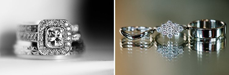
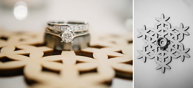
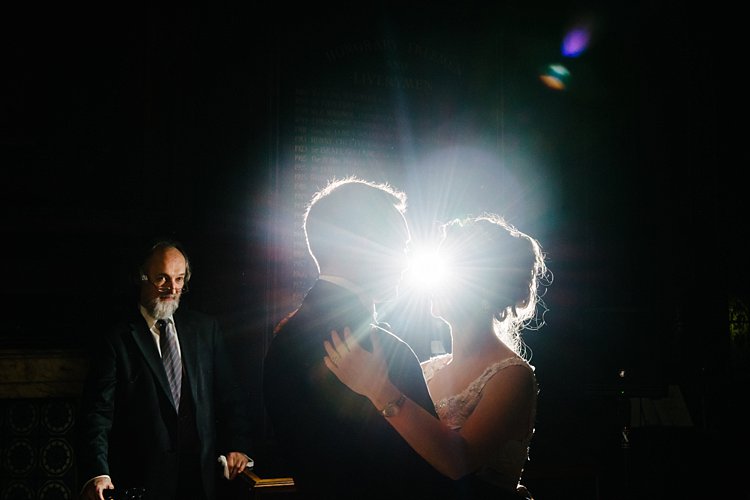
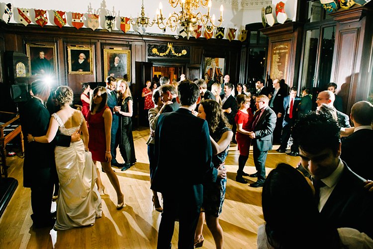
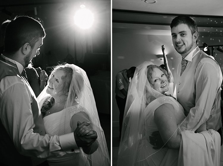
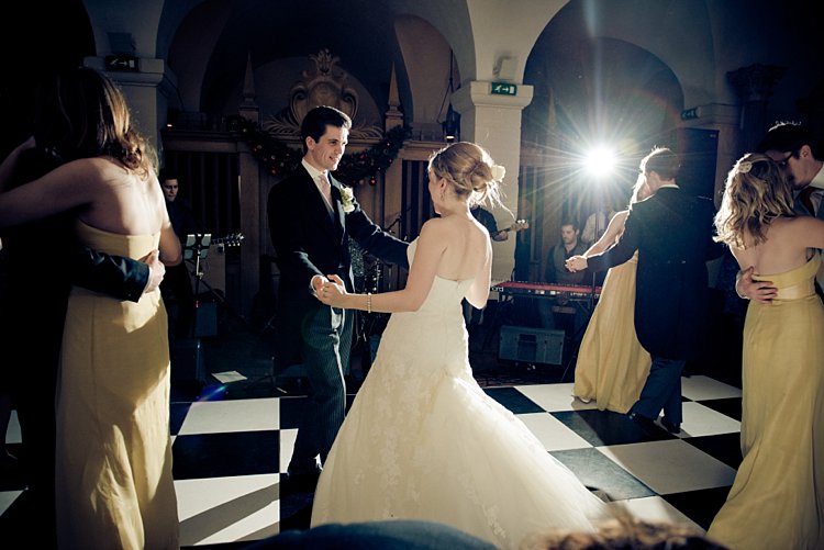
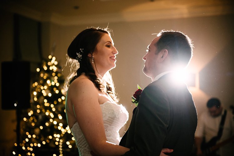
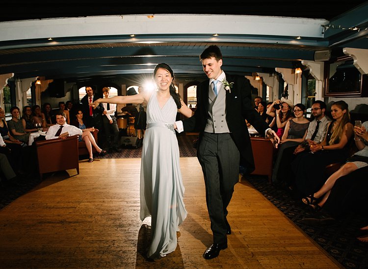
    What do you think is the one thing that people treasure the most after they have cut their birthday cake, completed a wedding ceremony, or had their first baby? Well, for most photographers, the answer is rather simple. These are the photographs taken by our fancy gadgets capturing those precious shots so that they remain a part of our clients’ Continue Reading

    The post Review of Moments Designer appeared first on Photodoto.


    Photodoto

  • How to Use the Levels Tool in Photoshop

    Photoshop is a pretty daunting program when you’re beginning. So this is the first in a series of articles to bring you up to speed on some of the most useful tools to you as a photographer for editing and correcting your photos. If you’ve been a Lightroom only user, and are a CC subscriber, do follow along to start your journey into Photoshop. In this article, you’ll learn how to use the Levels tool, along with Auto Levels and learn to set up Auto Levels to suit your personal preference for the tool’s response.

    You’ll also take your first step with Layers by using a Levels Adjustment Layer right at the end. But first, we’ll talk a little about Histograms.

    The Histogram

    A Histogram is a graphical representation of the colors and tones in your photo. The bottom axis shows the range of brightness in the image from dark to light. The side axis shows the strength a given tone has at that particular brightness. Typically you’ll hear people say that the bulk of tones should be in the middle, but that’s not exactly right. A night scene of stars will have the bulk of the tones in the dark region, with a spike at the top. Same for a dark product shot on a white background.

    How to Use the Levels Tool in Photoshop

    How to Use the Levels Tool in Photoshop

    Histogram of a high key (light) image.

    High Key shots will tend to have more information on the right of the histogram, while low key portraits will have them mostly to the left.

    In general, most images will have information throughout the range of tones. When they don’t, but should, that’s where the levels tool comes into play.

    Levels

    To begin, you can use the keyboard shortcut CNTL/CMD+L, or choose Levels from the Image>Adjustments Menu. This is a destructive version of the tool, so it will throw away pixels. You won’t be saving this file, so it’s okay for now.

    How to Use the Levels Tool in Photoshop

    I’m using an image that I know is underexposed (you can tell by the histogram below as it doesn’t touch the right-hand side of the graph). Let’s look at what’s in your Levels tool dialog.

    How to Use the Levels Tool in Photoshop

    Preset:

    You can save settings as a preset to reuse again quicker, there are a few default ones that ship with Photoshop. You can choose these presets and see both the effect and what’s been done to get it.

    How to Use the Levels Tool in Photoshop

    Level presets that come with Photoshop.

    Channel

    As well as the overall tone channel (RGB), you can select the red, green or blue channels separately. This will change the color balance of the image and you can use it to fix white balance issues or to creatively manipulate the look of the photo. For now, you’ll just be using the RGB channel.

    How to Use the Levels Tool in Photoshop

    Input Levels

    This shows the histogram with three triangles (see above). Each triangle has a number below it (the defaults are set at 0, 1.00 and 255). You can edit these points by dragging the triangle along the histogram. They have names too. The leftmost is the Black Point, which controls the darkest tones in the image. The centre one in the Mid-tone Point, while the top is the White Point, or brightest tone in the image.

    If you move the Black Point to the right, all tones to the left of the new position are rendered as pure black pixels. If you move the White Point to the left, this means that any pixel to the right of the new position will be rendered as white. Moving the Midpoint, (also referred to as the Gamma) it will shift the histogram the same direction effectively lightening or darkening the mid-tones. Left will lighten the mid-tone, while moving it to the right will darken. You may also have a perceived change in contrast as some tones at the extremes are compressed.

    Output Levels

    You can dictate the brightest or darkest point allowable in the image using these sliders. In general, you won’t use these as much as input levels.

    Buttons

    OK applies the Levels change. Cancel ignores any changes. We’ll look at Auto and Options separately. The Eyedroppers allow you to select the Black, Mid-tone, and White Points by clicking on specific parts of the photo. Preview allows you to see the changes you’re making on the image before applying the effect.

    In Practice

    Now that you know what the bits do, let’s look at them practically. You can see there’s a huge gap between the ends of the mountain in the histogram below and the White Point slider. By moving the White Point to the left, you can brighten the image and fix the underexposure.

    How to Use the Levels Tool in Photoshop

    Original histogram – notice the gap between the end of the mountain and the right-side of the chart? This indicates underexposure and is easily fixed.

    How to Use the Levels Tool in Photoshop

    Here the White Point has been moved to the left to touch the bottom of the mountain. This will give the image brighter tones and pure white.

    By holding the Alt/Option key as you slide, you also see a heat map that shows where and clipping (pure white with no detail) occurs. For the White Point, the screen goes black, and the clipped areas show as color. For the Black Point, the image goes white, and again, the clipped areas show as color.

    How to Use the Levels Tool in Photoshop

    Holding Alt/Option while moving the slider, you can see there are some areas being clipped in the highlights. Move the White Point slider back to the right until they disappear in order to have detail in all areas of your highlights.

    Here’s the result:

    How to Use the Levels Tool in Photoshop

    Fixing overexposure

    If your image is overexposed (but without the highlights clipping in important areas), you need to do the opposite. In this case, you bring the Black Point up to fix the issue.

    How to Use the Levels Tool in Photoshop

    See the different left to right here? There is no black in the image on the left.

    Low contrast

    Another possibility is the detail is all in the middle of the histogram (low contrast or flat image). In this case, you need to move the sliders in from both ends. Notice the increase in contrast between the two photos.

    How to Use the Levels Tool in Photoshop

    How to Use the Levels Tool in Photoshop


    How to Use the Levels Tool in Photoshop

    By moving the Black Point to the right and the White Point to the left the contrast has been increased in this image.

    While you’ve seen what changing the black and white points can do, you should also know that moving the midpoint will allow you to brighten (by moving to the left), or darken (by moving to the right) the mid-tones in your photo.

    Auto Levels

    Auto Levels, as the name suggest, will do this for you automatically. How Auto Levels responds depends on the settings in the Options section. These have changed with time as well, so you may not be aware of this. Press Auto Levels for this to work.

    How to Use the Levels Tool in Photoshop

    Original image.

    How to Use the Levels Tool in Photoshop

    After Auto Levels has been applied.

    Options

    To change the Auto Levels default settings you use the Options button.

    Enhance Brightness and Contrast

    The default option is Enhance Brightness and Contrast, which uses the external Brightness and Contrast tool to get a good rendition of the file. This is the look in the version of the photo above.

    Enhance Monochromatic Contrast

    The top option, Enhance Monochromatic Contrast is closer to what you’ve done manually in the previous section. Here’s what it looks like (starting from a fresh version of the file). First the settings in Options.

    How to Use the Levels Tool in Photoshop

    This results in the following, more dramatic, look.

    How to Use the Levels Tool in Photoshop

    Auto Levels with the default set to Enhance Monochromatic Contrast.

    You can also automatically fix the color by clicking the “Snap Neutral Midtones” checkbox.

    You’ll notice that the shadows are more than a little crushed in these images, though. That’s because of the mix of the swatch settings and the clip settings below. Clicking on the swatch gives Photoshop the base color for your blacks, neutrals, and white. In general, these should be black, mid gray, and white, but you could set them to suit tasks like having pure white below 255 to render something when printed, instead of paper white. For now, you should leave these at the defaults.

    To prevent pure white and pure blacks being so deep, you need to back off the clipping settings. Put them at 0%.

    You’ll notice the reduction in the blacks from this adjustment immediately. If you prefer the drama, leave the black clipping at 0.10%.

    You can have your images render this way automatically by ticking the “Save as Defaults” checkbox.

    Enhance Per Channel Contrast

    This setting emulates you going in and setting each channel separately to get the white and black points to the edge of information for each color channel.

    How to Use the Levels Tool in Photoshop

    This has the effect of changing both the contrast and the color of your photo as seen below.

    How to Use the Levels Tool in Photoshop

    Find Light & Dark Colors

    This option is used by the Auto Color command. It finds the average lightest and darkest pixels in your photo and uses them to get the best contrast while avoiding clipping.

    Each person will have their own preference for which looks best on their photo. So choose the option you prefer the most and save it as the default. Now when you use Auto Levels, it’ll give you a quick fix when you need to get done in a hurry.

    Levels Adjustment Layer

    Everything you’ve done so far has been destructive editing. You’ve been throwing away pixels, which affects the quality of the photo. Have a look at the histogram in Levels when using the Enhance Monochromatic Contrast option.

    See all those gaps? That’s information you’ve thrown away. If you change your mind, you’ve got nowhere to go, you can’t get that information back. There are ways to prevent this of course. You could, for instance, duplicate the layer (CTRL/CMD+J) and work on that. But you have an even better option; the Levels Adjustment Layer.

    At the bottom of the Layers panel is the Adjustment Layers option. It’s a circle that’s half black and half white.

    Click this to bring up the available Adjustment Layers and choose Levels. (Note: you can also open the Adjustments panel by going to: Window>Adjustments and then find the levels option, it’s the one that looks like a graph right after the sun icon).

    The Adjustments panel – Levels is the second one on the top row.

    A new layer, called Levels, will appear in your Layers panel. The controls for Levels don’t show as a dialog, they’re now in your Properties panel.

    How to Use the Levels Tool in Photoshop

    If you can’t see the Layers or Properties panel, you can turn them on in the Window menu. Using the Properties panel, set your Levels. If you’re not happy you can just change the settings as often as you like, without degrading the image like repeated use of the normal Levels tool would.

    For the plane photo, I used Auto, which had Enhance Monochromatic Contrast, with 0% clipping, and Snap Neutral Midtones on, as the Default. I then brightened the image using the Midtone, set to 1.15.

    Levelled Off

    Right folks, so that’s been a look at the Levels tool in Photoshop. It’s one of the most fundamental photo tools in Photoshop. I actually think it’s a shame that Lightroom doesn’t have equivalent options in the Basic panel that emulate the options available in the Auto options (Aperture had buttons for both Monochromatic and Per Channel Auto Levels for example).

    Give the tool a try, especially if you’re just starting to come to grips with Photoshop.

    googletag.cmd.push(function() {
    tablet_slots.push( googletag.defineSlot( “/1005424/_dPSv4_tab-all-article-bottom_(300×250)”, [300, 250], “pb-ad-78623” ).addService( googletag.pubads() ) ); } );

    googletag.cmd.push(function() {
    mobile_slots.push( googletag.defineSlot( “/1005424/_dPSv4_mob-all-article-bottom_(300×250)”, [300, 250], “pb-ad-78158” ).addService( googletag.pubads() ) ); } );

    The post How to Use the Levels Tool in Photoshop by Sean McCormack appeared first on Digital Photography School.


    Digital Photography School

  • Review of the Polaroid PL-190 TTL Flash

    Review of the Polaroid PL-190 TTL FlashPopping open the generic black carrying case of the Polaroid PL-190 TTL flash is an unimpressive endeavor. Not that these things ever are of course. The flash which slid smoothly out into my hand looked unremarkable as well; an LCD screen and a series of buttons below. The lens had the typical integrated bounce card and diffuser. But when I slid the sizeable flash onto the hot shoe of DSLR, the un-remarkability ended. In use, the PL-190 TTL was far more impressive.

    Equipped with an 18-180mm zoom, swivel/bounce head, TTL, and wireless remote capability, and it started to look pretty comparable to the high-end flashes available from Canon and Nikon (though much, much less expensive).

    Note: the Polaroid PL-190 TTL flash is available for both Nikon (PL-190N) and Canon (PL-190C).

    Review of the Polaroid PL-190 TTL Flash

    Brand comparison

    As a largely Canon shooter, I’ve always been a bit disappointed by my brand’s flashes. Designed to be so closely integrated into the operating system of the camera, they can produce great results. But making swift changes to settings, power, and TTL exposures can be a slow, button-pushing, menu-searching process. Then, of course, there is the cost of the Canon flashes. The higher end can run close to $ 500, which is almost five times the cost of the Polaroid PL-190 TTL flash, which I held in my hand.

    Review of the Polaroid PL-190 TTL Flash

    On-camera, the PL-190 TTL is as large as Canon or Nikon’s high-end flashes. And it’s just about as powerful.

    In part due to the fiddly nature of Canon flashes, I’ve often defaulted to using basic, inexpensive, manual control lights. Plus I can buy two, three, or even four for the price of a Canon 600EX. So I was excited about this new offering. The specs of the Polaroid PL-190 TTL flash are similar to that of Canon’s high-end ones (the Speedlite 600EX II-RT), though perhaps not quite as capable, and as a third party offering, the integration with my standard operating system is not quite as smooth. This flash is capable of TTL, but also easily adjustable through manual power settings. Basically, the flash seemed like a great compromise, and much more affordable.

    Using the flash

    In using the flash, that pleasure continued. Frankly, I love this thing and didn’t want to return the demo I’d received on loan from Polaroid.

    The controls on the back are simple, a pleasant change from the various wheels and menus required to Canon’s 580ex. It’s powerful too, lighting up distant objects even under fairly bright conditions. The zoom capability, which was automated, to correspond with the focal length of the camera’s lens reached to nearly 200mm, throwing a light cone that worked nicely with my 70-200mm (one of my favorite lenses).

    Review of the Polaroid PL-190 TTL Flash

    Straight flash, is typically direct and bright, mostly lacking shadows and textures. (True of any camera when used on-camera.)

    Review of the Polaroid PL-190 TTL Flash

    Using the built-in diffuser, you lose about two stops of light (this is the same flash power and camera settings as the previous, straight-flash shot). The light does soften somewhat but is still direct and harsh.

    Review of the Polaroid PL-190 TTL Flash

    This image shows the same camera setting and flash power as the previous two images but is using just the bounce card with the flash aimed straight up. It creates a softer, top-light look, though you lose about three or four stops of light.

    Here, I increased the flash power three stops and used the bounce card with the flash aiming up. The result is brighter but retains the softness and directionality of a top light.

    TTL and Manual Settings

    Since the TTL functionality worked well with my camera, I could take advantage of that one shot then quickly switch over to full manual functionality the next. I could zoom manually as well, allowing me to focus the beam narrowly while shooting with a wide angle lens on the camera, highlighting a single portion of a much larger frame.

    Review of the Polaroid PL-190 TTL Flash

    Off-camera the Polaroid PL-190 TTL flash was easy to use. Manual settings are easy to control, providing a great deal flexibility when creating the proper exposure.

    Review of the Polaroid PL-190 TTL Flash

    Another off-camera image. When used with the bounce card and placed close the subject, the light was surprisingly soft.

    Now I want to note, that since I was primarily interested in the basic functionality and usability of this flash, I tried it only briefly off-camera, making a few images of flowers. Off-camera, I used the manual settings. As I noted earlier, the simple adjustment of power makes this a breeze. With a simple radio trigger on board, I was set to go. The Polaroid PL-190 TTL flash does have wireless slave capability and although I did not test this, given the smooth operation of the flash in general, I’m sure this too would work well.

    Review of the Polaroid PL-190 TTL Flash

    With a 1/200th sec flash sync speed the PL-190 TTL is easily capable of images like this. Fast moving subjects like flying birds retain sharpness, with little motion blur.

    Summary

    In short, I think the Polaroid PL-190 TTL flash is a great lighting tool. It worked flawlessly in the brutal cold of an Alaska winter day when I played with it outdoors, and it has easy to use controls with some helpful camera integration. In fact, I liked its simplicity and ease of use so much that as my Canon 580ex ages, this Polaroid flash may be the replacement. With a $ 109 price tag (at major online retailers) I can buy four with change for the price of one Canon 600ex. Guess that means I can quadruple my creative lighting options…now, where did I leave my credit card?

    Shop for the Polaroid PL-190 TTL flash on Amazon.com (Nikon PL-190N or Canon PL-190C ) or B&H Photo (Nikon PL-190N or Canon PL-190C ) .

    googletag.cmd.push(function() {
    tablet_slots.push( googletag.defineSlot( “/1005424/_dPSv4_tab-all-article-bottom_(300×250)”, [300, 250], “pb-ad-78623” ).addService( googletag.pubads() ) ); } );

    googletag.cmd.push(function() {
    mobile_slots.push( googletag.defineSlot( “/1005424/_dPSv4_mob-all-article-bottom_(300×250)”, [300, 250], “pb-ad-78158” ).addService( googletag.pubads() ) ); } );

    The post Review of the Polaroid PL-190 TTL Flash by David Shaw appeared first on Digital Photography School.


    Digital Photography School

  • How to Understand the Lightroom Tone Curve

    With all the editing options available in the Lightroom Develop module it can be tough to know where to start when you pull up a picture and start making changes. The Basic panel covers elementary adjustments like exposure and white balance; Detail lets you adjust sharpness and noise reduction; Effects allows you to add a vignette, and so on. The Tone Curve panel seems downright strange at first, with a light gray histogram and a diagonal line going right through the middle of it. But this panel can actually be used to tweak and enhance your images quite a lot if you know how it works.

    It won’t give you the same level of finely-tuned control you may want for individual colors, and can’t help you remove spots or blemishes. But it does give you a huge amount of power to change the overall visual impact of a picture and with a few clicks of the mouse can take it from average to awesome.

    How to Understand the Lightroom Tone Curve

    What is the Tone Curve?

    The Tone Curve panel can be thought of almost like the contrast slider on steroids. Most photographers use it to add a sense of punchiness or vibrancy to their pictures. You can also do the opposite and make the overall exposure a bit more even-handed by bringing down the highlights while bringing up the shadows.

    How you use the Tone Curve is going to depend on your editing style and the pictures you are working with, but suffice it to say that if you’ve been using the contrast slider you may find yourself quite pleased with the editing power offered by the tone curve. To understand how it works I’m going to use the following image as an example and apply a few simple edits using only the tone curve.

    Using the Tone Curve

    How to Understand the Lightroom Tone Curve

    Straight out of the camera, with no edits.

    This picture is an unedited RAW file straight from my camera, but with a few tweaks of the Lightroom Tone Curve, it can be transformed into a much more vibrant photo. To get started with these edits on any picture, enter the Develop module of Lightroom and click the Tone Curve panel (on the right side) which brings up a grayscale graph with a diagonal line going from one corner to the other (as shown below).

    How to Understand the Lightroom Tone Curve

    Look carefully in the background of the graph and you will see a histogram which is the exact same as the one at the top of the Lightroom Develop module. This shows you where the color values are in your image and whether you have a lot of colors that are very bright, very dark, or somewhere in the middle.

    What the diagonal line and the sliders below it allow you to do is change the intensity of various parts of your picture. You can make the light parts lighter or the dark parts darker. For instance, here is the original image with a bit of adjustment to the lights.

    Adjusting the curve

    How to Understand the Lightroom Tone Curve

    This adjustment has taken the lighter portions of the image (mostly the blue sky in the background) and made them even brighter while leaving the darker portions of the image alone. Now I’ll take the editing process a bit further by clicking on the bottom-left part of the diagonal line and dragging it down instead of up.

    With just two simple edits on the Tone Curve, the image is now much more pleasing than the initial version, and things are just getting started. In making the bright portions lighter and the dark portions darker it has given the picture an improved sense of contrast and vibrancy. The same thing can happen with your images too.

    Using the sliders

    You may also notice if you do these edits on your own that the adjustments you make to the tone curve are also quantified in the sliders below the graph, as you can see below.

    How to Understand the Lightroom Tone Curve

    You can also use these sliders to adjust the values of the tone curve if you choose, and you may also notice that there are more than just two sliders, one each for lights and darks. The highlights are the very brightest portion of the image, whereas the shadows are the very darkest portions, and as you adjust these sliders (or the tone curve itself) you will see the colorful histogram at the top of the Develop module change accordingly.

    If you lower the numerical value of the shadows or darks (or simply drag that portion of the line down) you will notice the histogram creep towards the left which is another visual illustration of the edits you are performing. The same holds true for the highlights and lights.

    Use in moderation

    I recommend that if you are using the tone curve to enhance your pictures, that you are careful not to push the histogram too far to the right or the left. Ideally, you want the darkest parts of your image to be pure black, but not so much more that whole sections of your photo get muddied in the process. The same goes for the lighter portions, as you can see in the following example.

    How to Understand the Lightroom Tone Curve

    There are a couple of things to note in the above image, so I want to break it down a bit.

    First, you will see that the picture of the leaf is vastly different from its original incarnation at the top of this article. It has much more contrast and is in my opinion, too heavily edited. Some people like this look though, and using the tone curve is a good way to achieve it.

    Second, if you look carefully at the bottom portion of the diagonal line in the tone curve you will see that it flatlines until after it starts to overlap part of the shadowy gray histogram behind it. This means that much of the color in the darker portions of the image has been crushed to be completely black, and the same thing has happened to the lighter portions. You can see this at the top of the S-shaped curve where it hits the top of the graph while there is still gray histogram data left on the right-hand side. All that color data has been discarded, which is why huge swaths of the bright blue sky in the picture now show up as completely white.

    Finally, the colorful histogram on the right side shows that instead of a well-exposed picture, much of the data is now extremely bright or extremely dark which is a sign that the picture is very high contrast.

    Curve presets

    You can also use two built-in presets by clicking on the “Point Curve” options in the lower-left portion of the panel for a medium or high contrast image, but I generally don’t use those. Normally when making adjustments to the tone curve I keep things subtle and avoid such high contrast situations. Because many photographers prefer this style, Adobe has limited the way in which the tone curve can be edited by default.

    When you click and drag on the white line it affects a rather large swath of the whole line, which is a nice way of making sure your adjustments are evenly reflected across much of the image. However, you can have a bit more fine-tuned control over your edits by clicking the small little mini-graph icon in the lower right corner of the tone curve panel.

    The Point Curve

    Using the Point Curve to make adjustments gives you much more control over your image, but if you’re not careful things can quickly get out of hand. It’s always a good idea to try things out, especially in a program like Lightroom where all your edits are nondestructive. But generally, I like to stick with the default tone curve adjustment because it’s a bit more forgiving in its edits.

    How to Understand the Lightroom Tone Curve

    I wouldn’t normally edit a picture to look like this, but I wanted to illustrate how the point curve can give you much different results from the traditional tone curve.

    RGB Curves

    You might notice the “RGB” option in the lower-right portion of the point curve as well, which gives you even greater control over your edits. Click this to edit the individual Red, Green, and Blue channels of your image and perform the same types of adjustments (i.e. adjust the brightness and darkness) but on each individual color separately.

    I rarely use it, but this can be quite useful if you want to give your pictures a certain type of color cast or edit a single color (e.g. blue skies, green grass) to have more impact. If you find yourself going a little overboard while editing the point curve and want to remove some of your edits, just double-click on a point to delete it.

    Targeted adjustments

    Finally, another way to edit the tone curve that some people find useful is to click the little circle (targeted adjustment tool) in the top-left corner of the tone curve panel. Then you can click and drag on specific parts of your image (say, a bright sky or a dark river) to make them lighter or darker. It’s an easy way to make targeted adjustments right on the image itself without trying to guess at which part of the tone curve graph to edit.

    Conclusion

    I hope this gives you a bit more understanding as to what the tone curve does. If you’ve never tried it before I highly recommend giving it a chance. If you want to add just a little bit of punch to your pictures, whether portraits, landscapes, sports, wildlife, or just about anything else, click over to the Tone Curve and try a couple of adjustments. You can’t really go wrong with a little bit of a classic S-curve, where you raise the highlights and lower the shadows, but you might find other types of edits that work well for specific pictures too.

    Do you have any tips that work for you when using the Lightroom Tone Curve? Any secrets that you want to share that I forgot to mention here? Please leave your thoughts in the comments below.

    googletag.cmd.push(function() {
    tablet_slots.push( googletag.defineSlot( “/1005424/_dPSv4_tab-all-article-bottom_(300×250)”, [300, 250], “pb-ad-78623” ).addService( googletag.pubads() ) ); } );

    googletag.cmd.push(function() {
    mobile_slots.push( googletag.defineSlot( “/1005424/_dPSv4_mob-all-article-bottom_(300×250)”, [300, 250], “pb-ad-78158” ).addService( googletag.pubads() ) ); } );

    The post How to Understand the Lightroom Tone Curve by Simon Ringsmuth appeared first on Digital Photography School.


    Digital Photography School

  • How to Take Unique Double Exposures Without Using Photoshop

    For over a hundred years, double exposures have captivated photographers and art enthusiasts alike. Discovered by pure chance, a double exposure is a trick where a single frame of film is exposed twice or more in order to achieve multiple images in a single shot. This results in a photograph that comes out as a combination of the two images that were shot, one superimposed on top of the other.

    From the technique’s boom in the 1860s, this inspired accident created an avant-garde trend that could only be described as one of the most creative uses of photography. Today, you don’t need to shoot on film to be able to create wonderful double exposures. Digital cameras are all capable of performing this unique trick!

    Double Exposures Made Simple

    There are five key steps to creating a basic double exposure on a digital camera. Let’s look at them one at a time.

    1. Conceptualize

    Although spontaneity and experimentation in photography are excellent (and very important learning processes in becoming a good photographer), more difficult techniques require further planning and forethought. It is far easier to produce a successful and satisfying double exposure when you conceptualize the image(s) beforehand, than fumbling around for hours producing work that may leave you feeling frustrated! To begin your plan, ask yourself a few simple questions:

    • What is my subject?
    • What is my background?
    • What is this image’s purpose?
    • What resources do I have available to me?

    After you have answered these, you should have a much better idea of what your finished photograph will look like. As such, bringing your vision to life will now be a breeze!.

    Double Exposures Made Simple

    2. Multiple exposures settings

    For film, you would simply shoot on the same frame multiple times by re-rolling (or not advancing it) the film. Since digital is not a roll, you will have to dig into your camera’s settings (check your user manual if need by) and do a couple of tweaks. Most digital cameras, such as Canons and Nikons, have a multiple exposure setting to allow you to generate these distinctive images.

    Often found in the menu, the multiple exposure setting will more than likely host an array of options.

    One of the main selections presented is choosing how many images you would like to overlay. Most cameras range from two to ten. For the purpose of this simple tutorial, we will only be using two images. At the bottom of this article, I will mention how to use far more than two photographs for advanced techniques.

    Another important option will be Multi-Exposure Control (or blend mode). This tells the camera how you want your images composited together. The options are typically Additive, Average, Dark, and Light.

    Blend mode options

    Additive means that your images will simply be overlaid one over the other without any special considerations (see below).

    Double Exposures Made Simple

    Average (which is similar to Additive) means that the camera will automatically adjust the exposure in any overlapping areas to prevent overexposure, based on the number of exposures you combine. Any non-overlapping areas will be rendered with a normal exposure.

    Double Exposures Made Simple 8

    Bright means that exposure priority will be given to bright objects so that they will retain their exposure even when combined with a dark background.

    Double Exposures Made Simple 6

    Dark means that exposure priority will be given to dark objects so that they will retain their exposure even when combined with a light background.

    Double Exposures Made Simple

    The final main setting should revolve around the actual physical camera controls. On Canon and Nikon cameras, you will most likely be presented with two options: Func/Ctrl (which allows you to pick your base image before shooting) and ContShtng (which means that you just photograph images one after the other and they will be composited).

    Every camera is different, so remember to please reference your user manual for more detailed information.

    3. Photograph the silhouette

    A silhouette is the shape that will be filled by your background of choice. The key to this is making sure that your silhouette subject is photographed on a plain background. Don’t worry too much about properly exposing the details on your subject, all of that will be covered up by your background. Focus on making sure that the area around your subject is clear of objects.

    Double Exposures Made Simple

    The first thought that may pop into your head is using a studio, but that isn’t necessary. You don’t have to be in a studio to photograph your subject on a clean background. You can photograph your subject on a plainly colored wall or better yet, you can go outside and use the beautiful open sky above you.

    To photograph your subject in front of the sky, shoot from a slightly lower angle to make sure that no additional clutter ends up disrupting your clear sky. Depending on your geographical position, the easiest time of day to photograph your subject is about an hour before sunset. The right exposure will ensure that no flare ends up in your photograph.

    4. Photograph the background

    This is the texture or image that will fill the silhouette you just captured. Good options for this image are well exposed trees, landscapes, flowers, mountains, or patterns. Make sure that your background is well lit, as to not lose any details. If the background is over or underexposed, the resulting image may be hard to read.

    When picking your background, consider color, complementary shapes, and how these factors all correlate with one another to produce a great double exposure. If your silhouette is a soft, female form, think about using flowers with complimentary delicate shapes. If your silhouette is a rugged form, think about using some strong-featured trees to accent the silhouette’s configuration.

    Double Exposures Made Simple

    5. Watch the images line up

    On some cameras, you need to remember the positioning of the two images. On others, you can use the Live View feature to actually see how the images line up before taking the last photograph. In either case, watch the photographs come together, and look in awe at your masterpiece.

    The aforementioned steps are just the foundation for creating a simple version of these painterly images. The double exposure technique can be utilized for a variety of purposes, styles, and effects. Instead of just using two photographs, utilize three or more to create entirely new types of imagery. Here are some advanced techniques to really push the limits of double exposures:

    Using double exposures for movement

    Double exposures are a fantastic way to express artistic movement in an image and have the viewer move their eyes around the frame. Set your number of frames to three or more, and have your subject move differently in each shot. When the images are composited together, you will generate an image that showcases a lot of movement.

    Double Exposures Made Simple

    Using double exposures for sequences

    You can use double exposures to create a step-by-step sequence in a single image. When Continuous Shooting (ContShtng) is selected in the settings, put the camera on a tripod, and fire away at your subject without panning (following the subject with your camera). Make sure that your focus settings are set to AI Servo for Canon or Continuous-Servo AF (AF-C) for Nikon (which means that the camera will lock focus on your subject and hold that focus no matter where the subject moves.

    You want to keep the camera as still as possible so that the not-moving parts of your photographs do not have any overlap distortion. Your finished composite will feature every step in the sequence.

    Super-imposing without photo editing software

    Upon its discovery in the 1800s, a significant use of double exposures was to super-impose without needing to physically combine or paint photographs in the dark room. Today, although we have access to incredible post-processing and retouching programs, editing can be quite time consuming. A good way to combine images without the need of Photoshop is by utilizing this infamous technique.

    Instead of silhouetting your subject and picking a background, you will now be placing subjects together. Similar to what was done with sequencing above, put the camera on a tripod to make sure that the frame does not move (as to not have any distortion on still objects.

    Using double exposures for sequences

    Ghosting

    Back when double exposures were first discovered, many photographers of that time loved to create ghostly images. The concept of ghosts were quite prevalent because of the world’s tumultuous history. Photographers and artists alike were captivated with this eerie subject matter, and fascinated with the audience’s response to that kind of image.

    To create your own ghostly photograph, set your camera on a tripod. Photograph the background location. Then for the next image, set your shutter speed quite low to create some motion blur. Finally, have someone slowly walk through the frame and take a picture. The composite will feature a ghostly presence.

    Now that you’ve finished this guide, go out there and take some phenomenal double exposures. Please share your images and comments below.

    googletag.cmd.push(function() {
    tablet_slots.push( googletag.defineSlot( “/1005424/_dPSv4_tab-all-article-bottom_(300×250)”, [300, 250], “pb-ad-78623” ).addService( googletag.pubads() ) ); } );

    googletag.cmd.push(function() {
    mobile_slots.push( googletag.defineSlot( “/1005424/_dPSv4_mob-all-article-bottom_(300×250)”, [300, 250], “pb-ad-78158” ).addService( googletag.pubads() ) ); } );

    The post How to Take Unique Double Exposures Without Using Photoshop by Anabel DFlux appeared first on Digital Photography School.


    Digital Photography School

  • How to Use Neutral Density Filters to Make Better Landscape Photos

    In an earlier article, I wrote that neutral density filters are the secret weapon of the landscape photographer. I couldn’t work without mine and I suspect most landscape photographers would say the same.

    But why are they so useful? There are two reasons. One is that neutral density filters give you control over exposure, and the other is that they give you creative control over shutter speed.

    Neutral density filters

    Let’s take a closer look at these concepts.

    What is a neutral density filter?

    First, some definitions. A neutral density filter is one that blocks light. The result is that less light passes through the lens and reaches the camera’s sensor (or film).

    There are several ways of measuring the strength of neutral density filters, but they are basically all different ways of stating how many stops of light the filter blocks. Typical strengths are one stop (0.3 or ND2), two stops (0.6 or ND4), three stops (0.9 or ND8), six stops (1.8 or ND64 )and ten stops (3.0 or ND1024). Some manufacturers even make neutral density filters that block 16 stops or more light, although these are more of a specialty item.

    This photo shows a ten stop neutral density filter mounted on a lens. As you can see the filter is nearly opaque and you can’t see through it well.

    Neutral density filters

    Different kinds of ND filters

    Neutral density filters block light evenly across the frame. Graduated neutral density filters, on the other hand, block light across just part of the frame. Half the filter is clear, and half is opaque, with a graduated area in-between (hence the name).

    This photo shows a two stop Lee graduated neutral density filter in a square filter holder. The top half of the filter is dark (to block light) and the bottom is clear.

    Neutral density filters

    Graduated neutral density filters and the landscape

    Graduated neutral density filters (often just called grads or GND filters) are used by landscape photographers to control exposure.

    Imagine you are taking a landscape photo that includes the sky and the setting sun. In this scenario, the sky is much brighter than the foreground. If you expose correctly for the sky, the foreground goes dark. If expose correctly for the foreground, the sky is burnt out.

    A graduated neutral density filter blocks light from the sky without affecting the foreground. If for example, the sky is three stops darker than the foreground then a three-stop graduated neutral density filter will help even out the difference between the two, allowing you to capture the scene in a single frame.

    Here’s an example

    For this first photo below I set the exposure by exposing to the right (on the histogram) so that there were no clipped highlights. The problem is that the bottom half of the photo is too dark. You can make it lighter  in Lightroom, but not without introducing noise.

    Neutral density filters

    I made another photo (below) and increased the exposure by two stops. The foreground is exposed properly but now the sky is burnt out. There is no way to bring back the lost highlight detail in Lightroom.

    Neutral density filters

    I made this last photo using a three-stop soft graduated neutral density filter. The filter allowed me to capture detail in both foreground and sky.

    Neutral density filters

    The advantage of using the filter is that it let me continue working as the light faded, taking longer exposures without having to bracket. The last photo of the evening had an exposure time of six minutes.

    It also saves time in post-processing compared to using techniques like exposure blending or HDR in Lightroom. Before digital cameras (and processing), graduated neutral density filters were the only way that photographers had to balance out exposure between foreground and sky.

    Disadvantages of graduated neutral density filters

    Graduated neutral density filters do have some disadvantages.

    The first is that they don’t work well with scenes broken by something that sticks up above the horizon (like a tree or mountain).

    The photo below is a good example. The sky is a small part of the frame and it’s impossible to cover it with a graduated neutral density filter without making the rocks darker as well. The only solution was to take two different exposures, one for the foreground, the other for the sky, and blend them in post-processing.

    Neutral density filters

    Another disadvantage is that good quality graduated filters are expensive.

    Despite this, some landscape photographers like to use them as it gives them choice. With graduated neutral density filters you can decide which technique is best suited for the scene you are photographing.

    Neutral density filters and the landscape

    Landscape photographers use neutral density filters for creative control over shutter speed.

    Think about the exposure settings landscape photographers tend to use. You normally set ISO to the lowest setting and aperture to f/11 or f/16. This gives you maximum image quality (low ISO) and good depth-of-field (narrow aperture).

    The shutter speed required to give the correct exposure will depend on the ambient light leves. In bright light, it might be around 1/125th of a second. In the fading light at the end of the day, it might be around 1/2 second.

    But what if you want a longer shutter speed? This is where neutral density filters come in. They block light so that you can get longer shutter speeds. Longer exposures allow moving parts of the landscape (like clouds or water) to blur, which in turn creates mood and atmosphere.

    The ultimate example of this is long exposure photography, where exposures of several minutes are used to blur the motion of the sea and clouds. Here’s an example. This photo was taken at ISO 200, at f/11 for 1/125th of a second.

    Neutral density filters

    With a neutral density filter, I was able to turn that into a shutter speed (exposure time) of 210 seconds. The photo is transformed.

    Neutral density filters

    The neutral density filters I use

    One of the problems with neutral density filters is that there are so many to choose from. How do you know which ones to buy? Ultimately you have to decide how much you want to spend and then look at the options. But I can start by telling you which filters I own, why I bought them, and give you some tips for choosing filters.

    Take note – filter size is a factor

    But before I do that, I’d like to make the point that filters are very closely related to lens size. The bigger your lens, the bigger the filter required to cover the front element, and the more expensive it will be to buy. The difference can soon add up to hundreds of dollars. You have to bear in mind the filters you may want to buy later when you buy the lens itself.

    My Neutral Density Filter Kit

    My neutral density filter kit is the circular Formatt Hitech 72mm Firecrest Joel Tjintjelaar Signature Edition Long Exposure Kit #1. It contains three neutral density filters with strengths of three, six and ten stops respectively. You can also use two filters together to block nine, 13 or 16 stops of light. I bought the circular filters because they are less expensive than the square ones. (NOTE: if you plan to use your filters on multiple lenses, buy the size you need for the largest one, and get step-down rings to adapt the filters to fit the smaller ones – OR get the square drop-in kind instead.)

    My Graduated Neutral Density Filter Kit

    My graduated neutral density filter kit is the Lee Seven5 system, which I bought in a set that includes the filter holder, an adapter ring, and four graduated neutral density filters. The Lee Seven5 system is smaller (and less expensive) than Lee’s full size filters and is designed for mirrorless camera systems. This comes back to the point I made earlier about lens size.

    I love these filters because they help me take photos like this.

    Neutral density filters

    I would love to hear from you what neutral density filters you use. Which ones did you choose and why did you buy them? What brands would you recommend to other photographers? Please let us know in the comments below.


    If you enjoyed this article and would like to learn more about landscape photography then please check out my ebook The Black & White Landscape.

    googletag.cmd.push(function() {
    tablet_slots.push( googletag.defineSlot( “/1005424/_dPSv4_tab-all-article-bottom_(300×250)”, [300, 250], “pb-ad-78623” ).addService( googletag.pubads() ) ); } );

    googletag.cmd.push(function() {
    mobile_slots.push( googletag.defineSlot( “/1005424/_dPSv4_mob-all-article-bottom_(300×250)”, [300, 250], “pb-ad-78158” ).addService( googletag.pubads() ) ); } );

    The post How to Use Neutral Density Filters to Make Better Landscape Photos by Andrew S. Gibson appeared first on Digital Photography School.


    Digital Photography School

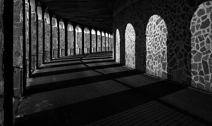
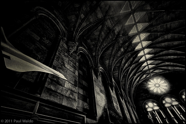
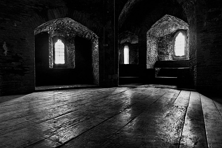
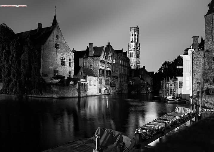
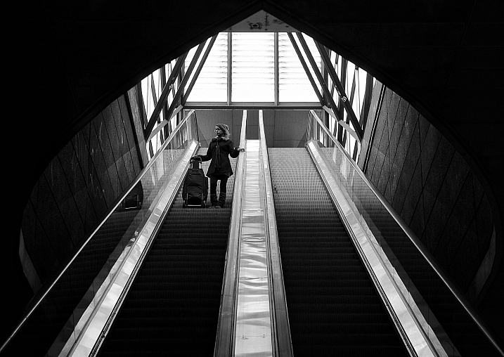
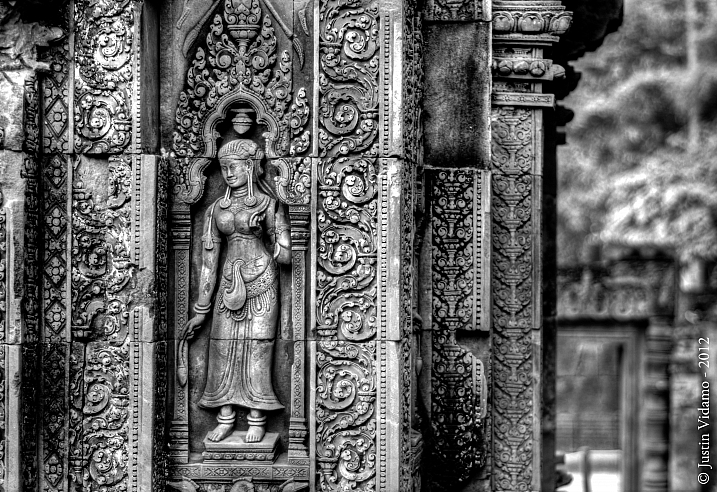
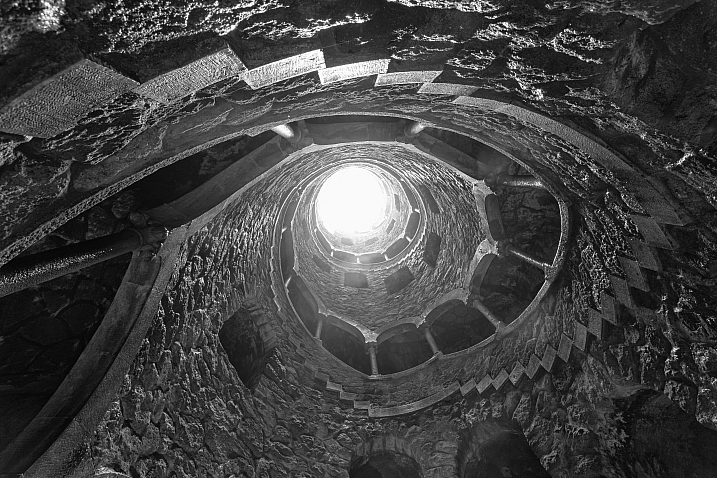
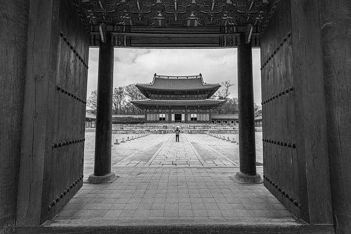
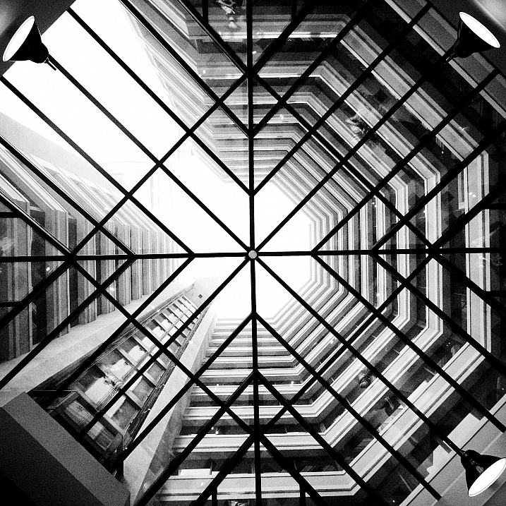
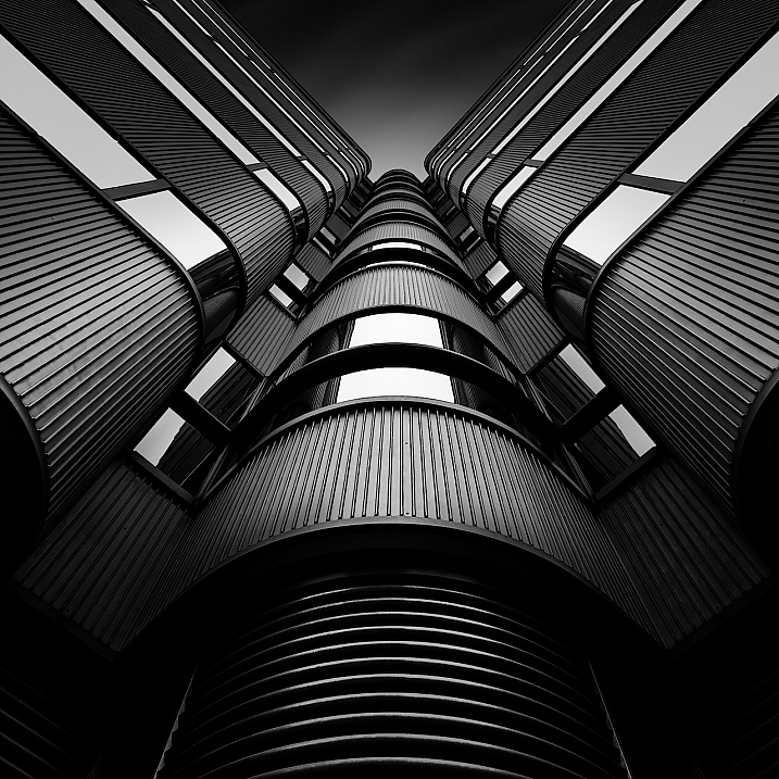
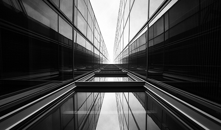
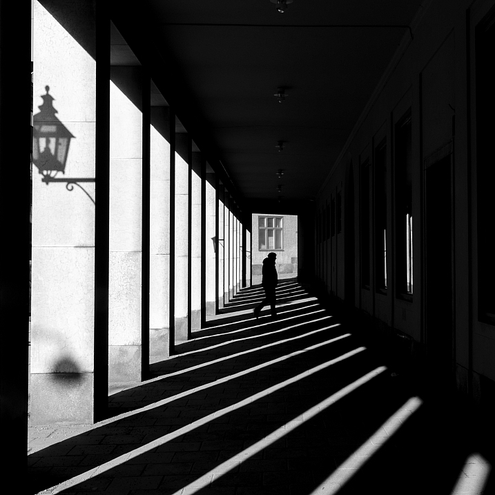
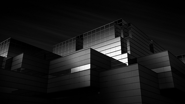
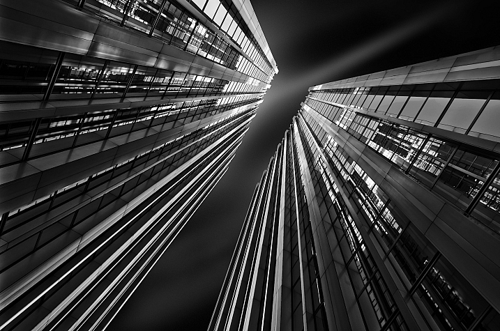
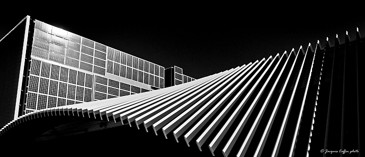
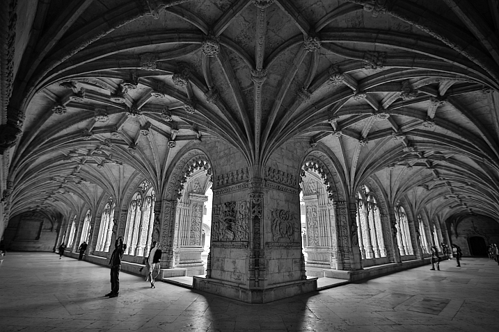
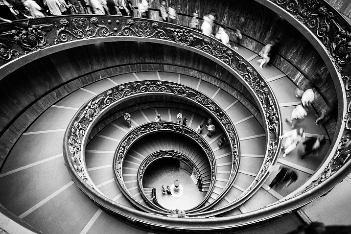
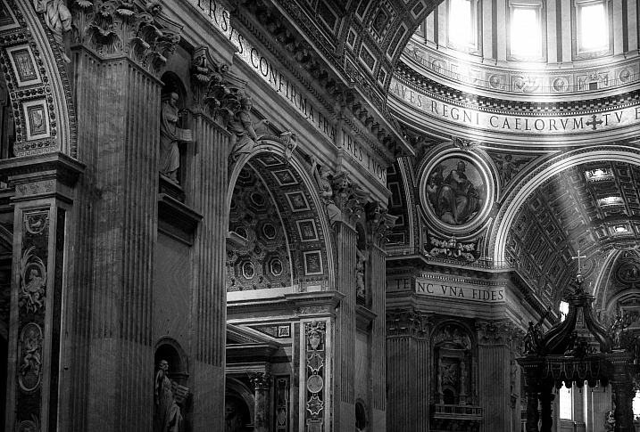
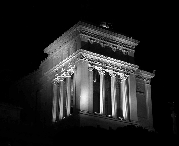
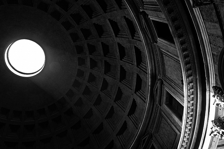
  • 23 Moody Black and White Architectural Images

    Architecture provides a few things that photographers love; texture, shape, contours, dramatic lighting.

    Let’s see how these 23 photographers found and photographed different buildings and kinds of architecture in black and white.

    By Marco Crupi

    By Paul Waldo

    By Andrew Howson

    By jesuscm

    By Thomas8047

    By Justin Vidamo

    By Brad Hammonds

    By Brad Hammonds

    By Thomas Hawk

    By ?Jin Mikami?

    By perceptions (creative pause)

    By Peter Tandlund

    By ?Jin Mikami?

    By ?Jin Mikami?

    By Jacques Caffin

    By Paulo Valdivieso

    By Franck Vervial

    By Chris Chabot

    By Wasif Malik

    By Davidlohr Bueso

    By gato-gato-gato

    By Brad Hammonds

    By Premnath Thirumalaisamy

    googletag.cmd.push(function() {
    tablet_slots.push( googletag.defineSlot( “/1005424/_dPSv4_tab-all-article-bottom_(300×250)”, [300, 250], “pb-ad-78623” ).addService( googletag.pubads() ) ); } );

    googletag.cmd.push(function() {
    mobile_slots.push( googletag.defineSlot( “/1005424/_dPSv4_mob-all-article-bottom_(300×250)”, [300, 250], “pb-ad-78158” ).addService( googletag.pubads() ) ); } );

    The post 23 Moody Black and White Architectural Images by Darlene Hildebrandt appeared first on Digital Photography School.


    Digital Photography School

  • Weekly Photography Challenge – Black and White Architecture

    Earlier I shared some moody and dramatic images of architecture in black and white. Now it’s your turn!

    Weekly Photography Challenge – Black and White Architecture

    Even in harsh midday sun, you can often create stunning and dramatic images of architecture. Let’s take a look at a few black and white images of architecture. I’ll start you off with a few of my own from Turkey.

    The library at Ephesus

    Inside the great Haga Sofia in Istanbul.

    Your challenge this week is to photograph some architecture. You can do this no matter where you live. If there are buildings, you can do this. Even a hut or shack is architecture! Use a wide-angle lens or go for details, maybe shoot at night? It’s up to you how you approach it, just get out there shooting.

    If you need some tips here are a few articles to help:

    • 4 Beginner Tips for Doing Architecture Photography
    • How to Create Stunning Architecture Photography by Painting with Light
    • Tips for Different Approaches to Architecture Photography
    • 8 Quick Tips to Improve Your Photos of Architectural Details
    • 9 Architectural Photography Tips
    • A Guide to Black and White Conversion in Photoshop
    • A Guide to Black and White Conversion in Lightroom
    • 8 Reasons to Use Silver Efex Pro 2 for Your Black and White Conversions

    By Pietromassimo Pasqui

    By David

    By Hernán Piñera

    By darkday

    Share your images below:

    Simply upload your shot into the comment field (look for the little camera icon in the Disqus comments section) and they’ll get embedded for us all to see or if you’d prefer, upload them to your favorite photo-sharing site and leave the link to them. Show me your best images in this week’s challenge. Sometimes it takes a while for an image to appear so be patient and try not to post the same image twice.

    Share in the dPS Facebook Group

    You can also share your images on the dPS Facebook group as the challenge is posted there each week as well.

    googletag.cmd.push(function() {
    tablet_slots.push( googletag.defineSlot( “/1005424/_dPSv4_tab-all-article-bottom_(300×250)”, [300, 250], “pb-ad-78623” ).addService( googletag.pubads() ) ); } );

    googletag.cmd.push(function() {
    mobile_slots.push( googletag.defineSlot( “/1005424/_dPSv4_mob-all-article-bottom_(300×250)”, [300, 250], “pb-ad-78158” ).addService( googletag.pubads() ) ); } );

    The post Weekly Photography Challenge – Black and White Architecture by Darlene Hildebrandt appeared first on Digital Photography School.


    Digital Photography School

  • How to Use a Speedlight at Wedding Receptions and Events

    Using a speedlight at weddings and events take me back down memory lane to my very first paid wedding. I had the most basic digital camera, my trusty Nikon D40, the 18-55mm kit lens, a telephoto I bought separately 55-200mm f/4-5.6, and a 50mm 1.8D. What did I know about weddings? Hardly anything technical for sure but I had bags of creativity which got me hired. We have to start somewhere. But before anyone judges me at touting my wedding photography as a professional, well I wasn’t. I was recommended to someone looking for a wedding photographer. I didn’t have a portfolio, so the person who recommended me took some of my family photos to show her friend.

    What did I know about weddings? Hardly anything technical for sure, but I had bags of creativity which got me hired. We have to start somewhere. But before anyone judges me at touting my wedding photography as a professional, well I wasn’t. I was recommended to someone looking for a wedding photographer. I didn’t have a portfolio, so the person who recommended me took some of my family photos to show her friend.

    How to Use a Speedlight at Wedding Receptions and Events

    My first speedlight

    Up until then, I had only photographed friends’ weddings because I enjoyed them and they gave me some practice other than photographing my own kids as well as other families. So this was my first paid venture outside family photography. But, even as a super wedding novice, I knew I needed a speedlight (flash gun) and dared not go without one. I also borrowed a backup camera just in case.

    I bought the super affordable Nikon SB-400, a nifty little speedlight that fits in your pocket with a head that can be tilted overhead (and only that) for bouncing light. It was better than not having a speedlight at all. I was ready to roll, or so I thought.

    How to Use a Speedlight at Wedding Receptions and Events

    Research the venue ahead of time

    On realizing that the venue had a very high ceiling, totally unreachable for light to be bounced back, and with beams spanning the walls, I was stumped. There was no way I could bounce the light as my little SB-400 didn’t swivel sideways to be bounced off the walls. Fortunately, I found this out when researching the venue, not during the wedding day. I McGyvered my speedlight by strapping a white foam card behind it so it bounced the light somewhat in a forward direction. DIY yes, but it did the job, plus I have always hated direct flash anyway so for me, bouncing was the only way ahead at that time.

    I McGyvered my speedlight by strapping a white foam card behind it so that it bounced the light in a somewhat forward direction. DIY yes, but it did the job. I have always hated direct flash anyway, so for me, bouncing was the only way ahead at that time.

    How to Use a Speedlight at Wedding Receptions and Events

    Please the clients

    To cut the long story short, I shot the wedding and the newlyweds were happy with the results. There were times when the flash was not strong enough in the dark venue but I was able to improve the photos somewhat through Photoshop. Thankfully, that was many years ago. Looking back at those photos now makes me realize how much I didn’t know and how much I’ve learned. The pictures were creative definitely, but technically they were cringe-worthy! Too heavy Photoshop actions were used, too much styling like desaturation or oversaturation, missed focus, overexposure, underexposure, I could go on and on. I tried to leverage my creativity to hide the fact that I was technically weak.

    The newlyweds loved them and even ordered albums and a canvas! Luckily for them, I had no idea how to price my wedding services so I sold the products to them at cost, not even charging for the time it took me to make the albums! I mean, what sane professional would do that?

    So I started on a journey that would make me realize just how much technical knowledge and physical work a wedding requires and how we have to learn to price accordingly or live in a perpetual grudge against the business and face an abyss that is the loss of any self-worth.

    How to Use a Speedlight at Wedding Receptions and Events

    Here are three ways you can use a speedlight at events or wedding receptions

    Moving on, this article is all about how I use speedlights at wedding receptions and events now, and some tips for you to do so as well. Thankfully, I now have an arsenal of professional gear that I am confident enough in using and know what to expect from. I have also stopped relying on Photoshop and instead try to get my exposures correct in camera, even with the use of external lighting, the ratio calculations of which I still find super confusing, if I’m being honest!

    How to Use a Speedlight at Wedding Receptions and Events

    How to Use a Speedlight at Wedding Receptions and Events

    #1 – On-camera speedlight

    On a wedding day, I prefer not to use a speedlight during the ceremony but at all other times, I pretty much have it sitting on my camera just in case I need a bit of fill light. I now have the Nikon SB-900 / SB-910 speedlights as well, which can be swiveled at all angles, not just upwards, therefore I can bounce the light anywhere needed.

    I always use an on-camera speedlight for all my group portraits as they usually happen while there is still natural light outside and I only need a fill light. After the wedding ceremony and portraits, the reception typically starts with welcome drinks and canapes awaiting the newlyweds’ arrival. It’s at this time that I photograph guests as well as details like flowers, the cake, and room decorations.

    How to Use a Speedlight at Wedding Receptions and Events

    Shooting candids

    I always have my speedlight on for this bit as I go around the room photographing guests mingling and chatting. My flash head is always angled slightly sideways at 45 degrees to get a directional bounce. If the area is pretty dark with no light coming from windows, I may bounce the light upwards to create a more even spread of light. There is a caveat to this one, however, in that there is a greater chance of deep shadows under the eyes and chins.

    If there is ample light everywhere but I still feel I need a bit of a fill for the face, I would point my flash head backward. The only time I would point my flash head straight at the face/subject is when the scene is completely backlit unless I am after a silhouette. So yes, there’s a lot of swiveling and adjusting to the flash head but it is worth the effort.

    How to Use a Speedlight at Wedding Receptions and Events

    using-speedlight-wedding-events-photography-flash-tutorial_0000

    The only thing you really need to remember is to NOT have the flash pointing downwards. This can be done so easily and unintentionally when you change the orientation of your camera from landscape (shooting horizontal) where the flash is currently pointed at a sideways angle to portrait (vertical) where the flash head would then be pointing to the floor. That is an absolute no-no as you would get “horror lighting” in that case. You know, the suspense-thriller lighting where flashlights are pointed from under peoples’ noses and you get dark heavy shadows pointing upwards (growing by the minute waiting to devour the photographer). We don’t want that kind of lighting in wedding photography!

    #2 – Off-camera speedlight

    At weddings, I typically carry 3-4 speedlights with me, and 4-6 transceivers. Tranceivers or transmitters/receivers are devices that allow you to remotely trigger your flash without it being attached to your camera. It works using radio waves so that you (and your camera) can be quite far from the flash. You can even have people or a wall directly between your camera and the flash and you can still trigger it. You usually need to have two devices; a transmitter that is attached to your camera, and a receiver that is attached to the flash. Nowadays, transceivers are more popular because they can do both, transmit and receive, so it doesn’t matter which one you put on the flash or camera as these devices will do the job.

    How to Use a Speedlight at Wedding Receptions and Events

    There are two fantastic things about these transceivers in my opinion. First, you can trigger as many speedlights as you want as long as they each have a transceiver attached to them. The second thing, which has been a game changer for me, is the fact that I can put a transceiver on the hotshoe of my camera and then put a flashgun on top of it. That allows me to shoot with an off-camera flash to the right of my subject and if I need a fill light from the front, the speedlight sitting on my camera on top of the transceiver does the job. It’s totally awesome!

    How to Use a Speedlight at Wedding Receptions and Events

    Great for detail shots

    I do this a lot for details, rings shots, room shots, cakes, flowers, etc. It’s like having an assistant attached to me without having to tell them where to go and what to do. Before these transceivers, what was available was a bracket arm attached to the hot shoe of the camera and your flash sat on the end of the bracket arm. The advantage of this is that you didn’t have direct light hitting your subject, but one that was just slightly off on the side. However, with the amazing bounce capability of the flashes now, you can maneuver the light in more ways than in the past.

    How to Use a Speedlight at Wedding Receptions and Events

    using-speedlight-wedding-events-photography-flash-tutorial_0000

    With an assistant

    I lean towards more dramatic photos, so if I have an assistant or a second shooter, I personally prefer that they hold the second off-camera flash at an arm’s length away from me (much like the bracket arm but slightly further away) especially when I’m shooting the first dance.

    I always have at least two lights, a kicker light which is bare bulb (no diffusion) pointing at a 90-degree angle at the newlyweds creating a backlight, and another light held by my assistant to the side for some directional fill. Sometimes I do away with this side light though when shooting a silhouette or if I want a dramatic rim light. I like having light and shadows in my reception pictures especially when the shadows fall in the right places.

    How to Use a Speedlight at Wedding Receptions and Events

    How to Use a Speedlight at Wedding Receptions and Events

    How to Use a Speedlight at Wedding Receptions and Events

    How to Use a Speedlight at Wedding Receptions and Events

    How to Use a Speedlight at Wedding Receptions and Events

    How to Use a Speedlight at Wedding Receptions and Events

    Speeches

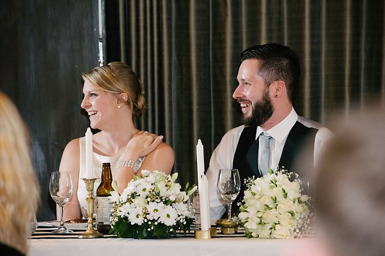
    During speeches, I tend to have one off-camera light positioned on a stand somewhere at a distance, either with an umbrella or bounced, to provide directional light. I also have a speedlight on my camera for fill but only use it when I feel it’s needed, and not for all shots. However, if I have three or four speedlights at various parts of the room for off-camera lighting, I don’t usually bother with any fill light from my camera. I would just position myself in relation to the off-camera lights to get the best directional light for my subject.

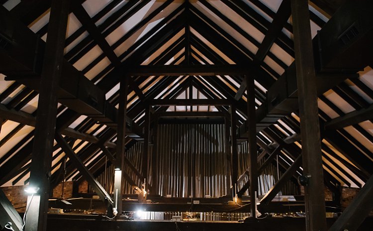
    The examples directly below show where I placed two speedlights on opposite sides of the room. This was because the venue had decided to put the couple at the back next to the cake where there was no light at all. You can see on the photo of the beams where the lights have been placed, one to camera-left directly in line with where the couple was sitting, and one on camera-right angled slightly at about 45 degrees towards me to light the cake and provide fill light for the couple.

    How to Use a Speedlight at Wedding Receptions and Events

    How to Use a Speedlight at Wedding Receptions and Events

    Sparklers

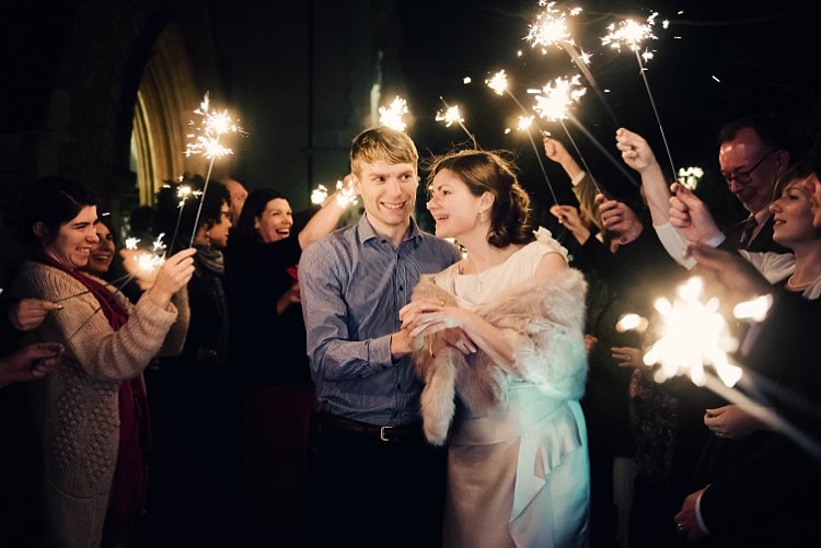
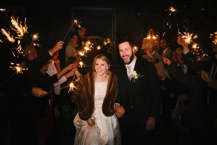
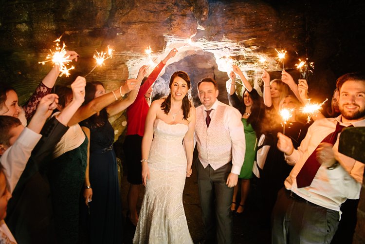
    Sparkler shots are tricky as it depends on the location, space, season, and so on. I have done sparkler shots in all manners; with just a speedlight on-camera both bounced up and angled forwards, an assistant holding a light from the side, a diffused speedlight positioned at 90-degrees, a kicker light behind with a speedlight on my camera for fill, and a shot with no light at all because the flash didn’t recycle in time but it was the best photo of the couple where both looked lovely (no blinkers or funny expressions).

    No matter how prepared you are, in wedding photography, you have to be ready for the unexpected. The main thing to remember, which in the speed and flurry of events I admit that I sometimes forget myself, is to keep the shutter speed at a fairly low setting to let in more ambient light. The sparks and smokey ambiance from the sparklers bring in that subtle and dreamy lighting look.

    How to Use a Speedlight at Wedding Receptions and Events

    How to Use a Speedlight at Wedding Receptions and Events

    How to Use a Speedlight at Wedding Receptions and Events

    #3  – Dragging the shutter

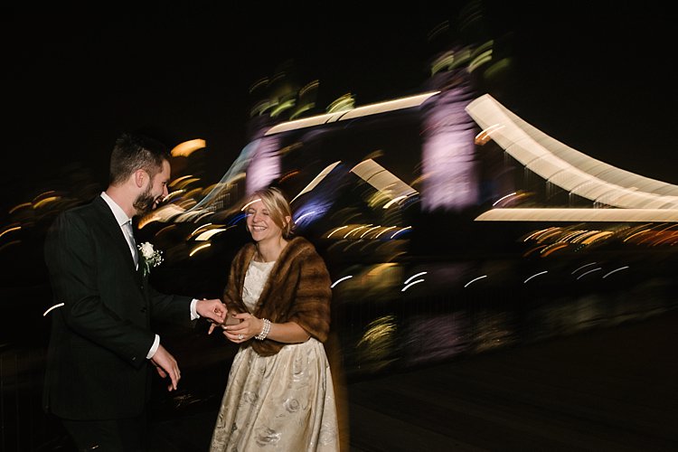
    Dragging the shutter is a technique where you shoot at a very low shutter speed, say 1/10th of a second, to capture the ambient light but have your flash pointing directly at the subject to freeze their motion. While the shutter is open, you also must make exaggerated movements with the camera to get the funky motion of the lights in the background. This is especially necessary if the lights in the background aren’t moving so you have to compensate by making the motion yourself as opposed to shooting car light trails in the background where the cars are traveling at high speed and therefore the head lights trails are captured in motion.

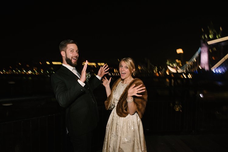
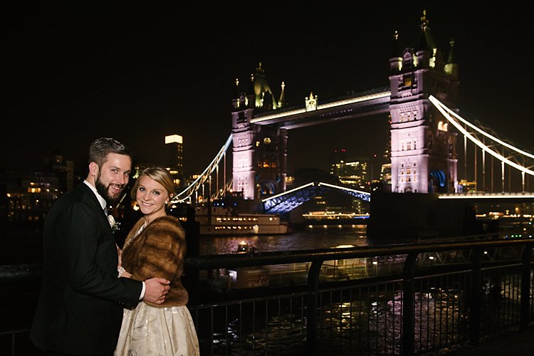
    The flash firing at a single point will keep the subject sharp so you don’t need to worry about blurry faces. This works well in a very dark room or space with dramatic background lighting like fairy lights, illuminated architecture such as the Tower Bridge in London, funky DJ lighting, or disco ball reflections and suchlike.

    How to Use a Speedlight at Wedding Receptions and Events

    How to Use a Speedlight at Wedding Receptions and Events

    Conclusion

    I have shown quite a few examples above of various instances I have used on and off-camera lighting using speedlights. If you look closely, I think you would be able to tell easily what type of lighting combination I have used on each of the photos, whether that included off-camera lighting or a combination of everything, as well as the number of speedlights used.

    I have also referred to my learning journey as a photographer and I know there is still so much to learn; I am only touching the tip of the iceberg. If you have more tips and examples, do share them in the comments below.

    How to Use a Speedlight at Wedding Receptions and Events

    googletag.cmd.push(function() {
    tablet_slots.push( googletag.defineSlot( “/1005424/_dPSv4_tab-all-article-bottom_(300×250)”, [300, 250], “pb-ad-78623” ).addService( googletag.pubads() ) ); } );

    googletag.cmd.push(function() {
    mobile_slots.push( googletag.defineSlot( “/1005424/_dPSv4_mob-all-article-bottom_(300×250)”, [300, 250], “pb-ad-78158” ).addService( googletag.pubads() ) ); } );

    The post How to Use a Speedlight at Wedding Receptions and Events by Lily Sawyer appeared first on Digital Photography School.


    Digital Photography School

  • Announcing Two Tamron Competition Winners

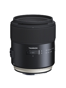
    The Winners of our recent Tamron Holiday Competition for a Tamron SP 45mm F/1.8 Di VC USD and a Tamron SP 70-300mm Di VC USD lens are…

    Thanks!

    A HUGE thank you to everyone who entered our recent competition to win an SP 45mm F/1.8 Di VC USD and an SP 70-300mm Di VC USD lens from our friends at Tamron. Yet again, the response was absolutely AMAZING with over 400 entries! But now…onto the winners!

    Drum roll. And the winners are:

    First Prize

    Winner of the Tamron SP 45mm F/1.8 Di VC USD lens is – Sandeep

    • Tamron SP 45mm F/1.8 Di VC USD – Value $ 599
    • Canon, Nikon or Sony-A mount.
    • No substitutions.
    • For canon, Nikon or Sony cameras.

    Burk Uzzle has said “Photography is a love affair with life”. My journey with photography has been long, filled with love and labour.

    I fumble-started with a twin lens camera borrowed from my uncle about 30 years back, then with a prized EXA (GERMAN film based camera), Olympus C-8080 and since last 4 years a Nikon D5200 (18-105mm VR f3.5). I also own a Yongnuo MK-IV flash, a Sony tripod, a Nikkor 35mm f1.8 prime lens, Hoya ND & CPL filters and a ML-2 remote release given my burgeoning interest to make better photos.

    Many years back, I scanned all my family owned b/w photos, to create a treasure trove of memories… I love the life stories that these photos convey – my son’s dimpled smile over gentle glazed skin next to my mother’s weary eyes filled with compassion… my wife’s lingering gracious beauty over the years as she grows older… the children’s audacious poses giving way to awkward conscious stares at the camera… I get mesmerized often, lose myself for hours in these frozen golden moments.

    My love for my family takes refuge in the photos I take. I am the de facto family photographer responsible for bringing alive visual expressions of many events. I think, prepare, experiment, analyze and post produce thoughtfully to make them worthy of being seen and relived many times over. “Photography takes an instant out of time, altering life by holding it still.” – famous words from the great Dorothea Lange that are, for me, a constant source of inspiration.

    Of late, I have started getting deeper into photography, studied via online training courses, read about great photographers, pored over user manuals and most importantly made a conscious effort to practice long and hard, to make more photos.

    Now if I had the choice to pick from the lenses on offer, I would unhesitatingly pick Tamron 45mm (about 68mm with my D5200’s cropped sensor) which suits the family portraiture I so love to indulge in. The various reviews I went through clearly suggests that Tamron 45mm lens is a winner. The Prime lens I own is good but a poor cousin to Tamron by er, a long way. Going by its looks, build quality, the tack sharp photos demonstrated some at low-light (wow!), its colour reproducibility, sharp corners, flexibility of purpose across landscape to macro — I will really look forward and love to have this one in my bag. I suffer from shaky hands so its 3-stop VC should help which my prime lens visibly lacks.

    Not sure 2017 will serve surprises for me but I surely will pray. Hope is eternal.”

    Congratulations Sandeep! You will also receive a copy of the new Night Photography Course by dPS.

    Second Prize

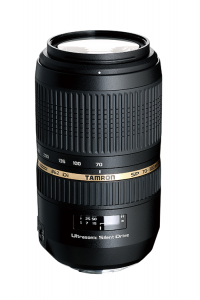
    Winner of the Tamron  SP 70-300mm Di VC USD lens is – Br Fla

    • Tamron SP 70-300mm Di VC USD – Value $ 449
    • Canon, Nikon or Sony-A mount.
    • No substitutions.

    “As a veteran who has seen my fair share of ugliness in the world, Photography takes me to another place where I can cope with PTSD symptoms by exploring the beautiful world surrounding me.

    For my first prime I was looking for a fast lens at the same focal length as human vision for street scenes, portraits, landscapes, and close photography. I wanted a fast, solid built, durable lens with high-end contrast and resolution. The Tamron SP 45mm F/1.8 Di VC USD fits my current needs and allows me to grow as a photographer finding even more beauty in the world.

    When shooting with my full frame Nikon D800, a prime 45 mm lens is the just right (Goldilocks) focal length. Any wider you can have distortion, which can be really unflattering for people’s faces or create curved lines that should be strait. Any narrower you will have to stand farther back when you may not have the space and will lose some connection with the subject. You can confidently walk around with this 45mm, because with the human field of vision focal length, the beauty you see is the beauty you get.

    The wide open aperture of F1.8 is very fast which will allow for shooting in low light and the circular diaphragm will create beautifully smooth bokeh that no other lens can match.

    More importantly, when I can’t sleep I like to go out and shoot in the predawn hours. I would love not only the wide aperture to bring in lots of light but also 3.5 stop vibration compensation so I can capture beauty that exists in low light conditions.

    Beauty also exists up close. With such a minimal distance to get sharp focus (only 11.4 inches) I can get closer into a subject without having to purchase expensive macro lenses. With the Vibration Compensation the beautiful details will remain sharp and beautiful.

    Beauty can be seen in the contrasts of light. This lens maintains high contrast throughout the frame so you can get more usable images right out of the camera and not have to shoot large just to crop out the edges.

    When shooting in some of the harshest conditions (as much as I enjoy the beach and salt air, it is incredibly harsh on photographic equipment) weather sealing is vital to not only durability but also keeping dust/debris out of your camera body and showing up as annoying spots in your images. The fluorine coating will also help keep spots off the front of the lens.

    However, despite all the impressive specifications of this lens the true beauty is in the details. In this case the details are tack sharp. I have seen that DXOMark tested this lens to have superior sharpness to all other lenses in the class, even ones that cost significantly more. So when asked how I would use this lens it is simple – I would find beauty in this world and capture it in as sharp detail as the true-life experience provides.

    The Tamron SP 70-300mm Di VC USD would be useful zoom lens allowing me to photograph the beautiful wildlife where I live and the Vibration Compensation would greatly help with such long focal lengths.”

    Congratulations Br Fla, you will also receive a copy of the new Night Photography Course by dPS.

    We were all thrilled with the entries. You tugged at our heartstrings, made us laugh, made us smile, but most importantly, you made us keep wanting to do more of what we are doing; providing you quality information and guidance to become a better photographer. We were so pleased to see that you came from every part of the world, young adults to grandparents, and everyone in between. Thank you all for your entries!

    Now, for those of you that didn’t win, Tamron has invited ALL dPS readers download their 2015-2016 eBook Series! You can find those HERE!

    The Winners will be emailed with details of how to collect their prize. Please make sure to look for our email. Thanks you again for all the wonderful submissions and to Tamron for sponsoring this competition.

    For winners outside the USA, please allow 6-8 weeks for delivery.
    Winner responsible for any taxes or tariffs.

    Tamron Rebates!

    For all of you residing in the USA, when you do purchase your next Tamron Lens, make sure to take advantage of the rebates* up to $ 200 through March 4, 2017. Find additional information HERE!

    *Current rebate offers end March 4, 2017. US RESIDENTS ONLY.

    About Tamron

    Disclaimer: Tamron is a paid partner of dPS.

    googletag.cmd.push(function() {
    tablet_slots.push( googletag.defineSlot( “/1005424/_dPSv4_tab-all-article-bottom_(300×250)”, [300, 250], “pb-ad-78623” ).addService( googletag.pubads() ) ); } );

    googletag.cmd.push(function() {
    mobile_slots.push( googletag.defineSlot( “/1005424/_dPSv4_mob-all-article-bottom_(300×250)”, [300, 250], “pb-ad-78158” ).addService( googletag.pubads() ) ); } );

    The post Announcing Two Tamron Competition Winners by Darlene Hildebrandt appeared first on Digital Photography School.


    Digital Photography School