Category: Photography

  • 5 Tricks to Make Your Landscape Photos Stand Out

    Are you passionate about portrait photography? Do you love sharing images of your trips and landscape photos? Or maybe you spend your free time capturing the streets of your city?

    Let me tell you something you might not know about yourself. Every now and then you are a landscape photographer, too. Everyone is. Let’s be honest, you couldn’t resist that beautiful mountain view you photographed a few weeks ago on a hike. Your social media feeds are full of your friends’ photos of canyons, lakes, and forests. Even your grandma sent you a picture of a sunset from her backyard the other day.

    01 Sunset in Ilulissat Icefjord Greenland - 5 Tricks to Make Your Landscape Photos Stand Out

    The amount of landscapes captured and uploaded every day is overwhelming. So how can you make people stop and look at YOUR images? How do you make YOUR landscape photos stand out?

    Here are some useful tips and tricks to help you. Save them for later, and the next time you are photographing a beautiful view make sure to follow them. You will have a much better chance of taking a good picture and making it noticed.

    1. Less is more

    “A designer knows he has achieved perfection not when there is nothing left to add, but when there is nothing left to take away.” – Antoine de Saint-Exupery

    011 Greenland midnight sun - 5 Tricks to Make Your Landscape Photos Stand Out

    This famous quote also applies very well to landscape photography. I know you are excited to show the whole world how beautiful nature is around you. However, often showing everything is equal to showing nothing.

    For instance, look at the image below. It is simple and straightforward. You clearly know what the photographer tried to show.

    Now, imagine there is a road below the greenery, two smaller mountains on the right and little pond on the left. You could capture all of that instead; it would give much more information about the location. However, then your viewer wouldn’t know where to look.

    002 Bad weather Iceland - 5 Tricks to Make Your Landscape Photos Stand Out

    Your viewer is exposed to thousands of images every day (social media, streets banners, TV, online advertising, etc.). Don’t give him any more work. Seeing your photo should be an effortless and enjoyable process. Here is how to get rid of the unnecessary parts of your images:

    • If you have a zoom lens, zoom into the frame.
    • Reposition yourself. Sometimes you have to walk closer to your subject or choose a different point of view.
    • As a last resort – crop your image later. Generally, It’s not advisable to crop more than 20% of your images. This rule will keep you more disciplined about your choices in the field. Also, it will help you keep your images in high resolution in case you decide to print them one day or participate in photography contests. (Many contests don’t allow cropping more than 20%).

    2. Avoid distractions

    Now you’ve decided which part of the scene is the most compelling. But before you click the shutter, make sure that these technicalities are in check:

    A) Check that the horizon is straight. Turn on the grid in your camera to help you with that.

    003 Nepal tilted horizon - 5 Tricks to Make Your Landscape Photos Stand Out

    004 Nepal straight horizon - 5 Tricks to Make Your Landscape Photos Stand Out

    B) Position your subject away from the middle of the frame. Most of the time you will find yourself following the rule of thirds

    005 Rule of thirds precise - 5 Tricks to Make Your Landscape Photos Stand Out

    .Sometimes following the rule, precisely.

    006 Rule of thirds approximate - 5 Tricks to Make Your Landscape Photos Stand Out

    Sometimes, not so much.

    C) Get your settings right to avoid overexposed, underexposed, blurry, or noisy images.

    3. Look for color contrast

    This is an extremely important concept that you need to be familiar with.

    Our brains are wired in a way that when we look at a picture, we first respond to contrasts in color and light, then to the shape, size and other characteristics of the scene.

    Make sure you know the theory of color contrast. The general rule is that cold and warm colors work well together. Here are some examples:

    007 color contrast moon iceberg - 5 Tricks to Make Your Landscape Photos Stand Out

    008 color contrast aurora - 5 Tricks to Make Your Landscape Photos Stand Out

    4. Test a thumbnail of your image

    In a perfect world, you would make a large format print of your image and people would come and spend hours savoring every detail of it. In reality, your picture will be one of many tiny thumbnails on someone’s social media feed. (If you don’t post your images online, you can skip this part.)

    A great exercise is to look at your image as a small thumbnail. Can you tell what’s on it? Would you pay attention to it if you saw it on your Instagram timeline or would you scroll past it? You’ll notice, that simple images with high color and/or light contrast stand out the most.

    Can you guess which of the images from the grid below got the most amount of interaction on Instagram?

    009 thumbnail grid - 5 Tricks to Make Your Landscape Photos Stand Out

    5. Is the image good or does it make YOU feel good?

    You just came back from a trip and that sunset you observed with your partner was amazing. You still remember the sound of the waves and the warm wind coming from the sea. Time to share that memory with the world!

    99% of the time, that’s fine if you want a snapshot of a holiday, but not if you want people to see an artistic value in it. A great image should be great by itself, regardless of what emotions you have attached to it.

    A good practice is to look through your photos weeks, or sometimes months after you took them. You will be surprised at how your selection will change compared to the day of the shoot.

    Here are a couple more images that follow the tips above.

    010 iceland beach - 5 Tricks to Make Your Landscape Photos Stand Out

    012 Norway window lights - 5 Tricks to Make Your Landscape Photos Stand Out

    Over to you

    Do you have some images that reflect the points of this article? Share them in the comment section so that others can learn from you.

    The post 5 Tricks to Make Your Landscape Photos Stand Out by Maria Sahai appeared first on Digital Photography School.


    Digital Photography School

  • How to Add a Sense of Scale to Your Landscape Photos

    You might find that sometimes you take pictures of grand, scenic landscapes only to have viewers not react to the picture the way you had hoped. You present them with a well composed, properly exposed photo of a dramatic scene, but the viewers quickly pass it by. Why is this happening with your landscape photos?

    Adding a Sense of Scale to Your Landscape Photos - Grand Canyon

    One reason might be that the viewer cannot get a sense of the scale of the scene.  They cannot tell if they are looking at something really big, or just something that looks big in a picture. Viewers are used to being tricked by the camera, such that small things look huge.

    Remember that a picture is just a two-dimensional representation of a scene and it is hard for the viewer to put things in the right context. You only have a split second to do so, or the viewer has likely moved on to other things.

    Using items to add a sense of scale

    It can be tricky to relay a sense of proper perspective in your photographs. For example, you might have a photo of some cliffs, but it might not be clear to the viewer whether these cliffs were 7 feet tall or 700 feet tall.

    It happens to me all the time, and my hard drive is littered with photos of large cliffs and mountains that did not translate into compelling photographs because there is no sense of scale. In the example below, however, I think you get a sense of the height of these cliffs. How?

    Adding a Sense of Scale to Your Landscape Photos - cliffs

    I think it is because of the castle in the middle of the picture. It is just a tiny item, but your eye picks up on it and uses it to put the rest of the picture into context.

    It is probably not something you really think about, but it happens nonetheless. You know that castles are fairly tall, and you subconsciously use that knowledge to add a sense of scale to the entire picture.

    Finding items to use to add a sense of scale

    The same dynamic works in other contexts. Your picture doesn’t need to be dramatic cliffs like the one above. It can be any landscape or coastal scene.

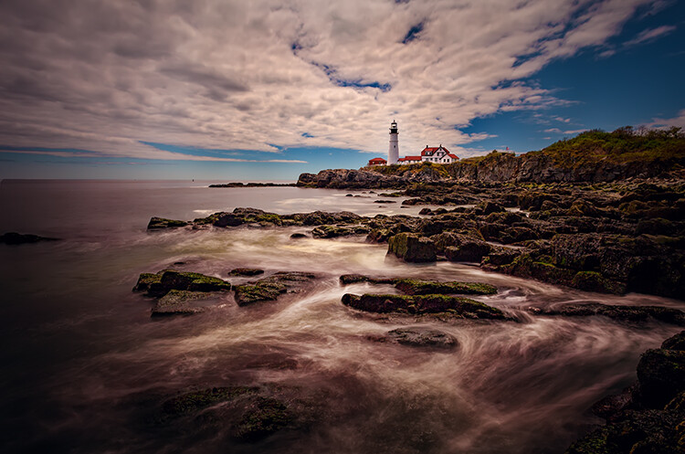
    Look for things that your viewer knows. Those items give them something to use to add a sense of scale to the picture. It can be anything. Sometimes the item you use is the actual subject of the picture. For example, in this picture below, the lighthouse provides an actual subject or center of interest for the picture.

    lighthouse - Adding a Sense of Scale to Your Landscape Photos

    In addition to providing a point to the picture, the lighthouse is also providing your viewer with a sense of scale. It makes the viewer’s mind more comfortable with the entire image. The viewer has a better idea of what they are looking at, and the relative size of all the elements.

    Small things provide scale too

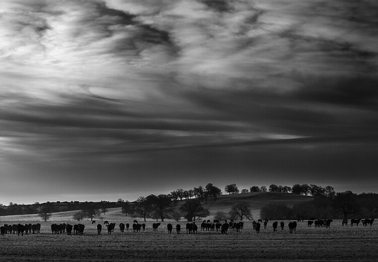
    You don’t have to use a large structure like a lighthouse to provide this sense of scale though. You can also include small things that just give your viewer a little clue. In the case of landscapes, perhaps a bird or birds in the distance will help. In fact, animals of any kind often work. In the picture below, the herd of cows provides context for the picture.

    cows - Adding a Sense of Scale to Your Landscape Photos

    When there is nothing else available, just use trees. We have a sense of the general height of trees and our mind will use that to provide context to the photo. Of course, there are trees everywhere (you almost cannot avoid them) so that should be easy to do.

    Keep the people in your pictures

    The final item I want to mention is the one that you may struggle with, and that is adding people to your pictures. This is an incredibly powerful tool. We, humans, are amazingly adept at recognizing people in a picture and we will use that to provide context to the entire scene.

    Therefore, there is no more powerful way to add a sense of scale than by including people to your pictures. Your viewer will see those people in the pictures and naturally use them to gain a sense of scale.

    little people on a cliff - Adding a Sense of Scale to Your Landscape Photos

    To do this, you will have to reverse your thinking in a lot of ways, particularly if you are a landscape photographer. You probably spend a lot of time trying to avoid having people in your pictures.

    You probably ask the people you are with to step out of your frame. Or you might spend a lot of time standing around waiting for people to move. In many cases, you will still want to do that, but sometimes – to add this sense of scale – you might want to include those people in your image.

    Adding a Sense of Scale to Your Landscape Photos

    Conclusion

    There is no magic bullet to creating a sense of scale in your images. It is something I get asked about from time to time, and I do not have a quick answer. The good news is that just thinking about it puts you ahead of the curve.

    So next time you are out shooting, look around and find things that will work for you. Use them to add that sense of scale. Hopefully, the ideas in this article will provide you with some things you can use for your images.

    The post How to Add a Sense of Scale to Your Landscape Photos by Jim Hamel appeared first on Digital Photography School.

    Digital Photography School

  • Why Olympus Mirrorless Cameras are Top Notch for Travel Photography

    From entry-level to pro, the Olympus Mirrorless Four Thirds OM camera series has something for every aspirational travel photographer.

    Why Olympus Mirrorless Four Thirds Camera Systems are Top Notch for Travel Photography

    Camera – Olympus Mirrorless E-M1 with kit lens at 38mm, 1/250th, f/14, ISO 400.

    Are you looking to get serious about your digital photography and move up to an interchangeable lens system? Or maybe you are looking to upgrade to a pro level weatherproof transportable system?

    Are you off on a journey of a lifetime and looking to record every moment? You want to be sure there’s no danger the camera won’t be up to the task – so which will you take along?

    Why Olympus Mirrorless Four Thirds Camera Systems are Top Notch for Travel Photography

    Camera – Olympus mirrorless E-M10 Mark II, Lumix G 20mm lens, 1/125th, f/2.2, ISO 200.

    The Olympus OM Micro Four Thirds system could be heaven sent. In this article, we’ll look at the OM-D E-M10 entry-level camera and the top of the range OM-D E-M1 through almost 12 months of use.

    Why Olympus mirrorless systems are phenomenal travel cameras

    Why Olympus Mirrorless Four Thirds Camera Systems are Top Notch for Travel Photography

    Olympus EM1, kit lens at 14mm, 1/5th of a second, f/22, ISO 3200.

    This was taken handheld, showing just how good the image stabilization is on these cameras.

    The important considerations for travel cameras are size and weight, versatility, durability, performance, and picture quality. Ideally, you want a light-weight system that will easily move between landscape, street, and portrait photography.

    Let’s look at each of these considerations in turn.

    Size and weight

    Why Olympus Mirrorless Four Thirds Camera Systems are Top Notch for Travel Photography

    The flagship model Olympus EM-1 weighs in at just under 500g (1.1 pounds), the smaller and lighter EM-10 at an incredible 342g (0.75 pounds). Both are smaller in size than my hand.

    Incredibly, they both fit in a parka-style coat pocket when fitted with a 14-42mm kit lens. Look at the size of my Sony DSLR in this picture below to see just how much of a space saving there is comparatively.

    Why Olympus Mirrorless Four Thirds Camera Systems are Top Notch for Travel Photography

    There are obvious advantages to the smaller cameras in regards to luggage on a plane, and carrying gear around all day. But the small size is also non-threatening if your shots include passers-by. Plus you can take it places where professional style cameras are not allowed.

    The Micro Four Thirds System also means lenses are much more compact. For instance, the Olympus 75-300mm zoom lens measures 130mm and weighs in at 430g (just under a pound). The equivalent focal range for a full frame camera is 150-600mm. That kind of glass for a DSLR would weigh in at about 3kg (6.5 pounds)!

    Versatility

    Why Olympus Mirrorless Four Thirds Camera Systems are Top Notch for Travel Photography

    There is a good range of lenses available for the Micro Four Thirds mount including ranges by Lumix and Panasonic, as well as Olympus. The range will take you from a fish-eye pancake lens, through wide-angle primes to long zooms. The image stabilization system built into the camera means the lenses are both light and affordable.

    Extension rings with electronic connections to allow your lens and camera talk to each other are also available allowing you to make the best use of your available lenses. Two lenses and one converter will take you from wide-angle to macro to long zoom without missing a beat.

    Durability

    Both these cameras look and feel solid and durable. Having used them both for almost a year in sometimes inhospitable conditions and on long hikes, I have had no issues with these cameras or the lenses I use.

    If you look at the pictures the condition is still like new. They even get taken along on motorbike and camping trips in the winter!

    Why Olympus Mirrorless Four Thirds Camera Systems are Top Notch for Travel Photography

    Olympus E-M10, 40-150mm zoom at 150mm, 1/400th, f/7.1, ISO 200. Despite the dark and overcast day, the camera produced good detail straight out of the camera in this JPEG image.

    Performance and Picture Quality

    Firstly, I should mention I am using systems that were current when they were purchased at the beginning of 2017. They have both been upgraded since with some notable improvements. The EM-1 now has a Mark II version with a 20MP sensor rather than 16MP chip, and improved AF tracking. The EM-10 moves up from Mark II to Mark III with more minor improvements.

    Why Olympus Mirrorless Four Thirds Camera Systems are Top Notch for Travel Photography

    The camera has a fantastic viewfinder with 100% picture coverage as well as a touch-control rear screen, a feature that will feel familiar if you use a smartphone. A massive range of buttons allows you to set up the camera to suit your style with several where you can assign the functions. The menu system will feel familiar if you’re a DSLR user. It has a very useful one-click user “Myset” comprising four customizable options for configurations that you use frequently.

    My set screen - Why Olympus Mirrorless Four Thirds Camera Systems are Top Notch for Travel Photography

    The 5-axis stabilization is excellent, making handheld shooting easy and rewarding. The AF system has 81 points and is surprisingly good though tracking is not up to that of the weightier and roomier APS-C cameras. This is one of the trade-offs for having the compact size.

    As the cameras use electronic viewfinders or the rear LCD screen, batteries get used up quickly. Battery packs are available, but this adds to the size. So if you attach one the camera won’t fit in a pocket anymore.

    Why Olympus Mirrorless Four Thirds Camera Systems are Top Notch for Travel Photography

    Olympus E-M1, kit lens at 35mm, 16mm extension tube, 0.3-second exposure, f/7.1, ISO 400. I adjusted levels in post-processing to lighten the image and create a fine art feel.

    All the photographs in the article are taken with either one or the other of these two cameras, so you can judge for yourself the quality of the results. The newer versions of these cameras can only be even better.

    The cameras provide great results for landscape photography, handling a range of tones well, especially with the added use of the HDR function to bring out details at both ends of the scale.

    At lower ISO levels, up to 1600, there is little evidence of noise, although it increases in the dark areas as you approach that mark. Quality is acceptable up to ISO 6400, in my opinion.

    Why Olympus Mirrorless Four Thirds Camera Systems are Top Notch for Travel Photography

    Olympus E-M1, 82mm, 1/200th, f/9, ISO 1600. Look, I’m Pinnochio! Grab shot – love the skin tones and the AF got the near eye, spot on.

    Skin tones are good, producing great portraits and color handling is great. Low light shooting isn’t a problem for this camera, especially at the lowest ISO.

    Millstone beach - Why Olympus Mirrorless Four Thirds Camera Systems are Top Notch for Travel Photography

    Olympus E-M10, Lumix 20mm, 1/80th, f/1.8, ISO 200. Fabulous colors despite the overhead canopy and reduced light.

    CONCLUSION

    Both of these Olympus mirrorless cameras are fantastic pieces of kit for almost every situation. Picture quality is good, handling with the stabilization is awesome, AF and exposure are solid. With an entry-price of about $ 500 for the EM-10, the value is terrific.

    The pricier EM-1 is also a good value, especially when considering the price of additional lenses. A Mark I at less than $ 1100 represents astonishing value. However, I do aim to upgrade to the EM-1 Mark II when finances allow, knowing I already have a decent range of accessories for it.

    Why Olympus Mirrorless Four Thirds Camera Systems are Top Notch for Travel Photography

    Olympus E-M1, 75-300mm lens at 270mm, 1/40th, f/6.7, ISO 400. The quality of this shot is fantastic, just look at that tail!

    As a travel camera, I don’t think these two Olympus mirrorless cameras can be beaten at their respective price points. If you are new to system cameras, the EM-10 would be a fantastic introduction, with its straight-forward layout. A more seasoned photographer may prefer the customizable options and total control of the EM-1

    Why Olympus Mirrorless Four Thirds Camera Systems are Top Notch for Travel Photography

    Olympus E-M1, kit lens at 22mm, 1/60th, f/22, ISO 2000 using Aperture Priority. Straight out of the camera JPEG file. Great results even if you’re not a Photoshop fan.

    Either way, you won’t be disappointed with the results. You can take that once in a lifetime trip knowing you’ll bring back images of your travels to be extremely proud to show off to friends.

    The post Why Olympus Mirrorless Cameras are Top Notch for Travel Photography by Janice Gill appeared first on Digital Photography School.


    Digital Photography School

  • How to Create a Retro Look for Your Images with Luminar

    Over the past few months, I’ve been testing out the features of Luminar. I’ve looked at the time-saving features that can help reduce your editing headaches. I’ve also played around with the AI filter to see how it holds up in quickly editing holiday photos and now it’s time to check Luminar’s capabilities when it comes to creating a retro look for your photos.

    I wanted to know if Luminar would be quick, easy to use and create a look that tastefully gave my photos the look and feel of shooting with film.

    Retro Look #1

    To embark on this experiment, I studied some famous older photographs. My goal was to shoot a few images that paid tribute to the look and feel of old-school Hollywood. I saw this first image of Sophia Loren from the 1960’s and knew it was perfect. I love the style of dress from past eras and thought this would be a suitable project.

    Sophia Loren Image

    The goal was to create an image with a similar look and feel. I borrowed my friend Nahleen, she has some similar features to Sophia Loren. Once she agreed we set out to capture an image and then process for that 1960’s film look. Here’s the original image we took.

    How to Create a Retro Look for Your Images with Luminar

    This is the original unedited photo.

    It was shot outdoors on a cold and frosty December afternoon. Nahleen has some similar features to Sophia Loren but is by no means a carbon copy. Instead, I was more interested in attaining a photo in which the fur hood framed her face.

    So now that we had captured the image, it was time to bring it into Luminar. I tried to make to make the conversion as simple and quick to complete as possible. I will admit that I tried several times with different settings, etc. until I found a look that I felt was similar to the Sophia Loren image.

    The AI Filter was used to bring out some contrast in the image. The photo of Sophia Loren was quite sharp and also had a fairly contrasty look, so my first goal was to pull out the dark tones and brighten my lighter tones to match more closely.

    How to Create a Retro Look for Your Images with Luminar

    The Accent slider made adjustments quickly and easily.

    The B&W Workspace

    I then used the B&W Workspace to guide my editing of the photo. I adjusted several sliders. The intention was to increase the contrast and create some fairly strong blacks.

    How to Create a Retro Look for Your Images with Luminar

    The B&W Workspace comes equipped with a variety of filters all designed to help with black and white conversions.

    How to Create a Retro Look for Your Images with Luminar

    Here are the settings I used.

    Adding Film Grain

    My final step was to add film grain. At first, I cranked up the amount of film grain. In this screenshot, you can see how strongly I adjusted it. I always like to adjust a setting by purposely using too much. Then I back off the amount until I find a nice balance.

    How to Create a Retro Look for Your Images with Luminar

    Here you can see that I’ve adjusted the grain to a fairly heavy amount. For the final image, I backed off a bit.

    The whole process was pretty quick. Once I found the right settings it didn’t take too long to recreate this retro look. The final photograph is dark and contrasty but also a little different from the original Sophia Loren shot.

    How to Create a Retro Look for Your Images with Luminar

    The final image is cropped in closer. My use of film grain is also heavier than in the original Sophia Loren shot.

    Retro Look #2

    In this second shot, I used a photo from a recent photo shoot in which I was working with a young lady to create a portfolio of modeling images. The 10-hour photo session was created using a very basic budget, but we made sure to utilize a retro outfit for this article.

    The bell bottoms and the fur jacket were both found at the thrift store, as was the backdrop. We were working a tight space with limited materials.

    How to Create a Retro Look for Your Images with Luminar

    Here’s the original unedited file. It was shot in my living room. We used a very basic DIY type of set up.

    Free Presets

    For this shot, I decided to take advantage of Luminar’s free presets. There are lots of free presets available for download, and I was lucky enough to find a set of free analog-film looks.

    How to Create a Retro Look for Your Images with Luminar

    Here’s a look at all the free presets available on the Luminar website.

    Quick Clicks and Some Cloning

    The look of this image was very easy to create with just a few simple adjustments. I chose a cross-processing look and then tweaked it to my liking. The accompanying texture was applied pretty heavily. I found that it was overwhelming the image. So I chose to back off the strength of the texture.

    I also cropped the image slightly and applied the Orton Effect filter. It quickly smoothed the model’s skin, and I didn’t need to go in and do any retouching on her face. This saved me quite a lot of time.

    Finally, I took the image into Photoshop, where I cloned and added a layer to fill in the areas around the outside where you could see my living room in the original shot.

    How to Create a Retro Look for Your Images with Luminar

    The preset applied without any adjustments to the original settings.

    How to Create a Retro Look for Your Images with Luminar

    I started to make some minor adjustment to the original settings found in the preset which included adjusting the saturation in cross-processing.

    How to Create a Retro Look for Your Images with Luminar

    Here’s the split screen of the before and after views. I completed some cropping and clone stamping.

    Plug in for Photoshop

    Luminar also has the capability to clone and add layers, but I’ll be honest there’s a part of me that will forever remain loyal to Photoshop for completing these parts of the editing process. This is partly why I really like Luminar  – it works as a plug-in for Photoshop as well. I can move back and forth between the two programs pretty seamlessly.

    How to Create a Retro Look for Your Images with Luminar

    Here’s the final edited image.

    Retro look #3

    How to Create a Retro Look for Your Images with Luminar

    This is the original unedited file.

    For this final shot, I decided to edit the image fully in Luminar. I started from scratch with a RAW file. The goal was to experiment with the full editing capabilities of Luminar. The intention was to create a sepia look image that felt like an older faded photograph.

    To start, I opened the B&W Workspace. It contains all the tools I needed for this conversion. That means I didn’t have to search through the list of filters to find anything.

    Next, I applied the orange filter, cropped the image and adjusted contrast. I also adjusted the black and white sliders and played around with the strength of this first filter. I did consider creating a color image with a faded look but decided to go with full black and white.

    How to Create a Retro Look for Your Images with Luminar

    Here’s a look at the faded film style.

    Split Toning

    After making these adjustments, I started to experiment with the Split Toning sliders. I gave the image a more brownish tone. This step took some experimentation with saturation and various colors.

    How to Create a Retro Look for Your Images with Luminar

    These are the sliders and colors I experimented with during editing.

    How to Create a Retro Look for Your Images with Luminar

    After adding the split toning, it was time to add a vignette and film grain. Again I adjusted the grain so it was very heavy and then backed it off to a more suitable amount. The longest part of this whole process was finding a texture that I liked which I felt fit with the feel of the image I wanted to create. I tried several. Luminar comes with lots of free textures you can download. They all seemed to work quite nicely.

    In the end, I chose a weathered-looking texture and used the brush tool to apply it to the image in varying amounts. I didn’t want a lot of heavy texture over her face. Here are the final results of my editing and experimentation. The image has a heavier texture application along with film grain and a stronger vignette. The B&W Workspace worked perfectly. It placed all the necessary tools right at my fingertips.

    Experimenting with Different Textures

    How to Create a Retro Look for Your Images with Luminar

    I tend to adjust the image quite strongly then slowly back off the effect until I find the treatment I like.

    How to Create a Retro Look for Your Images with Luminar

    I played around with several different textures to create the old damaged photograph type of look.

    How to Create a Retro Look for Your Images with Luminar

    Overlay option number two.

    How to Create a Retro Look for Your Images with Luminar

    Overlay option number three.

    The Finished Image

    The final image includes the texture you see in the image above, but I backed it off quite a bit. Here are the results of the experiment. The application of the texture was reduced down to about 14. I didn’t want the effect to be as heavy-handed as in the image above.

    In this final finished image, you can see the texture is most obvious around the edges. It’s a subtle texture called tattered that was available in the free downloads section of the Luminar webpage.

    How to Create a Retro Look for Your Images with Luminar

    Your turn

    Luminar comes equipped with a full array of filters that can help you to create a retro look for your images in both black and white and color. Give it a try, they have a 14-day free trial.

    Disclaimer: Macphun, soon to be Skylum, is a dPS advertising partner.

    The post How to Create a Retro Look for Your Images with Luminar by Erin Fitzgibbon appeared first on Digital Photography School.


    Digital Photography School

  • 5 Reasons Why You Might Want to Try Black and White Photography

    5 Reasons Why You Might Want to Try Black and White Photography

    There are different schools of thought when it comes to black and white photography. Some believe it was a technical limitation of the past that you need to get over and move on. While others see it as a creative choice, that needs to be explored in great depths.

    As camera technology gets better, with more emphasis on improved color ranges, why would you choose to shoot or process your images in black and white? In this article, we’ll look at five reasons why you might want to shoot or convert your images to black and white.

    5 Reasons Why You Might Want to Try Black and White Photography

    1. B&W Helps you see differently

    The old “Masters” of photography shot in black and white initially, because they had no choice. Even with the advent of Kodachrome, which introduced the world to color photography, there was still a pursuance of black and white. This was because black and white was (and still is by some people) seen as photography in its the purest form.

    5 Reasons Why You Might Want to Try Black and White Photography

    When you remove color the emphasis shifts to the other compositional elements of the image. These include lines, shape and texture, contrasts and tones.

    With this in mind, it is obvious that not all images will translate well to black and white. So, look at all the elements and deduce what else you have to work with, besides color.

    5 Reasons Why You Might Want to Try Black and White Photography

    Many times black and white helps you develop a different perspective from what you are used to seeing, which nurtures your photographic eye.

    2. B&W Eliminates distractions

    You are used to seeing the world in color and there nothing is wrong with that view. Sometimes this contributes to other elements or details being lost or taken for granted. Some of the elements (highlighted before) required for a great photo include contrast, texture, lighting, shape, and form.

    When you shoot for black and white, you challenge yourself to remove the distraction of color. These include color casts and differences in color temperature (ambient light sources), as well as specific colorful elements that are strong, which may reside in the background or take away from your story.

    5 Reasons Why You Might Want to Try Black and White Photography

    Monochromatic imagery forces you to focus on form, shape, and texture while composing. If your emphasis is on making colors work together, these elements are sometimes overlooked. With black and white, distracting colors are now translated into shades of gray that add to your image.

    3. B&W Offers creative choice

    Since your world is in color, it is safe to say that color photography depicts reality and is more realistic. Thus, black and white photography is viewed as a rendition of reality – or how you interpret what you see.

    When you remove color, you not only isolate the different elements, you are compelled to find how they relate to each other. This helps you explore and create different ways to tell your story.

    When you take away color, you remove what your viewer is used to seeing. Now you are charged with finding the stronger elements in the scene and figuring out how to use them to convey what you want to depict.

    5 Reasons Why You Might Want to Try Black and White Photography

    4. Adds emotion or mood

    Something about the variance of tonal ranges, rich blacks, and deep contrasts appeal to us psychologically. It creates a connection that makes you stop and pay attention to what is being presented.

    5 Reasons Why You Might Want to Try Black and White Photography

    Many photographers use black and white for storytelling in travel and street photography, as well as when portraying religious or cultural activities. Monochrome in some genres connects, enhances and strengthens emotions and mood.

    5. Timelessness

    Even though this is lower on the list, it is one of the more common reasons why some photographers shoot in black and white. Monochromatic photography adds what is seen as a timeless quality to your images.

    Black and white photos seem to transcend reality and take you back to a time gone by. Historically there were color schemes that were specific to types of film or trends in digital photography that can date your image. The removal of color makes it tougher to figure out when the image was taken/produced.

    5 Reasons Why You Might Want to Try Black and White Photography

    Bonus

    You no longer have to imagine what your scene will look like in black and white, as current camera technology allows you to try this on the spot and see if it works. While some photographers prefer to shoot in black and white, others prefer to shoot in color and then process or convert their images to black and white to get a different or better tonal range.

    Note: If you shoot RAW format and set your camera to its version of the monochrome setting, you will see a black and white preview on the LCD when you review your images. But you will still have all the color data available in the RAW file at the post-processing stage. This gives you the best of both worlds – a quick b/w preview and ability to convert later.

    5 Reasons Why You Might Want to Try Black and White Photography

    This image was shot in black and white using the camera’s monochrome settting.

    5 Reasons Why You Might Want to Try Black and White Photography

    This image was shot in color and then converted to black and white in the processing stage.

    Conclusion

    While black and white photography still has an important role in photography, please note that not all subjects translate well to this mode. Even though a strong composition is not color dependent, sometimes the power of the photo is its color. This is why it is good to know when to use black and white.

    5 Reasons Why You Might Want to Try Black and White Photography
    If you are interested in pursuing the monochromatic, look for the other elements of composition like texture, shape, form, lines, and contrast. Experiment with shooting and processing black and white images and figure out which resonates with you more.

    The post 5 Reasons Why You Might Want to Try Black and White Photography by Nisha Ramroop appeared first on Digital Photography School.


    Digital Photography School

  • Getting Started with Landscape Photography – 4 Easy Tips for Beginners

    One of the things I like most about photography is that there is always more to learn. It keeps the mind active and the creative juices flowing. But the wealth of information out there can be overwhelming for beginners in landscape photography. Where do you start?

    There are a few easy things you can do that will have an immediate impact on your photography so you can start making better images right away. Let’s focus on those and leave the more technical stuff for later.

    1. Pay attention to the light

    There is no such thing as bad light. The key is to understand what kinds of images are suitable under various lighting conditions.

    Red Rock State Park, Arizona by Anne McKinnell - Getting Started with Landscape Photography - 4 Easy Tips for Beginners

    During golden hour, the day’s last light makes the rocks glow.

    The Golden Hour

    This is the time right after sunrise and right before sunset when the sun is low in the sky and casts beautiful golden light. Start here! It’s hard to go wrong with golden light, which is the most popular time of day for photography.

    Ajo, Arizona by Anne McKinnell - Getting Started with Landscape Photography - 4 Easy Tips for Beginners

    The cactus in the foreground is in the shade while golden hour light reflects off the mountain in the background.

    Bright Midday Light

    The opposite of golden hour, the harsh direct light you find at midday can be the most difficult to work with – unless you photograph in the shade.

    Just look for interesting subjects that are in the shade and leave the sky out of the frame. The even soft light is great for close-ups and flower photography.

    Bush Lupin - Getting Started with Landscape Photography - 4 Easy Tips for Beginners

    Flowers photographed in the shade.

    There are more types of light to work with and different times of day to photograph, but start with these for the quickest results.

    2. Remove distractions

    Pay attention to the things in the background of your images and try to simplify the background as much as possible. Sometimes there is an unwanted object, like a trash can for example, that you might not notice unless you are looking for it. These things can often be hidden behind your main subject simply by moving to one side, photographing from a higher or lower perspective, or getting closer.

    Try to simplify your composition as much as possible with fewer items in your scene. Find a way to photograph your main subject on a clean background.

    Big surf on the Oregon Coast. Getting Started with Landscape Photography - 4 Easy Tips for Beginners

    To make this image, I had to change my perspective to eliminate debris on the sand as well as other rocks and birds from the frame.

    Beware of tree branches or other things that poke in to the edge of your frame. Before you take your shot, try to remember to do an “edge check”. Look around the edges of your frame and make sure it looks clean.

    3. Look for one thing

    Your photograph cannot be about everything. You need to decide what is most interesting in your scene and make your photograph about that. Get closer to it.

    One exercise that will get you in this habit is to go on a photo walk with the purpose of looking for one particular element of design. You’ll find that when you set your mind on one thing, you’ll start to see it everywhere. Here are some ideas to get you started:

    Textures and Patterns

    Often beginning photographers will try to capture an entire vista in one photograph and don’t notice the details. But the more you train your eye to notice the details, the more interesting your photographs will become.

    The best thing about photographing textures and patterns is that you don’t have to go far to find them. Your subject can be anything from rocks to grass or peeling paint. I’m sure you can find subjects with wonderful textures close to home. Try to fill your frame with the pattern.

    Weston Beach, Point Lobos State Reserve, California - Getting Started with Landscape Photography - 4 Easy Tips for Beginners

    Filling the frame with the pattern of colorful rocks.

    Lines

    Look for horizontal lines, vertical lines or diagonal lines. Try to find lines that lead the way to some interesting subject.

    Colors

    Take a look at the color wheel and notice complementary colors. Those are the ones that are opposites on the wheel such as blue and orange, red and green, or yellow and purple. Any scene with complementary colors is always striking (which is why so many photographers carry around a red umbrella or a red jacket for their partner to wear in a grassy or forest scene).

    Bamboo Forest - Getting Started with Landscape Photography - 4 Easy Tips for Beginners

    Complementary colors plus diagonal lines.

    4. Make time to practice

    It doesn’t take long to develop good habits and learn what makes an interesting photograph. But it can be hard to remember if you only go shooting once in awhile. Try to make a habit of doing it every day, even if it’s only for fifteen minutes. By doing this, you’ll reinforce the habit and find yourself seeing the potential for great images all around you all the time.

    Spider Rock, Canyon de Chelly National Monument, Arizona - Getting Started with Landscape Photography - 4 Easy Tips for Beginners

    Golden hour – there is still enough light to photograph the depths of the canyon while the last of the day’s light reflects off the top of the highest rock.

    Conclusion

    There are more technical things that you’ll want to start learning soon such as; how the exposure triangle works, understanding depth of field, picking the right shooting mode, focus settings, and more. It’s endless (which is a good thing).

    But for now, these tips will get you on the right track so you are happy with your images right from the beginning. Have fun!

    The post Getting Started with Landscape Photography – 4 Easy Tips for Beginners by Anne McKinnell appeared first on Digital Photography School.


    Digital Photography School

  • How to Make Use of Foggy Surfaces for Abstract Photography

    When I mention that one of my favorite subjects to photograph is foggy surfaces, I get a few weird looks. To the uninitiated, the subject is an unusual one and most likely a boring one too. Photographers in-the-know furrow their brow, recalling the dreaded lens fog plaguing important shoot days and holidays photos.

    Nevertheless, diffused glass is a beautiful and extremely diverse tool, great for adding an atmospheric layer to any image.

    How to Make Use of Foggy Surfaces in Photography

    How to Make Use of Foggy Surfaces in Photography

    What is a foggy surface?

    First of all, “foggy surfaces” (or fogged) is a term I use to encompass a whole wealth of surfaces that render softly focused images. Office partitions, shower doors, windows – there are hundreds of different sources of glass diffused organically by weather or intentionally by the manufacturer.

    Frosted glass is an artificially diffused surface material. Created by sandblasting annealed glass, frosted glass is used to separate environments without sacrificing light. It suggests a sense of openness without sacrificing privacy. These surfaces diffuse and soften subjects to create dense, otherworldly subject matter that investigates form as much as they obscure.

    How to Make Use of Foggy Surfaces in Photography

    Due to scratches and reflections, this image has an extra layer of depth.

    Where to find fogged surfaces

    A great source of fogged glass is through your everyday exterior office window. Decorative or plain sheets of frosted glass are used as partitions, making use of natural light. Photographing objects through these types of glass creates beautiful, isolated studies of subjects matter.

    Plant leaves pressed against the glass plays with light and form, unusual office chairs take on a new life framed by a foggy canvas. It’s amazing how little it takes to re-imagine form in a whole new way with something as simple as a thin layer of glass.

    One of my favorite times for taking photographs is on a rainy day. The heavy atmosphere, the movement, the transformation of color and light – it’s all enticing to me and nothing illustrates this more than the view through a damp, slowly fogging window.

    On a cold and wet day, warmer moisture in the air turns into condensation upon contact with cold air. Inside a vehicle, warm air brushes against the coldness of a window and this begin to collect as condensation on the glass. This fogs the window and the pane of glass frames and reflects the environment while housing the subject itself beyond the glass. It’s a bit of a mixture of art and science, and the results are really beautiful if you’re willing to brave the wet conditions.

    How to Make Use of Foggy Surfaces in Photography

    This photograph was taken through a tram window on a cold and rainy night. Commuter’s coats and the lights in the tram create a surreal landscape of color.

    The bad type of fog

    Seeking out subjects in the rain as can also lead to “camera fog”. This is a type of fog you want to avoid. Transferring a camera from a warmer environment to a cooler one causes condensation inside the camera too. While a few rounds of camera fog won’t destroy a camera, taking steps to acclimatize your camera will prevent extra wear.

    Before heading out for a rainy day photography walk, minimize the issue by putting your camera inside a plastic zip-lock bag until the temperature inside the bag and out have equalized. Depending on the difference in temperatures, you may need to leave your gear in the bag for a few hours to acclimatize. While it’s a bit of a pain, but it’s better to keep the fog outside of the camera!

    How to Make Use of Foggy Surfaces in Photography

    Fogged glass can create beautiful abstract effects.

    How to Make Use of Foggy Surfaces in Photography

    Photographing fogged surfaces rely on the light coming through the glass. Different times of the day can render completely different results.

    How to photograph fogged surfaces

    Photographing fogged surfaces is very similar to photographing transparent surfaces like glass. The strength of the light behind the subject will dictate how your subject will look. As you probably don’t have an opportunity to adjust the backlight, try taking photographs of subjects at different times of the day. The morning may depict an office plant in detail, but the light in the evening will lend more of a silhouette effect.

    The result of an image taken through fogged glass also relies heavily on the proximity the subject to the glass itself. However, most subjects will be tucked behind a window or a building security system. Like street photography, this means that you’ll have to make the most of what you have.

    From the exterior, closer objects, or even objects leaning against the glass will be the sharpest subjects. Distant subjects like faraway light sources are dispersed into the cloudy shades of the surface. It’s like having your focusing done for you. Try a few different angles and change your distance in relation to the subject.

    Try to focus on detail rather than quantity, that way you will have a frame full of information rather than an empty frame of a faraway scene. If possible, try setting up a tripod so you’ll be able to use slower shutter speeds to capture the image. This isn’t ideal in every circumstance, however.

    The post How to Make Use of Foggy Surfaces for Abstract Photography by Megan Kennedy appeared first on Digital Photography School.


    Digital Photography School

  • How to Use ND Filters Creatively to Make the Most of a Scene

    Photography is the art of capturing light. In many instances, harnessing the light and properly exposing a scene means controlling it first. This is necessary for many landscape scenes where contrast is high. You have likely seen high contrast many times: a sunset with dark foreground elements, a church with deep shadows, or a moonrise over a snow-filled background. Each of these situations (and many others like it) will present a challenge for you to overcome.

    One of the tools that you have at your disposal to alter the amount of light hitting your camera’s sensor is neutral density filters (ND). These dark gray pieces of glass come in many styles (graduated, 1-stop, 2-stop, 10-stop, etc.) and do not alter the color of your image but do restrict the amount of light.

    How to Use Neutral Density Filters Creatively to Make the Most of a Scene

    I stacked a Graduated ND filter and ND Stopper for this image to control the gray sky and flatten the water around the island with a long exposure.

    They provide an opportunity to control your exposure or create long exposures that emphasize static elements. This article will focus on Graduated ND filters that are clear on one half and dark on the other, as well as ND stoppers which are completely dark.

    You can find more info here on dPS for learning about the fundamentals of using in ND filters. The rest of this article will focus on a few creative ways that you can experiment with ND filter angles, grades, and techniques to create unique shots.

    Stack ‘em

    You can easily combine ND filters to control more light in the scene as filter holders usually have more than one slot for multiple filters. Having multiple slots is a huge advantage because it allows you to stack filters on top of each other to control the light.

    Be sure to think about creative combinations of filters to give you the most out of a scene. For instance, you may want to shoot a really long exposure to flatten out the water in a sunset, or you may want to control very bright highlights such as the sun. The table below outlines some of the possibilities that stacking filters can provide you.

    ND GRADUATED ND STOPPER
    GRADUATED FILTERS Graduated ND filters can be stacked on top of each other to control light and feathering at the horizon. Try stacking a hard-edged grad with a soft-edged grad to control more light high in the scene and then feather into a lighter foreground. An ND stopper filter will evenly stop out the light in the scene. You still need to control the highlights! Add an ND grad to control highlights in the scene and bring up the foreground shadows.
    ND STOPPER You can combine an ND stopper with a flipped ND grad (i.e, put the dark side of the grad on the bottom). This approach is non-conventional but could be used if your highlights are at the bottom of a scene. See the Flip ‘em section of this article for more. Stacking ND stoppers on top of each other can give you very long (>1 minute) exposures even in the brightest conditions. This is a great tool for you to use to extend creativity mid-day.
    How to Use Neutral Density Filters Creatively to Make the Most of a Scene

    For this image, the boats in the harbor were important to complement the sunrise overhead. I stacked a Graduated ND filter and ND Stopper to control the sunrise and raise the foreground shadows.

    How to Use Neutral Density Filters Creatively to Make the Most of a Scene

    Preserving foreground highlights and shooting sunbursts can be difficult because of the extremely high contrast. I double-stacked graduated filters for this shot to give me a firm control of the highlights (the sun) and maintain the snowy landscape in front.

    How to Use Neutral Density Filters Creatively to Make the Most of a Scene

    This image was captured on a cold night in Minnesota (about -25F). At those temperatures, the sky after sunset has a purple hue, which was exacerbated by the double-stacked graduate filters that I used to control the light of the moon and allow you to see its craters.

    Rotate ‘em

    ND filter holders rotate easily around the lens giving you flexibility in the angle you choose. ND graduated filters are often aligned to the horizon by the photographer. This makes great sense if you have a flat horizon, but what if a mountain range is sticking up in front of you? You can take a little bit of creative license and easily align the ND filters to the angle of the mountains. Examine your scene and think about how the orientation and filters could emphasize foreground elements or draw the viewer’s eye.

    In the images of Nugget Falls (below) in Juneau, Alaska I shot one image with a graduated filter flipped with the dark side of the sky and one over the falls. Although I personally prefer the images with the brighter falls, you can see how the lighter sky draws your eye to the mountain and glacier beyond the falls.

    How to Use Neutral Density Filters Creatively to Make the Most of a Scene

    How to Use Neutral Density Filters Creatively to Make the Most of a Scene

    Hold ‘em

    Let’s face it, you are not going to have a filter holder for every lens in your kit. However, that does not mean you cannot use filters! You can also hand hold a filter in front of your lens in a pinch.

    I recommend that you mount your camera on a tripod before trying to hand hold filters. It will make them the easier to handle and allow you to compose your scene before adding the filter.

    How to Use Neutral Density Filters Creatively to Make the Most of a Scene

    I was not carrying a filter holder for a 100mm lens, but handheld the filter on this shot to raise the foreground shadows. Sometimes you have to make due with what you have.

    Practicing in the Field

    As you begin to use and experiment with ND filters you are going to grow as a photographer. Keep creativity in mind to give your shots a distinguished and unique look. As I like to say, “pixels are cheap” so be sure to make lots of pixels as you experiment with your ND filters.

    I would love to hear how you have extended your photography through creative uses of ND filters.

    The post How to Use ND Filters Creatively to Make the Most of a Scene by Ian Johnson appeared first on Digital Photography School.


    Digital Photography School

  • Adobe RGB Versus sRGB – Which Color Space Should You Be Using and Why

    How frequently have you been to your camera settings to switch between Adobe RGB and sRGB color space? Are you even aware of what these terms mean, or what exactly is a color space? Even I was unaware of these technical terms until a few years back but I quickly realized their importance.

    What is a color space?

    A color space is a part of the color gamut, which is basically the universe of color tones. So you can assume different color spaces to be planets of different sizes. Out of many planets, Adobe RGB and sRGB are two most commonly used color spaces in photography.

    Depending on your preferences, you can choose the desired color space and get the best possible result out of it.

    Adobe RGB Versus sRGB - Which Color Space Should You Be Using and Why

    By The original uploader was Cpesacreta at English Wikipedia [Attribution or CC BY 2.5], via Wikimedia Commons

    What are Adobe RGB and sRGB color spaces?

    Adobe RGB is a bigger color space than sRGB as it is comprised of many more variations of color tones. This is one of the reasons that Adobe RGB monitors are vastly used by photographers – they can display more colors as compared to an sRGB monitor.

    Monitors and printers

    Adobe RGB monitors are used by a majority of modern day printer operators as well because they are capable of showing what a CMYK (cyan magenta yellow and key or black) printer color profile can produce. This helps the printer operator to ensure that colors that are being displayed on the Adobe RGB monitor shall be very close to the print that comes out of the CMYK color space printer (used for magazines and publications).

    So being a photographer it makes sense that you use an Adobe RGB monitor so that you can edit your photos and see the actual colors that will come out in the prints.

    Whereas, if you are sure that you will not get your photos printed in the near future then it does not make any sense to use an Adobe RGB monitor. If you only take photos for yourself or to upload them to the web, then an sRGB monitor is ideal for your purposes.

    Adobe RGB Versus sRGB - Which Color Space Should You Be Using and Why

    Camera shooting color space

    But in order to view the actual colors of Adobe RGB or sRGB color space on your monitor, you need to capture the photo in that particular color space in the first place.

    Unless you capture a photo in the required color space, be it Adobe RGB or sRGB, you cannot use that photo to its full potential. Shooting photos in the larger Adobe RGB color space allow you to capture more color tones, thus helping you see accurate colors on Adobe RGB monitors and in the prints. Whereas clicking in sRGB color space allows you to upload images to the web without any change in colors.

    While shooting in one of these two color spaces each has their own advantages, there are few disadvantages as well.

    Adobe RGB Versus sRGB - Which Color Space Should You Be Using and Why

    Setting your camera color space.

    Advantages and Disadvantages of shooting in Adobe RGB

    Advantages:

    1. You get to capture a wider range of color tones in your photos.
    2. This color space is capable of displaying color tones that come out of a CMYK printer, thus ideal color space if you print your photos.

    Disadvantages:

    1. When you upload a photo captured in Adobe RGB color space on the web, the colors get desaturated (and can look “off”).
    2. Adobe RGB monitors are costly, so in order to edit Adobe RGB color space image, you need to invest a lot in a monitor.

    NOTE: You can convert an Adobe RGB color profile image into sRGB color space using software such as Photoshop and Lightroom.

    Adobe RGB Versus sRGB - Which Color Space Should You Be Using and Why

    Left: While exporting photos in Lightroom, you get the option to choose the color space. Right: In Photoshop, you can go to Color Settings and select the required option as your working color space.

    Advantages and Disadvantages of shooting in sRGB

    Advantages:

    1. When you upload a photo shot in sRGB color space, the colors remain the same and do not get desaturated, unlike an Adobe RGB image.
    2. A majority of monitors in the world use the sRGB color space and are not that expensive, unlike Adobe RGB monitors. This ensures that the colors that you experience on your monitor would be almost the same on any other sRGB monitor.

    Disadvantages:

    1. As the color tones in sRGB are less compared to Adobe RGB, you do not get accurate colors in your prints.
    2. If you submit your photos for photography contests, there are chances that those photos will be viewed on an Adobe RGB monitor. This might reduce your chances of winning as a photograph captured and edited in Adobe RGB will look more pleasing to the judges.

    Conclusion

    Adobe RGB or sRGB, which color space to choose while shooting?

    If you are a photographer who prints your photos often and you want to ensure that the colors are accurate in your prints, then you must shoot in Adobe RGB color space. Shooting photos in sRGB color space might give you a variation in colors that you see on your monitor and in the final prints. Also if you participate in online photography contests, it is safe to capture and edit photos in Adobe RGB color space.

    But if you only capture photos to upload them on the web, then shooting in the sRGB color space is the ideal choice for you. If you upload Adobe RGB color space photos to the web, you will notice that colors get desaturated.

    Adobe RGB Versus sRGB - Which Color Space Should You Be Using and Why

    Left: This is how your photo gets desaturated when you upload Adobe RGB color space photo to the web. Right: When you upload sRGB color space photos, you get correct colors as seen here.

    Nonetheless, to be on the safe side you can shoot photos in the Adobe RGB color space. If needed you can always use the file for prints, and if you wish to upload to the web then you can simply convert the color space using Adobe Photoshop or Lightroom.

    The post Adobe RGB Versus sRGB – Which Color Space Should You Be Using and Why by Kunal Malhotra appeared first on Digital Photography School.


    Digital Photography School

  • How to Geotag Your Photos Using Lightroom and a Smartphone App

    As a landscape and travel photographer, it is important to be able to track where you traveled and note exactly where a specific picture was taken. Sound complicated and expensive? It’s not if you have a smartphone and a geotag app that will track your GPS location. In this article, I’ll show you how to use Lightroom and the Geotag Photos Pro app to mark your photos locations.

    Geotag Your Photos Easily in Adobe’s Lightroom with the help of Geotag Photos Pro App

    How to Use Lightroom’s Map Module and the Geotag Photos Pro App

    Geotagging is the process of pinpointing the location you took your picture with the aid of a GPS unit. There are a few ways to collect GPS information from a camera. A GPS unit can be built-in to your camera, an accessory to your camera, or a smartphone app like Geotag Photos Pro.

    All of these GPS accessories will add EXIF data to your photo files. This data usually consists of the file name, folder location, city, GPS coordinates, as well as the date and time the image was captured. This feature can be very useful if you are a travel or landscape photographer who would like a record of your travels and photo shoot locations.

    How does it work?

    Your camera records the picture information each time you take a shot, including the time each photo was captured. All the while, you will have the Geotag Photos Pro app running on your phone to record your exact position at the time the photo is taken. It’s all tracked based on the time the image was shot. The fun comes later when you merge all of the data in Lightroom.

    Geotag Photos Pro app

    Using GPS attachments on an SLR can be expensive and cumbersome. The Geotag Photos Pro app might be a good solution for you. It will work with whatever capture device you prefer to use, a DSLR, a mirrorless camera, a compact point and shoot, or a mobile phone.

    Available in both IOS and Android versions, the app records your position while you are taking photos. It then creates a “.gpx” file that you export to Geotag Photos Pro desktop app or other apps and services like Lightroom, Flickr, and Apple Photos.

    It’s all tracked by synchronizing the clock on the app with the clock on your camera. It will create a track log with custom interval settings that you set up. The best part is you can bring it into the Lightroom mapping module and it will create a map of your shoot with thumbnail images along the route.

    Setting up the app

    Before you start your photo walk, make sure that your camera and your cell phone are synced at the same time. There is no need to have internet access to use the app, it works through a GPS signal which is available anywhere for free. First, start the Geotag Photo Pro App.

    How to Use Lightroom’s Map Module and the Geotag Photos Pro App
    In the settings, set the desired time for Geotag Photos Pro for your logging interval – 2 minutes is the optimal time interval. That way you can create a balance between the battery life of your cell phone and the accuracy of the app without using up all of your power. If you’d like it to track at faster intervals, you can set it up that way or manually set a point on your track.

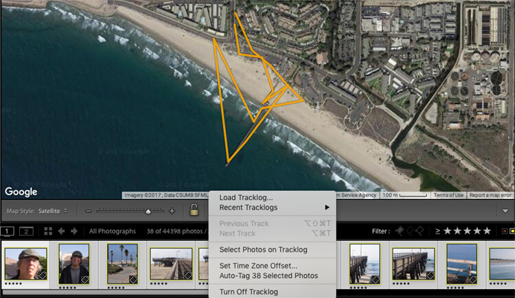
    You don’t need to hold on to the phone or watch the app once you have initiated your photo walk and you are happy with the interval settings. It will create a map similar to the one below when you are done. Your map may create an odd route as if you were walking in the ocean like this one, but there is actually a pier which doesn’t show up on this map.

    How to Use Lightroom’s Map Module and the Geotag Photos Pro App

    After your walk

    When you have finished your walk, Complete the track on the app and share the track log to your Dropbox, iCloud, or Google Drive account and download the track to your computer.

    Once you have downloaded the .gpx file track log, import your images into Lightroom and select the images in the filmstrip that you would like to geotag. Then open the map module of Lightroom.

    How to Use Lightroom’s Map Module and the Geotag Photos Pro App

    Just below the map window but above the filmstrip, there is a squiggly line that is the track log menu (circled in red above). Hover over it, navigate to your saved .gpx file and load into Lightroom. Once you open the file, you will see the track start to load on your map.

    How to Use Lightroom’s Map Module and the Geotag Photos Pro App

    Once you see a map similar to this (below), it is time to geotag your images.

    How to Use Lightroom’s Map Module and the Geotag Photos Pro App

    Geotagging your images

    Look at your filmstrip and navigate to the images you would like to include in the track log. Click on the first image and shift-click the last image in the sequence to select them all. Then click on “load track logs” and select “Auto Tag the select photos”.

    Now the photos and location will load to the track. If the track doesn’t look 100% correct, you can move the location of the track to put the images in the right place.

    How to Use Lightroom’s Map Module and the Geotag Photos Pro App

    Now you will have a track log of the images you took located on the map. Hover over the picture icons, and your images will pop up in the location where they were photographed. How cool is that?!

    How to Use Lightroom’s Map Module and the Geotag Photos Pro App

    In conclusion

    What a great tool for you as a landscape and travel photographer! As GPS gets more advanced, it will be included in more cameras and make this process a little easier. But for now, an app like this is fun and easy to use and adds another handy element to your photo toolbox.

    Give it a try on your next trip!

    The post How to Geotag Your Photos Using Lightroom and a Smartphone App by Holly Higbee-Jansen appeared first on Digital Photography School.


    Digital Photography School