Category: Photography

  • Why I Always Use an L-Plate Bracket for Landscape Photography

    There’s no secret that there’s an abundance of accessories for landscape photographers. Some of them are considered absolutely essential while others might just be unnecessary extra weight in your backpack. With so many tools to choose between it can be hard to separate the useful from the unuseful, which is probably why we end up purchasing so many unnecessary products.

    When talking about accessories that are useful for landscape photographers I find that there’s a handful of products that keep coming up: a tripod, a variety of filters, a remote shutter release and a cleaning kit. There’s no doubt that these are tools that can make a huge difference in your photography.

    L-Bracket Plate in use shooting on tripod.

    But there’s one that I feel goes under the radar quite often, which is fascinating as it’s one that the majority of professional landscape photographers use: an L-plate bracket.

    What is an L-Plate Bracket?

    If this is the first time you’ve heard about an L-plate bracket I urge you to keep reading this article and to consider if this is a tool you should be adding to your equipment list.

    The L-Plate bracket is a piece of metal that is fastened to your camera body as a replacement for the regular quick release tripod plate. Unlike a regular quick release plate, an L-Plate is shaped as an L, bending 90 degrees up the side of the camera. This makes it easy to quickly switch between a horizontal or vertical orientation, which is a benefit I’ll come back to in a minute.

    To connect the camera to the tripod you place a clamp on the tripod’s ball head. These clamps come in a few different options, including a quick-release lock and a twist lock.

    Why I Always Use an L-Plate Bracket for Landscape Photography - camera mounted on a tripod with an l-plate bracket

    Why I Always Use an L-Plate Bracket

    Ever since I started with landscape photography and purchased my first L-Plate, this has been an accessory that I have recommended. During the last few years, I’ve noticed that more and more beginners are understanding the value of this tool and I’m often surprised to see that the majority of my workshop participants use one.

    The main benefit of using an L-Plate is that you can easily switch between a horizontal and vertical orientation. Now, you might ask “how is it easier to remove and re-attach the camera than to just loosen the ball head and readjust it?”.

    That is a good question and one that might not seem that obvious but the answer is actually quite simple. When shifting from horizontal to a vertical orientation with an L-plate you keep the same composition.

    L-Plate Bracket for Landscape Photography - camera mounted vertically using an l-plate

    It’s easy to change the orientation of your camera when using an L-Plate

    When shifting from horizontal to vertical orientation without an L-Plate you need to move the tripod as you’ve also moved the camera a few centimeters to the side, meaning you’ve lost the composition you had previously. With an L-plate attached, you maintain the composition and don’t have to worry about moving the tripod back and forth each time you change the orientation.

    Another big benefit for those who shoot panoramas is that the camera perfectly pivots around the right spot, meaning you won’t have problems stitching the shots together later.

    Who are L-Plates for?

    Now I’m not going to lie and say that L-Plates are for everyone. If you’re a studio photographer or if you never use a tripod, it’s better not to waste your money on this tool. However, if you’re a photographer who regularly uses a tripod, I highly recommend that you get one right away.

    a vertical photo of a landscape scene - L-Plate Bracket for Landscape Photography

    It’s easy to quickly change to a vertical orientation when using an L-Plate

    Here are a few photography genres which will greatly benefit from using an L-Plate:

    • Landscape photography
    • Astrophotography
    • Architectural photography
    • Commercial photographers
    • Macro photographers
    • Studio photographers (who use tripods)

    Shot vertically using the L-Bracket.

    What to look for when purchasing an L-Plate

    Unlike many of the other types of accessories we find for photography, there aren’t a whole lot of options when it comes to L-plate brackets. There’s no fancy technology or must-have features. This is a simple tool, but there are still a couple of things to look for when you’re purchasing one.

    • Never purchase “universal” plates: When you’re searching for L-Plates you’ll most likely come across several models which are branded as universal plates. Do not purchase one of these! While they claim to be universal, this is rarely the case. Most likely parts of the plate will block the pockets and plugs on the side of your camera.
    • Metal plates are always best: Metal plates might be a few dollars more expensive but they are worth every cent. A sturdy metal plate is more durable and less likely to malfunction (I’ve had my RRS L-Plate for 4 years and it still works like new).

    Final tips

    The best option is to find a metal plate which is specifically made for your camera model. For example, I’m using a plate that perfectly fits the Nikon D800 and D810 but when using it on my backup camera, the Nikon D750, it covers the ports on the side, meaning I’m not able to use a cable release.

    Lastly, you don’t need to purchase the most expensive alternatives. I know many photographers who use L-Plates that cost between $ 10 and $ 30, and these work just as well as more expensive versions. Just make sure that it’s made of metal and fits your camera. You’re likely to find good options for less than $ 50 so don’t feel like you have to get one of the premium $ 200 versions.

    The post Why I Always Use an L-Plate Bracket for Landscape Photography appeared first on Digital Photography School.


    Digital Photography School

  • How to Mimic Window Light in a Studio Environment

    One of the most common reasons you hear from photographers who avoid off-camera flash lighting is that it looks artificial. Yes, studio lighting can look artificial, but sometimes that’s part of the charm. Nobody claims portraits made with a ringlight look natural, but that doesn’t stop the thousands of photographers (myself included) that use them all of the time. But that doesn’t mean that it is impossible to mimic window light in the studio.

    In fact, that’s kind of the point most of the time.

    How to Mimic Window Light in a Studio Environment - portrait of a lady in the studio

    Obtaining natural looking result in a studio is fairly easy with a few basic tools and some know how.

    With studio lighting, you can create whatever lighting you want at any time. Providing that you have the right tools (and they are pretty basic), creating natural looking portraits in a studio environment with off-camera flash is exactly as difficult as creating portraits using window light.

    Why is window light so wonderful?

    b/w window light portrait - How to Mimic Window Light in a Studio Environment

    Window light has a lot of wonderful qualities that make it a great choice for photographing people and other subjects.

    In a nutshell, windows give you a constant (during daylight hours) and large light source to work with. The light itself is soft, diffused (assuming that direct sunlight is not entering through the window), and lends itself well to virtually all subjects including portraits.

    It also tends to be very directional (depends on how you position yourself and the subject in relation to the window), making it easy to work with to shape your subject.

    two b/w portraits - How to Mimic Window Light in a Studio Environment

    Window light can give a variety of results depending on the time of day and the size and shape of the window. As such, there is no one size fits all solution to mimic window light and recreate it in the studio.

    On top of that, we see things lit in window light all day, every day. It is a very natural state of things and it’s how we recognize the world around us. This familiarity makes window light an obvious choice.

    Add to that that the master painters created a great many of their portraits in a studio lit by window light. The most obvious point of reference here would be Rembrandt since this style of lighting is one of the most common techniques that photographers use today.

    The reasons for unnatural looking light

    b/w portrait with ring lighting used - How to Mimic Window Light in a Studio Environment

    Some light sources, like the ringlight used here, are by nature very unnatural looking. When trying to recreate natural light, try to stay away from specialist tools like these and tri-flectors.

    There are a couple of reasons why studio lighting can look canned and unnatural. These are:

    • Too many lights – When using natural light, you’re usually shooting with only one light source. Perhaps there’s a reflector involved or there might be multiple windows, but for the most part, it’s one light. Going into a studio environment where a single setup can involve a key light, a fill light, a hair light, two rim lights and two background lights can feel both complicated and wrong (unnatural). Fair enough.
    • The modifiers are too small – In most cases, windows are quite big. This means that the light source you are using to light your subject is large. Big light sources give soft, flattering light. Add some mesh curtains to that window and the light gets even softer and more diffused. What does that tell you about the size of modifier you need to use on your studio portraits to get soft light?
    • The lights are too far away – In terms of the softness of the light, it’s the size of the light source in relation to the subject that determines how soft or hard it appears. If you have an 8′ octabox twenty feet from your subject, it will appear quite small comparatively; therefore, the light will be a bit hard. If you have a small pop-up softbox on there, it will be even harder. Bring your lights in as close as you dare to get for the softest light possible. If you have a small modifier, I recommend having it so close you can barely shoot past it without getting the light source in the frame.
    • You’re using an odd light source – Specialist lights, like the ringlight used in the image above, create light that you wouldn’t normally find in natural scenarios. Even if a viewer doesn’t understand the why behind it, people are quite intuitive when things seem weird. If you’re going for a natural look, avoid lights like these.

    How to recreate and mimic window light in the studio

    Here, you’ll see just how easy it is to mimic natural light in a studio environment. Here’s what you’ll need to get started:

    • An off-camera light source. Strobes, flashguns and continuous lights will all work equally well.
    • A large light modifier. These examples use a 5′ Octabox (or recessed softbox as PixaPro like to call it), but anything will do. If you don’t have any large modifiers yet and are unsure about what to get, consider starting with a large translucent umbrella. They’re big, dirt cheap, fold away easily and produce a nice, soft light.
    • White or silver reflector. This one’s optional, but you should have one anyway. If you’re using a really big modifier, the wraparound of the light may mean you don’t even need it, but they are useful for filling in dark shadows on the unlit side of your subject.

    Setting up

    behind the scenes studio shots - How to Mimic Window Light in a Studio Environment

    A medium sized octabox placed close to an above the subject and a silver reflector was all it took to create these images.

    To get started, place your light about three or four feet from your subject. Turn the light so that it’s forty-five degrees (in relation to your subject.) Raise the light up as high as you can (making sure the subject still has catchlights in their eyes). High ceilings are a bonus.

    The reason for this is that with window light, the light is often coming from above. The window is shaping the light into the room, but it is still coming down into the room. If you’re using modelling lights or continuous lights, watch the catchlights in your subject’s eyes. Once they are falling towards the top of their eyes, you’re good to go.

    Likewise, also watch where the shadows are falling. If the contrast seems too high, introduce a reflector. This does take practice, so don’t worry if you can’t tell just yet. It may help if you squint your eyes tightly. This makes it easier to see the contrast. In these examples, the silver reflector was placed flat and in front of the subject at around waist level.

    Now, all that you have to do is to take a light meter reading (or take a test shot), adjust your settings (either in-camera or on the flash) and start taking photos.

    portrait of a lady in pink - How to Mimic Window Light in a Studio Environment

    To start with, try having your subject turned toward either the light or the camera. Beyond that, there’s not really much else to it.

    How to Mimic Window Light in a Studio Environment

    Practice makes it simple

    If you are completely new to off-camera lighting, this may seem like a lot to get. I promise it’s not. Once you’ve set this up a few times, it becomes so easy that there’s not much more effort involved than placing someone in front of a window.

    The advantages here are that you aren’t at the mercy of the weather or the time of day and once you get started with a set-up, the light won’t change unless you tell it to.

    Just remember to keep the light both high and close and there isn’t much room to go wrong.

    two images of a lady - How to Mimic Window Light in a Studio Environment

    Putting it to use

    If you’ve had any hesitance to use studio lights for any of the reasons listed in this article, hopefully, you can see that with the right techniques, you needn’t worry at all. Honestly, it’s not as difficult or complicated as it seems. If you’re still unsure, rent a studio for an hour and put it to practice. You may be surprised at what you find out and learn.

    The post How to Mimic Window Light in a Studio Environment appeared first on Digital Photography School.


    Digital Photography School

  • How to Improve Your Landscape Photography By Understanding Portrait Lighting

    The further I have gone on my photography journey, the more I have come to learn about the importance of understanding light. I believe light is the single most important element that makes a photograph. Not a great subject. Not great composition. It’s great lighting that will make a photograph amazing.

    colorful landscape scene - How to Improve Your Landscape Photography By Understanding Portrait Lighting

    So what is great light? There is no one type of light that makes a photograph good or bad. Hardness, brightness, color, direction. All these things and more will dictate how your image looks, and more importantly, how it feels.

    One of the ways I’ve learned to see and understand light and how it affects my landscape photography is by learning about and understanding portrait lighting. Portrait photographers know that the way light falls on the human form dramatically affects the photograph.

    Although you can’t control the light in landscape photography, learning to apply the principles of portrait lighting will help you create far more dramatic landscapes that make the viewer feel something.

    Light and Shadow

    At its most basic level, a photograph is made up of light and shadow. We have a tendency to focus a lot on light in photography, but shadows are just as important, if not even more so. Shadows reveal shape, depth, and texture.

    aerial photo - How to Improve Your Landscape Photography By Understanding Portrait Lighting

    Portrait photographers understand light and shadow better than anyone. They shape a portrait by moving the light source around until the light falls in just the right way so that the shadows reveal the contours of the subject. When shooting with natural light that can’t be controlled, they will move the subject instead.

    The transition from light to shadow is often lost in modern landscape photography. Camera sensors with incredible dynamic range, along with the popularity of HDR techniques, have allowed us to bring back a lot of detail in the shadows of our landscapes.

    This isn’t a bad thing in itself, because usually, we want some detail in the shadows, but it often goes too far. Just because we can brighten the shadows doesn’t mean we should. Leaving parts of the image in darkness add mood and mystery.

    long exposure seascape - How to Improve Your Landscape Photography By Understanding Portrait Lighting

    Rembrandt Lighting

    I learned about Rembrandt lighting before I had ever heard of the artist it was named after. Rembrandt was a master painter who understood the principles of light and shadow better than anyone. Studying his paintings will teach you a lot about how they can create mood and drama in an image.

    Rembrandt self portrait - How to Improve Your Landscape Photography By Understanding Portrait Lighting

    Rembrandt self-portrait.

    Rembrandt lighting has become known as a classic lighting setup in portrait photography. Using soft side-lighting, this technique creates a beautiful look that you will likely recognize.

    When the light source is coming from the side of the subject, it causes the light to reveal and conceal various elements. The parts of the subject that are visible to the light source will be illuminated while the parts which aren’t visible to the light source will be in shadow.

    portrait lighting for landscape photography - How to Improve Your Landscape Photography By Understanding Portrait Lighting

    Understanding portrait lighting to bring out texture and dimension.

    You obviously can’t control the light source when photographing landscapes, but you can still apply the same principles.

    Considering how the light will fall on your landscape can guide the way you photograph it. The position you shoot from, your composition, and the time of day will all affect how the lighting affects your landscapes. Even though you can’t control the light, it never stays the same, so waiting for the angle of the sun to change or for a gap in the clouds can make a big difference to that way it illuminates the scene.

    Reverse Engineering Photos

    A great exercise for learning to understand light is to reverse engineer a photograph. When I was learning portrait photography I would regularly study an image and try to figure out how it had been lit. Is it natural light or flash? How far away from the subject is it? How big is the light source? Is there more than one light source?

    How to Improve Your Landscape Photography By Understanding Portrait Lighting - lighthouse on a rocky shoreline

    These days as a landscape and travel photographer, I still ask myself those questions when looking at a photograph. Which direction is the light coming from? What time of day was it taken? Was the sky clear or cloudy? Learn to get in the habit of analyzing photos that you admire by asking yourself more specific questions like this rather than what gear or presets the photographer used.

    Dodging and Burning

    Shaping light and shadow doesn’t stop when you take the photo. Dodging and burning is the process of lightening and darkening areas of a photo in post-production. It doesn’t need to be a complicated process. Often all that is necessary is burning (darkening) areas that could use more shadow or might be distracting.

    portrait lighting for landscape photography

    One of the best ways to think of dodging and burning is to ask yourself where you want the viewer to look. It may be a specific element of the photo, or you may want to draw the viewer’s eye through the image. You can paint more light and shadow into a photo to guide this process.

    Our eyes are naturally drawn to brighter parts of an image. Portrait photographers will often dodge and burn to draw the viewer to the subject’s eyes or another important element of the subject. When editing landscapes, try to paint in light and shadow to control which parts of the image are attracting your attention.

    waterfall and mountain and reflection in a pool of water - How to Improve Your Landscape Photography By Understanding Portrait Lighting

    Go Practice

    The next time you’re photographing a landscape, try taking another look at the light. Ask yourself some of the questions I’ve mentioned. Look for the shadows. Experiment with side-lighting. Wait until the light changes. By understanding portrait lighting you will be better equiped to apply it to your landscape photography.

    You’ll find that thinking of the landscape as contours with depth and shape rather than separate elements will help you make more engaging landscapes with mood and drama.

    The post How to Improve Your Landscape Photography By Understanding Portrait Lighting appeared first on Digital Photography School.


    Digital Photography School

  • Two Ways to Replace the Sky Using Photoshop

    There are many things that you can control when shooting a photograph, but the weather is not one of them! If you have a great landscape or architecture photo but the sky is too dull it will bring down the entire image, so just keep reading to learn how to replace the sky with Photoshop.

    Paste sky Photoshop tutorial before after - Two Ways to Replace the Sky with Photoshop

    “Give the clouds an assignment.” said photographer Werner Mantz.

    He was right, sometimes you can have the best weather and end up with a flat blue sky. Even worse if you have a horribly cold day that gives you a dull grey sky. Either way it can be the win or lose element of the image. No need to panic though, you can composite two photos into one perfect shot and replace the sky with a better one.

    Method #1 – Sky Replacement in Photoshop

    Most importantly you need an image from a cloudy sky that matches the mood of the image onto which you’re going to paste it. I’m going to work with a vertical shot so it’s better if the one from the sky has the same format. The subject is a ship aground in iced waters so my sky should be ideally from a stormy day.

    Paste sky Photoshop tutorial subject clouds - Two Ways to Replace the Sky with Photoshop

    With the image of the subject open, make a selection of the sky that needs to be covered by the new one. For this you can use any tool with which you feel comfortable. I usually start with a broad selection using the Magic Wand and then get closer with the different types of Lasso tools. You’ll see a dotted line (marching ants) around the area that is being selected.

    Paste sky Photoshop tutorial selection tools - https://digital-photography-school.com/3-ways-make-sky-selection-photoshop/

    Refine the selection

    I find it’s also useful to go into Menu > Selection > Edit in Quick Mask. This will show the parts that are not selected in a red mask, so you can paint with the Brush tool what you want out and use the Erase tool to include in the selection.

    Paste sky Photoshop tutorial quick mask selection- https://digital-photography-school.com/3-ways-make-sky-selection-photoshop/

    Now open the sky image and select it all (Cmd/Ctrl + A), then go to Menu > Edit > Copy. Turn back into the first image and go to Menu > Edit > Paste Into. Notice that it becomes a new Layer and it has a Layer Mask with the shape of the selection you made, therefore you can now scale it and move it around and your subject won’t be affected, you’ll see the new sky directly as it would be fit in the image.

    Paste sky Photoshop tutorial transform - Two Ways to Replace the Sky with Photoshop

    Once you’re happy with the montage, you can add some adjustment layers so that the two parts have the matching brightness, tone, etc., and the result seems as natural as possible.

    Paste sky Photoshop tutorial before after - Two Ways to Replace the Sky with Photoshop

    Method #2 – Sky Replacement in Photoshop

    When your landscape has a diffused horizon line like one with trees, for example, especially if you just need the sky to have a few more clouds instead of completely replacing the original sky then this technique is much more efficient because you don’t have to do the precise selection needed in the previous method. So go ahead and open both images on Photoshop.

    Paste sky Photoshop tutorial before sunny day - Two Ways to Replace the Sky with Photoshop

    In the image of the sky go to Menu > Selection > Edit in Quick Mask Mode and then choosing the Gradient tool draw a line from bottom to top, this will make the image appear with a red mask, faded gradually from one edge to the other.

    Paste sky Photoshop tutorial quick mask selection gradient - Two Ways to Replace the Sky with Photoshop

    Now go back to Menu > Selection > Edit in Quick Mask Mode and click again, this will turn the Quick Mask off, and you’ll see a rectangular selection on your image without noticing the gradient. But don’t worry, it’s still there.

    Now pull the tab of the image to the side so that you can access the two images simultaneously, then drag the sky selection and drop it on top of the first image.

    Paste sky Photoshop tutorial drag subject clouds

    Now pick the Eraser tool and with a soft brush start erasing the part of the new layer that is covering the subject. You can also decrease the opacity of the layer so that it blends in a bit more smoothly.

    Paste sky Photoshop tutorial erase opacity

    There you go, you can do the final touches with adjustment layers so that levels and colors match.

    Paste sky Photoshop tutorial after sunny day

    Conclusion

    So there you have two methods to replace the sky using Photoshop.

    Have you tried this technique before? Please share your questions and comments about it below.

    The post Two Ways to Replace the Sky Using Photoshop appeared first on Digital Photography School.


    Digital Photography School

  • Weekly Photography Challenge – Macro

    Time to get close-up with some macro photography this week.

    Need some tips? Read these dPS articles:

    • 5 Camera Settings That All Macro Photographers Should Know
    • How to Choose the Perfect Macro Lens
    • 5 Tips for Killer Macro Backgrounds
    • How to Use Natural Light for Macro Photography
    • 5 Quick Tips for Outdoor Macro Photography
    • How to Get Stunning Macro Photos with Your Mobile Phone

    Weekly Photography Challenge – Macro

    Simply upload your shot into the comment field (look for the little camera icon in the Disqus comments section) and they’ll get embedded for us all to see or if you’d prefer, upload them to your favorite photo-sharing site and leave the link to them. Show me your best images in this week’s challenge. Sometimes it takes a while for an image to appear so be patient and try not to post the same image twice.

    Share in the dPS Facebook Group

    You can also share your images in the dPS Facebook group as the challenge is posted there each week as well.

    The post Weekly Photography Challenge – Macro appeared first on Digital Photography School.


    Digital Photography School

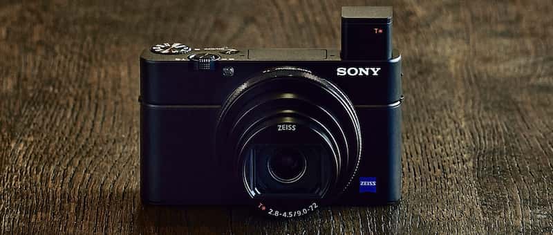
  • Hands-On with the new Sony RX100 VI Compact Camera

    Sony continues to innovate and release new versions of their popular line of mirrorless and compact cameras. Just release is the newest Sony RX100 VI, the sixth version in just six years. But at just under $ 1200 USD is it worth the price? Let’s see.

    There are quite a few new things and upgrades from the Mark V. Let’s see what a few different testers had to say about it in Venice recently where Sony handed out some cameras to put through the paces. Here’s a small list of features:

    Image courtesy of Sony.

    • New 24-200mm lens (with the 2.73 crop factor) but with an f/2.8 maximum aperture.
    • 24 frames per second burst mode.
    • Buffer 233 JPEGs standard.
    • 315 phase detection autofocus points.
    • 90-degree tilting LCD screen.
    • New touchscreen capabilities.
    • Easier popup electronic viewfinder.
    • Does 4K video.
    • New Vlogging stick available for easier video creation.

    Photo Gear News

    Richard Sibley from Photo Gear News gives the Sony RX100 VI some good tests as he walks around Venice. See what he has to say about shooting video, slow-motion, and other things. He talks about the aperture range limitations and the menu system.

    ?

    Camera Labs

    See what Gordon Laing, prolific camera reviewer, had to say about the Sony RX100 VI. His test of the tracking autofocus shows impressive results on moving subjects with the phase detect autofocus of this camera.

    So what does he like, and what does he miss from the Mark V? Watch to find out.

    ?

    Things missing on the RX100M6 he’s noted are:

    • No microphone jack or Bluetooth audio connection
    • The wider aperture of f/1.8 that was available on the Mark V
    • No built-in Neutral Density filter that was on earlier models

    For a little humor

    Finally, to inject a little humor into things is Kai (former of DigitalRevTV). His point of view and way of approaching things is unique and adds a bit of spice to reviews that can otherwise get a little dull.

    ?

    The official word from Sony

    Lastly, here is Michael Bubolo from Sony to give us the low-down on some of the official specs and features of this new camera.

    ?

    Is this camera for you?

    I have to admit when I heard about the 24-200 equivalent zoom lens I was a bit jealous as compared to my Fuji X100F with a fixed 23mm (35mm equivalent) lens. But the 1″ sensor (2.73x crop factor) on the Sony is a lot smaller, so I’ll stick with my Fuji!

    So who is this camera for? At the price of around $ 1200, it’s not for everyone. Perhaps it’s good as a backup to their DSLR for pros, or for bloggers (and vloggers) who do video and want something portable. The zoom range certainly is attractive and it does a nice job on video for sure. But would you spend this much on a compact camera?

    Note: currently the Sony RX100 VI is only available for pre-order from Amazon and other retailers.

    Let’s discuss in the comments section below.

    The post Hands-On with the new Sony RX100 VI Compact Camera appeared first on Digital Photography School.


    Digital Photography School

  • Tips for Using Color in Your Photography

    Tips for Using Color in Your Photography - boats in a row on the shore

    Color is one of those things that you easily take for granted because it is everywhere. Even though you see it every day, not much thought is given to how (or why) it affects your perception or mood. While it is a common part of your life, you can still pay attention to how it affects your images.

    Since color or the absence thereof plays an important part in your final product (others include light, shape, form, and texture), give it some more thought. Are you conscious of how you are using color in your photos?

    salt and pepper close up shot - Tips for Using Color in Your Photography

    1. The Basics

    There are three primary colors – red, blue and yellow. Secondary colors are produced when you combine these: green (combination of blue and yellow), purple (red and blue) and orange (red and yellow). If you further combine, you get the next level/tertiary colors.

    color wheel - Tips for Using Color in Your Photography

    By The original uploader was Sakurambo at English Wikipedia. [GFDL or CC-BY-SA-3.0], via Wikimedia Commons

    The color wheel is a diagram that shows how different colors relate to each other. They exist along a continuum with each color transitioning into the one next to it. So why are these basics important?

    Color Harmony

    Color harmonies are combinations that are visually appealing to the human eye. A color harmony is when you have two or more different colors that complement each other. This is a key tool used by both artists and photographers to communicate with their viewers, as it is used to evoke a mood or emotion. There are a few types of color harmonies that you can use.

    red boat on the shore and one bird - Tips for Using Color in Your Photography

    Monochromatic versus Analogous

    While these two color harmonies are similar, analogous offers subtle differences that set it apart. A monochromatic color scheme or harmony uses variation in the lightness and saturation of a single color. An analogous color harmony is composed of colors that are adjacent to each other on the color wheel. There is still one dominant color, but the second color enhances the overall look.

    anise seeds - Tips for Using Color in Your Photography

    Example of using color in a monochromatic way.

    Both of these color harmonies are easy to create and are very easy on the eyes. Monochromatic color schemes are sometimes used to establish a mood because of their visual appeal and balance.

    Tips for Using Color in Your Photography - mountain scenic photo

    Example of an analogous color scheme with blue and green being next to each other on the wheel.

    Analogous colors flow into each other, creating a more soothing look in your image. When you are outdoors, you are exposed to all the various color harmonies including these two. Think about a lush forest with its varying shades of green or the variances of oranges and red in an autumn scene. These tones are likely appealing to you, now you have a little idea as to why.

    Complementary Colors

    Complementary colors are directly opposite each other on the color wheel. Thus the color complement of a primary color is a secondary color (as shown on the color wheel) e.g., red and green complementary colors work well together since they are highly contrasting. They can be quite dramatic when used at full saturation, as each color makes the other appear more active.

    Tips for Using Color in Your Photography - sunset on the water

    Orange and blue are complementary colors, which makes sunsets and other scenes with these colors so appealing to us visually.

    2. The Key or Dominant Color

    The key color is the main color in an image. Often, the key color in an image is that which is the most dominant. Allowing one color to dominate can lead to a powerful image. This is stronger when a primary color (red, blue or yellow) is the dominant color.

    Colors with greater intensity will draw (and hold) your viewer’s attention. Keep that in mind, in relation to how it affects your subject.

    Tips for Using Color in Your Photography - red tomato in a red bowl

    Red is the dominant color in this image, clearly.

    3. Advancing or Receding Colors

    Advancing colors are the gamut of colors on the warmer end of the spectrum. These include red, red-violet, yellow, yellow-orange and orange. When advancing colors are dominant, they appear as though those objects are closer to the eye, as if coming towards you. Red is one of those colors that dominates and jumps right at you. Think about a scene that has only a hint of red (e.g., a red mailbox) and yet the red dominates.

    Tips for Using Color in Your Photography - sunset photo

    Advancing colors can work well in an image or on the other hand, can disrupt your scene by taking away the attention from your subject.

    Receding colors are the opposite and take on a more background characteristic. Think about what blues and greens (the cooler colors) add to a landscape. They fall into the distance, add a feeling of depth, and help balance the stronger colors.

    cool colors of blue hour - Tips for Using Color in Your Photography

    4. Feelings and Color

    Color provokes various emotional responses in people. So much so, that we use color to describe different emotions, for example: feeling blue, seeing red, tickled pink, or green with envy.

    We connect to the warm colors of a sunset differently than we do to a cool blue morning. Color in everyday life is used as a powerful psychological tool, the same applies when using color in your photographic compositions.

    Tips for Using Color in Your Photography - statue and the sky

    Remember that color is subjective – the same color can make one person happy but irritate another. Also of note, one color can evoke different emotions, if you change its hue and saturation or change the color you combine it with. Orange for example, can create excitement when it leans towards red and be more calming when it is more on the yellow side.

    Conclusion

    It is fun to learn how colors work with each other and how we react to different combinations. When creating an image, organize color in a way that is easy and pleasing to the eye. Use strong, bold colors to create impact or generate an emotional response. Do you want to grab your viewer’s attention immediately or prefer if their eyes wander around your image?

    buffalo in a yellow field - Tips for Using Color in Your Photography

    While people see the world in their own way, experiment with color and try to understand what reaches your audience. When creating images with impact, you can use color and make them feel what you want. Share your colorful world with us in the comment area below.

    The post Tips for Using Color in Your Photography appeared first on Digital Photography School.


    Digital Photography School

  • How to Edit Food Photography Images Using Lightroom

    To edit food photography it requires a bit of a different approach than you might take with other types of photography, like portrait or landscape. The objective is to keep the food looking as fresh and appetizing as possible, which can take a subtle but considered hand.

    How to Edit Food Photography Images Using Lightroom

    Before and after a subtle edit of a food photo.

    Although there is always room for style and artistry, the more real your subjects look, the better. Lightroom is the program of choice for most food photographers. It’s intuitive and relatively easy to use and offers most of the tools required to make great food photos.

    For this article, I will walk you through how I make global adjustments to a food image in Lightroom’s Develop module. Workflow is something that is individual to each photographer. This is how I approach editing my food photography, however, you may opt to do things differently. Hopefully, you will find some takeaways that will help you edit your own images.

    I’ll be editing this image of an apple pie. This is the shot straight out of the camera. Like all RAW images, it lacks contrast and needs a bit of pizzaz.


    How to Edit Food Photography Images Using Lightroom

    Final image.

    The Histogram

    It’s important to have a basic understanding of the histogram in order to make adjustments to the exposure and tones in your image. The histogram is one of the key tools available for analyzing your image. It provides a graph of the density values of a given image. The histogram shows the relative quantity of pixels at each density value.

    The far left point of the histogram is pure black and the densest, and the far right point is pure white with no density. A big peak in any of these regions means that the image has a lot of pixels at that particular density. An open gap in the histogram means that there are no pixels at that density.
    How to Edit Food Photography Images Using Lightroom - histogram

    The distribution of these tones will tell you about the overall exposure of the image. Most images look best if they contain both dark and light values. Generally, without some dark and light values, the image may lack contrast and look flat.

    If you have a strong peak at the black or white end of the histogram, your image could be under or overexposed. However, it really depends on the individual image and the desired aesthetic. For example, blown out whites has become a “thing” in recent years. A dark and moody shot will have a lot of pixel density at the dark end of the spectrum.

    Cropping

    Before you can start making global adjustments to your image, it makes sense to crop and straighten it first. One tip is to shoot a bit wider than what you want for your end result so you can tweak your composition in post-production. You also may want to crop it to a certain aspect ratio – say 4×5 or square for Instagram.

    First,  make sure that your horizon line is straight.

    My horizon line in the apple pie image was already pretty straight. I used the crop tool to check it and also brought the crop in slightly on the left-hand side to cut off a little bit more of the pie. To access the Crop Tool in Lightroom, click on the grid symbol under the Histogram in the top panel (or just hit R, the keyboard shortcut). This will allow you to crop your image by bringing in the corners with your cursor.

    While this tool is activated you can click “O” for the shortcut to bring up several compositional overlays like the Phi Grid or Golden Spiral to help you get the most out of your composition.

    How to Edit Food Photography Images Using Lightroom - crop your image first

    Lens Corrections

    How to Edit Food Photography Images Using Lightroom - lens corrections panel in LR

    The Lens Corrections options fix optical distortion caused by the position of your subject in the frame, or where your camera is positioned relative to your scene. Lightroom supports a variety of lenses to automatically calibrate with this function.

    I always check off Enable Profile Corrections before I start making adjustments to my image. Checking this box automatically brings up the camera profile for the lens used to create the image, in this case, the Canon EF 24-70mm.

    White Balance

    I recommend setting your White Balance in-camera or shooting with a gray card and adjusting it in post-processing. This removes incorrect color casts and ensures that your whites and colors render accurately.

    How to Edit Food Photography Images Using Lightroom - eye dropped for WB in LR

    You can correct your White Balance in Lightroom by taking the eyedropper tool (circled in red below) and clicking on an area in the image which appears neutral. This will the adjust the color temperature in the whole image, and you can tweak afterward if it’s not quite as you desire. It’s not as precise as the other options but can work well for food your food images.

    Also, in food photography, White Balance can be used creatively, depending on your image. I tend to favor a cooler approach to my food photography. Cool colors give a crisp and fresh feeling to the image, which means I tend to edit more towards the blue or cyan.

    Using the white balance eye dropper tool in Lightroom to color correct - How to Edit Food Photography Images Using Lightroom

    Using the white balance eyedropper tool in Lightroom to color correct

    Keep in mind that the goal is to make the food look as fresh and appetizing as possible, so you don’t want the food to look blue. Food photography looks best when there is a balance of tones. I keep my surfaces and props on the cool or neutral side and work with my food subjects individually to keep it as realistic looking as possible.

    When composing my apple pie image, I chose a vivid blue background to complement the golden tones of the pie. Not only does this create a balance of tones, blue and yellow are opposite on the color wheel and are a great combination of colors for food photography.

    How to Edit Food Photography Images Using Lightroom

    After White Balance color corrections.

    Exposure and Contrast

    The next slider is Exposure, which affects the brightness of the range of tones in your image. To see bright or dark details, pull the Exposure slider to the left, or the Blacks slider to the right. If the bright areas look muddy, or the shadows still need more light, move the sliders to points where the image looks good overall.

    I often make this adjustment initially and then may scale it back once I have made some other adjustments.

    Contrast can be boosted in the Basic Panel or in the Tone Curve panel, which I will get to in a moment. It’s important to add some contrast, as RAW digital files are flat by nature.

    How to Edit Food Photography Images Using Lightroom

    After slight Exposure and Contrast adjustments.

    Highlights, Shadows, Whites and Blacks Sliders

    How to Edit Food Photography Images Using Lightroom - basic panel sliders

    This panel is where you may end up doing a lot of tweaking before you settle on a look that you’re satisfied with. It will give you a more precise balancing of tones than simply relying on the Exposure slider.

    In my shot of the apple pie, the highlights were too bright, and the shadows too light for the look I was aiming for, which was a darker mood. My style tends to be dark and moody with bright food.  I brought the highlights down and boosted the whites, while also bringing down the shadows and blacks to create the ideal balance for the aesthetic I was going for.

    How to Edit Food Photography Images Using Lightroom

    After Highlights and Shadows were tweaked.

    Clarity, Vibrance, and Saturation

    Clarity is a most important slider in Lightroom when editing food photography. Clarity gives your image contrast in the mid-tones (edge details more specifically) and adds detail. You probably wouldn’t edit a portrait with +50 clarity, but you can easily do so with food photos. Keep in mind that overdoing the clarity can make food look dry and unappetizing. For this edit, I put my clarity at +42.

    Vibrance is also an important slider in food photography post-processing. It’s a better tool for your edits than saturation because it’s is more subtle. It tends to adjust the less saturated colors without intensifying the ones that are already saturated.

    The difference between Vibrance and Saturation is that it affects the intensity of the colors. Red becomes redder, green becomes greener, and so on. Vibrance will first boost the saturation of the muted colors and then the other colors. It adjusts the less saturated tones without over-saturating the ones that are already saturated. Whether you use Saturation depends on the image and the look you are going for, but in general, a conservative approach is what works best when editing food photography.

    How to Edit Food Photography Images Using Lightroom

    Clarity, Vibrance and Saturation adjusted.

    It’s easy to quickly overdo the Saturation and make your image look ugly. If I use the slider at all, I might only nudge it up a tad to about +5 or +6. You’ll notice that I actually brought down the Saturation slightly in this image, so the blue looks a little less intense.

    Tone Curve

    The Tone Curve is often challenging to new users, but it’s one of the most powerful tools that Lightroom has to offer. Getting in-depth with it is beyond the scope of this article, but let’s look at the basics.

    The Tone Curve is a graph that maps out where the tones in your images lie. The bottom axis of the Tone Curve starts with Shadows at the far left side and ends with Highlights on the far right end. The mid-tones fall in the middle, in a range from darker to lighter. The tones get darker as you move lower, and brighter as you move up the axis.

    Assess the mid-tones in your image. Are they bright already? If not, click on the middle of the tone curve and bring the point up. If they are already bright or too bright, bring the curve down slightly. Move on to the rest of your image. Typically you will find that your curve looks somewhat like a soft S (see screenshot below).

    You can control the lightness and darkness of your tones by adjusting the Point Curve itself or by Region Curve. The Region has sliders for each part of the tonal range. As you drag each slider, the curve and the image both change.

    To make adjustments with the Point Curve, click on the area you want to affect to create an anchor point at which to control the tone. Dragging the point up lightens that tone; dragging it down darkens the tone.

    After Curves.

    You will also notice that there is an RGB option in the lower-right portion of the point curve. This helps you to individually edit the Red, Green, and Blue channels. It performs the same types of adjustments to brightness and darkness, but on each separate color. This can be utilized if you want to edit a color individually, or give your image a certain type of color overall.

    To choose tones directly from the image, there is a handy tool called the Targeted Adjustment Tool. This is located in the top left of the Tone Curve.

    Click on it and move the cursor over the image. The tool shows you the tones under the crosshairs. If you click and drag it up and down the image, you will affect the tones like those under the crosshairs. For example, if you drag vertically on an area with light pixels, all of your image’s highlights will be adjusted.

    If you’re getting started with learning the Tone Curve, play around with the Region sliders and take note of how the various sliders affect the curve. Whichever approach you choose, be sure to watch the histogram as you make changes, to ensure that you are not losing important detail.

    HSL Adjustments

    HSL stands for Hue, Saturation, and Luminance. This is where you balance the colors in Lightroom. However, color adjustments are usually more subjective than tonal adjustments, as color gives a photograph a sense of mood.

    There are two ways to make color adjustments in this panel; you can adjust them all at once under HSL/All, or each color individually under the Color tab at the top of the panel.

    The Hue tab or section is where you choose how warm or cool you want each color in your image to be. For example, I find that greens almost always look off, so I slide the greens slightly more towards the left or right to get them looking more realistic. To add more warmth, that is, more yellow to your greens, slide it to the right. For a cooler hue, sliding it to the right will add more blue.

    Whereas the Saturation slider in the basic panel adjusts the color of the whole image, the saturation sliders here adjust each color individually.

    If you adjust a color to be more saturated, then it will affect the saturation of that particular color throughout the whole photo. Whether you’re working in the basic panel or the HSL panel, saturation requires a light hand.

    In the image of the apple pie, I thought that the blue looked a bit more on the magenta side, so I slid it towards the left. This hue gave me a blue that worked better with the orange tones in my picture.

    Lastly, Luminance affects the brightness of the color. I find these sliders more valuable than the saturation sliders and work with these first.

    How to Edit Food Photography Images Using Lightroom

    After HSL adjustments have been applied.

    Working in Lightroom is all about balance, and the same goes when working with the Hue, Saturation, and Luminance adjustments.

    Noise

    Noise is the grain that can appear throughout an image. It’s not often a problem when you are shooting with artificial lights, but when working with natural light, grain can appear in your images if you are shooting at a higher ISO or you didn’t get enough light onto your sensor.

    Working with the Noise slider in Lightroom will minimize the grain and give your image a smoother look. But, be careful not to push the slider too high, as it can result in a plastic look. For the apple pie, I set the Noise at +20, as it was shot in studio with a strobe.

    Post-Crop Vignetting and Dehaze

    If you are editing a darker, moodier image, Post-crop Vignette is a must. By darkening the outer corners of the frame, you draw the viewer’s eye towards the center of the image and your subject.

    To darken, move your slider to the left. The midpoint slider controls how far in the dark edges get to the center of your photo. Feather controls how soft or hard your vignette will look. A softer vignette looks more appealing than a hard, “spotlight” effect.

    How to Edit Food Photography Images Using Lightroom

    Vignette applied.

    Sharpening

    Sharpening should be the last editing step. It adds contrast between pixels and edges, thereby adding definition and creating a more refined look.

    NOTE: It’s not meant to make a blurry image look sharp!

    Also, sharpening should not be applied to the whole image. In food photography, there is not much of a point in sharpening the props and the background, etc. The focus is on the food, therefore, this is what we sharpen.

    To do this in Lightroom, mask out the image to select the areas of the image you want to sharpen rather than sharpening the whole image. You do this by holding down the Alt/Option key (it will show you where the sharpening is being applied, the white areas) while clicking on Masking in the Sharpening panel. Slide it to the right. The farther right you go, the less of the image it will sharpen. For my image, I left it at +76.

    Also read: How to Make Your Photos Shine Using Clarity, Sharpening, and Dehaze in Lightroom

    In Conclusion

    So here is the final image! Not drastically different than what I began with, but overall a more balanced and refined looking photo and consistent with my style of food photography.

    How to Edit Food Photography Images Using Lightroom

    Before and after editing. Note how subtle the differences are here.

    When it comes to post-processing your food photography, the best advice I can give is that whatever your style, strive for a natural look for your subject. Ask yourself this question, “Looking at this image, do I want to eat that food?”

    The answer should unequivocally be yes! If so, you’ve done a good job.

    The post How to Edit Food Photography Images Using Lightroom appeared first on Digital Photography School.


    Digital Photography School

  • The Best Way to Improve Your Photography is to Forget About Your Camera

    Are you confident using your camera to take photographs in every situation in which you want to shoot? Do you experience anxiety when you think about reaching for your camera? Would you like to feel sure that when you do head out for a photography session you will return more than satisfied with your results? So what is the best way to improve your photography?

    portrait of a Kayan girl - improve your photography

    If you are anxious or lacking confidence in using your camera you will most likely not be so happy with your photographs. As photographers, most of us like to be improving our pictures each time we use our cameras. I don’t know of a photographer who is not interested in continuing to create better photos than they have previously.

    Photography is so much more than having the most up to date equipment and knowing which dials to turn and buttons to push to make it work. The best way to improve your photography is to forget about your camera.

    Photography is More Popular Than Ever

    Photography is currently more popular than it has ever been. People are taking more photos every day than ever before in history. Why? Because they can and because it is easy. And because everyone always has a camera with them.

    Northern Thailand landscape near Suan Sook Homestay, Doi Inthanon - improve your photography

    Mobile phone cameras have made photography more popular than ever. This photo was taken with my phone camera.

    It is easier and more convenient than ever to be able to take and share your photographs. Most people can take a photo with their phone very easily and without much knowledge of photography technique. Most phone camera users are not concerned with their shutter speed or their ISO setting. But you don’t have to search much to find some outstanding photographs made with phone cameras.

    When people take photos with their phone they are most often concentrating on the moment, not the mechanics of how to work the camera. The more you can learn to do this when you are using your DSLR, mirrorless or any other camera the more you will improve your photography.

    Make Time to Learn

    Make time to study how your camera works. If you are just starting out, begin with the essentials. Become familiar with the settings for obtaining a good exposure and well-focused photos.

    Night photo of a buddhist monk at a ceremony at Wat Pan Tao - improve your photography

    In any situation you find yourself wanting to photograph, you need to be confident in adjusting your settings well without losing concentration on your subject.

    For more advanced photographers, don’t neglect to keep learning more about your camera. Learn to use more of the functions and become proficient at them. If you can do this you will be well prepared whenever you want to head out for a photography session.

    If you are constantly trying to figure out how to use your camera at the times when you want to make great photos, you will not be as successful.

    Know your camera functions and settings well, so you can use it as quickly and easily as your phone camera. You’ll be able to pay more attention to the moment if you do so.

    :aughing Karen woman in a rice field - improve your photography

    Be Prepared

    When you are in a situation where you want to take photographs, be prepared. Have everything with you that you need. Do you need another lens? Will you need flash? How about your tripod? As well, be mindful of whether or not you will need anything other than your camera and one or two lenses. If not, don’t carry it with you. It will only hinder you.

    Always try to anticipate the situation ahead of time. Be well set up with the right lens and any other accessories you need. If you can do this in advance you will be able to concentrate more on making great photos.

    Thai woman in traditional costume - improve your photography

    Being prepared means you will not miss any opportunities to make great photos.

    Review and Critique

    Always take a good look at your photos, including the ones you are not satisfied with. Hopefully, you are not deleting any of your photos from your cards before reviewing them on your computer. Aside from this being poor technical practice, you can learn a lot from your dud photos.

    lady and giant soap bubbles - improve your photography

    Studying your photos for composition, exposure, timing, subject choice, etc., will help you improve. If you are reviewing photos you are not so happy with, this will help you avoid making the same mistakes in future.

    Having someone else look at your photos and offer critique can be very valuable. Even if it’s a friend or family member who has little or no photography experience it can help keep you on track, (so long as they are honest and positive.)

    Sharing your photos for critique with an experienced photographer can help your growth. They will be able to point out things you may not have noticed. By seeking feedback you will learn directly from your own images.

    Reflection of a monk in a puddle of water - improve your photography

    Art and Science

    Photography is very much a whole brain experience. The left hemisphere of your brain engages to manage the technical aspects. Your right hemisphere is more attentive to the creative aspects. There must be a cohesion and a balance.

    If you are too focused on the technical aspects of photography you will not produce such creative pictures. If your right brain takes over you may not get well-exposed or focused images because of not paying attention to your camera.

    Pink dahlia photo - improve your photography

    Knowing your equipment, whatever camera you are using, will help you improve your photography. A photo that was taken with my camera phone.

    Being confident to use your camera, whichever one you choose to use, will help you be more successful. Understand how to use it and to adjust the settings to get the photos you want easily. This takes some study, commitment, and practice, but it’s well worth it to be able to achieve consistently better results.

    The post The Best Way to Improve Your Photography is to Forget About Your Camera appeared first on Digital Photography School.


    Digital Photography School

  • A Beginner’s Guide to Photographing Flowers

    Photographing flowers is one of the most enjoyable and rewarding types of photography around. Yet it can be surprisingly difficult, even for more seasoned photographers. Getting strong flower images often requires new settings, new lighting, and new gear, not to mention a new approach to your subjects.

    flower photography macro abstract - A Beginner's Guide to Photographing Flowers

    In this article, you will learn the ins-and-outs of flower photography. Starting off with a discussion of flower photography gear and camera settings. Then moving into flower photography lighting, focusing primarily on the best types of natural light. Finally, you’ll get few guidelines for strong flower photography compositions.

    Gear

    There are a few types of flower photography gear to think about: cameras, lenses, and accessories (such as flashes and tripods).

    flower macro photography abstract red tulip - A Beginner's Guide to Photographing Flowers

    1 – Cameras

    My camera recommendation is straightforward: the best cameras for photographing flowers are DSLRs. They offer great flexibility in terms of settings and have a huge array of excellent lenses available.

    Which DSLR camera should you use? Especially if you are a beginner, it matters little. Most DSLRs allow for outstanding quality images, whether marketed for professionals or consumers.

    Mirrorless cameras are another option. However, the macro lens line-up is still fairly limited. So at least for the time being, I’d go with a DSLR.

    clematis flower - A Beginner's Guide to Photographing Flowers

    I took this clematis photograph using a DSLR and a dedicated macro lens.

    2 – Lenses

    First, take note: It is possible to get good images of flowers using any lens, macro or non-macro, wide-angle or telephoto. I have taken some of my best flower images using a Canon 50mm f/1.8 lens.

    flower photography macro abstract poppy - A Beginner's Guide to Photographing Flowers

    I took this poppy image with my Canon 50mm f/1.8 lens.

    On the other hand, the higher your lens’s magnification capabilities, the more opportunities you’ll have. You can make intimate and detailed images of flowers. You can also experiment with more abstract photography techniques.

    This is why I generally recommend a dedicated macro lens for flower photography. Such a lens usually offers life-size magnification, pin-sharp images, and excellent bokeh. Some of these are available for a decent price, and I have written previously about choosing the perfect macro lens.

    flower photography macro yellow - A Beginner's Guide to Photographing Flowers

    This image was taken using a dedicated macro lens.

    Another option is to use a regular lens (often a telephoto lens) plus extension tubes. Extension tubes are a cheap way of reducing your lens’s minimum focusing distance, therefore allowing for you to shoot at higher magnifications. The primary downside to extension tubes is flexibility.

    When mounted between your camera and lens, extension tubes greatly decrease your maximum focusing distance, preventing you from quickly changing your point of focus. That is, with extension tubes mounted, you cannot take images of distant objects; you are restricted to only subjects within a few feet.

    A third way of doing inexpensive flower photography is to freelens. By detaching the lens and placing it in front of the camera body, you can increase magnification (while also generating some interesting effects). I often do this with my Canon 50mm lens and backup body, because there is a risk of getting dust in the sensor.

    pink coneflower - A Beginner's Guide to Photographing Flowers

    I used freelensing to photograph this coneflower.

    3 – Artificial Lighting

    Flower photographers often like to use artificial lighting (e.g., flashes or ringlights). These can be both bulky and costly. I prefer natural lighting, but a flash can be especially useful in situations when the natural light isn’t ideal; for instance, bright, midday sun.

    4 – Tripods

    Flower photographers rarely leave home without a tripod. This is where I’m going to break with the prevailing opinion and say – you don’t need a tripod.

    Let me qualify that statement. You don’t necessarily need a tripod for photographing flowers. You can shoot all kinds of pleasing flower images while handholding your camera. But there are certain techniques that do require a tripod. I will discuss those below.

    white flowers - A Beginner's Guide to Photographing Flowers

    I photographed these aster flowers without a tripod.

    Camera Settings

    Flower photographers generally aim for one of two looks: sharp throughout the frame or shallow focus.

    Sharp throughout the frame requires a very narrow aperture, especially at higher magnifications, often at f/16 or beyond. This is where a tripod is necessary, as this is difficult to do without one. It may also require special techniques (i.e., focus stacking) in order to prevent the diffraction that comes from higher apertures.

    flower photography macro dahlia - A Beginner's Guide to Photographing Flowers

    An example of a “sharp throughout the frame” look.

    However, my personal preference is shallow-focus macro photography. This requires no extra equipment, no flashes, and no tripod. Instead, you use a wide aperture (in the f/2.8-f/7.1 range) to render a small portion of the flower in focus.

    The rest of the image is blown out of focus which can produce unique and stunning effects.

    flower photography macro daisy abstract shallow focus - A Beginner's Guide to Photographing Flowers

    This daisy photograph is an example of my preferred type of flower photography with only a small part of the subject in focus.

    In both cases, it is the aperture that is important. The shutter speed and ISO should be adjusted in response to the aperture (though I wouldn’t recommend dropping your shutter speed below 1/160th or so unless you have very steady hands or some form of image stabilization).

    Lighting

    I am going to primarily discuss natural light for photographing flowers. This is not because artificial light in flower photography is useless, but because I think it’s much more enjoyable to experiment with the light that’s available.

    My first piece of lighting advice is to shoot on overcast days. When the sky is cloudy, the light becomes diffused. The flower will be evenly lit, and the soft light makes colorful petals pop.

    tulip flower photography abstract macro - A Beginner’s Guide to Photographing Flowers

    This tulip abstract was taken on an overcast day, which produced deeply saturated colors.

    My second piece of lighting advice is to shoot in the morning or evening when the sunlight is golden. This prevents strong sunlight from falling on the flower and can generate some outstanding images.

    flower photography macro evening light - A Beginner’s Guide to Photographing Flowers

    This image was taken in the evening when the light was soft and golden.

    I also like to shoot in the shade with the sun behind me, so that the bright sunlight is falling behind the flower (but not on it directly). One way to ensure this lighting is to find a flower that is in the shadow of a tree. Another is to cast the shadow yourself, by using your head, arm, or even your camera bag.

    flower photography macro hyacinth - A Beginner’s Guide to Photographing Flowers

    I cast a shadow over this grape hyacinth, in order to avoid the direct light of the sun.

    Composition

    A final aspect of flower photography to consider is the composition. This may seem daunting for the beginner, but there are a few simple compositional guidelines that will help you take better flower photographs instantly.

    flower photography macro abstract - A Beginner’s Guide to Photographing Flowers

    Fill the frame with your subject

    In flower photography, you rarely want to have a lot of empty space in your frame. More empty space means more opportunities for distraction, for confusion, and for loss of impact. So instead of leaving space around the flower, move in closer to fill the frame as much as you can.

    flower photography macro tulip - A Beginner’s Guide to Photographing Flowers

    The more colorful, the better

    When photographing flowers, you often have a whole palette of colors right in front of you. Use it to your advantage!

    Put color in the background by placing another flower behind your main subject. Add color to the foreground by shooting through several other flowers.

    macro photography flower colorful abstract - A Beginner’s Guide to Photographing Flowers

    Keep things clean

    In flower photography (or any type of photography, really), it’s important to have a point of emphasis (or a focal point). This can be the edge of a petal, the flower itself, the flower plus its environment, but regardless, you must ensure that the viewer’s eye is drawn to this spot.

    One of the easiest ways to guarantee a strong point of focus is simply to have little else but that point of focus. I hope this sounds simple because it is. Hence, before taking a photograph, rid your potential composition of all distracting elements. This includes out-of-focus stems, as well as bright colors or dark spots in the background that don’t fit the image as a whole.

    Think simplify.

    macro photography flower abstract rose - A Beginner’s Guide to Photographing Flowers

    The eye immediately focuses on this rose stamen.

    Conclusion

    By following this guide, you should be on your way to becoming an excellent flower photographer. While there are a number of elements to considergear, settings, lighting, and compositionI feel confident that you’ll be taking strong flower photographs in no time.

    Any questions about photographing flowers? Let’s discuss them in the comments!

    macro photography flower colorful abstract - A Beginner’s Guide to Photographing Flowers

    The post A Beginner’s Guide to Photographing Flowers appeared first on Digital Photography School.


    Digital Photography School