Category: Photography

  • Lightroom Local Adjustments – Radial Filter Versus the Adjustment Brush

    Adobe Lightroom is image editing software that allows you to edit and make color adjustments to your photos. Among many, the Radial Filter and Adjustment Brush are two very useful local adjustment tools in Lightroom.

    But often people get confused between both of these tools and are not sure which one to use in which situation. So I thought I’d share a few tips on the basis of which you can easily figure out the importance of each respective tool.

    Radial Filter Tool

    This tool is a blessing for portrait, event, wedding, and wildlife photographers. The reason why I am pointing to these genres of photography is that such photos usually have a single subject in the frame which needs to be highlighted.

    The Radial Filter allows you to select an area using an elliptical mask. Then the shape of the ellipse can be changed by dragging one of the points. Once the area is selected, you can make adjustments inside or outside the shape using the new Brush component depending on your requirements.

    radial filter Lightroom local adjustments

    Adjustment Brush Tool

    The Adjustment Brush is like painting the image canvas with the required adjustments. You can use the mouse pointer, drag and select the area manually where you wish to make desired adjustments. You have the ability to increase or reduce the size of the brush to make a fine and precise selection.

     Lightroom local adjustments - adjustment brush

    Radial Filter or Adjustment Brush? How to Decide?

    As you saw in the example above, using the Radial Filter allows you to select a particular area using the elliptical mask whereas the Adjustment Brush allows you to manually select the area using the cursor.

    As a photographer and a creative person, you have to first visualize the result you want to achieve for your picture. If you believe that using the Radial Filter would suffice for your editing needs, go ahead with it. But if you feel that you need more manual and precise control over the selection of the area where you need desired changes, go with the Adjustment Brush.

    It may sound easy but it might be challenging in some situations, so let me help you with this by looking at two examples.

    Example 1: When to use the Radial Filter

     Lightroom local adjustments - radial filter image of an Indian boy

    In the image above, my intention was to make changes to the area around the face of the boy. Now as the shape of the face is defined, I can easily select the area using the elliptical shape of the Radial Filter tool. Later, if I feel that I need to change the shape of the selection I can easily do that by dragging the points or using the Brush feature.

    It does not make any sense to use the Adjustment Brush in this particular scenario as I can save my time by simply using the Radial Filter.

    Basically, you should use the Radial Filter when the shape of your subject is defined and you can easily make the selection using the ellipse. Weddings, portraits, wildlife, events, and sports are some of the genres of photography where you can use the Radial filter to make changes faster.

    Example 2: When to use the Adjustment Brush Tool

     Lightroom local adjustments - landscape scene sky selected

    In this particular image, I wanted to make exposure and highlight changes selectively in the sky region. As you can clearly see, the shape of the sky area in this photo is not defined therefore I can not use the Radial Filter. If I use the Radial Filter I would either select unwanted areas of the mountains or would miss out some parts of the sky.

    But by using the Adjustment Tool I can manually select the area I want to make changes in and I was able to do that precisely. Though this approach is a bit time consuming as compared to the Radial Filter, but you surely get an accurate selection. Now whatever changes I make would perfectly be made only on the sky region.

    Conclusion

    So the conclusion is that you should be using the Adjustment Brush when the shape of the area that you wish to select is not well defined. Landscapes, Cityscapes, or any photo where the shape of the subject is very complex, the Adjustment Tool would give you much accurate selection than the Radial Filter.

    If you want to read more about each of these tools check out these dPS articles:

    • Creative Use of the Radial Filter in Lightroom
    • Lightroom’s Secret Weapon: The Radial Filter and How to Use it
    • Lightroom Mastery: The Power of the Adjustment Brush
    • 5 Tips for Using the Lightroom Adjustment Brush Tool
    • How to Use the Local Adjustments Tools Inside Lightroom

    The post Lightroom Local Adjustments – Radial Filter Versus the Adjustment Brush appeared first on Digital Photography School.


    Digital Photography School

  • 6 Quick Tips for Low Light Smartphone Photography

    The team over at COOPH consistently come up with some great video tips. In this one, get 6 tips doing some creative low light smartphone photography.

    Low Light Smartphone Photography Tips

    Summary of the tips:

    1. Backlit portraits
    2. Light painting portraits
    3. Dark object photography
    4. Side-lit portraits
    5. Ghostly exposures
    6. Nighttime cityscapes

    ?
    We have articles here on dPS covering those topics in more detail if you want to try them out with your smartphone or your regular DSLR or mirrorless camera.

    • The dPS Ultimate Guide to Taking Portraits and Photographing People
    • How to Create a Dynamic Light Painting Portrait
    • Five Essentials of Doing Dark Food Photography
    • Why You Should Make Dark Images
    • 6 Portrait Lighting Patterns Every Photographer Should Know
    • How to Take Unique Double Exposures Without Using Photoshop
    • How to Create a Luminous Look for Your Photographs
    • How to Find the Best Possible Time to Shoot Cityscapes at Blue Hour
    • How to do Long Exposure Photography and Light Trails at Night

    Want more info on smartphone photography? We got a few on that too:

    • Equipment List for Making Better Smartphone Videos
    • Tips for Better Smartphone Photography
    • 9 More Great Apps You Need for Your Smartphone
    • Review: Struman Lenses for Mobile Phones
    • How to Use a Cell Phone for Dramatic Night Photography
    • 8 Ways to Use Your Smartphone for Photography
    • How to Get Stunning Macro Photos with Your Mobile Phone

    Tell us, do you haul your main camera with you everywhere you go? Or do you use what you have on you at the time, your smartphone? Do you have any additional tips for better low light smartphone photography? Let us know in the comments below.

    The post 6 Quick Tips for Low Light Smartphone Photography appeared first on Digital Photography School.


    Digital Photography School

  • Weekly Photography Challenge – Low Light Photography

    Shooting in low light can be challenging, especially for newbie photographers. So now is the perfect time for you to practice so you can master it and be ready for anything!

    Weekly Photography Challenge – Low Light Photography

    Need help? Try these dPS articles:

    • Tips for Better Results When Shooting in Low Light Conditions
    • 6 Tips To Help You Shoot In Low Light Without a Tripod
    • 6 Tips for Getting Consistent Results Shooting in Low Light
    • How to Shoot in Low Light – 9 Commonly Asked Questions
    • Cheat Sheet: What Gear and Settings to Use for Low Light Photography

    Simply upload your shot into the comment field (look for the little camera icon in the Disqus comments section) and they’ll get embedded for us all to see or if you’d prefer, upload them to your favorite photo-sharing site and leave the link to them. Show me your best images in this week’s challenge. Sometimes it takes a while for an image to appear so be patient and try not to post the same image twice.

    Is it noisy? Yes but not outrageously so (shot with a Canon 5D Mark III). But without the use of the 50mm lens and high ISO, this shot isn’t even possible.

    Share in the dPS Facebook Group

    You can also share your images in the dPS Facebook group as the challenge is posted there each week as well.

    The post Weekly Photography Challenge – Low Light Photography appeared first on Digital Photography School.


    Digital Photography School

  • How to do Light Painting and Illuminate Your Photography

    The first time I did light painting was by mistake. It was New Year’s Eve, it was cold and dark, my brother was holding a sparkler, and I was playing with my camera.

    Midwinter light painting - How to do Light Painting and Illuminate Your Photography

    I was immediately fascinated by the result. Until then, I had always thought of and used photography as a way to capture what I saw. But there was a photo of something ephemeral I hadn’t perceived with my eyes but could see only thanks to the camera.

    That was a long time ago, but it’s when I started appreciating the camera not just as a tool to record what I saw, but as an additional sense that could help me see even more. My appreciation of light painting has only grown since then.

    Light painting with lights from a broken monitor - How to do Light Painting and Illuminate Your Photography

    What is light painting?

    Light painting is a pretty broad term that includes everything from using a light source to illuminate specific parts of a scene, to using the light itself as the main subject.

    The light source can be everything from a flashlight or a phone to light panels or headlights or even the moon! Basically, it can be anything that emits light.

    Light painting with the moon - How to Write with Light and Illuminate Your Photography

    The light source in this photo is the moon; instead of moving the light source, I moved the camera.

    Light painting is a fun way of taking your photography to the next level. Even if it isn’t something that you think would fit your style of photography, it’s worth trying both for the fun of it and for the things you’re guaranteed to learn about your tools and the art.

    In this article, I hope to give you some inspiration and the basic information you need to start experimenting. I’ll be focusing on the kind of light painting where the light itself is the main subject, and specifically on something that might more accurately be described as light scribbling. You’ll see what I mean.

    Light painting and light scribbling on a piano: the Pythagoras theorem

    What’s the point?

    There is always a point to try something you’re going to learn from, and that you’re going to enjoy doing.

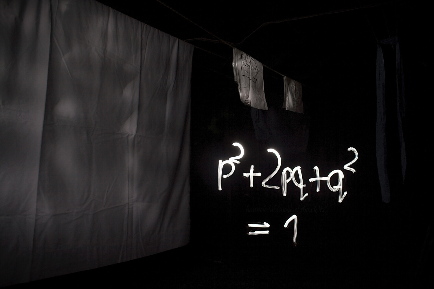
    I’m mainly illustrating this article with some light scribbled equations that I made some time ago. What was the point? Geeking out, finding something to do on a dark winter’s night, getting familiar with my new tripod, practicing manual exposure, and getting better at writing backward.

    I accomplished most of it.

    Einstein's famous equation made by light painting.

    Doing light painting is indeed a great way to learn about camera modes and settings you might not commonly use. For most kinds of light painting, you’ll need darkness, and darkness brings with it a whole new set of challenges.

    You’ll need to do quite long exposures and to find a way to illuminate the parts of the scene you want while avoiding capturing yourself in the picture. You’ll often also need to focus manually and figure out the best exposure for your photo, which can be quite different from that for most other scenes.

    A physiogram made with a head lamp. - How to do Light Painting and Illuminate Your Photography

    A physiogram is made by hanging a light source and photographing its movement.

    I’m mostly using light scribbled equations in this article, but the technique can also be used for creative birthday cards, unique wedding portraits, and a non-permanent kind of street art.

    Your imagination is the limit!

    How complicated is it?

    It’s surprisingly easy to get started with light painting or scribbling, and the basic tools are nothing fancy. At its most basic, you’ll need a camera, a tripod, and a mobile light source. That’s all.

    To get you started, I’ll be using my equations to explain the process and the tools. Use this as a starting point to extrapolate from and to experiment with to get what you want.

    Light painting an equation: the circumference of a circle

    Setup

    To get a photo like the one above, you’ll need your camera and a tripod (or a stable surface to keep your camera on), and a dark night. Since it takes a while to write, your shutter speed should be on Bulb, which means that the shutter stays open until you close it.

    Making many of these long exposure photos will use up your battery quite quickly, especially if it’s also a bit cold outside, so bring an extra battery or two. You need to change the drive mode to self-timer/remote, so you don’t shake the camera when it starts exposing and to help you with focusing.

    Often you don’t need to stress about standing ready to scribble, though. Uou can just walk into the frame after you start the exposure.

    Capturing fire with a long exposure. Light painting tips

    Focusing

    Focusing takes a bit of effort, but it’s nothing too tricky. The difficulty comes from the darkness of the scene, which means that the camera might have a hard time focusing automatically.

    You can focus manually, but what I usually do is let the camera focus automatically. I mark the spot where I’m going to stand to do the scribbling, go to that spot in front of the camera (or ask a helper to do it), turn on my light source and use the remote trigger to take a test shot.

    Then, before doing anything else, I turn the focus to manual so the camera doesn’t start focusing again when I want to take the real photo. This way the camera will stay focused on the spot you chose, as long as you don’t touch the lens.

    Light painting scribbling in the attic: the Hardy-Weinberg equation.

    After that, all that’s left to do is the scribbling!

    Make sure to wear something dark if you don’t want to be visible in your photo. For writing, you want a light source, such as a flashlight, that can be easily turned off and on. This way, you can make separate symbols without too much effort.

    Before you open the shutter and start taking the photo, think about what you’re doing. If you’re writing something, practice the motion you want to do in the air so you get a feel for it. Then start taking the photo, scribble, draw, paint or do whatever it is you want to with your light, and stop the exposure.

    It will probably take a few tries to get it right, so be patient and enjoy the process. You’ll definitely be creating something unique.

    NOTE: You don’t necessarily need to write backward. If there is nothing else in the scene with words you can simply flip the image later on the computer. 

    Light painting equations at night: the Lotka-Volterra equation.

    In this one, the boat worked as a canvas: instead of drawing in the air I could draw straight onto the boat.

    Conclusion

    Drawing or painting with light is a really fun and rewarding exercise that requires some patience, but not much else.

    I’d love to see your photos of light painting and scribbling and hear your thoughts in the comments below.

    The post How to do Light Painting and Illuminate Your Photography appeared first on Digital Photography School.


    Digital Photography School

  • Unlocking the Power of the Basic Panel in Lightroom

    Lightroom is anything but intuitive for new photographers. Its multitude of panels, sliders, menus, and buttons are enough to make your head spin. But fortunately, there’s hope for even the most beleaguered beginner.

    Amid all the options and icons is a single panel in the Develop module that can handle most of the basic editing tasks you are likely to need on any given image. Appropriately titled “Basic,” this one panel contains a plethora of sliders each with its own unique effect.

    Once you get the hang of these you’ll start to feel right at home with the way Lightroom works. The first step in becoming familiar with the Basic panel is understanding what each of the sliders does, so let’s examine each of them in detail.

    maternity photo - Unlocking the Power of the Basic Panel in Lightroom

    You and Lightroom: A match made in heaven

    The Lightroom Basic Panel

    The Basic panel is broken into three general areas; WB (or White Balance), Tone, and Presence.

    Each has a few sliders that control specific types of edits and it’s not uncommon for 95% of your editing to be done right within this one panel.

    Despite its meek-sounding name, the Basic panel is a powerful and highly effective tool that you can use to give your images the type of punch visual appeal you need.

    Unlocking the Power of the Basic Panel in Lightroom

    These sliders are in the Basic panel, but they can do quite a lot.

    The Temp Slider

    Lightroom’s nomenclature can seem somewhat daunting, especially if you don’t have a background in photography or image manipulation. Temp is the abbreviated form of Temperature, though a true beginner would be forgiven for thinking it simply meant Temporary (Lightroom is not good at helping people learn these sorts of things.)

    The temperature of an image, broadly speaking, is how warm or cool it appears. If you really want to dig deeper with White Balance this article is a good place to start.

    Move the slider to the left and it will give your image a blue tint, but move it to the right and it will appear to have a yellow cast. If you are editing a JPG image this slider will let you change the value to ± 100, whereas shooting in RAW lets you go from 2,000 to 50,000.

    The reason it’s called Temp is that you are adjusting the degrees Kelvin temperature of the white level of the photo. But you don’t need to know all the technical terminology to get good results. If a picture feels too cold or too warm, adjusting this one slider can go a long way towards fixing your photo.

    Unlocking the Power of the Basic Panel in Lightroom - white balance temp slider

    The Tint Slider

    This slider works in tandem with Temp to give your image just the right color cast. As you slide Temp back and forth, your White Balance will get closer to where you want it, but it might result in an image that looks somewhat green or red. You can then use the Tint slider to fix that, giving your image just the right look and feel.

    If you prefer Lightroom to do a bit of the heavy lifting for you, you can use the large eyedropper icon in the top-left corner of the Basic panel to get your image most of the way towards a proper White Balance and Tint.

    Click the eyedropper and then click on a light gray (not pure white) area of your image. Lightroom will adjust the Temp and Tint sliders to what it thinks are the best values for your image. It’s a good starting point and will often get you pretty close to the look you want.

    tint slider magenta to green - Unlocking the Power of the Basic Panel in Lightroom

    Exposure Slider

    Move this slider and you’ll quickly get an idea of what it does. It simply makes your picture brighter or darker. This is a global adjustment that affects all areas of the image including the light parts, mid-tones, and dark portions all get brighter or darker when you move the slider left or right. (Note: The Exposure slider mostly affects mid-tones although other tones are also affected.)

    You can see this reflected in the histogram above the Basic panel. Move the slider to the left or right and the entire graph moves to the left or right.

    Exposure is often used to compensate for when a picture doesn’t come out right from the camera. This usually happens if the camera wasn’t metering the scene properly or exposure compensation was enabled by mistake.

    Exposure is like a blunt instrument that goes a long way towards making dark images lighter or light images darker. Then you can use additional sliders in the Tone section to fine-tune your picture.

    exposure slider - Unlocking the Power of the Basic Panel in Lightroom

    Contrast Slider

    You might have seen a slider like this on your TV. If you have ever adjusted the values, you probably noticed that as contrast increases, the picture also gets more vivid and punchier. That’s because higher contrast results in a greater degree of variance between light and dark areas.

    The same holds true for the Contrast slider in the Lightroom Basic panel. Move the Contrast slider to the right and the bright areas will get brighter while simultaneously making the dark areas darker.

    Contrast can also have a negative value which makes your image seem almost hazy since the farther you move the slider to the left the less difference there is between light and dark areas.

    Most photographers don’t find negative contrast values particularly useful. But it can come in handy depending on the type of style you are going for in your image editing.

    contrast slider - Unlocking the Power of the Basic Panel in Lightroom

    Highlights Slider

    This slider, in conjunction with Shadows, works especially well if you shoot in RAW format. That is because much of your image data that might be discarded in a JPG file is still available to you when editing RAW files.

    When you move the Highlights slider to the left it makes only the bright parts of your image darker. Conversely, when you move it to the right the bright parts get even brighter.

    This works wonders on images where some parts are properly exposed but other parts are blown out and you want to decrease the exposure of just the bright parts.

    Highlights slider - Unlocking the Power of the Basic Panel in Lightroom

    Shadows Slider

    Whereas the Highlights slider only affects the bright portions of an image, the Shadows slider lets you adjust the degree to which the dark areas get lightened.

    Many photographers begin their editing by moving the Highlights and Shadows sliders, often by moving Highlights to the left just a bit and Shadows to the right. This will make dark portions of the image brighter while simultaneously making bright portions darker.

    Some image editing programs only allow you to bring the highlights down and shadows up, but Lightroom takes a slightly different approach. You can, if you so choose, make the bright areas even brighter and the dark areas even darker by moving the sliders to the right and left, respectively.

    Most photographers don’t take this approach but it’s nice to know you have it available if you want to use it.

    Shadows slider - Unlocking the Power of the Basic Panel in Lightroom

    Whites Slider

    While the Whites slider might seem somewhat similar to Highlights, it doesn’t actually adjust the brightness of lighter portions of an image. Rather, it makes the whiter areas more white. The effect might seem subtle, but careful adjustment of the Whites and Blacks sliders can have a similar effect to the Contrast slider but it offers you more fine-grain control over the outcome.

    I often begin with a +25 adjustment on the Whites slider just to give my images a bit more punch and brightness and then adjust it as needed.

    It’s easy to overdo it when adjusting the Whites slider. You might find that going much past 50 will give your images a strange and unnatural look so take care when editing that you don’t overdo it.

    You can also get good results by moving the Whites slider to the right while also moving the Highlights to the left. This tends to result in a bit more even-handed editing while giving your images the added spark you might be looking for.

    whites slider - Unlocking the Power of the Basic Panel in Lightroom

    Blacks Slider

    The Blacks slider works just like the Whites slider but in reverse. It makes the dark portions of an image more pure black which can give a nice sense of contrast and tone to a photo.

    When you first adjust this slider it might seem like it has the same effect as the Shadows slider, but careful examination reveals a subtle difference in that it is not actually making the dark portions brighter or darker, but adjusting the intensity how black the darkest portions are.

    Similar to the Whites slider you might get good results by lowering the black levels and then increasing shadow detail just a bit.

    blacks slider - Unlocking the Power of the Basic Panel in Lightroom

    Clarity Slider

    Of all the sliders in the Basic panel, Clarity is probably the one that is the least understood and depending on who you talk to, the most abused. Clarity does not adjust the overall contrast of an image but instead, it adjusts what’s known as edge contrast.

    Whenever there are harsh lines or edges, adjusting the clarity slider to the right will make them stand out and have a little more pop or visual punch than they otherwise might. Moving it too far to the right will result in images that look artificial and unnatural, but it can be useful to use high values if they get you the result you want.

    Conversely, you can move Clarity to the left to make your images appear softer and almost a bit ethereal.

    Keen image editors will note that the Adjustment Brush tool contains an option called Skin Smoothing which is merely a -40 Clarity adjustment that you can paint in wherever you want. Using this on a person’s face has the effect of removing the appearance of pores and even small hairs that can, if overused, lend an unnaturally smooth look that you might see in magazines or other media.

    Clarity slider - Unlocking the Power of the Basic Panel in Lightroom

    Dehaze Slider

    Arriving a few years ago for Lightroom Creative Cloud users, the Dehaze slider does pretty much what its name suggests, although the results are not always as good as what users might want.

    The idea of the Dehaze slider is that by moving it to the right on images with a bit of a foggy or hazy appearance, you can mitigate some of the issues causes lens imperfections or atmospheric intrusions.

    It’s not a perfect solution, but if used in the right conditions it can go a long way towards fixing an image that might have otherwise ended up in the rejected pile.

    dehaze slider - Unlocking the Power of the Basic Panel in Lightroom

    Vibrance Slider

    Have you ever taken a picture that you thought would look awesome, but after importing it into Lightroom, just seemed kind of dull and boring? As if the lifeblood had somehow been sucked out of its colors? Vibrance aims to fix that and it works especially well on images of nature and landscapes.

    Whereas saturation adjusts the overall color intensity of an entire image, Vibrance works by making duller colors more vivid. It’s also smart enough to leave skin tones alone which means you can make a scene look a little more interesting and colorful without resulting in portraits that are unnatural or oversaturated.

    Vibrance slider - Unlocking the Power of the Basic Panel in Lightroom

    Saturation Slider

    This option can take even the dullest and most boring image and add a massive punch of color. Or it can be used to turn vibrant pictures into faded black-and-white versions.

    When you slide the Saturation slider to the right it increases the value of all the colors in an image, whereas moving it to the left has the opposite effect and can eliminate all color entirely.

    Similar to the clarity slider, saturation is powerful but easy to overuse and I find that it’s best when adjusted in relatively small amounts.

    saturation on a portrait - Unlocking the Power of the Basic Panel in Lightroom

    Conclusion

    If you are new to Lightroom and unsure of where to even begin, the Basic panel is a great way to get you where you might be trying to go.

    Even though the goal of this guide was to give you a good understanding of the sliders in this panel the best way to learn is to try it out for yourself. Open up some images and start using the sliders and see what you can do with them. You might be surprised at your results!

    Remember that Lightroom is non-destructive so you can always undo your changes which makes it even easier to edit or just experiment for fun.

    The post Unlocking the Power of the Basic Panel in Lightroom appeared first on Digital Photography School.


    Digital Photography School

  • 11 Ideas for More Unique Concert Photos

    Musicians, magazines, fans, and record labels alike turn to skilled photographers to tell a story of a momentous performance and return unique concert photos.

    Concert photographers are often on assignment for a publication that has sent them out to capture meaningful pictures that could very well go down in music history. Otherwise, music photographers are individually hired by the performing artists. Whatever brings you to the photo pit, your goal is to capture something wonderful.

    That being said, the music photography industry has become surprisingly saturated in recent years. In order to stand out amongst the crowd, you have to take live music photographs that differ from others in your photo pit. Here are 11 tips on how to take more unique concert photographs.

    #1 – Don’t Forget About the Detail Shots

    still life concert image - 11 Ideas for More Unique Concert Photos

    Band: Behemoth

    Although you want to focus heavily on the musicians performing on the stage, the detail shots are just as important.

    Many bands put in a significant amount of effort into their live show productions, from stage props to lighting schemes. A unique and effective statement to your live concert gallery are some close-ups of the epic stage props that the band uses.

    At the very least, the artist who created the props or the instrument company will thank you!

    #2 – Play with Art and Distortion Lenses

    blue and pink concert lighting - 11 Ideas for More Unique Concert Photos

    Band: MGT. Shot with the Lensbaby Burnside 35.

    Though concert photography is often an assignment from a journalistic outlet, that doesn’t mean that you can’t have a couple of minutes to yourself to do something vastly different. You do not have to be afraid of using artistic or distortion lenses at a live show. If anything, they make the frame exceptionally cool!

    The fish-eye lens became very famous by well-known concert photographers by being used at live shows. I, myself, love using the Lensbaby lenses at live concerts. The manual focus can oftentimes be much more effective than relying on autofocus.

    Try using a copper tube to create very cool swirls around your subject.

    art lenses - 11 Ideas for More Unique Concert Photos

    Band: A Mirror Hollow. Shot with the Canon 16-35mm f/2.8 L IS USM lens.

    You can submit the standard shots to the outlet, and the unique ones to the band. I am telling you, the musicians will love a new take on their live performances.

    #3 – Tons of Flying Hair is Great

    hair whipping - 11 Ideas for More Unique Concert Photos

    Band: Cradle of Filth

    Naturally, try to capture the facial expressions of the performers. However, you are dealing with rockstars here, and part of the cool factor of these rock gods is their wild style.

    Take advantage of the flying hair and fun headbanging, they can sometimes make cooler shots than your standard singing portraits.

    #4 – Perspective is Everything

    band between legs - 11 Ideas for More Unique Concert Photos

    Band: HIM

    Although concert photography can be very limited, between shooting time restrictions and limitations on your shooting location, you can still play with perspective.

    The key to being different is viewing life through a lens that is more diverse than those around you, no pun intended. Get low, low, low to the ground and shoot up or move yourself to the very far side of the photo pit and shoot from there! Photograph in between the heads of fans or get up on the balcony.

    Whatever you do, find new angles, views, and compositions to take advantage of to create more unique concert photos.

    #5 – The Musician Doesn’t  Always Have to Look at You

    musician on stage - 11 Ideas for More Unique Concert Photos

    Band: Nightwish

    It is true that the viewer connects best when the subject is looking at or engaging with the camera.

    However, you don’t always have to fight for that type of shot during a live concert setting. It’s okay for the musicians not to interact with you as a photographer. Shots of them looking away or down can be just as eye-catching.

    #6 – Embrace the Light, Don’t Avoid it

    stage lighting - 11 Ideas for More Unique Concert Photos

    Band: IAMX

    Having a good grip on lighting will aid you in your concert photography journey. Stage lighting can differ tremendously between shows, venues, and even what lighting is available for that evening. The lighting can range from bright white strobes to deep reds.

    Understanding how lighting is photographed by your camera, how it reflects on the instruments and equipment, and how the bulbs affect the performer’s skin tones will change how you take the photograph.

    Most incredibly safe and tame images come from the photographer being wary of taking advantage of the lighting situation at concerts. Don’t be afraid to jump right in there and take advantage of whatever bizarre lighting scheme the performers have cooked up for you.

    At the end of the day, the lighting is a part of the concert experience, and your job is to capture that.

    #7 – Lens Flares are Rad

    lens flare musician performing - 11 Ideas for More Unique Concert Photos

    Band: Epica

    On the topic of lighting, lens flares can be very cool!

    This is, of course, an aesthetic choice, but I personally find them to be quite fun. You can cause a flare in a similar fashion to photographing during sunset or golden hour. When the light hits the front glass element of your lens at a specific angle, a flare will appear.

    #8 – Overexposing and Underexposing Can Work

    moody concert lighting - 11 Ideas for More Unique Concert Photos

    Band: The Misfits

    To help accurately capture the emotion and feel of the show, it is alright to overexpose or underexpose your frame. This can also create a rather unique and uncommon type of photograph.

    Use your best judgment and common sense here to determine when such exposures are appropriate.

    #9 – Don’t Be Afraid to Get Close

    close up of a band member on stage - 11 Ideas for More Unique Concert Photos

    Band: Jyrki69

    Guitarists don’t bite (not hard anyway)! Don’t be afraid to get close to the performers on the stage. Take a wide-angle lens, such as a 16-35mm lens, and get right up in there. The perspective distortion can make for a very cool shot.

    However, that being said, be aware of your surroundings. I cannot reiterate this point enough. Absolutely be aware of your surroundings!

    It is easy to get lost in the moment and fall into a creative bliss when shooting, but a live music event is not the place to lose yourself.

    If you’re not growing eyes in the back of your head, you’ll most likely get clonked right in the temple by a crowd surfer, tangled in a microphone cord, or smacked by a flying guitar. This will help you avoid injury to yourself and others.

    #10 – In-Between Moments Tell a Story

    singer between songs - 11 Ideas for More Unique Concert Photos

    Band: HIM

    The band may have put their instruments down for a moment, but that doesn’t mean that the job of the photographer ends there.

    Some in-between moments can become incredible iconic images through their powerful storytelling ability.

    #11 – The Moment is More Important than Technical Accuracy

    red concert lighting - 11 Ideas for More Unique Concert Photos

    Band: IAMX

    Let’s face the facts, we all pixel peep. I believe that over time, passionate photographers get a bit anxious about technical perfection in their images (I know I sure do sometimes). However, some niches such as event photography are not as fussed over technical mistakes as long as the moment captured is important.

    There is be a fine balance between taking a good photograph by technique and taking a good photograph by design (aka a great and powerful moment). However, if you have to choose between capturing a fantastic story and ensuring equipment perfection, pick the story.

    Many wonderful images are overlooked because the focus is too set on ensuring that an image is tack sharp rather than what the subject portrays.

    Of course, this isn’t meant to be interpreted as disregarding technical proficiency. You should aim to take exceptional photographs, but don’t get lost in your pursuit and forget your purpose for photographing the event.

    Your turn

    Now that you have these tips in your photography toolbelt, go out there and take some wicked shots!

    Band: Epica

    The post 11 Ideas for More Unique Concert Photos appeared first on Digital Photography School.


    Digital Photography School

  • 5 Photography Mistakes You Need to Avoid When Shooting Seascapes

    Here are some practical steps to take and 5 photography mistakes you want to avoid in order to help you capture better seascape images.

    Capturing seascapes is a very popular past-time and one of the most enjoyable and fascinating types of landscape photography. People love to capture the ocean and for good reason.

    Seas around the world are more accessible than ever to the majority of us. People take regular holidays to visit the abundance of natural beaches and the ocean provides a fantastic place of escape and freedom from bustling towns and cities.

    beach and palm tree - 5 Photography Mistakes You Need to Avoid When Shooting Seascapes

    The ocean is a breathtakingly beautiful place and offers peace, tranquility, and an ideal opportunity to capture some memorable images. While the coastline offers photographers spectacular seas and atmospheric skies, recording these scenes can be challenging.

    Mistake #1 – Cloudless skies

    A common mistake that is often presented in seascape imagery is a vast expanse of empty sky without any texture or formation from clouds to lift the image.

    Seascape rocky shore sunset - Here are some practical steps to take and mistakes you want to avoid to help you capture better seascape images.

    To avoid this pitfall, head to the coast on partially cloudy days. Photographing ocean vistas to include the different patterns and shapes of clouds above the sea will help your images to become more inspiring.

    If you find yourself taking pictures by the sea during first and last light, you will discover the colors in the sky can look even more dramatic than at other times of the day. This can beautify your image with vibrant sunset skies igniting the sky.

    Alternatively, capturing big white clouds to complement a blue sky or dark, moody and overcast skies can add drama and emotion to your images.

    Seascape with clouds - 5 Photography Mistakes You Need to Avoid When Shooting Seascapes

    Mistake #2 – Not checking the tide schedule

    If you are unprepared during a visit to photograph the ocean by not checking the tide schedule, you may get caught out by incoming tides and even freak waves during adverse weather.

    The sea and waves can be unpredictable and powerful. I have ended up with wet shoes countless times while trying to capture the moving waves. Be mindful of the risks the ocean presents to you and the harmful impact the saltwater can have on your camera and equipment.

    Always protect your camera (a plastic bag can keep it safe from the salty sea air) and be sure to clean your camera when you return home.

    Seascape long exposure - 5 Photography Mistakes You Need to Avoid When Shooting Seascapes

    If you would like to capture the swell of the ocean at high tide or an exposed bay of rocks during low tide, be sure to check the tide times and visit at the right hour.

    You will find that planning to be at the coast when the tide is at a certain point will help you shoot better compositions and seascape photos.

    Mistake #3 – Not considering your composition

    Capturing beautiful images of the coast is not as straightforward as you might think, especially if you don’t think about your composition carefully. A few things worth considering are leading lines and the rule of thirds.

    Seascape blue sunset - 5 Photography Mistakes You Need to Avoid When Shooting Seascapes

    Leading lines are a great way to lead the viewer’s eye into the frame toward the main focal point in the photo. They can help to create depth in an image and provide more purpose.

    When photographing the sea, you will find that placing the horizon in the middle of the image will generally be less effective than positioning the water level above or below the center of the frame.

    Seascape simplified - 5 Photography Mistakes You Need to Avoid When Shooting Seascapes

    You may be asking if should you include more sea or more sky in your composition? Well, that depends on the nature of the scene in front of you and what is the most interesting and important aspect of the story.

    If the sky is compelling and vibrant, your image will be stronger by including more sky. But if the sky is uninviting and lacks drama while the ocean is swirling beautifully, compose the image to include more of the sea.

    Whatever you decide to shoot, be imaginative and creative with your composition and capture some great images.

    Mistake #4 – No focal point

    Seascape blue water and a fish - 5 Photography Mistakes You Need to Avoid When Shooting Seascapes

    One of the great benefits of being by the coast is the variety of subjects to shoot. However, it is surprising to see the number of times beginner photographers take images of the sea without including a strong focal point in their images.

    You could focus your camera on any number of interesting material at the sea such as piers, fishing boats, lighthouses, cliffs, rocks or fish.

    Mistake #5 – Not including any foreground interest in the shot

    While the sea can make an exciting subject, a mistake newbie photographers tend to make when capturing the ocean is to photograph the sea and sky with nothing in the foreground.

    This can occasionally work well in the right light and setting.

    Seascape foreground rocks - 5 Photography Mistakes You Need to Avoid When Shooting Seascapes

    But capturing an extra element such as cliff ledges, flowers, shells, or footprints in the sand will add context and another dimension to your image to help it stand out.

    Conclusion

    The best seascape images rarely happen by chance. Instead, they are the result of careful planning, diligence, and practice. Keep exposing, avoid these photography mistakes and use the tips and with plenty of practice, you will soon be capturing breathtakingly beautiful images!

    How about you, what do you enjoy about seascape photography? Please share your tips and images below, as well as any questions you might have.

    The post 5 Photography Mistakes You Need to Avoid When Shooting Seascapes appeared first on Digital Photography School.


    Digital Photography School

  • 10 Dos and Don’ts for Mastering Your Tripod

    Love ’em or hate ’em, tripods are an essential piece of gear for all photographers. It will keep your camera steady during long exposures, support the weight of those big lenses you need for wildlife photography, and hold your camera in what could otherwise be an awkward position for macro photography.

    But just like any other tool, a tripod can be used the right way, and the wrong way.

    10 Dos and Don'ts for Mastering Your Tripod - photographer under a rock arch

    DO – Get a good tripod that fits your gear

    First of all, make sure your tripod is sturdy and solid. There are a wide variety of models available that range anywhere from $ 20 on into the thousands, and there is a reason for that. A bargain tripod will hold a small point-and-shoot camera steady but is not strong enough to keep your heavy DSLR steady during a long exposure.

    Even if you have a high-quality tripod, there are still some things to consider such as its weight limit and maximum height. Make sure your tripod is built to hold the weight of your camera, biggest lens, flash, and any other accessories you might put on it.

    You might also want to consider if your tripod should be as tall as you are. If you need to look through your viewfinder, having a tall tripod will mean you can use it more comfortably without bending down. On the other hand, if you have an LCD screen that flips up, a tall tripod is less important.

    A good tripod should last decades with proper storage and care, so it’s worth the investment.

    photographer on sand dunes - 10 Dos and Don'ts for Mastering Your Tripod

    DO –  Make sure your tripod is sufficiently weighted

    The weight of the tripod itself is also something to think about. Typically they are made from aluminum which is relatively inexpensive but heavy. For a higher price, you can get one made of carbon fiber, which is strong and lightweight but more expensive.

    A carbon fiber tripod is an excellent choice for nature and wildlife photographers who have to walk or hike long distances while carrying their gear. However, they are so light that a stiff breeze could potentially knock the tripod over, taking your camera with it. If you are using a lighter tripod and there is a lot of wind, anchor the legs of the tripod or hang a rock, sandbag, or your camera bag from the center to weigh it down.

    I recommend going for a light tripod otherwise it will tend to get left at home. A light tripod is easy to carry and you can always weigh it down on a windy day.

    sunset over Canyon de Chelly, Arizona - 10 Dos and Don'ts for Mastering Your Tripod

    DO – Extend the thickest sections of the legs first

    When a tripod folds up, its legs unlock and collapse into sections (usually three or four). The thickest sections of the leg are the most stable. So if you’re not raising your tripod to full height, extend the thicker upper sections before you bring the thinner lower parts into play.

    DON’T – Raise the center column until the legs are fully extended

    Raising the tripod using the legs offers much more stability than using the center column, which can sway slightly during long exposures. For maximum sharpness, the center column should be used to gain extra height only after the legs are fully extended.

    DO – Remove the center column altogether

    Consider whether you are more likely to require additional height, or if you would rather be able to get lower to the ground. Some tripods allow you to remove the center column, which means you can set up your tripod lower to the ground for super low-angle shots.

    Gatklettur, or Arch Rock, in Arnarstapi, Iceland - 10 Dos and Don'ts for Mastering Your Tripod

    DON’T – Touch the tripod or camera during the exposure

    If you’re doing a long exposure, even a slight nudge on the tripod can cause blur. Make sure that nothing touches the camera or tripod while the shutter is open. A camera strap blowing in the wind comes to mind.

    Ideally, you should use a remote shutter release or 2-second self-timer to prevent movement when you press the shutter button.

    DON’T – Carry your camera mounted on the tripod

    Okay, I have to admit I’m guilty of this one! It can be tempting to leave your camera attached to the tripod as you walk from location to location – it makes set-up and take-down so much faster when you need to get the shot.

    But the release plates and screws that hold the camera to the tripod assume that gravity will be working with them. They aren’t built to hold the camera at an angle, especially with the bustling and bumping that can happen while walking around outside. By doing this, you risk your precious camera coming loose and taking a bad spill.

    DO – Protect your tripod from water, sand and other debris

    A good tripod should be fairly rugged, but tiny particles can get inside the tripod and erode the screws that make it move smoothly and fasten securely. Avoid submerging the joints and locks in sand or silty water, and if your tripod does get dirty, make sure it is clean and dry before folding it back up.

    I often use my tripod on the beach and sometimes submerge it in salt water. A solution to the problem of getting sand and salt in the tripod is to not collapse it again. I just leave all the legs extended until I get home (or to home base if traveling) and can rinse it off.

    Hraunfosser Waterfall, Iceland - 10 Dos and Don'ts for Mastering Your Tripod

    DON’T – Over-tighten the screws

    Some tripods have spinning screw locks that tighten the legs, and some fasten with clips that are held on with bolts that may need to be adjusted from time to time.

    Either way, you want these screws to be secure enough, but you don’t want to muscle them so tight that they can’t be unlocked. Worse, you could strip and damage the threads. Most screws on a tripod should be firmly finger-tight, and no more.

    DO – Turn off image stabilization

    The image stabilization technology inside cameras and lenses is fantastic when hand-holding the camera, but can actually backfire when used on a tripod.

    This is because the stabilization system itself causes vibrations, and when it’s mounted on a stable base such as a tripod, it actually detects its own vibration. It works harder to stabilize this, which causes it to vibrate, even more, compounding the problem.

    Therefore, this setting should be turned off when your camera is mounted on a tripod.

    10 Dos and Don'ts for Mastering Your Tripod - photographer in a desert valley

    Over to you

    There’s nothing worse than making a big investment in your photography only to find it isn’t helping very much. So make sure you are using your tripod properly to get those sharp images you are after.

    The post 10 Dos and Don’ts for Mastering Your Tripod appeared first on Digital Photography School.


    Digital Photography School

  • How to Edit Old Images with Your New Skill Set

    This article is going to be a little different from some of the others I’ve written. It’s going to be more like a journal entry or a reflection. It’s very personal in some ways but the ideas within will have universal value for everyone.

    The idea is to show a personal exploration of my editing skills, which will hopefully inspire you to explore your skills and progression as a photographer as well.

    How much can experience change your editing workflow?

    I was recently cleaning up my catalogues and image storage when I ran across a bunch of my older work. I looked at the images and how I had processed each pic. Looking back, I can see how my tastes and skills have evolved.

    Over time we become better photographers, but we also become more adept at using Lightroom, Photoshop, Luminar or any other editing programs we might love to use. So as our skills evolve so does the way in which we process each image.

    It was at this moment that I decided to go back and edit some of my old images. The goal was to compare the ways my skills have changed as well as my personal aesthetic. You can do the same thing. The results may be surprising.

    You might also learn something about the way in which your work has evolved over time. Perhaps you were totally into creating monochromatic images way back when. This might contrast with your recent images in which you’re into creating brilliant warms tones in your work. You may also have become more skilled at cloning, utilizing layers, or using plugins. It all depends on what you have learned over time.

    So without any further rambling, let’s take a look at an older image of mine.

    How to Edit Old Images with Your New Skill Set - photo of a path and steps in a forest

    Here’s the initial image with my original edits. This was framed and sold a number of times during my earlier years.

    This shot was one of the first I processed and created for sale in a gallery. It sold quite well. I was very proud of the work but what if I went back now and edited the RAW file again. How would my more refined skills change the look and feel of the photograph?

    This image was edited fairly simply. I used Lightroom, and at the time I didn’t have anything else in my arsenal to utilize. I’m pretty sure I adjusted the blacks and whites in this image and added a little bit more saturation to the greens.

    At that time, however, I didn’t have much of skill set, and edits were pretty basic. This doesn’t mean that what I did was bad. It was just simple and created a pretty clean and attractive image.

    So now it’s time to see the difference and how my workflow has changed.  Here are the steps I took to re-edit this image some six years after it was first shot.

    Searching for ideas and inspiration

    One of the first things that changed about my workflow is how I begin to create my final image. These days I tend to surf through a large amount of presets searching for some ideas.

    Part of this is experience, and part of it is time-saving. Over the years I’ve collected a large amount of presets, some of which I’ve created others I’ve purchased. I’ve also acquired a few plugins and I also use the presets available in these as inspiration.

    Most of the time, however, I have a pretty good idea of the type of image I want to create already stored in my brain. As time has gone by, there’s far less trial and error associated with my work. Instead, my work is now far more purposeful with specific goals.

    How to Edit Old Images with Your New Skill Set - inside NIK Analog Efex

    I took the image into Nik Analog Efex just to see what kind of looks I could create. I didn’t use anything from the plugin but I did get the idea to use a radial filter to focus attention on the path.

    In the case of this old image, I studied the previous look and decided I wanted to change it. I feel the first edit was flat and a little too dark with not enough warmth or contrast. I also searched through some presets and decided I wanted more emphasis on the pathway leading to the stairs.

    The following edits were made to create the look and feel I wanted specifically.

    The Workflow

    Step #1 – Sharpening

    I ran the image through a RAW sharpening plugin. I wanted to have nice sharp details on the pathway. The image was also shot long ago with a very basic kit lens which I felt was softer than my newer 50mm lens.

    Step #2 – Histogram

    The histogram was adjusted so that the image touched both ends of the spectrum for black and white tones.

    Step #3 – Local Adjustments

    Next, I applied the adjustment brush to several different parts of the image. I wanted the pathway to have a brighter light that leads the viewer’s eye back through the image. More clarity and sharpness were also added to certain parts of the image.

    How to Edit Old Images with Your New Skill Set

    I used the adjustment brush to add more highlights to the pathway.

    Step #4 – Presets

    I used a preset to quickly deepen shadows and also to warm the tones within the image.

    Inspired by a film preset I added a small bokeh to the image by using a radial filter and pulling the clarity and sharpness down. The filter was inverted and applied to the outer edges of the image.

    How to Edit Old Images with Your New Skill Set

    Here’s a quick screenshot after I used a preset to deepen shadows in the image.

    Step #5 – Vignette

    Finally, to create a little bit of depth, I added a small vignette to the image.

    How to Edit Old Images with Your New Skill Set

    Here’s a side by side comparison of the initial jpeg image and my updated edit.

    The editing of the image didn’t take an overly long time. These are all fairly simple steps to take, but they have changed to look and feel of the piece. I didn’t use Photoshop with this image, and as per usual it was edited solely in Lightroom.

    When I first edited this image Lightroom was the only program I used, so it seemed appropriate to keep all edits within the same program for a fair comparison.

    The look and feel of the new version are certainly bolder and brighter. It’s a subtle change from the first edit. There’s nothing hugely drastic but I think what it shows is how our skills evolve and we become more polished in our editing work.

    When I first created this image all those years ago, I loved the look. Now I find it a little flat so the edits that were applied this time adjusted what I now find to be a fault in the work.

    How to Edit Old Images with Your New Skill Set

    Here’s the final image. This was edited fully in Lightroom with the exception of the RAW sharpening, for which I used a plugin.

    It’s always good to reflect on things

    Sometimes it’s interesting to dig through the past and see what you can find. It’s worth it to experiment and explore how your work has changed. Don’t be afraid to go back and rework some of your old photographs, who knows what you’ll discover.

    If you’ve done some experimenting, then please share it with us. We want to see how your skills have evolved or maybe the ideas you’ve come up with as time has passed. I’m sure there’s someone out there with a really dramatic edit.

    Let’s see what you can cook up to inspire the rest of us.

    The post How to Edit Old Images with Your New Skill Set appeared first on Digital Photography School.


    Digital Photography School

  • Color Management Can Be Easy

    Color Management is the starchy, techie term assigned to a complex set of issues facing photographers every day. How to accurately capture the colors in a scene, display those same colors on a computer monitor and then print those colors successfully on paper.

    While this is a very complicated challenge (on the level of herding cats), the answer is a lot easier than you might think.

    The Problem in a Nutshell

    Color photography is a visual communications system that attempts to equalize the differences between three utterly different technologies.

    Red Green Blue - Color Management

    Imagine three people trying to discuss a difficult topic while speaking different languages. Words and phrases in one tongue have no equivalence in the others. Cultures and behaviors clash as convictions and meanings get misinterpreted. The result is frustration. This scenario pretty well describes the complications of color reproduction.

    Chromacity Luminosity - Color Management

    Cameras record light in one color language, monitors interpret that same light in a different language, and printers try to explain the monitor’s interpretation in yet another language. All three are doing their level best, but collectively they aren’t communicating.

    Is it any wonder why accurate color reproduction sounds more like an oxymoron than a truthful description?

    Further, cameras are influenced by the color of the light in a scene, monitor colors appear different based on technologies and brands, and printing inks and papers alter how colors are reproduced. Cameras record light frequencies, monitors transpose those frequencies into numbers and printers translate the numbers into colored dots and spots. There is unity but not harmony.

    Learn more with the Datacolor complimentary Color Management eBook.

    Vive la Différence

    camera monitor printer - Color Management

    Just as foreign languages and international currencies require accurate translation and timely exchange rates, cameras, monitors, and printers interpret colors uniquely. Like both spoken languages and currencies, color reproduction requires an accurate translation of values.

    It would be wonderful if all the systems spoke the same visual language, but they simply don’t.


    World history notes that in 1878 an attempt was made to unify all national languages and adopt a new common language called “Esperanto.” This proposal was initiated by an ophthalmologist named L. L. Zamenhof in an effort to reduce the “time and labor we spend in learning foreign tongues” and to foster harmony between people from different countries.

    While the concept is quite noble and though the movement still exists, the monumental undertaking to reduce all spoken languages into a single world language has proven impractical.

    Color Management - Color Management

    Accurately translating the varied languages of color is a challenge, but one that can be easily handled by adopting a straightforward process. That process is called color management.

    The Gray Standard

    Every conflict can be resolved when all differences are accurately acknowledged and clearly defined. In the case of color, defined standards have now been established that align the capture, display, and printing processes so that they individually recognize and pledge allegiance to a single corporate “Gray Standard.”

    When each stage in the process has been internally aligned to this universal standard and all three processes are linked, then true color consistency is achieved. It really is that simple.

    All color issues for all three individual contributions to color reproduction revolve around this single color of neutral gray. The utter simplicity of the concept of color balance is focused on the unbiased and “uncolored” tint of gray. The science of color is based on the fact that all photographic images are recorded as three channels of colored light; red, green, and blue.

    Color Wheel Neutral Gray - Color Management

    When these three colors are produced (captured, displayed, and published) in equal values, the result is the combined color of neutral (no color cast) gray. Gray is the Holy Grail standard of all color. In the middle of the color wheel, between all the primary (RGB) and secondary (CMY) colors is the color neutral gray.

    When this balance is maintained in a color photograph, all colors remain “balanced,” the ultimate goal of color management. While the complexity of the process is immense, the control involves only a three-stage process, and the system itself is quite elegant and simple.

    Once your camera recognizes neutral gray, all the other colors in the visible spectrum will be recorded accurately. When your computer monitor is taught how to display this same neutral gray (as well as an extended range of primary and secondary colors), it will display the full range of spectral colors.

    While the myriad of print technologies, inks, and papers available today is staggering, all printing devices can be taught to produce quite consistent and pleasing results – all focused on printing a patch of color inks that appear colorless.

    Here’s how it all works.

    Camera Capture

    The first commandment of color photography:

    Thou shalt faithfully capture balanced lighting.

    Balanced light is all about neutrality; respecting non-color. When the camera recognizes gray, it automatically orients all the other colors in the scene. Color always obeys gray. Items like automobile tires and shadows cast on white buildings are examples of reliably neutral color.

    All digital cameras are predisposed to see colors accurately during daylight conditions, generally between 9 am and 4 pm. Under this lighting, any neutral-colored objects are recorded faithfully.

    CheckrCapturePro High - Color Management

    The light that illuminates each scene influences the colors captured by the camera. But light is always changing. Even natural sunlight changes (color) temperature constantly.

    Each time clouds pass overhead the daylight color of 5500°K – 6500°K changes slightly. When alternative light sources are used (incandescent, fluorescent, halogen, etc.), the colors can change drastically, ranging from 2500°K to 6500°K. These measurements are recorded as degrees of Kelvin (K), with the higher numbers recording whiter light.

    SCK100 Product SpyderCheckr dooropened highres - Color Management

    There are several ways to ensure that colors are captured accurately in the camera. You can utilize the camera presets (daylight, overcast, cloudy, incandescent, flash, fluorescent, etc.), include a reference “gray card” in a target shot for establishing color balance in post-processing, or establishing a custom color balance (also using a gray reference card).

    Monitor Profiling

    Computer monitors, like TVs, have a mind of their own. There are a variety of video technologies that use ultra-mini RGB pixels in LCD (liquid crystal display), Plasma, LED (light emitting diode) and OLED (organic light emitting diode) flatscreen displays. Each technology delivers light and color uniquely and has their own spectral qualities.

    In addition to the delivery systems, individual monitors of the same technology can display colors slightly differently. There is simply no guarantee that your computer monitor will automatically deliver accurate color straight out of the box, and even less so after it ages a bit.

    monitor and device - Color Management

    But there is a surefire way to tune-up each of these displays so that they will produce accurate color. The tune-up involves a monitor colorimeter device; a mouse-size instrument that analyzes the color of light as it gives the monitor a visual exam.

    spyder5 - Color Management

    This colorimeter dangles in front of the monitor while special software makes the monitor flash dozens of variations of RGB light on the screen. The device reads the color temperature and intensity of each of these flashes as it records the three-minute light show.

    After the show, the software automatically compares the results of the monitor’s performance to a reference table of ideal readouts. This comparison reveals the difference between what the monitor should deliver and what is actually delivered. The two lists are juxtaposed and a visual color personality or “profile” of the monitor is generated.

    This profile contains precision adjustments to the normal monitor output and adjusts the monitor’s display signals to compensate for any abnormalities. The monitor’s color “guns” are monitored and adjusted on the fly to deliver color-accurate signals to the display. What once just looked pretty now looks pretty accurate. It’s pretty nifty!

    Printer Profiles

    Printers face a multitude of variables based on three factors: printing technologies, ink brands, and paper surfaces. Each of these factors has a significant effect on the way colors print.

    There are currently three distinct kinds of color printers that can deliver photographic quality results; inkjets, laser printers, and dye-sublimation. Each of these technologies deals with very unique “ink.” I use the word ink loosely because only one of these actually uses ink, as we know it.

    Herb Laser vs Inkjet - Color Management

    Laser printing toner-based geometric dots (left) versus inkjet stochastic-style liquid ink pattern (right).

    Laser printers deal with toner, which is a colored powder that gets fused into the paper. Dye-sublimation overlays dry sheets of variable-density colored dye which get baked on top of each other. Inkjets are the only printers that actually spray microscopic particles of multi-colored liquid ink onto the paper.

    The colorants (inks) used by each of these printing devices can be purchased from multiple suppliers and thus the consistency of color from one batch to another is a concern. Paper shades and surfaces also affect the appearance of colors printed on them. Ink tends to sit on top of coated papers but absorbs into the fibers of uncoated papers, which changes the way light reflects from the surface and changes the color saturation values.

    Light Refracting - Color Management

    For this reason, printer manufacturers usually provide “printer profiles” embedded into the printer drivers (the software that controls the printer when files are sent from the computer).

    Ink Surfaces - Color Management

    Side view of paper surfaces. The two top dots illustrated here, demonstrate how differently inkjet inks behave when printed on uncoated (top) and coated (middle) papers. The bottom dot shows that laser toner particles are “baked” onto every paper surface.

    Printer profiles are color correction “prescriptions” for specific paper and ink combinations. Because printer profiling is a very specialized process requiring specialized equipment, manufacturers usually provide individual profiles for their own brand of papers and inks.

    Printer Dialog - Color Management

    They test each of their papers and inks for reproduction accuracy and then supply you with the “prescription” color correction files for those papers. When you select the correctly profiled paper from the print driver, the printer generally delivers accurate color.

    Here’s how the profiling process works

    A special file is sent to the printer containing thousands of very specific color patches that get printed on a specific paper. A very specialized device called a spectrophotometer then reads the patches on the test file. It analyzes the color patches and compares the results to the actual color values.

    Profiling software then uses the difference between the two readings to create a profile; a set of instructions that tells the printer how to color correct any image file printed on that paper.

    Color Management Simplified

    So here’s the bottom line to controlling (managing) the colors in your photographic process.

    1. Camera – Take note of the color of light illuminating your photo scene and set the camera accordingly.
    2. Monitor – Purchase an inexpensive colorimeter device and run a 3-minute tune-up process every 60 days on your computer monitor.
    3. Printer – Take note of the paper you load in your printer and choose the proper profile when you print your pictures.

    Color management is a very complicated science, but thanks to some great products and information from Datacolor, controlling that science is pretty simple. All it takes is an awareness of the issues and three simple actions.

    Don’t be intimidated by technical information – learn all you need to know from the Datacolor Color Management eBook. Sign up to download the free eBook here. Each dPS reader who signs up for the Datacolor FREE eBook will receive one chapter per month and will be signed up for the Datacolor informational newsletter.

    Ebook 580x400 NSA EN

    Disclaimer: Datacolor is a paid partner of dPS

    The post Color Management Can Be Easy appeared first on Digital Photography School.


    Digital Photography School