Category: Photography

  • Happy Holidays 2019 from the dPS Team

    The post Happy Holidays 2019 from the dPS Team appeared first on Digital Photography School. It was authored by Caz Nowaczyk.


    happy-holidays-2019

    Wow! 2019 is almost over! Where has the year gone?

    We’d like to wish you a big Merry Christmas from the dPS Team!

    In the land “down under,” Australia, where many of the dPS team is based, it’s Christmas day already. So, we are likely already celebrating and basking (or melting) in the Australian heat.

    Wherever you are based, thank you for being a regular reader and fan of dPS. Thanks for helping us to continue to provide quality photography education for you and other photography enthusiasts. It’s what we love to do, and we are glad that it helps you to learn and expand your photography skillset.

    However you decide to celebrate this holiday season, we hope you make the most of it and thoroughly enjoy your Christmas and Holiday Season.

    Moreover, we look forward to continuing on our photographic journey together in 2020!

    Cheers!

    And, for a bit of fun, tell us where you will be spending your holiday season in our poll!


    Note: There is a poll embedded within this post, please visit the site to participate in this post’s poll.

    The post Happy Holidays 2019 from the dPS Team appeared first on Digital Photography School. It was authored by Caz Nowaczyk.


    Digital Photography School

  • 10 Quick Beginner Tips for Fantastic Mobile Phone Photography

    The post 10 Quick Beginner Tips for Fantastic Mobile Phone Photography appeared first on Digital Photography School. It was authored by Karthika Gupta.

    mobile-phone-photography-tips

    Photography is such an important part of our everyday life, and now we have photography at our fingertips with mobile phones. This article will share with you some simple tips so you can achieve awesome, and memorable mobile phone photography.

    Photography is an incredible medium to document, share and preserve all those fleeting moments in time that seem to go by so quickly. I have to admit, I am a complete sap when it comes to taking pictures. I take way too many of my family because I really want to preserve each and every moment. Like the time when my husband surprised me and took me to New Zealand for our honeymoon, or the time when my kids hung out with their grandmother taking photos right by our front porch.

    Little did we know that this would be the last time we would get to spend time with my mom. She lost her battle to cancer later that year and those images are priceless to me!

    10 tips for mobile photography by Karthika Gupta

    And even though I am a professional photographer, I find that I use my phone more often than not to capture precious everyday moments. After all, they say that the best camera is the one that you have with you, right?

    So here are 10 tips to improve your mobile phone photography to make the best of your images. And just to be completely transparent, all the images shown in this post are through my iPhone (a mix of the 6s, 8 and 10 versions).

    1. Clean your lens

    This one is really basic, but you will be amazed at how many times I have reached for my phone only to find lots of smudges and dirt from little hands that think they are helping with everything and anything.

    So, do yourself a favor and get into the habit of quickly wiping your phone camera lens before taking a shot. It does make a world of difference to the picture quality.

    2. Manually set focus

    Just like a real camera, your phone camera is also a sophisticated piece of technology. A lot of times, it is too smart for your own good! Typically when you point your phone camera at something, the phone will take an educated guess at what you want to photograph. If it recognizes faces, that’s what it will pick. To manually change focus from one subject to another, simply tap on the phone screen and choose your focus point.

    Karthika Gupta 10 tips to improve mobile photography

    3. Don’t use flash

    Your phone camera has a flash, and it sucks! Sorry, there simply isn’t a way to sugarcoat this. The flash on your phone camera is not the most flattering for photos, and if you use natural light, also known as daylight or sunlight (take photos during the day), there is no reason to use flash.

    Simply tap on the flash button to turn it off and use natural light (sunlight or ambient light) creatively. If you have to use flash, try not to point it directly at the subject. One way to avoid this is to have a second phone flash, a mobile phone light, or even flashlight pointing to the subject from the side. That way, you are avoiding that harsh flashlight from pointing at your subject.

    4. Manually set exposure

    Just as tip #2, you can adjust the exposure (also known as brightness of the photo) manually on your phone camera. This helps control how dark or how bright the photo will turn out when you press the shutter.

    To adjust, simply tap on the screen and when you see the sunburst symbol or sunlight symbol, use your finger to swipe up or down to adjust or reduce the exposure accordingly.

    Karthika Gupta 10 tips to improve mobile photography

    5. Compose your photos creatively

    This simply means avoid placing your subject in the center of the image all the time. There are many different creative composition rules, but the most famous of them all is ‘Rule of thirds.’

    Here, the subject is placed in just one-third of the image, so the eye is drawn to that part of the image to make it aesthetically pleasing.

    Karthika Gupta 10 tips to improve mobile photography

    6. Rule of odds

    Another tip for fantastic mobile phone photography is using the Rule of Odds. This means that when you have many subjects, try to have an odd number like 3, 5, 7, etc.

    An odd number of subjects or focus elements are also perceived to be more aesthetically pleasing to the eye than an even number of elements in the frame. Do keep in mind that these rules are simply suggested photography concepts…not following them does not make the photo bad!

    7. Straighten the horizon

    One of the most aggravating things in a beautiful image is a crooked horizon. It throws the whole image out of whack! So take a moment and straighten any horizon lines in the frame. This can be done by selecting the grid function on your phone and making sure that horizontal lines are in line with the grid lines.

    8. Use leading lines

    Leading lines are a great way to lead the viewer into the frame and drawing attention to the subject matter. Roads, buildings, or even furniture placed creatively, can act as leading lines to draw the viewer into the image – almost inviting them to stay awhile and rest their eyes.

    Karthika Gupta 10 tips to improve mobile photography

    9. Photograph in natural light

    There is something so pure and clean about photographing in natural light.

    Natural light is simply outdoor light. No matter what the time of day, natural light has a very distinct quality. Photograph at different times of day outdoors and see how light affects the image.

    The image below of a foggy morning out on Lake Michigan was actually taken from a moving car in burst mode. I really wanted to capture those orange posts against the blue-green water. You can also edit your images using a variety of mobile apps out there.

    My personal favorites are SnapSeed and VSCO.

    Karthika Gupta 10 tips to improve mobile photography

    10. Try not to zoom

    My final tip for fantastic mobile phone photography is to try not to zoom. The digital zoom of the phone camera is not very powerful – no matter what phone companies will have you believe.

    When you use the digital zoom, a lot of noise and distortion is introduced in the frame. If possible, try to move your feet to get closer to the subject as opposed to using digital zoom.

    Conclusion

    There you have it – 10 quick and easy tips to help you improve your mobile phone photography and take it up a notch. Remember, oftentimes the best camera is the one you have at hand. And if you are like me, that phone literally lives with you 24×7, so might as well use it as a tool to not only document your everyday life but also improve your photography skills.

    The post 10 Quick Beginner Tips for Fantastic Mobile Phone Photography appeared first on Digital Photography School. It was authored by Karthika Gupta.


    Digital Photography School

  • Try our most popular photography training resource for just $13

    The post Try our most popular photography training resource for just $ 13 appeared first on Digital Photography School. It was authored by Darren Rowse.

    dPS Deal 12

    Day 12 of dPS Holiday Deals gives you a taste of our most popular course of all time, for just $ 13! Try the 31 Days to Becoming a Better Photographer Printable Guides + Assignments and you can credit your purchase towards the full course starting on the 27th of January.

    Save 55% now

    We all want to take stunning photos like you see in galleries or magazines and other places. But the question is: how do you get there? How do you learn the skills and master the techniques to take amazing photos?

    Instructor Jim Hamel has condensed key learnings from each day of our most popular course into one-page printable cards. Take the tips into the field with you, either printed out or on your device.

    31 Printable Course Cards and Assignments

    And there’s 31 detailed field assignments to help you consolidate what you have learned by putting theory into practice, getting out there and achieving results you may not have thought possible.

    (Not included: Access to the course videos, Full downloadable course notes for each day, Access to the private Facebook Group and Instructor)

    Usually $ 29, you can now grab the set of all 31 printable guides and assignments for just $ 13 USD. And if you love it you can credit your purchase towards the full course starting in January.

    Check it out before the next deal arrives in less than 24 hours.

    Best wishes,

    Darren and the team at dPS

    PS – You can still grab yesterday’s deal today and save $ 100 on Portrait Fundamentals by Digital Photo Mentor. Check it out here.

    The post Try our most popular photography training resource for just $ 13 appeared first on Digital Photography School. It was authored by Darren Rowse.


    Digital Photography School

  • Review: Lensbaby OMNI Color Expansion Pack for the OMNI Filter System

    The post Review: Lensbaby OMNI Color Expansion Pack for the OMNI Filter System appeared first on Digital Photography School. It was authored by Anabel DFlux.

    lensbaby-omni-expansion-pack

    What’s the best way to stand out from the crowd and exhibit some eye-catching colors? By applying some colored gels to a Lensbaby Omni effects system, of course!

    Home to some of the most unique lenses in the world (fondly called “art” lenses), Lensbaby pride themselves on developing equipment that gives you a slew of unusual in-camera effects. Their newest mind-boggling contraption, the Lensbaby OMNI Filter System, now has an expansion pack for the color enthusiast in us all.

    Review: Lensbaby OMNI Color Expansion Pack for the OMNI Filter System

    What is the Lensbaby Omni Filter System?

    If you’re an out-of-the-box photographer who hasn’t heard of the OMNI yet, you’re missing out.

    In simple terms, the Omni Creative Filter System is a metal ring that holds various effect wands in front of the glass to produce an effect. And it works by using the power of magnets. These effect wands come in the form of crystals, panels, and other doohickeys that opens a world of possibilities when used.

    The awesome thing about this product is that you can sort-of ‘make a Lensbaby’ out of any existing lens that you own.

    As you can imagine, there is a lot of room for growth with this system. This is where the brand new Color Expansion Kit comes into play.

    What does the Color Expansion Pack add to the mix?

    lensbaby-omni-color-expansion-pack

    The main original OMNI kit only includes three Effect Wands, a long arm to hold the Effect Wand, a short arm to hold the Effect Wand, two magnetic mounts (each mount holds up to two Effect Wands), and a small carrying case to tie it all together. While this is absolutely awesome, and the effect wands are great, they have the downside of, well… not having color. They are all clear wands.

    So how does one fill the gap if they have a bit of an inclination towards color and rainbows?

    Boom – the Color Expansion Kit.

    Color quickly seeps into your work via two multicolored crystals, a rainbow diffraction film, and a variety of luminescent and textured films and gels (that are held up conveniently by the Effect Wands).

    The gels and films come in a variety of colors, and depending upon your positioning of them can be very vibrant and intense or just provide a subtle light leak.

    Practical, real-life use

    Review: Lensbaby OMNI Color Expansion Pack for the OMNI Filter System

    Much like the main OMNI system, this expansion pack is self-explanatory and quite easy to use.

    There is a large-ringed, donut-shaped disc that holds the magnetic arms that, in turn, hold the effects wands. This disc, depending on your lens filter thread, can either be screwed on directly or use a step-down/step-up ring to attach to your lenses’ glass element.

    The filters and microgels are just thin strips that slide into the same effects holder as the diffraction film. This holder is solid and sturdy and ensures that your films don’t slide around. The wind picking up could not cause these to budge!

    Shallow depths of field tend to work very nicely with this particular expansion pack, and the filters turn into a part of the bokeh and spread across the frame rather than showcase their rectangular shape.

    The wider the focal length you use, the more room you have to play with each of the new components. For example, the crystals work better with 35mm frames than, say, 85mm, as the effect becomes more prominent.

    This filter set works best in bright, good lighting as opposed to low light as the filters do darken the frame quite a bit.

    Review: Lensbaby OMNI Color Expansion Pack for the OMNI Filter System

    Pros

    • A myriad of possible effects.
    • Great color range.
    • Easy to use and simple to learn.
    • Comes with a carrying case.

    Cons

    • The individual pieces are small and easy to lose? I’m grasping at straws here for a con. This expansion pack is marvelous.

    Final thoughts

    Review: Lensbaby OMNI Color Expansion Pack for the OMNI Filter System

    The Lensbaby OMNI gets your creative juices flowing, pushes you to try new things, and adds a brand new spark of life to your images. Offer your subjects something different! The addition of color only expands your horizons further.

    Can you achieve the same with a do-it-yourself method? Probably. But there is so much room for error or frustration there, versus a system that is already tried and true! I love playing with this system, and I have no doubt whoever nabs it next will too.

    They also have a Crystal Expansion Pack, and you can read a review about them here, along with the main filter system.

    Have you used any of the Lensbaby OMNI filter systems? Share your thoughts with us in the comments.

    The post Review: Lensbaby OMNI Color Expansion Pack for the OMNI Filter System appeared first on Digital Photography School. It was authored by Anabel DFlux.


    Digital Photography School

  • How to Create Twinkle Lights for Christmas Tree Portraits in Photoshop

    The post How to Create Twinkle Lights for Christmas Tree Portraits in Photoshop appeared first on Digital Photography School. It was authored by Jackie Lamas.

    how-to-create-twinkle-lights-in-photoshop

    Christmas is almost here and like you, many photographers are getting ready to photograph their holiday sessions and are likely using Christmas trees. In this article, we’re going to show you how to add a little more twinkle to your Christmas photos so that you can wow your clients. Even if your trees have lots of lights, this will show you how to create twinkle lights in Photoshop so you can add more cheer to your photos!

    Image: Learn how to add twinkle lights to your holiday photo sessions in this article.

    Learn how to add twinkle lights to your holiday photo sessions in this article.

    Step 1. Create your twinkle lights pattern

    In order to add the twinkle lights to the lights and create more lights, you’ll need to first create the brush preset. This isn’t as difficult as it seems. Of course, you could download brush presets online, but there’s nothing like having the perfect brush you’ve created for your photos.

    1.1 Create a new document. It doesn’t have to be a large document. Use a predetermined one and make sure you aren’t using artboards and that your resolution is at 300dpi. A white background will help you see what you’re doing.

    Image: Create a new document. It doesn’t have to be large since you’ll end up with a bru...

    Create a new document. It doesn’t have to be large since you’ll end up with a brush preset that can be sized after.

    1.2 Next, go into Brush Settings. If you don’t see this on the icon menus on the left (or where you have your tools), you can open it by going to Windows -> Brush Settings and the window with the settings will pop up.

    How to Create Twinkle Lights for Christmas Tree Portraits in Photoshop

    Choose the round brush with zero hardness – it should be brush 30 in the brush menu. It’s a predetermined brush.

    Here, you’ll want to select the roundness of the brush to around 8%. This will make sure your brush is flat to make the different strokes of the twinkle.

    For this tutorial, we’ve made our twinkle with 5 points, but you can get creative with the size and add in additional points if you like.

    Image: You can see how the brush is flattened.

    You can see how the brush is flattened.

    1.3 Choose the angles of your brush. Respectively, they are 90-degrees, 180-degrees, 45-degrees, and -45-degrees to make the five points. You can set a ruler to help guide you, making sure the lines intersect in the middle. For this one, I just painted with the brush by eye.

    How to Create Twinkle Lights for Christmas Tree Portraits in Photoshop

    1.4 Once you have all five points or as many points as you want for your twinkle, go back to the Brush Settings and change the roundness back to 100%. With this brush, go to the center of your star and fill in the middle with a couple of clicks to add more to the middle.

    This will give the twinkle a little more fullness and make it look like an actual light in the Christmas tree.

    How to Create Twinkle Lights for Christmas Tree Portraits in Photoshop

    1.5 We’re almost done! Finally, we’ll add in a nice Gaussian Blur to the twinkle so it looks more real in the background and the points on the starburst aren’t too harsh when you’re adding them into the images.

    Of course, this is preference and you can make one brush with the blur and another brush without so you have options. We’ve added the blur to our starburst. Go to Filter -> Blur -> Gaussian Blur and choose how much blur you want.

    How to Create Twinkle Lights for Christmas Tree Portraits in Photoshop

    1.6 Now you have a nice full twinkle light! From here, we’ll need to create the Brush Preset pattern so that you can use it in the future on any image in Photoshop. Go to Edit -> Define Brush Preset -> Change the name to what you’d like to call it and click OK.

    How to Create Twinkle Lights for Christmas Tree Portraits in Photoshop How to Create Twinkle Lights for Christmas Tree Portraits in Photoshop

    This will create your brush pattern! Now you have your twinkle light brush ready to use and you can change the color and size.

    Step 2. Clone lights to make the twinkle lights look more real

    If you add your twinkle lights to the photo, it will look oddly out of place. This is because it needs an actual light to shine off of an actual light source. The best way to do this is to clone a light in the original photo to other parts of the tree before using the twinkle light brush.

    While you could just paint on dots, they don’t have the same color and gradient as a light that is already in the tree and may look out of place.

    2.1 To do this, first create a new layer so that your twinkle lights can become moveable after you’ve added them. Also, this will keep you from cloning and using the brush on the original image in case you need to start over, you can simply delete the layer.

    How to Create Twinkle Lights for Christmas Tree Portraits in Photoshop

    2.2 Now go to the layer of your original image, click on the Stamp Tool. In the menu bar at the top, make sure that you uncheck where it says Aligned. This will make sure to only clone the light as you click on various parts of the layer.

    How to Create Twinkle Lights for Christmas Tree Portraits in Photoshop

    Click on ATL and click a light. Make sure the brush is just large enough for the light tip so you don’t clone too much of the tree/background.

    2.3 Once you’ve made your selection of which light you’ll clone, go back to the new layer and click on the parts of the image you see that you want to add the lights in. Don’t worry, you’re not cloning on the image itself, this layer is transparent and that’s why you can see the photo in the layer below. It helps to see where you’re putting the extra lights.

    How to Create Twinkle Lights for Christmas Tree Portraits in Photoshop

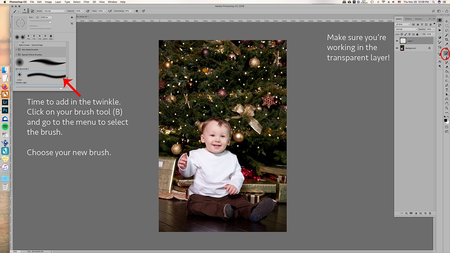
    2.4 All right, now that you’ve added more lights to the tree, you are ready to add in the twinkle lights brush! Go to Brush and choose the brush you just created. Usually, new brushes show up at the end of the brush list.

    Choose your twinkle light brush. Make sure that the color for your brush is set to white. Alternatively, you can choose the color picker and get a warmer yellow color that matches the lights. It’s your choice! You can also add colored lights if you wish!

    Leave the hardness and opacity at 100%, go to your new layer where you’ve cloned the lights on. Go to each light and add in the twinkle onto it. Adding the lights and the twinkle makes the twinkle look real and not too fake.

    How to Create Twinkle Lights for Christmas Tree Portraits in Photoshop How to Create Twinkle Lights for Christmas Tree Portraits in Photoshop christmas-twinkle-lights

    Change the size for a few of the twinkles so they look more random.

    How to Create Twinkle Lights for Christmas Tree Portraits in Photoshop

    3. Add in additional colors

    The great thing about doing the twinkle lights this way is that because you’ve added them onto a transparent layer, you can move them around and resize them as you need.

    The amazing part is that you can duplicate the twinkle lights layer, move it around, and add colors to it to create colored twinkle lights. Here’s a break down of how you do that for multiple colors:

    3.1 Duplicate the twinkle lights layer.

    How to Create Twinkle Lights for Christmas Tree Portraits in Photoshop

    3.2 Move it around and transform it so that it’s not directly on top of the other twinkle lights. If you’re going to add in more colors, I suggest that you don’t add in too many twinkle lights in the original layer so that you can fill in those empty spots with the colored twinkle lights.

    3.3 Go to Layer -> New Fill Layer -> Solid Color. Choose a color. I did blue, green, and red. But you can add in any color.

    How to Create Twinkle Lights for Christmas Tree Portraits in Photoshop

    3.4 You’ll end up with a solid color onto your images. Don’t worry, right-click on the layer and choose Create Clipping Mask to clip it to the twinkle light duplicate layer.

    How to Create Twinkle Lights for Christmas Tree Portraits in Photoshop

    How to Create Twinkle Lights for Christmas Tree Portraits in Photoshop
    3.5 Go to Blending modes at the top of the layer window and choose Color. This will overlay the color on the twinkle lights and make it look more real.

    How to Create Twinkle Lights for Christmas Tree Portraits in Photoshop

    How to Create Twinkle Lights for Christmas Tree Portraits in Photoshop

    3.6 A great tip is to merge each color to the twinkle lights layer. Then add a mask so that you can go into the layer with your brush and take out the twinkle lights for that layer without having to deal with the color clipping mask and all that.

    It’ll make removing them easier. This is ideal in case you need to remove one from an ornament or face.

    How to Create Twinkle Lights for Christmas Tree Portraits in Photoshop

    You can also add a clipping mask to the original twinkle lights layer to help brush out unwanted twinkle lights as well.

    Image: Using a mask on the layer can help you to take out unwanted twinkle lights.

    Using a mask on the layer can help you to take out unwanted twinkle lights.

    And that’s it! That’s how you add in additional twinkle lights in color to your image!

    Image: Before and after with the twinkle lights in color. You can make it more subtle by adding fewe...

    Before and after with the twinkle lights in color. You can make it more subtle by adding fewer twinkle lights.

    Use in non-holiday images as well

    Use this tutorial on other images where you’d like to add in some twinkle too! It doesn’t have to just be for holiday sessions, simply just use the brush only with a color set.

    Image: Use the twinkle lights brush on other portraits that you’d like to add some sparkle to.

    Use the twinkle lights brush on other portraits that you’d like to add some sparkle to.

    Make sure you’re working on the transparent layer and play with opacity levels and additional colors.

    How to Create Twinkle Lights for Christmas Tree Portraits in Photoshop

    In a new transparent layer, I selected the twinkle lights brush and added the twinkle lights to various parts of the layer in white in different sizes. Then, set the blending mode to Overlay to get the right look. I also lowered the opacity.

    Twinkle lights with more than 5 points

    The great thing about adding in twinkle lights is that you’re creating your own brush preset! This lets you create different types of brushes, and one might be adding more points to the twinkle light.

    Image: Here’s a comparison of no twinkle lights, a five-point twinkle, and a multi-point twink...

    Here’s a comparison of no twinkle lights, a five-point twinkle, and a multi-point twinkle light.

    Go through all of the steps in Step One, only this time add more angles and add in more points. It also looks great when you change the size within the same brush.

    Image: In the close-up, you can see that the brush preset has more points than the five-point twinkl...

    In the close-up, you can see that the brush preset has more points than the five-point twinkle light brush we made previously.

    It’s really all about preference, so play around and see what look is the right one for your portraits.

    In conclusion

    Image: Before and after on another photo. This is more subtle and only uses white twinkle lights.

    Before and after on another photo. This is more subtle and only uses white twinkle lights.

    It may sound complicated the first time you give it a try, but with time it gets easier! Adding in additional twinkle lights can give your holiday photos a little more twinkle and pop that will make your clients very happy to see in their final images!

    Will you be using this tip to add in twinkle lights to your images?

    The post How to Create Twinkle Lights for Christmas Tree Portraits in Photoshop appeared first on Digital Photography School. It was authored by Jackie Lamas.


    Digital Photography School

  • Finally, a Road Map to Taking Better Photos of People!

    The post Finally, a Road Map to Taking Better Photos of People! appeared first on Digital Photography School. It was authored by Darren Rowse.

    Finally, a Road Map to Taking Better Photos of People!

    Day 11 of dPS Holiday Deals brings you this fundamental portrait photography course like no other – and it’s from our previous long-time Editor Darlene Hildebrand of Digital Photo Mentor.

    Save $ 100 now

    If you’re feeling lost when it comes to taking photos of people then you need Portrait Fundamentals: a road-map to portrait photography skills and confidence for beginners. 

    Especially if you are disappointed by how your portrait shots turn out, or don’t even take photos of other people for fear of messing it up!

    • Unsure what camera settings to use for portraits?
    • Can’t get sharp, well-exposed images consistently?
    • So overwhelmed by all the technical stuff you struggle to focus on your subject and enjoy the portrait process?

    Then, let Darlene and her team from Digital Photo Mentor guide you. They’ll give you a plan to follow so you can start improving your portraits immediately. 

    Portrait Fundamentals Product

    This is no ordinary course, it includes over 6 hours of video lessons, a 245-page PDF notebook, 21 practice exercises, quizzes at each stage, and a private Facebook group for students to interact with each other.

    Learn to take great portraits even if you are a beginner!

    Save $ 100 and get the course now for only $ 97 USD (usually $ 197)

    Check it out before the next deal arrives in less than 24 hours.

    PS – Did you miss yesterday’s deal? You can save 50% on Andrew Gibson’s Art of Black and White in Lightroom and Beyond course. Check it out here.
    We receive an affiliate commission when you purchase from our trusted partners.

    The post Finally, a Road Map to Taking Better Photos of People! appeared first on Digital Photography School. It was authored by Darren Rowse.


    Digital Photography School

  • Camera Color Spaces Explained – sRGB vs Adobe RGB vs RAW

    The post Camera Color Spaces Explained – sRGB vs Adobe RGB vs RAW appeared first on Digital Photography School. It was authored by Herb Paynter.

    camera-color-spaces-explained

    Your camera is probably able to capture color images in a variety of different color containers called “spaces.” These camera color spaces collect colors in one of several size light buckets labeled sRGB, AdobeRGB, and RAW.

    Each bucket gathers slightly increased varieties of light, similar to the way Crayola crayons are packaged and sold in increasingly inclusive collections of colors; small, large, and jumbo.

    Camera color spaces offer photographers a variety of different size boxes.

    Camera color spaces

    camera-color-spaces

    Scenes that include both brilliant colors and bright lighting are excellent candidates for capture with AdobeRGB color space.
    F/3.5, 1/1000, ISO 400, Lumix G Vario 2.8, 35mm


    A debate in the photo community usually arises over which camera color spaces to choose in the camera’s preferences. Some color spaces capture more of the hues and saturated colors than others. Pictures captured in one space may include more colors than another.

    Each space is ideally suited for certain purposes, and the question of which camera color space to choose needs a bit of explanation. In addition to the capture question, choosing a color space for post-production editing will depend on the image’s ultimate usage.

    Your camera’s color spaces involve not just color data, but additional parking space on the drive. Larger color spaces provide more bit-depth (explained below), which occupies more digital real estate on the memory card. So, the choice of which to use does have practical importance.

    What camera color space to use

    There is no singularly perfect color space choice, so let’s examine which is best for specific situations.

    camera-color-spaces

    Images that do not include highly-saturated color but contain significant detail in the shadow areas will benefit from RAW format capture and high-bit processing. F/10, 1/1600, ISO 800, Lumix G Vario 2.8, 200mm


    Unless the sole purpose of a photo is to display as a high-resolution digital image, you might want to convert the file’s original color space for a less demanding result. However, keep in mind that every time a file mutates from a larger color space to a smaller color space (RAW to AdobeRGB, or AdobeRGB to sRGB), the image’s color intensity and integrity may diminish in the process. Some imaging applications are less demanding than others.

    While copies of digital files remain identical in size and intensity to the original regardless of how many times they have been copied, when a digital file mutates to a lesser color space, it will always lose some critical color information. Your camera color spaces in general, and device color spaces, in particular, are all unique. Each serves a particular purpose.

    Image: The extreme dynamic range and saturated skies benefitted from the RAW capture and editing in...

    The extreme dynamic range and saturated skies benefitted from the RAW capture and editing in AdobeRGB. Detail buried in the shadows was possible because of the 14-bit capture. F/14, 1/300, ISO 3200, Lumix G Vario 2.8, 12mm


    It’s a matter of depth

    The difference between camera color spaces boils down to an issue called bit depth. Bit depth is a mathematical description of how many visible distinctions between shades of color can be recognized and reproduced by different devices (a techie term for scanners, cameras, computer monitors, and printing machines). Unfortunately, not all devices can reproduce all colors the same (which is the primary stumbling block amidst all color issues).

    Every device reads and reproduces color using a different process. While this sounds like a fixable problem, there is a sad and unsolvable reality behind the problem. There are at least three different interpretations of color at play in every capture-display-print cycle.

    Image: These colorful seat cushions and deep shadows were captured in RAW format, edited in AdobeRGB...

    These colorful seat cushions and deep shadows were captured in RAW format, edited in AdobeRGB, and saved in sRGB for upload to our camera club’s server for display as part of a club field trip slideshow. F/7.1, 1/320, ISO 400, Lumix G Vario 2.8, 19mm


    First, cameras capture color by recording intensities of light as electrical signals and interpreting those signals as colors. Each color is assigned a specific number.

    Second, these numbers are then sent to the computer. Here, they get translated into another process that interprets those electrical signals into a process that turns on tiny lights (called pixels) on a backlit screen.

    And third, those pixels are then sent to a printing machine that instructs those pixel values to spit tiny splatters of colored ink onto paper.

    It’s a very complicated process that color scientists have tried for years to make simple. Unfortunately, it just ain’t that simple!

    Anyway, during this hair-on-fire digital transition, different methods are employed that utilize the various color spaces in a way that transforms the colors from one device to another as accurately as possible. Sometimes the color translations don’t convey the colors as accurately as we would like, which is why sometimes the monitor colors don’t match the printer colors.

    camera-color-spaces-explained

    Science uses charts like this to plot the characteristics of camera color spaces. While these charts are referred to as “theoretical” because they are not visible to the human eye but represent what each color “bucket” can capture versus what the eye can see.


    The ultimate referee

    The only comprehensive color space that plots the full scope of what the human eye can see is what the science community calls L*a*b* (inverted horseshoe diagram) space.

    The human eye is the ultimate arbitrator in the color wars, and all device capabilities (camera, display, and printer) are defined by how they match up to the eye’s master gamut. This is why this strange horseshoe shape is referred to as the Reference Space. All other devices, whether camera, display, or printer, can only recognize and utilize portions of this “reference space,” and they usually disagree with each other.

    Color is a very diverse and dysfunctional family. Each device speaks a different dialect of a similar language. Each produces colors that cannot be faithfully reproduced on other devices. Color is a very messy topic.

    color-spaces-explained

    Crayola crayon boxes contain varying numbers of colors just as color spaces collect varying amounts of color. The lightest and darkest color crayons are the same value, but larger boxes contain more colors than smaller ones.


    Some devices can express color more completely than others. Unfortunately, no device created by humans can reproduce all the colors that can be seen by humans. Also, the colors captured by one device that fall outside the gamut (Crayola box size) of other devices, get clipped, lost, or compressed during the handoff. Those colors never come back home.

    This is the tragic truth about digital color reproduction. The trick to color reproduction is in retaining as much of the common color as possible during the process. Fortunately, this same human eye (and brain) are very forgiving about accepting the limitations of non-human devices.

    Color reproduction is a true application of the law of diminishing returns and the visual science of physics. Photographers understand this law quite well.

    Very rarely can a camera actually capture all the color and dynamics of an original scene. Moreover, nature’s color gamut extends even further than the colors that the human eye can identify. Any time a digital image gets transposed from one form into any another form, that transformation is a diminished-value exchange.

    As an image is transferred from one device to another, those pixel values located outside the color gamut of the destination device always get lost in the translation. The object of color management is to mitigate color loss and maintain as much of the appearance of the original as possible, all the way through the reproduction process.

    RGB spaces (sRGB, AdobeRGB, ProPhoto RGB)

    It all begins with the camera’s color settings that are in place when you capture the scene. All cameras capture light through red, green, and blue filters (RGB color space). While there are a number of RGB color spaces to choose from, each sports a slightly different color gamut.

    camera-color-spaces-explained

    Each device in the photography chain interprets colors slightly differently, and each responds to the individual color spaces uniquely.


    Each color space (sRGB, AdobeRGB, ProPhoto RGB, etc.) provides a unique collection of color attributes, and each space satisfies specific display and reproduction requirements.

    Gamuts are descriptions of the range of colors that a device can recognize, record, display, or print.

    Shooting a vibrant, saturated scene with the camera requires a larger color space. Using a camera color space with a smaller gamut could significantly diminish the raw, harsh emotion of the scene. This is why most photography experts encourage photographers to set their cameras to capture images in AdobeRGB.

    sRGB

    Almost all digital cameras are factory-set to capture colors using sRGB as the default color space for a plausible reason; most of the pictures we take never get printed! At best, we view them on computer monitors or social media. Quite honestly, most of the pictures we capture never make it past the initial glance at the camera’s LCD screen. Capturing those images in higher-bit color space is a total waste of disk space.

    camera-color-spaces-explained

    sRGB color space remains largely unchanged since it was defined in the 1950s to compress video images into a manageable size for broadcast. While the format has been updated slightly, the basic intent is the same.


    sRGB was developed by HP, Microsoft (and others) back in the early days of television to address the color gamut needs of most televisions (early versions of computer monitors), and the standard was set long ago. The airwaves and Internet browsers live on an sRGB diet. As such, the sRGB color space standardizes the way images are still viewed on monitors and televisions.

    Adobe RGB

    If the ultimate destination for your picture is monitor or display-based presence (presentations, Internet, or television displays), this is probably the best choice to capture images. However, if you shoot for print on paper, both AdobeRGB 1998 and ProPhoto RGB RGB contain a wider gamut of colors and are thus more suited for preparing images for print.

    camera-color-spaces-explained

    The brilliant dynamics and saturated colors are always captured best in the deepest color bucket of all – RAW. The degree of adjustments provided by RAW capture and ProPhoto RGB editing is perfect for images like this. F/6.3, 1/800, ISO 400, Lumix G Vario 2.8, 26mm


    RAW

    Actually, the most ideal bucket for capturing images actually exceeds the gamuts of all three of these camera color spaces. I’m speaking of course of your camera’s ability to capture images in RAW format. This is a format that supersedes any defined color spaces.

    RAW files capture color in the highest bit depth possible; up to 14-bits per color. RAW is not an acronym; it is more of a description. It is the recording of all the limited color depth and uncompressed dynamic range of the original scene. Start RAW and strip down from there.

    Camera color spaces explained – Conclusion

    Congratulations on sticking with this article through all the minutia.

    By now, it probably seems like camera color space is more like outer space, but it doesn’t have to remain this technical. Simply remember to capture images in RAW format (perhaps in addition to capturing them as JPG) and then transform the colors down the chain of reproduction as the need dictates.

    Edit images in the camera color spaces of ProPhoto RGB or AdobeRGB to retain as much color elbow room as necessary. Those images destined for print should be transposed to AdobeRGB, and reduce those images destined for the Internet or slideshows to sRGB. Simple, enough!

    The post Camera Color Spaces Explained – sRGB vs Adobe RGB vs RAW appeared first on Digital Photography School. It was authored by Herb Paynter.


    Digital Photography School

  • The Art of Black and White in Lightroom and Beyond

    The post The Art of Black and White in Lightroom and Beyond appeared first on Digital Photography School. It was authored by Darren Rowse.

    dPS Deal 10

    Day 10 of dPS Holiday Deals brings you the Art of Black and White in Lightroom and Beyond by Andrew Gibson.

    Save 50% now

    Can you recall some of the images that have affected you and stayed with you over the years?

    It’s likely many of them are in black and white. 

    Monochrome exerts a power over the imagination – highlighting texture, contrast and shadow – which leaves a lasting impact on the viewer.

    But there’s more to creating a powerful black and white image than just stripping the colour out of your favourite photos. 

    A popular writer on dPS for many years, Andrew Gibson will teach you how to create beautiful black and white photos in Lightroom and Silver Efex Pro 2.

    The Art of Black and White in Lightroom and Beyond Video Course comprises 25 video lessons, accompanying PDF guide and 7 DNG files so you can follow along and try out the techniques for yourselves.

    Art of Black and White

    Whether it’s jaw-dropping landscapes, angular architectural photography, dramatic documentary-style shots, memorable travel pictures or personality-rich portraits you’re looking to capture, the art of black and white can elevate all of these. 

    Save $ 50 and get the guide now for only $ 49 USD (usually $ 99)

    PLUS receive $ 43 worth of bonuses (10 Black & White Assignments ebook, PowerBlack Presets for Luminar, SuperBlack Presets for Lightroom).

    Check it out before the next deal arrives in less than 24 hours.

    PS – You can still save big on over 300 presets from dPS, save 62% per set or save $ 100 on the whole bundle. Check them out here.

    We receive an affiliate commission when you purchase from our trusted partners.

    The post The Art of Black and White in Lightroom and Beyond appeared first on Digital Photography School. It was authored by Darren Rowse.


    Digital Photography School

  • News: The Nikon Yellow Program Lets You Try the Nikon Z 50 for 30 Days

    The post News: The Nikon Yellow Program Lets You Try the Nikon Z 50 for 30 Days appeared first on Digital Photography School. It was authored by Jaymes Dempsey.

    nikon-yellow-program-z-50-camera

    Nikon has started a program called Yellow, which allows potential customers to try the Nikon Z 50.

    You can get 30 days of use out of the Z 50. And at the end of the trial period, if you don’t like the camera, you can send it back.

    According to Nikon’s website:

    We’re so confident that you’ll fall in love with the photos and videos you’ll get with your new mirrorless Z 50 camera, especially when compared to the ones you get with your smartphone, we’ll let you try one at home for 30 days. If you don’t fall in love, send it back to us for a full refund, including shipping.

    A neat aspect of the program is that Nikon allows you to choose your kit so that you can trial the Z 50 with a 16-50mm VR lens (for $ 999.95 USD), with the 16-50mm lens and a 50-250mm VR lens (for $ 1199.95 USD), or you can just get the Z 50 (for $ 859.95).

    The camera arrives with a charger, a battery, and a memory card, so you’ll have everything you need to start taking photos.

    Now, you will have to be careful when trialing the Z 50, because you’re responsible if the camera comes back to Nikon in anything less than like-new condition. Note that Nikon makes you pay upfront, either in full or in installments through PayPal, so you’ll need to be prepared to hand over money in advance.

    Really, there’s a lot to like about this program with very little to lose; assuming you take care of your camera equipment, you should have no problem trialing the Z50 without risk.

    Of course, the Z50 isn’t a camera for everyone. But it does offer a lot of power in a little, fairly inexpensive camera body: a 20.9-megapixel APS-C sensor, 11 frames-per-second continuous shooting, 4K video, and much more. If you’re a user of full-frame cameras, you’ll probably want to go for one of Nikon’s other mirrorless options (or a Canon, or a Sony, or a Panasonic).

    But if you’re a hobbyist looking to upgrade from a smartphone, a compact camera, or a consumer DSLR, then the Z 50 is definitely worth a look!

    Will you take advantage of this and try out the Nikon Z50?

    The post News: The Nikon Yellow Program Lets You Try the Nikon Z 50 for 30 Days appeared first on Digital Photography School. It was authored by Jaymes Dempsey.


    Digital Photography School

  • Save up to $100 on Massive dPS Lightroom Presets Bundle

    The post Save up to $ 100 on Massive dPS Lightroom Presets Bundle appeared first on Digital Photography School. It was authored by Darren Rowse.

    dPS Holiday Deals 9

    It’s day 9 of dPS Holiday Deals and today we’re doing a mega deal on our dPS presets.

    Save up to $ 100 now

    You can now get any of our Lightroom Presets Bundles for just $ 19 each. That’s a massive 62% off the regular price, and 67% if you buy them all together.

    Each bundle contains at least 101 presets:

    • 101 Lightroom Presets
    • 101 Landscape Lightroom Presets 
    • 101 Lightroom Portrait Presets 

    There are no duplicate presets amongst these, so you can grab all three knowing that each preset is unique.

    Save 62% on each set of presets or save $ 100 (67%) by buying the mega-set of all 303 presets.

    Check it out before the next deal arrives in less than 24 hours.


    PS – Don’t miss out on yesterday’s deal – learn how to “Capture Your Memories with Awesome Video” for just $ 39, save 60%. Check it out here.

    The post Save up to $ 100 on Massive dPS Lightroom Presets Bundle appeared first on Digital Photography School. It was authored by Darren Rowse.


    Digital Photography School