RSS
 

Archive for the ‘Creativity’ Category

World’s Longest Pedestrian Suspension Bridge Stretches Over 1,000 Feet

04 Aug

[ By SA Rogers in Drawing & Digital. ]

Three hundred feet above the valley floor, a suspension bridge gently sways and bobs as pedestrians cross its 1,621-foot length through the Swiss Alps. These impressive stats have helped the Charles Kuonen Suspension Bridge in Switzerland break previous records, making it the longest pedestrian suspension bridge in the world.

Sure, the glass-floored bridge in China is higher and forces you to look down from your precarious position, but this bridge is almost as scary, considering that it’s not stationary and measures just two feet wide. That means you have to march down its length single-file, making it harder to clutch onto others for dear life.

The bridge was completed in 10 weeks by Swissrope and offers magnificent views of the surrounding mountains, including the Bernese Alps and Matterhorn (if you manage to look up and enjoy them instead of staring at your feet and trying not to hyperventilate.) It features a grated metal floor, runs between 5,000-7,000 feet above sea level, and takes ten minutes to walk cross. The pass through the mountains previously took four hours to navigate.

Photos taken from the air (provided by the Switzerland Tourism Board) give us the best idea of the bridge’s scale. The Charles Kuonen Suspension Bridge links two sections of the Europaweg hiking trail, a two-day link between the towns of Zermatt and Grächen, and replaces an older bridge that was damaged by falling rocks. It’s named for its primary sponsor.

Share on Facebook


[ By SA Rogers in Drawing & Digital. ]

[ WebUrbanist | Archives | Galleries | Privacy | TOS ]


WebUrbanist

 
Comments Off on World’s Longest Pedestrian Suspension Bridge Stretches Over 1,000 Feet

Posted in Creativity


Future Fonts: Tracing the Role of Typography in Science Fiction in Films

04 Aug

[ By WebUrbanist in Design & Graphics & Branding. ]

Whether intentionally retro, as in Stranger Things, or overtly futuristic, as in RoboCop, the role of typography in a movie goes well past the title, subtly but powerfully shaping the world viewers are invited to experience.

Dave Addey, author and creator of Typeset in the Future, is as meticulous as he is obsessed, analyzing appearances of type in film line by line, providing insights, context and speculative answers to various uses (as well as typo corrections).

It started with Eurostile Bold Extended, which has made appearances from Star Trek to Wall-E. Since then, he has written about typography in Alien, 2001: A Space Odyssey, Moon, and in anticipation of the sequel: Blade Runner.

With fonts you get a lot of context for free,” says Addey. “You’ve established the time frame for your movie in seconds without a lot of special effects or backstory.” It also tells you something about the world, like: when a single megacorp runs everything and its typeface is consequently found everywhere.

He watches films over and over again, taking notes then tracking down type, sometimes manually by searching through old books to find exact matches (in other cases: the typography is custom, making the process frustrating).

And type is just part of the equation: he looks at iconography and other design elements too, piecing together a larger picture of the various strategies in play and how they relate to the core narrative.

By zooming in on this one aspect of films, he often traces connections that are easy to miss, like: a newspaper being held by the lead character in Blade Runner later appearing as the liner for a drawer. For fans of sci-fi and design, his blog will take you deeper into films than you realized you could go — it is well worth checking out.

More about the project: “This site is dedicated to typography and iconography as it appears in sci-fi and fantasy movies and TV shows. It’s inspired by the Typeset In The Future trope I added to TV Tropes. (If you know of more good sci-fi font examples, please do add them to that page.)”

Share on Facebook


[ By WebUrbanist in Design & Graphics & Branding. ]

[ WebUrbanist | Archives | Galleries | Privacy | TOS ]


WebUrbanist

 
Comments Off on Future Fonts: Tracing the Role of Typography in Science Fiction in Films

Posted in Creativity


Anime Architecture: Exhibition Showcases Japan’s Fictional Buildings

03 Aug

[ By SA Rogers in Art & Drawing & Digital. ]

Visions of fictional cities – whether optimistic, realistic, fantastical or dystopian – tend to take on a haze of mystery and grandiosity in Japanese anime, as epitomized in ‘Ghost in the Shell.’ Dark jumbles of nearly-identical skyscrapers lurk over the protagonists in futuristic metropolises, often emphasizing feelings of desolation, industrialization and technology run amok. If you’ve ever sighed over a particularly incredible work of fictional architecture, you might be interested in an exhibition currently on display at London’s House of Illustration.

‘Anime Architecture: Backgrounds of Japan’ is the first UK exhibition of architectural illustrations for classic anime films, featuring over 100 technical drawings and watercolor illustrations. Most of these works come from series that debuted or were most popular during the anime heyday of the 1990s, including Hiromasa Ogura’s paintings for ‘Ghost in the Shell’, Takashi Watanebe’s pencil drawings from Ghost in the Shell 2: Innocence and work from the films ‘Patlabor: The Movie’ (1989) and ‘Metropolis’ (2001) by Mamoru Oshii and Atsushi Takeuchi.

Sure, there are great anime works that came after these with fictional architecture that’s just as beautiful, but these days, artists use computer animation instead of hand-painting the backgrounds. In an interview with It’s Nice That, curator Stefan Riekeles explains that it took quite a bit of nudging and late-night meetings at bars to convince the artists that people would want to see these works outside the context of the films, and that they’d translate well to gallery walls.

“[Ghost in the Shell], released 1995, was the continuation of [director Mamoru Oshii’s] reflection of the Asian mega-city, which he started with Patlabor in 1989 and continued after Ghost in the Shell: Innocence in 2004. Patlabor is set in a realistic urban depiction of Tokyo. Innocence is located in a purely fictional Asian world. The world of Ghost in the Shell is a hybrid of these poles.”

“The idea was to evoke a feeling of submerging into the deep levels of the city, where a flood of information overflows the human senses and a lot of noise surrounds the people. The artists were looking for an expression of a crowded space. They found a blueprint for such a place in Hong Kong, which is exotic enough for a Japanese audience to evoke a feeling of alienation and strangeness but familiar enough to relate their daily life to.”

Anime Architecture: Backgrounds of Japan will be open through September 10th, 2017 at the House of Illustration in King’s Cross.

Share on Facebook


[ By SA Rogers in Art & Drawing & Digital. ]

[ WebUrbanist | Archives | Galleries | Privacy | TOS ]


WebUrbanist

 
Comments Off on Anime Architecture: Exhibition Showcases Japan’s Fictional Buildings

Posted in Creativity


Art of Wearable Tech: 10 Fashionable Designs Help with Fun, Sex & Self-Defense

03 Aug

[ By SA Rogers in Gadgets & Geekery & Technology. ]

Not all wearable tech has to be a tiny smartphone on your wrist or a device that tracks how many steps you’ve taken – it can also record your memories as you see them, visibly react to your emotions, flirt with people on your behalf, warn others they’re invading your personal space or even measure your sexual performance. These unconventional wearables are also a little less dorky than usual, aiming to blend fashion and technology in a way that’s exciting,  beautiful and sometimes strange.

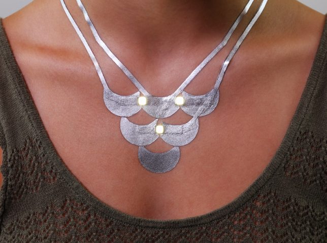
Robotic Jewelry by MIT Media Lab

What look, at first, like jewels or little bulbous decorative accents on a blouse suddenly start crawling around like they’ve got minds of their own. ‘Kino’ is a collection of ‘living’ jewelry from MIT Media Lab, designed to reconfigure itself in response to environmental conditions. “It is our vision that in the future, these robots will be miniaturized to the extend that they can be seamlessly integrated into existing practices of body ornamentation. With the addition of kinetic capabilities, traditionally static jewelry and accessories will start displaying life-like qualities, learning, shifting, and reconfiguring to the needs and prefereces of the wearer, also assisting in fluid presentation of self.”

Lumoscura Smog Mask by Stephanie Liu

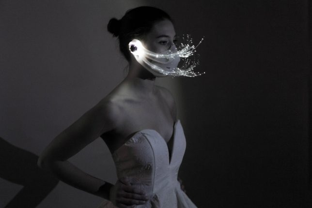
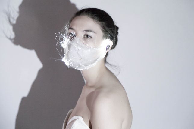
Dazzling fiber optics inspired by shimmering white peacock feathers make the need to wear a smog mask at least a little bit more fashionable. Says designer Stephanie Liu, “Masks have always been associated with disease, fear and negativity. Some wear it in public to hide their identities, in reality it attracts attention and can generate fear and stress amongst those in their immediate surroundings. As air pollution becomes more and more of an issue in many countries, people have begun to surrender to wearing a mask for the sake of their health, however there are still a lot of people who do not wear masks for many reasons – the top three being unattractive, uncomfortable and repelling people.”

Smart Self-Defense Spider Dress by Anouk Wipprecht

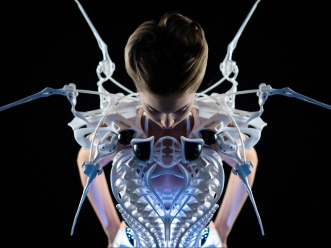
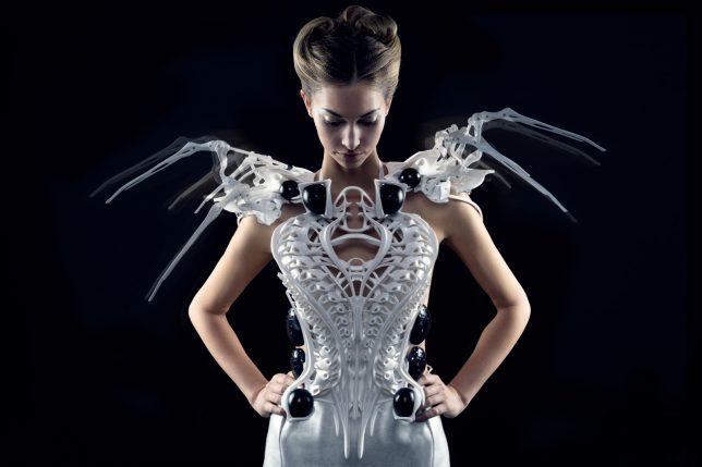
People might be less likely to mess with you if the mechanical spider you’re wearing as a dress makes a sudden move. That’s the idea behind the Smart Spider Dress by Anouk Wipprecht, powered by Intel Edison. The legs of the spider constantly move, reacting to the wearer’s real-time biometrics as well as violations of social norms, like when someone invades their personal space. “Since the system based with mechanic spider legs is literally hosted on the shoulders of the wearer and attacks using the same viewing angle as the wearer, the system knows how you feel and adapts to those feelings,” says Wipprecht.

MIT Duoskin Temporary Electrical Tattoos

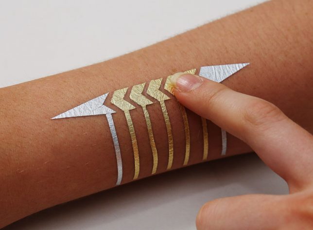
Anyone can create functional devices directly attached to their skin, including lights and controls for mobile devices, using an electricity-conducting gold leaf paint in a fun design that makes it look like a metallic tattoo. “We believe that in the future, on-skin electronics will no longer be black-boxed and mystified; instead they will converge toward user friendliness, extensibility, and aesthetics of body decorations, forming a DuoSkin integrated to the extent that it has seemingly disappeared,” says MIT, who refer to the project as ‘digital skin jewelry.’

i.Con Smart Condom Ring Measures Performance

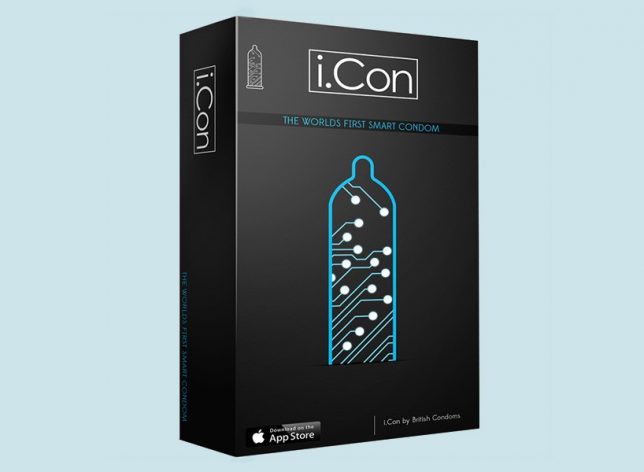
No more boasting about your performance using inaccurate figures. The i.Con smart condom ring by British Condoms will know exactly how long you last, how many positions you used, ‘velocity of thrusts,’ ‘girth’ and other data, sending the information straight to your smartphone via bluetooth. One positive of this technology is, it can give users a way to measure improvement if their data is disappointing and they want to work on things. But perhaps even more valuable is the fact that the wearable comes with an ‘antibodies filter’ to detect the presence of sexually transmitted infections.

Next Page – Click Below to Read More:
Art Of Wearable Tech 10 Fashionable Designs Help With Fun Sex Self Defense

Share on Facebook


[ By SA Rogers in Gadgets & Geekery & Technology. ]

[ WebUrbanist | Archives | Galleries | Privacy | TOS ]


WebUrbanist

 
Comments Off on Art of Wearable Tech: 10 Fashionable Designs Help with Fun, Sex & Self-Defense

Posted in Creativity


California City: The Half-Built Desert Metropolis of the Golden State

01 Aug

[ By WebUrbanist in Abandoned Places & Architecture. ]

It’s the third-largest city in California by land area but most people (including many in CA) have never even heard of this mostly-empty desert oasis, home to around 15,000 people. It’s not quite a city, but not quite a ghost town either.

Visiting the area is a bit surreal – roads running through its 200 square miles connect nothing to nothing in the hot Mojave, in some cases following straight lines and in others wrapping to form cul-de-sacs.

Some roads are paved, but most aren’t. In places, nature has started to reclaim the dirty gravel strips with hearty desert plants growing right up through streets.

Photographer Noritaka Minami recently took a trip in a helicopter to photograph the strange sprawling semi-ghost town, which are on display at On Freedom, an exhibition at Aperture for another month.

The place was a mid-century vision of a real estate developer named Nathan Mendelshon who purchased over 80,000 acres, imagining California City as a fresh metropolis for a growing state.

Some parcels were resold but never developed — others were bought and remain in use, mainly for people working at a nearby military base or prison.

The few houses that do exist seem almost stranger than the framework of roads around them, neatly fenced in a neighborhood of empty plots.

More from Minami: “This project focuses on California City, a master planned community in the Mojave Desert conceived by sociologist turned real estate developer Nathan K. Mendelsohn in 1958. California City was envisioned as the next major metropolis in California in response to the population and economic growths after World War II. This development was based on the belief that even in a harsh desert landscape, mankind had the freedom and power to produce a built environment that provided all of the essential needs for a prosperous modern life.”

In his series of black-and-white images, “aerial photography is used to document the scale of the vision Mendelsohn proposed in the desert and question whether this ‘wonderland’ could have even been sustainable in this environment. Despite having the foundation for a city in place, there are no indications that this city will ever be realized in the future.” In the end, half-built may be an overstatement — in reality, the place is more like a skeletal outline of a city, punctuated (like a normal rural landscape) by pockets of development and clusters of community.

Share on Facebook


[ By WebUrbanist in Abandoned Places & Architecture. ]

[ WebUrbanist | Archives | Galleries | Privacy | TOS ]


WebUrbanist

 
Comments Off on California City: The Half-Built Desert Metropolis of the Golden State

Posted in Creativity


Rethinking the Refugee Camp: 8 Architectural Proposals for Asylum Seekers

01 Aug

[ By SA Rogers in Architecture & Cities & Urbanism. ]

Refugees fleeing the worst humanitarian crises of our time don’t just need tents – they need safe and stable long-term housing, a sense of community, access to transitional resources and plans for permanent integration into existing cities. Smart and sensitive design solutions may play just one small role in addressing the crisis, but they can help provide the architecture and infrastructure needed to start a new life.

Mannheim Refugee Pavilion, Germany

Architecture students at the University of Kaiserslautern in Mannheim created an airy community center made of latticed wood to offer a sheltered communal area for refugees arriving to an adjacent camp. The team worked with 25 refugees and building companies to create the shelter. “Due to bureaucratic procedures, refugees arriving in Germany are condemned to sustain a long period of passiveness. They are well provided with the bare essentials but the immediate area is quite desolate and lacking of quality common spaces. The residents at the preliminary reception center has the opportunity to actively shape their environment and create a quality place for common or individual use.”

20,000 New Homes for Refugees in Kenya by Shigeru Ban

Japanese architect Shigeru Ban will design 20,000 new homes for refugees at the Kalobeyei refugee settlement in Kenya based on discusses he held with refugees in the area. “The key thing will be to construct shelter where no or little technical supervision is required, and use materials that are locally available and eco-friendly,” he says. “It’s important that the houses can be easily maintained by inhabitants.”

Ikea’s Flat-Pack Refugee Shelter Named 2016 Design of the Year

The ‘Better Shelter’ by Ikea is a flat-pack structure large enough to house a family of five that can be assembled in just a few hours. Made from recyclable plastic, it consists of just 68 components and includes a solar panel to power lights and charge smartphones and other devices. It went into production in 2015, and since then, tens of thousands of units have been delivered to countries all over the world. Though it’s more practical than glamorous, the Better Shelter won the Beazley Design of the Year Award presented by the Design Museum in London in 2016.

‘Weaving a Home’ by Abeer Seikaly

Winner of a Lexus Design Award in 2013, ‘Weaving a Home’ by Abeer Seikaly is a collapsible structural fabric shelter capable of adapting to various climates. The design is cellular, made of high-strength plastic tubing woven into a fabric membrane, and segments can be left open to create doorways or windows or closed to retain heat. At the top of the unit is a water storage tank supplied by rainwater or an onsite source to provides running water inside. “Refugees carry from their homes what they can and resettle in unknown lands, often starting with nothing but a tent to call home…” says Seikaly. “In this space, the refugees find a place to pause from their turbulent worlds, a place to weave the tapestry of their new lives.”

Next Page – Click Below to Read More:
Rethinking The Refugee Camp 8 Architectural Proposals For Asylum Seekers

Share on Facebook


[ By SA Rogers in Architecture & Cities & Urbanism. ]

[ WebUrbanist | Archives | Galleries | Privacy | TOS ]


WebUrbanist

 
Comments Off on Rethinking the Refugee Camp: 8 Architectural Proposals for Asylum Seekers

Posted in Creativity


Where Gods Live: Forest Environment Enhanced by Live Digital Projections

01 Aug

[ By SA Rogers in Art & Installation & Sound. ]

As if forests aren’t magical enough already, the Japanese art/technology collective Teamlab will be live-projecting their signature transforming visuals onto the surfaces of Mifuneyama Rakuen Park, giving visitors the feeling of being on an alien planet. ‘Forest Where Gods Live’ is a collection of individual installations with names like ‘Ever Blossoming Life Rock,’ Drawing on the Water Surface Created by the Dance of Koi and Boats,’ ‘Memory of Continuous Life’ and ‘Resonating Forest.’

“TeamLab is executing an art project called ‘Digitized Nature’ where ‘Nature Becomes Art.’ The concept of the project is that non-material digital art can turn nature into art without harming it. We exist as part of a process of eternal continuity of life and death, a process which has been continuing for an overwhelmingly long time. It is hard for us, however, to sense this in our everyday life. It was when we were wandering through the woods that we realized the shapes of those giant rocks, caves and forests, that have been formed over an infinite amount of time, are the continuous cycle of life itself.”

“By applying digital art to this unique environment, the exhibition celebrates a massive chunk of life that nests on such continuity. In Mifuneyama Rakuen, we got lost in the ambiguous border of garden and forest, and finally, we have come to realize we exist on the borderless continuity between nature and humans.”

Sponsored by Japanese beauty brand Shiseido, the awe-inspiring installation will be in place throughout the 500,000-square-meter garden located in the Saga prefecture July 14th through October 9th, 2017. If you can’t make it out there in person to experience the immersive exhibit firsthand, taking some time to delve into the individual pieces on the teamLab website is well worth it. The collective has produced a number of videos showing their projections in action, with descriptions of their inspiration behind each one.

Share on Facebook


[ By SA Rogers in Art & Installation & Sound. ]

[ WebUrbanist | Archives | Galleries | Privacy | TOS ]


WebUrbanist

 
Comments Off on Where Gods Live: Forest Environment Enhanced by Live Digital Projections

Posted in Creativity


Vape Trails: 12 Hot Vape Shops & E-Cigarette Retailers

31 Jul

[ By Steve in Design & Graphics & Branding. ]

E-cigarette and vaping supply shops have sprouted up like mushrooms in recent years but when it comes to branding, this youthful industry is still in a fog.

The electronic cigarette was invented in 2003 by a Chinese pharmacist and since then vaping, supplies shops and lounges catering to vapers have grown by leaps and bounds. As with any new type of business, however, vape shops have had to grapple with branding, advertising and generally making a good first impression on (in many cases) first-time customers. Take “Generation V”, an e-cigarette and vape bar in Lincoln, Nebraska. We have to assume Gen V has some deep-pocketed backers as the biz has hit the ground running with a good location, a spacious interior and signage that just oozes professionalism.

Flickr member Loren Rye (eL Bz) visited Generation V at its official grand opening on January 30th of 2016. Note the thick haze subsuming the interior – London’s infamous pea-soup fog’s got nuthin’ on a packed vape lounge hosting a creative cloud competition on a frosty winter’s night!

Make ‘Murica Vape Again

Stay classy, vape shops… and if you can’t be classy, be AWESOME! That appears to be the route taken by the above garish-as-can-be “Drive-Thru Vape & Smoke Outlet” shop in New Church, Virginia. One wonders whether the convenient drive-thru format allows customers to browse the shop’s boasted “biggest selection” of vaping supplies but hey – check out that patriotic banner out front. Kudos to Flickr member Judy Gallagher (judygva) for capturing the shop in all its glory – or Old Glory – on January 17th of 2016.

E Din’t Do Dat, Diddy?

Leave it to the Brits (home of The Daily Mail) to push the envelope when it comes to punny shop names… and “Puff Dad E” is about as punny as it gets. Flickr member Matt Brown (Matt From London) just couldn’t resist snapping two store locations: in Waltham Abbey on March 14th of 2016 and in Osidge, London on May 18th of 2017. Time will tell if Sean “Puff Daddy” Combs can resist siccing his lawyers on the shop owners, whose website was still up and running at press time.

Come Up To The Lab

According to photographer ans Flickr member Ewan Munro (Ewan-M), the former Duke of Wellington pub in Shoreditch, London is now “The Vape Lab” e-cigarette and coffee shop. Munro visited The Vape Lab on March 29th of 2014 and the shop’s clean storefront, signage and spiffied-up exterior alludes to ongoing gentrification and social shifts in Shoreditch, an historic district in London’s East End.

Next Page – Click Below to Read More:
Vape Trails 12 Hot Vape Shops E Cigarette Retailers

Share on Facebook


[ By Steve in Design & Graphics & Branding. ]

[ WebUrbanist | Archives | Galleries | Privacy | TOS ]


WebUrbanist

 
Comments Off on Vape Trails: 12 Hot Vape Shops & E-Cigarette Retailers

Posted in Creativity


NYC Transformed: Graffiti Artist Turns Urban Objects into 3D Cartoons

29 Jul

[ By SA Rogers in Art & Street Art & Graffiti. ]

No street grate, pipe, manhole cover, stack of barrels or concrete blob on the beach is too random and irregular to be transformed into a lighthearted cartoon. Street artist Tom Bob looks for the potential in every alleyway, every sidewalk – seeing all sorts of creatures and scenes and bringing them to life in his signature vivid, playful style. You’ll never see street debris the same way.

BEFORE & AFTER ? Found this street sign end post as is. #bartsimpson #after #streetart #cartoonface #bart #simpson #tombobnyc #stencilart #thesimpsons #? #beforeandafter #tombob

A post shared by Tom Bob (@tombobnyc) on

JUMP ROPE GIRL #??#bikerack #jumpropegirl #sillouette #streetart #newbedford #massachusetts #brockavenue #nbma #southend #tombobnyc #publicart #tombob #jumprope

A post shared by Tom Bob (@tombobnyc) on

FLOAT LIKE A BUTTERFLY, STING LIKE A BEE!! ? RIP #muhammadali #thegreatest #boxer #champion #ali #cassiusclay ? #floatlikeabutterfly ? #stinglikeabee ? #streetart #saltspreader #tombobnyc #bumblebee #bee #?

A post shared by Tom Bob (@tombobnyc) on

The artist posts many of his creations on Instagram, sometimes showing before-and-after shots that give us an idea of just how mundane the scenes looked before he arrived with his cans of paint. Abandoned construction equipment becomes giant insects, a squashed traffic cone is roadkill, utility boxes turn into monkeys or crabs. The pieces seem to send a message that fun is wherever you want to find it.

ROAD KILL!! #splat #trafficcone #streetart #tombobnyc #stencil #tombob #stencilart #roadkill

A post shared by Tom Bob (@tombobnyc) on

Quiney #enjoying her @oreo #cookie @buttonwoodpark #nbma #? #oreocookie #manholecover #oreo #manholecover #streeart #stencil #manholecoverart #tombob @hmimoso4 @dlupe #oreocookies

A post shared by Tom Bob (@tombobnyc) on

? If you are in #newyorkcity tonight, come check out this piece I have in a group show @theskinnybar 174 #orchardstreet #les 7-4am curated by @djpumpkin #menatwork #warning #streetsign #roadsign #catching #gator #? #alligator #croc #sewer #sewergator #streetart #tombobnyc

A post shared by Tom Bob (@tombobnyc) on

With everything going on in the world, it’s good to have some levity to balance out the bad. The artist – whose real name is Thomas Bobrowiecki – was born in Massachusetts and earned a Bachelor of Arts degree in Design at Southeastern Massachusetts University.

Share on Facebook


[ By SA Rogers in Art & Street Art & Graffiti. ]

[ WebUrbanist | Archives | Galleries | Privacy | TOS ]


WebUrbanist

 
Comments Off on NYC Transformed: Graffiti Artist Turns Urban Objects into 3D Cartoons

Posted in Creativity


Now with More Minimalism: Brandless Brand Trademarks Bland White Boxes

28 Jul

[ By WebUrbanist in Design & Products & Packaging. ]

Viral Silicon Valley controversies like those revolving around Juicero (a device that squeezed out juice) and Lyft (which seems to be reinventing the bus) are often held us as examples of how innovators are out of touch, which leads us to Brandless, a brand that is apparently reinventing minimalist packaging — the kind of thing that companies like Target have been doing for ages.

To be fair, the Brandless boxes don’t look all that bad, and color-coding products make some sense. Plus, the idea of making everything the same price (three dollars) is fascinating if a bit difficult to scale. They are trying to take things a step further, too, by putting more information on the box (including the Brandless name) and less on the product, which could in theory be a nice way to visually declutter one’s home.

But of course, reality and regulations don’t always play nice with packaging design — for starters, the smooth look is interrupted by a black-printed net weight stamp toward the bottom and other essential labels of that sort. And, really strangely, a white trademark stands out from the colored portion of the product. Naturally, if one wants to order the flat-priced products, a shipping charge also interrupts the otherwise consistent pricing scheme.

None of this is meant to knock the conceptual underpinnings or commercial viability too much — entrepreneurs Tina Sharkey and Ido Leffler are clearly tapping into the West Coast demographic that has money and craves simplicity. But their claim to be making something “completely fresh and new” is a bit much — grocery and convenience store chains have been selling products in simplified and distinctive brand-free packages for a long time, with the same mission in mind (to reduce the “brand tax” people pay to get a name-branded version of something).

For now, the company is rolling out around 200 initial products. And, at least for the time being, they are all at the same price point. But one has to wonder: does that flat rate idea really make sense for a growing consumer brand? Surely some things are best bought in bulk to save money, or simply too expensive to sell for a few dollars. And consumers who want one-stop shopping may find their offerings a bit thin. In the struggle for minimalist simplicity, Brandless just may be making things harder on themselves than they have to.

Share on Facebook


[ By WebUrbanist in Design & Products & Packaging. ]

[ WebUrbanist | Archives | Galleries | Privacy | TOS ]


WebUrbanist

 
Comments Off on Now with More Minimalism: Brandless Brand Trademarks Bland White Boxes

Posted in Creativity