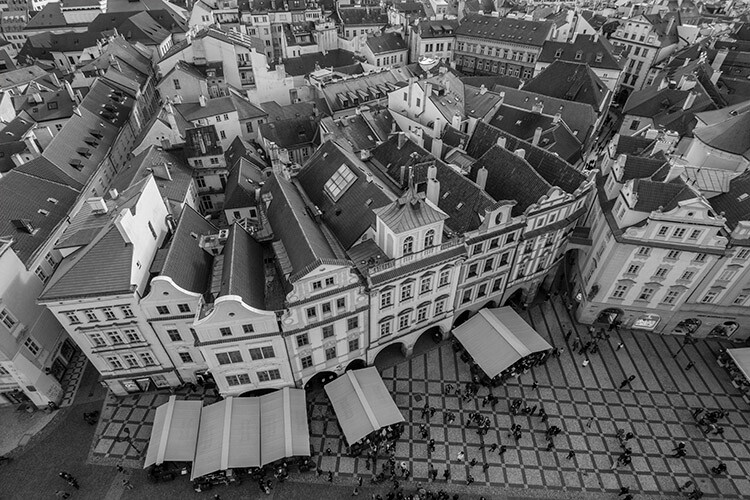
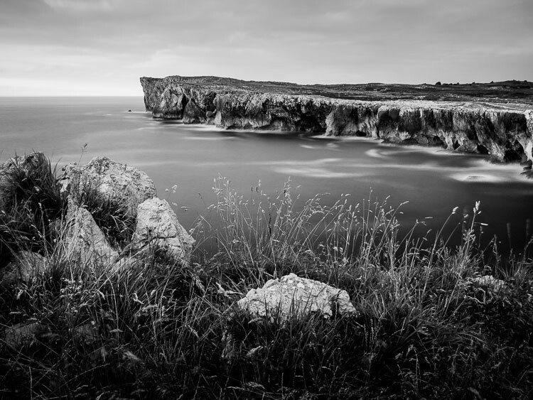
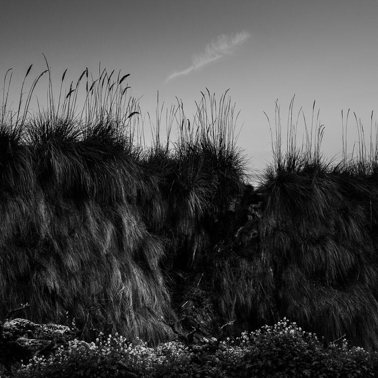
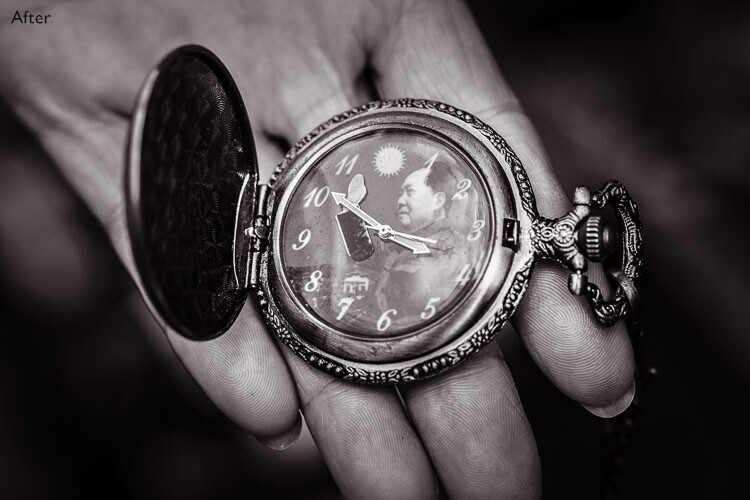
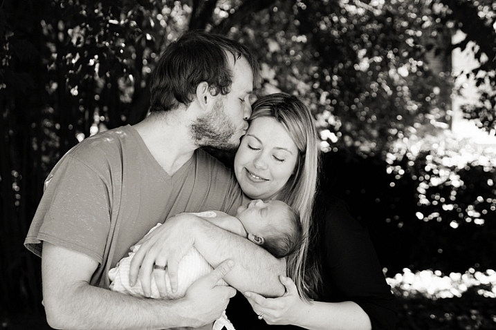
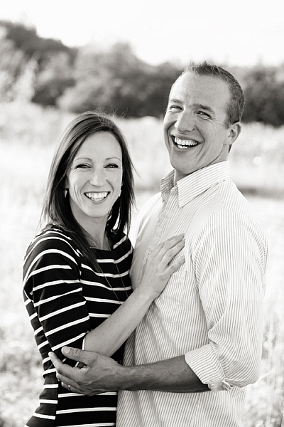
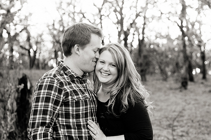
Black and white photography is as popular as ever. If you’re one of the many photographers who adore it, you know why that is the case. On one hand, black and white conversion removes the distraction of color from an image. It can help you to create evocative and dramatic images, that concentrate on the forms and shapes of a subject as a whole. On another level, black and white photographs can be reminiscent of a time gone by, one of film canisters and darkroom chemicals.
With digital photography, it doesn’t matter whether you come to black and white from a stance of nostalgia, or approach it as a tool for visual storytelling. The tools to create it are the same either way. These tools, however, are many, and can be confusing if you’re approaching Photoshop (or any post-processing tool) for the first time.
Photoshop conversions
Photoshop alone has many methods to create black and white conversions. Some of them are quite useless, and should be avoided. Others are very powerful, yet won’t work well in every instance. However, it is important to know and understand as many of the tools as possible. No two images are alike, and every image requires its own treatment. While one tool may provide perfect results, another image from the same shoot might require the use of an entirely different tool for the best results.
In this tutorial, we’ll work through nine different methods for black and white conversions in Photoshop. By following along with your own images, you will be able to quickly develop an understanding of the many tools available. Some of these methods work at the press of a button. While others take a few minutes, they offer absolute control over every aspect of the tonality of your photographs.
The basic techniques
The first four black and white conversion techniques are very basic, and will not lead to good results in most instances. I can already hear you asking; “If they’re so bad, why are they in this article?” They are here so that you will be aware of them, and know to avoid them. Also, some of them (like the Grayscale method) are among the few clearly labeled in Photoshop as black and white conversions. By actively knowing about them, you will be able to save time later when you come across a tool you previously weren’t familiar with.
This isn’t to say that they don’t have their uses. Often these techniques can be used as part of a much larger retouching workflow. But, for straight black and white conversions, these methods will leave you with muddy tones and lacklustre results.
It’s important to note, that this article concentrates on the black and white conversion process only. With the exception of the Gradient Map tool, you will still need to consider using some other post-processing techniques (blemish removal, contrast adjustments) on your images, for the best results.
1) Grayscale mode
Converting your images to Grayscale is fast, but the cost is a loss of control, and a lot of file information.
This method is as simple as it gets. In Photoshop, go to your toolbar and click Image > Mode > Grayscale. When prompted to discard your color information, click discard.
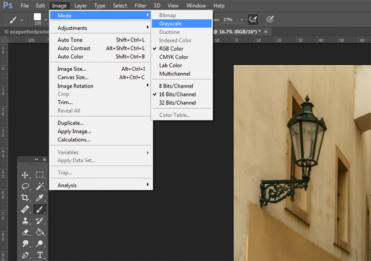
Out of all of the options, this is the one to avoid at all costs. The act of discarding all of the color information from your images is a destructive technique. That makes it difficult, if not impossible, to make changes later if you decide you don’t like the output. Also, as you’ll see in later techniques, that discarded color information is what gives you the most control over the tonality in your images.
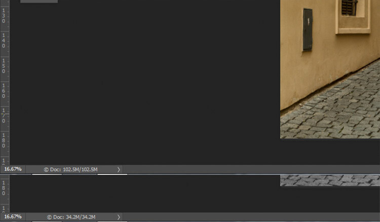
Here, you can see how much data was lost when converted to Grayscale. The converted image (bottom) has nearly 2/3 less data than the original image (top).
The best advice for this conversion method is to try it, acknowledge it, and then avoid it at all costs.
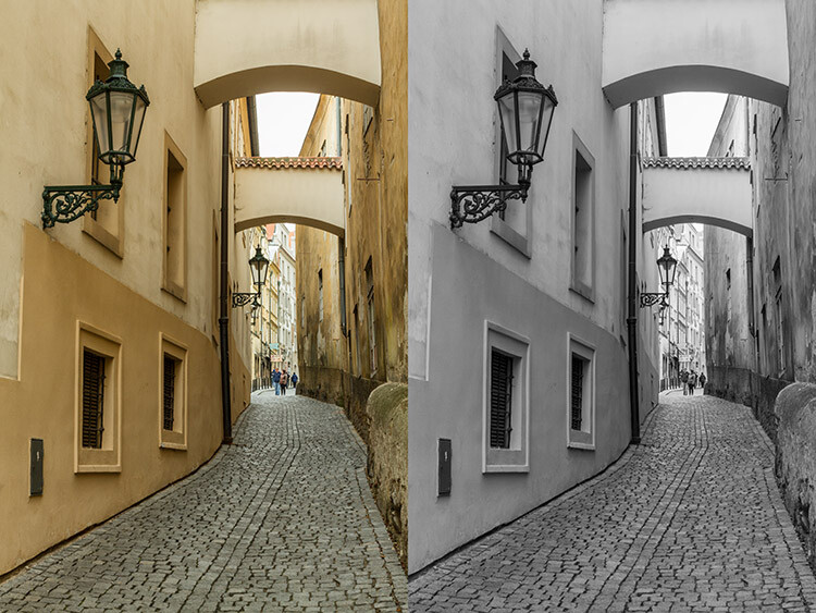
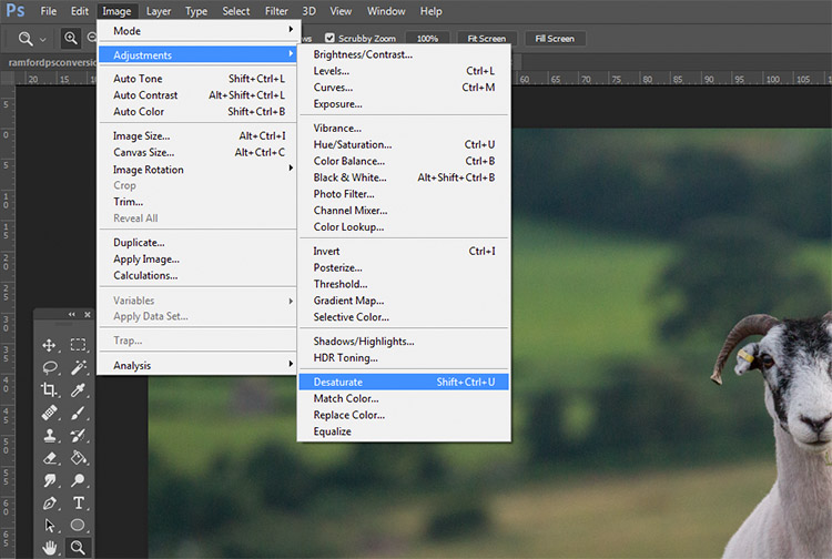
2) Desaturate
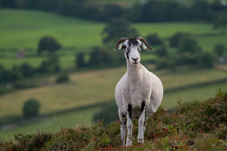
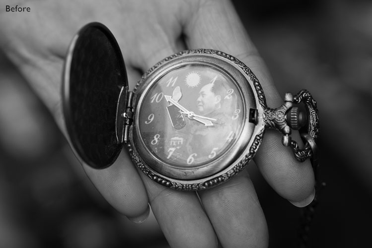
Original Image
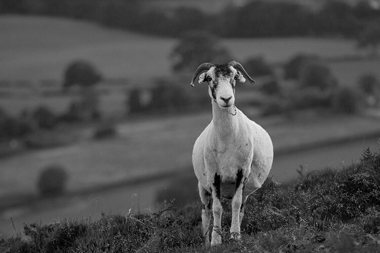
Converted to black and white using the Desaturate command.
Unlike the Grayscale method, using the Desaturate command does not discard the color information from your image. It is, however, still a destructive technique, as it does not allow you to alter or control any aspects of the conversion once it’s made.
To Desaturate your image, go to your toolbar in Photoshop and choose Image > Adjustments > Desaturate
Once again, as a destructive technique, I encourage you to avoid this tool whenever possible.
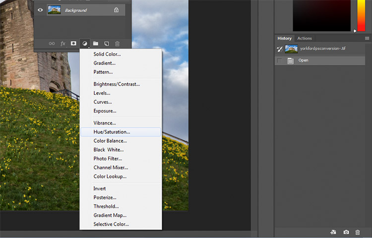
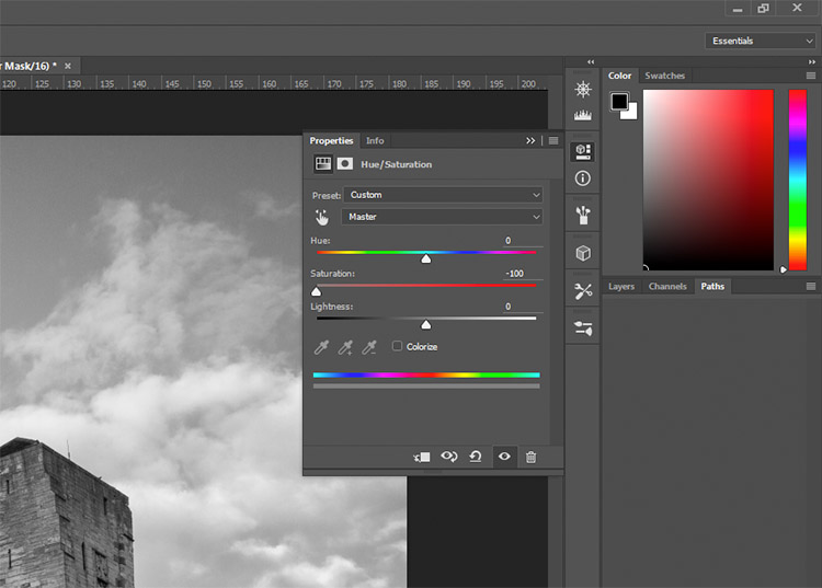
3) Hue/ Saturation layer
Original image
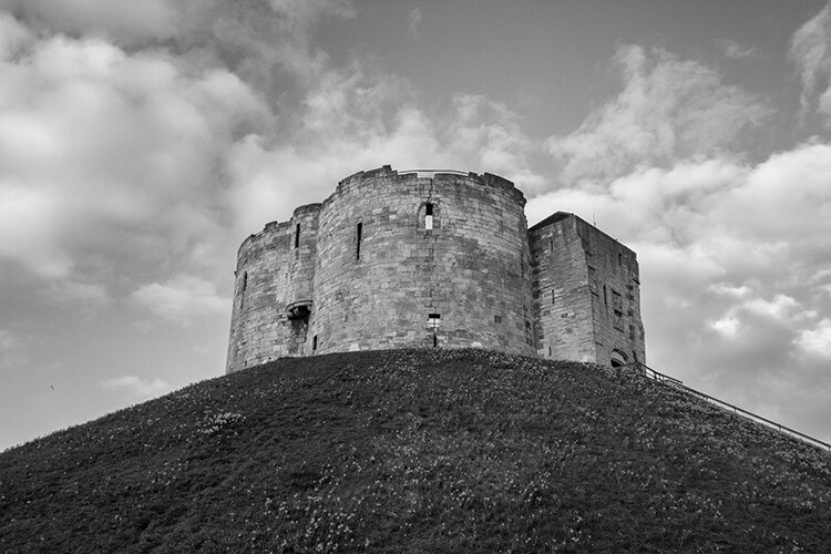
Converted to black and white using a Hue/Saturation adjustment layer.
By using a Hue/Saturation adjustment layer, you will get the exact same results as the Desaturate method, with one exception. Because this is an adjustment layer, it can be changed or discarded at any time, without any alteration to your original image, making this a non-destructive technique.
To convert your image with this method, find the Create new fill or adjustment layer button (circle that is half dark, half white) at the bottom of the Layers Palette and choose Hue/Saturation (you can also select it from the Adjustments panel if you have it visible).
In the layer properties tab that should have opened, find the Saturation slider and move it across to -100.
This is still not an ideal method, as it offers no control in the actual conversion process.
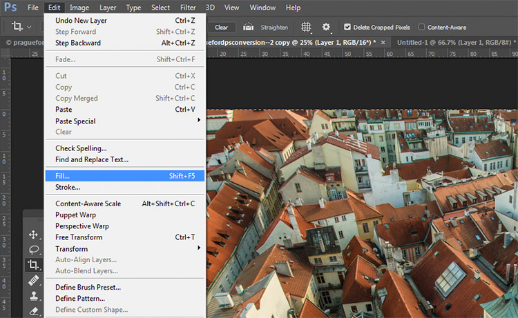
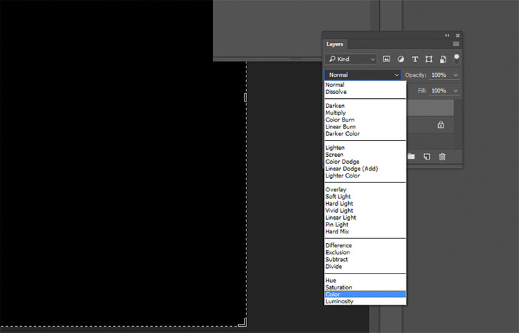
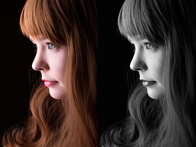
4) Solid black or white layer
Original image
Converted to black and white using a solid black layer, set to the Color blending mode.
Another easy method of converting your image to black and white is to create a new layer filled with black or white, then set the blending mode to Color. Again, this technique offers no control over the actual conversion, so it’s best avoided.
To do this, create a new empty layer by pressing the New Layer button on the layer palette (ctrl/cmd+shift+N).
With the empty layer selected go to Edit>Fill (shift+f5) and choose either black or white. Your image should now be filled with the color you selected.
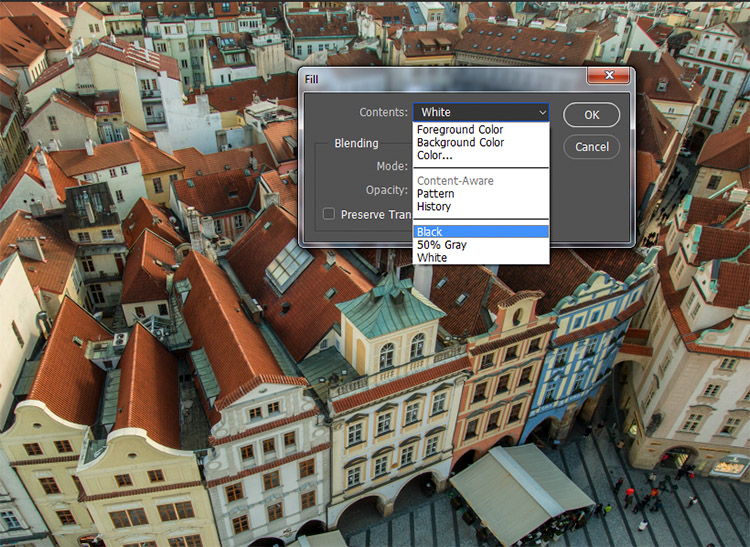
On the layer palette, find the drop down menu for the blending modes and choose color.
Intermediate Techniques
The previous four techniques are very basic, and offer you very little control, if any, over the actual conversion of your image to black and white. Now that you’re aware of them, you know what to avoid if you want the best results. The following techniques offer you a range of control over your black and white conversions, however, they take a bit more effort to get right.
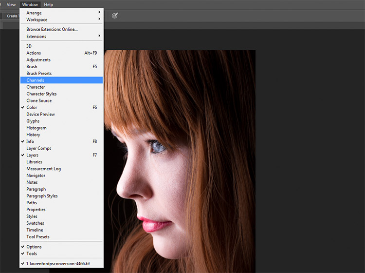
5) Channels
Left: Original image
Right: Converted to black and white by using Channels
Out of all of the techniques presented in this tutorial, this one may be the least obvious. To start, you want to make sure that you can see the Channels tab in your layer palette. If it’s not visible, go to Window in the top menu bar and make sure Channels is ticked.
This is a destructive technique, so please make sure you are working on a copy of your original image in case it goes wrong. If you’re unsure, go to Image>Duplicate to have Photoshop create a second instance of your file to work with.
With the Channels tab selected, you should see four sections (they appear as layers would in the Layer Palette) labeled RGB, Red, Green and Blue. If you select the Red, Green and Blue Channels in turn, you will see variations of your image in black and white as it relates to the color information in your image.
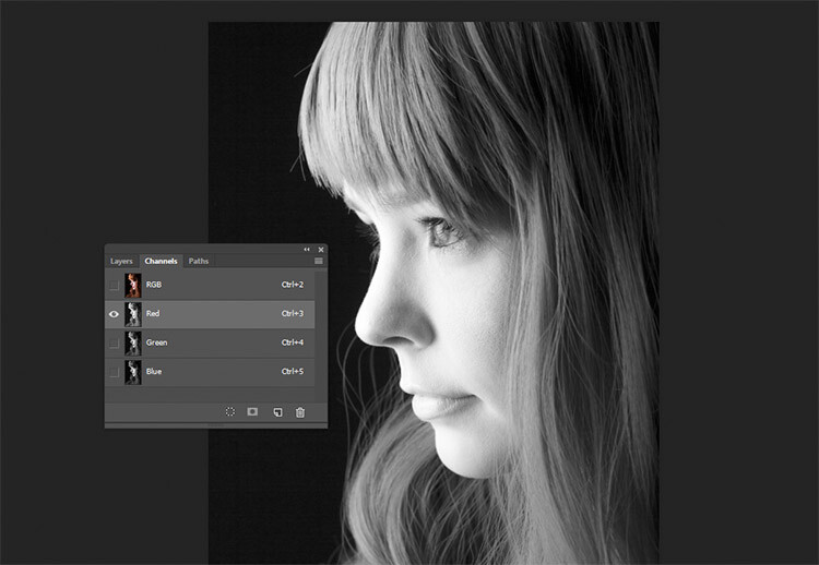
Red Channel
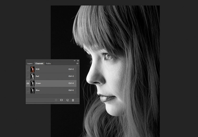
Green Channel
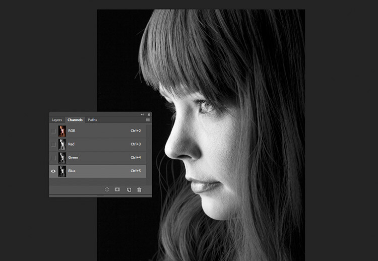
Blue Channel
To use this to convert your image, choose the channel that has the most pleasing effect on your image. This will vary depending on your subject, and the range of colors in your photos. Once you’ve made your choice, make sure you click on the channel you wish to work with. Now, on the toolbar, choose Select>All (ctrl+A or cmd+A). With the selection active go to Edit>Copy (ctrl/cmd+C)
The next step is to paste the selected channel into the other two. In this case, Green is copied and pasted into the Blue and Red channels. One at a time, select the other two channels and go to Edit>Paste (ctrl/cmd+V).
Once that is done, click on the RGB channel and you should see that your image has been converted to black and white. While this technique does not offer complete control over the conversion, it can still be used to great effect.
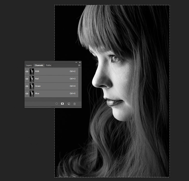
The final result with the Green channel, pasted into the Red and Blue channels.
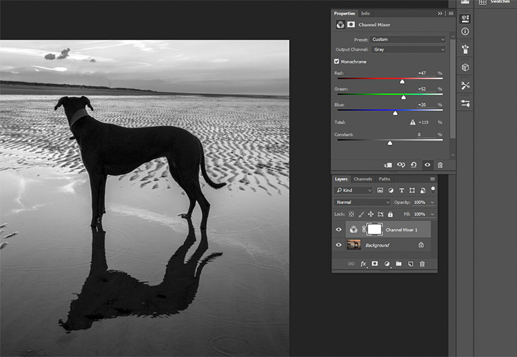
6) Channel Mixer adjustment layer
Original Image
Converted to black and white using a Channel Mixer adjustment layer.
For a bit more control, you can use a Channel Mixer adjustment layer, as a non-destructive technique. On the Layer Palette, find the Create new fill or adjustment layer button and choose Channel Mixer (or select it from the Adjustments panel).
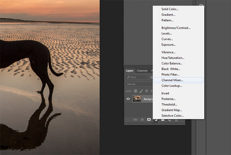
On the properties tab for the Channel Mixer layer, click the box that says Monochrome.
To fine tune your image, you can adjust the red, blue and green sliders until you get the effect you desire. These sliders are not very forgiving, so try to keep the adjustments small to avoid destroying the highlights and shadows in your image.
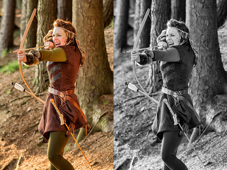
7) Black and White adjustment layer
Original image
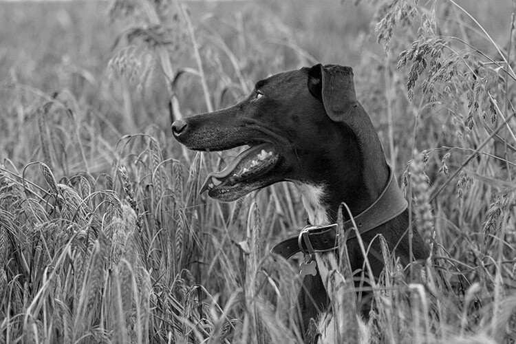
Converted to black and white using a Black and White adjustment layer.
Okay, this one’s pretty obvious in function. It’s also pretty powerful, but it’s not always the best choice. However, it is a good starting point in many cases. As such, this technique will likely become your go-to black and white conversion method, especially if you’re just starting out.
To start, find the Create new fill or adjustment layer on the Layer Palette and choose Black and White (or select it on the Adjustments panel).
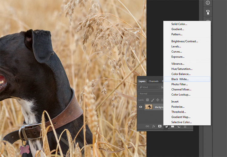
Your image will be converted to black and white, and in the properties tab, you will now see an array of color sliders. Moving these sliders to the right will brighten any tones associated with that color. Moving them to the left will darken those tones. The idea behind these sliders is to emulate the effect that colored lens filters used to have on black and white film.
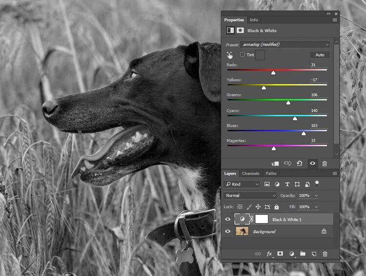
Moving the Reds and Yellows slider to the left brings out the detail in the grass by darkening the tones associated with those colors.
For portraits, the most noticeable changes will come from moving the red and yellow sliders. For landscapes, the blue and green sliders will be more useful.
As with any adjustment layer, if you change your mind later, you only need to return to the properties tab and alter the sliders to your heart’s content. This is non-destructive editing.
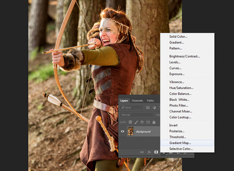
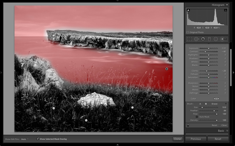
8) Gradient Map
Left: Original Image
Right: Converted to black and white using a Gradient Map adjustment layer.
The Gradient Map is easily the most powerful of all the black and white conversion tools. It allows you to control every aspect of the tonality of your image. Because of this control, it’s also the most complicated and hardest to use. It is worth knowing though, and a bit of practice will make it an invaluable tool on your belt.
Make sure your foreground and background colours are set to black and white. You can do this by pressing D on your keyboard. Now, find the Create new fill or adjustment layer on the Layer Palette and choose Gradient Map.
Make sure the gradient that is selected is black to white. Your image is now monochromatic, and you may notice that this technique gives it higher contrast to begin with, than the other methods.
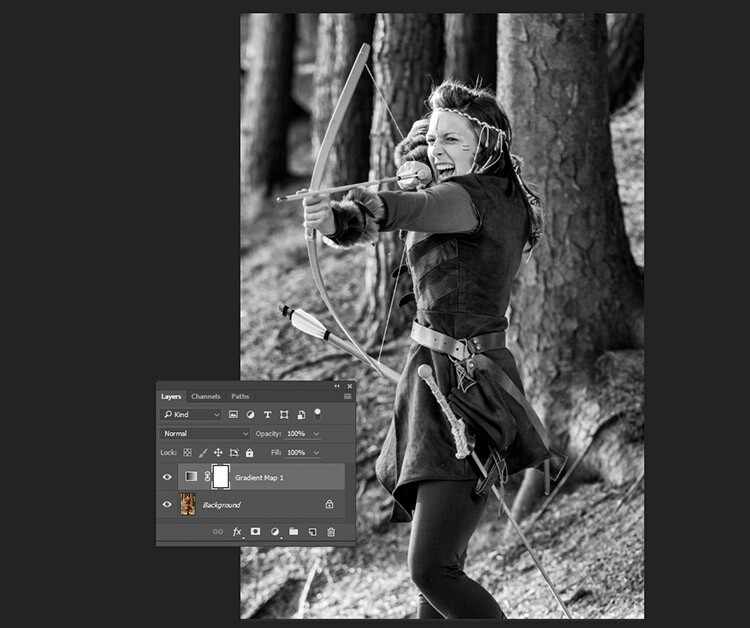
This is an example of how an image might look with a Gradient Map layer, and no further adjustments.
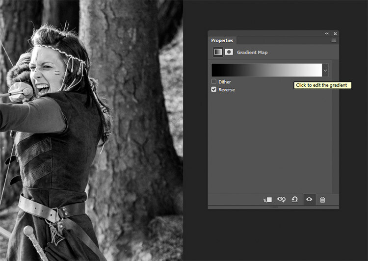
Note: If your image looks like a negative after making the adjustment layer, just click the Reverse box in the layer’s properties tab.
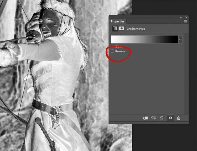
If your image looks like a negative, it just means your foreground and background colors are backwards. Just click the Reverse box in the Gradient Map’s properties tab.
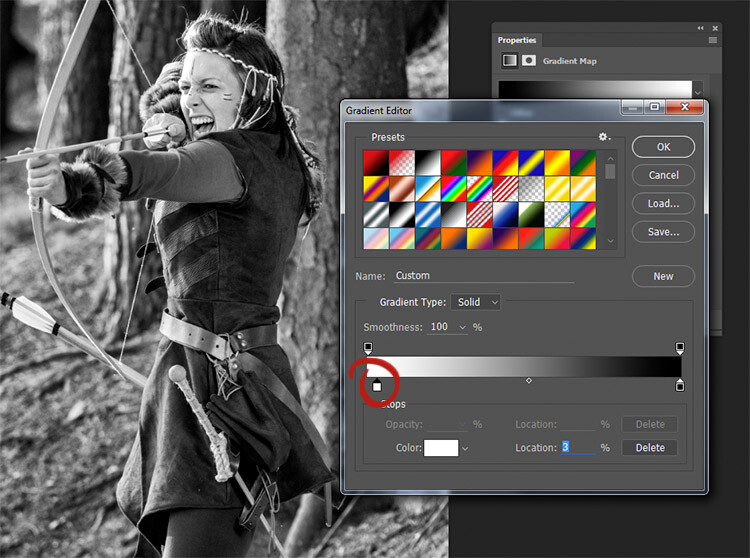
If you forgot to reset your foreground and background colors, your image probably looks like a colored mess. Just click in the gradient in the properties tab, and choose the black and white gradient to fix this with little error.
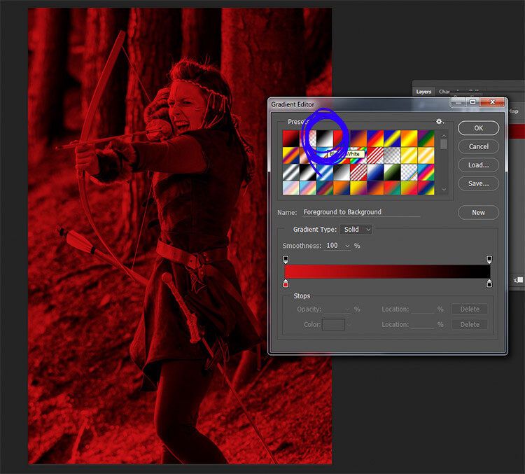
Forgetting to reset your foreground and background colors may result in something like this image. To fix it, just choose the black and white gradient (circled in blue) in the presets section of the Gradient Editor.
At this stage, you may feel that this enough. However, the Gradient Map offers a lot more in terms of control over tonality of the image.
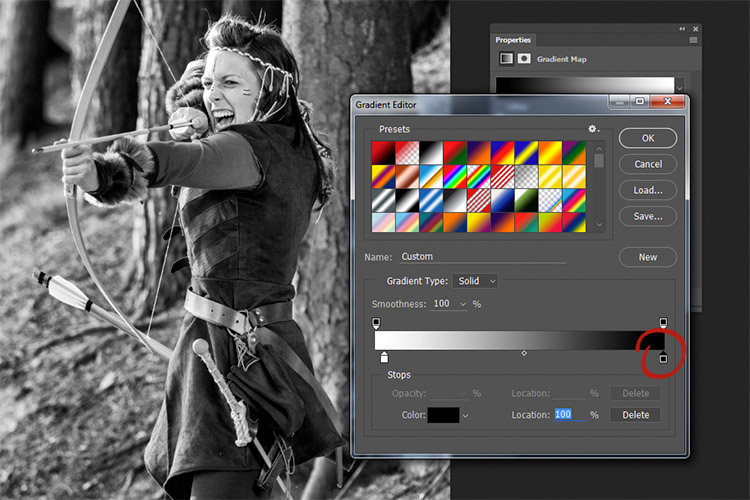
In the properties tab, if you double click the image of the gradient, the Gradient Editor will open. Towards the bottom of this screen, you will see a visual representation of your gradient. There are also be a set of sliders that show either black or white.
If you move the bottom sliders inward, you will increase the contrast in your image. Moving the black slider in, will deepen the shadows, while moving the white slider in will brighten the highlights (which direction those are will depend on whether you have reversed the gradient or not). This is an effective way to increase contrast in your image without leaving the conversion layer. Do watch your histogram for shadow and highlight clipping though.
Click into the image of the gradient to enter the Gradient Editor (note my gradient here is reversed)
Moving the white slider to the right (circled in red) will brighten the highlight tones in this image. Moving the lower black slider (to the left) will deepen your shadows.
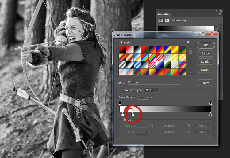
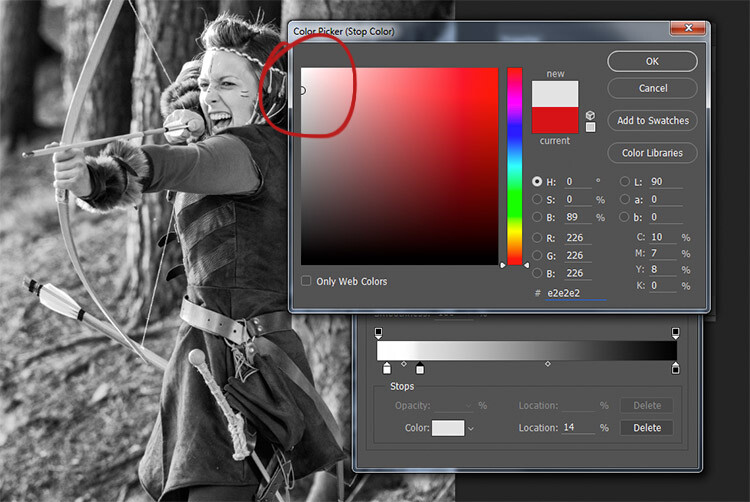
If you wanted to darken your highlights or brighten your shadows, you can change the colour of the sliders. To do this, double click on one of sliders. In this image, the dark tones are more intense than I would like, so I double-clicked the shadow slider as circled in the above image.
You should then see a Color Picker colour palette (if you don’t see red as shown below, just click the H for Hue). Click into the far left hand side of the palette, and slide the cursor up and down until you get the tone you want for your darkest shadows(or highlights if you chose them). Try to only use colours all the way to the left in the palette. Anything even a bit to the right will have a color tint to it.
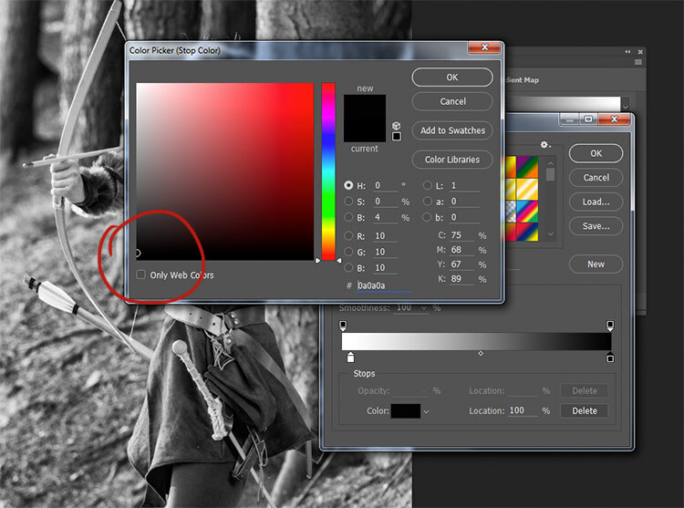
By selecting a colour just above pure black, the shadow tones in the image are brightened significantly.
To really take control over your image’s tonality, you can also control your mid-tones with the Gradient Map. Click just underneath the gradient bar and create a new slider.
To control the mid-tones in your image, create a new slider in the Gradient editor by clicking and dragging under the gradient.
Double clicking this slider will open a color palette. Choose a grey tone (light if you want to alter lighter tones, dark if you want to alter darker tones) and press okay.
Choose a color relevant to the tones you want to alter in your image.
Now drag the slider to a point where it affects the image in the way you desire. If your tone is wrong, just double click the slider again and pick a new shade. You can make as many of these sliders as you need. This gives you absolute control over every tone in your image.
At first, it may be difficult to get used to this tool, but practice will make it easier. The Gradient Map is by far the most powerful black and white conversion tool for your images.
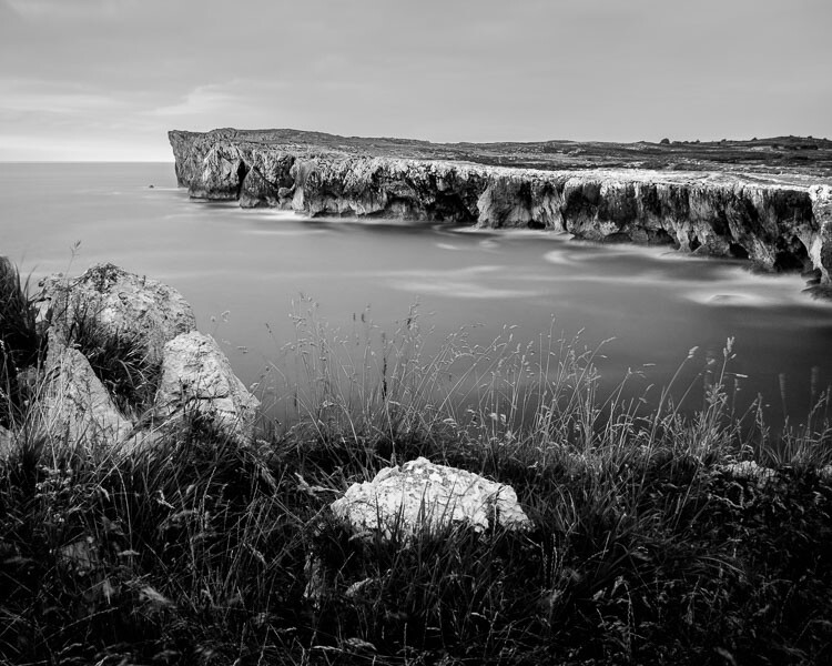
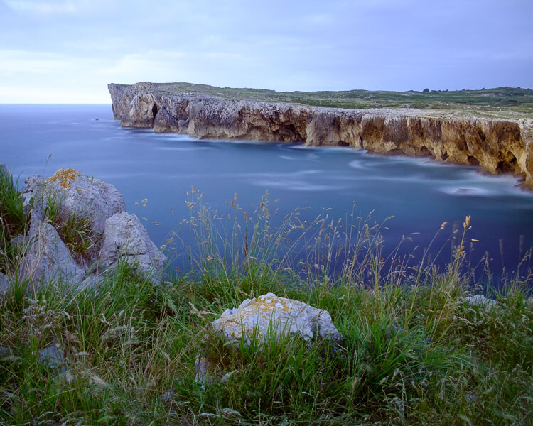
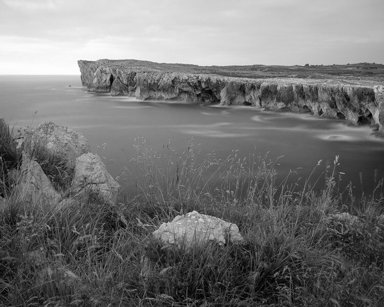
9) Adobe Camera Raw
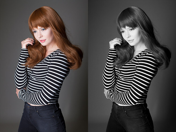
Left: Original Image
Right: Converted to Black and White in Adobe Camera Raw
The last method involves converting your image to black and white at the raw processing stage. Doing this, doesn’t grant you absolute control over your tonality, but it is still quite a powerful possibility. Because you’re working with a raw file, no matter what changes you make, the file information will remain untouched, making this a completely non-destructive technique. It also grants you access to the rest of the tools available in raw processing after you’ve converted your image, giving you a more polished result without having to open your image in Photoshop.
To start, open your image in ACR (Adobe Camera Raw) by opening your raw file with Photoshop. On the toolbar to the right, you should see a row of icons. Find the one that’s called HSL/Grayscale and click it.
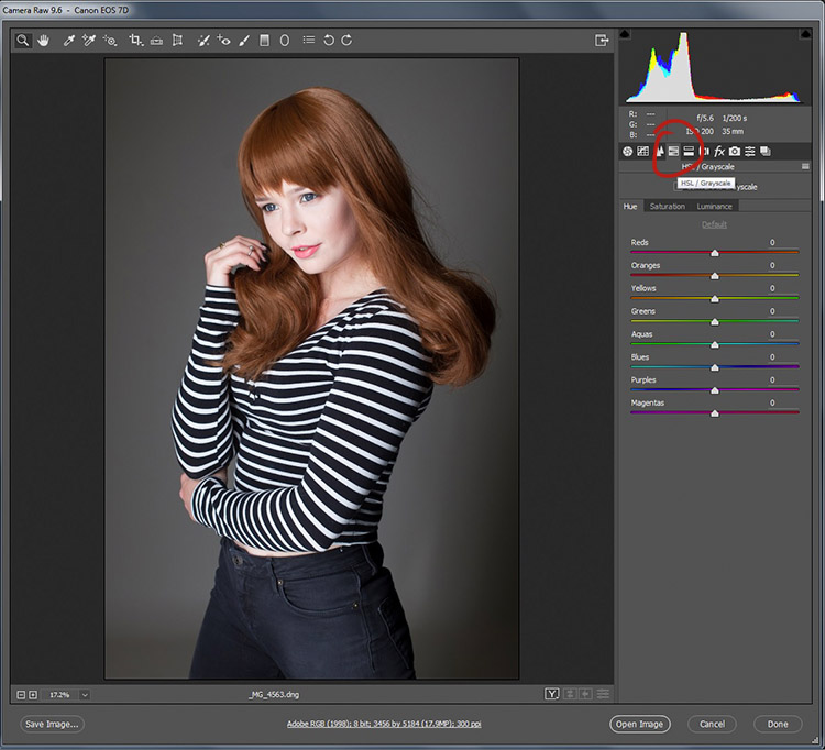
You should see a box labeled Convert to Grayscale. Click it.
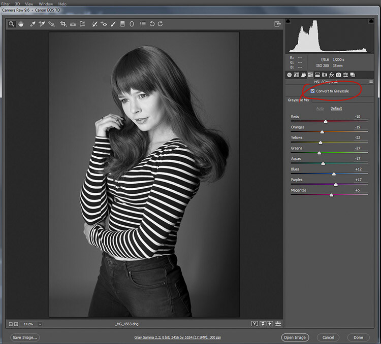
To convert your raw file to black and white in ACR, click the Convert to Grayscale box in the HSL tab.
From here, you have access to a bunch of sliders that act the same way as if you were using a Black and White adjustment layer in Photoshop. Play around with them until you’re happy with the way the tones appear in your image.
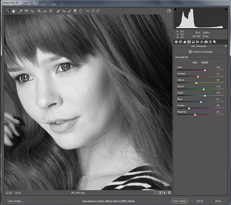
While adjusting the sliders, zoom in to areas like skin tones, so you can watch exactly how the sliders are affecting your image.
If you go back to the Basic panel, you have access to all of the basic functionality in ACR. Here you can process your raw file as normal, and you can go back to the HSL panel to alter your sliders at any point (before you leave ACR).
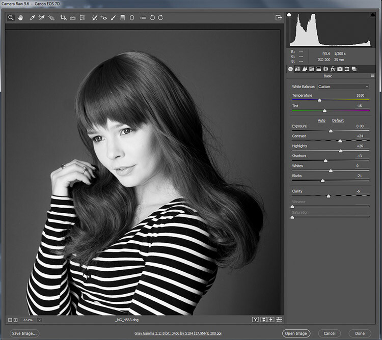
By doing your black and white conversion at the raw stage, you still have access to all of the processing tools in ACR. Take advantage of these to get a more polished result, before even entering Photoshop.
Once you’re done, export your image in your preferred format (or open it directly into Photoshop) and there you have it.
The right tool for the job
If you’ve followed each of these tutorials through, you will have gained at least a basic understanding of how to use each for black and white conversions in Photoshop. Now, ask yourself the following questions:
- Which of these tools worked best for me?
- Which of these tools did I enjoy using?
- Which of these tools did I hate using?
- Which of these tools created results that fit my tastes?
In the end, the best tool for the job is the one that gets you the results that you are looking for (even if it’s the tools that I’ve urged you to avoid). Just keep practicing, and you’ll be able to figure out which tool is best, before you even start working on your image.
How do you use Photoshop for your black and white conversions? Please share in the comments below.
googletag.cmd.push(function() {
tablet_slots.push( googletag.defineSlot( “/1005424/_dPSv4_tab-all-article-bottom_(300×250)”, [300, 250], “pb-ad-78623” ).addService( googletag.pubads() ) ); } );
googletag.cmd.push(function() {
mobile_slots.push( googletag.defineSlot( “/1005424/_dPSv4_mob-all-article-bottom_(300×250)”, [300, 250], “pb-ad-78158” ).addService( googletag.pubads() ) ); } );
The post A Guide to Black and White Conversion in Photoshop by John McIntire appeared first on Digital Photography School.

Digital Photography School


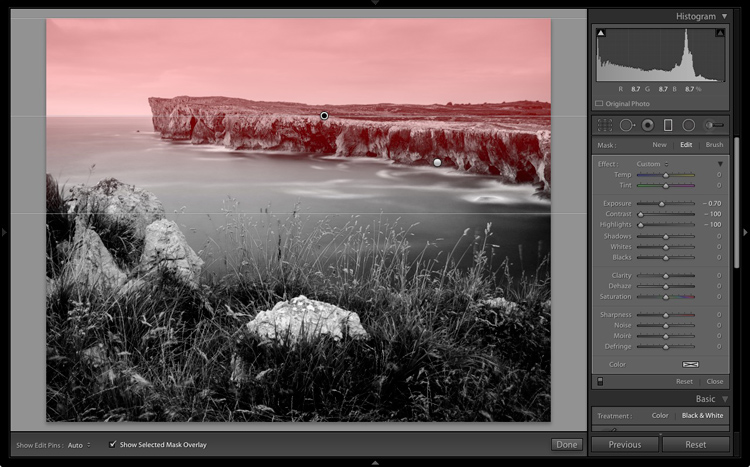
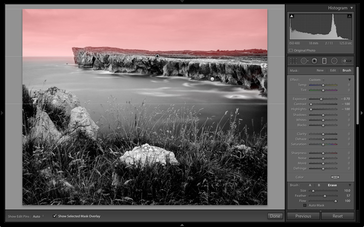
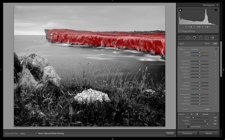
 In the bottom panel of the Develop module called Effects, make the following adjustments:


 Today is deal 4 of our mid year sale and you’re sure to love this one…
You must be logged in to post a comment.