RSS
 

Xiaomi details DeepExposure, an AI that automatically fixes image exposure and detail

06 Dec

Chinese company Xiaomi’s AI Lab has published a new paper detailing an AI network called “DeepExposure” that improves low-quality images through machine learning. “Comparing with other methods,” the researchers explained in their paper, “our algorithm can restore most of the details and styles in original images while enhancing brightness and colors.”

DeepExposure utilizes generative adversarial networks and asynchronous adversarial learning to split low-quality images into segments called sub-images. The system computes both local and global exposures for these sub-images, then evaluates their quality before blending them with the original image.

The end result is an image with improved exposure and detail, opening the door for future solutions that may automatically enhance low-quality photos. It’s possible that Xiaomi may one day offer this technology on its smartphones, which already offer other AI capabilities.

The researchers point out in their paper, “Due to the requirement of expertise of photography, photo quality enhancement is beyond the capability of non-professional users, thus leading to the new trend of automatic techniques of image retouching.”

The study indicates that DeepExposure could also be adjusted in the future to improve image tone and contrast.

Xiaomi isn’t the only company using artificial intelligence to automatically improve images. Earlier this year, researchers with Intel and the University of Illinois Urbana-Champaign detailed a deep neural network able to brighten low-light images without reducing their quality. Similarly, a technology called Deep Image Prior was unveiled last year with the ability to recreate damaged parts of an image based on the image’s existing elements.

Articles: Digital Photography Review (dpreview.com)

 
Comments Off on Xiaomi details DeepExposure, an AI that automatically fixes image exposure and detail

Posted in Uncategorized


Black and White in the Outdoors: Learning to see in Monochrome

06 Dec

The post Black and White in the Outdoors: Learning to see in Monochrome appeared first on Digital Photography School. It was authored by David Shaw.

1 - Black and White in the Outdoors

To determine when black and white is the best option in nature photography, you need to learn to see your scene in black and white. Most beginner photographers arrive at their monochrome images by experimenting with post-processing. While this occasionally works, shooting with black and white in mind results in far better images.

In other words, you need to SEE in black and white.

Look for Contrast

Highlights

In color photography, there are almost unlimited options to juxtapose contrasting and complementary colors or to provide an attention-getting subject in a flashy tone. But in black and white, you lose the ability to use color in the traditional way and are instead left with shades of gray. Contrast, rather than color, is our compositional tool.

Most of us see the world in rich color and there is no saturation slider in our eyes or brains with which we can switch color on and off. But we can train ourselves to see contrasts.

As I’m writing this, I’m looking out my window onto the spruce trees in my front yard. The sun is shining on a layer of fresh snow which fell over the past few days. The limbs of the spruces are draped in white. Looking south, toward the low sun, I can see flashes of perfect white where the sunlight is illuminating fresh snow. Those bright highlights contrast sharply with the dark, shaded trunks and exposed branches of the trees. In fact, even in the shaded areas, the difference between the snow and the dark needles is remarkable. With little color in the scene to begin with, it doesn’t take much to “see” this scene in black and white.

Because I can “see” this scene clearly in black and white, I can recognize that images like this will translate well from color. Here, let me step outside for a few minutes and make a few photos, to show you what I mean.

(A few minutes later…)

I’m back. I’ve pulled a few images and did a quick black and white conversion in Lightroom. Here are a couple of shots; first color, and then black and white.

2 - Black and White in the Outdoors

3 - Black and White in the Outdoors

4 - Black and White in the Outdoors5 - Black and White in the Outdoors

This is a straightforward example. As most people can see, lacking many colors, the snowy trees were a likely subject for black and white. However, the next step is harder.

Color Contrast

I had another black and white shooting session a few months back when “seeing” in black and white was much more difficult.

Each fall, I make a pilgrimage from my home in Alaska’s interior to the Kenai Peninsula. This year, I spent a day exploring the forest and mountains of Kachemak Bay State Wilderness Park, across the bay from the town of Homer. I hiked for several miles through the wet forest making images of the rising autumn colors, and the fog-draped mountains. It was a sea of greens and yellows, red highlights, grays, and browns. Some images were perfect for color, others not so much. Telling the difference in the field was a game I played as I walked.

6 - Black and White in the Outdoors

Some black and white images were clear in the gloomy forest. The dull yellow, jagged leaves of Devil’s Club against the muted greens and browns of the forest floor were an obvious contrast that I knew would translate well into black and white.

Others, like the pale green of fern fronds, were less contrasty in the field, and yet translated beautifully into shades of gray.

7 - Black and White in the Outdoors

These ferns were dying back at the end of the season and were largely a dull brown. Kind of ugly really. However, the color doesn’t matter in black and white, and the contrast between the pale brown fronds, and the deeply shaded background worked.

8 - Black and White in the Outdoors

This patch of ferns was pale green and popped against the darker green background. This is my favorite image of the series. It was a shot that took me a moment to “see” in black and white.

Another shot of an autumn stalk of bright red fireweed, I thought would look good in black and white when I first made the image, but upon examination of the back of my camera in the field. There was actually little contrast in brightness between the greens and red. That image didn’t work quite as well.

9 - Black and White in the Outdoors

10 - Black and White in the Outdoors

Lighting Contrast

Later that same afternoon, bright sunlight started to filter through increasingly thin clouds. It wasn’t yet hard light, but it was bright enough to be directional. The sun came through the forest canopy in patches, illuminating and shading different areas.

And this brought about a third option for black and white: lighting contrast. In the differing light, even similar colors will contrast in black and white.

11 - Black and White in the Outdoors

Beyond Details

12 - Black and White in the Outdoors

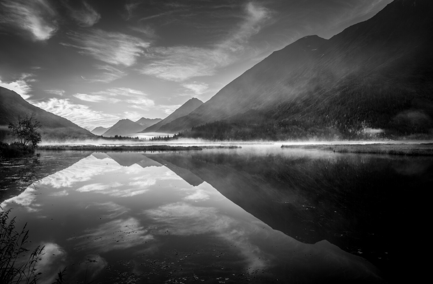
Seeing a large scene in black and white is the next step. I was photographing by a lake this fall. It was early in the day, the sun not yet far above the horizon, but any lingering sunrise color had faded. Most of the lake, some rising fog, and the surrounding mountains were in shadow. Aside from the sky, there wasn’t a lot of contrast. I was about to pack it in for the morning when the sun got high enough to illuminate a patch of fog, which flashed white in this scene of muted blues. Not much for color, I thought, but in black and white? That, I realized, would work.

13 - Black and White in the Outdoors

Terrible Light

At times, when photographing in harsh light, black and white can also salvage an otherwise impossible situation. A number of years ago, I was shooting in the altiplano of Bolivia. I arrived at mid-day at the spectacular and weird Laguna Colorado. It was savagely bright; cloudless skies, high elevation, middle of the day, and within a few degrees of the equator. Lighting conditions couldn’t have been worse.

While the landscape was uniformly drenched in harsh, ugly light, there was contrast in the colors of the desert. A polarizer darkened the sky and removed the worst of the glare. The resulting black and white conversion, was if not perfect, at least the best of a very bad situation.

14 - Black and White in the Outdoors

15 - Black and White in the Outdoors

Frequently traveling photographers find themselves in beautiful locations at bad times, and we don’t always have the freedom to return when the light is better. In such situations, consider black and white. It’s not a cure-all, by any means, but nasty light will often translate better into monochrome than full color.

The situation I described above was not unique on my trip through Bolivia. The sweet light of morning and evening lasted only minutes in the high desert, quickly replaced by glaring light. And yet contrasts in the landscape salvaged many a scene for me.

16 - Black and White in the Outdoors

Conclusion

If you can recognize a black and white subject in the field, it will open up your eyes to new compositions you may have previously ignored. Black and white photography is not simply the removal of color, it is a way of seeing.

When next you venture outdoors with your camera, look at the way colors and even shades contrast with one another. Look for lighting conditions that cause contrast to appear and embrace those situations in the form of black and white photography. Even on those days with rotten, bright light, consider how removing those washed out colors might help your final image, sometimes black and white can salvage an otherwise desperate moment.

Give it a try and then share your results in the comments below.

The post Black and White in the Outdoors: Learning to see in Monochrome appeared first on Digital Photography School. It was authored by David Shaw.


Digital Photography School

 
Comments Off on Black and White in the Outdoors: Learning to see in Monochrome

Posted in Photography


Qualcomm’s new Snapdragon 855 chipset offers faster depth sensing, 4K HDR video at 60fps

06 Dec

Qualcomm has announced its new flagship mobile chipset that we should expect to see in most 2019 high-end Android smartphones, including the Samsung Galaxy S10.

From an imaging point of view the most interesting news is an upgraded Spectra image signal processor (ISP) that is taking over some tasks that previously have been performed by CPU, GPU and DSP in conjunction. For example, the ISP can process depth mapping at a frequency of 60 frames per second. This should be useful for real-time object attenuation applications but could also help improve simulated bokeh effects in video footage.

In addition the new ISP enables 4K HDR video capture at 60 fps and Qualcomm also claims the processor generally needs only about 25 percent of the power for the same task than previous variants.

For general computing the new chipset’s 7nm process is expected to deliver improved performance while yielding noticeably better battery life then the current Snapdragon 845. The Snapdragon 855 should also bring performance improvements to AI-applications. Qualcomm says the new chipset delivers “up to three times the AI performance compared to the previous generation mobile platform”.

In terms of connectivity the 855 won’t come with 5G but instead use Qualcomm’s new X24 LTE modem which is capable of theoretical download speeds up of to 2Gbps. However, device manufacturers will have the option to add an X50 5G modem to their packages if they they want to include 5G connectivity in their Snapdragon 855-powered products.

Articles: Digital Photography Review (dpreview.com)

 
Comments Off on Qualcomm’s new Snapdragon 855 chipset offers faster depth sensing, 4K HDR video at 60fps

Posted in Uncategorized


Tumblr will remove and ban all ‘adult content’ from its platform starting December 17th

05 Dec

In a controversial move, social media website Tumblr has announced it will start removing all pornography and explicit content on December 17th, 2018 and subsequently ban adult content going forward.

The ban comes three weeks after Apple removed the Tumblr app from its iOS app store after it was discovered underaged content was slipping through an ‘industry database of child sexual abuse material,’ but it’s unclear if the move to ban all adult content is due to Apple’s decision.

For context of how much adult content there is on Tumblr, former Tumblr CEO David Karp said in June 2012 that roughly two to four percent of the content on Tumblr was related to pornography. A year later, in May 2013, web analytics firm SimilarGroup came out with its own analysis claiming 22,775 of the 200,000 most-visited Tumblr domains were pornographic in nature — roughly 11.4 percent. The discrepancies between those two statistics is stark, but regardless of how it’s looked at, there’s a great deal of adult content floating around the social network with more than 100-million blogs.

‘Posts that contain adult content will no longer be allowed on Tumblr, and we’ve updated our Community Guidelines to reflect this policy change,’ says Tumblr CEO Jeff D’Onofrio in a blog post on the Staff Tumblr. He goes on to say ‘Bottom line: There are no shortage of sites on the internet that feature adult content […] We will leave it to them and focus our efforts on creating the most welcoming environment possible for our community.’

Where things get interesting is how Tumblr is defining adult content. On Tumblr’s Help Center page, it defines it as follows:

Adult content primarily includes photos, videos, or GIFs that show real-life human genitals or female-presenting nipples, and any content—including photos, videos, GIFs and illustrations—that depicts sex acts.

Tumblr goes on to say on the same page what is allowed, which reads as follows:

Examples of exceptions that are still permitted are exposed female-presenting nipples in connection with breastfeeding, birth or after-birth moments, and health-related situations, such as post-mastectomy or gender confirmation surgery. Written content such as erotica, nudity related to political or newsworthy speech, and nudity found in art, such as sculptures and illustrations, are also stuff that can be freely posted on Tumblr.

In terms of photography, it appears as though nearly all nude photography will be removed and banned, regardless of how tasteful it is or isn’t. That is, unless it’s a male nipple or pertains to the other exceptions mentioned above.

Tumblr has started flagging content as inappropriate already and will continue to do so. In the event a piece of content was flagged unnecessarily, something that’s already happening, Tumblr has an appeal button alongside the post that can be used to protest the flag.

Articles: Digital Photography Review (dpreview.com)

 
Comments Off on Tumblr will remove and ban all ‘adult content’ from its platform starting December 17th

Posted in Uncategorized


How to Create a Lithography Effect Using Photoshop

05 Dec

The post How to Create a Lithography Effect Using Photoshop appeared first on Digital Photography School. It was authored by Ana Mireles.

1- How to Create a Lithography Effect Using Photoshop

I love getting inspiration from darkroom techniques and applying original effects to digital photos. If you’re like me and want to give your images a vintage look, this tutorial is for you. I’ll show you how to get a beautiful creamy-caramel tone that mimics Lithography (or Lith for short) printing.

Lith printing is a monochrome technique that consists of overexposing the paper and then underdeveloping it. By doing this, your photograph gets warm colors with strong shadows but with aerial highlights. That explained, now let’s get into Photoshop.

1.  Choose Your Image and Create a Black and White Adjustment Layer

To create a Lithography Effect Using Photoshop, choose the image you want to work with and open it in Photoshop. There’s no need to duplicate it or save an extra copy as you’re not going to touch this original image. Everything is done using layers and adjustment layers. Working this way not only protects your original image, but it also allows you to go back and adjust or modify every step if you wish to.

2 -How to Create a Lithography Effect Using Photoshop


The first step is to create an adjustment Black and White Adjustment layer. To do this, click on the ‘Add Adjustment Layer’ button from the bottom of the layers panel. It’s the one with the symbol of a half dark – half light circle. A pop-up menu appears with all your choices. Choose the Black and White one. Now the properties panel allows you to adjust it through the use of sliders. You can move the green and the yellow sliders to lighten it a little bit like I’m doing. However, this depends on the photo you’re using.

3 - How to Create a Lithography Effect Using Photoshop

2. Create a Hue/Saturation Adjustment Layer

Next, add another adjustment layer. This time choose ‘Hue/Saturation’ from the menu to achieve the tones you want. Ensure the ‘Colorize’ box is checked and move the ‘Hue’ slider. In the original technique, the tone depended on the type of paper, the specific blend of developer and the time you left it to process, so you can also be flexible here. In any case aim for a soft brown or caramel, For my taste, something between 20 or 30 on the slider works well.

4 - How to Create a Lithography Effect Using Photoshop

3. Create a Brightness/Contrast Adjustment Layer

Create another adjustment layer and choose ‘Brightness/Contrast’ from the menu. Click the ‘Legacy’ box and drag the contrast slider to the left to flatten your mid-tones.

5 - How to Create a Lithography Effect Using Photoshop

4. Create a Curves Adjustment Layer

The last adjustment layer is meant to adjust the shadows. Add a ‘Curves’ adjustment layer and anchor the lightest part by clicking on the top right corner. Drag the darkest one (on the bottom left) to the right until you reach the first quadrant. Finally, create an anchor point in the middle and drag it upwards for the mid-tones. It may sound complicated, but you can see it in the screenshot below. There is also no need to replicate exactly. It also depends on your image and your liking.

6 - How to Create a Lithography Effect Using Photoshop

5. Create a New Layer

That is all for the adjustment layers. Now create a new layer. This button is also on the bottom of the panel; however, the symbol is a square with one corner bent. Color this layer by going to Menu -> Edit -> Fill, choose 50% Gray and apply. This layer should completely cover your image but don’t worry; you’ll fix that later.

7 - How to Create a Lithography Effect Using Photoshop

6. Add Noise

While still in this layer, go to Menu -> Filter -> Noise -> Add Noise. In the pop-up window, choose ‘Monochrome’ and slide up to about 140% because you need to distress the image.

8 - How to Create a Lithography Effect Using Photoshop

6. Add Blur and Soft Light

Next, go to Menu -> Filter -> Blur -> Gaussian Blur and set it to ‘4.’ This softens the noise.

9 - How to Create a Lithography Effect Using Photoshop

Now change the Blending Mode from the drop-down menu that you’ll see on the top of the panel, and choose ‘Soft Light.’

10 - How to Create a Lithography Effect Using Photoshop

7. Add a Layer Mask

Now your image is distressed as desired, but the effect needs to be contained only into the darkest areas because Lithography prints are characteristic for their grittiness within the shadows. To achieve this effect, you need to add a layer mask to it. Go to Menu -> Select -> Color Range and sample the darkest areas by clicking on one of them. You can fine-tune this selection by dragging the fuzziness slider.

11 - How to Create a Lithography Effect Using Photoshop

Now click on the Layer Mask button and see the results or your finished digital Lith. Please give it a try and share your results in the comment section.

12 - How to Create a Lithography Effect Using Photoshop

The post How to Create a Lithography Effect Using Photoshop appeared first on Digital Photography School. It was authored by Ana Mireles.


Digital Photography School

 
Comments Off on How to Create a Lithography Effect Using Photoshop

Posted in Photography


Officials say Apple’s claim of ‘studio quality’ portraits on iPhone X, Xs isn’t misleading

05 Dec

Two challenges to Apple’s claim that its iPhone X can shoot studio quality portraits have been turned down by the UK’s Advertising Standards Authority (ASA). The complainants took issue with Apple’s advertising line that the phone could deliver ‘Studio-quality portraits […] Without the studio’ and believed consumers would misled, but after an investigation the ASA found that the statement was fair.

The basis of the findings is that there isn’t clear definition of what ‘studio quality’ means, and that there is a wide variety of talent in the studio photography industry that meant that the term didn’t necessarily indicate that a ‘studio quality’ portrait was a good one. Rather, the ASA agreed with Apple that the Portrait Lighting effects, the depth-of-field mimicking software and the inclusion of a standard, instead of a wide, focal length meant that the characteristics of a ‘studio’ portrait could be achieved. The investigation also found that the effects shown in the Apple adverts could indeed be produced with the phone at the time of shooting or post capture.

The ruling might seem a smack in the face to the portrait business and to undermine respect for the profession, but photographers are perhaps becoming victims of our own well-worn stock phrases such as ‘the best camera is the one you have with you’. While there is no clear measure of what ‘studio quality’ means, skill and vison are required to create a good portrait and as we all know ‘it’s the archer not the arrow’ – though Apple forgot to mention that bit.

The fact is that smart phones are genuinely becoming better and better at taking pictures, and their developers are devising features and functions well ahead of those traditional camera makers offer. These features often exist to compensate for the physical limitations of the tiny camera units, but they also put incredible flexibility into the hands of the user. At every turn in history the advances of smaller formats have been opposed by ‘proper’ photographers, but that has done nothing to prevent the inevitable progress of the convenience and popularisation of photography. You would be mad to buy an iPhone X to start your portrait business however, as a decent interchangeable lens camera can be had for less than the same price – with change to use a pay phone.

For more information on the complaint, the investigation and the ruling see the Advertising Standards Authority website.

Articles: Digital Photography Review (dpreview.com)

 
Comments Off on Officials say Apple’s claim of ‘studio quality’ portraits on iPhone X, Xs isn’t misleading

Posted in Uncategorized


Ibis Switzerland hotels offer social media pros to manage guests’ Instagram accounts

05 Dec

Ibis hotels in Switzerland are offering guests a new service called Social Media Sitter. With this, customers can use “Instagram professionals” provided by the hotel to manage their Instagram profile while on vacation, enabling guests to “enjoy the city without a smartphone in front of the face,” the company explains on its website.

The Social Media Sitter service is now available at Ibis hotels in Zurich and Geneva. The company lists several “Instagram professionals” on its site who specialize in categories that include fashion, travel, beauty, culture, art, and more.

The Instagram sitter shares “the best posts” on the guest’s profile, though it’s unclear how the service works. Presumably the Social Media Sitter is provided with the customer’s username and password; the company’s video suggests the sitter will follow the guests to capture candid shots and will manage the account’s comments and likes on the user’s behalf.

It’s unclear whether Ibis plans to launch its Social Media Sitter option at its other hotels. The new service appears popular, though, as Ibis’s Geneva and Zurich locations both show their Instagram professionals having been fully booked each weekend throughout November.

Articles: Digital Photography Review (dpreview.com)

 
Comments Off on Ibis Switzerland hotels offer social media pros to manage guests’ Instagram accounts

Posted in Uncategorized


Full Frame VS Crop Sensor VS Micro Four Thirds: Camera Sensors Explained

05 Dec

The post Full Frame VS Crop Sensor VS Micro Four Thirds: Camera Sensors Explained appeared first on Digital Photography School. It was authored by Kunal Malhotra.

1 - Full Frame VS Crop Sensor VS Micro Four Thirds: Camera Sensors Explained

‘DSLR Camera, Full-Frame, Crop Sensor’- Just 3 terms which are prevalent in virtually every discussion involving photography. The two terms in use to classify sensor sizes of a DSLR camera are ‘Full-Frame’ and ‘Crop-Sensor.’ A Full-Frame camera contains a sensor size equivalent to a 35mm film format whereas a Crop-Sensor camera has a sensor size smaller than a full-frame sensor or a 35mm film format.

Micro-Four-Thirds (4/3) is a relatively new format (and term). First introduced around 2008, this sensor is slightly smaller and compact in nature. However, owing to a variety of factors, this format is now considered almost equal to, if not better than, the Crop Sensor format.

Apart from the physical size difference, there are several other points of difference between a full-frame sensor, a crop-sensor, and a micro-four-thirds sensor. Let’s take a look at a comparison between them under the following characteristics, to get an accurate understanding of their differences.

Crop Factor

As mentioned above, a full-frame camera has a 35mm sensor based on the old film-format concept. Whereas, a crop-sensor (also called APS-C) has a crop factor of 1.5x (Nikon) or 1.6x (Canon). Micro-Four-Thirds are even smaller sensors having a crop factor of 2x.

This crop factor also directly affects our field of view. Simply put, an APS-C sensor would show us a cropped (tighter) view of the same frame as compared to a full-frame sensor, and a Micro-Four-Thirds sensor would show an even tighter (more cropped) output of the same frame.

2 - Full Frame VS Crop Sensor VS Micro Four Thirds: Camera Sensors Explained

LEFT: Photo clicked using a Full-Frame camera. CENTER: Photo clicked using a Crop-Sensor camera. RIGHT: Photo clicked using a Micro-Four-Thirds camera.

Focal Length

The focal length obtained by different sensors is also directly associated with crop-factor. The focal length measurement of any given lens is based on the standard 35mm film format. Whenever we use any crop-sensor camera, its sensor crops out the edges of the frame, which effectively increases the focal length. However, this is not the case with any full-frame sensor, as there is no cropping involved with a full-frame field of view.

For example, in the Nikon eco-system, a crop-sensor camera such as the D5600 has a ‘multiplier factor’ of 1.5x. Thus, if I mount a 35mm f/1.8 lens on my Nikon D5600, it would multiply the focal length by 1.5x, thus effectively giving me a focal length output of around 52.5mm. If you mount the same lens on a full-frame Nikon body such as the D850, it gives an output of 35mm.

Similarly, if you mount a 35mm lens on a Micro-Four-Thirds sensor, which has a crop factor of 2x, it effectively doubles the focal length obtained to around 70mm.

3 - Full Frame VS Crop Sensor VS Micro Four Thirds: Camera Sensors Explained

LEFT: Photo clicked at 35mm on a Full-Frame camera. CENTER: Photo clicked at 35mm on a Crop-Sensor camera. RIGHT: Photo clicked at 35mm on a Micro-Four-Thirds camera.

Depth of Field

Similar to focal length, the aperture or f-stop measurement of a lens is based on the full-frame 35mm format. Similar to focal length, a ‘multiplier effect’ gets applied to the f-stop when using crop-sensors. As we know, the f-stop or aperture is the singular most important factor that affects the Depth of Field.

Thus, a Micro-Four-Thirds camera gives us less (shallow) Depth of Field at similar focal lengths when compared with a full-frame camera. For example, an image shot at f/1.8 on a Micro-Four-Thirds camera would give an output similar to an image shot at f/3.6 on a full-frame camera, and f/2.7 on a crop sensor camera. This is assuming that the effective focal length, and other shooting conditions, are the same.

Low Light Performance

Generally, full-frame cameras provide not only better low light & high ISO performance, but a better dynamic range. These factors combined eventually produces a much better image output than any crop-sensor camera can achieve.

Full-frame cameras are capable of capturing the most light and will almost always out-perform an APS-C or Micro-Four-Thirds camera body under low-light conditions. Micro-Four-Thirds sensors don’t perform well under low-light conditions where the ISO needs to be cranked up to say, above 2000.

For these reasons, despite full-frame camera kits being expensive, bulky and heavy to carry around, they are still industry-standard and the preferred cameras for virtually all professional photography work.

Conclusion

Thus, while full-frame DSLR’s remaining the industry standard even today, we cannot ignore the undeniable advantages of the Micro-Four-Thirds cameras. Micro-Four-Third cameras, such as the Olympus EP-5 & the Panasonic GH5, are affordable and easy to carry around. Thus, enabling a much larger group of people (who are hobbyists and enthusiasts but not professionals) to have access to DSLR-like shooting conditions at a fraction of the price.

Ultimately, factors such as your budget, use and other criteria define whether you choose either Full-Frame, Crop-Sensor, or Micro-Four-Thirds cameras.

Read more info on sensors here.

The post Full Frame VS Crop Sensor VS Micro Four Thirds: Camera Sensors Explained appeared first on Digital Photography School. It was authored by Kunal Malhotra.


Digital Photography School

 
Comments Off on Full Frame VS Crop Sensor VS Micro Four Thirds: Camera Sensors Explained

Posted in Photography


iPhone XS: How does the variable bokeh effect compare to a real lens?

04 Dec

One of the key new features of Apple’s latest iPhones is the ability to adjust the ‘bokeh effect’ on portrait images, after they’ve been taken. But, as well as letting you adjust the intensity of the effect, the function has been enhanced to more accurately represent the bokeh characteristics of a real lens, rather than just trying to blur the background.

Every time you shoot an image using the 56mm-equivalent F2.4 portrait camera on the iPhone XS you have the choice of editing the bokeh effect. This brings up a scale marked in F-numbers. This may sound like Apple just borrowing an interface from the real-world (a process called skeuomorphism), but it goes beyond this: the company says it’s modeled the bokeh characteristics to mimic the behavior of a Zeiss lens.

We thought we’d put this to the test: how convincingly does the iPhone XS resemble a real-world lens? Is the F-number scale anything more than a pastiche? To find out, we shot the XS alongside the Nikkor 58mm F1.4, mounted on a full frame camera.

iPhone XS vs Nikon 58mm at F1.4

iPhone XS image processed as ‘F1.4’ Nikkor 58mm at F1.4

Scaling the Nikon image down to the same width, you can see the bokeh is around the right size:

Then, when you look at the bokeh off-center, you’ll see it develops an elongated ‘cat-eye’ effect.

iPhone XS vs Nikon 58mm at F8

iPhone XS image processed as ‘F8’ Nikkor 58mm at F8

Just as with the real lens, the cat-eye effect diminishes as you ‘stop down.’ And Apple has given its bokeh a smooth, fairly gaussian look, rather than the slightly bright-edged bokeh that Nikon has produced, being constrained by the limitations of things such as glass and physics.

Unlike the ‘real’ camera, the iPhone’s sharpness doesn’t always drop-off smoothly: for instance it’s blurred both shoulders and the subject’s scarf, despite the nearer being in a similar plane to the face.

However, while this doesn’t always looks natural, the phone is intentionally ensuring that the subject’s face remains entirely in focus, which is usually a good thing. And, unlike the $ 1600 Nikkor lens, it doesn’t become a little soft and dreamy when set to ‘F1.4.’

Equally, because the iPhone isn’t actually changing its aperture, you don’t find yourself with less light if you want more depth of field (the iPhone portrait camera’s actual depth of field is F15 equivalent, so there’s plenty that’s in focus in the underlying ‘native’ image), so you don’t have to worry so much about camera shake or subject movement.

The end result isn’t going to convince anyone if they look too closely (the processing has cut-off some of the fine hairs, for instance), but for social media use, it’s hard to deny that the effect is impressive. And we have to assume this technology will only get smarter and more powerful in future generations.

Articles: Digital Photography Review (dpreview.com)

 
Comments Off on iPhone XS: How does the variable bokeh effect compare to a real lens?

Posted in Uncategorized


Have your say! 2018 Readers’ Choice Awards open for voting

04 Dec

It’s that time again! This is your opportunity to make your voice heard by voting for your favorite photography products of the year. Polls are currently open in six categories but don’t deliberate too long – they close December 17th.

Articles: Digital Photography Review (dpreview.com)

 
Comments Off on Have your say! 2018 Readers’ Choice Awards open for voting

Posted in Uncategorized