Blog

  • How to Use Monochrome Color in Photography

    Although photography is relativity new in terms of history, color still provides us with the opportunity to convey meaning and draw the eye. Monochromatic pallets take color photography to the next level.

    From the origins of color photography, photographers have honed in on the emotional bond humans have with color. First used in prehistoric cave paintings, red ochre is one of the oldest pigments still in use. Blue was popular in Egypt and later in the medieval era to depict the delicate robes of deities. Fast forward to the present and we are surrounded by the same array of colors that impressed our ancestors. The difference now is only that we are able to harness it for our own uses with much greater ease.

    How to Use Monochrome Color in Photography

    What is monochrome color?

    Black and white photography (which renders a photograph in varying degrees of gray) is the dominant example of monochromatic photography. You may be surprised to learn, however, that monochromatic photography is not limited to black and white.

    A classic example is sepia, the warm tone that is reminiscent of aging photographs. Over time, sepia slowly claims the tones of black and white images and transforms them into shades of reddish-brown instead.

    Basically, any photograph containing only the hues or tones of a specific color are considered monochromatic. A photograph can be organically similar in tone or edited in post-production by adjusting the blending mode of a solid colored layer. Either way, monochromatic photography is about prioritizing color to enhance mood and atmosphere.

    How to Use Monochrome Color in Photography

    Red

    The color red traditionally conveys vigor, love, anger and valor  – all of which are passionate emotions. The blood vessels in our face expand in times of stress making our cheeks flush red. We bleed red blood when we are hurt. When suffering from lack of sleep (or hay fever) we even develop bloodshot eyes. Red has a unique physical relationship with the human body. We are attracted to it because we are so familiar with it in ourselves.

    Red also catches our eye so effectively because it triggers an evolutionary response. As humans evolved, we came to understand red as a color that could portend danger. The color which drew the watchful eye of our prehistoric relatives registers as an attention-grabbing color in the modern day. An example of this is red stop signs or signs warning of danger. Photographers can use this evolutionary connection to catch a viewer’s attention quickly and hold it for longer.

    How to Use Monochrome Color in Photography

    Monochromatic red conveys unease or unrest but also appears more gentle in nature with the change of seasons. It’s boldness contrasts pattern and texture, and blends with darker shades to lend the illusion of voyeurism or intimacy.

    How to Use Monochrome Color in Photography

    Orange

    Sharing properties with yellow and red, orange is a versatile color most often associated with heat, health, and strength. It encourages extroversion and activity. Red, yellow and orange combine to depict flames and desert landscapes. Orange pumpkins carved out at Halloween lend their color to the annual festival. Red squirrels are actually orange, as is the red fox. The tiger, striped with orange lends its reputation of courage to the color itself.

    How to Use Monochrome Color in Photography

    A monochromatic orange color scheme could indicates sunset to a viewer.

    In the color version of the “chicken or the egg” scenario, the color orange is believed to have been named after the fruit, not the other way around. In ancient Egypt, artists used orange mineral pigment for tomb paintings, and medieval artists used the pigment to color manuscripts. Before the late 15th century, Europeans had no specific name for orange, calling it yellow-red instead. Portuguese merchants, trading orange trees to Europe from Asia also imported the Sanskrit word “naranga” which evolved into “orange” in English.

    Orange in photography is atmospheric and dense, but like red, it can also indicate danger or the need for caution. Because of its associations with sunsets and autumn, orange is useful for alluding to the time of day or the season. It can lend energy to a photograph, but its warm tones can also emphasize relaxation and warmth, reflecting the warmth of a fire or candle flame.

    How to Use Monochrome Color in Photography

    Orange can remind the viewer of the sweet fruit that shares the color’s namesake.

    Yellow

    Yellow is the color of joy, spontaneity, and laughter! As the color of the sun, yellow lends vibrancy to a photograph, creating lightness and a sense of ease. Alongside red, prehistoric cave paintings were decorated with yellow ochre and ancient Egyptians used yellow in elaborate tomb paintings to represent gold. The painter Vincent van Gohn was a great admirer of yellow, describing the color to his sister in a letter saying, “The sun, a light that for lack of a better word I can only call yellow, bright sulfur yellow, pale lemon gold. How beautiful yellow is!”

    Our predominantly positive associations with the color yellow mean that photographers can convey scenes of happiness more effectively with color. Although darker yellows can be associated with autumn, lighter tones are associated with spring, renewal, and clarity.

    Highly discernible from any background, yellow is useful for safety purposes. Bright yellow high-visibility jackets and reflectors are worn universally as a safety precaution. However, yellow’s vibrancy can prove to be fatiguing on the eyes, which could be the reason why jarring shades of yellow are sometimes associated with unease and anxiety. Try balancing yellow out with negative space or a range of soft yellow tones to avoid over-saturated photographs.

    Green

    In some cultures, green denotes jealousy and sickness. In others, it represents wealth or a lack of experience. Overall, however, most would agree that the dominant association of green is with nature. Green’s associations with health and growth stem from the life cycle of trees, seeds, fruit, and vegetables. Its ties to nature have even been borrowed by environmental groups who aim to preserve the natural environment.

    Some scientists suggest that the calming and centering nature of the color green is due to the composition of the human eye. Our eyes have three types of receptors called cones, each dedicated to a particular wavelength – red, green or blue. Two of the three types of cones have a reasonably high degree of sensitivity to the green wavelength. When color information is relayed to the brain, the majority of that information is about green. This means that we are able to decipher variations in green tones much more effectively than we can for other colors which make the color more dynamic to a viewer.

    Often green has been described as having a calming or even hypnotic effect due to its tonal variations. Monochromatic green color allows photographers to create densely rich imagery that appeals to our eyes and our emotions.

    Blue

    Blue is another color that has strong associations with nature. It is an incredibly changeable color, with perhaps the most diverse connotations. Overwhelmingly selected by many as a favorite color, blue speaks to many with the emotion even a picture cannot fully dictate. Interestingly, the distinction between blue and green as separate colors is not universal. For example, ancient Japanese people used the word “ao” as a blanket term for both green and blue. Modern Japanese has a separate word for green – midori – but the boundaries between the two colors is not as cleat-cut as that of English speakers.

    Blue can convey sorrow, depression, harmony, relaxation, or modernity. When fluorescent, it can lend a scene of other-worldly surrealism. It’s a color that is often tied to internal emotion. A monochromatic blue scheme can subtly allude to a subject’s state or emphasize detail.

    With the invention of new synthetic pigments in the 18th and 19th centuries, impressionist arts began to observe the color that existed in shadow. It became the favorite color of impressionist painters to convey nature, mood, and atmosphere. Later Picasso, realizing the emotional effect of blue tones, began to paint only in blues and greens after the death of a friend.

    Pink

    Often associated with young love, spring time, sensitivity, and femininity, pink takes its title from a flower of the same name. Ancient poets of Rome described the color in their verse, and Renaissance artist Raphael depicted baby Jesus presenting a pink flower to his mother Mary.

    The luxurious hue of the color pink has perhaps been most stunningly captured by the films of director Wes Anderson. The rich wedding-cake pallet of movies such as The Grand Budapest Hotel are heavy with the atmospheric luxury and manicured design. But Wes Anderson’s color pallet is also somewhat stifling. The constant presence of the color pink becomes claustrophobic for the characters who inhabit the hotel. It’s presence, depicting traditional ideas of femininity is beautiful and smotheringly repetitious.

    Because of its strong associations of softness and joy, pink can be used ironically to contrast darker imagery teetering between dark surrealism and a sweet dream.

    Purple

    Because of its associations with lavender, many cultures have come to view purple as the color of health and relaxation. As an intermediate between blue and red, purple is a color that stimulates contemplation but doesn’t belie a greater sense of sorrow as blue.

    As the process for obtaining the color purple was long and laborious. Only royalty, nobles, kings and priests of the Mediterranean and Eastern Europe wore a very rich strain of purple dubbed “Tyrian purple”.  While purple was worn less frequently by Medieval and Renaissance kings and princes, it continued to be worn by professors of Europe’s new universities, hence the association with wisdom.

    While purple is readily available nowadays, it can often be a contentious topic of discussion. In my days of retail, I learned from discerning customers that purple is a color you either love or hate. While I consider myself a fence sitter in the matter, I can understand the passion that the color purple stimulates, worn by the wisest and often the most mysterious individuals in history.

    Conclusion

    So how do you use monochrome color in your photography? Use this information to use color to add mood and feeling to your images. Please share your monochrome images in the comments below.

    The post How to Use Monochrome Color in Photography by Megan Kennedy appeared first on Digital Photography School.


    Digital Photography School

  • 5 Tips for When You Feel Inadequate as a Photographer

    Frustrating isn’t it? No matter what you do, some days you just don’t feel like a photographer. You feel like hanging up the camera for good because you ask yourself, what’s the point of it all? In other words, you feel sorry for yourself because you feel inadequate even calling yourself a photographer. Well, the good news is that you are not alone even if it seems that way.

    Go on Facebook and Twitter and all you see are people showing you how great and happy their life is. Seems like every one of these photographers has their stuff together while you, poor soul, do not. The funny thing is, from time to time all of those social media superstars post something that reveals a different picture: Sometimes they are not happy, sometimes they are downright depressed.

    5 Tips for When You Feel Inadequate as a Photographer

    See, here’s what nobody tells you; feeling down about yourself, your work is an integral part of the creative process.

    “I am not a painter.” Guess who wrote that in his diary? Michelangelo. No, not the Ninja Turtle, but one of the best painters that ever lived. It’s crazy to think such an able artist would have so much self-doubt, no? What do you need to DO if you feel so much self-doubt or inadequate that you just want to abandon your camera? Let’s find out.

    The impostor syndrome

    Ever felt like you are pulling a con on everyone by calling yourself a photographer? Afraid of one day being “found out”? Feel like a total fraud? All of these are symptoms of something called the impostor syndrome. It’s the failure to accept your achievements. And the crazy part? So many suffer from that specific syndrome:

    Sometimes I wake up in the morning before going off to a shoot, and I think, I can’t do this.  I’m a fraud. – Kate Winslett (Titanic actress)

    I have written eleven books, but each time I think, “uh oh, they’re going to find out now. I’ve run a game on everybody, and they’re going to find me out.” – Maya Angelou (Famous author)

    How do you conquer those feelings of being a fraud? I personally have a written list of my accomplishments and also of nice comments people have made. When I feel down, I read them all and the impostor syndrome symptoms usually fade away. BUT, I hear you say, “I don’t have many accomplishments!”

    That’s probably not true, learning things like Aperture, Shutter speed, ISO and more are achievements. Making a better picture than you did yesterday is an accomplishment. You have to cut yourself some slack and give yourself credit where it is due. Always remember that when you feel like an impostor, it’s a syndrome, that doesn’t mean it’s true.

    The thing about feelings

    That leads us to the “thing” about feelings. You see, feelings are not truth, but opinions. Just because you don’t FEEL like a photographer doesn’t mean you aren’t. You can’t control feelings, they come and go on a whim. But what you CAN control, is accepting or rejecting them. The Good Book says, “Guard your heart with all diligence for out of it flows all the issues of life.” Meaning, watch what you tell yourself, it’s what you accept as true that will make the difference.

    You just blew something. Feelings calling you a loser start popping up. You can either accept those feelings or chose to reject them. You are either a slave or a master of your feelings. If you start feeling like you are not a photographer, chose to ignore them.

    The heart of photography

    One thing that might make you feel really bad about yourself is the perceived success of other photographers. Just look at them. Thousands of likes, and popularity. You? Two likes, including one from your family member. You Facebook and you Tweet to only get silence in return. So what?

    When feeling down about yourself remember what truly matters in photography is not the likes, the popularity, the accolades, or the gear you own. It’s the images. They are what matters most. Nothing illustrates this more than a quote from the movie Amadeus. Salieri, when he heard a piece of Mozart said, “I was staring through the cage of those meticulous ink strokes at an absolute beauty”.

    Nothing illustrates this more than a quote from the movie Amadeus. Salieri, when he heard a piece of Mozart said, “I was staring through the cage of those meticulous ink strokes at an absolute beauty”. Salieri enjoyed financial success and high status while Mozart was often in poverty and rejected…but his music, his music was prodigious! He had fame and fortune…but what he didn’t have was what really mattered the most, Mozart’s skills.

    Look, I’m not saying you or I are like Mozarts of photography, but you have to decide what really matters to you in photography. If that’s success in accolades, then go seek that. But if it is a success in making great images that matter to you, then do not feel bad if you do not get the response you seek. Being a good photographer and being popular are two different beasts. One comes from knowing photography, the other how to market yourself. It’s pretty well known that Van Gogh died an unknown artist, but he was a great artist nonetheless.

    Change things up

    Sometimes feeling down about your work is a function of redundancy. It’s the same old same old, every day. That might be a good time to change things up a bit. If you shoot color, try black and white. If you shoot film, try digital. One tried and true way they shake things up in art school is that they give you a subject to draw. But they want you to draw it upside down so that it shakes up your brain.

    Also, try to change your subject matter. If you shoot family stuff, try street photography. If you shot sports, try landscapes. This is one of those things where you cannot know where it leads until you try. You might realize that what you have been shooting up until then was not something you actually liked!

    Commit yourself

    The brain goes into overdrive when you limit it in certain ways. Hence, commit yourself to certain things for a definite amount of time. Say you have a 15mm lens that’s been gathering dust. Commit to using only that lens for a month.

    Or you can commit yourself in another way by simply starting a project. A project forces you to come up with patterns and links between the images. Plus it has the added effect of boosting your self-esteem because a complete project feels more substantial than one-off images. Plus if you make a project that is thematically close to you, you’ll be more connected to it, making it even more probable for you to make better images.

    Conclusion

    When Michelangelo wrote, “I am no painter.” in his diary, he had two choices – to ditch the brush or to press on. The world knows his work simply because he chose to press on. He moved beyond those feelings of inadequacy and ended up being stronger.

    In everything, there are always hurdles of self-doubt. While many see them as negatives, I see them as tests. It’s like a guardian staring you in the face and asking you, “Are you SURE you want to continue? Do you REALLY want to be a photographer?”

    So…let me ask you, how bad do YOU want it? Be yourself, stay focused and keep on shooting. Share your tips for getting out over your feelings of inadequacy in the comments below.

    The post 5 Tips for When You Feel Inadequate as a Photographer by Olivier Duong appeared first on Digital Photography School.


    Digital Photography School

  • Wildlife in Context – The Short Lens Approach to Wildlife Photography

    I was on my stomach in the grassy tundra of the coastal plain of Alaska’s Arctic National Wildlife Refuge. In front of me, some 10 meters away, a Pomerine Jaeger sat relaxed on the tundra. 50 meters beyond it, a small band of caribou, some 20 animals, grazed slowly across the landscape. The light was hot and bright, not ideal, but there was a story to be told here. The bird had flown in with the herd, as did two or three other Jaegers which still cruised about over the caribou. They were not interested in the caribou themselves, but Jaegers prey on small mammals which are kicked up by the hooves of the migrating caribou.

    Wildlife in Context - The Short Lens Approach to Wildlife Photography

    In my image, I wanted to show that relationship so a long lens zoomed in tight, was not going to tell that story. I pulled back, composing so that the caribou were visible beyond the bird, almost lost in the heat waves coming off the summer tundra (above).

    Often, you don’t need a lens as long as your leg to tell the wildlife story that matters. Huge telephotos are sexy, don’t get me wrong, I love my 500mm f/4 and drool regularly over other long glass in online camera catalogs. That said, long lenses can be extremely limiting. They help you get close, but close isn’t always what you need to tell a good wildlife story, in fact, it’s often counter-productive.

    Wildlife in Context - The Short Lens Approach to Wildlife Photography

    Telephoto lenses are key in wildlife photography – or not?

    There is a myth, prevalent among wildlife photography enthusiasts, that an effective image is a close image. Headshots or tight, full-body portraits, with perfectly clean backgrounds are the formula for good images… or, not.

    While there is a place for wildlife portraiture, that style leaves out one very important element; the story. To include the story, you’ve got to have context. To get context you need to back off. Like my Jaeger on the tundra, the location and the environment matter. To tell the story within the image, it’s ALL that matters.

    Rather than give a bulleted list of tips, I thought it might be more illustrative to show you a few images that I think tell an effective story, something less superficial than a portrait. (As a side note, you can use your beloved super-telephoto to make these types of images, you just need to make sure your composition reflects the context. So go crazy, spend your kid’s college tuition on that lens, just be sure to use it judiciously.

    Gentoo Penguin, South Georgia Island

    Wildlife in Context - The Short Lens Approach to Wildlife Photography
    I was guiding on an expedition cruise to Antarctica and South Georgia Island a few years back and spent some time with a group of nesting Gentoo Penguins high on a ridge above a protected bay on South Georgia. I’d been using my 500mm to make some headshots, but realized that wasn’t getting at the core of the story.

    This was a unique place to nest, these birds were waddling more than a half mile and 500 vertical feet to get to their rocky nests high on the hillside. THAT was the story, the context. So I slapped on a wide angle zoom and composed with the penguins in the foreground and the blue water of the South Atlantic in the background. The weather and fog only add to the sense of place. When one Gentoo raised its bill to call, I snapped the image above.

    Skua, South Georgia Island

    Wildlife in Context - The Short Lens Approach to Wildlife Photography
    Showing context doesn’t necessarily mean being distant. As I was working on photographing the penguins in the previous image, a Skua, an opportunistic predator that snatches eggs and chicks from careless penguin parents, appeared. It landed nearby, so I lay down flat on my stomach (trying not to think of the reddish brown penguin poop that covered the hillside) and waited. The curious bird, perhaps wondering if I was about to expire and provide an unexpected meal, approached.

    The curious bird, perhaps wondering if I was about to expire and provide an unexpected meal, approached.  Eventually, it leaned forward and almost pecked the glass on the front of my lens. As it did, I composed to include a pair of nesting penguins in the background and clicked the shutter. Curious predator, wary prey, and interaction are all wrapped up nicely in the resulting photo.

    Sandhill Cranes, Fairbanks, Alaska

    Wildlife in Context - The Short Lens Approach to Wildlife Photography

    If there is one thing that matters to Sandhill Cranes on migration, it’s having company. On their way south, these birds congregate in huge flocks at stopover locations where they refuel for the next stage. Many eyes mean a better chance of avoiding predators. While in flight, their long V-shaped flocks provide extra lift to each of the birds in line. In other words, for an image to show the real nature of a Sandhill Crane in migration, it’s got to show more than one.

    In this case, I was out shooting in the early morning hours at Creamer’s Field State Game Refuge, not far from my home in Fairbanks. It was a foggy morning and the huge flocks of cranes and geese were restless. They kept lifting off in groups of a hundred or so, before settling again. This image shows how they gather, and a bit of the habitat. To me, it screams of migration.

    Caribou, Arctic National Wildlife Refuge, Alaska

    Wildlife in Context - The Short Lens Approach to Wildlife Photography
    I was camped with a couple of clients on a photo tour a stone’s throw from the Arctic Ocean on the coastal plain of the Arctic National Wildlife Refuge. We’d been concentrating our photographic efforts to the late night hours when the arctic light was low and sweet. So I was fast asleep when around midday, I was woken by a distant splashing. Curious, I clambered from my tent and looked out over the river to the south of our camp. Hundreds, no, thousands, of caribou were crossing the river a few hundred yards from our camp.

    I grabbed a camera and ran down to join my clients who were standing, watching, and photographing. It took three or four hours for all the caribou to pass. With the last few bands of animals, the light finally improved, and I was able to make this image. The caribou moving across the coastal plain with the distant Brooks Range in the background tells something of the animals, as well as a story about the Refuge itself.

    King Penguin, South Georgia Island

    Wildlife in Context - The Short Lens Approach to Wildlife Photography

    Early in the morning, I landed in a zodiac on the shore of Saint Andrews Bay on South Georgia Island. I’d skipped breakfast to make the early morning landing. The storms that had plagued our trip to that point were holding off for the moment. But a bruised sky lay to the south, threatening more weather to come.

    While everyone else scurried off to the main penguin colony a quarter mile away, I lingered around the landing area to make a few images. I concentrated on this single King Penguin, who was standing alone on the beach with a few resting Giant Petrels and fur seals. My favorite of the resulting images, this one, reminds me of a museum display, more than an isolated individual, it says something about the ecosystem the penguin shares. And the soft sunlight and purple sky help set the stage about the storm-battered Southern Ocean.

    Composition Techniques

    Wildlife in Context - The Short Lens Approach to Wildlife Photography

    Brown Bears living in southeast Alaska spend a lot of time wandering beaches where it’s easy to walk and foraging is productive. In this image, my group and I spotted this bear walking toward us down the beach. I wanted to show some of that context, the forest in the background, the gravel shore, and the water’s edge are all important parts of this bear’s life.

    Creating images of wildlife in context is a more of a creative than a technical discipline. As I think about it, it’s really more like landscape photography than anything else. There are many articles here on dPS about camera settings, exposure, and sharpness, so I won’t trouble you with you that. But I do want to take a moment to talk about composition.

    As I noted, these images are often similar to landscapes. The setting is just as important as the animal you are photographing. Consider the balance of the image, and the aspect of the life of the critter you are trying to show. Do you want your animal to appear as a just another part of its world, or the dominant part? Both can work.

    Below are a few images of bears. All show some context, but in some, the bear is the unquestionable subject, while in others the animal is part of the landscape. Neither composition strategy is right, nor wrong. Rather, it depends on your goals for the image and its ultimate use. Most of these images have sold for publication, and editors have selected them for different reasons. But in every case, the context and setting were the selling points.

    Wildlife in Context - The Short Lens Approach to Wildlife Photography

    This Brown Bear in Katmai National Park was grazing peacefully in this sedge meadow. In this case, I wanted to show the bear in a larger setting, so I pulled back, showing the mountain in the background and the vast, green tundra.

    Wildlife in Context - The Short Lens Approach to Wildlife Photography

    This is the same bear as the previous image. I made this image just moments after the one above, when the bear, curious at our appearance across the river, rose to give us a look. The composition still shows her in the meadow, the flowers, the sedges, the tundra hill in the background, but she is suddenly, very clearly the subject.

    Wildlife in Context - The Short Lens Approach to Wildlife Photography

    This aerial image of a Brown Bear searching for clams on a muddy shore in Katmai National Park, Alaska is an extreme example of wildlife in context. Yet, it tells a story. Coastal bears in Katmai spend a lot of time digging clams. It’s a lot of work, there is an enormous amount of ground to cover. This image is effective at telling that story.

    Wildlife in Context - The Short Lens Approach to Wildlife Photography

    Small in the frame, yet clearly the subject, I photographed this Brown Bear walking along the shore of a river.

    Final Note

    This is not “spray and pray” photography. Unlike birds in flight, or other fast moving subjects where you shoot a rapid burst of images in the hopes that one will end up sharp and pleasing, showing animals in their environment is more of a mind-game. Spend time composing. Consider the wildlife, their ecology, and place in their environment. Play with the balance of elements in the image, the focal length, and depth of field. Only then, once you’ve weighed your options, should you start shooting.

    When photographing wildlife, by all means, make some clean, close-up shots, but don’t stop there. Think deeper about the story at hand, about the environment in which the animal lives, and its relationship to it. Don’t be afraid to go wide, or ease back that zoom.

    Are you a wildlife photographer? Have you tried making this type of image? If so, please share your stories and images in the comments below.

    The post Wildlife in Context – The Short Lens Approach to Wildlife Photography by David Shaw appeared first on Digital Photography School.


    Digital Photography School

  • Panasonic Lumix FZ80/FZ82 real world samples gallery

    ISO 80 | 1/200 sec | F4.4 Photo by Jeff Keller

    Panasonic’s latest update to its consumer superzoom line, the FZ80, comes with a crazy 20-1200mm F2.8-5.9 zoom lens, 4K video capture and Panasonic’s usual suite of 4K photo modes, and comes in at a very affordable price. We’ve taken it out and about on some rare sunny Seattle days to see what it can do.

    See our Panasonic FZ80 sample gallery

    $ (document).ready(function() { SampleGalleryStripV2({“galleryId”:”2565132945″}) })

    Sample photoSample photoSample photoSample photoSample photo

    Articles: Digital Photography Review (dpreview.com)

  • You Gotta Be Leaf: 12 Smokin’ Hot Marijuana Mascots

    [ By Steve in Design & Guerilla Ads & Marketing. ]

    Marijuana is smokin’ hot and an herb’n helping of marijuana mascots have helped add leaf, er, life to a host of marches, rallies and events.

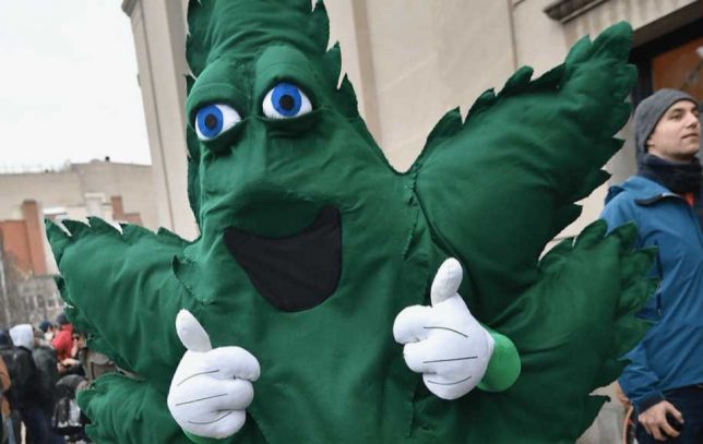
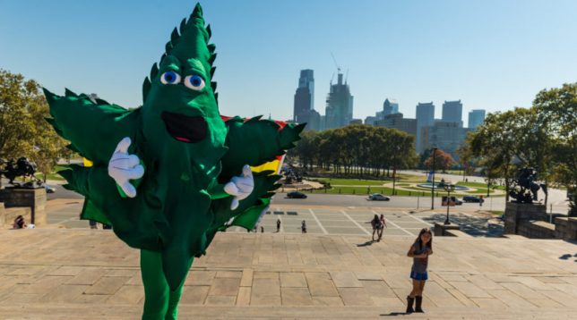
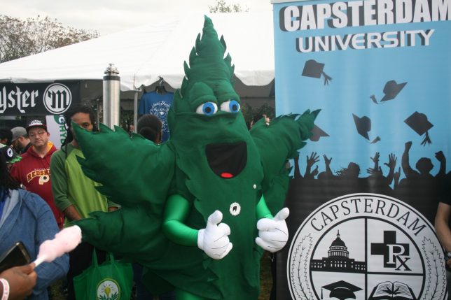
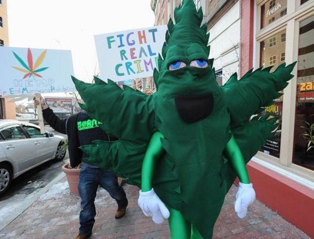
    Marijuana’s gradual transition from an illegal, subversive hobby to a legal, taxable commodity is neither quick nor easy. Proponents of the psychedelic herb have resorted to traditional methods of getting their point across, and mascots take front row center when it comes to getting attention to the cause. Philadelphia-based “Hempy” is a typical marijuana mascot that plays on the wacky weed’s most obvious attributes: he’s green, leafy and makes you smile.

    Being a marijuana mascot ain’t all it’s cracked up to be, however. Hempy’s looking decidedly red-eyed and wasted at the November 2015 march for Delaware NORML. Get that dude some Doritos, stat!

    Bongman

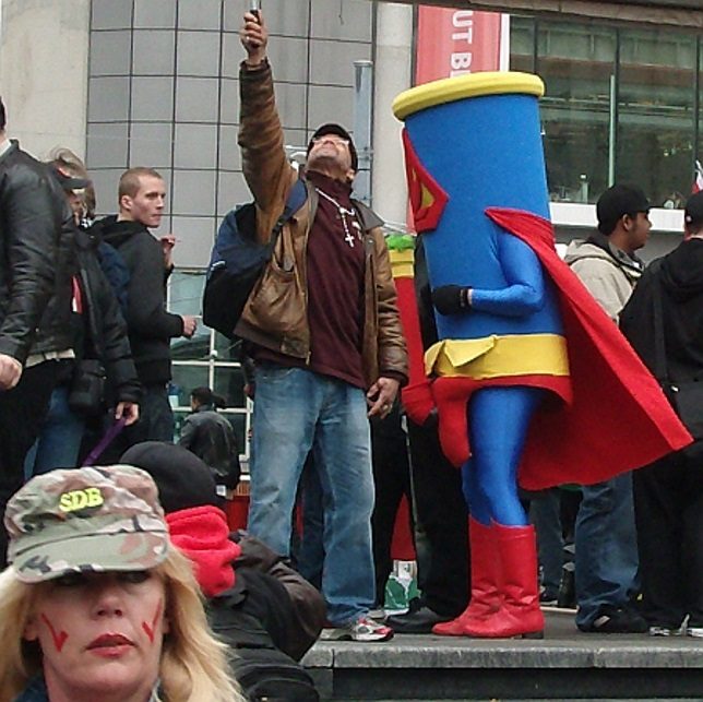
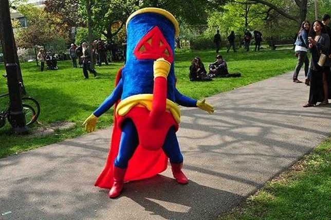
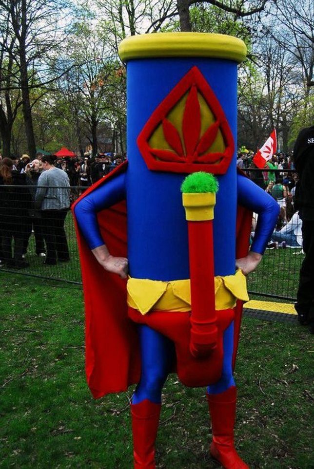
    Yikes! “Bongman” may not be green but something about him will make you FEEL green… and we don’t have to tell you what that something is, hmm?

    Appearing at the 420 Smoke Out in downtown Toronto on April 20th of 2011, Bongman was spotted leaving the event behind the wheel of a white van with “FREE CANDY” scrawled on the sides – at least that’s our guess. Canada is set to legalize the recreational use of marijuana on July 1st of 2018, so maybe Bongman did more than make everyone feel uncomfortable and harsh their buzz.

    Potsquatch

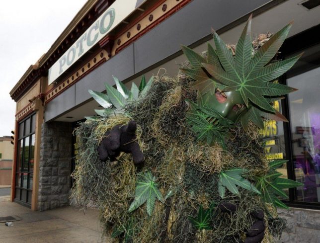
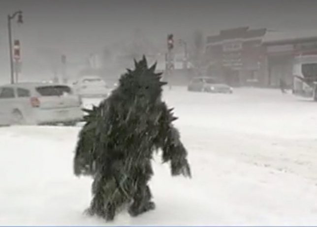
    Bumble Snowman’s got nuthin’ on Potsquatch – just ask Jennifer Pagliei (below) of WWLP-22 News, who was video-bombed by the shambling weed mascot while reporting live in a Springfield, MA blizzard on February 9th of 2017.

    When he’s not crashing newscasts, Potsquatch can be found at POTCO – a marijuana growing supplies store described by owner Dave Mech as a “Costco for marijuana” Welcome to POTCO – we love you, man.

    Horny Goatweed?

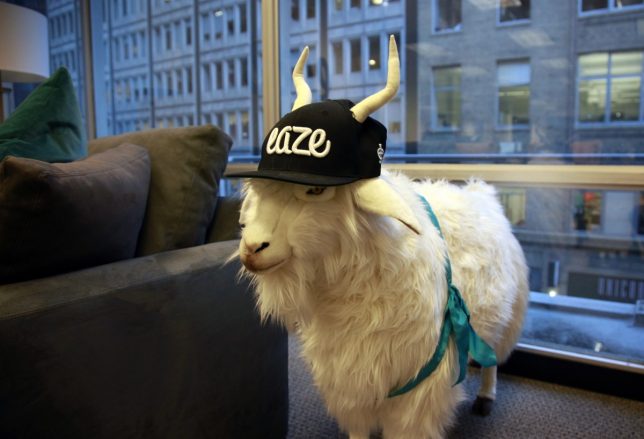
    This capped & shaded stuffed goat is the unofficial mascot of EAZE, a San Francisco-based medical marijuana delivery service backed by Snoop Dogg, among others. No one at EAZE knows the goat’s name, how it got to be the company mascot, or even how it ended up in the front lobby… yeah, sounds like your typical weed-biz startup. Word to staffers: goats eat weeds so keep an eye on your stock.

    Next Page – Click Below to Read More:
    You Gotta Be Leaf 12 Smokin Hot Marijuana Mascots

    Share on Facebook


    [ By Steve in Design & Guerilla Ads & Marketing. ]

    [ WebUrbanist | Archives | Galleries | Privacy | TOS ]


    WebUrbanist

  • In praise of shooting monochrome landscapes

    Taking color out of the equation forces the viewer to focus on shapes and textures

    In an age of wide color gamut displays and HDR-everything, DPR regular Nicolas Alexander Otto urges his fellow landscape shooters to embrace shooting in black-and-white. Here are a few reasons why he embraces monochrome for landscape work – and thinks you should too.

    Reducing imagery to its essentials, breaking it down to texture and shape, can help render the image more accessible to the eye. In this instance – a shot of the Iceland’s famous Vestrahorn – the patterns in the dunes leading the eye towards the mountain range in the distance are not visually overwritten by the color of the grass in the fore- and mid-ground thus stand out more and suffice to lend the foreground dynamism which might otherwise be not visible enough.

    Taking color out of the equation forces the viewer to focus on shapes and textures

    In this next example (above) the line work isn’t as important, but the different contrast areas with strong tonal differences are aided by the black and white treatment, enabling the small lighthouse to stand out as a visual anchor and helping to create a focus on the balance between the lighter slopes and dark areas on each side of the cliff.

    You can emphasize what’s unique about the subject

    I think an abundance of color can indeed sometimes distract from the motif in itself in regards to how it carves out the essence of a landscape. You may get sundown coloring or blue hour at every spot on earth, but a certain shape of rock might be unique to the place you’re shooting. If that’s what you want to capture, you may want to consider shooting black and white in order to prioritize forms over hues.

    Pre-visualizing a scene in black and white can help you find better compositions

    Pre-visualization is key. This means that photographers have to determine in field what the monochromatic image will look like after processing and decide on site how to compose and shoot accordingly. Subsequently, thinking in black and white may enable us to find better compositions; those which do not need color in the first place.

    While I personally enjoy color as much as black and white, I often find myself trying to shut out color while composing, aiming to focus on the abstract rather than the concrete. This helps me to find my way around cluttered foregrounds or difficult light. It’s an approach I find helpful from time to time and would recommend trying, even though it may take some time to get used to (I guess everyone who has the option to use black and white directly in their live view is a lucky camper in this regard). Taking a picture and converting it in camera for a preview might be cumbersome but can be helpful as well.

    Black and white promotes detachment from reality

    A black and white image is always a departure from our inherent logical view of the world which is secondarily governed by color (primary is light and dark).

    This entails certain freedoms such as to depart further from reality, which can be a liberating feeling as a photographer, opening up more creative possibilities. Often times a black and white image can simply ‘get away’ with more dramatic editing and capture technique since it is not regarded as a ‘authentic representation of reality’ as much as a color image.

    You can be a bit more aggressive with processing

    There’s a perception that editing images, in one way or another, deteriorates the character of the image. Black and white images however don’t seem to be subject to the same amount of critique because they are governed by a different frame of reference.

    Take a look at more of Alex’s work and be sure to read our Readers’ Showcase Q&A with him.


    Do you regularly shoot monochrome landscapes? Why do you embrace black-and-white? Let us know in the comments.

    Articles: Digital Photography Review (dpreview.com)

  • Celebrate International Dark Sky Week with a night sky time-lapse

    A few months ago we featured the work of astrophotographer Matt Dieterich, whose iconic photo of star trails over Mt. Rainier was selected for a special series of U.S. postage stamps commemorating the 100th anniversary of the U.S. National Park Service. If you haven’t seen those photos, you should definitely check them out.

    In honor of International Dark Sky Week, Dieterich has just released a time-lapse video called Pacific Northwest Nights, using photos shot while working at Mt. Rainier National Park. Of course, we love it because it highlights places in our own backyard, but even if you’ve never been to our part of the world it’s a beautiful video, and a reminder of why dark skies matter.

    If you pay close attention at 0:50 and 2:45 you can even see the glow of headlamps as climbers ascend Mt. Rainier. You can find more of Dieterich’s work at his website and on Instagram.

    Articles: Digital Photography Review (dpreview.com)

  • Canon releases firmware version 1.1.1 for EOS 7D Mark II

    Canon has released new firmware for the Mark II generation of its EOS 7D APS-C DSLR. Version 1.1.1 includes all the improvements and fixes of previous updates and in addition addresses the following issues:  

    1. Enhanced reliability of communications when transferring images using Wireless File Transmitter WFT-E7 (A/B/C/D/E).
    2. Corrects the phenomenon of Err70 which occurs with certain combinations of settings.
    3. Corrects the phenomenon in which in very rare cases the shutter can no longer be released.
    4. Enhances reliability of operations for specific custom function settings.

    Please note that if you are using a W-E1 Wi-Fi adapter the camera nickname will be reset to default when the new firmware is installed. You should therefore change the nickname before using the camera again. Firmware version 1.1.1 is now available for download from the Canon website. 

    Articles: Digital Photography Review (dpreview.com)

  • Acer unveils 31.5″ 4K display for image editors and other creative types

    At its Acer Next event in New York City the Taiwanese electronics manufacturer has unveiled its new 31.5″ ProDesigner PE320QK display. The new monitor features super-thin bezels and, looking at the impressive specifications, is clearly targeted at image editors and other creatives. It offers 550 nits of brightness at 4K (3840 x 2160 pixels) resolution and has an enhanced color gamut, supporting 130 percent of the sRGB and 95 percent of the DCI-P3 color spaces. Response time of the display is 4 milliseconds, with a 100 million to 1 contrast ratio.

    In terms of connectivity there are two HDMI 2.0 ports, audio out, a DisplayPort 1.2, a USB 3.1 type C input, and four USB 3.1 Type C outputs which are suitable for peripherals and support power delivery of up to 85W. The display also comes with a pair of 2W speakers and a removable anti-glare hood. Unfortunately Acer has not provided any information on pricing and availability yet. 

    Articles: Digital Photography Review (dpreview.com)

  • RotterZwam: Abandoned Water Park Turned Indoor Mushroom Farm

    [ By SA Rogers in Abandoned Places & Architecture. ]

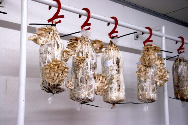
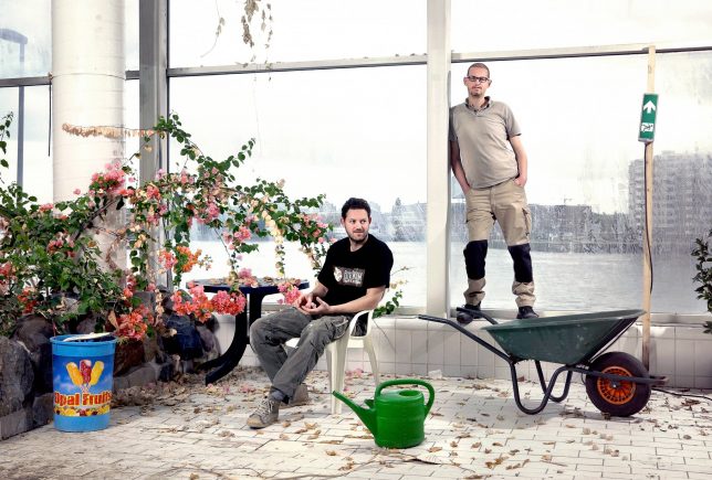
    Bags of old coffee grounds hang in the dank dressing rooms of an abandoned Rotterdam water park, growing oyster mushrooms. Two men turned the former Tropicana space, an old teen hangout, into the perfect damp, dim environment for their business, making use of the structure while the city council decides what to do with it. ‘RotterZwam’ rents the building on an anti-squat lease and have transformed it into a fascinating example of adaptive reuse and urban farming.

    Tropicana is fairly infamous among Rotterdam locals, but closed after the former owner went bankrupt in 2010. The space had been plagued with problems, from hygiene to sexual assault. It sat empty until Siemen Cox and mark Slegers, RotteZwam’s owners, realized it looked like a giant greenhouse.

    Though they hope that central glassed-in space – formerly the pool – will eventually become a greenhouse, for now, they’re making use of the dressing rooms and basement, which offer ideal conditions for fungal growth. The crew hangs bags of coffee grinds from the old Tropicana clothes hangers, and before long, they sprout oyster mushrooms.

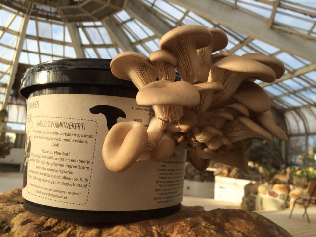
    They collect the coffee from local cafes, transport it in their carrier bicycle, and give the compost to worms to create an extremely low-waste operation. The produce about 20-50kg of mushrooms every week, and sell it to local restaurants, bakeries and food trucks. They also offer DIY mushroom-growing kits.

    “Cities like Rotterdam produce nothing but waste and commuters,” they say in an interview with Vice’s Munchies. “This entertainment park represents that perfectly – we build things and, when we don’t want them anymore, we need others to clean it up, to sweep up our garbage. That’s not how nature works, though – in nature wast doesn’t exist. In this building we hardly ever buy a thing, because eery material or nail is already here.”

    Share on Facebook


    [ By SA Rogers in Abandoned Places & Architecture. ]

    [ WebUrbanist | Archives | Galleries | Privacy | TOS ]


    WebUrbanist