 |
| The Pentax 645Z might be large compared to the mirrorless medium format cameras announced at the show, but look at the effect of that viewfinder on Carey’s face. |
‘Visual Revolution’ is the concept that links Ricoh’s Theta 360 degree camera to its Pentax K-1 DSLR and the arrival of competition only serves to grow the market, the company says.
We spoke to Kazunobu Saiki, Senior Management and Group Leader, Marketing Section, Visual Revolution Business Development and Yutaka Takada, General Manager, Business Management Department, Global Sales and Marketing Division. Saiki started by explaining the company’s philosophy when it comes to imaging.
‘We don’t see the Pentax business and products like the Theta as separate concepts, we group them together under a business group called ‘Visual Revolution.’ We believe the K-1 is a visual revolution within the frame, whether this is in terms of high resolution, the really nice hand feeling or Pixel Shift Resolution.
 |
| The Pentax K-1 has been receiving positive feedback both from established Pentax users and photographers who aren’t invested in the K-mount. |
Another visual revolution could be beyond the frame. Both are different but both can help users to enjoy some new creativity. That’s why Ricoh governs both areas as one business group.’
Mr. Saiki seems to be in a bullish mood, buoyed by the market response to the K-1. ‘The reaction to the K-1 has been beyond our expectations,’ he says: ‘not only in terms of sales but also in the words we’re hearing from users. We believe we can revive Pentax as the leading company for DSLRs. We’ve had lots of feedback from non Pentax users, who wanted to be able to enjoy our FA Limited lenses. That’s nice feedback to have.’
This response validates the company’s commitment to the system, he says: ‘In terms of developing the system, we have a lens roadmap and we plan to release some single focal length D-FA lenses. We know some users want to have D-FA Limited lenses and we’re listening to their voices.’
But the Visual Revolution business isn’t just focused on established technologies. Ricoh hopes to capitalize on its early entry into the market for 360 degree capture devices. ‘We believe we are a pioneer of 360,’ says Saiki: ‘If we compare to two years ago, the move to the Theta S has seen business grow to something like triple. Now in 2016 we have several new entrants to the market, but we’re really happy to get competition. That will grow the market itself.’
They’re already starting to see the impact of this increased interest in 360 content: ‘The VR market has really started now, and the Theta is a one-shot VR camera. At the moment, the majority of people enjoy the content that’s provided for them, but with the Theta they can create their own content with one shot. It’s in good harmony with VR development and we expect rapid growth for 360 market, including Theta.’
 |
| The Theta, now on its third iteration, faces increased competition but its capability and form-factor remain unique. |
The company is confident that the Theta is the right product for the market: ‘When we’ve done our evaluations, we’re told one of the top features is the form factor. It’s very different from all competitors models including newly released ones or any of the earlier released ones we’ve seen. It has the advantage of being small, so it’s always with the user. It can also create a 360 image in a single shot, so it’s quick and simple. Because of this, we’ve applied the same form factor to the first, second and now third generation, the Theta S.’
The current Theta model offers both stills and video but its users are already demanding more: ‘we’ve been listening to the customers voice and after Theta S they’re telling us they want 4K video, HDR and easy live streaming. In today’s form factor this is difficult but this is what they want. They want to enjoy video and high resolution images, too. Most likely we need to develop our product to catch up, technologically.’
‘The Theta S’s still image is more than 4K but the video is 1080 for the entire 360 degree scene. For video customers they require more quality.’ But this is hard, Saiki says: ‘The technology for compression and data transfer have not caught up to allow end users to capture VR in 4K. We need to develop 4K and beyond. This means processing a huge data and this requires heating management in a small and slim body of this form factor. But we want to be the leader in the industry so we’re very busy trying to reply to these needs.’
As well as responding to customer demands, the company says it’s also been trying expand what can be done with the content its devices produce. ‘In order to enjoy and share 360 images/videos, we had needed to have a lot of platforms. Thanking to Google, FaceBook, YouTube, Instagram and others, Theta users can enjoy instant sharing of their works. Also we provide the applications Theta + and Theta + Video for editing and posting on FaceBook, Instagram and so on.’
This isn’t Ricoh’s only work in the area of content sharing, though. ‘One of the key issues is the number of pictures our audience takes. It’s only getting bigger and the size of their images are getting bigger,’ says Saiki.
‘These days we need instant action. Before we had to wait maybe one week to get our prints back. Now it’s maybe a couple of seconds. We think the challenge is not just the connectivity but the management and storage (probably in the cloud), is very important, too.’
‘The cloud side can play a role. These two [connectivity and the cloud] can provide a new era of visuals. Ricoh acquired Eye-Fi’s cloud service, and this is one step to creating new solutions of communication and storage. Not just from the point of view of taking pictures but from the back end as well.’
 |
| The 645Z’s weather sealing and lens options (both current and planned) are part of its appeal, the company says. |
The 360 market isn’t the only area in which Ricoh faces new rivals. Photokina saw the announcement that Fujifilm will introduce a digital medium format system and for many it was also the first opportunity to see Hasselblad’s X1D camera. Yutaka Takada doesn’t seem too worried, though: ‘We could enjoy success in the medium format market,’ he says: ‘Fujifilm coming to our market shows that it still has potential to grow. Like the Theta, having competition is a great chance to develop the medium format market as a whole. Our advantage is that we have plenty of lenses in our lineup and on our roadmap, which helps convince customers to join medium format. 645Z has great image quality but it’s also weather sealed. People can use it in outside situations. This is very much the DNA of Pentax cameras.’
‘All these are under one business unit to provide visual innovation. We want to give surprise and astonish with innovation.’
And, having discussed the Pentax K-1, 645Z and Theta, we wanted to check whether the company still has time for models such as the GR. Absolutely, says Saiki: ‘Ricoh GR is one of our most important premium cameras. We want to reassure our GR lovers that the series will continue.’
Might that extend to GRs with other focal lengths? ‘It depends,’ says Saiki: ‘we know we really appeal. We have so many GR lovers, it’s a very emotional attachment. That’s why we need to listen to customers about where we should go.’
Articles: Digital Photography Review (dpreview.com)


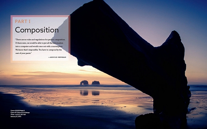
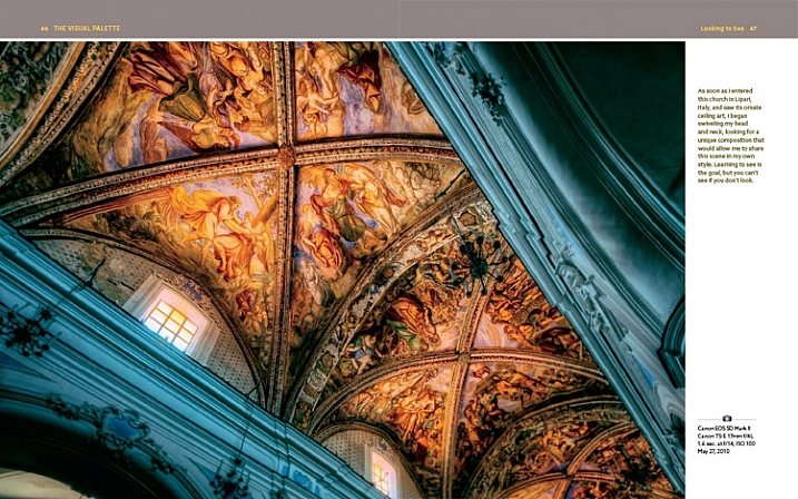
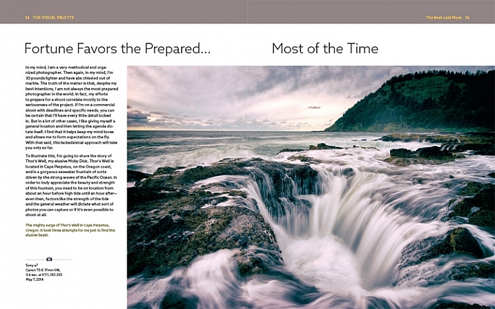
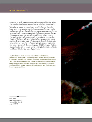
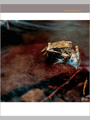


 Mastering Composition


You must be logged in to post a comment.