RSS
 

Posts Tagged ‘Vintage’

Architectural Polychrome: Vintage Interactive Color Guidebook by Le Corbusier

28 Dec

[ By WebUrbanist in Design & Products & Packaging. ]

corbusierbook

Created by Le Corbusier, one of the most famous architects of the Modern movement, this vintage Polychromie Architecturale: Die Farbenklaviaturen book features interactive pop-up and pull-out pages to illustrate ideal color combinations for architectural and interior designers.

color-book-interiors

Developed for and published by a Swiss wallpaper company, a rare first edition of the 1931 original volume is being auctioned in New York, its paper sliding elements and color sample storage pockets still functional and intact.

color-book-cover-le-corbusier

Like much of his work, which treated architecture as “machines for living in,” Le Corbusier saw color as something that could be systematized for the modern era. These, in turn, could effect the health and happiness of building occupants. His polychromatic custom color systems included a “color keyboard” for matching hues and shades across the spectrum.

interactive-pallette-color-book

Also as with his other systematic efforts, Corbu boiled down color selection to key components like mental effects, weight and depth, perception and unity – these parallel the logical and reductive approach of his “five points” for designing architecture. Color combinations were designed to take advantage of the positive potential in mixing and matching.

interactive-book-auction

Lighter and more natural colors could warm rooms while darker shades could camouflage parts of a space. He also designed wallpapers that took his color theories into account, combining them with rational geometries to form modern patterns. Despite the rarity of the volume and fame of its author it is expected to sell for only a few thousand dollars at the Swann Auction Galleries.

Share on Facebook


[ By WebUrbanist in Design & Products & Packaging. ]

[ WebUrbanist | Archives | Galleries | Privacy | TOS ]


WebUrbanist

 
Comments Off on Architectural Polychrome: Vintage Interactive Color Guidebook by Le Corbusier

Posted in Creativity


Unfree Wheeling: Amusingly Surreal Vintage Soviet Auto Ads

21 Aug

[ By Steve in Culture & History & Travel. ]

soviet-auto-ad-zaz968-2

The Soviet Union not only manufactured cars, they exported them to buyers charmed (or duped) by some amusingly and bemusingly photographed advertisements.

soviet-auto-ad-zaz968-4

soviet-auto-ad-zaz968-1

Putin the pedal to the metal lately? Don’t let the jet-fighter-like rear fender air intakes fool you, the ZAZ-968 “Zaporozhets” wasn’t exactly a muscle car even by Soviet standards. Built at the Zaporizhian Automobile Factory in Melitopol, Ukrainian SSR from 1971 through 1980, the ZAZ-968 was propelled by a 40hp air-cooled V4 engine mounted in the rear. Export versions were upgraded with international-spec headlights, a safety glass windscreen and an anti-theft steering lock which was rarely, if ever, tested.

soviet-auto-ad-zaz968-3

soviet-auto-ad-zaz968-putin

Wonder if that guitar-playing model knows “Back In The USSR”. Designed to be a “people’s car” that was sturdy yet affordable, the Zaporozhets is fondly recalled by Russians of a certain age… including some guy named Vladimir Putin. According to the Russian President’s official website, Putin’s mother won a ZAZ-968 in a lottery when young Vlad was a third year university student. His parents then gave the car to Putin – no word if he frequently drove it shirtless.

Whole LADA Love

soviet-auto-ad-lada-2

soviet-auto-ad-lada-1

soviet-auto-ad-lada-3

soviet-auto-ad-lada-4

soviet-auto-ad-lada-5

Russian car manufacturer AvtoVAZ, based in Tolyatti, Samara Oblast based their boxy Lada Classic on the mid-sixties Fiat 124 sedan. Between 1966 and 2012, over 20 million Classic sedans and station wagons had been sold without the vehicle undergoing a major design change. Dig that groovy vinyl roof on the last ad above; it kinda breaks up the Red Square look.

soviet-auto-ad-lada-4headlights-1

soviet-auto-ad-lada-4headlights-2

soviet-auto-ad-lada-4headlights-3

About 60% of all Lada Classics were exported to both East Bloc and West Bloc nations – the USA being a notable exception; Americans had to wait for the Yugo to “enjoy” owning a workers-paradise-made copy of a Fiat. Note what appears to be (at first glance) a Soviet laptop computer in the faux photoshoot ad above.

soviet-auto-ad-lada-samara

AvtoVAZ introduced the VAZ-2108 in 1984 with export versions named Samara and domestic market cars labeled Sputnik – hey, Plymouth had a Satellite so why not? The French copy on the ad above translates to “More stylish and less expensive. Hold on! Yeah, hold on to your wallet.

Next Page – Click Below to Read More:
Unfree Wheeling Amusingly Surreal Vintage Soviet Auto Ads

Share on Facebook


[ By Steve in Culture & History & Travel. ]

[ WebUrbanist | Archives | Galleries | Privacy | TOS ]


WebUrbanist

 
Comments Off on Unfree Wheeling: Amusingly Surreal Vintage Soviet Auto Ads

Posted in Creativity


Blood Red: 30 Vintage Soviet Accident Prevention Posters

03 Jul

[ By Steve in Design & Graphics & Branding. ]

soviet-accident-prevention-poster-0
In Soviet Russia, accident prevent you! That’s the message rendered in classic commie-propaganda style via these thirty soviet accident prevention posters.

soviet-accident-prevention-poster-1

soviet-accident-prevention-poster-3

Graphic workplace accident prevention posters are nothing new, neither are they the purview of any one nation. That said, this selection of vintage Soviet accident prevention posters reflects a period in Russian history that was drenched in blood, sorrow, violence and loss – and not only on the factory floor.

soviet-accident-prevention-poster-2

soviet-accident-prevention-poster-4

soviet-accident-prevention-poster-5

Oleg Atbashian, a former citizen of the Soviet Union who moved to the United States in 1994, doesn’t recall ever seeing these horrifying-to-the-point-of-being-comical posters. Atbashian worked as a metal worker apprentice at a large Ukrainian factory when he was a teenager and later, as a visual agitprop (agitation and propaganda) artist specializing in posters directed at construction workers. Atbashian was in the right place; just at the wrong time.

soviet-accident-prevention-poster-6

soviet-accident-prevention-poster-7

soviet-accident-prevention-poster-8

Indeed, Atbashian’s USSR of the 1970s was quite a different place from the fledgling “communist paradise” of Lenin and Stalin. “They (the posters) reflect the zeitgeist of a completely different, less sensitive generation of Soviet citizens,” explains Atbashian, “who were so used to being disciplined, humiliated, and terrorized by the authorities that the least of their concerns would be to question some silly presumptive posters that described them as a herd of bumbling idiots being gored by machinery.” Geez Oleg, tell us what you really think!

soviet-accident-prevention-poster-30

soviet-accident-prevention-poster-13

Just as the communist system of government represented a clean break from the Czarist regimes which preceded it, graphic art in the nascent Soviet Union aspired to blaze a new trail in lockstep with the policies and philosophies of the Red Revolution.

Next Page – Click Below to Read More:
Blood Red 30 Vintage Soviet Accident Prevention Posters

Share on Facebook


[ By Steve in Design & Graphics & Branding. ]

[ WebUrbanist | Archives | Galleries | Privacy | TOS ]


WebUrbanist

 
Comments Off on Blood Red: 30 Vintage Soviet Accident Prevention Posters

Posted in Creativity


How to Add Vintage Frame Overlays Using Alien Skin Exposure X

20 Mar

Here is a quick and snazzy tip on adding some cool retro and vintage frame overlays to your photographs, including polaroids and borders, using Alien Skin Exposure X. It’s easy as pie, and takes seconds! Unlike Photoshop, adding frames in Exposure X does not require masking, or the use of layers.

adding-vintage-frames-tutorial-alien-skin-exposure_0007

But first… why add frames?

  1. You may be going for a certain look and want your images to stand out.
  2. You may want to use your images in scrapbooks and blogs that have  a specific theme.
  3. You might just be feeling super creative and want to do something different.

Whatever your reason, it’s a fun experiment, and of course, highly dependent on your taste.

Here’s how to add a frame

Open Alien Skin Exposure X (the latest version is 10, but previous versions work just the same). Click the + icon on the top left corner of the window to add folders from your computer. Choose the folder you want to add, and double click. You may notice that when you open the folder, your images will be initially displayed as a Grid as shown on the second photo below.

adding-vintage-frames-tutorial-alien-skin-exposure_0000

adding-vintage-frames-tutorial-alien-skin-exposure_0008

Click Fit on the upper right corner of the window and you will see (as shown on the first photo) that your chosen image is enlarged, but you can still see the rest of the set, in the thumbnails just below. Once you have your image, look on the right panel, and bring up the Overlays option by clicking on the arrow. Tick the border, then click on the box showing the overlay and a pop up window, giving you a variety of overlay options, comes up. You can scroll through these options to find the overlay you want to use.

You can work on each photo individually or select all using Cmd/Ctrl + A, and your chosen settings will be applied to all the images. TypeCmd/Ctrl + D to deselect, and click on one photo to work on it individually. Don’t forget to use the Overall Intensity slider on the top right corner of the window, it works like the opacity slider in Photoshop. You also have a selection of view options that allow you to see the various before and after splits, as shown on the image below. In this case, the left half of the photo has the overlay and the right half shows the original. This is helpful in gauging the intensity of the overlay applied, and its effect on the original image.

adding-vintage-frames-tutorial-alien-skin-exposure_0001

After you have applied your frames on each image, you now need to export them. Select all the images using Cmd/Ctrl + A, then either go to the Exposure bar File menu and select Export, or simply typeCmd/Ctrl + E, and you can export your new images to a folder you designate. I suggest that you keep the suggested file suffix, or change it to something of your choice, so you know these are the new files with the Exposure edits, should you want to keep them in the same folder. You will still have your original images in tact and untouched, in case you want to revisit them later.

adding-vintage-frames-tutorial-alien-skin-exposure_0002

Here are the images that I used in this tutorial, with the added frames using Alien Skin Exposure X.

adding-vintage-frames-tutorial-alien-skin-exposure_0006

adding-vintage-frames-tutorial-alien-skin-exposure_0005

adding-vintage-frames-tutorial-alien-skin-exposure_0002

adding-vintage-frames-tutorial-alien-skin-exposure_0004

I hope you enjoyed this quick tip. Have fun experimenting with frames as well as other special effects. Do share any other quick tips on adding vintage frames in the comments below.

This week on dPS we are featuring articles on special effects. Check out the others that have already been published here:

  • How to Photograph the Full Band of the Milky Way
  • Fire Spinning with Steel Wool – A Special Effects Tutorial
  • Special Effect – How to Create Multiple Flash Exposures in a Single Frame
  • Stacking Light Trails for Night Photography Special Effects
  • 26 Unique Special Effects Photos to Spark Your Creativity
  • Weekly Photography Challenge – Special Effects
  • Tips for Shooting Through Objects to Create a Special Effect

googletag.cmd.push(function() {
tablet_slots.push( googletag.defineSlot( “/1005424/_dPSv4_tab-all-article-bottom_(300×250)”, [300, 250], “pb-ad-78623” ).addService( googletag.pubads() ) ); } );

googletag.cmd.push(function() {
mobile_slots.push( googletag.defineSlot( “/1005424/_dPSv4_mob-all-article-bottom_(300×250)”, [300, 250], “pb-ad-78158” ).addService( googletag.pubads() ) ); } );

The post How to Add Vintage Frame Overlays Using Alien Skin Exposure X by Lily Sawyer appeared first on Digital Photography School.


Digital Photography School

 
Comments Off on How to Add Vintage Frame Overlays Using Alien Skin Exposure X

Posted in Photography


Mad for Vintage Motorcycles: 14 Vespa-Inspired Designs

01 Mar

[ By Steph in Design & Furniture & Decor. ]

vespa inspired sculpture 3

Synonymous with carefree cool classic Italian design, the Vespa has a timeless, iconic look that’s instantly recognizable even when translated to chairs, jewelry, alarm clocks, pizza cutters and uncanny animal-motorcycle hybrid sculptures. These vintage Vespa-inspired designs often re-use salvaged parts from discarded motorcycles, while some just make use of the simple, streamlined silhouette.

Scooter Chair by Bel & Bel
Vespa inspired chair 1

vespa inspired chair 2

vespa inspired chair 3

vespa inspired chair 4

Made from real, original 1980s parts of the Italian scooter, these chairs by Spanish firm Bel & Bel translate Vespa’s aesthetics for a new purpose. The chair features functioning lights, soft tread silent wheels, imitation leather cushions and hydraulic pistons in the base for height adjustment.

Vespa Scooter Ring by Paul Michael Design
vespa inspired ring 1

vespa inspired ring 2

vespa inspired ring 3

This fun design from Paul Michael lets you wear a Vespa on your finger. Get it in sterling silver for $ 300 or go all out with palladium and a real diamond for $ 2,295.

Zero Vespa Segway
vespa inspired segway

vespa inspired segway 2

Segways are inherently dorky, but if only this version would catch on, they’d at least be a lot more pleasing to look at. From the same design group that created the Vespa Chair, there’s the Zero, a scooter with two electric-powered wheels and a computer-controlled gyroscopic stabilizing system. Hand-built to order, it reaches a top speed of 12mph and can climb hills of up to 30 degrees.

Skootcase
vespa inspired skootcase

vespa inspired skootcase 2

vespa inspired skootcase 3

Considering how many kids try to ride their parents’ wheeled suitcases at the airport or down the sidewalk, the Skootcase is actually pretty practical. The fully-functional scooter doubles as a child’s carry-on sized suitcase, with a sturdy tow strap so you can pull them along when you’re rushing to catch your flight.

Vespa-Inspired Rocking Horse
vespa inspired rocking horse

vespa inspired rocking horse 2

This awesome Vespa-inspired rocking horse was a one-of-a-kind gift for the designer’s grandson Diego.

Next Page – Click Below to Read More:
Mad For Vintage Motorcycles 14 Vespa Inspired Designs

Share on Facebook


[ By Steph in Design & Furniture & Decor. ]

[ WebUrbanist | Archives | Galleries | Privacy | TOS ]


WebUrbanist

 
Comments Off on Mad for Vintage Motorcycles: 14 Vespa-Inspired Designs

Posted in Creativity


How to Create a Vintage Look for Your Image Using Photoshop

23 Dec

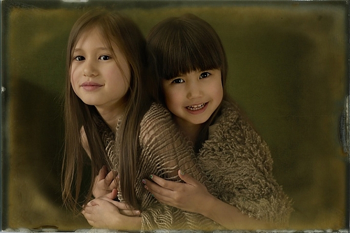
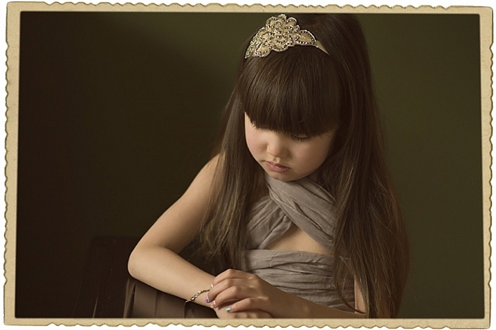
Creating a vintage look for an image is now easy, without having to shoot with an old film camera. Although I would recommend any photo enthusiastic to try! I have a an Agfa camera ISOLA that I use every now and then. I love the contrasty, grainy black and white pictures it allows me to shoot. I usually ask advice regarding the film I can use depending on the sought-after result (contrast- grain – ISO).

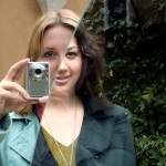
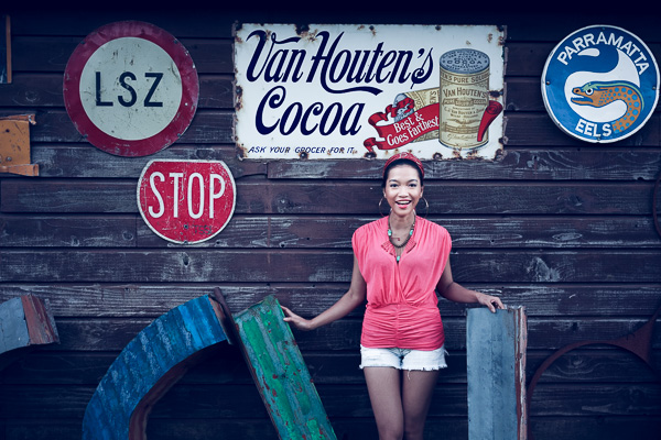
With a few easy steps in Photoshop you can make a textured, desaturated vintage look for any of your pictures. I’m going to show you how I did it with a self-portrait, but you can really do it with any picture as this technique really creates a great feeling to any image, whether it is a portrait or a landscape.

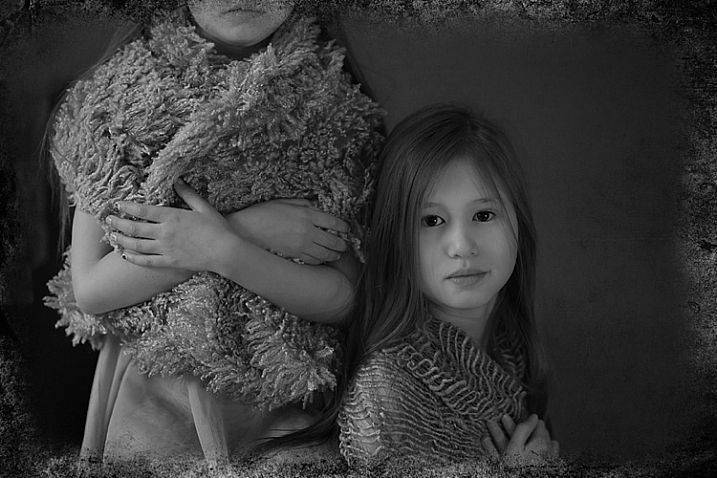
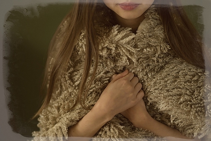
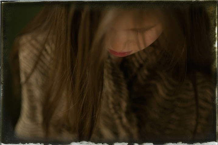
Vintage images are usually not so sharp, so I chose an image with some motion blur. You can add some directly in camera playing with slow shutter speeds and creating some motion. To edit this image, we are going to change the color using a gradient map adjustment, add some textures, and finally add a vignette to get a vintage look image.

Setting the mood for creation before Setting the mood for creation after

Step one: Modifying the color tones using gradient map

There are many ways to desaturate an image. I love the gradient map adjustment because it allows me to desaturate the image, to add some color tones, and also to adjust its contrast. Hopefully, you will love this tool if you haven’t tried it yet.

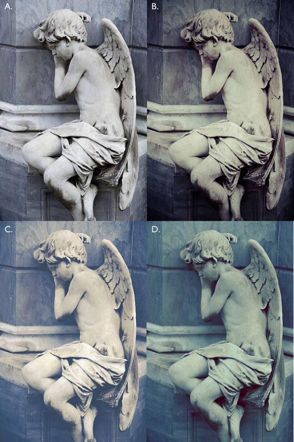
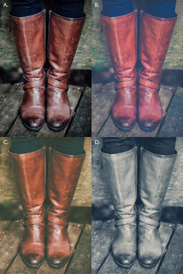
Vintage images are usually desaturated – it could also be sepia. To get the desaturation you can go to Layer > New adjustment layer > Gradient Map (as shown below).

01

Or you can go to your layer tab and select new Gradient Map layer (as below).

02

In the properties tab (screenshot below) you can see what gradient has been applied. By default it will be a foreground to background color, so usually black and white (the color squares on the bottom of your tools bar). You can also set the gradient color by changing your background and foreground color.

03

Photoshop then offers you 2 different options:

  • The Reverse option will change the gradient and give you a negative of your image, as in this case I add white into the black and black into the white (below).04
  • The Dither option will mix in noise to help blend the gradient more smoothly. So you can check any of those options depending on the effect you want to achieve.

Edit your gradient by clicking on it (click on the gradient color bar); the gradient editor will then open.

05

The gradient editor window shows you on the left the color applied to your blacks, and on the right the color applied to your whites. To modify the gradient you have two options:

First option, you choose one of the available presets. You click on a preset to apply it to your image. Second option is to create a custom gradient. Simply double click on one of the color stops, and choose a new color among the color pop-up menu.

You can also create a new color stop/intermediate by clicking below the gradient bar to define another one wherever you want (remember on the left are your shadows/black tone – in the middle mid-tones, and on the right your highlights/white tones). Once the new color stop is set you can also move it so it affects more of your dark or light tones.

In case you want to save the created gradient as a preset, name it, then click New after you have finished. It will then appear in your presets.

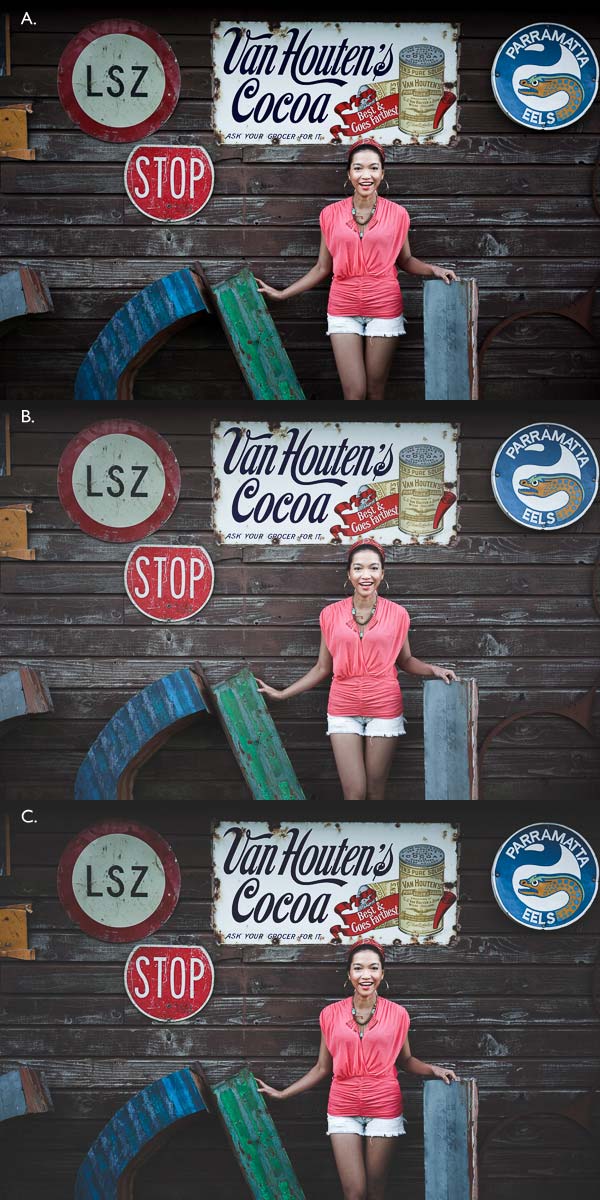
This is a powerful tool to adjust any color tone in your images. In this case I will first use the black and white gradient. When using this option the image is then turned into a black and white picture.

06

As it is not what we intended to do, lower the opacity of the adjustment layer.

07

I set it to 68% in this case, but you can choose whatever number gives a nice look to your image – play with the opacity to decide which one best suits the image you are editing.

You can add also a touch of color. Keep it very soft to achieve a vintage look. To bring back some color, you can add a second Gradient Adjustment layer. After you add another layer, click on your gradient and choose a yellowish/brownish option to get a sepia tone, one in the presets or make a custom one.

08

Once again you can lower the opacity of the adjustment layer to have a softer effect.

09

You can also add a different color according to the mood you want to set in your image. In this case I decided not to add further color tones so I added only the black and white gradient.

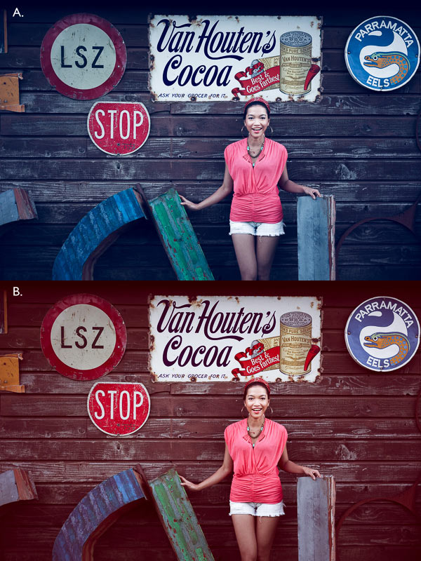
Step two: Adding texture to give the image a vintage feel

Now that you have achieved the color you want, it is time to add some texture to your image.

Personally I always shoot my own textures, but you can also find great textures on the internet on stock image sites. Or shoot your own pictures: walls, old paintings, grounds, wood, leaves, etc., any textured surface you can find. It is very easy, and can help you find some inspiration.

10

You drag and drop using your move tool or copy and paste a textured photo on top of your main picture. Then mix it by using the layer Blending Mode, try Overlay or Soft Light. I really recommend you to go through all the blending options to see how they blend the texture with your image (each image is different, and each mode can create a different look).

11

I always add textures to my personal works to give a painterly effect to my images. To have a lighter effect you can lower the opacity of your layer. To have a stronger effect you can repeat this step and add several textured layers.

You can modify the effect by adjusting your texture image. Select the texture in your layer’s tab and go to: Image > Adjustment > Curves/Levels.

12

Playing with Curves or Levels will help you to bring back, or soften, some details in the texture. You also can add a Gaussian Blur filter if there are details that are too sharp in your texture image.

13

Select the area where you want to show or not show the texture. You can add a layer mask on the texture layer and by painting with black or white on the layer mask, you add (show) or remove (hide) areas where the texture appears.

Select your texture layer and click on add a layer mask. Lower the opacity of your brush tool, and keep its hardness to 0% to get very smooth edges. Now you can start painting in black over the areas where you want less or no texture.

14

Everything is in the details, and Photoshop allows you a full control over your images. Usually to still have a “clean” image, and not to lose some details, you can mask areas such as skin, eyes, lips, etc., when editing a portrait.

So take your time to play with your textures. Try different types of shapes and contrasts. You can desaturate your textured image, or keep it in color. I find it easier when the texture is desaturated so you can fully control the color tones of your image separately, but it is up to you, and to the image you have in mind. As with any creative exercise, it is a matter of taste and style.

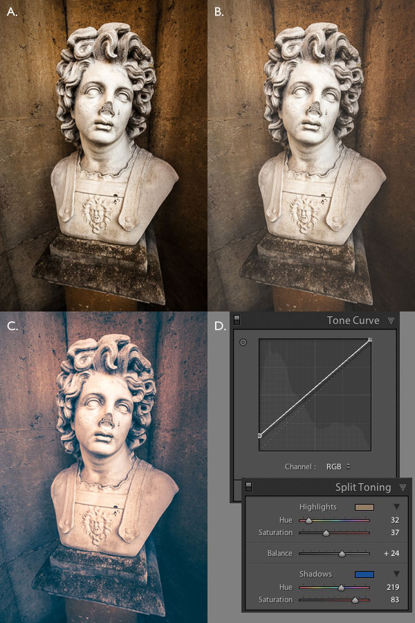
Step three: Finishing your image by adding a vignette

Vignetting can be an unintended, and undesired effect, caused by camera settings or lens limitations. However, you can also introduce it for creative effect, such as to draw attention to the center of the frame. You can choose a lens which is known to produce a vignette, or a filter to obtain the same effect.

Obviously, as we are going to do now, you can also add a vignette by post-processing your image in Photoshop. You have many options in Photoshop to vignette your images. In this case we are doing something very uneven so the vignette also helps to create a strange atmosphere.

Grab your lasso tool and draw very random lines around the edges of your image. It looks weird, but it is quite effective.

15

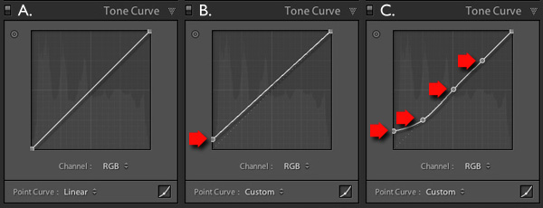
Go to Layer > New adjustment layer > curves. Darken your mid-tones by pulling down your curves to about one third (or to any darker/lighter spot according to your taste).

16

Whenever you select an area of your image, and have this selection active when you create a new adjustment layer, Photoshop automatically creates a layer mask on the new layer from your active selection.

Remember – on your layer mask white is where the effect will be applied, and black where the effect will not be applied. Here you want to apply the effect on the edges of the image, not in the center- if need be invert your layer mask by selecting the layer mask and pressing: CMD/CTRL+I.

Then double click on your Curves layer mask and feather your selection (around 87 pixels here).

17

You can once again play with the opacity of your layer to lighten the vignette.

I hope you enjoyed this article. Feel free to share in the comments your usual steps to crete a vintage look to your images. Share your images as well using this technique if you give it a go.

googletag.cmd.push(function() {
tablet_slots.push( googletag.defineSlot( “/1005424/_dPSv4_tab-all-article-bottom_(300×250)”, [300, 250], “pb-ad-78623” ).addService( googletag.pubads() ) ); } );

googletag.cmd.push(function() {
mobile_slots.push( googletag.defineSlot( “/1005424/_dPSv4_mob-all-article-bottom_(300×250)”, [300, 250], “pb-ad-78158” ).addService( googletag.pubads() ) ); } );

The post How to Create a Vintage Look for Your Image Using Photoshop by Amélie Berton appeared first on Digital Photography School.


Digital Photography School

 
Comments Off on How to Create a Vintage Look for Your Image Using Photoshop

Posted in Photography


Twisting History: 40+ Surreal Altered Vintage Photographs

20 Aug

[ By Steph in Art & Drawing & Digital. ]

vintage photos long 3

Many of us have picked up old black and white photographs and wondered what their backstories are, but these artists take history into their own hands, altering the images to produce new narratives. In the following 40+ revised photographic histories, new elements are combined with the mysterious original images, giving them a sense of surreality that could then serve as the basis of an entire book if the creative chain were to continue.

Black-and-White to Colorfully Surreal by Jane Long

vintagephotos long 5

vintage photos long 4

vintage photos long 2

vintage photos long 1

A figure in a found black-and-white photograph catches artist Jane Long’s eye and she begins to envision them in a new setting, giving them a story, making them somehow less anonymous. She digitally restores and colorizes each image and combines them with other photographs to create entirely new, surreal compositions. “I wanted people to see these figures as real people, more than just an old photograph. Adding color completely changes our perception of images.”

Library of Congress Images Get Horror Makeover by Jim Kazanjian

vintage photos kazanjian 1

vintage photos kazanjian 2

vintage photos kazanjian 3

vintage photos kazanjian 4

Historical photographs archived by the Library of Congress are a lot more interesting in the hands of digital artist Jim Kazanjian, who combines them in unexpected ways to create terrifying architectural creations straight out of a horror movie. “I’ve chosen photography as a medium because of the cultural misunderstanding that it has a sort of built-in objectivity. This allows me to set up a visual tension within the work, to make it resonate and lure the viewer further inside. My current series is inspired by the classic horror literature of H.P. Lovecraft, Algernon Blackwood and similar authors.”

Crazy Hyper-Colored Collages by Eugenia Loli

vintage photos lolli 4

vintage photos lolli 1

vintage photos lolli 3

These smash-ups of vividly colored vintage photographs juxtapose entirely unexpected elements, like gigantic children riding tortoises through a city park or a war plane dropping candy instead of bombs. “I start by finding a ‘base’ image, and then I sort of build around it. Sometimes I have a concrete idea of what I want to do, and sometimes I leave the images to fit together by themselves,” says artist Eugenia Loli. “Sometimes, after a lot of juxtaposing, the ‘base’ image might not even be a part of the final collage. Most of the time I try to ‘say’ something important via my art, but other times it’s just about doodling.”

Bizarre Details Painted Onto Photos by Colin Batty

vintage photos batty 1

vintage photos batty 2

vintage photos batty 3

vintage photos batty 4

vintage photos batty 5

Can you imagine what the original subjects of these photos would think if they saw artist Colin Batty’s alterations? They might be a tad disturbed to see their own heads on fire or replaced by gigantic eyeballs. The artist paints with acrylics directly onto cabinet cards from the early 1900s.

Next Page – Click Below to Read More:
Twisting History 40 Surreal Altered Vintage Photographs

Share on Facebook


[ By Steph in Art & Drawing & Digital. ]

[ WebUrbanist | Archives | Galleries | Privacy | TOS ]


WebUrbanist

 
Comments Off on Twisting History: 40+ Surreal Altered Vintage Photographs

Posted in Creativity


Vintage Cars x Modern Sunsets SF Bay Area Photowalk This Saturday

22 Apr

AWESOME PHOTOWALK IN THE SFBAY AREA THIS SATURDAY

Priime is hosting an exclusive photo event + photo walk that starts at a Sports Car Museum in Corte Madera, at the base of Mount Tamalpais, then moves to a fantastic vantage point to shoot above the fog from the top of Mount Tam.

The event starts this coming Saturday, April 25, 2015 at 4pm.

4pm – 6pm: food, photos, and photographers
6pm – 8pm: sunset on Mount Tamalpais

I’ll be making a few remarks about my own photography at this event, but am mostly just looking forward to hanging out with other photographers.

You can RSVP here, but there is limited space!

See you there! :)


Thomas Hawk Digital Connection

 
Comments Off on Vintage Cars x Modern Sunsets SF Bay Area Photowalk This Saturday

Posted in Photography


10 Vintage London Paintings Superimposed on Street View Images

09 Jan

[ By WebUrbanist in Art & Drawing & Digital. ]

london church street montage

Blending fiction and reality, art and history, this series of superimpositions takes ‘then-and-now’ imagery all the back to the 18th Century on the streets and rivers of England’s capital city. Most of the added classics (spliced with Google Street View shots) are largely unedited, a few are strategically cropped but many show a naturally stark contrast in colors, tones, lighting, and of course: street life.

london historical street view

london history meets modernity

Collected and collaged by Halley Docherty, these hybrids show historical structures in their built environments like St. Martin in the Fields, shown at the top (painting by William Logsdail in 1888), a church situated on the opposite side of Trafalgar Square to Northumberland House, pictured directly below (painted by Canaletto in 1752 and since demolished).

london then now painting

london ships boats river

Various views of the River Thames show how the riverfronts, skylines, ships and boats and shifted in type and number over time, or highlight key points and storytelling scenes of local history set against the everyday backdrop captured by Street View vans.

london historical painting war

london street chapel view

Many major streets are shown at least partly as they were, albeit with some embellishments or artistic license here and there, as well as the vehicles and people that populated them (just surrounded by contemporary persons and contexts).

london historical contemporary collage

london gardens park neighborhood

london street view hybrid

Other paintings shown in this collection include: A View of Greenwich from the River by Canaletto (1750–52), Blackman Street London by John Atkinson Grimshaw (1885), View of The Grand Walk by Canaletto (1751), The 9th of November, 1888 by William Logsdail (1890), The Strand Looking East from Exeter Exchange by Anonymous (1822), Covent Garden Market by Balthazar Nebot (1737), The River Thames with St. Paul’s Cathedral on Lord Mayor’s Day by Canaletto (1746) and Westminster Abbey with a Procession of Knights of the Bath by Canaletto (1749).

Share on Facebook


[ By WebUrbanist in Art & Drawing & Digital. ]

[ WebUrbanist | Archives | Galleries | Privacy | TOS ]


WebUrbanist

 
Comments Off on 10 Vintage London Paintings Superimposed on Street View Images

Posted in Creativity


How to Create a Vintage Look using Lightroom

21 Jul

How to create the vintage look in Lightroom

Before you create a vintage look using Lightroom, you have to decide what characteristics you think that look should have. It may mean different things to other people, but here’s my version. Photos with the vintage look are nostalgic, evoking the look of faded photos taken decades ago. There may be a colour cast or faded blacks, and they should look as if they may have been taken with film.

What is your definition of the vintage look? Whatever it is, once you have arrived at it, you can think about how you can achieve that look in Lightroom.

Using Lightroom Develop Presets

The easiest way to create a vintage look is to buy Develop Presets or download free ones. Don’t worry, I will explain how you can create the vintage look yourself, without buying somebody else’s presets, in the second part of this article. But I think it’s wise to acknowledge that sometimes the easiest path is to let someone else do the hard work of figuring out the mechanics, and buy into their expertise.

By the way, if you are new to presets, my article A Concise Guide to Lightroom Develop Presets will give you an introduction to the subject.

Free Vintage Develop Presets

An easy place to start is with onOne Software’s free Develop Presets for Lightroom. I recommend Nicolesy’s Matte Presets for Adobe Lightroom 5 and the onOne Signature Collection Presets (available for Lightroom 4 and 5). There are also some presets for Lightroom 2 and 3 if you are using those versions.

You can also try these free vintage presets from Presets Heaven.

This comparison shows you some of the effects you can create with these presets. Please remember that the best way to use Develop Presets is as a starting point. Once you have applied the preset you can then go to the right-hand panels and tweak the settings to get the most out of your photo (something I haven’t done with these examples as I wanted to show you how they work straight out of the box).

How to create the vintage look in Lightroom

A. Original photo B. onOne Signature Collection: Vintage – Grandma’s Lemonade preset C. Nicolesy Matte Lightroom Presets: Nicolesy Matte 2 preset D. Presets Heaven: PH Vintage IV preset

Best Paid Vintage Develop Presets

Not everybody wants to pay for Lightroom Develop Presets (my article Are Lightroom Develop Presets Worth the Money? asked that question) but there are certainly some great preset collections out there if you don’t mind doing so. I recommend (and have personally bought and used) the following:

Nicole S. Young’s Vintage Fade presets. These are the least expensive out of all these preset packs. The set includes Photoshop Actions and ACR presets as well as Lightroom Develop Presets.

Lightgram Instafade presets. These presets emulate the beauty and nostalgia of film. I like Lightgram’s presets a lot. They also have some free presets you can try out.

Really Nice Images Faded Films presets. These are the more expensive than the others, but you get nearly twice as many presets plus a toolkit to help you tweak the settings. But most importantly they are really good.

How to create the vintage look in Lightroom

A. Original photo B. Nicolesy Vintage Fade: Rainfall preset C. Lightgram Instafade: Lightgram Faded 12 preset D: Really Nice Images: Faded Films – Utah Monochrome preset

How to create the vintage look yourself

Now it’s time to take a look at a few of the techniques you can use to create the vintage look yourself in Lightroom.

1. Fade out with the Tone Curve

Go to the Tone Curve panel and raise the left side of the RGB curve upwards. Doing so removes true black from the photo, making the darkest tones lighter. How far you move it is up to you – the best way is to judge the effect by eye.

You’ll get the best results when the RGB curve starts from its linear position (a straight line from bottom-left to top-right). If you are planning to use the Tone Curve to create a matte effect, it is best to carry out tonal adjustments such as increasing contrast in the Basic panel. You may also wish to reduce Saturation or Vibrance to weaken the colours in the photo, emphasizing the vintage look created by the matte effect.

Alternatively, click on the RGB curve three times (where the lines intersect it on the grid) before lifting the left-hand corner. This gives a slightly different look. Experiment with both techniques to see which one suits your particular photo best. This is what the curves look like.

How to create the vintage look in Lightroom

A. Linear curve B. Entire curve raised. C. Left-hand side of curve raised only.

This is how those curve adjustments affect the photo.

How to create the vintage look in Lightroom

A. Linear curve B. Entire curve raised. C. Left-hand side of curve raised only.

Using the RGB Tone Curve applies a matte effect without affecting the colour. However, you can play with the colour curves as well. If you use the same technique on a colour curve, it affects the colour of the photo as well as the contrast. Here are a couple of examples.

How to create the vintage look in Lightroom

A. Blue curve raised. B. Red curve raised.

2. Split toning

Another way to add colour is with split toning. The basic concept is simple. Apply a warm colour to the highlights (such as orange, red or yellow) and a cool one to the shadows (for example blue, dark green or teal). You may be aware that warm colours appear to move towards the viewer, and cooler ones away. Split toning builds on that principle.

How to create the vintage look in Lightroom

A. Original photo. B. RGB Tone Curve raised (neutral colour). C. Split tone applied. D. The Tone Curve and Split Toning settings used for these photos.

Conclusion

Now you know how to create a vintage effect in Lightroom. If you have any other tips for creating a vintage effect, please leave them in the comments below.


Mastering Lightroom: Book Four – The Photos ebookMastering Lightroom: Book Four – The Photos

My new ebook Mastering Lightroom: Book Four – The Photos takes you through ten beautiful examples of photography and shows you how I processed them step-by-step in Lightroom. It explores some of my favourite Develop Presets and plug-ins as well as the techniques I use in Lightroom itself. Click the link to learn more.

The post How to Create a Vintage Look using Lightroom by Andrew S. Gibson appeared first on Digital Photography School.


Digital Photography School

 
Comments Off on How to Create a Vintage Look using Lightroom

Posted in Photography