In last week’s article about Lightroom you learnt how to use Collections and Smart Collections to organise your images. Today, I’m going to take a closer look at the Grid View (part of the Library module) and show you how to customise the display.
If you’re not in Grid view, just press the ‘G’ key. It’s a keyboard shortcut that will take you to the Grid view from any part of Lightroom.
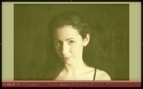
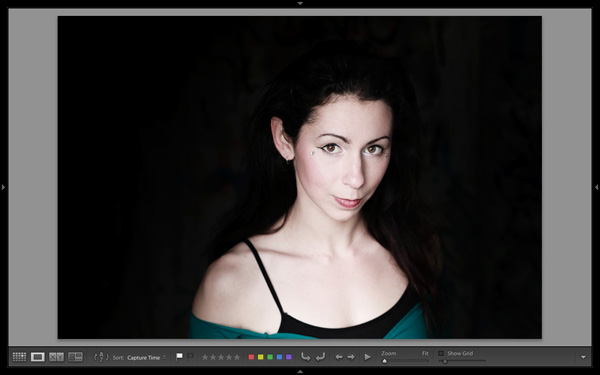
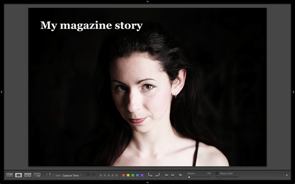
The Grid View displays thumbnails of photos contained in the currently selected Folders, Collections or search results. Here, I used the Shift+Tab shortcut to remove the left-and right-hand panels, the filmstrip and the module picker button panels from the view:
These are the three main sections of the Grid View:
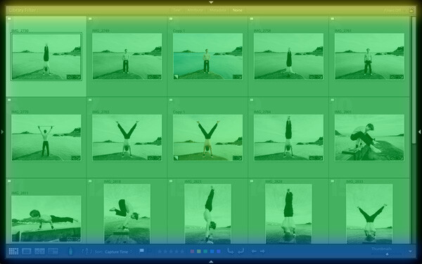
The Filter bar: marked in yellow. Press the backward slash (‘\’) key to reveal the Filter bar if you don’t see it. You can use the same key to hide it.
The Content window: marked in green. This is where Lightroom displays the image thumbnails.
The Toolbar: marked in blue. Press ‘T’ to reveal it if you don’t see it. The same key also hides the Toolbar.
The Toolbar
There are several items on the Toolbar of immediate interest:
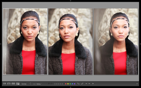
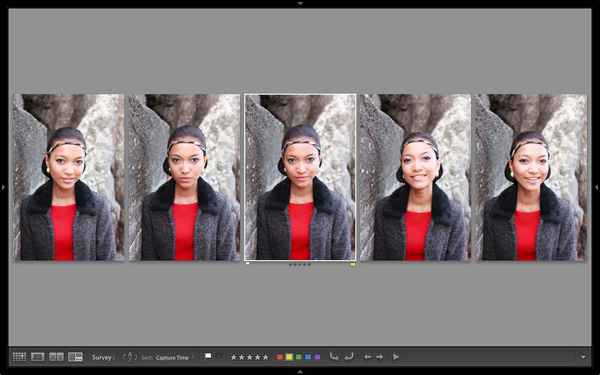
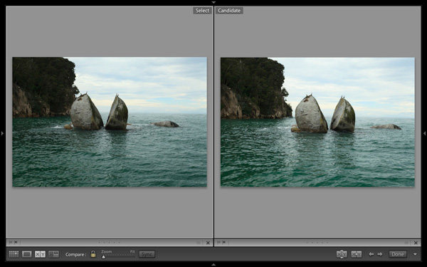
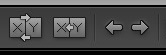
These icons represent the four view modes of the Library module. From left to right they are Grid View, Loupe View, Compare View and Survey view. The Grid view icon is highlighted to indicate that it is the active view mode (I will look at the other view modes in future articles).
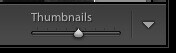
The Thumbnails slider is on the right-hand side of the Toolbar. Use it to set the size of the thumbnails in the Content window.
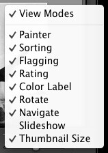
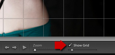
Finally, if you click the white arrow on the very right of the Toolbar, you’ll see the above menu. Each menu item corresponds to an item on the Toolbar. The ticks indicate which items are displayed on the Toolbar. Click on any of the menu items to add or remove them.
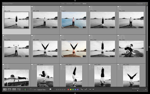
The Content window
The Content window is where Lightroom displays thumbnails. Each thumbnail, plus the grey border around it, is called a cell. There are two types of display: Compact cells and Expanded cells.
Compact cells
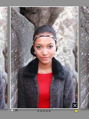
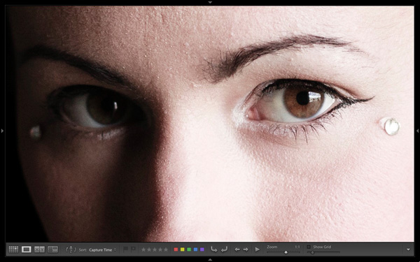
This is what the Compact cell display looks like:
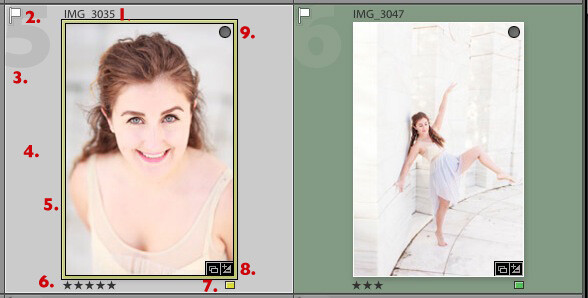
I’ve numbered the important parts:
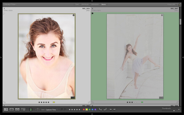
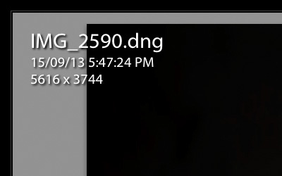
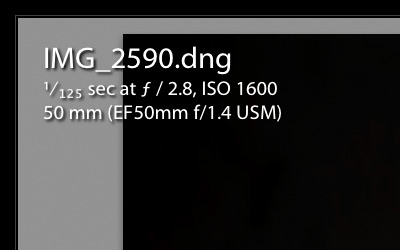
1. The filename of the photo.
2. The white flag indicates this photo has been flagged as a pick.
3. The big number 5 shows this image is the fifth in the sequence in the currently selected folders or Collections.
4. The light grey border means this photo is selected.
5. The yellow border shows that the yellow colour label has been applied to this image. This photo is selected, so Lightroom displays a thin border. If the image is not selected, Lightroom applies the colour label to the entire border. That is why the thumbnail on the right is surrounded by a thick green border.
6. These stars show that the image has a five star rating.
7. The yellow square also indicates the colour label.
8. There are two icons at the bottom right of the photo (you may see different icons depending on what you have done to the image). The icon on the left indicates that the photo has been added to at least one Collection. The icon on the right tells you that the photo has Develop adjustments.
Tip: If you hover the mouse over an icon and keep it still, Lightroom will display a label telling you what the icon means. It appears after about two seconds.
9. The grey circle in the top right indicates that the photo has been added to at least one Collection.
Tip: To see what Collections the photo has been added to right-click on the thumbnail and go to the ‘Go to Collection’ option. Click on a Collection name to open that Collection in Grid View.
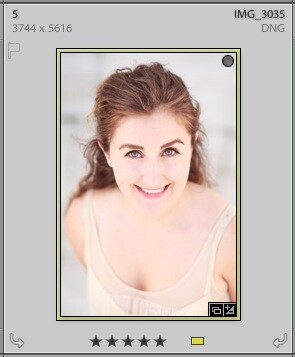
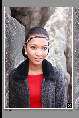
Expanded cells
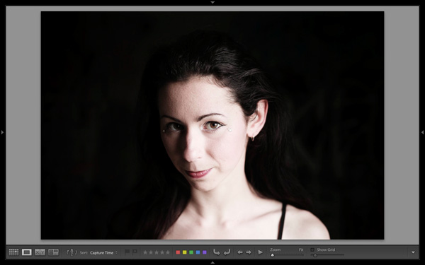
Here is the Expanded cell display. The cells are larger than the Compact cells, and contain a little more information. I’ve marked the parts that are different:
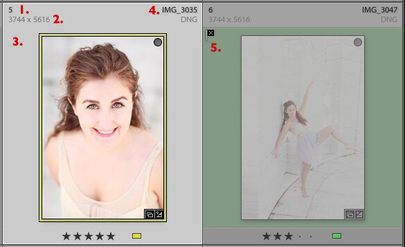
1. The size of the number indicating that this is the fifth photo in the currently selected folders or Collections has changed.
2. These figures show the dimensions of the photo in pixels.
3. There is no flag here, indicating that this photo hasn’t been flagged as a pick or flagged as a reject.
4. The filename of the photo, with the file type (in this case, DNG) underneath.
5. The black flag indicates that this photo has been flagged as a reject. Lightroom fades out the thumbnail so you can see it has been rejected.
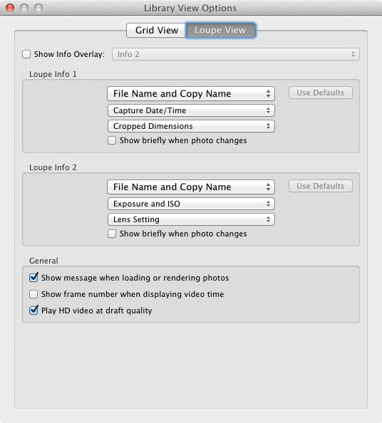
View Options
Lightroom lets you customise the layout of the cells so the display shows as much or as little as you wish. Go to View > View options (or use the keyboard shortcuts PC: Ctrl+J, Mac: Cmd+J) to bring up the Library View Options window. Again, I’ve marked some of the interesting menu options:
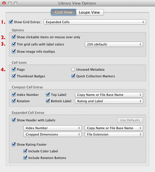
1. Show Grid Extras. This is where you chose between Compact Cells and Expanded Cells. Untick the Show Grid Extras box if you want to simplify your display. Doing so removes the information displayed around the thumbnails in Grid View.
2. Show clickable items on mouseover only. If you untick this box every thumbnail is displayed with arrows in the bottom corners that you click to rotate the image, and a grey flag if the image is unflagged. With this box ticked, these icons are only displayed when you move the mouse over the image:
3. If the colour labels annoy you, or you just don’t use them, untick this box to turn them off. The menu on the right lets you adjust the intensity of the colour tint.
4. The rest of the View Options let you customise what icons and information are displayed alongside the thumbnails.
Your thoughts
How do you customise Lightroom? I’d be interested to hear your thoughts, whether they are about the Grid View or another part of Lightroom. Leave a note in the comments if you have anything to share.
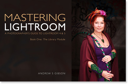
Mastering Lightroom Book One: The Library Module

My latest ebook Mastering Lightroom Book One: The Library Module is a complete guide to using Lightroom’s Library module to import, organise and search your photo files. You’ll learn how to tame your growing photo collection using Collections and Collection Sets, and how to save time so you can spend more time in the Develop module processing your photos.
Post originally from: Digital Photography Tips.
Check out our more Photography Tips at Photography Tips for Beginners, Portrait Photography Tips and Wedding Photography Tips.
Making Sense of Lightroom’s Grid View
The post Making Sense of Lightroom’s Grid View by Andrew Gibson appeared first on Digital Photography School.

Digital Photography School


You must be logged in to post a comment.