RSS
 

Posts Tagged ‘Urban’

Peruse Your Illusions: 21 Mind-Bending Urban Works of Art

30 Jun

[ By SA Rogers in Art & Street Art & Graffiti. ]

illusions main

Optical illusion art brings a bit of magic to the streets, using paint, paste-ups or photographic tiles to transform urban surfaces into massive sinkholes, bizarre portals and mysterious doors offering entrance to places unknown. Three-dimensional objects seem to float in midair, people walk across vertical surfaces and entire buildings seem to be melting beneath the sun in these fun works of large-scale urban art.

Graphic Wormhole Mural by Astro

mural astro 1

mural astro 2

astro 2

astro 3

A huge, boring side wall of an apartment building in Loures, Portugal just got a lot more fun to look at with the addition of a massive optical illusion mural by the street artist ‘Astro,’ who made it seem like a blue abyss. The artist has completed similar illusions in other spots, like a patch of concrete beneath an overpass.

Melting Facade in Paris

mural illusion facade

mural illusion facade 2

mural illusion facade 3

A mural added to the entire exterior of a building in France makes it look as if the structure is melting like a Dali clock. Imagine walking down an alley while under the influence and then looking up to see this. It’s disconcerting enough as it is.

Mind Your Step by Erik Johansson

mural mind your step 1

mural mind your step 2

Pedestrians crossing Stockholm’s Sergels torg square either dangle dangerously close to a giant sinkhole or appear to miraculously walk right over it while interacting with an amazing street art illusion by artist Erik Johansson. ‘Mind Your Step’ was created off-site and assembled using large printed sheets, with a yellow platform indicating where passersby should stand to make the illusion come together.

Skrapan Illusion by Erik Johansson

mural skrapan

mural skrapan 2

Equally fun is Johansson’s ‘Skrapan Illusion,’ commissioned in the summer of 2012 for a Stockholm shopping center. The artist’s rendering of a city as seen from a perilously high vantage point is so realistic, you could get a bit of vertigo standing on the ‘edge.’

3D Portals by 1010

murals 1010 1

murals 1010 2

murals 1010 3

Surprisingly colorful inner layers of exterior walls seem to have been peeled away to reveal the pitch blackness inside, making it seem as if each building contains some kind of intriguing mystery. Germany-based street artist 1010 started with small framed paper cuts and then realized he could achieve the same effect with paint on a large scale. “I call them holes, abyss, passage or portals, names that leave enough space for interpretation and projection for the viewer.”

Next Page – Click Below to Read More:
Peruse Your Illusions 21 Mind Bending Urban Works Of Art

Share on Facebook


[ By SA Rogers in Art & Street Art & Graffiti. ]

[ WebUrbanist | Archives | Galleries | Privacy | TOS ]


WebUrbanist

 
Comments Off on Peruse Your Illusions: 21 Mind-Bending Urban Works of Art

Posted in Creativity


How to Enhance Urban Night Photographs Using Luminosity Masks in Photoshop

19 Jun

As the sun sets on a city’s skyline, thousands of lights come flooding the concrete jungle, turning every urban scene into a photographer’s paradise. Every corner around the city suddenly seems too irresistible not to be photographed.

Image 01

Urban night shots is probably one of the most common photos taken at night. The way most people shoot cityscapes at night is to keep the camera still, press the trigger, and snap the shot. The result is often an uninspired image, with overexposed highlights due to the long exposure. This problem can be fixed by blending multiple exposures, to recover details in the highlights with luminosity masks.

Image 02

Overexposure of highlights circles in red.

Using Luminosity Masks is a way of making a selection based on the luminosity (or brightness) value of the pixels. The main advantage of luminosity masks over other selection tools is its ability to feather the edges, which makes the transition seamless. One of the earliest articles detailing how luminosity masks works was published by Tony Kuyper. You can learn more about luminosity masks here.

In this tutorial, I will show you step by step, how you can recover detail in the highlights of your urban night shots, using luminosity masks in Photoshop. There are two parts to this: taking the multiple exposure, and editing them in Photoshop with luminosity masks.

Part one: How to take multiple exposures

  • Step 1: You need a tripod, and a camera that has aperture priority and manual mode.
  • Step 2: Mount your camera on the tripod and compose your image. In aperture priority mode, set the aperture and ISO settings you want, and take a shot with the default metering mode (usually matrix metering).
  • Step 3: Review the image on the LCD screen and take note of the shutter speed. Switch your camera to manual mode and dial in the ISO, aperture, and shutter speed that you used for the first shot.
  • Step 4: Speed up your shutter speed by one stop and take a shot again. For example, if the initial shutter speed was 30 seconds, stopping up by one stop would be 15 seconds (the shutter speed halves).
  • Step 5: Repeat step 4 until you can see details in the highlights by zooming in on the LCD screen on your camera, and checking the histogram for clipped highlights (blinks).

Tip: Use a remote release and/or enable mirror lockup (in a DSLR) to ensure the sharpness of your photos.

Part two: Recovering the highlights using luminosity masks in Photoshop

Step 1: If you use Adobe Lightroom, select all the images you want to blend. Right click on the mouse, choose Edit in > Open as layers in Photoshop. Otherwise, you can open them individually in Photoshop, use the move tool and drag each image into a single file as layers.

Step 2: Make sure the images are arranged such that the brightest exposure is at the bottom of the layers. To make sure all images are absolutely aligned, select all layers, then go to Edit > Auto-Align Layers. You may have to crop the image a bit after alignment.

Image 03

The layers are arranged so that the brightest image is at the bottom.

Step 3: Make sure you have luminosity masks Photoshop Actions to add and remove luminosity masks. If you don’t, you can download it here (the file is zipped, so make sure you unzip it first, then follow the instruction on how to install it here).

Step 4: To start off, make all layers invisible except the bottom two (layer 1 and 2). You can do so by unchecking the eye icon next to each layer. Next, create a mask for Layer 2 and fill it with black.

Image 04

Step 4: Next, generate luminosity masks based on Layer 1 (the brightest exposure). To do that, select Layer 1 on the layers panel, and generate the luminosity mask with the Photoshop Action.

Step 5: Go to Channels panel, select a Brights luminosity mask that targets just the highlights. In this case, Brights 2 seems like a good choice because it is not too restrictive and has good feathering on the edges.

Image 05

Step 6: Select Brights 2 luminosity mask by holding down CMD (Mac) or CTRL (Win) and left click on the mask. You should see marching ants appear on the image. Depending on your image, if you do see a pop-up window that says “Warning: No pixels are more than 50% selected…”, don’t worry about it and just click ok.

Step 7: Go back to the layers panel and click on the mask on layer 2. Select the brush tool, set the opacity to 50%, color to white, and paint over the layer mask to blend the darker exposure (Layer 2) into the brighter exposure (Layer 1 below). Depending on your image, you can choose to paint just the brightest highlights or all of them. In this example, I chose to paint all the highlights. If you find the marching ants annoying, hit CMD (Mac) or CTRL (Win) + H key to hide them.

Image 06

Details in the highlights are gradually recovered.

Step 8: Delete the luminosity masks generated previously because you now need luminosity masks based on the brightness of Layer 2, where you have just blended in the darker exposure. To do so, remove the current luminosity masks with the Photoshop Action.

Step 9: Now select Layer 2 and generate luminosity masks with the Photoshop Action.

Step 10: Select Layer 3, add a layer mask, and fill it with black.

Step 11: Go to the Channels panel, select a brights mask that targets the highlights. In most cases, selecting the same mask should do the job. In this example, I have chosen the Brights 2 mask again.

Image 07

Comparison of Brights mask for Layer 1 and Layer 2.

Step 12: Hold down CMD (Mac) or CTRL (Win) and click on Brights 2 mask to select once again. Go back to layers panel and click the mask on Layer 3, then use a white brush as before, and paint over the highlights again. You should see details being recovered gradually. At this stage, you should consider painting over the brightest highlights only instead of the whole image. In this example, I only painted the highlights as circles in the illustration below.

Image 02

Step 13: Repeat Steps 8 to 12 until you are done with all the layers. Your final image should have a more balanced exposure, with details in the highlights. You can then apply further tonal or color adjustments, and sharpening to your image.

Image 08

Final image.

Bonus: Adding a reflection and color to the lights

This involves a lot of editing, and may not be for everyone. For those of you who are into post-processing, you can clean up the image by removing unwanted objects, add a reflection, and change the color of the lights.

Adding a reflection

This only works if you have an empty foreground in your image like the example here.

  • Step 1: Use the rectangular marquee tool and make a selection of the city’s skyline. Then, copy and paste it as a new layer.
Image 09

Copy and paste the selection as a new layer.

  • Step 2: Select the layer of the copy, hold CMD (Mac) or CTRL (Win) + T to transform. Move your cursor to the image, right click and select > Flip Vertical. Use the move tool to position the flipped image lower to align the border.

Image 10

  • Step 3: You can add a ripple effect to the reflection by going to the top menu and selecting Filter > Distort > Ripple. Keep the size of the ripple to medium, set the amount you like, and press ok.
  • Step 4: Increase the contrast of the reflection by adding a curves adjustment layer, and clip it to the reflection layer only. To do that, right click on the curves layer and select Create Clipping Masks. You should see a little arrow on the curves layer pointing down at the layer below it. You can also reduce the opacity of the reflection layer if you like.
image-11

Clipping curves adjustment to the layer below.

Image 12
Final image with reflection.

Adding color to the lights

  • Step 1: You need a visible layer to begin with. If you don’t have one, you can go to the menu on the top and choose Layer > Merge Visible.
  • Step 2: Generate luminosity masks based on this layer. Remember to delete any luminosity masks you had before this.
  • Step 3: Select a brights luminosity masks that targets the highlights. In this example, I know from before that brights 2 mask works very well, so I’m going to choose it again. Select it by holding cmd (Mac) or ctrl (Win) + left click on your mouse.
Image 13

Brights 2 luminosity mask.

  • Step 4: Add a new layer, and change the blend mode to soft light. The selection should be automatically loaded onto this new layer already.
  • Step 5: Now fill the with the color of your choice by holding down Shift + Backspace, select a color, and press ok. You should now see the color of the lights have changed subtly.

Image 14

  • Step 5: If you want the effect to be stronger, duplicate the layer once or twice until you like it.
Image 15

Duplicate the layer for a stronger effect.

  • Step 6: The final step is what makes the lights glow. Double click on the top layer to bring up the layer style. Check the box for outer glow, and pick a color that is slightly darker than the one you have used before. Click ok and your done!
Image 16

Apply outer glow for the final touch.

Apply a few other tweaks and sharpening and you’ve got yourself a cool urban night cityscape!

Before

Before

Image 01

After


googletag.cmd.push(function() {
tablet_slots.push( googletag.defineSlot( “/1005424/_dPSv4_tab-all-article-bottom_(300×250)”, [300, 250], “pb-ad-78623” ).addService( googletag.pubads() ) ); } );

googletag.cmd.push(function() {
mobile_slots.push( googletag.defineSlot( “/1005424/_dPSv4_mob-all-article-bottom_(300×250)”, [300, 250], “pb-ad-78158” ).addService( googletag.pubads() ) ); } );

The post How to Enhance Urban Night Photographs Using Luminosity Masks in Photoshop by Yaopey Yong appeared first on Digital Photography School.


Digital Photography School

 
Comments Off on How to Enhance Urban Night Photographs Using Luminosity Masks in Photoshop

Posted in Photography


Urban Fairytales: Hyperrealistic Paintings of Kids Exploring the City

18 Jun

[ By SA Rogers in Art & Drawing & Digital. ]

urban fairytales main

Modern-day children move through a decidedly un-fairytale-like world with unlikely gangs of friendly wild animals to protect them in this series of paintings so realistic, it takes a moment to realize they’re not photographs. Artist Kevin Peterson creates these incredible scenes in oil paint on panel, highlighting the inner strength it can take to survive in places beset with violence and poverty.

urban fairytales 5

urban fairytales 2

urban fairytales 3

Princesses regally make their way through rubble in abandoned industrial districts with crowned polar bears at their heels, point the way for the fierce lions acting as their champions and saunter down sidewalks with raccoons and foxes. The contrast of wild creatures and worn, neglected urban environments is a startlingly effective one most often utilized for post-apocalyptic scenes, but the addition of the little girls suggests a hope of human resilience.

urban fairytales 6

urban fairytales 7

urban fairytales 9

“My work is about the varied journeys we take through life,” says Peterson in his artist statement. “It’s about growing up and living in a world that is broken. These paintings are about trauma, fear and loneliness and the strength that it takes to survive and thrive. They each contain the contrast of the untainted, young and innocent against a backdrop of a worn, ragged, and defiled world. Support versus restraint, bondage versus freedom, and tension versus slack are all themes that I often visit.”

urban fairytales 8

urban fairytales 10

urban fairytales 1

A look through Peterson’s history of work reveals an interesting progression from fairly straightforward (albeit stunningly realistic) portraits of women and little girls in urban environments to these fairytale scenes. Some of these paintings are also going large-scale as public murals. Check out details and stay on top of Peterson’s current work on Instagram.

Share on Facebook


[ By SA Rogers in Art & Drawing & Digital. ]

[ WebUrbanist | Archives | Galleries | Privacy | TOS ]


WebUrbanist

 
Comments Off on Urban Fairytales: Hyperrealistic Paintings of Kids Exploring the City

Posted in Creativity


Urban Human Habitats: 13 Compact Concepts for Growing Cities

07 Jun

[ By SA Rogers in Architecture & Cities & Urbanism. ]

compact cities coastal cliffs 1


How will various cities around the world adapt to rapid population growth while maintaining quality of life and responding to their unique environments and cultural context? In some cases, new ideas for maximizing urban density require building new cities from the ground up, while others reclaim industrial areas and depressed suburbs or simply keep building higher and higher into the sky. These proposals – some fanciful, others currently under construction or completed – represent a diverse variety of urban growth solutions, each with its own pros and cons.

Lush Pedestrian-Oriented Vision for Singapore

PARKROYALonPickering_Ext-ViewofSkyTerraceFromClubLounge02_(c)PatrickBingham-Hall

ParkRoyal_Dwg-GardenDown_(c)WOHA


PARKROYALonPickering_Ext-DistanceStreetViewFromAcrossUrbanPark_(c)PatrickBingham-Hall

The ‘PARKROYAL on Pickering’ is a pedestrian-oriented elevated neighborhood for Singapore with lush greenery planted on nearly every level and a porous layout encouraging daylight, cross-breezes and free circulation between the various elements of the structure. The 2015 winner of the Urban Habitat Award by the Council on Tall Buildings and Urban Habitat (CTBUH), the Parkroyal was praised for being “intelligently influenced by both its environmental and cultural context.” A contoured podium draws inspiration from terraced landscapes like rice paddies, and a series of columns resembling trees makes the entire building seem to hover above the street, establishing a shaded pedestrian thoroughfare on the ground level. By stretching upward, the building design with all of its integrated greenery adds 215% new green space to the plot area, proving that increasing density in cities doesn’t have to mean losing parks and gardens.

Cities Carved Into Coastal Cliffs

compact cities coastal cliffs 1

compact cities coastal cliffs 2

copact cities coastal cliffs 3

The ‘Living on the Edge’ project imagines building new cities right into coastal cliffs around the world, forming new urban environments. While it would seem like expanding human developments into areas that are currently in their natural state isn’t exactly desirable (not to mention the threat of rising seas), the designers contend that making use of these spaces high above the water level would be better than allowing currently-existing cities to keep sprawling outside their urban boundaries into surrounding forests and agricultural land.

Shop-Top Neighborhood in Beverly Hills

compact cities MAD 1

compact cities MAD 2

compact cities MAD 3

As multiple functions compete for space in crowded cities, the answer is often to build tall structures full of apartments that sacrifice the classic suburban neighborhood feel for density and walkability. But what if we could have both? 8600 Wilshire by MAD Architects places a relatively traditional neighborhood complete with green spaces and trees right on top of a retail block in Beverly Hills. The clustered white glass villas offer 18 residential units in the form of a ‘hillside village,’ with the houses appearing opaque from the street but facing the inner courtyard with transparent facades.

High-Density Urban Development Inspired by Chinese Mountains

compact cities shanshui 1

compact cities shanshui 2

compact cities shanshui 3

Another MAD project “treats architecture as a landscape,” integrating waterfalls, trees and gardens into a high-density urban development with curvaceous structures mimicking traditional Chinese paintings of mountain ranges. ‘Shan-shui City’ is a concept that can be applied to all sorts of building projects, and MAD aims to make use of it in both all-new construction projects in China and as supplements to existing cities. They will apply it to a mixed-use urban development that’s half a million square meters in size, and new plaza development in Beijing’s central business district.

Next Page – Click Below to Read More:
Urban Human Habitats 13 Compact Concepts For Growing Cities

Share on Facebook


[ By SA Rogers in Architecture & Cities & Urbanism. ]

[ WebUrbanist | Archives | Galleries | Privacy | TOS ]


WebUrbanist

 
Comments Off on Urban Human Habitats: 13 Compact Concepts for Growing Cities

Posted in Creativity


How to Improve the Impact of Your Urban Images Using Lines

27 May

If you are struggling with getting your photos of cities and architecture to pop out, chances are that you are underestimating the power of lines in your images. Lines help you structure your images in ways that lead your viewers to look at different parts of the picture, and create interest in both your main objects and the surroundings.

using lines for more impact in your images

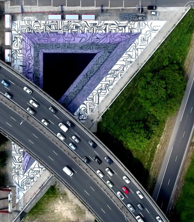
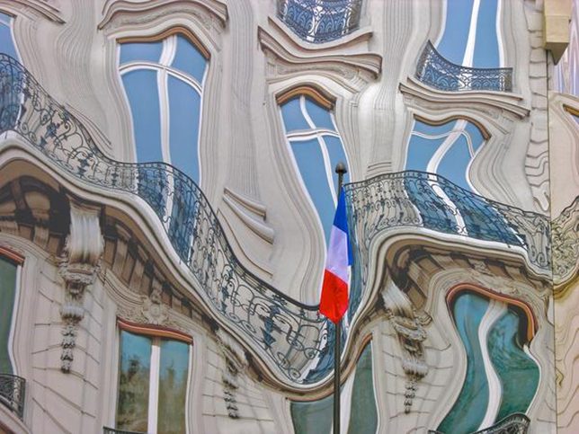
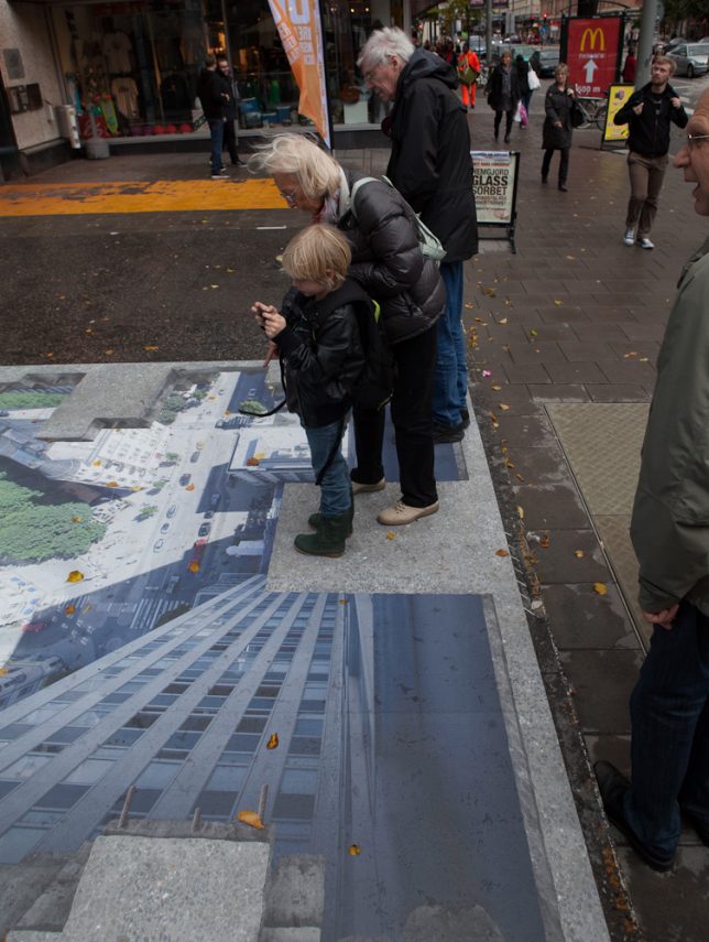
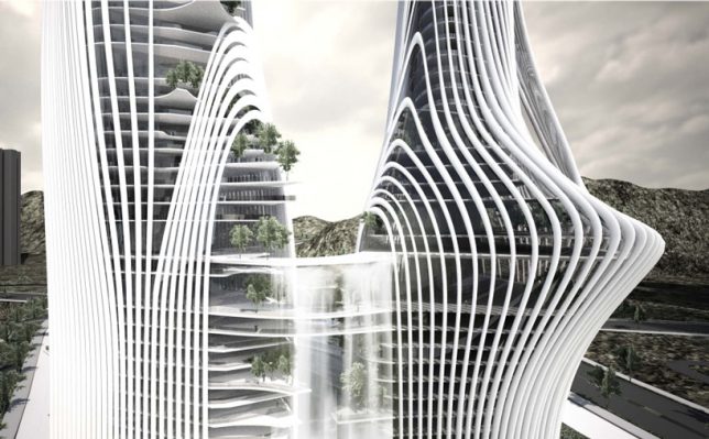
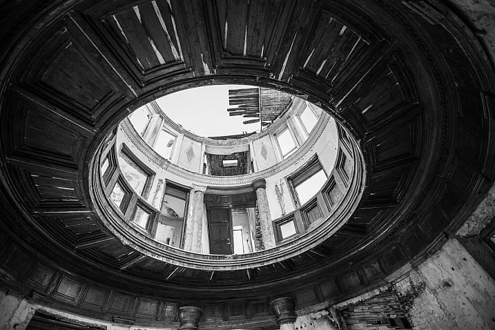
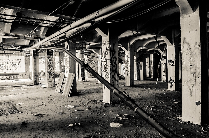
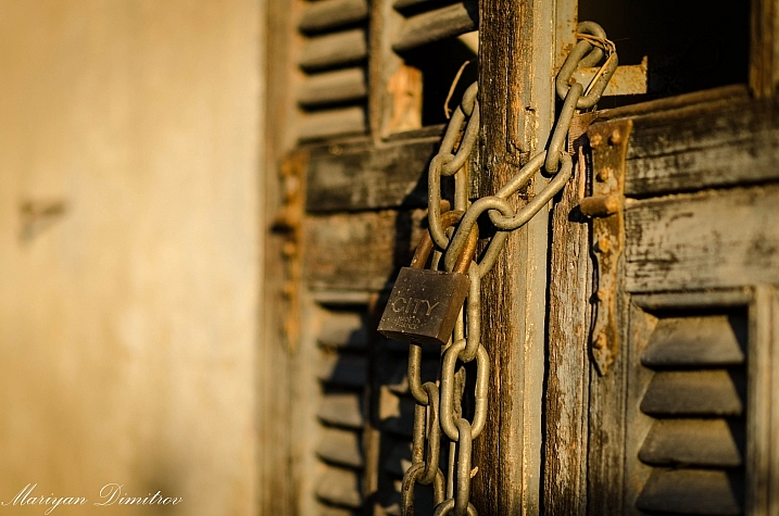
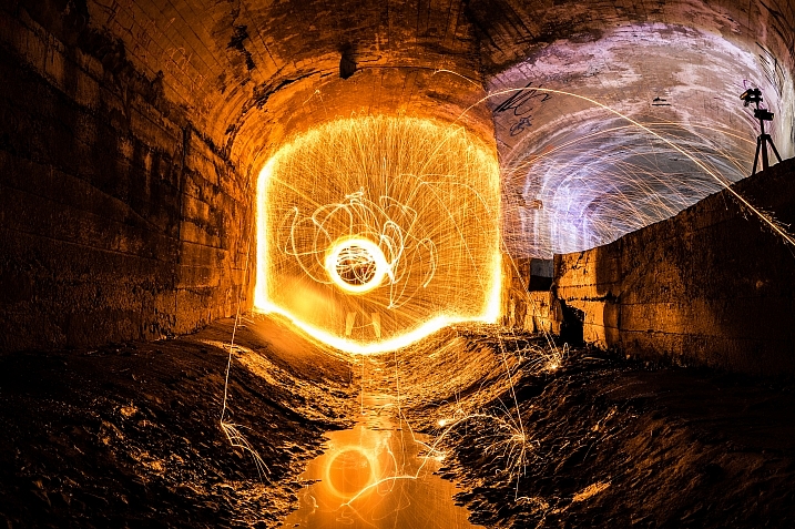
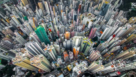
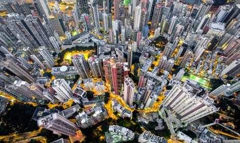
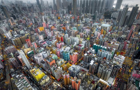
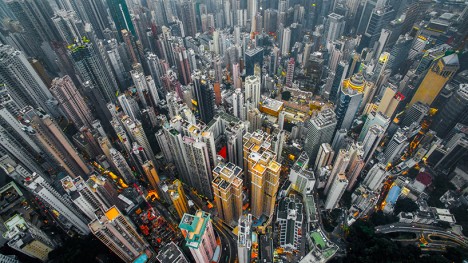
The image above shows an example of how you can use lines to create a visual guidance within your city and architecture images, that will help your viewers find multiple points of interest and take a closer look.

using lines for more impact in your images

To help you understand how the lines work in a rather complex image like this, reducing the image to a black and white version with high contrast, can help visualize the structures of the image without getting distracted by the color elements.

Why lines are important especially for urban images

While in many areas of photography, using depth of field and blurred backgrounds is a good way to lead the viewers’ eyes to the most important element, and add a sense of perspective, as city photographers we rarely have this choice. In architecture images, you want most elements to be in focus.

When taking pictures of city scenes, you need to structure your images in different ways to provide perspective and a feel of scale. The conscious use of lines in your images can divide a photo into smaller pieces, separate elements from each other, provide a sense of perspective and lead your viewers’ eyes to where you want them to focus.

using lines for more impact in your images

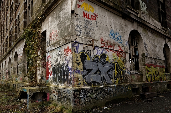
The image above shows an example of a random shot without considerations for the use of lines. With its grey stones, the National Museum of Ireland in Dublin on a cloudy day, doesn’t offer much to work with when trying to create an interesting image. This is merely a documentation of the place, but probably wouldn’t make it as a header image.

using lines for more impact in your images

However, beyond the documentary aspect, the use of lines to create perspective, orientation and symmetry can increase the impact, even of an otherwise dull looking image.

Which lines can you use to increase impact?

You can separate the lines in three categories which I call:

  • Dividing lines
  • Leading lines
  • Symmetrical lines

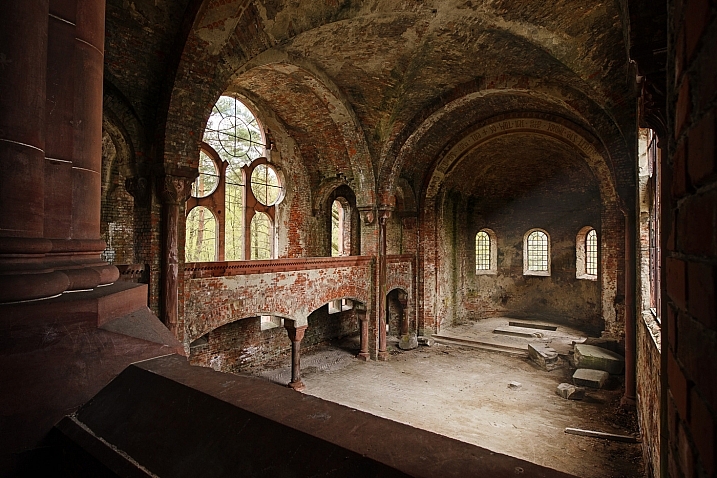
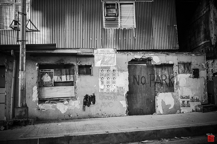
A dividing line structures your images into separate areas of interest. It can be horizontal, vertical, or diagonal. You can use it to make a clear difference between bottom and top of an image, but also make sure to use dividing lines to show near and far. In many outdoor images, the horizon line is a natural dividing line.

using lines for more impact in your images

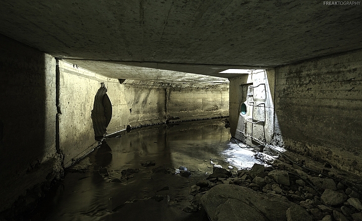
In this image, I am using a major dividing line to clearly separate the floor and the wall. Less noticeable, the additional line in the wall serves as another separation in the photo. Without the addition of this line, the right half of the image would be rather boring. By adding a simple line into the frame, it helps dividing the image into a left and right.

Make sure that your dividing lines are in the right place. With very few exceptions, make sure to place your lines outside of the center of the image (both horizontally or vertically) but also not too close to the borders. The well known Rule of Thirds is good guidance, in many cases dividing images into a two-thirds and a one-third part works best.

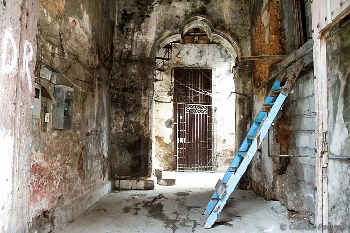
Leading lines are an important way to provide your viewers with an idea of perspective. They will lead the eyes into, and around the image. Leading lines often come in pairs, slowly merging into the distant part of the picture. But in fact, you can use multiple leading lines, even one can help the viewer find orientation. Leading lines don’t even have to be straight, you can use curves and angles just as well.

using lines for more impact in your images

The main street in this image serves as a single leading line, it helps the eye find orientation from the interesting space in the foreground, and puts it into the context of the big city.

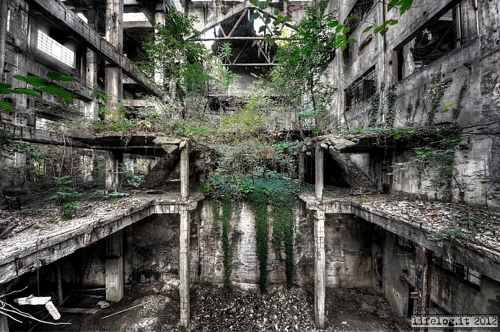
The third way of using lines to increase impact, is the use of symmetries. When looking for interesting images to capture in a city, try to find symmetrical lines in the architecture around you. Thankfully, architects also know the visual impacts of symmetries, and use them to create the buildings around us.


Bürogebäude des Deutschen Bundestages in Berlin,, Deutschland.

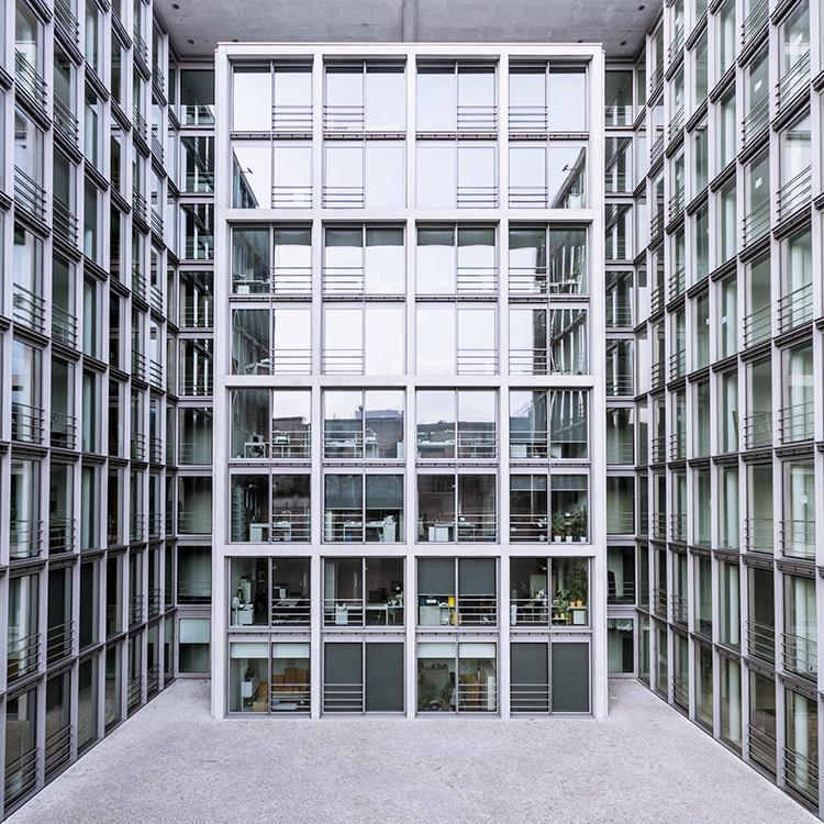
Buildings like this lend themselves to be taken in symmetries. While the content is not perfectly symmetrical due to the individual office decorations on the inside, the structure of the building makes an interesting frame for these individual elements. The symmetry helps to create interest, as you subconsciously start looking for the differences between the halves.

Learn to focus on lines

If you are shooting with a camera capable of RAW images, there is an easy way to train yourself to look out for lines: Use your camera settings, and change your camera to shoot in black and white!

When shooting RAW, the camera will still capture and store all the data from the sensor, including the color information. So when you are back at your computer to edit images, you will find all the options to create color images as well. But while shooting, you can look at your images at the screen in black and white, which will eliminate distractions from the forms in your image.

using lines for more impact in your images

Going a step further, in most cameras you can set up your own image processing profile in camera: Increase the contrast and sharpness of the image as far as possible, and you will end up with a preview image on the camera screen that is mostly reduced to the lines.

Additional ways to use lines

using lines for more impact in your images

Probably one of the most photographed objects in the world, the houses of parliament and the tower with Big Ben in London, UK, it is hard to come up with a unique version. In this image above, I added the light trails created by the passing traffic to add an interesting element. The light trails serve both a dividing lines between the other photographers in the foreground and the architecture in the background, as well as leading lines providing perspective from the left to the right part of the picture.

using lines for more impact in your images

When taking images of tall buildings, like in this case the tower of Westminster, the borders of the building will typically provide leading lines from the bottom (near) to the top (far). To generate an additional element of interest, I used a long exposure image to create another set of lines, through the moving clouds in the sky above the building. This helps add a dynamic element and interest, to an otherwise static and often boring background.

curved leading lines

Do not limit yourself to using only straight lines. While a horizon should always be straight and strictly horizontal, others, especially leading lines, can also be curved. In this image above, the cable car tracks take two turns that lead the viewer’s eyes from the bottom (near) to the center (far) part of the image.

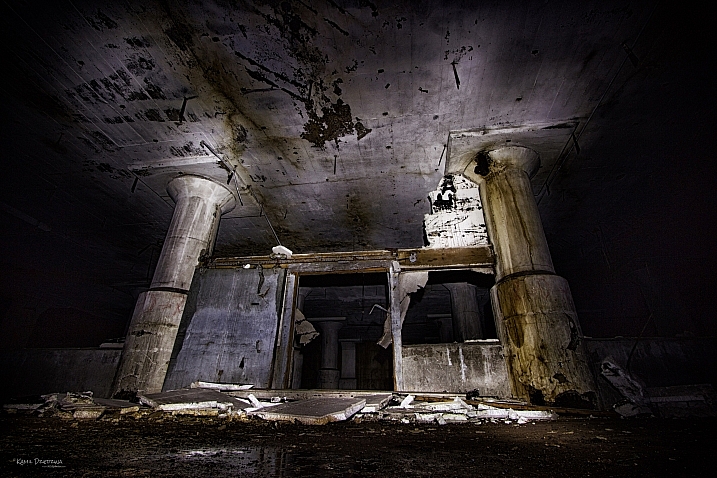
Even complex scenes win from the use of lines

Once you become aware of the lines in your images, you can use them to structure even more complex scenes.

using lines for more impact in your images

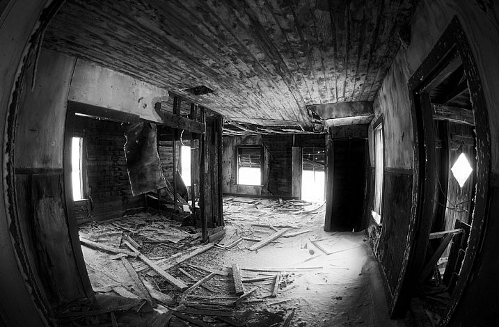
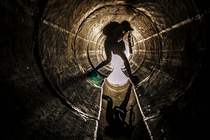
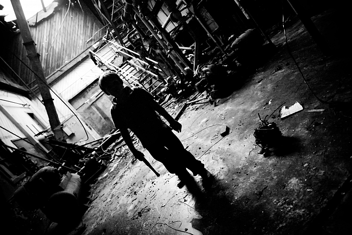
While the above example might show the lines all that obvious, you will most likely see the curb of the street easily as a (curved) leading line into the image.

using lines for more impact in your images

However, upon a closer look, you can also note the use of a dividing line separating the photo into a top and bottom part to provide additional perspective and scale. Finally, a use of lines as a frame puts more emphasis on the silhouetted person crossing the scene, adding further scale to the size of the elements contained.

These lines help the viewers structure the image into separate parts and make it easier for the brain to digest all the elements contained.

How do you use lines in your compositions? Please share in the comments below.

googletag.cmd.push(function() {
tablet_slots.push( googletag.defineSlot( “/1005424/_dPSv4_tab-all-article-bottom_(300×250)”, [300, 250], “pb-ad-78623” ).addService( googletag.pubads() ) ); } );

googletag.cmd.push(function() {
mobile_slots.push( googletag.defineSlot( “/1005424/_dPSv4_mob-all-article-bottom_(300×250)”, [300, 250], “pb-ad-78158” ).addService( googletag.pubads() ) ); } );

The post How to Improve the Impact of Your Urban Images Using Lines by Michael Zwahlen appeared first on Digital Photography School.


Digital Photography School

 
Comments Off on How to Improve the Impact of Your Urban Images Using Lines

Posted in Photography


Street Origami: Vivid Urban Art Installations in Folded Paper

03 May

[ By Steph in Drawing & Digital. ]

Screen Shot 2016-05-02 at 5.33.35 PM

Busting out beyond small proportions, delicate materials and indoor settings, origami has a chance to bloom, bringing bold colors and unexpected patterns to urban surfaces around the world. Paris-based street artist Mademoiselle Maurice installs large-scale origami artworks on public walls, ceilings, crumbling stone castles and even beach rocks, everywhere from Singapore to San Francisco. While some of her creations are made on canvas or installed in galleries, others are made to be destroyed, as ephemeral as real flowers blossoming and then dying on a branch.

origami street art 1
origami street art 2
origami street art 3
origami street art 4

Maurice says she was first inspired to work with origami while living in Tokyo for a year. She was there when the devastating earthquake, tsunami and nuclear power plant explosion occurred in 2011, and wanted to make art reflecting how she felt about the tragedy. Her first project came from the legend of 1,000 origami cranes, an ancient tale promising that anyone who manages to fold that many tiny paper cranes will be granted a wish by the gods.

Screen Shot 2016-05-02 at 5.32.40 PM
Screen Shot 2016-05-02 at 5.32.54 PM
Screen Shot 2016-05-02 at 5.34.21 PM

Screen Shot 2016-05-02 at 5.34.59 PM

Growing up in the urban confines of Paris, which she found rather grey and monotonous, Maurice wanted to add more color to the world with works that “emanate a carousel of emotion.” In the past five years, the young artist has collaborated with heavyweights like Louis Vuitton, Google, Vice Magazine and Issey Miyaké, and her work has been installed in Italy, the Netherlands, Sweden, China, Vietnam, Australia, Mexico, the U.S. and many more countries.

origami street art 5
origami street art 6
origami street art 7

“This is my way to stay discrete and not to impose myself too much on the walls,” Maurice said of her choice to use paper outdoors. “But otherwise I love doing something telling me that it will not last, ‘dust thou shalt return to dust.’”

Share on Facebook


[ By Steph in Drawing & Digital. ]

[ WebUrbanist | Archives | Galleries | Privacy | TOS ]


WebUrbanist

 
Comments Off on Street Origami: Vivid Urban Art Installations in Folded Paper

Posted in Creativity


Weekly Photography Challenge – Urban Decay

30 Apr

If you live in a city now is your chance to get out and hunt for some run down, dilapidated, crumbling buildings that say urban decay to you.

Thomas Hawk

By Thomas Hawk

Weekly Photography Challenge – Urban Decay

You can handle this challenge and subject however you wish to approach it. Shoot or convert to black and white, try some HDR, how about doing some light painting at night? The choice is yours. Go find a good subject, take a friend along too, and shoot away!

NOTE: As always though – please put your safety and taking the proper precautions to ensure you aren’t trespassing on private property or endangering yourself or anyone else in the process of getting your photos. Safety and getting proper permissions come first!

Pelle Sten

By Pelle Sten

Louis Du Mont

By Louis du Mont

Babak Fakhamzadeh

By Babak Fakhamzadeh

Toby Bradbury

By Toby Bradbury

Neal Wellons

By Neal Wellons

David Barnas

By David Barnas

Share your images below:

Simply upload your shot into the comment field (look for the little camera icon in the Disqus comments section) and they’ll get embedded for us all to see or if you’d prefer upload them to your favourite photo sharing site and leave the link to them. Show me your best images in this week’s challenge. Sometimes it takes a while for an image to appear so be patient and try not to post the same image twice.

Julian Lennon

By Julian Lennon

Freaktography

By Freaktography

David Barnas

By David Barnas

Darkday

By darkday

googletag.cmd.push(function() {
tablet_slots.push( googletag.defineSlot( “/1005424/_dPSv4_tab-all-article-bottom_(300×250)”, [300, 250], “pb-ad-78623” ).addService( googletag.pubads() ) ); } );

googletag.cmd.push(function() {
mobile_slots.push( googletag.defineSlot( “/1005424/_dPSv4_mob-all-article-bottom_(300×250)”, [300, 250], “pb-ad-78158” ).addService( googletag.pubads() ) ); } );

The post Weekly Photography Challenge – Urban Decay by Darlene Hildebrandt appeared first on Digital Photography School.


Digital Photography School

 
Comments Off on Weekly Photography Challenge – Urban Decay

Posted in Photography


25 Dilapidated Images of Urban Decay and Grunge

29 Apr

Many photographers are fascinated with old things, the more decayed and falling apart the better. Urban decay and grunge is a popular subject for photographers in cities. Some go out of their way to find abandoned buildings and little known spots.

Perhaps like these images:

Wayne Stadler

By Wayne Stadler

Vincent Ferron

By Vincent Ferron

RAFFI YOUREDJIAN

By RAFFI YOUREDJIAN

Ghalam_DAR

By ghalam_DAR

Anna S.

By Anna S.

Claudia M Eastman

By Claudia M Eastman

Nano Anderson

By Nano Anderson

Simon Samuelsson

By Simon Samuelsson

OlavXO

By olavXO

Howard Ignatius

By Howard Ignatius

Freaktography

By Freaktography

Freaktography

By Freaktography

Andre Valente

By Andre Valente

Freaktography

By Freaktography

Pietromassimo Pasqui

By Pietromassimo Pasqui

Maurizio

By Maurizio

Oreste Messina

By Oreste Messina

Maurizio

By Maurizio

Mariyan Dimitrov

By Mariyan Dimitrov

Daniel Go

By Daniel Go

Kamil Dziedzina

By Kamil Dziedzina

Darkday

By darkday

Darkday

By darkday

Guillaume DELEBARRE (Guigui-Lille)

By Guillaume DELEBARRE (Guigui-Lille)

Thomas Hawk

By Thomas Hawk


googletag.cmd.push(function() {
tablet_slots.push( googletag.defineSlot( “/1005424/_dPSv4_tab-all-article-bottom_(300×250)”, [300, 250], “pb-ad-78623” ).addService( googletag.pubads() ) ); } );

googletag.cmd.push(function() {
mobile_slots.push( googletag.defineSlot( “/1005424/_dPSv4_mob-all-article-bottom_(300×250)”, [300, 250], “pb-ad-78158” ).addService( googletag.pubads() ) ); } );

The post 25 Dilapidated Images of Urban Decay and Grunge by Darlene Hildebrandt appeared first on Digital Photography School.


Digital Photography School

 
Comments Off on 25 Dilapidated Images of Urban Decay and Grunge

Posted in Photography


Sladda: IKEA to Sell New Flat-Pack Bicycle for Urban Cyclists

23 Apr

[ By WebUrbanist in Technology & Vehicles & Mods. ]

ikea bike trailer

IKEA has announced a new lightweight bicycle with a rust-resistant chain, aluminum frame and low-maintenance construction all aimed to make it easier for more casual bicyclists to hop on and enjoy the ride.

sladda bike

A joint project by Oskar Juhlin, Jan Puranen and Kristian Eke from Swedish studio Veryday Design, the easy-upkeep bike comes in a few basic models with a series of adjustable features.

ikea trailer attachment

It is simple and unassuming at a glance, but aimed to be a go-to, easy-to-use object just like IKEA’s furniture and furnishing lines (just presumably more robust than some). For many would-be bikers, the prospect of maintaining the bicycle itself is a barrier to entry that IKEA hopes to eliminate as a concern.

ikea new bike model

Bike racks, bags and a two-wheeled trailer can all be added via click-to-attach mechanisms to allow for easy adjustments. At $ 750 it won’t be the cheapest model on the market, but affordable for its quality.

Share on Facebook


[ By WebUrbanist in Technology & Vehicles & Mods. ]

[ WebUrbanist | Archives | Galleries | Privacy | TOS ]


WebUrbanist

 
Comments Off on Sladda: IKEA to Sell New Flat-Pack Bicycle for Urban Cyclists

Posted in Creativity


Urban Jungle: Dizzying Drone Photos of Hong Kong from Above

08 Apr

[ By WebUrbanist in Architecture & Cities & Urbanism. ]

drone photo hong kong

Hong Kong has inspired so many iconic images of urban density shot from the ground or horizontally across buildings, but seeing it from above via drone footage gives the city an entirely fresh dimension.

drone density china

drone repeating buildings

In this series of vertigo-inducing snapshots, photographer and unmanned aerial vehicle pilot Andy Yeung captures both the chaos and order, colorfulness and monotony, of one of the world’s most stunning urban centers.

drone aerial city

drone view above

Shot from hundreds of feet in the sky, the resulting views exceed even the relatively awesome ones attainable by tripping up to the top of the adjacent hillsides. An onlooker starts to get a sense of the combination of  rigorous order and organic evolution of the city.

Share on Facebook


[ By WebUrbanist in Architecture & Cities & Urbanism. ]

[ WebUrbanist | Archives | Galleries | Privacy | TOS ]


WebUrbanist

 
Comments Off on Urban Jungle: Dizzying Drone Photos of Hong Kong from Above

Posted in Creativity