RSS
 

Posts Tagged ‘Tutorial’

Lighting Tutorial: The Science Behind Light

05 Jul

Alana Tyler Slutsky image from Surrealia series as featured on Fashion Photography Blog (FashionPhotograpyBlog.com)

Light : The Science of it All

Hey FashionPhotographyBlog.com readers. Happy Independence Day!

Today we are going to be talking about:

Light. Learn to understand it, learn to see it and the better you’ll be able to manipulate it. After all, the whole science behind photography is based on the principles of light. Stick it out through these next three days and things will get a lot more interesting. Before you can learn to manipulate light (or if you’re a curious person like me,) it’s good to understand the “how” and “why” behind it.

So, welcome to the science of light.

(I know this is the boring part, just stick with me…)

Light and Color Science:

The human eye is only sensitive to the visible spectrum of the electromagnetic spectrum.  White light contains all colors.  We learned this when Newton split white light with a prism.

Electromagnetic Spectrum Chart

Electromagnetic Spectrum

Color Prism By Pink Floyd

(Thanks Pink Floyd)

Additive Primaries – Red, Green, Blue

When you add equal parts of the additive primaries together (Red, Green, and Blue), you create white light.  RGB is the color method used in today’s digital world.  Mixing just two of the additive primaries will result with one of the subtractive primaries.

RGB Color Light Chart

Subtractive Primaries – Cyan, Magenta, Yellow

The subtractive primaries absorb their compliments (RGB) and subtract them from white light.  CMYK is the color model for printing (K referring to Black).  When subtractive primaries are mixed, they subtract brightness from white, resulting in Black.

CMYK Color Light Chart

Each additive color has a subtractive color that is its compliment.

Red – Cyan

Green – Magenta

Blue – Yellow

Before you can learn to modify and use light, you need to understand how it works! The first things to be conscious of are the qualities of light which include direction, contrast, color, brightness, diffused, and specular.

Direction is where the light is coming from.  This controls the relationship between light and shadow.  Direction can also be understood as the position or placement of the light.

Contrast is the relationship between light and shade.

Color is the color temperature or actual color of the light source.  (We’ll get into this in a minute.)

Brightness is the intensity of the light.

Diffused light is a softer light typically produced by a larger light source.

Specular light, in short, is light from a source that is not modified. Most of you guys will refer to this as “harsh” or “hard” light.

How can you tell if something is diffused or specular?  Look where the shadow meets the lighted areas.  If the transition is gradual, it is diffused. If the transition is knife edge its specular.  Aka – Does the shadow end very abruptly? Think of high noon light and how the shadows cast by the sun are very crisp.  This is specular light.

Shadow Transition Examples

Pay attention to the transitions at the edge of the shadows

Source

The size of a light source (as relative to your subject) will greatly effect the type of light produced.  A small source will produce hard light, hard edges and harder shadows.  A large light source will produce a shadowless or softer light with softer shadows.

Distance also effects your light.  A light close to your subject will create a softer light, whereas the same light when placed farther away will create a harder light.  Think of the sun!  It’s far away, appears quite small but produces an extremely harsh light/shade relationship unless there are clouds to diffuse the light.  When the sky is overcast, it acts as a giant soft box for the sun.

We’ll dive a little further into distance and light tomorrow.

Until then –

Alana

IMAGE SOURCE:

Feature image & image 1: photography by Alana Tyler Slutsky from her Surrealia series. To view the rest of the photos from this series visit her website.

Image 2, 3, 4 & 5: Alana Tyler Slutsky

Image 6:  150m.com


Fashion Photography Blog

 
Comments Off on Lighting Tutorial: The Science Behind Light

Posted in Uncategorized


Photography Tutorial: Intro Into Lenses

28 Jun

Camera Lens Image
INTRO TO PHOTO: PART 3 – LENSES


Last day of Intro to Photo! Last time we talked about how to set up your exposure. Today, we are going to discussing the ins and outs of lenses.  Here comes the easy stuff!


Lenses


Lenses can be either zoom or prime.  Zoom lenses allow you to vary focal lengths (based on what is built into the lens) and – as the name says – zoom in and out of the frame.  Prime lenses are fixed.  This means that it has one focal length.  In order to “zoom in or out” with a prime lens, you must physically move closer or farther from the subject.  Prime lenses typically have a larger maximum aperture, making them “faster” than zoom lenses.


Lenses that have larger apertures are described as fast lenses because they have the ability to collect light faster.  However, lenses with smaller apertures have a greater depth of field.


Camera Lens Chart

Lenses fall into a few different categories:


A wide-angle lens widens the angle of view thus bringing more into focus.  A wide angle can also have a flattening effect.


– Super wide angle lenses are typically anything under 20mm

– Wide-angle lenses are from 21-35mm


A “normal” is a lens that most accurately portrays what a human eye will see.  With a 35mm camera, this is typically a 50mm lens.  Normal lenses fall into the category of standard lenses.


– Standard lenses range from 35-70mm


telephoto lens reduces the distance between objects in the photo, bringing the subject “closer” to the photographer.


– Medium telephoto lenses are considered portrait lenses. These range around 80-135mm

– Telephoto lenses are between 135-300mm

– Super telephoto lenses are anything over 300mm


Focal length is the distance in millimeters between the lens and the sensor when the camera is focused on a subject at infinity.  Lenses that are classified as “long” lenses have a larger focal length- these are telephoto lenses.


Each lens has its place. Standard lenses are great all around lenses but excel when used for documentary and street work.  Wide angle lenses are great for landscape and architecture whereas telephoto lenses work well with portraiture, sports and wildlife photography.


Be careful when selecting a portrait lens.  Different focal lengths can distort the face in different ways.  Wide angles tend to flatten out the face in an unattractive manner.  The optimal portrait lens depends on what camera you’re using (and if there is a crop factor) but you’re typically safe using a lens between 85-135mm long.  135mm lenses (or about that) are optimal when shooting head shots.


Focal Length Examples

How focal length distorts the face


Megapixels


People are far too concerned with megapixels when it comes to buying a new camera. Let me put this very clearly… MEGAPIXEL COUNT DOESN’T ALWAYS MATTER!  The only time megapixel count really matters is when you’re going to be shooting something which has to be blown up large scale, such as a billboard.


Don’t drive yourself crazy over it!  In the end, it really doesn’t matter that much.


Crop Factor


Most digital camera sensors are smaller than film.  An image created with a 35mm body but smaller sensor will end up cropping a bit of the image out, as compared to what would have been captured with a full sized 35mm film frame.  Hence the term “crop factor.”  This determines how much of the image is cropped out as compared to a “full frame” sensor (a digital sensor the same size as 35mm film).


Be conscious of your gear.  If your camera has a crop factor, it effects how you view the world through your lens.  Because the focal length is effected, a crop sensor zooms in a bit with every lens.  A 50mm lens is closer to a 70mm or 85mm lens.  Each camera model has a different crop factor.  Be sure to look if your camera has a crop factor and what it is.


To determine actual focal length, take the crop factor and multiply it by your lens’ focal length to determine the focal length you’re actually viewing.  (I.e. – If you’re using a 50mm lens on a camera with a crop factor of x1.6, you’re actually shooting at a focal length of 80mm.)


Ken Rockwell Image Taken With A Full-Frame Sensor

Taken with a full-frame sensor


Ken Rockwell Image Taken With A Camera With A x1.6 Crop Factor

Taken with a camera that has a x1.6 crop factor


Last but not least, just a few tips:


– Don’t trust LCD backs for exposure! Always meter when possible.  LCD’s don’t accurately depict the information recorded by your camera’s sensor.  Something that looks perfectly exposed according to your LCD can actually be an entire stop under or over exposed.  The only way to trust what you see on the back of your camera is to learn how to read histograms.

– Check out this article on how to read histograms: How to Use Histograms by Ken Rockwell

– It helps to turn on the “over exposure indicator.”  This feature will cause the whites on your LCD screen to blink when they’re blown out.  (When they contain no detail and are essentially just blobs of pure white.)

– And last but not least.. As boring and nerdy and tedious as it is.. READ YOUR CAMERA MANUAL!


If you’re just tuning in to today, be sure to check out Part 1 – Cameras and Part 2 – Exposure.


I know there was a lot thrown out over the past few days – hopefully you made it through okay!  If you have any questions, feel free to shoot me an email at alana@alanatylerslutsky.com.


Happy shooting!

Alana


PHOTO SOURCE:

Feature Image & Photo 1: www.timeslive.co.za

Photo 2, 3, 4, 5: Alana Tyler Slutsky


Fashion Photography Blog

 
Comments Off on Photography Tutorial: Intro Into Lenses

Posted in Uncategorized


Photography Tutorial: Intro Into Exposure

27 Jun

Retro Photography Gear With Exposures

Intro to Photo: Part 2 – Exposure


Good morning, Fashion Photography Blog readers!  Welcome back to our brief intro to photography. Last post we talked about the camera basics. In this post we are going to going to talk about how to set up your exposure correctly. So let’s jump right in.


Setting Your Exposure


There are three main settings to be aware of prior to taking a photograph. Those settings are ISO, Aperture and Shutter Speed.


ISO – ISO, back in the days of film, was the measure of a film’s sensitivity to light. This system has been adopted by digital cameras and essentially works the same way it did with film. “Less sensitive” films require more light to make an exposure – The higher the ISO number, the more sensitive the film. So, what exactly does this mean?


Let’s say you want to shoot someone outside on a bright, sunny day. You would use a film (or set your digital camera) with an ISO of about 100. Because of the large quantities of light available to you, it’s not necessary to use a sensitive film.


If you’re trying to shoot someone in a room solely illuminated by candle light, you’re going to need film that is much more sensitive. For this situation I would suggest using something closer to ISO 1600. Films that are more sensitive are referred to as “fast films” whereas films that are less sensitive are referred to as “slow films.”


In the case of film, the more sensitive it is, the more grain you will see in the final image (this has to do with the chemistry of the film and something called “silver halides.”). With digital cameras, the higher the ISO, the more noise you will see in your final images. This has to do with the image sensor and how much heat it is giving off while capturing your image, among other things.


ISO Comparison Example

ISO Comparison – Same camera settings, only difference is the ISO


Aperture (f/stop) – Aperture is the size of the hole in the lens that controls the amount of light let in. The larger the f/stop # the smaller the opening in the lens.


Aperture F/Stop Diagram

Shutter Speed – Shutter speed is the other setting which controls how much light is let into the camera. This one is kind of self-explanatory, time works in fractions of a second.


You must understand the relationship between shutter speed and aperture in order to precisely control your exposure. The wider open your aperture, the faster your shutter speed to prevent overexposing your image. The smaller your aperture, the slower your shutter speed to prevent underexposing your image.


Think of it this way… Let’s pretend that your camera is a bucket and light is water. In order to fill your bucket with water, you have to control how much pours in at a time. The larger the opening (the wider open your lens is, i.e. f/2.0) the more water (light) will pour in. Therefore you must shut off the water relatively quickly (use a faster shutter speed, i.e. 1/250th) in order to prevent it from “overflowing” or overexposing your image. It works in the reverse as well… If you have a smaller opening (smaller aperture, i.e. f/22) you must let the light in for longer (use a longer shutter speed, ie 1/15th) in order to prevent an underexposed image.


Shutter Speed Diagram

(The numbers in this image have nothing to do with the number in the paragraph above)


Stops


Everything in photography is measured in stops. You should memorize these stops because you will need to recall them at a moments notice. Cameras and light meters often measure things in thirds of a stop for more precision, but this can be turned off.


The main stops for ISO:


(Least sensitive) 100, 200, 400, 800, 1600, 3200 (Most sensitive)


The main stops for aperture (f/stops):


(Largest opening) f/1.4, f/2.0, f/2.8, f/4, f/5.6, f/8, f/11, f/16, f/22, f/32, f/64 (Smallest opening)


The main stops for shutter speed:


(Longest) 2s, 1s, 1/2, 1/4, 1/8, 1/15, 1/30, 1/60, 1/125, 1/250, 1/500, 1/1000 (Shortest)


Stops either double or halve when opening up or stopping down. This is blatantly obvious with shutter speeds; it works the same with ISO and f/stops. F/8 allows in 1/2 the amount of light that f/5.6 allows in.


Stops work in relation to each other. If you have the combination for a perfect exposure but decide you want to use a more shallow depth of field or want a longer shutter speed for motion blur, you can easily achieve your desired effect without having to re-meter or anything.


This is something called equivalent exposures.


Equivalent Exposures Chart


Count the number of stops between your actual exposure and your desired exposure to figure out what is the new f/stop – shutter speed combination would be. I know this sounds confusing but I promise it’s quite simple.


Let’s say you are shooting at ISO 100 @ f/16 with a shutter of 1/15th of a second.. But you want a shallow depth of field and would rather shoot at f/4. Count the number of stops between the two and adjust your shutter speed accordingly.


The difference between f/4 and f/16 is 4 stops. In this scenario, you’re opening up your aperture, therefore letting in more light. So you must stop down (close) your shutter 4 stops to keep an equivalent exposure. 4 stops difference from 1/15 would be 1/250.


Your new, but equivalent exposure would be ISO 100 @ f/4 with a shutter speed of 1/250th of a second.


F Stops Versus Shutter Speeds Chart

I know this part gets a bit confusing.  Just stick it through and I promise we’ll get to the fun stuff soon.


Check back in tomorrow for Day 3 – Lenses.  (Or if you missed it, catch up on yesterday’s post, Part 1 – Cameras.)


In the meantime if you have any questions, just ask! Shoot me an email at alana@alanatylerslutsky.com.


Happy shooting!


Alana


Fashion Photography Blog

 
Comments Off on Photography Tutorial: Intro Into Exposure

Posted in Uncategorized


Photography Tutorial: Intro Into Cameras

26 Jun

SLR camera montage

INTRO TO PHOTO: PART 1 – CAMERAS


Hey FashionPhotographyBlog.com readers!  I’m Alana Tyler Slutsky, a NYC based fashion photographer.  For quite a while I had no one to turn to in order to seek advice and ask questions about photography.  From learning the basics to testing with models, I didn’t know what was right and what was wrong.  It’s this very reason that I’m so thankful for FPBlog’s editor, Ed, for giving me the opportunity to contribute.  I hope to shed some light on the subjects I found difficult to understand and give all you readers some much needed help that I didn’t have in the beginning.


Now that FashionPhotographyBlog.com is back up and running, what better way to say “we’re back!” than by dishing out all of the information that everyone asks for when starting in fashion photography?!  Check in weekly for information posts on a range of topics from cameras and lighting, to retouching, to producing a fashion photo shoot!


Now that that’s out of the way… Let’s get to the good stuff!  Over the next three days, we’ll be breaking down the building blocks of photography.


I know that this is going to be one of those pretty generic posts that goes over the basics but I feel obligated to write it… After all, this is a blog that caters to all levels and we were all once new and unsure before.


So, here goes nothing… A brief intro to photo and how cameras work.


(Hey, maybe you experienced folks will pick up a thing or two. If not, use this as a refresher!)


Types of Cameras


There are many different types of cameras out there in the world. What the majority of photographers use is a SLR – a single lens reflex camera. (Digital SLR cameras are referred to as D-SLR cameras.).

SLR cameras use a lens and a mirror to reflect what is seen via the lens into the viewfinder. Essentially, what you see in the viewfinder is what you get.


How a SLR camera works diagram

How an SLR camera works – The mirror lifts up to reveal the film or shutter

The most common type of camera body that is used is a 35mm camera. 35mm camera bodies are designed to use, you guessed it, 35mm film. The cameras that you most of you use and own are digital 35mm cameras.


Pentax K1000 Camera

Pentax K1000 – My favorite!

While 35mm cameras are popular among professionals, it’s not uncommon to find a pro using a “medium format” camera. These cameras, in the days of film, were used with specific film which was larger in format, thus yielding a larger negative. So why is this important today? Digital medium format cameras have larger sensors, which allow them to have more megapixels. While megapixel count isn’t always that important, it helps to have the most megapixels you possibly can when shooting something that will be displayed in a relatively large format – such as a billboard. We’ll get more into this in a bit. The most common brands of medium format cameras are Hasselblad, Mamiya and Phase One.


Hasselblad 501 Camera

Hasselblad 501 – A film medium format camera which can be outfitted with a digital back

Film Size Comparison Diagram

645, 6×6 & 6×7 films are all forms of medium format film.

Be sure to check back tomorrow for Day 2 – Exposure.


If you have any questions, feel free to shoot me an email at alana@alanatylerslutsky.com.


Happy shooting!

Alana


PHOTO SOURCE:

Feature Image & Photo 1: www.arts.tau.ac.il
Photo 2, 3, 4, 5: Alana Tyler Slutsky


Fashion Photography Blog

 
Comments Off on Photography Tutorial: Intro Into Cameras

Posted in Uncategorized


Everything you wanted to know covered in helpful Lightroom tutorial

10 Jun

shared:AdobeLogo.png

Adobe’s Lightroom 5 is a powerful program, but that power comes at the expense of a learning curve that some find pretty steep. In this excellent video shot at B&H, Photographer Robert Rodriguez, Jr. walks photographers through the functions and features of Lightroom’s Develop module in an hour-long hands-on tutorial as he covers just about every panel and slider in the Develop module. Learn more

News: Digital Photography Review (dpreview.com)

 
Comments Off on Everything you wanted to know covered in helpful Lightroom tutorial

Posted in Uncategorized


Getting Real with HDR – a Step by Step Tutorial for Realistic Looking HDR

11 May
Try to make your HDR images look as realistic as possible

Try to make your HDR images look as realistic as possible

If you have been photographing for more than a year or two, you will have heard about HDR (which stands for High Dynamic Range). We have probably seen them, the “overcooked”, over processed HDR images that float around the photo websites. For some photographers, the process seems to force them to overdo their images and after a while that seems to be the only result they are trying to achieve. Do a Google search on “bad HDR” and you will see what I mean. The images have halos,  the colours are surreal and look metallic, the contrast is off and in short, the image is really messy.

When I first shot HDR, I fell into this trap too. These results caused many photographers to say that HDR is not a useful technique and is really gimmicky. That perception is partly true. HDR in the hands of someone who cannot use it effectively can result in some weird looking images, however, HDR done properly can produce some incredible results. To see some good examples of HDR done properly, visit the website HDR Spotting and take a look at the editors picks. There are some astounding images there. The colours are amazing, the contrast is perfect and the detail in the shadows and highlights, sublime. That is what HDR should be. It should be the best combination of the highlights and the shadows properly exposed, the image should look as real as it can. So, how do you get this right you might be asking, read on to find out.

What is HDR?

As I said earlier, HDR stands for High Dynamic Range. Your cameras sensor has the ability to capture light and colour. The extent to which your camera can do this is called the dynamic range. More specifically, if your camera can render lots of details in the shadows and the highlights in the same shot, then it has a high dynamic range. Over the past few years, digital sensors have become so much better at capturing more detail. This is a huge benefit for photographers and of course for HDR photography. This means that we can get more details out of every image and as a result, the HDR images will be that much more detailed.

Lions Gate Bridge Vancouver - HDR image

Lions Gate Bridge Vancouver – HDR image

How do I shoot HDR?

Making an HDR image involves 3 distinct and separate processes. I will go into detail on each one, but at a high level, they are as follows:

  1. Image Capture
  2. HDR Processing
  3. Image editing in Photoshop

Lets start with image capture first. This is the photography part of this process. It’s pretty simple really. Set up for your shot as you normally would. Make sure you have your subject well composed and you are ready to go. The difference between HDR and normal photography, is that with HDR you will take either three to five bracketed images of the same scene. The reason for the number of images is that you will blend these images together in a dedicated HDR product.

My recommendation for HDR software is Photomatix Pro. It is a programme that has been around for many years now and has some really good editing functions. It’s probably the most widely used software when it comes to HDR. Photoshop also has an HDR function, but in my opinion, its not as refined as the Photomatix Pro yet. Don’t get me wrong, I am a huge Photoshop fan, it is an incredible tool, I am sure that Photoshop will have something within their functions that will be competitive in time, but for now, I still use Photomatix.

Step #1 –  Image capture

These are the steps I follow when I intend to do an HDR shot. They are not rules, nor are they inflexible, they just work for me. You need to find what works for you and gives you the best results, this method has helped me get my best results, so try it out. Tweak it and change it as you need.

  1. Use a tripod – it is a good idea to put your camera on a tripod for HDR, especially if you are shooting in low light. I have done some handheld HDR but only in bright conditions. The tripod will also help you get your composition right.
  2. Put your camera into Manual mode “M”
  3. ISO Settings – it is a good idea to keep your ISO settings at 100 or as low as your camera will go. That way you will avoid introducing unnecessary noise into your images. The process of HDR allows you to capture the dynamic range of light and colour in the scene. Using high ISO settings is great when you are trying to shoot a low light scene and capture it in one shot, but for HDR you will want to keep it as low as possible.
  4. Set your aperture to anywhere between F/8 and F/ 11 and don’t adjust your aperture between shots.
  5. Adjust your shutter speed so that you are exposing the scene perfectly according to your cameras light meter.
  6. Capture one image at this reading
  7. Underexpose by one or two stops (depending on the scene) and capture another image by adjusting your shutter speed.
  8. Do this twice on either side of the perfectly exposed image.

This will result in five images being captured.

Below are the three images I used in making the HDR image you see above. Take a look at how the colours and exposure don’t look good at all.

3 Different exposures for the HDR image above

3 Different exposures for the HDR image above

Some photographers use five shots for their HDR shots, some use seven or up to nine. I have found that three to five shots seem to work best for most scenes. I have only used nice shots on a few occasions, but have not been happy with the results. The colours seem to be “muddy” and unclear once processed. If necessary, shoot seven images and see how that works.

Once you have completed the shoot, download the images to your computer. It is important NOT to edit the images before blending them into an HDR image. Some of the shots might look over exposed or under exposed, thats OK, in fact they must look like that. The software will deal with these issues, so don’t be concerned that the images look bad out of camera, they need to be processed and then the magic begins.

Click on - Load Bracketed Photos

Click “Load Bracketed Photos”

Step #2 – HDR processing

I will be explaining the Photomatix software in this article. I have tried HDR with each new version of Photoshop and I am still happier with the results I get from Photomatix Pro. You can download a trial version of Photomatix from their website. It is fully functional, the only thing is that the trial version puts a watermark on the image. This is OK for trying it out, you will see exactly what the software can do, if you think it is worth it, then you can buy it. Ok, so here is how you take your images into Photomatix Pro

  1. Open Photomatix Pro (or if you’ve set it up as a Lightroom plugin, select your bracketed images, right click and choose “edit in” and Phototix Pro)
  2. Click  ”Load Bracketed Photos” and then click on “Browse” and select the images you have taken (you can also drag and drop them into the box)
  3. Click OK once the images appear in the box
Select the options displayed on the screen above

Select the options displayed on the screen above

Preprocessing options are available.  Make selections on the box as shown in the screenshot above. Then click preprocess and Photomatix Pro will begin to tone map the images into a composite 32-bit image. This process is generally quite quick, between 30 seconds and a minute.  Once complete, click on the Tone Mapping button.

Use the “Remove ghosts” function if you have people or moving objects in your images. If you don’t have this, then you wont need to use this function.

The HDR editing screen

On this screen, you are able to select a variety adjustments that will create an overall change to the image. There are no absolutes here. Each adjustment makes minor or major differences to the image and the combination of the adjustments provides diverse options.

HDR-Screen-600

At the bottom of the screen you will see different “treatments” (or presets) which you can use as a starting point to your image editing process. I would avoid using these as they are generally overdone. Try and use the functions on the left hand side to edit your image.

Below are the details about each function on the left hand side of the screen and what each does. One of the best ways to see what a function does is to slide it all the way over to the left and then to the right and see how it affects your image, but here are the details:

General Settings

  • Strength – affects the degree to which contrast and detail are enhanced in the image. A value of 100 gives the maximum amount of enhancement. To get a more natural effect, move the slider to the left. The default value is 70.
  • Color Saturation – controls the saturation of the RGB color channels. The greater the saturation, the more intense the color. Move the slider right or left to change the setting. A value of zero produces a grayscale image. The value affects each color channel equally. The default value is 46.
  • Luminosity – controls the compression of the tonal range, which has the effect of adjusting the global luminosity level. Move the slider to the right to boost shadow details and brighten the image. Move it to the left to give a more “natural” look to the resulting image. The default value is zero.
  • Detail Contrast – controls the amount of contrast applied to detail in the image. Move the slider to the right to increase the contrast of the details and give a sharper look to the image. Note that increasing the contrast also has a darkening effect. Move the slider to the left to decrease the contrast of details and brighten the image.
  • Lighting Adjustments – affects the overall ‘look’, controlling the extent to which the image looks natural or surreal. When the Lighting Effects Mode box is unchecked, move the slider to the right to make the image look more natural and to the left to make it look more ‘painterly’ or ‘surreal’. Use this carefully as it can have an unpredictable effect on your image.
  • Lighting Effects Mode – the checkbox lets you switch between two modes for the Lighting Adjustments setting,where each mode produces slightly different results. Checking the box tends to produce results with a type of ‘Magic Light’ effect.

More Options

  • Smooth Highlights – reduces the contrast enhancements in the highlights. The value of the slider sets how much of the highlights range is affected. This control is useful for preventing white highlights from turning grey or uniform light blue skies becoming dark blue-grey. It is also useful for reducing halos around objects placed against bright backgrounds. The default value is zero.
  • White Point and Black Point – these sliders control how the minimum and maximum values of the tone mapped image are set. Moving the sliders to the right increases global contrast. Moving them to the left reduces clipping at the extremes. The White Point slider sets the value for the maximum of the tone mapped. The Black Point slider sets the value for the minimum of the tone mapped image.
  • Gamma – adjusts the mid-tone of the tone mapped image, brightening or darkening the image globally. The default value is 1.0.
  • Temperature – adjusts the color temperature of the tone mapped image relative to the temperature of the HDR source image. Move the slider to the right to give a warmer, more yellow-orange colored look. Move the slider to the left for a colder, more bluish look. A value of zero (default) preserves the original color temperature of the HDR source image.

Advanced Options

  • Micro-smoothing – smoothes local detail enhancements. This has the effect of reducing noise in the sky, for instance, and tends to give a “cleaner” look to the resulting image. The default value is 2. Important note: The Loupe may not properly show the effect of the Micro-smoothing setting when the area magnified is uniform. If you want to see the effect of the Micro-smoothing setting at 100% resolution on a uniform area such as the sky, you will have to select an area that contains an object in the scene in addition to the sky.
  • Saturation Highlights – adjusts the color saturation of the highlights relative to the color saturation set with the Color Saturation slider. Values higher than zero increase the color saturation in the highlights. Values lower than zero decrease it. The default value is zero.
  • Saturation Shadows – adjusts the color saturation of the shadows relative to the color saturation set with the Color Saturation slider. Values higher than zero increase the color saturation in the shadows. Values lower than zero decrease it. The default value is zero.
  • Shadows Smoothness – reduces the contrast enhancements in the shadows. The value of the slider sets how much of the shadows range is affected. The default value is zero.
  • Shadows Clipping – the value of the slider sets how much of the shadows range is clipped. This control may be useful to cut out noise in the dark area of a photo taken in a low-light situation. The default value is zero.

Once this part of the process is finished, then it is time to take the image into Photoshop. Save the tone mapped image and then re-open it in Photoshop.

Step #3 Image Editing in Photoshop

This is a very basic workflow. It will enhance the lighting and tonality in your images. These techniques are discussed here at high level.

Shadows and Highlights

Photoshop has a function called Shadows and Highlights. Use this tool to bring out detail in the shadows of your image. Use it carefully, if you overdo the treatment on the shadows, there may be some unsightly image degradation or “noise”. This function is not great for adjusting highlights, so use it for the shadows only. This tool is found in Photoshop as follows: IMAGE > ADJUSTMENTS > SHADOWS AND HIGHLIGHTS. The adjustments of AMOUNT, TONAL WIDTH and RADIUS should all be kept aligned close to one another to ensure that the adjustment looks realistic.

Shadow and Highlights function in Photoshop

Shadow and Highlights function in Photoshop

Levels Function

The levels function in Photoshop is for adjusting the lighting in an image. This means that if your image is a little dark you can push up the exposure slightly and see more details in the image. The levels function shows a representation of a histogram. Move the sliders in to touch the edge of the histogram as a general rule. This will ensure that your image has a good representation of highlights and shadows.

The Levels functioning Photoshop

The Levels functioning Photoshop

Hue and Saturation

Once the exposure and lighting has been adjusted and looks correct, then you may begin adjusting the colour in the image. The tool to use will be the Hue and Saturation tool. The important tip here is not to adjust the master channel but rather to adjust by each channel independently. To do this, click on the top toggle button that says “default”. A drop down menu will appear and each colour channel will be available from there. Slide the Saturation Slider to the left to desaturate (remove colour) or to the right to saturate. That way you have the best control of the colour in your image.

Hue and Saturation Function in Photoshop

Hue and Saturation Function in Photoshop

Dodging and Burning

These functions are localized adjustments. By using a brush tool, you are able to make certain areas of the image darker and other areas of the image lighter. This is useful for adding the finishing touches to your image. There is also the sponge function which is a saturation tool which can saturate colours at a local level.

Sharpening

Almost every image that comes out of a digital camera requires sharpening of some sort. The easiest and quickest tool to use is the Unsharp Mask tool and it works effectively.

Unsharp Mask Tool in Photoshop

Unsharp Mask Tool in Photoshop

The Unsharp Mask has three separate sliders: Amount, Radius and Threshold. As a general rule you can keep the Amount anywhere between 80 and 120%, Radius can be set between 1.0 and 3.0 pixels and Threshold is generally at zero. Adjust the sharpness of the image according to each image requirement and beware of degrading the image by over sharpening. You will easily notice if an image is over sharpened by the appearance of a “halo” around certain edges in the image. The idea is to sharpen the image but not make it overly sharp and lose image quality.

Once you are done, save your image and thats it! Have a go, try different settings in different light, let me know what you think and how your images turn out. If you have any questions, drop them into the comments box below.

Please leave your comments and questions below. If you want more HDR tips, try some of these articles:

  • HDR Vertorama Photography – How to Create Mind-bending Images
  • Five Minutes to Realistic HDR using Lightroom and a 32-Bit Plugin
  • The 10 Steps Every HDR Photographer Goes Through
  • Exposure Blending Using Luminosity Masks Tutorial

The post Getting Real with HDR – a Step by Step Tutorial for Realistic Looking HDR by Barry J Brady appeared first on Digital Photography School.


Digital Photography School

 
Comments Off on Getting Real with HDR – a Step by Step Tutorial for Realistic Looking HDR

Posted in Photography


Exposure Blending Using Luminosity Masks Tutorial

18 Apr

There will be a time when the wizards behind your camera technology conjure up a sensor so powerful they will swallow up any scene and spit it out just as it was – no over, or underexposed areas. Until then, in order to produce an image with a high dynamic range of light, you have to work with the sensors available to you and create your own post-processing magic.

Pink sunset

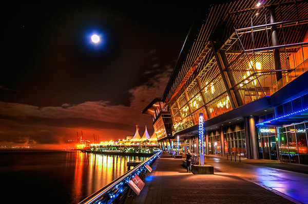
Image created by blending two exposure with luminosity masks, one for the sky and one for the foreground.

While you, and many photographers, may have relied heavily on HDR programs in your exposure blending quest, many more are now beginning to turn to luminosity masks as a cleaner alternative. Through the use of luminosity masks you can create stunning, balanced images that encapsulate a vast dynamic range of light. They give you incredibly fine control over your imagery in almost every area.

While some HDR programs nowadays produce very natural, clean HDR images, luminosity masks do not affect the original files at all, so there is literally zero image degradation during the blending process. That is why so many digital photographers are beginning to make luminosity masks a staple in their workflow.

What are Luminosity Masks?

Luminosity masks break an image down into various channels of luminosity. In other words, they allow you to make very specific selections in Photoshop based on how bright or dark an area is. Let’s say you were looking at a beautiful nighttime cityscape shot. Everything is exposed correctly apart from the street lights, which are completely blown out. You also have a darker exposure in which the street lights are ideally exposed.

Through luminosity masks you can make an accurate selection of the street lights because you can hone in on their brightness, or luminosity values. With this selection you can simply replace the overexposed streets lights with the correctly exposed ones in the darker image.

What You Need to do Luminosity Masking

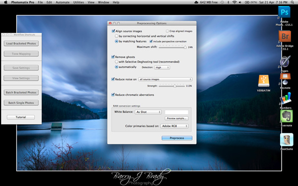
Firstly, creating your own luminosity masks is a complex and cumbersome process. However, I have a free Photoshop Luminosity Mask Action Set that will do all of the work for you. You can download it here: Free Luminosity Mask Action Set.

Secondly, it is imperative that you have a good understanding of Masking in Photoshop. If you’re a little bit unsure of the process, you can visit Adobe’s site which has a useful video tutorial for you to follow: Masking in Photoshop.

Which exposures to blend?

Ideally, the exposures you choose to blend should cover the full range of light in a given scene. Your brightest exposure should contain information in the darker areas, while your darkest exposure should contain information in the brightest areas. You are not limited to the number of exposures you can blend. Sometimes, in scenes of extremely high contrast, you may need to use as many as five to ensure a smooth transition between exposures and to cover the full range of light in the scene.

The order you choose to layer the exposures in Photoshop is dependent on your personal preference and the exposures you’re working with. Usually working with your normally exposed image as the base layer will derive the best results, but sometimes you may need to work with a darker or brighter exposure as your base layer.

Once you’ve decided on your exposures and have layered them in Photoshop, you now must decide which exposure you will run the actions on. Generally this will be done on your normally exposed image because it will offer the widest range of usable masks. For example, if you ran the luminosity mask actions on a darker exposure, you would gain a full range of dark and mid-tone luminosity masks, but very few, if any, workable bright masks, because the darker exposure is lacking in highlights. The converse is true for a strongly overexposed image.

Blending Exposures Using Luminosity Masks Tutorial

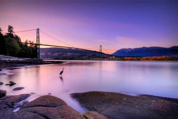
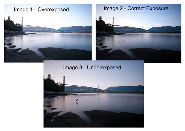
Today you’ll work with two exposures. One is ideally exposed for the sky and sea (download the underexposed image here), while the other is exposed for the foreground elements (download the overexposed image here).

Original files

You want to combine the sky and the sea in the underexposed image with much of the foreground in the overexposed image. To do this, you need to find a way of selecting the sky and the sea (i.e., the blown out areas) in the overexposed shot. Once you’ve done that you just need to replace it with the sky and sea of the darker exposure.

Steps in Photoshop For Blending Exposures

1. Install the Photoshop Action set

Instructions on how to install actions can be found here: Get Creative With Photoshop Actions

2. Import your two images into Photoshop

Bring both images into Photoshop as layers, placing the underexposed image on top. Align the images by selecting both of them on the layers panel, and going to Edit > Auto-Align Layers.

3. Turn off the top layer

Uncheck the eye on the layers panel next to the underexposed layer. This will make it invisible and ensure that the luminosity mask actions will run on the overexposed layer only.

4. Run the Masking Action

Go to your Actions panel, which looks like a Play button on the toolbar. Open it up and go to the set called JM Luminance Masks. Click on the arrow to the left of that. You will now see an option called Generate Luminance Masks. Select it and press the Play button at the bottom of the Actions panel to begin the process.

Luminosity mask actions

5. Add a Layer Mask to the Dark Underexposed Layer

Now, check the eye next to the underexposed layer, so that it is visible again. Make sure that layer is selected, then go down to the bottom of the Layers panel and, while holding Alt (Option on a Mac), left click the Add a Mask icon. This will create a black layer mask on the underexposed layer, making it invisible again.

6. View Luminosity Masks

To see the Luminosity Masks that you’ve generated, go to your Channels palette, next to the Layers panel (if it is not showing go to: Window > Channels and it will appear). You’ll see 18 monochromatic channels, ranging from Brights 1-6, Darks 1-6, Midtones 1-6. Every one of these channels is a potential mask.

Luminosity mask channels

7. Comparing and Selecting a Luminosity Mask

For this set of images, you only need to use one mask in order to blend the sky from the darker exposure into the overexposed image. In this instance, you’ll need to select Brights 3.

Comparing Masks

Just as with normal masking, the brighter the pixel the stronger the selection. In other words, in the image above, if you used Brights 3 you are selecting much of the sky and sea, but none of the foreground which is completely black. Conversely, if you selected Darks 3, for example, you would only be making a selection of the foreground sand and the poles that lead out to sea.

When choosing the appropriate mask, you are looking to isolate different areas. Therefore, it’s important that the mask you choose has the greatest contrast between the areas you wish to select and the areas you wish to ignore.

For example, if you were working on an image of a nice green field on sunny day, but the sky was blown out and you wished to exchange it with the sky from a darker exposure. You would run the luminosity mask actions and choose the mask where the field was black and the sky was white. This would ensure you would only select the sky and not the field in the foreground.

To turn Brights 3 into an actual selection, you just need to hold Control (Command on a Mac) and click the left mouse button on the thumbnail of the Brights 3 channel. Marching ants will appear to indicate your selection. Press “Control + H” to hide the marching ants.

8. Get Ready to Paint on the Mask

Now switch back to your Layers panel and select the underexposed layer. Make sure you select the mask, and not the actual layer itself.

9. Set up the Paint Brush Tool

Choose the Paint Brush tool on the toolbar and make sure the foreground colour is set to white. Choose the correct brush size. This will depend entirely on the area you’re working with in a given image, but usually, a larger brush is better. A brush size of 2,000 pixels was used here. Set the opacity depending on the strength of the masking you wish to use. For example, with this image, you will mask the sky with an opacity of 100%, but the overexposed areas in the water and foreground will only be masked at 40% opacity. This is because you don’t want to darken the sea too much.

10. Painting or Applying the Mask

Now you’re ready to begin masking. Freely move your paint brush around the areas you wish to affect. Since you are masking with a luminosity mask selection you don’t have to worry about going over the edges. Try varying opacities in different places. Even if your brush opacity is set to 100%, you can still run your brush through certain areas a few times to strengthen the effect.

By holding Alt (Option on a Mac) and clicking on the layer mask you’re working on, you can see exactly what the mask now looks like. The image below is the final layer mask after you’ve finished painting. Remember that white equals visible and black equals invisible. So the sky in this layer is completely visible, the sea is grey so it is partially visible. Since the foreground is black, which means invisible, you will be left with a foreground that is 100% from the overexposed layer below.

Final Mask

After a small contrast adjustment and a selective vignette added, here’s the final image along side the original overexposed image you were working with.

Final images

You now have a nicely balanced image with a good range of dynamic light and tones.

Deleting the Luminosity Masks

While working in Photoshop, the more layers you work on, the larger the demand on Photoshop and your system. Large workflows can seriously slow down your operating system. To ease the load, you should delete the luminosity masks once you’ve finished working with them.

To do this, go back into your Channels palette and select Brights 1. Then hold down Shift and press your left mouse button on Brights 2 to select this too. Do the same with each luminosity mask below. Once all are selected, click your right mouse button on any of the selected masks and choose the Delete Channels option. This will remove the selected channels.

Summary

At first, luminosity masks seem complex and sometimes daunting, but in truth, this whole workflow took less than 5 minutes. After a little bit of practice you begin to get an intuitive sense of how to use these powerful tools, and once you do, you gain extensive control over your images that can change your photography forever.

Have you tried this method of blending images, if so share your thoughts or images in the comments below. Or do you prefer the HDR tone-mapping process? Do you think HDR is dead or maybe it should be? Or perhaps you are somewhere in the middle in the 10 steps every HDR photographer goes through? What are your thoughts?

Check out the newest dPS ebook – Loving Landscapes A guide to landscape photography workflow and post-production – a brand new dPS ebook by the authors of Living Landscapes

The post Exposure Blending Using Luminosity Masks Tutorial by Jimmy McIntyre appeared first on Digital Photography School.


Digital Photography School

 
Comments Off on Exposure Blending Using Luminosity Masks Tutorial

Posted in Photography


Processing an Image in Lightroom 5 – a Video Tutorial

02 Mar

Lightroom5-processing

Of course, I always like to get the photo as perfect as possible, right in the camera.  But, sometimes the situation just doesn’t allow for a lot of adjustments to be made before the opportunity is lost. Today’s image of a Canadian Lynx kitten was one of those situations.

The kitten was in a forest on a bright sunny day with mottled light, pretty much nightmare’ish light.  Fill flash would have helped, but I’m hesitant to use fill flash with most mammalian critters because the flash will often show off hairs that our eyes don’t normally see, thereby rendering an artificial appearance to the critter.  So, instead, I attempted to expose for the highlights, trusting and hoping that my RAW files (later converted to Adobe’s DNG format) would help save the day when I got around to processing the image.  Today, is that day.

Processing an Image in Lightroom 5

So here is a video tutorial on using the features in Lightroom 5 to change a photo that started off looking like this . . .

© Paul Burwell

Before Lightroom Processing

. . . into a photo that looks like this!

© Paul Burwell

After processing in Lightroom 5 – Horizontal Crop

OR even this . . .

© Paul Burwell

After Lightroom Processing – Vertical Crop

To accomplish this we’ll make use of the Crop tool, the Basic Adjustment Panel, the Adjustment Brush, the Radial Filter, the Detail (Sharpening) Panel and the Virtual Copy feature.

We’ll take the photo of the Canadian Lynx kitten that started off pretty bland and forgettable, and end up with a nice looking, intimate portrait of a beautiful cat.  The video will cost you about 30 minutes of your life to watch through from beginning to end, but when you’re done, you’ll have an excellent idea on how to use these tools that come embedded in Lightroom to transform (or save) some of your own, less than stellar images.

Enjoy this video on processing an image in Lightroom 5

For more Lightroom tips try these articles:

  • 3 Uses for the Radial Filter Tool in Lightroom 5
  • Lightroom 5 Tips – Hidden Gems
  • Lightroom Tips for the Develop Module – the Magic Alt Key
  • Comparing Images with Lightroom 5’s Survey View

The post Processing an Image in Lightroom 5 – a Video Tutorial by Paul Burwell appeared first on Digital Photography School.


Digital Photography School

 
Comments Off on Processing an Image in Lightroom 5 – a Video Tutorial

Posted in Photography


Quick Off-Camera Flash Tutorial

17 Feb

Using off-camera flash is one of the most requested articles we get here at dPS. I found this short but informative video on YouTube on using off-camera flash. My thought after watching it was “oh that poor girl” at it was clearly shot in some rather nasty weather.

check it out here:

For more articles on off-camera flash see:

  • Balancing Color for Flash and Ambient Light using Gels
  • Working with Off Camera Flash and TTL
  • Balancing Flash and Ambient Light Using an Incident Light Meter
  • Yongnuo YN622C TTL Flash Trigger Review – I personally have a set of these and they work GREAT!!
  • The Basics of a One Light Setup: A Lighting Tutorial

The post Quick Off-Camera Flash Tutorial by Darlene Hildebrandt appeared first on Digital Photography School.


Digital Photography School

 
Comments Off on Quick Off-Camera Flash Tutorial

Posted in Photography


Sequence Photography Tutorial to Take Your Sports Photography to a Whole, Nother Level

12 Feb

Sequence photography is a great tool to use when you need to have a more interesting shot to use, but it’s not always easy to do – to take a flawless sequence shot you’ll need to do as much work on the day as you will in Photoshop. What you’ll need is: A tripod to steady the camera Photoshop (or Continue Reading

The post Sequence Photography Tutorial to Take Your Sports Photography to a Whole, Nother Level appeared first on Photodoto.


Photodoto

 
Comments Off on Sequence Photography Tutorial to Take Your Sports Photography to a Whole, Nother Level

Posted in Photography