RSS
 

Posts Tagged ‘touch’

A Mirage You Can Touch: Liquid Marble Installation Fools the Eye

12 May

[ By Steph in Art & Sculpture & Craft. ]

liquid marble 1

Even crueler than a real mirage, this convincing illusion continues to look like a real body of water until you reach down to touch its surface, only to find that it’s as solid as anything you’ve ever touched. Thankfully, this faux aquatic feature isn’t sitting in a desert somewhere to fake out unsuspecting travelers, but rather placed in the courtyard of the magnificent Domaine de Chaumont-sur-Loire Centre D’Arts et de nature, a garden center in France. The piece will be on display through November 2nd.

liquid marble 2

liquid marble 4

Designer Mathieu Lehanneur achieved the effect with a marriage of 3D computer software, hand-polished green marble and natural light, so it looks like wind is rippling on the surface of a river. What would have been a split second of scenic beauty, experienced and then forgotten by the naked eye or captured in a two-dimensional photograph, is now frozen in time, made into a durable object that could last thousands of years.

liquid marble 3

“I wanted to address the garden with water as my muse,” says Lehanneur. “The water whose presence we sense even before we first catch sight of it below the chateau, flowing uninterrupted to the sea. Some say the Loire is France’s last wild river; it shapes and nourishes the landscapes, it passes through without ever pausing along the way.”

liquid marble 5

“I hope that, when passing the Chateau gates, the visitor will experience something that comes close to a magic portal, to a forbidden place in so many fairytales. Everything is liquid in this space, evanescent, enlightened, and yet it is executed in a material that is one of the most solid imaginable.”

Share on Facebook


[ By Steph in Art & Sculpture & Craft. ]

[ WebUrbanist | Archives | Galleries | Privacy | TOS ]


WebUrbanist

 
Comments Off on A Mirage You Can Touch: Liquid Marble Installation Fools the Eye

Posted in Creativity


Review of the Wacom Intuos Photo Pen and Touch Tablet

05 Dec
Intuos Photo Creative Pen and Touch Tablet

Intuos Photo Creative Pen and Touch Tablet

In this article I’ll review the Wacom Intuos Photo Creative Tablet Small. Wacom brought out this model, and three other similar ones, back in September 2015. The only difference is they come bundled with different software. Otherwise the specs are the same.

Can you benefit from using a tablet?

The short answer to this question is, yes. Do you actually need one? Possibly not. But, if your workflow demands a lot of retouching to your images, then you will indeed benefit from using a tablet. The pen (stylus) essentially replaces your mouse, and allows for more precise actions where pinpoint accuracy, especially pressure sensitivity, are indispensable.

I’ve being using a Wacom tablet for a number of years. Although, I will admit when I first got my Graphire4, I took it out of the box and thought, “Hmm that looks nice” and put it straight back into the box. Long story short, some time later, I was about to give it away when I decided I’ll give it another go. Initially, it did take a little bit of getting use to. Whereas now, I would find it difficult resorting back to a mouse for editing my images.

The Graphire4 served me well even though it had only 512 levels of pressure sensitivity. So it was time for an upgrade.

two-tablets-side-by-side

The Graphire4 tablet on the left versus the new Intuos Photo Small on the right

The new Intuos Photo has 1024 levels of pressure, which was immediately noticeable, and very responsive. It has four Express Keys (the Graphire4 had only two) which you can configure to whatever shortcuts you choose. There also two buttons on the stylus, which offer the same customization.

ExpressKey

There are 4 ExpressKeys on this tablet, two on the left and two on the right, which can be customized for shortcuts.

I didn’t notice any lag time when moving the stylus across the surface, and the pen feels so intuitive, just like a real pen. It’s is very responsive and doesn’t have that scratchy feel when using broad brush strokes, you might expect because the surface is matte.

Features and design

This tablet is small, slim, and lightweight, which makes it very portable. Although it is light, it does feel solid.

slim-tablet

I’m holding the Intuos Photo between my fingers to illustrate how slim it is.

It has multi-touch gestures, which operate in the same manner as a trackpad. I wouldn’t use this feature, as I use my keyboard for shortcuts, but it’s cool nonetheless. There is a switch at the back to turn this feature off. My hand would activate the zoom feature, which was distracting.

If you turn the tablet upside down and slip this portion of the base off, you will find slots for the Wireless bits to go. You have to purchase the Wireless Accessory Kit separately. You get four spare pen nibs tucked away neatly, saved for when you need them.

back-off

Back of the Intuos Photo where the Wireless kit goes (sold separately).

I did find the engraved instructions neat. It did appeal to my sense of aesthetics!

stylus-spare-nibs

Close up to show the four spare nibs for the pen (stylus). Notice the neat engraved instructions.

Size can matter!

Before I purchased the Intuos Photo Small, I wasn’t sure whether to choose this size (6 x 3.7 inches) or go for the medium size. The medium is called the Wacom Intuos Art Pen and Touch Tablet Medium (8.5 x 5.3 inch active area). The larger model retails at $ 199.95.

The price wasn’t just the only determining factor for me. I have a 24” monitor so I wasn’t sure if this size tablet would match the monitor? I’ve found no issue, the size is good for me. However, if I had a bigger monitor, I would probably have gone with the medium tablet. Another factor to consider is how much space do you have on your desk? The Intuos Photo is small and compact.

What software is included?

  • Macphun Creative Kit
  • Corel AfterShot Pro (Mac)

In order to get the software, a download key is printed on the inside of the box. I have downloaded the Macphun Creative Kit (Tonality Pro, Intensify Pro, Snapheal Pro, Noiseless Pro) but that’s as far as I got. I haven’t tested out the software yet.

My verdict

Wacom tablets are a leading brand. Their Intuos Pro range are expensive. However, the Pro range offer 2048 levels of pen pressure sensitivity, wireless connectivity, and other features. So this makes the Intuos Photo Small a really good deal for the price. I find the pressure sensitivity levels suffice for my workflow.

Another plus, if you suffer from RSI (Repetitive Stress Injury) issues, especially if you spend a considerable amount of time in front of your computer editing your images, I certainly find holding a pen preferable to gripping a mouse for any length of time.

To sum up, if you have a (much) older Wacom tablet, I would recommend the Intuos Photo as an upgrade. If you haven’t used a tablet before and are thinking of buying one. This model is a good place to start and it is competitively priced.

Cons (or maybe quirks)

This is more of an observation rather than a gripe. The USB cable supplied is 148cm (58 inches) in length! Not sure of the rationale behind this…maybe a ploy to get you to buy the Wireless Accessory Kit, which is sold separately.

USB-cable-very-long

USB cable measuring 148cm(58 inches) in length.

The stylus is much lighter and slimmer compared to the chunkier and heavier model I was more use to. It does feel a little cheap.

I’ve found the pen inclined to roll between my thumb and fingers, so that at times, I had to keep rolling the pen around again to where the two buttons are at the side to access them. This was getting quite irritating. I feel a rubberised moulding would help in preventing the pen from rolling around. Similar to the rubber grip found on ordinary pens. So I came up with my own inexpensive solution to modify the pen.

DIY hack for the stylus

I bought these pen grips at a local stationary shop. I cut one in half and rolled it up until it reached just below the two buttons. This way, I can grip the pen better, and roll it more easily, so that the two buttons rest next to my thumb for easy access. The four in a pack came to less than $ 2USD.

pen-grips

Ordinary biro pen grips that are sold in stationary shops.

DIY stylus holder hack

The Intuos Photo has a fabric sleeve to house the pen, which I presume is for when you’re transporting this tablet in your bag. The sleeve is tight fitting, so this is not practical for everyday use while sitting working at your desk. The tablet doesn’t come with a pen holder.

So, while I was in the same stationary shop to get my pen grips, I spied this pencil sharpener with eraser holder and thought that would make a great stylus holder. It was a perfect fit (see photo below). Again, this item cost less than $ 2! Just to add a little weight stability, I put fishing lead balls in the bottom part, only because I had them anyway.

Stylus-hack-holder

DIY stylus holder hack from a pencil sharpener with an ordinary pen grip on the stylus.

Do you use a tablet or a mouse? Which is your preference for editing your photos? Share in the comments below.

googletag.cmd.push(function() {
tablet_slots.push( googletag.defineSlot( “/1005424/_dPSv4_tab-all-article-bottom_(300×250)”, [300, 250], “pb-ad-78623” ).addService( googletag.pubads() ) ); } );

googletag.cmd.push(function() {
mobile_slots.push( googletag.defineSlot( “/1005424/_dPSv4_mob-all-article-bottom_(300×250)”, [300, 250], “pb-ad-78158” ).addService( googletag.pubads() ) ); } );

The post Review of the Wacom Intuos Photo Pen and Touch Tablet by Sarah Hipwell appeared first on Digital Photography School.


Digital Photography School

 
Comments Off on Review of the Wacom Intuos Photo Pen and Touch Tablet

Posted in Photography


Hypercolor Architecture: Paints React to Light, Heat & Touch

25 Nov

[ By WebUrbanist in Design & Products & Packaging. ]

colorchangingpaint

The 90s are back and better than ever, with Hypercolor-style material science now making its way onto exterior surfaces, robust enough to withstand external weather but with the same color-changing properties you know and love from those once-cool t-shirts.

coloradaptivetouch

Potential applications of Olikrom are many, from tracing air paths across model airplanes wind tunnel simulations to creating buildings that change color, brighten or darken by night or day.

Prefab panels could be installed, or existing buildings repainted to create desired effects in all kinds of different conditions, from wall-touch interactivity to colors optimized around sky conditions or times of day.

Of course, there are many fun possibilities as well, like adding color-sensitive paint to coffee mugs to determine how hot and full they are, or creating a really cool every-changing car paint pattern as show in the video above.

light painting

Taking the playful side a bit further, variants on Neverwet-style, appear-on-demand graffiti are also possible – hidden appear-after-dark messages or stealth art on sidewalks and walls, or more on the practical side: touch-or-temperature-activated warnings when streets are wet.

Share on Facebook


[ By WebUrbanist in Design & Products & Packaging. ]

[ WebUrbanist | Archives | Galleries | Privacy | TOS ]


WebUrbanist

 
Comments Off on Hypercolor Architecture: Paints React to Light, Heat & Touch

Posted in Creativity


Pixelmator update brings Dynamic Touch and improved repair tools

15 Jul

The Pixelmator app for iPad and iPhone has received another update, ensuring it remains one of the most powerful mobile image editing tools in the App Store. Introduced in version 2.0.2 is Dynamic Touch, which automatically adjusts the brush to the surface area of your finger that’s touching the screen. Read more

Articles: Digital Photography Review (dpreview.com)

 
Comments Off on Pixelmator update brings Dynamic Touch and improved repair tools

Posted in Uncategorized


How to Give Your Macro Photography a Fine Art Touch in Post-Processing

21 May

Editor’s Note: This is part a series on macro photography this week. Look for a new one each day. The next newsletter will have them all if you miss any!

Macro photography is very popular and you will find lots of images, of all sorts of subjects on the internet. People spend a lot of time taking the photos, planning them, setting them up, and getting all the gear they need to get all the shots they want. Then the photos are loaded onto the computer and minimal processing is done to them.

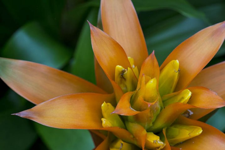
With this tutorial we are going to look at how you can get your macro images from this:
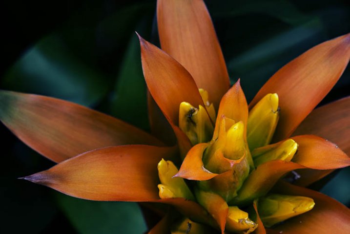
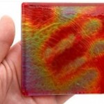
1-fitzroy-gardens-succulent-marco-original

To this:

2-fitzroy-gardens-succulent-marco-fineart

There are many things you can do to your images; what I’m going to show you is only one way. You can try anything really as it’s up to you, it’s your image.

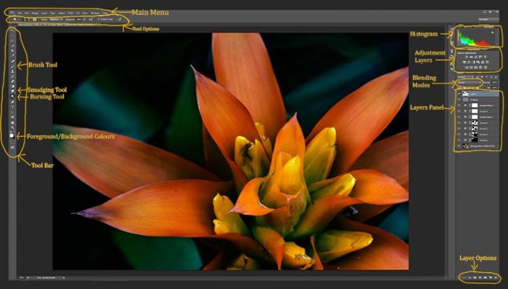
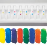
This image was first opened in Adobe Camera Raw and some processing was done to it, just to get the exposure right. From there the macro was opened in Photoshop CC (2014). To explain what some of the instructions are for Photoshop I am including an image below that has the various areas of the interface pointed out, especially the sections that we will be using for this tutorial.

Here is the screenshot of Photoshop with all the various places to find the tools, options, layers and adjustments that were used.

photoshop-setup-2

Step #1 – Curves

At this stage we are going to do several adjustment layers using Curves to change the lighting and bring the centre of the flower out more.

Work in adjustment layers so if you decide further down the track that you should have changed something you did earlier, then you still can go back and fix it, change it or delete the layer. The best way to do this is to use adjustment layers. The adjustment layers are often found above the layers panel on the right of your screen or in the layers menu at the top of the Photoshop window (if you don’t see them go to Window > Adjustments and place it above your layers panel). You will also need the brush tool for this, which is in the tool panel, usually found on the left of the window.

3-adjustment-layer-brush-tool

Once you know where each one of those are, you can start doing your layers for the image.

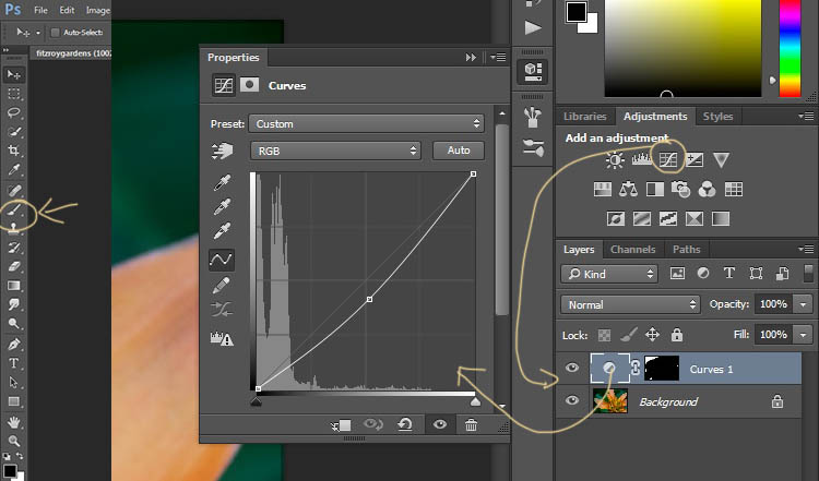
Click on the adjustment curves layer, as in the photo above. Then in the window that pops up, move the curve down to the dark area just a little, like the image above (just click on the straight line and hold the mouse button down while you drag to move it).

Grab your brush tool from the tool panel. Make it the size that you will need for your image. You can change the size by using the square bracket keys on your keyboard – [ or ] , or right click and in the pop-up window moving the slider for the size. The same changes can be made in the options bar for the tool at the top. Click on the second option from the left, the one that has the size of the brush, and you will get the same panel to change the size and hardness of the brush. For this tutorial a brush towards the soft end was chosen so the edges wouldn’t be too hard (Hardness set to 30% or lower).

You will need to click on the layer mask within the layer, it is the white rectangle in the curve layer. When the mask is white it means the adjustment is being applied to the image below, and when it is black it the change has been hidden. If you paint black onto the mask with the brush you are hiding the adjustment. Black on a mask conceals – white reveals. If you make a mistake and hide a bit you want, you can just paint it back in with the opposite color, white.

Start brushing the image, if nothing changes, then the foreground color (which the brush uses) is likely set to white. You will need to change that colour to black. You can also press X on your keyboard too, it will swap the foreground and background colours around.

For each different curves layer I took less and less of the adjustment from the image. The following image will show you what I did to each layer. The white areas are where the curves layer still applies, and the black shows where it was hidden.

4-macro-curves-layer

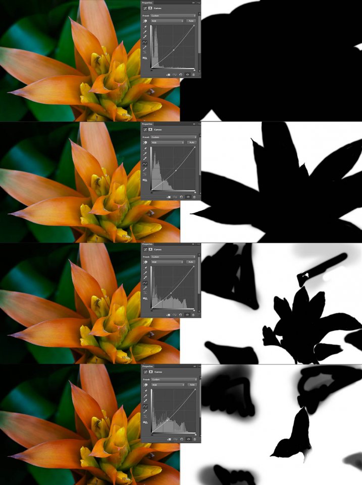
This image was done with curves layers. You don’t have to use the same number of layers, it is up to the image. Some of the background leaves were brought back in the last couple of layers as they were getting too dark. It is something you should be aware of, take notice of what is happening in the background as well.

The centre of the flower is now the same as the original but everything else is darker. The changes should be subtle.

Step #2 – Gradient Map Adjustment Layer

Once the curves were done a gradient adjustment layer was added. The gradient adjustment will change the highlights and shadows; you can decide what colours you want to use.

When you click on the gradient adjustment layer often the black and white gradient comes up and you will notice your image turns to monochrome. If you click on that bar in the window that comes up, you will get a lot more options for the gradient. For this tutorial I used the orange and purple gradient.

5-gradient-adjustment-layer-01

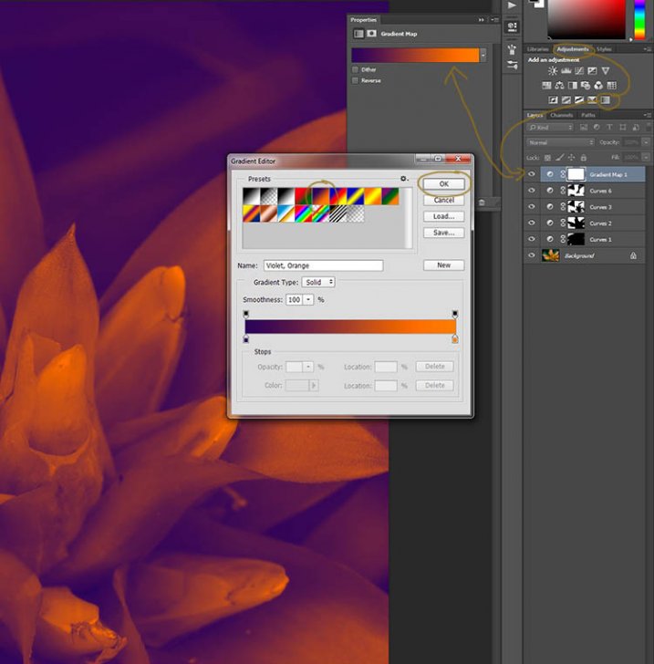
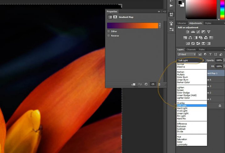
You will see all your highlights turn orange and the dark areas will go purple. You don’t want your image to remain like this, so now you need to blend it. In the image above you can see the blending modes that are above the layers, normal is the default. Click on that and go down to select Soft Light. You will notice the gradient layer is now blended and doesn’t look so horrible.

5-gradient-adjustment-layer-02

Just because that gradient has those colours, doesn’t mean you have to stick with them. They are easy to change them to give your highlights and shadows the tones you want.

In the bottom part of the gradient editor you can see the colour slider which is how the change goes from one colour to another, and directly underneath you can see little colours. If you click on one of those, the colour comes up at the bottom.

6-gradient-adjustment-layer-2b

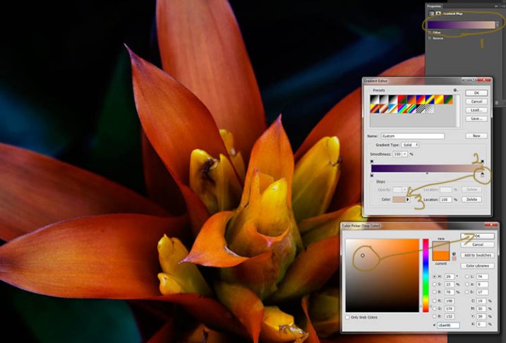
Click on that, you will see the Colour Picker window open up. You can change the colour to whatever you want, and as you do so you should be able to see the effect on your image straight away. If you can’t, then it is likely because you forgot to blend the layer. See the following image.

6-gradient-adjustment-layer-2c

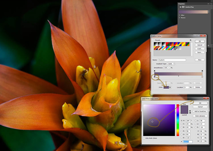
You can see from the images what I changed the colours to; you don’t have to use the same ones. I would recommend trying a few colours to see which ones you like. Purple is my favourite colour, so I use it a lot.

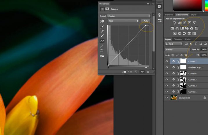
The next step is not always necessary, but often nice to do. All the work that has been done can mean losing the highlights, so to help bring them back you can use a Curves Adjustment Layer.

Step #3 – Adjusting the Highlights

Open a new Curves Adjustment Layer. In the Curves window go to the top right corner and move the line across the top. Watch as you do it and notice if you can see the highlights changing. Sometimes it is good to go too far and then bring it back, just to see what it does. Just be careful not to blow the the highlights out, making them solid white with no detail. Check out the image before to see what to change.

7-curves-highlights

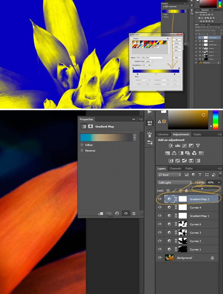
Step #4 – Adding Another Gradient Map Adjustment

Next another gradient map adjustment layer was added, time time using a different one.

From the above image you should be able to see what colours I choose and follow along the same steps as previously. This time I chose a gradient that changed three areas.

8-gradient-adjustment-layer-3

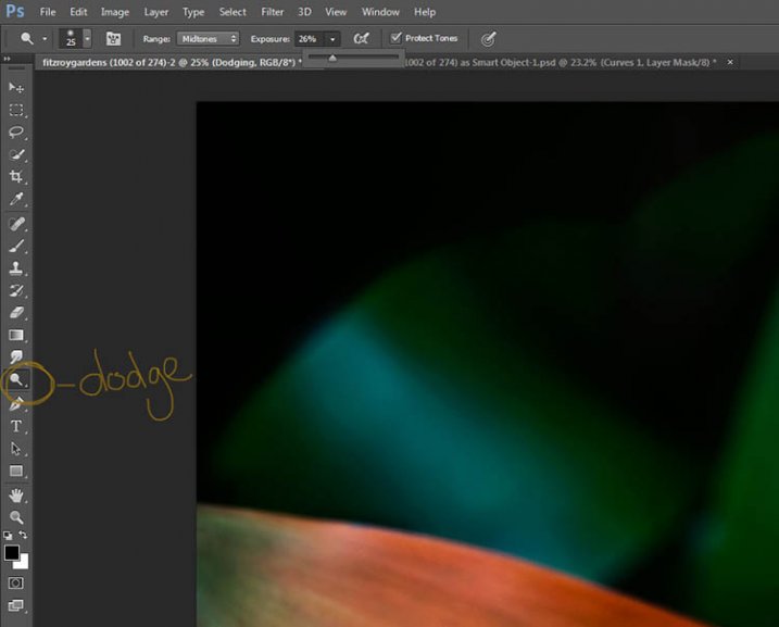
Step #5 – Dodging the Highlights

One thing that I like to do on many of my images is to bring out the highlights, in small ways, with the dodging tool. The dodging tool is a touchy one, to be used carefully.

It is always best never to do anything straight onto your original image layer, so like with everything we have done so far it’s going to be on a separate layer. Go to the top menu and click layer, then new layer. When the window appears you can name the layer, if you want to, I called it “Dodging”.

Dodging

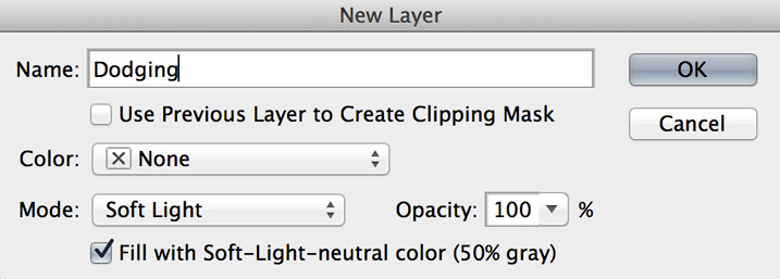
There are a couple of things you need to do so you can use this layer with the Dodge tool. First change the layer blend mode to Soft Light, then under the mode drop down menu you will see a box you can check to “Fill with Soft-Light Neutral Colour 50% Grey”, so check that, then press okay (see above)

Over in the layers panel you will see what looks like a grey box, this is what you will do the dodging on. Go over to the tool bar on the left and select the dodge tool.

At the top under the main window you will see Exposure, I have set mine at 26% for this image, but you can set it to anything, it depends on how patient you are. In the options bar there is also a setting for the highlights, midtones and shadows, I tend to use midtones. The more you move over an area the more it will go white. In the days of the darkroom they would using dodging to stop the light from getting to certain parts of the area. In Photoshop you can use it to put a little of the highlights back into the image, or to make the highlight pop. It should not be obvious, again subtle is the way to go.

I have changed the layer back to normal mode so you can see what I worked on. Dodging shows up as white on the layer.

10-dodge-layer-2

You can see that I haven’t done a lot, except bring up some of the highlights a little more.
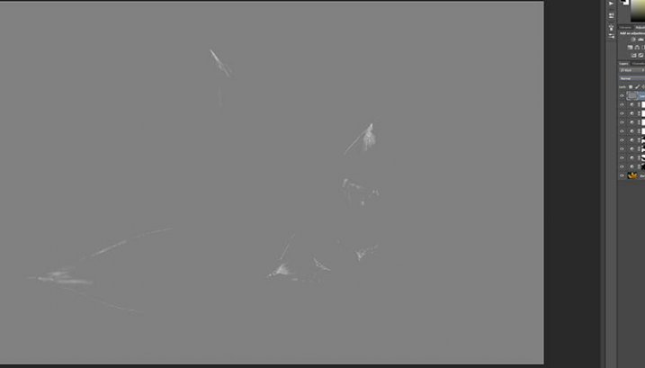
11-dodge-layer-3

Step #6 – Smudging

Finally I did a little smudging. Sometimes when you do a lot of work to images it can start to look pixelated, or you get some colour separation. I’ve found that the smudge tool can help get rid of that. You will find it in the tools panel.

I did this on a new transparent layer, again not working on the original image.

12-smudge-layer

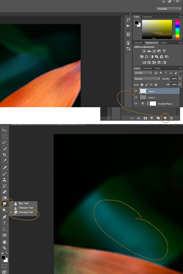
Make sure you check the Sample all Layers in the options bar for the tool at the top, and for this tutorial I left the Strength at 50%. I went over the areas where I thought I had some colour separation to smudge them together. If it were a painting I would get my finger into it and smudge the colours together.

Here is the final image.

2-fitzroy-gardens-succulent-marco-fineart

It is all about personal taste, so you should do it to your own style. I like it like this, but other people might find it too much, and others may think it isn’t enough. I like the way the flower seems to be coming out of the darkness.

If you have any questions, please ask. I will do my best to answer them.


macro-coverWant to learn more about macro photography? Check out Ed Versosky’s Introduction to Close-Up & Macro Photography ebook – just $ 10 (over 30% off) this week with coupon code: DPS. You will need to enter the code to apply the discount.

googletag.cmd.push(function() {
tablet_slots.push( googletag.defineSlot( “/1005424/_dPSv4_tab-all-article-bottom_(300×250)”, [300, 250], “pb-ad-78623” ).addService( googletag.pubads() ) ); } );

googletag.cmd.push(function() {
mobile_slots.push( googletag.defineSlot( “/1005424/_dPSv4_mob-all-article-bottom_(300×250)”, [300, 250], “pb-ad-78158” ).addService( googletag.pubads() ) ); } );

The post How to Give Your Macro Photography a Fine Art Touch in Post-Processing by Leanne Cole appeared first on Digital Photography School.


Digital Photography School

 
Comments Off on How to Give Your Macro Photography a Fine Art Touch in Post-Processing

Posted in Photography


Touch and go: Nikon D5500 review posted

03 Apr

Slightly smaller and lighter than its predecessor, the Nikon D5500 continues to offer a proven 24.2MP APS-C sensor in a body that’s more approachable than a D7000-series DSLR. It offers a fully articulated 3.2″ touchscreen, 1080/60p HD video, a new EXPEED 4 processor and built-in Wi-Fi. Can it compete in ever more crowded class? Read more

Articles: Digital Photography Review (dpreview.com)

 
Comments Off on Touch and go: Nikon D5500 review posted

Posted in Uncategorized


A light touch: Dean Bradshaw’s commercial and personal portraiture

22 Mar

‘Conceptual’ and ‘commercial’ photography are styles that relatively few are able to achieve success in, especially at the same time. But Dean Bradshaw’s intellectual and humorous approach to advertorial work sets his portfolio far above that of the typical commercial photographer. Take a look at a selection of his imagery and find out a few insights behind his success in our Q+A. See gallery

Articles: Digital Photography Review (dpreview.com)

 
Comments Off on A light touch: Dean Bradshaw’s commercial and personal portraiture

Posted in Uncategorized


Give Your Fave Gloves Touchscreen Power with Touch Tonic!

25 Oct

Extra photos for bloggers: 1, 2, 3

You want to keep your hands warm this winter, but those fuzzy fingers keep getting in the way of important photo-ops and text messages.

Add the magic touch to your gloves with Touch Tonic, the paint-on solution that lets you stay warm and connected to your touchscreen.

When the weather gets chilly, you’ll be able to use your touchscreen phone to snap snowy pics and share them online without ever taking off your favorite gloves.

Choose the Touch Tonic that matches your gloves’ fabric type, quickly apply to the fingertips and let dry.

Keep your personal style without losing the ability to stay connected (or freezing your fingers off).

Stay Connected in the Cold with Touch Tonic (for Gloves!)
$ 20 at the Photojojo Shop


© Britta for Photojojo, 2014. |
Permalink |
No comment |
Add to
del.icio.us

Post tags:


Photojojo

 
Comments Off on Give Your Fave Gloves Touchscreen Power with Touch Tonic!

Posted in Equipment


Vertu Signature Touch comes with Hasselblad-certified camera

04 Jun

vertu1.jpg

If you’ve always wanted a Hasselblad camera, but found the real thing too bulky and the rebadged Sony cameras too ridiculous, smartphone manufacturer Vertu has just given you another option. Vertu’s latest model, the Signature Touch, comes with a “Hasselblad-certified” camera. Despite a vague statement that Vertu has worked with Hasselblad to “perfect the image tuning of the camera onboard Signature Touch,” it’s almost certainly using a standard 1/3-inch CMOS sensor. Read more

News: Digital Photography Review (dpreview.com)

 
Comments Off on Vertu Signature Touch comes with Hasselblad-certified camera

Posted in Uncategorized


Touch Ground: Massimo Cristaldi documents cost of migration

25 May

MassimoCristaldi-TouchGround-Portopalo__4_.jpg

Photographer and dpreview.com member Massimo Cristaldi has spent the past five years documenting illegal migration from North Africa into Europe through Sicily and its islands. Last year alone more than 40,000 desperate migrants made the journey, which many did not survive. In ‘Touching Ground’ Cristaldi focuses not on them directly, but on the places where they came to shore – tired, hungry, and in many cases dead. Click through to learn more and see a selection of images.

News: Digital Photography Review (dpreview.com)

 
Comments Off on Touch Ground: Massimo Cristaldi documents cost of migration

Posted in Uncategorized