RSS
 

Posts Tagged ‘Style’

How I Got The Shot: Portrait Style

30 Jan

Lynsey Peterson_6howIgottheshot

Whenever I see “How I Got The Shot” articles, they are typically landscape or nature shots, or difficult lighting situations.  Rarely do you see a detailed account of the taking of a portrait image.  Maybe because for portrait shots, it’s often more about the connection between subject and photographer than the technicals, or maybe because it seems fairly straightforward.  That said, when I was first starting out in portrait photography, I spent many hours drooling over beautiful images I admired and wondering how they had been taken, and more importantly, how could I try to take something similar.

This article will not only discuss the technical accepts of the shot and the editing process, but also the interaction I had with the subject, which was key to this, and every shot I’ve ever taken.

Portrait Style

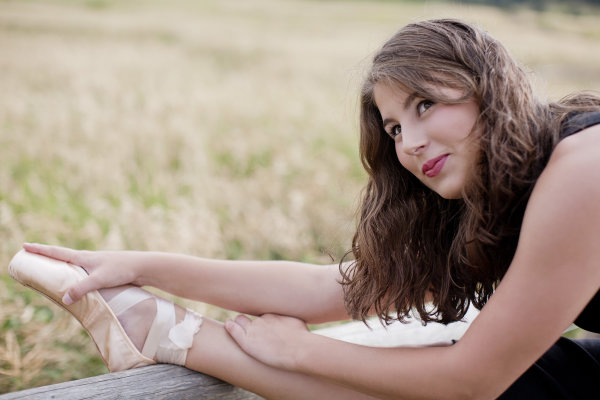
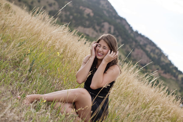
This beauty is Madeleine and these images are from her high school senior photo shoot taken last September.  I don’t often shoot this type of portrait. But, I say the same thing about weddings and dogs and yet I’ve photographed both in the last week, so maybe I should just face the fact that if you are lovely and ask me real nice, I’ll shoot just about anything.  Except food.  Food photography freaks me out.  Life is hard enough without having to make sure sesame seeds are all in the perfect place, or that there is just the right amount of shine on an edge of cheese.

Lynsey Peterson_1howIgottheshot

Madeline has studied dance on and off and had just started pointe dancing prior to this shoot, so incorporating her new pointe shoes into a few shots was something she wanted to try.

Technical stuff – gear

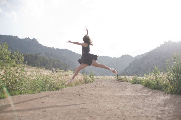
These images were shot at Boulder, Colorado’s Chautauqua Park in the rain, near sunset. I was likely wearing a black t-shirt, jeans, and flip-flops if you want to get the full visual, but I doubt that mattered much because 90% of the time I am wearing a black t-shirt, jeans, and flip-flops. Probably of more interest to you was the gear. I travel light and I’m not into fancy equipment (my money is better spent on quality flip-flops), so this was shot with my faithful Canon 5D and my workhorse/splurge Canon 50mm f/1.2L which rarely leaves my camera body.  I typically don’t use a lens hood, and didn’t here as I like a little flare.

The image below that I will detail was shot in Aperture priority mode (f/2.5). I could possibly wax poetic about my camera, the settings, and lighting and other technical components for a few more paragraphs but it is truly not necessary. Here, as with most portrait photography, the details of how this image came to be were driven by the subject matter: the location choice was her favorite park; the jump was something that she felt she could do and a way to incorporate the dance element that I felt was least awkward and most genuine; and the settings were dictated by the need to shoot towards the mountains.

An argument could be made that this isn’t a true portrait, unlike the image I’ve shown above. An argument could also be made that flip flips aren’t real shoes. But they get me from point A to point B, are extremely comfortable, and allow for me to continue my hatred of anything on my feet. A portrait is a documenting someone’s likeness. This is a picture of a 17 year old girl that does ballet, has a beautiful free spirit, and mountain living in her DNA. I can’t think of a better way to document her likeness.

The Process

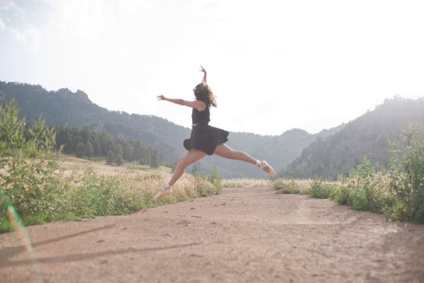
Let’s start with the Straight Out Of Camera (SOOC) image

Lynsey Peterson_2howIgottheshot

Other than minor editing to her skirt, this is exactly what the world looked like in my camera. I shot this in RAW and converted it to jpg in Photoshop. My settings were not spot on, and there are flaws. The most glaringly obvious flaw, being that focus on the subject is soft at best.  I mean, really soft–clouds and fluffy bunny rabbits soft. There were other images in this sequence where the focus was much sharper. But in those, I didn’t care for arm placement, or light, or a hundred other picky details. I could have taken the sharpest one of the bunch and edited it to perfection, completely changing or correcting things, turning something unreal into reality. Some photographers would may do that, but I am not going to fight for either side of that battle today. This is a picture of a girl jumping in mid-air and if you are looking at that happening in real life, it’s not going to look sharp as a tack. This is an image worthy of being delivered to the client, soft focus or not.

Image clean up

The first thing I always do to an image during the editing process is clean it up if necessary. This park is always crowded, and waiting for random people to be out of the shot isn’t an option I like because the entire mood could change. I also don’t like to use Photoshop to drastically change anything (as mentioned earlier when I refused to do Photoshop Plastic Surgery on a sharper image), but here the lessor of two evils is just to remove the innocent bystanders from the image entirely in post-production. Beyond the hikers, there are a few other elements that are distracting including the trail markers, which only take away from her being in midair.

Lynsey Peterson_3howIgottheshot

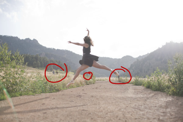
Things to clean up in Photoshop

Warm up!

This was not the first image we shot. People take time to warm up. If I had asked her right off the bat to leap as high as she could, without care as to who was watching or how she would do it, or what it would look – she wouldn’t have been comfortable enough to even try it. We started with some basic face-only shots, worked up to some dance poses in the shoes, and then found a spot where she felt comfortable enough to jump. Because of this, I didn’t have a lot of options for the exact frame. This was the flattest and least rocky area for the jump to be safe and successful.

Whenever I attempt an action portrait shot, I do several things the same when interacting with the subject: 

#1 – I always watch them the first time with my own eyeballs.  

I don’t even touch my camera. Not only do I need to see the entire view without the limits of a viewfinder, I need to earn their trust that I am interested in what they’re doing, with or without the picture. Then after encouragement, I make it clear that we may have to try this several times; she may not nail the jump, but then again I may not nail the shot, successful jump or not. To give you an idea, for the five jumps she did, I have 32 shots taken over the course of about 8 minutes.

#2 – this is typically the only time I break my rule of never letting a client see the image in the back of my camera.

For an action shot like this, I shoot until I have an image I like and then show my subject. It’s their action, their talent, their special trick. I have no idea how to leap in the air like this; I want to know that whatever they are doing is coming out as they envisioned it, or at least that they are happy with how it is likely to turn out. I, like most of the people who will view this, have no idea if this jump is technically correct in the world of pointe dance. That one ballet class I took in the first grade didn’t really cover much beyond how to stand straight in a tutu. However, in the moment I remember questioning even photographing this considering I didn’t know what to look for. In those moments, it’s best to realize that the only thing you should be looking for is a great image—you’re not always qualified to look for much else.

Lynsey Peterson_4howIgottheshot

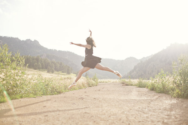
After image clean up

Most important – subject’s comfort level!

Now that I have cleaned up the things that didn’t need to be there and adjusted my exposure a bit, I will tell you the most important technical piece of this image: none of it matters. It really doesn’t. Why? I’m glad you asked. Even if I had the fanciest equipment available, perfect light, sharp eyes, and sturdy flip-flops, there is no way I could have gotten this shot if Madeleine didn’t feel comfortable. Not only is she fairly new to pointe dancing, she is a teenage girl. The most important thing I brought to this shoot was an ability to make her feel comfortable, a ton of patience, and an honest desire for her to love these pictures.

Without those things, this image and every other one I shot that day, don’t happen. For me, portrait photography is 95% people skills and 5% equipment. Maybe even a little luck thrown in for good measure. But we still need to make it sing the tune it was meant to carry. Throw in a little sparkle.  Wave the magic wand a bit. Put a layer of frosting on this cake.  Everyone loves frosting–I don’t know if I could trust someone that doesn’t.

Final touches in Photoshop

I started with a manual adjustment in Photoshop with Levels, a quick sharpener with the oddly named Unsharp Mask (60% and 2.0 pixels is my go-to setting), and then removed a few stray raindrops that were showing on her dress.  I opted to leave the framing the way I shot it—I like the bit of shadow you see of her legs in the bottom left corner, and I like where she is in relationship to the mountains in the background.

Now for the fun part: I use a few actions to kick-up the color and clarity a notch on most of my images. I like Totally Rad and the Pioneer Woman’s actions quite a bit and over the years have managed to customize my favorites to exactly what I like, saving me a great deal of time. Here I have used a few actions to both sharpen the color and also warm it up a bit, to give a nod to the sun flare that was already there. In doing so, I lost a bit of my sky detail, but I don’t miss it. Here is the finished version of the image:

Lynsey Peterson_5_finalhowIgottheshot

And voila! It’s just that easy. Years of ballet lessons, a scheduled photo shoot, waiting out a rainstorm, getting to the perfect jump, and a bit of editing. Oh internet, I kid.

This is an image that I love. This is an image that my client loved. Will it end up in a magazine or be noticed by people beyond those that love Madeleine, and obviously anyone reading this? No. But it’s a shot that I am proud of. It’s a great example of the kind of portrait photography I like to do and a lovely addition to my portfolio. It happily hangs on a wall in my office, where it will stay as a reminder that not all beautiful and loved shots are technically perfect and portrait photography is a lot more than a camera and a pretty girl.

Lynsey Peterson_7howIgottheshot

The post How I Got The Shot: Portrait Style by Lynsey Peterson appeared first on Digital Photography School.


Digital Photography School

 
Comments Off on How I Got The Shot: Portrait Style

Posted in Photography


Matching the Production Style to the Image – High Energy Means High Contrast

31 Oct

Introduction

The Following is an excerpt from the SLR Lounge Lightroom Preset System v5 and accompanying workshop from the Lightroom Workshop Collection v5.  The Lightroom Preset System is designed to take you from Ordinary to Extraordinary photos in just a few seconds and clicks within Lightroom 4 and Lightroom 5.

Overview

One thing that we like to do within our studio is match the post production style to the overall emotion and story within the image. We feel that doing so leads to a much stronger overall image.

So in scenes that have a lot of energy, we want to emphasize the excitement with a colorful, high contrast production style. For this tutorial, we are using this sparkler exit photo which should be well complimented by the high contrast edit. The SLR Lounge Lightroom Preset System v5 has presets specifically for high contrast portraits which we are going to apply to this photo. Not to worry, we are going to demonstrate all of the settings below.

Here is what our image looks like before and after our presets are applied.

beforeandafter

Lightroom Preset System v5 Mixology

For those who have the Preset System, you can follow the Mixology Recipe below to get to the same results. If you don’t have the Preset System, please read the article or watch the video below to see exactly how this look was achieved.

Develop Mixology
01-10 BASE-SOFT: 14a. Heavy Crush – Skin Desat

Local Adjustment
Radial Filter: 03 Burn (Darken) -0.5 Stop (watch video tutorial for reference)

Written Tutorial

Step 1: Checking the EXIF data

Screen-Shot-2013-08-12-at-3.40.04-PM

The first thing we generally do is take a look at how the image was shot. Doing so, gives us a lot of information on things we need to look out for when post producing. To check the EXIF data press ”i”.  This image was shot with a Nikon D700 at ISO 6400. This is important to keep in mind because Nikon cameras tend to shoot skin tones slightly green, and this high of an ISO might also present a noise issue.

Step 2: Apply Preset

After we adjust Color Temperature and Tint to taste, we apply the “01-10 BASE-SOFT: 14a. Heavy Crush – Skin Desat” preset. This preset adds contrast to the photo and makes adjustments to desaturate skin tones.  The Contrast is being raised and the Shadows and Blacks are being dropped in order to boost overall image contrast. To flatten out the highlights over skin tones, we have dropped the Highlights and Whites.  In the Tone Curve we have a subtle “S” shaped contrast boosting tone curve to add a bit of contrast back specifically where we need it.

Here are the final Basic and Tone Curve Panel settings:

developpanal

We have our standard Sharpening and Noise Reduction adjustments applied to this image. Even though this image was shot at a high ISO,the D700 takes such great photos at ISO 6400 that we don’t have to raise any of the Noise Reduction Luminance beyond what we already have.

In the HSL our Reds and Oranges are slightly dropped in order to desaturate heavy reds and oranges that can appear within skin tones when we are doing a high contrast edit.

developsettings1

Step 3: Add Radial Filter

The last thing we’re going to do is add a Radial Filter to this image. This filter is unique to Lightroom 5, but Lightroom 4 users can get the same effect by adjusting the vignette settings, or by using an Adjustment Brush and painting around the outside of the image.

radialfilter

We’re pairing the Radial Filter with our “03 Burn (Darken) -0.5 Stops” preset to get a nice vignette around our couple. We adjust the Feather to 70 to make the effect more subtle.

radialfiltersettings

Some people may comment that shadow details are being clipped, but that’s okay for this image. Remember, we edited this image to fit the mood and energy, not for it to be technically “color correct.” Making this high energy photo a high contrast one is a stylistic choice, and we love the way it looks. Here’s what our photo looks like before and after our edit.

Before

lightroom-5-tutorial-high-contrast-portrait-0001

After

lightroom-5-tutorial-high-contrast-portrait-0002

Watch the Video Tutorial

If you would like to see exactly how all of the settings and adjustments were applied, please watch the video from the SLRLounge youtube video channel.

Conclusion and Learn More

We hope you all enjoyed this tutorial. If you are interested in learning more or purchasing the SLR Lounge Lightroom Preset System v5 or the newly released Lightroom Workshop Collection v5, please click any of the links in this article.

Post originally from: Digital Photography Tips.

Check out our more Photography Tips at Photography Tips for Beginners, Portrait Photography Tips and Wedding Photography Tips.

Matching the Production Style to the Image – High Energy Means High Contrast

The post Matching the Production Style to the Image – High Energy Means High Contrast by Post Production Pye appeared first on Digital Photography School.


Digital Photography School

 
Comments Off on Matching the Production Style to the Image – High Energy Means High Contrast

Posted in Photography


Photography Rules and Finding Balance to Discover Your Own Style

13 Oct

By Lori Peterson

Digital photography has put the camera in more hands than ever before and everyone seems to either want to follow the standard mold of photography or they want to completely break away from it.

For instance, Ian Ruhter took a delivery van and transformed it into a giant wet plate camera. There are so many photographers out there that are wanting to copy someone else’s style instead of finding their own. Learn the rules and then use them or twist them as you need to do to make your own art and to tell your story. One part of your image may follow the standard photography rules and another part will completely be out of the norm. Not everyone sees the image or the story the same and that is fine. Don’t get so caught up in trying to make everything absolutely perfect that you lose the shot.

One of the rules that you hear a lot is to simplify your image. Sometimes, especially in street photography, you can’t simplify the scene. Sometimes the scene has to speak for itself. Whether it’s chaos or clutter, sometimes you need to just go with what you have and work with it. There are stories that can be told just by being the silent observer and recording the image at that place and time.

Photography Rules and Finding Balance

Some photographers will talk to you endlessly about the Rule of Thirds and not centering your subject. Composition of the image is really subjective, but people get too comfortable just centering the image and when they start thinking outside of that box they begin to see everything in a new way. Moving your subject slightly off to the side can actually bring the focus onto them. Just make sure that no matter where your subject is in the image that they are the focus.

Photography Rules and Finding Balance

Using patterns and lines can draw your viewer in more. It helps for them to picture the scene and even put themselves into that moment in time. S-curves work really well to draw your eyes to a particular spot in an image. You can also try a new perspective and get down really low to the ground and use whatever lines are there to your advantage. Experimenting with your shooting techniques can help you learn what works for your style and what doesn’t.

Photography Rules and Finding Balance

Use of color and tone in an image can set the scene for the viewer. Colors can bring a harmony and unity to an image or it can be used to emphasize a certain part of the image. Color can add contrast, it can help parts of the image blend in, or it can really make a bold statement. Using color in your image can convey emotion and without a written word it can tell you what time of day it is, such as sunrise or sunset.

Photography Rules and Finding Balance

You could do a Google search on photography rules and it would make your head spin from trying to follow all of them, but the important thing about photography rules is knowing when to follow them, when to break them, and when to vary them up just enough to fit your image. Learning to find that balance takes time and practice. Sometimes you just have to learn from the mistakes you make and take those lessons with you to your next shoot. Don’t forget that art is very subjective and what works for one image may not work for another. Experimenting with techniques and composition helps you to learn about photography and find your own creative balance.

Lori Peterson is an award winning photographer based out of the St. Louis Metro Area. Her dynamic work ranges from creative portraits to very unique fine art photography. Lori’s work can be seen at www.loripetersonphotography.com and also on her blog at www.loripetersonphotographyblog.com. You can follow her on Facebook at https://www.facebook.com/LoriPetersonPhotography.

Post originally from: Digital Photography Tips.

Check out our more Photography Tips at Photography Tips for Beginners, Portrait Photography Tips and Wedding Photography Tips.

Photography Rules and Finding Balance to Discover Your Own Style

The post Photography Rules and Finding Balance to Discover Your Own Style by Guest Contributor appeared first on Digital Photography School.


Digital Photography School

 
Comments Off on Photography Rules and Finding Balance to Discover Your Own Style

Posted in Photography


Canon creates ‘Video Camera X–series-look’ Picture Style for movie work

14 May

EOS-1DC.png

Canon has created a ‘Video Camera X-series look’ Picture Style for its EOS cameras, specifically designed for movie work. As its name suggests, it’s designed to match the colour look of the company’s X-series professional camcorders. It produces low contrast, low saturation footage that’s better suited to post-production grading processes than the cameras’ existing options. It’s downloadable now from Canon’s website and can be installed on almost any Canon EOS model, from the movie-optimized EOS-1D C to the mirrorless EOS M.   

News: Digital Photography Review (dpreview.com)

 
Comments Off on Canon creates ‘Video Camera X–series-look’ Picture Style for movie work

Posted in Uncategorized


Developing Your Photographic Style: Adding Power And Impact To Your Photography

14 Mar

I’ve been working as a photographer for almost 2 years now. And looking back at this time, I can see a number of stages I’ve grown through. Each stage is characterised by what I believed is the most important element of great photography. And in this post I decided to analyse them and come to a conclusion on the benefits Continue Reading

The post Developing Your Photographic Style: Adding Power And Impact To Your Photography appeared first on Photodoto.


Photodoto

 
Comments Off on Developing Your Photographic Style: Adding Power And Impact To Your Photography

Posted in Photography


Incredible Shrinking Building: Top-Down Demolition in Style

31 Jan

[ By WebUrbanist in Architecture & Cities & Urbanism. ]

demolition top down

Japanese culture is commonly thought of as being centered around quiet politeness and public respect. If so, this may be a physical representation of that interpretation -a  remarkably subtle and deferential structure-destroying process with many levels of conscientious thought behind it (not to mention a brilliant visual effect, per the video below).

demolition process deconstruction phases

This elegant form of razing is “reverse engineering” in a much more literal sense – taking apart what has been put together with equal care. The strange structure that seems to move down the building does just that: at each stage, it is held up, then strategically lowered as the process unfolds, making it appear as if the building is shrinking (perhaps imperceptibly to pedestrians, but noticeable as time lapses).

Demolition might be too strong a word: Taisei’s Ecological Reproduction System (aka Tecorep) caps buildings and proceeds to disassemble them piece by piece and level by level in order to reuse intact components and materials.

building deconstruction by floor

The process does more than just aid in reuse – it lower environmental impact, from dust and debris to sound, all of which are buffered. And as elements are dropped down by crane, the power generated by that release of potential energy serves to generate electricity for the deconstruction efforts. The entire system is, in short, incredibly considerate and extremely well thought-out.

Share on Facebook


[ By WebUrbanist in Architecture & Cities & Urbanism. ]

[ WebUrbanist | Archives | Galleries | Privacy | TOS ]


WebUrbanist

 
Comments Off on Incredible Shrinking Building: Top-Down Demolition in Style

Posted in Creativity


11 Tiny Houses With Huge Style

07 Dec

[ By Marc in Architecture & Houses & Residential. ]

Tiny houses are growing in popularity because of increasing environmental consciousness and a desire to reject unnecessary material goods. Transitioning from paper books and files to digital copies is a boon to those who want to make their life leaner, and is helping minimalist housing flourish.

(Images via tumbleweedhouses)

The Tumbleweed Tiny House Company is at the forefront of designers in the field, pumping out an amazing variety of tiny house designs. The house featured above is their Epu plan, a straightforward house design that is incredibly mobile and can comfortably house two people in a space that is 8 x 15 feet.

(Images via designboom)

This house is built primarily out of two shipping containers and can house up to 4 occupants. It’s not as small as many of the examples featured, but in terms of environmental impact, and in relation to the average home, it’s quite a step up.

(Images via tumbleweedhouses)

The Enesti is a tiny house plan that lays out a small, but permanent structure. At pricing around $ 60,000 for nearly 900 square feet, it is significantly less expensive than the typical home.

(Images via tinyhouseblog, tinyhouseblog, tinyhouseblog, idesignarch)

The top home is totally mobile and designed by Maximus Extreme Living Solutions to stand up to the toughest elements. This North Carolinian build was created during a tiny house workshop and has beautiful modern lines. This gypsy style buggy is the perfect place for two people to crash after a long day on the road. The final design is unusual, in that it actually opens up in the middle to give much more space to the occupants. In foul weather, it’s a simple fix to seal it up tight.

(Images via comingunmoored, tinyhousedesign, theinnovationdiaries, theatlanticcities)

These houses show the versatility of tiny house designs. With such little space to work with, creativity is a must, and builders are able to use the low cost to add deluxe features that would be prohibitively expensive in a full sized house. For example, a house shaped like a castle turret would cost a fortune, but that’s not the case when it’s this tiny. An entire house can fit in the backyard, as the perfect place for guests to spend the night. A curved house design gives the bottom right house a unique look, while the final house mixes modern elegance with cozy cabin stylings.


Want More? Click for Great Related Content on WebUrbanist:

How to Shrink Your Footprint: 10 Little Examples of Tiny Houses

A man’s home is his castle…except when it’s barely bigger than the tool shed. These tiny houses encourage simple living and a smaller environmental footprint.
4 Comments – Click Here to Read More »»


Stacking in Style: New Trend Puts Houses on Houses

These three structures couldn’t be more different in all ways except one: they all look like individual houses piled on top of each other into vertical towers.
Click Here to Read More »»


Share on Facebook


[ By Marc in Architecture & Houses & Residential. ]

[ WebUrbanist | Archives | Galleries | Privacy | TOS ]


WebUrbanist

 
Comments Off on 11 Tiny Houses With Huge Style

Posted in Creativity


Extreme Sports (Calisthenics Style) pt 8

11 Nov

Some signature workout routines from some of Wingate’s finest. Dre Skillz, Super Mario, ABS, D-Nice, B-Rock. sorry for taking down the video… I did not like the quality… BTW this is my first video as far as editing

 
Comments Off on Extreme Sports (Calisthenics Style) pt 8

Posted in Nikon Videos


Wallpaper Paint Rollers: Cool & Classic Patterns, DIY Style

30 Oct

[ By WebUrbanist in Design & Furniture & Decor. ]

Applying wallpaper is nothing if not frustrating – you have to line everything up just right, and if you ever want to take it down, it is nowhere near as easy as painting over an existing color on primed drywall.

But what might be more amazing than this nifty do-it-yourself patterned paint roller tool is that it is nothing new, as explained on The Painted House: “When I stumbled across these paint rollers in a market in Romania I was so excited ….”

“They have been used there for the last 100 years or so as an alternative to wallpaper. As an ardent upcycler I have been using them ever since to bring unloved fabrics and wonky old walls back to life.“ The resulting new-version rollers can put patterns to paper, walls and fabrics, adding substantive decor to more than just mere walls.

The company is beyond enthusiastic about their product and its various applications: “So far we have made metres of fabric, curtains, bunting, cushions, stationary, lampshades and wrapping paper, covered books and furniture, printed on walls, and someone is in the process of rollering the inside of their bell tent!”


Want More? Click for Great Related Content on WebUrbanist:

Wild Wallpaper: Interactive Decor You Can Rip & Color

Hanging wallpaper is made much more fun when you get to paint and peel it, revealing intricate geometric patterns that won’t be found on any other wall.
Click Here to Read More »»


Inside Out: Print-Crazy Wallpaper Made for Exterior Surfaces

Outdoor wallpaper brings bright colors and bold prints out to exterior walls in an eye-popping series by Italian design company Wall & Decó.
Click Here to Read More »»


Share on Facebook


[ By WebUrbanist in Design & Furniture & Decor. ]

[ WebUrbanist | Archives | Galleries | Privacy | TOS ]


WebUrbanist

 
Comments Off on Wallpaper Paint Rollers: Cool & Classic Patterns, DIY Style

Posted in Creativity


PHOTOSHOP HOW TO GLOSSY LIPS WITH LAYER STYLE PALETTE-N 1.mp4

26 Oct

With Photoshop Layer Style Palette you are able to color lips,eyelids,garments,bloks fasade,jewellery,cars and what else…..mmmmmm everythig! It gives you tones of color,nuance and why not humour? So follow next steps 1-make selection of some object (you can use some like Lasso Tool or Polygonal Lasso Tool or Qick Selection Tool or something that you prefer to make selection) 2-place this selection on a new layer with CTRL +j 3-click on FX (down in Layer Palette) or on the Layer sidelong to bring out Layer Style platte box 4-replace the settings I give you,but you can experiment with your own settings as well ENJOY AND MAKE A GREAT FUN WITH IT FOTO FROM WWW DIGITALDESIGN.COM
Video Rating: 4 / 5

 
Comments Off on PHOTOSHOP HOW TO GLOSSY LIPS WITH LAYER STYLE PALETTE-N 1.mp4

Posted in Retouching in Photoshop