RSS
 

Posts Tagged ‘Split’

Halfway House: Townhouse Duplex Split Straight Down the Middle

23 Jan

[ By WebUrbanist in Architecture & Houses & Residential. ]

halfway house real

It looks more like an optical illusion or photo edit than a real dwelling, but this hundred-year-old halved townhouse really stands (out) on the streets of Toronto.

half house side view

half house toronto

54 1/2 St. Patrick was built in the early 1890s as part of a set of six homes with shared walls. Starting in the 1950s, owners of the neighboring units started to crumble under pressure from a developer, slowly selling their domiciles one at a time.

half rowhouse remaining plan

As a result, each of the other structures was torn down with surgical precision. When the occupant of the final house in the row refused to sell at any price, they cleaved off the other half of the building and the shared structural wall running down the middle was reinforced and covered in concrete.

halfway house up

halfway house front

The neighboring Village by the Grange opened in the mid-1970s. According to author and photographer Chris Bateman, “54 1/2 St. Patrick is currently vacant. No-one answered when I knocked at the door and the front room has been stripped to the floorboards. Perhaps it’s being spruced up, it would surely be worth it. The current assessment on file with the city lists the value at $ 648,000.”

Share on Facebook


[ By WebUrbanist in Architecture & Houses & Residential. ]

[ WebUrbanist | Archives | Galleries | Privacy | TOS ]


WebUrbanist

 
Comments Off on Halfway House: Townhouse Duplex Split Straight Down the Middle

Posted in Creativity


Split Toning Black and White Images in Lightroom

18 Aug

It can at times seem difficult to make our images unique, or at the very least more interesting. During our workflow we sometimes even discard photos because we feel they aren’t interesting, or that we have failed at an exposure or composition. What we often forget is that we can actually make our images stand out from the rest, and become less mundane, just by being slightly creative with our editing. Sometimes we can even go so far as to salvage an image that might otherwise have been introduced to the delete button. Just by using some powerful, yet simple, post-processing techniques we can discover hidden gems within our images.

Rain-on-Grass.jpgIntroducing split toning

One such technique which can add uniqueness and strength to an image, is the process of split toning. Most likely, you have already viewed many images that were split toned, even if you didn’t know anything about it. Many of the vintage looking photographs, that seem to be trending at the moment, almost always employ split tone processing to some extent. That’s not to say that split tone images are something new, in reality, the situation is actually quite the opposite. Split toning has its roots in film photography and dark-room printing. Before we begin to learn just how easily you can convert your images to split tone, let’s first take a brief look at what split toned images are, and examine (even more briefly) a little bit of the history behind the process.

What is split toning?

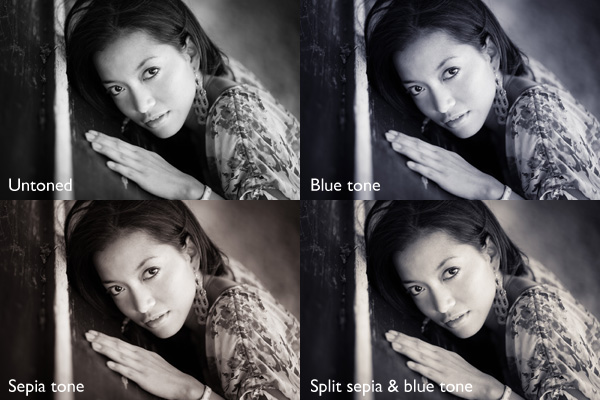
Split toning is quite simply a process by which color tone is added to the highlight and shadow areas of an otherwise monochromatic photograph. Traditionally, the photo being processed with split tones begins its life as a black and white image capture. After the print has been fully made and developed, it is then introduced to other chemicals, which affect the image tones in different ways, depending on the relative compositions of the chemistry involved. In our world today, digital darkrooms now allow us to carry-over this technique of selective toning to our color prints. Color split tone images are quite possible and are often very pleasing. However, for our purposes here, we will keep the discussion limited to the process of using split toning as it relates to black and white photos exclusively.

History of split toning

Virgin Falls

It all started with the birth of the photographic process itself in the mid 1800s. The images produced during that era of early experimentation into the medium were very delicate, and extremely susceptible to degradation from physical touch, atmospheric conditions, as well as exposure to light post-development. As photography evolved, the pioneers of the art found they needed a way to make their finished prints more durable and longer lasting. This lead to the introduction of toners in the darkroom printing process. Essentially, most toners replace the metallic silver present in the print with a more stable silver compound.

The finished print tone of course depended on the type of toner used. A readily identifiable example of this is sepia tone. We’ve all seen them before; the warm and golden hues that look predominately old fashioned and can lend a sense of nostalgia to an image. Originally, sepia toned photographs were a result of a chemical process in the darkroom. The process involved treating the finished print with chemical compounds that converted the silver present into a silver compound called silver sulfide, which made for a much longer lasting finished print.

The split toning processes came about by using different toning agents in different stages, in different proportions. A photographer might treat a photo with one type of toner and then stop the process at a desired stage, leaving only the highlights unreacted. Then, another and different type of toner might be introduced, which would react with the remaining silver present in the shadows left over from the previous treatment. Thusly, the tones visible within the image would be split – hence split toning.

Roots

Ansel Adams, one of the most influential photo makers of the our time, also employed the use of split toning in his masterworks. This in itself is quite interesting since Adam’s was a realist in all ways. Meaning that he promoted straight photography with minimal manipulations in the darkroom aside from his own adjustments, using mostly dodging and burning. Ansel choose primarily selenium based toning agents for his work, which added a very slight blue hue to the shadows of most of his prints. He called the color tones eggplant, and indeed the coolness of bluish blacks produced images that are still counted among some of the most magnificent examples of photographic art ever made.

How to apply split toning in Lightroom

Now that you have an understanding of what the split tone processing is all about, we can move on to the fun stuff. Let’s take a look at how you can easily make your black and white images really stand out using split toning feature in Adobe Lightroom 6 (the split toning feature is also available in other image processing software including LR CC, Photoshop and ACR).

Let’s begin with a color image that we feel would benefit from being converted to black and white. Photos which transition well to black and white more often than not possess stark contrasts between the light and shadow areas, and have great texture within the subject matter.

This is quick snapshot of my dog Leia. The bright light coming through the door casts her profile nearly in silhouette and the high ISO made for a slightly grainy image, but really no remarkable color of which to speak. So I chose to convert it to black and white and use the grain in order to produce a gritty, and spontaneous look to the photo.

Leia Original

Original color image

Leia Original BW

This is the image after converting to black and white.

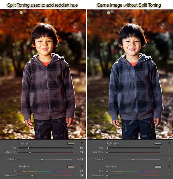
But, I still wanted more than just a black and white photo, so I decided to apply some slight split toning. Here we have the same photo of Leia opened in LR 6. The Split Tone panel is highlighted.

Split Tone Panel

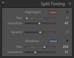
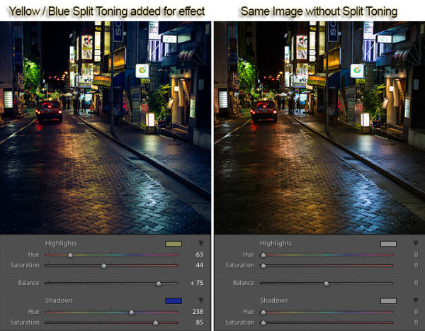
You’ll see a few options for controlling the highlight and shadow tonality, along with a hue and saturation slider for each. There is also a balance slider. The balance slider controls how the color tones are applied in relation to one another.

Split Tone Panel 2

I adjusted the tones to make the highlights into a yellow hue, while the shadows I changed to a bluish-purple. I simply kept adjusting each slider until I achieved the look I wanted for the image.

Split Highlights

Here is the edit with the balance slider favoring the highlights.

Split Shadows

Here we see it balanced to favor the shadows.

Leia Split Tone

Here is the finished image after split toning. From beginning to end the processing took less than five minutes.

Applying split toning to your black and white photographs can be an easy way to move beyond merely converting your photo to black and white. It adds interest to your shot, and helps to make it stand out from the ordinary. Luckily, digital photography has given us enormous range to experiment with our images, apply edits, and see the effects in real-time.

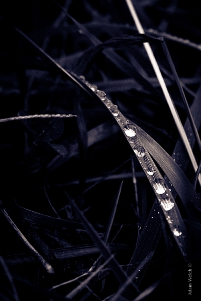
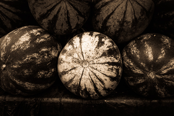
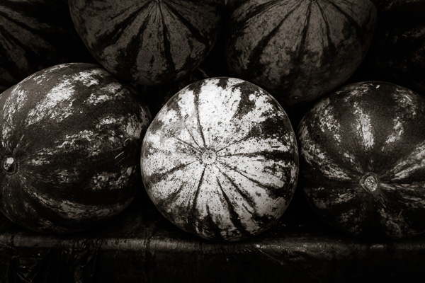
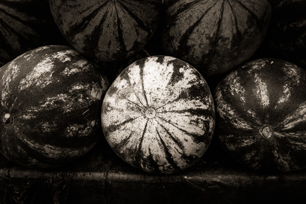
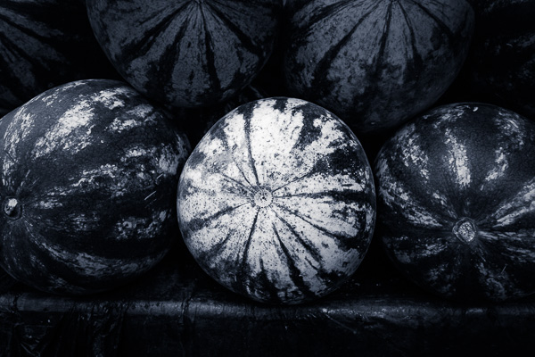
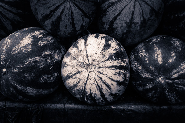
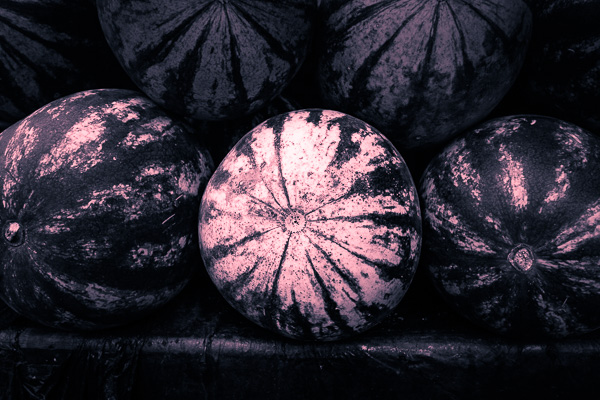
Here is another example of an image which has been processed using split toning (see others throughout the article as well). Try some split tone processing techniques for yourself and see what your black and white photos can become!

Cataloochee Valley Overlook

Editor’s Note: This is one of a series of articles this week featuring black and white photography tips. Look for earlier ones below and more daily over the next few days.

  • 5 Simple Ways to Create Expressive Photos in Black and White
  • Tips for Black and White Wildlife Photography
  • 7 Tips for Black and White Portrait Photography
  • 28 Images with Strong Black and White Compositions
  • Weekly Photography Challenge – Black and White Techniques
  • Tips for Black and White Wildlife Photography
  • How to Convert Images to Black and White and Add a Color Tint in Photoshop
  • Shooting all Black and White for a Day to Improve Your Photographic Eye

googletag.cmd.push(function() {
tablet_slots.push( googletag.defineSlot( “/1005424/_dPSv4_tab-all-article-bottom_(300×250)”, [300, 250], “pb-ad-78623” ).addService( googletag.pubads() ) ); } );

googletag.cmd.push(function() {
mobile_slots.push( googletag.defineSlot( “/1005424/_dPSv4_mob-all-article-bottom_(300×250)”, [300, 250], “pb-ad-78158” ).addService( googletag.pubads() ) ); } );

The post Split Toning Black and White Images in Lightroom by Adam Welch appeared first on Digital Photography School.


Digital Photography School

 
Comments Off on Split Toning Black and White Images in Lightroom

Posted in Photography


Split Personality: Chaos vs Calm in Half-Painted Hotel Room

04 Jun

[ By Steph in Art & Installation & Sound. ]

half painted hotel room 1

This hotel room is a little bit minimalist, a little bit rock n’ roll, and if you’re too much of the former persuasion, the chaos of the latter half might irritate your less-is-more sensibilities. Seen straight-on, the installation by Kiev artist Pavel Vetrov looks like a Photoshopped illusion, or perhaps a split view of a before-and-after design project. Which side is the before and which the after depends on your aesthetic preferences.

half painted hotel room 2

half painted hotel room 3

A razor-sharp line divides the two halves of the room, beginning at the top of the back wall, traveling right through the center of the bed and across the floor to the other wall. Everything from the duvet and TV cabinet to the books and a canvas propped against the brick gets the half-painted treatment.

half painted hotel room 3

half painted hotel room 4

half painted hotel room 5

On the minimalist side, nearly everything is colorless, save for a few pops of vibrancy in the wall art. The other side is a creative explosion of paint and prints, with designs scrawled all over nearly every surface.

half painted hotel room tilt

The installation is inspired by a 2012 project called ‘Panic Room’ by French graffiti artist TILT, who took one half of a monochromatic hotel room and completely obliterated every hint of white. The original state of the room reflects a feeling of calmness, while the other half is utterly chaotic, hence the project’s name.

Share on Facebook


[ By Steph in Art & Installation & Sound. ]

[ WebUrbanist | Archives | Galleries | Privacy | TOS ]


WebUrbanist

 
Comments Off on Split Personality: Chaos vs Calm in Half-Painted Hotel Room

Posted in Creativity


How to Split Tone Black and White Photos in Lightroom

04 Jan

Split toning in Lightroom

Toning originated as a darkroom process designed to extend the longevity of black and white prints. Photographers did so using chemical toners such as sepia, selenium and gold. Toners work by removing silver from the print and replacing it with another element with a longer life span.

A side effect of toning is that it adds colour. Sepia toned prints range from light yellow to deep brown, selenium is a subtle blue or purple, and gold anything from blue to deep red (if applied to a photo that has already been sepia toned). For many photographers the colours were just as important as the archival benefits because of the emotional values they added to the monochrome print.

Another, more unfortunate side effect of darkroom toning is that many of the chemicals are hazardous. Luckily, in the digital age, there is no need to use them. Toning is much quicker, and you can create any colour tone you like, using Lightroom’s Split Toning panel.

Furthermore you can use Virtual Copies to create several different versions of the same image, each with a different tone. It makes experimenting easy, and you can compare them afterwards to see which you prefer. You can even turn your favourite toning effects into Develop Presets so you can use them again whenever you want.

Emotional value of toning

Before we start, let’s look why you would tone a black and white photo. With digital, there is no need to tone for archival purposes, that leaves two reasons. The first is simply because you want to add some colour. Toning is a good way to do that and can really lift your images. The second reason is to add emotional value to the photo. For example, sepia toning both flatters the model and adds a sense of nostalgia and warmth. Blue toning, on the other hand, adds a cold feel.

Split toning in Lightroom

These four photos are processed identically apart from the toning treatment. The colour makes a huge difference to the appearance and emotional impact of each image.

It should be noted at this point that not all black and white photos take well to toning. The best images to use are those with lots of dark tones (plus some highlights for contrast – my article about tonal contrast goes into this more). Black and white photos with lots of light tones don’t seem to tone as well as those with lots of shadows.

How to use the Split Toning panel

Split toning in Lightroom

The Split Toning panel

The Split Toning panel is simple to use. The first pair of Hue and Saturation sliders sets the colour that is applied to the photo’s highlights. The second pair sets the colour that is applied to the shadows. The Balance slider is used to give precedence to either the highlight or the shadow colour.

If you hold the Alt key down while moving the Hue slider, Lightroom displays the Hue at 100% saturation, helping you judge the colour accurately.

Here are some examples. Most black and white split toning combinations are a variation of the following.

Split toning in Lightroom

Highlights: Hue 0/Saturation 0 | Shadows: Hue 0/Saturation 0

Untoned black and white image.

Split toning in Lightroom

Highlights: Hue 0/Saturation 0 | Shadows: Hue 45/Saturation 13

 Sepia tone applied to shadows only, leaving highlights unchanged.

Split toning in Lightroom

Highlights: Hue 46/Saturation 17 | Shadows: Hue 45/Saturation 15

 Sepia tone applied to shadows and highlights.

Split toning in Lightroom

Highlights: Hue 0/Saturation 0 | Shadows: Hue 234/Saturation 26

 Blue tone applied to shadows only, leaving highlights unchanged.

Split toning in Lightroom

Highlights: Hue 39/Saturation 30 | Shadows: Hue 234/Saturation 26

Blue tone applied to shadows, sepia tone applied to highlights. This is the classic split tone look. Split toning like this helps create a sense of depth. Basic colour theory tells us that warm colours appear to be closer to the viewer and that cool colours recede. Applying a cool tone to the shadows and a warm one to the highlights helps reinforces a similar sense of depth created by the effective use of tonal contrast.

Split toning in Lightroom

Highlights: Hue 0/Saturation 47 | Shadows: Hue 234/Saturation 31

Blue tone applied to shadows, copper tone applied to highlights. This imitates the blue and copper split tone effect that was possible to achieve in the chemical darkroom.

Split toning in Lightroom

Highlights: Hue 47/Saturation 52 | Shadows: Hue 36/Saturation 23

Sepia tone applied to shadows, gold tone applied to highlights. This imitates the sepia and gold split tone effect it was also possible to achieve in the chemical darkroom.

Those combinations should be enough to get you going, and of course you can experiment as much as you like with the sliders in the Split Toning panel to see what you can achieve.

Please share some of your split toning creations in the comments below.


Mastering Lightroom: Book Three – Black & White

Masterlng Lightroom: Book Three – Black & White by Andrew S GibsonMy ebook Mastering Lightroom: Book Three – Black & White goes into the topic of black and white in depth. It explains everything you need to know to make dramatic and beautiful monochrome conversions in Lightroom, including how to use the most popular black and white plug-ins. Click the link to visit my website and learn more.

googletag.cmd.push(function() {
tablet_slots.push( googletag.defineSlot( “/1005424/_dPSv4_tab-all-article-bottom_(300×250)”, [300, 250], “pb-ad-78623” ).addService( googletag.pubads() ) ); } );

googletag.cmd.push(function() {
mobile_slots.push( googletag.defineSlot( “/1005424/_dPSv4_mob-all-article-bottom_(300×250)”, [300, 250], “pb-ad-78158” ).addService( googletag.pubads() ) ); } );

The post How to Split Tone Black and White Photos in Lightroom by Andrew S. Gibson appeared first on Digital Photography School.


Digital Photography School

 
Comments Off on How to Split Tone Black and White Photos in Lightroom

Posted in Photography


Herringbone House: Tiny Tokyo Residence Split into 7 Levels

29 Nov

[ By Steph in Architecture & Houses & Residential. ]

tiny house japan 1

Measuring just 280 square feet, this tiny house in Tokyo by architecture firm Flathouse includes a public biscuit shop on the first level and manages to fit a lot of function into an irregularly shaped footprint by taking advantage of vertical space. Built on a system of parallelograms that create a herringbone pattern both inside and out, the home has no interior walls, dividing the rooms with a series of staggered platforms instead.

tiny house japan 2

tiny house ajapan 6

tiny house japan 9

For privacy-obsessed Westerners, this may seem like a strange move, but interior walls aren’t seen as a necessary part of a home in many areas of Japan. In this case, eliminating these dividers keeps a small space open and encourages rapid movement from one area of the home to the next. The shop owner can quickly move from the personal areas of the home to serve a customer on the first floor, and back again.

tiny house japan 3

tiny house japan 4

tiny house japan 8

All levels are connected by a central staircase. The dining room, living area and private rooms are all set on small platforms with barely enough room for the furniture required in each. The shop and bathroom are tucked into a concrete basement level, while the rest of the home is lined in a light and airy larch plywood.

tiny house japan 5

tiny house japan 7

tiny house japan 10

This approach uses the full available height of the property, creating a comfortable space despite the restrictive dimensions of the plot, a common architectural challenge in Tokyo.

Share on Facebook


[ By Steph in Architecture & Houses & Residential. ]

[ WebUrbanist | Archives | Galleries | Privacy | TOS ]


WebUrbanist

 
Comments Off on Herringbone House: Tiny Tokyo Residence Split into 7 Levels

Posted in Creativity


Split & Slide: Modular Dividers Make 3 Rooms in Single Space

12 Nov

[ By WebUrbanist in Design & Fixtures & Interiors. ]

modular room system design

Complimenting a flexible open area on one side of this apartment are a series of suspended separators that provide storage but also move along rails, opening up a variety of additional functions on demand. If the system looks familiar: it is based on the sliding stacks often used to save space in libraries.

modular-osb-oriented-board

modular space kitchen view

modular space bedroom

modular bedroom configuration open

Designed by PKMN Architectures in Madrid, Spain (with images by Javier de Paz García), this cost-and-space-saving solution employs relatively cheap materials including engineered particle wood boards (composed of glued wooden flakes) and a ceiling-hung system of industrial rails.

modular living room space

modular room shuffle sliding

modular room system

modular osb oriented board

The three suspended sections offer shelves and cabinets and variously create a kitchen, dining or living room depending on how they are configured and positioned relative to the room and one another.

modular murphy folding bed

modular living room blackboard

modular apartment sliding rooms

modular cooking kitchen closeup

Fold-down tables and a fold-out bed are able to be accessed as needed while the walls are variously occupied by storage, openings or unique decorative, fun and functional touches (like a blackboard for sketching ideas during meetings).

modular room changing gif

Sliding panels can also provide privacy when desired, separating the more open space from the modular-room side of the apartment. The fixed-in-place spaces are reserved for open living and dining areas as well as a bathroom in one corner of the unit.

Share on Facebook


[ By WebUrbanist in Design & Fixtures & Interiors. ]

[ WebUrbanist | Archives | Galleries | Privacy | TOS ]


WebUrbanist

 
Comments Off on Split & Slide: Modular Dividers Make 3 Rooms in Single Space

Posted in Creativity


Split, Broad & Short Lighting Techniques

17 Sep

Image from Alana Tyler Slutsky's Surrealia series featured on Fashion Photography Blog (FashionPhotographyBlog.com)SPLIT, BROAD AND SHORT TECHNIQUES

Hey FashionPhotographyBlog.com readers! Welcome back.

Today we’ll cover the other three basic techniques for lighting – split, short and broad lighting.  If you missed yesterdays’ basic techniques of Paramount, Loop and Rembrandt lighting, you can find them here.

Let’s jump right in!

LIGHTING TECHNIQUES

Split Lighting: Slight lighting literally divides the subject’s face in half.  It’s also known as side lighting.  Because of the nature of this type of lighting, it’s great slimming light.  Keep in mind that in lighting from the side, it will show any texture (and imperfections).  Aka- this is not ideally the light to be used on a very zitty person.

Split/side lighting is exactly as it sounds – Place the key light at your subjects side.  It will illuminate half of their face and leave the other half in shadow.

If you don’t want as extreme a shadow as pictured above, use a bounce fill or fill light to bring in detail on the shadow side.

Split lighting diagram featured on Fashion Photography Blog (FashionPhotographyBlog.com)

Split Lighting Diagram

These next two lights are not exactly a lighting pattern, but terms that deal with the subject and the lights orientation to the camera.  The two lighting scenarios below deal with the subject being 3/4 to the camera.

Broad Lighting: Broad lighting will create a “broad” or “wide” face.  This is because the part of the face that is lit (the part of the face that is facing the camera) is wider than the section of the face that is in shadow.  Don’t use this type of light on heavier people, it will make them look bigger than they are.  It’s ideal for thin people.

To achieve this, place the light opposite the direction of your subject’s face.  For example, If the subject is looking to the left of the camera, place the light to the right of the camera.

Broad lighting example featured on Fashion Photography Blog (FashionPhotographyBlog.com)

Broad lighting diagram featured on Fashion Photography Blog (FashionPhotographyBlog.com)

Short Lighting: Short lighting will create a narrower looking face.  This is because the part of the face that is in shadow (the part of the face that is facing the camera) is wider than the section of the face that is lit.  This type of light is great for heavier people!  It creates a thinning effect which makes it really flattering lighting.

To achieve this, place the light in the same the direction of your subject’s face. For example, If the subject is looking to the left of the camera, place the light to the left of the camera.

Short lighting example featured on Fashion Photography Blog (FashionPhotographyBlog.com)
Short lighting diagram featured on Fashion Photography Blog (FashionPhotographyBlog.com)
Lighting type guide featured on Fashion Photography Blog (FashionPhotographyBlog.com)

If you want to know more about Kickers, Rim, Hair, and Background lights, check our post on Types of Light.

As always, if you have any questions, feel free to shoot me an email.

– Alana


IMAGE SOURCE:

Feature image & image 1: photography by Alana Tyler Slutsky from her Surrealia series. To view the rest of the photos from this series visit her website.

Image 2-8: Alana Tyler Slutsky


Fashion Photography Blog

 
Comments Off on Split, Broad & Short Lighting Techniques

Posted in Uncategorized


Fujifilm X100S Digital Split Image focus – how it works

11 Jan

fujifilm_x100s.png

The Fujifilm X100S is the latest in a recent rush of cameras to include phase-detection elements on its imaging sensor, giving an AF system that is a hybrid of contrast and phase-detection methods. However, Fujifilm also uses this system to provide a unique and incredibly clever manual focus aid – which could finally allow digital cameras to offer the speed and convenience enjoyed by manual-focus SLR and rangefinder users. Fujifilm UK has posted a video showing ‘Digital Split Image’ focusing and Japanese camera site DCWatch has published details that allow us to show how it works.

News: Digital Photography Review (dpreview.com)

 
Comments Off on Fujifilm X100S Digital Split Image focus – how it works

Posted in Uncategorized


Creative Color Processing (Part 2/3 – Split Toning)

21 Dec

This is Part 2 of a 3-part series on creative color effects using Lightroom 4. In Part 1 of the series, I discussed shifting White Balance either warmer or cooler for creative effect. In this article I will explain Split Toning, and also give you some ideas for using creative white balance and split toning together for even more color control.

For this image, I used split toning to complement the autumn foliage by adding red to the shadow areas:

Split toning used to add a warm reddish hue

Example of Split Toning used to add a reddish hue

While white balance affects the entire image, split toning allows you to treat the shadows and highlights differently. You can add one color to the shadows and a different color to the highlights, and also control the balance between the two.

In processing this scene of a street in Tokyo I used split toning to add blue to the shadows and yellow to the highlights:

Example of Split Toning

Example of Yellow / Blue Split Toning

Split Toning can also be combined with white balance for creative effect. In the photo below I used a cool 3500 kelvin white balance, and then used split toning to warm the skin tones by adding yellow to the highlights. The result is cool-toned image, without unnaturally bluish skin tones. In this way, white balance and split toning can be used together to create an effect that would not be possible with either tool on its own.

Split toning to warm skin tones

Using Split Toning to warm skin tones

Creative color processing is very subject, and ultimately comes down to personal preference. Even if you don’t really like the editing decisions I’ve made in these sample photos, I hope I’ve inspired you to try some new techniques for creatively processing your photos. I appreciate feedback, please comment below or feel free to connect with me through Facebook or Google+.

This concludes Part 2 of my Creative Color Processing series. In Part 3, I will show you how to use the Tone Curve tool to control the red, green, and blue color channels separately.

Post originally from: Digital Photography Tips.

Check out our more Photography Tips at Photography Tips for Beginners, Portrait Photography Tips and Wedding Photography Tips.

Creative Color Processing (Part 2/3 – Split Toning)


Digital Photography School

 
Comments Off on Creative Color Processing (Part 2/3 – Split Toning)

Posted in Photography


Adobe Lightroom – Split Toning + Black and White

26 Oct

*Simply giving this video a ‘Like’ helps my channel grow 🙂 T-Shirt Design: aleksparx.deviantart.com My DeviantART: infuzedmedia.deviantart.com Enhancing Preset Download bit.ly Soft Colour Preset Download: bit.ly Soft Colour Tutorial: www.youtube.com Colour Enhance Tutorial: www.youtube.com Landscape Editing Tutorial: www.youtube.com In this tutorial I’ll be showing you how you can add split toning to your black and white photos. I hope this is helpful and you all enjoy the tutorial 🙂 Thanks.
Video Rating: 4 / 5

 
Comments Off on Adobe Lightroom – Split Toning + Black and White

Posted in Retouching in Photoshop