RSS
 

Posts Tagged ‘Redesign’

New owners completely redesign Mk ll Meyer Optik G?rlitz Trioplan 100 ‘soap bubble’ lens

17 Jun

The new owners of the Meyer Optik G?rlitz lens brand say they’ve completely redesigned the optical designs and much of the mechanics of the Trioplan 100mm f2.8 lens so it produces better resolution and contrast while controlling internal reflections more effectively.

Famous for its soap-bubble bokeh the original Trioplan 100 was recreated in 2015 by a company called net SE that eventually went bankrupt taking customer’s pre-order money with it. The new owners, Optical Precision Components, has produced its lenses up-front and has just started shipping them.

A OPC Optics spokesperson told us the Mk ll lens has a completely new optical construction and many newly designed mechanical parts inside too. ‘As we are an optics company, rather than a marketing company, we have the know-how and equipment to analyze and optimize optical systems in-house’, the spokesperson tells us. ‘This led us to completely redesign the optical construction of the Trioplan 100, as we especially wanted to improve its resolution and contrast performance.’

According to the spokesperson, ‘the new optical design meant we needed to use different glasses and differently shaped elements, which in turn required a lot of mechanical changes. We prioritized the optics first and everything else is built around that new design.’

The spokesperson further elaborated on the differences between the two lenses, saying (edited for clarity and brevity):

‘All the parts inside and outside the lens have been produced completely new, but some retain the same design as those used in the Mk I version. As we have changed the shape of the main elements in the design and changed the distance of the elements from the aperture, we also needed to redesign the mounts that hold the elements in place [and change] the way the aperture unit works, as in the Mk l version it had no hard stops when it closed or opened completely. That caused damage to the aperture, as the blades could get bent when the aperture ring was turned to its full extent. Our Mk II the aperture has hard stops, so you can turn the aperture ring and really hit against the end without damaging anything. Overall we changed many small things to produce a lens of much higher quality and to make the focusing smoother, but most important are the changes to the lens elements and those main mechanical parts that increase durability.’

As with the original model, this new version uses just three elements in its construction, and a newer 15-blade aperture diaphragm helps to form the characteristic round out-of-focus highlights in the background. The soap bubble effect is often enhanced through the use of macro extension tubes to bring the minimum focus closer and thus exaggerate the size of the bubbles. The lens is manual focus only and takes a 52mm filter.

OPC Optics says it has also redesigned the rest of the Trioplan series as well as its Primoplan lenses. Again, in these models the aim is to improve resolution, contrast and to reduce flare while building a more durable construction.

The Meyer Optik G?rlitz Trioplan 100 f2.8 ll is available in mounts for Canon EF, Fujifilm X, Leica L, Leica M, M42, MFT, Nikon F, Pentax K and Sony E cameras. It costs €999 (approx. $ 1100) and is shipping now. For more information see the Meyer Optik G?rlitz website.

Articles: Digital Photography Review (dpreview.com)

 
Comments Off on New owners completely redesign Mk ll Meyer Optik G?rlitz Trioplan 100 ‘soap bubble’ lens

Posted in Uncategorized


MAD Architects Redesign Turns Ugly Paris Tower into Giant City-Scale Mirror

03 Oct

[ By WebUrbanist in Architecture & Offices & Commercial. ]

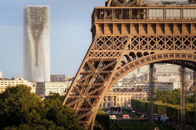
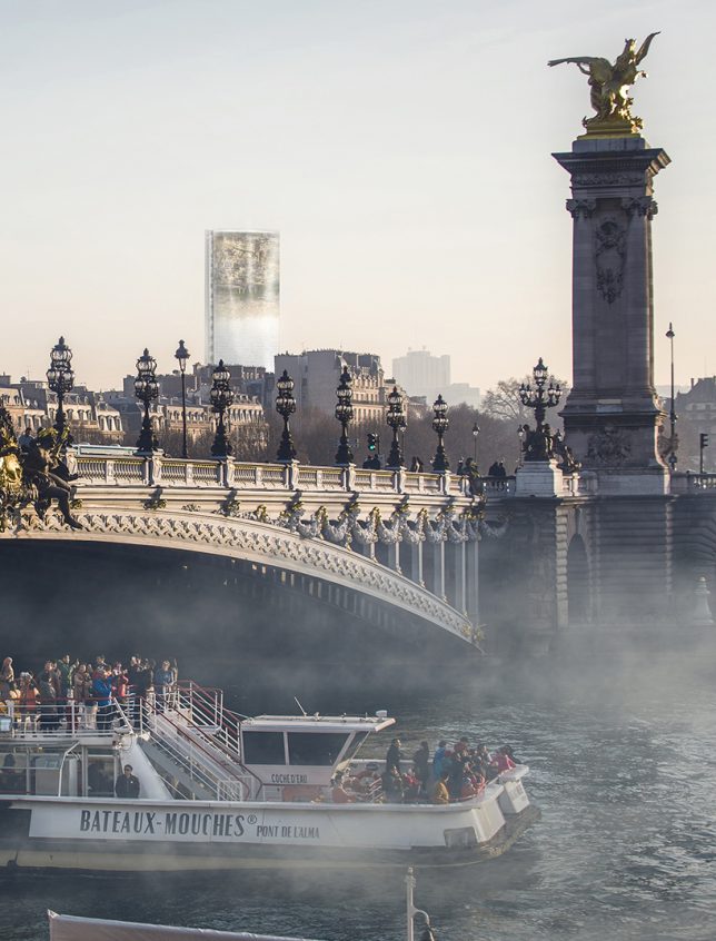
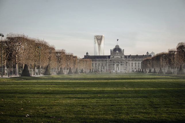
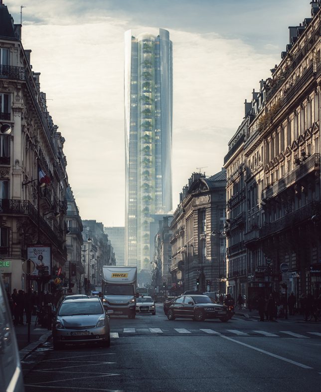
Tall, dark and brooding, the infamous Maine-Montparnasse Tower is an unexciting skyscraper, especially by Parisian standards, but that could all change if MAD Architects converts it into a city-scale mirror. Their renovation proposal employs clever optical tricks to reflect and invert the surrounding cityscape.

When it was built, Montparnasse was the tallest building in France and heralded as a technological achievement. But unlike the Eiffel Tower, which was controversial at first but became a symbol of the city, this skyscraper never gained iconic status — in fact, it led urban building heights to be capped at seven stories. Some quip it has the most beautiful views in the city, in part because those views don’t include the building.

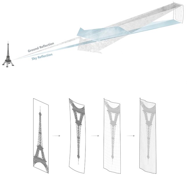
MAD Architects aims to change perceptions of the tower and its role in the city using concave glass panels tilted at an angle to create reflections of the surrounding built environment.

Viewers would be able to see surrounding streets, roofs and buildings in its mirrored facade. In a way, the resulting design both blends into the environment while also highlighting the beauty of the French capital and showing it from generally unseen angles.

“Today, we cannot really demolish this building and the historical regrets it stands for,” explains one of the architects behind the proposal, “but we can establish a new perspective to re-examine and think about how humanity can co-exist and interact with the tower and its environment, to bring meaning to our hearts.”

Perhaps unfortunately, while the firm was shortlisted in a redesign competition, another team was chosen to renovate the structure before the upcoming Olympic Games. Still, the design idea is out there, and another city might have its own ugly tower in need of transformation.

Share on Facebook


[ By WebUrbanist in Architecture & Offices & Commercial. ]

[ WebUrbanist | Archives | Galleries | Privacy | TOS ]


WebUrbanist

 
Comments Off on MAD Architects Redesign Turns Ugly Paris Tower into Giant City-Scale Mirror

Posted in Creativity


Sprawl Trilogy Redesign: Fractal City Covers for Classic Gibson Novels

04 Dec

[ By WebUrbanist in Art & Drawing & Digital. ]

fractal-cover-art

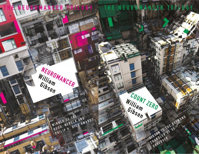
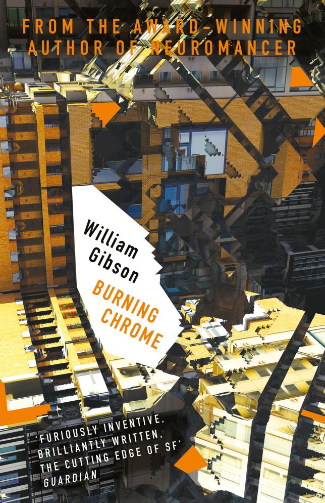
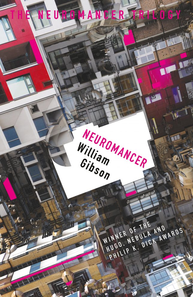
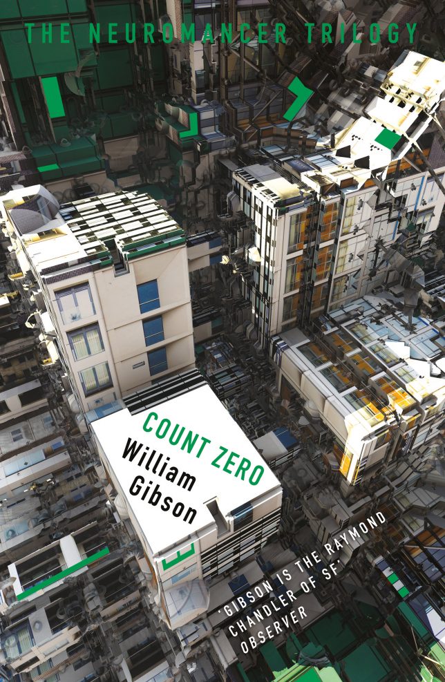
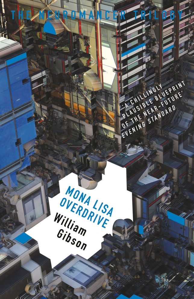
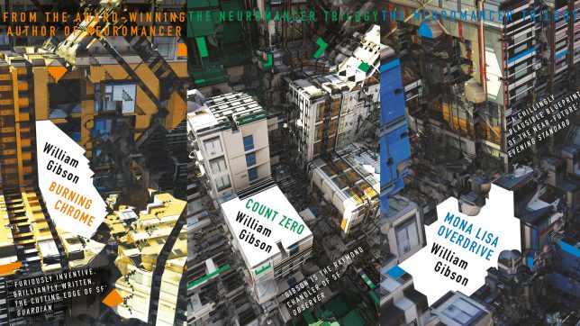
Three classic cyberbunk books and a short story collection, all by William Gibson, are getting an apt makeover in the form of architectural covers featuring beautifully abstracted (if dystopian) urban landscapes.

burning-chrome-cover

Anyone familiar with this master of science fiction will make the connection quickly — the strange and seemingly impossible shapes are exactly what come to mind when reading the Sprawl Trilogy (Neuromancer, Count Zero, Mona Lisa Overdrive) as well as shorts from Burning Chrome. In William Gibson’s fiction, the Sprawl is a colloquial name for the Boston-Atlanta Metropolitan Axis (BAMA), an urban sprawl environment on a massive scale, and a fictional extension of the real Northeast megalopolis.

neuromancer-cover

Developed by digital artist, designer and programmer Daniel Brown, the method of these remakes also fits the techno-futuristic narratives in question: fractal mathematics and computer software turned ordinary architectural photographs into these surreal built environments. The covers seem to flow into one another but are distinctly colored, forming unique art separately but a kind of fractal collage when seen together.

count-zero-cover

The images were generated by repeating one shot at different scales to create complex patterns, at once recognizable as architectural but hard to pin down, much like a memory or a visualization based on reading a book. Gibson approached Brown when Gollancz, an imprint of Orion, acquired rights to the publishing of these speculative fiction classics.

mona-lisa-overdrive-cover

The designer says he was personally approached by Gibson to create the cover designs for the books, which have been recently acquired by science-fiction publisher Gollancz, an imprint of Orion. Their meeting was fortuitous as Brown had been looking for a platform to execute his creative ideas.

new-gibson-cover-art

“I had been experimenting with generating architecture via computer code,” says Brown. “As a project it was still in its infancy and without real purpose. Then William Gibson contacted me, and stated it was exactly how he had envisaged The Sprawl. In an uncanny way the code found its own purpose.”

Share on Facebook


[ By WebUrbanist in Art & Drawing & Digital. ]

[ WebUrbanist | Archives | Galleries | Privacy | TOS ]


WebUrbanist

 
Comments Off on Sprawl Trilogy Redesign: Fractal City Covers for Classic Gibson Novels

Posted in Creativity


Pencil + Sharpener: Redesign Solves 3 Classic Drawing Tool Problems

27 Jun

[ By WebUrbanist in Design & Products & Packaging. ]

pencil plus sharpener

Pencils require sharpening, run out of eraser and turn into unusable stubs as they near the end of their lifespan, but this clever gadget aims to change all of that, solving all three issues at once.

demo

Even in today’s digital world, artists, designers, writers and musicians still fall back on this traditional tool. The Pencil+ helps on multiple fronts, but functions first as a pencil holder, enabling the user to tuck various lengths of pencil into a central void.

eraserhead

What keeps the pencil from slipping too far in? An adjustable eraser serves as a backstop, letting you move the pencil portion backward to fit and forward as the pencil gets shorter. Meanwhile, the back of the holder (normally where one would find an eraser) doubles as a sharpener, keeping it always on hand for reworking broken or worn tips.

remove and sharpen

“Worry no more because with pencil+,” say its creators, “you can now have a sharpener, extender, eraser holder and transporter for your favorite tool” which is available in Teak, Ebony, Wild Olive, African Padauk and Indonesian Redwood”

pencil sharpener combo

A few potential critiques come to mind: first, someone employing this device will have to deal with an additional step to access an eraser. Second, the holder is necessarily wider than a pencil, so it will require some getting used to in terms of grip and function. Third, the eraser length is a function of pencil length, so storing a lot of extra eraser could be an issue (though easily longer than a normal one). Still, one can be sure, at least, never to lose track of one’s sharpener, and also that a single pencil will last a lot longer.

Share on Facebook


[ By WebUrbanist in Design & Products & Packaging. ]

[ WebUrbanist | Archives | Galleries | Privacy | TOS ]


WebUrbanist

 
Comments Off on Pencil + Sharpener: Redesign Solves 3 Classic Drawing Tool Problems

Posted in Creativity


Open Competition: Redesign the World’s Largest Temporary City

01 Sep

[ By WebUrbanist in Architecture & Cities & Urbanism. ]

back rock center camp

Creating a one-of-a-kind opportunity for urban designers and aspiring planners, Black Rock City is soliciting fresh layouts from anyone who wishes to contribute. Winners selected by the BRC Ministry of Urban Planning will be featured in an upcoming publication but will also influence the future shape of this surreal city.

black rock aerial view

As the home of the Burning Man Festival, BRC is unique not only due to its intermittent existence, rising from the desert for just one week every year, but also because of its density and size, with 75,000+ annual residents making their home in less than 2 square miles.

black rock circular layout

The fact that the place is rebuilt anew with each iteration means lessons learned one year can be applied the next, while the absolutely flat desert landscape makes for effectively endless possible layouts. Likewise, the architecture that populates the place is highly varied and ever-evolving, reflecting the radical changes in temperature from day to night and the ever-present threat of rain and dust storms.


black rock city early

While critics and ‘citizens’ alike have strong feelings and differing views about other aspects of the gathering, once attendees have arrived they effectively become residents of a grand urban experiment. Reliant on streets and other public infrastructure, everyone fills into the grid, from individual campsites (often on the fringes) to large theme camps (arrayed primarily around a central circular Esplanade) and core communal functions (generally near the entrance).

fractal pattern

These designs, past through present, reflect the need for clear navigation within the city as well as the desire to foster density and (through that) community interactions, all while maintaining critical services at key places or appropriate intervals.

brc design idea

While leeway is given for creative variation, submitters to the contest are similarly encouraged to reinforce density and interactivity, through fractal patterns or other applicable configurations and shapes. Far-fetched, implausible or even physically impossible entries will still be considered, however, even if they cannot be incorporated in a near-future plan.

brc 99

The shape of the city has changed significantly over time, but certain elements like the centrality of The Man have remained largely the same. Tall relative to its surroundings and aligned with axes of the city, it serves to help orient people (particularly at night) while also providing a central locus around which activity revolves. While it was initially arrayed closely around it, the city pushed back from The Man over the years, creating a broken circle with views to and beyond this center figure.

brc move over time

As the city grew in size, its location also shifted, pushing it deeper into the wide-open desert. However, since 1999, major changes have been fewer and farther between – a fact that may change with the right submission to this competition.

black rock city urbanism

More on the origins of the competition: “We founded the Black Rock City Ministry of Urban Planning with the goal of enabling people to share and discuss ideas for the spatial and geometric possibilities for Black Rock City and regional events, and to give architects and urban designers a platform to participate more directly in this process. Design competitions such as this are a familiar format in these trades, and as such, are an efficient way to get lots of ideas on the table for consideration.”

brc 2015

Types of and evaluation criteria for submissions: “(1) Individual design elements : boulevards, roundabouts, street lights, all of the things that are part of a cityscape that can be incorporated into larger scale plans. Have an idea for a park, or a winding boulevard? Submit this as a design element. (2) Conforming city plans : these are large scale city plans that make adaptations to the existing time + named street coordinate system without altering the fundamental character of the plan. The objective with this type of plan is to make aesthetic or practical improvements to what’s already in place, for example by adding pedestrian boulevards (think Las Ramblas in Barcelona). (3) Non-conforming city plans : here we explore BRC, or a regional event city, as an imagined or science fictional space, and invite people to submit radically new configurations for the city.” (Images via Burning Man, Duncan Rawlinson and Jonathan LaLiberty).

Share on Facebook


[ By WebUrbanist in Architecture & Cities & Urbanism. ]

[ WebUrbanist | Archives | Galleries | Privacy | TOS ]


WebUrbanist

 
Comments Off on Open Competition: Redesign the World’s Largest Temporary City

Posted in Creativity


Two World Trade Center: BIG Redesign Deconstructs Skyscraper

24 Jun

[ By WebUrbanist in Architecture & Offices & Commercial. ]

two wtc stacked boxes

A long-standing design proposal from Foster + Partners has been scrapped by developers in favor of a new scheme from BIG (Bjarke Ingels Group) that presents a different face to viewers depending on their approach or view within the city, rejecting conventional skyscraper typology and cultivating visual transitions between neighborhoods on all sides.

two world trade stack

As the last project slated to be built on the World Trade Center site, the would-be 2 WTC skyscraper is a critical piece of the Lower Manhattan landscape, but its future tenants wanted something that stood apart from the more straightforward tall buildings associated with finance and Wall Street.

two tower foster partners

The prior scheme, shown above, featured four connected verticals, each terminating in an angled plane at the top, essentially a tower with slots centrally located along each face. The new scheme, endorsed by occupants including 21st Century Fox and News Corp and shown below, intentionally shies away from the skyscraper aesthetic and creates space for greenery on a series of platforms created by recessed sections of structure.

two memorial site view

two box tower view

Its facade shows off a slim and modest structure when viewed from the memorial site on one side below but creates a stacked-box effect when seen from adjacent lower-rise parts of the city above like Tribeca: “From Tribeca, it will appear like a vertical village of singular buildings each tailored to their individual activities stacked on top of each other, forming parks and plazas in the sky.”

two platforms gardens levels

two interior exterior bridge

two wtc interior

two news media studio

two news broadcast pit

two newsroom open space

By keeping larger boxes at the base and similar overall square footage (nearly 3,000,000 square feet), the building also is designed to accommodate sizable studio spaces for the aforementioned media companies. Lower levels will be occupied by these giants while upper floors will be rented out to smaller commercial clients. Set alongside One, Three and Four World Trade Center, this structure will stand apart, its broken-down scale visually bridging the gap between the southern tip of the island and the rest of the city to the north.

Share on Facebook


[ By WebUrbanist in Architecture & Offices & Commercial. ]

[ WebUrbanist | Archives | Galleries | Privacy | TOS ]


WebUrbanist

 
Comments Off on Two World Trade Center: BIG Redesign Deconstructs Skyscraper

Posted in Creativity


Flickr Founder Stewart Butterfield on Flickr’s New Redesign

28 May

Founder of Flickr Likes the New Flickr


Thomas Hawk Digital Connection

 
Comments Off on Flickr Founder Stewart Butterfield on Flickr’s New Redesign

Posted in Photography


Tell Us What You Want Out of a dPS Redesign

13 May

It has been a couple of years since we did a complete overhaul of the design of dPS so over the coming months we’ve commissioned a team of designers and developers to give our site a once over – and we’d LOVE your feedback!

So now is your chance to tell us what features and design elements you’d love to see on the newly designed dPS.

Is there something missing that you’d like to see added? Is there a feature on another site that you’d love to see here?

You’re welcome to give feedback upon the blog area, the forum area or even our social media accounts (Facebook, Twitter, Pinterest etc).

Feel free to tell us what you honestly think (as long as you’re constructive that is) – we’ll keep this post open for comment for a day or two before closing it off to pass onto our team.

Thanks – ultimately dPS is nothing without you as readers so we can’t wait to hear what you’d like to see to make it even better than it is.

It’ll be a couple of months before you notice too many changes but rest assured we’re listening to your feedback today!

Post originally from: Digital Photography Tips.

Check out our more Photography Tips at Photography Tips for Beginners, Portrait Photography Tips and Wedding Photography Tips.

Tell Us What You Want Out of a dPS Redesign


Digital Photography School

 
Comments Off on Tell Us What You Want Out of a dPS Redesign

Posted in Photography


Ways to Redesign Flickr Groups to Make Them More Social, Addictive and Powerful

16 Oct

Flickr is currently in the process of redesigning the Groups section of their site. Initial comments by some beta testers have suggested that more emphasis will be placed on photos and less on discussion threads. I’m not a part of this new beta group, but I thought I’d share a list of ways that Flickr could improve Groups anyways. I believe that Groups represent Flickr and Yahoo’s greatest chance at making progress in social — an area increasingly being dominated by Google+, Facebook, Twitter, Instagram, Pinterest and other Yahoo social competitors.

Although I have not been as active in Groups over the past year, I’ve literally spent thousands of hours in Flickr Groups and feel like I understand how they work and their dynamics very well.

1. It cannot be overstated. The power of Groups are in the discussion threads. The power of Groups are in the discussion threads. The power of Groups are in the discussion threads. Discussion threads, positioned correctly, can be like crack. They can be terribly addictive. Flickr should be doing everything that they possibly can to push people to the discussion threads in Groups. This is how you turn a casual user into a hardcore top 1% Flickr user. If you can suck someone into the discussion threads you can get 100x the use of Flickr out of them. These are the most valuable members on Flickr. These are the biggest Flickr evangelists. These are the ones who will promote the site more than everyone else. Every design decision around groups should be made with the idea of how can we suck more users into the group discussion threads.

2. Toxic people are like cancer. Toxic people will drive people away from Flickr. Toxic people are the single biggest impediment for Flickr Groups to overcome today. The answer to protecting Flickr members from toxic people is simple. Create a more robust blocking mechanism which allows users to block each other. Online harassment that turns into real life harassment will drive even the most hardcore Flickr Group addict away from social. The best way to prevent this harassment is to allow users the ability to block each other. This seems so basic. Google got this super right a long time ago with Google+.

If I choose to block you then you should be made completely and entirely invisible on the site. Poof. Gone. Vanished. It’s not that you still can’t harass, but it makes it harder to harass someone when you are invisible to them in any profile they create that gains momentum on the site. This would encourage people to behave more civilly towards each other if such a tool existed.

Civility will help social for groups.

3. The goal for Flickr should be to create a page of discussion threads that are irresistible to me — an entire page of threads that I simply can’t help myself but click and converse. Any thread that is not of interest is a waste of space. Allowing me to mute or hide threads will ensure that I will be more social because I will see more opportunities to be social. There is no reason for me to see a thread about baseball that keeps popping to the top if I don’t care about baseball.

Muting threads also helps with trolling.

4. Flickr already has a super powerful tool that they are using in their help forum that they are not using in their Groups. If they’ve already coded it for the help forum it seems like a total non-brainer to simply port it to other Group discussions. This is the button that shows me posts that I’ve posted in. Obviously I care more about the threads that I’ve posted in than the threads that I haven’t.

5. Flickr needs to allow me to subscribe to threads that I’m particularly interested in and aggregate these threads on a single page sorted by recent activity. If you want people to be active in multiple groups (and you do, trust me) you want them to be able to easily follow the conversations that they care about in multiple groups. This does not happen today. Instead you have to go to group by group by group by group to hunt around for the conversations that you care about. Alternatively you can bookmark them all and go back and check them manually over and over and over again. You quickly tire of bookmarks because you are only interested in a Group conversation if there is new activity. Having a page to view subscribed threads could become the most powerful page for social on the web.

6. Flickr can’t fight anonymity at this point. It’s too late. Google and Facebook forced this issue early on by requiring users to use names that they are commonly known by. There would be too much of a revolt if Flickr even tried to institute anything like this. However, they can allow verified profiles. By allowing users to opt in to verified profiles they would give these accounts more credibility. Verification could be done similar to how Google used to do it by having users submit a Government ID or simply enter in a credit card number on a credit card. NOTE: I’m suggesting this be made voluntary and OPT IN. If people want to opt in, why not let them? If someone wants to keep their hackerboy6969 anonymous ID this is fine too.

7. Groups need to be promoted more heavily by Yahoo and Flickr across other sections of the site. Yahoo especially and Yahoo search especially, should be driving traffic to Group discussions. Although Yahoo probably has to talk to the boss (Bing/Microsoft) at this point to try to have any input on the search algorithm, if I were Yahoo I’d try to get multiplier algorithm weightings for public group conversations and general group pages. If someone is searching for information on a new Canon 5D Mark III, by all means, Yahoo should try to route them to a Canon Group on Flickr where they can find discussion about this. It’s relevant and invites them to be more social on a Yahoo property.

8. Group invitations should be super easy. New blood is vital to ensuring Group success. Flickr should make it as easy as possible both to invite other Flickr members to your Groups and also equally important to invite people outside of Flickr to your Groups. A Group invitation section should be made which will invite Facebook friends, people in your address book, etc. to your Group. A few years back Flickr made it actually harder to invite people to Groups. They probably did this due to criticism about people spamming Group invitations. Instead of making Group inviting harder, they should simply allow users to mute these notifications by category.

9. Flickr needs to come out with a super easy way to consume and converse in Group discussion threads on both iPhone and Android.

10. Create a +/@ mentioning system for Groups. If someone +/@ mentions me in a Group (or on a photo page discussion as well), I should receive a notification. This is smart and will invite and encourage me to respond.

Flickr Group discussion threads represent the future for social at Yahoo not just for the photo community that is Flickr. Group discussion threads represent the future for social ideally for millions of other topics. To this end, Flickr Photo Groups should be considered as much a social lab as anything for Yahoo. Thoughtful consideration should be made as to how to push this Group format out to the rest of the social web, inviting people to create and manage groups about everything from knitting to hang gliding. Yes, photos are important. Every Group should have a photography function, but the discussion threads really are the power.

By making Groups more about photos and less about discussions Yahoo squanders this important opportunity.

I also believe that Yahoo should consider hiring some people to live in Groups for a while. They should hire some super smart people who understand psychology and just have them live in Groups. Their entire job should just be to participate in Groups all day long and then thoughtfully consider how to make them more and more social.

Although Yahoo staffers are in some Groups today, I can’t think of any who are particularly hyperactive there. It’s hard to be social in Flickr Groups when you’re so busy writing code all day, but Yahoo does need some talent to really get in there and understand what they have — because today I don’t think they really do and I’m not sure there’s ever any HOPE that senior management at Yahoo will ever truly understand what they have with social in the form of the seedling that is Flickr Groups.


Thomas Hawk Digital Connection

 
Comments Off on Ways to Redesign Flickr Groups to Make Them More Social, Addictive and Powerful

Posted in Photography


Flickr Close to Releasing a Redesign of Global Navigation, Explore and Groups

16 Oct

Yesterday I was contacted by a Flickr member asking me if I knew about the redesign that was being done on Flickr. Although I’d assumed that more redesigning was coming to Flickr after earlier releases this year, I wasn’t aware of what specific changes were being implemented or considered. I’ve seen screenshots of some of the new redesign but haven’t had a chance to seriously examine it yet.

Apparently a beta group is currently testing changes to Flickr’s Global Navigation, Explore section and most significantly Groups. Rollouts of the new design have begun and some users are now seeing a different layout on Flickr.

I’ve long believed that Groups represents Flickr/Yahoo’s most significant chance for winning at social. Although it doesn’t sounds like the new Groups layout is set in stone yet, some of the comments made by beta testers would seem to suggest that more emphasis is being placed on Group photos and less emphasis on Group threads. Here are some of the comments in the thread

“That would be a complete disaster and kill off what remains of the active discussion groups on Flickr. Good luck getting new members to ever click over to the threads.

The Groups List page redesign is also, quite frankly, atrocious. Much harder to find groups, not to mention the graphics are messed up.

I will personally lead the revolt if the new group page design sticks. It will KILL any attempts to integrate new users into group discussions.”

AND

“Oh lordy, that’s terrible. The group rules page and intro is completely hidden and while the emphasis on photos is kind of nice, it completely destroys any importance of the description and the discussion.

Not liking that at all. It makes groups look about as social as a set is now. Completely wrong direction and neuters the group other than a photo collection.”

AND

“Let me rephrase that. If you go ahead, and make the groups look like what I just saw, I will mothball every group I have, log out and never log back in. This is not out of some idea that I’d be contributing to an effort to twist Flickr’s arm into doing anything, but because navigation will have broken down so badly, that the site will no longer be worth my time.”

These initial comments regarding Groups are disappointing. It sounds like Groups may be headed in the wrong direction. I’ve long been critical of Yahoo executives who can’t/won’t join Flickr publicly including current Yahoo CEO Marissa Mayer (Mayer posts her photos on competitor Instagram instead of on her own company’s photo sharing site Flickr). Previous CEOs Scott Thompson and Carol Bartz likewise did not have public Flickr accounts.

Part of my criticism of Yahoo execs not using Flickr is that without dogfooding it, without really digging into it, I don’t believe that they can begin to understand the promise that Groups represent for social on Yahoo. Based on early comments on the Group redesign page I’m also beginning to worry that even Flickr staffers don’t truly understand the power of social that Groups represent.

Whether or not this new Group redesign will be rolled out to other users or not remains to be seen. I’m concerned though that time/engineering/design talent wasted making Groups *less* social might just be another blunder after a long line of previous blunders made by Flickr in terms of the guesswork on what users may or may not want.

Last year Flickr rolled out a wonky photo/chat feature, for example, that was quickly killed earlier this year. Time wasted going in the wrong direction hurts Flickr and hurts their chance at social.

Photo sharing is a super competitive space and becoming more and more important. Great care should be taken to make photo sharing as social as it can possibly be. Every single step towards redesign should be asking the question, will this make Flickr more social or less social?

Although I’m not part of this beta or test group, I’m usually not one to keep my opinions to myself, so I’ve also written a companion post to this one entitled “Ways to Redesign Flickr Groups to Make Them More Social, Addictive and Powerful.”


Thomas Hawk Digital Connection

 
Comments Off on Flickr Close to Releasing a Redesign of Global Navigation, Explore and Groups

Posted in Photography