Photography has never been more important to selling real estate than it is today. The markets are heating up again and demand for real estate creates demand for photography. This is good news to photographers, but like any business, there is plenty of competition. If you are new to real estate and architecture photography, here are some general guidelines to start you on the right path.
Camera Equipment
A camera, lens, and tripod, are all that is required to get started, but you might quickly learn that many competitors are very proficient at using supplemental lighting and Photoshop techniques.
Your camera should allow you to add a cable release, a flash, different lenses, and wireless triggers. Wide angle lenses are required. For cropped sensor cameras a lens around 10-22mm or 12-24mm is perfect, and for full frame sensor cameras, a lens around 16-35 mm will do the job.
Tilt-shift lenses help avoid converging vertical lines such as wall edges and door frames leaning in or out. There are several tilt-shift lenses available from Canon’s 17mm, the 24mm from Canon and Nikon, and others. While these lenses are wonderful to use, they are fixed focal length so if you need a perspective that is for example; 19 mm or 27 mm or somewhere in between, a 16-35mm zoom lens is a great companion to a tilt-shift lens.
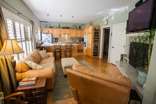
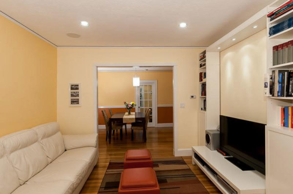
This image before processing shows diverging vertical lines, seen best by the edge of the fireplace, from using a 16-35mm lens tilted down to add foreground and minimize ceiling.
Shooting techniques vary from exposure blending, HDR, wireless flash, and light painting with multiple exposures. No matter your shooting style the camera should not be moved to guarantee image alignment of multiple exposures. The camera’s self-timer, a cable release, or wireless triggers insure no camera movement. The iOS App or Camranger also triggers the camera and provide a preview of the photo on a smart device.
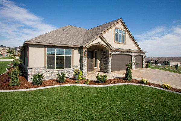
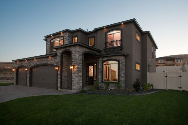
Approaching the Property
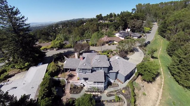
The first image a potential buyer sees (usually) when reviewing properties online is an exterior photo. That photo is important so take the time to find the best angle and best light. Ask the realtor what are the important features to highlight. They usually want exterior photographs from front and rear, a deck or patio, landscaping and gardens, pool or hot tub, a barn, shop, or other outbuildings. Each feature should be emphasized in the composition by using the surroundings, like beautiful gardens leading to a cool garden shed.
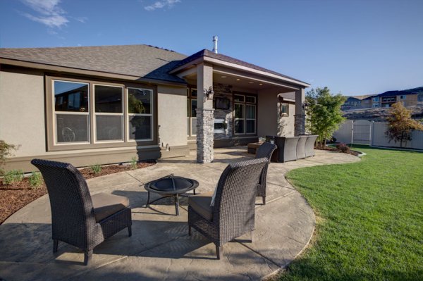
The client was most interested in the outdoor theater under cover on the back porch, which I captured, but I also captured this image showing the patio furniture and giving a broader view of the backyard.
Exterior Lighting
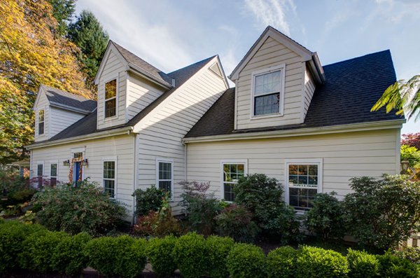
Most outdoor subjects benefit from early or late day lighting, including real estate. Using Google Maps and Google Earth can help you determine the best time of day prior to the photo shoot. Searching only takes minutes and provides an idea whether a home faces the sunrise or sunset, or neither.
Light hitting the front of a home is perfect as seen here after sunrise.
In winter, some homes facing south never have the sun hitting the front of the home To avoid shooting into the sun, photograph from the same end of the house as the sun.
This home has a huge hedge behind the camera and a street lined with cars. Photographing from the left put the sun right above the roof but moving to the right side was a better perspective and the sun was out of view.
Overcast skies can eliminate any problems with sun’s position, but shooting on poor days is a decision best discussed with the realtor. The advantage is you can shoot any time of the day but the disadvantage is white skies can lessen the impact of an otherwise great exterior image.
The dusk/dark technique
The dusk/dark technique is often requested by clients because it helps sell properties. The image is photographed outside and from the best angle to showcase the house. The technique is to turn on all the lights in a room and shoot at a certain time. After sunset the sky’s exposure will balance with the room lights’ exposure. A better approach is to add lights to the rooms creating even lighting, and working this way means not having to wait for that perfect balance between room lights and outdoor light.
Interior Photography
Homes come in all shapes, sizes, styles, and conditions. I always tell my clients that I am not in the house cleaning business, so I send them a task list with my suggestions on prepping the home prior to the photo session. Once inside, I set out to photograph the main rooms: the living room, kitchen, dining area, master bedroom, master bath, are all ‘must shoot’ rooms. There could also be a library, office, large walk-in closet, and more. The client can often tell you what they deem important. Next, seek the best perspective for each room.
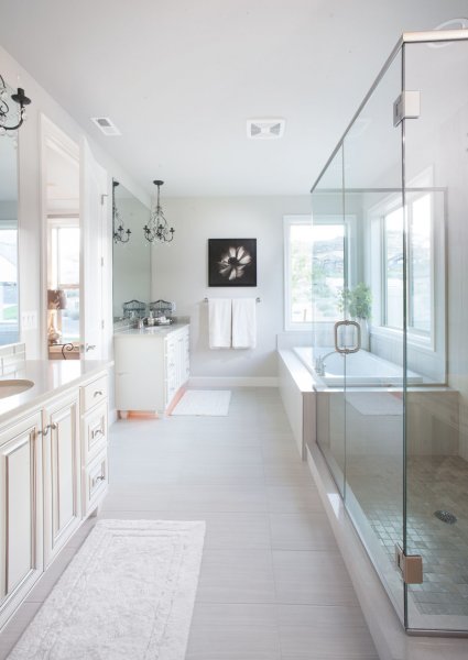
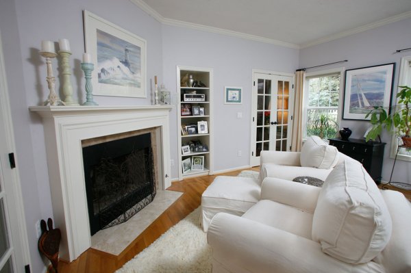
The master bathroom
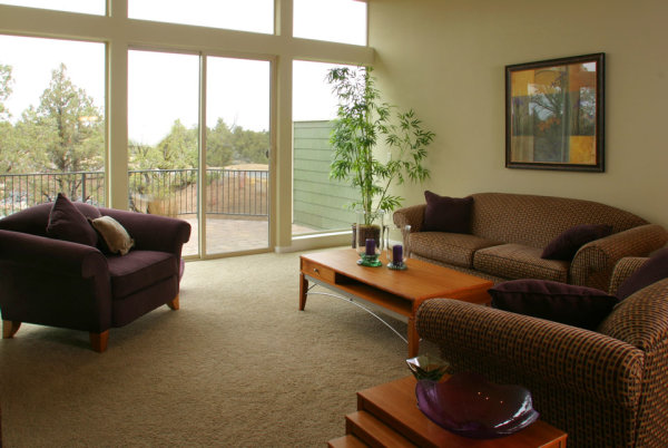
I describe my approach as using the inside elements: furniture, windows, and room layout, to create visual flow. I generally try to avoid composing something large in the foreground that prevents the eye from flowing through the room.
This is the first test shot I took of this room and the foreground chair blocked the flow through the room.
By rotating the chair and lowering the camera height slightly, the eye can flow through the room easier. This image also has the vertical lines corrected.
Camera Height and Vertical Edges
There is broad agreement among clients and photographers, that if there is to be a rule it will state: verticals must be correct! In most interiors there are edges and corners of walls, door frames, and windows that have vertical sides and these edges need to truly be vertical. When you use a tilt-shift lens this problem is solved, but tilting the camera up or down with a non-TS wide angle lens makes vertical edges converge or diverge and they no longer appear straight.
One widely used approach is to level the camera using a hot shoe bubble level, making edges straight. While this is a simple solution, it is not always the best solution when using a non-TS lens. A level camera at chest height can result in foreground subjects, like furniture being cutoff at the bottom with too much ceiling at the top. Lowering the camera height will improve this problem but how low can you go and still have an effective photo?
This image by one of my online course students; Simone Brogini, illustrates this point. His camera is chest high and is levelled to avoid diverging lines. The problem as I mentioned, is that the foreground furniture is cutoff and there is too much ceiling that lacks interest.
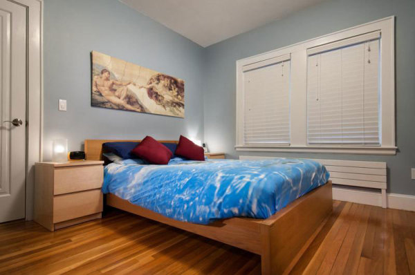
Simone also shot this bedroom image the same way. It looks pretty good but I advised him again that in my opinion the camera height might be just a little too low, as the bed and furniture get only about 1/3 of the frame and the wall and windows use 2/3 of the frame.
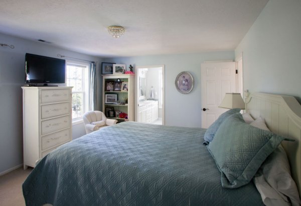
So what is the perfect camera height? There are many opinions. Some suggest chest height while others suggest door knob height or even lower, all to avoid diverging verticals lines. I prefer chest height or close and correcting vertical lines using other methods like a tilt-shift lens or the Lens Correction Tool in Photoshop (or Lightroom).
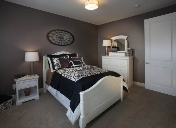
This image shows the use of the Lens Correction Tool. The bed and furniture consume 2/3 of the frame and provide a fuller view of the room.
Getting Good Exposure
The perfect interior exposure is challenging when balancing bright window light, with darker interiors. You can deal with scene contrast many ways; one is to shoot when outdoor light levels are lower. Midday light will be much brighter outside than during or after sunset, or on a cloudy day. Turning on every light inside increases the interior brightness, and if the outdoor brightness is lower a RAW file can often capture the scene in one frame.
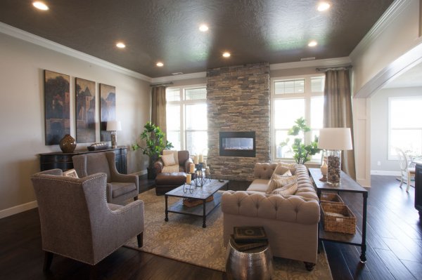
This room has a dark ceiling, a dark floor, a window flare and hot spots with too much contrast for one capture. (see corrected version below)
On a overcast day, the interior exposure is quite good as well as the window exposure. A flash was bounced off the ceiling on the right.
To make sure I have all the exposures for a great image, I determine my ‘base exposure’, the image that has most of the data centred in the histogram. Then I bracket widely in +/- one stop increments of varied exposures so I have variety just in case I need them. Lightroom and Photoshop, and certainly other programs, allow selective lightening and darkening of shadows and highlights on a single image, but if the contrast is too much, I can blend those bracketed images into a great final image.
The Adjustment Brush in Lightroom was used to bring down the brightness of the left window.
Interior Lighting
Just like a finely lit portrait, interiors can benefit greatly from nicely styled lighting. HDR can manage scene contrast but it does not create highlights and shadows in areas that have no directional light. If you have a dark cabinet against a dark wall, adding supplemental light can bring out that needed detail.
Most interiors have two light sources: window light and interior lights, both constant light sources. You can add constant lights or use strobe or flash. Constant lights, unlike flash, are like the lamp on the table or window light. Changing your exposure to darken window light also changes the exposure brightness of your constant lights. Flash is not a constant light! If you change your shutter speed to darken the window light exposure, flash exposure will not change and for this reason; flash or strobe provides flexibility when lighting interiors.
Photographers shooting for architects or magazines often have plenty of time to photograph a property with finely crafted lighting techniques, but a real estate photographer’s time is usually limited, making flash the perfect tool. Some photographers have mastered the balancing act of using direct on-camera flash to fill in a scene while others use on-camera flash in a bounce capacity.
Here the only light is coming from a window on the left and the ceiling fixtures, leaving dark areas in front.
Adding bounce flash, handheld just to the right of the camera, filled in those darker areas effectively.
Also popular are multi-flash wireless set ups allowing the flash to be placed around a room for styled lighting. Also growing in popularity is the ‘light painting’ approach where areas are selectively lit and the exposures are blended.

This image utilizes the Light Painting approach to interior lighting.
One side effect with outdoor lighting mixing with interior lighting is ‘lighting color balance‘. This is different than camera White Balance settings. Camera White Balance is set to either specific areas of your scene or set to average all light sources together.

There is a blue color cast above and right side of the window as well as the floor on the left.
When you have mixed light, such as daylight colored window light mixing with tungsten colored ceiling lights, and then throw in a fluorescent kitchen light, you have a veritable palette of different colors mixing together. Walls closest to windows will be blue while the wall closest to a lamp will be amber and the ceiling in the kitchen will have a green tint.

The final image shows color correction in those areas as well as corrected verticals and removal of window flare.
In some cases the effects of mixed light will be minimal and other times require attention. You can prevent mixed color in many cases by color matching the inside lights to the same color or use Photoshop color correction techniques to change color of specific areas.
The End Product
Once you have completed the assignment you will need to deliver the image files. Clients may have different preferences, but mine usually request low resolution for the web and high resolution for print publication.
Be sure to save your files in the proper file format and size for the intended use. Most Multiple Listing Service’s specify what is accepted format and acceptable sizes. I use Photoshop and the Save for Web option for the low resolution and TIFF format for high resolution. Then final delivery of the files is made by Dropbox or a comparable online service.
Summary
Things to remember doing real estate photography:
- You are not photographing for yourself; you are photographing for clients who will expect professional quality work.
- Don’t get ALL the best gear, get only what is required to do the job well.
- Master the creative side of photography such as angles, perspectives, and composition.
- Master the technical side of exposure, HDR, supplemental lighting, color matching, and exposure blending.
- Be careful when processing real estate images, like removing power lines, to avoid misrepresenting the property.
There are many styles and techniques you can use to photograph architecture and real estate and you should master them all. Real estate photography is architecture photography and you can photograph a home for a real estate agent for $ 200 or photograph a model home for a home builder for $ 1000 or more. Start small, plan big!
The post Real Estate Photography – a Guide to Getting Started by Charlie Borland appeared first on Digital Photography School.

Digital Photography School


You must be logged in to post a comment.