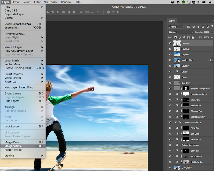
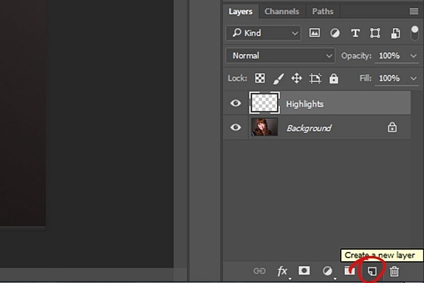
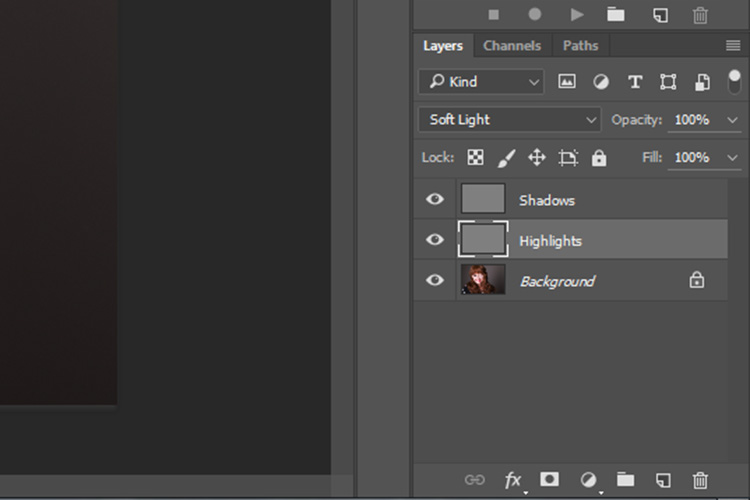
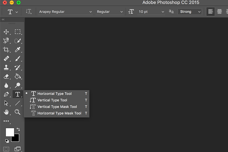
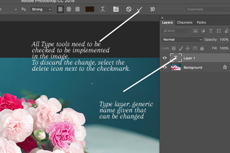
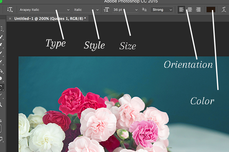
Photoshop is a wonderful tool if it is used correctly. Yes, there is a way to use it right. The basic idea is that if someone can see the adjustments you have made to your image, that’s not so good.
Think of Photoshop as your own personal darkroom. During the film era, some photographers had black and white darkrooms in their homes. That way, they could control the complete process of making the image. Very few had colour darkrooms, as that was far more complicated and costly. Nowadays, we have a fully functional colour darkroom loaded onto our computers (even our iPads), it’s called Photoshop or Lightroom (which is not named that by mistake, it is the opposite of darkroom). If you have Photoshop or Lightroom, you have a very powerful tool with which to edit your images.
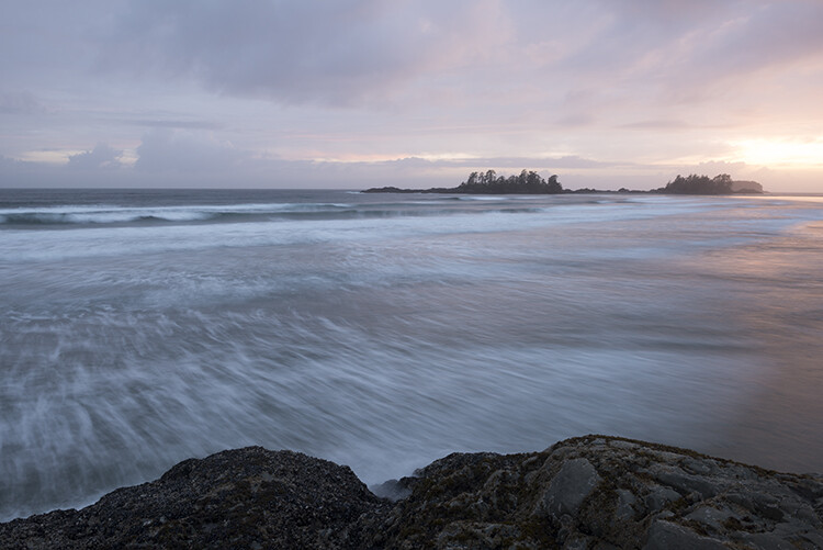
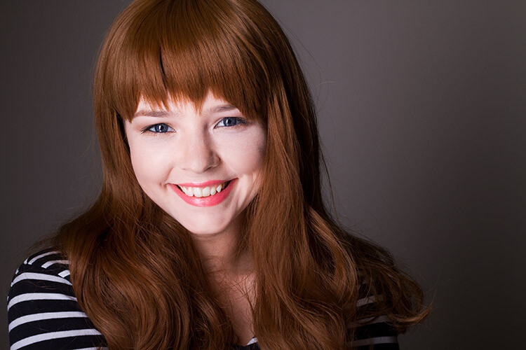
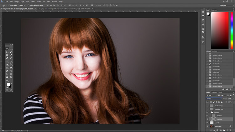
Before
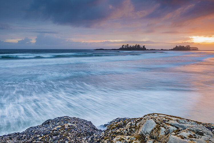
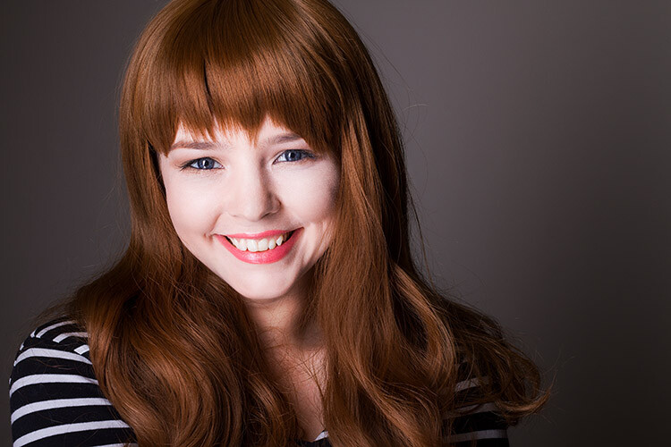
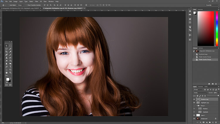
After
Making your images POP!
What does it mean to make your images pop? It can mean a number of things, but mostly it means to have more colour, contrast, and look more dramatic. As always, it implies that you have a good image to start with. Trying to make an average image pop, is not what this is about. Make sure you start off with a good image out of camera, then go through these steps in order.
Shoot in RAW
Shooting in RAW is a good start. I know, you may not want to shoot in RAW because the file sizes are so big, or you don’t really see the benefits, but RAW really does make a difference. Firstly, you are working with a full uncompressed file of data. A JPEG image has already had adjustments make in camera to compress it to that file size. Some information has already been discarded, which means you are working with less image information, which in turn means you have less flexibility in the editing process. Of course, RAW is only useful if you are going to spend time editing your images in Photoshop or Lightroom.
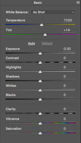
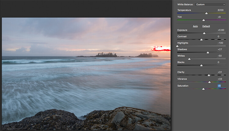
Let’s assume that you are going to edit and you have shot in RAW, open your image up in Photoshop and you will see the Adobe Camera Raw (ACR) Editor open. The ACR editor is a really powerful tool. The latest updates have made the ACR editor in Photoshop almost a separate image editing tool, it’s that powerful. As it opens, you will see a selection of tools on the right hand side, mostly sliders such as: White Balance, Tint, Exposure, Contrast, Highlights, Shadows, Whites, Blacks, Clarity, Vibrance and Saturation.
Camera Raw Editor in Photoshop CC
The camera raw editor has some very powerful adjustment tools. The next few steps will be done mostly in the RAW editor, then the image will be opened in Photoshop, and edited further. Many of these edits are very similar in the Lightroom Develop module, so you can make these same adjustments there as well.
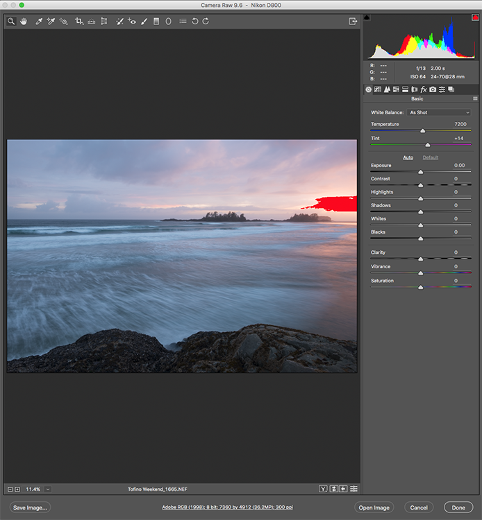
The Camera Raw Editor in Adobe Photoshop CC
Close up of the basic RAW editor sliders
Making adjustments in the RAW editor
- Temperature – Start off by taking a look at the colour in your scene. You can adjust the temperature to make the colour of the scene warmer (slide towards yellow) or cooler (slide towards blue). This can be used to correct a colour cast, or to add some drama to your image. In this scene, I chose to move toward the warmer side.
- Exposure – Take a look at your exposure, the image might be a little dark, or maybe a little bright. Slide the exposure slider to adjust this.
- Contrast – Adjust the contrast to make sure that the dark areas of the image are dark enough, but don’t lose details here.
- Highlights – In this image, the red indicator in the highlights shows me where there is very little detail. To compensate for this, slide the highlights slider to the left. If your highlights are underexposed, slide this slider to the right, but be sure not to overexpose your highlights.
- Shadows – The shadows slider can help you bring back details in the shadows or darken them a little. Be careful not to overdo this slider as your shadows may look noisy (or your image can take on an “HDR” look) if you push this too hard.
- Whites – This slider adjusts any pixels in the image that are white or partially highlighted.
- Blacks – This slider will adjust any pixels that are black.
- Clarity – The clarity slider adjusts contrasts in the midtones. This can really add some structure to your image, but be careful not to overdo it.
- Vibrance – This slider will adjust any pixels that are not saturated. This is a good place to start to add some subtle pop to your scene.
- Saturation – This slider will adjust all pixels by saturating or desaturating them.
Basic adjustments in Camera RAW
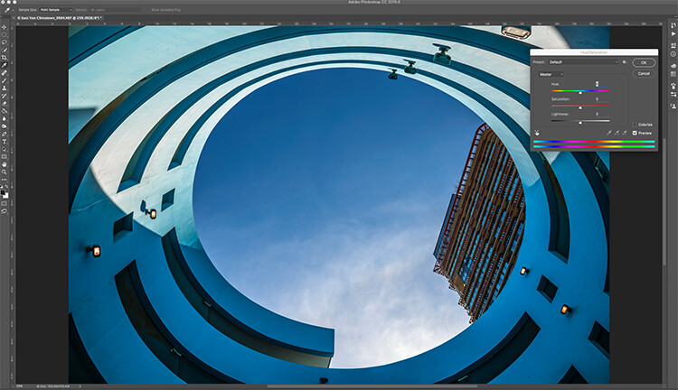
HSL adjustments tab
This tab has three different tools under it, namely: Hue, Saturation, and Luminance (HSL). These adjustments will make changes based on the colour channels in your image. For example, if you click on the saturation tab, you can make the reds in your image more or less saturated, the same is true for the oranges and all the way through the colour channels. You can also make certain colours brighter, by using the luminance tab. In this image, I wanted to saturate the reds, yellows, and oranges, as well as some of the blues.

HSL tab adjustments
Graduated Filter in Camera Raw
Much like using one on your camera in the field, you can add a graduated filter in Camera Raw. The beauty about doing this in Photoshop is that you can make some very fine tuned adjustments to your image, depending on how you position the Graduated Filter tool.
Click on the Graduated Filter icon at the top of the screen, and the you will see a whole new dialogue box with very similar functions to the basic Camera Raw Module. The difference here is that you will click and drag the filter down on your image to select the sky. You can also click and drag up from the bottom to select the foreground. I will do both (theGraduated Filter applies to the image from the edge inward).
Starting at the top, I click and drag the filter to just over midway through my image. That limits the effect to the top half. This filter is graduated, so the effect will be properly blended, and you won’t see a hard line where the filter ends (the more you drag it the wider the blend area, you can also adjust that after). I make some adjustments and you can see the difference they made to the sky. Once you are finished with one filter, click on New (at the top of the adjustment box) and repeat the process, but drag up from the bottom this time to make adjustments to the foreground. Once you have made the final adjustments, you can click open image at the bottom of the Camera Raw box to open your image into Photoshop.

Graduated Filter icon highlighted
One key adjustment that needs to mentioned here is the Dehaze tool. The Dehaze tool does exactly what it says, it removes haze and creates better contrast. Use it carefully, it is easy to go too far with it, and your image may suffer as a result. It is a really useful tool for landscapes and seascapes, as there is often some haze in the images, as there was in mine. Using it lightly has removed the haze and made the image better overall.
You will notice it is part of the Graduated Filter tool, and there is also a Dehaze function in the effects tab of the Camera Raw Editor. It is up to you when you use it, but be aware that if you use it without a selection, it will apply the effect universally to your entire image. Using it here in the Graduated Filter tool means you can have better control over how it affects your image.
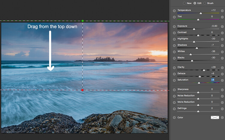
Click and drag the Graduated Filter from the top down to select the sky. Then select with adjustments you want to apply.
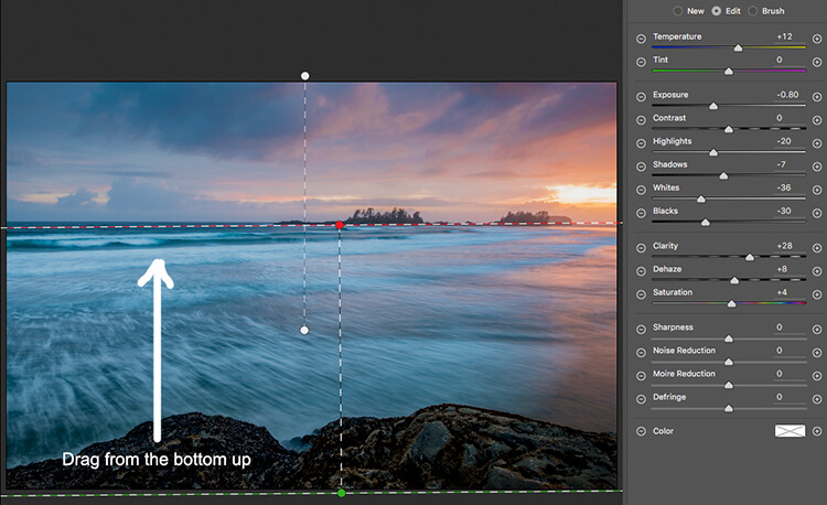
Selecting the foreground by dragging from the bottom up.
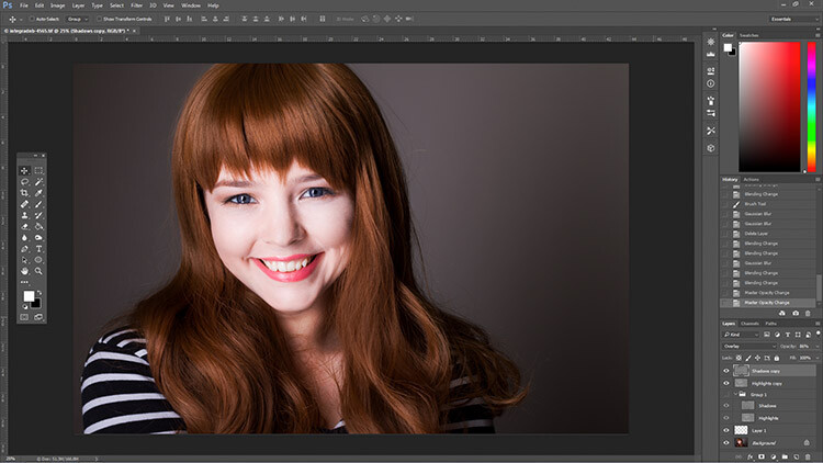
Open your image in Photoshop
After you have made your adjustments in Camera Raw, the final touches can be applied in Adobe Photoshop. Once again, the sky and the foreground in this image are going to look different, and will need different adjustments.
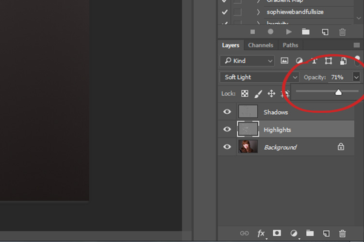
To make a softer selection of the sky, click on the quick mask tool at the bottom of the left hand side toolbar in Photoshop. You can then use a soft brush to paint in a selection of the sky as a mask. Once you are happy with the selection (see red mask) click on the quick mask tool again to activate that selection. There is one tricky thing to note about the quick mask tool, the mask means that you are selecting everything that is NOT red. So, when you click on the quick mask tool, you will see the marching ants around the bottom portion of the image and not the red area. This is good, because you can toggle between the two areas very easily and make adjustments to each selection.
First of all, make the necessary adjustments to the foreground using Levels. In this image, I wanted to make the foreground a bit brighter, so I popped up the highlights a little. From there I selected the inverse (i.e. the sky). You can do this by holding down CMD>SHIFT>I together. This will toggle your selection from the foreground to the background.
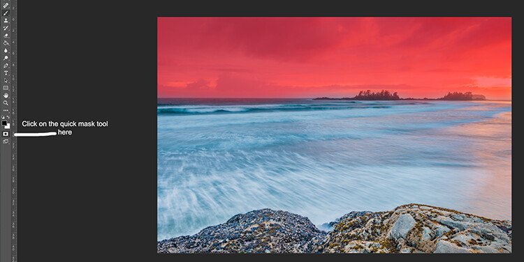
Red indicates the area that will be masked
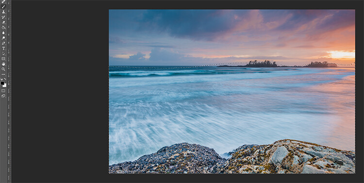
The marching ants show where the current selection is in the foreground.
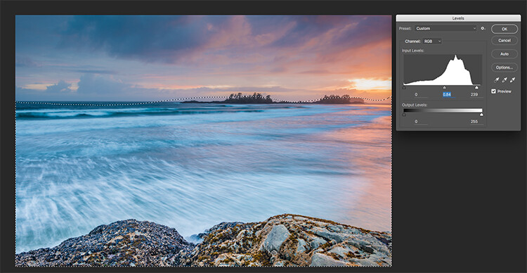
Making levels adjustments to the foreground
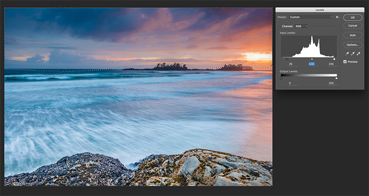
CMD>SHIFT>I will toggle the selection, here the sky is being selected and levels is being used to adjust the sky
Use Hue and Saturation to make final colour adjustments
You can use the toggle function (CMD>SHIFT>I) to select the sky and foreground interchangeably. Once you have your selection, choose a tool to make adjustments, and the changes will only be made to the area that is selected. In this example I have used the Hue and Saturation function to make further enhancements to the image. I am again making adjustments by each channel. This gives me great control over what colour ranges need to be saturated, and perhaps desaturate others that are a little over done. Go through each channel and make the necessary adjustments.
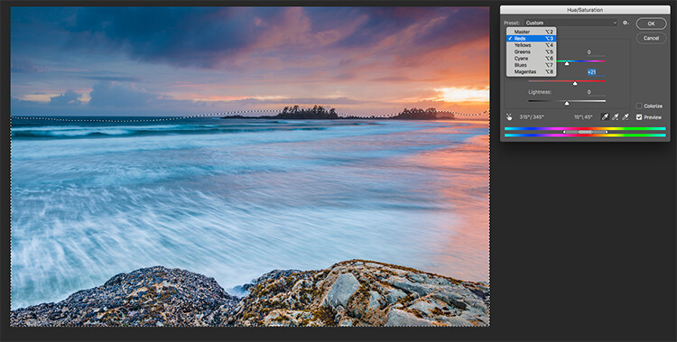
Use Hue and Saturation to make final colour adjustments
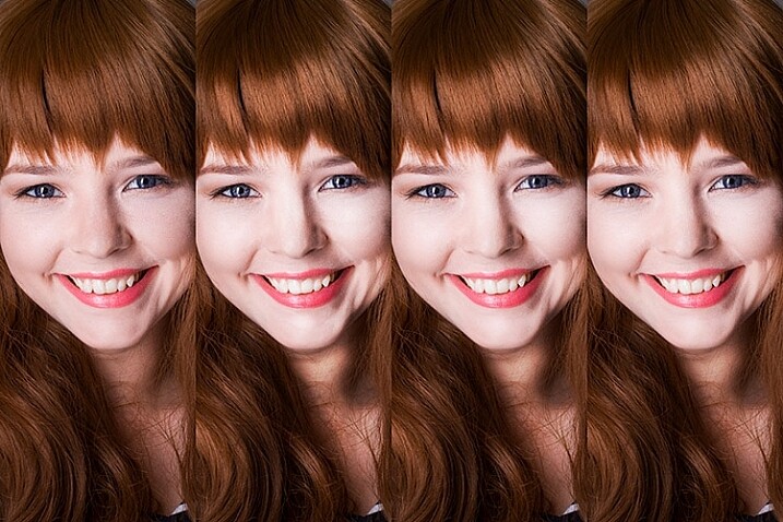
Once you are done, you can then sharpen your image as you see fit and save it to be printed. The steps outlined above will help you make any image look better. If done correctly, your images will have the pop and drama that you are looking for.
Give it a try, once you know the process, these adjustments can be done really quickly.
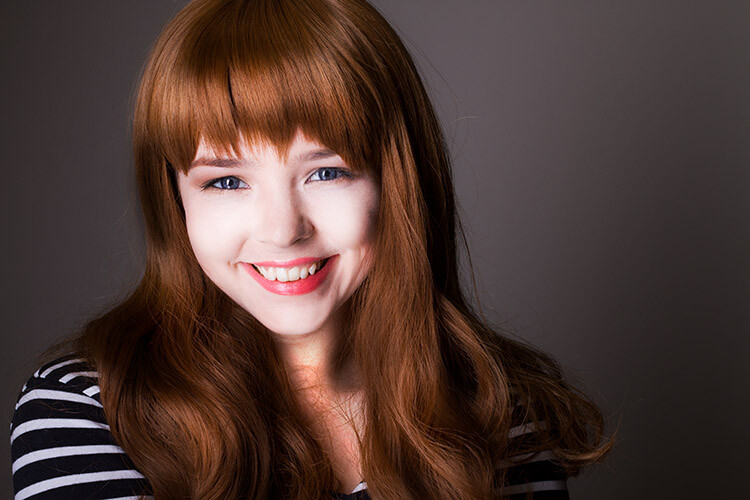
Final image
Please share your images and thoughts on the comments section below.
googletag.cmd.push(function() {
tablet_slots.push( googletag.defineSlot( “/1005424/_dPSv4_tab-all-article-bottom_(300×250)”, [300, 250], “pb-ad-78623” ).addService( googletag.pubads() ) ); } );
googletag.cmd.push(function() {
mobile_slots.push( googletag.defineSlot( “/1005424/_dPSv4_mob-all-article-bottom_(300×250)”, [300, 250], “pb-ad-78158” ).addService( googletag.pubads() ) ); } );
The post How to Use Adobe Camera Raw and Photoshop to Make Your Landscape Images Pop by Barry J Brady appeared first on Digital Photography School.

Digital Photography School


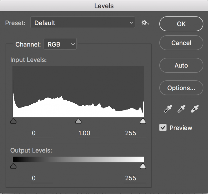 Levels is a great tool to quickly make exposure adjustments to your image. Curves gives you the same ability, but in much more detail. It also has some very powerful abilities in terms of specific adjustments. For a quick edit though, Levels is your tool of choice: IMAGE > ADJUSTMENTS > LEVELS, the keyboard shortcut is CMD>L on a Mac and CTRL>L on a PC, OR add it as an adjustment layer for non-destructive editing.
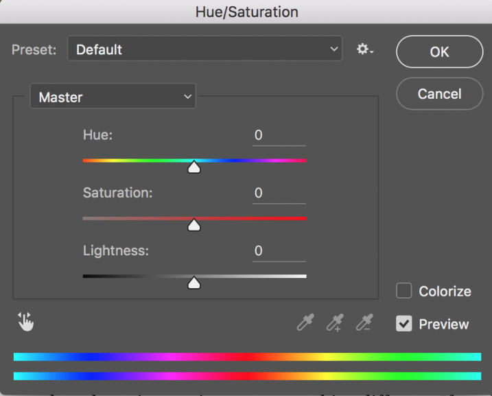 This tool is the next one in order. Start off with Levels and then move onto Hue and Saturation (IMAGE > ADJUSTMENTS > HUE AND SATURATION or the keyboard shortcut is CMD>U on a Mac or CTRL>U ON A pc). This also looks like a simple tool on the surface, but there is a lot more depth to it.
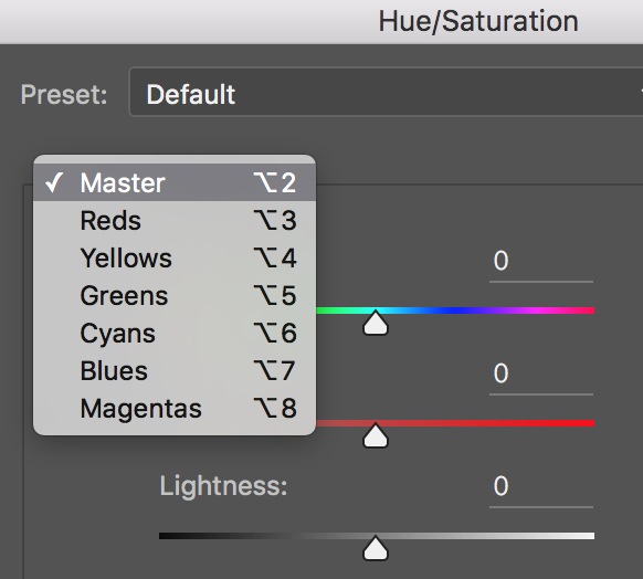 The Hue slider is used if you want to change the colours in your image to something different. If you leave the box at the top on Master and adjust the Hue slider, all the colours in the image will change, making your image look a little funky and weird, but this could be fun too! The real power of the Hue slide comes into play when you select a colour channel from the drop down box. If you click on the arrow next to Master, all the colour channels will drop down (see screenshot left). This is really useful if you want all the reds to look a little more orange in your scene. Bear in mind, this is a universal adjustment, it will select all the reds in your image and make an adjustment to them all.
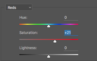 The second slider is Saturation which affects how rich your colours are in your image. If the reds in your image seem to be light or weak, you can select Reds from the list, and simply move the Saturation slider up (see screenshot right). Also, if some of your colours seem too bold, you can select the appropriate colour channel and move the Saturation slider to the left. You can select each colour individually and make the necessary adjustments.


You must be logged in to post a comment.