RSS
 

Posts Tagged ‘Photography’

8 Pieces of Architecture Photography Equipment You Need

22 Mar

The post 8 Pieces of Architecture Photography Equipment You Need appeared first on Digital Photography School. It was authored by Simon Bond.

A great subject for photography is Architecture. Whether you’re a commercial photographer, or you enjoy photographing interesting buildings for fun, this is a great area of photography to explore. In this article, you’ll learn about some of the essential equipment you’ll need. Through using this equipment, you’ll be able to get great results each time you photograph. So read on and find out what architecture photography equipment should be in your camera bag.

A tripod combined with a decent wide-angle lens. This is a great architecture photography equipment combination.

1. Tripod

The tripod is a great piece of gear to have, and that’s certainly true for architecture photography. If you’re photographing indoors, or as it’s getting dark, it’s essential you have this. Even when the light is good, using a tripod will improve your results. The following are the main reason you’ll want to bring a tripod with you.

  • Interior photography – The lower light levels for interior photography mean using a tripod is necessary. You’ll need to use slower shutter speeds while keeping the aperture at around f/8.
  • Manual focus – The best way to gain the sharpest focus is to use live view, and then manual focus. This is easiest to achieve with the camera on a tripod.
  • Bracketing – There are many occasions you’ll need to take bracketed photos to balance the light across the scene. When photographing towards the light, or if there is a bright light source such as a window, you’ll need a range of exposure to use in post-processing to balance the scene. In this case, you will need a tripod.
  • Blue hour – A great time for exterior architecture photography is Blue Hour. During this time you’ll need to take long exposure photos from a tripod.

Bracket and clamp

An alternative piece of architecture photography equipment is the bracket and clamp. This can be used as an alternative to the tripod, and you can use it to secure the camera to a structure such as a metal railing. There are locations where a tripod won’t be allowed, and in some cases having a bracket and clamp instead, will allow you to secure the tripod for your needs.

2. Wide-angle lens

The next most widely used piece of architecture photography equipment is the wide-angle lens. This will almost certainly be needed for interior work and is often needed for exterior work as well. Those photos taken in a room, where you need to capture the entire room, will need a wide-angle lens of at least 17mm on a full-frame camera. A lot of architecture is often large in scale, so a wide-angle lens is needed to capture the full size of the architecture you’re photographing. The exception comes when you are some distance from the subject you’re photographing, in this case, a longer focal length would then be required.

The interior of the grand mosque in Abu Dhabi. This requires a wide-angle lens to capture how impressive it is.

Which wide angle lens?

Here is a selection of some of the best wide-angle lenses you can use. Depending on the system you have, you may go for a different lens from this list.

  • Canon 17-40mm f/4L – A great lens at a budget-friendly price. This lens is wide enough for most situations.
  • Sigma 14-24mm f/2.8 DG HSM Art – Great quality lens, made to fit numerous camera manufacturers. Great focal length – and if you need it – a large aperture.
  • Nikkor 14-24mm f/2.8G ED – An excellent lens for those using Nikon cameras. Once again, very wide at 14mm.

3. Bubble level

Getting a bubble level is a good idea to ensure your camera is completely lined up. You’ll find that with a wide-angle lens the distortions they produce can make it difficult to see if the camera is truly level. Using a bubble level, which can easily attach to the hot shoe, you’ll have a quick and easy visual reference. In some cases, you may have a bubble level built into your tripod head. This is a great alternative to a separate bubble level.

4. Strobes

The use of strobes is not just for portraits, you can use them in architecture photography as well.

Strobes are excellent at close quarters, but perhaps not for outdoor use with a larger structure.

You’ll get the best use out of these when you’re doing interior photography.

They’ll come in handy when you have a bright window, and a dark room. You can now use the strobes to light up the room, by bouncing light off the ceilings or walls. This will balance the light across the photo, and can either supplement or replace the need to bracket your photos.

Take care when bouncing the light off a surface that isn’t white, as the light from the flash could potentially color cast the room, in the color the strobe has bounced off.

5. Tilt-shift lens

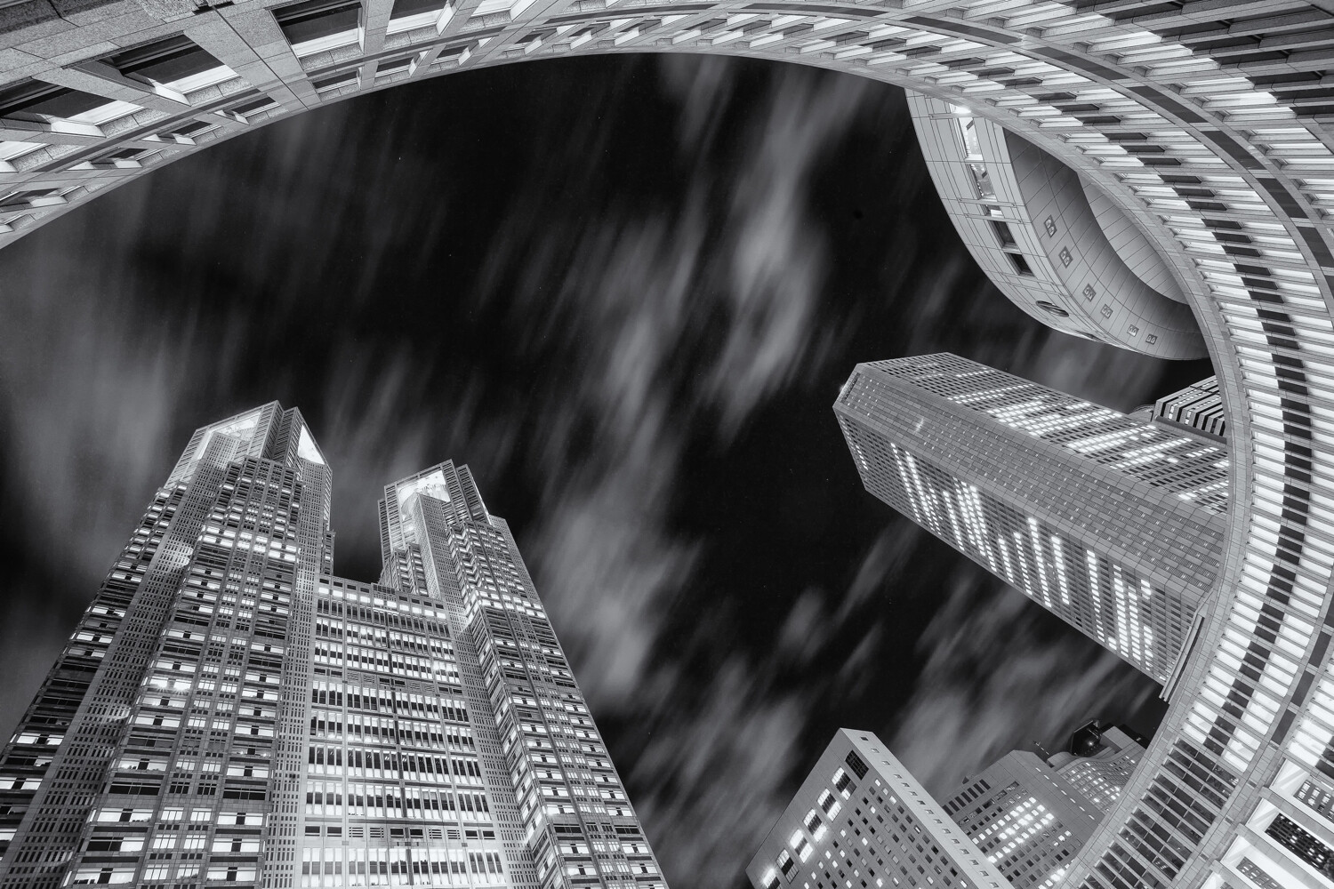
You’ll be photographing your architecture at a wide angle, and it’s likely you’ll be aiming up from street level. This causes problems for architecture photography due to lens barrel distortion. The result is you’ll have buildings that bow inwards towards the center of your image. This is a problem that can be solved using a tilt-shift lens. It’s also possible to correct this distortion in post-processing, so the tilt-shift lens is not strictly needed. It’s best to get your photo as correct as possible in camera though, so using a tilt-shift lens is best.

This photo has not been adjusted for barrel distortion since the minarets lead the eye into the center of the image. It is an example of where a tilt-shift lens could be applied, as this would fix this distortion.

6. Cable release

You’ll want to get the sharpest results possible for architecture photography. You will take the majority of your photos from a tripod to achieve increased sharpness.

However, when you press the shutter, you’ll move the camera a little. To avoid this, you’ll need a cable release cord or a remote control shutter release. Using these tools ensures your camera will be completely steady when you expose.

Those using DSLR cameras should remember to lock up their mirrors ahead of exposure. If you were using live view to compose and focus your photo, then the mirror will already be locked up.

A cable release is a great piece of architecture photography equipment to have.

7. Post-processing

Post-processing is an important part of architecture photography. Post-processing software might not be physical gear, but it’s easily as important. To get successful architecture photos you’ll need to learn how to sharpen your image in the right area, and how to apply noise reduction software. One of the most useful post-processing techniques you can learn is digital blending, this is essentially manual HDR photography. A correctly blended image will have a lot more impact with certain areas of the photo made brighter and distracting highlights such as window light reduced in brightness. So which software is worth having?

  • Photoshop – The Goliath of the post-processing world, a package widely used by the best photographers and with good reason. You’ll need this for digital blending, and through Adobe Camera Raw you’ll be able to do some sharpening and noise reduction work.
  • Nik collection – A really great set of programs that can be used to polish your photo in post-processing. A combination of Nik color EFEX, Dfine, and Pro sharpener can lead to great results.
  • Raya pro – You’ll need Photoshop to use this, but this excellent tool will make digital blending much easier, and there are guides that go with this program to help improve your work.

Learn to use Photoshop effectively. Your photographs will improve.

8. Filters

A good set of filters are great pieces of architecture photography equipment. It could be argued the need for filters is diminished due to the advance of post-processing. Those that are best at post-processing will tell you to use filters though because it makes life a lot easier once you get the photos onto your computer. The two main filters worth having in your bag are a circular polarizing filter, and a graduated neutral density filter.

  • Circular polarizing filter – This is great for adding vibrancy to your scene, especially useful for outdoor architecture photography. This can be used to enhance or reduce the amount of reflection in your photo.
  • Graduated neutral density filter – Used to balance the light across the scene, these are primarily used by landscape photographers. In architecture photography, you can use the dark portion of this filter to balance the light across the scene. A window will often be too bright in your photo, so you can position this filter on your lens, to reduce the brightness in a portion of your photo.

There are many types of filters, these can all help your photography.

Which architecture photography equipment do you use?

There is a wealth of good camera equipment available for you to use. Which pieces of architecture photography equipment do you find best? Do you have experience of using some of the items in this list? What other items are in your photography bag, and why would you recommend them?

At digital photography school we’d love to see your images of architecture photography, so please share them in the comments section.

The post 8 Pieces of Architecture Photography Equipment You Need appeared first on Digital Photography School. It was authored by Simon Bond.


Digital Photography School

 
Comments Off on 8 Pieces of Architecture Photography Equipment You Need

Posted in Photography


Mastering Color Series – The Pschology and Evolution of the Color RED and it’s use in Photography

21 Mar

The post Mastering Color Series – The Pschology and Evolution of the Color RED and it’s use in Photography appeared first on Digital Photography School. It was authored by Megan Kennedy.

Photography was invented in 1839 as a black and white medium. Finicky and cumbersome, most proponents of photography were more concerned with perfecting the photographic process without the added complexity of color. Some pioneers endured, creating new methods to convey the colored photographic image. But it was only in the 1930’s, when companies like Kodak and Agfa began introducing consumer-based color film that color photography started to become widely available and relatively affordable.

With color photography, photographers could create imagery with the emotional charge of colour

The invention and widespread use of color film had a significant impact on photography. Modern photographers could now depict a more realistic rendition of a scene, conveying the world in colors similar to that seen through the average human eye. But color photography had another purpose too. Photographers could now couple imagery with the emotional charge of color a lot more readily.

Over the course of history, humans have forged strong associations with colors. And while some associations are experiential, others speak to our evolution and the history of visual arts. In this series of articles, we’ll take a look at the history of different colors, how they have shaped our way of seeing and what it means for your photography.

The psychology of red

Color has a significant impact on our perceptions, emotions and physicality. Our earliest ancestors drew associations between red and the color of our blood, cultivating a strong visual link between red and danger, violence, and life. Humans evolved to prioritize red as a color of immediacy, warning and opportunity. For example, the appearance of fire links red to warmth and light, but also to destruction.

Associated with warmth and fire, red appeals to our emotions and our physicality

Because it commands our attention, red brings text and subjects to the foreground of an image. Red is also the international standard for stop signs and traffic lights. In nature, red Autumn leaves and vibrant sunsets appeal to our sense of time and season. Perhaps tied to the color of red roses – a flower traditionally associated with romance – red symbolizes passion, love and sex. Red appeals to our taste buds too, with foods like strawberries, apples, cherries, tomatoes and peppers all colored by forms of carotenoids – vibrant red pigments that assist photosynthesis.

Red has different associations in different cultures and beliefs. In some parts of Africa, red is a color of mourning, representing death. Traditionally worn at funerals, weddings and New Year festivities, red symbolizes good luck, happiness and prosperity in China. In Thai tradition, red is the color for Sunday, associated with Surya, a solar god. In the Indian subcontinent, red signifies purity, fertility, wealth, beauty and the goddess Lakshmi. And in Japan, red is the traditional color of heroism.

Informed by the enduring presence of red in visual arts, these inherent associations (and more) sculpt the way a viewer reads an image.

Evolution of the color red

Despite its numerous forms, red has held a constant place of significance throughout history. From Ocher to Cadmium Red, the evolution of red stems from our ancient reverence for the commanding hue.

Ocher

Ocher is a naturally occurring pigment that ranges in color from yellow to deep orange or brown. When combined with hematite, ochre takes on a red tone. Dated around 36,000 years old, the red bison on the cave walls of Altamira in Spain are among some of the oldest examples of red being used in visual arts.

Red bison on the cave walls of Altamira in Spain. Image credit: By Museo de Altamira y D. Rodríguez, CC BY-SA 3.0, Link

Cinnabar

Cinnabar, a natural mercuric sulfide, ranges in hue from deep brick to scarlet. Though highly toxic, Romans lorded over the brilliance of the red pigment, using it extensively in decoration. Cinnabar features prominently in the murals of upper-class villas in Pompeii. Starting with the Song dynasty, the Chinese employed cinnabar in elaborately carved lacquerware.

Vermilion

Ancient writers used the term vermilion to describe the pigment made from grinding up cinnabar. But vermilion also refers to a synthetic version of the color, invented in China. Renaissance paintings feature the latter regularly. Renowned renaissance artist Titian is known for his luxuriant vermilion accents.

Titian’s Assumption of the Virgin with vermilion accents. Credit: Titian [Public domain], via Wikimedia Commons

Minium

Romans made minium, also known as red lead, by heating white lead to extremely high temperatures. Contrasting well against gold and marble, the Romans used minium mainly for inscriptions. Medieval illustrators made use of the pigment in their illuminated manuscripts but it was particularly popular with the Mugal artists from India and Persia in the 17th and 18th centuries.

Vincent van Gogh was an ardent user of minium. However, it has since been discovered that minium whitens under light, and some of van Gogh’s works have had their red accents fade as a consequence.

Carmine

During their conquest of Mexico in the early 16th century, Spanish conquistadors were taken aback by the vibrant fabrics and face paint of the Aztecs. Derived from cochineal bugs, the Spanish soon started shipping large quantities of ‘Spanish Red’ to Europe. Artists quickly adopted carmine to adorn their elaborate dramas. However, like minium, carmine also had a tendency to fade, especially in sunlight. Cosmetics and red food coloring continue to employ carmine today.

Cadmium red

In 1817, a German chemist discovered a new element, cadmium, which became the basis for shades of yellow and orange paint. However, it took another 93 years before cadmium red became available commercially in 1910. Intense and lightfast, Henri Matisse was one of the first prominent users of the pigment. Other artists who adopted cadmium red include Edvard Munch, Francis Bacon and Clyfford Still.

Since the invention of cadmium red, technological advances have created a broad range of synthetic pigments and chemical processes for producing red pigment. Easier preparation and application, better archival qualities and a wide variety in shades have all become standard for red in paint, dyes and inks today.

henri matisse the red room

The Red Room by Henri Matisse. Credit: JD Lasica via Flickr

Red in visual arts

Because of its continuous presence in art history, the concept of red has evolved over time, encompassing new significance and meaning. We can’t be entirely sure what significance red held for our ancient ancestors. However, we can assume that at the very least that the use of red elevated the drawing from the rock, making the image appear more dimensional.

Medieval artists associated red with Pentecost, the holy spirit and the blood of Christian martyrs. In renaissance painting, red exploited the gaze of the viewer, cloaking Christ, the Virgin Mary or other substantial figures.

Baroque art saw deep and luminous reds conveyed in spectacular drama. Later, pre-raphaelite artists used shades of red and orange to paint the flowing locks of women and to draw attention to the symbolism nested within their artworks.

Lady Lilith by pre-raphaelite Dante Gabriel Rossetti. Image credit: By Dante Gabriel Rossetti – Delaware Art Museum, Public Domain, Link

Impressionist and post-impressionist artists used reds to convey light or accent detail. Fauvists however, crammed abundantly vibrant reds into scenes and portraits with almost violent tenacity. Only a few years later, abstract art abandoned objective subject matter. Used to punctuate, irritate and philosophate, abstract artists energized the viewer or engulfed them altogether in fields of ravenous red.

Mark Rothko (1903–1970). Four Darks in Red, 1958
Abstract expressionist Mark Rothko painted in deep reds. Credit: G. Starke via Flickr

Red in photography

With the advent of color photography, the creative possibilities for photographers flourished. The radical medium allowed photographers to depict color close to as it was in the field. Furthermore, inherent color associations carried over to color photography. Red’s enduring qualities allowed photographers to communicate visual cues based in evolution and in art.

As an early pioneer in color photography, Marie Cosindas‘ dispersal of reds throughout her still lifes and portraits resembles the technique of baroque still lifes. William Eggleston‘s famous photograph, The Red Ceiling, uses red as a stark undercurrent to a seemingly ordinary setting. In Saul Leiter’s dynamic renderings, red adds drama to the theater of the urban landscape.  Images like Dust Storm and Red Boy and Holi Festival by Steve McCurry document the history and materiality of red in art and culture. McCurry’s most well-known photograph, Afghan Girl depicts a young girl whose piercing eyes are further accentuated by the striking red scarf framing her face.

Nan Goldin’s use of red conveys atmospheric tension, as if the air itself were dense with color. Richard Mosse’s series Infra depicts the Congo in infra-red, rendering the green landscape in shades of pink and red, re-framing the nature of photojournalism.

The use of red isn’t limited to color photography either. Red filters (applied on/in-camera or in post production) absorb blue and green light, enhancing contrast. Famous landscape photographer Ansel Adams used red filters to dramatic effect, darkening the blue skies featured in his abundant vistas.

Ansel Adams used red filters to enhance the contrast of the sky in his photographs. Photo credit: Wikimedia Commons

Conclusion

Faber Birren, an American author and consultant on color theory once said “red is the passionate and ardent hue of the spectrum, marking the saint and the sinner, patriotism and anarchy, love and hatred, compassion and war.” Red has been regularly utilized throughout history to denote concepts and experiences. Status, physicality, anger, warmth, love and danger are all aspects that have been characterized as having associations with red.

With the invention of color photography, red carried over to film and then digital media. And while it has different meanings in different cultures, red’s prominence throughout art history is a testament to its emotional and visual impact today.


The post Mastering Color Series – The Pschology and Evolution of the Color RED and it’s use in Photography appeared first on Digital Photography School. It was authored by Megan Kennedy.


Digital Photography School

 
Comments Off on Mastering Color Series – The Pschology and Evolution of the Color RED and it’s use in Photography

Posted in Photography


What to Write on Your Photography Website (So That People Will Hire You)

20 Mar

The post What to Write on Your Photography Website (So That People Will Hire You) appeared first on Digital Photography School. It was authored by Mat Coker.

If you want to sell your prints or get hired as a photographer, you can’t just put your photos on display. You’re going to have to use words too.

Many photographers struggle to come up with words about their photography. At one point, that was my biggest challenge to grow as a photographer.

I’ll show you how to come up with words for your photography website. We’ll start with a blank screen and finish with a finished web page.

If I post a photo of a baby or toddler on social media, I will get a lot of “likes.” All this means is that people like cuteness. But if I tell a story about a photo, it gets people thinking and talking. Nobody will know why we’re showing our photos if we don’t say something about them.

Why words?

If you’re showing your portfolio on your website or social media, you need to understand a hard truth: Your photos probably don’t stand out to people.

Your photos may be beautiful, but there are many photographers with beautiful photos. People are overwhelmed with thousands of images all day long and you’re just throwing more images into the mix.

Don’t assume that people will see and understand what is unique about you as a photographer, or appreciate the beauty in your photos unless you tell them. Your words help people understand what to think when they see your photos. Your words can draw them in to hire you or buy your prints.

I heard a rumor that my old public school was going to be torn down. That meant that my son would never have a chance to attend the school I did as a kid. So I took him for a photo shoot. We ran through the fall leaves, climbed on the monkey bars and retraced the steps of my childhood. Maybe the reason it was so meaningful is that the chance would soon be gone forever.

How to write about your photos so that people will hire you as a photographer

Let’s start from scratch and write words for a photography business website. You don’t have to follow my entire approach. Just take the parts that will help you where you’re struggling.

Let’s pretend we’re going to launch a toddler photography business. However, keep in mind that you can use this approach for any sort of photography business including fine art prints. Keep these ideas in mind as you write for your blog too.

1. Create a list of words and ideas

At this point, there is no pressure. The first step is to simply come up with a list of keywords and ideas. Then we’ll turn those ideas into the actual words on our website.

Give yourself at least 30 minutes for this. My suggestion is to turn off your phone, go somewhere you enjoy, and take a pen and some paper with you.

Consider who or what your subject is and then come up with a list of words and ideas that can inspire your writing. Your subject is whatever the main focus of your photography work is. Your subject could be CEO’s, landscape prints, weddings or seafood.

Our portrait business is about toddlers, so here is a list of words and ideas that I’ve come up with:

  • Strong willed
  • Explorer (little explorers)
  • Chaotic (agents of chaos)
  • Emotional (emotional roller coasters)
  • Unique
  • Growing
  • Impressive
  • Achievement
  • Funny
  • Silly
  • Showmanship
  • Performance
  • Giggles
  • Messy
  • Curls
  • Grins
  • Stinky feet
  • Tickling
  • Mud puddles
  • No shoes
  • Snacks
  • Lovable
  • Adorable

We could keep going, but that is a good list to start with. From this point on, whenever we have to write something, we have a list of words and ideas to pull from.

We’ll never have to sit down to a blank screen demanding us to fill it with the perfect words.

So far, we’ve only considered what our subject matter is, but we’ll also have to consider who we’re showing our picture to and who we are writing for. That means you need to consider who will be hiring you and write especially for them.

2. Who are you writing for?

Though our subject matter is toddlers, we’re writing for moms. They’re the most likely ones to be booking a photographer. Yes, dads and grandparents will look at your website too. However, don’t try to write for everyone. Choose one main person to write for.

3. What do they need?

Every good business solves a problem. What problem does your photography business solve?

Let’s consider two levels of the problem.

First, there is the immediate problem. Mom is on our website or social media page because she needs to find a photographer. Here are some things she has in mind:

  • Mom needs pictures
  • Has to find a photographer that specializes in toddlers
  • Wants the right style
  • Can handle her toddler
  • Can capture their unique personality

There is a deeper element to her problem too. Her little one is about to grow up. As much as she wants to, mom won’t be able to remember everything about this stage of life. These photos will preserve the toddler moments that are about to disappear forever.

Here are some ways the photos will help her:

  • Freeze time
  • Stop her toddler from growing up
  • Keep them small
  • Have something she can hold when they’re too big to hold
  • Have something to help with that desperate feeling that she is going to lose them when they grow up
  • Create photographs that provoke all the overwhelming feelings of motherhood, that will come rushing back to her even when she’s 80

How do you know that these are her problems? You listen. You listen to everything that moms say about their toddlers. Then you tell those moms (through the words on your website) that you understand, that you care, and that this is what you’re all about.

4. Explain how you will help them

You need to show the person looking at your website that you can help them solve their problem.

Let them know that you understand their problem and are the perfect person to help. This is where words may be more important than the photos you show.

Let’s get writing!

We have a lot of ideas about our photos and the people we’re writing for, so let’s start writing our web page.

Keep these 4 things in mind as you write:

  1. Draw from your list of words and ideas
  2. Remember who you are writing for
  3. Show that you understand what they need
  4. Explain how you can help them

People need to know very quickly that your website is just what they’re looking for. If somebody is searching for a toddler photography session, they need to know they’ve found the right place.

The first thing you should do is make some sort of statement regarding what your website is about. It should come right before or after your first image.

I photograph the toddler years because they’re some of the most wonderful times of development in your little one’s life. They’re also the years that go by the quickest.

This makes it clear what I offer and why I’m offering it.

That opening image and statement is followed by a more extensive gallery. After the gallery, I like to add some sort of story that digs into the deeper reasons that a mom would want a toddler photo session.

“We tend to love the things that are most scarce. The less there is of something, the more we value it. But far too often, we didn’t realize it’s value until it was gone. One day our babies outgrew the constraints of infancy. They learned to crawl and then pulled themselves up by whatever they could. They mastered our language – or their version of it! And now they think they’re going to keep growing right up! But not before we document them as toddlers. So that you’ll have photographs that make all those overwhelming feelings of motherhood and fatherhood come rushing back.”

While people are looking at your website, there are going to be many distractions. They get constant social media notifications, their minds wander, and their toddlers interrupt them! So write words that will keep them engaged. Being brief but powerful is good.

The “About Me” section reinforces why I offer this sort of photography session and why I’m the right photographer for the job.

“My favorite thing to photograph? Toddlers, without a doubt. Because they hold nothing back. Just watch how they explore the world. Their imaginations soar. And they don’t fake their emotions. My littlest guy is a toddler. I’m always racing to grab my camera because he’s almost not a toddler anymore. I can’t wait to see him grow up, but I’m going to miss the toddler him.”

My concern in the about section is to connect with my reader. I want them to know how much I love the toddler years too.

Toddler photography writing

The final words are about packages, pricing, and contact information. It’s important to reinforce exactly what you’re offering. Remember, you’re not just offering photos.

You might be selling fine art prints, but they’re not just prints. They’re a source of beauty and inspiration in an otherwise dull living room.

You might be selling a photo session, but it’s not merely a session. It’s a way of remembering those precious moments that are about to slip away forever. It’s easy to forget this in the midst of a chaotic life. Let your words remind them.

When their toddler years have long passed, you’ll have frozen time. And when you replay their video or hold their photos in your hands, all those feelings of motherhood and fatherhood will come rushing back.


Writing about photography

Some people write quite quickly, others take a long time to get the words out. I worked on the toddler page for about six hours spread out over three days. That’s a lot of time invested in a small amount of writing, however, I’m happy with what I’ve come up with. Along the way, I sifted through photos, reminisced about my own childhood and thought about many of the conversations I’ve had with other parents.

In the end, this was all for practice since I don’t actually run a toddler photography business. Practice is the key to getting comfortable with writing about your photos.

To fill out the rest of the website I would add a blog with several articles. Topics would include:

  • Photos and stories from sessions
  • Articles that explore the nature of toddlers
  • Reminiscing about my toddler memories
  • Funny quotes by or about toddlers
  • How I work well with difficult toddlers

These articles are there to engage interested parents, show them that I truly do understand toddlers, and settle their curiosity about whether a session like this is worth it.

When I sit down to write these articles, I’ll follow a similar approach:

  • Build a list of words and ideas based on the topic and point of the article
  • Keep in mind who I’m writing for
  • Show them that I understand and care
  • Solve the problem they have

Be yourself

What I’ve given you is a simple formula for getting to the heart of what you want to say about your photos, especially if you would like people to hire you.

These basic principals hold true in all sorts of photography writing contexts. What sort of problem are you solving with your photography blog?

Perhaps your readers are new to photography and your writing offers a window into the photographer’s life.

Maybe your readers are bewildered by all the technology choices and your writing simplifies things for them.

Over time you’ll discover many interesting ways to write about your photos.

It won’t be long until people respond more to what you said about your photos than the photos themselves.

This doesn’t make your photos any less important. If anything, it will make them all the more memorable in a sea of endless images.

The post What to Write on Your Photography Website (So That People Will Hire You) appeared first on Digital Photography School. It was authored by Mat Coker.


Digital Photography School

 
Comments Off on What to Write on Your Photography Website (So That People Will Hire You)

Posted in Photography


The Best Fujifilm X-Series Kits for Travel Photography

20 Mar

The post The Best Fujifilm X-Series Kits for Travel Photography appeared first on Digital Photography School. It was authored by Matt Murray.

Travel has always been my first love. In 1994 I bought my first camera – a Pentax Zoom 90 WR point and shoot – because I was going to Europe for a two-year working holiday. The only way to share photos with family back then was to have the film developed and post the prints home!

While photography (and technology) has changed remarkably in the last 25 years, what you should look for in a camera for travel photography is much the same: small, light, capable of great results and preferably weather resistant.

I’ve used all sorts of camera brands over the years. However, for me, Fujifilm X-Series cameras and lenses are the perfect travel companions. Whether it’s a trip to the Australian outback, visiting remote Buddhist temples in the Javanese jungle, photographing puffins in the Faroe Islands or capturing traffic trails in Taiwan, my X-Series cameras have always produced stunning results. Here are my recommended Fujifilm X-Series kits for your next big adventure.

Best minimalist kit

Camera: Fujifilm X100F
Lens: Fixed F2 Fujinon lens
Weight: 469 grams

The best minimalist kit choice was easily the stunning Fujifilm X100F. This is the best compact digital camera ever made. Yes, it really is that good!

Many photographers – including diehard users of other brands – use this as their “take everywhere” shooter. The X100F is small and quiet, and the fast f/2 Fujinon lens creates beautiful images. It may be small, but it boasts an impressive array of features including a leaf shutter and built-in neutral density filter.

Like all the cameras I feature in this article, the X100F can shoot RAW alongside Fujifilm’s array of stunning JPG film simulations, that replicate the look of classic films such as Provia and Velvia. Fujifilm cameras produce the best JPGs I’ve seen straight out of the camera.

This choice is a little unusual as it has a fixed lens. That’s right. You can’t take it off and swap it for another lens. If the 23mm focal length (35mm in full-frame terms) isn’t your preferred choice, the system also has wide-angle conversion and telephoto converter lenses. However, these do add extra weight to your kit. One of the few downsides to the X100F is that it’s not weather resistant. But, at least it’s small enough to fit in your pocket during a downpour.

One body plus one lens kit

Camera body: X-T30
Lens: XF 18-55mm F2.8-4 R LM OIS lens
Approximate weight: 693 grams

If you only have space to take one body and one lens on a trip, I would recommend the brand new Fujifilm X-T30 with the XF 18-55mm F/2.8-4 R LM OIS lens. I’ve been using this line of cameras since buying the X-T10 as a second body back up to my X-T1, and I’ve also used the X-T20. The X-T cameras with a “0” after them are lighter, cheaper, non-weather resistant versions of the flagship models, but usually feature much of the same technology. For example, the X-T30 has the same 26.1MP X-Trans 4 CMOS sensor as the X-T3.

Alternatives for the camera body would be the X-T20 and the X-E3. The X-T20 gives you a screen that tilts up and down for overhead and low to the ground shots. Whereas, the X-E3 is the more minimalist choice, and features a joystick that controls where the focus point is in the frame. The X-T30 and the X-T3 have both of these features.

My choice of lens for this kit is the XF 18-55mm F/2.8-4 R LM OIS. Not only is it one of my favorite Fujifilm lenses, but it’s also the lens that I’ve used the most over the last three years.

Often sold with camera bodies, many newcomers to the X-Series remark that the XF 18-55mm F2.8-4 R LM OIS lens is “surprisingly good for a kit lens.” In no way is this lens like the subpar beginner kit lenses produced by other manufacturers. The XF 18-55mm F/2.8-4 R LM OIS is a stunningly sharp lens in its own right and has produced some of my favorite images ever.

It may not be weather resistant, but it does feature OIS (optical image stabilization) to ensure your shots are as sharp as possible at lower shutter speeds. It’s a variable aperture zoom lens, meaning that the maximum aperture changes as you zoom through the range. However, you can still shoot at f/2.8 at the 18mm focal length, and f/4 at the 55mm end. It’s a top lens for landscape, cityscape, and portraits.

Best kit under 1kg

Camera body: X-T30
Lenses: XF 18-55mm F/2.8-4 R LM OIS + XF 35mm f/1.4 R
Approximate weight: 880 grams

My picks for the best kit weighing under 1kg include the same choices as the ‘One body plus one lens’ kit above, with the addition of the XF 35mm f/1.4 R. The first time I used this lens, I was blown away by its sharpness and stunning bokeh. It’s a top lens for portraits, still life subjects and even street shooting.

It did have a reputation of being slow to focus, but with Fujifilm’s ongoing firmware updates to both lenses and camera bodies, this has greatly improved. I wouldn’t hesitate to use it in any situation. This lens has a fast maximum aperture of f/1.4 that enables you to shoot images handheld at night without raising the ISO too high or lowering the shutter speed too low.

One zoom, two fast primes kit

Camera bodies: X-T30
Lenses: XF 18-55mm F2.8-4 R LM OIS + XF 35 1.4 R + XF 60mm f2.4 R Macro
Approximate weight: 1.095kg

For a lightweight travel kit weighing just over 1kg and featuring two fast prime lenses, add the XF 60mm f/2.4 R Macro to the kit above. This is another option often overlooked by newer lenses on the block, but it offers superb image quality for portraits and macro shots.

Although it’s not a true macro lens (it offers 1:2 magnification rather than the standard 1:1 magnification for a true macro lens), it is an incredibly light option for close up shots. It weighs less than a third of the weight of Fujifilm’s XF 80mm F/2.8 R LM OIS WR Macro lens.

Best weather resistant kit

Camera bodies: X-T3
Lenses: XF 16mm F1.4 R WR, 23f2, XF 50-140mmF2.8 R LM OIS WR.
Approximate weight: 2.6 kg check

The best weather resistant kit features Fujifilm’s newest X-Series flagship camera. The X-T3 has won high praise from users and critics alike since its release in mid-2018. It is an impressive performer, having the fastest autofocus in the X-Series lineup and a continuous shooting rate of up to 20 frames per second. I’ve really enjoyed using this camera alongside my X-T2, which is still an excellent camera.

The newcomer to this kit is the XF 16 f/1.4 WR lens – often praised as the best lens in the X-Series lineup. Weather resistant, the lens is optically stunning, and a solid performer for landscape, cityscape, and low light shots. With a close focusing distance of 15cm, the XF 16 f1.4 WR lens is highly versatile. I’ve loved using it for food photography.

Best travel kit with zoom lenses

Camera bodies: X-T3 and X-T30
Lenses: XF 18-55mm F/2.8-4 R LM OIS and XF 50-140mm F/2.8 R LM OIS WR.
Weight: 1.8kg

This kit gives you the best of both worlds: the light X-T30 with the XF 18-55mm F/2.8-4 R LM OIS lens, and a weather resistant combo of the X-T3 with the stunning XF 50-140mm F/2.8 R LM OIS WR lens.

Weighing in at 995 grams, you might actually question why I would choose this lens as part of a travel kit? I’ve even been laughed at when I’ve suggested this lens for travel. Although it’s heavy, this lens is a must-have in my travel photography kit.

Like an equivalent focal range 70-200mm, the lens has a constant maximum aperture of f/2.8, meaning that you can shoot with a shallow depth of field throughout the zoom range. This is particularly helpful during low light situations, or to achieve shallow depth of field at any time.

This XF 50-140mm F/2.8 R LM OIS WR lens also features OIS (optical image stabilization) and has a pleasing bokeh. I’ve used this lens for landscape, cityscape, and portraits. If I could only pick one lens for travel, I’d have to flip a coin to choose between the two amazing zooms in this kit.

If you have different weight or budget considerations, you could substitute the excellent XF 55-200mm F/3.5-4.8 R LM OIS lens in this kit. I’ve never regretted taking this lens along with me on trips, but if you plan on shooting in low light at the far range of the zoom, you will be shooting at a maximum aperture of f/4.8, which may slow down shutter speeds. Thankfully, this is another lens with OIS (optical image stabilization).

My favorite kit

Camera bodies: X-T3 and X-T2
Lenses: XF 16mm F/1.4 R WR + XF 18-55mm F/2.8-4 R LM OIS + XF 35mm f/1.4 R + XF 50-140mm F/2.8 R LM OIS WR
Approximate weight: 2.9 kg

This is my favorite kit. It may be the heaviest listed in this list, but this is what I would typically take on my travel adventures. It pairs two weather resistant camera bodies with my two favorite zooms and two favorite primes. This kit has a reach from 16-140mm (24-210 in full-frame terms) and covers many shooting situations. The XF 50-140mm F/2.8 R LM OIS WR lens may not be the longest in the X-Series lineup, but it’s still capable of capturing stunning wildlife images.

X-Series options I don’t recommend for travel kits

X-T100

In 2018, Fujifilm released the entry-level X-T100. Although this attractive looking camera looks very much like the rest of the X-Series line-up, its autofocus can’t match the cameras I’ve featured above.

18-135mm lens

The XF18-135mm lens is often on the list of recommended lenses for Fujifilm travel photography. Having owned and used one, it doesn’t make my list. For a slower, all-in-one travel zoom, I don’t think it has enough reach.

27mm lens

The 27mm F/2.8 pancake lens is sharp, and you can often buy them at a bargain price. It’s a firm favorite amongst many Fujifilm photographers, but it doesn’t make my list as it’s the only lens in the lineup not to have a ring on the lens to change aperture.


Conclusion

The Fujifilm X-Series range is perfect for travel photographers for so many reasons.

With an impressive lineup of prime and zoom lenses for all budgets, the X-Series has you covered for a wide range of situations including low light photography and adverse weather conditions. The camera bodies feature retro charm and excellent ergonomics, and no other system can match the beauty of Fujifilm’s straight out of camera JPGs.

Whether it’s a day trip near home or the trip of a lifetime, Fujifilm X-Series is my number one recommendation for travel photography.

Do you use Fujifilm Cameras for your travel photography? Let us know what you use in the comments below.

The post The Best Fujifilm X-Series Kits for Travel Photography appeared first on Digital Photography School. It was authored by Matt Murray.


Digital Photography School

 
Comments Off on The Best Fujifilm X-Series Kits for Travel Photography

Posted in Photography


9 Creative Architecture Photography Techniques for Amazing Photos!

19 Mar

The post 9 Creative Architecture Photography Techniques for Amazing Photos! appeared first on Digital Photography School. It was authored by Simon Bond.

It’s great to get a technically sound photo, and architecture photos demand this. Getting the technical side of your photo correct should be your first priority, but beyond that, it’s worth experimenting. In this article, you’ll learn about some creative photography techniques, and how you can apply these to your architecture photography. Whether you adopt any of these for your work will be at your discretion, but having extra options for your photography is never a bad idea. So read on to find out which creative architecture photography techniques you could apply.

This photo of the Tokyo metropolitan government building has used a worm’s eye view, and a wide-angle lens.

1. A different perspective

Many architecture photos are taken at eye level. In other words, a standing composition from street level or an elevation that brings you level with the building if that’s available. This is far from the only way to photograph architecture though. Using extreme perspectives like worms eye or birds eye views can give dramatic results.

  • Worms eye view – This is likely to be the easiest perspective to achieve and works best when photographing taller structures. You can use this to emphasize interesting ceiling features or to take photos of skyscrapers from the base of the building. If you happen to be surrounded by tall buildings that are close to each other, you can use this perspective to fill the sky.
  • Birds eye view – To get this type of angle, you’ll first need to find a way of getting above the structure you’re photographing. With the advent of drone photography, this has now become a lot easier to achieve. No drone? No problem. You can always find a tall building to photograph from or, if you’re lucky, a hot air balloon ride!

2. Infrared photography

You can change the nature of your creative architecture photography, without needing to use extreme perspectives. One of the best ways to do this is by using infrared photography. This will change your image into more of a dreamscape. This style of photography works much better outdoors, and in places where there is some vegetation. Through some post-processing, you’ll create an image where photosynthesizing plants are white, and the sky is dark. Architecture then forms a powerful focal point within your infrared photo. There are some excellent guides on this style of photography. You have three main choices when it comes to carrying out this style. You can convert your camera for infrared, use an infrared filter, or you can produce this effect through post-processing.

Infrared photography is a great technique to experiment with.

3. Light painting

One of the most creative photography techniques out there is light painting. Through the use of light painting techniques and styles, you can customize the way you photograph architecture. The trick is knowing where and how to apply this to your photograph because not all architecture lends itself to every technique. Perhaps it’s impossible to gain access to the area of the structure in which you’d like to light paint? Perhaps light painting will be too big a distraction and detract from the architecture itself. When you can use light painting to form a leading line to the architecture, or perhaps to frame the architecture, you’ll be on the right lines. There are various tools you can use. Below is a selection.

  • A torch – The simplest of light painting tools. This can be used to create patterns in front of the camera, or perhaps to light up a section of the architecture you wish to photograph.
  • A light source on a string – Repeating patterns work well in photography, and spinning a light source on a string will provide this repetition. You could also use this to create a light orb, and strategically place the orb in front of your architecture.
  • LED light sticks – In recent years products like the pixelstick and the magilight have really revolutionized light painting. These excellent tools can be used to create bespoke light paintings in front of the architecture you’re photographing.

In this photo a pixelstick has been used to light paint around the pagoda.

4. Kinetic light painting

Light paintings’ cousin is kinetic light painting. The technique also requires a tripod, but this time you move the camera rather than the light source. Once again, this can be quite experimental, and not all locations are well served by this photography style. The two main types of kinetic light painting are the zoom burst and camera rotation.

  • Zoom burst – This technique works well with tall buildings, from a distance, and where they’re lit up with lots of interior building lights. You’ll need to set the camera on a tripod, with a lens that can zoom. A kit lens works very well for this, or perhaps a 24-70mm lens. You begin the photograph at the longer focal length, and then zoom out. You can read more about this technique here.
  • Camera rotation – This time you rotate your camera around a tripod head. It works well with tall buildings, where you have a worms eye view. Once again, you can read more about how to do this by reading this guide.

This is a single photo of the Tokyo Skytree. It’s straight out of the camera, and has used kinetic light painting.

5. Refraction photography

You can also use refraction photography with a crystal ball for creative architecture photography. That’s because the fisheye-like properties of the glass ball will capture the entire piece of architecture you intend to photograph. There are tricky aspects you need to handle including the upside-down image within the ball, and centering the architecture within the ball. Providing you can find a good place to position the ball, you’ll be able to use this technique to produce a unique photo of a building or sculpture.

This location is a popular place to photograph St Paul’s cathedral in London. The addition of a crystal ball gives this image another perspective.

6. Detail photos

The main focus of architectural photography is to capture the whole scene. That’s not always needed though, and you can find great detail photos by using lenses of longer focal length. These photos might not work on their own but would certainly add to a selection of photos of one particular piece of architecture. You’ll need to look out for details in the roofing, lines of repeating architecture like arches in a church, or ornate decorations on a wall. Then look to focus in on this particular area. Look to light the detail photo well by either choosing the correct time of day for the sun or using an external flash.

Detail photos of architecture are always worth taking.

7. Digital blending

A process known as digital blending allows you to get perfect pictures. The technique is great for getting technically perfect photos, but you can push beyond that and get more creative. One of the main advantages of this is the ability to photograph towards a sunset sky, and then to balance light across the scene so your architecture doesn’t become too silhouetted. The technique requires you to use a tripod for best results and to take a set of bracketed images. You’ll then need to use luminosity masks to blend the bracketed images in post-processing.

In this photo digital blending is used to ensure the roof windows aren’t blown out.

8. Contrast

Contrast is a broad term, and can be interpreted in several ways. You can use any of these interpretations for more creative architecture photography. Let’s look at some of the ways contrast can be applied.

  • Light and shadows – The most obvious when it comes to photography is to use the light in your photo. You can use this to accentuate areas of interest on the architecture, by using shadows to show detail points.
  • Colors – In some cases, you can play colors off against each other. Obviously, you can’t move architecture, so you’ll need to be creative about how you add opposite colors that contrast with it.
  • Old and new – Old architecture surrounded by new can make an effective photo. Think of a church or temple surrounded by modern skyscrapers.

Framing is a potent photographic technique, which draws the eye to the main subject.

9. Framing

Look to frame the architecture you’re photographing. An arched doorway is a great way to frame your main subject. You could introduce the framing yourself, by holding something in front of the camera. You can use gaps in a fence as a way of framing your photo.

Which creative architecture photography technique will you use?

There are many ways to add creativity to your photography. You’ve now learned about some of the best creative architecture photography techniques. Are any of these techniques you’ve tried before? Which of these ideas will you try? We’d love to see the results of your photography from the past, and anything you might take in the future. As always please share your thoughts and photos in the comments section of this article.

The post 9 Creative Architecture Photography Techniques for Amazing Photos! appeared first on Digital Photography School. It was authored by Simon Bond.


Digital Photography School

 
Comments Off on 9 Creative Architecture Photography Techniques for Amazing Photos!

Posted in Photography


How Mark Rothko’s Paintings Can Inspire Your Photography

18 Mar

The post How Mark Rothko’s Paintings Can Inspire Your Photography appeared first on Digital Photography School. It was authored by Megan Kennedy.

I first encountered a painting by Mark Rothko when I was a uni student, perusing the National Gallery of Australia. Seeking the wisdom of abstract expressionists like Lee Krasner, Clyfford Still and Hans Hofmann, I was somehow completely unaware of Rothko’s renowned canvases. So when I came across #20,1957 I was instantly mesmerized. In the reverent light of the gallery, the cells of the painting seemed to shift under my gaze, bleeding and retracting at once. And when I looked away, the after-image formed a striking hollow into the gallery surrounds.

I felt meditation and calm, but I also felt something I couldn’t quite put my finger on. The ineffable. #20,1957 was like nothing I’d ever come across before.

My reaction to the Rothko painting wasn’t unique. Audiences around the world have reported a deep emotional experience when viewing Rothko’s work. Rothko hoped that in viewing his paintings, others would be drawn into a deep meditative state, a state of vulnerability and receptivity that he himself entered into while creating his artworks.

Today, Rothko’s motivations and techniques continue to inform not only painting but visual arts as a whole.

Mark Rothko

Born in Dvinsk, Russia (now Daugavpils, Latvia) on September 25, 1903, Mark Rothko (born Marcus Rothkowitz) immigrated to the USA with his family in his youth. Inspired to take up art in the autumn of 1923, he began his artistic career painting urban life, portraits, nudes and landscapes. His portrayal of architectural space leaned on abstract compositional techniques, exploring the relationship between the painting and the viewer, an aspect that would play a critical role in his future works.

In the early 1940’s, Rothko shifted from painting the figurative to the symbolic, exploring themes such as prophecy, ancient myths, archaic ritual and the unconscious. Inspired by the surrealist method of automatic drawing, Rothko began to delve into more abstracted imagery, graduating almost entirely to abstraction by the late 1940’s. Unimpeded by the figurative or symbolic, Rothko stained the canvas with diluted oil paint, rendering shapes and forms with soft, indistinct edges, some outlined by luminous white halos.

Mark Rothko, No. 3 No. 13 1949, MOMA
No. 3 No.13, 1949 photo credit: Sharon Mollerus on Flickr

Rothko’s arrived at his signature style in the 1950’s. His expanses of graduated tones and ethereal light seemed to suspend vibratious squares and rectangles upon active planes of color. Toward the end of the 1950’s, Rothko began to paint in an increasingly darker, more restricted pallet.

Mark Rothko (1903-1970)
No. 9 (Dark over Light Earth/Violet and Yellow in Rose), 1954 photo credit: G. Starke on Flickr

In 1964, Rothko received a commission for a series of paintings for a non-denominational chapel in Huston, Texas – a space that was ideal for immersion in his stark, contemplative canvases. Unveiled in 1971, the paintings took 6 years to complete. However, sadly, Rothko never saw the culmination of the space. He committed suicide in his studio on February 25, 1970. He was 66.

Mark Rothko (1903-1970)
Black on Dark Sienna on Purple, 1960 photo credit: G. Starke  on Flickr

Making photos inspired by the art of Mark Rothko

Painting and photography are two different mediums, I know. There is a significant separation between the paintbrush and the camera (although there are some commonalities too). Creating photographic work inspired by Rothko’s paintings isn’t about mimicry, it’s about trying out different styles and techniques. While this article discusses ways to approach photography that reflects Rothko’s paintings, you don’t have to end up with an exact copy of Black on Dark Sienna on Purple, 1960 (I sure didn’t!).

Through the elements and principals of art and design, Rothko created work that communicates beyond seeing. Using the same principals, photographers can create work inspired by Rothko that challenges the viewer and plays with the concept of photography and visual arts.

Using color

When described solely as a colorist Rothko said, “if you are only moved by color relationships, you are missing the point.” Rothko used color as a path to realizing the unseen. Looking beyond the event of color as an optical phenomenon, Rothko constructed oscillating visions driven by our innate conceptions of color.

Like Rothko, photographers use color as a tool to convey an image beyond seeing. Our associations with color stem from experience and instinct. Emphasizing color over literal subject matter doesn’t just convey color relationships; it communicates emotion and ineffability.

Capturing photography imbued with color is simple enough, but may require a little exploration. Look for flat planes of solid or graduated color. Seemingly dull urban surfaces like doors, walls or panels come to life within the camera frame. Try to include as little objective evidence as possible, articulating the emotional charge of color without the disturbance of other visual detritus.

The color in this image breaks up space, conveying meaning through our inherent associations

Unfocused photography

Another way to exemplify color is through unfocused photography. Rothko created a visual vibration within his paintings by blurring the edges of his colors and forms. This effect can be re-imagined by unfocusing your camera lens (turn off Auto Focus first) before taking a photograph. Unfocused photography creates a painterly quality that emphasizes color over subject matter. Rather than taking pin-sharp photos, unfocused photography frees the edges of the components that make up a scene, creating a unique movement throughout the image.

Unfocused photography emphasizes color, creating a unique movement throughout the image

Rothko’s abstract expressionism

Although Rothko himself shrugged off classifications, his work is generally categorized as abstract expressionist. Developed in New York in the 1940’s, abstract expressionism refers to a movement of predominantly non-representative painters. Neither completely abstract nor completely expressionist, abstract expressionism encompassed a wide variety of styles and techniques. Overall however, the practitioners of abstract expressionism stood united in their desire to reinvent the nature of painting.

Abstract expressionism is understood today to be divided into two camps – the action painters and the color field painters. Considered a member of the latter, Rothko prioritized austere beds of color over the wild, diacritic mark. Rothko’s serene blocks generate an emotional aura predominately through shape, form, color and line. It’s these basic precepts that have translated into abstract photography.

Like abstract painting, abstract photography operates independently from depicting the objective. As a result, abstract photographers emphasize the non-objective, peeling back the literal to expose the bare bones of an image. Beyond language, abstraction investigates the visual, discards the literal and charges an image with potentiality.

Aerial photography cultivates abstraction through distance. Abstract macro photography closes in on a subject to reveal often unseen planes. Like Rothko’s paintings, what you exclude from a photograph is just as important as what you include. Turning your lens to strong shapes, forms, colors, textures and lines cultivates imagery that cuts through to the essence of visual language.

Abstract photography operates independently from depicting the objective

Movement

Through extensive layering, blending and blurring, Rothko manipulated hard-edged structures of color into stark, yet softly transcendent forms.

Intentional camera movement (ICM) uses the same principals of movement within a photograph. Through motion, ICM reduces a subject to shape, form, color, and line, creating an abstracted study of movement and light. Similar to painting, ICM involves the physical movement of the camera during an exposure. Also, like Rothko’s actions documented in the strokes of a brush, ICM creates an artwork that is visibly, inextricably linked to the experience of the photographer.

To take an ICM photograph, first, turn off autofocus and, if you have it, image stabilization. Set your camera to Shutter Priority, adjust your exposure time to around 1/2 of a second and turn your ISO down to the lowest setting on your camera. The longer your shutter speed, the more a subject will blur.

Point your camera at a subject, depress the shutter and physically move the camera. Once the shutter closes, review the result on your LCD screen. Your movement will register as blurred lines within the image.

The nature of ICM is that it is both simple and experimental – it takes some adjustment to perfect. Explore different combinations of subject matter, time of day, focus, shutter speed, aperture, and movement to create an image you’re happy with. Moreover, don’t forget to wear your camera strap!

Conclusion

Saying once that “the most interesting painting is one that expresses more of what one thinks than of what one sees,” Rothko shifted the way art is made and observed. Now, with the advent of digital photography, we have new ways to communicate visually.

However, Rothko’s reflections on the human spirit continue to resonate as a vital pause amongst visual loudness. Through his use of color, abstract expressionism and movement, Rothko’s work transcend artistic mediums, informing and inspiring contemporary practice today.

The post How Mark Rothko’s Paintings Can Inspire Your Photography appeared first on Digital Photography School. It was authored by Megan Kennedy.


Digital Photography School

 
Comments Off on How Mark Rothko’s Paintings Can Inspire Your Photography

Posted in Photography


How to Improve Your Photography by Changing Perspective

18 Mar

The post How to Improve Your Photography by Changing Perspective appeared first on Digital Photography School. It was authored by Simon Ringsmuth.

Sometimes I find myself stuck in a bit of a photographic rut, and it seems like no matter what I do I just can’t quite find interesting subjects to take pictures of or compelling scenes to capture. Even worse, when I do think I’ve stumbled across something that would make a good picture, I’ll start clicking away only to be disappointed with the results.

One trick I’ve learned over the years to dig myself out of these pits is to change my perspective. By looking at familiar subjects from a different angle, or under a different light, I often find myself seeing it almost for the first time. It’s a fun exercise and doesn’t involve much effort. It can transform even the most boring scene or bland subject into something worth photographing and framing.

There is any number of ways you can change your perspective on things to get a good photo. I’m going to examine four of my favorite techniques and show you an example of each one. Hopefully, this gives you some ideas to try out on your own and start turning the mundane into something magical.

Look at the lighting

Not long ago I was walking around a pond near my work with my Fuji X100F when I stumbled across the following scene. As you can see, it really wasn’t much to look at whatsoever. I noticed two brown leaves among a sea of dull green leaves, but nothing stood out to me as photo-worthy.

A few minutes later the sun poked out from behind the clouds. I decided to take a look at this same scene from a slightly different perspective, and with a bit of a change in lighting as well.

Instead of shooting from above with the sun behind me, I shot from below with the sun behind my subject.

That simple change made a massive difference.

The result is one of my favorite leaf photos I have ever taken.

One morning in May, I used the same technique to get this shot of a butterfly.

I put myself in such a position that the sun would be behind this particular butterfly. It not only gave an incredible glow to its wings but made the dew on the grass glow and sparkle in a way that makes the scene seem almost magical.

Normally, I incline to take pictures like this with the sun behind me, not behind my subject. However, this was a good reminder that sometimes creative lighting choices yield amazing results.

You cannot overstate the effect that lighting has on your photos. Even the word photograph itself means to draw with light. Even so, I often think of lighting in terms of formal portraits or other contrived situations. It doesn’t immediately cross my mind to alter the lighting when I’m trying to capture casual shots in an interesting manner.

The next time you feel a bit of a slump coming on, try looking at everyday items and situations from a different perspective. A perspective where the light is altered, and see how it changes everything right before your eyes.

Another tip is to try creating your own lighting, like in the shot below. It is nothing more than a jar of pasta in my kitchen that I set on top of a flashlight. However, the result was something interesting and unexpected that brought a big smile to my face.

On a similar note, this purple vortex was shot using pretty much the same principle. It might look like something out of a movie or painting, but it’s just a plastic bottle with some purple water that I lit with a flashlight.

The original setup is far less dramatic and quite boring – not the type of scene that seems ideal for an interesting photo. However, with a bit of light manipulation, even scenes like this can result in a magical picture.

Get closer

When I first started taking pictures, I didn’t realize how much I could change the impact of my images by moving myself around a bit. Sometimes I would end up moving to shoot a subject or a scene from a different angle. However, the proverbial light bulb really lit up when I realized how moving closer to my subjects could have resulted in such a dramatically different outcome. This has come in to play when taking pictures for clients – such as this one that I shot at 190mm with an aperture of f/4.

The picture is fine on its own. However, when I moved closer, I found the resulting image more intimate and personal. It was almost like I had caught the two in a bit of a private moment. I shot this image at 150mm with an f/4 aperture. While the focal length was shorter, the image feels more comfortable and natural because I was physically closer to the couple.

I didn’t zoom in to get this shot – I zoomed out. But, I moved a lot closer to them. Not only did this give me a more personal picture, but it also helped the couple feel more comfortable with me. Instead of being remote and distant, I was now able to talk and joke with them. This enabled them to let down their guard and smile a bit more naturally.

Of course, the converse of this is true as well. Sometimes you might find that moving farther away can give you a better shot. The point is that a simple change in perspective can profoundly impact your pictures. Also, if you are working with people, it can change the entire mood and tone of the photo session as well.

Re-frame your subject

When you don’t want to move back and forth but you want to kick your pictures up a notch or two, try moving your subject around. Such that they are in a slightly different spot with slightly different surroundings. Take this photo from a maternity session as an example. The expectant mother is in a garden leaning against a brick outcropping.

Like the couple in the earlier example, this picture is fine on its own, but it feels like it’s missing something. By moving my subject to a nearby flower bed and shooting a similar photo, we were able to add an entirely different dimension to the photo. As a result, I captured an image that feels much more personal and intimate despite a similar pose and expression.

A simple re-framing of the subject, and even adding foreground and background elements, can have a huge impact on the resulting images and the story you want to tell or emotions you are trying to convey. This works with more than just people too, such as this image of the moon. It’s not bad. The subject is sharp and in focus. However, the picture isn’t all that compelling. It’s just a big white circle against a black background. As a result, the image is somewhat lifeless and uninteresting.

Now contrast that image with another one that I captured months later just after sunset. This time I composed my shot so there would be some tree branches in the foreground. This simple compositional decision made the final image far more compelling than just a shot of the moon in the sky with nothing else around it.

Above and below

There is one final tip that can help make your pictures a lot more interesting (or just more fun to look at). Examine your subject or the scene from a vantage point that’s either much higher or lower than you might be accustomed. That may involve climbing up on a ladder or crouching down to the ground. The more creative you can get, the more compelling your results can be.

These two shots are the same sleeping infant. However, I took one from a very low angle and the other from directly above. Neither one is better or worse than the other, and that’s not the point. Instead, both pictures showcase the same subject in different ways. Thus, they convey different meanings to the viewer.

The same scene from a different angle feels more personal and intimate, even though almost nothing about the baby has changed.

On a similar note, I did a family photo session for some clients recently where they wanted a picture of all their hands together. After discussing some ways to accomplish this, we decided to shoot the hands from above. It involved a tall ladder, and all the family members crowded around a tree stump. They were thrilled with the result.

It all came about because I shifted my vantage point to directly above instead of my normal inclination to take photographs from my eye level.

Finally, one more example involves nothing more than a washing machine that my father had rigged to run with the lid open. I held my camera directly above to get this picture of the spin cycle in action.

While it may not be as special as an infant or three generations of hands together, it’s an interesting image of a familiar situation made possible by shifting perspectives.

Hopefully, these images give you a sense of what’s possible by changing a few simple things with your photography. You don’t need expensive gear or fancy studio setups to accomplish some interesting results. Often you just need to adjust your viewpoint or find ways to use the light differently.

I’d love to see some of your examples and read your tips on this same idea. If you have any thoughts or images about this, please share them in the comments below!

The post How to Improve Your Photography by Changing Perspective appeared first on Digital Photography School. It was authored by Simon Ringsmuth.


Digital Photography School

 
Comments Off on How to Improve Your Photography by Changing Perspective

Posted in Photography


Weekly Photography Challenge – Arches

16 Mar

The post Weekly Photography Challenge – Arches appeared first on Digital Photography School. It was authored by Caz Nowaczyk.

This week’s photography challenge topic is ARCHES!

Ryan Johnston

Your photos can include anything includes anything that has arches. It can be architecture, human, objects, nature, motion-blurred, cropped, minimalist, color-based or anything really! They can be color, black and white, moody or bright. You get the picture! Have fun, and I look forward to seeing what you come up with!

Holger Link


Some Inst-piration from some Instagrammers:


View this post on Instagram


A post shared by Evan Demas (@evandemas_art) on


View this post on Instagram


A post shared by Quima Montlló Sol (@laquima) on


View this post on Instagram


A post shared by Mohammad Ramezani (@mdri_dante) on


View this post on Instagram


A post shared by Vadim Sherbakov (@madebyvadim) on

Check out some of the articles below that give you tips on this week’s challenge.

Tips for Shooting ARCHES

How to Tell Stories with Architecture Photography

6 Ways to Do Architecture Photography That Stands Out

4 Beginner Tips for Doing Architecture Photography

The dPS Top Landscape Photography Tips of 2018

7 Landscape Photography Tips You’ll Wish You Knew Earlier


Weekly Photography Challenge – ARCHES

Simply upload your shot into the comment field (look for the little camera icon in the Disqus comments section) and they’ll get embedded for us all to see or if you’d prefer, upload them to your favorite photo-sharing site and leave the link to them. Show me your best images in this week’s challenge.

Share in the dPS Facebook Group

You can also share your images in the dPS Facebook group as the challenge is posted there each week as well.

If you tag your photos on Flickr, Instagram, Twitter or other sites – tag them as #DPSarches to help others find them. Linking back to this page might also help others know what you’re doing so that they can share in the fun.

The post Weekly Photography Challenge – Arches appeared first on Digital Photography School. It was authored by Caz Nowaczyk.


Digital Photography School

 
Comments Off on Weekly Photography Challenge – Arches

Posted in Photography


Your Guide to Photography User Agreements

14 Mar

The post Your Guide to Photography User Agreements appeared first on Digital Photography School. It was authored by Darina Kopcok.

Copyright and image usage can be a complex and confusing arena even for experienced photographers.

When you shoot for a client, you not only need a contract outlining the deliverables, but you also need a user or licensing agreement. You also need a user agreement if a brand or organization comes across one of your images on the Internet and wants to use it in some way.

User Agreements by Darina Kopcok-DPS

So what exactly is a user agreement and why do you need one?

A user agreement is a type of contract in which you as the photographer grant specific usage rights to a client or collaborator. They may only use the image within the bounds of this agreement.

Under most copyright laws, photography is as protected as any other artwork. In photography, you’re not “selling” your image or giving up your copyright. You’re giving someone a license to use the images for a specific purpose and time frame. In effect, you’re the “lender,” and they are the “borrower.” This is basically what happens when someone purchases stock photography.

The two types of licenses

There are two types of licenses: exclusive and non-exclusive.

An exclusive license does not allow the photographer to license the image or images to other third parties during the duration of the agreement.

A non-exclusive license allows the photographer to license the same image to other third parties under separate agreements during the same time frame.

Clients often want an exclusive license to ensure the images created for their brand don’t appear elsewhere. In some cases, so they don’t end up being used by their competitors.

However, be aware that they should be required to pay a premium for this exclusivity. This is why usage rates can go very high, depending on the client and their visibility in the marketplace.

When you give exclusivity to a client, it prohibits you from earning more income from your images by licensing it to other third parties, or through stock photography.

For example, I license my images through Offset, a division of Shutterstock. They offer high-quality stock photography for a much higher price point than microstock agencies.

I make a decent side income from being a contributor with them, without having the thousands of images required by other agencies to make stock photography worthwhile. Since most of my commissioned clients want exclusive usage, I don’t submit the images I license to them to stock also. Instead, I submit non-similar rejects from the shoot and even shoot specifically for my stock portfolio.

User Agreements by Darina Kopcok-DPS

What should go in the user agreement?

When you’re writing up a user agreement and setting your price, it’s crucial you consider the end use of the image and the visibility of the brand using it.

Licensing an image to a nationwide restaurant chain should have a different price and terms than the mom-and-pop taco joint down the street.

One example of how the details of a user agreement can become critical is when you’re dealing with a start-up or a growing small business.

If you provide licensing for several years or in perpetuity (forever ongoing), what happens if that business suddenly takes off and gains extensive exposure? Your image will become worth a lot more, but you won’t see an extra penny if you’ve given perpetual usage away.

The rule for user agreements is the wider the audience for the image, the more the image is worth to the brand.

When faced with a client who has good prospects to grow, keep your licensing period shorter and track when it expires via a spreadsheet.

The user agreement should also specify whether the license is exclusive or non-exclusive, and describe its intended use.

I don’t recommend granting unlimited use for an image; otherwise, a brand can use it across every conceivable platform – in advertising, on billboards and for product licensing.

Be very specific about how they can use your images. More and more clients are asking for universal and unlimited rights. If this is the case, they should be prepared to pay for it.

Specify the time frame in which the licensee is allowed to use the image. If they want to use the image beyond this time frame, they will have to purchase another license from you.

Another important tip is don’t provide a user agreement until the images have been paid for in full. Let the client know this policy and state on your invoice that the images cannot be used publicly until you have received payment in full.

User-Agreements-Darina Kopcok-DPS

Educate your clients

As with other types of contracts, a user agreement protects you as the creator of an image. It also prevents misunderstandings between you and a client that can lead to bad feelings and legal hassles if someone feels their expectations haven’t been met.

Unless a client has worked with photographers before, they may not understand the ins-and-outs of copyright law or why they need to sign a user agreement. Educating the client is vital.

If someone is questioning your contracts, they likely are not understanding the process.  A local small business or startup brand may need your help in understanding the transaction.

User-Agreements-Darina Kopcok-DPS

Conclusion

When negotiating a user agreement, it’s important to communicate with self-confidence and to recognize your work has value to your clients.

At the same time, remaining respectful and professional can lead to building a mutually beneficial relationship – with more opportunities and income down the line.

If you have any other licensing and user agreement info you’d like to share, please do so in the comments section.

The post Your Guide to Photography User Agreements appeared first on Digital Photography School. It was authored by Darina Kopcok.


Digital Photography School

 
Comments Off on Your Guide to Photography User Agreements

Posted in Photography


A Beginner’s Guide to Stunning Close-Up Photography

14 Mar

The post A Beginner’s Guide to Stunning Close-Up Photography appeared first on Digital Photography School. It was authored by Jaymes Dempsey.

Do you want to take incredible close-up photos?

Here’s the truth: Capturing incredible close-up photos doesn’t have to be hard. In fact, it can be extremely easy – if you know what to do.

In this article, you’ll discover the secrets to gorgeous close-up photography. You’ll learn about the required gear (Hint: You probably have everything you need!). You’ll learn the tips and tricks for stunning images (and you’ll love trick number 3).

Bottom line? I’ll make sure that you leave with the know-how to take truly beautiful close-up images.

Let’s get started.

Step 1: Pick any camera and lens for close-up photography

First of all, the big question: Do you need expensive, specialized gear for close-up photography?

The short answer?

No.

You can capture incredible close-up images with almost any camera & lens combination.

Because here’s what you need for stunning close-up photography:

A camera (any modern DSLR or mirrorless camera will do just fine). 

A lens that allows you to focus close to your subject (more on this in a moment). 

That’s it.

You don’t need a tripod. You don’t need a focusing rail. You just need a camera and a lens.

Now: What counts as a close-focusing lens?

First, for a technical answer (that you’re free to ignore): I like lenses that give the subject a magnification of (at least) 0.20-0.25.

But here’s the thing:

Most lenses will actually get you pretty close to your subject – if you give them the opportunity.

So don’t worry too much about your lens choice. Just use what you have.

If you want to make sure you’re getting as close as possible, I recommend you test out a few of your lenses. Then pick the one that focuses closest.

Now, for a brief aside:

If you want to get especially close to your subject, then you can invest in a macro lens.

A macro lens isn’t necessary for close-up photography. But it does let you focus extremely close.

A great inexpensive option is the Tokina 100mm macro (for Nikon and for Canon).

Once you have a good close-up photography set-up, it’s time for the next step…

Step 2: Start with flowers for some stunning close-up photos

Close-up photography is thrilling.

And there are tons of subjects out there, just waiting to be photographed.

But if you’re a beginner, I recommend you start with one particular subject…

Flowers.

Flowers are easy to get ahold of. They’re not a super challenging subject. And you can capture some stunning close-up flower photos.

You can shoot flowers indoors or outside.

But I recommend you start outside.

This is for two reasons:

First: Natural light is stronger than artificial light. Which means you’ll be able to get brighter, colorful photos without much difficulty.

Second: Being out in nature is a great part of the close-up photography experience.

But, if it’s winter where you live? Don’t despair.

You can still take some great close-up photos of flowers.

Just buy a bouquet of flowers at your local supermarket.

Then you’ll be ready to do some close-up photography.

Is there a particular flower that you should start with?

I’d suggest you start with some bright, colorful flowers. I’d also suggest you start with flowers that are large.

Roses are a great choice.

Tulips are another option.

Once you have your flowers, it’s time for the next step…

Step 3: Find the best light for stunning close-up photography

You need to be careful about your lighting choices.

Because amazing close-up photography requires good light.

What do I mean by good light?

You want to portray the colors of your subject. And you want to portray some beautiful details (e.g., the curves of the flower petals).

This gives you a few lighting options:

First, you could use cloudy light.

Cloudy light is soft and diffused. This means that it will capture nice, saturated colors. You’ll also be able to portray some nice detail.

Just try to shoot toward the middle of the day. Otherwise, the sky might get too dark. And you need a lot of light for close-up photography.

Second, you could shoot on a sunny day. This will give you plenty of light for stunning close-up photography.

But be careful: The light on a sunny day can be very harsh.

So if you do choose to shoot on a sunny day, take photos in the early morning or late afternoon. That’s when the light is soft and golden.

(These times are often referred to as the “golden hours.”)

If you’re shooting inside, I’d recommend you go with the same set of options. Shoot on a cloudy afternoon or on a sunny morning/evening.

But make sure you place your subject near a window. Otherwise, you won’t have enough light to capture gorgeous details!

Step 4: Follow these close-up photography secrets to get amazing photos

You know how to select the perfect gear. You know how to find the best subjects. And you know how to choose the best light.

It’s time for you to actually take some close-up photos.

But how do you get the best photos possible?

Here are a few tricks you can use…

Shoot on a level with your subject for the most compelling photos

In close-up photography, it’s important you choose a great angle.

You want to portray your subject in a way that shows off its shapes and colors. And you want to take an intimate portrait – one that brings the viewer into the subject’s world.

That’s why I recommend that you shoot on a level with your subject.

What do I mean by this?

Simply position your camera so that it’s ‘eye-to-eye’ with your subject. You want to feel like you’re looking straight at the subject.

Only then should you take the shot.

You’ll probably have to crouch down low to capture this angle. You might even have to lie on the ground.

But…

…It’ll be worth it, in the end.

Shoot toward the sky for the best backgrounds

The best close-up photos have simple, uniform backgrounds.

Simple backgrounds don’t take away from the subject. Instead, they emphasize it.

So here’s a trick for some nice, simple backgrounds:

Get down low, so that you’re on the same level as your subject.

Look through your camera.

Then scoot around the subject, paying careful attention to the background.

Does the sky appear behind your subject?

If so, then that’s the photo you should take!

If not, you can try getting even lower. But don’t go too low – you want to remain as level with your subject as possible.

This works best on cloudy days. Your subject will have a nice, white background.

But you can use the sky as a background on sunny days, too. Just be careful not to shoot into the sun (because that will cause unwanted flare effects).

Use manual focus to portray the little details

Here’s your final close-up photography secret:

Use manual focus.

Why is this?

Manual focus allows for incredible precision when focusing.

And when you’re shooting at high magnifications, you need to focus as precisely as possible.

Here’s why:

In close-up photography, your depth of field is limited.

(The depth of field is the amount of the photo that’s actually in focus).

You can get the petal of a flower in focus, but then the stem will be blurry.

Or you can get the stem of the flower in focus, but then the stem will be blurry.

So you have to ask yourself:

What do I want to get in focus? What do I want to emphasize in this photo? 

And then make sure you focus on that.

Unfortunately, lenses don’t autofocus well at high magnifications.

So you need to use manual focus, instead.

Start by switching your lens from autofocus (A, AF, or M/A) to manual focus (M or MF). There will be a switch on your lens body.

Then carefully roll the focusing ring between your fingers.

When focusing manually, don’t try to rush. Slow down. Glide from focus point to focus point.

You’ll quickly get the hang of it.

And you’ll be taking incredible close-up photos in no time!

Taking stunning close-up photos: The next step…

If you’re looking to take stunning close-up photos, I have good news for you:

You’re almost there.

You have the gear.

You have the knowledge.

You know how to find good light.

You know how to find strong backgrounds.

And you know how to focus carefully.

All that’s left…

…is to get out there and start shooting.

Do you have any close-up photos that you’re proud of?

Share them in the comments!

The post A Beginner’s Guide to Stunning Close-Up Photography appeared first on Digital Photography School. It was authored by Jaymes Dempsey.


Digital Photography School

 
Comments Off on A Beginner’s Guide to Stunning Close-Up Photography

Posted in Photography