Pixelmator, makers of the photo editing application Pixelmator Photo, has released Pixelmator Photo version 1.4. The new update includes ML Super Resolution, a new tool designed to enlarge low-resolution photos with a single tap. ML Super Resolution utilizes machine learning (hence the ‘ML’ in the name) and the processing power available in Apple iPad devices to enlarge photos, illustrations, paintings and designs while preserving and enhancing details, edges and textures.
ML Super Resolution was designed for the newly released iPad Air and was presented during Apple’s ‘Time Flies’ event last week. The app is powered by the new A14 Bionic chip and Pixelmator states that it is the first AI-powered image enlargement tool available on a mobile device.
To enlarge images, ML Super Resolution ‘creates a layered representation of the image that is over 100 channels deep, detecting features such as edges, patterns, textures, gradients, and colors.’ After this, the channels are upscaled individually and combined back into a single image. Pixelmator states that the process ‘requires up to 62 thousand times more processing power than traditional approaches,’ something that Pixelmator states is only possible on iPad thanks to recent advancements in iPad performance and the dedicated processor in the Apple Neural Engine.
Tomas Andrijauskas, lead developer of Pixelmator Photo, says, ‘The processing power of iPad has advanced in leaps and bounds over the last few years. With these advances, it is now possible to open up workflows that simply were not available in the past. One such workflow is using machine learning techniques to enlarge photos while retaining sharpness and enhancing intricate details.’
Pixelmator Photo 1.4 includes ML Super Resolution, a new AI-powered image upscaling feature. Image credit: Pixelmator
Of being able to show Pixelmator’s work during an Apple event, Andrijauskas continues, ‘Our team consists of 20 people and is based in a tiny Baltic country. So it is an incredible honor to be recognized by a company as respected and influential as Apple. It also shows that if you work hard to create powerful, beautiful, and easy-to-use products, your work will be recognized, no matter your location or size.’
In addition to the new ML Super Resolution tool, Pixelmator Photo version 1.4 includes a new split-screen view of original and edited images and support for the Apple Pencil’s double-tap gesture.
Pixelmator Photo 1.4 also includes a new before/after comparison tool. Image credit: Pixelmator
If you’d like to learn more about Pixelmator Photo and its RAW editing tools, check out the overview video below and head to the Pixelmator Photo website.
Pixelmator Photo 1.4 is available now from the App Store as a free update for existing users or for $ 7.99 USD for new customers. Pixelmator Photo requires iOS 11 or later and a compatible iPad device. A list of compatible devices can be found on the App Store product page.
If you’re like many photographers, the first thing you do upon taking a brand-new camera out of its package is to set aside the included software download info (or, with older cameras, the CD or DVD), opting instead for a third-party option like Adobe’s Camera Raw or Lightroom. But is that a smart move in our newly-normal, more cost-conscious world, or could you get by just as well with your camera’s bundled software?
Canon Digital Photo Professional version 4.12’s user interface.
That’s a question we’ve wanted to answer for a while now, and one which I’ll discuss in a new series of articles comparing the user interfaces, performance and image quality of the manufacturer’s apps with those of their much-vaunted Adobe rival. In the interests of keeping things to a readable length, I’m limiting myself only to image editing, and won’t address features like image management, tethering or printing.
The ground rules
In this article, I’m comparing Adobe Camera Raw 12.4 alongside Adobe Bridge 10.1.1 versus Canon Digital Photo Professional 4.12.60.0, all of which are their current versions. My computer is a 2018-vintage Dell XPS 15 9570 laptop running Windows 10 version 1909.
To ensure neither Adobe nor Canon had any advantage out of the gate, I’ve aimed to reproduce, as closely as possible, the look of already-processed images from our galleries, without any prior knowledge as to the recipes behind them. I’ve chosen images from the EOS R for use in this comparison, for reasons we’ll come to in a moment.
Adobe Camera Raw version 12.4’s user interface.
To avoid getting too far into the weeds, sharpness and noise reduction were left at their defaults, while lens corrections were enabled for both apps with the exception of distortion correction, so as to make for easier comparison to our reference shots from the gallery.
Images processed in ACR were saved at JPEG quality 11, just as used in our galleries. For DPP, I saved at JPEG quality 8, producing near-identical file sizes.
The main differences
Of course, the most immediately obvious differences between ACR and DPP are their camera support and pricetag. You already paid for DPP when you bought your Canon DSLR, so it’s effectively free. While it only supports Raws shot by the company’s own cameras, you can expect full Raw support for almost every Canon camera to be available more or less immediately upon release.
Click or tap for the full-sized ACR version; here for DPP version
By contrast, ACR comes with a recurring subscription fee. While it supports a vast range of cameras from many manufacturers – even a couple of older Canon models that DPP no longer recognizes – that support can take some time to arrive after the release of new cameras. It’s also sometimes more limited than that in first-party software. For example, Adobe doesn’t yet offer ‘camera matching’ profiles for any Canon camera released since September 2018. (That’s why I selected the EOS R for my comparisons here.)
Camera Raw’s UI is more modern
Overall, DPP’s user interface feels more dated than that of ACR, and occasionally more obtuse and frustrating. Both applications support modern features like 4K displays, touch-screens and pen control, although I did notice a few minor glitches in DPP’s 4K support.
But where Adobe’s controls are grouped together in clearly-named, collapsible sections within a single panel, DPP’s span no less than nine different tabs, each identified only by a small icon. And many of DPP’s sliders for contrast, tone, saturation etc. jump in large steps, unlike ACR’s which move smoothly and precisely when dragged. For finer-grained adjustments, you must either type in values directly or click tiny arrow buttons.
Click or tap for the full-sized ACR version; here for DPP version
And the locations of DPP’s controls aren’t always logical, nor are their names always intuitive. For example, even if you’ve tweaked multiple images at once, the large Save button at the top of the screen won’t process them together. Instead, you have to find a Batch Process command hidden within the File menu.
ACR is also much faster to use
But the biggest difference between ACR and DPP, operationally speaking, is in their performance. Compared to its Adobe rival, Canon’s app feels glacially slow to use.
When you move sliders in ACR, the preview image updates in real time to show your change before you’ve even released the mouse button, even when using a 4K display. But DPP’s previews frequently take anywhere from a couple of seconds to 10 seconds or more to update after releasing the mouse button. Worse still, the preview often updates in multiple passes, initially showing results that, misleadingly, differ significantly from the final pass.
Click or tap for the full-sized ACR version; here for DPP version
Things are no better when it comes to final output performance, either. Processing all six comparison images for this article in ACR took just 16 seconds, start to finish. DPP required longer than that to process a single image, making it 6-7 times slower than its Adobe rival. Processing all six images in DPP took a full 108 seconds – and that’s even with it configured to take advantage of my graphics processor, which it wasn’t by default.
The settings chosen for a given image do impact on performance somewhat, but they don’t come close to explaining DPP’s modest performance. Even with all six images reverted to out-of-camera settings and with all lens corrections disabled, DPP still needed 81 seconds to complete its work.
ACR makes lighter work of shadow / highlight control
Although most of their basic controls are broadly similar, ACR offers a few extra tools that DPP lacks. Both applications give you a one-click auto control to get basic settings in the ballpark, plus slider control over brightness, contrast, shadows, highlights, saturation and tone. But ACR adds sliders for vibrance, texture, clarity, dehazing and blacks/whites.
Click or tap for the full-sized ACR version; here for DPP version
I particularly missed these last two, and while DPP’s dynamic range control helps make up for their absence, I found it less intuitive to use. Even with it, I had to resort to finely tweaking curves to try to hold onto the brightest highlights and deepest shadows, using the keyboard arrows to more finely position the points than I could with a mouse or touchpad.
Both applications are capable of great results with a little effort
ACR’s one-click auto control tended to hold onto highlights and open up shadows much better than did DPP. But in return, Canon’s auto control yielded more realistic colors, although it sometimes felt too muted in foliage. Adobe’s results, meanwhile, tended decidedly towards the contrasty and garish, especially in foliage and skin tones.
Click or tap for the full-sized ACR version; here for DPP version
At default settings, DPP tended to control noise a little better than did ACR, although that advantage came at the expense of the finest image detail. In fact, even with its noise reduction sliders zeroed out completely, DPP showed similarly low levels of noise to ACR with both luminance / color noise reduction sliders set at around level 25-30.
Crop of lower-right corner of above image
But you really have to pixel-peep to notice these subtle differences. The effects of lens correction were much more noticeable, and both applications did a great job of automatically taming lens defects like chromatic aberration and vignetting.
Overall, I felt that neither ACR or DPP had a huge edge over the other in terms of basic editing. However, I found ACR quite a bit easier to work with, and spent several times as long working to get similarly-pleasing results from DPP.
Final thoughts
Although it’s capable of images just as good as those from ACR with a little effort, I personally found DPP’s interface and performance issues quite off-putting. If you’re on a shoestring budget, it could make sense as an alternative to paying the Adobe tax every month, freeing up cash for other gear at the expense of some convenience. But if you can afford it, I recommend spending the extra on Camera Raw for a much faster, more intuitive editing experience.
Canon Digital Photo Professional
Pros
Cons
Available free with your camera
Excellent support for Canon’s cameras from launch day
Realistic color with minimal effort
Tames noise well
Good lens corrections
Poor performance
Unreliable image preview
Only supports Canon cameras
Dated, clunky user interface
Doesn’t do as well with highlights/shadows
Denoising robs some fine detail even if “disabled”
Adobe Camera Raw
Pros
Cons
Clean, clear and modern interface
Supports a vast range of cameras from many brands
Great performance
Allows fine-grained adjustments with accurate real-time preview
Great image quality
Extracts more fine detail than DPP with minimal fuss
Does a great job with highlights/shadows
Recurring subscription fee with no perpetual license option
Camera support can take a while to arrive or lack support for more obscure features
One-click auto control produces overly contrasty, saturated results
Tends to leave more noise in images by default
Editor’s note: We’re aiming to have more of these comparisons between manufacturer software and third-party alternatives in the coming weeks. Either through our feedback form or in the comments below, let us know what you want to see us test to make these articles more valuable for you. Thanks!
The post Getting Started With Affinity Photo Editing Software appeared first on Digital Photography School. It was authored by Kevin Landwer-Johan.
Affinity Photo is a powerful image editing software. It’s both affordable and enjoyable to use.
But, as with any program for custom manipulation of photos, there is a reasonably steep learning curve involved. If you’re used to editing your images with Adobe Photoshop, you’ll find the interface is different. This will take only a little getting used to.
I haven’t been using Affinity Photo for very long and have found it to be well designed, allowing for intuitive use. Switching image editing programs is not something I choose to do lightly. When you’ve been used to a particular workflow within a computer program, there must be a reasonable motivation to change.
My motivation was partly price. Affinity Photo is a product you can purchase outright without any monthly subscription fees. It’s also discounted from time to time, making it even more affordable. Even still, at full price, it is very reasonable for the quality of the product you receive.
The Tone Mapping Persona interface in Affinity Photo
Opening files in Affinity Photo
The first step is to open a photo file you want to edit. This is pretty straightforward and there are a few options for making it happen.
For Windows users, you can right-click an image file in your file manager and choose Affinity Photo from the list. If Affinity Photo is not listed (and it probably won’t be the first time you use it), click Choose Another App. You’ll then need to locate Affinity Photo on your C:/ drive and select it. Here you can also check the box at the bottom of the panel to always use Affinity Photo to open the type of image file you have chosen.
Using a Mac, you can simply open Affinity Photo, navigate to File in the top menu, and click Open. This also works on a PC.
You can also drag and drop photos from your file manager onto Affinity Photo when it’s running.
Affinity Photo opens all standard image types, including RAW files. There is no need for two separate programs to open and edit RAW files. Affinity Photo combines functions that require both Lightroom and Photoshop. I am finding this makes for a great image editing workflow.
Opening a RAW file in Affinity Photo
Becoming familiar with the interface
Once you’ve opened your first photo, you have a massive number of options available to work with. Let’s walk through some of the most important features and where to locate them in the user interface.
Under the main menu at the top you have the Persona and Context toolbars. Here you’ll find buttons for various Personas such as:
Photo Persona (for photo editing)
Liquify Persona (for manipulating distortion)
Develop Persona (for developing RAW images)
Tone Mapping Persona (for mapping image tones)
Export Persona (for when you’re ready to export your image)
As you select a Persona, the Context toolbar changes to include only the tools you’ll need with that Persona.
With the Develop Persona selected, the Context menu shows a different set of tools.
These tools allow you to control how you see your photo as you’re working on it. You can view a single instance of your image. There’s also a split-screen and a mirrored option. The mirrored option is shown below.
Within this Persona, you have a set of adjustment tools in the right-hand panel. These allow you to make similar adjustments to your RAW files as you can in Lightroom.
Once you’ve finished making the adjustments to your RAW image, click the blue Develop button in the top left corner. The interface changes to the Photo Persona, where you can continue to refine the edits on your image.
Here is how the Context toolbar looks when you have the Photo Persona selected while you’re editing your photos:
You have buttons for making auto adjustments to levels, contrast, color, and white balance.
When editing photos in the Photo Persona, you also have a specific set of relevant panels open. These panel sets make up your Studio of editing tools. They are also highly customizable. To show or hide various panels, go to View in the top menu, then select Studio.
Here I have the panels for Layers and Adjustments open:
Getting a feel for Affinity Photo
As you can see, there are many similarities between Affinity Photo and other image editing software. I’ve found that working in the Photo Persona is very similar to my workflow in Photoshop.
The Develop Persona took a little more getting used to. But it offers a very well-designed interface and makes working on RAW images straightforward once you get used to how it functions.
Like anything new, getting used to Affinity Photo takes some commitment and practice. This is true whether you’re new to photo editing or have been using other software to manipulate your images.
Having everything you need to edit RAW images from start to finish, including the option to use multiple layers, has been very satisfying.
Not having an image organizer included means you need to work with your operating system’s file manager or use an additional program. There are many free and cheap digital asset management programs that you can use to organize your photos.
Conclusion
For any photographer with years of experience using a particular brand of editing software, changing is a big step. If you’re new to photo editing, learning to use any photo imaging software manually is a big step, too.
Affinity Photo provides an impressive set of photo editing tools all within one application. I find it to be well laid out and intuitive to use after using Adobe products for many years.
For people new to photo editing, take the time to learn Affinity Photo. You’ll be able to use it to edit your photos just as well as any other available software.
The post Getting Started With Affinity Photo Editing Software appeared first on Digital Photography School. It was authored by Kevin Landwer-Johan.
Canon Australia has announced the release of the PIXMA PRO-200, Canon’s latest professional desktop photo printer.
Although the PRO-200 is the successor of the PIXMA PRO-100, it takes its design cues from Canon’s more advanced imagePROGRAF lineup, and looks indistinguishable from the imagePROGRAF PRO-300, aside from a few small details.
The new A3+ printer features a new eight-color dye ink system, an increase in two cartridges from the PRO-100 and one fewer catridges than the imagePROGRAF PRO-300. Canon says a standard high-quality A3+ (11”x14”) bordered color print can be completed in 90 seconds and the printer now features better media capabilities, with ‘the ability for professional photographers to print on a range of photo paper surfaces and finishes up to 0.6mm thickness in addition to producing panorama size prints and gallery wrap support functions.’
The maximum print resolution is 4800 (horizontal) by 2400 (vertical) dpi and printing is done via 6,144 total nozzles (768 per ink color).
The PRO-200 offers three connection methods: Wi-Fi, ethernet and USB, and has a three-inch LCD display on the front to view settings, ink capacities and navigate through the menu. It measures in at 639mm (25.2”) by 379mm (15”) by 200mm (7.9”) and weighs approximately 14.1kg (32lbs).
No mention of pricing or availability has been made at this time, but you can peruse the product page on Canon Australia’s website. We’ve contacted Canon for additional details and will update the article accordingly if we receive a response.
The post 10 Cheap Photo Tricks for Creative Images appeared first on Digital Photography School. It was authored by Rick Ohnsman.
As the coronavirus crisis drags on, you may find that you’re getting out less to make photos. You could probably use some fresh and fun photo ideas as a pleasant diversion from the gloomy news. Whether you call these photo tricks, techniques, projects, or whatever, I suggest you give them a try and see what new and interesting photos you can make.
I think you’ll eat up these photo tricks with a fork and spoon! This is the last one in the collection, but be patient. Read the rest first, as there are some good ones; we’ll save this technique for dessert.
For a deeper dive
My intent here is not to get into great detail or give much “how-to” for these tricks. For some, I’ve already written complete articles and, where that is the case, I have linked to those articles so you can do a deeper dive into the subject.
For a few other tricks, I may not have written about them in-depth, but others have. The idea is that while these tricks may not be unheard of, this is a collection of photo tricks all in one place; it’s a jumping-off point for your photo exploration.
1. Bag a vignette
You may have heard of accessories called Lensbabies, a collection of adjustable and specialized lenses designed to give artistic, soft, blurred, and other looks to your image.
Now, I won’t pretend this trick will do for a few cents what specialized gear costing a few hundred dollars can do. But here’s a way to bag some interesting, Lensbaby-style images for dirt cheap.
This photo accessory costs a few pennies and easily fits in your pocket: the “Baggie Vignette.”
Here’s what you do:
Get a plastic sandwich bag and tear a ragged hole in the bottom of it. Pull the bag over your lens so that portions of the bag intrude into the edges of the image. Focus on your subject.
Viola, you have “Baggie FX.”
Play with the positioning, the size of the hole, various apertures, and lighting. Photo accessories don’t get any cheaper than this.
2. Bokeh with flair
Pronounce it how you like; bokeh refers to the look and quality of out-of-focus elements in a photo. Bokeh becomes especially noticeable when the out-of-focus elements are specular highlights.
Different lenses with different optics, different aperture blade shapes, and different numbers of blades will produce different kinds of bokeh, as will the photographer’s choice of aperture.
A wide aperture combined with out-of-focus highlights will give some nice bokeh effects. The pattern of the bokeh shape will depend on the lens. The Canon 50mm f/1.8 gives this kind of look.
Here’s a way to go a step further and make patterned bokeh. Lay a filter the size of lens you intend to use on a piece of cardboard, trace around it, and cut out the cardboard. Now cut a shape, such as a small star, into the center of the cardboard disc you made. Place the disc over the lens and tape it there, or sandwich it between the lens and a filter.
Here, a star pattern was cut in a “bokeh filter,” and the specular highlights in a piece of aluminum foil produced the star effect. Then the image was layered with another shot to create the final result.
With a wide aperture (a 50mm f/1.8 prime, the “nifty fifty,” works great), shoot something with some specular highlights and ensure those highlights are out-of-focus. The highlights will now be the shape of your “bokeh filter.”
Rather than make your own bokeh filter, you can also buy patterned bokeh filter kits with more elaborate shapes than you could probably cut yourself. For folks into 3D printing, this could also be a good project.
3. Reflect on this
You can take a still-life or product photo up another notch by shooting it on a reflective surface. You might think a mirror would be a natural choice for this, but because both the glass surface of a mirror, as well as its silvered backing, are each reflective, you will get two sets of slightly separated reflections if you shoot objects on a mirror.
A polished dark table proved just right for getting a reflection of the wedding rings. The jar of marbles was shot on a piece of black acrylic sheet and the bokeh effects were added with a string of Christmas lights in the background.
A better choice is a piece of acrylic plastic sheet, also known as plexiglass. You can get this in many colors, but I find a very dark black plastic sheet creates a look I like. (A piece of black tile would work well too, but I’ve not been able to find larger tiles.) Shoot with a black backdrop and you can isolate your subject nicely.
4. Big results with little lights
When we used film or less-sensitive digital cameras, big and often hot lights were needed for indoor photography. With the advent of LED lighting coupled with cameras offering low noise capabilities, we can now make images with very little light.
Also, when doing still-life photos, shutter speed can be anything you like: full seconds, or even minutes, if necessary. Now almost any lighting instrument can be used with some ingenuity. Small LED flashlights can also be used for light painting.
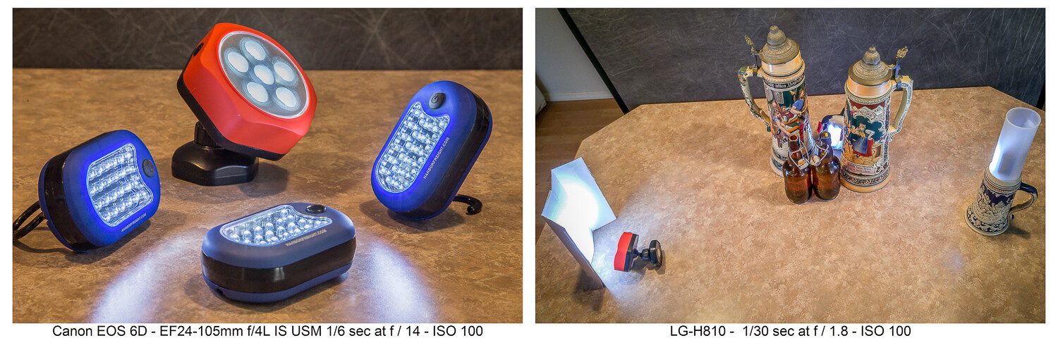
LED flashlights like these can be found cheap at the hardware store. The second image shows how they were used……to produce this image. Having limited light isn’t a problem when shooting still life where long exposures are fine. Canon 6D | Canon EF 24-105 f/4 | 3.2 sec | f/3.2 | ISO 100.
I have a collection of various flashlights (aka “torches”) and other LED lighting gear, which I’ve typically bought for just a few dollars online or at the local hardware store. Finding new ways to creatively use these little lights has allowed me to make some creative images. Take a look at this article which explores this topic further.
5. CD rainbow macros
Before you toss that scratched CD, add it to your bag of photo tricks. Mount a macro lens on your camera, or use whatever means you have to get close to your subject. Put the CD down with the reflective, non-printed side up. Then, with an eyedropper or other tool, place small water droplets all over the surface of the disc.
Waterdrops on a CD shot with a macro lens and lit in various ways can produce some colorful abstract images.
Focus your shot and get creative. The lighting is purely up to you. Perhaps try some shots in direct sunlight where the intense light will really pop the rainbow spectrum. Maybe try a small flashlight. Try a long exposure and light-paint the droplets. Anything goes when you’re making abstract images.
6. Oil and water abstracts
I wrote a complete article on this technique, which is another way to get some interesting and colorful abstract images. With minimal equipment and whatever lighting you like (even shooting outdoors with natural light), you can have a whole afternoon of fun.
Oil and water don’t mix, and that’s a good thing for this technique. A glass dish shot from above and through the mixture with some colorful objects in the background is the technique here.
7. Up in smoke
Add this to your collection of photo tricks to make some smokin’ hot images. An incense stick and some care with your lighting will get you going. Then take your shots to the computer where you can add additional effects. Have a look at my article here on DPS, “How to Make Interesting Abstract Smoke Photos,” for a full write-up on this technique.
This is a straight, side-lit shot of the smoke pattern rising from an incense stick.Take the straight shot on the left, mirror it in editing, and colorize it. Then you have a firebird! (At least that’s what I see. What do you see in this abstract?)The original smoke photo mirrored both horizontally and vertically and colorized in editing. Is this what they mean by “smoke and mirrors?”
8. Interaction with reflection and refraction
Find historic images of early photographers, and you might see them standing behind their cameras with black capes thrown over their heads. They did not have DSLRs, where the image entering the lens is reflected onto a mirror, through a prism, and then into the viewfinder right-side up. Instead, early photographers used the first “mirrorless” cameras, and the image came through the lens and displayed upside down on a ground glass at the back of the camera. The image was quite dim, which explains the need for the cape to better see the projected image.
The water-filled glasses refract the light while the black acrylic plastic sheet below reflects it. There’s a lot of light physics going on in these shots.
We won’t require you to take a course in optical physics so you can understand the behavior of lenses, light, reflection, refraction, or the differences in light transmission through various mediums. Just break out some glassware, pour in a little water, maybe use that piece of black plexiglass we mentioned earlier, find an interesting background, and go for it.
You are getting sleeeepy… The water in the glass refracts the light and flips the image, much like a lens.
If you do want to dive deeper into understanding light behavior, take a look at my article “How to Understand Light and Color to Improve Your Photography.” Maybe take a look at this one as well: “Just Dew It – Fun with Macro Dewdrop Photography.”
These tiny glycerin drops act as little lenses, focusing, refracting, and reversing the image behind them.
9. Zooming around
In our collection of photo tricks, this one is hardly a secret. You probably have done it before. No? Well, if not, and you have a zoom lens, it’s high time you tried the zoom blur effect.
The technique is simple enough. Set your exposure so you can get at least a one-second shutter speed, if not longer. This ought to be easy enough at night if you set the ISO to its lowest setting (such as ISO 100) and stop down the aperture to a small size (such as f/16 or f/22). If you’re shooting in the daytime and these settings alone don’t get you down to a second or more of exposure time, try adding a polarizing filter or a neutral density (ND) filter to reduce the light still further.
Lights at night make great subjects for the zoom blur technique. You’ll definitely need to work on a tripod.
You can do this technique handheld, but a tripod helps. Set your camera so you get the 2-second shutter delay, then with one hand on the zoom ring, trip the shutter. When you hear it click, zoom in (or out) during the exposure. Play with starting zoomed tight and then pulling out during the exposure, or starting wide and then zooming in. Lights at night can make for great looks. Try only zooming during the first or second half of the exposure. There’s no single way to do this, so play and discover what you can create.
Both these shots were zoomed during the exposure. See my fireworks article for the “Boom, Zoom, Bloom” technique.
10. Create a computer screen background
An interesting background can add to the story of your photo. If you have a good-sized computer monitor and are shooting a smaller object, being able to create a background on your computer screen opens all kinds of possibilities.
Create a unique background to go along with the theme of your photo by putting up something appropriate on a computer screen in the background of your shot.
Photographing screens would seem a simple process, but can be more tricky than you think. If you plan to do much of this, reading up on the best camera techniques for shooting screens would be time well spent.
Cheaper by the dozen
The title said 10 photo tricks, but I’m going to throw in two more for free and make it an even dozen. I really like the looks I can get with these last two.
11. Action sequences with Microsoft ICE
I wrote the article “Make Easy Panoramic Images with Microsoft ICE,” which focused primarily on how to use this free and very powerful tool from Microsoft to make panoramic images. That is good fun in itself and a very useful technique.
Toward the end of that article, I touched on something else you could do with ICE: sequential action images. These are great for showing the progressive steps of action, and ICE makes the technique quite easy. Follow the link, read through the article, and see how you can make images like this:
Pan with the action while shooting multiple images in continuous mode, then use the free Microsoft ICE software to assemble them. Quite easy, actually!
Here’s an alternative way to make sequential action photos with a completely different technique, one that’s more well-suited to capturing very fast action: “How to Use Multi-flash to Capture Compelling Action Photos.”
12. Phun photos with photoelasticity
Combine physics with fun and you get Phun, right? With this technique, you will be exploring what is called photoelasticity or, more specifically, birefringence.
Clear plastic tableware goes cosmic with this technique. Learn about birefringence.
You don’t have to understand what’s going on, and this isn’t hard to do. It just works and looks cool. Here’s what you’ll need to do:
Your light source will need to be an LCD computer monitor, TV or, for smaller subjects, a tablet, or even a cellphone. LCD screens emit polarized light, and using polarized light to backlight your subject is part of what’s needed to make this work.
Try to limit any other ambient light. The effect will be stronger if the LCD light is dominant in your shot.
Use subjects made of hard, clear plastic. Polystyrene is what is used for most clear plastic cutlery and drinkware, so these make good subjects. Often the plastic in cheap picture frames is made from similar materials. Glass objects will not work for this.
You will need a polarizing filter on your lens. Standard circular polarizing (CPL) filters work well.
Polarized light plus a polarized lens reveals the “mechanical stress patterns” within certain types of plastics. Clear styrene plastic usually works well.
Now, get ready to say “Wow!” Place your subject in front of the LCD light source. Bring up an image that will create a totally blank, white, bright screen so that light backlights your subject. You won’t see anything until you look through the camera viewfinder and through the attached polarized filter. Cool, huh?
Now rotate the filter. The computer screen will be white, black, or intermediate shades, while the plastic subject will show the rainbow birefringence effect. The patterns will be showing the mechanical stress within the plastic, with tighter patterns where the curves of the object are tighter.
Is it okay to still say “Groovy, man?” A second sheet of plastic was held in front of the lens, producing the colored background. Aside from some exposure and saturation adjustments, this effect is what you see through the lens while making the shot, not added later on the computer.
Just a tip when you are seeking potential subjects for this kind of photography:
Your LCD cellphone screen is a polarized light source. If you have a pair of polarized sunglasses, objects held in front of a blank white screen on the phone and viewed while wearing the glasses will show the effect if they are the right kind of material. You may have to tilt your head to get the same effect as rotating a circular polarizing filter.
Now go play
So there’s a dozen new things to try with your camera. You will also find that these kinds of photography will force you to use different exposure, focusing, camera control, lens selection, and editing skills than perhaps you normally might use.
Remember, even failed experiments can be lessons when you seek to determine what went wrong and then try again to get it right. Now go try some of these photo tricks, have fun, and post some of your images in the comments section. If you have any questions, feel free to post those, too.
The post 10 Cheap Photo Tricks for Creative Images appeared first on Digital Photography School. It was authored by Rick Ohnsman.
Netgear has announced the Meural WiFi Photo Frame. The frame is designed to conveniently display your photographs using an accompanying smartphone application.
The Meural is a 13.5″ x 7.5″ frame with a 15.6″ diagonal display offering a 1920 x 1080 resolution and anti-glare coating. The display promises a wide viewing angle and ambient light sensor to ensure it looks good in any setting and from a large variety of angles. Including its bezel, the Meural Photo Frame is 16″ (408mm) wide, 10″ (259mm) tall and has a depth of 1.68″ (42.4mm). The frame weighs 2.9 lb. (1.3kg).
Like Netgear’s Meural Canvas before it, the smaller WiFi Photo Frame also utilizes touchless gestures for photo control, allowing you to scroll through images with a wave of your hand. The frame can also quickly be rotated between portrait and landscape orientation.
On the inside of the Meural is 1GB of DDR3 RAM, 8GB of storage (of which 4GB are utilized for storing photos), a Quad-core ARM processor and WiFi 802.11a/b/g/n/ac (2.4GHz and 5GHz). The frame includes gesture sensors for both portrait and landscape orientation, an orientation sensor itself and an ambient light sensor to automatically adjust brightness. The frame utilizes a DC power port for power and Netgear states that it uses approximately 20W during typical usage. The included power cord is 6′ long.
Image credit: Netgear
Using an app on your smartphone, you can link existing photo albums to automatically upload and display on the Meural WiFi Photo Frame. The frame can also display location and data information so you will always know when and where images were captured by simply gesturing upward. You can also use the app to invite family and friends to upload their own photo albums to a specific Meural. This means that distant family and friends can upload new photos to your own Meural, allowing you to quickly share memories with one another via personalized photo playlists.
Image credit: Netgear
The Meural Photo Frame is compatible with Apple and Android devices. For iPhone and iPad users, you must have iOS 11 or later. On Android, the frame is compatible with Android 5.0 or later. For iOS users, the Meural Photo Frame supports Live Photos. When using either compatible device, you can also display short videos up to 15 seconds in duration.
In addition to the power cord, the Meural WiFi Photo Frame also comes with a cleaning cloth, wall mount, wall anchor and screws (for drywall), pre-loaded sample art images from the Meural art library and a quick start guide. Speaking of the Meural art library, the library contains more than 30,000 images and artworks in total. You can schedule the display of your favorite art from the library.
Image credit: Netgear
Of the Meural WiFi Photo Frame, Netgear’s David Henry, senior vice president for Connected Home Products, says, ‘So many photos are captured on smartphones every day, yet many are not seen on screens that showcase them in their fullest, richest detail, With our new Meural WiFi Photo Frame we’ve created a new way to enjoy and relive those special memories.’ Henry continues, ‘[with the included connectivity features] this new premium photo frame will also help to keep people close in a time when we all need to stay connected.’
The Meural Photo Frame is available to order now for $ 299.95 USD. The frame is available in one colorway: charcoal gray bezel with a wood-grain inlay. The full Meural art library membership is $ 8.95 USD per month or $ 69.95 per year. The membership is not required. However, membership does add 16GB to your Meural Cloud storage and allow you to send artwork to multiple frames using a single account. A subscription also includes 24/7 customer support, which is otherwise limited to the first 90 days with your Meural Photo Frame. You can learn more about the membership by clicking here.
We compare six of the most popular camera backpacks on the market: the Wandrd Prvke, the Peak Design Travel Backpack, the Shimoda Explore, the Manfrotto Manhattan Mover, the CosySpeed PhotoHiker and the Atlas Athlete.
Subscribe to our YouTube channel to get new episodes of DPReview TV every week.
The Mars Petcare Comedy Pet Photo Awards is still taking submissions through August 31, 2020 for its 2020 competition, but the organizers have already released a few of their favorite images submitted thus far, showcasing humorous photos of pets from around the world.
‘From the founders of the world-famous Comedy Wildlife Photography Awards, Paul Joynson-Hicks and Tom Sullam have created a fun photography competition calling on all pet and animal lovers to submit hilarious images of their funny furry friends for a chance of winning £3,000 and being named the 2020 Mars Petcare Comedy Pet Photographer of the Year,’ reads the press release for the ‘Best Images Entered So Far’ gallery.
In addition to laughter, the competition also aims to raise awareness around homeless pets in the United Kingdom, with 10% of the sponsorship fees and 10% of all entry fees going to the Blue Cross, a ‘UK Pet charity to help with its work rehoming pets and providing veterinary treatment and care.’
If you’re interested in submitting your own images to the competition, you can do so through August 31. Of the submitted images, 40 finalists will be announced on September 28 and the winning image will be announced on November 19th. For £5 you can enter five photos or videos; for £10 you can enter 15 photos or videos. There are multiple categories you can submit your photos into, including Dogs, Cats, The Mighty Horse and more.
You can find out more by visiting the Comedy Pet Photo competition website.
The post Become a Better Photo Editor with the New Lightroom Mobile ‘Discover’ Feature appeared first on Digital Photography School. It was authored by Simon Ringsmuth.
Every time you see a photo that strikes you as beautiful, brilliant, or breathtaking, you are only witnessing the tip of the iceberg. In nearly every case, the photo is the end result of dozens, even hundreds, of edits made by the photographer. From simple cropping and white balance to in-depth editing like curves and color mix, these edits are what turn an ordinary image into a work of art.
Unfortunately, such edits on a photo have been impossible to see. But, thanks to the recent addition of a ‘Share Your Edit’ feature in Lightroom Mobile, you’re now able to view the behind-the-scenes edits made to images.
Nikon D750 | AF-S NIKKOR 70-200mm f/2.8G ED VR II | 200mm | 1/4000s | f/22 | ISO 100
One of the best ways to grow as a photographer is to learn from others. Find out what works for photographers you admire and respect, and then adopt those techniques into your own workflow. This is the foundation for almost any trade, craft, or artistic pursuit. Yet, for photographers, this knowledge is often locked away behind a door. People can see the end result, but not the process.
The Discover feature in Lightroom Mobile solves this by giving you access to a worldwide community of artists who have willingly shared their editing process. There are hundreds, even thousands, of photo communities online that let you view pictures and share your own. However, none of these—not Instagram, Flickr, SmugMug, or anything else—let you see the editing process. You can only see the final image, which isn’t much use if you want to know how the photographer edited their photo to actually create the picture.
This is Lightroom Mobile’s ace in the hole: Because the Discover feature is part of the same software used to edit the images being shared, it allows for a level of freedom unmatched by any other photosharing site. In minutes, you can be learning from experts and professionals all over the world to see how they have edited their pictures, and you can adopt their techniques into your own workflow.
Discovering the Share Your Edit feature
Accessing the Discover option requires nothing more than a few taps on your mobile device. Open the Lightroom Mobile app and then tap on the icon that looks like a globe. If you hold your device vertically the icon will appear at the bottom of your screen along with the Discover label.
Tap the globe icon at the top left to access the Discover feature.
What you see next might remind you of many other photosharing apps, but dig a little deeper and you’ll see so much more. Scroll up and down to see more photos, and tap the heart icon in the lower right corner of any picture to mark it as one that you like. In the lower left corner, you will see the profile photo of the photographer who shot the picture. At the top is a list of categories for you to explore: Featured, New, Abstract, Landscape, Nature, and more.
So far so good, right? If the point of the Lightroom Mobile Discover feature is to help you find photos (or photographers) that you like, then there’s not much to distinguish this from any other photosharing app. The real fun begins when you tap on a photo to see the edit history.
Learning from the edits
When you tap on a picture it’s almost like stepping through a time machine or, more accurately, into a classroom.
Nearly every photo in the Discover feature lets you look at the edits that were made to it.
Lightroom Mobile now shows you the picture you tapped on, along with a blue bar at the bottom of your screen that fills from left to right. As the bar moves, the picture changes right before your very eyes, almost as though you’re watching it being edited in realtime. And, in a way, that’s exactly what’s happening.
Tap the Edits button at the bottom of the screen or just press and scroll upwards on the photo to load the entire editing history of the image. This is where the Lightroom Mobile Discover feature rockets into the stratosphere and becomes an amazing tool for photographers who want to learn from others, not just be inspired by their photos.
Scroll up and down through the list of edits to see them applied in real-time.
After tapping the Edits button you are presented with a scrolling list of every single edit that the photographer applied to the photo. Scroll to the top to see the initial import, and then slowly scroll down to watch the image change before your very eyes as each individual edit was applied. Lightroom Mobile shows you each particular edit along with the specific number for each individual adjustment.
This linear edit history lets you look over the shoulder of the photographer, watching every edit they made and seeing how each decision changed the image. The Discover feature lets you stand in a room with thousands of photographers, learning from each of them as you see how they arrived at their final images.
Looking through the edits to a photo is like being in the same room as the photographer while the image is being refined.
One limitation you will quickly realize is that this feature only shows you the edits. You are not allowed to change any of the editing values and, as a result, alter the image in any way. However, you can save the edits as a preset so you can use them in your own photography.
Click the three-dot icon in the top right corner and then tap Save as Preset to download the edits to your own Lightroom app. You can then apply these edits to any of your photos and adjust any of the parameters that you want.
Most edits can be shared as presets, unless the photographer sharing the edits has specifically forbidden it.
The Lightroom Mobile Discover feature has a few more tricks up its sleeve to help you get inside the mind of photographers who have shared their images. Tap the Info button to see additional details that the photographer has shared about the image. This often includes a title, written description, keywords related to the subject, EXIF data, and camera information. All this is extraordinarily useful for anyone who wants to learn more about a particular photo beyond just how it was edited.
Share your own
After diving into the Discover feature and learning more about how other photos were edited, you might be inclined to share your own images and edits. You can do this easily from Lightroom Mobile with just a few taps.
To get started with sharing your images to the Discover community, just open Lightroom Mobile and tap on any of the images in your library. Then tap the Share icon in the top right corner.
Tap the Share button on any of your images to upload the picture (and your editing history) to the Discover feature.
Then click the Share Edit option.
Note that as of this writing (July 2020) this process is still in Beta. Adobe will no doubt improve and refine it over time, and the exact steps might change.
Share Edit is still in beta as of July 2020, but it works very well.
The next screen prompts you to enter some information about the photo. This is similar to Instagram and other photosharing sites, but keep in mind that the point here is to help other photographers learn more about the photo. You aren’t competing for likes or upvotes; you’re sharing valuable information along with your edits to help a larger community of photographers learn more about their craft.
The more you write in your title and description, the more helpful other photographers will find your image.
It helps to be as descriptive as possible in your title, description, and category sections. That way, you are not only helping other people learn more about your photo; you’re helping them to discover it, as well, by using categories that are similar to hashtags on other photosharing sites.
Finally, choose whether you want your edits to be saved as presets. I always recommend enabling this option because of the sharing mentality that makes the Lightroom Mobile Discover feature so valuable. If you have benefitted from viewing edits that other photographers have made, it’s nice to respond in kind by sharing your own edits, as well.
I don’t recommend including location information, which is turned off by default.
I recommend enabling the Save as Preset option to let others save your editing process to use on their own images.
After you have all the basic information about your photo ready to go, tap the checkmark icon in the top right corner. This uploads your image, editing information, title, description, and categories to the Discover feature.
I get a kick out of heading to the Discover feature right away to see my images show up in the stream of new photos.
Tap the OK button and then head over to the Discover feature to see your image in the New section. Soon other photographers will start viewing it and learning from your edits! To see all the images you have shared with the Discover community, along with the number of likes each photo has gotten, tap your profile icon.
Keep in mind that the point of Discover is not to get likes but to learn and help others do the same. Thus, the number of likes on each of your images is almost entirely irrelevant and I recommend not paying attention to it all.
Conclusion
The Lightroom Mobile Discover feature is still in its infancy, and I’m excited to see where Adobe takes it in the coming years. Even though it’s still a bit rough around the edges in a few places, it’s an incredibly useful tool for learning more about the editing process. I hope you give it a chance and, if you learn anything from it, I’d love to have your thoughts in the comments below!
The post Become a Better Photo Editor with the New Lightroom Mobile ‘Discover’ Feature appeared first on Digital Photography School. It was authored by Simon Ringsmuth.
Winners of 2020 Creative Photo of the Year by Siena Awards
The Creative Awards is part of the larger international competition put on by the Siena International Photography Awards. The aim is to encourage photographers to experiment with the subject matter they capture as well as their post-processing techniques. There isn’t any limit to how much an image can be digitally manipulated.
11 jurors selected winning and runner up images from 12 different categories including Fine Art, Abstract, Nature & Landscape, Open Theme and Architecture. The Overall Winner, and recipient of the ‘Pangea Prize,’ along with € 50,000 in photography gear, is Hardijanto Budiman for his image of ping pong players competing in Indonesia.
Typically, winners and runners up attend the annual Siena Awards and their works are displayed in the ‘I Wonder if You Can’ outdoor exhibition. For now, they can be viewed in this online gallery.
Overall Winner and Pangea Prize Recipient: ‘Ping Pong Training’ by Hardijanto Budiman
Location: Jakarta, Indonesia
Artist statement: Ping pong or table tennis is my favorite sport. When I was young I used to be a ping pong player in my home town club. So when the idea came up, I straight away started the project. This picture is about daily activities of ping pong players in a club. I made the concept look different and unique, representing my signature style.
Creative Runner Up Winner, Fashion: ‘Borderland’ by Gerard Harrison
Location: Houston, Texas, United States
Artist Statement: A photograph of a fashion model in a couture bohemian design is merged with a a fine art painting to create a walk through a garden in an alternate reality.
Creative Runner Up Winner, Abstract: ‘Delta Abstraction’ by Manuel Enrique González Carmona
Location: Huelva, Spain
Artist Statement: Minerals, water and water currents are the ingredients with which nature creates these ephemeral landscapes. This canvas is actually a raft of toxic waste from a copper mine, located in the province of Huelva, Spain, having been captured by aerial shots. These ephemeral formations will disappear with the next intense rains.
Creative Runner Up Winner, Nature & Landscape: ‘Silky Hat’ by Takashi Nakazawa
Location: Lake Yamanaka, Yamanashi prefecture, Japan
Artist Statement: When the clouds cleared, there was Mt Fuji with a silky hat. To make it even more impressive, I used a long exposure and then made it black and white monotone.
Creative Runner Up Winner, Architecture: ‘Achieve Dream’ by Min Ying
Location: Zhoushan, China
Artist Statement: The image was shot at the Zhoushan Sea Bridge, which is a great construction area in China.
Creative Runner Up Winner, Animals/Pets: ‘Black Friday’ by Pedro Jarque Krebs
Location: Spain
Artist Statement: Flamingos have eyes that are bigger than their brains. But this doesn’t make them animals without a conscience. They have great vision, and although their ability to interpret what they see is limited, their way of associating in groups allows them to develop a collective consciousness to cope with their environment. Climate change is increasingly affecting their habitats.
Winner, Portraiture: ‘The Same Sky’ by Carloman Macidiano Céspedes Riojas
Location: Argentina
Artist Statement: This goodbye does not mask a see you later. This never does not hide a hope. These ashes do not play with fire. This blind man does not look back. To this noise so fatherless I will not let you drill. A rotten heart of beating. This fish does not die through your mouth. This crazy man goes with another crazy. These eyes do not cry anymore for you.
Creative Runner Up Winner, Experimental: ‘Chicago Station’ by Carmine Chiriacò
Location: Chicago, Illinois, USA
Artist Statement: This is the classic example of how I like to interpret what I capture with my camera. Through photography I try to communicate the emotions that I am feeling in that moment to the observer. My aim is to tell a story each viewer can experience, and allow him to see the world through my eyes.
Creative Runner Up Winner, Open Theme: ‘Celebration of Sitti Mariam’ by Hisham Karouri
Location: Sudan
Artist Statement: The annual celebration of ‘Sitti Mariam’ the nobel sufi lady of Khatmiyyah sect in Sinkat town in east Sudan; a three days feast ending by the first Thursday of Rajab (month of Hijri calender). During Sitti Mariam lifetime, (1870-1952), the celebration was an annual meeting to assist the followers of the sect, and especially the needy, whom she cared mostly about.
Creative Runner Up Winner, Beauty: ‘Inner’ by Renat Renee-Ell
Location: Saint Petersburg, Russia
Artist Statement: From the series ‘The Room Of Sound Distraction.’ The feelings of the heroine are rolled up like bud petals. At the heart of the fragrance is the soul. Sly hands stretch to take it away.
Creative Runner Up Winner, Product: ‘Speed Freak’ by John Grusd
Location: Long Beach, California, USA
Artist Statement: This image is one of a series of compositions about automobile racing and the driver’s relationship to the distractions and danger inherent in motorsports. The driver remains focused and calm while the world hurtles by at tremendous speeds. In this image, the world around the driver becomes streaking color at streaking speeds.
Creative Runner Up Winner, Food & Beverage: ‘The Broccoli Forest’ by Yuliy Vasilev
Location: Bulgaria
Artist Statement: This is the pilot image of my ongoing project ‘Miniature World.’ The image was taken in my home studio in Bulgaria in August 2019.


You must be logged in to post a comment.