RSS
 

Posts Tagged ‘Orange’

Weekly Photo Challenge – Orange

23 Jan

The post Weekly Photo Challenge – Orange appeared first on Digital Photography School. It was authored by Sime.

“Orange, oh, that’s easy!” I hear you say, well, let’s see how easy it is and how creative you can get with such a simple theme!

You can see all of our challenges right here, go back and try your hand at ones you’ve missed.

Need some ‘Orange’ inspiration? Have a look here or here! Or use the ‘search’ function at the top of our website.

Tag your photograph #dPSOrange if you share it on social media.

Weekly Photo Challenge – Orange

As ever, take a look below to check out how to upload your image under this blog post, or visit us on our Facebook group, or post your image on socials, @digitalps and use the hashtag #dPSOrange – Sounds good!

Great! Where do I upload my photos?

Simply upload your shot into the comments field (look for the little camera icon in the Disqus comments section) and they’ll get embedded for us all to see. Or, if you’d prefer, upload them to your favourite photo-sharing site and leave the link to them.

Weekly Photography Challenge – Looking Up

The post Weekly Photo Challenge – Orange appeared first on Digital Photography School. It was authored by Sime.


Digital Photography School

 
Comments Off on Weekly Photo Challenge – Orange

Posted in Photography


Weekly Photography Challenge – Orange

22 Feb

The post Weekly Photography Challenge – Orange appeared first on Digital Photography School. It was authored by Caz Nowaczyk.

This week’s photography challenge topic is the color ORANGE!

Autumn Colors 06

Photo by dPS writer, Jeremy Flint © Jeremy Flint

Image: Photo by dPS writer, Megan Kennedy © Megan Kennedy

Photo by dPS writer, Megan Kennedy © Megan Kennedy

This is a fun challenge. You can capture the color orange in so many ways. You can use macro, flowers and autumn leaves, landscapes (think orange sunrises or sunsets, or wildflowers), cityscapes, minimalist photography, abstracts or people wearing orange clothing. The orange can be a major part of the composition or be more subtle. There are so many options!

So, check out these pics to give you some ideas, have fun, and I look forward to seeing what you come up with!

natural light macro poppy

Photo by dPS writer, Jaymes Dempsey © Jaymes Dempsey

Image: Photo by dPS guest writer, Joey J © Joey J

Photo by dPS guest writer, Joey J © Joey J


Check out some of the articles below that give you tips on this week’s challenge.

Tips for Shooting the color ORANGE

Mastering Color Series – The Psychology and Evolution of the Color ORANGE and its Use in Photography

How to Capture the Colors of Autumn in Your Photography

How to Use Color in Your Photography to Give Your Photos the Wow Factor

How to Use Vibrant Colors in Photography with Great Success

How to Find the Best Possible Time to Shoot Cityscapes at Blue Hour

How to Take Epic Sunrise Photos with a Zoom Lens

Create Amazing Sunrise Photos with these Easy Lightroom Editing Tips

5 Reasons Why Your Sunrise or Sunset Photos Don’t Look So Stunning

Simply upload your shot into the comment field (look for the little camera icon in the Disqus comments section) and they’ll get embedded for us all to see or if you’d prefer, upload them to your favorite photo-sharing site and leave the link to them. Show me your best images in this week’s challenge.

Share in the dPS Facebook Group

You can also share your images in the dPS Facebook group as the challenge is posted there each week as well.

If you tag your photos on Flickr, Instagram, Twitter or other sites – tag them as #DPSorange to help others find them. Linking back to this page might also help others know what you’re doing so that they can share in the fun.

The post Weekly Photography Challenge – Orange appeared first on Digital Photography School. It was authored by Caz Nowaczyk.


Digital Photography School

 
Comments Off on Weekly Photography Challenge – Orange

Posted in Photography


Mastering Color Series – The Psychology and Evolution of the Color ORANGE and its Use in Photography

29 May

The post Mastering Color Series – The Psychology and Evolution of the Color ORANGE and its Use in Photography appeared first on Digital Photography School. It was authored by Megan Kennedy.

Situated between yellow and red on the visible spectrum, orange has a long history in visual culture. Dubbed the “happiest color” by Frank Sinatra, we’ll take a look at the color orange and its significance from antiquity to contemporary art.

The psychology of orange

Named after the citrus fruit, the word orange is derived from the old French phrase orenge. The earliest use of the word orange in English dates back to the 1300s. However, orange’s use as the name of a color didn’t occur until the early 1500s. Before that, orange was simply called yellow-red.

The distinctive orange color of many fruits and vegetables comes from carotenes, a photosynthetic pigment. As a result, the orange pigmentation has fostered associations between orange and nourishment, refreshment and energy. Autumn leaves also get their orange color from carotenes, forging links between the color and Autumn, beauty, preparation, and change.

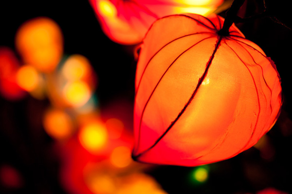
Orange cultivates optimism, enthusiasm, cheerfulness, and warm-heartedness. Orange’s boldness denotes confidence and creativity. Manifested in fire, orange can be associated with heat and destruction. Eye-catching and vibrant, orange is often used to direct attention. Furthermore, as the complementary color to azure, orange has the greatest contrast against sky blue tones. This means orange (or safety orange as it’s known) is often used in marine safety devices like life rafts, life jackets, and buoys.

In European and Western countries, orange is associated with harvest time, frivolity and extroversion. For Indian cultures, orange is considered to be lucky and sacred. In Japanese and Chinese cultures, orange denotes courage, happiness and good health. Buddhist monks’ of the Theravada tradition and Hindu swamis wear orange robes. Orange is the national color of the Netherlands, but in many Middle Eastern countries, orange can be associated with mourning.

The evolution of the color orange

Ocher

The history of orange pigment begins with ocher. As a family of natural clay earth pigments, ocher ranges in color from yellow to red, sienna and umber. Orange ocher is composed predominantly of limonite. Thanks to the pigment’s excellent light fastness, some of the worlds best-preserved cave painting sites still feature orange ocher today. The pigment continues to see application within modern art, in both traditional and contemporary practice.

Vermilion

Made with ground cinnabar, the use of vermilion pigment dates back to 8000–7000 BC. Produced artificially from the 8th century, the orange-red pigment was used by painters up until the 1800s. However, the cost, poor light fastness, and toxicity of vermilion led to it being superseded by modern synthetic pigments like cadmium red.

Realgar and orpiment

An arsenic sulfide, realgar is an orange-red mineral that saw artistic use in ancient Egypt, China, India, and Central Asia. Prized for its richness in color, realgar most commonly occurs as a low-temperature hydrothermal vein mineral. Highly toxic, realgar was the only pure orange pigment available until modern chrome orange.

Orpiment, also a sulphide of arsenic, was found in the same locations as realgar. Producing a golden yellow-orange pigment, orpiment was just as toxic as realgar and was also used as a fly killer and to taint arrows with poison. An important item of trade in the Roman Empire, orpiment was ground down and used in paintings up until the 19th century.

Chrome and cadmium orange

In 1797, French scientist Louis Vauquelin discovered the mineral crocoite. This led to the invention of the synthetic pigment chrome orange. Ranging from a light to deep orange, chrome orange was the first pure orange pigment since realgar. And while it’s no longer in production, chrome orange can be viewed in Renoir’s Boating on the Siene. 

As a by-product of zinc production, cadmium, was discovered by Friedrich Stromeyer in 1817. While heating zinc in his laboratory, Stromeyer observed a sample of zinc carbonate that formed a bright yellow oxide. Stromeyer realized the results of his experiment could prove useful to artists, but it wasn’t until the 1840s that cadmium pigments entered production industrially.

Quickly becoming popular among the Impressionists and post-Impressionists, the scarcity of cadmium meant that the availability of cadmium pigments was fairly limited up until the 1920s. Today, pigments like cadmium orange set the standard for coverage, tinting, and light-fastness.

Orange in visual arts

Prehistoric to pre-raphaelite

From prehistoric periods to the present day, orange has had a continuing presence in visual arts. Figures sketched into rock by neolithic artists were often filled out in orange ocher. Orange was present in the elaborate art and hieroglyphics of the ancient Egyptians. In ancient Rome, the orange-red vermilion was used to paint frescoes, decorate statues and color the faces of victors in Roman triumphs. Vermilion was also used by North and South Americans to paint burial sites, ceramics, figurines and murals.

In medieval art, shades of orange were used in the coloring of illuminated manuscripts. During the renaissance, orange was featured in lustrous drapery. Creating dramatic contrasts between brightness and shadow, Baroque artists used orange to illuminate detail and light. For instance, in The Abduction of Ganymede, Rembrandt centered on the boy Ganymede’s orange tassel as a visual pendulum, indicating momentum and resistance. Depicting lush landscapes and well-to-do inhabitants, rococo art featured light, airy oranges. And the red-orange hair of Elizabeth Siddal, model and wife of the painter Dante Gabriel Rossetti, became a symbol of the pre-raphaelite movement.

Impressionism to abstraction

In 1872, Claude Monet painted Impression, Sunrise. Featuring a luminous orange sun sprinkling light onto a hazy blue landscape, the painting lent its name to the impressionist movement. Post-impressionist Paul Gauguin used vivid oranges for backgrounds, clothing and skin color. And Vincent Van Gogh balanced rich blues and violets with bold oranges saying “there is no blue without yellow and without orange”.

Fauvists believed color should operate free from physical reality. Mountains at Collioure by André Derain expresses a landscape made up of patchwork oranges, an active contrast against the blues, greens and deep pinks that complete the image. Expressionist Edvard Munch used the visual activity of orange to suffuse his paintings with density and crowded movement. Later, abstract artists like Wassily Kandinsky and Robert Motherwell took advantage of orange’s internal buzz, generating movement and emotion within their canvasses.

Orange in contemporary art

As the possibilities of art have evolved, so has the application of color. As a color of great visual density, orange continues to have a significant role in contemporary art. Aboriginal and Torres Strait Islanders, painting in both traditional and contemporary styles, continue to use orange ocher in their artworks today.

Wilhelm Roseneder’s Orange Expansion uses orange to exaggerate a separation between art and setting. Roelof Louw’s Soul City (Pyramid of Oranges) invites viewers to take and eat one of the oranges that make up a pyramidic sculpture of citrus fruit. With each orange taken, the sculpture changes form and is eventually consumed in its entirety by the sculpture’s participants. Anish Kapoor’s Mirror (Pagan Gold to Orange to Pagan Gold) is a large concave dish that reflects the viewer within the orange haze of the artwork itself, re-expressing the self through materiality. And artist Alexander Knox chose orange as the prevailing color in his Moth Ascending the Capital, capturing the energy of a Bogong moth bursting into flight.

Orange in photography

Orange’s associations conveys a rich photographic landscape. Photojournalist Ozier Muhammad’s photograph Marines Move through Sandstorm is an insight into the nature of war. The density of orange, though natural, significantly dampens visibility, creating a palpable tension. Depicting humans and objects as things to be studied, Martin Parr’s ultra-saturated oranges pair with his inquisitive photography. And Uta Barth’s …and of time series documents the quality of light and the passage of time, an orange hue feeling out the dimensions of a room with ephemeral softness.

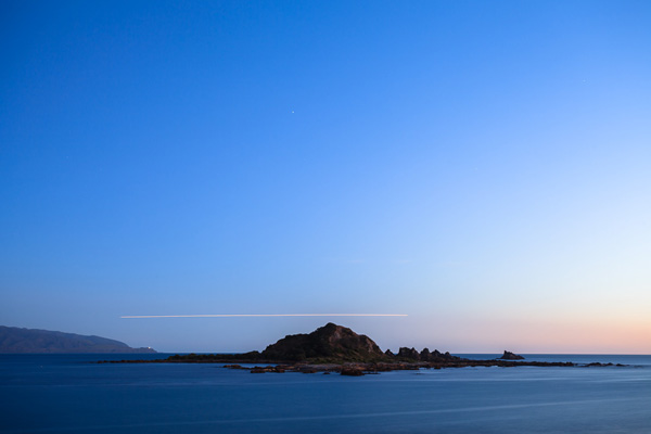
On the bucket list of many a photographer, Antelope Canyon, located just outside of Page, Arizona, is a natural photographic wonder. The warm orange tones of the canyon are captured in countless images online. Nevertheless, photographers still flock to the spot to make their own photographs of the beautiful eroded Navajo Sandstone.

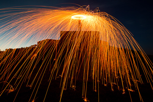
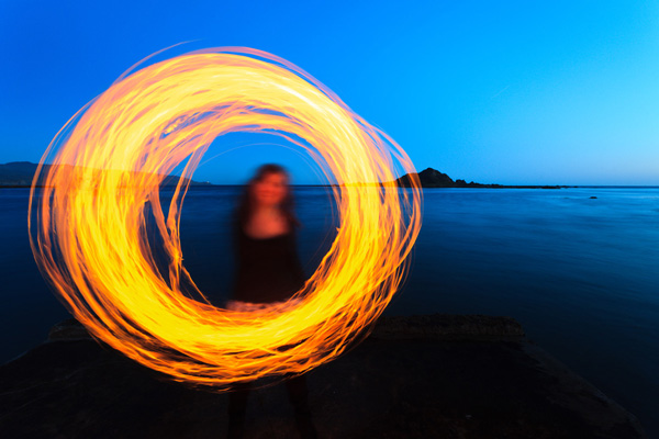
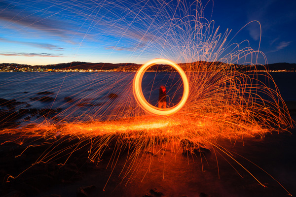
Occurring during the golden hour, orange-to-yellow light floods the atmosphere, creating ideal opportunities for landscape and portrait photography. Often manifested in steel wool photography, photographers can create effervescent trails of burning orange light with a few kitchen items. Orange filters are also a popular general-purpose tool for black and white photography. Balancing out the extremes of red filters and the subtlety of yellow filters, orange filters add a moderate degree of contrast to an image, darkening skies and emphasizing clouds. Furthermore, orange filters deliver a warm, smooth skin tone, reducing the appearance of freckles and blemishes.

Conclusion

Wassily Kandinsky once said, “orange is red brought nearer to humanity by yellow.” Energizing the viewer, orange conveys optimism, enthusiasm, and cheerfulness. Capturing attention, orange imparts vibrant emotion and illuminates detail. Found in food, orange also communicates nourishment and health. And reflected in nature, orange can be a signal of seasonal change, fire, and heat. A color of tenacity, endurance, and impact, orange reflects bold emotions, its historic presence and versatility inspiring and energizing audiences at the same time.

We’d love for you to share with us and the dPS community your photos that make use of the color orange in the comments below.

See other articles in the Mastering Color Series here.


The post Mastering Color Series – The Psychology and Evolution of the Color ORANGE and its Use in Photography appeared first on Digital Photography School. It was authored by Megan Kennedy.


Digital Photography School

 
Comments Off on Mastering Color Series – The Psychology and Evolution of the Color ORANGE and its Use in Photography

Posted in Photography


Is the future of beginner photography a bright orange camera with no buttons?

18 Nov

Traditional camera manufacturers fail beginner photographers over and over.

They’ll gladly sell you a camera with a kit lens, but they’ve struggled to help beginners with any of the challenges that come after taking it out of the box.

It’s not for lack of trying; every manufacturer has some form of beginner-friendly mode that will tell you how to open the aperture wider for sharp subjects with blurry backgrounds. But when you put a slow kit lens on a typical entry-level camera, you quickly find that there’s more to it than just opening or closing the aperture.

Only the viewfinder, shutter button and diopter are exposed – no LCD, no dials, everything else is off limits. It’s truly a point-and-shoot.

And as your memory cards fill up with photos, you realize there’s so much more to photography than just pointing a nice camera at a subject – from composition to editing to how the heck do I get these off my camera and on to my phone so I can share them? It ends up being a frustrating experience, and that nice new camera ends up on a shelf at home.

I recently paid a visit to a little boutique on University Avenue in Palo Alto that’s taking a radical approach to bringing photography to beginners.

Relonch doesn’t sell anything you can walk out of the store with, and it’s not a hardware company. Their ‘Photo Club’ lends out its Relonch 291 camera free of charge. Specifically, it’s a Samsung NX camera stitched up inside a brightly colored leather case. Only the viewfinder, shutter button and diopter are exposed – no LCD, no dials, everything else is off limits.

I know, I know, to a seasoned photographer, this is a vision of hell. But for a beginner who doesn’t really want those things, it’s kind of genius.

Here’s how it works: you reserve the camera in advance and borrow it for, say, the length of a vacation. The camera uses a 4G data connection to automatically send a preview of each photo taken to a companion app. The previews are just that – they’re screenshot-proof because they’re sepia-toned and watermarked. You select the photos you want to keep at a $ 1 each. At that point they’re sent to the cloud for processing, and back to your app where they’re yours to keep.

Interestingly, instead of a kit zoom Relonch 291 comes with a fast prime attached. And you aren’t just handed a camera when you walk in the door – you also get a crash course in photographic composition.

Nobody at Best Buy ever made a cup of Cuban espresso for someone buying their first DSLR.

During this lesson there’s no mention of shutter speeds or f-stops because there’s no need – the camera handles all of that. Instead, it focuses on getting the user to try different composition techniques that take advantage of the shallow depth of field afforded by the lens and larger sensor.

Yuri Motin, a Relonch co-founder, takes me through the introductory session that a typical customer gets when first picking up a camera. And let me tell you, it is a rare customer experience. Nobody at Best Buy ever made a cup of Cuban espresso for someone buying their first DSLR.

Relonch automatically processes Raw images, making adjustments to exposure, white balance, sharpening and so on. This is a photo Yuri took of me with one of the cameras. Bless the facial-recognition-skin-smoothing algorithm that produced this image.

A little cafe setup at the camera club allows you to try focus-and-recompose to put either your subject or the coffee in front of them in focus. Another scenario I’m guided through is using the handle of a suitcase to frame Yuri in the background, pretending to charge his phone while sitting on the floor. It’s a common scene to anyone in an airport, but an opportunity for a candid portrait that many beginning photographers would overlook.

I didn’t frame this exactly how Yuri told me to but he gave me a passing grade anyway.

Relonch has cleverly addressed many of the pains beginning photographers feel. Sending the images to your smartphone happens automatically. Curation is built in – instead of coming home with hundreds of photos, you have only your favorites. The fast prime lens offers much shallower depth-of-field than your typical slow kit zoom, and the composition lesson helps first time photographers use it to their advantage.

And then there’s the look of the thing – the brightly colored leather case gives the camera a dual purpose as a fashionable accessory. It’s not a look everyone will want to sport, but if you ask me it’s miles ahead of any attempt by Canon or Nikon to dress up an entry-level DSLR.

Relonch announced its 291 camera just under a year ago, and at that point planned to loan cameras at a rate of $ 100 per month, with the same image editing process baked in. There was a catch, though – only your best photos were delivered to your mobile device, and they didn’t arrive until the next day.

In the end, Relonch launched with a pricing plan that’s easier to stomach, and the service is now aimed clearly at travelers. And that’s a pretty smart move, because I hear this line a lot:

“I’m going to [insert exotic location here] and want to take better photos than my phone takes, what camera should I buy?”

That answer is getting more and more expensive, because the difference between what your phone and a $ 500 camera can do is rapidly shrinking. Paying by the photo rather than sinking a grand into a camera system you may or may not continue to use after the trip sounds like a fair value proposition.

And it’s also true that these days people, especially ‘The Youths’, seem perfectly happy to pay a little bit at a time for something they don’t own, rather than invest a lot of money up front to own it. Not all that long ago it seemed unfathomable to pay a fee every month to access your music collection, or drive a car you don’t own and pay by the hour. But the Spotify-ing, Zipcar-ing generation is happily embracing a life owning less.

Paying by the photo rather than sinking a grand into a camera system you may or may not continue to use after the trip sounds like a fair value proposition

Still, there’s another hurdle in the way. Relonch’s business model may have partially been made possible by the smartphone, but it’s a double-edged sword: smartphone cameras might just become good enough to render it unnecessary.

Yuri isn’t worried about that. When I ask him what Relonch thinks of the rise of bokeh imitating Portrait Modes, he says they welcome more beautiful photos in the world. He doesn’t see the smartphone as a competitor, because he believes that once they try it, Relonch’s members prefer the participatory experience of taking photographs with a traditional camera, with a viewfinder. And with curation built into the experience, Relonch’s customers end up with photos they want to revisit again and again.

But does that audience really exist? I’m less convinced. While that may be true for a small portion of the photo-taking population, camera makers know all too well that there are plenty of people whose desire to carry less stuff around overrides the appeal of using a dedicated camera, no matter how much better it is. If Relonch is counting on growing its business they’ll have to tap into a market that seems to be happily retreating to their increasingly capable smartphones.

Relonch might not in the end survive the rise of smartphone photography, but it seems to me that they’re onto something. You certainly can’t beat the smartphone by insisting that every camera user learn the intricacies of exposure and post-processing to get the results they want. Smartphones – and to an extent Relonch – meet these consumers partway and do the rest of the leg work.

It’s time to pay attention, traditional camera manufacturers of the world.

Articles: Digital Photography Review (dpreview.com)

 
Comments Off on Is the future of beginner photography a bright orange camera with no buttons?

Posted in Uncategorized


Colour Contrast: Making the Most of Orange and Blue

29 Jun

Colour contrast: using orange and blue

One of the principles behind using colour in photography is that of using contrasting colours. To understand the concept we need to look at a colour wheel – a type of diagram used by designers to show the relationships between colours:

Colour contrast: using orange and blue

Diagram by Wikipedia contributor Jacobolus

Contrasting colours are those that appear on opposite sides of the colour wheel. Today I’m going to look at two specific colours, orange and blue.

Why these two? They happen to be very useful colours to work with because they appear a lot in nature (even though you might not be aware of it). It’s all to do with the colour of the ambient light, which ranges from cool blue to warm orange, depending on the light source.

Incidentally, this is reflected by the colour temperature slider in Lightroom. One end is blue, and the other is orange:

Colour contrast: using orange and blue

Blue light

In low light, in fog or rain, or at twilight the natural colour of the light is blue. In these conditions, any photo you take has a blue colour cast.

The easiest way to see a colour cast in your photo is to set white balance to daylight. If the colour of the light is blue, then it will come out blue in your photo.

If you use auto white balance the camera will warm the photo up to compensate for the blue colour cast of the light. That’s useful sometimes, but it’s not desirable if you want to create a moody image.

Blue light is atmospheric. That’s because some colours evoke an emotional response, and blue is one of them. It is a cold colour – it connotes cold, misery, bad weather, even depression.

Colour contrast: using orange and blue

I took this photo in thick fog.The natural colour of the light is blue. The blue colour cast in this photo creates mood.

Orange light

Orange coloured light also occurs naturally. Light originating from the sun in the late afternoon, early evening or at sunset has an orange colour cast. So does light emitted by tungsten bulbs and burning flames.

Anything lit by these light sources will have a warm orange colour cast. Again, you will see it clearly if you set white balance to daylight.

Orange is another colour that evokes emotion. It is the colour of warmth and energy. It reminds us of things like the heat of summer or emotional warmth. Like blue, the psychological effect can be quite powerful.

Colour contrast: using orange and blue

The light source in this photo is the tungsten bulbs inside the lanterns. The natural colour of this light is orange.

You can see that blue and orange are opposites in many respects. They are opposites on the colour wheel, and also in the emotions and feelings that they represent.

Combining blue and orange

One way to show contrast between two things is to place them together. There is a famous photo by Annie Leibovitz of a jockey and a basketball player, side by side (you can see it here). Placing both sportsmen side by side emphasises their respective height, and the difference in stature between them.

It’s the same with blue and orange. Include both in the same image to add to the power of this colour combination. The coldness of the blue tones emphasises the warmth of the orange ones, and vice versa. Here are a few examples:

Colour contrast: using orange and blue

Most of the scene is lit by fading daylight, which has a natural blue colour. There is some warm light coming from the right, where the sun has set. The orange streak of light over the horizon comes from a plane flying by during the exposure.

Colour contrast: using orange and blue

This photo was taken when it was nearly dark. The landscape is lit by the fading light, which has a natural blue colour. My model is whirling a burning object around. The light from the fire is orange.

Colour contrast: using orange and blue

Finally, here is a photo created using the steel wool spinning technique. It’s taken at dusk, and the landscape is lit by the blue coloured light of the fading daylight. The light from the burning steel wool is orange, and so are the lights from the distant city buildings over the water.

If you want to try steel wool spinning yourself, click the link to read an article I wrote about it on my website. Please pay attention to the safety instructions in the article – steel wool spinning is potentially dangerous.

Mastering Photography

Colour contrast: using orange and blue

My latest ebook, Mastering Photography: A Beginner’s Guide to Using Digital Cameras introduces you to digital photography and helps you make the most out of your digital cameras. It covers concepts such as lighting and composition as well as the camera settings you need to master to take photos like the ones in this article.

By the way, the cover photo is another great example of using the orange and blue colour contrast. The building and flag are lit by the setting sun, so they have an orange colour cast. The summer sky is deep blue. You can take this sort of photo just about anywhere during the golden hour at the end of the day.

Post originally from: Digital Photography Tips.

Check out our more Photography Tips at Photography Tips for Beginners, Portrait Photography Tips and Wedding Photography Tips.

Colour Contrast: Making the Most of Orange and Blue


Digital Photography School

 
Comments Off on Colour Contrast: Making the Most of Orange and Blue

Posted in Photography


Nikon D90 – Orange Stop Motion

06 Feb

First attempt on stop motion.
Video Rating: 5 / 5


Orange Juice in Bishop’s Garden – “Where the hell was Laura?” – Ep. 4.11

31 Dec

Season 4 (Summer of ’96 Continued), Episode 11. The janky bonus video… taking you all the way back to the Class of 1996?s graduation. So just where was Laura-the-goth? Why did she skip her graduation? And just what was she doing? — Season 1 of OJBG is now in “The Vault”! Don’t worry! To get your fix, you can purchase the episodes and the script eBook here: bit.ly If you’re in the DC area, you can watch OJBG on DCTV on Mondays and Saturdays at 10:30pm EDT on Comcast 95 / RCN 10 / Verizon 10! Ultimately, Otessa, the creator of OJBG, believes that Season 2 is a great place to start with the series as it was always envisioned as a better/stronger/bolder season and gives a better sense of the show to come. — Website: OJinBG.com Twitter twitter.com Facebook: www.facebook.com Telly, LA Web Festival, and Webby honoree award winning teen web series following the lives of 18 kids as they grow up and get down in grunge-era Washington DC. “The bad things we do. The things we get caught for–and how they are never the same.” — Directed by Otessa Ghadar Writing credits Otessa Ghadar Episode Cast (in credits order) Hannah Goldman … Laura-the-Goth Andrew Cohen … Travis Episode Crew Produced by Otessa Ghadar …. producer Cinematography by Otessa Ghadar (director of photography) Film Editing by Lauren Burke Dylan Myers Sound Department Jorge Franzini …. post production sound Otessa Ghadar …. post production sound Camera and Electrical Department Xiaoyi Zhong …. director
Video Rating: 3 / 5


2011 Honda Fury Orange Chopper Motorcycle From Honda

28 Dec

I made this video, using my Nikon D90, to show my 2011 Honda Fury in orange. I just bought this motorcycle two weeks ago after taking long time researching for the best and nicest motorcycle in the market at an affordable price. It was between a Harley Rocker C and this Honda Fury. the Harley dealer wanted too much for a used Rocker C $ 20K +, so I went to buy the Honda Fury and I think I got a good deal $ 11300 for a brand new bike and I got an extended 5 year factory warranty too. out the door was $ 13K + . I am financing $ 10K and my payments are 0 a month. I have pretty good credit so that helped a lot. hope this info helps prospect buyers of Honda Fury. Thanks for watching
Video Rating: 4 / 5


Annoying Orange – The Annoying Orange

26 Nov

Orange annoys the hell out of his friend Apple. iPHONE & iPOD GAME: bit.ly TSHIRTS: bit.ly TWITTER: twitter.com FACEBOOK: facebook.com FACEBOOK APP: apps.facebook.com DAILYBOOTH: dailybooth.com WATCH MY EPISODES! www.youtube.com CREATED by DANEBOE: youtube.com
Video Rating: 4 / 5


Annoying Orange – Previously On

29 Aug

Will Orange and the gang survive the thrilling climax?! Orange annoys VidCon: j.mp iPHONE & iPOD GAME: ?bit.ly iPAD GAME: bit.ly TSHIRTS: ?bit.ly TWITTER: ?twitter.com FACEBOOK: ?facebook.com FACEBOOK APP: ?apps.facebook.com DAILYBOOTH: ?dailybooth.com WATCH MY EPISODES! ?www.youtube.com CREATED BY DANEBOE: youtube.com

 
Comments Off on Annoying Orange – Previously On

Posted in Animation Videos