Often times we occupy our processing time with thoughts of what can be added to our images in order to make them more impactful; more sharpness, contrast, or color. But, this may not always the best route to take. The old expression “Less is more” can be applied to many aspects of photography, and it is especially true when it comes to dealing with colors.

Desaturated images are becoming more and more popular, especially with nature, landscape, and street photographers. As counterintuitive as it might seem, removing some color saturation can be more effective than adding it in some situations. That being said, there is more to making a strong desaturated photograph than simply working with the saturation and vibrance sliders in Lightroom or ACR.
In this article I will walk you through all the steps needed to process a moody, desaturated image in Lightroom. It’s extremely easy, and will help you add a unique look to your images. But first, a little bit of knowledge that you need to understand before we get started processing our photos.
What is Saturation?
It might seem to be one of those “It goes without saying” type of situations, but have you ever really thought about what saturation means, or how it can impact your images? As it relates to photography, saturation is the overall intensity of a color. Technically, saturation can be viewed as how far a color differs from pure white in the color spectrum.
For our purposes, saturation is the depth of colors present within a photograph. How intense the colors are in an image can be controlled globally (affecting the entire photo) in multiple ways such as: the saturation slider, HSL panel, and tone curve. Also, saturation can be controlled selectively, to only certain areas of the image, by using the filter and brush tools. In the end, saturation adjustments apply themselves to all colors no matter their luminance.
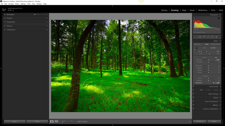
Full +100 saturation applied – notice the histogram here.
What is Vibrance?
Vibrance is a somewhat more interesting concept. This is a term Adobe has used to label something that is very similar to saturation. The difference between saturation and vibrance isn’t always black and white (color humor), but there is a distinction.
The saturation slider controls the intensity of all color tones throughout the image, regardless of their luminance. This means any colors whose brightness falls into the highlights, mid-tones, and shadows are all affected. Vibrance is different, in that it only affects the saturation of colors whose luminance falls into the mid-tone range. It has been referred to as smart saturation, and I tend to agree. Vibrance is very useful for enhancing, or in our case desaturation of the colors within a photo, without being as harsh as the saturation slider.
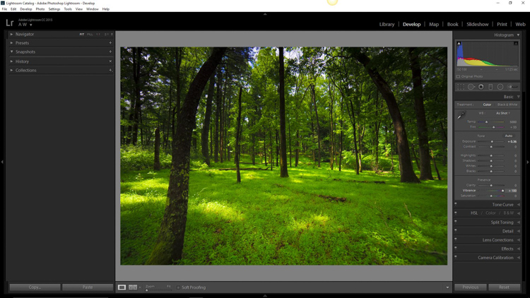
+100 Vibrance applied – notice the difference between this histogram and the saturation one.
When Does Desaturation Work Best?
Bright colors lend themselves to photos when the intent is to bring an upbeat or more cheerful feel to the image. Not to say that all less saturated images have to be melancholy or less cheerful, most times it is quite the opposite. The purpose of desaturated, or muted tones, is not to dampen the spirit of a photo, but rather to enhance the mood. Still, more often than not, photographs that benefit the most from desaturation are those which carry an underlying sense of brooding. Images that work well with desaturation include but are definitely not limited to:
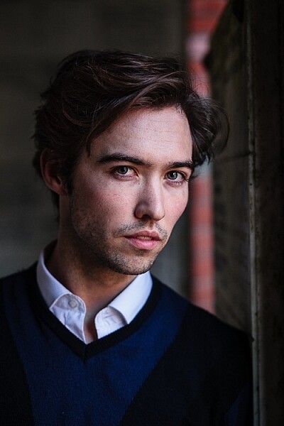
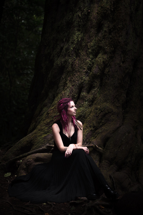
- Moody portraiture
- Earthy outdoor photographs
- Urban landscapes and cityscapes
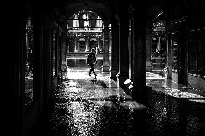
- Emphasizing dank weather conditions such as rain, mist, or fog
Now that you’ve been patient and endured the why, we will move onto the how.
How to Desaturate Images Effectively
More often than not, the actual desaturation process is accomplished with the vibrance slider more so than the saturation slider itself. They key is the desaturate the image without making it appear flat and completely colorless. There should almost always points of color which are emphasized. As with most aspects of photography less can actually be more. Don’t take away too much color and be sure to work with the colors that enhance the photo. It should be about harmony.
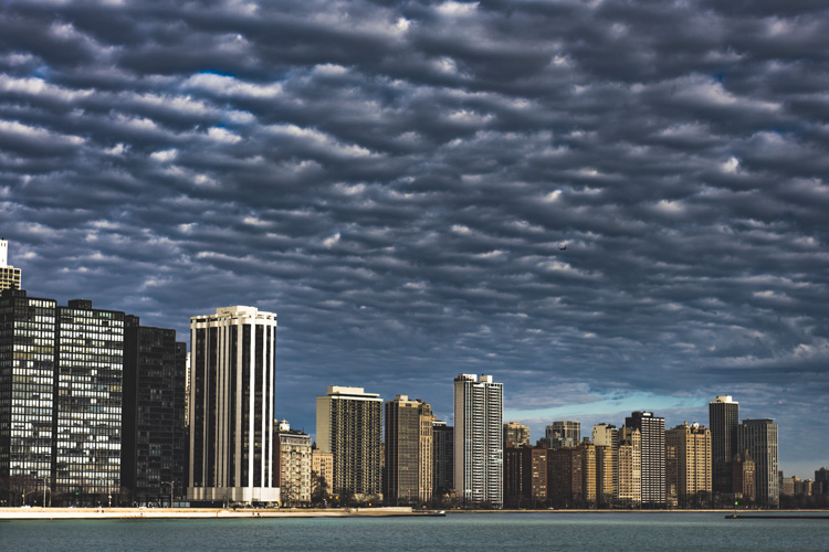
We begin with a RAW file straight from the camera.

Here we have the same image after being straightened, and some adjustments in the basic panel of Adobe Lightroom applied. I also used the neutral density filter tool to equalize the exposure of the sky, buildings, and water. Then +45 dehaze was added.

Now that we’ve finished with our basic adjustments, the desaturation process can begin. I find it usually works best to save the saturation adjustments for toward the end of the editing process. Please keep in mind that there are an infinite number of directions you can take your saturation effects, so have some fun with this part.
Find the Presence section of the basic Panel in the develop module of Lightroom.

For this image I took the saturation to -40.

This brings the entire photo into a considerably desaturated state.

By itself the desaturation leaves the image a little flat. To counteract this, let’s increase the vibrance to +25.

Remember that vibrance affects the colors in the mid-tones only. In this case, the blue, orange, and yellow tones are amplified. This makes them stand out more within the image, adding a little more pop.

Now, this is where things get interesting. Instead of settling for an image that is merely desaturated, we will now take full control with some advanced options, in order to make the photo stand out.
To do this, we turn to the curves panel. The tone curve is simply a graphic representation of the luminance present within the image. If you’ve ever seen a vintage style photo, most likely some edits have been applied using this technique. What we want to do is to slightly fade the image, in order to add a washed out feel to the scene. Mainly the blacks will be lightened and the highlights enhanced. This forms somewhat of an S-curve and looks something like the following image:

Which leaves us with a subtly faded effect.
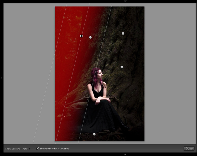
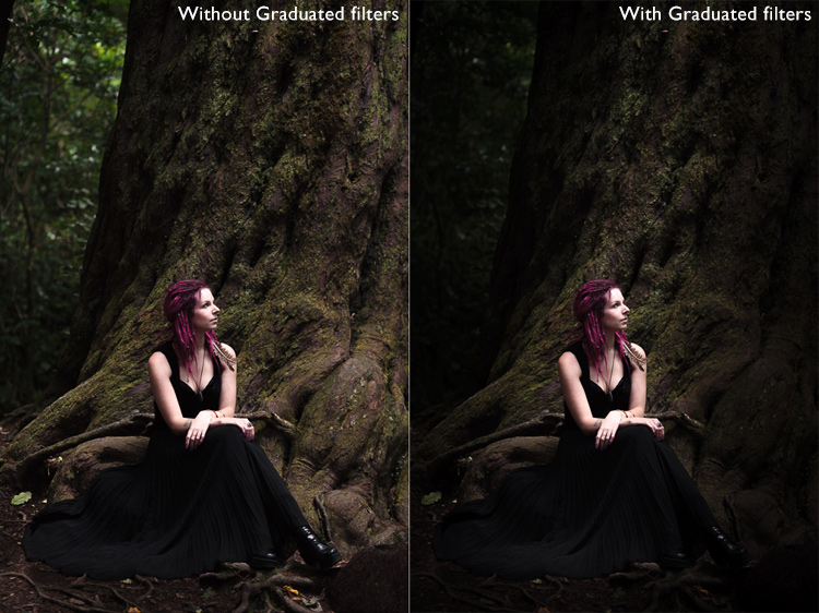
The buildings and the water still look a little drab, so to add a little color intensity we will once more turn to our old friend, the graduated filter tool. This will allow a little more color to be added where it is needed, without affecting the entire image.

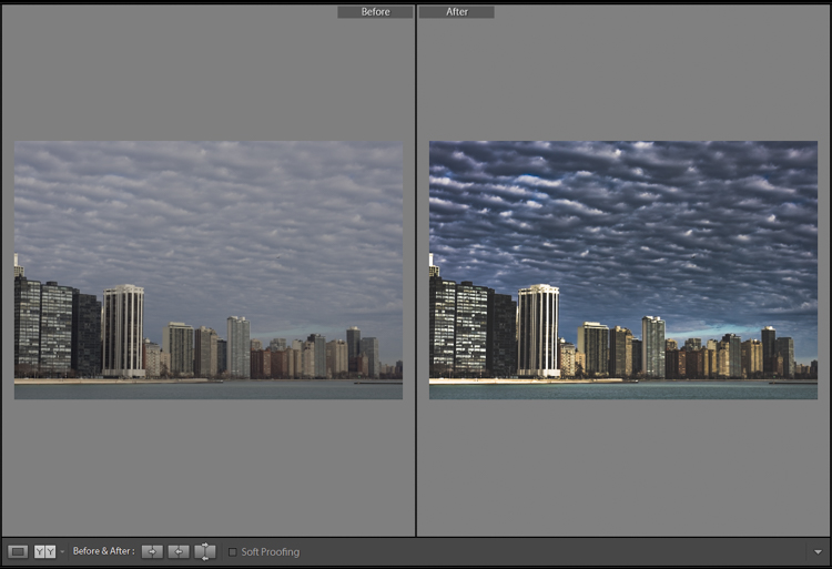
Which leaves us with a photograph much different than the one we began with just a few minutes earlier.

The difference is quite apparent when compared to the original RAW file.
Desaturating a photograph goes much further than merely taking away color. Sure, you can move those sliders to the left and continue on your merry way, but why not go further to the next level, and really make them unique? Remember these key points:
- Begin with a RAW file in order to give you the most dynamic range possible.
- Complete all basic adjustments such as exposure, contrast, and clarity first.
- Don’t go too far with your desaturation.
- Make use of the tone curve panel to add additional ambiance.
- Fine-tune your finished product using local adjustments such as graduated filter tool or the adjustment brush.
The important thing to remember is to never underestimate the possibilities for your images. Take the time to experiment with different effects until you discover what you like best. It may be something entirely different that what your expected.
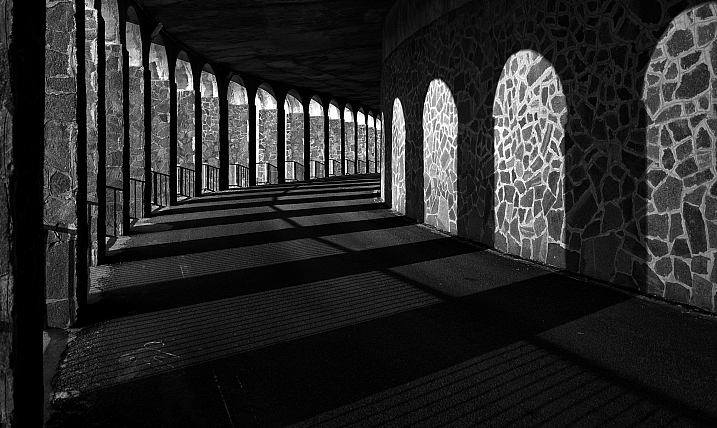
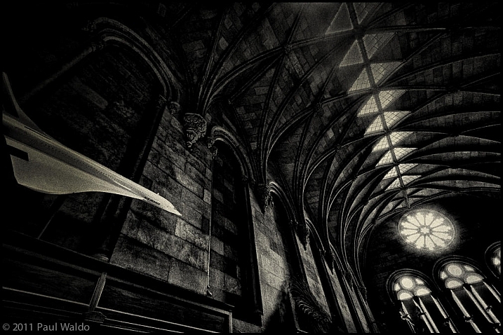
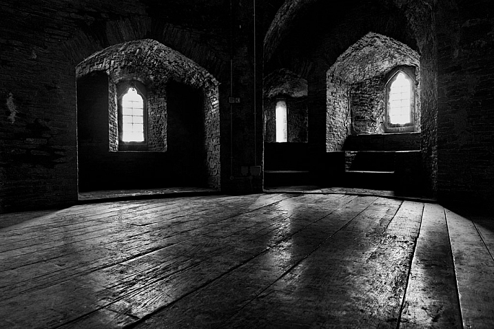
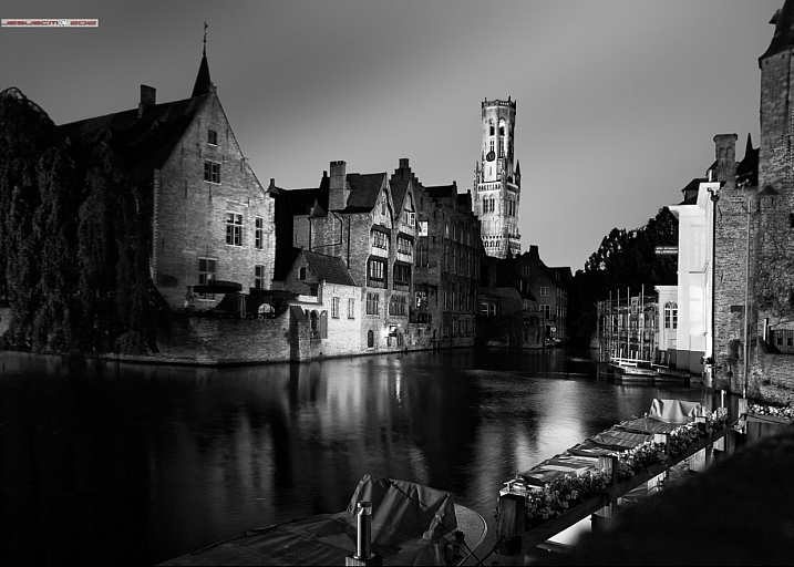
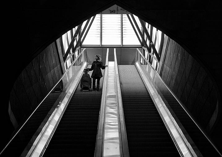
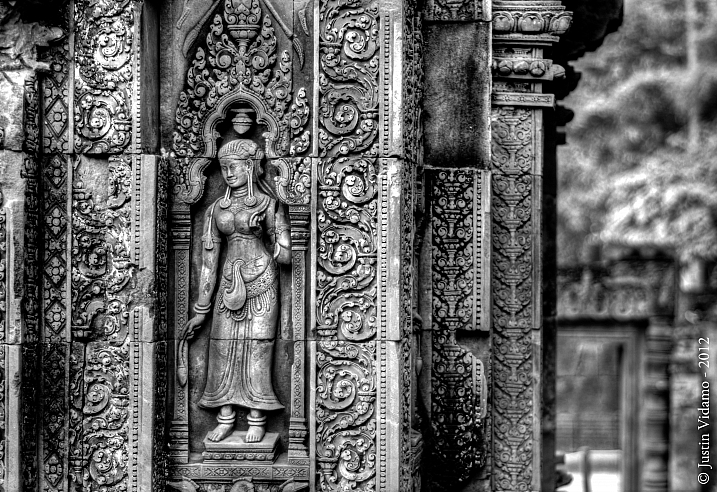
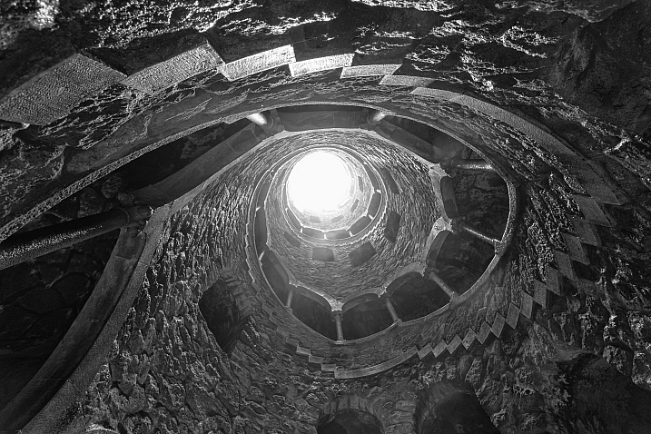
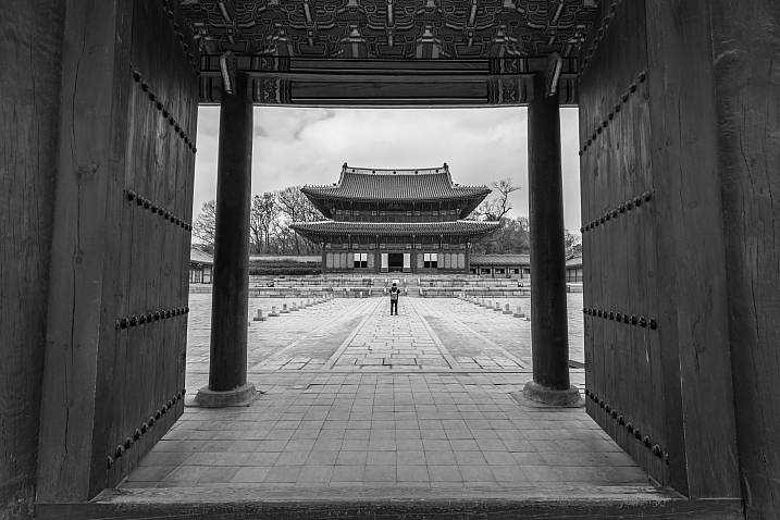
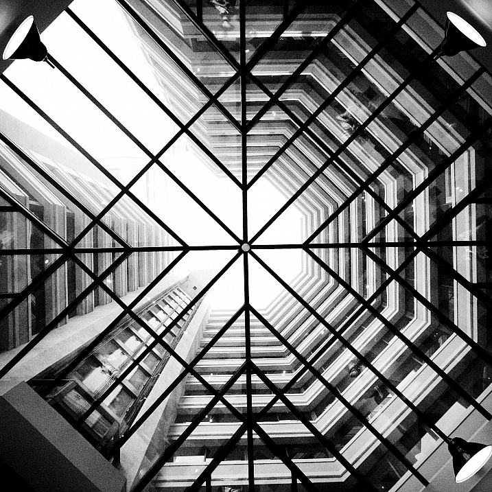
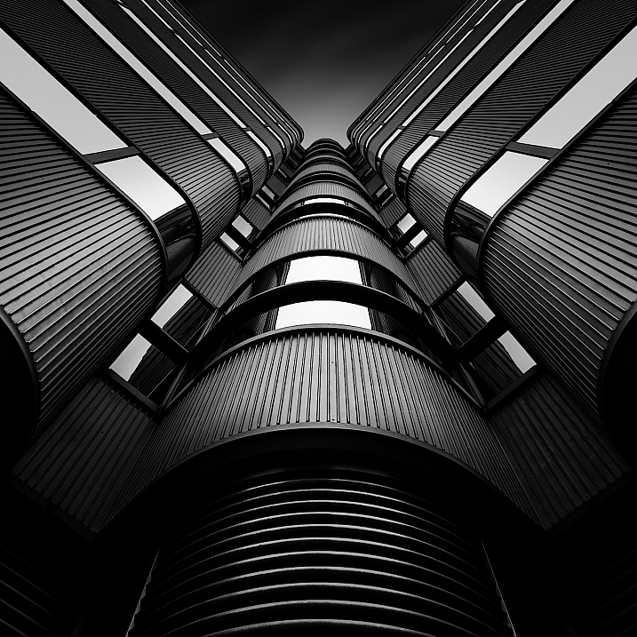
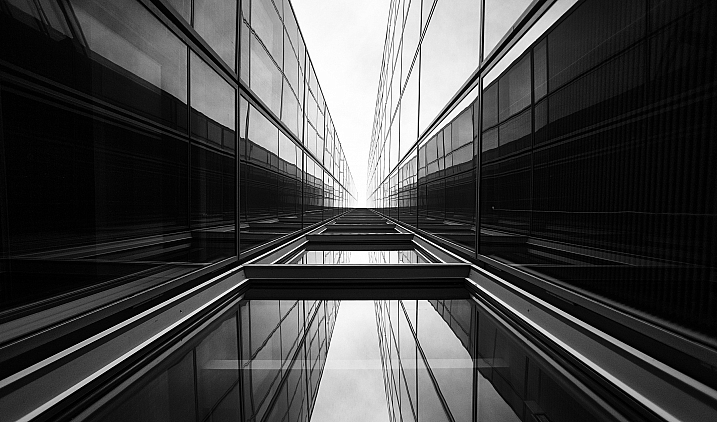
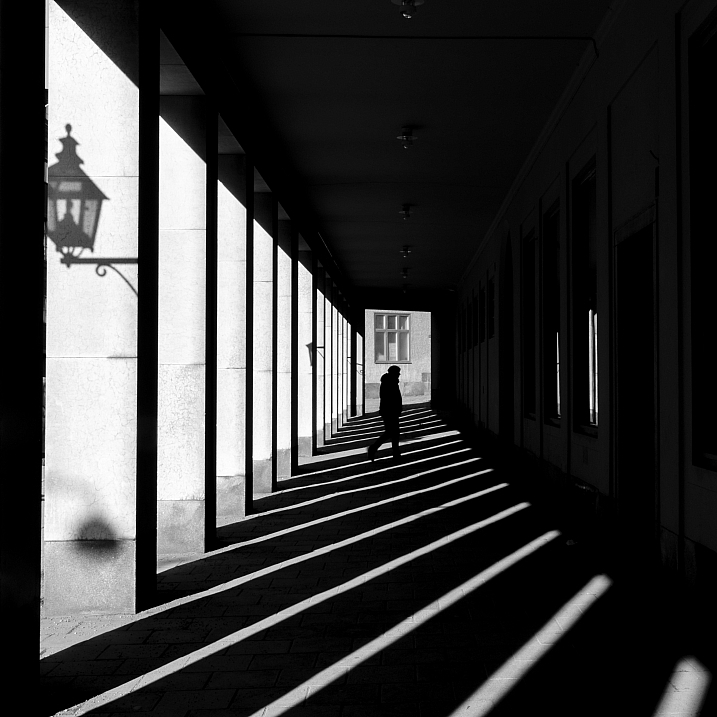
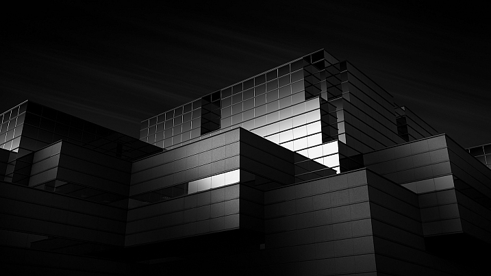
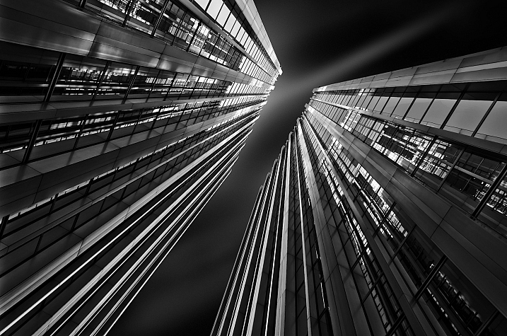
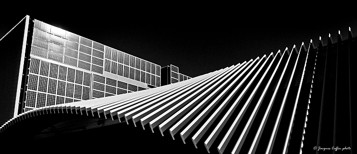
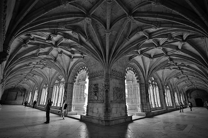
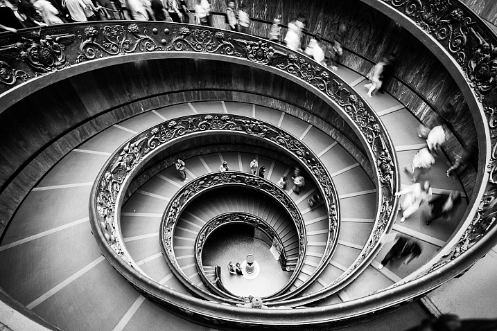
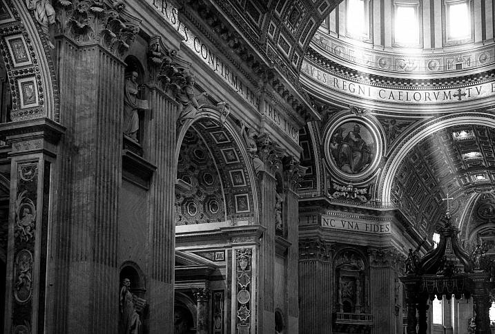
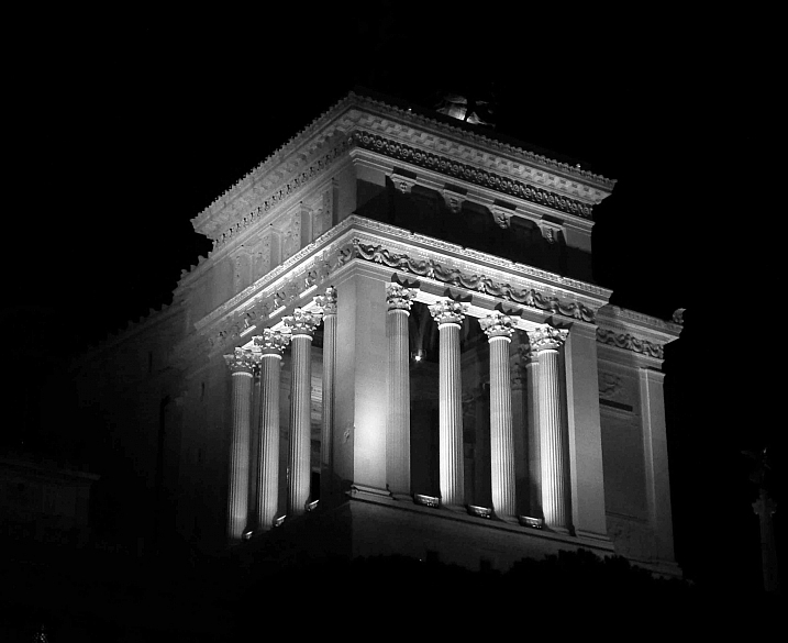
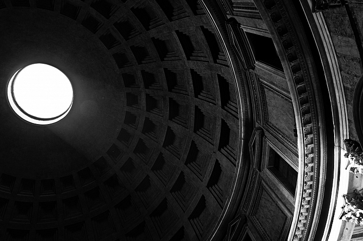
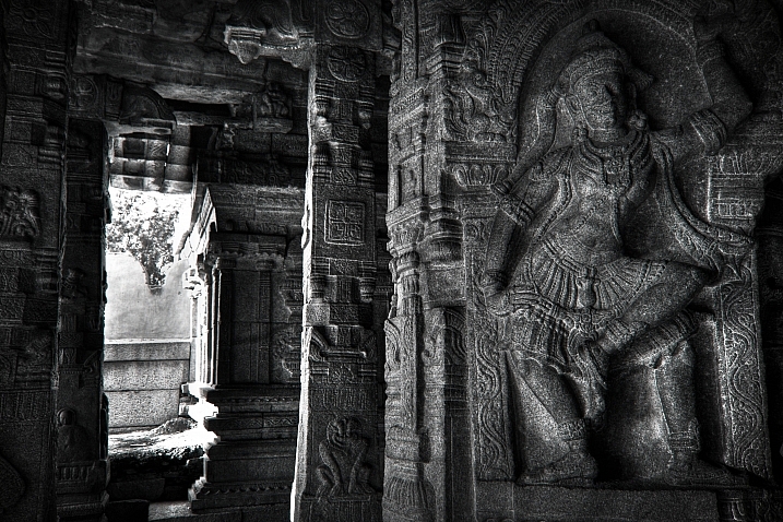
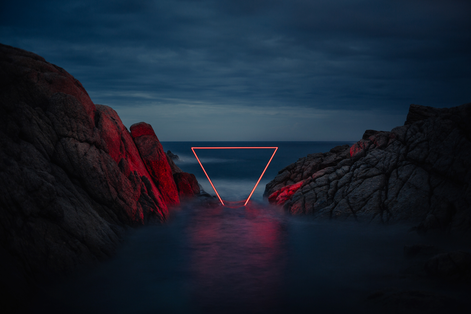
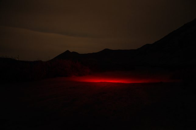
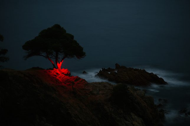
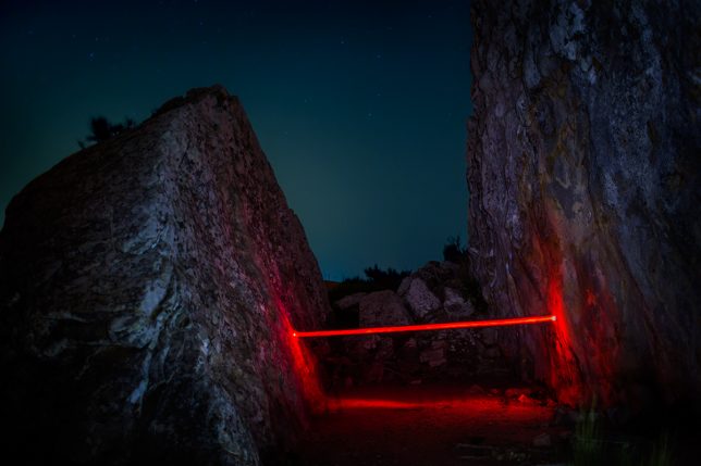
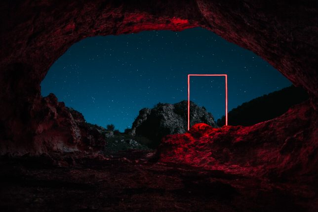
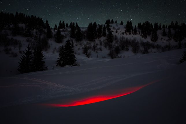
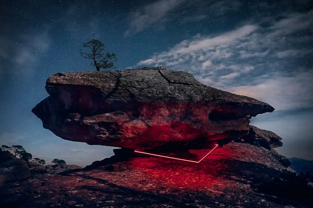
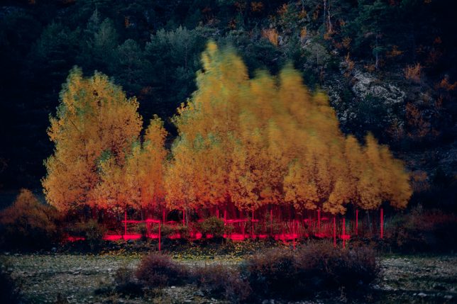
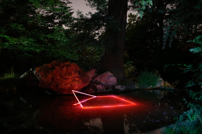
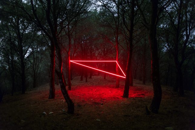
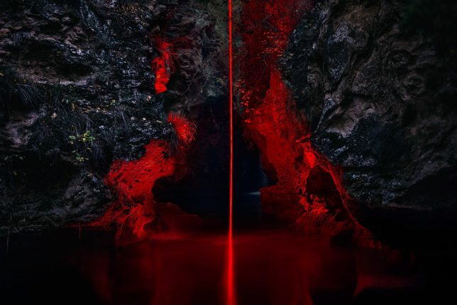
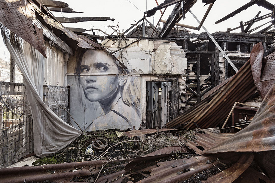
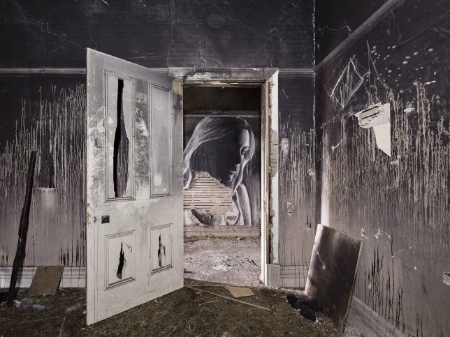
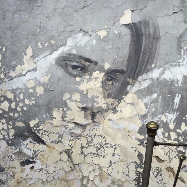
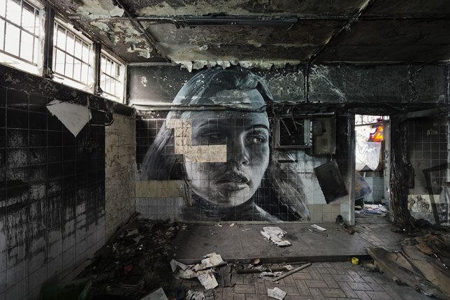
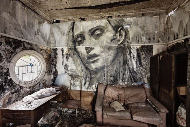
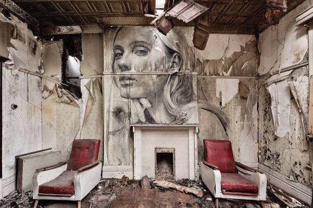
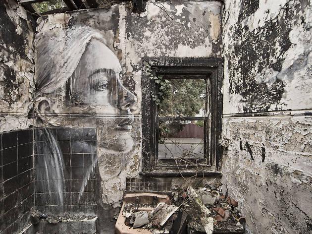
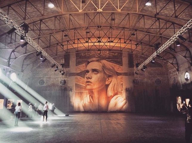
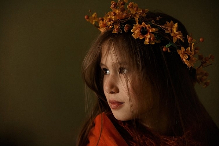
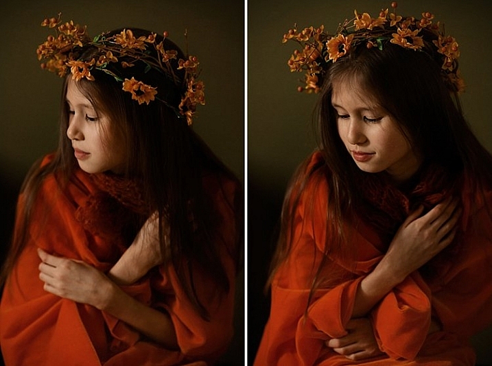
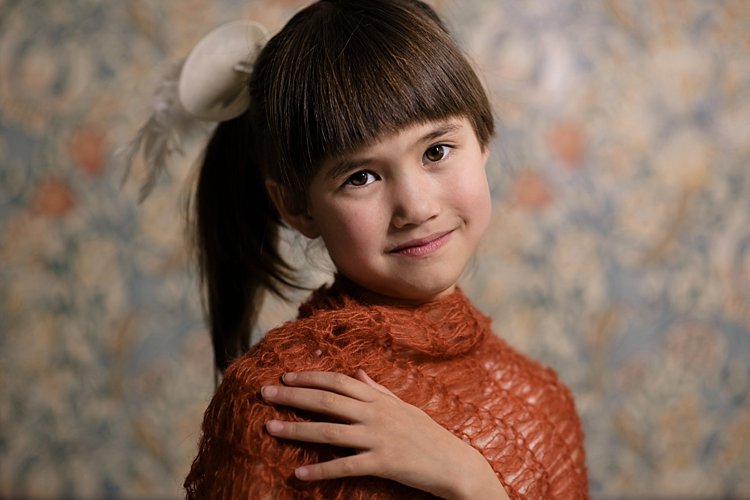
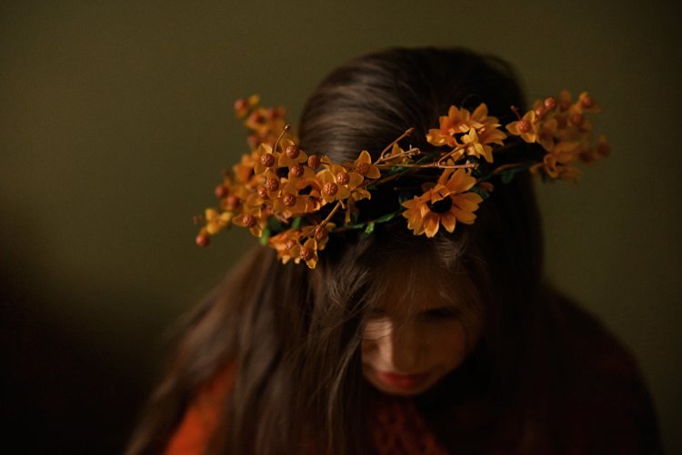
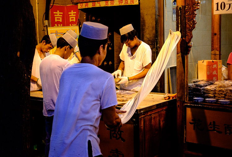
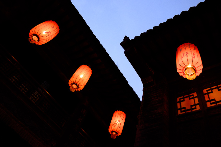
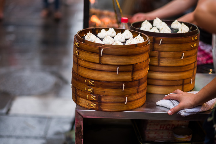
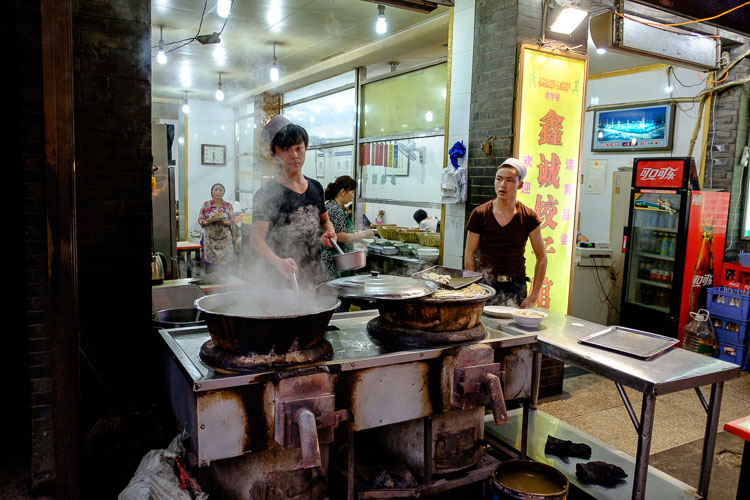
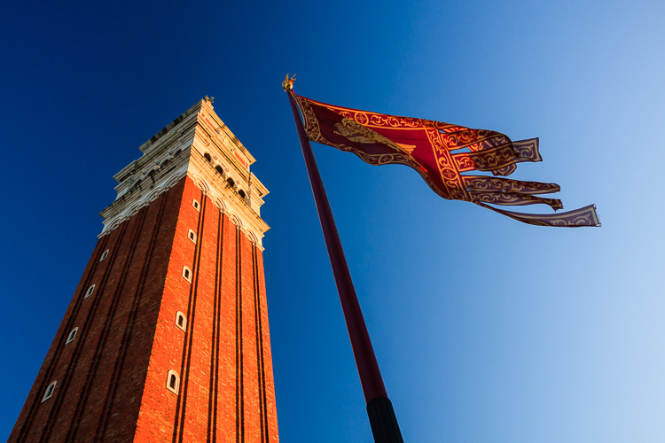
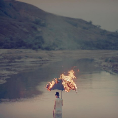
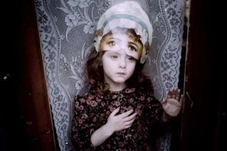
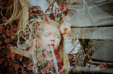
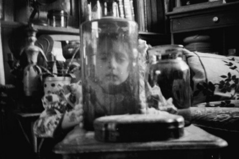
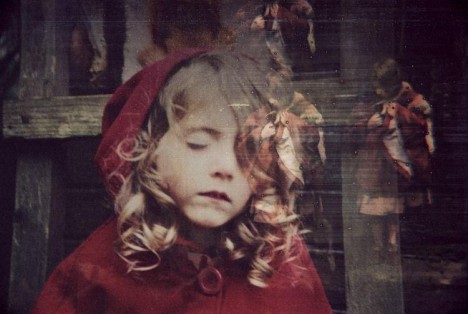
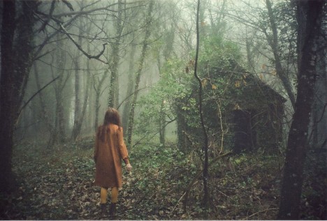
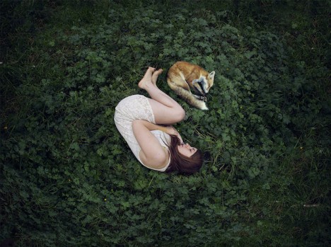
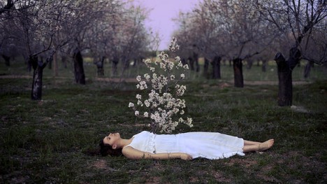
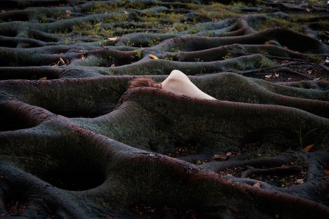
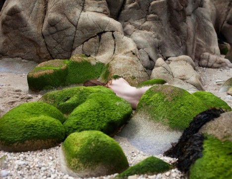
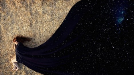
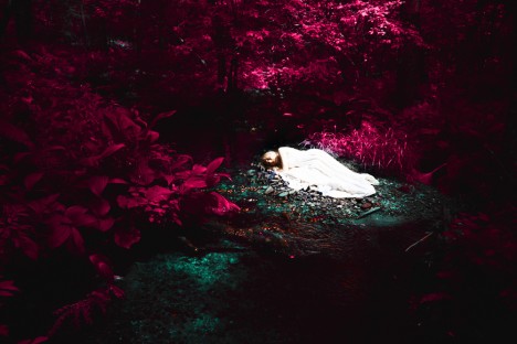
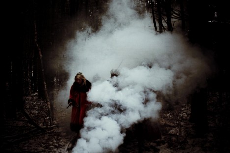
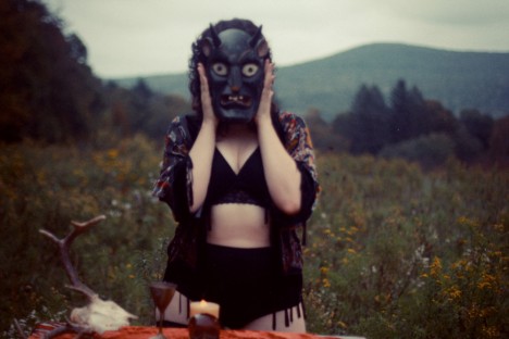
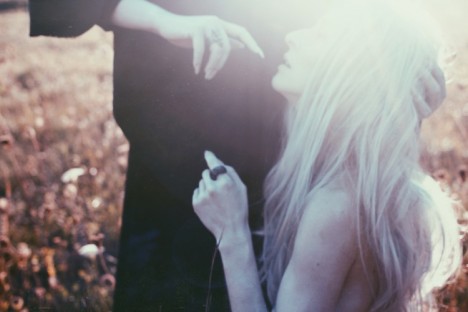
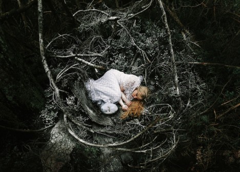
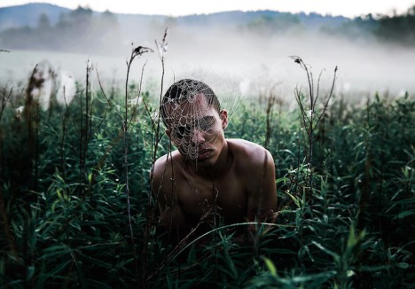
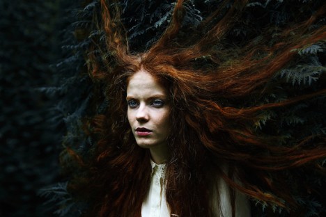
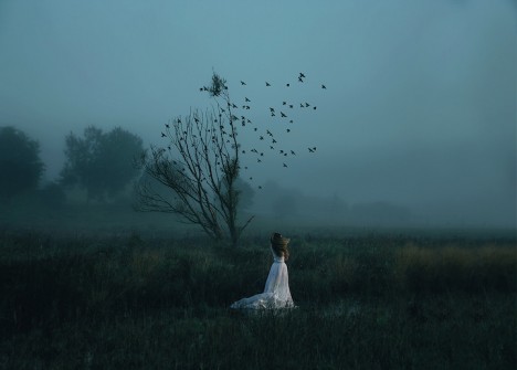
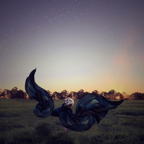
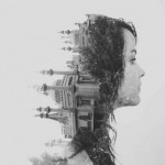
Here are a few more examples of images processed with a desaturated look:


Have you got some photos that you purposely desaturated? Be sure to share them with us in the comments below.
Editor’s Note: Adam also has a Lightroom Preset pack called Desaturated Cinematic that will give you this sort of look. Inspired by motion pictures and tv series, this pack of 25 lightroom presets will achieve great-looking desaturated effects. Perfect to give your images a simulated cinematic look. You can get more info on that by clicking the link.
googletag.cmd.push(function() {
tablet_slots.push( googletag.defineSlot( “/1005424/_dPSv4_tab-all-article-bottom_(300×250)”, [300, 250], “pb-ad-78623” ).addService( googletag.pubads() ) ); } );
googletag.cmd.push(function() {
mobile_slots.push( googletag.defineSlot( “/1005424/_dPSv4_mob-all-article-bottom_(300×250)”, [300, 250], “pb-ad-78158” ).addService( googletag.pubads() ) ); } );
The post Step by Step How to Make a Moody Desaturated Image in Lightroom by Adam Welch appeared first on Digital Photography School.

Digital Photography School


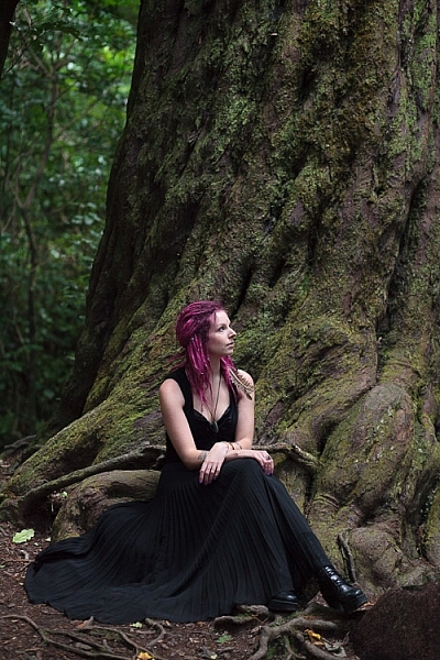
 Portrait #2
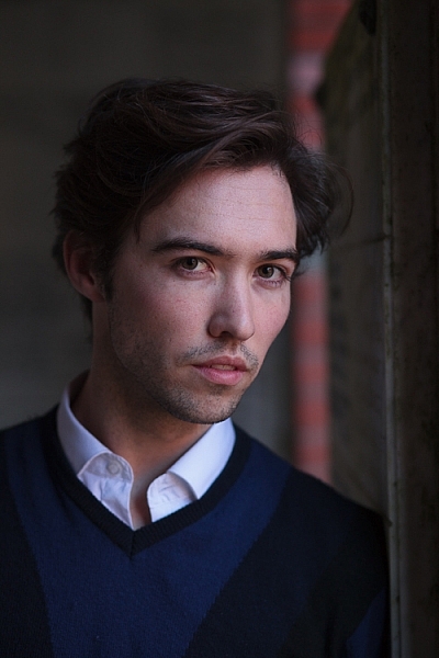
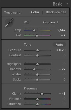
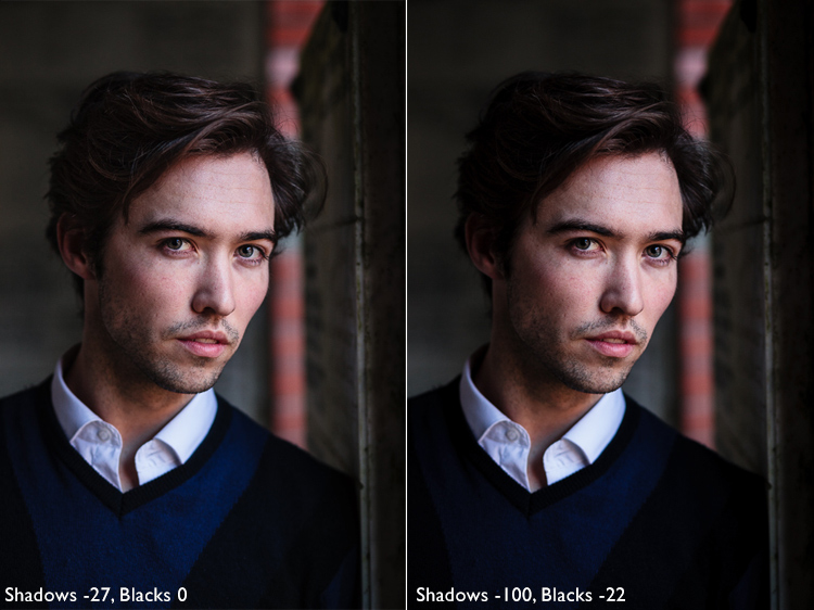
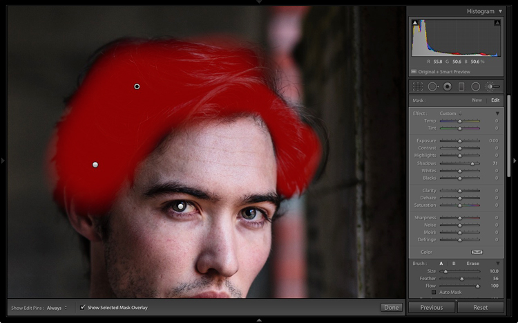
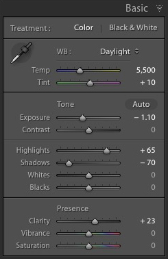 I made some subtle changes by setting the following:
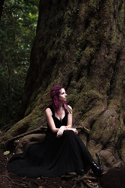


You must be logged in to post a comment.