RSS
 

Posts Tagged ‘Maximum’

Flickr triples maximum display resolution to 6K for Flickr Pro members

21 Oct

Flickr has announced it’s dramatically increasing the maximum supported display size for its Flickr Pro members, effectively tripling the current maximum resolution.

Until now, Flickr images were limited to being displayed at 2048px on the longest side. Now, the maximum display size is getting increased to 6144px (6K) on the longest side for Flickr Pro members.

According to the announcement post in Flickr’s help forum, ‘All new and previously uploaded photos from Flickr Pros with an original size larger than 6K will automatically be displayed in the largest size possible on Flickr, or the largest size set in your preferences […] Smaller photos will be displayed in the largest size possible for the original media.’

The increased maximum display resolution is already available to all Flickr Pro members. In the event you don’t want your images to be shown at the new 6K resolution, there’s a dedicated option to set the maximum display size. Those who aren’t Flickr Pro members will be limited to 2K resolution.

You can find a number of high-resolution example photos in the announcement post.

Articles: Digital Photography Review (dpreview.com)

 
Comments Off on Flickr triples maximum display resolution to 6K for Flickr Pro members

Posted in Uncategorized


USB4 gets official with maximum 40Gb/s bandwidth, USB Type-C connection

04 Sep

The USB Implementers Forum (USB-IF) has published the specifications for USB4, the next-generation USB architecture first teased back in March 2019.

USB4 will be a ‘major update’ that builds on the existing USB 3.2 and USB 2.0 architectures. It will be based on Intel Corperation’s Thunderbolt protocol specification and will double ’the maximum aggregate bandwidth of USB and enables multiple simultaneous data and display protocols,’ according to the announcement.

The USB-IF says USB4 is backwards compatible with USB 2.0, USB 3.2 and Thunderbolt 3, and will feature a maximum speed of up to 40Gb/s, twice the current 20Gb/s maximum. Since it will be using the same USB Type-C connection, manufacturers won’t need to alter designs to use the new ports. USB Power Delivery will also be a requirement in USB4 devices.

Despite the specification being finalized, it’ll likely take some time to market. Historically, it’s taken roughly a year from the time the specifications have been released to the time we see it in the first devices, but it’s always possible that precedent could be broken.

Articles: Digital Photography Review (dpreview.com)

 
Comments Off on USB4 gets official with maximum 40Gb/s bandwidth, USB Type-C connection

Posted in Uncategorized


CFexpress 2.0 cards will be offered in three sizes with different maximum speeds

15 Mar

In February, the CompactFlash Association announced the CFexpress 2.0 specification, a follow-up to the CFexpress 1.0 specification first revealed in late 2016. The new 2.0 spec update brings two more form factors to CFexpress, both targeting industrial and professional imaging markets, according to the association. The two new form factors join the original, ushering in Type A, Type B and Type C cards.

CFexpress 2.0 Type A cards are the smallest of the three form factors at 20mm x 28mm x 2.8mm, which is a bit smaller than a standard SD card. The Type A cards feature a Gen3 PCIe interface with 1 lane and a maximum theoretical performance of 1000MB/s.

The Type B card has the same dimensions as XQD cards at 38.5mm x 29.8mm x 3.8mm; this variety has a Gen3, 2 lanes interface and max theoretical performance of 2000MB/s. Finally, the Type C form factor is largest at 54mm x 74mm x 4.8mm with a Gen3, 4 lanes interface and max theoretical performance of 4000MB/s.

The different form factors offer manufacturers flexibility in choosing which card type their devices will utilize, such as the small card with a priority on compact size instead of transfer speeds, or the largest card with a focus on speed at the expense of compactness. Japanese publication DC.Watch shared images of these different card form factors earlier this month.

According to the CF Association, the CFexpress 2.0 specification is designed for a variety of needs, including imaging, which specifically includes DSLRs, mirrorless cameras, drone cameras and video cameras.

Articles: Digital Photography Review (dpreview.com)

 
Comments Off on CFexpress 2.0 cards will be offered in three sizes with different maximum speeds

Posted in Uncategorized


How to Use Creative Aperture to Maximum Effect

15 Nov

One of the most powerful controls on your camera is the aperture setting. It’s so useful that a good proportion of photographers utilize aperture priority as their primary setting, allowing them to quickly change this setting for creative aperture use.

So what are the ways you can use aperture to get creative photos? There are several ways and some different effects that can be achieved. So read on, and see how you can add these creative approaches to your photography.

You can use aperture to create bokeh like this.

Creating Bokeh in Your Photos

Almost certainly the first thing you’ll think of with creative aperture is bokeh. So what is this and how is it achieved?

What is Bokeh?

Bokeh is the area of the photo that’s out of focus, and the level of blur achieved will depend on a number of factors. The word itself come from the Japanese word ‘boke,’ which translates as blur.

Using aperture to blur out the background is an ideal way of making the main subject standout more.

How Creative Aperture Makes Bokeh

You’ll create bokeh by using a lens with a large aperture, and sometimes with a lens that has a long focal length. The best lenses for creating bokeh are prime lenses, mainly because they offer larger aperture. To create bokeh focus on an object in the foreground, and ensure there is a separation to the background. When using a lower focal length with a large aperture the distance of separation between fore and background can be relatively small. If you use a longer focal length with a lens that has a smaller aperture you can still achieve bokeh as long as the background is far behind your foreground object. To sum up use your lenses largest aperture, and ensure you leave enough distance to the background so it’s blurred.

  • Light source – One of the most attractive aspects are what are sometimes called ‘bokeh balls.’ When you have points of light in the background, they’ll become enlarged orbs because of bokeh. Look to place city lights in the background during blur hour, or light reflecting off leaves to create this type of bokeh.
  • Tell the story – One way of subtly telling a story in a scene is to blur out the background, but leave enough definition to see what’s happening in the background. Perhaps you can photograph some food, with the chef making that food blurred into the background.

You can use bokeh for simple minimalism in a photo.

Creative Bokeh

It’s possible to get even more creative with bokeh, by turning it into various shapes. The idea behind this involves placing a piece of black card over the front of your lens. You’ll need to cut the shape your want to create with your bokeh in the center of that card first though! To find out more about how to do this you can read this guide. Remember you’ll need some light sources in the background, so how about experimenting with some fairy lights this Christmas!

Get those creative sparks flying with different shaped bokeh!

Lensbaby

Lensbaby is a series of lenses produced with the idea of using bokeh in your photo. It’s a little like a tilt-shift lens and will create stretched bokeh as you change the position of the focal sweet spot. This lens can be fun to play around with, though it doesn’t produce the sharpest photos you’ll ever see.

The Sweet Spot

While this area of aperture usage isn’t especially creative, it’s worth knowing about. The lens sweet spot refers to the aperture which produces the greatest sharpness across your photo. Each photo will have a different sweet spot, but generally between f8 and f11 is the sharpest point for your lens. Knowing your lenses sweet spot is essential knowledge for landscape photographers. Keep in mind that if you have elements close to your foreground, you may need to use focus stacking to keep sharpness across the entire image.

Landscape photographers will often use an aperture of f8 for their photos.

Starburst Effect

A starburst can be produced when you have a single focused light source. This can be a street light, all the way up to the sun! The effect is produced by closing your aperture down to a number smaller than f16. Each lens will produce a slightly different starburst as well. This depends on the type of diaphragm used in your lens to open and close the aperture. The lens diaphragm has a number of blades and depending on how many of these there are, your ‘star’ will have different numbers of spikes.

The sun can have a star look to it, by hiding it behind the tree.

  • Photographing city lights – This is relatively straightforward, as you just need to close down your aperture. Keep in mind however that a small aperture will mean your photo is less sharp.
  • Photographing the sun – To do this you’ll need the sun to be partially blocked. This might mean hiding the sun behind some tree leaves, or waiting for the sun to just about disappear behinds some clouds or headland. In these conditions, the sun won’t dominate the rest of the frame as much, and you can create a star effect with it by closing down your aperture.

Starburst Filters

Not related to creative aperture, but this is an alternate way of creating starbursts in your photo. Once again this will create starbursts from a point of light in your frame. The light spikes will be longer though, and you might decide this creative effect is not for you.

City lights provide a great point of light, and this can be made into a starburst.

Get Your Own Creative Aperture Photos!

So now it’s your turn to use one of the key settings to its creative potential! Get your camera on aperture priority, and see what you can produce!

Do you have a favored way of using aperture for your photography? We’d love to hear your experiences with this setting.

Finally, please share your photos with the digital photography school community, by posting them in the comments section below.

The post How to Use Creative Aperture to Maximum Effect appeared first on Digital Photography School.


Digital Photography School

 
Comments Off on How to Use Creative Aperture to Maximum Effect

Posted in Photography


How to Set Up the Photoshop Interface and Workspace for Maximum Efficiency

03 Aug

You wouldn’t start cooking dinner and go to the supermarket each time you need an ingredient, that wouldn’t be very efficient, right? For any activity you want to undergo in life it’s always best to have everything you’re going to need before you start, don’t you agree? With the Photoshop interface, it is the same.

You will be able to work more efficiently if you set up your workspace according to what you need right from the beginning.

Photoshop interface - Get to Know Your Interface Setup Your Interface

The Photoshop Interface

In order to set up your workspace, you need to know what tools are available to you, how they behave, and what are the options. All of these things combined are called the interface, so let’s get to know it.

The big central area is called Canvas.

How to Setup the Photoshop Interface and Workspace for Maximum Efficiency

What is in the canvas area

This is where your image will be displayed, therefore it’s quite an important component. All around the canvas area you’ll find tools and information to help you manage your image.

On the right-hand side, you have the panels. There are tabs here that provide you with information about what you have on the canvas. Which tabs are there is entirely up to you as it is completely customizable, but I’ll get to that later on.

On the left-hand side, you’ll find the Tool box which, as the name suggests, contains the various tools you can use to modify your image. I’ll show you later how it can be moved but as a default, you’ll find it here.

On top, there’s the Option bar which provides the setting options for each tool that you select from the Tool bar, therefore it is constantly changing.

And on top of that, you’ll find the menu bar with many options to control your canvas, file, and interface.

How to Setup the Photoshop Interface and Workspace for Maximum Efficiency

When you put together these sections you can transform your workspace. Now that you know what everything is and where to find it you can start personalizing it according to your needs. Let’s get to it.

Personalizing your workspace

The very first thing that catches your eye, and therefore is something you want to decide, is the color. If you go to Menu > Photoshop > Preferences > Interface you’ll find the options.

You’ll notice on the image below that I have used the lightest shade of grey. But the choice is completely personal, try all of them and see which suits you best.

How to Setup the Photoshop Interface and Workspace for Maximum Efficiency

No matter which one of those you choose, you can change the color of the canvas any time because each photo may need a different background.

For example, if you are working on a black canvas and you start working on a black photo you might not be able to see the edges of the image. Just right-click anywhere on the canvas area and choose any of the default colors or make a custom one.

I’ll make it a really evident green, not because it’s something I would recommend using, but because I want you to be clear on which area is changing with this option.

How to Setup the Photoshop Interface and Workspace for Maximum Efficiency

Usability and function

Now that you fixed the look of your Photoshop interface and workspace, it’s time to move to the practicality aspects.

As a starting point, you can use any of the default workspaces that Photoshop has built-in. To find them just go to the drop-down menu on the top right corner. Feel free to try them all out.

However, since you are reading this in a Digital Photography School article, I’ll suggest you start with the Photography Workspace and we’ll start building up from there.

How to Setup the Photoshop Interface and Workspace for Maximum Efficiency

To start personalizing, it’s worth knowing that most panels can be detached and dragged anywhere on your workspace. You can just click on the top of the panel where there is a dotted line and let go wherever you want the panel situated.

How to Setup the Photoshop Interface and Workspace for Maximum Efficiency

However, this can get very messy really quickly. So if you want to move the panels around, I suggest you still attach them into another available slot. To find them just hover over the workspace and look for the blue lines as they indicate snapping points.

Panels

Let’s now focus on the panel area as it’s the most flexible of all. In here, you have different information windows in tabs that can be grouped or stacked. You may think that it would be helpful to have all of them open but that would take away space on the canvas for your image.

So it is actually much more practical to have as little as possible opened at one time. Therefore, let’s start by closing the ones you don’t need from the default setup. To close a tab just go to the top right corner of the tab and click on the drop-down menu, from there choose “Close”.

How to Setup the Photoshop Interface and Workspace for Maximum Efficiency

You’ll notice that the panel area is divided into smaller boxes. This is because tabs can be grouped. To move tabs from one group to another just drag them. And to close an entire group just choose Close Tab Group instead of Close from the drop-down menu.

How to Setup the Photoshop Interface and Workspace for Maximum Efficiency

Editing the Panels

If you need a panel that didn’t come with the default preset, you can access it by going to Menu > Window and select the desired option. It will be dropped into the collapsible column on the left of the panels which is a collapsible extension of the panels.

If you need it open all the time, like the Layer panel for example, then you can have it on the right so it displays all the information all the time. But if it’s something you need just on occasion, you can keep it collapsed on the left and just click on it when you need it.

If you don’t need a panel at all you can always make it disappear from that column just by right-clicking it and then choosing “Close”.

How to Setup the Photoshop Interface and Workspace for Maximum Efficiency

This column can also be customized to show the icon and name of the panel or just the icon. Just click on the arrow at the top to choose.

While I’m on that, let me tell you that the Tool Bar has a similar feature by giving you the choice of one or two columns. Keep in mind that expanding it means losing Canvas space, so I like to keep it in the slimmer version.

How to Setup the Photoshop Interface and Workspace for Maximum Efficiency

Finishing up

Now you know how to customize your Photoshop interface and workspace.

But, if you work on different projects (i.e you’re a photographer but also do design) you may need different workspaces according to each specific needs. Or if you use a shared computer with another family member or a co-worker then you also might need different workspaces for each of you.

This is why you want to save your customized workspace so you can come back to it easily each time without the need for repeating this process.

To do this, go back to the drop-down menu of the top-right corner and choose New Workspace. Name it and go back to it any time you need.

How to Setup the Photoshop Interface and Workspace for Maximum Efficiency

Furthermore, if you are in your workspace but still find that are some changes from how it’s supposed to look, just click reset and everything will be back to normal. One last tip, from the bottom of the Tool box you can also choose the screen mode you want to use.

How to Setup the Photoshop Interface and Workspace for Maximum Efficiency

Okay, no more procrastination, get to work!

The post How to Set Up the Photoshop Interface and Workspace for Maximum Efficiency appeared first on Digital Photography School.


Digital Photography School

 
Comments Off on How to Set Up the Photoshop Interface and Workspace for Maximum Efficiency

Posted in Photography


Maximum Discomfort: Furniture-Free House Takes Minimalism to Extremes

05 Mar

[ By WebUrbanist in Architecture & Houses & Residential. ]

kitchen

A renovated and expanded home in Maryland features no furniture, begging the question: what does it mean to be minimal and when does the philosophy go too far? Decorative clutter is one thing, but beds, tables and chairs are quite another.

minimal house addition

A new tower and extension expand the current cabin, and as photos of the project show: it is a very open space. Often furniture is removed for architectural photography, but in this case it is not a trick of staging just to get nice and clean shots.

living room

The place is a relatively spacious 1,200 square feet, maybe more than it needs considering its only furnishings are a movable dining table (diners sit on the floor) and a pair of roll-out sleeping mats. Where other furniture is required, islands and built-ins have been designed to serve the needs of the place. Sitting around the fire, apparently, involves sitting on the hardwood floors.

minimalist

McInturff Architects remade the space at the request of the client, providing a staircase to access the newly expanded upper level and adhering to their request for maximum minimalism. White, black and wood form the material and color palette of the place, likewise minimalist.

exterior

The architects argue that by leaving uses undefined the program retains flexibility, but he results look rather bare without decor (or furniture). Of course, at the end of the day, it is always up to the client, but one has to wonder if they will find it all sufficient or seek to add more over time.

Share on Facebook


[ By WebUrbanist in Architecture & Houses & Residential. ]

[ WebUrbanist | Archives | Galleries | Privacy | TOS ]


WebUrbanist

 
Comments Off on Maximum Discomfort: Furniture-Free House Takes Minimalism to Extremes

Posted in Creativity


Tips for HDR Night Photography to Retain Maximum Image Detail

07 Jul

Night photography is very popular, and if you go out to take photos on on any given night here in my hometown of Melbourne, you will find other photographers doing the same thing. Night photography can create magical images and you are able to see things with the camera, that you can not see with your eyes alone. Your camera can do a better job at taking in the lights than you can.

leannecole-night-photography-nightHDR-start

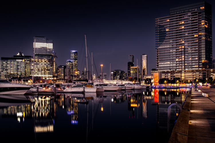
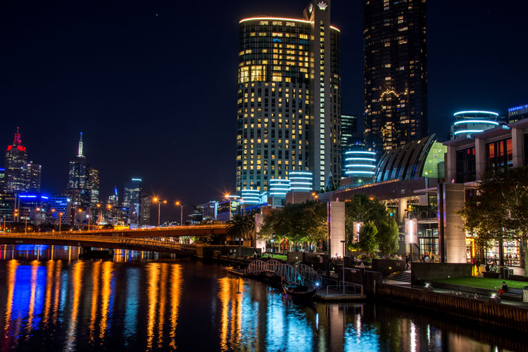
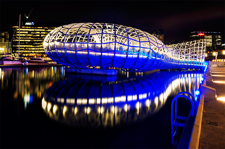
HDR image of Docklands, Melbourne.

Taking photos with your phone, or on a compact camera, is never going to give you those amazing results you see of night photos. You really need to do long exposures; set your camera up on a tripod and do exposures from a couple of seconds, to several minutes.

One major problem with taking photos at night is the sharp contrast between the highlights and shadows. If you try and get detail in the shadows, you will often blow out your highlights. If you do expose for the bright parts, then you won’t get any detail in the rest. Most people don’t mind this. However, if you want your night images to really sing, you should start looking at what you can do to make them stand out.

Comparing shots with different exposures

Here is a side by side comparison of images all taken at the same time, but with different methods. The first was taken with a phone, the second is a single exposure, the one the camera says is correct. Lastly, the third image is an HDR using four out of five bracketed shots.

leannecole-nightphotography-comparison

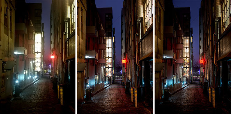
Three images of the same scene, (left) phone, (middle) camera correct exposure, and (right) HDR.

Hopefully you can recognize the difference and appreciate just how unique each approach is.

Photos with your phone

You see a lot of people in the city taking photos with their phones. If it is all you have, then you have to be content with what you get. However, you are never going to get amazing night photos simply with a phone or most compact cameras. Often the photos are too grainy, you will only get a few of the highlights, and none of the depth that a longer exposure will give you.

To get great night photos you need to have a camera on which you can control the ISO, aperture and shutter speed.

The first image (below) was taken with the Samsung Galaxy Note 4. It is not a bad image for a phone, but it is noisy and not as sharp.

leannecole-night-photography-phone

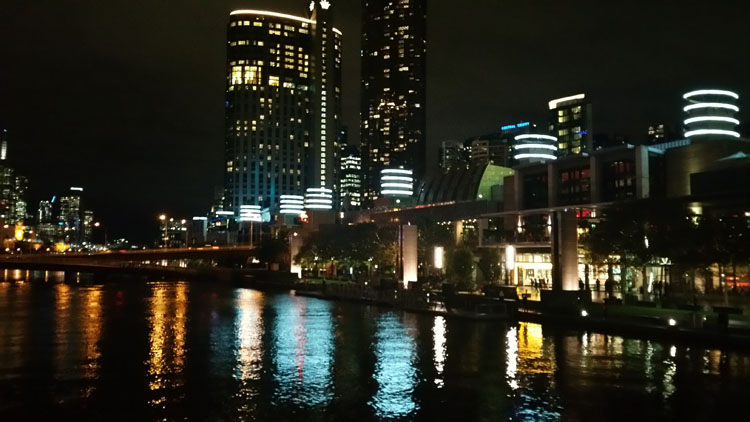
Image taken with phone of Melbourne at the Casino.

Using a DSLR or Mirrorless Camera

When you can control what your camera is doing, then you can use a low ISO, the aperture you want, and get a shutter speed of a couple of seconds to several minutes. You will get a lot more detail doing this, however, you do need more equipment.

A tripod or somewhere solid to set your camera is important to prevent camera shake. If you want to do exposures longer than 30 seconds you will need a remote shutter release, that will allow you to lock your shutter open for however long you choose to expose. Both are pieces of equipment that you will use a lot so they are worth getting.

This image was taken with a DSLR at the correct exposure, according to the camera.

leannecole-night-photography-3

Single image of Melbourne at the Casino.

Bracketing

Bracketing your photos is thought to be a process that people only do for HDR. However, photographers have been using this technique for a very long time. In the days of film, you would have had to work it out for yourself, but most digital cameras have the ability to take bracketed exposures, and do the calculating for you.

The process involves taking a series of photos, usually three or five. When you do this, you are taking one image that is the correct exposure, and additional images that are under and overexposed. The amount of time for each image changes, while aperture and ISO remain the same, and the shutter speed is altered by the camera.

There are good reasons for bracketing, one being that it gives you more options. Sometimes the exposure the camera says is the right one, is in fact not. The overexposed image or the one that is under can be the better choice.

leannecole-nightphotography-bracketed

Five bracketed photos ready to use.

There are, of course, disadvantages to bracketing. You end up with many more images, especially if you are doing five each time. If you are shooting in RAW you may encounter storage problems. However, I find that the positives far outweigh the negatives.

High Dynamic Range (HDR)

HDR has been popular for a few years and we have all seen those hyper real images that some people create. They have given the process a bad name, but if it is used in the situations it is meant for, it can be very effective.

High Dynamic Range is used to correct the problem of having very bright and overly dark areas. Cameras do not work the same way as our eyes, and they cannot make the necessary adjustments that your brain and eyes do. Your camera will either expose for the highlights and make the shadows too dark, or it will do the opposite.

HDR software takes the well exposed highlights and shadows, and puts them together in one finished image so that nothing is lost in either area. You can do it manually (using luminosity masking or layer blending), but there is good software out there which can do it for you.

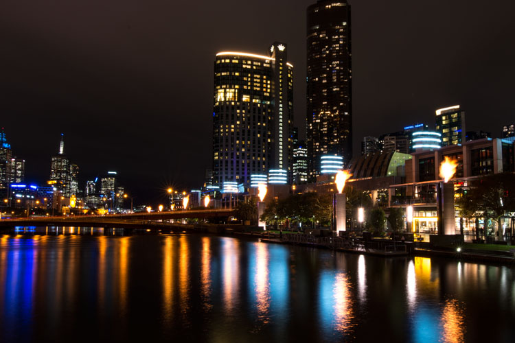
Here is an HDR image of the same scene above, using four of five bracketed shots. Notice how much more detail is retained in the highlights.

leannecole-night-photography-hdr-example

HDR night image of Melbourne at the Casino.

HDR Software

There are many different types of software that can process your HDR images for you. The most popular has been Photomatix Pro, though Lightroom and Photoshop can also be used, and they have improved significantly over the years.

Lightroom does a fairly decent HDR image and I often use it. However, you do have to be careful that the image is processed properly. Sometimes it misses spots, but most of the time it is effective.

Lightroom HDR

It is easy to use Lightroom’s Merge to HDR. Select the images you want to process and highlight them. Go to Photo > Photo Merge > and click on HDR (you can also find it by right clicking with the images selected).

leannecole-night-photography-101

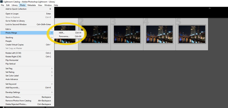
Selecting photos and merging for a HDR in Lightroom.

A separate window will come up. You can select whether you need deghosting or not (use it if something has moved between shots like trees or people). If you have used a tripod to take the image then you shouldn’t need deghosting, although it doesn’t hurt to use it regardless.

leannecole-night-photography-102

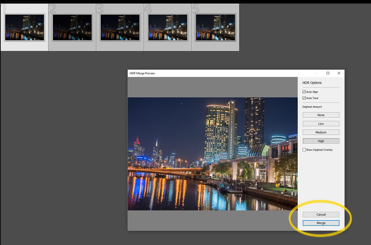
Lightroom loading the photos ready for you to click Merge

Watch for the Merge icon to come up and then press it.

Often the image will appear at the end of the folder, sometimes just after the images. You may have to search for it (sort by file name and it should appear next to your originals).

Once it is done you will see that it does not look great.

leannecole-night-photography-103

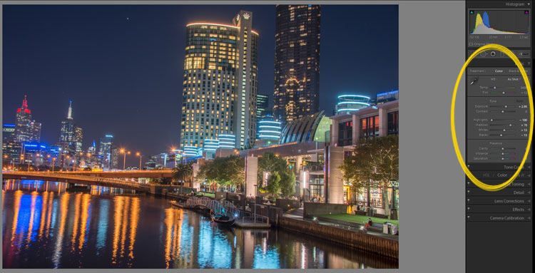
What the image looks like when Lightroom has processed it using Auto Tone.

Lightroom shows you the adjustments that it has made using Auto Tone, but there is no reason why you can not change them.

I have found that it will often have the exposure up too far, but you are able to turn that down slightly. You can turn the shadows down a little, and you usually need to add more black to the image. Compare the image above and below and you can see what changes have been made.

leannecole-night-photography-104

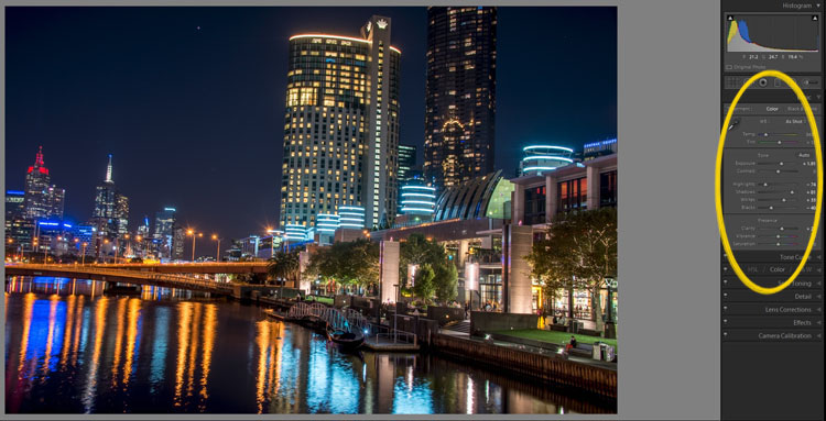
What it looks like after you have made changes to the adjustments.

Once you have the image as you want it, you can do further adjustments in Lightroom or press Ctrl+E and continue editing it in Photoshop.

Long Exposure Night Photography

There is nothing wrong with doing long exposures as well. You do not need filters, but you can do images that are more than 30 seconds. Using a tripod and a remote shutter release, you can put your shutter speed on Bulb, and try taking some exposures for a minute or longer.

leannecole-night-photography-longexposure

A one minute exposure of Melbourne at the Casino.

You do have to be careful that you don’t blow out the highlights too much. Try different times and see what you can get.

Examples

Night photos taken with any of these techniques can give you great results. You should try them all and see which ones you like, and what works best for your style.

Following are some more night shots with descriptions of how they were done.  Good luck and be safe out there.

leannecole-night-photography-example3

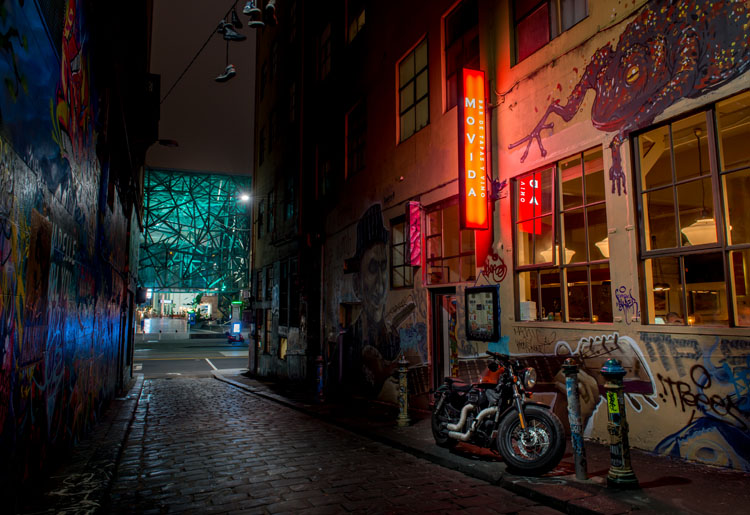
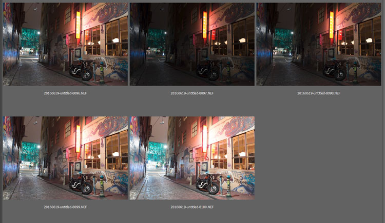
Hosier Lane in Melbourne, HDR image with 4 images.

leannecole-night-photography-hdr-example2

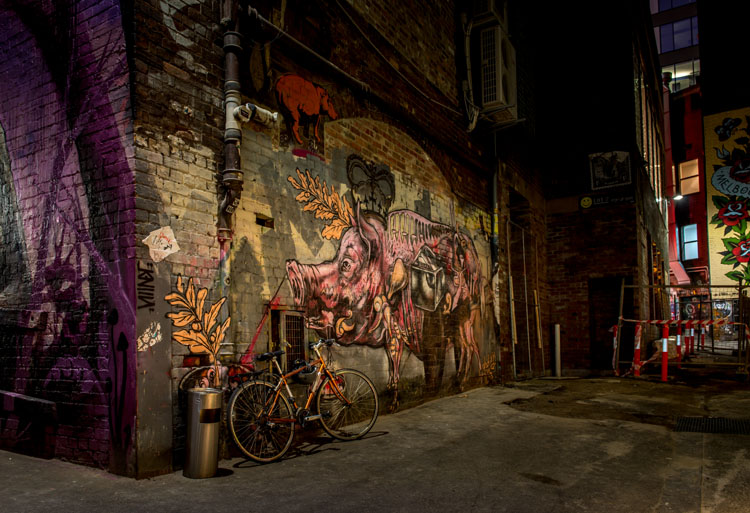
HDR image of laneway in Melbourne.

leannecole-night-photography-example4

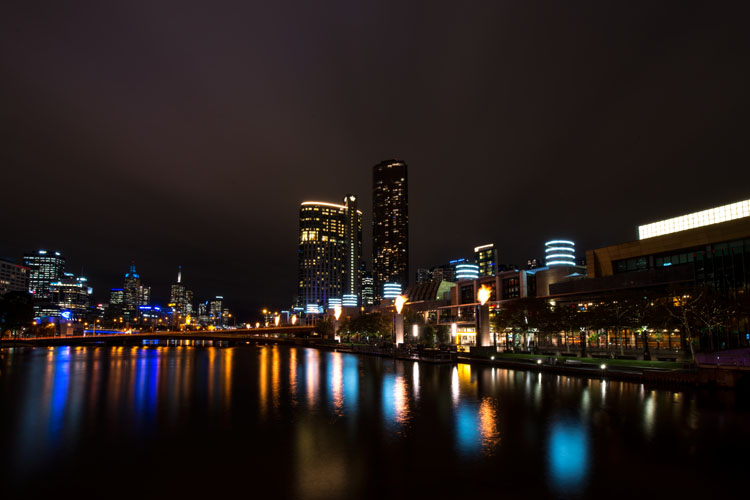
Single image at docklands with a one minute exposure.

googletag.cmd.push(function() {
tablet_slots.push( googletag.defineSlot( “/1005424/_dPSv4_tab-all-article-bottom_(300×250)”, [300, 250], “pb-ad-78623” ).addService( googletag.pubads() ) ); } );

googletag.cmd.push(function() {
mobile_slots.push( googletag.defineSlot( “/1005424/_dPSv4_mob-all-article-bottom_(300×250)”, [300, 250], “pb-ad-78158” ).addService( googletag.pubads() ) ); } );

The post Tips for HDR Night Photography to Retain Maximum Image Detail by Leanne Cole appeared first on Digital Photography School.


Digital Photography School

 
Comments Off on Tips for HDR Night Photography to Retain Maximum Image Detail

Posted in Photography


Maximum sharpness: Nikon’s automated AF Fine Tune explained

22 Apr

Among the features introduced in Nikon’s new D5 and D500 DSLRs, we’re very excited by automated AF Fine Tune. This feature allows users to quickly fine-tune their specific camera bodies and lenses, maximising the chances of a sharp shot and avoiding the lengthy process of trial-and-error tuning that was previously necessary. Watch our video and read our in-depth analysis.

What’s the problem?

If you’re a DSLR shooter, you may be acutely aware of consistent front or back-focus issues with some of your lenses, particularly fast ones like F1.4 primes. Mirrorless users tend to not have such issues, because their cameras focus using their image sensors. When a mirrorless camera says it’s achieved focus, generally it’s actually in focus. That doesn’t necessarily hold true with DSLRs, which use a secondary phase-detect sensor under the mirror as a sort of proxy for focus at the imaging plane. This makes DSLR focus sensitive to misalignments between the secondary AF module and the image sensor, and also requires calibration of the optics inside the module itself. Furthermore, the way these phase-detect AF modules makes them sensitive to certain lens aberrations, like spherical aberration.

Manufacturers of DSLR bodies and lenses do a lot of calibrations to make sure that this isn’t an issue, calibrating every AF point at the factory, writing look-up tables into lenses, and more. But the reality of tolerances is such that you’ll be best off if you calibrate your particular copy of a lens and your particular copy of a body yourself. That’s what AF Fine Tune, or AF micro-adjustment as Canon calls it, is all about.

State of the current art…

Up until now, this calibration procedure has required cumbersome procedures for accurate calibration. We’d often set a camera up on a tripod and align it to a LensAlign (which has a sighting tool), then have to change the set up to test different subject distances, lighting, or lenses. Some photographers even try to Fine Tune on the spot by trying different values and seeing if a real-world target looks sharper or not – but this method is extremely prone to error. Solutions like FoCal have tried to automate the procedure, but again, the requirement of a chart and a computer is cumbersome.*

… disrupted

Nikon’s new automated AF Fine Tune makes things as easy as child’s play. It uses contrast-detect AF in live view, which focuses using the image sensor and is nearly always accurate, to calibrate its own phase-detect AF system. Watch our video above to get an idea of just how easy it is to calibrate your lenses on the new D5 and D500 cameras.

A couple of things are worth keeping in mind. For some lenses and systems, the optimal calibration value can change for different subject distances. This isn’t necessarily always the case, but you may wish to calibrate for the subject distances you’re most likely to shoot for any particular lens. For a good all-round calibration, we’re told that using a target approximately 40x the focal length away strikes a good balance.

The key here is to play around a bit. Try a couple different distances, a few different runs, and make sure you’re getting a consistent result. Sometimes we’ve found the optimal value to change with lighting temperature, but this sort of thing is precisely why the automated procedure is so valuable: if you’re running into trouble with focus, you can – right at the wedding reception you’re shooting – set the camera on a table, point it at a static object, and calibrate your camera in under 10 seconds. Yeah, we timed ourselves.

The result

Here’s an example of how Fine Tune helped calibrate our Nikon 24/1.8 to our D5. Roll your mouse over the ‘OFF’ and ‘ON’ buttons to see Sam’s eye sharpen up. If you click on the main image, you can see the full image in a separate window, where you’ll notice that the ‘OFF’ shot is front-focused on Sam’s nose, while the ‘ON’ shot is focused correctly on his eye. We placed a single AF point over Sam’s left eye (on camera right) for focus in both cases.

AF Fine Tune OFF
(focused on nose)
AF Fine Tune ON
(focused on eye)

In this case, for this lens paired to this body, automated AF Fine Tune found a value of +14 was best. This indicates that for correct focus, the camera has to shift focus backward an arbitrary 14 units from the focus reading the phase-detect sensor makes. In other words, out of the box, this lens on our D5 front-focuses. If it had back-focused out-of-the-box by a similar amount, we might have expected the automated procedure to find -14 to be the optimal value.

How we’d like to see this feature evolve

AF Fine Tune currently only writes one global value per lens. This means the calibration value can’t be adjusted for either end of a zoom. Furthermore, only the center point can be calibrated – the camera assumes that the calibration at the factory ensures all points are consistent with one another and, importantly, the center point. Finally, as mentioned earlier, sometimes the optimal value can change based on subject distance.

Canon cameras currently at least offer to microadjustment values for either end of a zoom, but don’t offer any sort of automation to help you out. Sigma and Tamron USB docks allow for calibration at either end of the zoom, and for 3 to 4 different subject distance ranges, allowing for a high degree of accuracy of calibration. Unfortunately, entering 4 different subject distance ranges for two ends of a zoom mean the user has to literally set up the camera 8 times, with some sort of test target for accurate assessment – hardly practical for most working photographers.  

The key here is automation: automating opens up a world of opportunities, and automated Fine Tune is an important first step. We’d even imagine a future implementation where calibration data for all focus points is stored and learned from over time. Every time you calibrate a particular point, the camera could retain subject distance information (passed on to it via the lens), and over time learn the best calibration values for each point, for all subject distances, for different temperatures and lighting as well (the latter are often minor concerns).

To sum up…

Nikon’s automated AF Fine Tune is truly one of the most welcome features we’ve seen added to a DSLR in recent times. We’ve wondered for years why camera companies don’t use their contrast-detect AF to self-calibrate their phase-detect systems, instead relegating calibration to a cumbersome end-user experience.

Automated Fine Tune changes all that. It’s a really useful feature that takes a lot of guesswork and cumbersome aspects of calibrating yourself out of the equation, allowing you to do it on the spot, at an event, anywhere, on the fly. In fact, anyone working with shallow depth-of-field imagery should absolutely perform this procedure. Wedding, newborn, portrait, lifestyle, photojournalist, and even sports photographers: take note.


* We really like Reikan FoCal for research purposes though: you get a plethora of data for how a body/lens combination behaves at different subject distances, on different days, under different lighting, and even a map of the optimal calibration value per AF point. Of course, since you can only enter one global adjustment value into your camera, this information is a bit more academic, but if you want to get an idea of the behavior of your system, there’s probably no more comprehensive tool than FoCal.

Articles: Digital Photography Review (dpreview.com)

 
Comments Off on Maximum sharpness: Nikon’s automated AF Fine Tune explained

Posted in Uncategorized


Composition After the Fact: Cropping for Maximum Impact

10 Aug

It may at first seem simple. You took the shot a little wide, or a sneaky branch that you didn’t notice found its way into the edge of your photo. In Lightroom (LR) it’s just a quick press of the R key to activate the crop tool, hold down the shift key to constrain the crop so you don’t get a weird aspect ratio, and your task is complete.

A cropped portrait

The crop tool – simple, yet powerful.

On the contrary, cropping is one of the more powerful tools that you have at your disposal to dial in the composition of your images. Prime lens users will also find that the limited versatility (compared to zoom lenses) can result in the need for cropping more often.

First, let me make the caveat that many aspects of photography are highly subjective. Some of the information and advice offered in this article is my personal opinion, and is the approach I take to create images that fit my style. Personal preference always prevails. Anything called a rule is only so because a common pattern was identified within compositions that are considered especially attractive.

In many respects cropping echoes the fundamental principles of composition. Luckily, if you didn’t get what you wanted the first time around, when you took the photo, you get a second chance, albeit limited, to recompose your images in post-production for maximum impact.

The Basics

The very first thing I look for, and correct, in any photograph that I edit is straight lines. Horizon lines and any vertical lines that are near the edges of the image, should be straight. It absolutely drives me crazy when I see photos with crooked lines.

That being said, lines can be crooked, but it better be obvious that was the intent, otherwise it just looks like careless composition or lazy editing. In the right context a skewed horizon can add drama, and make an image more dynamic.

Photo cropped with crooked horizon.

Crooked horizons can make viewers cringe unless the intent is obvious.

Make this your first step in cropping, because depending on how radically you have to rotate the image you may be forced to crop the edges of the image.

If you have the time when composing the shot, and your camera has a built-in virtual horizon feature for levelling, by all means do so. I have delegated a customizable button on the front of my camera for activating this feature, and I use it all the time.

With the crop tool activated in LR (keyboard shortcut R) there are a few ways to straighten out an image:

  • Drag the Angle slider left or right
  • Click on the value to the right of the slider and drag left or right (scrubby slider)
  • Click on the numerical value and enter whatever you want
  • Hold the CTRL key while dragging along a straight horizontal or vertical line (will correct on either axis) and LR will fix it automatically
  • Also new in LR6 (LR CC) is the “Auto” feature for the crop tool. Just click it and see how it does – then tweak as necessary.

Elimination

A senior photojournalist at a newspaper I once interned for, gave me a memorable piece of advice while critiquing my photos, he said, “crop until it hurts.” It was his way of telling me that I was leaving too much dead or negative space in my compositions.

To this day his advice always resurfaces in my mind when I’m editing images, especially with portraits or other photos with people in them. Fight the urge to become attached to pixels. Crop out half of the photo if need be. Unimportant areas of a photo are not precious real estate.

Cropping to isolate the subject.

You can’t always get as close to the action as you would like (or it is safe to do so) and heavy-handed cropping can make all the difference.

The fact of the matter is that simple is better. We all suffer from attention deficit disorder, and viewers usually don’t want to spend too much precious time analyzing a photo to get the story. Consider the allure of silhouette images. When cropping look for simple compositions and try to distill the scene down to its essence.

Once the image is rotated and you’ve been forced to chop off some of the edges, look for elements that detract, distract or add little to the image. You may not have a choice but to include them, but it’s good practice to be cognizant of them and it may help guide the rest of your editing process or future compositions.

You see many images where the photographer is too conservative when cropping portraits or photos of people. Again, each photo is different, and there is no magic formula, but for example, I find that tight profile shots of people grab my eye more when they are cropped in really close. I am not afraid to cut off the back of the subject’s head, putting their ear in the upper corner of the image, or even cropping the ear out.

Tight cropped portrait

Cropping in very tight can sometimes create a more powerful image.

Negative space can play an important role, especially if shooting for a publication where they need space for text. But, the nice thing about having post-processing options is that you can always revert back to the original. If you compose your images super tight in camera, you can’t get that negative space back.

Leading Lines

Although thoughtfully composing your shots through the viewfinder is one of the more rudimentary skills in photography, there are often distractions. You may find surprises when you pull up the final image on your computer screen.

In photography, as well as painting and other forms of art, you should always be thinking about the arrangement of elements in the image that are going to draw in the viewer’s eye. A compelling subject is just that, but it is your job as photographer to strive to portray that subject in the most powerful, or striking way possible.

Utilizing leading lines to draw in the viewer's eye.

It’s easy to overlook compositional elements while shooting moving subjects. Post -processing cropping reveals additional possibilities for framing your shots like using leading lines to draw in the viewer’s eye.

When we talk about leading lines it’s not always an obvious straight line. Often it is an invisible thread that takes the viewers’ gaze hostage and leads it through the scene. Think of a series of elements that create a pattern.

Diagonal lines which stretch towards the subject are a common, and effective, way to create interest and tension in an image.

Using Crop Overlays as Guidance

In all of its ingenious glory, LR has included several overlays in the Crop tool to help guide your cropping endeavors. There is a basic grid, the Rule of Thirds, the Golden Ratio, the Golden Triangles, diagonals and the Golden Spiral. With the Crop tool active, the keyboard shortcut O cycles through the various overlays and Shift+O rotates the overlay where applicable.

Personally, I find myself using the Rule of Thirds overlay most often. The Rule of Thirds says that when two horizontal and two vertical lines are drawn across the frame to divide it into equal thirds, the subject or elements of interest, should be placed on, or near the intersection of those lines.

Example of the rule of thirds.

The rule of thirds suggests that the subject be placed at the intersection of lines that separate the image into thirds.

An easy mistake to make is placing the horizon line right in the middle of the frame. This is generally considered a no-no, and is a significant compositional faux pas. The Rule of Thirds overlay gives you those handy horizontal lines for recomposing your photo.

The Golden Ratio and Golden Spiral overlays are closely related. There are a bunch of names for this formula including Phi, the Golden Mean and Fibonacci’s ratio. The Golden Ratio grid employs the same basic concept as the Rule of Thirds. I find that the Golden Spiral really isn’t much different, and is more useful to consider in your original composition, instead of trying to apply it after the fact.

The Golden Triangles overlay shows a diagonal line drawn from one corner to another with two branching lines to the other two corners separating the image into four triangles. This gives you a guide for aligning diagonal leading lines, and a suggested location for the subject at the intersection of the lines.

The diagonal overlay calls for placing elements of interest along 45-degree lines drawn across the image. Although the overlay is meant to fine tune this alignment in post-processing, it has been found that artists tend toward this layout intuitively.

The Moral of the Story

Cropping in post-processing is far more than just a simple tool to tighten up composition. Experimenting with various crops of the same image can help you develop an eye for the hidden compositions in a photo.

After you familiarize yourself with the possibilities, you will likely find yourself looking back through your photo library to revisit old images, in order to give them fresh compositions.

Photography is all about seeing, not just looking, and sometimes instead of taking a step back to see the big picture, you need to take a step forward to discover the small one.

What is your thought process when cropping in post-production?

googletag.cmd.push(function() {
tablet_slots.push( googletag.defineSlot( “/1005424/_dPSv4_tab-all-article-bottom_(300×250)”, [300, 250], “pb-ad-78623” ).addService( googletag.pubads() ) ); } );

googletag.cmd.push(function() {
mobile_slots.push( googletag.defineSlot( “/1005424/_dPSv4_mob-all-article-bottom_(300×250)”, [300, 250], “pb-ad-78158” ).addService( googletag.pubads() ) ); } );

The post Composition After the Fact: Cropping for Maximum Impact by Jeremie Schatz appeared first on Digital Photography School.


Digital Photography School

 
Comments Off on Composition After the Fact: Cropping for Maximum Impact

Posted in Photography


Minimalist Photography ~ 4 Tips To Keep It Simple With A Maximum Impact

08 Jun

Minimalism is a very subjective concept in the art world. The Webster dictionary defines it as follows: A style or technique that is characterized by extreme spareness and simplicity. Some love it, others hate it, but no one seems to be indifferent. Many artists thrive in the openness of the concept, others have a problem with the lack of definition and direction. Many of us are drawn to ‘less is more’ with simple lines, geometric patterns, strong shadows, contrasting colors, lone subjects, etc. For others, deciding what to leave out of the frame to make a stronger image is a difficult exercise. Here are a few tips and examples to get you started in your quest for minimalist imagery.

©Valerie Jardin ~ Contrasting colors make for great minimalist subjects.

©Valerie Jardin ~ Bright colors make great minimalist subjects.

1. Composition

“Keep it simple” doesn’t mean “keep it boring”. Contrary to what you may think, a minimalist approach requires a lot of creativity. The use of negative space is an integral part of minimalist photography.  A well placed subject doesn’t have to be large to have a big impact.  Deciding what to leave out of the frame and create a stronger image can be challenging and often requires a lot of practice until it becomes the way you see. I recommend training yourself to make those decisions in camera instead of cropping unwanted distractions in post processing. A clever use of depth of field will also isolate your subject from the background by shooting with an aperture as wide (smallest number) as your lens will allow.

2. Textures and colors

A bright color or contrasting colors make great minimalist subjects. The same applies to textures. The viewer should be able to almost feel the texture. Sometimes it’s all about finding a creative angle to make the photograph. Don’t be afraid the experiment. Shoot straight on, shoot high or  low, work your frame until you get the shot that will speak to you.

3. Lines and geometric patterns

Strong lines make strong images. A good place to get started with minimalist photography is by paying attention to modern architecture around you. Leading lines, and other geometric shapes, can make great backdrops for minimalist pictures. Isolating a bird on a power line, if done well, can make a great minimalist shot. There are great opportunities around you all the time, you just have to learn to see them and that requires practice.

4. Telling a story

Push your minimalist photography to the next level by telling a story. Minimalist street photography showcases an interesting urban landscape with a human element. The human element, however small, becomes the focal point of the image. Yet, it’s the interesting background that draws the photographer to make the shot. Symmetry, lines, curves, shadows all play a vital part in making the photograph. Sometimes the story and the environment come together spontaneously and it’s the photographer’s job to see it and respond quickly. Other times it require a bit of patience for the right subject to walk through the frame. A minimalist approach to photography can be applied in nature as well as in an urban environment. You can practice anywhere, so get out there and open yourself to a different way of seeing with your camera!

©Valerie Jardin ~  The use of negative space is an integral part of minimalist photography.

©Valerie Jardin ~ The use of negative space is an integral part of minimalist photography.

©Valerie Jardin

©Valerie Jardin ~ Using a shallow depth of field will allow you to isolate your subject from a distracting background.

©Valerie Jardin ~ You can use a minimalist approach in nature as well as in an urban environment.

©Valerie Jardin ~ You can use a minimalist approach in nature as well as in an urban environment.

©Valerie Jardin

©Valerie Jardin

©Valerie Jardin

©Valerie Jardin

©Valerie Jardin

©Valerie Jardin

©Valerie Jardin ~ Strong lines make strong images.

©Valerie Jardin ~ Strong lines make strong images.

©Valerie Jardin

©Valerie Jardin

©Valerie Jardin

©Valerie Jardin

©Valerie Jardin ~  The viewer should be able to almost feel the texture. Sometimes it’s all about finding a creative angle to make the photograph.

©Valerie Jardin ~ The viewer should be able to almost feel the texture. Sometimes it’s all about finding a creative angle to make the photograph.

©Valerie Jardin ~ In minimalist street photography The human element, however small, becomes the focal point of the image.

©Valerie Jardin ~ Minimalist street photography showcases an interesting urban landscape with a human element.

©Valerie Jardin ~ The human element, however small, becomes the focal point of the image.

©Valerie Jardin ~ The human element, however small, becomes the focal point of the image.

Post originally from: Digital Photography Tips.

Check out our more Photography Tips at Photography Tips for Beginners, Portrait Photography Tips and Wedding Photography Tips.

Minimalist Photography ~ 4 Tips To Keep It Simple With A Maximum Impact


Digital Photography School

 
Comments Off on Minimalist Photography ~ 4 Tips To Keep It Simple With A Maximum Impact

Posted in Photography