RSS
 

Posts Tagged ‘Mastering’

Mastering the Exposure Triangle for Newbies

03 Dec

When I first got my digital camera, words like Aperture and ISO were foreign to me, and it took me a couple of weeks of reading and studying a lot before the lightbulb turned on in my head. You might be feeling a little confused, and you may even feel like you will never get your camera out of Auto mode, because it’s just too hard to understand.

exposure-triangle.jpg

So, if you are unfamiliar with your camera, or just starting out, you might appreciate a little explanation of the basics. Sometimes reading about these things in slightly different words helps something new to click each time.

Introducing the Exposure Triangle: Aperture, Shutter Speed, and ISO

These three things work together to expose your picture perfectly, and after experimenting for a while, you may even find that you can use your knowledge of these three things to manipulate your picture for different effects.

APERTURE

The aperture or f-stop is how wide open your lens is. Imagine a hole: if it’s open just a teeny bit, there won’t be very much light coming through. If it’s a big hole, lots of light will come through. The tricky thing with aperture is that often confusing numbering system.

  • SMALL numbers (like f/1.8) = wide open aperture (large opening).
  • BIG numbers (like f/22) = small aperture (teeny opening).

That confused the heck out of me at first, but now it’s second nature. It will become second nature to you too, after some practice!

Another thing that can be affected by aperture is depth of field, or how much of your picture is in sharp focus. A wide open aperture (small number) will make less in focus, and a closed down aperture (big number) will make more in focus. Let’s look at some photos that demonstrate depth of field:

aperture-1

With the aperture set to f/3.5 on the left, you have a blurrier background (my favorite). Also notice that the shutter speed (1/640th) is fairly HIGH, we’ll get to this later.

aperture-2

A little bit smaller aperture (bigger number), makes the background come into focus a bit more, and the shutter speed is slowed down.

aperture-3

See what I mean? If you want to play around with Aperture, try putting your camera in Aperture Priority mode (A on Nikon, Av on Canon – if you have a different camera, check your manual).

Now, remember that all three parts work together? You probably started seeing how if you noticed the shutter speed changing with each of those different aperture values in the pictures above.

SHUTTER SPEED

The shutter speed is how fast the shutter opens and closes. If the shutter is open longer, more light is let into the camera. If it opens and closes really fast, less light is let in.

If you have a wide open aperture, your shutter speed will need to be faster, because you’re already letting a lot of light in the lens opening. If your aperture is small, your shutter will need to move slower, so there is more time for light to get to the sensor.

If you want to freeze the action, or hand-hold your camera, then a faster shutter speed is needed. If you want to create blur, then you need a slower shutter speed. For example:

Shutter-Speed

The vehicle in the photo on the left was driving past my house quite fast, but since I had the shutter speed set to 1/2000th of a second, it froze the action. It looks like the vehicle could be sitting still in the middle of the road.

The truck on the right is a blur going past, but everything else is still. 1/10th of a second was slow enough to blur the truck as it sped past. Notice the f-stop. Since the shutter was open for so long, the opening in the lens needed to be smaller to balance the exposure.

Try putting your camera in Shutter Priority mode (S on Nikon, Tv (time value) on Canon) to experiment with different shutter speeds. As you play with these different priority modes, notice what the camera chooses for the rest of your settings. The more you pay attention to these things, the more knowledge you’ll have to be able to set everything yourself in the future.

Okay, so now you’re probably asking, how does ISO fit into all of this?

ISO

The ISO is your camera’s mood. It can be all uptight and picky, or it can be easy-going and laid back. If you have the ISO set to a low number (100) your camera will want light, and plenty of it, because it’s going to take a smooth, crisp picture, and this requires perfect conditions. If you have your ISO set to a high number (3200) it can handle low light, because it’s not going to work as hard – a noisy (grainy) picture is good enough for Mr. High ISO.

So, how does this apply to your photography? Let’s say you wanted to take a picture in the evening, and you don’t want to use a flash. Just bump the ISO up, and it will allow you to have a faster shutter speed, or a smaller aperture (bigger number) and still accept the light conditions to expose correctly. Or, if you’re taking pictures at a sporting event, and you want to make sure you catch that action, but the light isn’t great, bump the ISO up. Or you may even want that moody grainy effect (it can be really cool)!

If you ever get frustrated because there’s just not enough light, and your pictures are blurry because the shutter speed isn’t fast enough, and you’re about to scream – just remember to bump the ISO. You could also leave this on Auto, but I usually don’t. My camera always seems to choose a higher ISO than I feel it needs. However, don’t forget to put it back down after you’re done. You don’t want to take a whole bunch of photos in the middle of the day at a 3200 ISO because you forgot to change it after your evening indoor party photos the night before.

Here’s a little demonstration:

ISO3200clock

ISO 3200

The photo above was taken in a very dimly lit room. Notice the digital noise?Notice the crispness of the photo below?

ISO100clock

ISO 100


Conclusion

Well, that’s the exposure triangle in a nutshell. I hope this helped, especially if these three exposure factors have been confusing to you in the past. Please ask any questions in the comments, and I’ll answer them the best I can.

googletag.cmd.push(function() {
tablet_slots.push( googletag.defineSlot( “/1005424/_dPSv4_tab-all-article-bottom_(300×250)”, [300, 250], “pb-ad-78623” ).addService( googletag.pubads() ) ); } );

googletag.cmd.push(function() {
mobile_slots.push( googletag.defineSlot( “/1005424/_dPSv4_mob-all-article-bottom_(300×250)”, [300, 250], “pb-ad-78158” ).addService( googletag.pubads() ) ); } );

The post Mastering the Exposure Triangle for Newbies by Melinda Smith appeared first on Digital Photography School.


Digital Photography School

 
Comments Off on Mastering the Exposure Triangle for Newbies

Posted in Photography


5 Simple Tips for Mastering Outdoor Photography

08 Aug

While it is relatively easy to go outside and just “point and shoot,” there are better ways to take pictures in the great outdoors. Snapping photos in the outdoors rather than indoors brings a whole new list of considerations to deal with. From the weight of your pack to the eventual downpour, there are certain preparations you can take before Continue Reading

The post 5 Simple Tips for Mastering Outdoor Photography appeared first on Photodoto.


Photodoto

 
Comments Off on 5 Simple Tips for Mastering Outdoor Photography

Posted in Photography


12 Tips for Mastering the Clone Stamp Tool in Photoshop

29 Apr
Clone Stamp Tool - Opera Garnier shot

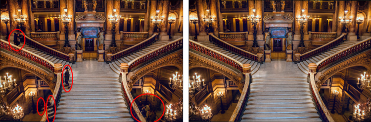
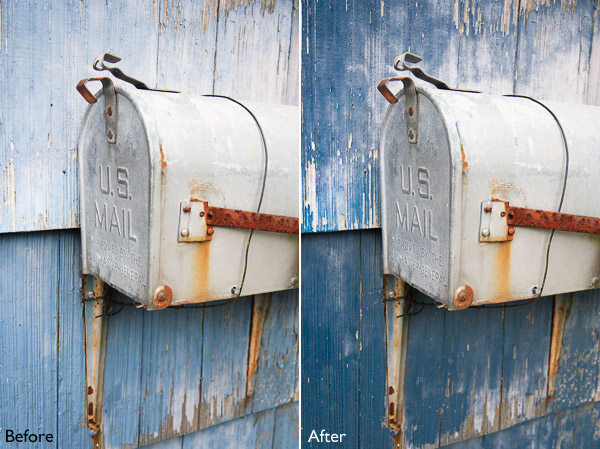
You will not often find the stairs of Opera Garnier in Paris free of people, so you will need to put the Clone Stamp tool to work to remove the people if you want a clean picture. This applies at many other tourist destinations as well.

There are a lot of good post-processing tools available for making minor edits to your photos. Within Photoshop, there are the Healing Brush and the Spot Healing Brush tools. Lightroom now has its own healing brush. Those are great for minor edits to your photos like removing spots or power lines. When it comes time for serious, intensive surgery on your photos, however, there is no substitute for the Clone Stamp tool. You will only find this in Photoshop and Photoshop Elements, there is no Lightroom substitute.

Getting started with the Clone Stamp tool is simple. You just have to tell Photoshop two things: (1) where you want to replace the pixels (target area), and (2) from where Photoshop should take the pixels to use as replacements (s0urce area). To use the Clone Stamp tool, just follow these steps:

  1. Select the Clone Stamp tool from the tool bar on the left side of your screen (you can also use the keyboard shortcut S). Once selected, set the brush size and hardness.
  2. Put your cursor in the area where you want to change the pixels.
  3. Select the source area: Press the Alt key (your cursor will now become a target) and move your cursor to the location where you want to take pixels from (source area). Click your mouse in that location.
  4. Paint in the target area: Release the Alt key and move your mouse back to the original location. Hold down the mouse button and paint in the pixels from the location you chose.

That is a simple process, but if you have used the Clone Stamp tool you realize that there is a lot more involved if you want to master it. This article will provide you with some tips to move you along the road towards conquering this important tool in Photoshop.

#1 – Work on a New Layer

First, always create a new layer before making changes with the Clone Stamp tool. Any changes you make should be made on the new layer. You can flatten the image when you’re done.

Why should you do this? There are many reasons. First of all, it is non-destructive – meaning you are not changing the underlying pixels of your image. In addition, when you use a layer, you can delete it if you don’t like where the changes are going. You can also create a mask if there are portions of the changes that you decide later you do not want. Finally, you can target adjustments to just the cloned areas if they are on a new layer (as will be shown below).

Creating a new layer is easy; simply press Ctrl+J (Cmd+J on Mac) to create a duplicate. You can also press Shift+Ctrl+N (Shift+Cmd+N on Mac) to create a new blank layer, but if you do so, make sure that you have “All Layers” selected as your source in the Clone Stamp Tool settings.

Clone Stamp Tool - Work on a New Layer

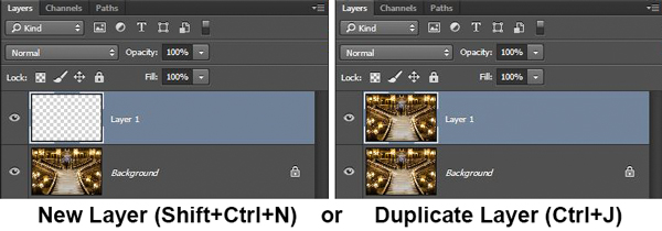
I prefer working on a new layer (as opposed to a duplicate layer) but either way will work.

#2 – Zoom in (way in)

When working with the Clone Stamp tool, zoom in on the area you are working on. In fact, zoom way in (to 100% even). That will help isolate the area you are working on, and importantly, it will also allow you to work at a much greater level of detail than you otherwise would. Make your changes look as good as you can at this higher level of detail, then when you zoom back out, the changes will be indistinguishable (which is what you want).

A shortcut for zooming quickly is to hold the Alt key with your left hand while using the scroll wheel on your mouse to zoom in and out (or use Cntrl/Cmd and the + or – key on the keyboard). That will allow you to move in and out quickly.

#3 – Set Your Brush Size Quickly

You will change your brush size often when working with the Clone Stamp tool. You should do this often to make sure that your brush size is tailored to the change you are making. Changing the size through the Brushes panel is cumbersome. Instead, use the keyboard shortcuts for changing brush size:

  • Left bracket [ makes brush smaller
  • Right bracket ] makes brush larger

Using these keys will allow you to rapidly tailor your brush to the specific circumstance.

#4 – Set the Proper Brush Hardness

The Clone Stamp brush’s edges can be set to whatever hardness you desire. Hardness determines the level to which the cloning will blend in with the surrounding pixels. If you set the hardness level more toward 100%, the edges will be hard and definite. If you set the hardness more toward 0%, the edge will blend in with the surroundings.

Clone Stamp Tool - Setting Hardness of Brush

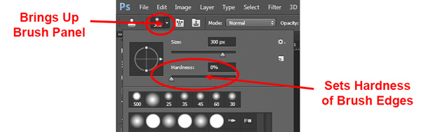
In general, keep the hardness level at 0%. That will help you seamlessly blend in the effect. There will be times, however, where you are working near a defined edge, in which case you should increase the hardness. Even then around 50% will usually do. Setting the hardness any higher creates harsh transitions that are dead giveaways to your use of the Clone Stamp tool.

#5 – Clone Without Adjustments

Do your cloning before making other adjustments to contrast, color and other changes often made via adjustment layers in Photoshop. If you use the Clone Stamp tool after creating those layers, you are baking the changes permanently into your picture when you clone.

Clone Stamp Tool - Adjustments

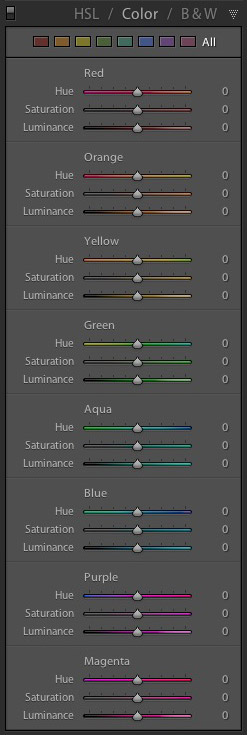
However, in some cases you will have already made changes on an adjustment layer, and you need to decide whether your cloning should include those adjustments. Photoshop lets you decide whether to include those changes in your cloning. After you have selected the Clone Stamp tool, the top row of your screen will include a circle with a line through it (see graphic above). Photoshop defaults to applying the changes of any adjustment layers, but if you click on this icon, Photoshop will ignore any adjustment layers when cloning.

#6 – Grab the Low Hanging Fruit

Most of the time your pictures will have some easy items to clone out, as well as some harder things. Clone out the easy ones first. In addition to giving you confidence in the tool, this will also help you when the time comes to make the hard changes.

How will that help you? Remember that you need clear space from which to draw pixels when using the Clone Stamp tool. By making the easy changes first, you are doing just that so you can draw replacement pixels and will make your job easier when it comes time for the harder, more in-depth changes.

#7 – Watch for Patterns

Sometimes you want to include patterns in your cloning. In that case, when selecting pixels from which to draw, try to find patterns in your picture that match the area you are replacing. For example, if the background is a building, look for a similar building. Then make them match (which will be the subject of the next tip).

Clone Stamp Tool - removing distractions without creating a pattern

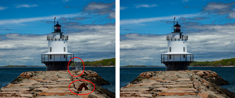
Here is a different example to show the Clone Stamp tool in another context. The right side of this image was filled with distractions, but the Clone Stamp tool eliminates them. Be careful that you do not create patterns by using pixels immediately adjacent, or it will give away your use of the Clone Stamp tool

But many times you will not want there to be any discernible patterns in your cloning. Usually a pattern is a dead giveaway to your having cloned something out. In that case, the way to ensure that there will be no patterns is to keep resetting your source point. Sample from one area and clone one part, then sample from another area – repeat frequently. Keep doing that to blend everything together without repeating a pattern.

#8 – Follow the Lines

A key to successful use of the Clone Stamp tool is making all the lines in your picture match. Even slight deviations look fake and destroy the effect you are trying to achieve. For example, in a landscape setting make the edges of tree branches match up. In an urban context, follow lines in buildings such as roof lines, doorways, and patterns on the ground.

When you are using the Clone Stamp tool, start with the lines and then let the rest of the pixels fall where they may. After that, if you need to go back over other areas, you can do so.

Here I've zoomed in on a portion of another shot of the Opera Garnier. Use the patterns on the floor and door to recreate the space where you clone over the people.

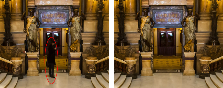
Here I’ve zoomed in on a portion of another shot of the Opera Garnier. Use the patterns on the floor and door to recreate the space where you clone over the people.

#9 – Avoid Selecting from Adjacent Areas

As previously mentioned, a dead giveaway of Clone Stamp tool usage is repetition. The Clone Stamp tool is all about repetition – you just need to do it in such a way that the viewer doesn’t notice it. If you draw pixels from an immediately adjacent area, you are risking the viewer noticing the repetition. Take the pixels from somewhere else in the picture instead.

Inadvertently creating a pattern is an easy trap to fall into because the immediately adjacent areas usually are the closest in color and tone to the area you want to replace. As you move further away, tones and colors change so that the pixels get harder to match. Working hard to find a way to use pixels from somewhere else in your picture will pay dividends because the viewer won’t see the repetition.

#10 – Muddle Through (accept the messiness)

By now you have fixed all the easy areas in your picture and you’re ready to tackle a bigger problem. It might be a crowd of people or a car that entered your frame, but it is a large area of your picture. This is the scary part of using the Clone Stamp tool.

The key is to just dive in. Don’t try to figure it all out beforehand (you never will). You can do this in a couple of different ways:

  1. Go big first: Set your brush a little larger than you might otherwise use and just replace the entire area in one fell swoop (and then clean up with a smaller brush), or
  2. Go small and steady: Stick with the smaller brush and paint in gradually, but the key is to keep going. Remember that you can go over it again. Whatever you are doing, while it is probably not perfect, will undoubtedly look better than what you started with.

The key thing is just to do it. There is a tendency to freeze up and plot the entire change before doing anything, which causes you to stare at the computer screen for long periods of time.

Remember, you can always undo what you’ve done (Ctrl/Cmd+Z). In addition, because you followed tip #1 above and are working on a new layer, you can always mask this area off or delete it if it isn’t heading in the direction you want.

#11 – Use the Mirror Function

You can affect a lot of settings involving the Clone Stamp tool in the Clone Source panel (to see it, go to Window and then click on Clone Source). For instance, you can change the shape of the brush or the angle of the replacement pixels.

One of the most useful features in the Cone Source panel is the flip-horizontal option in the middle of the panel. If you click on it, the pixels will be replaced in the opposite horizontal direction as the source. This can be extremely useful in many instances since often you will be dealing with a symmetrical subject where you can now draw from the other side.

Clone Stamp Tool - Flip Horizontal setting

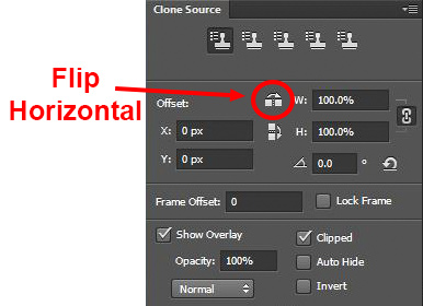
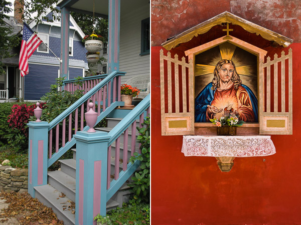
A typical example where you might want to use the flip horizontal option is where something covers one side of a doorway or window that you want to remove. By clicking on flip-horizontal, you can use the other side of the doorway or window as your source. Take another look at the Opera Garnier examples above and you will see how the flip horizontal tool would be used quite frequently whenever your picture contains any symmetry (I used this feature in those pictures quite a bit).

#12 – Change the Cloned Areas with Adjustment Layers

Sometimes your cloned areas just won’t look exactly like the surrounding areas. Perhaps it is too bright or too dark, or perhaps the colors are just off a little bit. You can fix it without affecting the surrounding pixels.

Clone Stamp Tool - tying adjustment layers

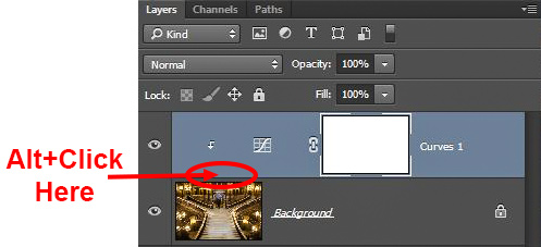
One of the great benefits of working on layers is that you can create adjustment layers that affect only the areas you just cloned. Simply create a new adjustment layer (levels, curves, or hue/saturation), which will appear above your cloning layer. Then hold down the Alt key and click at the bottom of the adjustment layer (you will see your cursor change). Doing so will apply the changes of the adjustment layer only to the layer below it.

Conclusion

Remember that using the Clone Stamp tool can be a messy process. Don’t worry if you find yourself having to redo changes or make things up as you go. There is no magical “clean” process. One of the fun parts about the cloning process is the problem-solving that goes into it. Take your time and just keep moving. You can always redo your changes or, if you are working in layers, get rid of them without losing the rest of your work.

The Clone Stamp tool will save more pictures than almost any other tool in your post-processing. If you master it, you can remove almost anything in your pictures that you do not want.

googletag.cmd.push(function() {
tablet_slots.push( googletag.defineSlot( “/1005424/_dPSv4_tab-all-article-bottom_(300×250)”, [300, 250], “pb-ad-78623” ).addService( googletag.pubads() ) ); } );

googletag.cmd.push(function() {
mobile_slots.push( googletag.defineSlot( “/1005424/_dPSv4_mob-all-article-bottom_(300×250)”, [300, 250], “pb-ad-78158” ).addService( googletag.pubads() ) ); } );

The post 12 Tips for Mastering the Clone Stamp Tool in Photoshop by Jim Hamel appeared first on Digital Photography School.


Digital Photography School

 
Comments Off on 12 Tips for Mastering the Clone Stamp Tool in Photoshop

Posted in Photography


Mastering The Digital Workflow

29 Jan

Alana Tyler Slutsky shares with the readers of FashionPhotographyBlog.com, the processes she goes through in her workflow. After revealing her tips for the photographic workflow, Alana explains that there are two types of workflow that photographers should pay attention to. In this article she will be discussing the other half of the equation, that is, the digital workflow process. Let’s jump right into it! All yours Alana!

Mastering The Digital Workflow

Digital Workflow


This applies to everything that involves a computer, bring images in from the camera to prepping for print.


– Use a card reader to bring images from your CF/SD card to your computer. (Don’t bring them over via your camera!)

– Download directly to your hard drive – do not bring in via iPhoto or another photo program – This causes problems and confusion when trying to rename and separate individual images.

– Create an organized file structure so you can find anything at a moments notice.

– Bring images into Lightroom or Bridge to review

– Bring images into Photoshop to retouch


Download Directly To Your Hard Drive:


Create a new folder > Open up the DCIM folder on your CF card > Select and drag images to new folder you just made


File Structure:


My files are meticulously organized, as pictured below:

Year > Month > Shoot date/name
Each shoot has a set of 6 folders that are worked in.  Nothing exists outside of these 6 folders.  Then consist of:


1. Capture – All images shot from the session, further broken down into folders based on look #
2. RAW Selects – ONLY the RAW files for the images I’ve selected to retouch
3. Working Files – PSD’s from the files I’ve retouched
4. Final TIFFS – Flattened, final images ready for print
5. High Res JPEGS – Flattened, final images in high-res ready to hand out to my team/client/etc
6. Low Res JPEGS – Flattened, final images sized and formatted for web use 


Photographers Digital Workflow - Saving To PDF

How I organize my files


Reviewing Images In Lightroom:


As far as reviewing images goes, there is no right or wrong way, this is just how I do it. Again, keeping with the same meticulous file structure that I use to store my images, my Lightroom is organized the same way so I can easily flip between looks from a shoot.


– Flip through all the images (by look) and “flag” or “pick” anything that jumps out at me initially by clicking “P”

– Use the filter options to view only images that have been flagged.  Further narrow down your selection, first by using 1 ? and working your way up to 4 ?‘s.

– Once I get to 4 ?‘s, I’ll view all my looks at once to determine which images work best together and mark my final selects as 5 ?‘s.


Photographers Digital Workflow - Reviewing Images In Lightroom

Making final selects


– Create a contact sheet to send to client/agency/whoever based on images rated 4 & 5 ?‘s.


To Create A Contact Sheet:


1. Select images in Lightroom

2. File > Print or Select “Print” from the menu on top right

3. Top right choose “Single Image/Contact Sheet”

4. Play with “Layout” to determine how your contact sheet is laid out

5. Save your contact sheet as a PDF to email to clients and save a copy for yourself in your newly organized file structure!


It’s helpful to add file names under the images so you know what image your client is talking about.


Photographers Digital Workflow - Print Window In Lightroom

Print Window in Lightroom


To save as a PDF, hit Print and the following menu will pop up:


Photographers Digital Workflow - Save As PDF


Photographers Digital Workflow -  Creating A Contact Sheet

Yay Contact Sheet!


Editing Images In Photoshop:


– Once you’ve made your selections, bring your image into Photoshop

– Retouch

– Save


When you put it that way, it seems so easy!


Retouching:


If you haven’t already, check out our previous post on Retouching Skin.


1. Work on the big stuff – compositing, reshaping (liquify), any more substantial fixes

2. Heal/Clone

3. Dodge & Burn

4. Apply color – color is a whole other beast on it’s own.  It’s something we’ll definitely get into in another post.


Saving Images:


1. First, save your final retouched image as a PSD file.  This takes up less room than a TIFF file when layers are involve. (Remember to ALWAYS work on layers.  NEVER EVER EVER work directly on your background layer! This is a terrible practice and if you currently do work on the background layer, break this habit now!)

2.  Flatten your image and save it is a TIFF for printing.

3. Save a high res JPEG for agency/client/whatever – TIFFs only go for print (magazine or specifically asked for. Otherwise everyone gets jpegs.

4. Save a low res JPEG for web use. For me this is typically 72 DPI with longest side around 800 pixels.


By the time you finish all this, all those folders you made in the initial file structure should be filled (that is, it you adopt the file structure I currently use). By saving all these formats up front, you won’t need to go into the file every time someone asks for it. They will already be created and will be easily found!


I’d love to hear what your workflow is. If anyone has found an even easier/more organized way to go about file management, be a pal and share it in the comments!


As always, if you have any questions, feel free to shoot me an email.


– Alana


Did you find Alana’s post useful? Please leave your comments below in the comment section. We would like to know what you thought about this post. If you enjoyed this article, do stay tuned as Alana has another post just around the corner on FashionPhotograhyBlog.comIf you want to know more about tips for a photographer’s workflow, check our post on Mastering The Photographic Workflow.


IMAGE SOURCE: 

Feature image & images 1-6: courtesy of Alana Tyler Slutsky.


Fashion Photography Blog

 
Comments Off on Mastering The Digital Workflow

Posted in Uncategorized


Mastering The Photographic Workflow

28 Jan

Alana Tyler Slutsky shares with the readers of FashionPhotographyBlog.com, the processes she goes through in her workflow. After revealing her tips for working with agency models, Alana explains that there are two types of workflow that photographers should pay attention to. In this article she will be discussing the photographic workflow process.  The stage is yours Alana!   

Mastering The Photographic Workflow

Having establish a workflow system that works for you means that you’ll be more efficient. Once you have a set routine you’re less likely to forget something or mess something up. Rather, you’ll find yourself almost on autopilot and able to get through things much more quickly.


I used to be a mess when it came to organizing my files and keeping things clean and precise. I was a workflow nightmare! But over time I’ve recognized the importance of workflow now have everything impeccably organized. What is a workflow? A sequence of steps, or a routine, that creates a sense of flow to your typical workload.


There are two types of workflow we’re going to look at here, Photographic Workflow and Digital Workflow.  Technically all of this just falls into workflow, but I’ve broken it down into two different categories to make it less overwhelming.


Photographic Workflow


Basically this entails everything that happens with your camera before you get to a computer (or if you’re working with film, before you bring the film into the darkroom). My typical photographic workflow goes as follows:


– Check File Format, Size and Color Output (you only really have to do this once depending on how you shoot.)

– Set to Auto/Manual/Aperture Priority/Whatever (Manual for life!)

– Set ISO

– Set Aperture and Shutter Speed

– Check Focus

– Shoot!


Checking File Format and Size:


Typically with cameras you can chose what file format to take pictures in. On Canon and Nikon you have two options: JPEG and RAW (Canon: CR2, Nikon: NEF). What’s the difference?


JPEG files are compressed files.  The sensor on your camera captures a scene then packs all that it sees into one nice, neat little file.
RAW files are uncompressed.  They are significantly larger files that JPEG’s because they take everything that the sensor sees and packages it into one file which then has to be converted to open.  This can be done through software that comes with your camera or a RAW converter (Photoshop has one that can be installed.)


You can also choose the size in which your camera captures an image. While I prefer to shoot full res RAW files, that is purely because of the nature of what I shoot. Someone who is shooting an event may prefer to work in JPEG because their work requires less retouching, faster capture time and more images to be captured. Because of the sheer size of a RAW file, you can’t capture nearly as many images on one CF/SD card as you can if you’re shooting JPEG (Why?  Remember… JPEG’s are compressed!)


Setting Color Output:


With Canon and Nikon cameras there are two color output, Adobe RGB 1998 or sRGB. What’s the difference?


Adobe RGB 1998 is a “larger” color space.  Essentially a color space, or “gamut,” is a range of colors that can either be seen by a camera/computer or printed by a printer.  Being that Adobe RGB 1998 is a “larger” color space, means that it contains more colors than other color spaces, such as sRGB.  Adobe RGB is becoming a common gamut to print in.
sRGB is a smaller, more condensed color space.  It’s best when an image is being used for web or something that will be viewed on a screen, rather than in print.  A good way to think of it is screenRGB.


General rule of thumb is to always start with your images in the largest color space you have access to and then convert them into a smaller color space later on.


– Alana


Did you find Alana’s post useful? Please leave your comments below in the comment section. We would like to know what you thought about this post. If you enjoyed this article, do stay tuned as Alana has another post just around the corner on FashionPhotograhyBlog.comIf you want to know about shooting with models from agencies, check our post on Tips For Working With Agency Models.


IMAGE SOURCE: 

Feature image & images 1: courtesy of Alana Tyler Slutsky.


Fashion Photography Blog

 
Comments Off on Mastering The Photographic Workflow

Posted in Uncategorized


Mastering Family Portrait Part III: Posing Guide

11 Nov

It might be the redheaded stepchild of photography, the gum under your shoe, the backwash left in the glass when you think you’re drinking champagne, but posing is one of the most important parts of any photograph. I am not a traditional poser, so I’m not going to get into thumbs in or out of pockets, or serious or smiley, Continue Reading

The post Mastering Family Portrait Part III: Posing Guide appeared first on Photodoto.


Photodoto

 
Comments Off on Mastering Family Portrait Part III: Posing Guide

Posted in Photography


Mastering Family Portrait Part II: How to Deal with Clients

06 Oct

So you had your pre-shoot consultation, and you’re ready to go. You get to your location, and the family are all there on time, in happy moods, excited to shoot, and looking great. Except for that toddler who just wouldn’t go down for his nap. (Note: NEVER shoot a toddler during his naptime…EVER!!!) Or that grandfather who doesn’t want to Continue Reading

The post Mastering Family Portrait Part II: How to Deal with Clients appeared first on Photodoto.


Photodoto

 
Comments Off on Mastering Family Portrait Part II: How to Deal with Clients

Posted in Photography


Mastering Family Photography: What You Need to Get Started

29 Sep

One thing that I shoot my fair share of is family pictures. I love the family dynamic so much… the “over primpers”, the “get me out of here’s”, the “I’ll be in the picture, but I’m going to ruin every single shot”, the “smile or I’ll beat the snot out of you later’s” and the “gee, we’ve known that we Continue Reading

The post Mastering Family Photography: What You Need to Get Started appeared first on Photodoto.


Photodoto

 
Comments Off on Mastering Family Photography: What You Need to Get Started

Posted in Photography


Mastering On-Camera Flash

14 Sep

You get caught off-guard with a photo assignment and you might not have time to set up additional lights or have the luxury of using a reflector. Maybe it’s an awards event in a large room and you don’t want the background to go completely dark. You see a celebrity, rock star, astronaut or maybe it’s the president of your company that you need to photograph (see image below), or maybe you just need to travel light, with a minimum of gear.

Fig 1

George Lucas: 1/180 at f/13, ISO 200

Shoe-mount flashes are very portable and you CAN use them to get a great image. The key to getting that image is controlling the balance of camera, flash, and ambient light.

TTL TYPES

The automatic advantage to shoe-mount flash units is that they use TTL metering, which stands for Through The Lens. This type of flash metering is much more accurate than the thyristor technology that precedes it, and it’s also easier to use correctly.

Sb910 d3x frt34r

Photo courtesy of Nikon

Camera manufacturers have their own versions of TTL flash and the alphabet soup of lettering can be a bit intimidating. Different types include i-TTL, P-TTL, E-TTL, etc. So what is the difference or similarity in each of these? Canon calls their flash technology E-TTL (introduced in 1995) or the newer E-TTL2 (since 2004). Firing a low power pre-flash immediately before the shutter opens, this type of Through The Lens metering is very accurate because the flash unit actually fires very quickly. This brief pre-flash determines the correct power output of the flash unit. The camera body and flash communicate together on the exposure by means of additional contact pins in the hotshoe and in the foot assembly of the flash unit.

Pentax’s P-TTL arrived in 2001 and it meters a low power flash with the lens wide open before opening the shutter. Nikon’s i-TTL has been available since 2003 and also uses a pre-flash to calculate the amount of light needed by the flash. Their TTL-BL is a separate mode for fill flash, with the idea of it giving you better balanced light, but for it to work accurately the subject needs to be darker than the background. So all of these systems are similar and no matter what brand of camera system you have, one of them will work great for you.

All of this solves the problem of getting the correct amount of light on the subject, which is weighted with the area of focus that you and your camera have selected. What about the surrounding elements in your artistic composition? You are seeing a potentially great image in the viewfinder, and whether you’re indoors or out, you want the flash to match the scene just enough to make it look right.

MATCHING THE LIGHT

Let’s take the example of photographing indoors. The best way to do this that I’ve found is to meter the ambient light in the room first. The camera can be in any exposure mode to take this reading. If for example, your exposure is 1/30 at f/5.6, ISO 800 – you would then switch the camera to Manual mode and make those your camera settings. Note that some cameras have a slow sync setting, or you could also use shutter priority to get this same balance.

Fig 2

Paula and Cayden: 1/60 at f11, ISO 200

You can leave the flash set on TTL mode and let it adjust its power output automatically. When you take the image you should have a remarkably balanced exposure. This can be further fine-tuned by adjusting the flash exposure compensation to add a little more, or a little less, fill light to the image. Flash exposure compensation can be added on the flash unit itself, or by adjusting the settings in the camera.

If you find that you need a little more depth of field to get your subjects in focus you can bump up the ISO to 1600 and lower the aperture setting to f/8. If you can use less depth of field, do the opposite by lowering the ISO to 400 and opening your aperture to f/4. There are always tradeoffs to be made, and you might not be able to handhold that particular lens at 1/30 second to get a steady image. Try using a monopod or tripod to help with that issue. For a faster shutter speed you might want to try 1/60 at f/5.6 with 1600 ISO. If you need to get your depth of field back to f/8 then you might need to be daring and go to 3200 ISO. Digital noise levels are improving all the time so don’t be afraid to try a higher ISO.

If you are photographing outdoors the opposite is true. Go to the lowest ISO to match your ambient light with your flash. There’s no way a flash can compete with the sun, so if you can select a lower ISO you will have a better chance of balancing ambient and flash at f/8 or f/11, rather than f/16 or f/22.

DIFFUSERS

Sb910 sw13hSome flash units come with diffusers and I’ve had good luck with those. These are usually plastic, and they snap on tightly in front of the flash. There are also many innovative aftermarket diffusers available. Some units are a card type that bounce the light and redirect it to a larger pattern. Some diffusers are of the softbox type with a diffusion panel that the light passes through.

Some diffusers take the plastic design to a much higher level (such as the Gary Fong brand). All of these diffusers are variations on taking a directional light, such as an on-camera flash unit, and modifying the light to lower the amount of shadow
that you would normally get from a harsh light source. My recommendation is that you try some of these for yourself and see what works best for you. Your flash, the environment you’re photographing in, and the type of photos that you take are
all factors that could determine which is the best one for you. If you have a favorite please let us know in the comments following this article.

Bounce flash is when you angle the flash head so that the light reflects off of the ceiling or a nearby wall to disperse the light. Due to light falloff less light will get to the subject, so having a low ceiling is helpful for this to work. Light falls off and can be accounted for using the Inverse Square Law – an object that is twice the distance from the flash head will receive one quarter the illumination – or two stops less light.Ttl cord

TTL CORDS

Off-camera TTL cords are another great option. I consider this to still be on-camera flash but the TTL cord allows you to be flexible with the direction of the light. Holding the camera in one hand, you can move the flash unit around with the other hand and try different variations of light on your subject. These cords are small, easy to carry with you, and they are relatively inexpensive. They’re a good item to keep in your camera bag.

FILTERS

Sb910 sz2tnFilters sometimes come with a shoe mounted flash, and they are also available from aftermarket sources. The most common filters are tungsten and fluorescent. These are a great, and often overlooked, option to match the color of light from your flash unit to the ambient light temperature of a room. Color temperature from a shoe mounted flash is similar to a daylight balance of approximately 5500 degrees Kelvin. Fluorescent lights are in the 4000K range and tungsten light is around 3200K, so using these filters will make quite a difference in the color of your final image. Give those filters a try the next time you’re in that situation.

SUMMARY

Fill flash is a matter of finding the right amount of light to make the image appear to have been taken with natural light by using just enough flash to add catch-lights to the eyes, eliminate shadows, and give a more pleasing look overall to an image. You will be able to capture this balance using just your on-camera flash. It might sound difficult, but it doesn’t have to be.

Fig 3

Lisa Marie Presley: 1/250 at f/4.5, ISO 200

The post Mastering On-Camera Flash by Jim Wise appeared first on Digital Photography School.


Digital Photography School

 
Comments Off on Mastering On-Camera Flash

Posted in Photography


Mastering Color in Lightroom using the HSL Tab

24 May

Mastering colour in Lightroom

Color in Camera

Mastering color in Lightroom occurs in two steps. The first is when you take the photo. Successful color photography requires an awareness of the colors in the scene and how they work together. If you read about the topic of color composition you will come across a lot of advice, including articles about the emotional values of color. It’s all good background knowledge, but if there’s one tip I can give that will help you compose better color images right away it is to simplify. Color is powerful, and if there are too many colors in the photo they will either clash or weaken each other. Simplify the use of color to make your images stronger. This works because the colors you choose to leave in have more impact when there are fewer other hues in the frame to distract from them.

Here’s an example below. In the photo on the left the use of color is not as good as it could be. There are too many conflicting hues. The red stripes on the flag compete with the orange flowers on the porch, and the blue and violet paintwork. It is more of a snapshot than a carefully composed image.

In comparison the photo on the right is dominated by red and yellow, and the colors are much stronger.

Mastering colour in Lightroom

An easy way to simplify color is to use a telephoto lens to simplify the composition. Another is to  use a wide aperture to blur the background. Click the links to read my articles on those topics.

You can go into the topic of color in more depth by reading Mitchell Kanashkevich’s ebook Captivating Color.

Color in Lightroom

The next step, after you have taken your photo, is to get the best out of it in Lightroom. Today I’m going to focus on the first two tabs in the HSL / Color / B&W panel, and show you how to use them. If you’re a Photoshop user, you will find the same sliders in Adobe Camera Raw.

The HSL and Color tabs are essentially the same, but with the sliders arranged in a different order. In the Color tab, the sliders are grouped in eight colors.

Mastering colour in Lightroom

Mastering colour in Lightroom

Click on one of the colored squares at the top to show the sliders from a single color group.

The HSL tab groups the same eight color sliders into three categories: Hue, Saturation and Luminance. It is the tab I prefer to use as I find it easier to adjust by property (ie. hue, saturation or luminance) rather than color. It also has a Targeted Adjustment Tool (I will show you how to use that further on in the article), which the Color tab doesn’t.

Mastering colour in Lightroom

H=Hue, S=Saturation, L=Luminance

Now it’s time to take a look at the sliders under the HSL and Color tabs to see what they do. You can carry out most of these adjustments within either tab, but the examples I show you will all use the HSL tab.

Hue adjustment sliders

Hue is another word for color. The Hue sliders let you replace colors in your photo with neighbouring hues from the color wheel. Let’s take a look at the earlier photo again to see how it works. The image is dominated by the color red. This diagram shows you approximately where those red hues occur on the color wheel.

Mastering colour in Lightroom

When you move the Red slider under the Hue setting to +100 Lightroom replaces red with orange tones, located nearby on the color wheel.

Mastering colour in Lightroom

When you move the Red slider to -100 Lightroom replaces red with purple tones, located in the other direction on the color wheel.

Mastering colour in Lightroom

It is possible to make dramatic differences to the colors in your images using just the Hue sliders. Here, the right hand version of the image was created by setting Red to +100 and Blue to -100. Lightroom replaced the red and blue tones in the photo with other colors.

Mastering colour in Lightroom

Before left – after Hues adjusted on the right.

The Targeted Adjustment Tool

The Targeted Adjustment Tool gives you an alternative way to do the same thing. It is more precise than the sliders because most of the hues within your photos will fall somewhere between the color sliders in the HSL tab. The Targeted Adjustment Tool lets you target those colors exactly.

Start by clicking on the Targeted Adjustment Tool icon. Use the mouse to lay the crosshair over the hue you want to adjust. Click and hold the left mouse button down while you move the mouse upwards to replace the hues underneath the crosshair with neighbouring colors from the color wheel in one direction, and down to replace them with colors from the other direction.

When you do this, Lightroom moves colored sliders in whatever combination is required to adjust the color you have targeted. In the following example I used the Targeted Adjustment Tool to target the red colors in the wall. Lightroom moved both the Red and Orange sliders, indicating that the targeted color was comprised almost equally of those colors.

Mastering colour in Lightroom

You can use the Targeted Adjustment Tool to target colors with precision exactly the same way when you adjust Saturation and Luminance.

Saturation adjustment sliders

The term saturation refers to the strength of a color. If you increase Saturation, the color becomes stronger. Decrease it and it becomes weaker. Note: My article Color Composition: Using Subtle Color goes into the topic of using subtle colors in more detail.

One way to emphasize color in Lightroom is to desaturate surrounding colors. Here’s an example. The starting point is an image of an old car I took in Alaska. The composition is simple –  the red paintwork on the car contrasts against the blue wooden shingles on the house behind it and the patches of greenery.

Mastering colour in Lightroom

First I used the Targeted Adjustment Tool to reduce the saturation of the green patches. Lightroom reduced Saturation in the Yellow and Green sliders accordingly.

Mastering colour in Lightroom

This simplifies the color composition even more, leaving red and blue as the dominant hues.

Mastering colour in Lightroom

Then I used the Targeted Adjustment Tool again to reduce the saturation of the blue paint. Lightroom reduced Saturation in the Aqua and Blue sliders.

Mastering colour in Lightroom

This is the result. I’ve placed the original and the final versions together so you can see the difference.

Mastering colour in Lightroom

Here’s another technique you can use. I set every Saturation slider except Red to zero. This desaturated most of the colors, turning the entire image black and white with the exception of the red paintwork on the car. I added a slight vignette using the Post-Crop Vignetting tool and increased Contrast and Clarity in the Basic panel to arrive at this black and white conversion.

Mastering colour in Lightroom

Luminance adjustment sliders

Luminance is the brightness of a color. You can make colors brighter to make them stand out more, or darker to subdue them. Depending on how bright the color was to start with, reducing luminance may also increase saturation, and increasing it may reduce saturation.

Here’s a example showing the difference when I used the Targeted Adjustment Tool to reduce the luminance of the blue paintwork.

Mastering colour in Lightroom

Lightroom reduced luminance in the Blue and Purple sliders when I made this adjustment.

Mastering colour in Lightroom

Note that with some images the colors may go a little weird when you adjust luminance too much. Watch out for this and ease back on the luminance sliders if this happens to you.

Your turn

Now it’s your turn. How do use you use the HSL and Color tabs when processing your photos in Lightroom or Adobe Camera Raw? Have you come up with any interesting techniques you can share with our readers? Let us know in the comments.


Mastering Lightroom: Books One, Two and Three

Mastering Lightroom ebook bundle
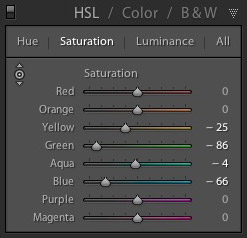
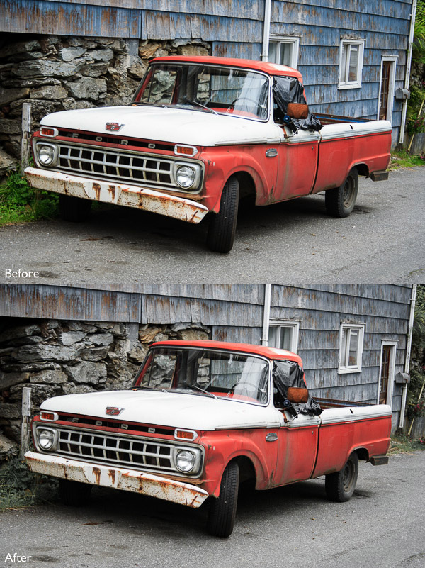
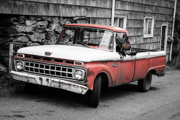
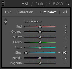
My Mastering Lightroom ebooks are a complete guide to using Lightroom’s Library and Develop modules. Written for Lightroom 4 & 5 books One and Two take you through every panel in both modules and show you how to import and organise your images, use Collections and creatively edit your photos. Book Three shows you how to create stunning black and white images in Lightroom.

The post Mastering Color in Lightroom using the HSL Tab by Andrew S. Gibson appeared first on Digital Photography School.


Digital Photography School

 
Comments Off on Mastering Color in Lightroom using the HSL Tab

Posted in Photography