If you are using Adobe Lightroom for editing your photos, then you might have come across the problem of duplicate images. Let me explain the right method for deleting duplicate images in Lightroom. These duplicate images will waste unnecessary space on your hard drive and they will also make your Lightroom editing process cumbersome. So, you must delete these images Continue Reading
Photodoto
Posts Tagged ‘lightroom’
How To Delete Duplicates in Lightroom
17
Jun
The Best Lightroom Presets in 2021 (13 Beautiful Options)
17
Jun
The post The Best Lightroom Presets in 2021 (13 Beautiful Options) appeared first on Digital Photography School. It was authored by Ana Mireles.

If you’re looking for the best Lightroom presets, you’ve come to the right place. Given the number of available options, it’s easy to get overwhelmed – or even worse, buy a pack of presets that you’ll never use.
To help you navigate the wide market of Lightroom presets, we’ve put together a selection of the best quality packs (to fit many different needs).
So read on to discover the 13 best preset packs in 2021!
1. Landscape and Travel Photography Presets

Fine art photographer Jan Erik Waider offers a bundle of eight Lightroom presets packs, designed for different landscapes. Some target physical locations, such as polar or forest landscapes. Others offer a specific aesthetic, such as cinematic or dark and dramatic.
These professional presets allow customization so you can “develop a repeatable personal style.” In addition to the eight preset packs, the bundle includes a surprise pack and will give you access to all future preset releases.
Of course, if you’re not interested in the entire bundle, you can also also purchase the packs individually.
2. Night Leaks

This free pack of presets from Presetlove.com will add vibrancy to your urban night photography. It’s part of the Night bundle, which includes more than 300 free presets.
Night Leaks work best on night scenes where there’s artificial lighting, such as street lights. They’re designed to give you a colorful and vibrant effect with clear tonal contrast.
3. Golden Hour Presets

These Golden Hour Lightroom presets are perfect for portrait photographers who organize outdoor sessions. We all know that golden hour offers beautiful light for your photos. Unfortunately, it’s not always possible to schedule your clients around that time.
KatherineDream offers 15 Lightroom presets for mobile and desktop that will give your photos those beautiful, warm, golden hour tones. And on her Etsy shop, KatherineDream offers multiple other packs (and often puts her presets on sale!).
4. All in One Lightroom Preset Bundle

The All In One Lightroom Preset Bundle is perfect for beginner photographers. If you don’t have a field of specialization and you’re still figuring out your style, you’ll find 90 helpful presets to choose from.
The Bundle includes presets for everything: beach shooting, indoor photography, food photos, portrait photos, black and white photos, and moody photos. In other words, the All In One Bundle offers everything a beginner could need – and it even comes with a handy how-to guide!
5. Boho Wedding

If you’re a wedding photographer, then you know how important it is to have an automated workflow that delivers consistent results.
This Boho Wedding preset bundle offers ten one-click presets; they’re easy to adjust, plus they come with an installation guide PDF and video. And they create a creamy warm tone that improves the overall ambiance of your pictures.
6. Winter Wonderland Preset Collection

Most winter presets only add a cool tone to your images – but the Winter Wonderland Collection offers a uniquely well-rounded solution for a winter look.
This bundle offers 32 presets and 5 brushes to create snowy and winter images, no matter the weather forecast. All the presets are customizable, and an instruction guide and video tutorial are included in the download.
7. The Crush Pack

Unlike other presets that are based on subject matter or mood, the Crush Pack is designed for light. Each preset is tailored to a specific lighting scenario so that you always know which to apply.
Whether it is soft or hard light, backlight or flash, there’s a preset to improve your picture, delivering a “bold and vivid style that maintains the skin tone.” You can buy the Crush Pack on its own, or bundled with the Retouching Toolkit for a special discounted price.
8. 20 Free Lightroom Presets Collection

This is a starter pack from BeArt-Presets, and includes 20 presets that can be applied to all types of photographs, from food to portraits.
The download includes two sets of presets: one set for mobile and one set for desktop. And once you determine which preset styles you’re after, there’s a shop with more specialized presets for sale.
9. Free Lightroom Presets for Street Photography

These presets are designed for a grungy look that creates contrasty, detailed images and is especially suited for urban photography.
You’ll be able to choose between color, black and white, and three different tones to “make your images jump off the screen.”
10. Color Pop

If you’re looking for a pack of Lightroom presets to make your images stand out, the Color Pop presets are exactly what you need. You get 20 different presets designed to boost the color of any photograph and make your images look vibrant and fresh.
The files come in three different formats for maximum compatibility. And if you’re impressed and you want more, PhotographyPla.net also offers a bundle with all 1000 of their presets.
11. Free HDR Lightroom Presets

This free preset pack offers ten Lightroom presets designed to adjust the light balance and color tones while boosting saturation, luminosity, and contrast. You can find the preset that matches your style and subject and apply it with just one click.
And if you like what you see, Fix the Photo has a store with a wide variety of LR presets, PS actions, LUTs, overlays, and more.
12. Nathan Elson’s 2020 Lightroom Presets

Nathan Elson is a professional photographer who specializes in portrait, fashion, commercial, and architecture photography; his very defined style inspired this preset collection.
The download includes six color profiles and ten custom-built presets that “create cinematic images to push your photography to the next level.”
13. Prolost Graduated Presets

Designed for complete beginners, the Prolost preset pack includes over 600 presets for you to choose from.
Each effect comes in different intensities; that way, you only need to hover over each preset to preview different results. If you like an effect, you click to apply. And because the pack already comes with plenty of variations, no customization is required.
How do you pick the right presets?
There isn’t one perfect preset that will fit every photograph. There are, however, presets that will be more fitting for your workflow. So given the many choices available on the market, how do you choose?
First of all, look at the quality of the work from the creator and what they’re offering. Any adjustment can technically be turned into a preset, so you’ll run into a lot of useless downloads. Some websites or blogs offer a freebie to get you on their mailing list or make you subscribe, but all you receive is a single preset that moves a slider slightly to one side.
So make sure you get your presets from a professional and check that they offer something more complex than what would be achievable by a beginner.
Another thing that you should consider is the type of photography you do. Make sure it matches the “before” image from the preset preview. This will ensure you get results similar to what you’re expecting. Otherwise, the effect might look great on the sample picture but won’t work on your own shots.
Finally, try to find presets that are customizable. This will allow you to create your own style instead of just replicating someone else’s. It will also make your presets more versatile, so you can use them on a wider variety of pictures.
Are presets worth it?
In my opinion, yes. Because they automate a part of your work, presets will save you a lot of time. Also, presets are a good way to keep your style consistent. This is very important for gaining followers, and it lets your clients know what they can expect from you far in advance.
Also, remember: If you want the benefits of presets but feel like none of the presets I’ve suggested fit your vision, you don’t have to use third-party presets. You can always make presets of your own!
The best Lightroom presets: conclusion
Now you know some of the best Lightroom presets available in 2021! Make sure you get the presets that will fit your type of photography and style – and have fun!
Now over to you:
Have you tried presets in the past? Do you have a favorite preset or preset pack? Share your thoughts in the comments below!
Best Lightroom presets FAQs
Is it worth buying presets for Lightroom?
Yes. Many professionals offer high-quality presets that are a great investment; they’ll help you achieve the look that you want in your photos.
Do professional photographers use presets?
Yes. Some professionals create their own presets to save time when editing. Others use presets from professional retouchers. Photography and photo-editing are two separate skills and can be performed by two different professionals.
Can you use Lightroom presets for free?
Some of them are free, yes. Others cost money. Before downloading a preset, I recommend checking the preset terms and conditions.
Can I create my own presets?
Yes. A preset automates a set of image adjustments. Any Lightroom post-processing that you do can be saved as a preset and used in other photographs.
Can I use Lightroom presets on the mobile version?
Any preset that you have in Lightroom can be synced across devices. That way, you can download the best Lightroom presets and use them on your computer and your phone.
The post The Best Lightroom Presets in 2021 (13 Beautiful Options) appeared first on Digital Photography School. It was authored by Ana Mireles.
3 Simple Steps to Make Your Skies Pop in Lightroom
09
Jun
The post 3 Simple Steps to Make Your Skies Pop in Lightroom appeared first on Digital Photography School. It was authored by Jim Hamel.

You photograph a scene that includes a beautiful blue sky with puffy white clouds. You’re excited – until you look down at your LCD, only to see that the sky your camera captured is not what you see in front of you. It’s washed out. It has little or no detail. It looks overexposed, colorless, and really, really boring. So what do you do?
Here’s the good news:
You can fix this problem both quickly and easily in Lightroom. And you don’t need to be a post-processing wizard to make it happen.
In fact, there are three editing steps you can use to make your daytime skies pop. Each step is dead simple, and you can do just one of the steps, or you can do all three together.
Even if your sky already looks pretty good, these steps will help! Here’s a teaser of what it’ll do for your photos (with the unedited photo on the left and the edited photo on the right):

So if you’re ready to improve your skies in Lightroom, then let’s get started!
1. Darken the blues
Here’s the first step to enhancing a sky:
Darkening the blues.
This is simple to do in the HSL/Color panel in Lightroom’s Develop module. You’ll see a number of sliders that control individual colors – and you can adjust the hue, saturation, and luminance (brightness) of each color.
So find the Blue slider. Remember, the goal is to reduce the brightness of just the blue tones.
Then click on Luminance:

And pull the Blue slider to the left.
How much should you adjust the Blue slider? Honestly, there’s no set amount or range of values for this change; it’ll just depend on each picture. But I don’t recommend making the blues too dark (otherwise, the sky will start to look unnatural).
Once you’ve made your Luminance adjustment, you may want to add more punch to the blues. So click on Saturation and push the Blue slider to the right. This will intensify the blues even further and give your luminance adjustment more bite.
By now, you should see a dramatic improvement in your sky. Sometimes, adjusting the blues is all you need to do!

Note: As mentioned above, be careful not to go too far. Adjusting the blues too heavily can cause banding (i.e., separation of the colors into stripes) and other forms of image degradation.
2. Control the highlights
You may be wondering:
Why didn’t we start by toning down the highlights? After all, that would handle a lot of the washed-out areas of the sky.
The truth is that part of what makes a sky look great is deep, rich, blue tones combined with bright white clouds. If you crank down the highlights, yes, you will add detail to the clouds – but you will push the tones of the blues and whites together so that there won’t be the strong contrast you want.
That’s why we started by darkening the blue tones.
By the way, after darkening the blues, take a careful look at your photo. If there is sufficient detail in the clouds, you don’t need to recover the bright areas further. In fact, you may even want to increase the Whites or the Highlights to create more contrast between the blue sky and the white clouds.
Other times, however, your sky will still be too bright and the clouds will lack detail (even after adjusting the blues). If that’s the case for your photo, it’s time to tone down the brightest portions of the image by pulling down the highlights.

Here, you want to add detail to the sky, but not so much that your clouds turn gray. Let the histogram be your guide. Pull the Highlights slider to the left until there are no histogram peaks pressing up against the right-hand side of the graph.
Ideally, you’ll get an effect like this:

3. Add a blue tint to the sky
At this point, your sky should be looking very good. In fact, in most cases, the two steps shared above should be all you need to make your sky pop.
If you have a particularly flat and lifeless sky, however, you may want to bring out the big guns: adding a tint.
To do this, you’ll need the Adjustment Brush. (By the way, you can use the Adjustment Brush for either of the two steps above, but you usually won’t need to.)
So click on the Adjustment Brush icon:

Then find the Temp slider and drag it to the left. This will increase the amount of blue in the image – but only in places you paint with your brush.
Before you paint on the sky, there is one important thing you need to do:
Make sure the Auto Mask box at the bottom of the Adjustment Brush panel is checked. This will limit the brush to the sky so that it doesn’t bleed over into midground or foreground objects. Once Auto Mask is checked, go ahead and brush in the effect!
After you’ve brushed the relevant areas of the photo, you can always increase or decrease the blue tint by moving the Temp slider. You’ll end up with a beautiful blue sky!

When should you adjust your sky with Lightroom?
You can do a lot to enhance a sky in Lightroom.
But the old adage about getting it right in-camera still applies. Try to get your sky looking as good as possible in the field with proper exposure techniques. And if you have a polarizing filter, consider using it; the effect will make a midday sky look much better. You might also work with a graduated neutral density filter to tone down the sky and help balance it with the foreground.
Sometimes, with the proper techniques, you won’t even need Lightroom to improve a sky. But there will also be times when you just can’t get it looking right, or you make a mistake in the field (e.g., you accidentally overexpose the sky).
And that’s when you’ll want to use the steps I’ve discussed above.
So the next time your sky isn’t looking its best, try using Lightroom to achieve the effect you’re after. Follow the three steps I shared – alongside your normal workflow – to create breathtaking skies!

Enhancing skies in Lightroom: final words
Lightroom offers some powerful sky enhancement tools – and now that you’ve finished this article, you know how to use them for great results.
So find some photos that include washed-out skies. And practice improving them with Lightroom! Pretty soon, you’ll be a sky-editing master.
The post 3 Simple Steps to Make Your Skies Pop in Lightroom appeared first on Digital Photography School. It was authored by Jim Hamel.
How to Create Your Own Lightroom Presets (2021)
02
Jun
The post How to Create Your Own Lightroom Presets (2021) appeared first on Digital Photography School. It was authored by Andrew S. Gibson.

How can you create and save presets in Lightroom?
In this article, I’m going to take you through the simple process, step by step. By the time you’re done, you’ll be able to confidently make presets of your own – and I’ll even show you how to make and apply import presets for high-quality, lightning-fast edits.
Let’s dive right in.
When should you create and apply Lightroom presets?
There are mundane edits in Lightroom that you should carry out on almost every photo.
And you can save time by creating presets that perform these jobs automatically upon import. That way, you don’t have to do editing later.
In other words: I highly recommend you apply presets to pretty much every photo you take.
(You can also apply presets during the editing process, but you’ll want to use these more sparingly.)
The fact is that RAW photos need edits to look good. And presets will help you do those edits faster than a standard editing workflow. Look at this unedited RAW file:

And look at it after applying a simple preset:

That’s what I’m going to teach you how to do in the next section:
Create a simple preset that you can apply upon importing. But note that you can use these instructions to create a preset of any type, whether you plan to apply it on import or not.
How to prepare a useful Lightroom preset: step by step
Now let’s take a look at the simple instructions for making a useful Lightroom preset:
Step 1: Open a photo in the Develop module
Start by selecting the photo you plan to use as your preset base. Open it in the Lightroom Develop module.

Hit the Reset button to zero out any existing settings:

(You may find it helpful to make a Virtual Copy of the photo first so you don’t undo any edits you have already made.)
Step 2: Set your Profile in the Basic panel
Next, you’ll need to pick a Profile. Think of this as a starting point or base layer, on top of which you’ll make all your edits.
So head up to the Basic panel and click to open the Profile fly-out menu:

Lightroom’s default Profile is Adobe Color, and this is where I often leave my photos – but if you’re a frequent landscape photographer, you might try Adobe Landscape, portrait photographers might try Adobe Portrait, and black and white photographers might try Adobe Monochrome. Really, it’s all about experimenting. Test out a few options and see what you like!
Remember that you can always change these settings after applying the preset if you decide they don’t work for a particular shot.
(Also, note that your Profile options may vary depending on your camera, so if you can’t find one of the options I suggested, don’t worry; you probably have other cool Profiles to try out instead.)
If you shoot a number of different genres or in a number of different styles, or if you simply like several profiles, you might consider creating a preset for each one!
Step 3: Apply profile corrections and remove chromatic aberration
Most shots suffer from slight issues due to lens aberrations. The specifics depend on your lens, which is why Lightroom comes with profiles for a huge number of lenses:

So head down to the Lens Corrections panel and check Enable Profile Corrections:

If Lightroom offers a profile matching your lens’s make and model – and it almost certainly will! – the profile corrections will be applied automatically.
I’d also recommend checking Remove Chromatic Aberration, which will get rid of unwanted fringing and is always a good idea.
Step 4: Make sure the Basic panel is ready to go
Now it’s time to look at the Basic panel. Make sure the white balance is set to As Shot:

And make sure all the other sliders are zeroed:

If you’re a fan of Lightroom’s automatic settings, you can hit the Auto button. This will automatically set the exposure, contrast, highlights, shadows, whites, and blacks, along with the vibrance and saturation. I don’t do this myself, but if it’s helpful to you, then go ahead and try it!

Also, if you shoot a mix of color and black and white, consider creating one preset for color photos and a second preset for black and white shots. Simply set the Treatment to Black and White:

Creating a preset in Lightroom
Now it’s time to actually make a Lightroom preset. The process is extremely simple:
Step 1: Click the Create Preset option
Make sure you’re in the Develop module, then click the Plus icon next to the Presets panel:

And select Create Preset:

Step 2: Determine which settings should be a part of your preset
The New Develop Preset window should come up:

Give your preset a name and select a folder to save it in:

Then select the settings you’d like to save as your preset. Hitting Check All works fine if you’re creating the preset I discussed above – though if you’ve decided to create a more targeted editing preset, you may want to only check certain boxes.

Step 3: Hit Create
Finally, once you’re ready to save your preset, press Create:

And that’s it! It’s a simple process that doesn’t take very long and can save you a lot of time when importing or editing your photos.
Applying presets upon import
To apply the preset you just created upon importing your photos, launch the Import window:

Then head over to the Apply During Import panel and set the Develop Settings menu to the appropriate preset:

(This is where creating several presets helps saves time, as you can pick the best preset for the photos you are importing.)
Then, when you click the Import button, Lightroom applies the settings from your selected preset!
Adding copyright info
While you’re in the Import window, it’s worth setting up another preset to automatically add copyright information to photo metadata upon import.
So go to the Metadata menu in the Apply During Import panel and select New.

Lightroom will open the New Metadata Preset window, where you can add information such as your name and copyright details:

So give the preset a name, then click the Check Filled button (so the relevant boxes are checked as you go along):

Under IPTC Copyright, set Copyright Status to Copyrighted and fill in the other fields appropriately (my entries are shown below).

Under IPTC Creator, add your name, website, email address, and any other appropriate details. Personally, I leave out my address – I move around a lot so it’s constantly changing (plus identity theft is a risk).

Click Done when you’re finished. Then, when you import photos, simply select the preset from the Metadata menu:

How to create your own Lightroom presets: your turn
Hopefully, you’re now ready to create Lightroom presets of your own (and you have some ideas for useful presets).
That way, you can save time and speed up your workflow!
Now over to you:
What kind of presets do you plan to create? How do you plan to use them on your photos? Share your thoughts in the comments below!
The Mastering Lightroom Collection

My Mastering Lightroom ebooks will help you get the most out of Lightroom. They cover every aspect of the software – from the Library module to creating beautiful images in the Develop module. Click the link to learn more or buy!
The post How to Create Your Own Lightroom Presets (2021) appeared first on Digital Photography School. It was authored by Andrew S. Gibson.
6 Times Photoshop Is Better Than Lightroom [Video]
30
May
The post 6 Times Photoshop Is Better Than Lightroom [Video] appeared first on Digital Photography School. It was authored by Jaymes Dempsey.
Lightroom is a fantastic editing program, but should you use it for every edit? Or is Photoshop sometimes the better choice?
In the video below, landscape photographer Mark Denney tackles these questions head-on. Denney explains how he incorporates Photoshop into his own workflow, and he lists the six times he always turns to Photoshop over Lightroom.
So if you’re wondering whether Photoshop is really necessary, I highly recommend you hear what Denney has to say. And when you’re done, leave a comment on this article letting us know whether you agree or disagree with Denney’s recommendations!
The post 6 Times Photoshop Is Better Than Lightroom [Video] appeared first on Digital Photography School. It was authored by Jaymes Dempsey.
How to Do Noise Reduction in Lightroom (2021 Guide)
26
May
The post How to Do Noise Reduction in Lightroom (2021 Guide) appeared first on Digital Photography School. It was authored by Helen Bradley.

Are you struggling with noisy photos? You’re not alone.
Noise is a huge problem, and it can easily ruin an otherwise great photo – but fortunately, Lightroom’s noise reduction tool allows you to quickly and easily remove unwanted noise. Once you’re done, you’ll be left with clean, beautiful-looking images.
That’s what I talk about in this article. I’m going to show you the step-by-step process for getting rid of noise in Lightroom. And I’ll share plenty of tips along the way!
So if you’re ready to master noise reduction in Lightroom, then let’s get started.

A word of (noise reduction) warning
Noise reduction is great, and it can easily improve your images.
At the same time, it’s important to note that noise removal is generally achieved at the expense of image detail.
This is because the noise removal process smooths out noisy areas; this compromises fine detail. Also, the main Lightroom noise removal tool applies its fix to the entire image and not just the areas where noise is most visible – meaning that you’ll lose image quality even in low-noise locations.
Because of this, if you are a purist and noise reduction is an ongoing and significant need, then you should consider a dedicated program such as DeNoise AI, Neat Image, or Photo Ninja.
However, for most photographers – including many professionals – the noise reduction tools offered in Lightroom, assuming they’re applied judiciously, will suffice.
The two kinds of noise
There are two types of noise in photos: color noise and luminance noise.
Color noise appears as multicolored pixels. In the crop below, you can see many flecks of color, yet the area is supposed to be a solid blue:

Luminance noise is monochromatic, so it’s less colorful and more like grain. Here is luminance noise in an early morning sky:

Lightroom noise reduction: step by step
Now let’s take a look at how you should approach noise reduction in Lightroom.
Step 1: Open the Detail panel
First, to remove noise from a photo, you’ll need to open the Detail panel in the Develop module. You’ll find sliders for luminance noise and for color noise:

For RAW images, Lightroom automatically applies color noise reduction during the import process. By default, the Color slider will be set to 25 (with Detail and Smoothness set to 50). The Luminance slider will be set to 0, with Detail set to 50 and Contrast set to 0 (see the screenshot above).
Step 2: Identify the noise
Now comes the fun part. You’ll need to carefully observe your image – I recommend zooming in to 100 percent or more – with the aim of determining the type of noise present. In some cases, you may have both noise types; in other cases, only one noise type will be a problem.
(Quick tip: If you’re not sure what type of noise is in an image, boost both the Color and Luminance sliders to their maximum values and see what happens. If you have a lot of color noise, adjusting the Color slider should make a big difference, and if you have a lot of luminance noise, the Luminance slider will have the greater effect.)
Step 3: Increase the corresponding sliders
Once you know the type of noise you are trying to remove, drag the corresponding slider to the right. Aim to reduce the noise to an acceptable level, but avoid going too far. After all, the more noise reduction you use, the more detail you lose.
Step 4: Fine-tune additional sliders
Once you’ve adjusted the Luminance slider, adjust the Detail and Contrast sliders just below it. The Detail slider controls, well, detail – the higher the value, the more detail that’ll remain in the image. Of course, the more you boost the Detail slider, the less you’ll remove the actual noise. (And if you use a low Detail value, you will get a smoother result but with less detail).

The Contrast slider controls luminance contrast. The more you boost this slider, the more contrast you’ll get in the final image. You’ll also end up with more noise and mottling. Of course, lower Contrast values will give you a smoother, lower-noise result, but at the expense of reducing contrast.
For color noise, you also get two extra sliders: Detail and Smoothness.
The Detail slider controls the amount of detail left alone by Lightroom’s color noise reduction; boosting the slider will protect detail. Lower Detail values will give you some added smoothing of the color noise, but you may notice that colors bleed into each other. (Adjust the Smoothness slider to help reduce low-frequency color mottling artifacts.)
In this image, removing color noise leaves some luminance noise:

Then, once the color noise is removed, the Luminance slider can remove the remaining luminance noise:

When removing noise from an image, it helps to zoom to 100 percent. That way, you can see what is happening on a pixel level. (Though you also want to look at your image zoomed out! I recommend periodically zooming in and out to check the result.)
Local noise reduction
What if you want to target your noise reduction to a specific part of your image? Is that an option in Lightroom?
Yes, you can do this – sort of. You see, Lightroom does offer a Noise slider as part of its targeted adjustment panel. So you can apply noise reduction via the Adjustment Brush, the Radial Filter, or the Graduated Filter, and you’ll be able to limit noise reduction to the areas you want to affect, leaving the rest of the image unchanged.

But there is a major downside to this feature:
It only removes luminance noise (not color noise), and there’s no additional Detail or Contrast slider to help you fine-tune the results.
Still, for images suffering from luminance noise, it can be useful, so I do recommend you try it out.
Select the area you want to denoise, then boost the Noise slider. The selected area of your image will instantly become less noisy.
By the way, if you sharpen your images after removing noise, make sure to use a light touch – increasing sharpness can increase noise. I’d recommend using the Masking slider in the Detail panel to keep the sharpening applied only to areas with lots of detail.
How to do noise reduction in Lightroom: conclusion
Now that you’ve finished this article, you can confidently reduce noise in Lightroom – for clean, beautiful files.
So grab some noisy images, then test out your new noise reduction skills. And don’t be afraid to experiment with different slider strengths; if you don’t like a change, you can always adjust it right back.
Now over to you:
How do you do noise reduction to your images? Do you struggle? Share your thoughts in the comments below!
The post How to Do Noise Reduction in Lightroom (2021 Guide) appeared first on Digital Photography School. It was authored by Helen Bradley.
How to Blur the Background in Lightroom: A Complete Guide
08
Apr
The post How to Blur the Background in Lightroom: A Complete Guide appeared first on Digital Photography School. It was authored by Rick Ohnsman.

If you want to give more emphasis to your subject, you must minimize the background. The best way to achieve this is in-camera; you can focus on the subject but pick a wide aperture and a long focal length for limited depth of field. The result is a sharp subject but a blurred, simplified background:

That is the ideal method. I’m going to teach you how to blur the background in Lightroom, but with the caveat that it is not the best way.
What if your image is sharp from front to back but the background now competes for attention? You didn’t think about it and made your shot with a smaller aperture, wide focal length, or both. Or perhaps you’re dealing with a smartphone image, where a small sensor size and a very short focal length almost always creates images with everything in focus.

If you failed to get a blurred background in-camera, your next best option is Photoshop – or another sophisticated editing program that supports layers, selections, and functions like gradients and Gaussian blur.
As for Lightroom: It’s a fair option. It will work, but using it to blur your background probably ought to be thought of as a “rescue mission.” I don’t want to discourage you – Lightroom often can produce a very acceptable blur – but I’d strongly encourage you to shoot multiple images during your photo session and vary the aperture if you think you might want to soften the background.
But all the coulda, woulda, and shoulda regrets over how you might have made a better in-camera capture don’t count when the session is over, the images are already made, and Lightroom is the only editing tool you have.
So let me show you how to blur the background in Lightroom.

Two major steps
There are two major things to consider when blurring the background in Lightroom:
- What area(s) you want blurred
- The kind and amount of blurring you want
The what and how of masking
In Photoshop, defining the area you want to work with is typically done with selections. There are a variety of tools to create selections, and once you’ve made them, you’ll typically see the “marching ants” – the animated dotted-line border that defines your selected area.
But in Lightroom, there are no selections, and you’ll never see the ants. Instead, Lightroom uses what it calls “masks” to allow you to select areas where you want effects applied.
There are three local adjustment tools you can use in Lightroom to select areas and apply masks:
- The Adjustment Brush
- The Graduated Filter
- The Radial Filter
Blurring the background with a Graduated Filter and the filter brush


It’s probably best to think of your filter brush more as an airbrush than a paintbrush. There are four settings you can use to control its application:
- Size: Changes the size of the brush. Roll the mouse wheel, use the left and right bracket keys, or use the slider.
- Feather: Changes how hard the edge of the brush is and how rapidly the effect falls off. Use Shift while rolling the mouse wheel, Shift and the bracket keys together, or the Feather slider.
- Flow: Controls how quickly the effect is applied with each stroke of the brush. Use the slider to adjust the flow, or with the brush tool selected, change the flow with the number keys on the keyboard. Using multiple strokes will build up the effect.
- Density: Controls the maximum opacity of the brush effect. For example, if the Flow was at 100 but the Density was at 50, one stroke of the brush would apply the effect at 50% opacity.
It is possible to simply select the Adjustment Brush, drag the sharpness slider all the way down (“reverse sharpening”), and start painting away on your image, watching the painted sections become more blurred. (You are still creating a mask this way, but you will not see it unless you turn on the Mask Overlay).
The Adjustment Brush method might work fine if you don’t mind being imprecise about how finely the blur is applied, but it is not the best method for finer work.
Radial Filter
The Radial Filter has a shape that is restricted to circles and ovals. The effect radiates out from the center of the spot where it is applied. You can control its size, feathering, and orientation.
Using the Invert checkbox, you can also control whether the filter effect occurs outside the oval (the default), or inside the oval (if the Invert box is checked).

1) Mask the entire image with the Radial Filter. (Turn on the Mask Overlay to see where the mask is applied.)
2) Use the filter brush to erase portions of the mask you want to remain sharp.
3) Slide the Sharpness slider to the left for reverse sharpening (softening) of the masked areas.
The image on the left is prior to masking; the image in the center shows the masked area after removing the mask on the barn; the image on the right shows a blurred background.
The Overlay option
Being able to see where you’ve applied a mask makes things easier, so turning on the Mask Overlay option is a good idea. This can be done by either checking the box at the bottom of the screen labeled Show Selected Mask Overlay or by tapping the “O” key on your keyboard.
You can cycle through various overlay colors (which can help to make your mask stand out over different photo colors) by using Shift + O.

Modifying masks
Though the Adjustment Brush, Radial Filter, and Graduated Filter are the only tools for applying masks, there are other tools for modifying them.
- Auto Mask – Checking this box while working with a brush will help the brush find edges in your image and can make masking much easier.
- Erase – You can use the Adjustment Brush to paint on a mask. When doing so, you will see a “+” symbol at the center of the brush. Clicking the Erase option will change the symbol at the center of the brush to a “-” symbol so that you can erase portions of the mask you already painted on. You can also easily switch from painting to erasing by holding down the Alt/Option key.
- You can add or subtract from Graduated Filter or Radial Filter masks with the filter brush tool. If you are working with a Graduated or Radial Filter mask, you will see the word “Brush” appear to the right of the word “Mask.” Important: This is a different brush than the Adjustment Brush tool. It will allow you to add to or subtract from your existing Graduated Filter or Radial Filter mask.
Range masking
Lightroom has recently added what is called the Range Mask.
With Range Masking, you still apply an initial mask using the three tools mentioned above (the Adjustment Brush, the Radial Filter, and the Graduated Filter). But by turning on Range Masking, you can control more specifically where the mask is applied.
The Luminance Range Mask will allow you to selectively apply a mask to a range of luminance (brightness) in the photo, while Color Range Masking allows the mask to be applied to a range of color (hue). Being proficient with the Range Mask will serve you well as you become a more skilled Lightroom editor.

Learning how to create a mask to work with the areas you want is the most important part of how to blur the background in Lightroom. Take time to carefully apply and fine-tune your masks. How convincing your final image will be is highly dependent on the careful application of your mask.


Creating the blur
Creating your masks will determine where your blurring effect is applied. It’s the more time-consuming and critical step.
But these next steps will determine how the blur looks.
Let’s say you have a person in your foreground as the main subject. You want them to be sharp, but you’d like to blur the background. Using the masking tools and techniques I’ve outlined above, here’s how I’d approach the image:
- Drag a Graduated Filter across the image so the entire scene is masked.
- Use the filter brush tool (the one that’s part of the Graduated Filter) to fine-tune the mask, erasing portions over the subject, adding back as needed, and perhaps also using the Auto Mask feature to help you better mask near the edges.
- Now, with your Graduated Filter selected, drag the Sharpness slider down, perhaps all the way to the left.
- See if dragging down the Clarity slider a bit helps achieve the blur you want. Use this more sparingly than the Sharpness slider as it can create a strange look if applied too strongly.
- Play with the other sliders to see what effect they might have. Remember that each slider will only affect the masked area.
Double down on the blur
You might find that even if you drag your Sharpness or Clarity sliders all the way to the left, you still aren’t getting the amount of blur you’d like. Time to double down.
Once you’ve added the sharpening or clarity effect, right-click the pin and hit Duplicate. A copy of the adjustments will be applied on top of the existing adjustments, and the blur will be multiplied.
Still not enough? Repeat and duplicate again. You can make as many duplicates as you like, slowly building up the effect.

When you blur the background in Lightroom, less is more
Let’s come back around to what I said at the beginning of this article:
Using Lightroom to blur your background is not the best way to achieve the look you’re after. Softening details with editing is a bit of fakery and cannot begin to truly reproduce the kind of bokeh blur achieved with a lens.
So instead of creating something that is immediately obvious and calls attention to itself, be subtle. If an untrained observer would say, “This looks like an editing effect,” you’ve failed.

Spend whatever time it takes to create and refine your masks so that it’s not obvious where the edge is. Consider the different parts of the scene that should – and shouldn’t! – be blurred.
Then be sparing in your application of reverse sharpness and clarity. It’s always a good practice to take a break after an editing session to give your eyes a rest, then look at your image again later. You might even ask someone else to view the image. (They should not be able to tell that anything was doctored.)

How to blur the background in Lightroom: final words
In teaching you how to blur the background in Lightroom, I want you to be successful with your editing and make beautiful images.
So test out the techniques I’ve shared. And if you get good results, post some of your before and after images in the comments below!
Why should you blur the background of a photo?
You should always decide on the most important subject in your photo and use techniques to put the most attention on that subject. Sometimes backgrounds can be distracting, so blurring them while keeping the main subject sharp can be a good idea.
Is Lightroom a good application for blurring the background?
It works, but you will be using tools not especially created for this purpose. Adobe Photoshop or a different editing application with selections, layers, and Gaussian blur would be better.
Is there a Blur tool in Lightroom?
Not really. To blur backgrounds in Lightroom, you add reverse sharpness and reverse clarity over selected portions of the image.
What is the best way to blur the background in a photo?
The best way is to shoot your photos with a limited depth of field. Wide apertures and longer focal lengths would be the in-camera approach to the blurred background look.
Will the “Portrait mode” of newer smartphone cameras allow you to blur the background?
Yes, this mode actually takes multiple shots and combines them in-camera to create a blurred background effect. It might be better than what you can do in Lightroom, but it provides limited user control and is not nearly as good as what can be done with a traditional camera.
The post How to Blur the Background in Lightroom: A Complete Guide appeared first on Digital Photography School. It was authored by Rick Ohnsman.
Master Lightroom in Under 20 Minutes With This Video
04
Apr
The post Master Lightroom in Under 20 Minutes With This Video appeared first on Digital Photography School. It was authored by Jaymes Dempsey.
Do you want to master Lightroom, but you never really have the time?
Then you’re going to love this video from photographer and editing-expert Sawyer Hartman. In just 18 minutes, Sawyer takes you through everything you need to know to start creating gorgeous Lightroom edits, from the absolute basics (such as importing and adjusting exposure) all the way down to Lightroom’s powerful Graduated Filter and Adjustment Brush.
He even includes a downloadable photo (the link is in the video description) so that you can follow along on your own computer.
Watch the video here:
And when you’re done, leave a comment letting us know your favorite Lightroom feature!
The post Master Lightroom in Under 20 Minutes With This Video appeared first on Digital Photography School. It was authored by Jaymes Dempsey.
Ultimate Guide to Using Lightroom Presets in Photoshop
27
Mar
Ansel Adams once said, “you don’t take a photograph, you make it.” Fortunately, with tools like Adobe Photoshop and Lightroom, producing that perfect image is a much less daunting task nowadays. Still, it can be hard to keep up with all the updates and changes. Have you ever fallen in love with a preset that you want to use in Continue Reading
Photodoto
Soft Proofing in Lightroom: The Essential Guide
03
Feb
The post Soft Proofing in Lightroom: The Essential Guide appeared first on Digital Photography School. It was authored by Charlie Moss.

If you’ve ever printed without first soft proofing in Lightroom, you might have been surprised to find that your print didn’t match the image that you saw on your screen. Your print may have included inaccurate colors or incorrect tones.
All because you didn’t soft proof!
But don’t worry. It’s not a complicated process to soft proof your photos.
And I guarantee:
If you start soft proofing images before printing them, you won’t end up with prints that turn out different from how you expect them to look.
So let’s discover all the key features of soft proofing, and how you can use it to get your prints looking beautiful.
What is soft proofing in Lightroom?
Soft proofing is the process of previewing an image prior to printing – in order to get a better idea of what that image might look like when actually printed. Soft proofing gives you the opportunity to make changes before sending along the digital file to be printed.
The result, after soft proofing in Lightroom, is that your print will match the image you created on your computer.
Taking this extra proofing step is the key to getting top-quality printed images.
Why is soft proofing important?
Without soft proofing, it’s almost impossible to tell what your printed photograph is going to look like.
Why?
Because every printer and printing surface will interact in a different way, meaning that your results will vary wildly from printer to printer and from printing medium to printing medium.
Now, if you consistently order from the same print lab or you have your own printer at home, you may learn to predict the adjustments you need to get your images looking right. But this will only come from experience with particular printer and printing surface combinations.
And as you can imagine, gaining this experience can be expensive, especially when you’re ordering premium prints and products!
Why you need a calibrated display
First things first:
Before you do any soft proofing at all, you need a calibrated display.
A calibrated display is essential if you want your prints to match the photographs you see on your computer monitor.
By calibrating your display, you ensure that the colors are accurate. Most monitors will not have perfect color reproduction out of the box (not even the expensive ones!). Monitors are often too blue or too magenta, too light or too dark.
Also, monitors don’t hold their color calibration for long periods of time – you need to keep calibrating them every three to four weeks.
What is a printer profile?
An ICC printer profile is a file that describes how a printing machine and paper will interact.
A printer has to convert your image file into instructions for how to put ink on the paper, and each printer will do this slightly differently.

But ICC printer profiles give you a way to predict how the printer will turn your digital file into a physical print.
In fact, a good print lab will offer custom ICC printer profiles for you to download on your own computer. This lets you soft proof your digital photographs before sending them to be printed.
How to load printer profiles into Lightroom
Soft proofing begins with downloading printer profiles.
Once you have downloaded the necessary printer profiles from your favorite print lab’s website, you’ll need to add them to your computer so that software such as Adobe Lightroom and Photoshop can find them.
Fortunately, this is very simple. You just move the files to the correct operating system folder as follows:
- Mac: Library/ColorSync/Profiles/
- Windows: Windows\system32\spool\drivers\color
Now the different profiles will be ready for use when you start soft proofing in Lightroom.
How to soft proof in Lightroom
Once a file is ready for printing (i.e., you’ve edited it to your heart’s content), head over to the Lightroom Develop module.
There, in the bottom left-hand corner of the main window, you’ll find an option labeled Soft Proofing. Tick that box.

Once you’ve activated the soft proofing option, you’ll find that your photograph moves onto a white background and some new options appear in the top right-hand corner of the screen (as indicated above).
If you click the Profile option in the new Soft Proofing panel, you’ll find a list of profiles to choose from. If your new ICC printer profiles haven’t yet appeared on the list, then select Other at the bottom of the dropdown menu.
A window will pop up, and you can select from the different ICC print profiles that are installed on your computer. Each option you pick will appear in Adobe Lightroom for soft proofing.

Once you’ve selected your profiles and closed the window, pick the profile you want to use and make sure the Simulate Paper & Ink box is checked.
Soft proofing challenges
The challenge with soft proofing is that, as you can see below, the image won’t look the same as the original file once you’ve applied the soft proofing ICC print profile.
In the example below, I’ve applied a profile for a metallic flex paper, and you can see that the image on the right is quite a bit darker than the original image. This means the print will likely be darker than we intended.
To fix this problem, hit the button labeled Create Proof Copy:
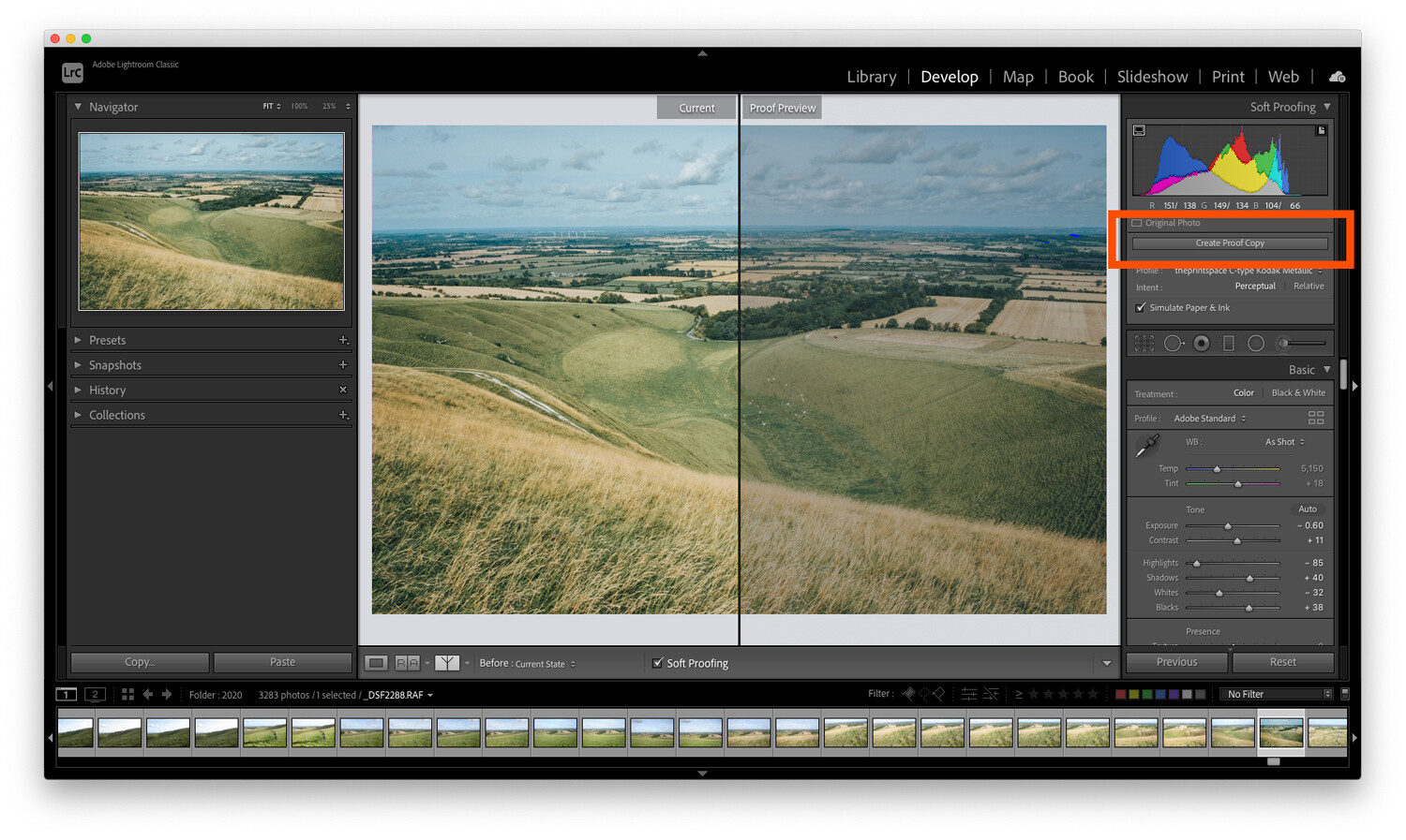
This will create a duplicate image with your print profile embedded so you can make adjustments for printing. By creating a proof copy first, Lightroom will leave your finished image unchanged – even as you make adjustments to your file for printing.
You see, on this new copy of the image, you can make adjustments while still in soft proofing mode. That way, you can ensure that what gets printed is exactly what you intended.
So simply make adjustments to the proof preview using the Lightroom sliders until you like the result!
Here’s one final technical check worth running:
The gamut warning feature.
In the left-hand corner of the histogram is a button that looks like a computer screen:

If you toggle this setting on, your image may gain some striking blocks of color.
The colors are simply warning you which areas of the image will not reproduce properly when you go to print. To get the best quality print, you should do your best to reduce (and ideally remove) all of these problem areas.
To get rid of the warnings, try adjusting the saturation and exposure of your image.
Soft proofing in Lightroom: Conclusion
Many people see soft proofing for printing as unnecessary. They may get acceptable results already when printing, and they may have even learned to compensate while editing their photos to get the best prints.
However, if your prints don’t match the images you’re seeing on the screen, it’s because you haven’t done any soft proofing. With enough experience, you’ll learn the adjustments to make for perfect print results. But this is a process, one where you have to learn by making mistakes – so don’t be discouraged if things don’t work out the first time.
When you make your next print, give soft proofing in Lightroom a try. Calibrate your monitor, then soft proof your images with the correct ICC print profiles.
I guarantee it will improve the quality of your print!
Now over to you:
Have you ever tried soft proofing your prints? How did it go? Do you think you’ll start soft proofing before printing, now that you’ve read this article? Share your thoughts in the comments below!
The post Soft Proofing in Lightroom: The Essential Guide appeared first on Digital Photography School. It was authored by Charlie Moss.
You must be logged in to post a comment.