RSS
 

Posts Tagged ‘Images’

Leica SL2: First sample images from this new 47MP camera

07 Nov

$ (document).ready(function() { SampleGalleryV2({“containerId”:”embeddedSampleGallery_8394780689″,”galleryId”:”8394780689″,”isEmbeddedWidget”:true,”selectedImageIndex”:0,”isMobile”:false}) });

The Leica SL2 is the brand’s latest full frame mirrorless camera sporting a new 47MP sensor, updated processor, redesigned ergonomics and an upgraded 5.76M-dot OLED viewfinder.

We got our hands on an SL2 prior to launch and we’ve been shooting around downtown Seattle alternating between Leica’s beefy but versatile 24-90mm F2.8-4 and Sigma’s charmingly compact 45mm F2.8. Here are our initial samples.

See our Leica SL2 sample gallery

Articles: Digital Photography Review (dpreview.com)

 
Comments Off on Leica SL2: First sample images from this new 47MP camera

Posted in Uncategorized


Video: 10 in-camera tricks for capturing unique images without Photoshop

01 Nov

Jordi.Koalitic, a creative photography project from photographers Jordi and Arnau Puig, has published a video detailing 10 ways photographers can add interesting effects to their images without using editing software. These in-camera tricks include spraypainting alphabet pasta to simulate letters falling on a book, gluing dirt inside a pot to imitate shooting through a hole in the ground and more.

Other effects detailed in the video include simulating action shots involving fruit, marbles, and a tennis ball, using a mirror to creatively capture a subject from a unique angle, using a slinky toy to create a swirly effect extending from the camera to subject and using glass to safety shoot water being thrown at the camera. The video includes sample images and the camera settings used to capture them.

Additional images can be viewed at the team’s Jordi.Koalitic Instagram account.

Articles: Digital Photography Review (dpreview.com)

 
Comments Off on Video: 10 in-camera tricks for capturing unique images without Photoshop

Posted in Uncategorized


How to Find and Photograph Wild Landscapes for Epic Images

20 Oct

The post How to Find and Photograph Wild Landscapes for Epic Images appeared first on Digital Photography School. It was authored by Jeremy Flint.

epic-wild-landscapes-photography

Wild Landscapes can be described as “unspoiled areas of land including hills, mountains, and rivers where wild animals, trees, and plants live or grow in natural surroundings and are not looked after by people.”

Venturing into the wild with your camera can be a great adventure that provides a unique opportunity and rewarding exploration to photograph untouched and pristine landscapes. Embarking on such a trip requires careful planning before you go.

How-to-Find-and-Photograph-Wild-Landscapes-and-Create-Epic-Images-01

Sinai Mountains, Egypt

The first thing you will need to do is choose a wild landscape location to visit. How to go about finding these places is simply a matter of looking for potential destinations. Certain areas around the world are famous for their wild landscapes and rugged beauty including the majestic mountains of Scotland, the highlands of Iceland, the Grand Canyon in the USA, the Canadian Rockies, the deserts of Namibia, Patagonia in South America and many more.

Closer to home, you can find wild landscapes within national parks, areas of outstanding natural beauty and amongst local nature.

Two UK-based photographers worth following who like to photograph wild landscapes include, Thomas Heaton and Alex Nail. Both produce great visuals of wild landscapes, outdoor photography and nature, and are very inspiring.

Once you have found a suitable location, there are several things to consider before going out to photograph wild landscapes.

Go prepared

How-to-Find-and-Photograph-Wild-Landscapes-and-Create-Epic-Images-02

Brecon Beacons, England

When going on a shoot, make a packing list and be prepared from wearing the right gear to having plenty of food and drink supplies to keep your energy levels up.

Take the right clothing

The clothing you take will determine how comfortable you will be. For example, appropriate rain gear is essential if this is the forecast. In sunny weather, you may be uncomfortable in too much clothing, and in colder weather, you will be chilly if you don’t wear enough layers. So you will need to wear appropriate clothing.

Footwear

Choose the appropriate footwear for the terrain you will be walking on. A sturdy pair of waterproof walking boots with good grips on the souls are essential for long walks over rough grounds with rain forecast.

Supplies

Supplies of food and water are important to keep you fuelled and hydrated. Take more than you estimate for your journey in case of any difficulties, such as burning more calories than expected on a long hike to your destination.

Consider wild camping

How-to-Find-and-Photograph-Wild-Landscapes-and-Create-Epic-Images-03

Torres del Paine, Chile

Consider taking a lightweight tent and camping out overnight somewhere to photograph an epic scene of the wilderness. There are advantages to wild camping beside a great view. They include being able to capture the sunset and sunrise, and not having to walk to the destination twice.

The right camera gear

Travel light, especially if you are going to stay out overnight somewhere. Cut back on the camera equipment you take as much as you can. Make room to carry other essentials such as food and drink supplies. Only take the lenses you think you will need, such as a wide-angle lens.

Other equipment

Be sure to take a map with you as a precaution. Also, take a fully-charged phone with a GPS app or an ordinance survey map for directions.

Let people know where you are going

It may seem obvious, but it is essential to tell people where you are heading, and for how long, as a safety precaution. This helps in the unlikely event that you experience any unforeseen circumstances. This could include bad weather (for example, thick fog on a mountain top) or sustaining an injury where you are unable to return at the anticipated time.

You will feel more comfortable in the knowledge that someone knows where you are if you require assistance.

Time your visit

Wild Landscapes 04

The Rockies, Canada

When shooting a wild landscape, it is important to consider the weather conditions.

Time your visit to go and shoot when the weather is good or dramatic. It depends on the kind of image you want to achieve.

There is no such thing as ‘bad weather’ for photography, as in different conditions, you’ll gain different results. For example, a wild stormy sky is great for a powerful and energetic image. Calm and still conditions can give you a minimalist outcome. Each has its own appeal.

You can even shoot landscape images in the midday sun if you prefer to visit during the day.

Choose a viewpoint and composition

When it comes to photographing an epic wild landscape, you will want to choose a viewpoint and composition that captures the location well. Seek out strong compositions that show the majesty of the place, such as a striking mountain range or some intriguing details.

Tripod

It is worth setting your camera on a tripod, especially to help shoot in low light or blustery weather where the conditions can adversely affect the outcome of your images. This will assist in providing more stability and essentially sharper pictures.

Light

Wild Landscapes 05

Sossusvlei, Namibia

When photographing wild landscapes, consider the light to create great images. You can photograph spectacular scenes by using light creatively. Capture sidelight (when the sun lights the landscape from the side, often creating interesting shadows and textures), backlight (shooting in the direction of the sun where your subject can be silhouetted or have bright edges) or front light (where the sun is coming from behind you and straight onto your subject). You can also include the sun in your shot to make images with different tones and brightness.

Conclusion

Photographing wild landscapes can be a great adventure and an opportunity to explore pristine and untouched landscapes. You can find wild landscapes within national parks, areas of outstanding natural beauty and amongst local nature. Remember to consider clothing, footwear, food and water, camera equipment and a map and be sure to let people know where you are going. Choose an interesting viewpoint, use a tripod and be creative with light. Share your pictures of Wild Landscapes with us below.

The post How to Find and Photograph Wild Landscapes for Epic Images appeared first on Digital Photography School. It was authored by Jeremy Flint.


Digital Photography School

 
Comments Off on How to Find and Photograph Wild Landscapes for Epic Images

Posted in Photography


How to Make Your Images Have Fall Vibes

18 Oct

The post How to Make Your Images Have Fall Vibes appeared first on Digital Photography School. It was authored by Anabel DFlux.

how-to-make-your-images-have-fall-vibes

With Fall fast approaching, we will soon be surrounded by beautifully warm-colored leaves and vegetation, filling the air with the sweet scent of Autumn. This is a photographer’s paradise, especially the ones who are also social media mavens following artistic trends. But what if you, like me, are not so lucky to live in a place that actually has seasons?! I live in Southern California, and finding trees that actually change color is…pretty uncommon, to say the least. So what are lonesome Californians to do?! Turn to post-processing, to make your images have fall vibes!

What defines a Fall or Autumn vibe in images?

how-to-make-your-images-have-fall-vibes

All there is to portraying specific ideas or ‘vibes’ are color. We associate colors with seasons, inspired by the colors that nature gives us during those times (in locations that actually have seasons. Is my bitterness over Southern California’s lack of seasons showing yet?!). Winter tends to be cold and blue, Spring is rainbow and vibrancy, Summer is warm greens, and Autumn is oranges, reds, and yellows.

Although you can sit there for several hours and recolor every leaf into a different Autumn color, for the most part, Fall vibes can be achieved by playing with and removing colors that are associated with the seasons we are not trying to mimic. Fall is warm and full of reds, oranges, yellows, and more rustic tones.

How to make your images have fall vibes in post-processing

Taken this summer, this is the base image we will be working with to show you how to make your images have fall vibes. I find that images with very shallow depth of field (like the one below) are a bit easier to work with when altering their colors.

How to Make Your Images Have Fall Vibes

For the sake of explanation, the edits shown below are quite extreme. Use your judgment and personal taste to determine how far you take them.

Also, the tutorials I am listing below use Adobe Lightroom and Adobe Photoshop. However, they can easily apply to other editing software too as many feature similar options and sliders. Even the free mobile version of Photoshop and Lightroom have these sliders.

Adobe Lightroom

I turn to Lightroom for these kinds of color adjustments because it’s quite quick and simple to do. You can also copy the settings and apply them to an entire batch of images rather than having to do each one by one. Our final image will look like this:

how-to-make-your-images-have-fall-vibes

The HSL Panel

The HSL panel is the first panel I go to when I want to create a summer vibe in my photographs. Conveniently, this is one of the first open panels in Lightroom.

HSL stands for “Hue, Saturation, and Luminance,” and is a panel box in Adobe Lightroom (with similar panels in other programs). I like to say that this is the panel that adjusts each of the colors individually. Each slider is divided by colors: red, orange, yellow, green, aqua, blue, purple, and magenta.

Hue is the color. On a technical term, the hue is the wavelength of the light reflected. This describes why an object that is a solid color appears different depending on the amount of light that hits it. On the HSL panel, the Hue slider can change how specific colors look. For example, the reds can be made to be more orange in color or more red.

Saturation determines how intense a color is. Pulling the slider to the left makes the color more gray, pulling the slider to the right makes it more true to pure tone.

Luminance lightens or darkens a specific color. Luminance refers to the reflective brightness of colors. I use this slider to make colors that are a bit too light, much darker in photographs so that they don’t stand out to the eye too much.

With the image above, our primary objective is to change the green to more fall colors. In this case, I will make the green more orange. I can achieve this by adjusting the Green color slider under ‘Hue’ and subsequently adjusting the colors surrounding the green. The awesome thing about sliders is that you have full control.

Next, I drop down to saturation and adjust how true to tone each color is and decreasing the color we want to remove altogether (for example, the green).

Finally, with the Luminance slider, I brighten up all of the warmth we have put into the photograph.

How to Make Your Images Have Fall Vibes

Split toning

If you find solely using the HSL sliders isn’t enough, you can add more of the color you want using the Split Toning menu. Split Toning is located right below HSL.

Split Toning is just toning applied to different areas of luminance. You can color your shadows with one color, and your highlights with another. In this case, I toned both the highlights and the shadows to bring even more warmth into the image.

When I do Split Toning, to make it easy to see what I am doing, I bring the Saturation up to its maximum 100 value point and then click on the little color rectangle next to Highlights and then next to Shadows. Clicking this rectangle brings up a color selection box. I then select the color I am interested in and proceed to significantly lower the sliders until I achieve the shadow or highlight coloration I desire.

The settings I used for the image above are these:

How to Make Your Images Have Fall Vibes

Masks

If you’re following along in your own editing program, you may find that making all of these color adjustments have now impaired parts of our image that you may not want to be colored like that. In my photo, the whites of the dog became far too yellow for my liking. You can use Masks to remedy this by selecting the parts of the image you do not want the effect applied to.

Locate Masks at the very top of the right-hand tabs when clicking “Develop.” I like to use the Adjustment Brush which is the long selectable line directly under “Histogram” in the screenshots below.  Then, you paint on the image and can make adjustments on the painted section independent from the overall image. In this case, I removed the warm effect from the dog and brightened the dog a bit. The red haze shows you where you applied the mask.

How to Make Your Images Have Fall Vibes how-to-make-your-images-have-fall-vibes

Adobe Photoshop

There are many, many, many different methods of achieving the same end result in Adobe Photoshop.

Photoshop is a large, and at times, complex program. To keep it simple, I’ll explain my favorite color adjustment methods similar to the adjustments in Adobe Lightroom. For another example of a Fall-vibe in a more muted tone than the edit above, we will replicate the image featured below:

how-to-make-your-images-have-fall-vibes

Before we even get started, in the Layers panel, duplicate the Background (main) layer and work on that. As a rule of thumb, never work on the original layer and make all adjustments on a new layer. This helps you remedy mistakes, give you the flexibility to change your mind, and use masks to remove the effect from the parts of the image it shouldn’t apply to!

Hue/Saturation

The term ‘saturation’ in general describes the level at which something is absorbed. For example, a sponge heavily saturated with water. In photography, saturation refers to how pure a color is. How red is red? How blue is blue? You can imagine a color  “absorbed” in the photograph like a sponge, with a higher saturation resulting in a more significant color.

Hue is a color attribute that explains how discernible a color is to its true color (for example, how green is the green?). Hue is based on color wavelength and is completely independent of a color’s lightness or darkness and intensity.

You can use the Hue/Saturation slider in the Image > Adjustments window!

How to Make Your Images Have Fall Vibes

Where it says “Master” (which will adjust everything simultaneously) you can select individual colors to adjust. This is great to use on images that don’t involve a lot of color variation.

How to Make Your Images Have Fall Vibes

Selective Color

The Selective Color in Photoshop (also located in Image -> Adjustments) is similar to the HSL sliders in Lightroom. Selective Color allows you to modify each color (located in the drop-down menu under “Color”) by either adding or decreasing CMYK colors (Cyan, Magenta, Yellow, and Black). CMYK is the color mode that a printer operates in.

I like using Selective Color with images that feature a lot of white because I don’t necessarily want my whites toned the same as the rest of my image. You can adjust the white itself in Selective Color, which is pretty cool. This allows me to keep the white dog more authentic to the original rather than making the Great Dane orange.

How to Make Your Images Have Fall Vibes how-to-make-your-images-have-fall-vibes

Color Balance

Another way to adjust the colors in the image is by utilizing the Color Balance sliders. This can also be located under Image -> Adjustments. Color balance is the global adjustment of the intensity of the colors. This what I use the most when trying to create some fall vibes in my photographs.

I prefer this method because it’s the fastest slider set to use – but the end result does tend to look a lot like a filter. If that’s the look you’re going for; awesome! But if not, Selective Color may be of better use to you.

how-to-make-your-images-have-fall-vibes

Conclusion

Whatever method you implore to make your images more Autumn oriented, enjoy those warm fall vibes and glow up that Instagram feed!

Do you have other tips on giving your images fall vibes? Try these methods and share your images with us in the comments below!

The post How to Make Your Images Have Fall Vibes appeared first on Digital Photography School. It was authored by Anabel DFlux.


Digital Photography School

 
Comments Off on How to Make Your Images Have Fall Vibes

Posted in Photography


High resolution Sony a7R IV pixel shift images added to studio scene, sample gallery updated

24 Sep

$ (document).ready(function() { SampleGalleryV2({“containerId”:”embeddedSampleGallery_0635778599″,”galleryId”:”0635778599″,”isEmbeddedWidget”:true,”selectedImageIndex”:0,”isMobile”:false}) });

One of the eye-catching features of the Sony a7R IV is its 16-image pixel-shift mode. This shoots four images centered around one position then shifts the sensor half a pixel sideways and takes another four, then another half pixel… until it’s taken 16 images. These 16 images can be turned into 240 megapixel images.

We’ve added pixel-shift images to our studio scene at several different ISO settings, along with a couple of real-world examples to our sample gallery showing both the 4-image demosaicing mode as well as the high-res 16-image mode. Just for good measure, we’ve added more standard images to the gallery as well.

Studio Scene

$ (document).ready(function() { ImageComparisonWidget({“containerId”:”reviewImageComparisonWidget-52074786″,”widgetId”:715,”initialStateId”:4752}) })

Image Processing

We’ve processed the images in the studio scene using PixelShift2DNG, because it allows us to use our standard Adode Camera Raw processing to maximize comparability with other cameras in the scene.

It should be noted that Imaging Edge has a setting called ‘Px Shift Multi Shoot. Correction,’ adjustable in eleven steps between 0 and 1, that smooths some of the stair-stepping and chequerboard errors that can appear in the image. The shots in our test scene effectively have this set to 0.

Before making this decision, we compared this output with the results from Sony’s own Image Edge software. We’ve created a rollover that compares the PixelShift2DNG result to the Imaging Edge output with sharpening, noise reduction and Px Shift Correction minimized, and to the default Imaging Edge result.

DNG -> ACR Imaging Edge Modified Imaging Edge Defaults

We’ve uploaded the Image Edge-combined ‘ARQ’ files to the studio scene, but you can download the combined DNGs here:

16-image files merged using PixelShift2DNG
  • ISO 100
  • ISO 6400
  • ISO 51200
  • ISO 102400

Articles: Digital Photography Review (dpreview.com)

 
Comments Off on High resolution Sony a7R IV pixel shift images added to studio scene, sample gallery updated

Posted in Uncategorized


Samsung Exynos 980 chipset supports 108MP images, 4K video at 120 fps

06 Sep

Samsung has launched its latest top-end chipset for mobile devices which will likely make an appearance in the brand’s next-generation Galaxy S and Note series smartphones. The Exynos 980’s headline features are a built-in 5G modem and plenty of processing power, but the new chip also has lots on offer for mobile photographers and creators.

The chipset supports image resolutions up to 108MP which means it’s ready for use with the next generation of high-resolution Quad-Bayer-like sensors. The image signal processor supports up to five sensors and can simultaneously process the output from three, allowing for advanced image-merging and other computational imaging methods.

There is also a built-in neural processing unit (NPU) which is specially designed to run artificial intelligence tasks. On the camera side of things, this is used for scene and object detection and subsequent optimization of camera parameters.

Exynos 980 powered mobile devices will also be able to encode and decode 4K video at 120 frames per second (fps). Support for HDR10+ with dynamic mapping should result in better color rendering in video clips.

There’s no definitive timeline for when this chipset will be released, but it’s safe to say Samsung’s future smartphones will likely be the first to showcase it.

Articles: Digital Photography Review (dpreview.com)

 
Comments Off on Samsung Exynos 980 chipset supports 108MP images, 4K video at 120 fps

Posted in Uncategorized


You can now search for images in Google Photos using text found within the image

24 Aug

Google has confirmed Google Photos is adding the ability to search for images using the text featured in the content. This is different than searching for images based on their filename, instead using Optical Character Recognition (OCR) technology to identify words featured in photographs, such as from an image of a menu or sign.

The feature was first spied by Hunter Walk, who shared the above screenshots of the new capability. The official Google Photos account responded to the tweet, confirming it’s rolling out the new search capability.

Though apps that use OCR to copy text aren’t anything new, the ability to search through albums of uploaded photos for text located within the images will come in handy for many users, particularly those who use Google Photos for storing scanned copies of invoices and other business documents.

According to The Verge, the new OCR-based search option is available on some Android devices at this time. Google indicated in its tweet that the feature is rolling out over the course of this month, so it may take a number of days or weeks to arrive for everyone.

Articles: Digital Photography Review (dpreview.com)

 
Comments Off on You can now search for images in Google Photos using text found within the image

Posted in Uncategorized


5 Nature Photography Editing Tips to Create Stunning Images in Seconds

12 Aug

The post 5 Nature Photography Editing Tips to Create Stunning Images in Seconds appeared first on Digital Photography School. It was authored by Jaymes Dempsey.

Do you ever feel like your nature photos are just a bit…bleh? Like they could use something more?

nature-photography-editing-tips

It’s a common problem. Because while you can be a master of light, composition, and camera settings, there’s still one thing you need for amazing nature photography:

Editing.

You see, editing is how you make your nature photos shine. It’s how you add a final touch to your images. It’s how you take a slightly bland image, and make it into something truly stunning.

In this article, I’m going to share with you nature photography editing tips so you know exactly how you can create amazing nature photography edits.

And you’ll come away with the ability to enhance every single one of your nature photos.

Sound good?

Let’s get started.

nature-photography-editing-tips

1. Straighten and crop to emphasize your main subject

First things first:

If your nature photo is crooked…

…then it just won’t work. No matter how amazing the content.

(This is especially a problem for landscape photos, where crooked horizons are extremely obvious.)

You see, a crooked photo is just disorienting. It causes the viewer to get caught up in being imbalanced and makes them forget all about the subject.

So the first thing you should do to enhance your nature photos:

Check to make sure your photo is straight. And if it isn’t, straighten it! Pretty much every photo editing program offers straightening tools, so make use of them.

I handheld this swan photo, and so it required a bit of straightening:

5 Nature Photography Editing Tips to Create Stunning Images in Seconds

Once you’ve straightened your photo, it’s time to think about cropping.

Now, if you’ve composed carefully in-camera, you won’t necessarily need to crop. But it’s easy to miss something small while looking through the viewfinder. Maybe there are some leaves dangling in the corner of the frame!

In which case:

Crop!

By removing distractions, you’ll make your photo stronger overall. You should also crop to improve your composition. For instance, you might crop slightly to place your main subject on a rule of thirds gridline.

Or you might crop to place a symmetrical subject smack-dab in the middle of the frame, like this:

5 Nature Photography Editing Tips to Create Stunning Images in Seconds

Basically, just think of cropping as a second, more measured chance at composing.

Use it to nail the perfect final composition. But don’t think that you need to crop each time a photo comes up. And try to get the composition right in-camera.

After all, crops automatically reduce resolution!

2. Drop the blacks and up the whites to add interest

If you think that your nature photos are looking a little flat, then you might be suffering from a common problem:

Low contrast.

Low-contrast photos generally lack interest. There’s not a clear difference between the subject and the background, so the whole shot just seems to blend together.

Fortunately, this can be fixed pretty easily with a bit of post-processing!

First, basically, every photo editing program offers a contrast slider. For a quick-and-dirty edit, go ahead and boost up this slider.

However, I’d go for something a bit more controlled.

In Lightroom, for instance, I like to use the adjustment sliders to drop the blacks and increase the whites, like I did for this photo:

nature-photography-editing-tips

You can also use the tone curve function to create a nice s-shape, which will give you the same effect.

If my image is fairly low contrast to start with, I’ll add a touch of contrast and then leave things be.

But if my image already has a lot of light and dark tones, I like to push the contrast further. This is especially the case if I’m taking photos in black and white.

Therefore, I’ll add to the blacks until the deepest shadows are close to losing detail. And I’ll increase the whites until the brightest parts of the photo are almost clipped.

3. Clean up your subject with a bit of Healing or Cloning

Now it’s time for some careful adjustments.

You see, many subjects in nature photography could use a bit of cleaning up. Because they tend to have dirt or blemishes that interfere with the overall look of the photo.

For instance, I often clean up my flower photos. Insects chew holes in the petals, or the tips of the flowers start to wither. And if I were to leave these elements in, they would simply distract from the overall shot.

5 Nature Photography Editing Tips to Create Stunning Images in Seconds

If you’re a bird photographer, think about cleaning up the bird’s surroundings. There are often stray branches in photos of woodland birds. There is often dirty sand and distracting shells in photos of shorebirds.

On the other hand, I would not advocate making extensive modifications to your subject. I like to portray nature as close to reality as possible. And that means holding myself back from altering my subject in any deep way.

I generally use Lightroom’s excellent healing tool to remove these blemishes. But any clone tool will do the job. It’ll just require a bit more work.

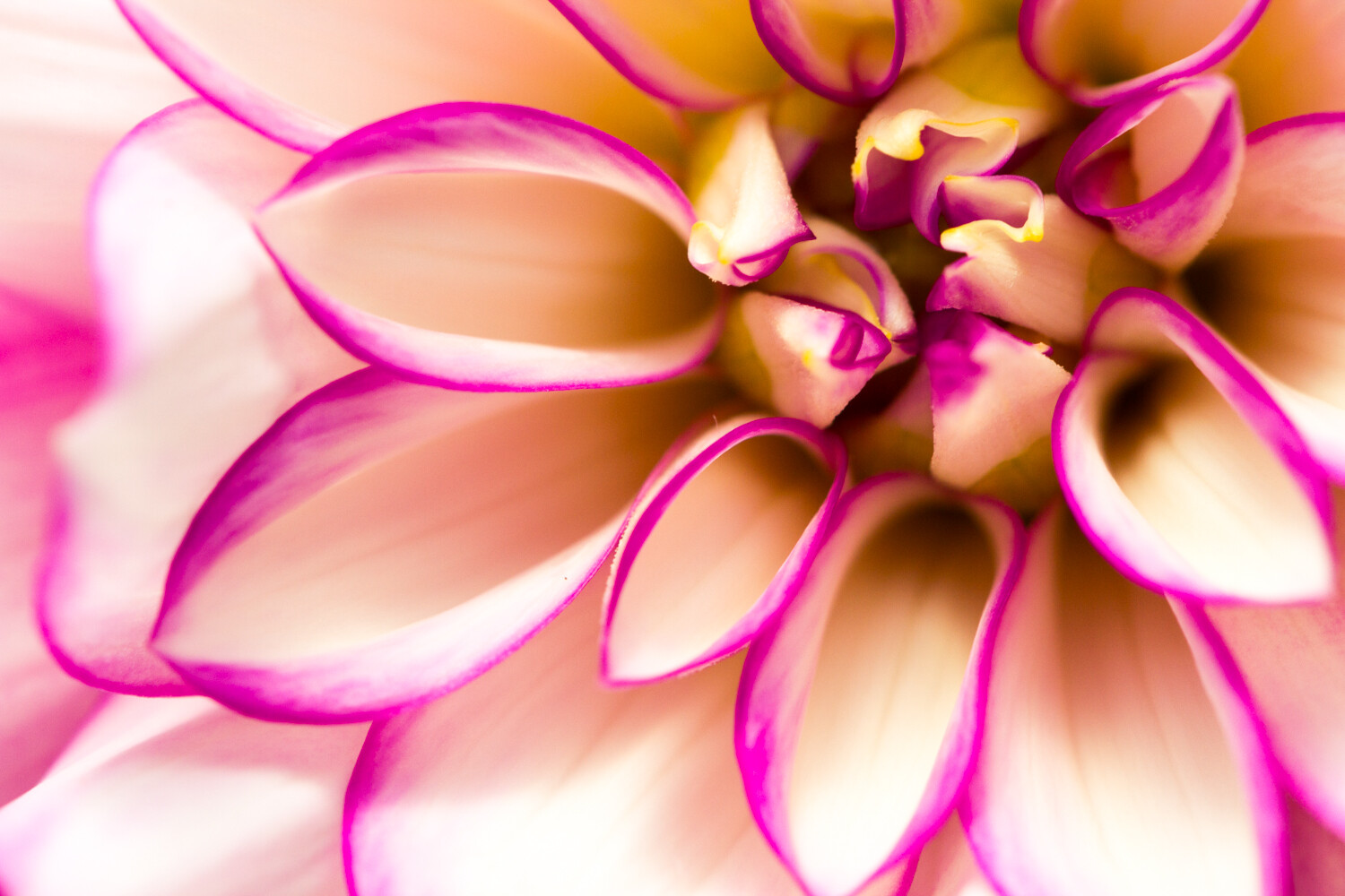
4. Simplify the palette with Color Adjustments

In nature photography, I advocate simplicity:

Simpler shots are generally best.

But that doesn’t just go for composition. It’s also true for color.

In other words, for a stunning photo, you should try to limit the number of colors you include. One color works just fine. Two is nice. Three is good. Four is reaching the upper edge.

After that, the colors contribute a sense of chaos to the scene, which is exactly what you don’t want.

Fortunately, you can work on simplifying your color palette after you’ve taken your shots.

5 Nature Photography Editing Tips to Create Stunning Images in Seconds

All you have to do is use the color adjustment sliders. In Lightroom, these are the hue, saturation, and luminance (HSL) adjustments.

Here’s a couple of ways you can simplify your colors:

First, you can desaturate any colors that you want to deemphasize, and saturate any colors you’d like to bring out.

Second, you can change the hues of several colors to look more similar. For instance, you might make greens slightly bluer and blues slightly greener, so that everything leans toward a balanced middle color.

Third, you can darken any problematic spots of color. If you have a splash of orange in the background that you just don’t like, you can dial it back by simply darkening the oranges.

Unfortunately, there’s no set formula for working with color adjustments. But I always recommend you keep a final goal for the photo in mind: simplicity.

5 Nature Photography Editing Tips to Create Stunning Images in Seconds

And I should note: It’s easy to overdo color adjustments so that you end up with a garish, oversaturated scene. I suggest that you always check your color edits the day after you’ve finished, and make sure that the edits still seem to make sense.

That way, you can be sure that you haven’t taken things overboard.

5 Nature Photography Editing Tips to Create Stunning Images in Seconds

5. Use a subtle Split Tone to give a polished look

Here’s your final piece of advice for nature photography post-processing:

Use (subtle) split toning!

Now, split toning is a bit complex:

It allows you to choose a color to add to the shadows of the image, and a color to add to the highlights of your image.

For instance, you can add a yellow to the highlights, and make the whites of the image look very warm:

5 Nature Photography Editing Tips to Create Stunning Images in Seconds

Then you can add a blue to the shadows, and make the dark parts of the image look very cold:

nature-photography-editing-tips

In fact, yellow/blue split toning is extremely common in cinema, because the warm/cold contrast makes the visuals more compelling.

Now, in nature photography, you don’t want to split tone to the extent they do in cinema. The point of a nature photography split-tone is to subtly enhance the colors.

So here’s what you should do:

Once you’ve finished your main editing, head over to the split-toning options in your editing software. This isn’t an edit offered by every post-processing package, so check to see if it’s something you can do.

Then simply play around with the split toning options. Be careful to keep things pretty minimal. You don’t want to grossly alter the colors of the photo. You want something subtle.

The yellow-highlights, blue-shadows split-tone is one that works pretty consistently, so it’s something that I suggest you try.

But feel free to experiment with many split-tone options.

And pick the one you like best for a wonderful finishing touch!

5 nature photography editing tips to create stunning images in seconds: next steps

Nature photography editing is just the thing you need to add a bit of punch to your photos.

So I suggest you have a consistent post-processing workflow, one which allows you to take your pictures to their full potential.

nature-photography-editing-tips

That’s how you’ll really create a polished nature photography portfolio.

Which nature photography editing step do you think is most useful? Let me know in the comments right now!


5-nature-photography-editing-tips

The post 5 Nature Photography Editing Tips to Create Stunning Images in Seconds appeared first on Digital Photography School. It was authored by Jaymes Dempsey.


Digital Photography School

 
Comments Off on 5 Nature Photography Editing Tips to Create Stunning Images in Seconds

Posted in Photography


Why You Shouldn’t Delete Your Images Too Quickly

23 Jul

The post Why You Shouldn’t Delete Your Images Too Quickly appeared first on Digital Photography School. It was authored by Nils Heininger.

why-you-shouldnt-delete-images-too-quickly

There are many reasons why you might want to delete images: They show the same subject, again and again, they are technically inferior, or you simply do not like them. However, don’t hit the delete button right away!

Here are some reasons why you shouldn’t delete your images too quickly

Isn’t it hard to stay organized? Since the age of digital photography, it is quite easy to get “just one more shot” of your subject. These few shots quickly add up to hundreds, even thousands. Considering the huge file sizes of modern cameras, that’s a lot of memory. Not only is your hard-drive full of bytes, but you also have to keep an overview – a few stars here, a few flags there and a red label for your beloved ones. It’s often hard to avoid the data mess.

why-you-shouldnt-delete-images-too-quickly-1

At first, I rated this image with one star. Recently, I rediscovered it and was happy that I did not delete it

Sometimes, I feel like deleting all the images I assume I will not use anymore. Why should I keep images that I don’t sell, show to my friends and family or use in any other way? It’s the same subject, just from another perspective.

I have five images from a nicer angle, in a better light and with fewer people in it.

Here is my hint:

Wait a little while, and stay organized. Don’t delete everything in the first place. There are some reasons why you might want to keep your images.

why-you-shouldnt-delete-images-too-quickly-2

A picture I rejected because it was a byproduct of a hike to shoot the Milkyway over a river bend.

Your client wants a specific picture

If you are documenting something, or you do travel photography, you should be careful what you delete. Never get rid of any image before completing the job. You may think the light in the image of person XY was not too nice or the photograph is not perfect, but maybe it tells a story.

Your client or editor might ask you, “Is there an image of this person XY, while he looks a bit sad?” or “Is there an image of a person wearing this weird hat, which is so typical for people working in this area?”

You may remember that person XY wore that hat. Then you look it up and realize that you deleted the image because you did not find the light appropriate. My friend, you missed a chance to satisfy an editor.

Even after delivering a project, it is smart to keep all of your images. You may want to sell some of them to someone else. People could approach you to ask if you have an image of this one shop because they make a follow-up story on yours. We never know what the future brings. Don’t delete what others might ask for. Demands of editors can be unpredictable.

why-you-shouldnt-delete-images-too-quickly-3

I shot this image as a byproduct of covering a desert safari in India. It was useless for this topic, but it might be useful for another project about the desert region.

Blindness for the beauty

Sometimes, while you are working on a project, you get used to the beauty that you create. You are completely sucked into a breathtaking work environment, and every shot amazes you.

Later, you look at your images and search for the best ones (which you should do) but ignore the second-best ones. Make sure you do not delete them.

When I was in the Indian Himalayas on a motorbike tour, every mountain peak was worth shooting. The light was appealing, and the blue sky was full of little cottonwool clouds. I shot away hundreds of images during the daytime and edited the best in the evening. I recently looked at the old folders and found some amazing images that I rated with two stars just because the others outshined them.

why-you-shouldnt-delete-images-too-quickly-4

This picture almost ended up in the bin. Luckily, I checked the folder after a few years.

Maybe you want something specific at one point in time, and you simply cannot see other forms of beauty then. The image may be surrounded by too many other nice ones that distract you at that moment.

When you open your old folders a few years later, you may be happy that you kept them all. Don’t delete what you might value later.

Did you think about stock?

If you worked on commission, you might have a deal that your client takes a bunch of images out of your primary selection. You probably shot far more pictures than needed (you should!). What can you do with the rest? Did you ever think about uploading them on a stock photography platform? You may be able to get a little money from all those images that your client rejected or that you didn’t even send to them because there were better ones of the same subject.

why-you-shouldnt-delete-images-too-quickly-5

I chose an image of me sitting under the stars for an article about the desert. This “dismissed” one of me standing on the dune might work well in stock.

Always give your clients the best quality and the best compositions. If your contract does not stop you from using the other images, why would you want to waste them? When you make three images of subject A, but just one is good enough for your client, maybe the other two might be good enough for stock. Don’t delete what you might use afterward.

An image contains memories

Maybe the best reason to keep your images is the simplest – for yourself.

When I look back at any image, it triggers my memory.

These rivers are meeting in the Himalayas. It’s not the best image because it’s too dark, with bad light. Yet, they make me remember the feeling I had when I stopped to take the image. They remind me of the taste of the air, the feeling of empty solitude and the discovery of my dire sunburn where my scarf did not cover my neck.

why-you-shouldnt-delete-images-too-quickly-6

Technically, a bad image, yet, the broken bridge reminded me of the struggle to get up this mountain and shoot better images. I laughed out loud when I rediscovered it.

Little details in images make you remember big stories. They evoke feelings. You can smell the flowers again, which you see in the frame of that horribly composed landscape-image. You remember the way that tea vendor smiled, even though the image is a little soft or blurry because you had to shoot with one hand while balancing your teacup in the other. Don’t delete what your older self might love to see.

why-you-shouldnt-delete-images-too-quickly-7

It is very hard to compose with one hand while reaching for tea with the other.

Conclusion

You never know what will happen and how you will look at your images at a later point in time. If you have completely identical pictures, well, hit that Del-Button.

If they differ, mark them differently.

You can check your old files after a few years and decide what you want to delete for good.

Maybe you will find something useful even if it is just for a blog post about why you should not delete images. All the images in this article were once ready for deletion.

I resisted, and today, I am happy about it.

why-you-shouldnt-delete-images-too-quickly-8

Be careful what you delete. One day, you might regret it.

What about you?

Did you ever have any regret after deleting images? Do you find pleasure in it? Is there a method, which helps you to avoid deleting the wrong pictures? And when did you last review your old images? I would love to hear your stories in the comments below.


why-you-shouldnt-delete-your-images-too-quickly

The post Why You Shouldn’t Delete Your Images Too Quickly appeared first on Digital Photography School. It was authored by Nils Heininger.


Digital Photography School

 
Comments Off on Why You Shouldn’t Delete Your Images Too Quickly

Posted in Photography


Do Larger Camera Sensors Create Different Looking Images? [video]

05 Jul

The post Do Larger Camera Sensors Create Different Looking Images? appeared first on Digital Photography School. It was authored by Caz Nowaczyk.

In this video from fstoppers, they show you whether large sensors create different-looking images to smaller sensors in cameras.

?

In the video, Lee Morris photographs his friend Keith Bradshaw with four different cameras each with different sensor sizes.

Lee uses the following cameras and settings:

FujiFilm GFX 50R/ 43.mm x 32.9mm sensor/ 64mm lens f/8

Canon 6D/ 35mm ff sensor/ 50mm f5.6

FujiFilm XT-3/ 23.6mm x 15.6mm sensor/ 35mm f4

Panasonic GH5/ Micro 4/3 sensor/ 25mm f2.8

He shot each image in RAW and only changed the white balance. he also cropped in on all images to hide the 4/3 aspect ratio of the GH5 and GFX.

You may be surprised by the results (or perhaps you already knew this).

Check it out.

You may also find the following helpful:

  • Full Frame Sensor vs Crop Sensor: Which is Right For You?
  • Full Frame VS Crop Sensor VS Micro Four Thirds: Camera Sensors Explained
  • Is it Time to go Full-Frame? Weigh These Pros and Cons Before You Decide
  • Is Full Frame Still the Best?
  • Making Sense of Lens Optics for Crop Sensor Cameras


The post Do Larger Camera Sensors Create Different Looking Images? appeared first on Digital Photography School. It was authored by Caz Nowaczyk.


Digital Photography School

 
Comments Off on Do Larger Camera Sensors Create Different Looking Images? [video]

Posted in Photography