RSS
 

Posts Tagged ‘Editing’

Editing Gently: 3 Tips for Processing Realistic Landscape Photos

11 Jul

A well-processed photograph should be just like a good haircut. That’s one of my favorite analogies when it comes to explaining my approach to editing my own photographs. Not only does it confuse people and make them think I’m weird but it is also incredibly accurate when it comes to processing realistic landscape photographs.

What I mean is that when an image is well-processed the viewer will know something has been changed while not being overly apparent and in the end, they like what they see. Just like a good haircut.

sand dunes - Editing Gently: 3 Tips for Processing Realistic Landscape Photos

Before we get further into this, I want to go on record and say that in my opinion there is no “correct” way to process any photograph. So the tips you’re about to learn here come from my own creative tastes and style for landscapes which lean towards an “enhanced” realism but solidly anchored in reality nonetheless.

Now, let’s talk about some ways you can give your landscapes a good haircut and push your processing right up to the boundaries of realism without tipping over the edge.

#1 – Directional Light

Photography is all about light and in landscape photography, 99% of the time the only light source in your compositions will be the sun, or in some cases the moon, which is just reflected sunlight (science).

Sunlight comes from that big ball of fire in the sky and that makes it very directional by nature. Meaning, your main light source for your photographs comes from one spot. When you process your landscape images it’s very important to pay attention to the direction from which the natural light is falling in the image.

The reason for this is because there’s nothing more telling that a photo has been blatantly over-processed than sunlight appearing to miraculously illuminate the frame from different directions. This is especially true when the sunlight is close to the horizon in the early morning or late afternoon. Have a look at the photo below.

zion canyon - Editing Gently: 3 Tips for Processing Realistic Landscape Photos

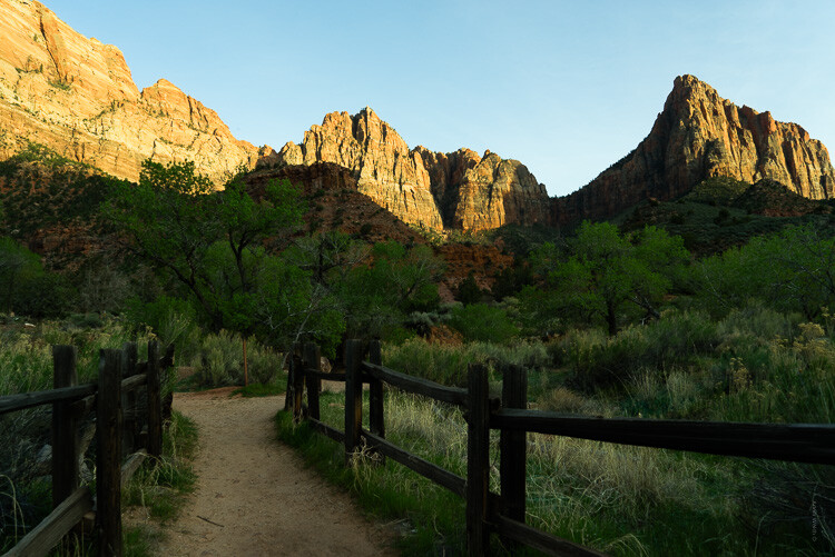
Notice how the light comes in from the right of the frame and illuminates the tops of mountains? Yet the foreground is in shadow and so are the areas where the sun is blocked by the cliffs.

When processing a photo with such stark lighting as this be mindful that you don’t create overly artificial light where it shouldn’t be. Sure, bring up those dark areas but don’t go too far as I have with this example (below).

zion bad edit - Editing Gently: 3 Tips for Processing Realistic Landscape Photos

See how “off” the lighting is now? Sure, it’s not terrible but there is bright illumination in areas that should be in shadow on the right. There is no longer a natural feeling gradient to the light as it falls on the foreground.

Let’s look at a more harmonious example of the same photo that has been processed to work with the direction of the available light.

zion good edit - Editing Gently: 3 Tips for Processing Realistic Landscape Photos

In this example, the entire photo feels much more comfortable without having bright spots, uneven shadows, or that odd appearance in the first version.

Most of the editing you’ll do to selectively adjust the luminance of landscapes will be done with local adjustment tools like the gradient filters and adjustment brush. We’ll get into using local adjustments in a moment but first, let’s talk about another aspect of landscape processing that can truly ruin any great photo if you’re not careful.

#2 – Match Color Tones in Reflections

Walking hand in hand alongside working with directional light is how you manage reflections in your landscapes. More specifically, matching reflections in water is a little detail that can make or break a convincing landscape photo.

So often I see reflections in water which are either too bright or too dark or perhaps more noticeable, reflections which do not match (or reasonably approximate) the color tone of the light which it is literally reflecting. Have a look at this. I’ve warmed the sky in this image somewhat from its original blue hour cool tone.

yosemite sky - Editing Gently: 3 Tips for Processing Realistic Landscape Photos

Notice how the light reflecting from the river also carries a hint of the orange color from the sky? Not too much but just enough to add some realism. This is because I intentionally warmed the color of the water a wee bit in order to be more harmonious with the warmed sky. If I had not, we would have something of a tonal mutant on our hands…

yosemite cool water - Editing Gently: 3 Tips for Processing Realistic Landscape Photos

Notice how the color tones in the water don’t match the sky and overall scene here?

When it comes to working with your reflections the name of the game is remembering that the light reflecting in the water comes from the sky…usually. So it should also carry some of the same attributes of that light in terms of luminance and color.

Of course, the type of water plays a role in skewing this a bit but just use good judgment and keep in mind that the reflection should almost always carry a hint of whatever color the ambient light brings to the scene.

#3 – Make Realistic Local Adjustments

I’ve talked about how much I love using local adjustments in other dPS articles. I’m admittedly a radial filter junky and the majority of my photos carry some use of either the gradient or radial filter and adjustment brush edits, often times all three. When it comes to making edits using any of these tools it’s important to know how NOT to use them.

My old friend the gradient filter comes into play quite a bit when processing realistic landscape photos to even out bright skies and for illuminating dark foregrounds. What’s more, used with the radial filter and local adjustment brush, it can work wonders.

good adjustments filters yosemite - Editing Gently: 3 Tips for Processing Realistic Landscape Photos

Good adjustments using the filters in Lightroom.

Or it can look absolutely horrifying when used poorly.

Yosemite - Editing Gently: 3 Tips for Processing Realistic Landscape Photos

Bad use of a graduated filter in editing.

The same is true for its circular counterpart, the radial filter. This little gem works beautifully for applying custom vignettes and brightening (or darkening) areas or for adding in a host of other great adjustments to your photos. However, much like the gradient filter, it can be easily blundered.

saguaro cactus bad edit - Editing Gently: 3 Tips for Processing Realistic Landscape Photos

Bad edit with a radial filter in Lightroom.

The local adjustment brush also carries the same caveats. Few things make a picture look worse than the application of a “finger-paint” local adjustment brush. Actually, it gives finger-painting a bad name.

death valley - Editing Gently: 3 Tips for Processing Realistic Landscape Photos

The key to making effective and realistic local adjustments in any photograph comes down to remembering a few important guidelines:

  • Less is usually more. Local adjustments are just that, local. So when applying them remember that they will become more and more apparent when you use them to make drastic edits.
  • Feathering is your friend. Whether it’s the radial or gradient filters or event the adjustment brush, most times you will want to apply your adjustments gradually with very soft borders which blend well with the surrounding pixels. Set your feathering all the way to 100 and then if you need a harder edge for more defined work back it off from there.
  • Don’t be afraid to stack adjustments. When done judiciously, many local adjustments can be applied one over the other. For example, you might use three graduated filters each with a varying color temperature to give the sky a creamy color tone or multiple radial filters to layer out an exposure adjustment.

Final Thoughts

Landscape photography is a long-loved standby in the photography world. It is also one of the most ethereal and easily mismanaged types of photography when post-processing is done unconvincingly.

There are so many aspects of processing realistic landscape photos and most go beyond simply moving a few adjustment sliders around. In fact, I think of my landscapes as more of an exercise in digital painting than as simply editing a picture.

Whatever your persuasion may be in terms of how much you choose to make edit, having a solid basis in reality is a great jumping off point for making a dynamite landscape.

zion - Editing Gently: 3 Tips for Processing Realistic Landscape Photos

Remember, pay close attention to the direction of the light in your frame and make sure that the rest of your edits stay somewhat true to the natural lighting already present.

The same goes for reflections. Make sure the light reflecting from surfaces like water looks like it came from the ambient light source even if that light source has been changed by you. And lastly, don’t mess up the endgame but applying freakishly obvious local adjustments.

Always remember, there are no rules for processing a landscape photograph but there are ways you can make sure your photos stay true not only to your visualized outcome but also to the natural splendor from whence they were born. Yes, I used “whence” in a sentence.

Happy editing!

The post Editing Gently: 3 Tips for Processing Realistic Landscape Photos appeared first on Digital Photography School.


Digital Photography School

 
Comments Off on Editing Gently: 3 Tips for Processing Realistic Landscape Photos

Posted in Photography


Adobe announces Project Rush, a cross-device video editing application

20 Jun

Adobe has announced development of Project Rush, a cross-device video editing application that consolidates the entire video creation workflow, from shooting to social media sharing. According to Adobe, Rush is intended to provide a more streamlined and intuitive user experience for creating videos, as well as to provide a powerful video solution for mobile users.

In contrast to traditional video creation workflows, which often require switching between specialized programs, Rush aims to put the entire workflow into one, integrated application. It supports shooting, editing, audio optimization, motion graphics, and video sharing, and provides a simplified interface for editing, color correction, audio, and titling.

Adobe says the tools available in Rush are based on the same underlying technology as some of its pro apps, including color correction technology from Premiere Pro and audio technology from Audition. Integration with Adobe Stock will provide access to free motion graphics templates which can be customized by users.

Project Rush will work across mobile and desktop platforms, and will include the same feature set in both versions. Projects will synchronize between devices using Adobe Creative Cloud.

Recognizing that a great deal of video content is now shared through social media, Rush will automatically optimize video for a variety social media platforms, as well as manage publication and scheduling of content to those platforms. Adobe did not specify which platforms will be supported.

Rush will be available in mobile and desktop applications, with both versions supporting the same feature set, meaning users will have the same tools at their disposal no matter which device they’re using. Projects will sync between devices using Adobe Creative Cloud.

Although Project Rush is unlikely to replace pro-level tools for larger productions, it may prove useful to those who don’t need the power of a dedicated non-linear editor, or those who prefer a workflow that doesn’t involve multiple programs.

Adobe did not provide a release date or pricing for Project Rush, but since it’s designed to sync across Creative Cloud it’s likely to require a Creative Cloud subscription to fully utilize its features. If you want to try Rush for yourself, you can apply to join the public beta here.

We’ll be taking a look at Rush in the near future and will share our impressions once we’ve had a chance to give it a spin.

Articles: Digital Photography Review (dpreview.com)

 
Comments Off on Adobe announces Project Rush, a cross-device video editing application

Posted in Uncategorized


How to do Creative Editing with Layers in ACDSee Ultimate Photo Studio 2018

20 Jun

In my first article on ACDSee Ultimate Photo Studio 2018, I covered all the elements of the program that a beginner would need to know about. This article covers editing in more detail, starting with processing your RAW file in Develop Mode and then doing some creative editing using Layers in Edit Mode.

Layers are a critical part of editing your images. Either in doing your RAW process and then tidying up areas that need it with curves, levels, and other adjustments. Or if you want to add more creativity to your images, with textures, decorative flourishes, fancy text embellishments. Finally, you can go all the way up to compositing, and using layers is the best way to achieve that.

textured image of flowers - How to Edit Using Layers with ACDSee Ultimate Photo Studio 2018

Let’s look at what ACDSee Ultimate Photo Studio 2018 has to offer for editing a RAW file. Then we’ll add a creative edit with texture layers, embellishment layers, and using masks to create a vintage grunge effect.

I am going to assume that you have a basic understanding of RAW editing and using layers and masks and not detail absolutely every step worked through in this process. If you need more help, go back and read: ACDSee Photo Studio Ultimate 2018 Guide for Beginners first.

Editing a Raw File in Develop Mode

First, open up Manage mode and find the right folder to select an image. For this exercise, I liked the Gerbera Still Life image and decided that the final version should have a grungy vintage look added at the end.

How to Edit Using Layers with ACDSee Ultimate Photo Studio 2018 - image thumbnails

This is the selected image of three crimson gerbera flowers, with a pair of pointe ballet shoes and some sheet music. It’s a bit dark and dull and needs some tweaking which we will do in the Develop mode of ACDSee Ultimate Photo Studio 2018.

original image before editing - How to Edit Using Layers with ACDSee Ultimate Photo Studio 2018

Original unedited RAW file

After some basic editing, the image is brighter and the colors are better balanced.

How to Edit Using Layers with ACDSee Ultimate Photo Studio 2018 - edited with basic adjustments

However my final vision for this image is more of a vintage look, and the colors are too bright and rich. So, further editing to bring the saturation down and darken the crimson was applied. This now provides the basis for the layers and creative elements, so it’s saved and then we move into Edit mode.

How to Edit Using Layers with ACDSee Ultimate Photo Studio 2018 - image with lower saturation

Creative Editing Using Layers

Switching to Edit Mode by clicking on EDIT with the edited RAW file open will change your workspace. Now the Layers palette is laid out on the right. As there is only the one image open, it shows up as Layer 1.

At the bottom of the Layers palette are the different layer options – hover over each one to find the one you need and click to activate it. For this exercise, we are going to bring in some grunge textures and additional elements to make it look vintage, old, and more artistic.

Textures

I use a lot of textures from 2LilOwls, The Daily Texture, and Distressed Textures. If you are patient you can also make your own but there are plenty of places to acquire them online. The ones used in this article were from 2LilOwls.

How to Edit Using Layers with ACDSee Ultimate Photo Studio 2018

My preferred option to add extra layers is to use a second monitor, open up Windows Explorer to the desired folder, find a texture I like and then drag across to my image. Note, when using ACDSee, you have to drag it into the Layers Palette (rather than onto the image directly).

The other option is to click on the “Add A File As A Layer” button which allows you to search for a file within your directory and add it. This was a useful feature which I used several times.

By default, the texture is applied in Normal mode which means only the top layer is visible, which is the texture in this instance. In the Layer Palette it is visible as Layer 2.

How to Edit Using Layers with ACDSee Ultimate Photo Studio 2018 - texture layer

The first texture layer has been added – it’s showing in Normal mode so you can only see this layer and not the one below (the image of the flowers).

Blend Mode

Next, change the blend mode of the layer to something that suits the image – either Overlay or Soft Light are good choices to start with. Also, dial down the layer opacity to soften the effect and make it look more pleasing.

How to Edit Using Layers with ACDSee Ultimate Photo Studio 2018

Masking parts of the layer

This texture has some heavy vignetting around the edges that is a bit too dark. So to solve that, add a Layer Mask and select a large soft brush at around 30% opacity. Dab the brush in the darker edges and corners to reduce the effect.

How to Edit Using Layers with ACDSee Ultimate Photo Studio 2018

The Layer mask is white and it shows up the areas you brush in grey (or black) – you can see where it has been applied in the corners.

How to Edit Using Layers with ACDSee Ultimate Photo Studio 2018

Image with texture and layer mask applied with softer tones in the dark corners now

Add more grunge

It needs more grunge so let’s apply a second texture layer. This one has lots of cracks and scratches for a nice vintage effect. It is also a bit lighter around the edges so should balance out the first texture nicely.

How to Edit Using Layers with ACDSee Ultimate Photo Studio 2018

The texture file is a different size than the original image but you can drag it out to fit by clicking on the yellow squares on the outside edges and corners.

This layer also had the blend mode changed and the opacity adjusted to suit. The crack effect was quite strong on the flowers so a mask was applied with a soft brush at low opacity that was brushed over the flowers.

More embellishments

The top left and right corners felt a bit empty so I added some decorative embellishments. On the left, is a butterfly with some fancy handwriting and another textural element was added on the right. Both are PNG files that are blended in with low opacity and Soft Light blend mode.

layers - How to Edit Using Layers with ACDSee Ultimate Photo Studio 2018

Each element goes onto a separate layer for full control.  Masks are applied to remove the effect from the flowers.  These become Layers 6 and 7.

Finally, a Photo Effect (Somber) was applied to add a bit more contrast and punch.

How to Edit Using Layers with ACDSee Ultimate Photo Studio 2018 - photo effect

Before and after images

Here we have the RAW file after it was edited in Develop mode and some creative adjustments for Saturation and Vibrance applied.

before layered editing - How to Edit Using Layers with ACDSee Ultimate Photo Studio 2018

Here we have the final image after the texture layers, embellishments, Photo Effect and masks have been applied.

How to Edit Using Layers with ACDSee Ultimate Photo Studio 2018 - final image

Additional Notes

As an advanced Photoshop user, I was comfortable using all the layer tools and functions available in ACDSee Ultimate Photo Studio 2018. Most of the usual tools were available and functioned as expected.

The one major issue I found was the inability to change the brush shape. It does not appear possible to import .abr files to add creative brush shapes. The only options for changing the brush are blend mode, size, and opacity and the only shape is round.

You can change the size, hardness, and opacity of the brush but not the actual shape of it. This limits the creative choices available. Some of my brush files were present as PNG images so I was able to import them as individual layers.

Additionally, there were several extra features that were new to me which I found useful. The “Add A File As A Layer” button was extremely helpful and I used that on several occasions. There is also a button for “Adding a Blank Layer”, “Duplicating a Layer” and “Deleting a Layer”. All things that happen frequently and usually require a right mouse click, then a selection and second click. ACDSee made these steps much quicker with a single click.

There were extra adjustment layer functions, in particular, “Photo Effect” that offer a range of predesigned creative effects you can apply as a separate layer, to blend and edit as desired. A Vignette option (similar to Lightroom) was also available to quickly add a vignette.

Conclusion

If you are a beginner to using layers and masks then it can be a bit complicated to get your head around. The good news is that with ACDSee Ultimate Photo Studio 2018 everything that you would expect to be able to do and use to work with layers is all present and accounted for. It looks and functions very similar to Photoshop, so is comfortable for anyone transitioning over.

Except for the ability to change your brush shape, everything necessary to do a basic layer edit was easily recognizable and usable with pretty much no additional learning curve. That is a real bonus for anyone coming across from other programs.

There are also some nice new features that added extra value and made the experience better – in particular, “Add A File As A Layer” is something that I could easily get used to using. For anyone only using one monitor (like on a laptop) that makes adding another image as a layer so much easier. The Move function in Photoshop is really not user-friendly. This is a definite bonus if you are like me and add lots of extra files to your layers when editing.

Working in Edit mode and making a layered image with ACDSee Ultimate Photo Studio 2018 was not difficult and the additional features added real value in unexpected places.

Disclaimer: ACDSee is a dPS advertising partner.

The post How to do Creative Editing with Layers in ACDSee Ultimate Photo Studio 2018 appeared first on Digital Photography School.


Digital Photography School

 
Comments Off on How to do Creative Editing with Layers in ACDSee Ultimate Photo Studio 2018

Posted in Photography


Fotophire Photo Editing Toolkit

25 May

If you’re looking for a good and reliable photo editing tool, Fotophire  has you covered. It provides you with a host of interesting features that help you turn your photos into beautiful works of art. Fotophire is simple and easy to use. It has an intuitive user interface packed with functionalities both beginner and pro users can draw on to Continue Reading

The post Fotophire Photo Editing Toolkit appeared first on Photodoto.


Photodoto

 
Comments Off on Fotophire Photo Editing Toolkit

Posted in Photography


How to Use the Lightroom HSL Panel for Landscape Photo Editing

12 May

If you are a landscape photographer, you might already be using various lens filters to get desired colors and saturation in your images. What if you do not own these filters or forget to carry them along? There is a tool in Adobe Lightroom can help you.

The HSL (Hue, Saturation, and Luminance) tool is a savior for all photographers, especially those shooting landscapes. This is because the HSL tool allows you to adjust the hue, saturation, and luminance in your photos very efficiently.

Where is HSL Panel located in Lightroom?

First, you have to make sure that you are working on the Develop module, in order to access the HSL tool.

How to Use the Lightroom HSL Panel for Landscape Photo Editing - develop module

Once you are in the develop module, you can now see all the toolbars on the right-hand side of the window. Simply scroll down a bit until you see the “HSL / Color / B&W” panel. As you will be working on the HSL tool, just click on the “HSL” tab.

How to Use the Lightroom HSL Panel for Landscape Photo Editing - HSL panel

Using the Hue Sliders in HSL

The first tool that we shall be discussing is the Hue tab, which as the name suggests allows you to adjust the hue (or color tint) of a photo. Hue enables you to adjust the tones ranging from -100 to +100. In simple language, you can change the tone/tint of a particular color in a photo, but within the hue range. By default, Lightroom allows you to play with the hue of eight default colors as shown in the photo below.

For example, if you look at the comparison below the original color of the sky was blue (middle image below). So if I adjust the blue slider and take it all the way to -100, the color shifts from blue to a somewhat greenish color. Similarly, if I take the slider all the way to +100 the color shifts towards a magenta tone.

hue adjustments - How to Use the Lightroom HSL Panel for Landscape Photo Editing

Hue adjustments with the Blue slider.

I know it looks disastrous, but this extreme example gives you an idea of how you can use the Hue tool when required. Let me share a perfect example with you that I achieved using the Hue adjustments.

How to Use the Lightroom HSL Panel for Landscape Photo Editing

LEFT: Original image RIGHT: Color corrected using the Hue tool

Using the Saturation Sliders in HSL

Now once you are done adjusting the hue of the colors that you desire, you can move on to the saturation tab in the HSL panel. We all love saturation in landscape photos especially in the sky, don’t we?

Using the saturation tab, you can adjust the intensity of a particular color from the list of eight default colors. Unlike the saturation slider in the Basic LR panel where the whole photo gets affected, here you can selectively adjust the saturation of a single color.

Suppose you want to boost the saturation of blue color in the sky, simply drag the blue slider towards the right and see the magic. If you wish to make it less saturated, mode the slider towards the left and experiment with selective coloring effect.

Similarly, you can perform repeated actions using different colors in your frame and get a well-saturated photo.

How to Use the Lightroom HSL Panel for Landscape Photo Editing - blue saturation slider

The blue saturation slider on the HSL panel in action.

Using the Luminance Sliders in HSL

The last tool from the HSL panel is Luminance, which allows you to adjust the brightness of a particular color tone. So basically you can increase or reduce the brightness of a color by adjusting the Luminance slider.

There are situations when the sky is way brighter than the mountains or your subject, or maybe your subject is brighter than other elements of your frame. Using the luminance sliders, you can balance the brightness of the scene.

For instance, in the photo below, the sky is overexposed and I want the blue color to be dark in order to get more contrast in the sky. Using the Luminance tool I adjusted the blur color slider to -80 to get the desired result as shown below.

How to Use Lightroom HSL Settings for Landscape Photo Editing

Choosing Colors Manually in HSL

There are chances that the color that you want to choose to adjust the Hue, Saturation, or Luminance is not amongst the eight default colors. No worries, you can still adjust the HSL settings using a special feature called the Targeted Adjustment Tool which is located on the HSL toolbar itself (as shown in red below).

How to Use Lightroom HSL Settings for Landscape Photo Editing

The targeted adjustment tool is highlighted in red.

Simply tap on the icon and take it over to the exact spot where you wish to adjust the hue, saturation,  or luminance. Now click and hold at that point in your frame and drag the mouse up/down to adjust the sliders automatically.

Some colors are a mix of two or more primary colors, so you may see multiple sliders being adjusted when you click and drag the mouse. For example, green grass isn’t always just green, it usually has a lot of yellow in it as well.

Final Words

Hue, saturation, and luminance play an important rule in landscape photo color correction, do you agree? Using the HSL sliders, you get a lot more flexibility as you can perform better color correction based on particular colors.

Be it changing the hue of trees from green to orange, boosting the saturation of the sky, or adjusting the luminance of the scene, the HSL tool in Lightroom takes care of it pretty well.

The post How to Use the Lightroom HSL Panel for Landscape Photo Editing appeared first on Digital Photography School.


Digital Photography School

 
Comments Off on How to Use the Lightroom HSL Panel for Landscape Photo Editing

Posted in Photography


Tips for Editing Hockey Photos in Lightroom

06 May

In this article, I’ll give you some tips for editing hockey photos using Lightroom. If you’re a hockey mom or dad, read on to make the photos of your kid on the ice stand out.

Shooting hockey is hard

Have you ever tried to photograph lightning?

Sometimes that’s what it feels like when taking pictures at a hockey game. Every play is a blur. You can feel the game’s speed and intensity right until the final whistle. Emotion and sweat mix together on the faces of players who battle and fight for every inch, as the arena shakes with a thunderous ovation from the spectators.

Two hockey players battle for the puck

In short, it’s a whole lot of fun to capture through a camera. But after the crowds are gone and your ears have stopped ringing, it’s time to head home, load your images up on the computer and apply your special brand of editing.

Editing hockey photos can be tricky too

Regardless of what camera you use, all hockey images will benefit from some attention in Adobe Lightroom before you share them on social media or in a local publication. And despite the thrills of the sport, the arena is a tough place for a photographer. You have to deal with low or inconsistent light, high ISO settings and low shutter speeds, scuffed up glass and more.

Learning the technique to get decent shots in the first place is half the battle — but that’s a story for another time. Today, it’s time to head into the editing room.

Note that even though this guide specifically addresses features in Adobe Lightroom, the same concepts can be used in any photo editing program with similar controls.

Shoot in RAW

First off, if you’re serious about getting the best hockey pictures possible then it’s a good idea to shoot in RAW. Sure, file sizes are a lot larger, but this is because more data is preserved for each shot. When you’re editing, you’ll be thankful for all the extra leeway you can get with a RAW file over a JPG.

A hockey player sitting on the bench during a game

That’s not to say that you’re doomed if you shoot JPG. It just means you’ll need to be extra careful getting the settings right in the camera since there won’t be nearly as much flexibility when editing later. The choice is yours.

Cull Aggressively

Culling is the process of removing and maybe also deleting photos that simply don’t make the cut.

Not every image is a keeper. Especially in sports photography, you’re going to get images that are out of focus, poorly composed or simply not very interesting. If your goal is to edit every single image you take, you’re going to go crazy.

Choose the best of the best to focus your time and energy on, and then start editing those.

Cropping and Straightening

It’s rare to nail the best possible composition right in your camera. Sure, it happens from time to time, but it’s more likely that your pictures will benefit from a bit of cropping and straightening.

Consider what’s important in the frame. You want to have a nice balanced composition that fills the image. Think in terms of simplicity: if you crop out a stick or skate that appears in the corner of the image it will help your final picture feel more clean and professional.

The unedited image of a hockey player on a breakaway - Tips for Editing Hockey Photos in Lightroom

This is the image out of the camera. It’s already a fairly tight shot, but it would be even better with a crop.

A hockey player on a breakaway against a goaltender - Tips for Editing Hockey Photos in Lightroom

That’s more like it! Now the action feels close and intense.

It might not be possible to do a tight crop of a shot and maintain quality, depending on how your camera handles high ISO settings. If you find that your images are always just a little too zoomed out, remember that for next time you photograph a game.

Straightening out your images is a big help as well. As you track the play through your camera, it’s easy to start tilting the camera.

There are times when a crazy tilt gives a sense of action and energy to a picture — but often it just looks like the players are about to tumble out of one side of the image.

An unbalanced image of a hockey goaltender - Tips for Editing Hockey Photos in Lightroom

The players by the bench look like they’re ready to slide down to the bottom left side of the shot.

A hockey goaltender taking a break while the crowd cheers - Tips for Editing Hockey Photos in Lightroom

This straightened version feels a little more stable.

Take the time to straighten your pictures and they’ll look much more professional and balanced.

Understanding White Balance

Cameras interpret color differently than our eyes do. Under tricky lighting conditions, cameras don’t always capture an accurate representation of color.

Correcting the White Balance is an important part of your final edit since it’s hard to appreciate an image that looks too blue or too yellow. If you shoot in RAW, you can adjust the White Balance without losing any image quality. With JPG, you can still make minor adjustments but don’t count on being able to save many images.

An example of the white balance settings in Lightroom

The White Balance slider in Lightroom.

If you have a shot that needs to be fixed, the eyedropper tool can be useful for getting you fairly close to the mark. Click on something in the shot that is a neutral color, such as the boards, and then adjust from there. Pay close attention to skin tones and always remember that the ice should be white.

A hockey image with a poor white balance setting - Tips for Editing Hockey Photos in Lightroom

The Auto White Balance setting missed badly on the original shot, choosing to use 4450K

Hockey players fighting for the puck - Tips for Editing Hockey Photos in Lightroom

After some correction, I settled on 3800K as a White Balance that displays the colors more accurately.

Finding the right White Balance can be tricky, especially since different display screens can have subtle variances. But with a bit of practice, correcting the White Balance in your shots will become a piece of cake.

Contrast, Shadows, Blacks and Dehaze

Your approach with editing is going to be very different depending on whether or not you have to shoot through the glass. In the NHL, photographers either shot through a small hole in the corners or from higher angles where they can see above the glass. But you may not have that luxury.

Shooting through thick glass usually robs a picture of a lot of its contrast. Contrast plays an important role in giving an image depth and making it “pop”. So you’ll need to add that back in the final edit.

Lightroom offers a couple of sliders that can manage this.

  • Contrast: This slider will make dark mid-tones darker and light mid-tones lighter. When used in moderation it can make a picture appear richer, but be careful not to overdo it and create surreal tones.
  • Blacks: This slider influences the darkest tones of the image. This can be useful for fixing hockey pants, sticks and skates so that they are black again, rather than a faded dark grey.
  • Shadows: This slider affects the mid to dark tones of the image. Typically this slider plays a big role in determining the brightness of the crowd and the players’ faces.
  • Dehaze: Introduced only a few years back, the Dehaze slider tries to interpret how light has been lost and scattered in the image. It works well with foggy images and is actually a good fit when shooting through hockey glass as well.
A low contrast image of two hockey players, taken through the glass - Tips for Editing Hockey Photos in Lightroom

This shot was taken through the glass. The colors are weak and the contrast is very poor. Overall, the image looks dull.

Two hockey players fighting for the puck in the corner of a rink - Tips for Editing Hockey Photos in Lightroom

After applying Contrast and Vibrance, the picture comes back to life! This image uses the following settings; Contrast +45, Shadows +42, Blacks -19, Dehaze +25.

If you’re lucky enough to get the chance to shoot without a pane of glass between you and the players, these contrast sliders will still be an important part of your final edit.

There is no “right” amount of contrast to use; just adjust the slider to taste and to make sure the final image is full and rich.

A hockey player on the bench during a game - Tips for Editing Hockey Photos in Lightroom

With no glass between the player and the camera, this shot is clear. It still benefits from some contrast to bring out color and drama.

Lightroom settings for a hockey image - Tips for Editing Hockey Photos in Lightroom

Adjustments used for the image above.

Keep your Whites White

The ice at a hockey rink is white. That means that it should be white in your final image as well. This can be a tricky process, especially since cameras don’t “see” the same way that your eyes do.

If you overexpose an image, the ice might turn into a uniform blob of white. If you underexposure, the ice becomes a murky gray. It’s a delicate balancing act.

An underexposed hockey image where the ice has turned a shade of gray - Tips for Editing Hockey Photos in Lightroom

A perfectly timed snap – but the underexposed ice looks terrible!

Once again, shooting in RAW gives you a bit of leeway. With RAW you can get good results correcting the exposure by plus or minus two stops. With JPG, a missed exposure could mean that the picture needs to go into the trash.

When editing, you’ll want to pay attention to your histogram and clipping warnings. If the ice is overexposed, it will show as a line right up against the right side of your histogram. Your final image should have bright ice but without clipping.

The histogram of a hockey picture - Tips for Editing Hockey Photos in Lightroom

The histogram of a typical hockey image (above). The mountain far to the right is the white of the ice. If it was all the way to the right, we’d start losing detail in the highlights.

A hockey player jumping into the air in celebration after scoring the winning goal - Tips for Editing Hockey Photos in Lightroom

After some tweaks to the exposure, the celebration can begin!

In Lightroom, you can adjust the overall image with the exposure slider, or you can target the ice surface more precisely by adjusting the Highlights or Whites sliders.

Start by adjusting the “Whites” slider, as this controls the maximum brightest point of the image. Once this is set, you can also adjust the “Highlights” slider, which affects a range of the brightest tones.

The goal should be to bring out a bit of the texture in the ice made of snow and grooves carved into the surface.

Brushes, Graduated Filters & Other Adjustments

Now let’s dig into some of the incredible tools in Adobe Lightroom. This is the point where your friends will wonder what kind of wizardry you are conjuring up to make your pictures look so good.

Adjustment brushes give you pinpoint control over selected areas of a picture. This is perfect for when you’ve got your whole image to a good point, but there are just a few more details that you can’t let slide.

Brushes can be used to apply any of Lightroom’s editing features. In the example below, I can use a brush to brighten up one of the players, who was a bit too dark in the finished image.

A hockey image with a adjustment brush applied to it - Tips for Editing Hockey Photos in Lightroom

The player in black was just a little too dark, even after all our adjustments. Never fear – now’s the time to use an Adjustment Brush.

Setting for an adjustment brush used on a hockey picture

Above are the settings applied to the brush. We’re raising the shadows to make the player brighter, but also adding contrast so that the adjustment doesn’t look unnatural.

The final hockey image, after an adjustment brush was applied - Tips for Editing Hockey Photos in Lightroom

The final image looks much more balanced!

Graduated Filters are fantastic for tackling uneven light or color shifts. If you’re a photographer in the big leagues, chances are you’ll be shooting at arenas with top-of-the-line lighting. But most of us aren’t there yet.

You’re probably more familiar with an old rink that has flickering lights, sections of the ice that are darker, or even the dreaded mixture of color temperatures. Find yourself in this situation and it’s going to take some fancy footwork to save your image.

The image below stood out for its strong composition and a good view of the players’ faces, but it doesn’t get much worse than the uneven light. No fear, Lightroom to the rescue!

An ice hockey image that is nearly ruined by poor lighting and color casts - Tips for Editing Hockey Photos in Lightroom

Ugh! This picture is the perfect example of terrible hockey rink lighting. Is it even possible to save it?

Using a graduated filter to fix the color cast on a hockey picture - Tips for Editing Hockey Photos in Lightroom

Fortunately, this shot was taken in RAW. So after applying some exposure and contrast adjustments, we can now use a Graduated Filter to try to fix this mess.

Settings on the graduated filter of a hockey image

The settings on the filter (above). We’re giving it a bump in exposure, and some heavy White Balance corrections.

The edited image of hockey players celebrating after a goal - Tips for Editing Hockey Photos in Lightroom

Voila – the picture is saved!

Lastly, Lightroom also offers a Radial Filter, which can be used to create effects similar to a vignette. This is a useful tool for subtly drawing attention to a certain player.

Saturation, Vibrance & HSL

Hockey sweaters are typically bright and vibrant with color. However, high ISOs, poor lighting, and dirty glass can often cause those colors to appear faded and drab in your image.

The Vibrance and Saturation sliders play an important role in bringing your image back to life with color.

Hockey players wearing bright red hockey jerseys - Tips for Editing Hockey Photos in Lightroom

For more precise control over colors, you can also turn to the HSL sliders. HSL stands for Hue, Saturation, Luminance, and these sliders allow you to modify an individual color in the image.

Is the home team wearing yellow? You can make their shirt colors “pop” by adding a saturation boost in the yellow channel but be careful not to ruin the balance in the rest of the image.

A hockey player deeking around a defender - Tips for Editing Hockey Photos in Lightroom

The settings of an HSL slider in Lightroom for a hockey image

Example of how to give just the yellow channel a bump in saturation.

If you’re looking for a more advanced application of the HSL sliders, try using them to eliminate unwanted colors from your image.

The image below is suffering from being a bit too colorful. All the spectators in the back, plus the yellow on the goaltender’s glove don’t really suit the color palette.

Fortunately, we can go in and start reducing the saturation of those colors that don’t fit in the image, giving a more professional and cohesive final shot.

A hockey goalie waiting for the face-off - Tips for Editing Hockey Photos in Lightroom

An intense shot, but the mishmash of color in this image is a bit distracting.

The adjustments made to the HSL sliders for a hockey image

These settings reduce the saturation on several channels. Note that we aren’t affecting either team’s colors.

The final edited image of a hockey goalie waiting for the puck to drop - Tips for Editing Hockey Photos in Lightroom

It’s a subtle effect, but now the colors are a bit more controlled, which improves the overall quality of the image.

The HSL sliders are also an invaluable tool for controlling unwanted color casts in your final image. If you can’t quite seem to find the right White Balance and there’s an overly blue or yellow tone lingering in your image, you can reduce the saturation for that specific color.

This might be necessary when shooting in arenas that have uneven lighting or that use a variety of types of light.

Adding Grit

Hockey isn’t a soft game. Play can get rough and gritty in a hurry — and you may want to try to capture a flavor of that in your edit. For this, you can turn to the Clarity slider.

The Clarity slider controls edge contrast. Using a pinch of Clarity can really help with bringing out textures and lend a gritty feel to the image.

A hockey player on the bench, with a pinch of clarity applied - Tips for Editing Hockey Photos in Lightroom

A +10 Clarity boost keeps this picture grounded in reality.

A hockey player on the bench, with clarity heavily applied

Sliding Clarity up to +85 creates a distinct and gritty style.

Be aware of how stylized you want your image. If you’re trying to edit the image to reflect reality, the Clarity slider should be used in moderation. But if you’re looking to let loose and create a bold, loud image, the Clarity slider can quickly become your best friend.

Sharpening & Noise Reduction

We’re getting close to the finished product! The combination of fast-paced action and high ISO speeds means that you’ll need to pay a bit of attention to sharpening and noise reduction.

Examples of sharpening and noise reduction in a hockey image

This is a tight crop of the finished image. Sharpening is set to +40 and Noise Reduction is +15. There’s still some grain, but it isn’t overly distracting.

Examples of sharpening and noise reduction in a hockey image

Now we move both Sharpening and Noise Reduction to +100. The grain is gone, but all details and texture have been smoothed out of existence as well.

A hockey goalie exits the bench and goes out onto the ice at the start of the game

The finished image, with +40 Sharpening and +15 Noise Reduction.

While modern cameras have vastly improved how much grain is produced in high ISOs, you’ll want to add some Noise Reduction. Don’t panic about the amount of grain while viewing the image at 400% zoom. Some grain is okay — in fact, it will be barely noticeable at all when viewing the picture under normal circumstances.

Noise reduction should be beneficial to the image; if you notice that details start to lose definition, then you’ve overdone it.

Sharpening can be added according to taste as well. Oversharpening can make the image look metallic and fake, so try to find the right balance.

Export and Share!

Last but not least, click “Export” and share your shots with the world! Maybe you’ve grabbed some awesome shots for a friend or family member, or maybe you’ve set a goal to become a professional photographer for the NHL.

A hockey team celebrates winning the trophy

Either way, you’re sure to have learned a few more tricks and will be able to apply that newfound knowledge to the next game you photograph.

Good luck chasing those elusive action shots!

The post Tips for Editing Hockey Photos in Lightroom appeared first on Digital Photography School.


Digital Photography School

 
Comments Off on Tips for Editing Hockey Photos in Lightroom

Posted in Photography


Eizo unveils ColorEdge CG319X DCI-4K HDR monitor for high-end video and photo editing

10 Apr

High-end monitor maker Eizo has just unveiled the ColorEdge CG319X: a 31.1-inch DCI-4K HDR display with a 4096 x 2160 resolution, built-in calibration sensor, and 98% DCI-P3 coverage. The new ColorEdge model builds upon the previously launched CG318-4K, adding multiple new features including hybrid log-gamma (HLG) support and a perceptual quantization (PQ) curve for HDR video editing.

According to the company, the CG319X’s panel offers images that “appear more true to how the human eye perceives the real world.”

The new ColorEdge model is targeted at pro-tier post-production work, offering a variety of features beyond what is available on typical consumer displays. For one, the CG319X has an integrated calibration sensor that has been upgraded so that it can recalibrate your monitor even while you’re using it. To facilitate this, the user selects a time during which the sensor will swing onto the screen, using up “minimal space” so that work can continue.

The CG319X comes with this built-in calibration sensor, which has been updated so it can recalibrate your display even if the monitor is in use.

This model also offers 98% DCI-P3 color space reproduction, a 1500:1 contrast ratio, and a retardation film that maintains tone depth when viewing the monitor from an angle. Finally, because temperature changes can affect an LCD’s brightness and color, Eizo has built a temperature sensor into the CG319X, which allows the display to adjust as necessary when the ambient temperature of the room changes.

The ColorEdge CG319X also features two HDMI ports, two DisplayPort inputs, DCI-4K/60Hz using HDMI or DisplayPort 1.2, 3D LUT, 10-bit simultaneous display from 24-bit LUT, 4K zoom, aspect ratio markers, luminance warning, an ergonomic stand, light-shield hood, built-in carrying handle, 5-year manufacturer’s warning, and support for the following cinema and broadcast preset modes:

  • EBU
  • Rec. 2020
  • Rec. 709
  • SMPTE-C
  • DCI
  • PQ
  • HLG

Eizo will start shipping the ColorEdge CG319X monitor next month in some regions; US shipments start in June. Price is still TBD.

Press Release

EIZO Releases 31.1″ DCI-4K Monitor with HDR Gamma Support for Media and Entertainment

Hakusan, Japan, April 5, 2018 – EIZO Corporation (TSE: 6737) today announced the new ColorEdge CG319X – a 31.1-inch monitor with DCI-4K resolution (4096 x 2160) and HDR gamma support for the professional post production workflow. It is the successor model to the CG318-4K with several upgraded features.

Distinguishing it from its predecessor, the ColorEdge CG319X comes equipped with HLG (hybrid log-gamma) and the PQ (perceptual quantization) curve for displaying and editing HDR (high dynamic range) video content. The optimized gamma curves render images to appear more true to how the human eye perceives the real world compared to SDR (standard dynamic range). Having a monitor equipped with HDR gamma support ensures professional creators can reliably display HDR content during the editing process so it is ready for color grading at the end of the workflow.

ColorEdge CG319X is equipped with an upgraded built-in calibration sensor, which allows the user to continue to operate the monitor even during recalibration. The sensor swings onto the screen at a time designated by the user and takes up minimal space so work remains uninterrupted.1 A built-in sensor eliminates the need for a third-party calibration device and ensures the screen stays color-accurate.

The monitor’s wide color gamut reproduces 98% of the DCI-P3 color space used in the media and entertainment industry. In compliance with the DCI standard, the ColorEdge CG319X offers a high contrast ratio of 1500:1 for producing true blacks that are otherwise difficult to display on a typical LCD monitor. In addition, it is equipped with a retardation film which allows tones to retain their depth even when viewed from an angle.

The color and brightness of an LCD monitor can be affected by changes in ambient temperature of the monitor itself. The ColorEdge CG319X is equipped with an internal temperature sensor which detects those changes and adjusts the monitor so gradations, color, brightness, and other characteristics continue to be displayed accurately. The algorithm used in the AI (artificial intelligence) 2 of the monitor allows it to perform this temperature detection and adjustment even at high brightness levels for providing a truly accurate viewing environment. In addition, EIZO’s patented digital uniformity equalizer (DUE) technology also counterbalances the influences that a fluctuating temperature may have on color temperature and brightness for stable image display across the entire screen. The monitor also provides noiseless, fanless operation while still maintaining low heat output without impacting performance.

Additional Features

  • 3D LUT for individual color adjustment on an RGB cubic table
  • 10-bit simultaneous display from a 24-bit LUT for smooth color gradations 3
  • DCI-4K resolution at 60 Hz via DisplayPort 1.2 or HDMI input
  • Broadcast and cinema preset modes: EBU, Rec. 2020, Rec. 709, SMPTE-C, DCI, PQ, and HLG
  • Two DisplayPort and two HDMI inputs
  • Ergonomic stand which meets IEC/EN 62368-1
  • Light-shielding hood included
  • 5-year manufacturer’s warranty 4

EIZO will be showing the ColorEdge CG319X for the first time at the NAB Show 2018 in Las Vegas, USA from April 9 – 12. Visit Booth SL15713 to see the product.

Product Information

  • ColorEdge CG319X

Availability

The ColorEdge CG319X will begin shipping in May, 2018. Date of availability varies by country so contact the EIZO group company or distributor in your country for details.

Articles: Digital Photography Review (dpreview.com)

 
Comments Off on Eizo unveils ColorEdge CG319X DCI-4K HDR monitor for high-end video and photo editing

Posted in Uncategorized


WD’s new blazing fast gaming SSD is perfect for 4K video editing

07 Apr

Western Digital has unveiled a new line of solid state drives in 250GB, 500GB, and 1TB capacities. Called the Black 3D NVMe, this new model is designed for gaming but is ideal for video production as well, due to its key selling point: the ability to rapidly and seamlessly handle 4K/UHD graphics.

The 500GB and 1TB 3D Black NVMe drives have a sequential read speed up to 3,400MB/s, while the 1TB drive exclusively has a read speed up to 2,800MB/s. Additionally, the new SSD is capable of up to 500,000 random-read IOPs for what Western Digital calls “extreme throughput.” That, the company explains, makes its new NVMe drives particularly ideal for multitasking environments that are data-intensive, as well as multi-threaded applications.

“With our new architecture and controller, the Western Digital Black SSD integrates our 3D NAND technology with the NVMe interface to enable new levels of performance,” says Mark Grace, senior vice president of WD’s Devices Business Unit. “Whether it’s a new gaming rig or a video-editing workstation, our innovative NVMe drives will power many existing and future environments that enable data to thrive.”

The drives will be available in the US by the end of the month for $ 120, $ 230, and $ 450 for the 250GB, 500GB, and 1TB SSDs, respectively.

Press Release

Western Digital Ups the Game with Powerful New Gaming SSD with NVMe Performance

PC gaming is increasingly immersive, with richer and more intense visual content than ever before, and gamers are faced with making technology choices to maximize their experience. To push leading-edge performance, lower power consumption and extended durability for PC gaming systems, Western Digital Corporation(NASDAQ: WDC) today introduced a high-performance Western Digital® Black 3D NVMe™ SSD featuring the company’s own SSD architecture and controller. The drive accelerates data for PC applications to enable users to quickly, access, engage and capture today’s high-resolution video, audio and gaming content.

With growing demand for rich content, PCs must have the capability to run intensive applications and enable the 4K/Ultra HD graphics and video content experiences. To move this immense amount of data quickly and seamlessly, Western Digital developed a new breed of SSDs to help remove the traditional storage bottleneck. This M.2 drive features a new NVMe architecture and controller, which optimally integrates with Western Digital 3D NAND. Western Digital’s new vertically integrated SSD platform was engineered from the ground up, specifically architected to help maximize performance for NVMe SSDs, with advanced power management, durability and endurance for the growing range of applications benefiting from NVMe technology.

“Today’s gaming applications require increasing capability from their PCs, and this will only continue to advance. With our new architecture and controller, the Western Digital Black SSD integrates our 3D NAND technology with the NVMe interface to enable new levels of performance. Whether it’s a new gaming rig or a video-editing workstation, our innovative NVMe drives will power many existing and future environments that enable data to thrive,” said, Mark Grace, senior vice president, Devices Business Unit, Western Digital.

Western Digital Black 3D NVMe SSD – Built to Boost Gaming Systems

With exceptional sequential read (up to 3,400 MB/s for 1TB and 500GB model) and write performance (up to 2,8001MB/s* for 1TB model) combined with up to 1TB capacities, the new drive is ideal for enhancing user experiences in gaming environments that benefit from acceleration of intensive fast data. Additionally, the drives feature up to 500,000 random-read IOPs (for 1TB model) to deliver extreme throughput, which is ideal for multi-threaded applications and data-intensive multitasking environments. The drive offers a five-year limited warranty with up to 600TBW endurance (for 1TB model). The Western Digital Black 3D NVMe SSD is available in the U.S. in capacities of 250GB ($ 119.99 USD), 500GB ($ 229.99 USD) and 1TB ($ 449.99 USD). The new drives will be available by late April 2018 in select Western Digital retailers, e-tailers, resellers, system integrators and distributors globally.

Enabling the possibilities of data, Western Digital offers the industry’s broadest portfolio of products and solutions to help people capture, preserve, access and transform their content. For more information, visit our website: Western Digital.

Articles: Digital Photography Review (dpreview.com)

 
Comments Off on WD’s new blazing fast gaming SSD is perfect for 4K video editing

Posted in Uncategorized


Tips for Quick Photo Editing in the Field

04 Apr

In today’s world of fast and super fast consumption of everything, perhaps photography and photographers are an anomaly in that we obsess over editing and over-editing our photos until the cows come home (figuratively speaking of course)! But there are some situations where quick photo editing and speed are our friends.

For example, say you are traveling on an adventure of a lifetime but still want to keep your followers and/or your community engaged and up to date on all your adventures by way of images. Or if you have just come back from a client photoshoot and want to send some sneak peek images so that your clients get excited about what is to come in the next few weeks.

Albert Hall Jaipur India at Sunset with pigeons - Tips for Quick Photo Editing in the Field

A quick edit of an image as I was traveling around India for 10 days.

In situations like these, having a process to edit your photos quickly yet efficiently and on-point with your photographic aesthetics is key. Luckily there are a few elements that can be adjusted to achieve a clean edited look. These sliders are universal in that they are available with almost any editing software available be it Lightroom (as seen below), Photoshop, or even smartphone editing software like Snapseed and VSCO.

Follow along with this video

In the following video, I share some quick and easy editing tips for times when you are in a crunch.

?

One quick tip for a fast edit in the field is to start with an image that has good bones, to begin with. Essentially what this means is that you try to get the images as close to your vision for the final outcome, straight out of the camera.

So slow down and really think through elements like exposure, composition, tonality, etc., right as you are taking the image. This will definitely help speed up your editing even more.

Golden Gate Bridge with a pink hue at sunrise before editing straight out of camera -

A clean straight out of camera shot that was almost what I wanted to achieve.

Karthika Gupta Golden Gate Bridge with a pink hue at sunrise after a quick edit

A few minor adjustments to amplify the pink/orange hues for a quick edit.

Conclusion

I hope these editing tips were useful. Keep in mind, the whole point of this exercise is to make editing in the field easy and quick.

You can always come back and re-edit those images to perfection when you have the time to spend hours on a single image (we have likely all been guilty of doing that at some point or the other – it is called the photographer’s dilemma!!).

Do you have any other quick photo editing tips you’d like to share? Please do so in the comments below.

The post Tips for Quick Photo Editing in the Field appeared first on Digital Photography School.


Digital Photography School

 
Comments Off on Tips for Quick Photo Editing in the Field

Posted in Photography


Fotophire Photo Editing Toolkit

04 Apr

If you’re looking for a good and reliable photo editing tool, Fotophire  has you covered. It provides you with a host of interesting features that help you turn your photos into beautiful works of art. Fotophire is simple and easy to use. It has an intuitive user interface packed with functionalities both beginner and pro users can draw on to Continue Reading

The post Fotophire Photo Editing Toolkit appeared first on Photodoto.


Photodoto

 
Comments Off on Fotophire Photo Editing Toolkit

Posted in Photography