RSS
 

Posts Tagged ‘Design’

Inverted Zoo: Enclosure-Free Design Puts Animals in the Open

11 Aug

[ By WebUrbanist in Architecture & Public & Institutional. ]

open air zoo reversed

Aiming to change the nature of zoo experiences for species on both sides of the glass, Zootopia radically reverses traditional layouts and changes conventional expectations. It almost looks as if the humans were on the display while the animals are given the most space possible to roam.

open zoo path concept

Being created in conjunction with the Givskud Zoo and Safari Park in Denmark, this architectural design by Bjarke Ingels Group (BIG)  is in part a response to some long-standing criticisms of zoos, attacked for putting animals into barred, walled and windowed boxes.

big zoo sky bubbles

big zoo interactive concept

Instead, this architecture is meant to disappear, with barriers becoming effectively invisible and the experience more seamless for humans and animals alike. Rolling hills and strategic rocks replace over dividers, creating an environment that looks, feels and ultimately is more natural.

big zoo master plans

Additionally, habitats are being designed around the spatial needs and social desires of individual species, granting them the freedom as well as privacy required for each animal type to both survive and thrive.

big zoo habitat examples copy

For visitors, a central entrance gives a wide view in all directions to section spinning out from the middle and representing various climates and regions. Travel through the zoo will happen on foot but also by bike, boat and sky car.

big zoo physical model

big zoo central circle

The idea itself is not entirely novel – there are many drive-through zoos and wildlife refuges that attempt to simulate more organic conditions and break down barriers between humans and the animals they are visiting. Still, for a large-scale zoo, this approach is rare is not unprecedented in its aims and scope.

Share on Facebook


[ By WebUrbanist in Architecture & Public & Institutional. ]

[ WebUrbanist | Archives | Galleries | Privacy | TOS ]


WebUrbanist

 
Comments Off on Inverted Zoo: Enclosure-Free Design Puts Animals in the Open

Posted in Creativity


Crash Course: 24 Elements of Design Animated in 48 Seconds

28 Jul

[ By WebUrbanist in Design & Graphics & Branding. ]

animation design elements video

Arguing that design is more art than science, this stunning short video provides a rapid-fire visual tour of principles all aspiring designers should keep in mind.

Matt Greenwood ties each example into the next, speeding through basics like lines and planes before covering balance, scale, texture, symmetry, then contrasting rules with randomness and much more.

animated example of designers

It might not teach you to be a designer in less than a minute, but it does provide a dazzling introduction to basic concepts, showing and not just telling with useful and compelling (if quick) examples.

animated principles of design

About the creator: Matt is a “freelance art director & motion designer based in Toronto with over 10 years professional experience. Working with After Effects, Photoshop, illustrator and Cinema 4D, [he] create[s] styleframes, storyboards, hand drawn illustration, 3D animation, matte painting and compositing for both broadcast and film work.”

animation example design principles

If you are into speed-learning new things (and have a few more minutes to spare), you may also want to check out this 15-minute Animated History of Western Architecture as well as this short 100-second animation of 26 famous buildings.

Share on Facebook


[ By WebUrbanist in Design & Graphics & Branding. ]

[ WebUrbanist | Archives | Galleries | Privacy | TOS ]


WebUrbanist

 
Comments Off on Crash Course: 24 Elements of Design Animated in 48 Seconds

Posted in Creativity


Casa Futebol: Design to Deploy Housing in World Cup Stadiums

17 Jul

[ By WebUrbanist in Architecture & Houses & Residential. ]

converted football casa design

Imagine converting the circumferential spaces of sports stadiums into a plug-and-play system of modular residential units, leaving their open centers for use as open sports surfaces, green spaces or even mixed-use recreational, commercial and institutional purposes.

converted box office seats

converted stadium fifa cup

Architects Axel de Stampa and Sylvain Macaux, the minds behind this radical design concept, note that the world’s most biggest football competition, set this year in Brazil, has left a series a freshly made and refurbished arenas in its wake.

google

Some of these World Cup creations will continue to be used for sporting and other events but others that may be demolished could be better suited to another purpose, turned into hybrid urban complexes.

converted adaptive reuse concept

From 1Week1Project: “Casa Futebol proposes a reappropriation of the stadiums renovated or built for the World Cup using modules of housing. It is not a question of denying the interest of Brazilians people for the soccer” but of also suggesting an “alternative in the face of a [housing deficit].”

converted exterior facade residences

In effect, the seating and box offices would be joined with domestic functionality, the degree of transformation and adaptation depending on the other usage still anticipated for the existing structures. Residences would face outward to enjoy views of their environments and could take advantage of existing amenities and circulation built into the surrounding structure.

converted residential detail closeup

“It is thus a question of replacing a part of the sets by prefabricated housing and of colonizing the outside facade. Casa Futebol proposes a human scale in these disproportionate constructions.”

Share on Facebook


[ By WebUrbanist in Architecture & Houses & Residential. ]

[ WebUrbanist | Archives | Galleries | Privacy | TOS ]


WebUrbanist

 
Comments Off on Casa Futebol: Design to Deploy Housing in World Cup Stadiums

Posted in Creativity


The Ferrari of Rail: Ultra-Luxurious Train Design for Japan

11 Jul

[ By Steph in Conceptual & Futuristic & Technology. ]

Luxury Ferrari Train 1

Japan is set to get a new luxury sleeper train with spacious modern cabins designed by Ken Okuyama, who’s best known for his work with Ferrari. The $ 50 million Cruise Train will run on both electric and non-electric rails and feature large glass-paneled windows, high ceilings and leather seating. Envisioned as the future of train travel in Japan, this designer creation won’t be for everyone: it’s got a max capacity of just 34 passengers.

Luxury Ferrari Train 2

Luxury Ferrari Train 3

Expected to lance in the spring of 2017, Cruise Train is essentially an upgrade of the ‘Seven Stars in Kyushu,’ a deluxe sleeping car excursion train that’s been in operation since late 2013. The new design appears to be far more open, stylized and modern than that of the Kyushu train, with Okuyama clearly taking a lot of inspiration from luxury personal vehicles.

Luxury Ferrari Train 4 Luxury Ferrari Train 5

The ten carriages of the Cruise Train will include two observation areas with glass walls so passengers can take in the views as the train passes through the countryside. A two-story deluxe suite car with two beds on the lower floor, a private bathroom and a lounge room upstairs will be available as well. There’s no word yet on just how much it’ll cost to experience the Ferrari of trains, but it’s safe to say that it won’t be a bargain.

Share on Facebook


[ By Steph in Conceptual & Futuristic & Technology. ]

[ WebUrbanist | Archives | Galleries | Privacy | TOS ]


WebUrbanist

 
Comments Off on The Ferrari of Rail: Ultra-Luxurious Train Design for Japan

Posted in Creativity


Preview of the Slide and Clutch Camera Carrying System from Peak Design

10 Jul

With Peak Design launching another set of products via Kickstarter, we’re very fortunate to get our hands on the new, as yet unreleased, Slide and Clutch camera carrying system prior to launch for a little dPS preview!

You can see the Kickstarter here and pre-order if that’s your thing!

As a Peak Design pro, I’ve been using “Capture” since it was released along with Leash and Cuff. The video below of Pete and Adam will give you a great idea of what the team at Peak Design are doing with this new gear and why they’re passionate about what they do – they love this stuff we do called photography.

The Kickstarter is already funded, 450% funded, which says a lot about what they’ve built and the products they’ve created in the past. The new strap, Slide, is building on that, and after using it for a week (no, they don’t pay me to say this) it really is worth picking up now via the Kickstarter campaign. If you don’t, and you see it afterwards for more money, you will think to yourself “you know, Simon was right”. The strap sits really comfortably on my shoulder, it allows quick attachment to my camera through Peak Design’s unique anchor system, it literally slides around to where you want it and is so super easy when you’re wearing it, to make the strap shorter or longer as you can see in the video.

I’ve also been using Clutch, a hand strap system that keeps your camera firmly in your big greasy paw when you’re out and about shooting. I have used it with a gripped Canon 5DMK3 and without the grip – it’s quick to attach, quick to tighten and very quick to loosen off, too. When shooting portrait, I’d slide my hand out of Clutch and shoot my portrait photographs and then slide my hand back in. I didn’t really notice any loss of speed and after a few goes I was a veritable wild west camera slinger. I used Clutch on the weekend for a cycling event and loved the flexibility of being able to not worry about dropping my camera in the rain, and boy did it rain! It stayed firmly in my hand and allowed me to drop the camera into Capture to use the other body with my long lens and Slide attached – once done, I could let the long lens slide around to my hip / back and grab body number one back to continue shooting. Lots of bodies, no time to stop (over a thousand cyclists to grab a portrait of while they cycled past) and it worked perfectly (aside from when I tried to drink soup and shoot at the same time, but that’s another story).

Back in my office now and this is what the Slide strap looks like attached to a Sony A7, (granted, at f/1.4 which doesn’t show you much A7 at all, but you get the picture) to give you a vague idea of scale.

peak-design-slide-preview

peak-design-slide-kickstarter-dps-preview

In conclusion, I’m super impressed with this, the next iteration of the Peak Design strap – Slide. (Leash being my first Peak Design strap) and from me, it’s highly recommended! I give it a healthy FIVE stars.

That said, I’m sure you have questions! So, as I have the Slide with me, and I’m taking it on a quick trip to China tomorrow, please feel free to ask any questions in the comments section below, I will answer as best I can. Another great product from Peak Design. Well done guys.

–Sime

The post Preview of the Slide and Clutch Camera Carrying System from Peak Design by Sime appeared first on Digital Photography School.


Digital Photography School

 
Comments Off on Preview of the Slide and Clutch Camera Carrying System from Peak Design

Posted in Photography


Peak Design Kickstarter offers ‘hassle-free’ Slide and Clutch straps

04 Jul

San Francisco-based Peak Design will release a couple of new camera straps, the Slide and Clutch, in October following a successful funding campaign on Kickstarter. The Slide is a quick-connecting shoulder strap for cameras of any size, while the Clutch is a smaller hand strap designed for use regardless of whether the camera has a battery grip. Read more

related news: Digital Photography Review (dpreview.com)

 
Comments Off on Peak Design Kickstarter offers ‘hassle-free’ Slide and Clutch straps

Posted in Uncategorized


How to Make Stronger Photographs Through the Process of Visual Design

18 Jun

Sails 600

Photography is an art that relies on light. It also relies heavily on the visual message. You have no way of communicating anything to your viewer except through the visual language you use. If you use strong visual elements, your images will be effective and people will stop and look. If you want to convey a message, use the most powerful visual imagery you can: color to enhance your scene, light to punctuate it, and use shapes and texture to fill in the details. Doing this will not only be more satisfying for you as a photographer, but will make your visual language stronger and your message more compelling.

It is right to assume that photography is about being able to see a scene, and then photograph it. I am going to challenge that assumption, and say that there is something vastly more important that comes after you “see” the scene, and before you photograph it. Most often, the next step is called composition.

Loosely defined, composition speaks about how the image is put together, what the components are in the scene, and how they work together. Very often, the first thing that we think of when we hear composition is, you guessed it, the Rule of Thirds. I truly believe that the Rule of Thirds is a good place to start, but it is by no means the only compositional tool. In fact, some of the most iconic images of our time have broken this very rule. So, the next step after you have decided on a scene is not to just snap away. Put some serious thought into how you will visually design your image, and then capture that scene photographically. After that, grab the camera!

Forest-Canopy-600b

What is visual design?

Visual design sounds like a fancy word for composition, but in reality it takes composition to the next level. It is not simply about making sure everything is aligned on a grid à la the Rule of Thirds. Rather, it is about working with the flow and dynamic elements in your scene. In this article I will discuss the nuances and tools you can use to improve your composition to get the most out of any scene.

There have been many times when I have looked at a photograph and I could almost feel the wind in the scene or smell the salty sea air. The photographer captured the image in such a way that when I looked at the scene, it evoked my memory of similar scenes I had witnessed in real life. At a very high level, people relate to images in a few different ways.

Waterfall 600Photographs evoke emotions, memories or feelings based on what the person sees in the image. In many ways, the viewer’s perception is their reality. So, if the image is of a loved one, the person looking at the photograph will immediately be transported to a memory of that person, good or bad. That memory could cause them to be quite emotional. The reaction to the image could be utterly visceral depending on what emotion is recalled. The same is true in a landscape scene or a seascape scene. The goal of every photographer should be to visually translate the scene in such a way that the viewer can either relate to the scene or would like to be in that scene.

The goal here is to change your perception on composition, to help you break out of the mental constraints of the Rule of Thirds, and open up new pathways to explore in photographic visual design. Don’t get me wrong, I am not suggesting that the Rule of Thirds is bad; it is still a very relevant and useful tool. All I am saying is that it should not be your only tool.

What do we have to work with?

Light, color, and shape all play an integral role in visual design. Using these tools is a good start; however, now we will discuss some details about making more powerful visual design choices. The idea here is to move your images from good to spectacular. The new elements we will be talking about are:

  • Form
  • Color and color relationships
  • Texture
  • Unity
  • Coherence
  • Balance and rhythm
  • Space (positive and negative)

Form and texture

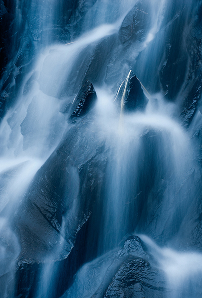
Form is similar to shape, but in this context I am referring to form in a more three-dimensional sense. Form is enhanced when there is side light to emphasize the shape of the object in the image. When the sun lights a rounded, polished rock from one side, the rounded form of the rock is emphasized. This gives the viewer some critical information about the object. Side light also emphasizes texture and that too is a key piece of information. With side lighting, you can emphasize the object’s shape and form to the point that the viewer can almost “feel” the three-dimensional aspects of the image. This is a really strong way to communicate visually.

009

At a higher level, when you want to communicate form and texture, side lighting is your best friend; soft side lighting is even better. The important idea to remember here is that side lighting adds dimensionality to your image. Try this on your next photo shoot: take a look where the sun is and take a photo of the subject with the sun over your shoulder. Then move to the side of the subject and take another shot. The difference will astound you. If you do this in the soft glow of sunrise or sunset, your results will be that much better.

Using color in your design

We all know how important color is. Think of your favourite image in color, then strip that color out and somehow it is not necessarily as impactful. That’s not to diminish the fact that black and white photography can be equally impressive – it absolutely is, however, to keep this article in context, we’ll leave black and white for a future article.

004

color gives the viewer crucial information about the scene. The warm colors of a fiery sunset or the cold blues of a glacier convey critical information about the scene. The overall color in your scene can determine how the viewer interprets it, so be purposeful with your use of color. If you want to convey warmth, choose reds, oranges, and yellows for your scene. If you want to convey cold, use blues, grays, and greens in your scene. You can see which colors are warm and which colors are cold if you look at the visual color wheel.

Colour Wheel

Certain colors draw the viewers’ eyes into the scene. Reds and yellows in particular cause the viewer to look at those colors (it’s not arbitrary that emergency vehicles are painted red and yellow warm colours,as they demand your attention). Be careful when you see anything that is red or yellow in your scene. It can either add value to the scene, if it is the subject of your image, or it could be distracting if it is not the subject of your image (in the background).

Rgb cmy

Let’s talk about color theory briefly. This is by no means an exhaustive guide to color theory, rather a quick introduction into it. Your camera can “see” three colors: Red, Green and Blue (RGB). These three colors are the primary colors in the visual color wheel (different to the color wheel used when painting). There are secondary colors too, namely, Cyan, Magenta and Yellow. These six colors and their combinations make up the visual color wheel. The hue (color) and saturation (richness or intensity) of all of these colors give us multitudes of combinations of colors. Understanding this aspect color theory will help you make better choices about color when photographing.

Using primary and secondary colors together makes your images compelling. So, looking at the color wheel, images that have red and yellow in the scene make very interesting photographs. Images with red and green in the scene work well too. The next time you look at a scene to photograph, try and look at what predominant colors are in the scene and try to photograph those colors only. This alone can make your images much more striking and visually interesting.

Take some time to practice intentionally composing your images using these techniques.

Ipad 005


The preceding article is a full-length excerpt from the CLARITY eBook series. Join other dPS readers today and dramatically improve your photography by learning the step-by-step process of visual storytelling and techniques for making stronger photographs. Get your CLARITY photography eBooks today!

The post How to Make Stronger Photographs Through the Process of Visual Design by Barry J Brady appeared first on Digital Photography School.


Digital Photography School

 
Comments Off on How to Make Stronger Photographs Through the Process of Visual Design

Posted in Photography


Check out the Big Bang Bundle: A Design Bundle Worth $15K for Only $49…Insane!

19 May

Yup, you read that right: If you want value on top of value that you can’t beat or find anywhere else, then you absolutely have to make plans to check out the Big Bang Bundle from Inky Deals. You won’t regret it, and you’ll be surprised at the insane degree of value that you’ll find there. Calling all photographers: This Continue Reading

The post Check out the Big Bang Bundle: A Design Bundle Worth $ 15K for Only $ 49…Insane! appeared first on Photodoto.


Photodoto

 
Comments Off on Check out the Big Bang Bundle: A Design Bundle Worth $15K for Only $49…Insane!

Posted in Photography


Disorienting Design: 14 Trippy & Surreal Interior Spaces

15 Apr

[ By Steph in Design & Fixtures & Interiors. ]

Surreal Interiors Main

You might feel like you’re dreaming or even drunk when you wander into these bizarre, surrealist interiors, from a bar that looks like the inside of an alien to a hotel room modeled after TRON. Going beyond mere concepts, these are real, existing spaces with interior design so surreal, avant garde or otherwise unexpected, it’s disorienting.

Conversation Pieces by HEAD Design

Surreal Interiors Conversations 1
Surreal Interiors Conversations 2

The entire room can be a conversation piece, as proven by this unique interior design series by students at ‘HEAD,’ the Geneva University of Art and Design. The designers created an entire apartment with dreamlike rooms including a bedroom that feels like a cloudy white womb, a library entrance that never seems to end, and a dining room that wouldn’t be out of place on the set of the latest Star Trek movie.

H.R. Giger Bar, Switzerland

Surreal Interiors Giger Bar

Few spaces are more surreal than the H.R. Giger Bar in Gruyéres, Switzerland, which takes its cues from the artist’s work. The skeletal motif found within, with giant vertebrae arches, makes it feel like you’re inside some monstrous creature.

HITGallery Hong Kong

Surreal Interiors HITGallery

The paintings of artist Giorgio de Chirico inspired this surreal black, white and blue shop interior in Hong Kong. Symmetry, a restrained color palette and the scale of the humanoid shelves that take up the center of the store make it feel like stepping into a work of art.

Next Page – Click Below to Read More:
Disorienting Design 14 Trippy Surreal Interior Spaces

Share on Facebook


[ By Steph in Design & Fixtures & Interiors. ]

[ WebUrbanist | Archives | Galleries | Privacy | TOS ]


WebUrbanist

 
Comments Off on Disorienting Design: 14 Trippy & Surreal Interior Spaces

Posted in Creativity


Floor-to-Wall Books: Dizzying Sideways Cafe Design in NYC

12 Apr

[ By WebUrbanist in Design & Fixtures & Interiors. ]

finished space interior design

Looking like a bookshop flipped ninety degrees, this coffee shop was stands out even in Manhattan, a world of off-the-wall spaces and strange conceptual designs.

exterior shop storefront

This new location for D’espresso was crated by Nemaworkshop, “a team of architects, designers and thinkers who create spaces which are conceptually bold yet highly sensitive to cultural and social contexts.”

interior dual views

Referencing the historical combination of cafes and bookstores as well as the nearby New York Public Library, the book photographs wrapping the floor, back wall and ceiling above become conversation pieces as well as a wraparound backdrop for sipping lattes. Meanwhile, the ‘floor’ on the left wall provides a backdrop for seating and contrasts with the functional ‘ceiling’ lighting on the right, which illuminates and differentiates the service space behind the counter.

concept floor side

About Nemaworkshop: “The studio approaches projects through research and collaborative brainstorming wherein ideas are discussed and reworked until a team emerges with a single cohesive concept.” Like its results, “the process is a non-linear approach, adhering to the conviction that good ideas can come from unlikely places. Ultimately, the designs challenge architectural typologies, demonstrate acute cultural awareness and propose original spatial concepts.

concept drawing interior

About this particular project itself, the designers write: “The client approached nemaworkshop with a single espresso bar existing and the ambition to build an espresso empire. For the location for the second shop, on Madison and backs up to Grand Central Terminal, Nemaworkshop and the client agreed that the design needed to be immediately striking to the goal-oriented suits and wandering tourists alike.”

Share on Facebook


[ By WebUrbanist in Design & Fixtures & Interiors. ]

[ WebUrbanist | Archives | Galleries | Privacy | TOS ]


WebUrbanist

 
Comments Off on Floor-to-Wall Books: Dizzying Sideways Cafe Design in NYC

Posted in Creativity