RSS
 

Posts Tagged ‘Correct’

How to Correct Skin Tones Using Lightroom’s Color Curves

27 Oct

Lightroom gives you a million and one ways to complete most photo edits. Having options is important. No two photos are alike, so no two edits are alike either. In this article, I’ll show you how to correct skin tones using Lightroom’s color curves.

There are times when the best way to edit color in general, and skin tones in particular, is to use Lightroom’s Color Curves. After reading this tutorial, you’ll be able to; measure RGB skin tone numbers to give you a general idea of which edits your photo needs, and correct the color issues using Lightroom’s Color Curves

skin-tones-Lightroom-curves-13.jpg

Finding the color numbers

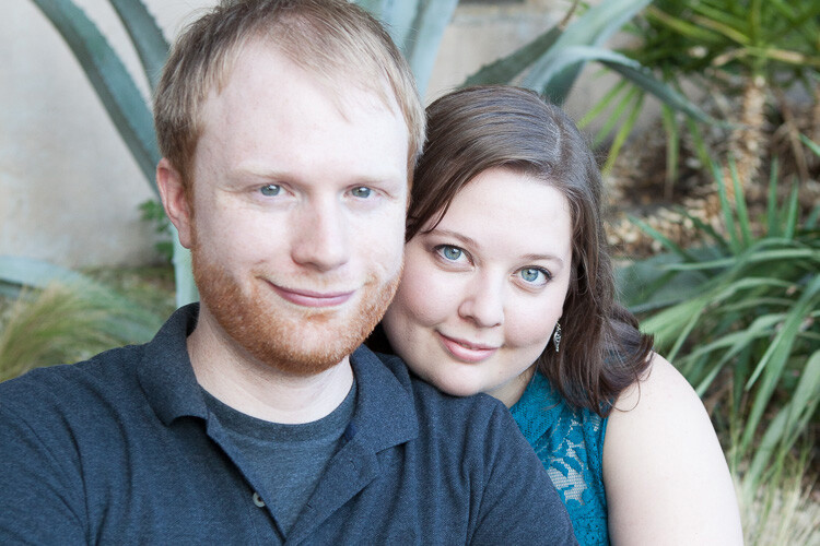
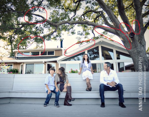
The image below is a photo that came out of the camera with a pretty good white balance and skin tone. Do you see the numbers under the histogram? Those are Red, Green and Blue (RGB) numbers.

Skin tones Lightroom curves 01

You can display the RGB numbers for your photos too. In Lightroom’s Develop module, hover your cursor over the area you want to measure. Look under the histogram for the corresponding RGB measurements.

These measurements tell us that the pixels next to the arrow in the screen shot had the following measurements:

  • Red: 73.1%
  • Green: 67.1%
  • Blue: 60.5%

RGB numbers are usually measured on a scale of 0-255, unless you are working in Lightroom. In Lightroom, you generally see them on a percent scale. 0% is the darkest value for any color, it’s so dark that there is no visible detail in that area. 100% is the brightest, and is so bright that no detail is visible.

Analyzing the color numbers

When analyzing RGB numbers for skin tone, look for the following indicators:

  • Red should be higher than Green. Green should be higher than Blue. This pattern is universal to all skin tones, regardless of age or ethnicity.
  • Each color should have at least a 2% difference, usually more, between it and the next number. Do you know how to identify a pure gray? That is a pixel that measures exactly the same in its Red, Green and Blue numbers. So skin whose RGB numbers are very close to each other is going to look gray. Not very appealing, right?
  • If any colors measure 94% or above, you probably have overexposure to deal with.
  • If any colors measure 6% or below, you probably have underexposure to deal with.

The RGB numbers in the photo above are consistent with expectations. This means that the skin is within “proper range” of a well-exposed photo with good white balance.

What do to with bad numbers?

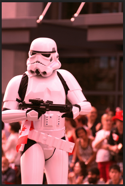
What happens, however, if your photo doesn’t look so good straight out of camera?

Skin tones Lightroom curves 02

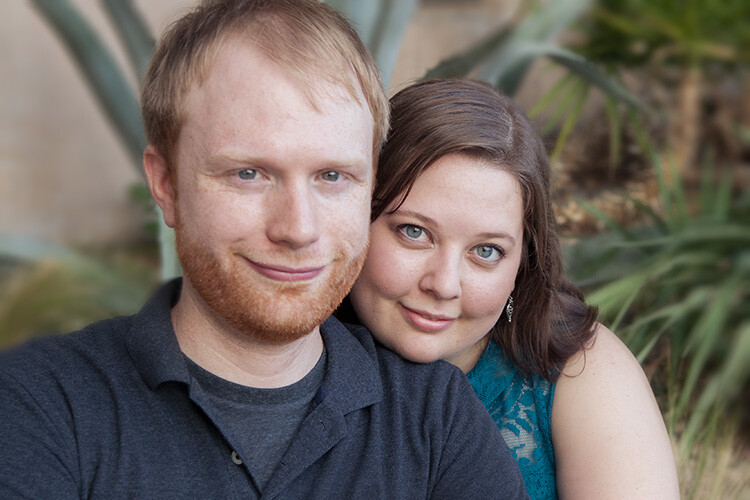
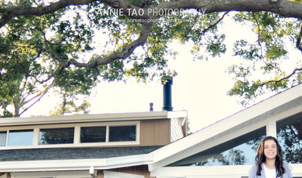
In this photo, the measurement point was just next to the arrow on her forehead. The numbers read: Red 93.8%, Green 92.5%, and Blue: 93.6%.

Anytime you see a photo with skin tones that measure like this, your eyes are going to tell you that something is off before the numbers do. The benefit of using the numbers is that they give you the direction to which your edits for the image need to go.

The numbers in this photo cause concern because:

  • Anything higher than 94% or so in Lightroom is bright enough that your image, if you print it, might not render good detail in those areas. That means that these areas are too bright.
  • Blue is higher than Green. Red should always be the highest and Blue the lowest otherwise the skin tone will appear cold.
  • The RGB numbers are too close together – they are approaching gray. This skin in this photo is lifeless as a result.

Correcting the skin tones

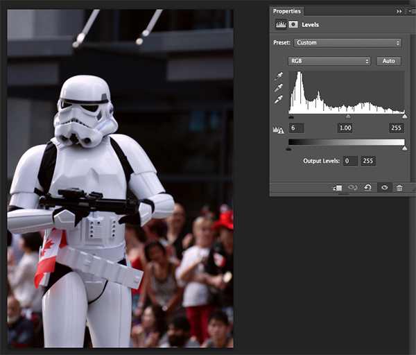
To fix this image, you would start by tweaking exposure. Proper exposure is a huge component of proper skin color. In fact, it’s often impossible to assess skin tone issues correctly without correcting exposure first.

A little-known bit of Lightroom awesomeness is that it’s easy to correct exposure while keeping an eye on the RGB numbers. In the Develop module, double click in the numeric entry field for Exposure so that the number is highlighted. Next, hover your cursor over the area of skin you are measuring without clicking. Use the up or down arrows on your keyboard to change exposure until a more appropriate measurement for the Red value appears under the histogram.

Skin tones Lightroom curves 03

Adjust Highlights (or Shadows, Whites, or Blacks) in the same way. Activate the numeric input field for editing then hover the cursor over the arrow you want to measure. Use the arrow keys on your keyboard to increase or decrease the adjustment.

Exposure for this photo is better with the adjustments you see above, but color is still off. When the RGB numbers are as close together as you see here, it’s often better to use Color Curves than the White Balance sliders to fix the issue.

Using Color Curves instead of White Balance Sliders

Color Curves has two major advantages over the white balance (WB) sliders.

You might have noticed already that Lightroom measures three colors (red, green and blue) for each pixel. However, the White Balance sliders don’t allow for editing the most important component of skin color – red. But, you can edit Red tones using Lightroom’s Color Curves.

The other big benefit of using Color Curves is that you can adjust colors in limited parts of the tonal range. For instance, if you reduce yellow in an image using the Temperature slider in the White Balance section, you are reducing yellow globally (everywhere in the image equally). Using Color Curves, however, you could reduce yellow only in the shadows, without taking away the yellow that properly belongs in the mid tones and highlights of an image.

To find Color Curves in Lightroom, scroll down to the Tone Curve section. By default, it shows you the parametric curve, which looks like this:

Skin tones Lightroom curves 04

Click on the small button in the lower right corner of the Curves panel to access the Point Curve. (It’s circled in the screen shot above.)

Now you are looking at the Point Curve interface:

Skin tones Lightroom curves 05

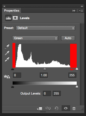
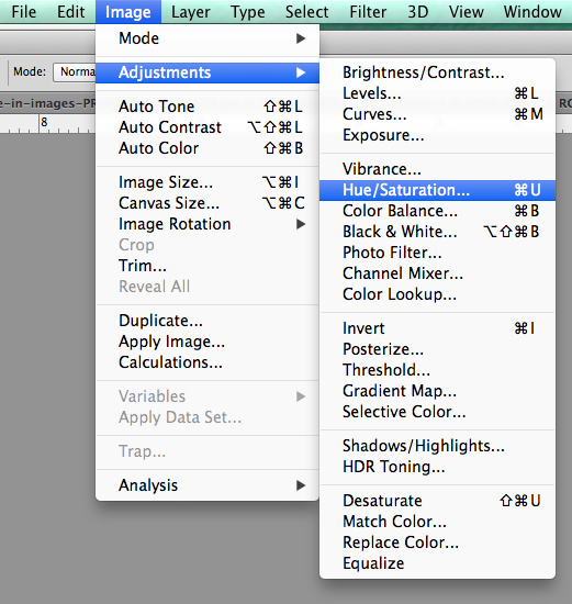
Using the Channel drop down menu, select the color you’d like to adjust.

Skin tones Lightroom curves 06

Which color channel to edit?

At this point, you may be wondering about adjusting colors other than red, green, and blue. For instance, what if your photo has too much yellow or orange? Think about it like this.

Each of the three colors measured in Lightroom has an opposite:

  • Red is the opposite of cyan
  • Green is the opposite of magenta
  • Blue is the opposite of yellow

Reducing any one of those colors using Color Curves, increases that color’s opposite. In other words, reducing blue is the same as increasing yellow.

Looking at the Curves panel, do you see the histogram behind the straight line? When you click and drag the straight line to create a curve, this tells Lightroom to adjust the pixels corresponding to that part of the histogram.

Say, for instance, that you wanted to add blue to the mid tones of an image. You would select the Blue channel and click the line in the middle of the histogram, where the midtones live. Dragging the line up would add blue to the bright parts of your photo’s tonal range.

Dragging up increases the color the channel is named after – blue, in this case. If it increases blue, that means that it’s also decreasing blue’s opposite, yellow.

Skin tones Lightroom curves 07

Dragging down decreases the color the channel is named after.

skin-tones-lightroom-curves-08b

Using the Targeted Adjustment Tool for Curves

That’s the way it works in general. But you can get much more precise color control by using Lightroom’s Targeted Adjustment Tool. Click on the button at the top left corner of your Curves panel to activate it (circled below).

Skin tones Lightroom curves 08

Hover this tool over the spot you’re using to measure the skin tone in your photo, but don’t click! Use the up and down arrows on your keyboard while keeping an eye on the RGB numbers beneath your histogram until the both the appearance of the photo and the RGB numbers improve.

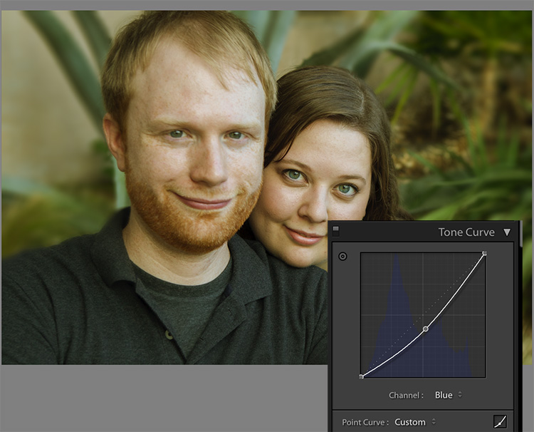
Moving the blue curve down, as in the screenshot below, provides better separation between the Green and Blue measurements. It also gives the photo the warmth it’s lacking.

Skin tones Lightroom curves 09

If the image still lacks vibrance, as this one does, move to the Red curve and increase the Red channel. Adding a touch of red is the best way to counteract gray skin.

Skin tones Lightroom curves 10

Next, decreasing green (to add magenta) makes the skin color, as well as the corresponding RGB numbers, look just about right.

Skin tones Lightroom curves 11

Tweaking things

However, the warmth of the plants behind them is overpowering the subjects. To downplay it, return to the Blue channel.

Using the Targeted Adjustment Tool, add Blue to the the shadows by hovering over a dark area of the photo and hitting the up arrow on your keyboard.

Skin tones Lightroom curves 12

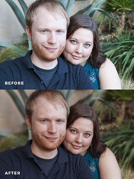
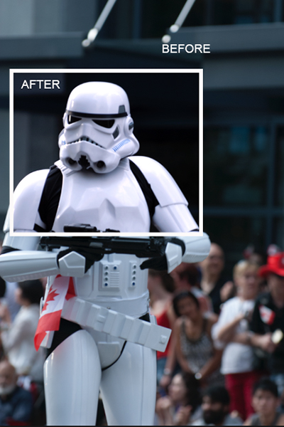
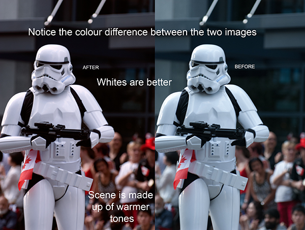
Compare the original and edited photos here:

Before

Before

After

After

Editing your own images with Color Curves and RGB numbers

Keep the following tips in mind when editing your own images.

#1 – First, a big caveat to anyone who has heard that using RGB numbers to edit will solve all skin tone problems! There are as many proper RGB measurements as there are people in the world. As you study RGB numbers, let trends in the numbers and generalities guide your edits, but don’t try for an exact numeric match.

#2 – Measure skin tones in the middle range of brightness. Look for mid-tones rather than bright highlights or deep shadows. Also avoid measuring on cheeks, the end of the nose, or other areas that are usually redder than others.

#3 – In general, when I’m editing photos, I look for tones in these ranges:

  • Red is highest > Green is middle > Blue is lowest – always.
  • The Red channel is usually between 70% and 90%. Very light skin can be as high as 94%. Very dark skin can go as low as 40-50%.
  • The Blue channel is usually between 30% and 80%.
  • It’s not possible to generalize how many percentage points difference should be between Red and Green, or Green and Blue. However, skin that has warmer tones will have less Blue in proportion to Red and Green.

#4 – Small movements of your tone curve impact your image dramatically. Don’t go overboard!

Conclusion

Studying the patterns in the RGB numbers of your photos is a great way to develop your editing eye. Everyone has photos that aren’t quite right. Analyzing the relationship between the numbers and the appearance of the photo will help you get to the point where you can eyeball a photo’s needs without referring to the RGB numbers at all.

Any questions? We could talk about this topic all day. Comment below and tell me what you think.

googletag.cmd.push(function() {
tablet_slots.push( googletag.defineSlot( “/1005424/_dPSv4_tab-all-article-bottom_(300×250)”, [300, 250], “pb-ad-78623” ).addService( googletag.pubads() ) ); } );

googletag.cmd.push(function() {
mobile_slots.push( googletag.defineSlot( “/1005424/_dPSv4_mob-all-article-bottom_(300×250)”, [300, 250], “pb-ad-78158” ).addService( googletag.pubads() ) ); } );

The post How to Correct Skin Tones Using Lightroom’s Color Curves by Erin Peloquin appeared first on Digital Photography School.


Digital Photography School

 
Comments Off on How to Correct Skin Tones Using Lightroom’s Color Curves

Posted in Photography


Correct name of mis-identified Iwo Jima flag raiser revealed after 70 years

28 Jun
Photo By: Office of U.S. Marine Corps Communication, Headquarters Marine Corps

One of the officers in Joe Rosenthal’s iconic ‘Rasing the Flag on Iwo Jima’ has been mis-identified for over 70 years, according to a statement by the U.S. Marine Corps. The man (highlighted in the image above) was previously believed to be John Bradley, but a review panel considering ‘all available images, film, statements and previous investigations’ found the man to be Private First Class Harold Schultz.

How did this case of mistaken identity come about? According to his son James, John Bradley remembered raising a flag on Mount Suribachi, and was later told as he lay recovering in a hospital bed that he was one of the men in the photo. He was believed to be the sixth man in the Pulitzer Prize winning photo for more than 70 years.

When a Smithsonian Channel research team approached the Marine Corps with a theory that Bradley was not the man in the photo, an investigation was launched. A panel led by retired general officer Jan Huly started looking over evidence in April, and released its findings late last week.

Articles: Digital Photography Review (dpreview.com)

 
Comments Off on Correct name of mis-identified Iwo Jima flag raiser revealed after 70 years

Posted in Uncategorized


Use Photoshop to Correct Perspective Distortion of Buildings in Your Images

25 Jun

Shooting buildings can be tricky. The main reason is that they are tall, and you need to get far away from them if you want to fit them into the frame. If you are shooting in the city, you don’t have the luxury of getting really far away, the best you may be able to do is get farther down the street. What you have to do then, is tilt your camera upwards to get the whole building in, and that’s when it happens – perspective distortion.

City Scenes can be difficult to photograph

City scenes can be difficult to photograph because of the risk of distortion

When you are using a wide angle lens (which you probably will be when shooting architecture) and you tilt your lens up or down, your image will distort. Architectural photographers would use a tilt-shift lens to counteract this distortion, which can make a really big difference in your image. The only problem is that it is a specialist lens, and it is expensive.

Until a few years ago, that was the only solution for fixing perspective distortion, but in the latest versions of Photoshop, there are a few truly amazing tools that can fix it painlessly. Sometimes the distortion may work well in the image, but if you need to fix it, these techniques can help. To learn more about getting better architectural photos read: Tips for Different Approaches to Architecture Photography

1. Working with distortion

The definition of distortion is: when the straight lines of a subject are either curved in a particular direction, or they converge or diverge. This happens when the focal plane of your camera is pointed upward or downward. This is called perspective distortion. The second most common type of warping is barrel distortion, this type is dependent on the type of lens you are using. Barrel distortion make the image look like it has been inflated in the middle of the scene so it looks like a barrel – wider in the middle, and narrower at the top and bottom. Wide angle lenses tend to distort a fair amount when pointing up or down, and in some cases, you may get barrel distortion in the image too. So, how do we fix this?

Tall buildings distort easily with a wide angle lens

Tall buildings distort easily with a wide angle lens.

2. Fixing distortion in camera

If you want to avoid perspective distortion, then you will need to keep your focal plane at 90 degrees to your subject. In other words, don’t tilt your camera up or down when you are shooting. This may work well for landscape photography, but when you are shooting tall buildings, it may be very difficult to get that right. Sometimes there is no way to avoid perspective distortion in camera.

Thankfully Photoshop can help you out here. Barrel distortion is a function of the lens you are using, wide angle lenses can make the middle of the image seem bloated or inflated. You can try and fix this by zooming in a little, as wide angles tend to suffer from barrel distortion when they are at their widest focal length. Zooming in is not always possible, so we will fix the bulk of the issues in Photoshop.

3. Fixing distortion in Photoshop

Photoshop has a few functions that can help you fix both perspective and barrel distortion. One of the best tools that has been included with recent versions is the Adaptive Wide Angle Tool. This tool is intuitive and easy to use, but takes a little practice initially. In the past, I would use the transform tools (i.e., Distort, Skew, Perspective and Warp). While these worked really well, it took a fair amount of time to get the corrections to look realistic.

In the examples below, you can see that the building looks shorter and more squat. Some further adjustments would need to be made to correct this, but overall, the buildings are vertical and look correct architecturally.  With the Adaptive Wide Angle tool, this process is easily done, in some cases with only three or four mouse clicks.

Image of a building before the distortion tool was applied in Photoshop

Image of a building before the distortion tool was applied in Photoshop

Same image after the distortion tool was applied

Same image after the distortion tool was applied

4. Adaptive Wide Angle tool

The Adaptive Wide Angle tool sits under the filter menu. Open the image you want to correct (with skew buildings or walls) click on FILTER>ADAPTIVE WIDE ANGLE, and a new box will open up with your image inside it.

Adaptive Wide Angle tool screen

Image to be corrected, you can see the vertical lines are pretty skew

Depending on how your image is displayed in the box, you may need to scale it to see the whole thing. On the right hand side you will see a box that says Correction. Underneath that you will see a scale slider, adjust it until you can see your whole image in the box. There is a dropdown box in there with other options such as perspective, fisheye, etc., – I find leaving it on Auto seems to work best. The other functions within that box may work in some cases, but by leaving it on Auto and making specific adjustments to the verticals and horizontals in your image, you will get the best results.

Adaptive Wide angle tool screen

Adaptive Wide angle tool screen

You will then need to identify the walls of the building that are converging or diverging. On the left hand side of the dialogue box, you will see some constraint tools. The tool that is first in the row is simply called the Constraint Tool, this is the one I use most often.

Click on that and move your mouse over to one of the vertical lines of the building, and draw a line down the wall. Start at the top of the building and drag the line down to the bottom, along a vertical wall that should be straight. Click at the bottom of the line when you are done and Photoshop will drop a line down exactly where you dragged. As you click, Photoshop will correct any barrel distortion, but the line will still be skew.

At the bottom of the line you will see a square, right click on the square and three options will pop up: Horizontal, Vertical, and Arbitrary. These are the three ways you have to correct that line. If it is a vertical wall, then click on Vertical. Immediately, Photoshop will bring that wall into a perfect upright position. What you will notice is that it may distort other lines now. That’s okay, find a second vertical that is not correct and repeat this process, once you have done three or four verticals, your building should be perfectly straight, as should the rest of the building. Sometimes what may happen is that the horizontal alignment may shift with all these vertical changes. You can then select a horizontal line in the image and repeat the same process you did for the verticals, just use a line that you know should be horizontal. Also, when you right click, select the Horizontal option in the popup box.

To make sure you are making a precise selection when you draw your line, there is a 100% zoom window on the right hand side. This is really useful, as it can be difficult to be zoomed in to the image, and drag the line down at the same time. This box really helps make sure that you start and finish at the right places on the building.

Adaptive Wide Angle tool and image after 3 adjustments have been made

Adaptive Wide Angle tool and image after 3 adjustments have been made

Once you have straightened some of the more skewed verticals, and one or two horizontals, your image should be looking pretty close to perfect. Once you are done, click ok and your image will open up in Photoshop. From there you can edit the rest of the image with all the lines being straight and aligned.

A new tool has recently been launched by Adobe Photoshop for CC users called Guided Upright and you can find it in Camera RAW of the latest version.

Final image after being edited in the Adaptive Wide Angle tool

Final image after being edited in the Adaptive Wide Angle tool and cropped.

Here is a great short minute video that Adobe has released, take a look, this could also be a useful tool to use.

What’s your go-to method of correcting perspective distortion? Please share in the comments below.

googletag.cmd.push(function() {
tablet_slots.push( googletag.defineSlot( “/1005424/_dPSv4_tab-all-article-bottom_(300×250)”, [300, 250], “pb-ad-78623” ).addService( googletag.pubads() ) ); } );

googletag.cmd.push(function() {
mobile_slots.push( googletag.defineSlot( “/1005424/_dPSv4_mob-all-article-bottom_(300×250)”, [300, 250], “pb-ad-78158” ).addService( googletag.pubads() ) ); } );

The post Use Photoshop to Correct Perspective Distortion of Buildings in Your Images by Barry J Brady appeared first on Digital Photography School.


Digital Photography School

 
Comments Off on Use Photoshop to Correct Perspective Distortion of Buildings in Your Images

Posted in Photography


How to Get the Correct Exposure at Night with These Helpful Tips

25 May
Tappan zee bridge

Colorful lights on the Tappan Zee Bridge reflected in the Hudson River at night. Behind the shot: ISO 200, aperture f/8, shutter speed 90 seconds, White Balance tungsten, lens used 80-200mm f/4.5 manual Nikkor zoom.

Exposing your photos correctly at night can be a bit challenging, and will certainly require some trial and error. In this article, you will learn helpful information to minimize the learning curve. Follow the tips outlined below and you will be taking better night photographs in no time.

Tappan zee bridge at night

View of the Tappan Zee Bridge and surrounding landscape at night. Behind the shot: ISO 400, aperture f/8, shutter speed 10 seconds, White Balance auto, lens used 105mm f/2.8 Nikkor.

Claiborne pell newport bridge

Night-time view of the Claiborne-Pell Newport Bridge and Narragansett Bay, taken in Jamestown, Rhode Island. Behind the shot: ISO 200, aperture f/8, shutter speed 25 seconds, White Balance fluorescent, lens used 50mm f/1.8D Nikkor.

Things You’ll Need

A Tripod

If you’re shooting at night, your exposures are going to be pretty long (anywhere from one to 30 seconds, or more). Since it is impossible to hold your camera perfectly still for that long, you will need a sturdy tripod, so that your camera does not move at all during the exposure. For added stability, you can hang your camera bag (or another somewhat heavy object) from the hook on your tripod’s center column. This is especially handy in windy conditions.

Plants at night

Long exposure of plants illuminated by streetlight at night in Nyack, New York. Behind the shot: ISO 400, aperture f/4, shutter speed 30 seconds, White Balance tungsten, lens used 50mm f/1.8D Nikkor.

Illuminated plant at night

Golden plant illuminated by streetlight at night in Nyack, New York. Behind the shot: ISO 400, aperture f/4, shutter speed 30 seconds, White Balance tungsten, lens used 50mm f/1.8D Nikkor.

Remote Shutter Release

With a long exposure, any camera movement can ruin the shot, making it soft or blurry. To ensure you get a sharp image, use a remote shutter release (remote trigger). The best type of shutter release to use is the kind that functions as a timer remote as well. If you don’t have a remote shutter release, you can use your camera’s self-timer. The only downside to using the self-timer is that you will have to keep your shutter speed at 30 seconds or less. If you don’t have too much light, you can always increase your aperture (decrease the f-stop) or increase your ISO to speed up your shutter speed.

Colors of night

Assorted foliage illuminated by streetlights in Nyack, New York. Behind the shot: ISO 200, aperture f/5.6, shutter speed 30 seconds, White Balance fluorescent, lens used 24mm f/2.8D Nikkor.

Colorful night

Colorful plants and trees in Nyack, New York. Behind the shot: ISO 200, aperture f/5.6, shutter speed 30 seconds, White Balance fluorescent, lens used 24mm f/2.8D Nikkor.

Camera Settings

Shoot RAW

Keeping image quality in mind, you should always strive to shoot in RAW format. It records more pixel information, and does not compress your images at all. RAW provides you with more post-processing options, including white balance correction. If you happen to under or over expose an image, you can easily adjust the exposure if your image is in RAW format.

ISO

When taking photographs with little available light, you are better off using a low ISO (400 and below) and longer exposure times. This is important so you don’t get too much noise (or grain) in your images. Also, make sure you have Long Exposure Noise Reduction turned on in your camera’s settings.

Yellow leaved tree moving clouds at night

Yellow-leaved tree and moving clouds at night in Nyack, New York. Behind the shot: ISO 200, aperture f/5.6, shutter speed 30 seconds, White Balance tungsten, lens used 50mm f/1.8D Nikkor.

Tree in wind

Tree in wind at night in Valley Cottage, New York. Behind the shot: ISO 400, aperture f/2.8, shutter speed 30 seconds, White Balance tungsten, lens used 50mm f/1.8D Nikkor.

Use Manual Mode

While shooting in very low light, your camera’s light meter may not read the scene too well. Your best bet is to use Manual mode, where you control both the aperture and the shutter speed. To find a baseline for the correct exposure, you can use the following trick (which I learned in this blog post):

  1. Set your ISO to 6400
  2. Set the aperture you would like to use
  3. Set your shutter speed at one second

Take a test shot using these settings to get an idea of what your image will look like. Note, these settings are almost equivalent to a 1-minute exposure at ISO 100, a 30-second exposure at ISO 200 and a 15-second exposure at ISO 400, etc. If your scene is too bright with these settings, you can see what a half second exposure at 6400 looks like. This would equal a 30-second exposure at ISO 100, a 15-second exposure at ISO 200 and a 8-second exposure at ISO 400. This baseline is a great guide, you can easily take test shots to figure out what shutter speed to use.

Autumn leaves in motion

Autumn leaves in motion at night in Valley Cottage, New York. Behind the shot: ISO 400, aperture f13, shutter speed 30 seconds, White Balance fluorescent, lens used 24mm f/2.8D Nikkor.

Tree at night

Tree and clouds in motion at night in Nyack, New York. Behind the shot: ISO 400, aperture f/5.6, shutter speed 30 seconds, White Balance tungsten, lens used 50mm f/1.8 manual Nikkor.

If you use the above trick, you won’t unnecessarily waste time taking a bunch of long test exposures. As it is, long exposure night photography is rather time-consuming. Make sure you switch your ISO back to 400, or below, before you start taking photos that you intend to keep.

In scenes where you have a decent amount of available light (e.g. places with numerous streetlights), you may be able to use Aperture Priority mode instead of Manual mode.

In Conclusion

Night photography can be rather tricky, and requires a good amount of practice. In time, you will have a feel for the amount of light in various night scenes, and be able to figure out accurate camera settings with relative ease. Hopefully, the information contained in this post will help you capture great long exposure night shots, that don’t need much post-processing.


googletag.cmd.push(function() {
tablet_slots.push( googletag.defineSlot( “/1005424/_dPSv4_tab-all-article-bottom_(300×250)”, [300, 250], “pb-ad-78623” ).addService( googletag.pubads() ) ); } );

googletag.cmd.push(function() {
mobile_slots.push( googletag.defineSlot( “/1005424/_dPSv4_mob-all-article-bottom_(300×250)”, [300, 250], “pb-ad-78158” ).addService( googletag.pubads() ) ); } );

The post How to Get the Correct Exposure at Night with These Helpful Tips by Marshall Reyher appeared first on Digital Photography School.


Digital Photography School

 
Comments Off on How to Get the Correct Exposure at Night with These Helpful Tips

Posted in Photography


How to Correct Lens Distortion with the Adaptive Wide Angle Filter in Photoshop

11 Mar

The issue

When photographing subjects with a wide-angle lens, it’s pretty common for perspective problems to present themselves in the form of lines that should be straight, but appear curved and distorted. This is commonly referred to as barrel distortion, which occurs mostly in wide-angle lenses because the magnification of the image decreases the farther the subject is from the optical axis of the lens. In plain speech, it means that when looking through a wide-angle lens, anything that is at the edge of the frame will be prone to appearing curved.

BEFORE-Adaptive Wide Angle

Some lenses such as fisheyes take full advantage of barrel distortion by purposely capturing images that are heavily curved and spherical. However, there are times when other wide-angle lenses such as the Canon 16-35mm, or even mid-range zooms like the 24-70mm, might produce unwanted barrel distortion effects.

The solution

Perhaps the two easiest ways to correct this problem are to either use a tilt-shift lens or to change your perspective and zoom magnification while photographing the subject. But tilt-shift lenses are expensive, and sometimes, such as when photographing a large building, there aren’t a ton of different perspective options. In these cases, the easiest solution to correct correct lens distortion is to do so in post-processing using a unique tool in Photoshop known as the Adaptive Wide Angle filter.

Introduced in PhotoShop CS6, the Adaptive Wide Angle filter removes lens distortions in one of two ways: it either automatically detects the camera and lens model using pre-programmed details to straighten the images, or you can manually set constraints to tell the it which areas of the photo need to be straightened. In this tutorial, I’ll walk you through the manual use of the Adaptive Wide Angle filter.

The example below was photographed in a beautiful brand new bar and restaurant using a Canon 16-35mm f/2.8 at a focal length of 16mm. It was a tight space, so there wasn’t room to back up or shoot the bar from a higher angle, so the resulting image sees quite a few horizontal lines such as the upstairs white railings and granite countertop that clearly should be straight, but aren’t.

Photoshop Adaptive wide angle filter correction

To begin correcting these distortions, click on Filter in the upper drop down menu and select Adaptive Wide Angle Filter.

Photoshop Adaptive wide angle filter correction

Screen Shot 2015-02-25 at 5.18.00 PM

A large dialogue box will then appear with a host of options (see below).

Photoshop Adaptive wide angle filter correction

Begin with the right hand panel and choose a correction type from the drop down menu. Typically, I start with Auto, which will attempt for an automatic correction based on lens detection.

Photoshop Adaptive wide angle filter correction

In this case, when I select Auto, another pop up window appears saying, “No matching lens profile found.” This means I need to manually adjust the image. Hit the OK button and turn your attention back to the box in the right hand corner.

Screen Shot 2015-02-25 at 5.24.27 PM

Besides Auto, the drop-down menu has three other options to choose from. If Auto doesn’t work, I’ll typically choose Perspective as my next correction type.

  • Fisheye will correct the aforementioned extreme curves that fisheye lenses purposely cause.
  • Perspective will target converging lines typically causes by the tilt and angle of the camera.
  • Panorama corrects for distortions caused by photo merging for panos.
  • Full Spherical corrects distortions in 360 panoramas shot with a 2:1 aspect ratio.

Screen Shot 2015-02-25 at 5.20.23 PM

Other options below the drop down menu include more settings that you can fiddle with to help correct distortions.

  • Scale: A value entered here will scale the image to best minimize the blank spots that may be present after the wide angle filter is applied.
  • Focal Length: Specify the focal length of the lens that created the image.
  • Crop Factor: This can be used in combination with Scale to minimize and compensate for blank areas produced by the filter.
  • As Shot: This box can be checked if your lens profile can be detected; if not, this option will be greyed out and you will need to manually specify the values of Scale, Focal Length, and Crop Factor.

Next, turn your attention to the little vertical toolbar in the top left corner. These are the tools you’ll use to define the constraints that indicate which lines in your image ought to be straight. The primary tools to be familiar with are the first two:

Screen Shot 2015-02-25 at 5.27.14 PM

  • Constraint Tool: This tool is used to draw lines over the areas of the image that you wish to straighten. Simply click once to establish a desired starting point, and click again to close the line, holding down the shift key as well if you wish to add a constraint with a vertical or horizontal orientation.
  • Polygon Constraint Tool: This tool functions in the same way as the regular Constraint Tool except it allows you to draw a polygon instead of a single line.

For example, let’s look at the horizontal line of the granite countertop in the image below.

Begin by clicking once on the left end of the line to set one constraint point, then click once on the right end of the countertop to close it. After you set the line, right-click on it and you’ll see a small menu appear allowing you to assign either a Horizontal, Vertical, or Arbitrary constraint to the line. The default constraint is Unfixed, but in this case we want to assign a Horizontal constraint to straighten the line width-wise. In order to automatically assign a constraint to a line, hold down the shift key while in the process of creating the line. In between the two constraint points, there will be a yellow line (if you held down the shift key) or a blue one if you didn’t, indicating where the straightening occurred.

Photoshop adaptive wide angle filter

Constraints Explanation

You can set as many constraint lines as needed until your image is corrected to your satisfaction. Constraint lines typically should be vertical and/or horizontal. Some other tools in the toolbar that can help with this are the Move, Hand, and Zoom tools that allow you move the image around to make the adjustments needed. Additionally, there is the Magnification of the preview in the lower left corner that allows you to zoom in and help you see where to plant constraints.

Photoshop Adaptive wide angle filter correction

After you have corrected the image to your liking, hit the blue OK button to apply the filter.

Photoshop adaptive wide angle filter

BEFORE-Adaptive Wide Angle

BEFORE

After

AFTER

How do you correct distortion for your wide-angle images? Share in the comments section below.

googletag.cmd.push(function() {
tablet_slots.push( googletag.defineSlot( “/1005424/_dPSv4_tab-all-article-bottom_(300×250)”, [300, 250], “pb-ad-78623” ).addService( googletag.pubads() ) ); } );

googletag.cmd.push(function() {
mobile_slots.push( googletag.defineSlot( “/1005424/_dPSv4_mob-all-article-bottom_(300×250)”, [300, 250], “pb-ad-78158” ).addService( googletag.pubads() ) ); } );

The post How to Correct Lens Distortion with the Adaptive Wide Angle Filter in Photoshop by Suzi Pratt appeared first on Digital Photography School.


Digital Photography School

 
Comments Off on How to Correct Lens Distortion with the Adaptive Wide Angle Filter in Photoshop

Posted in Photography


Architectural Photography Using Layer Masking to Correct Contrast and White Balance

17 Dec
Dps 2

A challenging nighttime scene was overcome with multiple exposures and layer masking.

Blending indoors and outdoors in architectural photography can often create a compelling image. Unfortunately, however, it is often fraught with exposure and white balance issues. These issues are compounded at night, when artificial lights inside buildings coupled with the darkness of the night sky create an especially contrasty image with an unattractive colorcast created by the different light sources. Luckily, with multiple exposures and layer masking in Photoshop, you can create a photo that looks a lot like what you saw with your own eyes.

This method is a little different than HDR, which involves taking three or more photos at different exposures, then using automated software to combine them into one image that captures the range of light in the scene. Here, you’ll be taking three or more photos and blending them manually, since HDR software often creates unpleasant artifacts and odd color blending when used in the type of situations presented in this tutorial. You can always try HDR software first, and if the colors don’t seem to bleed, you can skip down to the later part of the tutorial for dealing with the colorcasts.

Dps 1

An image that required three exposures and had a color cast from the lamps.

Shoot three or more exposures on a tripod

You need to shoot as many photos as it takes to capture the dynamic range (the range from light to dark) in the scene. It is really important to shoot in RAW, to get as much mileage out of each photo as possible. A tripod is also necessary, since you’ll probably be taking these at night, and also because you won’t be using HDR software which aligns the images. You can use auto exposure bracketing to capture three images, but at night, exposures on the high end can often exceed 30 seconds, the longest shutter speed most cameras will let you shoot manually. It’s probably easiest to use manual mode, set your ISO to 100 or 200, stop down your aperture to f/7.1 or f/8 (if it’s really dark out, you can open it up wider), and then take a series of shots at increasingly slower shutter speeds until you’ve captured the range of light in the scene. If you need to go past 30 seconds, go into bulb mode (consult your camera’s manual for how to find it), and use a remote trigger release, holding the shutter open as long as you want. Don’t worry about white balance yet.

Dps 3

Processing one of the RAW files in Lightroom. Here you can see where just processing one RAW file wouldn’t be sufficient.

Process each exposure in Lightroom or Camera Raw, then open as layers in Photoshop

First, you are going to process the photos for exposure only, ignoring white balance. If you don’t have Lightroom, you can do this in Adobe Camera Raw. Since you have multiple exposures, you don’t need to go crazy trying to recover lost highlights (overblown bright spots) and shadows (dark parts that look black), but you want to recover them a little bit to give you more leverage later on in the process. There’s no magical formula for processing here. I usually apply lens profile correction, remove chromatic aberration, and do a little noise reduction before bringing down the highlights a little bit and bringing up the shadows and whites a little bit. Once you’re done processing each exposure, select them all, right click, and select “open as layers in Photoshop. Now you’ve got an image with three or more layers all ready to go, but we’re no quite ready to do the layer masking yet.

Dps 4

Go back and reprocess for white balance

White balance is a setting that keeps the whites in the image white, removing any colorcasts. Different light sources have different white balance settings though, so if you have a photo with two or more different light sources (such as the night sky and an artificial light), no matter how you adjust your settings, you’ll always have a color cast somewhere on your photo. What you’re going to do here is reprocess each photo so that you’ve corrected any colorcasts. If you’re lucky, you’ll have no more than two light sources in the photo. Unfortunately, though, there can often be more.

It’s important to note that you only have to correct for colorcasts that are in properly exposed parts of each photo. For instance, in one of your overexposed photos, don’t worry about the white balance for the overblown highlights. You’ll be discarding that part of the photo later. For one of your underexposed photos, don’t worry about correcting for the shadows, since you’ll also be discarding that. Start with your most properly exposed photo, and correct for any colorcast you see (for instance, the lights inside a building have a yellow cast).

All you have to do to correct the white balance is slide those two sliders (one goes from blue to yellow, and the other goes from green to magenta) until the part of the photo with the colorcast looks normal. When you’re done, open that photo in Photoshop, and make it a layer in the other image you have open. Do this by hitting Ctrl-A on Windows, or Command-A on a Mac to select the photo you just opened, then Ctrl-C or Command-C to copy it. Then click on the image with the three layers, and hit Ctrl-V or Command-V to paste it in as a layer. Repeat the processing until you have corrected all colorcasts in the photo. Then, move on to the other exposures, and correct any color casts there (remember, only the properly exposed parts need to be corrected).

Dps 5

Mask in one layer at a time

Once you’ve finally got every exposure and every colorcast accounted for as separate layers, you’re going to mask them in one by one. I start by making all but the bottom two layers invisible and masking in one layer at a time (by the way, the order of the layers does not matter, but having the most properly exposed image on the bottom will probably make things easier). Do this by clicking the little eye to the left of each layer except the bottom two. Then, with the layer one up from the bottom selected, click the layer mask icon (it’s a rectangle with a dot in the middle, found at the bottom of the layer panel). Make sure the paintbrush icon is selected as well (this can usually be found on the left hand side). You may need to adjust your brush size as you go through.

When painting with black on the layer mask, you will cover up the parts of the layer you don’t want appearing (the improperly exposed or color cast parts of the image are what you want to cover up). When you want to go back and reveal parts because you’ve made a mistake, paint with white on the layer mask. Click X on your keyboard to toggle back and forth between black and white.

When you’ve masked out all the parts of the layer you don’t want shown, select the layer on top of that and make it visible (click the space where the eye used to be). Then create another mask and start masking that layer. Keep revealing layers and masking them in until you’re done. In some cases, one part of the photo may be properly exposed in more than one image. In this case, keep the one that looks better to you. Once you’ve finished this process, save the photo as you would normally. If you think you might come back to this photo later and edit it, make sure to save a copy as a PSD.

Dps 6

Sometimes you get lucky, and the part of the image that’s colorcast has a very strong hue to it. If you have a colorcast that’s almost all one color, you can automate the masking process a bit for that layer. In the top pane, go to Select –> color range, then click somewhere in the colorcast. Look at the preview. You want the part of the image that’s your colorcast to be almost completely white, and the rest to look almost completely black. Adjust the fuzziness slider until this is the case, and then click ok. You actually want to select the inverse of that, so go to Select –> inverse. Now click the layer mask icon, and you’ll have a mask that hopefully masks out the colorcast. If it doesn’t look right, undo it and try it again with a different fuzziness setting. This is not a perfect fix. You will still need to do some fine-tuning, but it really helps move things along quicker.

Dps 7

A simple “select color range” layer mask got rid of most of the colorcast in this photo.

Conclusion

This is just one method of conquering the challenges brought on by nighttime architectural photography. As you start working with photos of this nature, you may find a different method that you prefer. Luckily, many photos only require some of the steps detailed in this tutorial. Sometimes you only need one exposure, but you need to process for colorcasts. Other times, the white balance is even, but you need to mask for exposure. It takes practice to master these intricate masking techniques, so don’t give up if you’re unhappy with your results at first. Start with simpler photos with fewer colorcasts and exposures needed before diving into a really complex one. In time you’ll be creating photos that look as natural as they appeared when you saw them in person.

Dps 8

A single exposure that required layer masking to correct colorcasts.

Have you got any tips for doing architectural photography or using layer masking? Please share in the comments below.

googletag.cmd.push(function() {
tablet_slots.push( googletag.defineSlot( “/1005424/_dPSv4_tab-all-article-bottom_(300×250)”, [300, 250], “pb-ad-78623” ).addService( googletag.pubads() ) ); } );

googletag.cmd.push(function() {
mobile_slots.push( googletag.defineSlot( “/1005424/_dPSv4_mob-all-article-bottom_(300×250)”, [300, 250], “pb-ad-78158” ).addService( googletag.pubads() ) ); } );

The post Architectural Photography Using Layer Masking to Correct Contrast and White Balance by Samantha Decker appeared first on Digital Photography School.


Digital Photography School

 
Comments Off on Architectural Photography Using Layer Masking to Correct Contrast and White Balance

Posted in Photography


Using Levels in Photoshop to Image Correct Color and Contrast

03 Dec
Notice the difference some quick adjustments in the Levels tool can make

Notice the difference some quick adjustments using the Levels tool can make

Image editing is an important part of making your good images look spectacular. Photoshop and Lightroom are packed with tools to help you get your images to look great after you have downloaded them on to your computer. While there are many different tools in Photoshop to enhance your image, there are really only a handful of tools that you will use on just about every image; one of those is the levels tool. Photoshop has a levels tool, Lightroom doesn’t unfortunately. Each photographer has a different workflow when editing images, my suggestion is to follow a process that is the same for each image. When you open up an image in Photoshop or Lightroom, the first step is to look at the exposure. Is the image over or underexposed? At this stage of the workflow, you could be looking at a tool like the Shadow and Highlights adjustment, the next one to use would be Levels.

What is the Levels tool?

Levels tool in Photoshop

Levels tool in Photoshop

Levels does two things in one tool, it corrects the tonal range in an image and it corrects the colour balance. Adjustments made using the Levels tool are not only about getting the exposure on your image correct; it also has a second function and that is, it can correct for colour too. Yes, there are other tools within Photoshop that can do this, but the Levels tool can make it really quick and easy.

The Levels tool uses a histogram to show a visual representation of the tonal range in your image. There is a lot to be said about a histogram, but the most important thing to remember is that there is no right or wrong histogram. If you are unsure about how a histogram works, check out: How to read and use Histograms. On the histogram in the Levels tool, you will see a numerical range starting at zero on the left hand side of the graph, and 255 on the right. In the Levels function, zero represents black and if you have pixels that are at zero, that means there is no detail, they are totally black. The right hand side at 255 represents total white. If you have pixels at 255 that means they are totally white, with no detail. If the shape of your histogram is leaning to the left hand side, that means you have a lot of dark pixels in your image and your image is possibly underexposed. If the histogram is more on the right hand side that means you have a lot of bright highlights in your image and it is possibly overexposed. The middle slider is the mid-tone or gamma adjustment. All the pixels that are not highlights or shadows, fall into this category.

How does the Levels tool work?

When you open the Levels tool, very often your first instinct is to push the sliders into a position that makes the image look brighter. That can work, but I suggest that you do the following: Before you make any adjustments, take a look at your image and see if you can pick up a colour cast. This is a tint or colour that affects the whole image, and is often unwanted. For example, if you have a wedding photo of a bride shot on an overcast day and while everything looks okay, there may be a slight blue hue in the image from the overcast light. This means that her dress looks a little blue instead of white. In a case like this, a colour cast is something you want to get rid of. If however you have shot a summer sunset and the whole scene is bathed in warm orange light, this could also be seen as a colour cast, but in that case you would probably not want change it. One way to find colour casts in your images is to look at an area of the image that should be white and see if it has a tint. A colour cast will vary depending on the light you shot under; it could be green, magenta, blue, yellow, orange, or anything in between.

How to use the Levels tool

Make and adjustment layer for Levels

Make and adjustment layer for Levels

You can use the Levels tool on any image that needs the colour or contrast corrected. If you have an image that needs to have the colour cast corrected, like my shot of the Star Wars Stormtrooper does, then do the following:

  1. Open your image in Photoshop.
  2. Click on the adjustment layer icon at the bottom of the Layer panel and create a Levels adjustment layer, or click on the Levels tool icon in the adjustments panel which is directly above the layers panel.

Step 1 – If you need to do colour correction

If your image has a colour cast (the example image does, as there is a slight blue colour because it was overcast weather that day), follow these steps. Not all images need to have the colour corrected, if you are happy with the colour in your image you won’t need to do this. If you do have a colour cast in your image, then do the following:

Bring the white and black sliders to the point where the graph starts moving upwards

Bring the white and black sliders to the point where the graph starts moving upward

Part 1: In the levels tool, click on the drop down box above the histogram that says RGB. This will open up the three channels individually. Click on RED and bring the white slider and black slider in to part of the histogram where it starts to move upwards. Click on the the RGB drop down box again and click on GREEN and do the same, and finally click on BLUE and repeat one more time. This step will only work if there is a colour cast in your image. If there is no colour cast, the histogram will spread to the edges of the graph. In this image, there was a colour cast and this was how the GREEN channel histogram looked.

The red areas in the screenshot above show you where there was no colour information. By sliding the sliders inward to the edge of the graph, you will start to neutralize the colour cast.
Part 2: You will notice that as you make these adjustments, your image may have a very strong colour cast of the channel you are adjusting. Don’t be alarmed, this will all work out once you make the final adjustments.
Part 3: Once you have adjusted for the colour correction in all three colors, you can now adjust the exposure and contrast

Don't be alarmed at the crazy colours you might see during the colour cast adjustments, they will work out in the end.

Don’t be alarmed at the crazy colours you might see during the colour cast adjustments, they will work out in the end.

Step 2 – Adjusting for exposure and contrast

The Levels tool can also adjust your image’s exposure and contrast. In other words, you can use it to make the highlights, shadows and mid-tones brighter or darker – an all-in-one tool. The levels tool is really great to make some quick adjustments to your image, here is how:

Part 1: In the RGB channel, move the white slider in from the right to the edge of the histogram. Do the same for the black slider, adjusting it in to the edge of the histogram on the left. The important tip here is to make sure that you don’t overexpose the highlights and underexpose the shadows. This is called clipping and the best way to see if you are clipping any pixels is to hold down the ALT key when you are adjusting the white and black sliders.
2. Once you have those two sliders adjusted, you can slide the mid tone slider to add some contrast to the scene and this will be the final touch to your levels adjustment.

The final adjustment showing colour correction and contrast correction

The final adjustment showing colour correction and contrast correction

Some final tips to remember

1. Like any tool in Photoshop, if levels is overdone, you will be able to see it in the image. So, be aware of over adjusting your image.
2. Small adjustments always work better than one big adjustment. Make small changes first and see if that works.
3. Use the ALT key to make sure you aren’t losing detail in the shadows and the highlights by clipping your pixels.
4. Add some contrast to your images in levels, that will give your image a bit more pop and will enrich the tones.

The levels tool is a powerful ally to have in your image editing workflow. I use this tool on just about every image I edit. It can really add some contrast and punch to your images so try and use it as often as needed. These techniques take practice, but once you know what to do, the levels tool is quick and easy to use.

Compare the images side by side, there is a subtle but real difference

Compare the images side by side, there is a subtle but real difference

The post Using Levels in Photoshop to Image Correct Color and Contrast by Barry J Brady appeared first on Digital Photography School.


Digital Photography School

 
Comments Off on Using Levels in Photoshop to Image Correct Color and Contrast

Posted in Photography


How to Correct Purple Fringing in Photoshop

13 Nov

A couple years after starting my business, I received a large print from my lab. Upon checking it, I noticed a problem with the print that was so blatant I couldn’t deliver it to my client. At first I thought the lab made the mistake, but nope. It was a problem created by my digital camera when I took the shot! It’s more than likely you’ve already noticed it in your images.

The problem is called purple fringing. In this article I’ll go over what it is, how to prevent it, and how to get rid of it.

What is Purple Fringing?

Purple fringing is when you get purple color in high contrast boundary areas in an image that was most likely taken in low light situations with a brighter background. It is most often attributed to a chromatic aberration that occurs commonly with digital cameras, but purple fringing can also be caused by lens flare.

How can you prevent getting it?

  • Avoid shooting with your lens wide open in high contrast situations.
  • Get a UV filter for all of your lenses.

Unfortunately, these actions don’t always resolve fringing problems, but it can prevent it from happening some of the times.

Purple fringing

Example image: You see it mostly in the branches and the edge of the roof.

Purple-Fringe-in-images-PROBLEMS-MARKED2

FYI:  I used my 14mm ultra wide lens for this shot. The lens looks like a fisheye lens with its bulging curvature, so it is not possible to put a lens filter on it.

Close-up view of purple fringing:

Purple-Fringe-in-images-PROBLEM-closeup

The image AFTER correcting it in post-processing:

Purple-Fringe-in-images-FIXED

Close-up view AFTER correcting it:

Purple-Fringe-in-images-FIXED-closeup

Steps to correct purple fringing in Photoshop:

Step One:

In Photoshop, click on “Adjustments” under the “Image” tab.

Step Two:

Select “Hue/Saturation”. (Or you can do this as an adjustment layer as well in case you need to mask off some areas later).

Photoshop-Saturation-menu

Step Three:

Where you see “Master”, click on it and select “Blues” to get to the blue channel.

Step Four:

Once you’ve selected the specific color channel, you will have the eyedropper tool. Select the left-most eye dropper.

BlueChannel

Step Five:

Then click on one of the areas in your image with purple fringing. I chose the tree branches on the right as they were one of the most prominent problem areas.

Step Six:

Next, go to the Saturation slide bar and move the slider to the left. Usually somewhere between -70 and -80 works best, but the exact number depends on the image and the amount of fringing.

Step Seven:

Lastly, check your image to see if you need to adjust anything else since reducing one color may effect the rest of your image. (If you’ve use an adjustment layer you can mask out the parts you don’t want effected)

There you have it! You’ve zapped away the purple fringe!

Read more on how to fix chromatic aberration here:

  • How to Fix Chromatic Aberration in Lightroom 5
  • How to Fix Chromatic Aberration in Photoshop

The post How to Correct Purple Fringing in Photoshop by Annie Tao appeared first on Digital Photography School.


Digital Photography School

 
Comments Off on How to Correct Purple Fringing in Photoshop

Posted in Photography


How to Correct Skin Blemishes Using the Patch Tool in Photoshop

11 Nov

There are many articles that discuss the overuse of skin smoothing in portrait photography. Photographers strive to find a balance between realistic skin and fixing the imperfections. Obviously, one way to minimize the use of Photoshop for skin issues is to hire a phenomenal makeup artist who can make the skin look realistic and flawless all at the same time. For the times when there are issues with a client’s skin I try to not go overboard and fix every little thing. I want my client to still look like themselves when I am done editing.

UsingPatchToolSidebySideBeforeandAfter_DigitalPhotographySchool_LoriPeterson600

Some photographers use the spot healing brush religiously. I never use it. Instead I use the patch tool. My reasoning is that the Patch tool actually takes samples of the pixels and closely matches them to what you are trying to fix. If the results are not quite right, you can tweak them to suit your needs.

Step 1. Open your image

As you can see my model is absolutely beautiful, but she does have a few blemishes on her skin and we are going to fix those before we give the image to her.

Step 2. Select an area and apply a path

Hit Ctrl or Command + J to duplicate your layer. You can add a Layer Mask in case you want to undo anything later.  Then select the Patch tool and draw around the part of the skin that you want to replace (make sure the “Source” setting is selected to patch the source from the destination so it will use information from the area you drag to fix the blemish). Once selected, keep holding your mouse down and move it over to better spot of brighter skin. The skin does not have to be in the same area where you are working. You can use skin from the neck, shoulder, hand, or wherever you find better, smooth skin.

1UsingPatchToolEdits_DigitalPhotographySchool_LoriPeterson600

Step 3. Repeat and refine

Repeat the process for any other skin issues. Just keep circling the area you want to replace and dragging the circle over to a clean area. If you change something you did not want to or it doesn’t look right you can use your layer mask to hide it or you can click undo (Cmmd/Ctrl+Z).

Step 4. Reduce dark circles under eyes

Most of the time you will find that some dark circles under the eyes are showing. While it’s actually normal, we want our clients or models to look bright eyed.  If you want to decrease these, simply use the patch tool and circle the under eye area. Drag that circled area over to better skin. The result will be very harsh if left like that, so fade the technique. Go to Edit > Fade Patch Selection and a pop up window will appear. Lower the slider until the fade looks like it will blend in. Repeat the process for the other eye. The percentage of fade you use may not be the same on both sides, depending on the lighting.

2UsingPatchTool_DigitalPhotographySchool_LoriPeterson600

Step 5. Review and merge layers

Once you finish, you will see that the skin looks much better and smoother, but the details of the skin are still there without being overly fake looking. If you are satisfied, merge your layers. If you are going to do any further edits, go to your History in the Layers Palette and make a snapshot of the image so you can always come back to it.

Step 6. Brighten eyes optional

Optionally, you can brighten up the eyes a bit. Duplicate your layer again using Ctrl or Command + J. Again, add a Layer Mask in case you might want to change anything later. Select the Dodge Tool and make sure your exposure is set to around 30%. Take a big brush that covers the eye and the brow and in one motion with your mouse sweep over the eye and the brow. You can adjust the layer if it’s too bright or use your Layer Mask and remove the parts that might be too overdone.

3UsingPatchTool_DigitalPhotographySchool_LoriPeterson600

The Patch Tool can be one of the easiest and quickest ways to clean up skin and still retain the overall look of your client without making the image seem overdone. After a few times, using the Patch Tool can become like a second nature and skin edits will go quicker. Here is the before and after showing that with just a few motions with the patch tool you can achieve an overall better image where skin looks smoother, brighter, and still looks natural.

UsingPatchToolSidebySideBeforeandAfter_DigitalPhotographySchool_LoriPeterson600

The post How to Correct Skin Blemishes Using the Patch Tool in Photoshop by Lori Peterson appeared first on Digital Photography School.


Digital Photography School

 
Comments Off on How to Correct Skin Blemishes Using the Patch Tool in Photoshop

Posted in Photography


How to choose the correct camera belt for the Modular Rotation Component System

25 Dec

In this video, Think Tank Photo identifies three different camera belts, the Pro Speed Belt, the Thin Skin Belt, and the Steroid Speed Belt and what each is designed and used for. Each belt is designed to be used with every Modular Rotation Component and can also be added to some of the Think Tank Photo backpacks.
Video Rating: 5 / 5

 
Comments Off on How to choose the correct camera belt for the Modular Rotation Component System

Posted in Nikon Videos