RSS
 

Posts Tagged ‘Compositions’

Masterpiece Mashup: Genre-Crossing Digital Art Compositions

21 Jan

[ By Steph in Art & Drawing & Digital. ]

masterpiece mashup 2

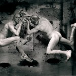
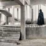
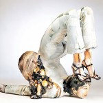
Diverse artistic disciplines from graphic design to architecture come together, crossing boundaries and merging eras, to bring the likes of Marina Abramovic and Marcel Duchamp together in this series of digital compositions. Italian architecture student Davide Trabucco diagonally bisects square-shaped sections of classic paintings, film stills, ad campaigns and photos of buildings and installations, putting them together in unexpected ways.

masterpiece mashup 9

masterpiece mashup 11

masterpiece mashup 4

The series, entitled Confórmi, has artists, designers and architects stepping into each other’s work, juxtaposing mediums and genres that you’d never imagine seeing in one image. These seemingly disparate masterpieces seamlessly meld together, revealing the basic elements of design that they all have in common, like composition, color, lines, tones and textures.

masterpiece mashup 3

masterpiece mashup 5

masterpiece mashup 6

masterpiece mashup 12

The Nike swoosh (designed by Carolyn Davidson in 1971) merges into the rooftop terrace of Curzio Malaparte in Italy. Architect Ludwig Mies Van Der Rohe steps in for the bartender in Manet’s famous 1882 painting of the Folies-Bergéres. Darth Vader’s light saber becomes an illuminated gallery installation by Dan Flavin.

masterpiece mashup 7

masterpiece mashup 8

masterpiece mashup 1

masterpiece mashup 13

Says the artist (translated from Italian), “I created this ‘archive’ to manage my ‘heritage’ of knowledge and references in art and architecture. The new images, then are born like this: at the very moment in which a painting, a facade, a sculpture I remember another. The subtitle of the work then, the forms belong to no one, aims to highlight that the artist and his products are independent… most forms are often already present in nature, and only need us to process them and give them new meaning.”

Share on Facebook


[ By Steph in Art & Drawing & Digital. ]

[ WebUrbanist | Archives | Galleries | Privacy | TOS ]


WebUrbanist

 
Comments Off on Masterpiece Mashup: Genre-Crossing Digital Art Compositions

Posted in Creativity


Crazy Combo Compositions: Photo Series Contrasts the Unexpected

12 Jan

[ By Steph in Art & Photography & Video. ]

Skiers land jumps on ice cream cones, construction equipment struggles to transport oversized hot dogs and jet-powered seagulls zoom through the sky in a series of surreal photographic collages by Stephen McMennamy. Creative director of the advertising agency BBDO, McMennamy takes original photos of everything from meatballs to hand grenades and puts them together in unexpected ways, calling the results ‘combophotos.’

combo photo 2

combo photo 3

combo photo 4

Inspired by the plethora of talent and creativity that can be found on Instagram, the photographer set out to pair things you’d never imagine together. Rather than seamlessly blending the photos in Photoshop so they appear to be a single composition, McMennamy simply matches up the contours of each subject, leaving behind the demarcation lines.

combo photo 5

combo photo 6

combo photo 7

This technique results in images that tell an entirely different story than each of the originals, turning what would be highly ordinary, stock-photo-type images into something else altogether. McMennamy’s curiosity was initially piqued by photo apps that let you layer photos into collage compositions, and then he tried connecting images for a more fluid effect.

Processed with VSCOcam with se3 preset

Processed with VSCOcam with se3 preset

combo photo 12

combo photo 13

“The whole thing is one big scavenger hunt,” says the artist. “Sometimes it’s as simple as playing with scale and other times there’s a more meaningful message being told, like the cigarettes and French fries image but for the most part it’s just visual fun, like a truck with skateboard wheels.”

Share on Facebook


[ By Steph in Art & Photography & Video. ]

[ WebUrbanist | Archives | Galleries | Privacy | TOS ]


WebUrbanist

 
Comments Off on Crazy Combo Compositions: Photo Series Contrasts the Unexpected

Posted in Creativity


Using Framing for More Effective Compositions

12 Nov

From my experience, it’s true – photographers tend to see the world in a different way. If not from the beginning, eventually, and maybe subconsciously, your eye is trained to notice details differently. Perhaps it’s the way light falls off of, or wraps around an object, or when pleasing geometrical compositions fall into place. In extreme cases, you may even start to catch glimpses of your camera’s viewfinder layout when you blink (you might want to seek help for this).

Framing of a hidden Chinese garden.

Some opportunities to use framing in photographs are less subtle than others. Of all the images I shot in this Chinese garden, this one stood out, as it not only shows the hidden nature of the garden, but makes a perfect frame.

Often, an important step in the “Seeing like a Photographer” evolution is to begin recognizing, and implementing, framing elements into your images.

Although in photo lingo we talk about framing often, it is one of the strongest tools you have at your disposal to create strong compositions. Let’s be clear that when we talk about framing your photo, we may be referring to the actual border of the image itself – but in this article we are discussing other objects used to intentionally create some sort of border around the subject of the image.

However, clever framing is just one part of an equation that fits into an overarching photographic formula. In certain circumstances, the frame itself may be so ridiculously amazing and awe inspiring that it carries the image all by itself. In practice, you are likely to use framing in order to draw attention to, and strengthen, the subject of the photo.

Framing a photo of a pier

Framing can help highlight your subject, directing the viewer’s gaze where you want it.

Framing can be used to various degrees; while some framing elements may be subtle in one image, they can be quite obvious in others. This can be a product of your personal creativity or style, or simply a result of making do with what you have, as there aren’t always framing options for every photo you shoot.

Using framing to boost your photo’s appeal is generally a good tactic, and is a great approach to creating original images of over-photographed scenes or landmarks.

Framed shot of the space needle

A keen eye for framing can yield original images of well-photographed landmarks like the Space Needle in Seattle.

As a photographer you will become familiar with the feeling of walking up to a familiar scene, turning on your camera and raising the viewfinder to your eye, only to not push the shutter button. You’ve realized that you’ve seen the picture you were about take a million times, and you want your own unique shot.

For example, as I wander around a new city seeing the sights, I am always looking for environmental elements that I can use to add a sense of place, or implement as an element of a frame. Once you make a conscious effort to use framing techniques in your photography, you start to see all sorts architectural and natural elements that you can use.

Architectural element used for framing an image

After developing an eye for framing your subject, many opportunities will reveal themselves.

What can you use to frame your image? Some of the more common elements include foliage such as trees, branches, and leaves. Windows and mirrors in houses and cars are other popular framing options.

Framing a food photo with the chef's body

Framing elements come in many shapes and sizes – creative perspectives can pay off.

I like to look for interesting architectural features, or even use people as framing borders. Sometimes you may not necessarily even have a subject in mind for an image but see a good framing opportunity, so you then look for a compelling subject or wait for a person to pass through the scene inside the frame.

You can also use lighting as a powerful framing tool. As we are always working with various lighting in photography, what is included or excluded from the lighter areas of the image can help isolate the subject.

Although it’s best practice to develop an eye for framing while out shooting, other options may often present themselves while editing your photos. Cropping can be very useful for honing in on, or aligning, the framed area of the photo just right. Other tools such as the Graduated Filter or Radial Filter in Lightroom, can be used to lighter or darken specific areas of your image, to boost the intensity of your framing.

Have you made good use of framing techniques? Share your successes and images with everyone in the comments below.

This is the first in a week of articles about composition. Look for another tomorrow and over the next few days! 

googletag.cmd.push(function() {
tablet_slots.push( googletag.defineSlot( “/1005424/_dPSv4_tab-all-article-bottom_(300×250)”, [300, 250], “pb-ad-78623” ).addService( googletag.pubads() ) ); } );

googletag.cmd.push(function() {
mobile_slots.push( googletag.defineSlot( “/1005424/_dPSv4_mob-all-article-bottom_(300×250)”, [300, 250], “pb-ad-78158” ).addService( googletag.pubads() ) ); } );

The post Using Framing for More Effective Compositions by Jeremie Schatz appeared first on Digital Photography School.


Digital Photography School

 
Comments Off on Using Framing for More Effective Compositions

Posted in Photography


28 Images with Strong Black and White Compositions

16 Aug

This week on dPS it’s all about black and white photography. We are featuring a series of tips and articles around that topic. You can earlier ones below and more daily over the next few days.

  • 5 Simple Ways to Create Expressive Photos in Black and White
  • Tips for Black and White Wildlife Photography
  • 7 Tips for Black and White Portrait Photography

Now, let’s take a look at some images that use this medium to their advantage in strong black and white compositions:

Photograph The great migration by Nicole Cambré on 500px

The great migration by Nicole Cambré on 500px

Photograph Awoken Despair by Alexandre Deschaumes on 500px

Awoken Despair by Alexandre Deschaumes on 500px

Photograph Snowy Owl by Kevin Pepper on 500px

Snowy Owl by Kevin Pepper on 500px

Photograph Biorhythms (2011) by Nik Barte on 500px

Biorhythms (2011) by Nik Barte on 500px

Photograph Farewell, dear friend! by Victoria Ivanova on 500px

Farewell, dear friend! by Victoria Ivanova on 500px

Photograph Story_IV by ? DrakSpirit ?  on 500px

Story_IV by ? DrakSpirit ? on 500px

Photograph Silhouette by mahmood Al-jazea on 500px

Silhouette by mahmood Al-jazea on 500px

Photograph Magical forest by Damian Cyfka on 500px

Magical forest by Damian Cyfka on 500px

Photograph Hide by  PortraitsBySam on 500px

Hide by PortraitsBySam on 500px

Photograph Art of road surface 2 by Junichi Hakoyama on 500px

Art of road surface 2 by Junichi Hakoyama on 500px

Photograph Six Steps by Dave MacVicar on 500px

Six Steps by Dave MacVicar on 500px

Photograph Lone Tree by Phil Buckle on 500px

Lone Tree by Phil Buckle on 500px

Photograph K. by pkfruen  on 500px

K. by pkfruen on 500px

Photograph pray by Muhammad Berkati on 500px

pray by Muhammad Berkati on 500px

Photograph Street Noir by András Sümegi on 500px

Street Noir by András Sümegi on 500px

Photograph Cold morning by Junichi Hakoyama on 500px

Cold morning by Junichi Hakoyama on 500px

Photograph Parisian Morn by Cubz Cubbon on 500px

Parisian Morn by Cubz Cubbon on 500px

Photograph Onwards and upwards by Lex Schulte on 500px

Onwards and upwards by Lex Schulte on 500px

Photograph *** by Turgut Kirkgoz on 500px

*** by Turgut Kirkgoz on 500px

Photograph LoaD IN # by Guillaume Rio on 500px

LoaD IN # by Guillaume Rio on 500px

Photograph Blues by Pascal-Ludovic Saissi on 500px

Blues by Pascal-Ludovic Saissi on 500px

Photograph Glass B&W by jenrygraphy on 500px

Glass B&W by jenrygraphy on 500px

Photograph Capitolio by Liban Yusuf B&W on 500px

Capitolio by Liban Yusuf B&W on 500px

Photograph I won't forget my roots by Cimone  on 500px

I won't forget my roots by Cimone on 500px

Photograph The Eye by John Steven Fernandez on 500px

The Eye by John Steven Fernandez on 500px

Photograph La batalla by alfonso maseda varela on 500px

La batalla by alfonso maseda varela on 500px

Photograph HERBAL TEA by Acken Li on 500px

HERBAL TEA by Acken Li on 500px

Photograph Taj Mahal - India by Christophe Paquignon on 500px

Taj Mahal – India by Christophe Paquignon on 500px

googletag.cmd.push(function() {
tablet_slots.push( googletag.defineSlot( “/1005424/_dPSv4_tab-all-article-bottom_(300×250)”, [300, 250], “pb-ad-78623” ).addService( googletag.pubads() ) ); } );

googletag.cmd.push(function() {
mobile_slots.push( googletag.defineSlot( “/1005424/_dPSv4_mob-all-article-bottom_(300×250)”, [300, 250], “pb-ad-78158” ).addService( googletag.pubads() ) ); } );

The post 28 Images with Strong Black and White Compositions by Darlene Hildebrandt appeared first on Digital Photography School.


Digital Photography School

 
Comments Off on 28 Images with Strong Black and White Compositions

Posted in Photography


6 Ways to Use Color for Eye Catching Compositions

04 Aug

A painter only needs to look at their palette before applying color to the canvas. Photographers have a different challenge, as they must locate their tones by studying a scene. Of course, this can be easy to bypass when you’re thinking about shadow, highlight, depth of field, shutter speed, and all of the other technical details that go into a photo. Still, as the great painter Kandinsky said, “Color is a power which directly influences the soul.” To use it in your compositions can infuse your work with a new level of sophistication.

1) Background Separation

To maximize the effect of bold colors, you’ll want to start by looking for dark, muted backgrounds. This type of stark contrast will deemphasize the surrounding areas, bringing the viewer’s attention directly to the subject. Of course, mixed lighting can trick even the most sophisticated metering systems. For the most accurate exposure, use the camera’s internal spot meter to take a reading of the brighter part of the scene. By purposely underexposing by approximately half a stop, vibrant colors will take on a deep, rich tonality.

2) Just a Dab of Color

If you want to draw people into your photograph, try including just a small amount of color. This subtle method gives your subject importance by allowing it to stand out from the rest of the frame. These thoughtful compositions are aided by a different approach to photography. Instead of working to add more visual interest, you want to eliminate any competing colors, and simplify the frame. While looking through the viewfinder, check all four corners carefully for distracting elements.

3) Cut the Glare

Each autumn, brilliant displays of fall foliage attract scores of photographers looking for that classic outdoor landscape. Yet, in many of these scenes, the glare of wet shiny leaves will actually detract from the desired color. An inexpensive solution is to add a circular polarizer to your kit. As you rotate the front element of the filter, you’ll actually see the surface reflection disappear to reveal only color. For added warmth you can even adjust the white balance using the cloudy or shade preset.

4) Make it Glow with Backlighting

Of all the directions light can come from, perhaps there’s no finer option than shooting directly into the sun. This is particularly true when working to emphasize color. When lit from behind, your subject will appear to glow. If the contrast is too great, eliminate the sun from the frame. This will make for a more even exposure, while still providing the dramatic benefit of backlighting. If you’re not comfortable with metering manually, take several shots using exposure compensation. Bracketing this way is a quick way to handle an otherwise tricky scenario.

5) Set the Mood

For added impact in your outdoor photography, consider using complementary colors. Although blue and yellow reside on opposite sides of the color wheel, they can be used together with outstanding results. On one side of the spectrum, blue is ideal for creating a quiet introspective mood. Warmer tones however, will infuse your subject with a dynamic energy. Each are effective on their own, but when used simultaneously, the contrast will bring attention to your main subject.

6) Use the Silhouette

During the magic hours around sunrise and sunset, you’ll enjoy a splendid display of color in the sky. Meanwhile, your subject will likely be in heavy shadow. If you properly exposed the subject, the sky would become pale, or even washed out. One simple option to retain the vibrant color is to create a silhouette. This is especially useful with moving subjects when HDR is less than ideal. To do this, simply expose for the sky, and let the subject’s tonality fall to black.

Conclusion

To fine tune your vision, give yourself an assignment where capturing a specific color is the only goal. For example, head out for a photo walk with no specific objective besides seeing and shooting – red. Rather than looking at subjects literally, you will be thinking in color. By studying the world around you with this in mind, you may be surprised at just how many opportunities reveal themselves. With practice, you’ll soon recognize color as an essential element of composition.

googletag.cmd.push(function() {
tablet_slots.push( googletag.defineSlot( “/1005424/_dPSv4_tab-all-article-bottom_(300×250)”, [300, 250], “pb-ad-78623” ).addService( googletag.pubads() ) ); } );

googletag.cmd.push(function() {
mobile_slots.push( googletag.defineSlot( “/1005424/_dPSv4_mob-all-article-bottom_(300×250)”, [300, 250], “pb-ad-78158” ).addService( googletag.pubads() ) ); } );

The post 6 Ways to Use Color for Eye Catching Compositions by Chris Corradino appeared first on Digital Photography School.


Digital Photography School

 
Comments Off on 6 Ways to Use Color for Eye Catching Compositions

Posted in Photography


How to Use Leading Lines for Better Compositions

17 Jul

A leading line paves an easy path for the eye to follow through different elements of a photo. Usually they start at the bottom of the frame and guide the eye upwards and inwards, from the foreground of the image to the background, typically leading toward the main subject.

The easiest place to find a leading line is on a road. Roadways are inherently leading because they go somewhere, give us a feeling of motion, and the lines often point so far inwards that they reach a vanishing point – the place where two or more lines converge into theoretical infinity.

Avenue of Oaks, South Carolina, by Anne McKinnell

The leading lines of the road converge to create a sense of infinity.

When leading lines, such as roads, connect the foreground to the background of a scene, they help to create depth and dimensionality which draws the viewer into the image.

Leading lines are all around us in cities and in nature. Your job as the photographer is to find them and arrange them in your photograph so that they lead towards something, even if that something is infinity.

Sunset at Ross Bay, Victoria, British Columbia, by Anne McKinnell

The logs on the beach draw the viewer’s eye into the frame and lead up to the house.

When you’re setting up a shot, take a moment to examine the scene for its prominent lines. Clear your mind, relax your eyes, and notice where they are naturally drawn to.

Pay special attention to man-made things such as:

  • roads
  • fences
  • boardwalks
  • bridges
  • bricks
  • anything in a row such as lamp posts
  • buildings
  • doorways
  • window panes

In nature, pay particular attention to:

  • rivers
  • shorelines
  • waves
  • sand dunes
  • trees
  • tall grass
  • cliffs
  • rocks
  • sun rays
Boquillas Canyon by Anne McKinnell

The soft leading line of the river’s edge creates depth in the image.

Once you’ve identified your strongest lines, consider how you can use them to enhance your composition. Depending on your intention, you might:

  • create depth and perspective by positioning a strong line leading from the foreground to the background;
  • create a visual journey from one part of your image to another;
  • place your subject where the lines converge to give the subject more importance in the frame and draw the viewer’s attention directly to it; or
  • make a cyclical composition, with the lines leading the eye in a circular motion and never out of the frame.

Arranging the elements in the frame may involve the use of different lenses to change perspective, but usually you can accomplish it simply by moving yourself so that the point of view you choose is purposeful.

Japanese Garden by Anne McKinnell

The leading line of the path leads the eye directly to the maple tree.

Leading lines are the key compositional element that carries our eye through the photograph. They can be used to tell a story, to place emphasis, and to draw a connection between two objects.

Use them creatively and with expressive purpose to help you tell your unique photographic tale.

Post originally from: Digital Photography Tips.

Check out our more Photography Tips at Photography Tips for Beginners, Portrait Photography Tips and Wedding Photography Tips.

How to Use Leading Lines for Better Compositions


Digital Photography School

 
Comments Off on How to Use Leading Lines for Better Compositions

Posted in Photography