RSS
 

Archive for June, 2016

Rare 1964 NASA 1000mm F4.5 super telephoto lens to be auctioned

17 Jun

A one-of-a-kind Birns and Sawyer Omnitar 1000mm f/4.5 lens commissioned by NASA in 1964 will soon be available to purchase through RR Auction. The lens is owned by Jim Headley, who introduced it to the public via Shutterbug. According to Headley, the lens weighs 70lbs / 32kg and measures 4ft / 1.2m in length by 10in / 25cm in diameter.

The super telephoto lens was built by Astra in Germany, and was acquired by Headley through a close friend after that friend closed down his camera store. Headly says on his website that he adapted the lens to work with a Canon EOS 40D, ‘effectively making this a 1600mm f:4.5 lens with the digital crop.’ The lens still features a pair of NASA identification tags, as well as a ‘trash can-sized’ lens shade. 

Headley plans to part with the giant lens, telling Shutterbug that it will be sold through an auction this fall by RR Auction in New Hampshire. Interested potential buyers can contact Jonathan Siefken at (603) 732-4280 for additional details.

Articles: Digital Photography Review (dpreview.com)

 
Comments Off on Rare 1964 NASA 1000mm F4.5 super telephoto lens to be auctioned

Posted in Uncategorized


5 Tricks from Professionals to Help You Do Better Wildlife Photography

17 Jun

Whether professional or an amateur, most photographers who enjoy wildlife photography do it because we love being outside in nature, and we love to share our experiences of the world’s wild creatures. Carrying our cameras, and making images along the way, helps us to truly see and appreciate what nature has to offer.

Orca, also known as killer whales, hunting seals by Anne McKinnell

But there’s more to making a captivating wildlife photograph than simply having an animal in the frame. If you just snap a shot when an animal is in front of you, you may find that your photograph lacks the impact you were after.

Next time you are out in the wild, try out these five tricks that professional wildlife photographers use to capture the world’s wild creatures at their best.

1. Watch and Learn

Every one of the world’s many species of animals are different. You cannot photograph them all the same way. But, if you spend some time observing your creature’s behaviour, you’ll be better equipped to click the shutter at exactly the right moment.

Two bald eagles by Anne McKinnell

It’s all about that special moment when the animal is doing something – whether it’s flying, walking, making eye contact, or interacting with another animal. Like spending time with friends, you come to know when they are going to do a particular thing and what triggers a reaction. Once you observe and understand their behaviour, be patient, be quiet, and wait for the right moment.

We often think of wildlife photography as being exciting, but more often than not, better images are made when it is a quiet, contemplative experience.

2. Use Faster Shutter Speeds

Many a great wildlife photograph has been ruined when an animal moves faster than the photographer anticipated, resulting in a slightly blurry image. It has happened to us all. Try not to let that happen by increasing your camera’s ISO, which will allow you faster shutter speeds.

Pacific White Sided Dolphins by Anne McKinnell

Even when your subject is absolutely still, you never know when they’ll decide to move, and that could be the magic moment you’ve been waiting for. Be ready by using a shutter speed of at least 1/500th of a second.

3. Carry Two Camera Bodies

The most important thing is to capture that special moment, so don’t miss it by changing lenses. It’s better to pick two lenses to work with, and have each mounted on its own camera body. Then, when you need to switch, you simply put down one camera, pick up the other, and you’ll be ready to shoot in less than one second. I usually use one camera with a 70-300mm lens, and the other with a 400mm lens.

Two elephants playing in Serengeti National Park, Tanzania by Anne McKinnell

4. Don’t Get Rusty

You don’t have to wait until you have an exotic animal to work with! Keep your skills sharp by practicing with whatever animals are nearby. You might surprise yourself and come up with some of your favourite shots. Practicing with seagulls and geese, will ultimately improve your photos of cranes and spoonbills when you have the opportunity to shoot them.

Seagull looking at underwater sockeye salmon by Anne McKinnell

Try setting up a bird feeder outside your window and you can practice on the birds that come right to you.

5. Vary Your Compositions

Usually when we photograph wildlife, we want the animal to fill as much of the frame as possible. But once you get that shot, don’t keep making the same shot over and over. Try some different compositions, such as getting super close to just part of the animal. You can shoot just the eye, or zoom in on an interesting detail.

The tail feathers of a peacock by Anne McKinnell

Then try zooming out and photographing the animal and its environment. Also try to change your perspective. Get on eye level with your subject or try making an image from a lower angle.

By understanding your subject, having good techniques under your belt, and lots of practice, you’ll be well on your way to making more captivating wildlife photographs. If you have any other tips of tricks for wildlife photography please share them, and your images in the comments below.

googletag.cmd.push(function() {
tablet_slots.push( googletag.defineSlot( “/1005424/_dPSv4_tab-all-article-bottom_(300×250)”, [300, 250], “pb-ad-78623” ).addService( googletag.pubads() ) ); } );

googletag.cmd.push(function() {
mobile_slots.push( googletag.defineSlot( “/1005424/_dPSv4_mob-all-article-bottom_(300×250)”, [300, 250], “pb-ad-78158” ).addService( googletag.pubads() ) ); } );

The post 5 Tricks from Professionals to Help You Do Better Wildlife Photography by Anne McKinnell appeared first on Digital Photography School.


Digital Photography School

 
Comments Off on 5 Tricks from Professionals to Help You Do Better Wildlife Photography

Posted in Photography


Tips for Different Approaches to Architecture Photography

17 Jun

Architecture is all around us, it is an integral part of our lives. We live in it, we work in it, we eat out in it, and in most towns a lot of money has been spent on it so they stand out to say something. We all know what those buildings are, and have maybe even taken photos of them, but they are often just snaps. There is nothing wrong with getting those, but it could be nice to try and get a lot more with the image, such as the essence of the building, what it says about its placement and where it stands.

So here are some tips for how to photography architecture to help you get started:

LeanneCole-architecture-006

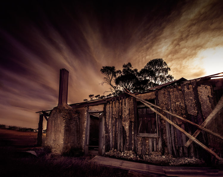
An old home that no one has lived in for a long time. The clouds in the sky look like a long exposure, though they were just like that.

Architectural photography is not a prominent genre, yet so many people take photos of buildings, so why is it a subject that is not discussed a lot? Think about how often there is a building in your images.

Common types of architectural photography

Most people, if you ask them what architectural photography is, are likely to say real estate. It is probably the most common type and you do see it everywhere, but there are many other ways of taking photos of structures.

URBEX Photography

With the rise of URBEX (Urban Exploring) architecture is being photographed in a new way. Photographers are getting into abandoned structures to take photos. The decay and destruction that happens to a building after it has been abandoned, gives a new story to it. This is even more true with the items that are left inside the buildings, and these items help to give us a hint as to what was there before.

LeanneCole-architecture-008

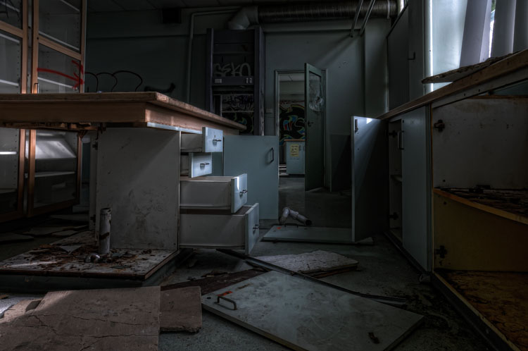
URBEX exploring, an old school that was closed down and vandals have been into.

Long Exposure Photography

Long exposure photography is also very popular now. Neutral density filters (ND Filters) are used to give subjects a timeless feel, and using them on architecture has been as common, pointing the camera straight up to a building and photographing it as the clouds move behind it. Read: Using a 10 Stop Neutral Density Filter to add Drama to the Sky

LeanneCole-architecture-009

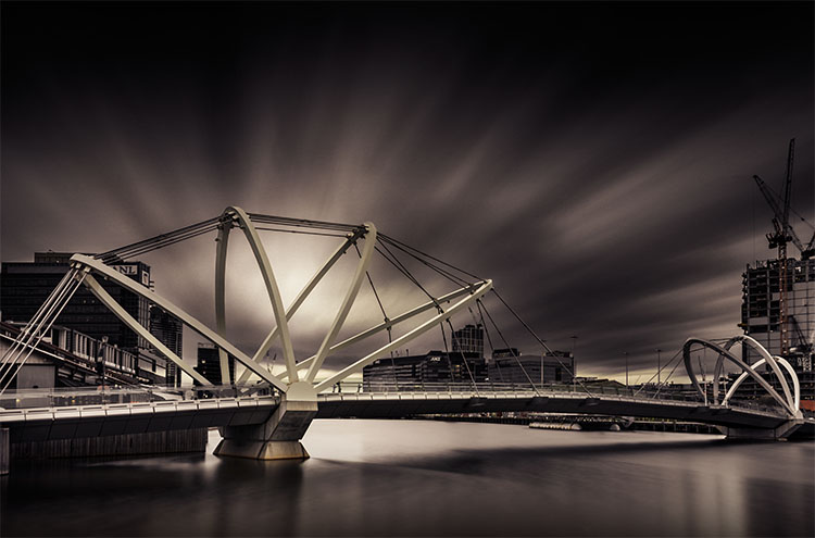
The long exposure helps give the image a sense of drama and a better look at the architecture of the bridge.

Alternatively

Those are the most common sorts of architectural photography, but you can do other types as well. You can make the building the subject, and create your image around it. You can do fine art images using the buildings, and create moods or stories around them.

Architecture around you

As stated earlier, architecture is all around, and you don’t have to go far to find buildings to photograph. It isn’t necessary that the building be architecturally important, more that you find it interesting, as that will help you to engage with it. It can be about what the building is or was, and how much it meant to the area it is in.

LeanneCole-architecture-005

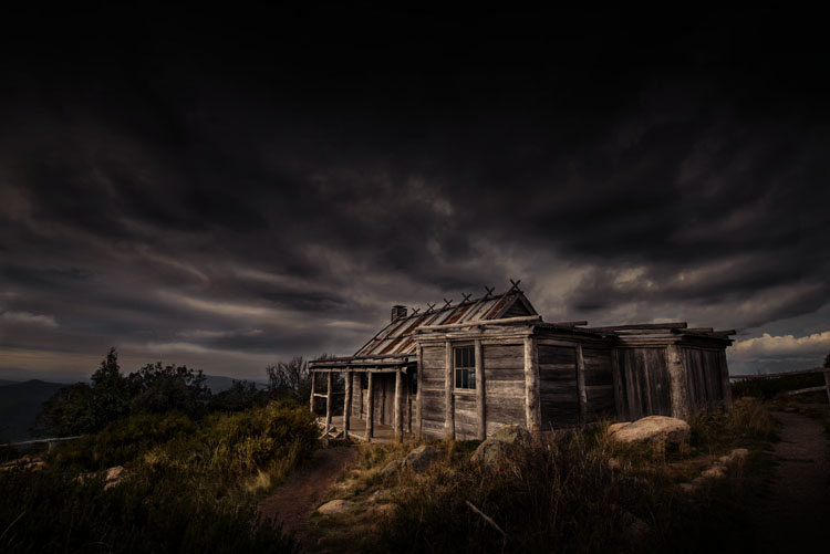
An old hut on top of a mountain. Photographing it with the surrounds helps to place it, and the sky helps make it moody.

Different ways of photographing architecture

Most people seem to photograph buildings more as a record rather than as a work of art. Architecture can offer so much more, and you can get some amazing portrait style images.

There is the potential to tell stories. Whether that story is about what the building was used for, or what its function is now, you can use that to help take your images and process it afterwards. Maybe there is a certain part of it that you are very attracted to.

Photograph aspects of it

You don’t have to photograph the whole building. Think about parts of it that might make interesting images. It is so easy to forget that the light fittings are really interesting, or the doors might have wonderful carvings. If you find a building you like, tell the whole story of it and then select the parts that you like – photograph details. You can take more than one image.

I really like corridors, more so if no one is in them, the idea of it going somewhere, or nowhere. It’s interesting to see what mood you can create with the hallway. Use the image to create a story that is there, or not.

LeanneCole-architecture-001

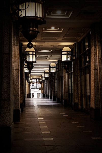
A walkway beside a building with interesting lights.

Look at the surroundings and how they can help tell the story

There can be more to what you see than just the building. Look at where the building is situated, and if other buildings or subjects around it can help place it. For example, a modern tower that is surrounded by buildings from the Victorian Era, or the other way around, provide an interesting context. An elaborate theatre that is in the midst of many shops that have closed down. They all help to provide a sense of place.

LeanneCole-architecture-004

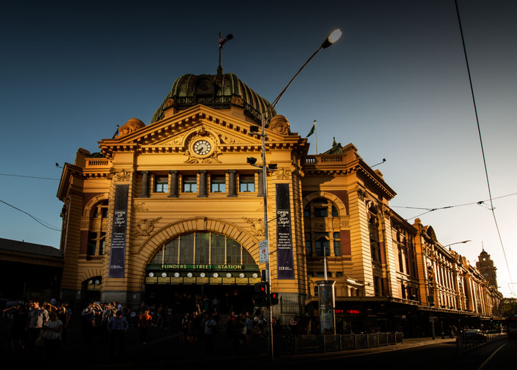
The sun hitting the building, then light being reflected on the front from somewhere else gives the station a great look.

Colour or black and white

It is easy to think that everything should be in black and white. It is the artsy way of thinking, but it really shouldn’t be the only way. It should be a personal choice and what you want with your image.

Maybe ask yourself some questions first. Does removing the colour add to the drama of the image? If you leave the colour in it will it distract from the story you are trying to tell? What time frame do you want to express? Is shape and form more important than what is there? If the answers to those questions are yes, then perhaps black and white is more suitable for that image.

LeanneCole-architecture-003

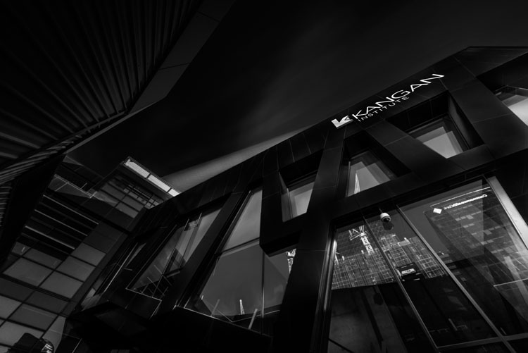
Looking straight up at a building is very popular, especially in black and white.

You get the idea, don’t just do black and white because you think that is what is expected for architecture. Make it a conscious choice, for a reason.

Processing

When it comes to how you process your images, it’s going to depend on the intention you have for the image. If it is to show the structure as it is, then you need to make sure that you only do basic processing.

LeanneCole-architecture-002

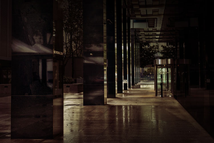
The wet ground was good for showing the reflections and making the most of an abstract view.

If you were commissioned to photograph a building, then you need to consider the goal, and how your client wants the final image. Do they want it to look like images that you already do, or perhaps with a different look? Remember your client is in charge of the final image and you need to be mindful of what they want.

On the other hand, if you have just taken the photo for yourself, then you don’t need to care about what other people want or like. You can process it anyway you like.

LeanneCole-architecture-007

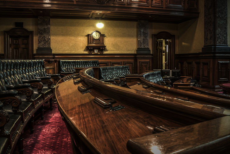
Using the lines in the council chambers to take your eye to the clock.

This is where you get to show your individual style and experiment with your processing. Work out what you like, what you don’t, and create images of architecture that are uniquely yours. In many ways you have a lot more freedom to do what you like to it than other types of photography, like nature for instance.

In the End

With so many different types architecture, it is up to you to find what you like doing. Develop your style and make it yours. There is nothing better than people recognizing your work before they see your name.

Do you have any other ideas or tips for photographing architecture? Please share your thoughts and images in the comments below.

googletag.cmd.push(function() {
tablet_slots.push( googletag.defineSlot( “/1005424/_dPSv4_tab-all-article-bottom_(300×250)”, [300, 250], “pb-ad-78623” ).addService( googletag.pubads() ) ); } );

googletag.cmd.push(function() {
mobile_slots.push( googletag.defineSlot( “/1005424/_dPSv4_mob-all-article-bottom_(300×250)”, [300, 250], “pb-ad-78158” ).addService( googletag.pubads() ) ); } );

The post Tips for Different Approaches to Architecture Photography by Leanne Cole appeared first on Digital Photography School.


Digital Photography School

 
Comments Off on Tips for Different Approaches to Architecture Photography

Posted in Photography


Origami Footwear: Lightweight Lace-Free Shoes Wrap & Fit Any Feet

17 Jun

[ By WebUrbanist in Design & Products & Packaging. ]

flexible origami shoe sole

A Japanese designer and Italian shoemaker have taken a fresh approach to athletic footwear, adapting the minimalist art of cloth wrapping to form the basis of a flexible shoe that fits any foot shape.

wrapping shoes japanese design

Masaya Hashimoto worked with Vibram, the makers of foot-shaped FiveFingers shoes (with articulated toes), to create the Furoshiki series of shoes with wrapping soles that fold around feet without needing laces (a simple hook and and loop system).

lace free sport shoes

A specially-engineered gripping system keeps the shoes in place and make it possible for the shoe to perform like ordinary footwear but with less weight and material.

foot wrapping athletci shoes

The system has a number of advantages, including more flexible sizing than traditional shoes, easier packing for travel and the ability to skip socks comfortably.

wrapping black sole shoes

From Vibram: “The concept for this type of footwear was derived from the Japanese custom of packaging items by wrapping them in cloth fabric. Furoshiki is the only sole on the market that wraps around the entire foot. Because the upper is constructed with stretch fabric, it will anatomically fit nicely on any foot type and the hook and loop closure system allows for a quick, easy fit.”

Share on Facebook


[ By WebUrbanist in Design & Products & Packaging. ]

[ WebUrbanist | Archives | Galleries | Privacy | TOS ]


WebUrbanist

 
Comments Off on Origami Footwear: Lightweight Lace-Free Shoes Wrap & Fit Any Feet

Posted in Creativity


Engineer Prints:Now in COLOR!

17 Jun

Call it a quarter-life crisis … our Engineer Prints moved and got a makeover.

Our giant Engineer Prints have left the Photojojo site, but we’re still printing them over at Parabo Press!

In addition to the Parabo app, you can now order them right from the Parabo Press website where you can upload files up to 20MB (that’s biiig).

Take $ 10 off your order with the coupon EPS10.

Plus, they’re now available in FULL COLOR!
(…)
Read the rest of Engineer Prints:
Now in COLOR! (29 words)


© laurel for Photojojo, 2016. |
Permalink |
No comment |
Add to
Now in COLOR!”>del.icio.us

Post tags:


Photojojo

 
Comments Off on Engineer Prints:Now in COLOR!

Posted in Equipment


D500 owner formally accuses Nikon of false advertising

17 Jun

A disgruntled D500 owner has taken out a legal warning against Nikon advertising the camera as offering ‘integrated Wi-Fi.’ In the equivalent of a cease-and-desist order. Andreas V, from Butzbach, Germany says, that the term is misleading, given there are unusual restrictions to using the function.

In the case of the D500, you need to use a compatible Android device with Bluetooth LE and the Snapbridge app to enable Wi-Fi: a restriction that is not commonly shared by other cameras, including Nikon’s own D750 and D7200 models.

The D500 does have integrated Wi-Fi, but you can’t necessarily use it in the way you might expect.

As highlighted in our review, although the D500 does have integrated Wi-Fi, it is distinctly reluctant to make use of it, mainly relying on the low bandwidth ‘Bluetooth LE’ technology for file transfer. At present even this system is available only to users of compatible Android devices, since an iOS app will not be available until later in the year. Unlike the D7200 and D750, there’s no way to directly make use of the camera’s Wi-Fi: it can only be initiated using Bluetooth from the Snapbridge app.

Part of the customer’s complaint was that it was reasonable to assume he’d be able to use his camera in the same manner as he had his D7200, and that the labels on the box indicating compatibility with Apple devices implied the function was already available to users of such devices. He goes on to highlight that it would be possible for Nikon to offer a simpler (and more readily accessible) Wi-Fi system via a firmware update.

The story, first reported in the German magazine Digitale Fotografie, and subsequently on Nikon Rumors, has attracted mixed responses. While there have been plenty of predictable ‘he should have done his research’ comments, there have also been words of support from people who believe Nikon should have made the system’s limitations clearer (or made the Wi-Fi simpler). What do you think?

Articles: Digital Photography Review (dpreview.com)

 
Comments Off on D500 owner formally accuses Nikon of false advertising

Posted in Uncategorized


Leica announces shortlist for the €35,000 Oskar Barnack award

16 Jun

$ (document).ready(function() { SampleGalleryV2({“containerId”:”embeddedSampleGallery_3059056603″,”galleryId”:”3059056603″,”isEmbeddedWidget”:true,”standalone”:false,”selectedImageIndex”:0,”startInCommentsView”:false,”isMobile”:false}) });

Leica has released details of the 12 photographers that have been shortlisted for this year’s Oskar Barnack competition. The company says that over 3200 photographers from 108 countries submitted portfolios of 12 images to compete for the Leica Oskar Barnack Award and the Leica Oskar Barnack Newcomer Award. The top prize for the main award is €25,000 in cash as well as Leica M system equipment to the value of €10,000, while the Newcomer will win €10,000 and an M camera and lens. Each of the remaining 10 finalists receive €2500 in cash.

Although the competition is open to all countries the majority of winners come from Europe this year, with France taking five of the shortlist slots on its own. Only one shortlisted photographer is from Leica’s home nation of Germany.

The winner will be announced at a Berlin ceremony at the end of September during the run up to the European Month of Photography. For more information, and to see the complete portfolios of the shortlisted photographers (highly recommended), visit the Oskar Barnack Awards website.


Press release:

Leica Oskar Barnack Award 2016 finalists revealed

Twelve finalists selected in prestigious international photographic competition

Leica Camera has announced that the twelve finalists in this year’s ‘Leica Oskar Barnack Award’ have been selected. Chosen by a jury of prominent international experts, the complete portfolios in the categories ‘Leica Oskar Barnack Award’ and ‘Leica Oskar Barnack Newcomer Award’ can now be viewed at www.leica-oskar-barnack-award.com.

This year, more than 3,200 photographers from 108 countries took part in and submitted their work to enter the long-established international photographic competition, organised by Leica Camera AG. This is a new record number of entrants in the history of the Leica Oskar Barnack Award. The announcement of both category winners will take place on 28 September at an official awards ceremony in Berlin. During EMOP Berlin – the European Month of Photography – Leica will publicly present the work of all twelve finalists for the first time in a grand exhibition at the ‘Neuen Schule für Fotografie Berlin’, from 29 September to 23 October 2016.

The twelve finalists are as follows:

  • Juan Pablo Bellandi, Venezuela: ‘Chasing HAMPA’
  • Fulvio Bugani, Italy: ‘Soul y Sombras’
  • Scarlett Coten, France: ‘Mectoub’
  • William Daniels, France: ‘C.A.R.’
  • Vincent Delbrouck, Belgium: ‘New Paintings’
  • Guillaume Herbaut, France: ‘Ukraine: Maidan to Donbass’
  • Stéphane Lavoué, France: ‘The North East Kingdom’
  • Max Pinckers, Belgium: ‘Two Kinds of Memory and Memory itself’
  • Guilio Piscitelli, Italy: ‘Informal facilities in the Jungle’
  • Clémentine Schneidermann, France: ‘The Unbearable, the Sadness and the Rest’
  • Sadegh Souri, Iran: ‘Waiting Girls’
  • Esther Teichmann, Germany: ‘Mondschwimmen’

The members of this year’s Leica Oskar Barnack Award jury were: Karin Rehn-Kaufmann, Chief Representative Leica Galleries International (Austria), JH Engström, photographer and last year’s award winner (Sweden), Christine Ollier, Art Director Galerie Filles du Calvaire (France), Chris Boot, Executive Director Aperture Foundation (USA) and Lorenza Bravetta, Director Camera – Italian Centre for Photography (Italy).

Karin Rehn-Kaufmann, Chief Representative Leica Galleries International, said, “The entire jury was impressed by the number of entrants, and the ongoing diversity and quality of the portfolios from 108 countries entered in this year’s competition. This once again underlines the international importance of the Leica Oskar Barnack Award, to which we have responded this year with its new alignment. The return of the prestigious award to Germany, and the roots of the man who lent it his name, was a wish that was very close to our hearts. We are looking forward to sharing the delight of the finalists at the exciting award-giving ceremony and the grand exhibition in Berlin.”

With prizes amounting to a total value of 80,000 euros, the Leica Oskar Barnack Award is one of the industry’s most prestigious photographic competitions. The winner in the main category will be honoured with a cash prize of 25,000 euros and Leica M-System equipment (a camera and lens) valued at an additional 10,000 euros. The winner of the Newcomer Award will receive a cash prize of 10,000 euros and will also be presented with a Leica rangefinder camera and lens. In order to honour the work of all twelve finalists, this year’s competition will be the first to award cash prizes of 2,500 euros each for the works of a further ten photographers in addition to the awards for the winners of the two main categories.

A special issue of LFI Magazine presenting the winners and finalists, and their comprehensive portfolios, will be published to accompany the Leica Oskar Barnack Award.

Articles: Digital Photography Review (dpreview.com)

 
Comments Off on Leica announces shortlist for the €35,000 Oskar Barnack award

Posted in Uncategorized


Pelican Air 1535 Rolling Hard Case with TrekPak Dividers Review

16 Jun

Pelican Air 1535 Rolling Case w/TrekPak Divider System
$ 315/£220 | www.pelican.com | Buy Now

For decades now, Pelican cases have been the go-to solution for anyone who needs maximum protection for their equipment. The company’s website is filled with user stories about explosions, lion attacks, shifting pack ice and airplane crashes where the gear inside the case survived. Recently, Pelican introduced the Air series of cases designed to be up to 40% lighter than their standard cases, with the same promises of extreme durability.

Many working photographers will factor in things like maximum comfort and gear accessibility when choosing a bag. But when you travel thousands of miles every month and your gear puts the food on your table, getting everything there and home in one piece becomes secondary to things like leather accents or ventilated shoulder straps. In and out of planes, taxis, luggage carts and TSA inspection checkpoints, whatever is carrying your cameras, lenses, and accessories has to do its job well or you won’t have your job much longer.

$ (document).ready(function() { SampleGalleryV2({“containerId”:”embeddedSampleGallery_4024174850″,”galleryId”:”4024174850″,”isEmbeddedWidget”:true,”standalone”:false,”selectedImageIndex”:0,”startInCommentsView”:false,”isMobile”:false}) });

It’s on those high standards that Pelican has built its reputation for being the ultimate in gear protection. I still remember being seeing promotional material showing a Pelican case being run over with a car and thinking that was pretty amazing. While I never had a case subjected to any of that sort of treatment, I did drop one off a chairlift back when I was doing snowboard filming. While I felt like an idiot, the miniDV camera inside survived just fine.

At the time of announcement, Pelican also said that the Air cases (along with a few others in the lineup) would have the option of coming with the TrekPak divider system instead of the standard pick ‘n pluck foam or padded divider inserts. I recently had a chance to run the rolling airline carry-on sized Pelican Air 1535 with the TrekPak system through its paces.

Specifications

  • Exterior 55.8 x 35.5 x 22.8 cm (21.96″ x 13.97″ x 8.98″)
  • Interior 51.8 x 28.4 x 18.3 cm (20.39″ x 11.20″ x 7.21″)
  • Weight 3.9 kg (8.69 lbs) without foam/inserts

By way of comparison, the similarly sized Pelican 1510 weighs 5.4 kg (11.99 lbs) without foam. Pelican says that the weight savings in the Air series comes from a newly developed generation of their HPX resin as well as hollowing out or honeycombing areas (the latch clasps and the extending roller handle for example) that were previously solid.

In Use

Hard cases are big and clunky and something of a pain to use if you are used to soft bags and packs. They bang into things, aren’t particularly ergonomic, and are a hassle to schlep long distances. That said, one of the best compliments I can give the Air 1535 is that using it is just like the 1500 series cases I have used in the past, but much lighter. It loads, latches, and generally seems just as tough as every other standard Pelican case I have ever used.

I would encourage anyone looking to get a hard case of this size to be sure to choose one with the roller option. Your back will thank you as you try to make it across a busy airport for a connecting flight. Even with the weight savings of the Air line, these things are still heavy loaded up. The 1535 loaded with the gear shown in the article images checked in at a beefy 11.3 kg/25 lbs.

That said, there are a few minor frustrations that remain. For some reason, Pelican chose not to use the easy pushbutton latches from their Storm Case series. Pelican’s standard double-throw latches work well and have been proven over the years. However, they are also loud as heck (particularly when closing) and can be a bit difficult for some people to use because they require a bit of force to operate.

‘You should not expect the 1535’s wheels to
easily go off-roading’

Also worth noting is that the wheels on the 1535 do not protrude very far from the bottom of the case. This makes it easy to stack cases without them rolling around on each other, but it also means that there is not much ground clearance. You should not expect the 1535’s wheels to easily go off-roading, rolling on ground much rougher than airport concourses will lead to some scraping and scratches.

Like most hard cases, the lid of the Air 1535 doesn’t open much past 90 degrees (straight up) and can easily flop shut when bumped or jostled. Just another reminder that these cases are for transport far more than for working out of.

One nice new feature is the card holder. It clips in and out easily with the lid open, but locks in once the lid is closed, and can be mounted on the side or end of the case. It can be used as a luggage tag when traveling or for an equipment list while on location or in storage.

TrekPak system dividers

If the Air 1535 is the steady performer who has hit the weight room in the off season and come back in better shape, then the TrekPak system may be the rookie superstar.

$ (document).ready(function() { SampleGalleryV2({“containerId”:”embeddedSampleGallery_7830013549″,”galleryId”:”7830013549″,”isEmbeddedWidget”:true,”standalone”:false,”selectedImageIndex”:0,”startInCommentsView”:false,”isMobile”:false}) });

Both the pick ‘n pluck foam and padded divider systems have taken care of camera gear for decades. The pick ‘n pluck foam is extremely protective and customizable to exactly the size and shape of the gear you are carrying, and the padded divider sets allow you to change the layout of your case for different gear and still protect quite well. But the foam is also fairly tedious to cut out correctly and doesn’t offer a way to use the same case for different gear without buying a whole new set of foam. Dealing with velcro can also be a hassle, and the more you change it, the more it breaks down. The TrekPak system claims to improve on both by offering a completely customizable system that not only protects but is easily modified.

The TrekPak dividers are corrugated plastic sandwiched with 3mm/0.125″ of dense foam on each side. This makes for a light yet protective divider in between each piece of gear. Setup was easy – I took the gear that I wanted to carry in the Air 1535 and laid it out in the case. Then I took a measurement for each divider and used the clever TrekPak cutter to trim the sections to fit. A U-shaped pin with a ribbon pull-tab holds the dividers together and allows for legitimately quick and easy repositioning.

‘I do admit to feeling somewhat uncomfortable making the cuts, as if perhaps I had made a decision that I was going to regret down the road’

All together, it took me around 30 minutes to get everything cut and laid out. And to be honest, a lot of that time was spent dithering about how I wanted to organize. I do admit to feeling somewhat uncomfortable making the cuts, as if perhaps I had made a decision that I was going to regret down the road. This is probably a point in favor of the padded dividers, if I’m being honest.

That said, you do get 80 inches of the TrekPak dividers (and 20 ‘U’ pins) to set up your case. Extra divider sections are available and are not terribly expensive, ranging from $ 3.50 to $ 15 depending on size.

What’s the bottom line?

Hard cases are bulky, less comfortable to carry and heavier than soft-sided bags. But when you need a hard case, there is no soft case that can do the same job. If you are looking for an airline carry-on sized hard case, there is every reason to consider the Pelican Air 1535. Significantly lighter but just as tough as the original 1500 series cases, the Air 1535 will protect your gear while giving you a much better shot at avoiding airline overweight fees.

While the older style pick ‘n pluck foam and padded divider systems certainly worked well enough, the TrekPak system is well ahead of the other options for anyone who thinks they might be carrying different gear regularly.

Overall, the 1535 with the TrekPak dividers would easily be my first choice if I were going to be doing a lot of traveling with my gear. These cases aren’t cheap, but neither is the gear they protect. I wholeheartedly trust the Air 1535 to get everything there and back in one piece; there’s not a lot more you can ask from a case like this.

What we like

  • Lighter weight than previous Pelican cases, still tough-as-nails
  • Conforms to carry-on sizing rules (check your specific airline)
  • TrekPak is easy to customize while still light and sturdy
  • Roller option is a back-saver
  • Clever card holder

What we don’t like

  • Expensive
  • Still heavy compared to typical bags/packs
  • Latches are loud and can be tough to use

Articles: Digital Photography Review (dpreview.com)

 
Comments Off on Pelican Air 1535 Rolling Hard Case with TrekPak Dividers Review

Posted in Uncategorized


How to Use the Zone System to Learn about Metering and Exposure Compensation

16 Jun

When you first move off auto, you realize how much control you have over your camera. You get to choose the aperture, shutter speed, ISO, and be able to manually select the autofocus point, among many other things. In short you get control over everything!

You also get full control over the exposure, or brightness, of the image. You decide you where to set the exposure for each image – something that the camera does not always get correct. The reason the camera doesn’t get it right all the time is because the in-camera light meter doesn’t always know how the brightness level of the subject. What tricks the light meter is bright or dark tones.

So how do you take back control of the exposure, and compensate for the camera’s errors? The process of correcting your exposure is referred to as Exposure Compensation. For more on that read: How to Use Exposure Compensation to Take Control of Your Exposure. However, before you add any exposure compensation, you first need to know how much to compensate, and understand exactly what your camera’s light meter is doing. This is why learning how to meter is important. If you are unfamiliar with the term metering, it is the process of measuring light values.

The first thing to grasp when is how your camera’s light meter sees the world. Put simply, it sees everything in grayscale. This means that all your camera sees is a world of tones; a colourless world. It cannot differentiate trees from people, people from snow, etc. (Although more modern in-camera light meters will now also recognize colour, the same basic principles apply.)

The other critical element to know is that your meter wants to make everything middle-gray, commonly referred to as 18% gray. Remember that! Right it down! Keep it with you in your camera bag until it’s firm in your memory! It’s very important!

Everything you need to know about doing exposure compensation correctly hinges off 18% gray. If your scene has a lot of bright areas in it, such as snow or sand for example, your camera will want that to be 18% gray. If you’re photographing a person in dark clothing, your camera will also want to make that 18% gray. Your camera doesn’t know your subject is actually meant to be black, nor does it know that all of that white in the viewfinder is actually snow. Leaving your camera’s meter at zero, or Meter as Read (MAR), can cause your photo to be over or under exposed.

Here is an illustration of what your camera meter will do. Tones will end up 50% grey.

Here is an illustration of what your camera meter will do. All tones will end up 18% or middle gray.

So how does knowing how your camera will meter, help you to decide how much exposure compensation to apply? This is where knowing a little about the Zone System can come in handy.

What is the Zone System?

The Zone System was developed by the late Ansel Adams and Fred Archer. In essence, it was a system used to meter and continue on in the dark room when developing images. I’m not going to discuss the Zone System in its entirety – that could be something for a future article – but at its core, the Zone System will greatly help you decide how much exposure compensation to add or subtract.

The Zone System

The Zone System

Above is an illustration of the Zone System. In it are 11 zones, denoted by Roman numerals. Here is a quick rundown of examples for each Zone:

  • Zone 0: Pure black, no detail. This is would be the edge of a negative film.
  • Zone I: Near pure black with slight tonality, but no detail.
  • Zone II: This is the first Zone where detail starts to show; the darkest part of the image where detail is recorded.
  • Zone III: Average dark materials.
  • Zone IV: Landscape shadows, dark foliage.
  • Zone V: Middle-gray, what your light meter sets to.
  • Zone VI: Average Caucasian skin tone.
  • Zone VII: Very light skin; shadows in snow.
  • Zone VIII: Lightest tone with texture.
  • Zone IX: Slight tone without texture, (e.g., glaring snow).
  • Zone X: Pure white with no detail. This would be light sources, or reflections of light sources.

This next piece of information is the other piece to the exposure compensation puzzle:

Each Zone is separated by exactly one stop of exposure.

Now that you have the information, how do you use it?! You know that you camera is metering for Zone V, or middle-gray, now consider your subject. How light or dark is it? If you were photographing a bride’s white dress, that would be very bright with texture; so going by the chart that would fall into Zone VII or VIII, which makes the exposure compensation required for correct exposure PLUS two or three stops (the difference between Zone V and where your subject should fall).

RV-02383-slideshow

Shot at zero exposure compensation. Black cat is gray or Zone V.

RV-02383-slideshow (1)

Shot at -2 stops black cat is now black or Zone III.

As an experiment, try photographing a piece of plain white paper. First, make sure that there is no exposure compensation added – your meter should be in the middle. Take a photo. Next, add +2-stops of exposure compensation. This will bring your exposure to Zone VII. Then, take another photo. Notice the difference? The first image should be very close to middle-gray, or Zone V, where the last image should be bright white, but still show detail in the paper.

External Light Meters

Another tool that may be helpful to you, is an external handheld light meter. They work the same way as your camera’s light meter in that they meter for middle-gray, but they have the added advantage of being to reading what’s known as Incident Light: that which is falling on the subject, not reflected from it. Your camera’s meter is a reflected light meter; it reads the light that has been reflected or bounced off your subject. This may seem obvious, but there is a big difference between incident light and reflected light. Reflected light is greatly affected by tone – the darker your subject is, the less light that will be reflected, whereas the brighter your subject is the more light that will be reflected. However, the incident light – or light coming from the light source – will remain the same no matter what the tones are in your subject. By using an external light meter, you are reading the light directly from the source; unaffected by the tone of the subject.

However, do be careful when you are using an external light meter that you read the incident light from the subject’s position. You may be in the shade, for example, and your subject in the sun. If you were to read the incident light for your position,you would be getting a reading for the shade area, and not the sun, which is the light that’s falling on your subject!

This is an external light meter. It's a Sekonic L-358, and is able to meter ambient light but also meter flash.

This is an external light meter. It’s a Sekonic L-358, and is able to meter ambient or natural light as well as flash.

Summary and application

Now that you know what your light meter is doing, and how to correct it with exposure compensation, you are on your way to getting more consistent and correct exposures.

Before you press the shutter button next time, do consider what the tones in your scene are like. Are there lots of brighter tones, or more darker tones? If your frame has more brighter tones, the exposure compensation will need to be more on the plus side to render them correctly. However, if there are more darker tones, your exposure compensation will be more toward the minus side of your meter. If you feel there are equal amounts of bright and dark tones, you may find that you don’t need to add any compensation at all.

teaching-eg-028-slideshow

Snow shot at zero exposure compensation is gray, or Zone V.

teaching-eg-028-blog1100

Snow shot at +2 is now white with detail or Zone VII.

If you’re ever unsure of how much exposure compensation to add or subtract, take a test shot at zero, or in the middle. This will help you decide the direction in which you need to go.

googletag.cmd.push(function() {
tablet_slots.push( googletag.defineSlot( “/1005424/_dPSv4_tab-all-article-bottom_(300×250)”, [300, 250], “pb-ad-78623” ).addService( googletag.pubads() ) ); } );

googletag.cmd.push(function() {
mobile_slots.push( googletag.defineSlot( “/1005424/_dPSv4_mob-all-article-bottom_(300×250)”, [300, 250], “pb-ad-78158” ).addService( googletag.pubads() ) ); } );

The post How to Use the Zone System to Learn about Metering and Exposure Compensation by Daniel Smith appeared first on Digital Photography School.


Digital Photography School

 
Comments Off on How to Use the Zone System to Learn about Metering and Exposure Compensation

Posted in Photography


3 Methods for Converting to Black and White Using Photoshop

16 Jun

I am a huge fan of color. I love bold colors to create a mood in my images, and often use the meaning behind colors to reinforce the message I want to convey.

Sometimes though, you want to get rid of the colors to draw the viewer’s attention to your compositional lines, to textures, or to make a contrast. To do so, you may want to turn a color picture to black and white, in order to see what works best.

I do not work so often with black and white, but I truly love it. There are some photographers who create amazing black and white pictures and I really appreciate such a beautiful images even if I am mainly drawn by color.

Setting the mood in color or in a black and white image is very different.

Color and bw image

There are very different types of black and white – whether you have a full tonal range from white to black, or merely light or dark grey tones. Dark or light tones will create different effects, and convey a different mood to your image. Dark tones are often associated with a sombre mood, while light tones are more optimistic, or positive. This is a generalization, of course, but it tends to be true most of the time.

Low contrast would impact a gentler mood, while high contrast will have a stronger impact. The eyes usually jump directly to the highest contrast area of an image. In addition to a well thought out composition, using contrast is a great way to highlight an important feature of your subject.

Think about what kind of black and white you are attracted to. It is very personal for you, plus it also depends on the genre of photography you are dealing with. As I am a portrait photographer, I will be showing you how I process a color portrait into a black and white one. I chose a portrait from a vegetal hairstyle shoot I did in Paris last month.

As usual you have many ways to achieve the same result in photoshop. Find the way that suits your workflow best, or the one that achieves the best results according to your photographic style, or mood of the day.

I am going to use two different adjustment layers to show you the difference regarding tones and contrast. Then, we are to combine those different layers, to keep the best part of each one.

1 – Channel mixer adjustment layer

Go to your layer panel and click on Channel mixer, or go to Layer > New Adjustment Layer > Channel Mixer.

Add channel mixer

Channel mixer layer

With channel mixer you can do more than just desaturate your colors. You can get great results sorting by color channel. This will modify your input and output levels.

You can get lighter or darker tones, you can also play with your constant overall tone, which I use mainly to darken my background. You can play with each channel and see what you like the most. You can play with red channel in a portrait, as skin tones are usually red, therefore highlighting your subject.

Channel mixer

2 – Using a Black and White Adjustment layer

Black and white layer adjt

When working with black and white you cannot see different adjustments at once. To keep several adjustments visible, I create a stamp layer (a separate layer on which the adjustment has been applied directly to the image). To do so, press Shift + Option + CMD + E, and the stamp layer appears (combining all visible layers into one).

You can then combine with a black and white adjustment layer. To do so you go to Layer > New Adjustment layer > Black and white. Then, play with the different values for each color to adjust the tones as you wish in your image. As in the previous step I create a stamp visible layer.

Black and white

On the two different stamp visible layers I have different contrasts. I can choose to apply each of these contrasts on different parts of the final image, combining those layers.

Different contrats bw or channel mixer

Add a layer mask to each one, and paint on the mask using black, over the areas you want to hide, thus revealing the layer underneath. Paint with white (layer mask is white by default) to reveal the selected areas of the top layer.

If you are not so familiar with layer masks I would suggest you create only two types of black and white, making it easier to apply selectively the different effects.

Layer mask

Layer masks deserve an entire article, so I will save how I use them for another article.

At the end, you have a mix of different contrasts in your image, and can apply those contrasts as they best suit each area where you want to drawing the viewers’ attention. There are so many ways to create a black and white images in Photoshop, each way giving a different look, and contrast to your image

For example see how I use gradient map in this previous tutorial: How to Create a Vintage Look for Your Image Using Photoshop

3 – Use a Level/curves adjustment layer

In this image I create a new curves adjustment to modify a little the overall light. Also, it is great to remove distractions such as you can see in this image.

Curves

Usually I do not pay much attention to small distraction in my backgrounds, as I would add a texture overlay to my image (therefore adding more details to a plain background). If you like smooth backgrounds it is very useful.

In this image I also wanted to remove the light distraction on the top right corner (too bright compared to the rest of the dark background).

Using curves to remove bg distractions

To finish this image I will add some texture.

Final image BW

Do you have other methods to convert to black and white using Photoshop? Please share in the comments section below.

googletag.cmd.push(function() {
tablet_slots.push( googletag.defineSlot( “/1005424/_dPSv4_tab-all-article-bottom_(300×250)”, [300, 250], “pb-ad-78623” ).addService( googletag.pubads() ) ); } );

googletag.cmd.push(function() {
mobile_slots.push( googletag.defineSlot( “/1005424/_dPSv4_mob-all-article-bottom_(300×250)”, [300, 250], “pb-ad-78158” ).addService( googletag.pubads() ) ); } );

The post 3 Methods for Converting to Black and White Using Photoshop by Amélie Berton appeared first on Digital Photography School.


Digital Photography School

 
Comments Off on 3 Methods for Converting to Black and White Using Photoshop

Posted in Photography