RSS
 

Archive for August, 2015

Auf der Straße zwischen Film und Sensor

14 Aug

© Max Slobodda

Ein Beitrag von: Max Slobodda

Als ich angefragt wurde, ob ich meine Bilder bei kwerfeldein vorstellen möchte, war ich sehr erfreut. Gleichzeitig war ich jedoch auch verunsichert. Sind doch die Fotos, die Ihr hier seht, noch aus der Zeit, in der ich glaubte, dass sich meine mir selbst gesetzten Standarss niemals ändern würden. Die Fotos sind aus meiner analogen Zeit und als Würdigung an meine geliebte Contax T2 zu verstehen.
kwerfeldein – Fotografie Magazin | Fotocommunity

 
Comments Off on Auf der Straße zwischen Film und Sensor

Posted in Equipment


5 Simple Ways to Create Expressive Photos in Black and White

14 Aug

Can you visualize the world around you in black and white? It’s not easy to do at first with an array bright colors competing for your attention. Look a little closer however, and you may recognize the broad potential for expressive imagery. Of course, not every situation lends itself to this artistic style. There are however, certain characteristics you can look for, to identify the best opportunities.

1) Embrace High Contrast

A subject with dark shadows and bright highlights would not be ideal for a color photograph. In fact, it’s one of the reasons techniques like HDR have become so popular. Yet, for black and white photography, this type of high contrast light can be extremely effective. The harsh mid-afternoon sun is no longer a detriment, but an enhancement. This is a major shift in the way one thinks about exposure. To help recognize these chances, look beyond what is immediately evident and pre-visualize the scene in grayscale. A scene you passed on, in color may prove quite dramatic in black and white.

As is always the case in all good art, rules are meant to be broken. The same is true with black and white exposures. You have even more flexibility as shadows can be inky black, and highlights can clip the histogram while retaining the image’s visual appeal. To maximize the dynamic range of the camera, use the “ETTR” technique (expose to the right). Rather than a muddy exposure, you’ll enjoy the crisp contrast of the full tonal range.

2) Simplify with Shape and Form

In the absence of color, shapes and patterns become more pronounced. Lighter tones will stand out boldly when placed in front of a darker area. This is an effective way emphasize the important parts of a subject while minimizing distractions. To compose this way, think about the process of subtraction. What can you remove from the image that’s not essential to the story? As you simplify, the design of the photo will get stronger.

Even something as simple as a shadow on the ground can be used creatively. To the human eye, detail is evident in the pavement, but with a camera they can be rendered as inky black. This may be a very different style of seeing for you. To practice, I recommend taking a photo hike in which you search for nothing but shadows. You may be pleasantly surprised by how many interesting shots you’ll find.

3) Details Tell a Story

It’s been said that a person’s eyes are the windows to their soul. Their character however, can often be revealed in their hands. In black and white, the subtle details that often go unnoticed become more evident. Wrinkles and texture, for example, benefit from a deeper more textured appearance. This method is especially effective when using flat or overhead light. Typically this direct light would be undesirable, but in grayscale it can be preferable to that of a softer, diffused quality light.

4) Imagine a Mood

Blue skies are often used to symbolize happiness. You’ll see this pattern in magazine ads, television commercials, and even movies. Black and white images however, are associated with a different variety of moods. The precise emotion is ultimately up to the viewer, but a few common themes include solitude, contemplation, and pensiveness. Photographers of all genres can work with these traits to effectively portray their vision.

Use your imagination to visualize the mood you want an image to have. A great place to start is to study some of the masters. While Ansel Adams’ landscapes in black and white are very well known, go further in your research. For example, look at the emotion in Edward Weston’s famous “Pepper No. 30”. Another fine representation of this medium is “White Sands, New Mexico” by Ernst Haas. Of course the list goes on, but these are a good place to start. A visit to a local library will undoubtedly prove inspirational as you may discover work by artists you are not yet familiar with.

5) Dark Spaces and Silhouettes

Subjects that linger in darkness are sometimes more compelling than well-lit scenes. Using black and white photography, you have the ability to show the world in a completely different way. Instead of eliminating the shadowy areas, use them to your advantage. An empty space can actually be an effective method of composition. This type of artistic exposure is more edgy than a literal interpretation.

Take a look through your own catalog of images. There will likely be a number of photos that could be quite dramatic as a black and white. As you convert them from color, experiment with different post production filters to see how it impacts the scene. For example, a blue filter may lighten the sky dramatically, whereas a yellow filter will make it darker. If you’re looking for even greater control, there are a number of excellent plugins available. One of my favorites is Exposure by Alien Skin as it offers nearly endless customization. More terrific options include software by Nik, Topaz, and OnOne.

Editor’s Note: This is the first article in a week full of features on black and white photography. Look for another one later today and daily over the next week.

googletag.cmd.push(function() {
tablet_slots.push( googletag.defineSlot( “/1005424/_dPSv4_tab-all-article-bottom_(300×250)”, [300, 250], “pb-ad-78623” ).addService( googletag.pubads() ) ); } );

googletag.cmd.push(function() {
mobile_slots.push( googletag.defineSlot( “/1005424/_dPSv4_mob-all-article-bottom_(300×250)”, [300, 250], “pb-ad-78158” ).addService( googletag.pubads() ) ); } );

The post 5 Simple Ways to Create Expressive Photos in Black and White by Chris Corradino appeared first on Digital Photography School.


Digital Photography School

 
Comments Off on 5 Simple Ways to Create Expressive Photos in Black and White

Posted in Photography


Two Useful Lightroom Print Module Custom Layouts

14 Aug

On sale now at Snapndeals: August 11-25th get 20% OFF Andrew’s ebooks – Mastering Lightroom Complete Collection: Lightroom 6 & CC Update. 

With a little imagination and know-how you can use the Lightroom Print module to create amazing layouts, which in turn you can use to create prints, postcards or even business cards. I’m going to give you a couple of examples, which you can copy or adapt to your own requirements. Let them inspire you to come up with your own creative designs!

Custom Layout #1: Single Image / Contact Sheet

This is the first custom layout we are going to create. It uses the Single Image / Contact Sheet Layout Style. With this Layout Style, each selected photo in the Collection is added to the layout just once, in the order that they appear.

Lightroom Print module

1. Maximize template

Go to the Template Browser panel in the Lightroom Print module and select the Maximize Size template. This simple template is an ideal starting point for creating your own layouts.

Note: I started with paper size set to A4 (click the Page Setup button to set paper size and orientation). If your paper size is different, you will require different measurements to those used here. The same applies if your page bleed area, which depends on the printer model, is different.

Lightroom Print module

2. Save Print

Before you go any further, click the Create Saved Print button. The Create Print window appears. Give the print a name, and make sure the Include only used photos box is unticked. Click Create, and Lightroom creates a new Collection called a Print Collection (marked by a printer icon in the Collections panel) containing the photos in the original Collection. Now it’s impossible for you to lose your work – you can leave and come back to the Print Collection at any time.

Lightroom Print module

3. Set up the page layout

Go to the Layout panel and under Page Grid; set Rows to 2 and Columns to 3. Only selected photos appear in the layout, so in the Filmstrip, select the photos that you want to appear, clicking and dragging to rearrange the order if necessary. Note: If you select more than six images, Lightroom creates a second page to automatically fit them onto.

Adjust the Margins, Cell Spacing and Cell Size settings to add space between the photos and create the style you see below. The layout is shown both with the guides on and off (tick/untick the Show Guides box in the Guides panel) for clarity. Remember to centre the photos between the grey border representing the page bleed area, not the page itself.

Lightroom Print module

This screenshot shows the layout with Guides enabled. Note the page bleed area around the edge (shown in grey) and the black lines showing the dimensions of the Photo Cells.

Lightroom Print module

The layout is much easier to see with the Guides turned off.

The idea is to keep the spaces between the photos as even as possible (or as close as you can get according to the restrictions of your selected paper size). The settings I used are shown below, but yours may differ if you are using a different paper size, or if your photos have a different aspect ratio.

Lightroom Print module

4. Set up the Identity Plate

Go to the Page panel and tick the Identity Plate box. Click the white arrow icon (down facing one) and choose a Styled Text Identity Plate to go at the bottom of the layout – if you don’t have a suitable one already, you can create a new one by selecting Edit from the menu. Tick the Override Color box and click the rectangle to the right of it to select a colour for the Identity Plate text.

Lightroom Print module

5. Set size of identity plate to match two columns

If possible, resize the Identity Plate so it is the same width as the last two columns. As long as the text doesn’t look too large or too small (you’ll have to exercise your own judgement), aligning it with the photos this way adds a professional touch to the design.

Lightroom Print module

Custom Layout #2: Custom Package

The Print module contains nine templates that work with the Custom Package Layout Style. This Layout Style is like the Single Image / Contact Sheet Layout Style, except that it lets you add the same image to a page more than once, and also overlap photos.

Another difference between the Custom Package Layout Style and the others, is that Lightroom doesn’t add photos automatically to the layout. Instead, you add them yourself by clicking and dragging them from the Filmstrip. This makes it easy to move photos around without having to rearrange them in the Filmstrip, and to add the same photo to a page more than once.

1. Select the Custom Overlap x3 template

Go to the Template Browser panel and select the Custom Overlap x 3 template. Don’t forget to click the Save Print button to create a new Print Collection.

Lightroom Print module

2. Add the photos by dragging and dropping them

Unlike the previous example the template doesn’t automatically populate with selected images. Instead, you have to click and drag photos from the Filmstrip. Here’s how it looks with photos added.

Lightroom Print module

3. Resize images to suit

The overlapping images are less than ideal, but unlike the Single Image / Contact Sheet Layout Style used in the first example, you can drag and resize the Photo Cells to something that suits you. You can adjust the size of the Photo Cells precisely in the Cells panel (and add new ones), and keep them aligned by going to the Rulers, Grids & Guides panel and setting Grid Snap to Grid.

Right-click on a Photo Cell and select Send to Front to bring it on top of the others.

You can also add a Styled Text Identity Plate the same way as in the first example. A little tweaking enabled me to come up with the following design.

Lightroom Print module

Hopefully these examples will show you just how flexible the layouts in the Print module are when you take the time to explore the possibilities. But did you know that you can also create triptychs and calendars quite easily in the Print module? The following articles show you how to do it.

  • How to Create a 2015 Calendar in the Lightroom Print Module
  • How to Make a Triptych in Lightroom

The Mastering Lightroom CollectionMastering Lightroom ebooks

On sale now at Snapndeals: August 11-25th get 20% OFF Andrew’s ebooks – Mastering Lightroom Complete Collection: Lightroom 6 & CC Update. 

googletag.cmd.push(function() {
tablet_slots.push( googletag.defineSlot( “/1005424/_dPSv4_tab-all-article-bottom_(300×250)”, [300, 250], “pb-ad-78623” ).addService( googletag.pubads() ) ); } );

googletag.cmd.push(function() {
mobile_slots.push( googletag.defineSlot( “/1005424/_dPSv4_mob-all-article-bottom_(300×250)”, [300, 250], “pb-ad-78158” ).addService( googletag.pubads() ) ); } );

The post Two Useful Lightroom Print Module Custom Layouts by Andrew S. Gibson appeared first on Digital Photography School.


Digital Photography School

 
Comments Off on Two Useful Lightroom Print Module Custom Layouts

Posted in Photography


Suggestions needed: Interesting / unusual crowd-funded projects

14 Aug

We’re busy planning our PIX show in early October, and we want your ideas! We’re putting together a list of companies who are using crowd-funding to create fun and interesting photo-related gear, to exhibit at the event. We’ve got a few names already but if you’ve seen a particularly interesting crowd-funded project or product that you think we should feature, we’d love to hear from you. Click through to leave your suggestions

Articles: Digital Photography Review (dpreview.com)

 
Comments Off on Suggestions needed: Interesting / unusual crowd-funded projects

Posted in Uncategorized


7 Tips for Black and White Portrait Photography

14 Aug

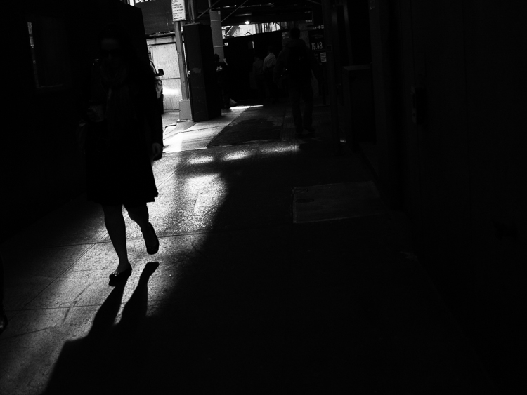
Why would you choose to create black and white photographs in the era of digital cameras that are capable of accurately capturing millions upon millions of colors? Black and white photography seems to be a constant in the history of the medium, with color technology only propagating itself into wide use around halfway between Nicéphore Niépce’s first heliograph and today.

Black and white portrait tips 3201

There’s a lot of debate on both sides of the argument, but for me and many others it’s a simple matter of aesthetics. A good black and white treatment has a way of stripping unneeded information from an image, helping you to emphasize specific elements to your viewer without the distractions color can provide.

Portrait photography is a genre where black and white images can really shine. Like any technique, there are considerations that you should regard that can help to make sure your images have the most impact.

1 – Start with black and white in mind

For many photographers, black and white is more than a creative choice at the post-production stage; it’s a mindset. If you can start the creation of an image knowing that you intend it to be black and white, you can take steps to ensure that all of the elements of a good monochrome image are in place before you press the shutter. Things like contrast in tonality, contrast in lighting, and appropriate expressions from your subjects are all elements that are difficult, if not impossible, to fix after an image is taken.

If you have trouble imagining how an image may look in black and white, try setting your camera to a monochrome setting. While it isn’t recommended to do this for a final image, as long as you shoot in RAW file format, then all of your image’s color data will still be present in the file, and Lightroom and Adobe Camera Raw will reset the photo back to color once it’s imported. Doing this will allow you to have an idea of how an image will work in black and white, while still providing the highest amount of versatility in post-production.

2 – The eyes are more important than ever

Black and white portrait tips 3088

The most important part of the majority of portraits are the eyes. They are usually the focal point that the rest of your image is built around. This is especially true with black and white. With the omission of color, a black and white image often breaks down into graphic forms and shapes. Eyes are shapes that everyone recognizes and they draw immediate focus from your viewers. Make sure that your subject’s eyes are well lit, and focus is critical.

3 – Expressions are emphasized

Black and white portrait tips 3191

Like the eyes, other facial features become more prominent in a black and white portrait. You can use this to your advantage by conveying emotion in your images. Even tiny changes in your subject’s expression can make a difference. Things like a raised eyebrow, a twitch at the corner of a mouth, and smile lines under the eyes can all be used to great effect.

Here is an exercise you can do with your portrait subjects to get a mixture of great expressions. Prepare a list of words or phrases and ask them to react to how they feel to each one. The words you choose can be simple descriptors of emotion like: love, sad, joy, angry and melancholy. For more diverse expressions try more abstract words, or funny ones like: cheeseburger, politics, Teletubbies or Hulk smash. As a bonus, this sometimes works extremely well to lighten the mood when you have a subject who’s tense or nervous during a sitting.

4 – Lighting considerations

Black and white portrait tips 3335

When it comes to lighting a black and white portrait image, there are no hard and fast rules. If you like high contrast images with hard gradations in tone, then choose a harder source of light. If you like soft tones and subtler images, then you want a softer light source.

It’s all about personal preference here. If you’re not sure what yours is, try finding the first ten black and white portraits that stand out to you the most and see if you can deconstruct them in terms of lighting.

5 – Add contrast with light

Black and white portrait tips 3107

If you’re going to create high contrast black and white photos, the best advice is to add it with light, not in Photoshop. Small global adjustments are okay and won’t hurt your images, but definitely do not crank the contrast slider to 100. Try to limit it between +15/-15. For local adjustments, use a dodging and burning technique of your choice. The key point in this, and all post-production, is subtlety.

6 – You can’t save a bad image with black and white

If you’re working on an image that you feel isn’t up to scratch and you ask yourself if it will work in black and white, the answer is probably no. A black and white treatment will often emphasize the flaws that made you question the image in the first place, and a bad photo is a bad photo regardless of its color scheme or lack thereof.

7 – Choose black and white in spite of color

Certain subjects scream out to be shot in black and white. Other subjects may not be so obvious. Bright, punchy colors obviously make for vivid color photos, but by removing the color element you can completely change how a subject or scene is perceived. When you want to ensure your viewer is focused on a particular element, color as a graphic element, can become a distraction. Try removing it.

This can be a difficult concept to understand without seeing it, so I have included an example of a color version of one the images above. Ask yourself: How did your perception of the photos change? What did you notice first in each of the images? Do you feel differently or think differently of it when you view it in color than in black and white?

Black and white portrait tips 3088 colour

Hopefully, you can see that even though bold colors can make for vivid imagery, their absence can as well.

If you’re new to black and white photography, do remember that these are guides and not rules. If you need to stray from them to get the result you’re after, do so without hesitation.

Finally, if you try black and white and you like it: welcome to the addiction!

Editor’s Note: This is one of a series of articles this week featuring black and white photography tips. Look for earlier ones below and more daily over the next week.

  • 5 Simple Ways to Create Expressive Photos in Black and White
  • Tips for Black and White Wildlife Photography

googletag.cmd.push(function() {
tablet_slots.push( googletag.defineSlot( “/1005424/_dPSv4_tab-all-article-bottom_(300×250)”, [300, 250], “pb-ad-78623” ).addService( googletag.pubads() ) ); } );

googletag.cmd.push(function() {
mobile_slots.push( googletag.defineSlot( “/1005424/_dPSv4_mob-all-article-bottom_(300×250)”, [300, 250], “pb-ad-78158” ).addService( googletag.pubads() ) ); } );

The post 7 Tips for Black and White Portrait Photography by John McIntire appeared first on Digital Photography School.


Digital Photography School

 
Comments Off on 7 Tips for Black and White Portrait Photography

Posted in Photography


13. August 2015

14 Aug

Das Bild des Tages von: Zuzi Pištová

©-Zuzi-Pistova-20423305502

Im Ausblick: Bruce Gilden, Augentausch und ein perfekter Moment.
kwerfeldein – Fotografie Magazin | Fotocommunity

 
Comments Off on 13. August 2015

Posted in Equipment


Eco Capsule: Mobile Grid-Free Home Harnesses Sun, Wind & Rain

14 Aug

[ By WebUrbanist in Architecture & Houses & Residential. ]

ecocapsule off grid unit

With stylistic nods to classic rounded Airstream trailers, this next-generation mobile pod dwelling is powered by solar and wind energy and provides drinkable water by recycling and filtering the rain.

ecocapsule interior design finishings

Designed by Nice Architects, the Ecocapsule shelter is intended to accommodate two people, providing basic necessities and bonus amenities including a fold-out bed, living and dining space, cozy kitchenette, working shower and flush toilet.

ecocapsule on beach

ecocapsule floor plan diagram

A 750-watt wind turbine attaches to the exterior and the roof is clad in a series of built-in solar cells providing multiple means of generating energy for the home. Power can be stored in an onboard battery with close to a 10,000 watt-hour capacity.

ecocapsule rain sun wind

ecocapsule transportation options

The entire structure is road-worthy as well: just under 15 feet long, 8 feet wide and 8 feet tall and weighing a bit over 3,000 pounds. It can be fit into a standard-sized shipping container or towed behind a vehicle. Currently in a prototype phase, the company plans to put these units on the market within the next year.

ecocapsule alternative interior finishing

ecocapsule winter pod layout

Its makers envision a great variety of potential uses: “Ecocapsule is a portable house offering an unmatched dwelling experience. With its immense off-grid life span, worldwide portability and flexibility it is suitable for a wide range of applications: from an independent research station or a tourist lodge to an emergency housing or a humanitarian-action unit.”

Share on Facebook


[ By WebUrbanist in Architecture & Houses & Residential. ]

[ WebUrbanist | Archives | Galleries | Privacy | TOS ]


WebUrbanist

 
Comments Off on Eco Capsule: Mobile Grid-Free Home Harnesses Sun, Wind & Rain

Posted in Creativity


Class Is In Session! Turn Photos Into School Supplies

13 Aug

Can it be? Summer’s almost over? It feels like it just started.

Guess that means it’s time to switch sunbathing for school supplies. But hey, that’s not a bad thing. Really!

Just check out our list of DIY school supplies that you can make out of your very own photos and you’ll see what we mean.

Now go get crafty and make all your classmates jelly!
(…)
Read the rest of Class Is In Session! Turn
Photos Into School Supplies (445 words)


© Taylor for Photojojo, 2015. |
Permalink |
No comment |
Add to
Photos Into School Supplies”>del.icio.us

Post tags:


Photojojo

 
Comments Off on Class Is In Session! Turn Photos Into School Supplies

Posted in Equipment


Tilmans Ausrüstung

13 Aug

Tilmans Ausrüstung, © Tilman Haerdle

Bei mir in der Familie war nicht der Vater der Fotograf, sondern meine Mutter. Bis heute ist für mich die Dacora, vermutlich eine Super Dignette electric-L, der Inbegriff von „Kamera“. Ich kann mich immer noch daran erinnern, wie im Sucher ein relativ hektischer Zeiger über die richtige Belichtung informierte. In rosa.
kwerfeldein – Fotografie Magazin | Fotocommunity

 
Comments Off on Tilmans Ausrüstung

Posted in Equipment


Church for Crabs: Architectural 3D-Printed Hermit Shell

13 Aug

[ By Steph in Art & Sculpture & Craft. ]

hermit crab castle

A hermit crab scuttles along the sand, carrying a perfect replica of a Japanese wedding chapel on its back, complete with a tiny spire. After designing a series of crystal-clear ‘crawling cities,’ artist Aki Inomata returns with another detailed architectural alternative to natural shells, rendered in transparent acrylic so we can still see the crab’s body within.

hermit crab castle 2

Entitled ‘White Chapel,’ this miniature sculpture is the third installment of Inomata’s project ‘Why Not Hand Over a Shelter to Hermit Crabs?’ The shape will look familiar to Westerners, of course, as we see churches like this practically on every block. But in Japan, such structures are used for weddings only, and rarely for worshipping or any other form of religious services.

hermit crab castle 3 hermit crab castle 4

“When I visit Western countries, I sometimes notice the origin of architecture, habits, foods, etc… in Japan, they would be transformed into local styles, and I ask myself, ‘are we Japanese living in mimicry of western world?’ says the artist. “For me, these imitations, or I would say reproductions or arrangements of Western-style architecture, seem to reflect identities of post-colonialism inside of Japanese people.”

hermit crab castle 5

Inomata uses CT scanning to perfectly replicate the interior shape of a natural hermit crab shell so all of her artificial alternatives fit comfortably. Previous versions have included skylines of New York City and Amsterdam, as well as reproductions of buildings in Paris and Tokyo.

Share on Facebook


[ By Steph in Art & Sculpture & Craft. ]

[ WebUrbanist | Archives | Galleries | Privacy | TOS ]


WebUrbanist

 
Comments Off on Church for Crabs: Architectural 3D-Printed Hermit Shell

Posted in Creativity