Month: December 2014

  • 2 December, 2014 – Another Two Barytas in the Neighbourhood


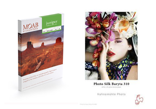
    There hasn’t been a lot of activity in new printers lately, but there has been a number of new ink jet paper introductions.  We are looking at and testing a number of different and interesting papers.  Today, Mark Segal looks at two new papers from Hahnemuhle and Moab.  Another Two Barytas in the Neighbourhood takes a look at these two papers and how they can fit into your printing workflow.

    If you haven’t seen it you should check out the amazing special B&H is offering on A Hasselblad Stellar Special Edition Digital Camera.  An instant savings of $ 2,300 USD now reduced to $ 999.00.  Guess they didn’t sell quite as well as expected.  

     The OnLandscape Conference was held this past weekend.  I had the chance to tune in and watch the lectures from a few of my favorite speakers, Joe Cornish being one of them.  Joe just did a workshop with me in Scotland and will be joining us for our Antarctica Trips in January.  All presentations at the conference are now available with a special LuLa Discount of 25% just use the code LL25 at check out.  If you have some time to watch these they are pretty interesting. Check out the Videos Available.


    The Luminous Landscape – What’s New

  • Fotografie mit flimmernden Fäden

    Ich traf den chilenischen Künstler Jose Romussi in seinem Berliner Atelier. Eingedeckt mit Künstlerbüchern, Fäden und Nadeln, einer Nähmaschine und inspirierender Kunst an den Wänden lud der kleine Studier- und Arbeitsraum zu einem längeren Gespräch ein.

    Vor einiger Zeit begann ich, mich für fotografische Collagen zu interessieren, die mit Fäden gearbeitet sind. Als eine der Gründerinnen der „Stick- und Fadencollage“ gilt Annegret Soltau, die private Bilder unter Berücksichtigung eines biografischen Hintergrunds vernäht hat.

    Neuere Beispiele stammen von Maurizio Anzeri, Melissa Zexter, Claudia Gutierrez oder Inge Jacobson.

    Ich stieß schließlich im kürzlich im Gestalten Verlag erschienenen Buch „The Age of Collage“ auf Jose Romussis Kunst. Besonders interessant fand ich das Zusammenspiel aus historischen Fotografien und neuzeitlichen Elementen.

    Mann mit roten und blauen Fäden.

    Fotografie mit Stickerei.

    Jose ist ein chilenischer Künstler, der eigentlich Landschaftsarchitektur studiert hat. Damals war dies, wie er berichtet, eher ein Versuch, bestimmten gesellschaftlichen Erwartungen zu entsprechen. Ein großes Bedürfnis, sich künstlerisch auszudrücken, verspürte er aber schon während seiner Studienzeit, als er bemerkte, dass Landschaftsarchitektur nicht zu seiner Berufung gehört.

    Zur Kunst kam er eher durch Zufall. Ein Bekannter aus Amerika fragte ihn, ob er ein Künstler sei und er sagte spontan, aber nicht unüberlegt: „Ja!“ Der Bekannte bat ihn, ein paar Arbeiten zu schicken. In kürzester Zeit erstellte Jose Romussi eine große Anzahl an Collagen, auf denen er unter anderem Bilder seiner Familie integrierte. Er zeigte die Arbeiten dem Bekannten, der ihm begeistert ein Kooperationsprojekt vorschlug.

    Fotocollage zweier Personen.

    Nach einigen Wochen war er genauso gut wie Freunde, die Kunst an der Universität studierten. „Das war der aufgesparten Leidenschaft zu verdanken“, erzählt Romussi. Schnell hatte er sich in der Künstlerszene einen Namen gemacht. Ein stolperhafter Einstieg in die Kunst, der nur knappe drei Jahre zurückliegt.

    Seitdem hat Jose Romussi an einer Vielzahl ein Einzel- und Gruppenausstellungen teilgenommen und plant die nächsten Künstleraufenthalte in New York und Chile. Die nächsten Jahre möchte er gern in der Welt unterwegs sein und seine Technik verfeinern. Eine Rückkehr zur Landschaftsarchitektur scheint eher ausgeschlossen.

    Torrero © Jose Romussi

    Dabei wertschätzt Romussi insbesondere die Bedeutung des Austauschs mit anderen. Vor allem in der Anfangszeit, in der sich sein künstlerisches Selbstbild langsam manifestierte, schätzte er die wohlwollende, aber auch kritische Rückmeldung seiner Freunde.

    Regelmäßig arbeitet Jose Romussi eng mit anderen Künstlern zusammen. Durch die unterschiedliche Expertise, so berichtet er, käme es zu Synergie-Effekten, die ihn und andere weiterbrächten. So kam es beispielsweise zum Projekt „String Figures“, auf denen Personen, ähnlich einem Fingerspiel, Schriftzüge, U-Bahnkarten und Symbole zwischen den Händen spannen. Das Projekt entstand mit der Fotografin Rocio Aguirre Venegas.

    Fingerspiel und Mann

    Fingerspiel und Mann.

    Wie arbeitet Jose Romussi? Er zeigt mir einige neuere Arbeiten und berichtet, dass jede der großformatigen Stickereien mehr als zwei Monate Zeit (und Geduld) benötigt. Romussi verwendete insbesondere am Anfang Vintagefotografien und vernähte die eingefrorenen Tänzerinnen und Ballerinas.

    Er spricht begeistert davon, wie er die Fotografien der Ballerinas entdeckte. Die vernähten Tänzerinnen waren eine der ersten Fadencollagen, die er gestaltete. Durch die Verknüpfung der Schwarzweiß-Fotografien mit den farbigen Fäden gewinnen die Arbeiten an starkem Kontrast und wirken lebendig.

    In meiner Arbeit versuche ich, meine Ideen eher intuitiv umzusetzen. Ich fertige anfangs Zeichnungen an und arbeite ein Konzept aus, aber oft entdecke ich nur über die Zeit vielfältige Schichten, die zu Beginn nicht planbar sind.

    Tänzerin und Stickerei

    Letztes Jahr nahm Jose Romussi an einer Ausschreibung der Neuen Gesellschaft für Bildende Kunst (NGBK) zum Thema „Kunst im Untergrund“ teil und wurde mit 12 anderen Künstlern aus 380 weltweiten Einreichungen ausgewählt, die Berliner U-Bahn mit Kunst zu bespielen.

    Seine großformatigen Portraits verzierte er mit Symbolen, Schrift sowie Linien und lehnte sie konzeptuell an Pop-Art und Graffiti-Kunst an. „Die Bilder geben […] keine detaillierte Auskunft über das Leben eines Individuums, sondern transportieren Lebensgefühle“, heißt es im Ausstellungskatalog zu „Kunst im Untergrund“. Im Zentrum der Arbeiten stehen Gefühle junger Menschen, die das Großstadtbild prägen.

    Porträit und Stickerei.

    Jose Romussi erzählt, dass viele Leute glauben, dass er diese Technik von seiner Mutter oder Großmutter gelernt habe. Tatsächlich hat er sich das Sticken und Vernähen selbst beigebracht und nur bei schwierigen Projektideen Freunde um Rat gebeten.

    Er zeigt mir die feinen Nadeln, mit denen er die Bilder verstickt. Da das Papier leicht reißt, muss er sehr sorgfältig arbeiten. So auch bei einer aktuellen Arbeit, die in Kooperation mit der Künstlerin Amanda Charchian entstand. Jose Romussi nutzte eine ihrer Fotografien und nähte der abgebildeten Frau ein schwarzes Rückgrat ein. Seine neueren Arbeiten der „Xserie“ wirken morbider und düsterer als seine vorangangenen Arbeiten. Sie markieren auch eine neue Phase seines künstlerischen Schaffens, die sich stärker inhaltlichen (statt ästhetischen) Gesichtspunkten widmet.

    Frau mit genähten Knochen

    Frauen mit Augen

    Jose Romussis Stickereien, die nicht nur Fotografien, sondern auch Landschaftsaufnahmen und Zeitschriften verzieren, stellen eine spielerische Auseinandersetzung mit Bildsprache und Bildästhetik dar. Ungewöhnliche Materialien setzt er derzeit auch in skulpturalen Arbeiten ein, die mit Holz, Stecknadeln und Nägel verarbeitet sind.

    Mehr über Jose Romussis Arbeiten findet Ihr auf seiner Webseite.


    kwerfeldein – Fotografie Magazin | Fotocommunity
  • Create a Festive Christmas e-Card Using Your Photo

    A short tutorial for those who don’t have a graphic design degree, but wish to create a simple clean Christmas e-card from their images within the familiar surroundings of Photoshop. Don’t miss our our great collection of Christmas gift ideas for photographers! Before

    The post Create a Festive Christmas e-Card Using Your Photo appeared first on Photodoto.


    Photodoto

  • Wall is Over: Art Students Whitewash Historical Street Murals

    [ By WebUrbanist in Art & Street Art & Graffiti. ]

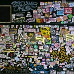
    wall is ocver

    In an audacious and contentious move, a group of young artists took it upon themselves to paint over the famous John Lennon Wall in Prague, replacing decades of layered mural work, drawings and tags with the message: “Wall is Over”. While the surface in question has particularly significant meaning for the local population, it has also long been a global symbol of resistance against governmental oppression – its clearing has thus become a border-crossing controversy.

    whitewashed john lennon wall

    Calling themselves Prague Service, the arts collective in question wanted to create a blank slate for future writers, reworking the wall that got its name after the assassination of its namesake. The piece was also intended to work as a combination  tribute to Lennon, referencing the song Happy Xmas (War is Over), and celebration of the 25th anniversary of the Velvet Revolution in what was then Czechoslovakia. Of their work, they write: “Twenty-five years ago, one big totalitarian wall fell … Students of art schools are expressing their commemoration of (1989) and opening room for new messages of the current generation.”

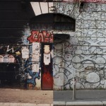
    wall john lennon prague

    According to Hyperallergic (with details from the French Associated Press): “It didn’t take long for others to take advantage of the free space and begin filling the Lennon Wall with tags again. However, the wall’s owner, the Order of Malta, was not so quick to dismiss the incident, and is pursuing legal action against the artists.”

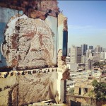
    3d installation art head

    While the intentions behind this buffing of history may have been good, there may be unintended references as well to an era of Communist domination in which free expression was limited and street art was also painted over for political reasons. Images above and below via Rick Chan, Matushy, Steven Feather, Eregoion,  Brandon Schauer and Brian Beggerly.

    wall street art tribute

    More on the history of the John Lennon Wall: “In 1988, the wall was a source of irritation for the communist regime of Gustáv Husák. Young Czechs would write grievances on the wall and in a report of the time this led to a clash between hundreds of students and security police on the nearby Charles Bridge. The movement these students followed was described ironically as “Lennonism” and Czech authorities described these people variously as alcoholics, mentally deranged, sociopathic, and agents of Western capitalism.”

    wall is over rework

    In fairness to the students who edited it, the wall will not be over for long – its surface will continue to be reinvented over time: “The wall continuously undergoes change and the original portrait of Lennon is long lost under layers of new paint. Even when the wall was repainted by some authorities, on the second day it was again full of poems and flowers. Today, the wall represents a symbol of global ideals such as love and peace.”

    Share on Facebook


    [ By WebUrbanist in Art & Street Art & Graffiti. ]

    [ WebUrbanist | Archives | Galleries | Privacy | TOS ]


    WebUrbanist

  • creativeLIVE presents ‘The Art of Wildlife Photography’ with Tom Mangelsen

    creativeLIVE is hosting a two day live workshop with nature photographer Tom Mangelsen. The class will be broadcast live from 9am today, December 2nd (Pacific time) and will cover everything from gear and location scouting advice to wildlife etiquette. It also includes a critique and portfolio review of viewers’ images. The class is free to watch live and costs $ 99 for the rebroadcast. Click through for a link

    Articles: Digital Photography Review (dpreview.com)

  • Documentary photographer turns to video for ‘The Long Night’

    A multimedia journalist by trade, Tim Matsui’s still photography projects have taken him from native Alaskan villages to Brazilian Air Force training facilities. Matsui shares with us his journey in creating his latest documentary work, from its beginnings in still photography to the adaptations he made to turn it into a video production. Learn more about his work on ‘The Long Night,’ a documentary debuting this week that looks into human trafficking in Seattle. Read our Q&A

    Articles: Digital Photography Review (dpreview.com)

  • 2. Türchen: Viddy

    2. Türchen

    Zusammen mit der Pop-Up Pinhole Company öffnen wir unser zweites Adventskalendertürchen und geben den Blick auf ein Bastelset für eine Lochkamera aus Pappe frei. „Viddy“ heißt das gute Stück und konnte dank Kickstarter realisiert werden.

    Der Aufbau der Kamera dauert etwa eine halbe Stunde, kommt ohne scharfe Gegenstände oder Kleber aus und ist daher auch für Kinder super geeignet. Sie wurde ausführlich bei Workshops an Schulen mit Kindern ab 11 Jahren getestet. Was nicht heißt, dass sie Erwachsenen keinen Spaß machen würde.

    Pappkamera zum Basteln

    Lochkamerabild von LiegestühlenLochkamerabild einer Frau

    Sowohl mit Kleinbildfilmen als auch Mittelformat kann man die Lochkamera „Viddy“ nutzen. Wer nur Mittelformat allein nutzen möchte, der kann sich mit der kleinen Schwester, der „Videre“, anfreunden.

    Die Viddy gibt es in vier Farben: grün, schwarz, blau und rot. Sie kostet umgerechnet etwa 51 €, die Versandkosten nach Deutschland betragen 15 €. Unser heutiger Gewinner darf sich über eine Bastelzeit mit der Viddy in seiner Lieblingsfarbe freuen.

    Um die Viddy zu gewinnen, schreibe einen Kommentar mit Deiner Wunschfarbe unter bürgerlichem Namen und gültiger E-Mail-Adresse bis heute um 24 Uhr. Danach verlosen wir sie per Zufallsgenerator unter allen Kommentatoren. Die genauen Gewinnspielregeln findest Du hier. Viel Glück!


    kwerfeldein – Fotografie Magazin | Fotocommunity

  • 2 December, 2014 – Another Two Barytas in the Neighbourhood


    There hasn’t been a lot of activity in new printers lately, but there has been a number of new ink jet paper introductions.  We are looking at and testing a number of different and interesting papers.  Today, Mark Segal looks at two new papers from Hahnemuhle and Moab.  Another Two Barytas in the Neighbourhood takes a look at these two papers and how they can fit into your printing workflow.

    If you haven’t seen it you should check out the amazing special B&H is offering on A Hasselblad Stellar Special Edition Digital Camera.  An instant savings of $ 2,300 USD now reduced to $ 999.00.  Guess they didn’t sell quite as well as expected.  

     The OnLandscape Conference was held this past weekend.  I had the chance to tune in and watch the lectures from a few of my favorite speakers, Joe Cornish being one of them.  Joe just did a workshop with me in Scotland and will be joining us for our Antarctica Trips in January.  All presentations at the conference are now available with a special LuLa Discount of 25% just use the code LL25 at check out.  If you have some time to watch these they are pretty interesting. Check out the Videos Available.


    The Luminous Landscape – What’s New

  • Real-world test: Nikon D750 at the Museum of Flight

    The D750 is Nikon’s enthusiast-oriented full-frame DSLR, featuring a 24MP sensor and a raft of high-end features borrowed from the D810 and D4S. These include a tweaked version of their highly capable 51-point AF system and a very solid HD video specification. We’re working on a full review of the D750 right now, and as part of that process we made a short video, highlighting some of the camera’s key features in real-world use. Click through to watch.

    Articles: Digital Photography Review (dpreview.com)

  • Using Levels in Photoshop to Image Correct Color and Contrast

    Notice the difference some quick adjustments in the Levels tool can make

    Notice the difference some quick adjustments using the Levels tool can make

    Image editing is an important part of making your good images look spectacular. Photoshop and Lightroom are packed with tools to help you get your images to look great after you have downloaded them on to your computer. While there are many different tools in Photoshop to enhance your image, there are really only a handful of tools that you will use on just about every image; one of those is the levels tool. Photoshop has a levels tool, Lightroom doesn’t unfortunately. Each photographer has a different workflow when editing images, my suggestion is to follow a process that is the same for each image. When you open up an image in Photoshop or Lightroom, the first step is to look at the exposure. Is the image over or underexposed? At this stage of the workflow, you could be looking at a tool like the Shadow and Highlights adjustment, the next one to use would be Levels.

    What is the Levels tool?

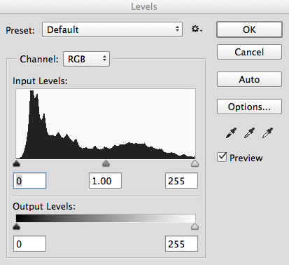
    Levels tool in Photoshop

    Levels tool in Photoshop

    Levels does two things in one tool, it corrects the tonal range in an image and it corrects the colour balance. Adjustments made using the Levels tool are not only about getting the exposure on your image correct; it also has a second function and that is, it can correct for colour too. Yes, there are other tools within Photoshop that can do this, but the Levels tool can make it really quick and easy.

    The Levels tool uses a histogram to show a visual representation of the tonal range in your image. There is a lot to be said about a histogram, but the most important thing to remember is that there is no right or wrong histogram. If you are unsure about how a histogram works, check out: How to read and use Histograms. On the histogram in the Levels tool, you will see a numerical range starting at zero on the left hand side of the graph, and 255 on the right. In the Levels function, zero represents black and if you have pixels that are at zero, that means there is no detail, they are totally black. The right hand side at 255 represents total white. If you have pixels at 255 that means they are totally white, with no detail. If the shape of your histogram is leaning to the left hand side, that means you have a lot of dark pixels in your image and your image is possibly underexposed. If the histogram is more on the right hand side that means you have a lot of bright highlights in your image and it is possibly overexposed. The middle slider is the mid-tone or gamma adjustment. All the pixels that are not highlights or shadows, fall into this category.

    How does the Levels tool work?

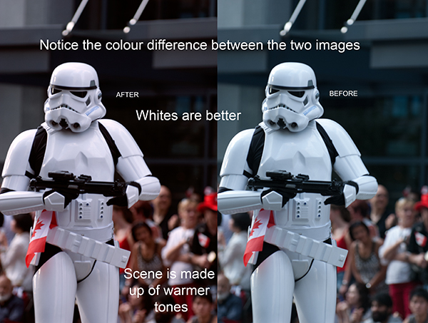
    When you open the Levels tool, very often your first instinct is to push the sliders into a position that makes the image look brighter. That can work, but I suggest that you do the following: Before you make any adjustments, take a look at your image and see if you can pick up a colour cast. This is a tint or colour that affects the whole image, and is often unwanted. For example, if you have a wedding photo of a bride shot on an overcast day and while everything looks okay, there may be a slight blue hue in the image from the overcast light. This means that her dress looks a little blue instead of white. In a case like this, a colour cast is something you want to get rid of. If however you have shot a summer sunset and the whole scene is bathed in warm orange light, this could also be seen as a colour cast, but in that case you would probably not want change it. One way to find colour casts in your images is to look at an area of the image that should be white and see if it has a tint. A colour cast will vary depending on the light you shot under; it could be green, magenta, blue, yellow, orange, or anything in between.

    How to use the Levels tool

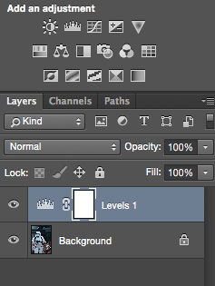
    Make and adjustment layer for Levels

    Make and adjustment layer for Levels

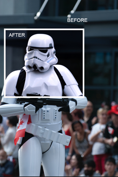
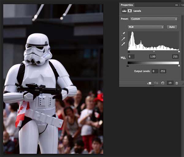
    You can use the Levels tool on any image that needs the colour or contrast corrected. If you have an image that needs to have the colour cast corrected, like my shot of the Star Wars Stormtrooper does, then do the following:

    1. Open your image in Photoshop.
    2. Click on the adjustment layer icon at the bottom of the Layer panel and create a Levels adjustment layer, or click on the Levels tool icon in the adjustments panel which is directly above the layers panel.

    Step 1 – If you need to do colour correction

    If your image has a colour cast (the example image does, as there is a slight blue colour because it was overcast weather that day), follow these steps. Not all images need to have the colour corrected, if you are happy with the colour in your image you won’t need to do this. If you do have a colour cast in your image, then do the following:

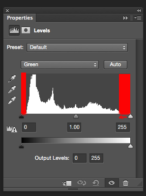
    Bring the white and black sliders to the point where the graph starts moving upwards

    Bring the white and black sliders to the point where the graph starts moving upward

    Part 1: In the levels tool, click on the drop down box above the histogram that says RGB. This will open up the three channels individually. Click on RED and bring the white slider and black slider in to part of the histogram where it starts to move upwards. Click on the the RGB drop down box again and click on GREEN and do the same, and finally click on BLUE and repeat one more time. This step will only work if there is a colour cast in your image. If there is no colour cast, the histogram will spread to the edges of the graph. In this image, there was a colour cast and this was how the GREEN channel histogram looked.

    The red areas in the screenshot above show you where there was no colour information. By sliding the sliders inward to the edge of the graph, you will start to neutralize the colour cast.
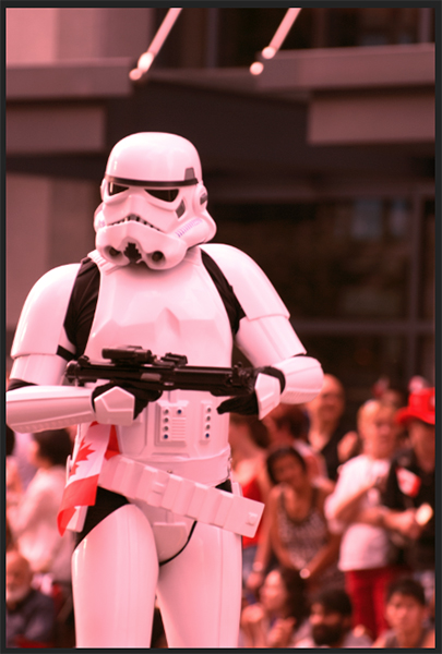
    Part 2: You will notice that as you make these adjustments, your image may have a very strong colour cast of the channel you are adjusting. Don’t be alarmed, this will all work out once you make the final adjustments.
    Part 3: Once you have adjusted for the colour correction in all three colors, you can now adjust the exposure and contrast

    Don't be alarmed at the crazy colours you might see during the colour cast adjustments, they will work out in the end.

    Don’t be alarmed at the crazy colours you might see during the colour cast adjustments, they will work out in the end.

    Step 2 – Adjusting for exposure and contrast

    The Levels tool can also adjust your image’s exposure and contrast. In other words, you can use it to make the highlights, shadows and mid-tones brighter or darker – an all-in-one tool. The levels tool is really great to make some quick adjustments to your image, here is how:

    Part 1: In the RGB channel, move the white slider in from the right to the edge of the histogram. Do the same for the black slider, adjusting it in to the edge of the histogram on the left. The important tip here is to make sure that you don’t overexpose the highlights and underexpose the shadows. This is called clipping and the best way to see if you are clipping any pixels is to hold down the ALT key when you are adjusting the white and black sliders.
    2. Once you have those two sliders adjusted, you can slide the mid tone slider to add some contrast to the scene and this will be the final touch to your levels adjustment.

    The final adjustment showing colour correction and contrast correction

    The final adjustment showing colour correction and contrast correction

    Some final tips to remember

    1. Like any tool in Photoshop, if levels is overdone, you will be able to see it in the image. So, be aware of over adjusting your image.
    2. Small adjustments always work better than one big adjustment. Make small changes first and see if that works.
    3. Use the ALT key to make sure you aren’t losing detail in the shadows and the highlights by clipping your pixels.
    4. Add some contrast to your images in levels, that will give your image a bit more pop and will enrich the tones.

    The levels tool is a powerful ally to have in your image editing workflow. I use this tool on just about every image I edit. It can really add some contrast and punch to your images so try and use it as often as needed. These techniques take practice, but once you know what to do, the levels tool is quick and easy to use.

    Compare the images side by side, there is a subtle but real difference

    Compare the images side by side, there is a subtle but real difference

    The post Using Levels in Photoshop to Image Correct Color and Contrast by Barry J Brady appeared first on Digital Photography School.


    Digital Photography School