Month: December 2014

  • How to Use Hard Lighting to Create a Dramatic Portrait

    When was the last time you did not primarily light your scene using a large soft source, such as a soft box or umbrella? Large soft sources easily create a beautiful, wrap-around quality of light. Just pop one up and you have instant “good” light.
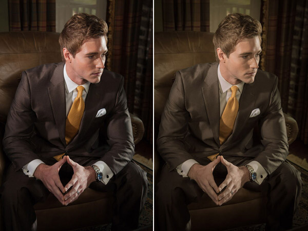
    before-after-lightroom-adjustments-01.jpg

    Final image: before and after in Lightroom

    Though soft light is beautiful and has its place, it represents only one part of the artist’s palette. In this article we are going to dissect the lighting setup for a men’s fashion shoot, and look at how using hard light can add dramatic impact to your photographs.

    I think two-time Academy Award-winning cinematographer Haskell Wexler said it best when it came to using hard light:

    “Everybody should still work in hard light as well. Not to do it and to say that it has to be all soft light is like throwing away part of the artist’s palette. I think the more variety you can have, the better it will look. To be able to light well in hard light makes the soft lighting a piece of cake, because soft light is very forgiving. Soft light, uncontrolled, is still acceptable photographically. It is really hard for soft light to look bad, but it is really not hard for hard light to look bad.”

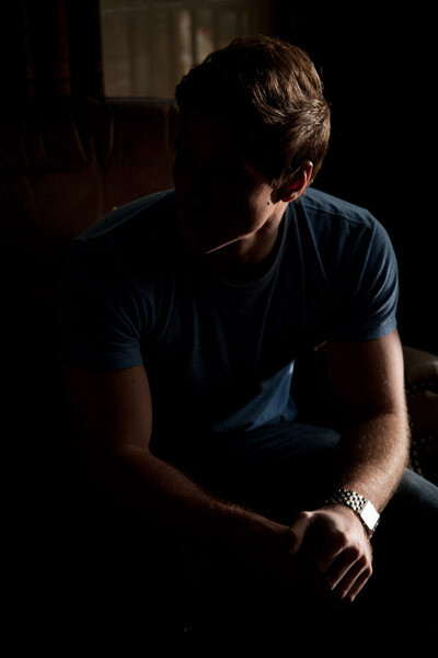
    The feel the magazine wanted was a dramatic, high-contrast look. One of the problems with soft light is that it can be hard to control and can easily kill the contrast of your scene – especially in small spaces. The location for our shoot just so happened to be one of those small spaces, so I decided that reflectors and honeycomb grids were the best tools for the job.
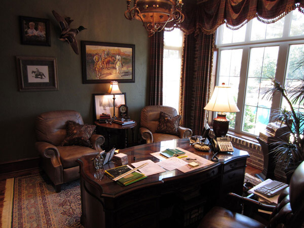
    Location picture

    The shoot was held at a local area builder’s office. The office provided the perfect backdrop for the shoot, but did not offer a lot of room for equipment.

    In the pre-planning phase, I chose to use a simple three light setup which included a key light, a fill light and kicker. I had room on camera left to place the main key light, but did not have much room for a kicker opposite camera right; however, there was a window.

    As luck had it, the office window overlooked a back patio that had electrical outlets, so I did not have to rely on a battery pack or generator. The only problem was that the patio was a lower in elevation than the office window, so I had to extend my 13′ light stand up to its near maximum height.

    To secure the stand, I fastened several 10 pound ankle weights to the legs. Ankle weights are a great and inexpensive alternative to sandbags. The set I use cost about $ 20 at Walmart, and came with Velcro straps for easy attachment to light stands or boom arms.

    Since the strobe was outside the window and placed a distance from the model, I attached a radio slave and set it to full power. (The strobe was rated at 600ws)

    Back in the office, I took a meter reading using a light meter with the dome retracted and pointed towards the light. The meter gave me a reading of f/5.6 at ISO 100. I decided the reading would be a good base to build my lighting ratios, so I set my camera to f/5.6 at ISO 100. As far as the shutter speed, I set my camera to 1/160th of a second because I did not want to capture a lot of ambient light. When using strobes, the shutter speed only controls the brightness of the ambient light.

    This first light would act as the kicker light, in the scene.
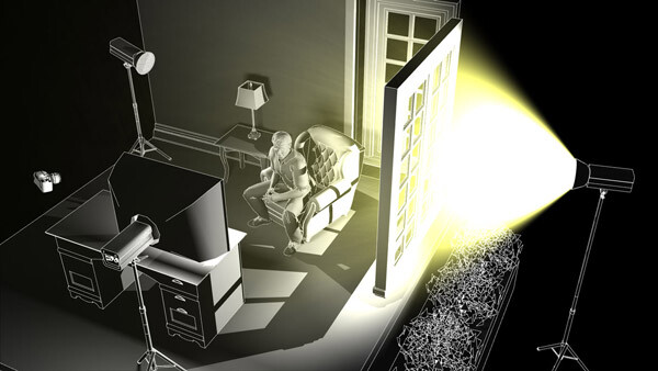
    Kicker light placement

    Position of the kicker light

    Kicker test shot

    Test shot of the model with just the kicker light

    When lighting with hard lights, you will often find the need to bring up the shadows, since they can easily go black. A large soft light source, placed close to the camera, is great for filling in shadow areas, because it resembles directionless ambient light.

    The fill light in our scene was fitted with a medium soft box and placed behind and slightly to the right of the camera.
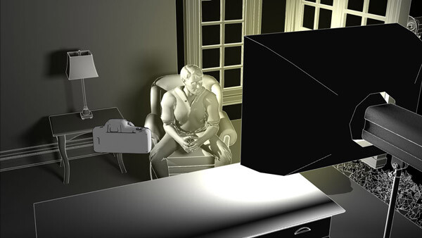
    Fill light placement

    Position of the fill light

    Since most of the elements in the scene were dark brown, including the suit the model was going to wear, I could not set my fill light much lower than my base exposure of f/5.6. If I had set it lower the elements in the shadow areas would quickly go black. I set the fill light to 1 1/3 stop lower than my base exposure, which read f/3.5 on my light meter.
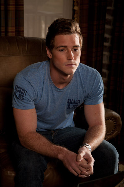
    Kicker and fill test shot

    Test shot of the model with both the fill and kicker lights.

    The last light I set up was the key (main) light. I placed this light in an open doorway, towards camera left and slightly above the model. I wanted to keep the light on the model and off the walls, so I fitted the light with a 20 degree grid to control the spill.
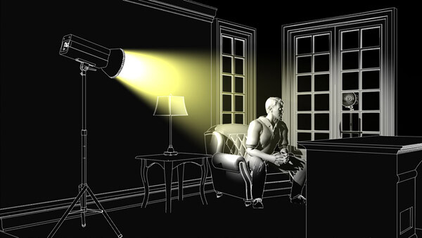
    Key light placement

    Position of the key light.

    Since most of the scene was dark brown, I decided to have the key light one stop over my camera’s base exposure of f/5.6. I adjusted the light until it read f/8 on my light meter.
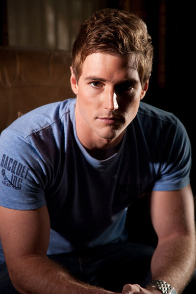
    Kicker and key test shot

    Test shot of model with the key light and kicker, no fill. Notice how the shadows go completely black without the fill light.

    You may have noticed that the key light on the left side of the model’s face does not appear as bright as the window kicker light on the right side of his face, despite it being one stop brighter (left: f/8 vs right: f/5.6) This is because the kicker is placed more behind the subject, while the key light is placed more towards the side. You might have heard the photography term “the angle of reflection equals the angle of incidence”? This is basically that principle in action. Since the kicker light is slightly behind the model, the angle at which the light is being reflected off the skin is causing the highlight to appear brighter.
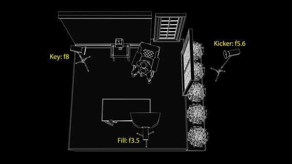
    Key fill kicker diagram

    Positions and settings for key, fill and kicker lights. Notice the camera positioning at the bottom left of the desk.

    Before after lightroom adjustments 01

    Shot with all three lights set and in place. Before and after adjustments in Lightroom.

    Once the lighting was in place, the model was dressed and the shoot began.

    A nice benefit of the positioning of the key and kicker lights was that they pulled double-duty, switching roles whenever the model turned his head. A nice short lighting pattern was created, whichever direction he faced. You can see this in the variations above and below.

    Before after lightroom adjustments 02

    Shot with all three lights set and in place. Before and after adjustments in Lightroom.

    In closing, I would encourage you to think of creative ways to use and experiment with hard lighting in your photographs. Hard lighting is not just limited to men. The photo below was lit in the same fashion as the photo of the male model. A word of caution, though. Hard light is unforgiving when it comes to wrinkles and blemishes, so you will have to be very careful with your light positioning when your are lighting women.

    Hollywood glam 7056 Edit

    googletag.cmd.push(function() {
    tablet_slots.push( googletag.defineSlot( “/1005424/_dPSv4_tab-all-article-bottom_(300×250)”, [300, 250], “pb-ad-78623” ).addService( googletag.pubads() ) ); } );

    googletag.cmd.push(function() {
    mobile_slots.push( googletag.defineSlot( “/1005424/_dPSv4_mob-all-article-bottom_(300×250)”, [300, 250], “pb-ad-78158” ).addService( googletag.pubads() ) ); } );

    The post How to Use Hard Lighting to Create a Dramatic Portrait by Joel Dryer appeared first on Digital Photography School.


    Digital Photography School

  • The Ultimate Guide to Depth of Field in Photography

    Depth of field basically means how much of your picture, from foreground to background is sharp. So there you have it, see you next week, bye, byeeeeee….Oh, are you still here? That wasn’t enough? Ok, so depth of field depends on several things, all centering arount the f stop of your camera, one of a triumvirate of things that allow Continue Reading

    The post The Ultimate Guide to Depth of Field in Photography appeared first on Photodoto.


    Photodoto

  • Gift Guide 4Our Last All New Guide of 2014


    Your house is lit, the tree is up, the stockings are hung, and the boxes are wrapped.

    But wait, are those boxes and stockings still empty?! Fill ‘em up with photo gear and capture the holiday memories.

    In our very last gift guide of the year, we’ve got 7 all new gift ideas.

    See Photojojo’s Gift Guide #4 of 2014
    (…)
    Read the rest of Gift Guide 4
    Our Last All New Guide of 2014 (0 words)


    © Britta for Photojojo, 2014. |
    Permalink |
    No comment |
    Add to
    Our Last All New Guide of 2014″>del.icio.us

    Post tags:


    Photojojo

  • 2 B&W Photography eBooks Worth $30… Yours Today for $7

    It is day 2 in our 12 Days of Christmas and if you like $ 7 eBooks (and the popularity of yesterdays deal says you do) you’re going to LOVE this one.

    The Deal

    It’s our very own Essential Guide to Black and White Photography for just $ 7

    Blackandwhitephotographycover

    It’s normally $ 20 so that’s a discount of 65%… but that’s not all. We’re going to throw in a bonus eBook ’10 Recipes for Amazing Black And White Photography’ which is worth $ 10!

    This eBook from renowned photographer David Nightingale launched earlier in 2014 and got some fantastic reviews.

    The Essential Guide to Black and White Photography will walk you through:

    • how to ‘see’ in black and white
    • the best gear to use
    • the special skills and setup needed to shoot
    • how to process your black and white photos to perfection
    • much much more

    This eBook has it all covered and has helped thousands of dPS readers to improve their black and white photography.

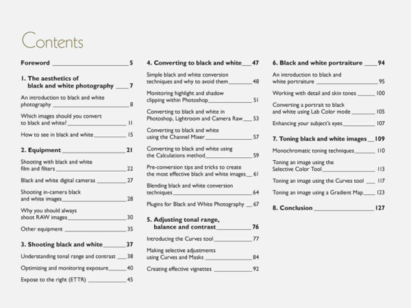
    Here’s the table of contents of the main guide:

    NewImage

    NewImageThe bonus guide (pictured right) shows you exactly how 10 black and white images were created – a fantastic companion to the main guide to show you how to put the theory into action!

    Don’t Miss This Deal

    Ready to take the quality of your black and white photography to a whole new level?

    Grab this amazing deal in before our 24 offer expires here.

    googletag.cmd.push(function() {
    tablet_slots.push( googletag.defineSlot( “/1005424/_dPSv4_tab-all-article-bottom_(300×250)”, [300, 250], “pb-ad-78623” ).addService( googletag.pubads() ) ); } );

    googletag.cmd.push(function() {
    mobile_slots.push( googletag.defineSlot( “/1005424/_dPSv4_mob-all-article-bottom_(300×250)”, [300, 250], “pb-ad-78158” ).addService( googletag.pubads() ) ); } );

    The post 2 B&W Photography eBooks Worth $ 30… Yours Today for $ 7 by Darren Rowse appeared first on Digital Photography School.


    Digital Photography School

  • Leica M9: kein Testbericht einer alten Lady

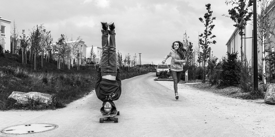
    Ein Kopfstand auf einem Skateboard

    Ein Beitrag von: Roman Tripler

    Wie alles anfing: Als ich mich entschlossen hatte, das Knipsen sein zu lassen und fortan fotografieren zu wollen, ging ich, meinem damaligen Budget entsprechend und den Ratschlägen eines befreundeten Fotografen folgend, auf die Suche nach einer passenden Kamera.

    Nach reiflichen Überlegungen und viel Gewühl in Zeitschriften wurde es eine Nikon D60 mit 18 – 55 mm Kit-Objektiv. Bis ich von völliger Ahnungslosigkeit zu einigermaßen vertretbaren Ergebnissen kam, verging einige Zeit und es waren nicht wenige Experimente und noch mehr Zeitschriften nötig.

    Ich kannte irgendwann die Funktionen der Kamera, kaufte wie von Sinnen Objektive, Blitz, Funkauslöser und einiges mehr an „nützlichem“ Zeug. Irgendwann war dann die D60 keine befriedigend gute Kamera mehr und ich brauchte dringend eine neue.

    Da halfen auch nicht die handwerklichen Fertigkeiten, die ich durch meinen Beruf als Bildbearbeiter einer Werbeagentur besaß. Es war mir zudem peinlich, bei einigermaßen guten Bildern mit einer solch kleinen Knipsbüx herumzurennen und ich brauchte dringend Megapixel, Schärfe usw. – das ganze Programm eben.

    Eine Frau raucht

    Unabhängig von meiner eigenen Fotografie habe ich seit meiner Jugend ein Interesse an Bildern anderer Fotografen gehabt. Ich habe diese sogar aus Zeitschriften ausgerissen und gesammelt, bis ein Umzug eine randvolle Kiste und einige Aktenordner voll verschwinden ließ.

    Geblieben ist aber eine Erkenntnis, die ich durch diese Bilder hatte: Die meisten meiner favorisierten Fotografen nutzen eine kleine, eher unscheinbare Kamera, die sich Leica M nannte.

    Nachdem mich nun viele weitere Testberichte zunehmend verunsicherten, welche Kamera dieses Mal die meinige wird, tauchten gegenwärtig immer wieder Vergleichstests der Platzhirsche von Nikon und Canon gegen die kürzlich erschienene kleine M9 von Leica auf. Dann hab ich den Preis gesehen, mal herzhaft gelacht und mich wieder den Testberichten gewidmet.

    Ich fasse das mal zusammen: Eine Kamera, die keinen Autofokus hat, für die es keine echten Zoomobjektive gibt und die nur eine Automatik hat: Das kann nix taugen. Und dann der Preis – lachhaft. Aber mit solchen Kameras haben die damals die Bilder gemacht, die mich heute noch einfangen und die nicht durch verschwenderische Bildbearbeitung eine glutamatartige Würze aufwiesen. Wie geht das?

    Ein Junge mit Hut

    Ein junger man mit Gesichts Make Up

    Es kam irgendwann der Zeitpunkt, an dem der erste Frust aufbrannte, mir kein Bild mehr so gelang, wie ich es vor meinem geistigen Auge hatte und ich erschreckend nah dran war, aufzuhören. Meine Frau grinste und sagte, dass es jetzt zwei Möglichkeiten gäbe: Entweder, das ganze Gelump wird schnellstens verkauft, dass es gerade noch etwas abwirft oder ich mach’s mit dem Fotografieren jetzt richtig.

    Entscheidungen

    Ich hab dann alles verkauft. Naja, alles bis auf den Body der D60 und die Standardlinste mit 18 – 55 mm, f/3,5 – 5,6 ohne Stabilisator und habe mit diesen ersten Paar Kröten begonnen, für die Leica M9 zu sparen. Dass es noch einige Zeit dauern würde, bis ich den Betrag zusammen haben würde, war mir klar.

    Mir war aber nicht klar, dass die D60 ein toller wie erstaunlich fähiger Begleiter und die Linse darauf zwar nicht lichtstark, doch im Rahmen ihrer Möglichkeiten ein ziemlich zuverlässiger und treuer Freund würde. Ohne krampfige Gedanken an die Technik funktionierte es auf einmal wieder mit dem Fotografieren.

    An dieser Stelle könnte man sich fragen, warum ich solch eine ausschweifende Einleitung schreibe und wann ich endlich von meinen Erfahrungen mit der M9 berichte. Die ersten Erfahrungen teile ich bereits, denn diese Vorfreude und das Auseinandersetzen mit dem Thema haben mir ein anderes Bewusstsein beschert. Diesen Weg, den ich im Zickzack gegangen bin, gehen viele Fotografen mit vergleichbaren Gedanken, Zweifeln und teils sinnigen, teils unsinnigen Handlungen.

    Das beweisen mir die E-Mails mit Fragen nach Kameras, die fast täglich mein Postfach erreichen. Ich möchte mit der Einleitung den oftmals quälenden Zustand beschreiben und eine weitere Erkenntnis mitteilen: Nämlich die, dass eine D60 auch heute noch eine richtig gute Kamera ist und dass so eine Entwicklung dazu beiträgt, die eigenen Bedürfnisse sowie die dazu passende Kamera zu finden.

    Eine Frau spiegelt sich in einem Eingang

    Ich hatte irgendwann genug Geld zusammen. Inzwischen war die M9P erschienen, die etwas teurere, dafür aber unauffälligere Variante mit weniger Leica-Branding und bruchsicherem Glas. Und es gab da irgendwo im Ruhrgebiet eine Arztfrau, die frustriert über das Geschenk ihres Mannes war.

    Eine Kamera, sündhaft teuer, die kein Live-View beherrschte, keinen blitzschnellen Autofokus besaß und ausschaute, als besäße sie jemand seit dem zweiten Weltkrieg. Diesem Umstand und der Vorliebe für zeitlose Designs verdanke ich meine M9P zu einem Preis, der ordentlich unter dem herkömmlichen Ladenpreis war. Die zwei Dutzend Auslösungen der ahnungslosen Dame störten mich nicht.

    Blick auf einen mann durch ein Schaufenster

    Der Umgang mit der Kamera

    Ich lernte die Kamera anfangs mit einem geliehenen 50-mm-Summicron kennen und experimentierte viel. Es hat keine Woche gedauert, bis ich das manuelle Fokussieren begriffen und ausreichend verinnerlicht hatte, dass ich zügig scharf stellen konnte. Ich war sogar überrascht, dass ich nahezu keine zeitlichen Einbußen im Vergleich zur DSLR hatte.

    Die Funktionsvielfalt der DSLR schöpfte ich auf der Straße ohnehin nicht aus und weil die Leica nicht viel mehr als die Grundbedürfnisse des Fotografierens bedient, war ich daher eher erleichtert, mich im aufgeräumten Menü zurechtzufinden und mich um gar nicht so viel kümmern zu müssen.

    Mit das Angenehmste, das mir aufgefallen ist, war eine spürbare Entschleunigung beim Fotografieren. Hat man einmal grob die Entfernung eingestellt, muss man keine großen Kapriolen mehr am Fokusring vollführen, wenn man nicht planlos herumhampelt und ständig drastisch die Entfernung zu möglichen Motiven verändert.

    Das geschieht sowieso nur dann, wenn man keine wirkliche Idee hat, was man fotografieren möchte und jedem potentiellen Big Picture, das sowieso keines wird, hinterherhechtet. Bei ausreichend Licht kann ich durch die Straßen ziehen und brauche so gut wie gar nicht mehr fokussieren. Beispielsweise stelle ich, wenn ich faul bin, Blende 8 ein und fokussiere hyperfokal, so ist ab etwas mehr als einem Meter Abstand alles scharf und ich kann mich rein auf den Ausschnitt konzentrieren.

    Ein Kopfstand auf einem Skateboard

    So wie die Aufmerksamkeit für die Kameraeinstellungen schwand, so sehr vervielfachte sich die Aufmerksamkeit für die Umgebung. Es war extrem befriedigend, denn ich hatte nun das Gefühl, zu fotografieren, also so richtig zu fotografieren.

    Die Kamera bringt einen förmlich dazu, eine Situation intensiver zu lesen, zu antizipieren, was geschieht. Die Komposition des Bildes formal und inhaltlich bekommt einen anderen Stellenwert. Man beginnt zudem, sich mit den Grundlagen der Fotografie zu beschäftigen, beispielsweise die Zusammenhänge von ISO, Blende und Zeit zu verstehen um auch in schwierigeren Situationen gewappnet zu sein.

    Am Ende eines Fototages waren dann auf einmal keine 500 Bilder mehr auf der Speicherkarte, sondern nur noch 100, davon „saßen“ aber deutlich mehr als je zuvor. Zudem verziehen die Linsen es einem, wenn man nicht hundertprozentig auf den Punkt fokussierte. Das Bild barg eine nicht eindeutig definierbare Natürlichkeit, die ich von der D60 und auch von anderen digitalen Kameras, die ich mittlerweile in der Firma nutzte, so nicht kannte.

    Mit 50 mm war ich mit dem Abstand, den ich persönlich für den richtigen hielt, jedoch zu nah am Geschehen und so schoß ich mir bei eBay ein Summicron 35 mm IV von 1991. Das Glas sah fabrikneu aus, mein Setup war nun perfekt. Mittlerweile gibt es Kameras, die gar keine Geräusche mehr verursachen und noch unauffälliger sind als man es mit der Leica ist, aber ich brauche das Geräusch des Auslösens um zu realisieren, dass ich das Bild tatsächlich auch gemacht habe und genieße es jedes Mal, wenn ich diese urige Mechanik wahrnehme.

    Sie ist tatsächlich noch mechanisch und kein Bestandteil eines digitalen Soundsets. Das seit Jahrzehnten marginal veränderte Design der M lädt zudem viele Menschen ein, mit mir darüber zu sprechen, weil eine uralte Kiste von Opa dahinter vermutet wird und ich von Passanten somit als Fotograf wahrgenommen werde. Der unliebsame Paparazzi-Faktor von Fotografen mit riesigen Bodies nebst aufgeschnalltem Kanonenrohr verschwindet spurlos.

    Ein Kind isst Zuckerwatte

    Die M9 im Dunkeln

    Ich hab mich lange gescheut, Konzerte mit der Leica zu fotografieren. Man sagt, bei ISO 800 sei bei der M9 finito. Das ist Unsinn. Wenn nicht gerade die Sonne zu grell scheint, habe ich meist ISO 800 eingestellt, weil mich das dezente Rauschen an das Korn der Abzüge meiner Vorbilder erinnert. Bei zunehmender Dunkelheit wird das Rauschen zwar stärker und die M9P hält sicher nicht mehr mit den gängigen Nachtsichtgeräten mit, doch gehe ich nicht selten bis zur maximalen ISO von 2500 hoch.

    Klar ist auch da irgendwann ein Limit erreicht, aber es bleibt dieses analoge Gefühl in den Bildern und die Ergebnisse sind durchaus gut. Darf’s ein wenig mehr sein? Ja, natürllich, deswegen liebäugle ich mit der Leica M Monochrom, weil ich ohnehin nur schwarzweiß fotografiere. Ich hätte sie mir auch gleich gekauft bzw. das halbe Jahr gewartet, hätte ich gewusst, dass sie erscheint. Aber wie damals mit der Nikon sehe ich, wie gut die M9 2014 samt Linsen trotz ihres für digitale Verhältnisse „hohen Alters“ ist.

    Ein Musiker bei einem Konzert

    Und macht die gute Bilder?

    Die M9 ist 2009 am Markt eingeführt worden und stand damals als kleinste vollformatige Systemkamera für überragende Bildqualität. Selbst fünf Jahre später sind die Ergebnisse bei optimalen Bedingungen und richtiger Belichtung wirklich schwer zu schlagen. Fotografiere ich JPGs, so bekomme ich Abbildungen der Umgebung, die meinem Sehempfinden entsprechen und eine Prise leicaesquen Charmes enthalten, von dem man hier und dort hören kann.

    Fotografiere ich in RAW, habe ich ein unglaubliches Spektrum an Bearbeitungsmöglichkeiten. Ich erwähnte, dass ich Bildbearbeiter bin. Ich bin es also gewohnt, Bilder unterschiedlichster Kameras zu bekommen und zu bearbeiten. Die RAWs der Leica sind bis auf den einzelnen Pixel „sauber“ und bieten mir sensiblen Spielraum für dezente wie große Anpassungen, wo ich bei RAWs von Canon und Nikon im gleichen Preissegment schon mal Schwierigkeiten bekomme.

    An dieser Stelle erinnere ich mich aber an meine alte D60 und daran, dass ich eine Ausstellung mit knackscharfen Abzügen der Größe 80 x 50 cm hatte. Und bevor irgendwelche Linienzähler auf die Barrikaden gehen: Geht in eine Ausstellung irgendeines Magnum-Fotografen und macht mit Eurer 1000-Gigapixel-ISO-5000000-Knipse so fesselnde Bilder wie die Mädels und Jungs, deren Bilder Ihr dort seht. Dann bin ich beeindruckt.

    Ein Mann steht vor einem Haus

    Was ich abschließend sagen möchte

    Wer vor der Wahl einer neuen Kamera steht, sollte sich zuerst immer fragen, was fotografiert werden soll. Zum Ausprobieren oder zur fotografischen Selbstfindung ist die Anschaffung teuren Geräts meist Unsinn, selbst, wenn die Leica mir bei meinem Weg geholfen hat. Ich hatte allerdings schon eine ziemlich genaue, wenn auch nicht hinreichend formulierte Idee davon, was ich machen wollte.

    Wer nur probiert, sollte sich nichts Größeres holen, wie die Nikon D60, es sei denn, Geld spielt keine Rolle. Aber selbst dann verleitet der Glaube an Megapixel und Co. zu Faulheit und man überlässt der Kamera schnell die eigentliche Arbeit am Bild. Das Ergebnis wird tendenziell enttäuschender sein.

    Die Leica M9 ist das, wofür sie entwickelt und gebaut wurde: Ein Fotoapparat. Auf höchstem Niveau entwickelt, dem digitalen Zeitalter angepasst und mit äußerster Präzision hergestellt, überlebt sie eine Kamera-Generation nach der anderen.

    Sie bräuchte für die nächsten 50 Jahre vielleicht nicht mehr als ein wenig mehr Lichtempfindlichkeit und etwas schnellere interne Verarbeitung, denn die ist leider noch auf dem Stand von 2009. Ich werde dem System treu bleiben, irgendwann vielleicht um die Monochrom erweitern, denn ich bin ziemlich glücklich und zufrieden mit ihr.

    Und wieder kommt mir der Gedanke: Eine Kamera, die keinen Autofokus hat, für die es keine Zoomobjektive gibt und die nur eine Automatik hat? Genau das Richtige für mich!

    kwerfeldein – Fotografie Magazin | Fotocommunity

  • Fungi Farm Prototype Turns Waste Plastic into Edible Treats

    [ By WebUrbanist in Conceptual & Futuristic & Technology. ]

    fungi muratium toxic waste

    Breaking down one of the most difficult types of trash, this incredible working incubator turns sterilized plastic remnants into nutritional biomass humans can consume and digest, in short: food. Texture, taste and flavor depend upon the strain of fungus, but reportedly can be quite strong as well as quite sweet.

    fungus growth system

    fungi plastic utensil set

    fungi eating good

    Livin Studio, an Austrian design group known for innovative work on insect farms, has built a working model of this growth sphere (dubbed the Fungi Mutarium) that takes parts of mushrooms usually left uneaten and grows them into fresh snacks.

    fungi eating growth sphere

    From the creators: “We were working with fungi named Schizophyllum Commune and Pleurotus Ostreatus. They are found throughout the world and can be seen on a wide range of timbers and many other plant-based substrates virtually anywhere in Europe, Asia, Africa, the Americas and Australia. Next to the property of digesting toxic waste materials, they are also commonly eaten. As the fungi break down the plastic ingredients and don’t store them, like they do with metals, they are edible.”

    fungi incubation chamber diagram

    In terms of the process, “Fungi Mutarium is a prototype that grows edible fungal biomass, mainly the mycelium, as a novel food product. Fungi is cultivated on specifically designed agar shapes that the designers called FU.  Agar is a seaweed based gelatin substitute and acts, mixed with starch and sugar, as a nutrient base for the fungi. The FUs are filled with plastics. The fungi is then inserted, it digests the plastic and overgrows the whole substrate. The shape of the FU is designed so that it holds the plastic and to offer the fungi a lot of surface to grow on. “

    fungus diagram design

    For now, the digestion is a relatively slow process, taking up to a few months for a set of cultures to fully mature, but by the standards of plastic biodegrading in nature this is still an extraordinary feat. The team continues to work with university researchers to make the process faster and more efficient. “Scientific research has shown that fungi can degrade toxic and persistent waste materials such as plastics, converting them into edible fungal biomass.”

    fungi edible grown creaiton

    fungi plastic eating design

    This novel application comes just a few years after a group of Yale students discovered a species of fungi on a trip to Ecuador as part of a Rainforest Expedition and Labratory led by a molecular biochemist. Even in the absence of light and air, the species they examined thrived in landfill environments, suggesting potential near-future and larger-scale solution for existing waste sites as well.

    Share on Facebook


    [ By WebUrbanist in Conceptual & Futuristic & Technology. ]

    [ WebUrbanist | Archives | Galleries | Privacy | TOS ]


    WebUrbanist

  • 15 December, 2014 – Camera Equipment Of The Year 2014


    It’s been an interesting year photography wise with some groundbreaking new products.  The trend is towards mirrorless and the stand out products this year fell into the mirrorless category.  As always Luminous-Landscape has its eye on the hot gear.  Today Michael Reichmann and Kevin Raber share their Camera Equipment Of The Year report.  Read what they thought was hot and not as well as disappointments and predictions for the coming year.

    We have an opening on the second Antarctica Trip in January.  If you are interested in this trip and a special offer please contact Kevin Raber for details.


    The Luminous Landscape – What’s New

  • How to Use LAB Color in Photoshop to Remove an Unwanted Color Cast

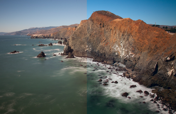
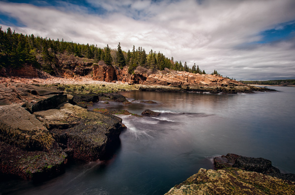
    Marin County Headlands with LAB adjustments

    In a recent article about the LAB colorspace, I covered the basic LAB move to enhance colors. Hopefully that gave you an idea of the power of the LAB colorspace to manipulate color in Photoshop. In this article we are going to build on that a little bit. Whereas in the last article we simply used the basic LAB color move to enhance color, now we will get into color manipulation. Specifically, I will show you how to remove an unwanted color cast from your photos using LAB. In many ways doing this in LAB is simpler and more powerful than doing it in your normal color space (RGB).

    Setting the stage

    Removing color casts and manipulating color will be simple for you once you know a little bit about how LAB color works, so first let’s make sure you understand what is going on in the LAB colorspace. Once you understand how LAB works, everything else will be easy.

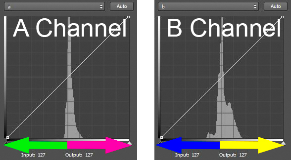
    LAB stands for Lightness, A channel, and B channel. The L channel strictly controls lightness and we won’t be working with it for purposes of this article. All color in the LAB colorspace is within the A and B channel. The A channel consists of greens and magentas. The B channel consists of blues and yellows. The histogram in both of these channels almost always looks like a spike in the middle of the histogram. Because LAB is such a ridiculously broad color space, there will be a lot of empty space on either side of the histogram. As you saw in the last article, this empty space is what gives us the opportunity to enhance color so effectively in the LAB colorspace.

    LAB color graphic

    Now let’s look at the histogram of the A channel more closely so that you can see how this works. The A channel is a combination of green and magenta. The further to the left you are in the histogram, the more green is present. Conversely, the further to the right you are in the histogram, the more magenta is present (see diagram above).

    The middle of the histogram is a gray tone without any real color. It is designated as zero. As you move away from the zero (gray) point in the middle, more color is added. To the left, the numbers go into negatives (all the way down to -128) and things get more green. To the right, you move into positive numbers (toward a max of +127) and things get more magenta (pinkish).

    It works exactly the same way in the B channel, only the colors are different. In the B channel you still have a starting middle point of zero, which is also gray. But, as you move to the left on the histogram towards -128, the colors get bluer. As you move to the right towards +127, the colors get more yellow.

    Also note that the center line of the histogram runs right through the zero in the center of both the A and B channels. This will be important for identifying and correcting color casts.

    If you are still with me thus far, everything will be easy from here. Now you can take what you just learned and see how to identify and fix color casts easily in LAB.

    Identifying color casts easily

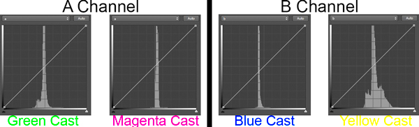
    It is easy to identify a color cast in LAB mode. Just look at the A or B channel. If the colors are more or less evenly distributed on either side of the midpoint of the histogram, your picture will probably not have a color cast. But if the histogram values are skewed to the left or to the right of the histogram, you are probably have a color cast. Here is how it works in the A and B channels:

    • In the A channel, if the colors are more on the left side, you will have a greenish color cast in your image. If they are to the right, you will have a magenta color cast.
    • Similarly, in the B channel you know if the histogram appears shifted to the left, you will have a bluish cast to your picture. If the values are to the right of the histogram, your picture will appear more yellow.

    LAB color cast chart

    In this way, the LAB colorspace makes it super simple to determine if you have a color cast. Just look at the middle of your histogram, and if the colors are skewed to one side or the other, you know you have a color cast or shift. This is important because a slight color cast is not always apparent to the naked eye. Your eye gets acclimatized to seeing the picture in a certain way, and accepts that as normal. Now this we’ve identified a color cast, let’s set about fixing it.

    Fixing  color casts in LAB

    Much of the power of the LAB colorspace comes from scooting in the endpoints on either side of the histogram. In the last article, we did that to separate the colors, which enhances them. We moved the endpoints in toward the center the exact same amount on each side of the histogram. That enhanced colors without affecting the overall color cast of the picture. This time, however, we are going to move the endpoints in different amounts to fix color casts.

    For example, let’s say your picture has a blue color cast. When you open up the B channel, the spike showing color is skewed to the left of center on your histogram. To fix it, you simply scoot in the right endpoint of your histogram more then the left endpoint. It’s as simple as that.

    Let’s try another example, let’s say you open the A channel of one of your pictures, and noticed that the values are skewed to the left of center on the histogram. That means that you likely have a green color cast. To fix it, simply scoot in the right endpoint a little bit. Don’t do it too much, usually three to five points will make a major shift in color.

    Identifying and fixing a slight color cast

    This might make more sense to you if we walk through an actual example. So here’s a good example of everything we have been talking about in this article so far. We will start with a photo that I was in the process of editing:

    Original photo with color cast

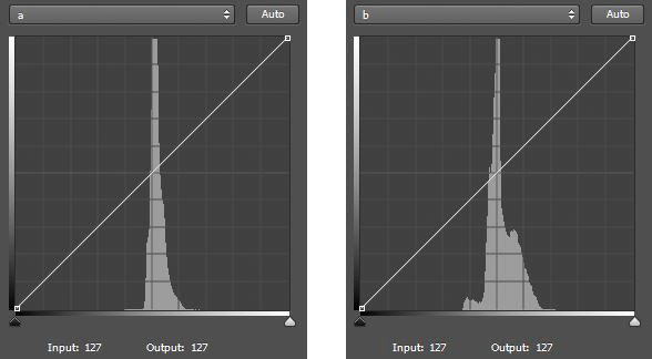
    I frankly did not see a color cast, however, I decided to check it out. I converted to LAB, opened a Curves Adjustment Layer, and looked at the histogram of the A channel and the B channel. Here is what I saw:

    Histogram showing A & B channels

    Two histograms in LAB. The left histogram is the A channel. The right histogram is the B channel. Notice that both are skewed to the right of the centerline – a sure sign of a color cast in the picture.

    Notice that in the A channel most of the pixels are stacked up to the right of the center line on the histogram. That is a sure sign that there are more magenta pixels than green in the picture. Notice also that in the B channel most of the pixels are also stacked up to the right of center, which means there are more yellows than blues in the picture. Neither necessarily means there is anything wrong with the image, but that might mean a color cast. So let’s make an adjustment as described above and scoot in the left endpoints a little bit in each channel. Here are the two minor moves I made:

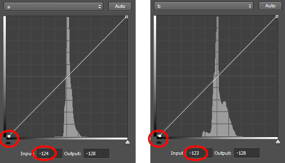
    Histograms of A & B channels - after adjustment

    Here are the histograms after the adjustments. Notice that I pulled in the left endpoints of each to the center.

    All I did was pull the left endpoint of each histogram to the center a little bit to offset the fact that the colors are skewed to the right of the histogram in each channel. As mentioned above, a change of three to five points will create a large adjustment, so that is all I did. As the numbers below the histograms reflect, I made the following adjustments:

    • A Channel:  I pulled the left endpoint to the center by four points (from -128 to -124).
    • B Channel:  I pulled the left endpoint to the center by five points (from -128 to -123)

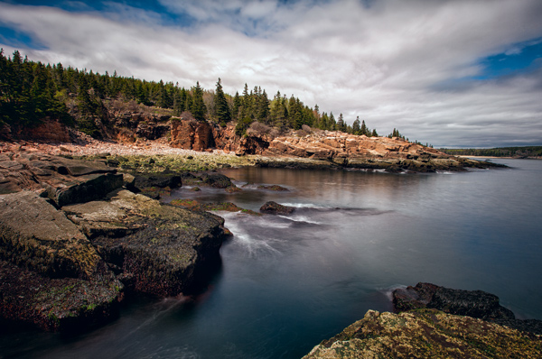
    After the adjustment, here is the resulting picture:

    Acadia After LAB adjustment

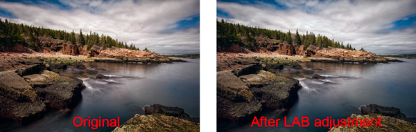
    I think it looks better now. To me, it had a color cast that I just wasn’t seeing. The difference is subtle, but significant. In particular, look at the clouds. Here are the before and after pictures side-by-side:

    Comparison

    The original picture is on the left. The picture on the right had is after a minor LAB adjustment. I did not even see the original color cast, but I think it looks better after the adjustment.

    Incorporating this into the LAB color move

    Sometimes, you will notice that the spike in the A or B channel is to one side of the center of the histogram, but you do not really want to change the overall color of the picture. It is still important to understand what is going on when you are making your normal LAB color move.

    If you ignore the shift to one side or the other, then when you scoot in your endpoints by equal amounts, you may be exacerbating the color shift. Therefore, keep an eye on your histogram and try to make your shift pivot around the spike rather than on the center of the histogram. In other words, if the pixels are to the right of the histogram, scoot in your left endpoint a little bit more (and vice versa). In this way, you can make your normal LAB color move, but at least not add any color cast to your picture.

    Why not just do this in RGB?

    You may be asking, can’t I just remove color casts in RGB? The answer, of course, is yes. But the LAB colorspace has advantages that I want to make sure are clear to you.

    First, because LAB separates Lightness from all color adjustments, LAB allows you to fix these casts without any impact on lightness or contrast. This is not possible in RGB. When you affect the red channel, green channel, or blue channel in RGB, you are necessarily affecting lightness. It is all tied together in RGB.

    Second, LAB makes it easier to identify color casts. As you saw above, you just open up the A or B channel and see if the spike is shifted to one side of the histogram. If it is, you likely have a color cast. If it isn’t, you do not. In RGB, you have to compare channels and see how one channel appears compared to the other two channels.

    Isn’t this like setting your white balance?

    You may have noticed that the LAB colors correspond with the sliders in Lightroom or Adobe Camera Raw (ACR) that are used to set the white balance in your picture. You can think about LAB in those terms and it might help you to understand how the colors work together. But using LAB to manipulate color offers certain advantages over just setting your white balance. For one thing, you can change the colors later in your workflow, and are not compelled to do it right up front. For another thing, you can take advantage of Photoshop’s layers and selections in manipulating color. Although Lightroom and ACR have very helpful aids in setting the while balance, like the White Balance Selector (the little dropper) or the presets, there is no histogram to allow you to really see and fine-tune your changes.

    Applying this to your worklflow

    What the technique shown in this article will allow you to do, is make your normal LAB color move in a more nuanced fashion. In the last article, I showed you how to make the LAB color move in a basic, unthinking way. You simply moved the endpoints of your A channel and B channel by equal amounts. It is sort of a one-size-fits-all approach, which doesn’t always work in photography. Now, you can use this to manipulate color a little bit or at least keep it from getting worse as you edit.

    I have talked about correcting color casts as if there was a special correct way. But of course that isn’t really true and what looks correct to me might not look exactly right to you. Use your own judgment and do what seems right to you. As you make these moves, however, you might want to bias them in one direction or another. Remember that sometimes a color cast can add effect or mood to your picture. Sometimes a slight color cast just looks good. For example, a warmer tone created by a yellow or magenta cast can actually enhance your picture. Sometimes, but less often, a bluish cast can be appropriate. Also remember that a greenish cast never looks good and should be avoided.

    I know it can sometimes be confusing knowing where colors reside, and how to fix them within the LAB color space. To try to make it easier for you, here is a chart:

    LAB Color Casts Chart

    Conclusion

    The LAB colorspace is a powerful beast. You previously learned how to unleash that power by using the basic LAB color move. Using the technique in this article will allow you to tame that beast a little bit. It will allow you to use the power of LAB without getting garish effects or color casts in your pictures. It will also allow you to fix these color casts simpler and easier than anything that RGB allows. Give it a try and see if it corrects your colors.

    googletag.cmd.push(function() {
    tablet_slots.push( googletag.defineSlot( “/1005424/_dPSv4_tab-all-article-bottom_(300×250)”, [300, 250], “pb-ad-78623” ).addService( googletag.pubads() ) ); } );

    googletag.cmd.push(function() {
    mobile_slots.push( googletag.defineSlot( “/1005424/_dPSv4_mob-all-article-bottom_(300×250)”, [300, 250], “pb-ad-78158” ).addService( googletag.pubads() ) ); } );

    The post How to Use LAB Color in Photoshop to Remove an Unwanted Color Cast by Jim Hamel appeared first on Digital Photography School.


    Digital Photography School

  • Die 5 Fotowettbewerbe des Monats

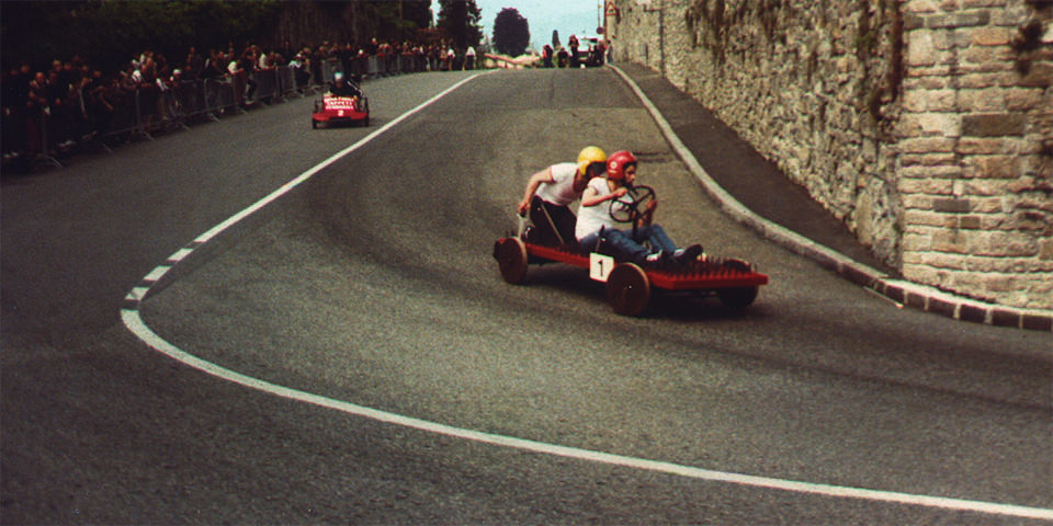
    Seifenkistenrennen

    Wettbewerbe gibt es wie Sand am Meer. Wir versuchen, Euch die besten aus dem unüberschaubaren Angebot zu fischen und präsentieren Euch jeden zweiten Sonntag im Monat fünf ausgewählte. Wer die alten browserFruits hier vermisst, den verweisen wir gern auf unsere Kategorie Ausblick, in der wir zusammen mit dem Bild des Tages auch täglich drei interessante Links präsentieren. Und nun viel Erfolg bei den Wettbewerben.


    1. Sony World Photography Awards 2015

    Der Sony World Photography Award ist ein sehr großer Wettbewerb, bei dem man nach kostenloser Registrierung bis zu drei Bilder einreichen kann, bei bezahlter Mitgliedschaft auch bis zu 20. Es gibt drei Bereiche: Die Open Competition für alle Hobbyfotografen, die Professional Competition für professionelle Fotografen und den Youth Award für alle bis zum 19. Lebensjahr.

    Je Bereich gibt es verschiedene Kategorien, bei denen sicher für jeden Fotografen etwas dabei ist und die auf der Webseite des Wettbewerbs noch genauer erklärt werden. Zu gewinnen gibt es 5.000 $ , Abdruck im Wettbewerbsbuch, eine Ausstellung in London sowie der Flug nach London zur Gala-Zeremonie. Einsendeschluss ist je nach Bereich der 5. bis 8. Januar 2015.


    2. Exposure Awards 2014 von LensCulture

    Ein weiterer großer internationaler Wettbewerb wird von LensCulture veranstaltet. Offen ist er für alle Arten der Fotografie und teilt sich in zwei Kategorien: Einzelbild und Serie. Es werden 6 Gewinner und 25 Finalisten durch eine Jury ausgewählt. Auf die Gewinner warten insgesamt 10.000 $ Preisgeld sowie eine Ausstellung in London.

    Die Teilnahmegebühr für die Kategorie Einzelbild liegt für ein Bild bei 20 $ , für 2 bis 3 Bilder bei 45 $ . In der Kategorie Serie zahlt man 65 $ . Der Einsendeschluss ist der 22. Dezember 2014.

    Dass die Konkurrenz sehr stark ist, beweisen die Gewinner des letzten Wettbewerbs von LensCulture mit dem Thema „Visual Storytelling“.


    3. BRITA Kunstpreis 2015

    Ein Wettbewerb für professionelle Fotografen mit künstlerischer Ausbildung und nachgewiesener Ausstellungstätigkeit ist der BRITA Kunstpreis. Das Thema ist „Endlich und unendlich – Natur als wertvolle ökonomische Ressource im Wandel“. Der mit insgesamt 10.000 € dotierte Kunstpreis wird sich auf vier Preisträger verteilen.

    Die Werke der Preisträger werden ab Ende April 2015 in einer Ausstellung im Kunsthaus Wiesbaden gezeigt, zu der auch ein Katalog produziert wird. Bewerben muss man sich postalisch mit Kurzvita und Bewerbungsformular. Einsendeschluss ist der 26. Januar 2015.


    4. Canon Profifoto Förderpreis

    Der Canon Profifoto Förderpreis ist ein fortlaufender Wettbewerb. Den Gewinnern winken zwei Mal jährlich Sachpreise nach Wahl von Canon im Wert von 2.000 €. Es werden Fotografie-Projekte gefördert, die erst noch realisiert beziehungsweise erweitert oder beendet werden sollen, wie zum Beispiel Diplomarbeiten, Semesteraufgaben oder freie Arbeiten.

    Teilnehmen können alle, die ihre Ausbildung in Fotografie oder Foto-Design gerade absolvieren oder abgeschlossen haben und professionell in der Fotografie oder artverwandten Berufsgruppen tätig sind. Das Höchstalter für die Teilnahme ist auf 30 Jahre begrenzt. Einsendeschluss ist am 2. Januar 2015 um 12:00 Uhr.


    5. Junge Fotografie Stipendium des Stern

    Die Redaktion des Stern vergibt jedes Jahr ein Stipendium an einen Nachwuchsfotografen mit einem abgeschlossenen Studium im visuellen Bereich. Der Gewinner hat die Chance, ein Jahr auf Vertragsbasis für den Stern zu arbeiten. Der Schwerpunkt liegt auf moderner Portrait- und Reportagefotografie.

    Euer Abschluss darf nicht länger als ein Jahr zurückliegen und Ihr dürft nicht älter als 35 Jahre sein. Der Einsendeschluss ist hier der 15. Januar 2014.


    Kurzmeldungen

    Natürlich gibt es auch viele kleine Wettbewerbe. Vor allem auf Facebook erfreuen diese sich großer Beliebtheit. Zum Beispiel der aktuelle Wettbewerb von Walimex, der bis zum 17. Dezember Euer bestes Foto von 2014 sehen will. Wem bei Nennung von Facebook leichtes Unbehagen überkommt, der kann sich beim Magazin „Der Greif“ umsehen: Bis zum 22. Dezember 2014 kann man sich hier für eine Online-Ausstellung bewerben.

    Ihr kennt weitere tolle Wettbewerbe? Dann schreibt unserer Redakteurin Katja Kemnitz eine E-Mail oder ergänzt die Liste auch gern in den Kommentaren.


    kwerfeldein – Fotografie Magazin | Fotocommunity

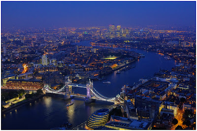
  • Now Live on Lynda.com: The Traveling Photographer_LONDON

    For much of 2014, I have been on the road for Lynda.com, producing the series, The Traveling Photographer. The latest episode, on London, has just posted.

    Hard to believe it, but we have now logged over 50,000 miles. In addition to Hong Kong, Dubai, Paris and London, we have just finished filming the New York City segment, which will be published soon.

    For more information about the entire series, see this earlier post.


    Strobist