Try to make your HDR images look as realistic as possible
If you have been photographing for more than a year or two, you will have heard about HDR (which stands for High Dynamic Range). We have probably seen them, the “overcooked”, over processed HDR images that float around the photo websites. For some photographers, the process seems to force them to overdo their images and after a while that seems to be the only result they are trying to achieve. Do a Google search on “bad HDR” and you will see what I mean. The images have halos, the colours are surreal and look metallic, the contrast is off and in short, the image is really messy.
When I first shot HDR, I fell into this trap too. These results caused many photographers to say that HDR is not a useful technique and is really gimmicky. That perception is partly true. HDR in the hands of someone who cannot use it effectively can result in some weird looking images, however, HDR done properly can produce some incredible results. To see some good examples of HDR done properly, visit the website HDR Spotting and take a look at the editors picks. There are some astounding images there. The colours are amazing, the contrast is perfect and the detail in the shadows and highlights, sublime. That is what HDR should be. It should be the best combination of the highlights and the shadows properly exposed, the image should look as real as it can. So, how do you get this right you might be asking, read on to find out.
What is HDR?
As I said earlier, HDR stands for High Dynamic Range. Your cameras sensor has the ability to capture light and colour. The extent to which your camera can do this is called the dynamic range. More specifically, if your camera can render lots of details in the shadows and the highlights in the same shot, then it has a high dynamic range. Over the past few years, digital sensors have become so much better at capturing more detail. This is a huge benefit for photographers and of course for HDR photography. This means that we can get more details out of every image and as a result, the HDR images will be that much more detailed.
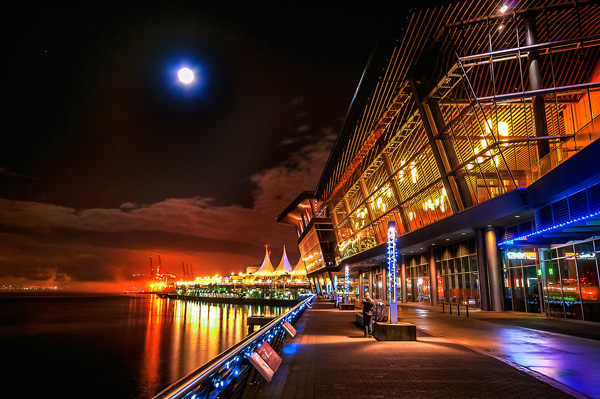
Lions Gate Bridge Vancouver – HDR image
How do I shoot HDR?
Making an HDR image involves 3 distinct and separate processes. I will go into detail on each one, but at a high level, they are as follows:
- Image Capture
- HDR Processing
- Image editing in Photoshop
Lets start with image capture first. This is the photography part of this process. It’s pretty simple really. Set up for your shot as you normally would. Make sure you have your subject well composed and you are ready to go. The difference between HDR and normal photography, is that with HDR you will take either three to five bracketed images of the same scene. The reason for the number of images is that you will blend these images together in a dedicated HDR product.
My recommendation for HDR software is Photomatix Pro. It is a programme that has been around for many years now and has some really good editing functions. It’s probably the most widely used software when it comes to HDR. Photoshop also has an HDR function, but in my opinion, its not as refined as the Photomatix Pro yet. Don’t get me wrong, I am a huge Photoshop fan, it is an incredible tool, I am sure that Photoshop will have something within their functions that will be competitive in time, but for now, I still use Photomatix.
Step #1 – Image capture
These are the steps I follow when I intend to do an HDR shot. They are not rules, nor are they inflexible, they just work for me. You need to find what works for you and gives you the best results, this method has helped me get my best results, so try it out. Tweak it and change it as you need.
- Use a tripod – it is a good idea to put your camera on a tripod for HDR, especially if you are shooting in low light. I have done some handheld HDR but only in bright conditions. The tripod will also help you get your composition right.
- Put your camera into Manual mode “M”
- ISO Settings – it is a good idea to keep your ISO settings at 100 or as low as your camera will go. That way you will avoid introducing unnecessary noise into your images. The process of HDR allows you to capture the dynamic range of light and colour in the scene. Using high ISO settings is great when you are trying to shoot a low light scene and capture it in one shot, but for HDR you will want to keep it as low as possible.
- Set your aperture to anywhere between F/8 and F/ 11 and don’t adjust your aperture between shots.
- Adjust your shutter speed so that you are exposing the scene perfectly according to your cameras light meter.
- Capture one image at this reading
- Underexpose by one or two stops (depending on the scene) and capture another image by adjusting your shutter speed.
- Do this twice on either side of the perfectly exposed image.
This will result in five images being captured.
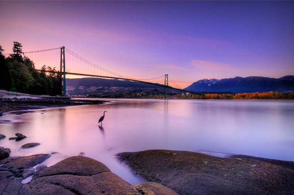
Below are the three images I used in making the HDR image you see above. Take a look at how the colours and exposure don’t look good at all.
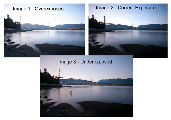
3 Different exposures for the HDR image above
Some photographers use five shots for their HDR shots, some use seven or up to nine. I have found that three to five shots seem to work best for most scenes. I have only used nice shots on a few occasions, but have not been happy with the results. The colours seem to be “muddy” and unclear once processed. If necessary, shoot seven images and see how that works.
Once you have completed the shoot, download the images to your computer. It is important NOT to edit the images before blending them into an HDR image. Some of the shots might look over exposed or under exposed, thats OK, in fact they must look like that. The software will deal with these issues, so don’t be concerned that the images look bad out of camera, they need to be processed and then the magic begins.
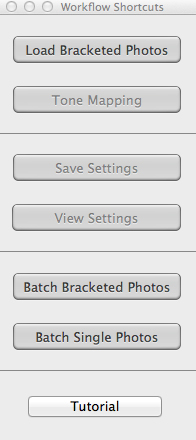
Click “Load Bracketed Photos”
Step #2 – HDR processing
I will be explaining the Photomatix software in this article. I have tried HDR with each new version of Photoshop and I am still happier with the results I get from Photomatix Pro. You can download a trial version of Photomatix from their website. It is fully functional, the only thing is that the trial version puts a watermark on the image. This is OK for trying it out, you will see exactly what the software can do, if you think it is worth it, then you can buy it. Ok, so here is how you take your images into Photomatix Pro
- Open Photomatix Pro (or if you’ve set it up as a Lightroom plugin, select your bracketed images, right click and choose “edit in” and Phototix Pro)
- Click ”Load Bracketed Photos” and then click on “Browse” and select the images you have taken (you can also drag and drop them into the box)
- Click OK once the images appear in the box
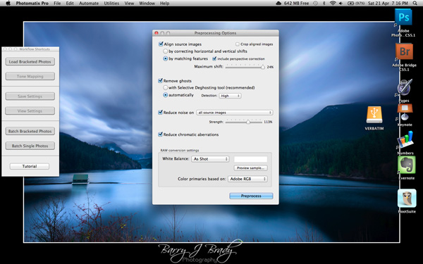
Select the options displayed on the screen above
Preprocessing options are available. Make selections on the box as shown in the screenshot above. Then click preprocess and Photomatix Pro will begin to tone map the images into a composite 32-bit image. This process is generally quite quick, between 30 seconds and a minute. Once complete, click on the Tone Mapping button.
Use the “Remove ghosts” function if you have people or moving objects in your images. If you don’t have this, then you wont need to use this function.
The HDR editing screen
On this screen, you are able to select a variety adjustments that will create an overall change to the image. There are no absolutes here. Each adjustment makes minor or major differences to the image and the combination of the adjustments provides diverse options.

At the bottom of the screen you will see different “treatments” (or presets) which you can use as a starting point to your image editing process. I would avoid using these as they are generally overdone. Try and use the functions on the left hand side to edit your image.
Below are the details about each function on the left hand side of the screen and what each does. One of the best ways to see what a function does is to slide it all the way over to the left and then to the right and see how it affects your image, but here are the details:
General Settings
- Strength – affects the degree to which contrast and detail are enhanced in the image. A value of 100 gives the maximum amount of enhancement. To get a more natural effect, move the slider to the left. The default value is 70.
- Color Saturation – controls the saturation of the RGB color channels. The greater the saturation, the more intense the color. Move the slider right or left to change the setting. A value of zero produces a grayscale image. The value affects each color channel equally. The default value is 46.
- Luminosity – controls the compression of the tonal range, which has the effect of adjusting the global luminosity level. Move the slider to the right to boost shadow details and brighten the image. Move it to the left to give a more “natural” look to the resulting image. The default value is zero.
- Detail Contrast – controls the amount of contrast applied to detail in the image. Move the slider to the right to increase the contrast of the details and give a sharper look to the image. Note that increasing the contrast also has a darkening effect. Move the slider to the left to decrease the contrast of details and brighten the image.
- Lighting Adjustments – affects the overall ‘look’, controlling the extent to which the image looks natural or surreal. When the Lighting Effects Mode box is unchecked, move the slider to the right to make the image look more natural and to the left to make it look more ‘painterly’ or ‘surreal’. Use this carefully as it can have an unpredictable effect on your image.
- Lighting Effects Mode – the checkbox lets you switch between two modes for the Lighting Adjustments setting,where each mode produces slightly different results. Checking the box tends to produce results with a type of ‘Magic Light’ effect.
More Options
- Smooth Highlights – reduces the contrast enhancements in the highlights. The value of the slider sets how much of the highlights range is affected. This control is useful for preventing white highlights from turning grey or uniform light blue skies becoming dark blue-grey. It is also useful for reducing halos around objects placed against bright backgrounds. The default value is zero.
- White Point and Black Point – these sliders control how the minimum and maximum values of the tone mapped image are set. Moving the sliders to the right increases global contrast. Moving them to the left reduces clipping at the extremes. The White Point slider sets the value for the maximum of the tone mapped. The Black Point slider sets the value for the minimum of the tone mapped image.
- Gamma – adjusts the mid-tone of the tone mapped image, brightening or darkening the image globally. The default value is 1.0.
- Temperature – adjusts the color temperature of the tone mapped image relative to the temperature of the HDR source image. Move the slider to the right to give a warmer, more yellow-orange colored look. Move the slider to the left for a colder, more bluish look. A value of zero (default) preserves the original color temperature of the HDR source image.
Advanced Options
- Micro-smoothing – smoothes local detail enhancements. This has the effect of reducing noise in the sky, for instance, and tends to give a “cleaner” look to the resulting image. The default value is 2. Important note: The Loupe may not properly show the effect of the Micro-smoothing setting when the area magnified is uniform. If you want to see the effect of the Micro-smoothing setting at 100% resolution on a uniform area such as the sky, you will have to select an area that contains an object in the scene in addition to the sky.
- Saturation Highlights – adjusts the color saturation of the highlights relative to the color saturation set with the Color Saturation slider. Values higher than zero increase the color saturation in the highlights. Values lower than zero decrease it. The default value is zero.
- Saturation Shadows – adjusts the color saturation of the shadows relative to the color saturation set with the Color Saturation slider. Values higher than zero increase the color saturation in the shadows. Values lower than zero decrease it. The default value is zero.
- Shadows Smoothness – reduces the contrast enhancements in the shadows. The value of the slider sets how much of the shadows range is affected. The default value is zero.
- Shadows Clipping – the value of the slider sets how much of the shadows range is clipped. This control may be useful to cut out noise in the dark area of a photo taken in a low-light situation. The default value is zero.
Once this part of the process is finished, then it is time to take the image into Photoshop. Save the tone mapped image and then re-open it in Photoshop.
Step #3 Image Editing in Photoshop
This is a very basic workflow. It will enhance the lighting and tonality in your images. These techniques are discussed here at high level.
Shadows and Highlights
Photoshop has a function called Shadows and Highlights. Use this tool to bring out detail in the shadows of your image. Use it carefully, if you overdo the treatment on the shadows, there may be some unsightly image degradation or “noise”. This function is not great for adjusting highlights, so use it for the shadows only. This tool is found in Photoshop as follows: IMAGE > ADJUSTMENTS > SHADOWS AND HIGHLIGHTS. The adjustments of AMOUNT, TONAL WIDTH and RADIUS should all be kept aligned close to one another to ensure that the adjustment looks realistic.
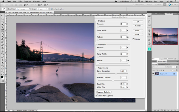
Shadow and Highlights function in Photoshop
Levels Function
The levels function in Photoshop is for adjusting the lighting in an image. This means that if your image is a little dark you can push up the exposure slightly and see more details in the image. The levels function shows a representation of a histogram. Move the sliders in to touch the edge of the histogram as a general rule. This will ensure that your image has a good representation of highlights and shadows.
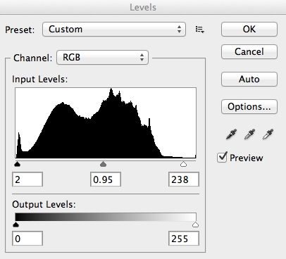
The Levels functioning Photoshop
Hue and Saturation
Once the exposure and lighting has been adjusted and looks correct, then you may begin adjusting the colour in the image. The tool to use will be the Hue and Saturation tool. The important tip here is not to adjust the master channel but rather to adjust by each channel independently. To do this, click on the top toggle button that says “default”. A drop down menu will appear and each colour channel will be available from there. Slide the Saturation Slider to the left to desaturate (remove colour) or to the right to saturate. That way you have the best control of the colour in your image.
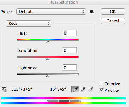
Hue and Saturation Function in Photoshop
Dodging and Burning
These functions are localized adjustments. By using a brush tool, you are able to make certain areas of the image darker and other areas of the image lighter. This is useful for adding the finishing touches to your image. There is also the sponge function which is a saturation tool which can saturate colours at a local level.
Sharpening
Almost every image that comes out of a digital camera requires sharpening of some sort. The easiest and quickest tool to use is the Unsharp Mask tool and it works effectively.
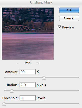
Unsharp Mask Tool in Photoshop
The Unsharp Mask has three separate sliders: Amount, Radius and Threshold. As a general rule you can keep the Amount anywhere between 80 and 120%, Radius can be set between 1.0 and 3.0 pixels and Threshold is generally at zero. Adjust the sharpness of the image according to each image requirement and beware of degrading the image by over sharpening. You will easily notice if an image is over sharpened by the appearance of a “halo” around certain edges in the image. The idea is to sharpen the image but not make it overly sharp and lose image quality.
Once you are done, save your image and thats it! Have a go, try different settings in different light, let me know what you think and how your images turn out. If you have any questions, drop them into the comments box below.
Please leave your comments and questions below. If you want more HDR tips, try some of these articles:
- HDR Vertorama Photography – How to Create Mind-bending Images
- Five Minutes to Realistic HDR using Lightroom and a 32-Bit Plugin
- The 10 Steps Every HDR Photographer Goes Through
- Exposure Blending Using Luminosity Masks Tutorial
The post Getting Real with HDR – a Step by Step Tutorial for Realistic Looking HDR by Barry J Brady appeared first on Digital Photography School.

Digital Photography School


You must be logged in to post a comment.