Month: October 2013

  • Augenschmaus: Beeren-Pizza mit Nutella

    Ein Beitrag von: Elisabeth Cölfen

    Ich hatte einen Haufen Beeren und wusste nicht so genau, was ich damit anfangen sollte. Ein kurzer Inspirations-Trip ins Internet brachte mich auf die Idee, eine Beerenpizza zu machen. Total pervers, aber warum nicht?

    Am Ende habe ich mich für eine Kombination aus einem lockeren und weichen Pizzateig und Nutella als Belag entschieden: Wenn schon, dann richtig! Auch, wenn wir das Ergebnis nur probiert und den Rest an unsere Nachbarn verteilt haben, waren wir uns einig: Wow. Der Saft tritt aus den heißen Früchten und vermischt sich mit warmem Nutella … Food-Pornografie pur.

    Zutaten

    Für den Teig:

    450 g Mehl
    250 ml Wasser
    1 Päckchen Trockenhefe
    2 EL Öl (Oliven- oder Sonnenblumenöl)
    1 EL Zucker
    1/2 bis 1 TL Salz

    Für den Belag:

    ca. 1/2 Glas Nutella
    frische Beeren nach Wahl (z.B. Himbeeren, Erdbeeren, Brombeeren, Blaubeeren)

    Beerenpizza mit Nutella © Elisabeth CölfenBeerenpizza mit Nutella © Elisabeth Cölfen

    Zubereitung

    Zunächst bereitest Du aus den Zutaten einen Hefeteig zu (alles einfach in die Küchenmaschine und richtig gut kneten) und lässt ihn lange genug gehen. Ich habe ihn ca. 2 Stunden lang gehen lassen. Dann den Teig auf einem mit Backpapier belegten Backblech ausrollen und den Backofen auf 225 °C vorheizen.

    Nutella kurz in der Mikrowelle erwärmen und dann großzügig auf dem Boden verteilen. Leg Dir einige der schönsten Beeren zu Seite, damit Du sie zur Dekoration verwenden kannst. Der Rest wird wild auf der Pizza verteilt.

    Ab in den Ofen für ca. 15 bis 20 Minuten (je nach Ofen). Der Rand sollte schön gebräunt und die Früchte noch zu erkennen sein. Nimm die Pizza aus dem Ofen, verteile noch ein paar frische Beeren darauf und serviere sie schön heiß.

    Fotorezept

    Ich fotografiere meist mit Studioblitzen, da ich so unabhängig von der Tageszeit bin. Für diese Serie habe ich ein stimmungsvolles Setup gewählt und das Backblech auf den Deckel einer alten Truhe gestellt. Das Licht kam von einer kleinen Softbox hinten links vom Motiv. Die Lichtposition war recht tief, damit die Struktur der Pizza besser betont wird.

    ~

    Du hast auch ein leckeres Rezept und die passenden Food-Fotos dazu, die einem das Wasser im Munde zusammenlaufen lassen? Dann werde einfach selbst Teil von „Augenschmaus“!


    kwerfeldein – Fotografie Magazin

  • DxOMark investigates lenses for the Nikon D7100

    DxOMark-logo-520.jpg

    Our friends and collaborators over at DxOMark have recently been looking into how lenses score on specific cameras, and the latest model they’ve examined is Nikon’s 24 MP APS-C flagship, the D7100. The article looks at no fewer than 126 lenses, and gauges the advantage of the D7100’s higher pixel count and lack of a low-pass filter compared to the 16MP D7000. As a bonus, there’s also an assessment of how the imaging performance of Nikon SLRs has improved over the last decade. Click through for the link.   

    News: Digital Photography Review (dpreview.com)

  • PhotoPlus Expo announces presenters for 30th anniversary show

    ppe.jpg

    PDN PhotoPlus Expo celebrates its 30th anniversary this year. The annual conference and tradeshow, held at the Javits Center in New York, will feature a lineup of more than 130 presenters taking part in keynotes, seminars and panel discussions with topics range from creative techniques to making a living as a photographer. The show takes place October 24-26th, and registration is open to the public. Click through to read more.

    News: Digital Photography Review (dpreview.com)

  • DxOMark investigates lenses for the Nikon 7100

    DxOMark-logo-520.jpg

    Our friends and collaborators over at DxOMark have recently been looking into how lenses score on specific cameras, and the latest model they’ve examined is Nikon’s 24 MP APS-C flagship, the D7100. The article looks at no fewer than 126 lenses, and gauges the advantage of the D7100’s higher pixel count and lack of a low-pass filter compared to the 16MP D7000. As a bonus, there’s also an assessment of how the imaging performance of Nikon SLRs has improved over the last decade. Click through for the link.   

    News: Digital Photography Review (dpreview.com)

  • Vier Jahre, ein Motiv

    Ein Beitrag von: Stefan Weber

    Für ein richtiges Langzeitfotoprojekt mögen vier Jahre nicht sonderlich lang sein, doch sind sie ein gutes Stück Zeit, um so einiges über Perspektive sowie Licht und seine Wirkung zu lernen. Eigentlich war es nie meine Absicht, ein Langzeitfotoprojekt zu starten. Doch wie heißt es manchmal so trefflich: „Es war nicht so gewollt, es hat sich so ergeben.“

    Ein Fotomotiv, das mich schon seit einigen Jahren begleitet, ist die Theodor-Heuss-Brücke. Sie verbindet nicht nur die zwei Landeshauptstädte Mainz und Wiesbaden, sondern auch die beiden Bundesländer Rheinland-Pfalz und Hessen, die an dieser Stelle durch den Rhein voneinander getrennt sind, miteinander.

    Ich überquere die Theodor-Heuss-Brücke nahezu täglich auf meinem Weg zur Arbeit. So war es für mich schon fast naheliegend, sie als Fotomotiv abzulichten. Anfangs war sie für mich, wie für andere sicherlich auch, gar nicht so interessant. Das änderte sich jedoch an einem Herbstmorgen vor fast genau vier Jahren.

    Theodor-Heuss-Brücke © Stefan Weber

    An besagtem Herbstmorgen zog wolkenartiger Nebel den Rhein flussaufwärts und umhüllte die Brücke, so dass sie sich scheinbar darin auflöste und das Rheinufer auf der anderen Seite nicht mal mehr zu erahnen war. Auf diese Art bewirkte der Nebel eine Freistellung der Brücke von ihrer sonstigen Umgebung und ihrem Hintergrund.

    Damit wurde sie mir damals mit einem Mal präsent und zwängte sich mir als Motiv quasi auf. Sie hatte damit mein Interesse geweckt, das bis heute anhält. Nach diesem ersten Foto folgten sehr viele weitere, nicht nur bei Nebel. Dabei waren die wenigsten Fotos zu meiner Zufriedenheit.

    Theodor-Heuss-Brücke © Stefan Weber

    Durch die zahlreichen Versuche näherte ich mich der Brücke jedoch immer mehr und lernte auf diese Weise einige ihrer Facetten kennen. Über die Jahre lernte ich, wie sehr beispielsweise die Farbe des Wassers vom Stand der Sonne abhängt, wie Reflexionen an der Wasseroberfläche teilweise zur Beleuchtung der Unterseite der Brücke beitragen und welche Bereiche zu welcher Tageszeit im Schatten liegen und welche im Licht.

    Ich lernte, in welchen Farbnuancen die rötlichen Sandsteinpfeiler erscheinen können und das Metall der Tragkonstruktion, welche Aufnahmestandpunkte am Rheinufer ich bei niedrigen und welche bei hohem Wasserpegelstand nutzen kann und wie und wo ich das Ufer und seinen Bewuchs abhängig von der Jahreszeit mit einbeziehen kann oder wo es störend wirken könnte.

    Theodor-Heuss-Brücke © Stefan Weber

    Theodor-Heuss-Brücke © Stefan Weber

    Man könnte somit auch sagen, dass ich in dieser Zeit gelernt habe, das Gesehene auch wahrzunehmen. Diese Wahrnehmung ist für mich mittlerweile ein sehr wichtiger Bestandteil in meiner Art der Fotografie.

    Diese eben exemplarisch genannten Erfahrungen und Eindrücke führten zu einem sehr guten Gesamteindruck der Brücke. Ich kann inzwischen recht gut einschätzen, bei welchem Licht und von welchem Standort aus ich ein für mich interessantes Foto bekomme.

    Theodor-Heuss-Brücke © Stefan Weber

    Das bedeutet natürlich nicht, dass ich mir alle Lichtsituationen und Perspektiven der Theodor-Heuss-Brücke hundertprozentig vorstellen kann. Ganz im Gegenteil, ich finde, dass die eigentliche Herausforderung gerade erst beginnt.

    Deshalb begebe ich mich immer wieder zum Rheinufer, auf der Suche nach einer neuen Perspektive oder versuche, eine schon bekannte zu verbessern. Ganz einfach, um meine gesammelten Erfahrungen zu erweitern und das Gesamtbild der Brücke in meinem Kopf immer weiter zu vervollkommnen.

    Theodor-Heuss-Brücke © Stefan Weber

    Manchmal reicht es dafür schon, die Kamera einige Meter neben einem bekannten Standort zu positionieren, um beispielsweise mehr Dynamik im Bild zu erzielen. Zudem habe ich so auch die Möglichkeit, die oben erwähnte Wahrnehmung weiter zu schulen.

    Rückblickend habe ich festgestellt, wie viel mir die Schulung meiner Wahrnehmung inzwischen auch bei anderen Motiven und in anderen Bereichen der Fotografie hilft. Ich finde es immer wieder faszinierend, verschiedene Lichtsituationen beziehungsweise Tageszeiten und mögliche Aufnahmestandpunkte und die daraus resultierende Bildwirkung im Kopf durchzuspielen.

    Theodor-Heuss-Brücke © Stefan Weber

    Theodor-Heuss-Brücke © Stefan Weber

    Diese neue Fähigkeit gibt mir eine gewisse Ruhe und Gelassenheit beim Fotografieren selbst. Ich bin weniger in Eile, weil ich nicht mehr im Hinterkopf habe: „Wenn ich mit dem Foto fertig bin, dann noch schnell da rüber und hoffentlich reicht die Zeit dann doch für ein Foto von da oben.“ Ich schaue heute öfter in den Himmel, um zu sehen, wo die Sonne steht und wo entlang sie sich weiter am Himmel bewegen wird.

    Eine weitere Sache, die mir mit der Zeit auffiel, ist, wie unterschiedlich Bilder ein und desselben Motivs wirken können. Welche Vielfalt an Stimmungen sich doch in einem einzigen Motiv verbirgt. Es zeigt meiner Meinung nach, dass man – genau wie bei Portraits auch – das Wesen oder den Charakter seines Motivs eben nicht mit nur einem Foto einfangen kann.

    Theodor-Heuss-Brücke © Stefan Weber

    Ich denke, das zeigen meine Fotos – in diesem Fall am Motivbeispiel der Theodor-Heuss-Brücke – ganz gut. Für mich hat es mittlerweile einen gewissen Reiz, immer wieder neue Stimmungen und Blickwinkel eines bekannten Motivs zu entdecken.

    Ich kann anderen nur empfehlen, neben dem, was sie sonst fotografieren, sich einen längeren Zeitraum mal nur auf ein einziges Motiv zu konzentrieren, um alle seine unterschiedlichen Facetten kennenzulernen.

    Theodor-Heuss-Brücke © Stefan Weber

    Dabei ist es meiner Meinung nach völlig irrelevant, ob es sich bei dem Motiv um eine Brücke, einen Baum, eine Büroklammer, eine Person oder beispielsweise ein Haustier handelt. Ich denke, viel wichtiger ist Beharrlichkeit beim Ablichten und die Reflexion über das Aufgenommene. Mich jedenfalls hat dieser Ansatz in der Fotografie ein gutes Stück weiter gebracht.


    kwerfeldein – Fotografie Magazin

  • Baroque Parking Garage Challenges Blind Civic Historicism

    [ By WebUrbanist in Architecture & Cities & Urbanism. ]

    baroque car park entry

    Challenged with designing something to fit a historic city-center context in “baroque, classic, neo-classical, romantic and neo-romantic style” is itself difficult if not paradoxical, but making that work for a multistory parking structure without devolving into kitsch seems nearly impossible.

    baroque structure street level

    Set in Skopje, Macedonia, the competition-winning solution by Milan Mijalkovic and  PPAG architects (images by Darko Hristov) is at once traditional in its aesthetic undertones and distinctively contemporary at the same time. It stems a careful study of cultural context and revisiting of architectural history in a place with a complex geographical and political past.

    baroque car garage interior

    From the designers (via ArchDaily): “The façade interprets the wish for a historicist appearance without explicitly using the traditional language of historicism. It adapts the baroque idea of creating reality by the means of illusive perspective. Baroque artworks expand into the real space as well as vice versa the reality merges into the illusive perspective of the artwork.”

    baroque building modern detail

    The finished product is thus neither faux-historical nor fully modern – it is interpretive yet highly original, playing on baroque themes without looking like a poor attempt to mimic past styles.

    baroque panel system patterns

    The pattern itself was derived from a single photograph of period residential architecture, distorted through a series of iterations rendering it intentionally unrecognizable.

    baroque parking garage facade

    Beyond the aesthetic accomplishment, there is a pragmatic balance of form and function in the project. The underlying garage is utilitarian while the overlapping exterior panel system provides shade and visual relief at various scales.

    baroque natural context image

    More from the architects on the origins of this bold approach: “Almost twenty years after the dissolution of Yugoslavia, this project is reinventing and re-affirmating Macedonia´s separable, undeniable and glorified national identity through urbanism and architecture. Macedonian culture is celebrated by a large number of memorials, religious symbols and new public buildings which are mostly designed in a historicist style. Neo-baroque is the favorite one, with its connotation of power and impact on the masses. The extensive use of these styles is supposed to establish Skopje as the European, Christian, bourgeois city that it has never really been – and to deny its oriental, Islamic as well as it socialist, modern past.”

    Share on Facebook


    [ By WebUrbanist in Architecture & Cities & Urbanism. ]

    [ WebUrbanist | Archives | Galleries | Privacy | TOS ]


    WebUrbanist

  • Adobe accounts hacked, data exposed for 2.9 million customers

    Adobe-Creative-Cloud-Logo.jpeg

    Cyber attackers breached Adobe’s security recently, compromising data on 2.9 million customers. Data accessed includes ‘customer names, encrypted credit or debit card numbers, expiration dates, and other information relating to customer orders,’ according to a company blog post. The attack exposes a weakness in the company’s new Creative Cloud subscription model, which omits the ‘bits-in-a-box’ distribution method in favor of faster access to software downloads through a monthly subscription. Click through for more. 

    News: Digital Photography Review (dpreview.com)

  • Olympus PEN E-P5 review – just how mighty is the latest PEN?

    ep5.jpg

    We’ve been shooting with the Olympus PEN E-P5 for some months now and have just completed our review. The arrival of the E-M1 may have grabbed the limelight in recent weeks but the latest PEN deserves its share of the attention. Although it continues the classic PEN look, it shares most of its specifications with the E-M5, which should make it pretty special – but what’s it like to use? Read our review to find out.

    News: Digital Photography Review (dpreview.com)

  • Team Notes From Our New Design

    Quite a few months ago we started the process of redesigning Digital Photography School. For some time we’ve wanted to freshen up of the site as it’s been a couple of years since we last did (and the web has changed a lot since then!).

    Our first port of call was to get your feedback on what you’d like to see – your feedback was great and we’ve put a lot of it into place (with more still to come).

    If you’re reading this post and everything has gone to plan you’re hopefully seeing the the result!

    We are still putting a few finishing touches on this design but while we do – we wanted to stop and share with you some of the important updates.

    The big three …

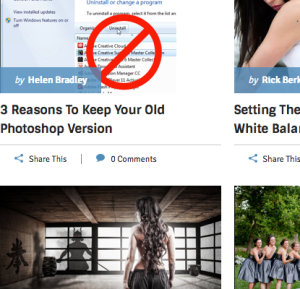
    Mobile Mobile Mobile!

    mobile

    You’ll notice the new design is what’s called responsive. This means it reformats itself depending on they size of the screen viewing the page.  The super wide screens we could optimise a little better for, but we’ll get to that.

    Bigger text, better readability. 

    text

    If you look through the articles on the site you’ll notice a significantly bigger font. Some have said perfect, others have said a little too big. We’d love to know your thoughts in comments below.

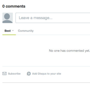
    Improved commenting system.

    comments

    We’ve moved to Disqus for commenting allowing you to more easily upload your photo’s, keep track of your comments and create threads in all the articles.  All your original comments have been kept the way they were so it’s the best of both worlds.

    Some other things we’ve Done

    Nicer Archive Pages.

    archive

    We’ve created what we feel are more usable archives and search results pages. Hopefully making it easier to find the articles you’re looking for. See what they look like in our Photography Tips, Post Production and Cameras and Gear archives.

    Some new Color

    color

    We’ve added a bit more color to the site.  We hope you like it!

    A flashy new Home for our eBooks.

    Our new bookstore page is designed to help you find the right eBooks with much less fuss.

    books

    Built for Speed

    Millions of people visit dPS every month and whilst an never ending vigil you should find this new design a little more zippier than the last.  Where possible we’ve kept everything as efficient as we can.

    Different but similar.

    We’ve tried not to change the menus of the site to much.  There are still three main categories (tips, post and gear) and the submenus are the same.

    A totally new front page.

    front

    You’ll notice the front page is very different.  We’ve tried to create the best window into the site as we can. This was perhaps the most controversial page so we’d love to know what you think.

    New ways to share articles.

    share

    We’ve added a bunch of new ways to share articles with links at the top and the side. The next part is up to you!

     The Forums are up Next

    Forum_Home

    The development team are hard are work getting the forum ready for an update as well.  Just like the blog this will be mobile friendly, cleaner, easier to use and a lot more colourful!

    … and a Little Glimpse into the Future

    A few of you made the suggestion that you’d like to be able to bookmark some of the articles and really customise your dPS experience.  Once this new design over we’re excited to start working on exactly that.  I won’t give to much away but it’s something to be excited about!

    How you can Help?

    There’s over 4,000 articles on dPS and  I’m sure we’ve missed something – in fact our team are currently working through the full site still making tweaks as we find them.

    You can help with this – if you do spot a bug, or some formatting that just doesn’t look right please let us know via the form below and we’ll get them fixed ASAP.

    We can’t wait to hear your thoughts and as always thanks for being part of the dPS community.

    Bug Submission

    • var RecaptchaOptions = {theme : ‘red’}; if(parseInt(‘4’) > 0) {RecaptchaOptions.tabindex = 4;}

    jQuery(document).ready(function(){jQuery(document).trigger(‘gform_post_render’, [5, 1]) } );

    Post originally from: Digital Photography Tips.

    Check out our more Photography Tips at Photography Tips for Beginners, Portrait Photography Tips and Wedding Photography Tips.

    Team Notes From Our New Design

    The post Team Notes From Our New Design appeared first on Digital Photography School.


    Digital Photography School