RSS
 

Archive for November, 2011

RAW Processing for a Poppy High Contrast Look – Weekly Lightroom Edit Episode 1

26 Nov

Pin It

This is the written article for our Weekly Lightroom Edit – Episode 1 that was released on November 18, 2011 on SLR Lounge. To view this tutorial in video form, click here.

The nice thing about doing written tutorials is that I get to include a bit more explanation as to why we are going to do certain things. Without further adieu, let’s get started.

RAW Processing Software

RAW processing doesn’t mean that you are using any specific program. In fact, you can pretty much use any of the following software titles and get the exact same results.

Lightroom, ACR (Adobe Camera RAW), Bridge, Aperture, Capture One, ACDSee Pro, etc.

Each RAW processor will have virtually the same set of controls, with slight variations when it comes to the details. There are arguments as to which RAW processor creates the best conversion. Some of the elite professionals prefer Capture One because they feel it gives them better tone conversion. However, believe me when I say that each software is not without its strengths and weaknesses. The standard is probably Lightroom, and that is what we use in our studio as well. So, we are going to do this tutorial in Lightroom, however the same methods can be used to get the same results in any RAW conversion software.

Download the Exercise File

First thing, let’s download and take a look out our zeroed out RAW file. Download the exercise file by clicking here. (Note: This image is provided by Lin and Jirsa Photography for educational purposes for DPS and SLR Lounge users only)

Here is our zeroed out RAW file, meaning all default processing values have been reset.

Default Develop Settings

While the image was correctly exposed for the subjects skin, it appears very flat prior to any processing. Now, when you bring this file into Lightroom or any other RAW editing program, that program will apply default settings.

Lightrooms default settings are the following:

Blacks +5
Brightness +50
Contrast +25
Tone Curve – Point Curve: Medium Contrast
Sharpening Amount +25, Radius 1, Detail +25

These default settings get you to an image that should look like what you see below.

00-slrlounge-episode-1-edit-before

RAW Workflow Tips

While the image above looks much better, it is still just a starting point. So, let’s proceed in finishing the image.

Now, whenever I am teaching editing workshops or lecturing online, I always start by saying, “start with your largest adjustments first.” This means that if an image is heavily under exposed, don’t adjust the White Balance prior to adjusting the Exposure/Brightness. Why? Because making smaller changes prior to broader ones will waste your time. In the afformentioned situation, if you were to adjust White Balance prior to adjusting your Exposure, then you will have to readjust the White Balance once again once the proper exposure value is set as the tones will look different with a brighter Exposure setting.

So, this is the general workflow process I follow when editing RAW files.

1. Brightness/Exposure
2. Temperature/Tint
3. Recovery/Fill Light
4. Blacks/Contrast
5. Clarity
6. Vibrance/Saturation
7. Lens Corrections
8. Sharpening

While I may still make minor adjustments here and there, correcting in this order prevents me from having to constantly make major adjustments and redo work.

Starting with a Vision

Before starting our adjustments, I always have a vision of what type of style I think would look best for a particular image. Vintage, Black and White, Poppy High Contrast, Vibrant, etc. Editing an image without an idea of what you want it to look like is like getting on the road without knowing where you are going. So, as stated in this article, we are going to make this image pop, so we are going to produce it to be a nice vibrant high contrast image. Though it would work well as really anything you like.

Making the Adjustments

So, let’s start with Exposure/Brightness.

Brightness +80 – This image is already heavy in highlights. For that reason, I don’t want to adjust my Exposure up as it is highlight biased. So, instead I am going to bring Brightness up to +80 to brighten all of the image tones.

Temperature 4400/Tint -16 – The default Temperature as shot is 4650 with a Tint of -1. At this setting, I see too much red in my skin tones. While I like the warmth of the image, I don’t want to see so much red, particularly in the shadowy areas of the skin. So, what I am going to do is slide my Tint down towards the green side to -16. Afterwards, your image is going to be too green/yellow, so we need to then pull the Temperature down to adjust. This image was shot during sunset, and I love the warmth in the shot, so I don’t want to kill it by taking the Temperature too low. So I am going to leave the Temperature at 4400 to leave that nice moody warm tone in the image.

Recovery +25 – Recovery is great for balancing out and pulling back highlight tones. However, be extremely careful. One of the most common color correction mistakes is over using Recovery. When Recovery is over used it will not only flatten and kill image contrast, it can also cause posterization where you will see unnatural color graduations. Remember, in every poppy high contrast image you want to have some true blacks and some true whites. Use Recovery moderately to balance and reduce some of the strong highlights particularly on skin, but don’t over do it. For this image, +25 recovery is fine.

Fill Light – If Recovery is the brother of common color correction mistakes, then Fill Light is the sister. Fill Light is being used far too heavily these days to create faux-HDR style effects. Large amounts of Fill Light will not only make images look fake and surreal, it also kills image quality by pumping up noise in the shadows, as well as causing edge fringing. I typically use Fill Light in the range of 0 to +15. Rarely do I go higher.

Blacks +12/Contrast +35 – I always adjust Blacks and Contrast together starting with the Blacks. My goal with every high contrast image is to add blacks until I have some true shadows in the image, areas that are completely clipped. Not a lot mind you, but a little. I want to be careful to preserve hair detail, particularly with those that have dark brown or black hair as it will be the first to go. So, what I will typically do, is adjust my Blacks to this level, then if I still need additional contrast, I will add a small amount of Contrast as needed. Be careful with adding too much Contrast as it will only strengthen highlights and colors over skin tones which can really look unflattering. For this image, Blacks at +12 and Contrast at +35 gives me a nice pop without being overpowering.

Clarity + 20 – Clarity is great for increasing mid tone contrast which has a sort of “detail enhancing” type of effect. You want to be careful that you don’t take clarity up too high as it will cause edge fringing in high contrast areas, such as where the rocks meet the highlights of the horizon in this image.

Vibrance -10/Saturation 0 – Once again, these are two sliders I am always adjusting together starting with Vibrance and almost never touching Saturation. Vibrance is going to increase/decrease image saturation while attempting to preserve skin tones. Thus, it is much more subtle than its overpowering gorilla of a cousin Saturation. Saturation will adjust every color in the image equally. This makes it very easy to overuse. Generally, I use vibrance in the range of -20 to +20 while saturation I leave around – 5 to +5. For this image, I want to pull a little bit of the color out and just leave that nice warmth and tone. So I am going to take my Vibrance down to -10 and leave everything else.

We are done with our Basic corrections, the last thing I want to adjust is my Lens Vignetting prior to moving on to sharpening.

Lens Vignetting (NOT POST CROP) Amount +36/Midpoint 20 – I have two styles when it comes to vignetting. I either like to have a very subtle darkening vignette when edge and background details are distracting. By very subtle, I literally mean very subtle. I don’t like people to be able to see any vignetting, but rather just a slight darkening of colors. For this reason I use Lens Vignetting in the Lens Corrections panel as opposed to the Post Crop Vignetting in the Effects panel.

The second style of vignetting I use is a reverse vignette to brighten edges when I like the edge detail and I want the image to be bright from the center to the edge. For this image, either would work actually. But, I like the edge detail and the rocks, so I am going to choose to go with a reverse vignette and set my Amount to +36 and my Midpoint to 20 to pull in the edge brightening effect into the center of the image a bit more.

At this point, we are done with our basic corrections and you should have an image that looks like this.

Sharpening

Sharpening Amount 70, Radius 1.5, Detail 30 – From here, all we have left is to sharpen our image. I always get questions on what amount of sharpening is enough? Well, here is the rule of thumb. Take the image, and zoom into 100% by mouse clicking on the image in the workspace. Move over the faces so you can see the faces at 100% size. From here, adjust your sharpening until your edges are defined to your liking. I like my images slightly on the sharper side, so for this image I am going to take my sharpening Amount to 70 with a Radius of 1.5 and Detail of 30.

Now, you should see the final image below. We now have a nice sharp image that pops by simply making a few RAW corrections. Hope you all enjoyed! As always, let me know what you think below!

Pin It

Post originally from: Digital Photography Tips.

Check out our more Photography Tips at Photography Tips for Beginners, Portrait Photography Tips and Wedding Photography Tips.

RAW Processing for a Poppy High Contrast Look – Weekly Lightroom Edit Episode 1


Digital Photography School

 
Comments Off on RAW Processing for a Poppy High Contrast Look – Weekly Lightroom Edit Episode 1

Posted in Uncategorized


Lytro Light Field Camera Makes Time Magazine’s Top 5 Cool Innovations List

26 Nov

Perhaps you have heard of Lytro. I first got wind of the company a few months ago and thought it sounded amazing. But then the “That’s a press release. Where’s the follow through?” mechanism in my brain that stops me from buying useless products kicked in. Was it too good to be true?

The camera the company is creating  is said be able to allow a viewer to focus on any spot in the image AFTER the image has been shot. This means different viewers can pick what they like and focus there, even changing the apparent aperture to control depth of field. All after an image has been shot. After checking out the Time article and the company’s website (which includes sample images) I believe the camera will be a hit from the moment it is stocked on store shelves.

While this camera is not for the serious photographer just yet (the image quality, while good, is not up to my standards), but its ability to (mostly) cure most amateurs’ problems with focus, coupled with its small size, will help it sell. What might go against the camera is the need for another computer program to download, edit and view images. This is understandable because nothing behaves like this camera and the images it produces.

The camera works on the principle that light hits an object and then scatters in all directions. When we, as humans or cameras, focus on one object, we are essentially focus on the two dimensional plane where that light is reflecting from. Light on planes before or after (forward or backward, if you will) isn’t focused on the same plane as our camera’s sensor and becomes slightly out of focus. That out of focus area is known as the circle of confusion.

The Lytro works by not focusing the light. Instead, it captures all the light rays reflected by objects at different depths of field. With a f/2 aperture, the sensor can capture 11 million individual light rays, then the software inside the camera process the information from the sensor to create the image, which then can be viewed on a computer. The images have their limits, but take a look at the examples on Lytro’s site, such as this image. After the image loads, click on various areas to bring it into focus. It really is quite cool.

It’s fun and innovative. While it has its limits (e.g., the camera does not accept memory cards and not everything can be brought into focus if objects are very, very close and very far away) I think it’s a step in a very interesting direction.

Stats:

  • Planned for release in early 2012
  • Suggested price of $ 399(8GB) and $ 499(16GB) – Pre-orders available now
  • No shutter lag as it doesn’t use a shutter
  • f/2 aperture constant throughout 8x zoom
  • Current software runs on Mac and is being developed for Windows
  • Weight: 7.55oz / 214g
  • Size: 1.61″x1.61″x4.41″ / 41mmx41mmx112mm

Check out Lytro’s website for more information. I’m very eager to get my hands on a demo until and will report here if/when it happens.

Post originally from: Digital Photography Tips.

Check out our more Photography Tips at Photography Tips for Beginners, Portrait Photography Tips and Wedding Photography Tips.

Lytro Light Field Camera Makes Time Magazine’s Top 5 Cool Innovations List


Digital Photography School

 
Comments Off on Lytro Light Field Camera Makes Time Magazine’s Top 5 Cool Innovations List

Posted in Uncategorized


Learning to See Light

26 Nov


As photographers, we are pretty intuitive about recognizing interesting ambient light when we see it. But stick a flash and umbrella in our hands and we tend to default to much more standard styles of lighting — especially at first.

In the real world, great light rarely comes from 45 degrees up and to the side. So if you want to be able to create more interesting light with your flashes, you should work to better recognize how ambient really works. This way, you can recreate those different looks when you are in control of the light. Read more »


Strobist

 
Comments Off on Learning to See Light

Posted in Uncategorized


If You Had $2000 to Spend on Camera Gear… What Would You Buy?

26 Nov

fujifilm-x100.jpeg
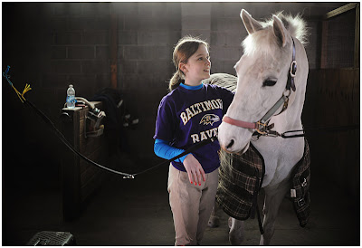
We’ve done this hypothetical exercise the last couple of years in the lead up to Christmas and it has been a lot of fun. So I t would do it again.

Here’s how it works:

  • I’m hereby giving each of your a hypothetical $ 2000 USD to spend on photography gear at Amazon. Very generous of me I know!
  • Head over to Amazon’s Camera and Photo section and surf around and see what you’d buy with it (cameras, ldpshypoth-20ng, accessories – anything photographic goes).
  • Come back here and in comments tell us what you’d buy with it – share a link to it on Amazon if you like and tell us why you’d buy it.

What would you buy?

  • Perhaps it would include the dpshypoth-20://www.amazon.com/gp/product/B003ZYF3LO/ref=as_li_ss_tl?ie=UTF8&tag=dpsgeneral-20&linkCode=as2&camp=217145&creative=399369&creativeASIN=B003ZYF3LO”>Nikon D3100 – currently the most ‘wished for’ item in Amazons camera store
  • Maybe a Canon EOS 7D – always popular on our
  • Or would it be the popular retro looking X100 or X10 from Fujifilm (I think I’d pick up an X100 – pictured right – to see what all the fans are raving about)
  • Or maybe you’d sink it all into the amazing Canon 85mm f1.2 II lens – one of the most lusted after lenses by Canon users

Or something else? Choose as many products as you like – just try to keep the total down under $ 2000!

PS: note: this is… strictly hypothetical (or your own) money!!!!!

Post originally from: Digital Photography Tips.

Check out our more Photography Tips at Photography Tips for Beginners, Portrait Photography Tips and Wedding Photography Tips.

If You Had $ 2000 to Spend on Camera Gear… What Would You Buy?


Comments Off on If You Had $2000 to Spend on Camera Gear… What Would You Buy?

Posted in Uncategorized


Book review: The Photographer’s Mind

26 Nov

FreemanPhogMing.jpg?v=1236

Adam Koplan takes a closer look at Michael Freeman’s ‘The Photographer’s Mind’. In this follow-up to his widely regarded book, ‘The Photographer’s Eye’, documentary photographer Freeman has published a fascinating text that aims to help photographers to be more thoughtful in their picture-making.

News: Digital Photography Review (dpreview.com)

 
Comments Off on Book review: The Photographer’s Mind

Posted in Uncategorized


Parabolic Activity

26 Nov

Ever have a problem with onlookers nosey-ing around on a shoot?

Photographer Radu Dumitrescu (that’s his voice on the tape) was shooting in an abandoned house in Bucharest, Romania when a couple of intrepid guys noticed flashing lights inside the house and decided to investigate. When they raised their cell phones to capture hard proof of the afterlife, Radu laid down on the remote trigger and gave them a show.

They only got one reaction on tape, but Radu said the guys repeatedly came back to the house only to be scared back off again by the flashes. Anyone who can have this much fun with a flash trigger is truly a man after my own heart.

-30-


Strobist

 
Comments Off on Parabolic Activity

Posted in Uncategorized


Adobe faces criticism for change of upgrade policy

26 Nov

adobe2.gif?v=1231

Photoshop trainer and author Scott Kelby has published an ‘open letter’ to Adobe requesting it re-thinks its product upgrade policy. The company, in a recent blog post about its ‘Creative Cloud’ online computing service, revealed that it will only allow owners of the most recent versions of Photoshop and Creative Suite to upgrade to the CS6 versions, when they become available. This moves away from its traditional position of allowing owners of the previous three versions a discounted upgrade. The company is offering a 20% discount for these owners to bring themselves up-to-date in time for the policy change.

News: Digital Photography Review (dpreview.com)

 
Comments Off on Adobe faces criticism for change of upgrade policy

Posted in Uncategorized


Full Horror Thai Movie: Shutter (????????) – [ English Subtitle ] HD

26 Nov

Shutter (Thai: ???????? ???????????) is a 2004 Thai horror film by Banjong Pisanthanakun and Parkpoom Wongpoom; starring Ananda Everingham, Natthaweeranuch Thongmee, and Achita Sikamana. It focuses on mysterious images seen in developed pictures. The film was remade in 2008 under the same title. ======================================== Plot: —— After celebrating at a drinking party with his close friends, Tun (Ananda Everingham), a photographer, and his girlfriend, Jane (Natthaweeranuch Thongmee), get into a car accident. Jane hits a young woman. With much fear and bewilderment, Tun prohibits her from getting out of the car: they drive away, leaving the poor girl lying in the road. Tun begins to discover mysterious white shadows and what appear to be faces in his photographs. A suspicious Jane thinks these images may be the ghost of the girl they hit on the road. Tun, who has been experiencing severe neck pains since the accident, visits a specialist. While a nurse attempts to measure his weight, to his dismay, he weighs approximately 120 kilograms. While collecting his medication via the counter, he hears a woman’s voice that accuses him of being a liar and he runs away, traumatized. Unconvinced of the existence of the supernatural, Tun dismisses the idea of being haunted although his friends are also being disturbed by this mysterious girl. Jane begins to investigate in the school’s lab and discovers that the girl was Natre (Achita Sikamana), a shy young woman who
Video Rating: 4 / 5


Panning: Weekly Photography Challenge

26 Nov

Image by Sam Javanrouh

This week your photographic challenge is to take and share a photo that uses the technique of panning. We’ve written a tutorial previous on how to master the art of panning (also check out this one on panning too)so you may like to go read that one first – but the challenge essentially revolves around photographing a moving subject and attempting to keep it in focus by panning your camera along with it. The result is hopefully a relatively in focus and sharp subject with some lovely motion blur around it.

The technique can be applied to almost any moving subject – from racing cars, to trains, to bikes, to flying birds, running animals or even to any toddler who has gathered up a little speed.

Once you’ve taken your ‘Panning’ Images – choose your best 1-2, upload them to your favourite photo sharing site and either share a link to them or – embed them in the comments using the our new tool to do so.

If you tag your photos on Flickr, Instagram, Twitter or other sites with Tagging tag them as #DPSPANNING to help others find them. Linking back to this page might also help others know what you’re doing so that they can share in the fun.

Note: while we don’t mind you posting previous images that you’ve taken that fit this topic – the real point of these ‘challenges’ is to inspire you to go out and take NEW photos. So perhaps instead of just trawling through your old photos to find one that fits – grab that camera and go use it too!

Also – don’t forget to check out some of the great shots posted in last weeks Photographer in the Picture challenge where there were some great shots submitted.

Image by Paco CT

Image by ram reddy

Image by Thomas Helbig

Image by Gerald Yuvallos

Post originally from: Digital Photography Tips.

Check out our more Photography Tips at Photography Tips for Beginners, Portrait Photography Tips and Wedding Photography Tips.

Panning: Weekly Photography Challenge


Digital Photography School

 
Comments Off on Panning: Weekly Photography Challenge

Posted in Uncategorized


DxO Labs announces Optics Pro 7 with faster performance

26 Nov

DxO_Optics_Pro_7_Elite.png?v=1233

DxO Labs has announced that Optics Pro 7, the latest version of its Raw processing and optical correction software, will be available from November 30th. The company says version 7 has been extensively re-written to make it faster – up to four times faster in the case of batch processing. Version 7 also includes support for popular enthusiast cameras, such as Fujifilm’s X100 and Sony’s A77, as well as more than 300 additional camera/lens Optics Modules. Refinements include an improved lens softness tool that attempts to correct for inherent lens softness without interfering with bokeh in out-of-focus regions. DxO Optics Pro 7 will be available with a 33% discount until December 24th (and free to users who bought version 6 after September 1st).

News: Digital Photography Review (dpreview.com)

 
Comments Off on DxO Labs announces Optics Pro 7 with faster performance

Posted in Uncategorized