Category: Uncategorized

  • Photography WordPress Themes

    As you know I’ve been slowly (very slowly, sometimes) working on a series of reviews of website templates for photographers. This has given me a bit of insight into the advantages and disadvantages of various kinds of solutions.

    Along with the team over at Photocrati, as well as a couple teams of web designers, I contributed that insight to help design a new series of WordPress themes for photographers. I think these are now one of the best low-cost solutions on the market (I’m biased, of course). I’m not going to write a full review of the themes, since it’s hard to objectively review a product you’ve helped design. But I do want to talk about what some of the advantages are, and, yes, some of the disadvantages. I’m going to structure this like my other reviews.

    Let me start by saying that we’ve converted this site and I’ve converted my own phojournalism site to the new Photocrati WordPress themes. Check them out here:

    MORE INFORMATION | DEMO

    photocrati-emulsion-theme

    OVERALL APPEARANCE

    In my view, these templates are beautiful. They have just the look I like, which is a simple, elegant look that emphasizes the images. The rest of the site just kind of fades into the background. They use primarily whites, grays, and blacks for the background, which for me is less distracting from the images than greens/reds/oranges or other bright colors.

    Let’s start with a few screenshots of the themes. Here they are:

    emulsion

    lightbox

    viewfinder

    They have the look of many flash sites, even though they are not flash. The home page is designed with one large image space that contains a flash-style slide show.  The gallery pages contain rows and columns of thumbnails, which I prefer to “filmstrip” style thumbnails that require you to scroll up/down or side/side to see all the thumbnails in a gallery.

    I actually like the gallery look enough that I actually use a gallery as my home page on my new photojournalism site. Below a screen shot of my new homepage. It also shows you want the galleries generally look like (although you can customize those like everything else.

    Grade: A


    erick-danzer-photography

    EASE OF USE

    I’ve often noted that there is an almost direct trade off between Ease of Use and Flexibility. Designers of templates can make thing easier by limiting the number of options you have, or they can give you lots of options, which will complicate things.

    WordPress has lots of options. You can do almost anything with it. One downside of that is that WordPress themes are very much do it yourself solutions. You need to set up your own domain, your own hosting, and install WordPress. If you are familiar with all that, it’s really not too complicated. You can do it all in a few minutes at sites like <a href=”http://www.BlueHost.Com/track/erickdan” target=”_blank”>Bluehost</a> that offer one-click installation of WordPress.

    Once you’ve got your blog and you’ve got to fill it out, and make many of the layout decisions yourself. Again, this is great for flexibility, but less so if you are looking for a plug-and-play-and-don’t-worry-about-it kind of site.

    That said, pound for pound, WordPress is known to be one of the easiest web platforms to learn, giving you a tremendous amount of flexibility for a relatively short learning curve. And once you know WordPress, it IS easy.

    Grade: B

    FLEXIBILITY OF DESIGN

    If these themes have a learning curve for WordPress newcomers, then the payoff is incredible flexibility. There really is very little you CAN’T do with a WordPress site. You can change colors, fonts, layout. Add elements or take them away. Move elements around. Add text where you want it. Integrate with social media. You can even add a full-fledged forum or e-commerce shopping center to your site if you want to.

    The WordPress community is huge, and there are thousands of plug-ins that allow you to do just about anything.

    Grade: A

    BLOGGING CAPABILITY

    WordPress is the world’s most powerful blogging platform. Not much more to say.

    Grade: A

    E-COMMERCE FUNCTIONALITY

    I mentioned just a paragraph or two that there are all kinds of E-Commerce plugin-ins that allow you to add full shopping capability to WordPress. So the potential is there.

    But for the time being, these these don’t offer what many of us want, which is the ability to sell photos directly from our galleries. The Photocrati team is working on this, but doing it in a way that is simple and elegant is tough work.

    So for the time being, unless you are a WordPress guru who can do it yourself with one of the E-Commerce plugins, then you are out of luck until the Photocrati team comes up with an easy method to do it.

    Grade: D

    COST AND FEE STRUCTURE

    Again, it doesn’t really get any better. Right now the Photocrati themes are selling for each – for lifetime rights to the themes any updates. Pay once, low price, and it’s yours for life. Most highly managed template solutions (Photobiz/PhotoShelter/etc) entail ongoing monthly payments ranging from low to very high.

    Grade: A

    SEARCH ENGINE OPTIMIZATION

    Once again, WordPress is widely known to have about the best SEO capability that it’s possible to have. It has an inherent advantage over managed flash solutions, because it is a powerful blogging engine. And search engines love blog-style content – it fits all the qualities that search algorithms look for and therefore does very well. That’s while small mom-and-pop blogs can compete on the front page of Google with major multinational corporations.

    Grade: A

    FREE TRIALS AND GUARANTEES

    Photocrati offers a 30-day money back guarantee that entails sending one email requesting a refund. Easy enough.

    Grade: A

    CONCLUSION

    So, as you can see above, the Photocrati themes are strong in almost every aspect. They have two weaknesses: they do not yet offer the ability to sell your images directly from your site, and there is a learning curve for users who are new to WordPress. The second weakness, however, goes hand-in-hand with overwhelming flexibility. The reason there’s a learning curve is that, with WordPress, you are in control, and you can do just about anything.

    As of now, pound for pound, I think these are best low-cost solution on the market, and it competes effectively with some highly managed solutions that cost 10-20 times more.

    OVERALL GRADE: A-

    DSLRBLOG – Photography Business Blog

  • Lastolite Triflash Sync: Triple Threat

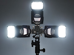
    Multi-speedlight brackets are a great way to gang up your small flashes when you need a little extra oomph, as in when trying to overpower the sun for a portrait.

    Why not just buy a monobloc, you ask? Well, for one thing, it is easy to gang up small flashes. But it is a little more difficult to hack a monobloc into key, fill and background lights. Different folks, different workflows.

    There are a few options for ganging speedlights into a more powerful, single light. And they have all been pretty much the same — until now.
    __________

    Ahead of the Curve

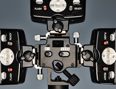
    Unlike most multi-flash brackets, the Lastolite TriFlash Sync includes three hot shoes, as compared to the typical cold-shoe versions.

    And that 1/8″ (3.5mm) jack you see out front? That is parallel-wired to all three, effectively giving you the minijack sync option that frees you from the PC Cord Mafia.

    Which means you can use an audio patch cord as a sync cable. A mono cord is supplied, but my stereo cords also worked with a PocketWizard to sync three speedlights at once.

    You can also even mount the PW on the center hot shoe and have it securely fastened if you just are firing two strobes. Lastolite includes a cold-shoe adapter for that, lest your PW get locked into an endless relay-mode feedback loop from triggering itself.

    Built Like a Tank

    With three SB-800s connected as shown, the bracket/flash combo feels like one solid unit. The shoes all have both clamping rails and locking pin holes for Nikon and Canon models.

    The clamps are really solid, which is important when you consider how much money could potentially be attached to this thing. I’d hang this one out over water without the usual ball bungee wrapped around the shoes for insurance. The tilt mechanism also has locking teeth, and is quite solid.

    (Please note that the above photos are of a beta unit, and the final version may have slight differences.)

    Radio Not Required

    Obviously, you can go with a 1/8″ hard sync cord into the bracket. But if you are, say, filling with an on-axis flash you can trigger a multi-speedlight key light with the built-in slave.

    The slave is intelligent, and battery-powered — which can be good or bad, depending on your perspective.

    First off, batt-powered slaves are generally more sensitive, which is good. And you can set it to ignore from one to four pre-flashes, if you are into combining manual and TTL.

    But that also means that the slave is battery dependent (in this case, a button cell) so if you are going to be using the slave you have to remember to turn the thing off every time.

    It’s a non-issue for me as the PW input is convenient and immune from syncing the flashes from other nearby photographers. And if I needed to use a slave I’d probably opt for the version built into my flashes — the SU-4 mode on the SB-800s is as good as it gets.

    That way, I also have three slave eyes pointing in different directions. So the best-aimed slave would trigger, and that flash would easily set the other two off. But most flashes do not have built-in slaves, and the Triflash Sync is inspired thinking for a multi-flash bracket.

    They are not yet available, but are coming soon. If you are in the UK you’ll get them first (est. in a couple weeks) as they are UK-made and distributed by Lastolite. And they should be trickling out to other countries via the normal Lastolite outlets in fairly short order after that.

    Price is expected to be ~9 in the US. And who knows, UK might even get a relative break this time. Or at least, not have to pay the usual ~1.5x price…


    Strobist

  • Review of Printroom.com Web Templates and Online Storefronts

    printroom-homepage

    This is the third article in a series on the best photography website templates. Also see:

    The Best Photography Website Templates: Introducing a New Series

    Review of Photobiz Website Templates

    Also, Photocrati has just released an outstanding set of WordPress themes for photographers. Unlike Photobiz, Printroom, and most other solutions, these templates combine gallery management and blogging in one package.

    Overview of Printroom.com Online Storefronts

    Printroom.com offers online storefronts for photographers. Although still in the realm of website templates, Printroom.com is an entirely kind of solution from Photobiz-style templates. After setting up an account, you upload images to your Printroom site. They offer very few choices regarding the appearance of your “homepage” or galleries, and very little flexibility. The major advantage of Printroom and similar sites like Smugmug is the integration of galleries, shopping carts, and order fulfillment. In a Printroom store, your clients can browse images, select what they want in terms of print sizes and styles, speciality items, even digital downloads. They checkout and pay, and Printroom alerts you to the order. If you have not done so already, they will ask you to upload high resolution versions of the relevant images. And that’s it. Printroom handles all order fulfillment – printing, packaging, shipping.

    I’d like to emphasize something up front. In some sense, comparing Printroom or other “pro storefronts” to full-blown website solutions like Photobiz is unfair. I can’t imagine any pro photographer using a Printroom store front as their sole or even primary online presence. Printroom just doesn’t offer the kind of attractive templates or customization options that allow photographers to present their online portfolios in all their glory. Usually, Printroom is a secondary site, one used to store client images after a shoot and give clients the ability to browse and, most important, order prints. That’s the best use of Printroom.

    Overall Appearance

    I personally find this to be a weak aspect of Printroom.com. They are not alone, sadly. Compared to the beauty and elegance of Photobiz flash templates, I find both the home pages and gallery pages at most printing-companies-cum-online-storefronts to be elementary looking and clumsy, especially the galleries. Above is a screen shot of my Printroom.com homepage; below is a shot of one of my galleries.

    printroom-gallery

    The design elements are very basic. The homepage is passable, although very lacking in flexibility. The galleries are just unnecessarily ugly. I don’t like using such a strong word, but if a duck quacks…  I’ve spent a lot of time staring at my gallery page, trying to figure out what bothers me about the look. It’s partly the white “shadows” cast to the right and bottom of each image. It’s partly the design of the toggle boxes and magnifying glasses.

    The individual images page are just a bit better. Here is a screenshot:

    printroom-image1

    I like the large image with thumbnails on top. But the little table to the right of the images, where clients are supposed to type the number and type of images they want, have the same 1990s-clumsy-but-gets-the-job-done look. It’s just a plain flat table with hard square lines.

    And, again, the final shopping cart, pictured below, has the same look.

    printroom_cart

    I have to admit that the appearance may not bother everyone. I’m continually trying to figure out if it really is ugly, or if it’s just a matter of personal taste. I’ve provided the screen shots, so ultimately you can decide.

    New Flash Sites

    Printroom may recognize that they are lacking the design area. They have very recently introduced new Flash websites. These sites are a marked improvement over the basic html homepages of yesteryear (above). They are quite passable. But, again, all things in comparison. Compared to Photobiz templates, the Printroom Flash templates look like first drafts. They have somehow managed to import the same clunky looking into their flash sites that undermines their html sites. Here are three sample flash website that Photobiz links to as samples.

    http://www.printroom.com/studio_homepage.asp?userid=robynsdesigns

    http://www.printroom.com/studio_homepage.asp?userid=ClarkLara

    http://www.printroom.com/studio_homepage.asp?userid=rarroyo02

    Looking at these, I am somehow underwhelmed. I’m not sure if it’s the fact that the image areas are all the same stock light gray, or if its the use of tabs for the menu, or the overall sense that the site has chunks (background and image area) that don’t work together as a unified whole.

    Grade: D for HTML sites, C for Flash sites

    Ease of Use

    This is a mixed area for Printroom. The main back-end management area is good enough. Below are three screenshots to give you a sense of the feel and functionality of the Printroom Backend. The first is a screen shot of what you see when you first log in. You can see the various menu items (square buttons) and you can see a list of galleries. The second screen shot is what you see if you click on a gallery. Here, you can change image names and order proofs. Finally the third screenshot is the page on which you set prices for prints and products of various sizes. You can prices specific for each gallery, which allows you to tailor your pricing to particular clients (say wedding versus your travel poster gallery).

    printroomcom_backend

    printroom_backend-gallery

    printroom_price-list

    I find this back-end management area fairly easy to use, which is a big feat given the amount of functionality for ordering and pricing. For image uploading, they encourage you to use their own software, Pro Studio Manager, which you download and install on your computer. This software allows you to create galleries, import images, delete images, and make other adjustments on your computer. You then upload or synchronize, and the software batch uploads your images and re-creates any changes.

    I must say that I found this to be an awkward solution. I don’t like having to down load new software, first of all. But then you have to be vary cautious about making changes within the backend management area, since synchronization seems to run just one way, from Pro Studio Manager to your site. They encourage to you to make ALL changes in their software. I guess it just seems to me that there should be a simpler way – something that’s quick and easy and online.

    (By the way, while we’re on the topic of ease of use, there is one more thing to comment on. Printroom makes another software package called Printroom direct, which is supposed to allow Photographers to upload images and order prints and products easily and separate from whether or not you have a Printroom storefront. AVOID this at all costs. When I was doing a lot of work with Printroom, this software was the bane of my existence. It’s slow, impenetrable, and senseless. Well, I should add a caveat. I haven’t used the software in over a year. I thought about trying it again so I could include something in this review, but I just can’t do it. I like you, my readers, but not that much.)

    Grade: B

    Flexibility of Design

    This is another weak spot (there are strong spots, really, coming below). Printroom store fronts offer very little flexibility and very few options for customization.
    As with Photobiz, you don’t have access to the source files that comprise you’re site, so you can’t make any individual tweaks you might like. You can’t add extra notes and announcements or elements to your home page. For technically skilled people, this may be a big turn-off.  At Photobiz, this lack of access is offset a bit because they’ve provided a good number of built-in options. You’re still hostage to the options they provide, but at least there are options. Printroom provides very few options for customization of your pages.

    In fact, you can see for yourself. Here is your online store front set up page. This includes all the options you have:

    storefront_setup

    They have added a new bit of flexibility with the option of flash websites. But again, the options for customization seem quite limited once you’ve had a chance to fool around with Photobiz. Below is the how Printroom describes the functionality and customization options of their Flash pages:
    * Sleek, clean design
    * Create your own slideshow- upload up to 15 of your images
    * Upload your logo- or create a text header with a wide selection of fonts
    * Custom background colors to match your style
    * About Us page, Contact Us page, and a custom page that you can define
    * Online tool allows you to create your site in minutes
    * Integrated Storefront with your photo galleries displayed right on your homepage

    If you want to test drive their “flash homepage tool” you can do so and get a very clear sense for what’s possible. Click on the demo link here:

    http://www.printroom.com/info/Store_Front_Designer.asp?

    Grade: D

    Blogging Capability

    None. There is no blogging capability. If want to maintain a blog, you would need to host it on a different server and different domain name. Given the importance of blogging today as a critical way to interact with past or potential clients, that’s a surprising omission and big, big limitation, as least as far as I’m concerned.

    Grade: F

    E-Commerce Functionality

    Now we finally move solidly into one of the big strength areas of Printroom. Indeed, it is the main reason Printroom exists. Printroom is a storefront. It’s designed to provide browsable galleries in which client can select, customize, and order photos. Although the appearance isn’t always elegant, it does this very well.

    One of the big weaknesses of Photobiz is that although they have a shopping cart, they do cannot provide any order fulfillment services. Well, Printroom is a printing company. So the integration between online shopping and order fulfillment is essentially seamless. If you are not picky about which photo lab you use, this can be a HUGE time saver.

    As I noted in the introduction, Printroom is not really designed to be a stand alone website solution. Most photographer use it as a secondary site to host photos for clients and provide online ordering options. For that purpose, the seamless integration of galleries, online shopping carts, payment, and order fulfillment is great.

    Grade: A

    Cost and Fee Structure

    The fee structure for Printroom is fairly straightforward. They offer three membership levels. The first level is free. That’s right, you can set up a Printroom storefront for free. This membership comes with limited space for images, no option for flash websites, and limited support from Printroom, but it’s still a good way to get started. How does Printroom make money? Easy – they charge you when you order prints. Printroom is after all a printing company. They figure if you set up a free account with them, and upload galleries, you are more likely to use their printing services. Which is true.

    At the second level you can buy a pro member ship for .99 per month or per year. This membership comes with 1GB of storage space, the option to use flash, and more or less full support. It’s important to note that this compares very favorably with Photobiz, which costs more than just for initial set up PLUS a much higher monthly fee. At per year, Printroom pro is still a very affordable solution.

    At the third level, you can buy a premium membership for 9 per year or .99 per month. This level comes with unlimited storage and a range of options like the ability to create a fully customized flash website and priority support from Printroom.

    In addition to their monthly or annual fee, Printroom also charge a printing cost, but this would be paid anywhere and Printroom’s charges for printing are quite reasonable. A 4X6 print costs .39 and an 8X10 .99.

    Grade: A

    Search Engine Optimization

    This is a huge weak area for Printroom. Despite the fact that the URL for my Printroom includes my name (www.printroom.com/pro/erickdanzer), my Printroom site has never shown up on the first page of search results EVEN WHEN SEARCHING FOR MY OWN NAME. Needless to say, if your site doesn’t show up when you search for yourself, you’ve got problems. I just did a test and searched for myself. My Printroom site shows up on page 4 of search results. By comparison, my main site erickdanzer.com is the number one result, and my Photobiz site shows up on page one.

    I don’t what the problem is with Printroom’s SEO structure, but it is clearly not a place where you will “be found” unless someone is actively looking for you.

    Grade: F

    Free Trials and Guarantees

    Photobiz offers a free membership, so you can test drive it completely as long as you like. Hard to beat that for free trials.

    Grade: A

    Conclusion

    In short, Printroom offers a great service: seamless integration of online galleries, print ordering and shopping cart functionality, payment processing, and photo printing and order fulfillment. This kind of service is hugely convenient if you shoot events and want to offer browsable galleries and online ordering to clients. And they offer this service at a very reasonable price. Back-end management is reasonably straightforward

    On the downside, their online storefronts and galleries can be visually unappealing. They’ve made some improvements in this area with the introduction of Flash websites, but even their Flash sites are not nearly as beautiful or elegant as some of the others out there. In addition, Printroom sites lack flexibility and options for customization (with some exception for premium members), lack blogging capability, and have an awkward system for image uploading. These sites are terrible as far as search engine optimization is concerned.

    The bottom line, as I’ve mentioned several times, is that Printroom probably isn’t a good option for a stand alone site to represent your work, but it is a good secondary option for offering galleries and online ordering to clients. For you main web site — the online portfolio that represents you to the world — you will want a solution that offers more visual impact, greater flexibility, and, ideally, blogging capability.

    Overall Grade: C

    DSLRBLOG – Photography Business Blog

  • Cheap, Powerful On-Axis Fill


    Here’s a quick little tip for the next time you find yourself in need of a little impromptu on-axis fill and you do not have a ring light: Use a direct speedlight instead.

    It’s small, hand-holdable — and very powerful. The trick is getting it off of top of the camera, and even closer to the lens.
    __________

    On-Camera vs. On-Axis

    The problem with on-camera flash is that the flash is mounted in possibly the very worst position possible. It’s too close to the lens to offer any real shape, and yet far enough away that it leaves gnarly shadows under the chin of your subject.

    But if you get it right next to the lens, everything changes. That’s why your point & shoot sometimes makes some pretty glam-looking direct flash photos. Because the flash is about an inch from the lens.

    Compare that to a typical DSLR, where the direct flash head can be ~6 inches from the lens and you see the difference. Pop-up flashes on DSLRs are better than shoe-mounted flashes for this reason, too (example here.) But right next to the lens — as in touching it — is best.

    The trick is knowing where to position it (i.e., where on the clock face) around the lens. Here is how I hold it when filling another light, and why:


    I put it on the exact opposite side as the direction of my key, and right next to the lens. I usually just hand-hold it, but I am actually thinking of building a little bracket that would do the same thing and allow me to position the flash on either side of the lens.

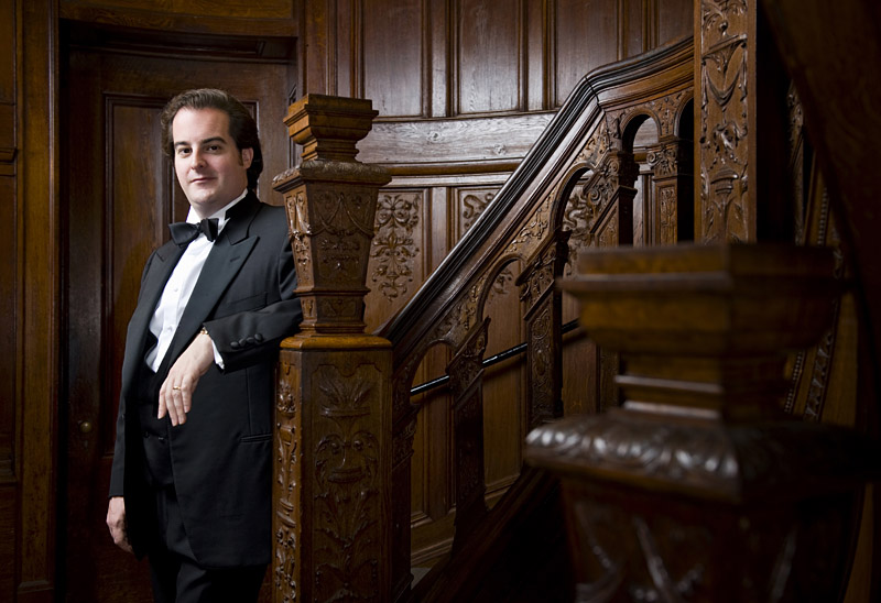
    Here is the thinking: The fill is gonna be a couple stops down, so the tiny (almost non-existent) shadows created would appear on the side of the subject getting the key light. So the key light (at full exposure) will easily erase them.

    The shot at top (of opera singer Rolando Sanz) is filled in this way. And it’s almost hard to tell the fill is there, until you see the photo without it:


    You can make it as subtle as you want, obviously. I usually just do it by eye — dial it in until I like it. Take this fill down another stop and the photo would look completely different. Not better or worse — just different.

    Power to Burn

    Say you are working outside with a big mono (or some ganged speedlights) as a key. You are underexposing the ambient by a good stop, with the sun coming from behind. That key is lighting your subject from one side, but leaving pitch black shadows on the other side.

    A speedlight, fired direct, only has to fill your subject to about two stops down — three, if you’re a badass and/or if your publication medium can handle the subtlety. That is not asking a whole lot out of a small flash. Firing direct (zoomed, even,) any speedlight can handle that in full sun out to a distance of a dozen feet or more. Go ahead — try it.

    But that little kiss of light in the key light’s shadows will give you depth and detail and more control over your subject. And right up against the camera, the sliver of a shadow it would have created will be wiped away by the key light.

    Syncing Options

    When shooting inside, I usually remote the key and slave the fill. Having a speedlight with a built-in slave is a godsend for this. But if you are outside, you may well need to remote them both depending on the position of the lights.

    If your key light has a slave, it is simpler yet. Use an off-camera cord (as shown in the diagram above) for the fill light and slave the key. As a rule, I generally do not buy a flash unless it has a built-in slave — a good one — just for this flexibility. (More on slaves coming next week.)

    So the next time you are shooting an off-camera flash-against-sunset photo, stick a little direct flash right up against that lens on the opposite side, dial it down two or three stops, and see if that doesn’t give you a more nuanced look — no fancy modifiers needed, and with power to burn.


    Strobist

  • nothing is original

    From Jim Jarmusch’s Golden Rules:

    “Nothing is original. Steal from anywhere that resonates with inspiration or fuels your imagination. Devour old films, new films, music, books, paintings, photographs, poems, dreams, random conversations, architecture, bridges, street signs, trees, clouds, bodies of water, light and shadows. Select only things to steal from that speak directly to your soul. If you do this, your work (and theft) will be authentic. Authenticity is invaluable; originality is nonexistent. And don’t bother concealing your thievery—celebrate it if you feel like it. In any case, always remember what Jean-Luc Godard said: “It’s not where you take things from—it’s where you take them to.”

    Tweet This Post Stumble This Post


    ed | zawadzki

  • Going Rogue with FlashBenders

    StrobistFlashBenders
    I know what you are thinking — this snoot looks a little familiar, perhaps?

    Well, it is — and it isn’t.

    Actually, better lemme explain.
    __________

    Okay, long story short — and without going into too much detail:

    Honl creates a line of snoots and gobos. Sells them independently. Signs with ExpoImaging as distributors. A falling out occurs. Honl back to independent. ExpoImaging releases new line of Rogue FlashBenders.

    So now you know some backstory. And yeah, there is a certain level of familiarity involved. But they are different enough to make them of interest, so here goes.

    Mounting Tension


    There are a few differences between the Rogue FlashBenders and the Honl stuff. But for me the special sauce is in the way they designed their mounting system.

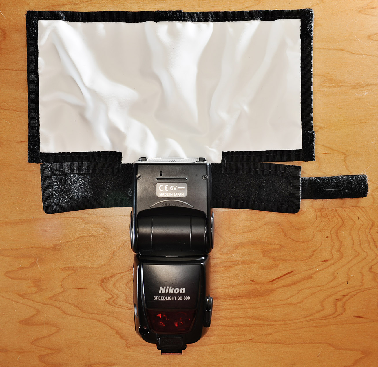
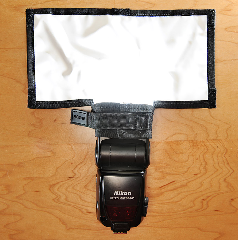
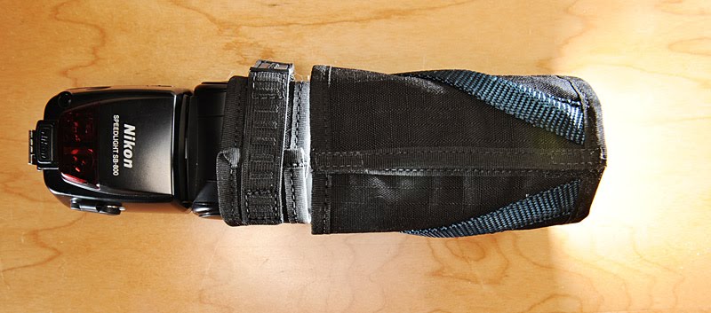
    The speed strap is elasticized, and built into the snoot itself. It attaches with a nice (and consistent) amount of tension. The edges of the snoot attach with velcro, like so:


    Advantages: Quick mounting, and the strap is always with the mod.

    Disadvantages: You’re essentially gonna pay for a strap with each mod. Whereas you might be able to get by with, say, four mods and two straps otherwise.

    Horses for courses. And depending on what configuration you end up with, one system might be priced better for you than the other.

    One area in which Honl snoots do best the Rogues is in reversibility. Being able to choose which surface you want on the inside of a snoot means that you can alter the internal reflectance of the snoot — and thus the quickness of the fall-off at the edge of the beam.

    Since the FlashBenders have a white interior, you are always going to get a wide feather to the edge of the snoot’s beam. You can see it what I am talking about in the photo directly above.

    I make my homemade cardboard snoots reversible from end to end (black interiors one end, white on the other) just for that reason.

    Get Bent

    Conversely, the FlashBenders do add a feature over the Honl models in that they have an internal set of thick, diagonal wires. This allows a kind of “twisty-tie” capability in that you can lock it into just about any shape you want if using it as a bounce card.

    Personally, I do very little (if any) bounce card-type lighting. But I know a number of you do shoot that way (receptions, parties, etc.) and it would seem to be more versatile for those folks.

    The wires do add weight. Not an issue for just one or two units, but if you have a stack you could tell. Feels kinda like one of the X-Ray proof film bags back in the day. (They were, of course only X-ray proof until the opaque image they gave on the machine caused the operator to crank the volume up until your film glowed in the dark.)

    There is a large and small version of the snoot / bouncer / bendy thing. There is also a straight bounce card/gobo version, which does have a black insert or a white backing for versatility.

    More info / prices, etc., at ExpoImaging.


    Strobist

  • Write a Marketing Plan for Your Photography Business

    Today, pro photographer and fellow Photocrati contributor Steve Buchanan offers some advice on marketing plans for your photography business. Steve is a commercial photographer in Maryland. His work can be seen at www.buchanan-studios.com.

    When is the last time you updated your marketing plan?

    This is of course assuming you have a marketing plan. If you do – good for you. If not – get on it. I certainly don’t want to hold myself up as a model of small business marketing. I have definitely made my share of mistakes (and will hopefully continue to do so) but I have invested a lot of effort, time and even some money into learning about what works and what doesn’t.

    I’m not here to tell you what will work for you and what won’t because those will be different for each photographer. Your particular market, the type of work you do and your geographic location all come into play when determining the right mix. The point I want to make is that all successful marketing campaigns have a few things in common.

    1. They are planned and executed according to a plan. Failing to plan is the biggest single error photographers when it comes to marketing.

    2. They are executed as campaigns – not discreet events. I’m regularly amazed at how many photographers try a marketing technique, don’t see results and abandon it relatively quickly.

    3. They are consistent with the core values of the business.

    Whether you shoot commercial or retail work, people, food, or weddings – you’ve got to market yourself in order to bring in new business. As of this writing the international economy, well, sucks. Things are looking better now than they have for a while but they’re still way down.  In times like these it’s easy to pull back on marketing expenses, after all, if the money’s not coming in, you can’t put it out again. While I’m not indifferent to the plight of small business owners, and I certainly wouldn’t advise anyone to pay for and ad before their mortgage, cutting marketing budgets and efforts right now is a big mistake. Look at it this way. If you have a 10% market share of a million dollar market, you have sales of 0,000. If that market shrinks to 0,000 you need to increase your market share from 10% to 12.5% just to hold steady. That’s certainly not possible without marketing.

    Writing a marketing plan is not an easy task and brining in outside professional help can be great. A marketing consultant can bring their expertise to yours and help you drill down through your business data. In the event you’re not able to afford or find a good marketing consultant there are a plethora of books and internet tutorials on writing marketing plans. Ask 100 different marketing experts how to write a marketing plan and you’ll get 100 different answers – but the basic concepts are the same.

    1.  Establish your goals – these should be solid, measurable goals, ie increase sales to 0,000 or shoot 47 weddings this year.

    2.  Establish a budget – usually a percentage of your monetary goal.  It will be different depending on your particular area of expertise, geographic area and your customer base. My personal marketing budget is 7 percent of intended sales for this year.

    3.  Establish methods to reach your goals.  This is the meat of the plan and requires the most research. This includes the tools you’ll use as well as a schedule.

    4.  Establish systems and methods to measure the effectiveness of your efforts.

    I use a program on my Mac called Omni Outliner to keep track of my efforts. This program is great because I can essentially create an outline very easily add sub headings and break down larger tasks into smaller discreet tasks.  How do you eat and elephant?  One bite a time.

    Of course writing the marketing plan is not enough, one must follow and execute it.  But this is the beauty of the plan. This business is usually very cyclical and inconsistent. With a well written plan and schedule in hand you can best utilize your down time.  If this week is slow get your newsletter articles written, start the printing on your postcards, shoot for your portfolio.  In other words, use your downtime and check those things off of your list.

    DSLRBLOG – Photography Business Blog

  • On Assignment: Mark Edwards


    A suburban community nestled between Baltimore and Washington DC, Howard County is not exactly known for its exotic location backdrops for shoots. But if you are a little creative, you can usually scrounge something up.

    Such was the case for a recent HCAC shoot of classical guitarist Mark Edwards, for which we borrowed access to the courtyard of the Franciscan Friars in Ellicott City, MD.
    __________

    The Friars are caretakers of an actual relic — AKA, a part of a human body — a practice which is common in Europe but much less so in the United States. The Franciscan Friars’ Shrine of St. Anthony houses a relic from the saint of the same name.

    The relic looks about as you would expect a centuries-old piece of human flesh to look, but the building itself is beautiful. It was designed after a similar structure in Assisi, Italy and is a great location, considering the relative homogeneity of the surrounding areas.

    My standard M.O. for getting access to a neat area for a shoot is to call well in advance, compliment the heck out of the location, and be very flexible and deferential to their schedule.

    I generally do not promise so beforehand, but afterwards I almost always email some images of the location itself and give the owners the rights to use them on the website, etc.

    Some will chafe at the fact that I am giving away the use of photos, but I am also getting a great location for free. It’s a win/win, as we are both essentially getting something for next to nothing.

    It’s also great karma. Thinking every transaction has to be of the monetary kind — not-so-great karma.

    Expose for The Sky, Light for The Subject

    For the shot at top I completely underexposed the shaded, interior hallway around Mark, dropping the exposure to just below that of the full-daylight sky and sunlit background.

    That means going to a 250th of a second shutter speed right off the bat, to give myself a friendly aperture against which to light. The shutter speed gives you the aperture (adjust your aperture until you get the background tones you want). Then you match that exposure with your flash and you are good to go.

    For these photos I was using one light — a Profoto B600 battery-powered flash in a Paul Buff PLM. I love the 64″ version. I cannot imagine the big one, as the middle-sized one I use is humongous.

    It is similar in theory to the 60″ Photek Softlighter II (which I used here) but significantly more efficient due to its parabolic design.

    Both of those light mods offer wonderful value for money — truly a poor man’s Octa, IMO. They both have some advantages over the other, but for less than 0 it is hard to go wrong either way. I am using both of them quite a bit lately, and hope to have a good comparison post up before long.

    Give Yourself an Edge

    So, why even use a PLM or Softlighter? Why not just a Zack Arias Special 60″ umbrella?

    Simple — I love what that optional front panel does for me. It gives me a light source that has a flat front, and that means it has an edge you can feather.

    Sometimes you want a big, bulbous light source to flood the area. And for that an umbrella is great. But the PLM, for instance can give you a beautiful, efficient, soft light source with an edge that you can use.

    Take this shot, for example. See how the light falls off as it heads up the wall? That makes Mark pop a little more, and it is very difficult to do with an umbrella. You could flag it, I guess. But that would involve another stand, a big gobo and some clamps.

    The outcropping on the wall also falls off a little differently than does the recessed wall in the back. I like that variety and texture.

    Here is a side view of the light, and you can really see how the light falls off at the edges with the PLM/front diffusor combo.

    For reference, Mark would be at the outcropping portion of the wall at left, and I would be shooting from camera right.

    I nearly always shoot setup shots, and I usually learn something new from them. (And yes, I did use that gorgeous hallway in some of the other shots.)

    In this case, you can see the hard tilt I have applied to the PLM. It’s such a big light source that I still get a nice wrap on the vertical axis on Mark, but I have a nice fall-off edge against which to work, too.

    In this setup shot you can see an even harder vertical fall-off on the camera right side than the one on the left. The light is actually pointed away from the wall, but is still hitting near the bottom. And you can really see the edge happening as it goes up.

    The other thing you can see is how cool it looks to drop a big light source into the middle of a frame. Say you were shooting a photo from the point of view of this setup shot, looking back into the hallway. The light would bathe down on the subject and fall off as it came towards you, making for a very 3-D look in that space.

    If you needed detail in the shadows of the subject, it would be an easy fill with some ~2-stop down on-axis light. If you did not want to fill the walls at the edge of the frame, you could flag the fill light on the sides or use a gridded, on-camera flash to fill.

    You may remember Mark from a previous post in which we blew out the background with a little high-speed, focal plane sync. That photo (here) was shot at this exact location and direction, yet looks totally different because the shallow depth of field melts the background detail away.

    But we spent most of the time working with that big, 64-inch PLM. Paul Buff is still trying to keep up with demand — and with good reason. They are efficient, gorgeous and amazing value for .90, including the front diffusor.


    Strobist