RSS
 

Archive for the ‘Photography’ Category

Google Photos — Bait Meet Switch

23 Nov

Google Photos blog post announcing their new Google Photos service.

In case you missed it recently, Google Photos has decided to end their free unlimited photo hosting service. Beginning in June of next year users will be limited to 15GB of space before being asked to pay for more storage. How much you’ll have to pay will depend on how much storage you use. Unfortunately for me, I have more photos than fit their top tier $ 100/year plan, so even if I wanted to pay I’d be capped out of the service.

While I don’t begrudge Google, a trillion dollar company that makes billions of dollars a year, from wanting to make even MORE money, I am offended by the bait and switch approach that they took with Google Photos. Offering a user the first hit for free is classic dealer marketing. A lot of time and energy goes into organizing your photos on ANY photo sharing site and when someone spends hundreds or even thousands of hours organizing their photos at a site only to be priced out of the site, those are countless hours that you will never get back.

Fortunately for me I’ve spent a lot less time using Google Photos for the past few years. Google’s consistent bad faith across photo hosting/sharing products has left me very skeptical of anything they do anymore.

Some of you may remember Picasa (Google killed it). I was a user of that. I also was a big user of Google Buzz (they killed that too). Then I put hundreds of hours into my photography on Google+ (once again RIP). We used to do photowalks and hangouts and lots of other fun things around photography with Google+. Here’s my old Google+ url.

Initially I was super excited about Google Photos, but that changed over time. I was disappointed that one of their early features, photo facial recognition, didn’t really work for me. It limited the service to 200 faces and unfortunately for me when the service launched it grabbed a bunch of faces of musicians I’d photographed performing at Coachella and chose those as the ones to tag. There was no way to delete those and have it choose people who were actually my family, friends, neighbors, etc.

I was also disappointed that the hours and hours and hours I’d spent keywording all my photos in Adobe Lightroom were stripped out of my uploads to Google Photos. I’m not sure why Google would want to remove one of the best ways for me to search my photos from their service but for whatever reason they strip this data.

Still, Google Photos was free (even though it downsized my photos). It’s hard to complain about free — until they locked my gmail. Last year I received a rather ominous message from Google threatening that unless I paid them for more storage they were going to turn my gmail off.

It turns out that even though Google Photos claimed to be able to convert my photos to high quality JPEGs with free unlimited storage, that TIFF files generated by the software program Analog Efex Pro (ironically a former Google owned product before they jettisoned that as well) were not being converted by Google Photos and were sucking up my gmail storage which was then demanding payment from me. They actually locked my gmail and I missed several important emails that were blocked during this fiasco.

By this point I was about ready to delete my Google Photos account — except I could not find ANY way to delete my Google Photos account. That’s right you can’t just delete Google Photos. You have to delete your entire Google account including your Gmail!

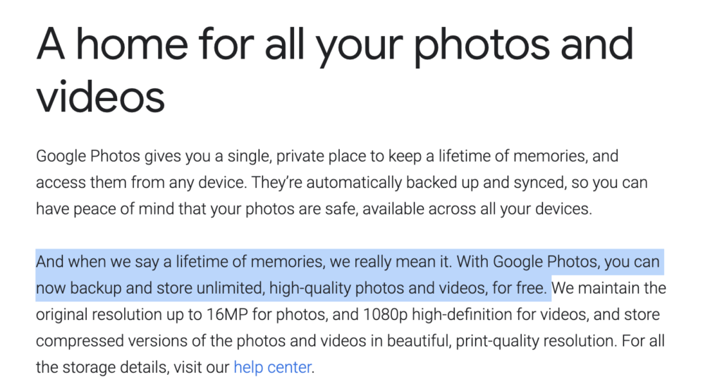
While this is my unhappy story and experience with Google Photos, many, many users were duped into signing up for a free service that they thought would protect, as Google put it, their “lifetime of memories.” Now Google is demanding money from these users.

To me it seems wrong (even evil — remember their old motto “don’t be evil” that they also abandoned?) that Google would bait and switch so many users on this product. You can’t/won’t get the many hours that you spent organizing your photos on Google Photos back. Some will just begrudgingly pay up. What I see is one of the world’s largest companies who used a classic monopolistic tactic to grab market share by pricing out and hurting smaller competitors and now wants to profit from their move.

Once burned shame on you. Twice, three times, four times, five times, six times burned, shame on me. I will never trust Google with another product again.

Thankfully there is an alternative to Google Photos, good old trustworthy Flickr. Here is a thoughtful analysis done by Jeremy Zero comparing Google Photos and Flickr.

I’ve been using Flickr since 2004 and as long as I can remember my Flickr Pro account has remained unlimited. Flickr/SmugMug CEO Don MacAskill even recently re-iterated Flickr’s commitment to honoring their unlimited service. While Flickr may not be a trillion dollar company or make billions of dollars every year like Google does, they are a small company that cares about photographers and your photography. They also do a great job storing and sharing your full high-res, uncompressed, high quality images (and they even retain your photo keywords when you upload them there). I feel much better supporting an ethical small business than a trillion dollar company using monopolistic bait and switch tactics to try to drive the smaller guy out of business.

You can find me on Flickr here. If you are an American Photographer come join the American Photographer Group I administer on Flickr and say hello.


Thomas Hawk Digital Connection

 
Comments Off on Google Photos — Bait Meet Switch

Posted in Photography


Aspect Ratios in Landscape Photography

22 Nov

The post Aspect Ratios in Landscape Photography appeared first on Digital Photography School. It was authored by Elliot Hook.

Composition is often the difference between a good landscape photograph and a great landscape photograph. There are oft-quoted rules that we all try to adhere to and break in equal measure (the rule of thirds, leading lines, golden spiral, etc.), yet when considering what we are trying to capture, we don’t always think about the frame itself.

The aspect ratio of a photograph can make or break the composition by either emphasizing the subject and removing distractions, or by putting the whole scene off-balance. When looking through the viewfinder, about to press the shutter, it’s a good idea to try and envisage the final shot, including the aspect ratio, in order to optimize your composition. Too often, the aspect ratio is an afterthought, applied during post-processing to correct for poor compositional choice.

But how does each aspect ratio impact compositions in landscape photography?

That’s where this article comes in. I’m going to discuss a few common aspect ratios (with examples). I’ll show the benefits and drawbacks for each, and explain where each aspect ratio may be applied.

Note that there is an argument for cropping your photo without sticking to a defined ratio; in other words, that you should give an image a custom ratio based on your subject matter. But that can make printing and framing awkward, so I will therefore be sticking to well-defined ratios that most should be familiar with.

1:1 – Square format

The square format can often be used to simplify an image and give your subject a striking presence at the center of the frame. 

By keeping the width equal to the height, the way in which we read the photograph changes, as there is less of a need to move from left to right through the frame. 

The square format also offers a good opportunity to break the rules we so often follow; place the horizon along the center of the image or place a subject in the center of the frame, and the composition may only get stronger. 

You’ll often see a 1:1 aspect ratio used to emphasize minimalism (again, it’s the theme of simplification).

Derwent Water, Lake District, UK presented in a 1:1 aspect ratio

4:3 – Four thirds format

This format is the default aspect ratio of cameras that use Four Thirds sensors. 

An image with a 4:3 aspect ratio is wider than it is tall, meaning that the eye naturally wants to move left to right through the image. However, given that the image is still fairly tall in relation to the width, this ratio is perfect for drawing the eye into the scene through leading lines. 

The relative height of a 4:3 image encourages the use of wide-angle focal lengths to capture the depth of a scene, without including excess details at the edge of the frame.

Lavender field at sunrise presented in a 4:3 aspect ratio

6:4 – 35mm format (also called 3:2)

This is the default aspect ratio for 35mm film, and therefore for full-frame and APS-C sensors used in most Nikon and Canon cameras. 

With a 6:4 image, the width is significantly wider than the height. This encourages viewing the image from left to right, meaning diagonal leading lines can work quite well.

A limitation of this aspect ratio is that the height is that much shorter in relation to the width. So capturing foreground detail using a wide-angle lens becomes more difficult due to the limited vertical space with which you can work. A 6:4 aspect ratio can even cause the subjects within the frame to become too disparate and therefore lose impact. 

The 6:4 ratio can, however, be suited to capturing scenes where there is little to no foreground interest, especially if you’re using midrange focal lengths (e.g., 35mm).

Rain over Lake Como presented in a 6:4 aspect ratio

16:9 – Widescreen panoramic

The widescreen panoramic format was supported in film by the Advanced Photo System (APS) upon its introduction, and has recently become more popular due to the prevalence of 16:9 aspect ratio displays in the home on TVs, computer monitors, and mobile devices. 

With this format, the width of the image is dominant, so leading the viewer in from the foreground is difficult.

But the format is ideally suited to presenting portions of landscape scenes captured with longer focal lengths (e.g., zoom lenses) from a distance.

Beach abstraction presented in a 16:9 format

12:6 or 18:6 – Panoramic (also called 2:1 or 3:1)

I’ve chosen to adopt 12:6 or 18:6 as the panoramic format here for a few reasons.

First, both 2:1 and 3:1 seem to be fairly well supported in that panoramic picture frame options are typically either 2:1 or 3:1. 2:1 is a panoramic format supported by a number of medium format film cameras and 3:1 was supported by the APS. 

Typically, panoramic ratios will be used to present the result of stitching two or more images together; it’s quite challenging to capture a 3:1 aspect ratio image in one frame and still be able to print at any meaningful size.

Often, frames to be stitched will have been captured using a longer focal length in order to pick out distant details in the landscape. There is no real option to include foreground detail here.

Chalkfields at sunrise presented in a 3:1 aspect ratio

Portrait mode

I’m aware that I’ve discussed a number of different aspect ratios in “landscape” format, and not in “portrait” format.

But that is because I believe the options for the successful presentation of landscapes in “portrait” format are much fewer in number. For a landscape to work, you need to balance the composition throughout the frame, and aspect ratios such as 6:4 make that very difficult, due to the image being too tall relative to its width. 

For “portrait” landscapes to work, fatter rectangles, such as 4:3, 7:6, or 5:4, are ideal. In fact, 5:4 is heavily used by professional landscape photographers with medium and large format cameras. This aspect ratio allows the eye to be taken through the image from left to right, without having an excess amount of sky knocking the frame off-balance.

Bwlch Y Groes, Wales, UK presented in three different portrait formats

Conclusion

While I have tried to describe specific uses of certain aspect ratios, I am aware that not all scenes will follow the suggestions I’ve made. Some images may work well with a certain ratio that’s contrary to what I’ve suggested.

However, I’m hoping this introduction to aspect ratios will encourage you to think about them when composing your shot, before pressing the shutter. It isn’t always ideal to fill the frame with the landscape in front of you.

And knowing that the aspect ratio you choose is not dictated by which camera you use means that you may be able to use aspect ratios effectively to boost the impact of your landscape photographs.

The post Aspect Ratios in Landscape Photography appeared first on Digital Photography School. It was authored by Elliot Hook.


Digital Photography School

 
Comments Off on Aspect Ratios in Landscape Photography

Posted in Photography


3 Simple Ways to Create Stunning Eyes in Your Portrait Photography

21 Nov

The post 3 Simple Ways to Create Stunning Eyes in Your Portrait Photography appeared first on Digital Photography School. It was authored by Gina Milicia.

portrait photography with beautiful eyes
Image model credits, clockwise from top left: Chris Milligan/Fremantle Media, Rachael Lever, Danny Spannerz/East Brunswick Tattoos, Tiffany Diaz

“Here’s looking at you, kid.”

Reclusive Hollywood legend Marlon Brando would always close his eyes when paparazzi tried to take his photo. He knew that without his eyes open the image wasn’t worth publishing.

The eyes are the single most important feature of any portrait. Beautiful eyes can make even the dullest portrait mesmerizing. Poorly lit, out of focus eyes, or eyes that lack connection, will weaken the impact of a portrait.

Here are my three favorite techniques to make eyes really stand out in your portrait photography.

1. Light

Light makes photography. Embrace light. Admire it. Love it. But above all, know light. Know it for all you are worth, and you will know the key to photography.” – George Eastman

Eyes look best when they are lit well, with beautiful catch lights. Catch lights are the reflection of a light source in the eyes. The size, shape, and brightness of your catch lights depend on the light source you use.

An eye lit by windows
Two large, frosted windows from my studio create beautiful catch lights. Model: Bryana Karanikos
Naked Flash on camera
Diffused on-camera flash creates a slightly softer, rectangular catch light.
Eyes lit by a medium softbox off camera
A medium softbox, off-camera and positioned at 2 o’clock, gives a soft, natural catch light.
Badly lit eyes
Poorly-lit eyes without catch lights look cold and a bit creepy.

2. Expression

You are what you think. All that you are arises from your thoughts. With your thoughts, you make your world.” – Anon.

Comparison of portrait photography with bad and good eyes
Model: Tiffany Dias

In the image on the left (above), Tiffany’s eyes are cold, and she looks nervous. After I gave Tiffany a visualization exercise, her eyes became warm, confident, and connected (see the right image above).

How you communicate, connect with, and direct your model is key to capturing a great expression in the eyes. If your model’s smile isn’t genuine, his or her eyes will appear cold and dull-looking. If your model is nervous or distracted, this too will be reflected in his or her eyes.

One technique I use to create a great expression is visualization. I ask my model:

If you could be anywhere right now, doing anything, where would that be? Tell me about that moment. Who is there? What does it feel like?

Once your model is in the moment of their visualization, their body language and expression changes.

3. Post-production

Be willing to give that extra effort that separates the winner from the one in second place.” — H. Jackson Brown, Jr.

Post-production can lift your portrait photography from good to great – when it’s done well. The key to great post-production is to avoid overdoing it. It’s easy to get excited with all the tricks and enhancements that post-production software offers. It’s addictive, and much like opening a jar of Nutella, it’s very difficult to control yourself once you’ve begun.

I try and use the overnight rule when it comes to retouching. Once I’ve worked on an image, I won’t look at it again for at least a day. I find that my eyes constantly adjust to the modifications I’m making, so it’s more difficult to see when I’ve gone too far (which is also what happened when I dressed in the ’80s).

Here’s a step-by-step technique to enhance eyes using Adobe Lightroom:

Before and after images of eyes
Before and after: I’ve used Lightroom to make the eyes sharper and brighter and to enhance their color.

Step 1: Import your image into Lightroom and use the Basic panel in the Develop module to edit your shot. In this case, I’ve used one of my own beauty presets.

Eyes edited in Lightroom
eye adjustments in Lightroom
Here are the basic adjustments I’ve used for this image.

Step 2: Zoom in on the eyes (“B” in the image below) and select the Adjustment Brush tool (“A” in the image below). You can also select the Adjustment Brush using the keyboard shortcut “K.”

Adjusting the eyes in portrait photography

Step 3: Next, you should adjust the eye color with the Adjustment Brush:

Adjusting the eyes in portrait photography
  • Increase the Temperature slider (A) to make the eyes appear warmer in tone.
  • Increase the Exposure slider (B) to brighten the iris.
  • Increase the Shadow slider (C) to bring more detail into the shadow area.
  • Increase the Sharpness slider (D) to make the eyes appear more detailed.

Adjust only the colored part (the iris) of your subject’s eye (highlighted in red in the image above) and set the brush to have a slight feather and a low flow so you can build up your adjustments slowly.

Step 4: Next, select a new Adjustment Brush (A, below), increase the Sharpness slider (B, below) by +22, and paint over the colored part of the eyes, eyelashes, and eyebrows. This will really make the eyes stand out.

Adjusting the eyes in portrait photography

Step 5: Finally, select a new Adjustment Brush. Set the Exposure slider to -29, and increase the Clarity to +10. Paint around the edge of the iris. This will darken the area slightly and give the eye more definition.

Here, the final portrait was imported into Adobe Photoshop, where I did a basic skin retouching to remove a few small blemishes.

Final image with beautiful eyes

And that’s it!

I’d love to hear about your techniques for enhancing eyes in portrait photography, and it’d be great to see some examples. So share them in the comments!


Gina is the author of several dPS eBooks, including Portraits: Making the Shot.

The post 3 Simple Ways to Create Stunning Eyes in Your Portrait Photography appeared first on Digital Photography School. It was authored by Gina Milicia.


Digital Photography School

 
Comments Off on 3 Simple Ways to Create Stunning Eyes in Your Portrait Photography

Posted in Photography


Weekly Photography Challenge – Down

21 Nov

The post Weekly Photography Challenge – Down appeared first on Digital Photography School. It was authored by Sime.

We did ‘Up’ a few weeks back… It made me think about how SO many of us walk from place to place looking down at devices (I’m not going to start in on the whole devices thing, don’t worry!) but it did make me think about what we miss by not looking at what we’re walking over, details or cracks in the pavement, etc. It can take some extra work to make ‘Down’ look good, and so with that gauntlet thrown down, let’s see what you’ve got… (Side note, if you fly a drone, this week is a good time to share your aerial photographs!)

Make sure you tag your photograph #dPSDown wherever you post it!

Weekly Photography Challenge – Down

SO ‘down‘ from your camera or your drone or wherever you like, just has to be ‘down’ – and yes, bonus points for alternate interpretations of ‘down’ – Just make sure you tag your photo #dPSDown wherever you post it! Oh, and don’t forget, you can try all of our previous challenges over here —> CLICKETY CLICK!

Great! Where do I upload my photos?

Simply upload your shot into the comments field (look for the little camera icon in the Disqus comments section) and they’ll get embedded for us all to see. Or, if you’d prefer, upload them to your favourite photo-sharing site and leave the link to them.

Weekly Photography Challenge – Looking Up

Share in the dPS Facebook Group

You can also share your images in the dPS Facebook group as the challenge is posted there each week as well.

If you tag your photos on FlickrInstagramTwitter, or other sites – tag them as #dPSDown to help others find them. Linking back to this page might also help others know what you’re doing so that they can share in the fun.

Follow us on Instagram?

The post Weekly Photography Challenge – Down appeared first on Digital Photography School. It was authored by Sime.


Digital Photography School

 
Comments Off on Weekly Photography Challenge – Down

Posted in Photography


Product Photography 101: The Complete Guide To Perfect Product Photos

20 Nov

Online shopping is the wave of the future. Already, e-retail sales account for 14.1% of all retail sales around the globe. That’s expected to grow to 22%. Every online retailer from small businesses to global giants face the same challenge — how to get customers to buy a product they can’t see. That’s where compelling, true-to-life product photography comes in. Continue Reading

The post Product Photography 101: The Complete Guide To Perfect Product Photos appeared first on Photodoto.


Photodoto

 
Comments Off on Product Photography 101: The Complete Guide To Perfect Product Photos

Posted in Photography


Canon Has at Least 7 New RF-Mount Cameras in the Works

20 Nov

The post Canon Has at Least 7 New RF-Mount Cameras in the Works appeared first on Digital Photography School. It was authored by Jaymes Dempsey.

Canon RF mount cameras EOS RP

Canon is rumored to have seven new RF-mount cameras in the works, including an APS-C model, a high-megapixel model, a niche professional model, and an inexpensive model that will cost less than $ 1000 USD.

This latest round of Canon information comes from Canon Rumors, who explains that they “have attempted to piece together what is coming for the RF-mount camera lineup,” and that the information stems from “multiple known and anonymous sources.”

These new bodies will presumably debut over 2021 and 2022, and Canon Rumors specifically asserts that we will not see any new cameras drop in the last few months of this year. Instead, the EOS R camera lineup will begin to heat up in the first half of 2021; that’s when we can start looking forward to a new batch of powerful Canon models. 

So what, specifically, can we expect?

First, there are a few cameras that have been rumored for months, if not longer:

  • A high-resolution, full-frame mirrorless model, one likely designed for serious landscape and commercial photographers and poised to compete against the Sony a7R IV. Canon Rumors explains that this may be an “R5 body with ‘twice the resolution;’” as the EOS R5 is a respectable 45 MP, that would make any high-megapixel EOS R5 at least 60 MP, but probably more in the 75 to 90 range.
  • A pro-level camera designed for sports and action photographers in the style of the Canon 1D X Mark III. This camera should offer blazing-fast shooting speeds, class-leading autofocus, and a rugged build.
  • An APS-C RF-mount model, one that will potentially cater to photographers looking for Canon 7D-like shooting capabilities in a mirrorless body. 

There are also two RF-mount cinema cameras on the docket: the Cinema EOS C90 and the Cinema EOS C50. Both of these bodies are designed for videographers but use RF-mount lenses.

Canon Rumors also reports several additional upcoming models, including an “entry-level camera to replace the EOS RP,” which “will be cheaper than the current EOS RP camera body.” Since the EOS RP is currently $ 999 USD, you can expect a sub-$ 1000 USD price tag (and potentially one that’s several hundred dollars lower!). Note that this will still be a full-frame model, so if you’re looking to break into the full-frame mirrorless world but have balked at the prices thus far, this EOS RP replacement could be exactly what you’re after.

Finally, Canon Rumors predicts a model above the future sub-$ 1000 camera but below the EOS R6 in price (so somewhere in the $ 800 USD to $ 2500 USD range). Note that the Canon EOS R currently slots between the EOS RP and EOS R6, but Canon Rumors claims that the new camera is not a direct EOS R replacement. 

Regardless, we’ve got quite a lot to look forward to over the next couple of years (not to mention Canon’s RF lens lineup, which should grow substantially). So keep an eye out for further news on these Canon RF-mount cameras.

Now over to you:

Which of these RF-mount camera models are you most looking forward to? Are there any that you’d love to own? Share your thoughts in the comments!

The post Canon Has at Least 7 New RF-Mount Cameras in the Works appeared first on Digital Photography School. It was authored by Jaymes Dempsey.


Digital Photography School

 
Comments Off on Canon Has at Least 7 New RF-Mount Cameras in the Works

Posted in Photography


What Is Abstract Photography? (Plus Three Ideas for Getting Started)

19 Nov

The post What Is Abstract Photography? (Plus Three Ideas for Getting Started) appeared first on Digital Photography School. It was authored by Charlie Moss.

What is abstract photography?

The exact definition can be tricky to pin down. It seems that everyone has an opinion, but those opinions can differ wildly depending on who you talk to. Of course, there will always be regional and cultural variants, but let me try and tell you where abstract photography came from.

That way, you can decide what abstract photography means to you.

What is abstract photography?

Abstract photography is no one particular style or technique. It has varied in style and approach for the last century or so.

However, all abstract photographers do have one thing in common: They are always looking to avoid symbolic representation.

What does that mean?

Well, it means that abstract photographers reject the idea that a photograph must always be of something recognizable. Instead, abstract photographers focus on color, shape, and texture.

what is abstract photography
Canon 5D Mark II | Canon EF 100mm f/2.8 Macro USM | 100mm | 1/320 sec | f/2.8 | ISO 100

It was in the 1930s that abstract photography really became recognized internationally. Early pioneers include Alfred Stieglitz, Edward Weston, and Dora Maar. For some photographers, the process of making images was just as important as the result, which meant that new techniques and new ways of taking photographs were discovered during this period.

Much abstract photography today involves unusual framing and viewpoints in order to try and disassociate the object being photographed from the resultant images. Abstract photographers almost try and trick our eyes and minds into not being able to easily understand what they’re looking at. Such abstract images often use high contrast, sharp focus, and an emphasis on geometric structure.

Now that we’ve answered the question of what is abstract photography, it’s time to try and put the theory into practice.

Here are three techniques you can use to try and shoot your own abstract photos:

Make it out of focus

One of the first things we all learn in photography is how to get things in focus. In fact, our cameras will do this automatically for us if we want them to!

Accurate focus and good sharpness are two of the most desirable traits that most photographers look for in a photograph. So what happens when you subvert that traditional approach?

This bright red photograph (below) was created by using extension tubes to get right up close to a flower. I then ensured that the entire image was out of focus. The colors and patterns become the focus of the image instead of the flower itself:

flower abstract photography
Canon EOS 350D | Canon 55-200mm f/4.5-5.6 | Extension tubes | 1/1000 sec | ISO 200

You can take this one step further by turning your image black and white to remove all of the color information. This abstracts the subject even more, moving the photograph further away from the original object and reality:

black and white abstract flower
Canon EOS 350D | Canon 55-200mm f/4.5-5.6 | Extension tubes | 1/1000 sec | ISO 200

For a photographer who is trying to explore what is abstract photography, this approach of creating out of focus photos can be a great way to start. It forces you to think hard about the composition of your images as you play only with light, color, and shape.

Make it move

There are several ways to “make it move” when you’re doing abstract photography. You can move your subject, or you can move your camera.

Moving the camera can be as simple as panning the camera left to right during long exposures to capture the beautiful tones of a golden beach under blue skies. This will create smooth strips of horizontal color across the photograph.

An exciting way to shoot motion-based abstract photography is to attend sports events. The photograph below was shot at a classic car racing meet, the block colors of the barriers and curb creating stripes of colorful interest in the picture:

what is abstract photography? car in motion
Fujifilm X-T20 | Fuji 50-140mm f/2.8 | 140mm | 1/15 sec | f/22 | ISO 100

For creating abstract images with panning, first set a long exposure. You might need a very low ISO and a narrow aperture in order to get a shutter speed that’s long enough if it’s a sunny day.

Then move your whole body to follow the subject with your camera. It will take lots of practice!

what is abstract photography jar
Fujifilm X-T20 | Fujifilm 35mm f/1.4 R | 35mm | 1/170 sec | f/5.6 | ISO 200| Layered images in Adobe Photoshop

Instead of moving your camera, you can also try moving your subject. The deceptively simple image of a glass bottle (above) is not quite as it seems. It was created from a dozen different shots, layered on top of each other using a Pep Ventosa technique. For each shot, the bottle was rotated slightly to catch the imperfections in the glass and the slight movement.

Make it repetitive

Repetition is a technique that can be used to great effect in abstract photography. It makes the viewer focus on the patterns and shapes rather than the subject.

abstract photography building repetition
Fujifilm X-T20 | Fujifilm 35mm f/1.4 R | 35mm | 1/340 sec | f/8.0 | ISO 200

Try finding patterns in architecture and then isolating them, rather than photographing the whole building. This kind of approach of looking for details in larger scenes can help you really understand what abstract photography is all about.

If you want to shoot some architectural abstracts, modernist buildings are some of the best subjects. Their clean, smooth lines really lend themselves to abstract photography.

To remove your picture further from reality, you can experiment with color toning the image in Lightroom, or even turn it black and white.

Conclusion: What is abstract photography?

There are many different answers to the question, “What is abstract photography?” And there are many different ways to create abstract images.

What’s important is to try to move away from straight reproductions of scenes and objects that look just like reality.

Try introducing movement, repetition, or even making your images out of focus. Creating abstract photos is a great way to try breaking the rules and pushing the boundaries of what is usually seen as the correct way to do photography!

The post What Is Abstract Photography? (Plus Three Ideas for Getting Started) appeared first on Digital Photography School. It was authored by Charlie Moss.


Digital Photography School

 
Comments Off on What Is Abstract Photography? (Plus Three Ideas for Getting Started)

Posted in Photography


How to Use Photoshop to Add Lightning to Your Stormy Photographs

18 Nov

The post How to Use Photoshop to Add Lightning to Your Stormy Photographs appeared first on Digital Photography School. It was authored by Ana Mireles.

Did you know you can use Photoshop to add lightning bolts to your images?

use photoshop to add lightning before and after

Thunderstorms are a great photographic subject, and bolts of lightning can add drama to your photos. Unfortunately, they don’t necessarily occur when you want them.

And you can’t always base your photoshoots around natural events. That’s when post-processing comes to your aid.

How to use Photoshop to add lightning

Have you ever seen a thunderstorm and wished it had happened the day before when you were out doing an urbex photoshoot? Or have you ever you looked at one of your photos and thought that a thunderstorm would have added the perfect ambiance?

how to use photoshop to add lightning tutorial

Unless you’re a professional that specializes in this kind of photography and purposely chases storms, you’ll rarely have a thunderstorm when you’re in the right location with the proper equipment.

And even if you are in the right place at the right time, it’s not always easy to photograph lightning.

Not to worry.

Because there are several different ways to use Photoshop to add lightning – and create the perfect thunderstorm in your photos.

how to use photoshop to add lightning Intro

In this tutorial, I’ll show you two ways of adding lightning to your images. The first way is by making a composite. The second way is to create a lightning bolt inside Photoshop.

So choose the one that’s better for you, and let’s get started.

Use Photoshop to add lightning via compositing

This technique is very easy to do, but you must already have a lightning photograph on hand.

Step 1: Choose and open your images

Use Photoshop to composite a thunderstorm

First, you need to choose the two images that you’re going to use. One of them will be the background where the lightning bolt is going to be added.

This method will work best if the image has a moody sky. You can always place a bolt of lightning into a clear blue sky, but an already-moody sky will look more realistic and have more drama. So pick an image with lots of clouds and contrast.

The second image is the one with the lightning bolt in it. If you’ve photographed thunderstorms in the past, then you can use one of those images. If not, you can always get a lightning bolt from a free stock photography website.

Open both images in Photoshop. Then drag the lightning photo onto the new background; this will automatically paste it into a new layer.

Alternatively, you can use the commands Edit>Copy and Edit>Paste.

Step 2: Use Photoshop’s blending modes to add lightning

Photoshop simple composite technique

Your new layer should be covering the background, so you need to blend both layers together and integrate the lightning bolt.

I prefer to keep the original color, but you can also make your lightning image black and white and then make it darker to make the blending easier.

Whether you decide to leave the lightning in color or change it to black and white, you need to change the blend mode. You can do this by opening the drop-down menu in the Layers panel and selecting your desired mode.

For my example, Overlay is the most appropriate. And it can be a good starting point for you, too, but feel free to experiment with other options.

Step 3: Fine-tune your composite

use Photoshop blending modes to add lightning

Move and adjust the lightning bolt until it’s positioned the way you want it in the background image. Once everything is in place, you need to do some advanced blending in the Layer Style dialog box.

To open the Layer Style box, just double-click on the layer next to its name. Don’t click on the thumbnail or the name itself, because those are different tools. A pop-up window will appear; that’s the Layer Style box. At the bottom, you’ll find the Blend If option.

Here, you need to move the sliders to the right. Start with the top slider (which controls the current layer). Hold Alt while you drag to split the slider and create a more gradual effect. Then, if necessary, do the same with the slider on the underlying layer. Once the lightning looks integrated into the photo, you can click OK to close the dialog box.

You can now add a layer mask to further fine-tune the effect. The source of the lightning is always lighter than the rest of the sky, so you might need to add a gradient to create that effect.

You can also color black any residual elements that didn’t disappear via the Blend If settings.

That’s it! Your composite is now ready. You can add other filters or do some more editing to finalize your picture.

How to use Photoshop to add (and create) lightning bolts

For this method, you only need to have a background image. Again, the choice is yours, but a cloudy day or dramatic scenery will help create more impact.

Step 1: Create a lightning bolt

add lightning using Photoshop - before

Open the background image in Photoshop and create an empty new layer at the top of the layer stack.

To fill it, grab the Gradient tool, set it to Linear Gradient, and drag the tool across the canvas. Make sure that your gradient goes from black to white. These choices can be found in the Options bar at the top of the screen.

With the same layer selected, go to Filter>Render>Difference Clouds. There are no settings (or previews) for this kind of filter; it just generates a pattern using random values.

Use Difference Cloud filter

Now invert it by going to Image>Adjustments>Invert. You can also use the shortcut Ctrl/Cmd + I.

Then go to Image>Adjustments>Levels. In the pop-up window, you’ll find a histogram with a slider (this is the Levels adjustment). Drag it to the right until the background is all black and only white lines are visible. You’ll notice that some of these white lines resemble lightning bolts.

Create fake lightning bolts

Pick a “lightning bolt” and start painting with black to cover the other lines using the Brush tool. Keep going until you leave only a line that looks like lightning. The size and shape are up to you; there’s no specific formula.

If you only want to add that lightning bolt, then just adjust the blend mode of the layer and position it where you want it (see the composite technique explained in the first part of this article).

If you’d like to add several lightning bolts or one lightning bolt with a more complex shape and multiple branches, then I recommend you make a brush.

Step 2: Make a custom brush

Create a custom brush

To create a brush, you have to select the lightning bolt you just made. To do that, you can use any selection tool that is comfortable for you. In this case, I’d recommend using Color Range.

Once you’ve selected your lightning bolt, click on Edit>Define Brush Preset and give it a name. To make the lightning more dynamic, you can adjust the settings and make it change size and direction.

Now you have a lightning bolt brush that you can use in any photograph without having to create one again and again. At this point, you can hide or delete the lightning layer.

Step 3: Add lightning bolts in Photoshop

create a thunderstorm in Photoshop

Create a new empty layer on top of the background. That way, you can have the lightning bolts in a separate layer to edit and modify them as required.

Start painting one or more lightning bolts until you’re satisfied with the thunderstorm effect.

Step 4: Fine-tune the effect

add lightning using Photoshop - after

You can add a layer mask to integrate the lightning using a gradient to make it look more natural.

You can also add a Solid Color layer above the lightning layer. You can then use the Blend If tool to color only the lightning bolts.

Your thunderstorm is ready now! However, you can continue to post-process the final image if you want to give it a specific look. Black and white usually works very well for these type of images, so give that a try.

How to use Photoshop to add lightning: conclusion

I hope this article helped you see how easy it is to use Photoshop to add lightning.

Feel free to share tips and your own amazing images in the comments section below!

The post How to Use Photoshop to Add Lightning to Your Stormy Photographs appeared first on Digital Photography School. It was authored by Ana Mireles.


Digital Photography School

 
Comments Off on How to Use Photoshop to Add Lightning to Your Stormy Photographs

Posted in Photography


How to Read and Use Histograms

17 Nov

The post How to Read and Use Histograms appeared first on Digital Photography School. It was authored by Darlene Hildebrandt.

The histogram is a useful but often misunderstood tool that your camera provides to help you get the correct exposure in your images.

In this article, we’re going to look at how to read a histogram, and how to use it to your advantage. Getting the best exposure (there is no such thing as the “correct” exposure, as it’s all subjective) in-camera should be your goal every time you click the shutter.

Using these tips should help you increase your photographic success rate!

What is a histogram?

Here’s the dictionary definition: 

A histogram is a bar graph of a frequency distribution in which the widths of the bars are proportional to the classes into which the variable has been divided and the heights of the bars are proportional to the class frequencies.

Huh? Anyone else confused? So what does a histogram really do? And how do you read it?

Let’s have a look!

How to read the histogram

A histogram is a graphical representation of the pixels in your image. The left side of the graph represents the blacks or shadows, the right side represents the highlights or bright areas, and the middle section represents the midtones (middle or 18% gray). 

The heights of the peaks represent the number of pixels of a particular tone (with each peak corresponding to a different tone). Each tone from 0-255 (0 being black and 255 being white) is one pixel wide on the graph, so imagine the histogram as a bar graph all squished together with no spaces between each bar.

Have a look at the diagrams below:

how to use the histogram

What can we learn from a histogram?

There are many things we can learn about an image just by looking at its histogram.

We can tell that an image is well-exposed if it reaches fully from edge to edge without a gap on one side of the graph, and it isn’t heavily going up one side or the other. In an ideal world, the graph should just touch the left and right edges of the histogram, and not spill up the sides. The graph should also have a nice arch in the center. 

However, this “ideal histogram” doesn’t always apply in every situation for every scene. Here are a few examples:

an ideal histogram
This is how an ideal histogram might look, evenly distributed, edge to edge, not up the sides.
a darker histogram
This is a histogram for a dark subject. It is not wrong; it is just more shifted to the left to represent the tones of the subject. This might be a black cat on dark pavement.
a brighter histogram
This is a histogram for a light subject (e.g., a white cat) with mostly light tones in the scene and few dark areas. See how it is shifted to the right compared to the dark subject? This is what you want, assuming your scene is mostly light-toned. If you change your exposure to keep the graph centered, you will end up with a gray cat, not a white one.

When the histogram tells you to adjust your exposure

Gaps on either end indicate you are missing information and your exposure can be shifted safely without losing detail. When your graph is shifted too far in one direction or the other direction, so that it does not even touch the other edge, you can safely shift your exposure to cover more of the range of tones. Let’s look!

an overexposed histogram
This graph shows an overexposed image; notice the gap on the left side indicating a lack of any blacks in the image. It also means you will lose lots of detail in the white areas that may not be recoverable. In this case, shift to give your image less exposure and shoot the scene again.
an underexposed histogram
This histogram shows the opposite. Now we see a gap on the right side of the graph indicating there are no whites represented, so the image will be dark – too dark. You can safely give the image more exposure until you see the tones just touch the right edge of the histogram.

What do the spikes up the sides mean?

Spikes up the left or right edge of the histogram indicate “clipping” of that tone and a loss of detail in that area. Clipped areas are often unrecoverable, especially in the highlights.

It is generally advised to expose so that your graph just touches the right edge (which indicates that you’ve kept your highlight details). It is usually easier to recover some shadow detail and retain a decent image than to try and create highlight detail that isn’t in the file.

In some scenes, however, it may not be possible to keep the graph within an acceptable range. For example, you’ll struggle to get great results if you are photographing a scene with extreme contrast, such as:

  • Sunset
  • Bright sunlight and deep shadows
  • A building interior where you also show the area outside the windows

In all of those cases, you will not be able to keep from clipping either your blacks, your whites, or both.

a high-contrast histogram
High contrast graph

The graph above shows an image with extreme contrast, lots of blacks, a spike of white, and not much in the middle.

Is this wrong? Can you correct for it?

No, it’s not wrong.

And you can’t really “correct” for it, but you do have a decision to make when you see something like this. Do you shift the graph left and maintain highlight detail, or shift it right and keep shadow detail?

There is no right or wrong here. It’s all how you interpret the scene before you. If in doubt, shoot both and decide later. The graph above comes from the image below, so as you can see it is not the incorrect exposure at all. There are simply no midtones in the scene:

neon star sign

Here’s another example of a scene that will potentially go off the graph on both ends:

wide-angle cathedral with a blown-out ceiling and deep shadows
Notice the skylight at the top of the roof is blown out, and the deep shadows have little detail.
cathedral with better detail
Notice how, in this image, the details have been retained in both the highlights and the shadows.

Using advanced techniques like image merging and blending, HDR, or careful post-processing, you can compress the tonal range of a scene to fit within the histogram and therefore have details in all areas.

For the image above, I’ve used four bracketed images (taken two stops apart) and the HDR tone mapping process to bring the dynamic range of the scene down within a printable range.

One more handy thing on your camera: the “blinkies”

To help you establish how far you can go when exposing, most cameras have a setting called “highlight warnings.” It will make any overexposed highlights flash or blink when you preview your images on the camera LCD. Many people affectionately call these “the blinkies.”

histogram blinkies flashing
Notice the flashing areas; that means the highlights are being clipped in those parts of the image.

To do this on a Nikon camera, preview an image and press the Up or Down button (near the OK button) until you see the highlights flashing or outlined. This is the “highlight mode.” If you choose this setting, your camera will remember to use it for the next image you preview. You may need to activate the “highlight warnings” feature in your settings menu first, however.

To do this with a Canon camera, press the Display or Info button (depending on your model) until the blinking highlights show up on the screen when previewing images. You may also need to turn on this feature in the menu settings. Check your camera manual if you aren’t sure how to do this.

Summary

By using the tools your camera provides you, it’s easier to understand how to adjust your image exposure. There is a lot more to know about the histogram, and you can use it when you process your images in Photoshop or Lightroom, as well. 

Just keep in mind that, if you shoot in JPEG format, nailing the exposure in-camera is even more critical. If you shoot in RAW format, you have some leeway to make adjustments later, but it’s still a better idea to get it right in the first place.

The post How to Read and Use Histograms appeared first on Digital Photography School. It was authored by Darlene Hildebrandt.


Digital Photography School

 
Comments Off on How to Read and Use Histograms

Posted in Photography


The Sony a7 IV Will Launch in 2021, With a 30+ MP Sensor and 4K/60p Recording

16 Nov

The post The Sony a7 IV Will Launch in 2021, With a 30+ MP Sensor and 4K/60p Recording appeared first on Digital Photography School. It was authored by Jaymes Dempsey.

Sony a7 IV rumors
The Sony a7 IV will likely be the next a7 model to launch, around a year after the a7S III (pictured above).

It’s been over two years since the release of the Sony a7 III, but it seems like we’re finally getting close to its successor.

According to Sony Alpha Rumors, the a7 IV will debut midway through 2021. And while the camera won’t offer any truly groundbreaking features, SAR’s “usually very good source” suggests a suite of intriguing specs.

First, the sensor will no longer fit Sony’s 24 MP mold. Instead, we’ll be treated to a megapixel upgrade, something in the “30-32 MP region.” If this is true, the Sony a7 IV resolution will offer a meaningful boost over the 24 MP a7 III and a7C, without reaching the storage-hogging heights of the a7R series. Personally, I’m a big fan of this megapixel “middle ground” – it guarantees some additional pixels without significantly affecting high-ISO noise performance (and you can bet that Sony’s done a good job with the sensor, which means that it’ll offer a noise performance at least comparable to the excellent a7 III).

One of the few areas where the a7 III has lagged behind the competition is with the electronic viewfinder, which comes in at 2.36M-dots, compared to the Canon EOS R’s and the Nikon Z6’s 3.69M-dot resolution. But while the a7 IV won’t compete with its 5.76M-dot sibling, the a7R IV, SAR claims the a7 IV should offer a 3.69M-dot EVF, which puts it in a “professional” range and should improve the overall a7 IV shooting experience.

Sony Alpha Rumors also claims that, despite a “cheap” LCD, the “image quality and AF will be top-notch.” While I wouldn’t expect anything less from an a7 III successor, it’s nice to hear it from a source.

As for video:

The a7 IV will offer (unsurprisingly) 4K/60p recording, which should be enough for most videographers, though it certainly won’t turn heads like the a7S III with its 4K/120p capabilities, or the Canon EOS R5 with its 8K option.

Finally, you can expect a price of around $ 2500 USD, which is expensive without heading into that “niche professional” category.

We’re a long way off from an announcement, but make sure to check back on dPS for any relevant updates!

The post The Sony a7 IV Will Launch in 2021, With a 30+ MP Sensor and 4K/60p Recording appeared first on Digital Photography School. It was authored by Jaymes Dempsey.


Digital Photography School

 
Comments Off on The Sony a7 IV Will Launch in 2021, With a 30+ MP Sensor and 4K/60p Recording

Posted in Photography