Category: Photography

  • 10 Ways to Direct a Portrait Shoot like a Pro

    In this post Gina Milicia – author of our brand new eBook “Portraits: Making the Shot” shares 10 tips on directing a portrait shoot like a Pro.

    Mallory Janson New York: photo by Gina Milicia

    1. Check your Mood

    Have you ever been served by a rude shop assistant or waiter that was in a bad mood? How did it make you feel?

    Your mood on the day of your shoot is going to have a huge impact on the people around you. If you want the people you photograph to look and feel relaxed then you should look and feel relaxed too.

    2. Try to be interested rather than Interesting

    A great portrait photographer knows how to speak to their models and make them feel comfortable, confident and relaxed.

    A persons name is the sweetest sound to their ears so remember it and use it often.

    Most people’s favorite topic of conversation is themselves. Ask questions, be interested and really listen to their answers

    3. “Be yourself, everyone else is already taken.” Oscar Wilde

    Ditch the boring clichés, saying stuff like “make love to my camera” just sounds really creepy

    Work with a language you are totally comfortable with. If you are softly spoken then this is how you should give direction. Trying to be someone else will just make directing awkward for you and your model.

    Daniel Macpherson: photo by Gina Milicia

    4. “By failing to prepare, you are preparing to fail.” Benjamin Franklin

    As the photographer you should always be the first to arrive and the last to leave.

    Always have your lighting, poses and location worked out in advance. Your model will already be feeling nervous and vulnerable. Subjecting them to lighting tests and your uncertainty is only going to make them feel worse.

    5. YOU need to know how to Pose

    Practice posing to learn which positions will flatter a body and which shapes looks good from different angles. Or be a model for another photographer and experience what it’s like to be directed by someone else.

    Then explain the pose in different ways.

    1. Get in there and do the pose for them. Show them what you want.
    2. Explain it to them at the same time.
    3. Then get your model to do the pose before you start shooting.

    This is not only the quickest and most effective way to get your sitter into the pose, it helps you develop a rapport. Once your model knows how nice the pose looks on you (and realizes they won’t look foolish), they will be much happier to do what you’re asking.

    Lachy Hulme: photo by Gina Milicia

    6. Use Visual rather than Verbal Cues

    I hear and I forget. I see and I remember. I do and I understand.” – Confucius

    The quickest and most effective way to direct a person is by giving them visual rather than verbal cues.

    Telling my clients how to stand with verbal cues would sound something like this

    Stand with your feet adjacent to each other, weight on your back foot, hips side on, front toe to camera, right arm on hip, left arm in pocket, chest ¾ to camera , head slightly right…. No sorry my right. Now move your head left… sorry, I mean right. Now step left… sorry I mean right

    Verbal cues become incredibly confusing and can really diminish rapport with your client. You become frustrated because your client keeps moving the wrong way and your client is confused, uptight and lacking in confidence.

    I have found that visual cues are by far the best way to pose your clients.

    I simply swap places with my client walk onto the set and go into the pose so they can see exactly what I’d like them to do.

    Once your client is in the correct position continue to use visual cues to direct them.

    Some examples of this would be;

    Turn your face towards that tree” instead of “turn your face to the left

    Move your face towards the window and move your eyes back to look into my camera” instead of “turn your face to the right and look at me

    7. Praise and Encourage

    Give positive feedback when your model is doing the right thing. It’s classic positive reinforcement but it works. Ignore the bad and praise the good.

    Talking to your model will keep them relaxed so they don’t worry about what you’re thinking behind the camera (because that’s exactly what they’re worrying about).

    Shaun Micaleff: Photo by Gina Milicia

    8. One Size does not Fit All

    A photograph is just a tiny slice of a subject. A piece of them in a moment. It seems presumptuous to think you can get more than that.” – Annie Leibovitz

    It’s really important to choose poses that fit your model.

    Trying to foist a particular style and attitude onto the shoot is a short cut to your model looking and feeling uncomfortable. Most great portrait photographers are masters at letting their model’s personality come through in their shots.?

    9. Eye, eye, eye

    You can’t hide your lying eyes” – The Eagles

    Everything you think about is mirrored in your eyes. I actually notice this in the eyes of women more than men.

    Even if you’ve nailed the pose, the lighting, and the location, an insincere smile or eyes that lack emotion can ruin your shot.

    How do you get your sitter to switch off?

    While you can’t actually stop your sitter from thinking, you can direct them to a better headspace to reduce any negative thought patterns.

    Here are a few visualization techniques I use

    1. Favorite holiday destination
    2. Dream job scenario
    3. Meeting one of their idols

    Ask your sitter to look away from the camera, and then back again after each frame. This is especially useful on a long shoot as it distracts your sitter long enough to give them fresh, thoughtful eyes for each shot.

    Make small variations on the pose to make it a little more interesting, such as asking your sitter to make their smile bigger or smaller.

    Just keep talking

    10. The quiet moments in between frames

    Some of my best portraits have been captured in those moments between frames when the model thought I wasn’t shooting and relaxed their “pose face” or glanced/laughed off camera. Watch for these moments. They are gold.

    Enjoy this post? Check out more of Gina’s advice in her new eBook – Portraits: Making the Shot (and get a bonus one free for the next week only).

    Post originally from: Digital Photography Tips.

    Check out our more Photography Tips at Photography Tips for Beginners, Portrait Photography Tips and Wedding Photography Tips.

    10 Ways to Direct a Portrait Shoot like a Pro

    Digital Photography School

  • Include The Foreground For Dramatic Landscapes

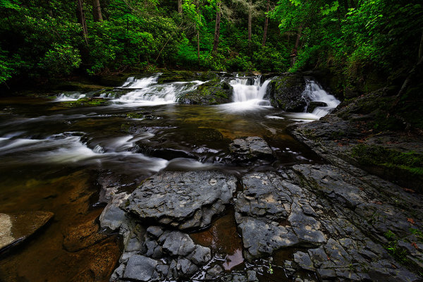
    When I came upon this small cascade, I felt it would make a nice image. I began working up close and felt like something was missing. Then I walked further downstream and found these interesting rock formations. Camera was Canon EOS 5D Mark III, with EF 17-40mm f/4L. Exposure was 2.5 sec., f/18, ISO 100.

    When photographing landscapes, it’s very easy to get lost in the grandiosity of the overall view, and sometimes , lose sight of what could be a better image.  Many times, I’ve been taken in by a grand expanse that was simply beautiful to look at, but was unable to translate that beauty into a compelling image. In the past few years, one of my favorite landscape techniques is to use an ultra wide angle lens to emphasize the foreground and use that beautiful expanse as background for an image.

    I was never what one would call a true “wide angle shooter”, but as I began exploring landscape photography more and more, I fell in love with lenses such as the 16-35mm f/2.8, the 14mm f/2.8, and the 8-15mm Fisheye Zoom. These lenses have become my go-to lenses when shooting landscape images.  They allow me to capture wide expanses, while emphasizing elements of the composition immediately in front of me.

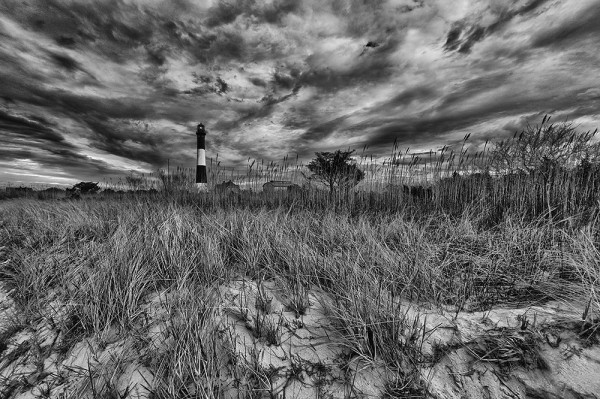
    The dune grass created a lot of foreground interest for me, with a nice texture that pointed towards the lighthouse. A low shooting angle ensured I'd be able to include that dramatic sky as well. Canon EOS 5D Mark III, with EF 8-15mm f/4L Fisheye Zoom. Exposure 1/60, f/16, ISO 100. The perspective was then corrected in Photoshop.

    The first thing to realize when shooting with these lenses is that you have to be close to that foreground element. It needs to be prominent and stand out. Being able to spot those elements that will do that for your image is a skill that requires some practice to perfect.  It took me some time to learn to “see” like a wide angle lens would.  But now I constantly pick out elements and frame my image around that element being right in front of the camera, rather than looking at the bigger picture first and accidentally getting a nice foreground.

    It’s important to take into account point of view when placing your foreground in the scene.  Too often I see photographers extending their tripod legs to the height that would be best for them standing at their full height.  The problem with this is that this is the height at which most people look at things, so for the most part the point of view in the scene won’t be too different from everyone else’s point of view.  I prefer to be able to get low when possible, and really get close to the foreground.  It’s a point of view most people don’t bother to get to, and it also makes the chosen foreground element that much more prominent in the scene. By being low, there’s also the added benefit that if the sky is dramatic, you can angle the camera up just a bit to include more of the sky.

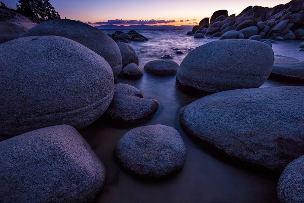
    These rocks made a beautiful foreground to place against the warm tones created by the sunset. EOS 5D Mark II with EF 14mm f/2.8L II. Exposure was 2.5 sec., f/11, ISO 100.

    Once you have that foreground element in place, you want to be sure it’s in focus.  But more than that, you want to be sure EVERYTHING that you want to be sharp, IS sharp. To do this, you’ll have to figure hyperfocal distance. Hyperfocal distance is defined as  the closest distance at which a lens can be focused while keeping objects at infinity acceptably sharp. When the lens is focused at this distance, all objects at distances from half of the hyperfocal distance out to infinity will be acceptably sharp.  There are two ways to figure this out.  The first way is to do some math.  Math makes my head hurt, so I do it the easy way and use a depth of field calculator on my smart phone.  There are several out there, so I’d suggest trying some of the free ones first before spending money on the paid apps.  Once you tell the app what camera you are using (sensor size), focal length, and f-stop, as well as the distance to the foreground element you want in focus, the calculator will tell you what the hyperfocal distance is- the distance you should focus your lens to, as well as the near limit- or how far the nearest area of sharp focus is from the camera. Everything beyond that point should also be acceptably sharp all the way to infinity.

    Of course, the foreground does not always lend itself to being included in our compositions.  These are choices we as photographers must make for every image we take.  As I said, it can be very easy to be sucked in by a beautiful vista.  But it’s just as easy to be turned off when the vista is only so-so. By looking at all areas of the scene, the foreground, as well as the middle ground and background, more options open up to your camera, and of course, more photos.

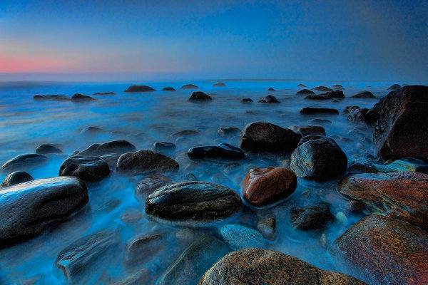
    Fog and mist at sunrise obliterated the grander vista I had intended to shoot this morning. The lighthouse was shrouded in fog, but as the sun came up it created this beautifully soft light. A long exposure using a variable ND filter allowed me to give a misty effect to the water. The wet rocks glistening in the soft light gave the foreground added interest. Canon EOS 5D Mark II, EF 17-40mm f/4L. Exposure: 20 sec., f/11, ISO 800.

    Post originally from: Digital Photography Tips.

    Check out our more Photography Tips at Photography Tips for Beginners, Portrait Photography Tips and Wedding Photography Tips.

    Include The Foreground For Dramatic Landscapes


    Digital Photography School

  • How To Photograph People You Meet While Traveling

    Imagine this scenario: You’re walking down a side street in Bangkok in the late afternoon, and you pass by an old man sitting on his patio. He’s drinking a cup of tea and staring off into the distance, and he just exudes an aura of contentment. The light is perfect, and the viewfinder in your mind’s eye composes the perfect Continue Reading

    The post How To Photograph People You Meet While Traveling appeared first on Photodoto.


    Photodoto

  • Using Photography and Video to Tell Stories that Need to Be Told

    This morning I came across a short film that I just had to share with the dPS community. It is the story of Jill Brzezinski-Conley who shares her story of life, love and the challenges thrown her way through breast cancer.

    Nothing I can really say adequately expresses what this video presents so… please watch and consider sharing this video.

    ‘The Light That Shines’ a story for all from InBedWithSue.com on Vimeo.

    I guess to bring it back to what we do here at dPS – this is a beautiful example of one photographer (Sue Bryce) and one videographer Hailey Bartholomew using their gifts and talents so positively to impact the life of another person and to tell a story that I suspect will touch and hopefully inspire many.

    Read more at Hailey’s blog and on Sue’s site and connect with Jill here on Facebook.

    Post originally from: Digital Photography Tips.

    Check out our more Photography Tips at Photography Tips for Beginners, Portrait Photography Tips and Wedding Photography Tips.

    Using Photography and Video to Tell Stories that Need to Be Told


    Digital Photography School

  • Your Photography Website Might Need This

    Photocrati has spent many days coming up with very educational and detailed virtual classes. Two are currently available; one on your overall photography website and the other specific to SEO.

    SEO is often overlooked or thought to be a waste of time, but Photocrati has made it a point to tell you why it is well worth the time.

    Photocrati has recently launched two interactive courses on the Udemy education platform. Here are some details:

    udemy_courses

    For $ 97, Supercharge Your Photography Website teaches you the fundamentals of getting your photography website going and how to optimize it for your customers and business success.

    You will learn about: Hosting, WordPress, Website basics, Plugins, Themes, Layouts, Galleries, Pages, Blogging, Social Media and more.

    For $ 49, SEO for Photographers dives into the SEO of your photography website and how you can implement the basic, most crucial SEO techniques into your website.

    You will learn about: What and Why, On and Off Site, Meta Tags, Link Building, Local SEO and more.

    In the graphic below, you can see how blogging plays a roll in your site’s rankings.

    blogging-impact

    With Google’s  new Author Rank algorithms, blogging and social media is more important than ever.  To learn more about this, check out the courses and get started today.

    • Supercharge Your Photography Website
    • SEO for Photographers

    Thanks and good luck.

    dslrBlog

  • An Editorial: Is the Internet a Photographer’s Friend or Foe?

    Rewinding the Clocks back 15 Years

    Should we wind our clocks back about 15 years to a time before the phenomenal popularity of home based computers and the internet, there was a general widespread knowledge or understanding that it was illegal to lift a picture from a book and re-use it in some fashion without the author’s permission.

    But really, how would one misuse the image: photocopy it and paste the picture on the office wall?  That really was a time of print media and the avenues for misuse were quite limited.

    Let’s move forward to about a decade ago and the infusion of the digital age.  Gone were the days of a stock photographer shooting in-camera duplicates and huge FedEx bills to supply clients with overnight deliveries of image requests.  Digital capture and ftp delivery were rapidly becoming the norm.  At the same time agency print catalogs were giving way to on line image marketing and automated image licensing.

    Unfortunately for the photographers of the world who earn a livelihood from their work, it also meant images could be right clicked and saved to a desktop without license or authorization.

    Introduce in the last five years, or so, the whole social media craze and picture sharing portals. What has evolved is not only a platform for families to share images with other family members, but it has also developed a breed of web users who, quite frankly, believe an image on the internet is public domain. Attitudes have become very cavalier and self-patronizing with barely a thought given to copyright and how repurposing that image might affect the copyright owner.

    What hasn’t changed, at least in Canada, and I also assume in other countries as well, is the copyright act.

    Although I am not a lawyer I certainly do understand its most basic premise that in most cases the copyright in a work resides with the author for his or her life plus fifty years.  There are a few exceptions, but for all intents and purposes when a photographer releases the shutter on a camera they own the copyright by default.

    Specifically Section 13.(1) of the Canadian Copyright Act, and I suspect most western countries that subscribed to the Berne Convention have similar provisions, reads:  “

    Subject to this Act, the author of a work shall be the first owner of the copyright therein.” 

    The Act further goes on to clarify that only the owner of the work shall have the right to license or assign that work.  I always thought this was very cut and dry.  Not so.

    Introducing DMCA

    Now introduce the Digital Millennium Copyright Act (DMCA), a piece of law from the United States of America that has far reaching implications.  While I certainly will never suggest understanding the laws of my own country, let alone those of another, what I do know is this one piece of legislation has opened a Pandora’s Box for photographers.  In essence the DMCA has provided immunity to ISP’s and requires the photographer to request a takedown notice should they feel their copyright has been breached.  To my mind, that is like closing the barn door after the horse has escaped.

    An Example

    Allow me to use a real case example as a point of clarification and concern.  But first, it is important for readers to know that a stock photographer earns their income by way of licensing their images to corporate or editorial clients. This can be done individually or by way of a commissioned agency.

    Generally the more an image has been licensed and ultimately seen the less its value (due to over-exposure), and most certainly that over-exposure will certainly limit the potential to be licensed exclusively within a certain corporate or editorial sector.  For example, an image of the Loch Ness Monster would be worth a small fortune to an advertising executive who wanted exclusive rights to the image; however, should that same image appear in every newspaper in the English speaking world the commercial value would be greatly diminished.  Regardless of ultimate use, it remains the sole privilege and right of the photographer how they could best take advantage of that image and they alone saw fit.

    Now let’s move forward to that real time incident that has me thinking of the long term consequences of the DCMA and internet picture sharing portals. In December 2012 a prestigious travel magazine licensed one of my images for the cover of its web based magazine.  No problem here, my agency negotiated the license fee and the magazine was certainly within their rights to use the image as was licensed.

    But this is where the complications start:  a viewer of that website obviously liked the picture also as they lifted the image from the magazines page and re-posted it on an image sharing site.

    From my school of thought, this act alone is a contravention of my copyright as they had not sought a license from me or my agency of reference.  The image sharing site stands under the notice that they are immune due to the DMCA, as does the person who lifted it. Both are saying I could ask to have the image removed and have to fill out the required reporting form.

    Excuse me, but shouldn’t the person who lifted the image have asked for permission first?  By their logic, and apparently by United States law, am I also to request the other 237 users who have re-posted the image from the image sharing site to have those users remove the picture from their respective websites as well?

    I can only imagine how long that will take: 15-minutes multiplied by 237 times, excluding follow-up enquiries.   More so, why is an American law being dictated to a non-American, and especially so when the person who lifted the image is also not American?  Hopefully an intellectual property lawyer can answer that question.

    Unfortunately what no one can answer is this:  Have I lost potential income from over exposure of this image?  I really don’t know, but I can suggest this incident certainly hasn’t done me any favours.

    Before those on the internet decide to “lift” images I do hope they consider the photographers point of view.  Not all images on the internet are public domain; in fact most aren’t.  Is there not an ethical question, if not copyright considerations, to be answered first?

    By innocently sharing that image is the act of re-purposing the image potentially depriving the photographer of income, income that we use to feed, house and clothe our families?

    These are questions that should concern all photographers from all stripes and skill levels.

    Let’s Discuss It

    I am hoping this editorial will encourage a POLITE discussion so I can get a better sense of feel just what the global interpretations of web based images are.  Are they there for the taking or does this appear to be a North American issue?

    Thanks in advance for your participation by responding with your thoughts.

    Post originally from: Digital Photography Tips.

    Check out our more Photography Tips at Photography Tips for Beginners, Portrait Photography Tips and Wedding Photography Tips.

    An Editorial: Is the Internet a Photographer’s Friend or Foe?


    Digital Photography School

  • See Nick Francher Create a ‘White Room’ with some Pegboard [Video]

    While surfing on Youtube today I came across the following video from photographer Nick Francher creating a DIY studio setup that created a cool effect.

    the-white-room-kerry.jpeg

    In it he uses peg board to create a background which he then shoots light through to create what he calls a ‘white room’ (he also has white hard board on the floor and ceiling which reflects light around). – check it out!

    Nick has shared a lot of images taken in his White Room on his blog (here, here, here and here are just a few).

    Post originally from: Digital Photography Tips.

    Check out our more Photography Tips at Photography Tips for Beginners, Portrait Photography Tips and Wedding Photography Tips.

    See Nick Francher Create a ‘White Room’ with some Pegboard [Video]


    Digital Photography School

  • Q&A: Will You Help Us Get a Studio for Our Photo Program?

    An unnamed student at the Digital Photography program at Ravensbourne (UK) asks, via Twitter:

    "Our photography degree course has no studio! (Will you) help us tell the management we need one?

    No, anonymous student at Ravensbourne, I will not. Firstly, I think your petition signatures should be from students in the program. But more important, I probably would not equip you with a studio even if I were your dean.

    For several reasons… Read more »
    Strobist

  • Learning to See, Part IV

    The Hues and Use of Colour, Part III

    Seek the strongest colour possible…the content is of no importance

    –Henri Matisse


    Upon review of our last entry we learned that the colour, tone or shade of a perimeter colour can, and does, affect the primary subject. The works of the artists identified —Turner, Maisel and Meola — amplify this notion without reservation.

    In many cases a specific colour is also very responsible for controlling our subconscious.  When we think of white we translate our thoughts to purity and objectivity. Red is for romance, yellow of jealousy, and green for a pristine environment. At the same time we can look at the colour black as a flat monotone that is suggestive of death; paint that same uninspired black with a wash of high gloss varnish and it immediately takes on a feeling of high-class and being formal. Blue is the most popular and preferred colour by adults in North America.


    A Basic Colour Wheel showing Primary and Secondary Colours


    An advertising executive once told me colour sells, the right colour sells better. It is not by accident that we instantly identify a specific red with Coca-Cola, yellow with Kodak or National Geographic, HP and IBM with the use of blue, and green by Fuji.  These colours were not selected by accident, and reinforces the notion that colour does have a very profound effect on how we view an image.

    If we think of the colours of Coke and Kodak and IBM, we instantly associate these corporate colours as being a bold red, yellow and blue respectively. These are primary colours, from which all other colours are made. If we were to mix an equal amount of two primary colours, the result would be the secondary hues of orange, green and violet. And so it continues, and millions of colours are possible by mixing variations of these three primary colours.

    Review illustration two, and see the effect the perimeter colour has on the red square in the centre. Against the black background the red stands up and offers an illusion of brilliance and strength, whereas when bordered by green the red really comes to life and is vibrant and happy. Meanwhile when surrounded by orange there is no contrast and the red square appears as, well, blah! Introduce violet as a neighbour and it simply kills that once vibrant and full of life little red square.


    Illustration 2


    That is all fine and dandy but what does it mean for the beginning photographer?

    Much, and if you remember the basic principle of colour theory you will see yourself moving around the landscape more than ever looking for the complementary colour to support that of the subject. In so doing your final result will have more contrast and impact and you will more often than not be rewarded with the ‘wow’ factor.


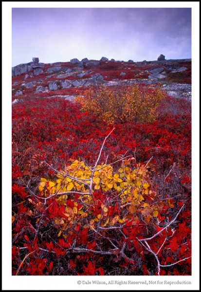
    This autumn scene near Peggy’s Cove, Nova Scotia is not overly exciting but provides a good example of colour theory in practise. If you cover the bottom half of the picture you are left with a secondary coloured orange foliaged tree and violet coloured sky, and the scene completely lacks any attention grabbing detail. Next cover the top half of the image; although the bottom half of the scene, although much less interesting than the picture as a whole, has far more impact due to the primary colour of yellow being surrounded by the primary colour of red and thus supporting the point of Matisse as quoted at the opening.


    There have been many textbooks written on colour theory, and the science of the colour wheel dates back to at least the time of Newton. Personally, my curiosity is aroused when I am out making pictures, all I have to remember is that opposite colours attract, bordering colours repel. Too easy; now get out there and make some great pictures.

    And remember, if you are having fun you are doing it right!

    Post originally from: Digital Photography Tips.

    Check out our more Photography Tips at Photography Tips for Beginners, Portrait Photography Tips and Wedding Photography Tips.

    Learning to See, Part IV


    Digital Photography School

  • Olympus PEN LIT E-PL5 Review

    There’s one thing that Olympus has mostly got right: stylish camera designs, with clearly labelled functions and layout.

    Olympus PEN LIT E-PL5.jpg

    However it seems like decades have been spent as the company has fumbled around with its viewfinder menu layout … and the PL5 is no exception. It is absolutely ghastly, confused and tricky to follow.

    Design of the PL5? Well, to be truly honest, the camera appeals at first sight and then, as you live with it longer, you get the impression it is fiddly, with a small textured grip near the right hand and the top deck cluttered with chromey controls. But that’s only my opinion.

    Olympus PEN LIT E-PL5 back.jpg

    Aside from these whinges, the PEN series of mirrorless interchangeable lens cameras has won many friends: they’re small, lightweight and give access to not only Olympus’ own Zuiko lenses but those from other manufacturers such as Carl Zeiss, Sigma and Schneider and Voigtlander (Cosina).

    Olympus PEN LIT E-PL5 Features

    The top dial offers entrée to the camera’s various modes, including iAuto, Program, shutter and aperture priority plus manual exposure as well as 23 scene modes (portrait, macro etc), 12 Art Filters (Pop Art, Grainy Film etc) and movie mode.

    Vodka bottles.jpg

    On a lower, slightly angled deck are buttons for replay, erase, Function, screen magnification plus movie record.

    Olympus PEN LIT E-PL5 tilt.jpg

    Rear: the delicious LCD screen tilts 170 degrees upwards and 65 degrees downwards but not sideways. I really don’t miss the sideways option I found that, when using it, I tended to unconsciously tilt the camera … but an upwards tilting LCD is perfect for handheld video shooting on the move.
    Menu 1.jpg

    Menu 2.jpg

    To the screen’s left is the control dial, info and menu buttons.

    The camera is well-balanced, despite the added 75mm front extension of the review 14-42mm kit lens which when used for table top photography tilted the camera forward.

    South Curl Curl.JPG

    The camera’s 16 megapixel Live CMOS can capture a maximum image size of 4608×3456 pixels and lead to a print size of 39x29cm.

    Video is shot in MPEG4 up to Full size HD 1920×1080 pixels.

    In video recording you can shoot stills but the video is interrupted.

    There are a couple of neat features:

    • The Touch Shutter is marvelous. Simply aim the camera, touch the screen and the shot is captured; hold your finger on the screen and it shoots continuously. I found only one hangup with this: you have to arrange your camera holding fingers so the camera is steady …otherwise, you’ll capture heaps of blurry shots.
    • The camera accepts EyeFi cards so you can wirelessly download your images to the computer, tablet or mobile phone.
    • 3D photography with a 1920×1080 pixel size image, with a suitable lens is supported.

    Olympus PEN LIT E-PL5 ISO Tests

    Olympus PEN E-PL5 ISO 200.JPG

    Olympus PEN E-PL5 ISO 800.JPG

    Olympus PEN E-PL5 ISO 1600.JPG

    Olympus PEN E-PL5 ISO 3200.JPG

    Olympus PEN E-PL5 ISO 6400.JPG

    Olympus PEN E-PL5 ISO 12800.JPG

    Olympus PEN E-PL5 ISO 25600.JPG

    It was only when ISO 6400 was reached that noise began to intrude. By ISO 12800 it was very visible and even more so at ISO 25600. But that’s quite a performance!

    Olympus PEN LIT E-PL5 Review Verdict

    Quality: above average in sharpness and colour accuracy.

    Why you’d buy the Olympus PEN LIT E-PL5: small, light, access to an enticing range of lenses.

    Why you wouldn’t: no reason!

    There’s a lot to like in the PL5, once you get used to the chromey look!

    Available in black, silver and white.

    Olympus PEN LIT E-PL5 Specifications

    Image Sensor: 16.1 million effective pixels.
    Metering: Multi pattern, centre-weighted averaging, spot.
    Exposure Modes: iAuto, Program AE, shutter and aperture priority, manual.
    Effective Sensor Size: 17.3×13.0mm (22.5mm diameter) Live MOS.
    Lens Mount: Micro Four Thirds.
    35 SLR Lens Factor: 2x.
    Shutter Speed: 2 to 1/4000 second, Bulb and Time.
    Memory: SD/SDHC/SDXC/EyeFi cards.
    Image Sizes (pixels): 4608×3456 to 640×480. Movies: 1920×1080, 1280×720, 640×480 at 30fps.
    LCD Screen: 7.6cm LCD (460,000 pixels).
    File Formats: JPEG, RAW, JPEG+RAW, MPEG4.
    Continuous Shooting: up to 8 fps.
    Colour Space: sRGB, Adobe RGB.
    ISO Sensitivity: Auto, 200 to 25600.
    Interface: USB 2.0, HDMI mini, AV, accessories.
    Power: Rechargeable lithium ion battery, DC input.
    Dimensions: 110.5×63.7×38.2 WHDmm.
    Weight: 325 g (inc battery and card).
    Prices: Get a price eon the Olympus E-PL5 Interchangeable Lens Digital Camera with 14-42mm Lens at Amazon.

    Post originally from: Digital Photography Tips.

    Check out our more Photography Tips at Photography Tips for Beginners, Portrait Photography Tips and Wedding Photography Tips.

    Olympus PEN LIT E-PL5 Review


    Digital Photography School