Category: Photography

  • The Pro Photographers Guide to Black & White Vs Colour

    Setting the tone of an image is arguable, the most important part of any photograph. As the photographer, this choice can help to define your overall style; making your work instantly recognisable purely by the tone of your chosen medium. You have to consider the composition, exposure and all those other technicalities. But it is how the subject is portrayed Continue Reading

    The post The Pro Photographers Guide to Black & White Vs Colour appeared first on Photodoto.


    Photodoto

  • How I Got The Shot: Desert Road

    This is the final image I created from a single shot, processed twice.  Taken with the Canon EOS-1D X, EF 24mm f/1.4L II.  Exposure 15 seconds, f/1.4, ISO 800.

    This is the final image I created from a single shot, processed twice. Taken with the Canon EOS-1D X, EF 24mm f/1.4L II. Exposure 15 seconds, f/1.4, ISO 800.

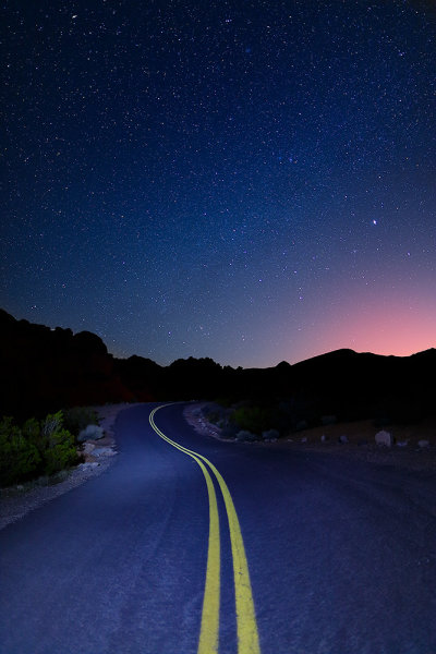
    Some exposure situations become difficult to handle in-camera without a little post processing later on.  A perfect example is this shot of a desert road in Valley of Fire State Park, Nevada, that I took a week or so ago.  There was no moon, which made it a great night for capturing the stars, but an awful night for capturing the road surface in the foreground.

    First, I needed an exposure for the stars.  I started with my usual base exposure for that, 15 seconds, ISO 800, f/1.4.  That gave me exactly what I wanted on the stars, but the foreground was too dark.  I was prepared for this, having brought an LED flashlight with me to “paint” the foreground.  So, during the next 15 second exposure, I held the flashlight on for five seconds, shining it indirectly down the road.  I did not aim it straight at the road, I simply aimed it down the road, allowing the light to skim along the road.  This avoided any hot spots. The 5 second exposure with the flashlight was the result of some experimentation with time. The entire 15 seconds created overexposure on the foreground, so I scaled it back to 5 seconds, and was pretty happy with that.

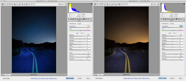
    In the screen shot on the left, I adjusted the white balance to render the sky the way I wanted it- that deep indigo we normally see.  In the shot on the right, I adjusted the white balance so the road looked the way I remembered it.

    In the screen shot on the left, I adjusted the white balance to render the sky the way I wanted it- that deep indigo we normally see. To do this, I simply adjusted the color temperature to 3000°K. In the shot on the right, I adjusted the white balance so the road looked the way I remembered it. Again, I used the color temperature setting and adjusted it to 5400°K.

    I always shoot RAW when shooting landscapes.  There are several reasons for that, but one of the biggest for me is that I can adjust my white balance for creative purposes in post processing.  As you can see, if I tried to adjust for the sky, correcting that yellow cast that came from the glow of a distant city, the road became a deep blue area.  But if I corrected for the road, the sky became this garish orange.

    There are two ways this could have been fixed. The first one could have been done in camera.  By taking a color correction gel, commonly called a CTO gel (Color to Orange), I could have warmed up the light on the road and then as I adjusted the white balance for the sky, the road would have fallen into place.  However, I did not have a CTO gel handy.  So I made the adjustments in Photoshop ACR.

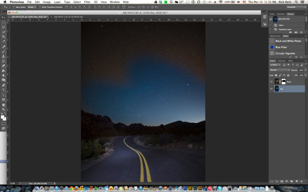
    When I adjust the white balance like this, during RAW processing, I tend to avoid the presets such as “Daylight” or “Shadow” or “Tungsten”.  I find I have much finer control by using the color temperature slider, which allows me very fine control over the color tone of the image.  I opened the file in Adobe Camera Raw, and adjusted the white balance for the sky, as shown above on the left, to 3000°K.   Then I opened that image in Photoshop.  I then reopened the image in ACR, and adjusted the white balance again, but this time for the road, as shown above on the right, to 5400°K.  I then duplicated the layer of the properly white balanced road, onto the layer with the properly white balanced sky.  I created a layer mask on the top layer, of the road, and masked out the orange sky, allowing the blue sky to show through.  The distant mountains silhouetted against the sky gave a perfect delineation for the layer mask, making it an easy blend.  After I got the layers the way I wanted them, I simply flattened them, did a few saturation and contrast adjustments, and had my final image.

    This image shows the two layers stacked, with the layer mask.  The mask has only partially been painted in.  After adding the layer mask to the layer, you use black or white and paint over the layer.  Black hides the layer, while white reveals the layer.

    This image shows the two layers stacked, with the layer mask. The mask has only partially been painted in. After adding the layer mask to the layer, you use black or white and paint over the layer. Black hides the layer, while white reveals the layer.

    Post originally from: Digital Photography Tips.

    Check out our more Photography Tips at Photography Tips for Beginners, Portrait Photography Tips and Wedding Photography Tips.

    How I Got The Shot: Desert Road


    Digital Photography School

  • Snap Up our Food Photography Guide for just $7 [Early Bird Special]

    snapnfoodToday I’m excited to announce the launch of our brand new Guide to Photographing Food over at SnapnGuides.

    This mini-guide is all about helping you to learn how to mouth-watering photo of food and today it is just $ 7 (30% off for early birds).

    If you’ve ever looked at other people’s pictures of food and thought to yourself, “Why don’t mine look like that?” then this is the guide for you.

    Snapn Food will:

    • break down all the important aspects of photographing food
    • give you practical advice on what gear to use
    • show you how to leverage available light
    • teach you how to use simple props to great effect
    • illustrate how to use different composition techniques and shooting angles to take great food images
    • help you to develop your own style of taking delicious photos of the food you make and eat

    The guide doesn’t overcomplicate things with technical jargon – everything is explained in a way that everyone can follow and understand.

    It is also written in a way that is accessible to people using all kinds of cameras – from a camera phone through to higher end DSLRs.

    Grab Your Copy for Just $ 7

    Ready to improve the quality of your food photography? Grab this brand new SnapnGuide here for just $ 7 before the price goes up.

    Post originally from: Digital Photography Tips.

    Check out our more Photography Tips at Photography Tips for Beginners, Portrait Photography Tips and Wedding Photography Tips.

    Snap Up our Food Photography Guide for just $ 7 [Early Bird Special]


    Digital Photography School

  • Why your Camera isn’t a Superhero

    A Guest Contribution by Draycat

    7361147094 a8705ae0ca nThe day my first SLR camera arrived I was excited. I’d already put my point and shoot at the bottom of a drawer knowing that I wouldn’t need it anymore – this would be the beginning of a new era; no more crappy pictures for me.

    For the first few minutes I just sat admiring the box, anticipating what this was going to do for my ‘photography’. Then I slowly removed everything from the box with the same care that a surgeon would do removing a kidney, and then sat again admiring all the curves and buttons on the camera body. This was a new experience for me and I wanted to savour the moment.

    I had always worked on the premise that all the best images had been shot with good cameras so now that I finally had one I expected it to do magic for me. I’d seen so many great images taken with SLR cameras that part of me felt that my photography would transform overnight and within a few days National Geographic would be calling me begging me to shoot for them. I would become an image superhero, transforming to the photographic equivalent of Spiderman from Peter Parker just by lifting up the camera. All my friends would wish they could take pictures like me, and all because of my new SLR.

    After waiting what seemed like two days for the battery to charge, I carefully inserted it into the camera and went out for my first photographic Spiderman adventure in my local area. I shot flowers, traffic lights and bicycles. Then went home to see what these potential Pulitzer prize winning shots looked like. I started up the computer, put in the memory card, clicked on the folder and waited for the magic to appear.

    One by one the pictures came up on the screen, and with each one I grew more and more disappointed. There was no magic – in fact they looked exactly the same as my old point and shoot pictures. And what was worse was that it was actually more difficult to shoot these ‘exactly the same as my old shots’ photographs because I suddenly had to consider these strange alien concepts like aperture, ISO and shutter speed. Not at all what I was expecting. I ripped up my new superhero costume designs and unpacked my carefully prepared ‘packed in case National Geographic call me to suddenly fly out’ suitcase. It was going to be a while before any of my images would look anything like the amazing images that I’d seen.

    I went on the internet and ordered a book – a kind of beginner’s guide to photography. Then I picked up the manual and started to read…..

    The point? Well sometimes we focus too much on the gear – the latest bodies, lenses, accessories, but the reality is that often it doesn’t actually improve our photographs. Our camera isn’t a superhero – it is simply a box that records light.

    It is us that determines what that light looks like and ultimately that is what makes great images. So next time you find yourself in a camera shop looking at new equipment ask yourself realistically ‘how specifically will this help me to create better images?’ If you can pragmatically answer then go ahead and knock yourself out, but if you can’t then perhaps it’s time to practice more with what you have instead of buying something new. Learn and practice the basic principles of photography because they will serve you well no matter what equipment you have. Remember many of the great photographers shot fantastic images with cameras most of us wouldn’t even look at today. Make yourself the superhero, not the camera.

    Draycat is British photographer, teacher and writer currently based in Tokyo, Japan. See more from him at his Website on Twitter on Facebook and on Youtube.

    Post originally from: Digital Photography Tips.

    Check out our more Photography Tips at Photography Tips for Beginners, Portrait Photography Tips and Wedding Photography Tips.

    Why your Camera isn’t a Superhero


    Digital Photography School

  • Learning to See, Part IX

    You don’t take a photograph, you make it.  – Ansel Adams


    In our last entry we learned that placing the subject at one of the four primary points of impact within the scene would greatly enhance the ease of viewing by way of good composition. We introduced the “Rule of Thirds” as a classic example of guidance by drawing an imaginary template from which to establish the point of impact.

    With that lesson reinforced, is there any particular reason why we couldn’t also have a Rule of Fifths or Rule of Sevenths?  No; not at all.  With that having been said the point behind these “Rules” is simply to provide the beginner with the tools to make an informed effort to move the subject from the centre of the viewfinder. 

    We must now be aware of the supporting components that will aid in subconsciously drawing us into the picture. Think lines, more specifically think of diagonal lines.

    The diagonal line will offer a suggestion of movement. To see how we can use diagonal lines to improve our composition we should first review the work of the great masters. If one were to do a web search looking for “Rembrandt and The Night Watch” one of his most inventive works should appear.

    One’s first impression of the work is to notice how there are three primary subjects in the work: the two gentlemen at the front centre and the girl in the background. If you reflect on your first reaction —and be honest—did you not immediately draw your eyes to the two lightest coloured persons in the work: the Lieutenant and the girl? That is because our eye will intuitively be drawn to the brightest part of a picture by default.

    Most importantly, look at the almost over-indulgence of diagonal lines. Everything in the picture leads from tallest on the outside to shortest on the inside. Study the lance, the muskets, the drum and the pennant; they all draw our eyes to the centre of the picture. Similarly, look at how Rembrandt has chosen to portray the other people in the picture; by drawing an imaginary line across the tops of their heads you can envision a diagonal line starting on the outside and receding downward to the centre of the picture.


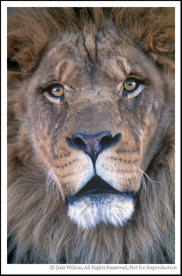
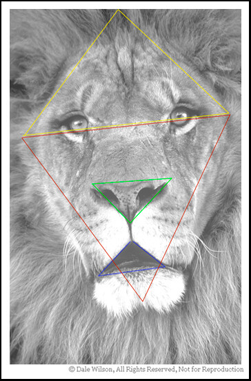
    How many diagonal lines can you find in this image of Leo?

    How many diagonal lines can you find in this image of Leo?

    Now, let’s advance the clock some 300 years to the great portrait of Winston Churchill by master photographer Yousuf Karsh. This photo can also be located by a web search.

    Notice how Karsh has very purposefully positioned Churchill’s hands on a hip and chair back. By default this raises the shoulders and creates triangles on both sides of the body; triangles are little more than three diagonal lines that join with the other. Because Churchill is wearing black, and with further darkroom burning, our eye is forced to follow the outside lines of Churchills forearm, biceps and shoulders until we are eventually drawn right into that remarkable face. 

    From these two examples by master artists we can learn how to use diagonal lines in our photography to draw the viewer toward our ultimate subject. Once we start to move away from the subject those diagonal lines should draw us right back into the scene yet again. Successful art will hold you in the scene by not allowing your eyes to escape.


    There are several more triangles that are less obvious. Can you find them?  The point is that you should be looking for composition elements in your photography until it becomes an intuitive process.

    There are several more triangles that are less obvious. Can you find them? The point is that you should be looking for composition elements in your photography until it becomes an intuitive process.

    By studying and understanding the master portrait artists we can learn their compositional technique and apply that equally as well to landscape and nature photography. Good composition is good composition; it really is that simple.

    And remember, if you are having fun then you are doing it right.


    Postscript: In keeping with the flavour of the artists (including other photographers) copyright I will ask the reader to reference the images that have been suggested as opposed to my posting without license.  Thank you in advance for understanding.


    Post originally from: Digital Photography Tips.

    Check out our more Photography Tips at Photography Tips for Beginners, Portrait Photography Tips and Wedding Photography Tips.

    Learning to See, Part IX


    Digital Photography School

  • 50 Great Photography Blogs You Can’t Afford to Pass by

    Have you ever seen excellent photography by Joseph Linaschke? Or do you know 22 things you can do today to change your photography forever? Or maybe you know what you may look like while taking pictures? All these intriguing posts were published on different photo blogs which you might have never seen before. I guess how many cool posts you’ve Continue Reading

    The post 50 Great Photography Blogs You Can’t Afford to Pass by appeared first on Photodoto.


    Photodoto

  • Color: A Powerful Creative Ally or an Afterthought?

    A Guest post by Mitchell Kanashkevich who is the author behind dPS eBook – Captivating Color.

    Color is one facet of photography which we often tend to overlook and take for granted. It is frequently only considered after the photograph has already been taken.

    Approaching color this way however is a big mistake and a lot of us make this mistake because we simply don’t know why color is important, we don’t understand what role it can play in our photography.

    The fact is, color is as much a part of visual communication as composition and light. If you are not fully aware of this fact while framing/composing color images and later when post processing them, you’re quite simply not in full control of what your photographs communicate. A knowledgeable, intentional approach however, turns color into a powerful ally that helps us convey stories, emotions, sensations and moods from within the photographic frame.

    In this post I have included some of my photographs along with brief explanations of just what role color plays in every one of them. The aim here is to raise awareness of color’s potential power, particularly among those of you for whom it (color) has been more of an afterthought than a creative ally.
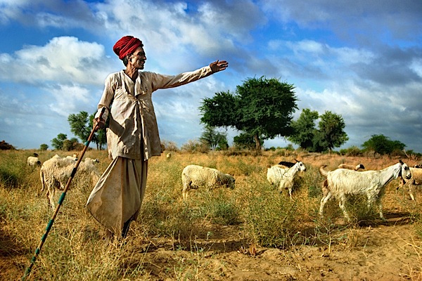
    image_01.jpg

    The above photograph is in large part about that attention-grabbing red. It helps me to immediately bring attention to what I considered to be the most important element to the story in this image, the turban. This turban is representative of the cultural background of the shepherd, it says that he is a man of tradition and this is something that I wanted to really highlight.

    The red also leads the way in communicating how this scene felt while I was shooting it -dynamic, exciting. This is also in large part due to the overall palette, which in addition to the red is made up of other bright, vivid colors that are usually considered dynamic, lively, exciting.
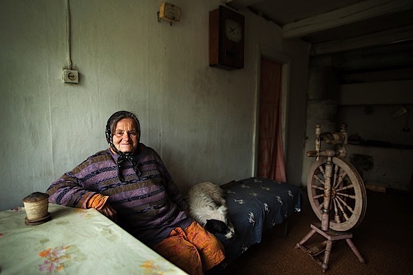
    The dominant color palette in this image is fairly subdued and neutral. The mood that it creates leans towards being melancholic, but the rather subtle “splashes” of brighter colors inject a little life and excitement into the scene (without completely shifting the feel of it). I think that this is fitting, as the mood in that room was a little melancholic and somewhat lively at once.

    Against the mostly subdued, neutral palette that dominates the frame those “splashes” of color inevitably demand our attention. It is as if the photograph is saying quietly, but clearly “Look here and now look there, these details are also important to the story”. Color (along with composition) helps our eye progress from the brightest, most vivid element, the central character – the woman, to all the other, less noticeable elements that add a certain level depth to the story.
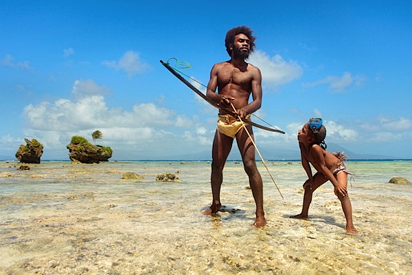
    image_03.jpg

    Here we’ve got bright, fairly vivid colors. Again there’s a sense of excitement, energy, perhaps an association with happy times, due to the blue sky and the brightness of everything, especially when you connect the color to the subject matter – parent and child.

    The dark flesh tones really stand out against that bright blue sky, hence the presence of the father and the son is strongly felt. It’s clear that they are the central characters of the story. At the same time, the surroundings, which are also important components of the story are not completely overshadowed either, because they are so bright and vivid, their presence is strongly felt too.
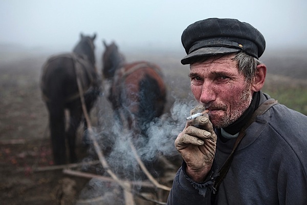
    image_04.jpg

    Here the colors are equally important to the mood and to the story. The subdued, earthy palette dominated by shades of grey creates a mood which is fairly sombre and that’s exactly how the scene felt. The palette is also reflective of this man’s story, his tough job of ploughing the land during a grey, foggy autumn (fall) day.

    It should be noted that the absence of certain colors can be just as important to creating a mood and telling a story as their presence, and here, the absence of bright, vivid colors ensures that the somberness is communicated strongly and that the story of hard-living is clear as can be.
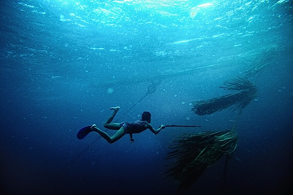
    image_06.jpg

    This image is essentially duo-tone. The simple minimal palette allowed me to emphasize the “gestures”, which are where the story is, the hand with the spear-gun pointing towards the palm leaves underwater (that’s what those things are), the legs in swimming motion. Less colors has equalled in no distractions from what’s important.

    One could argue that this image would work just as well in black and white, but I feel that the blue of the water plays a strong role in speaking to the senses, it helps communicate what it’s like to be in the sea, the coolness, the powerful presence of it. Towards the bottom part of the frame, as the water becomes dark blue, things get a little mysterious, darkness (dark colors) is often associated with the unknown. This sense of mystery is what you feel in the deeper part of the sea and it’s something that I really wanted to convey through the photograph too.
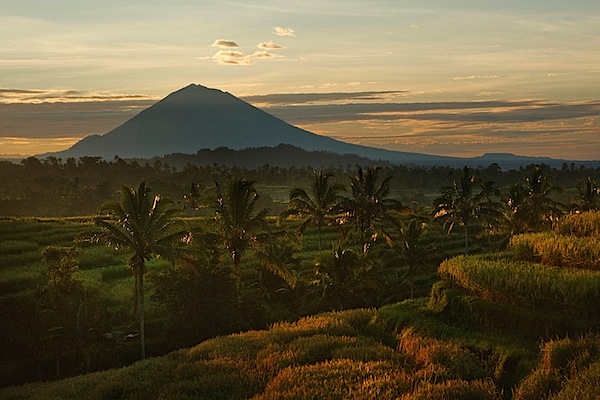
    image_05.jpg

    Vibrant shades of green and the warm, yellow-orange tinge created by the morning sun dominate this image. This palette is inevitably evocative of vitality and generally positive emotions.

    The story in this photograph is quite simple, it’s about the beauty of the landscape, the energy and excitement of the morning and it is only through the palette dominated by those vibrant, warm colors that it can be communicated effectively.

    image_07.jpg

    Sometimes the color of a particular scene we see captures our imagination, gets us excited and compels us to make the photograph. Even if we aren’t aware of it, it speaks to our senses. The above image is one such example. Color lends it a somewhat surreal and mystical quality, it creates a very distinct feel. In such photographs, color and the sensory response it evokes are so important that any kind of story can in a sense become secondary. Color is what makes (or breaks) these kinds of images and without it they (the images) simply do not work.

    Well, that’s all for this post. I hope that by taking a closer look at these examples of what role color can play in photography you are now a little more aware of its importance and potential. I urge those of you who make color photographs to begin taking advantage of color during your next shoot. Start thinking how you can use color to tell your own stories and to communicate the emotions, sensations or moods that you want the viewers of your photographs to feel.

    About the Author: Mitchell Kanashkevich is a travel/documentary photographer who’s passionate about color. His photographs have appeared on TV, billboards, on book covers, travel and inflight publications as well as in most of the world’s top photography magazines. Prints of his work hang in private photo collections around the world.

    Mitchell is also the author of DPS’s “Transcending Travel: A guide to captivating travel photography” and is the author of a brand new dPS eBook Captivating Color – a Guide to Dramatic Color Photography. Follow Mitchell on Facebook.

    Post originally from: Digital Photography Tips.

    Check out our more Photography Tips at Photography Tips for Beginners, Portrait Photography Tips and Wedding Photography Tips.

    Color: A Powerful Creative Ally or an Afterthought?


    Digital Photography School
  • Suction Cup Mounts on Inflatable Badfish SUP ?

    I am using suction cups on all my kayaks and canoes to mount cameras and GPS devices. Of course, you need a smooth surface to attach a suction cup. Rinsing the deck of your boat with water usually provides a stronger grip. But, what to do with decks which are not smooth like in the case of inflatable boats?

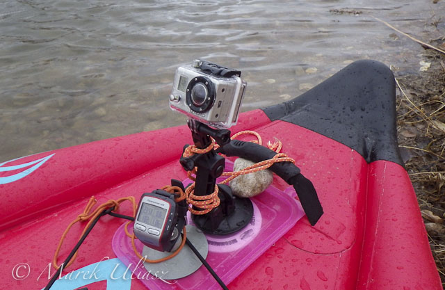
    suction cup mount on inflatable SUP

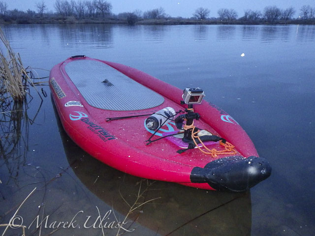
    I faced that problem during my first paddling this season on Beaver Pond with Badfish inflatable SUP (stand up paddleboard). Here is my quick and temporary solution: a lid of plastic box tacked under bungees and a handle in the front deck of my SUP. It provided just enough smooth surface to place my Garmin Forerunner GPS on sticky pod suction cup and GoPro Hero camera on its original suction cup mount. My suction cup dashboard worked pretty well for quiet water paddling.

    As a more permanent setup, I would probably use more a solid plate (plexiglass?) with holes to tie it to available anchor points. Do you have any other suggestions or ideas?

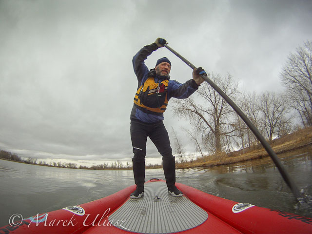
    Badfish SUP on Beaver Pond
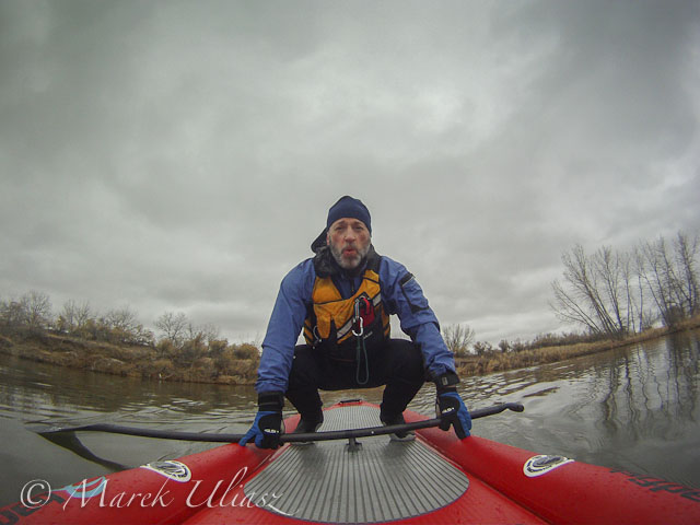
    Badfish SUP - March paddlingIt was rather cold and cloudy day …

    Badfish SUPwhich ended up with some snow.

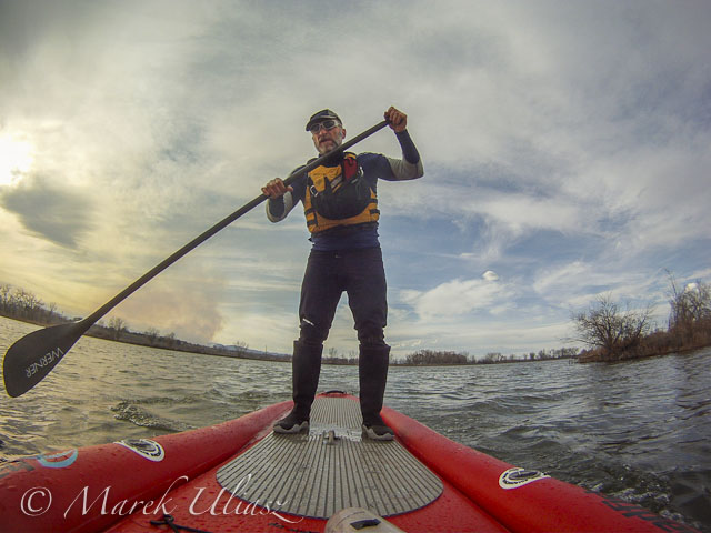
    Galena wildfire smoke plumeTwo days later (March 15, 2013). Paddling Badfish SUP on Beaver Pond in Arapaho Bend Natural Area with a smoke plume from Galena wildfire behind me.


    Related posts and links:
    MCIT 11.6′ Inflatable SUP Badfish at Colorado Kayak Supply
    Sticky Pod Camera Mounts
    GoPro HD HERO3 camera (I am still using GoPro Hero 2)
    10 Minute Double Suction Cup Camera Mount for a Kayak Deck
    Kayak Video Camera Mast – Sticky Pod Combined with Monopod
    A Simple Suction Cup Mount for Garmin Forerunner 305 GPS


    paddling with a camera

  • Welcome to The f/64 Club: A Front Row Seat at the 2013 GPP Shootout

    Sure, the Gulf Photo Plus shootout might be fun to watch. But for the photographers competing, it is all about a week of anticipation, stress and nervousness. And come shootout day, all of that is on display live in front of an audience of 350 armchair quarterback photographers.

    Below, the shootout video, how each photographer handled the stress and a challenge for you.

    Read more »
    Strobist

  • Acorn Version 3.5.1 Image Editing Software

    Acorn256Sometimes Photoshop is just too much. Just too much for your image editing skills and sometimes just too much for your needs. And that’s not to forget the demands on your pocket!
    As the company says ‘Everyone needs to edit images at some point, but not everyone has the time to learn super pricey wizbang image editing programs.’ With Acorn you can add text and shapes to your images, combine images, work with layers to improve images or create something new from scratch.

    An added plus is that Acorn is claimed to be the ‘world’s only image editor with native support for Retina displays.’

    After a brief dabble with the application and before I read any guff on its talents … a bit like using a camera under review and before reading the manual! … I fell for Acorn very heavily.

    Besides, it does things I have never seen before.

    Rundown

    Here’s a rough map of its talents:

    Apply non-destructive effects to your layers; turn your text and shapes upside down and every which way; Quickmask allows you to zoom in and edit your selections; Instant Alpha — remove backgrounds and other unwanted pixels from an image; Multistop Live Gradients — with this, you have infinite rainbows at your fingertips. It can also convert text to bezier paths, add and subtract points and have edges snap to pixel boundaries. And quite a bit more.

    You can export images as optimized PNG, JPEG, JPEG 2000, GIF and Google’s WebP format.

    Filters

    But my interest in these programs always falls onto the filters section. And boy! Has Acorn got some beauties!

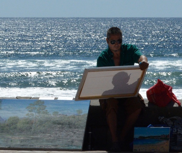
    Figures and beach 3

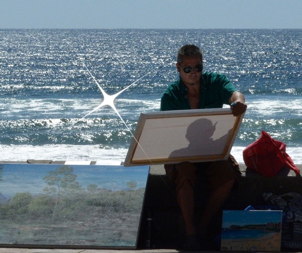
    Figures and beach 3 starshine

    I picked up a beachside image that just screamed out for a sunflare.

    In Filters>Generator I found Star Shine. Great!

    First, I could place the centre of the effect. Next, to adjust the radius (size) and cross scale (extent of the rays). Other controls included the ray’s opacity, width and Epsilon. The latter? Dunno!

    Clock

    Glass effect

    Next was a classic image of a railways station clock that just screamed out for some treatment to lift it out of the banal. My choice?

    Distortion Effect>Glass Distortion. By carefully limiting the effect to the circular clock face I could impart a pebbled, hand-made glass effect that did the trick.

    Strand arcade hats

    Strand arcade hats Bloom

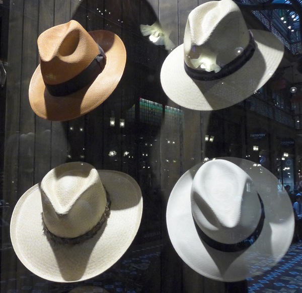
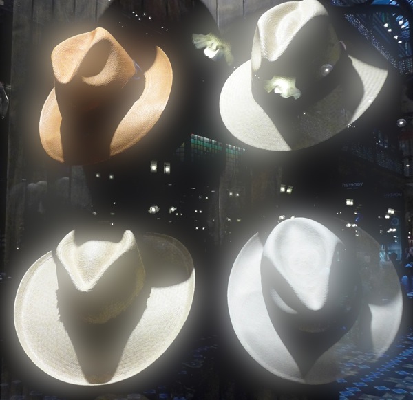
    A simple shot of a hat shop window showing their range had a bit going for it, but not much. My solution? Filters>Stylize>Bloom. Here I could vary the radius of the effect and its intensity. What I found interesting, and this comment applied to some other filters, was that the intensity of the bloom effect changed only in areas of lightness. Great!

    Brush sizes

    Lanterns brush effect

    Lanterns window

    Lanterns brush effect

    Then, as if the Filters department was not enough to engage me, I then fell upon the Brush section and, as you can see from this example, there is plenty to enjoy!

    If you feel your image making is becoming a bit tired, try an Acorn. From little ones, big things can grow!

    System Requirements

    Mac OS 10.6 and later. If your OS is earlier, back to OS 10.4 you can download an earlier version of Acorn.

    Go to http://www.flyingmeat.com/acorn/

    Price: US$ 49.99. Fourteen days trial version available.

    Post originally from: Digital Photography Tips.

    Check out our more Photography Tips at Photography Tips for Beginners, Portrait Photography Tips and Wedding Photography Tips.

    Acorn Version 3.5.1 Image Editing Software


    Digital Photography School