Category: Photography

  • Pentax MX-1 Review

    Pentax MX-1.jpg

    Many people can be misled by some camera makers’ claims of higher pixel counts, maxi zoom ranges etc … when in fact they’re actually being sold a turkey.

    Pentax MX1_SILVER high res.jpg

    Pentax MX-1-back.jpg

    Pentax MX-1-top.jpg

    This is one camera that goes against the trend: it can capture only a 12 megapixel image, has only a 4x zoom and its 35 SLR equivalent range is a meagre 28-112mm … reasonable but not spectacular.

    However, look a little deeper into the digits and you discover the CMOS measures 14.9mm diagonally and is capable of capturing a maximum image of 3984×2656 pixels, printing out to a 34x22cm print.

    Its video capture is in MPEG4 and runs to Full HD 1920×1080. You cannot shoot a still mid video.

    As well, the maximum lens aperture is f1.8, shrinking to only f2.5 when fully zoomed in. Obviously, a dim and dark spaces lover!

    Pentax MX-1 Features

    For such a small, pocketable camera, the MX-1 is surprisingly heavy. It does have a distinctly retro look and will make long time Pentax users a trifle teary!

    The control layout is sensible, well ID’d in largish, white text.
    Scene modes.jpg

    Top deck: at left, the flash cell; to the right the mode dial which gives access to PASM; 21 scene modes (kids, panorama, sport etc); HDR shooting (based on a three shot capture); user specified mode; movies; and a green mode which takes you an easy, no forethought picture taking mode.

    Further right we find power button; shutter button and zoom lever; the familiar red video record button; exposure compensation dial.

    Rear: here we find the vari-angle screen (Hooray!) that can be lowered down by approx 45 degrees or raised upward to approx. 90 degrees; an E-dial which varies ISO setting, shutter and aperture settings; an AV/AE-L button that lock exposure settings; trash; replay; info and menu buttons; plus the four way rocker which takes you to still/continuous shooting, flash settings, ISO and macro.

    Overall, a quite tidy and easily followed regime of external controls.

    Info button.jpg

    I found the info button useful to give a current status display and then affords immediate access to such matters as the size of the AF area, image size, AWB etc. This was useful as, for some odd reason, I continually threw the camera into ‘bright’ capture mode instead of normal … the info button reassured me of where I was control-wise.
    Menu.jpg

    Status.jpg

    The rear screen finder menu system is, admittedly, more involved but at least it does give access to an enormous range of options, running from custom image settings (natural, vibrant, bright etc).
    The camera is well balanced but I would have liked a speed grip for the right hand to feel more secure.

    Chupa chups.JPG

    Mercedes.jpg

    More: The camera has a novel Handheld Night snap mode helps the photographer capture sharp, blur-free night-time images by shooting multiple images in a run, then synthesizing them into a single image.

    Now, a little magic that I have never seen before on a digicam: a level indicator that shows the camera tilt not only left and right but fore and aft also. As I said: Magic!

    The MX-1 has a dual shake-reduction system that seems to work its magic with quite a bit more effectiveness than many of its peers.

    Digital Filters: with these (15 in all) you can edit captured images to take on a variety of looks: B&W, retro, high contrast, soft, miniature and pos to neg … amongst others. Got me!

    The AF system has 25 points.

    There’s face detection (32 in all) and pet detection (3 in all). Plus smile capture and blink detection.

    Startup Time

    From startup it took about three seconds until I could shoot the first shot; follow-ons about a second apart.

    Distortion

    No sign of any problems at the zoom’s wide or tele ends.

    ISO Tests

    Pentax MX-1 ISO 100.JPG Pentax MX-1 ISO 400.JPG Pentax MX-1 ISO 800.JPG Pentax MX-1 ISO 1600.JPG Pentax MX-1 ISO 3200.JPG Pentax MX-1 ISO 6400.JPG Pentax MX-1 ISO 12800.JPG

    By ISO 3200 the noise and definition had risen to such a degree that IMHO the setting would be unusable.
    Staircase.JPG

    Pentax MX-1 Review Verdict

    Quality: about average.

    Why you’d buy the Pentax MX-1: reasonably fast lens; Adobe DNG (RAW) capture; a wide variety of filters and image treatments for the dabbler.

    Why you wouldn’t: you really want a DSLR; limited zoom range.

    I found a lot to like in the MX-1: it sat well in the hand, the controls were easy to get around. And, it felt like a camera!

    Pentax MX-1 Specifications

    Image Sensor: 12 million effective pixels.
    Sensor: 15mm CMOS.
    Lens: f1.8-2.5/6-24mm (28-112mm as 35 SLR equivalent).
    Metering: Multi segment, centre-weighted, spot.
    Exposure Modes: Auto, Program AE, shutter and aperture priority, manual.
    Shutter Speed: 30 to 1/8000 second.
    Memory: SD/SDHC/SDXC plus 75.3MB internal memory.
    Image Sizes (pixels): Stills: 3984×2656 to 1536×1536.
    Movies: 1920×1080 (30fps), 1280×720 (30+60fps).
    Viewfinder: 7.6cm LCD screen (920,000).
    File Formats: RAW (DNG), JPEG, MPEG4.
    ISO Sensitivity: Auto, 100 to 12800.
    Interface: USB 2.0, HDMI mini, AV, DC input.
    Power: Rechargeable lithium ion battery, DC.
    Dimensions: 122.5x60x51.5 WHDmm.
    Weight: 391g (inc battery, card).
    Price: get a price on the Pentax MX-1 at Amazon.

    Post originally from: Digital Photography Tips.

    Check out our more Photography Tips at Photography Tips for Beginners, Portrait Photography Tips and Wedding Photography Tips.

    Pentax MX-1 Review


    Digital Photography School

  • Greg Heisler BTS: Bono/Gates for Time

    This video marks the last of Profoto's Greg Heisler BTS series.

    In today's BTS, Heisler does some pretty cool problem-solving before the fact only to get blind-sided with the bison head on the day of the lightning-paced shoot.

    Yeah, I said bison head. No, actually Heisler said that…

    Read more »


    Strobist

  • The Photography Bible [BOOK REVIEW]

    The Photography Bible coverConfession: I’m a sucker for books like this!

    ‘The Photography Bible brings you up-to-the-minute information on the rapidly changing world of photography, including the latest digital cameras … [and] offers expert photographic advice to help improve your photography ….’

    I absolutely love a single book that has the full story. The trouble is that, at the immediate moment the author hands his text file to the book’s publisher, the whole game changes! Camera models change almost overnight and the whole tech story is a very mobile feast!

    But, in spite of those cautions, Daniel Lezano’s book does a fine job of packaging most of the data into a single publication.

    The opening chapter does a thorough job of describing the current camera types, including generous illustrations and detailed text: from DSLR to Compact System Cameras (MILC) or digi compacts, bridge models, waterproof models … plus a brief rundown on medium format DSLRs, camcorders, the weird Lytro camera and even smart phones with camera capabilities. It should help prospective buyers to narrow down their choices before spending the hard-earned.

    Then follows details on camera components: sensors, stabilisers, sensor cleaning systems, LCD screens, Live View, HD video etc.

    For the more curious there is some excellent info on the different AF systems which surely, is one of the most misunderstood of camera functions.

    Similarly, with such matters as exposure: the role of the lens aperture in exposure and the ‘look’ of an image; differing modes such as auto, Program AE etc; metering systems such as multi zone and spot; how to deal with excessively dark or bright scenes.

    My congrats to the author for opening up the subject of resolution and the tricky subject of the ‘megapixel myth’. May I quote? ‘There is a very common misconception that you can determine the quality of a camera simply by judging it on the number of pixels.’ Bravo!

    An area that may confuse even the more digitally-educated reader is the subject of sensor types: CMOS and CCD are discussed, along with useful detail on Fujifilm’s X-Trans CMOS and Foveon’s X3 CCD … but I have a disconcerting feeling that tech change is proceeding at such a velocity that there are already sensor types out there that scream for attention.

    The book then moves on to subjects that are more in the realm of photo handy hints, such as dealing with white balance, types of memory cards and a useful discussion of how cards are speed rated.

    More: file formats; flash and studio lighting; filters; lenses, along with the role of wide and tele focal lengths; printers and scanners; image software and the mysteries of Photoshop; basic composition.

    Overall, I found the book to be useful for the newbie to digital photography. I felt, however, it could have gained by including more technical detail on digital hardware, why sensors do what they do along with their foibles, etc.

    A good starter. Well illustrated. Clear text.

    The book could have benefitted from a chapter on video shooting with digicams, especially now that digi still cameras have developed such enormous capabilities in this area!

    Author: Delezano.
    Publisher: D&C.
    Size: 25x19x1.5cm. 176 pages.
    ISBN: 1 4463 0217 0.
    Price: Get a price on the Photography Bible at Amazon.

    Post originally from: Digital Photography Tips.

    Check out our more Photography Tips at Photography Tips for Beginners, Portrait Photography Tips and Wedding Photography Tips.

    The Photography Bible [BOOK REVIEW]


    Digital Photography School

  • Seasonal: Weekly Photography Challenge

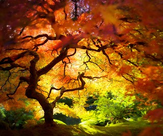
    Under "That" TreeThis week your photographic challenge is to take and share an image based on the theme of ‘Seasonal’.

    Recently we published a post on how to improve your photography of Flowers which may serve as inspiration for those of you in the Northern Hemisphere for this weeks challenge but for those of us down south it could be time to look for some more Autumnal shots (I notice the leaves on the trees in our street this week are turning red).

    So whatever the season where you are – grab your camera, head outside and try to capture the essence of what’s happening in Mother Nature in your part of the world right now.

    Once you’ve taken your ‘seasonal’ image and have upload it to your favourite photo sharing site either share a link to it or – embed it in the comments using the our new tool to do so.

    If you tag your photos on Flickr, Instagram, Twitter or other sites with Tagging tag them as #DPSSEASONAL to help others find them. Linking back to this page might also help others know what you’re doing so that they can share in the fun.

    Also – don’t forget to check out some of the images posted in our last challenge – Window Portraits challenge where there were some great images submitted.

    Post originally from: Digital Photography Tips.

    Check out our more Photography Tips at Photography Tips for Beginners, Portrait Photography Tips and Wedding Photography Tips.

    Seasonal: Weekly Photography Challenge


    Digital Photography School

  • 7 Easy Steps To Take Your Photography Career To New Heights

    We all know that being a successful professional photographer requires a lot of hard work, dedication, and a little bit of luck. The advice I hear most often is don’t bother trying, do it as a hobby. But for some of us, taking photos is something we have to do because there’s nothing else we’d rather be doing. So we Continue Reading

    The post 7 Easy Steps To Take Your Photography Career To New Heights appeared first on Photodoto.


    Photodoto

  • Clothing for Portraits – How to Tell your Subjects What to Wear

    portrait-clothing-featured

    The clothes your clients or portrait subjects are wearing in their photo can be a touchy subject to discuss with them, especially if you are just doing a portrait for them as “a friend with a good camera”. Even as pros we have a hard time getting people to listen and they show up in clothes that make us cringe and even hurt our eyes.

    This article will help you understand what to suggest your subjects wear for their portrait. You’ll also learn how to help them understand why your suggestions really are in their best interest so they actually listen to get it right.

    Clothes make the portrait

    What the subjects are wearing in a portrait is just as important as all the other details such as: lighting, location, and posing. Poorly selected clothing can really take away from an otherwise really great portrait.   The goals in helping your portrait subjects or clients select clothing are:

    •  to make the people the main subjects
    • to flatter the subjects and help make them look their best
    • to disappear and be a non-issue

    Poorly chosen clothing, or having no discussion about it at all, can result in just the opposite of all those things.  NOT what you want to have happen!

    • clothing that stands out so much you hardly even notice the people
    • arms, legs or tummies that look less than flattered and people that are unhappy with the end results
    • clothing that takes so much attention and draws your eye around that it becomes more about the clothes and a fashion photo that it does a portrait of the people in them

    So what IS the best thing for people to wear?

    I get asked for tips on this a lot in my portraiture classes. People “hear” funny things about what they should or shouldn’t wear for their portraits and show up in the damnedest things that sometimes make you shake your head and say “what were they thinking?” But they don’t know what is right, or what is better unless you tell them and help them understand why.

    This is what I recommend for what to wear to a portrait session

    • wear solid coloured clothing
    • choose muted tones that are a bit subdued
    • choose similar tones for your top and bottom (both dark or both light)
    • choose 1-3 colours for your group portrait, ones with similar tones that go nicely together and have everyone work within that colour palette. For example: dark green, navy, and burgundy – all dark jewel tones.  OR tan, a lighter olive green, and denims – all lighter, softer tones.
    • choose a top with sleeves at least to the elbow
    • choose long pants for men/ladies or a skirt below the knee for ladies
    • choose dark socks and footwear (unless it’s a barefoot photo on the beach)
    • keep jewellery simple and minimalistic
    • do your hair the way you’d normally do it while wearing these clothes (I’ll explain more later)
    • if getting a haircut or new hairdo, make your appointment at least 2 weeks prior to your portrait session

    Okay so I added a few bonus pointers on hair and make-up but they go right along with the clothing.

    Notice I consciously did NOT use the word “don’t” anywhere in the list above?  There’s a reason for that. People’s brains actually don’t register the words: don’t, not, or no. So when you say them the brain just disregards and registers what comes after.  For example, if I say, “do NOT think of a lemon” what did you just do?  Of course, thought of a lemon. So when you are explaining clothing (or anything for that matter) and giving suggestions on what to wear, take great care to always say what you DO want.

    If you tell people, “okay don’t wear stripes, flowers or bright colours.”  What will they remember?  “I think my photographer said something about stripes and bright colours,  so that’s what I’ll wear.”

    And they probably heard somewhere that for photography you need to put your make-up on extra dark and heavy, so even ladies that normally wear none or very little can show up with black eye liner and raccoon eyes. I know, because it’s happened to me when I didn’t discuss it. She will HATE her photos because it doesn’t look like her.  She likely won’t say anything, she just won’t pick any and you’ll think she didn’t like your work.

    It is YOUR job as the photographer, even if you are just doing it for fun and for friends, to help people look their best in the portrait you take.  So let’s look at the points above and how you explain it to them so they get on board!

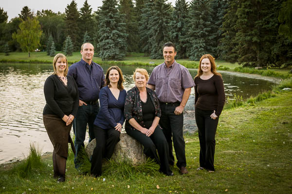
    I actually had a hard time coming up with “bad” examples of what not to wear. I’ve been doing this for so long I don’t have any portraits that don’t come fully prepared.  So I’ve found a couple group images just so you can see the difference the clothing makes.

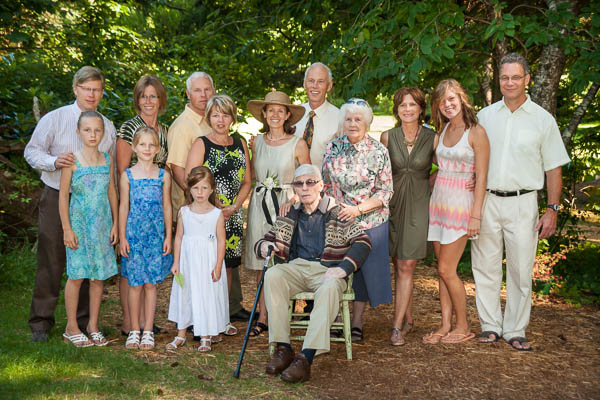
    The image below is from a wedding so they weren’t all planning on having this group portrait done. But it shows what happens when the clothes have not been planned.  There’s multiple colours, some dark and some light. We have a few bright patterns and a short skirt. We have a lot of short sleeves (it was a hot day) and some white shoes.  Can you see how all those things make an impact?  Overall it’s actually not that bad, I’ve seen a lot worse but let’s see what a little refinement can do to help.
    portrait-clothing-001

    Group portrait from a wedding, not planned so they were wearing what they were wearing.
    portrait-clothing-002

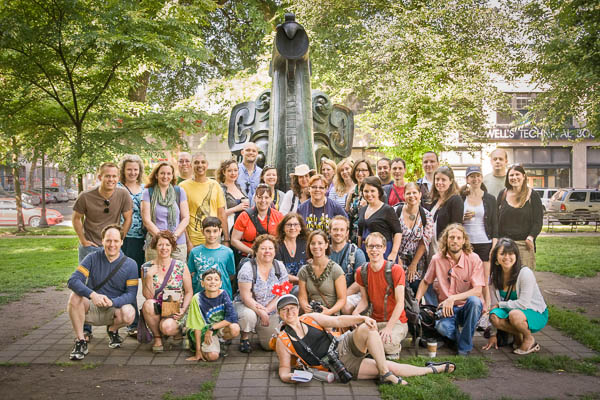
    Another “bad” example, again a group portrait from a photo walk this time. Notice how all the colours and patterns draw attention?

    Examples of clothing that is working

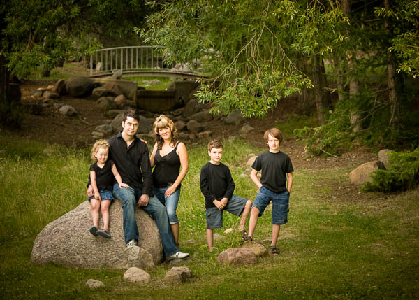
    This family chose all black and denim and for the most part it is working really well. Only thing I suggest as a change would be Mom in longer sleeves.  Notice how much attention her arms get?  For her that’s fine, but for someone self conscious about their arms or their weight, this will make their arms look larger.
    portrait-clothing-004

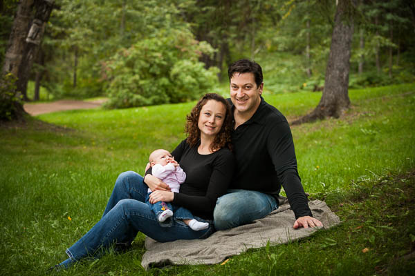
    In the image below everyone is in black except the baby. Babies are always tough because finding plain colours or black for a baby is almost impossible. Notice two things here.  #1 the baby stands out the most, and in this case that’s fine because she’s the smallest and you want to see her.  #2 if that had been an adult in the light outfit do you think it would work as well?  Doubt it, the result will be that person will stand out and look larger. No one likes to look bigger!  Trust me.
    portrait-clothing-005

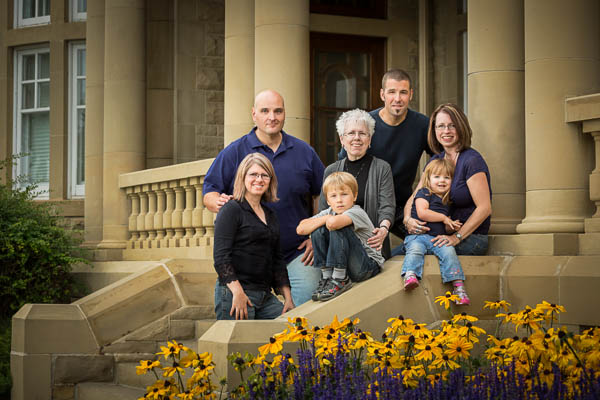
    This is my sister’s family so they’ve been well trained on what to wear (I even got in this phone). Once again dark tones have been selected: greys, deep purple, and navy. Those all work well with jeans. Can you see the difference between me wearing long sleeves (left) and my sister wearing short sleeves (upper right)?  What does it do to the bare arms? How do they look compared to mine?
    portrait-clothing-007

    How to get them to agree and follow your suggestions

    The key to explaining all this and getting people to agree and go along with your suggestions is in HOW you tell them. If you just list off all this stuff it can seem a bit pushy and like you’re telling them what to do. Most assume they know how to dress themselves and giving them a list could make them feel a tad insulted so they get defensive rather than listen to your suggestions.

    Photography is part technical stuff, part artistic stuff and part psychology!

    Let’s look at my recommended list again but this time adding in the WHY. By stressing the benefit to the subjects, or why they would want to do this, they will “get” it in a big way. Like I said, I have very few portraits that I’ve done in the last ten years that show up in poor clothing because I’ve prepped them so well and they know that if they want to look their best they will follow these guidelines.

    • wear solid coloured clothing so that we see all of your faces and no one person stands out. If you wear stripes or flowers, you will stand out from the rest of your group.
    • choose muted tones that are a bit subdued so that you are the subject not your clothes and you don’t stand out from the group. Bright colours project (especially reds, oranges, and yellows), which also makes you look larger.
    • choose similar tones for your top and bottom (both dark or both light) so that one doesn’t look bigger than the other.  White top, dark pants will make your top look bigger.  White pants, dark top will make your butt look bigger.
    • choose 1-3 colours for your group portrait, ones with similar tones that go nicely together and have everyone work within that colour palette. For example: dark green, navy, and burgundy – all dark jewel tones.  OR tan, a lighter olive green, and denims – all lighter, softer tones.  So that we see the people first and your portrait looks stunning. Wedding group photos look so good because they’re all wearing the same colours and the people stand out!
    • choose a top with sleeves at least to the elbow  because your arms take up more skin area than your face and will draw attention and it may also make your arms look larger
    • choose long pants for men/ladies or a skirt below the knee for ladies so that your legs don’t take attention from your faces, and you will be able to sit and bend without showing too much leg
    • choose dark socks and footwear (unless it’s a barefoot photo on the beach) because white just sticks out like a sore thumb and that’s all you’ll notice in your portrait
    • keep jewellery simple and minimalistic because too much draws attention from your face
    • do your hair the way you’d normally do it while wearing these clothes – no fancy up dos with jeans, no pony tails with evening gowns, etc. This is common sense, or so you’d think, but I’ve had ladies go to the hair salon and get fancy up dos then show up in jeans and a t-shirt.  It just simply doesn’t make sense cause you wouldn’t normally do that to put on jeans and go to the park for a BBQ or something. So tell them “it is because your portrait will be more timeless and represent more closely who you are, not just what you look like.”
    • if getting a haircut or new hairdo, make your appointment at least 2 weeks prior to your portrait session – again this seems like a no brainer but you’d be surprised! Fresh hair cuts rarely look their best the same or next day. Ladies need time to practice working it, men need it to grow out just a little. Allow some time to live with your new look before your portrait session.

    See a common thread in my notes above?  Most people have the same fears about being photographed – yes fears!  Being photographed is right up there on the fear list next to public speaking and going to the dentist, I kid you not!  Their fears are about looking stupid, not knowing how to stand or pose, and looking fat or old. So if you can help them see that these clothing tips will allow them to eliminate at least one of their fears before you even start, then you just have to deal with all the rest later!  Most of clothing suggestions has to do with helping them look slimmer and not stand out. How to stand and pose to minimize weight issues is another article, stay tuned!

    Putting it all together

    You may notice most of the “good” examples here are wearing dark colours. That’s pretty common as most people have heard that dark or black makes you look slimmer. To some degree that’s true. But light colors can work too if everyone in the group does similar, then the one person in dark clothes would stand out. Little kids in denim and white tops with bare feet is super cute, as is little girls in white sun dresses. Don’t be afraid of other colours or tones, just keep them similar. Some of my largest extended family groups over the years that have done the best even went as far as to put each family unit in their own colour scheme (one in browns, one in greens, etc) and mom and dad in another – all with dark jeans.  I’ve also had some ladies go as far as to buy everyone a matching shirt.

    The thing is once you get them on board and understanding the logic behind it – the WHY – they will go to great lengths to make it work because they know it’s for their benefit!
    portrait-clothing-006

    Action Plan

    If this all sounds like a lot and is overwhelming, feel free to copy my list and make a little sheet to hand out to people.  Just make sure you add the benefits, like in my second list.

    Show me your successes or ones that didn’t work out so good. I’m happy to give suggestions on how to improve it for next time.

    Post originally from: Digital Photography Tips.

    Check out our more Photography Tips at Photography Tips for Beginners, Portrait Photography Tips and Wedding Photography Tips.

    Clothing for Portraits – How to Tell your Subjects What to Wear


    Digital Photography School
  • DEAL: 25% Off Trey Ratcliff’s ‘Discover the Art of Photography’ Online Course

    NewImageThis week over at our sister site – SnapnDeals – we have a great deal running where you can get 25% off Trey Ratcliff’s ‘Discover the Art of Photography’ video course.

    Trey Ratcliff is one of the world’s best known photographers on social media and via his blog StuckinCustoms. He specialises in HDR photography and was the first photographer to have a HDR photograph hung in the Smithsonian.

    In this four part course Trey shares some great information on the basic elements of photography. The episodes covered are:

    EPISODE 1 – GETTING STARTED (30 mins)

    • Introduction to photography
    • Learning through curiosity and discovery
    • Setting up your camera
    • Taking your first photo
    • Editing your photo with Adobe Lightroom

    EPISODE 2 – PHOTO COMPOSITION (40 mins)

    • Challenging the traditional teachings on composition
    • Live example: Composing a landscape photo
    • Live example: Composing a photo with people
    • Editing the landscape and people photos
    • Review examples of many different compositions

    EPISODE 3 – FINDING YOUR OWN STYLE (60 mins)

    • Discovering your unique path to your own art
    • Live examples: Photos in a park and a candy shop
    • Reviewing examples of small-object composition
    • More advanced techniques using Adobe Lightroom

    EPISODE 4 – PHOTO EDITING (34 mins)

    • Moving past the learning curve of post processing
    • Sharing your photos with others online
    • Playing with Adobe Photoshop
    • Tips & Tricks with Adobe Photoshop
    • Introduction to HDR (High Dynamic Range) photography

    Get 25% off this course for the next 4 days only on SnapnDeals.

    Post originally from: Digital Photography Tips.

    Check out our more Photography Tips at Photography Tips for Beginners, Portrait Photography Tips and Wedding Photography Tips.

    DEAL: 25% Off Trey Ratcliff’s ‘Discover the Art of Photography’ Online Course


    Digital Photography School

  • Adjusting White Balance in Lightroom

    Lightroom white balance opener

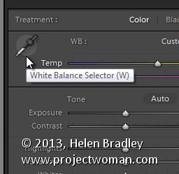
    Lightroom has a set of tools that you can use to adjust white balance in your images. To see these at work open an image in the Develop module. At the top of your Basic panel are the white balance adjustment tools.

    White Balance Options

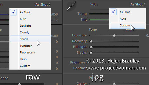
    The dropdown list will show you some options for adjusting white balance – what is shown here will vary depending on how your images are captured. If you capture in raw then the white balance dropdown list will contain the same options as you have on your camera for setting white balance. If you’re capturing jpg images then there are fewer options – As Shot, Auto and Custom.

    Lightroom white balance 1

    On the left are the options for a raw image and on the right those for a jpeg image.

    The Temperature and Tint sliders also have different units of measure depending on whether you’re working with jpgs or raw images. For jpg images both the sliders range from +100 to -100. If you’re working on a raw image then the Temperature slider shows degrees Kelvin from 2000 – 50,000 and the Tint slider ranges between + 150 and – 150.

    Kelvin is a measurement of the color of light – daylight is around 5,500 degrees Kelvin. Lights we consider to be warm or pink/orange in color including tungsten globes are around 3,000 degrees Kelvin and cool lights which are blue in color such as overcast daylight are around 7,000 degrees Kelvin and higher.

    Adjust White Balance

    To adjust the white balance in the selected image you can select an option from the White Balance dropdown list to use to fix the image or you can use it as a starting point and then fine tune the result.

    You can also manually adjust the Temp slider to add warmth or remove it from the image. Drag the sider to the left to add a blue tint to the image (to cool it down), or to the right to add a yellow tint to it to warm the image.

    Use the Tint slider to balance out any excess magenta or green in the image. Drag towards the right to add magenta to the image cancelling out any green tint and drag to the left to add a green tint cancelling out any unwanted magenta.

    White Balance Selector

    You can also use the White Balance Selector to adjust white balance. You can select the tool by clicking on it or press W.

    Lightroom white balance 2

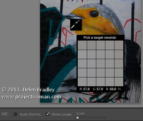
    From the White Balance toolbar under the image you can select options that make the White Balance tool easier to use. I suggest you deselect Auto Dismiss as you can then click on the image in various places to attempt to fix it. If you have Auto Dismiss enabled you’ll only be able to click once before the selector is dismissed so, if that fix isn’t perfect then you’ll need to select the tool again to attempt another fix. This is a cumbersome way to work so I prefer to disable Auto Dismiss and put the tool away only when I am done with it.

    If you click the Show Loupe checkbox then you’ll see a 5 by 5 pixel grid beside the mouse cursor. The center point in the grid is the pixel that you are currently targeting and which will be used to adjust the image if you click. This grid makes it easier for you to pick the correct point in the image to adjust to. The scale itself can be increased or decreased using the Scale option on the toolbar.

    At the bottom of the loupe itself are the RGB percentage values of the pixel under the cursor. These values tell you if the pixel is neutral or not. If it is neutral then the percentages of R, G and B will all be equal – if they are not equal then there is color in that pixel.

    Lightroom white balance 3

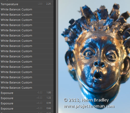
    To balance the image using the White Balance selector, click on a pixel that should be neutral grey – not white or black. When you do so, Lightroom will adjust the image so that the selected pixel is a neutral grey and, as a result, all the color in the image will change. At the same time Lightroom adds an entry to the image History for that adjustment. This means that you can wind back the history to return to an earlier white balance fix, if desired.

    Lightroom white balance 4

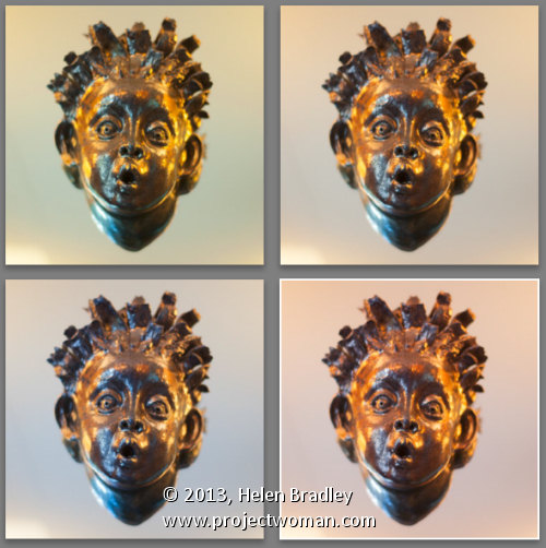
    You should be aware that adjusting image white balance is to an extent a subjective assessment – so there is no one value that is “correct”. There are, instead, a myriad of different results that can be achieved so look for one that is it pleasing to you. In most cases viewers prefer to see some warmth in photos as they are more pleasing to the eye if they are warmer rather than cool.

    I find that a good approach to take is to experiment with the white balance selector to see the effect on the image by selecting different pixels to adjust to. Then choose the most aesthetically pleasing result.

    Post originally from: Digital Photography Tips.

    Check out our more Photography Tips at Photography Tips for Beginners, Portrait Photography Tips and Wedding Photography Tips.

    Adjusting White Balance in Lightroom


    Digital Photography School

  • Surfrigger 2 Video – Paddling Outrigger Canoe in Colorado

    10 years ago: paddling outrigger canoe, Surfrigger, on Horsetooth and Boyd Lakes in northern Colorado, winter and summer.

    Surfrigger (24′x13.5″, ~28lb) built by John Diller from Savage River Works arrived to Fort Collins in the very end of January 2003. This solo outrigger canoe designed by Kris Kjeldsen, a New Zealand designer and has won many races in that area and in the west coast. A very light and stiff carbon/kevlar lay-up, rudder, the small volume cockpit with sprayskirt, two small hatches allow me to do some light overnight paddling.

    I’ve been paddling Surfrigger on local waters in Colorado including Horsetooth Reservoir, Boyd Lake, Gross Reservoir and Lake Pueblo. I also paddled her during 2003 WaterTribe Everglades Challenge in Florida and 2009 Missouri River 340 Race.

    Surfrigger is an interesting platform for photography and videomaking providing a variety of shooting angles.

    Related posts:
    Bent Shaft Paddle and Racing Outrigger Canoe
    Surfrigger Canoe on the Boyd Lake
    Crocks or Everything Turns Green in Springtime
    Photo Impressions on Surfrigger, My Outrigger Canoe


    paddling with a camera

  • 11 Core Principles To Help You Win An International Fine Art Photography Award

    Have you ever won a photography competition? The answer, for most of us, is no. As with the lottery, we always enter with hope, but the reality is that the winners’ circle is a pretty exclusive club. Why do we enter? Because we want to have our work seen by a wider audience. (Cash prizes and opportunities for exhibition are Continue Reading

    The post 11 Core Principles To Help You Win An International Fine Art Photography Award appeared first on Photodoto.


    Photodoto