Category: Photography

  • A Collection of Waterfall Photos to Spruce up your Weekend

    A couple weeks ago I shared some stunning landscape photos and you had a weekly challenge of the same theme. Today I’m going to get more specific and focus in on one element of nature that’s super popular with landscape photographers.

    Waterfalls!

    I think this is one of those things that when you can master taking photos of a waterfall, ones that make you and your friends go “oh wow” then your photography has stepped up a notch to the next level. Come with me on this journey, and if you’re not there yet I’ll leave you with a few articles on waterfall photos you can check out at the end.

    Photograph Hump Rock by Miles Morgan on 500px

    Hump Rock by Miles Morgan on 500px

    Photograph Morning at the Falls II by Derek Kind on 500px

    Morning at the Falls II by Derek Kind on 500px

    Photograph Triple Twilight by Alex Noriega on 500px

    Triple Twilight by Alex Noriega on 500px

    Photograph Hafragilsfoss by Max Rive on 500px

    Hafragilsfoss by Max Rive on 500px

    Photograph Open Canopy by Ryan Dyar on 500px

    Open Canopy by Ryan Dyar on 500px

    Photograph Spring waterfall by Jaewoon U on 500px

    Spring waterfall by Jaewoon U on 500px

    Photograph On the Move by Max Rive on 500px

    On the Move by Max Rive on 500px

    Photograph The Sunlit Kiss by Alister Benn on 500px

    The Sunlit Kiss by Alister Benn on 500px

    Photograph Seljalandsfoss Sunset by Michael Bonocore on 500px

    Seljalandsfoss Sunset by Michael Bonocore on 500px

    Photograph The Photographer by Scott  Smorra on 500px

    The Photographer by Scott Smorra on 500px

    Photograph When Heaven Touches Earth ... by Iurie  Belegurschi on 500px

    When Heaven Touches Earth … by Iurie Belegurschi on 500px

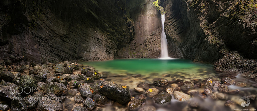
    Photograph Waterfall by Luka Esenko on 500px

    Waterfall by Luka Esenko on 500px

    Photograph Nauyaca by Mathieu Dupuis on 500px

    Nauyaca by Mathieu Dupuis on 500px

    Photograph midnight falls by Kevin Wenzler on 500px

    midnight falls by Kevin Wenzler on 500px

    Photograph ?  splash  ? by Ayie  Permata Sari on 500px

    ? splash ? by Ayie Permata Sari on 500px

    Photograph Palouse Falls by Jason Hatfield on 500px

    Palouse Falls by Jason Hatfield on 500px

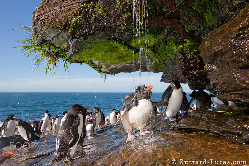
    Photograph Rockhopper Showering by Will Burrard-Lucas on 500px

    Rockhopper Showering by Will Burrard-Lucas on 500px

    Photograph Natural Window by Mohan Duwal on 500px

    Natural Window by Mohan Duwal on 500px

    Photograph Iguazu colours 4.0 sec. by Wave Faber on 500px

    Iguazu colours 4.0 sec. by Wave Faber on 500px

    Photograph Jaggedly Smooth by Dylan Toh  & Marianne Lim on 500px

    Jaggedly Smooth by Dylan Toh & Marianne Lim on 500px

    Photograph Well of Souls by Karezoid Michal Karcz  on 500px

    Well of Souls by Karezoid Michal Karcz on 500px

    Photograph My favorite place by Uwe Müller on 500px

    My favorite place by Uwe Müller on 500px

    Photograph Seljalandsfoss from Inside by Mike Reyfman on 500px

    Seljalandsfoss from Inside by Mike Reyfman on 500px

    Photograph Silk waterfall by yoshi ?? on 500px

    Silk waterfall by yoshi ?? on 500px

    Photograph Canyon Glow by Bill Ratcliffe on 500px

    Canyon Glow by Bill Ratcliffe on 500px

    Photograph Secret Falls by Jarrod Castaing on 500px

    Secret Falls by Jarrod Castaing on 500px

    Need some waterfall tips? As promised here’s some tips and articles that might help you out:

    • How to do Dreamy Landscape Photography with a Neutral Density Filter
    • Beginner’s Guide to Waterfall Photography
    • Photographing Waterfalls: 6 Tips To Get You Started
    • Picking A Waterfall Shutter Speed For The Best Look

    Check ou the newest dPS ebook – Loving Landscapes A guide to landscape photography workflow and post-production – a brand new dPS ebook by the authors of Living Landscapes

    The post A Collection of Waterfall Photos to Spruce up your Weekend by Darlene Hildebrandt appeared first on Digital Photography School.


    Digital Photography School

  • 50 Luxury Fashion Photography Portfolios You Should See

    The world of couture and high fashion ?aptivates with its glamor and gloss. With its big audience, glamorous, international lifestyle and high price tags, fashion photography may seem to be one of the world’s most demanded professions. For each fashion photographer who makes it through the door of top magazines, many others find their niche in art photography, fashion advertising, Continue Reading

    The post 50 Luxury Fashion Photography Portfolios You Should See appeared first on Photodoto.


    Photodoto

  • How to do Dreamy Landscape Photography with a Neutral Density Filter

    Neutral density filter 01

    16mm lens, ISO 100, f/13, 2 second exposure

    Perhaps one of the most overlooked and undervalued tools you can own as a photographer is a Neutral Density filter (ND Filter) or Graduated ND Filter. In fact, if photography is considered painting with light then a ND filter would be considered the brush tip. You see, different paint brush tips can be used to regulate, if you will, the amount of paint you apply with each stroke – just like different Neutral Density or Graduated ND filters can be used to regulate the amount of light you allow to enter your camera.

    What is a Neutral Density Filter?

    A Neutral Density filter reduces the intensity of all wavelengths or colors of light equally. That’s just a fancy way of saying it lets less light into your camera. They come in different intensities and styles. One such style is the Graduated Neutral Density filter which blocks light on half of the filter, and gradually transitions to the other half which is clear.

    neutral-density-filter-07

    Same scene as above without the Graduated Neutral Density Filter. Notice however that it is the same exposure – 16mm lens, ISO 100, f/13, 2 seconds

    Mastering the ND Filter or Graduated Neutral Density filter does not take a degree from Hogwarts School of Witchcraft (though it couldn’t hurt). Below I’ll show you the dynamic photographs you are able to capture with the proper tools and then I’ll show you a technique to replicate the ND filter in the off chance that you don’t already own one, or can’t afford one due to the fiscal restraints your significant other has put in place to reign in your “hobby budget”. Remember, there is often more than one way to achieve the desired results in photography.

    The neutral density filter is probably best recognized by its ability to slow your camera’s shutter speed to the point that fast moving water looks calm and silky.

    Neutral density filter 02

    23mm lens, ISO 200, f/16, 2.3 seconds

    Anytime you are working with slow shutter speeds you need to be careful of camera shake so it’s always recommended that you use a tripod and either a remote shutter release, or set the self-timer. Depending on the neutral density filter you use, you may be leaving your shutter open for many minutes at a time. Shooting in RAW is highly recommended as most ND filters leave a color cast on your photograph and you’ll want the flexibility to fine-tune your white balance in post processing.

    The Difference

    Neutral density filter 03

    26mm lens, ISO 100, f/18, 25 seconds

    The above photograph was taken with a 10 stop neutral density filter in order to enhance the reflections on the water. The ND filter slows the shutter speed significantly allowing the water to look like glass. This is a more subtle example than the first photograph, but either way the end result is more unique than what you’d be able to do without it.

    Think Outside the Box

    Neutral density filter 04

    16mm lens, ISO 100, f/16, 0.6 second

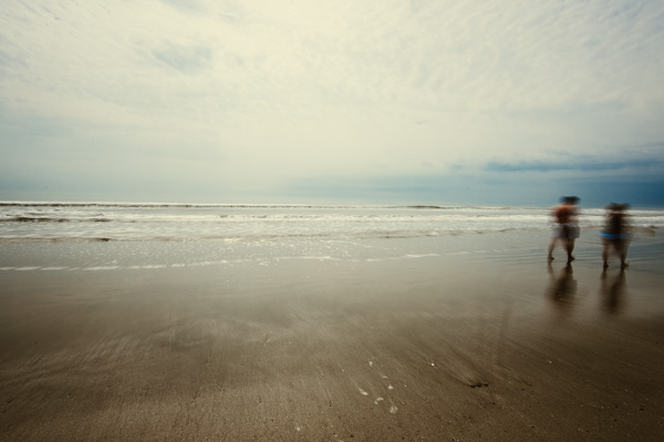
    By now, if you’re a regular reader, you’ll have learned that there is more than one way to photograph a subject or scene. There are many articles that talk about the harsh light during the afternoon – the neutral density filter tames that light and allows you to create some really interesting photography. The shot above was also taken with a 10 stop neutral density filter, on a very bright day. The ND filter allowed me to slow the shutter speed just enough to blur the couple who walked in front of me. The end result ended up being one of my favorite shots that day.

    Fine Art

    Neutral density filter 05

    16mm lens, ISO 3200, f/4, 30 seconds

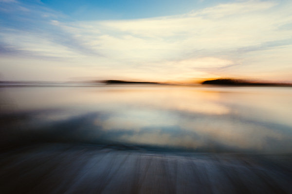
    Fine art photography is created within accordance of your own vision as the artist photographer. Sound vague? It is, but that’s the great thing about fine art, you can express yourself through your photography without following anyones rules, not even your own. The photograph above is actually classified as Intentional Camera Shake (or ICM) and it’s created by moving your camera while the shutter is open. I used a 6 stop neutral density filter for this shot and panned the camera to the left, and then back to the right while the shutter was open. If you are new to Intentional Camera Shake, the ND filter will give you more time with the shutter open in order to make deliberate movements.

    What if You Don’t Have a Neutral Density Filter?

    If you don’t already have a neutral density filter, but you’d like to improve the look of your photographs right now, there is a little trick you can tuck away in the recesses of your mind for the next time you’re out and about. Remember how your shutter speed and aperture are so closely related? Well, you can slow your shutter speed enough to make choppy water look smooth even without a neutral density filter by making a couple of adjustments.

    Note:  I’m going to recommend that you to close your aperture (smaller f-number) to the narrowest setting your lens will allow and you must be aware of the trade off. When you shoot with the smallest aperture your lens allows, you may cause lens diffraction. Lens diffraction is where your images will be less sharp due to light disbursement when passing through the small aperture opening of your lens. This is the tradeoff when trying to replicate the effects of a neutral density filter without having the actual filter.

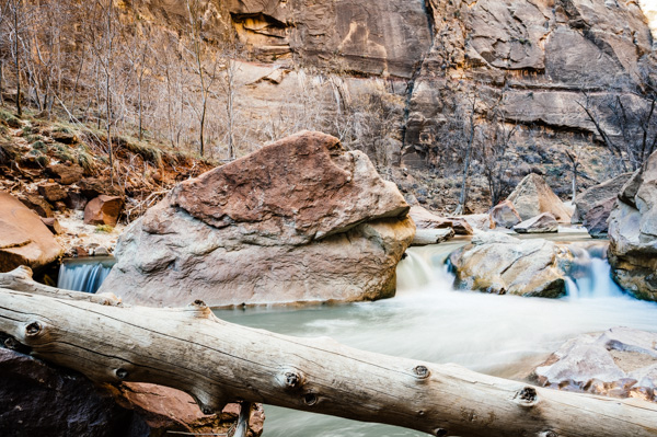
    For this example we are going to talk about fast moving water, the Virgin River to be precise. The photo below was taken at Zion National Park in rather bright conditions. The brighter the scene, the harder it will be to use this technique. In order to smooth the water you need to slow your shutter speed, right? Right. In order to slow your shutter speed without overexposing the image you need to compensate by reducing the amount of light that enters the camera another way. Opening your aperture (smaller f-number) lets more light in, while closing your aperture (larger f-number) will reduce the light, so we must close the aperture.

    Neutral density filter 06

    34mm lens, ISO 100, f/22, 1.3 seconds – no filter

    Close the aperture as far as you can, and make sure your ISO is as low as possible as well. Slow your shutter speed (if you are shooting in aperture priority mode the shutter speed will adjust automatically). Be sure to use a tripod or you’ll have blurry photographs. You will want a shutter speed around 1/4th to 1.3 seconds.

    Note: this will be pretty much impossible if you’re in full bright sunlight as the “Sunny f/16 rule” will apply and best you can do without a filter is 1/50th at f/22. So you’d need at least a 3 stop ND filter to slow down more than that, 6 stop would be even better in that situation. 

    Finally

    Remember, not all neutral density filters are created equally and the glass you put in front of your cameras sensor will directly impact the image quality of the photographs you take. You should strive for the best quality you can afford. The best ND filters can be purchased for $ 50-$ 200+ depending on the size and materials.

    When shopping for a neutral density filter I’d recommend purchasing the screw on type to fit the size of your largest lens (the size of filter you need will be written on the lens with a little circle with a line through it next to it, and inside the lens cap). You will save yourself money if you stick with the largest lens size, as you can purchase cheap metal adapters, (called step down rings) generally less than $ 10, to accommodate your smaller lenses.

    Let me leave you with this final tip. Your camera lets light in through the lens (and sometimes leakage around the lens) as well as through the viewfinder. When you shoot with fast shutter speeds this is not noticeable but when shooting with longer exposure times you’ll find that the light that comes through the viewfinder will cause brown areas to pollute your image. Cover your viewfinder when using a neutral density filter and you’ll eliminate this phenomenon. Enjoy.

    Check out the newest dPS ebook – Loving Landscapes A guide to landscape photography workflow and post-production – a brand new dPS ebook by the authors of Living Landscapes

    The post How to do Dreamy Landscape Photography with a Neutral Density Filter by John Barbiaux appeared first on Digital Photography School.


    Digital Photography School

  • Exposure Blending Using Luminosity Masks Tutorial

    There will be a time when the wizards behind your camera technology conjure up a sensor so powerful they will swallow up any scene and spit it out just as it was – no over, or underexposed areas. Until then, in order to produce an image with a high dynamic range of light, you have to work with the sensors available to you and create your own post-processing magic.
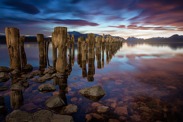
    Pink sunset

    Image created by blending two exposure with luminosity masks, one for the sky and one for the foreground.

    While you, and many photographers, may have relied heavily on HDR programs in your exposure blending quest, many more are now beginning to turn to luminosity masks as a cleaner alternative. Through the use of luminosity masks you can create stunning, balanced images that encapsulate a vast dynamic range of light. They give you incredibly fine control over your imagery in almost every area.

    While some HDR programs nowadays produce very natural, clean HDR images, luminosity masks do not affect the original files at all, so there is literally zero image degradation during the blending process. That is why so many digital photographers are beginning to make luminosity masks a staple in their workflow.

    What are Luminosity Masks?

    Luminosity masks break an image down into various channels of luminosity. In other words, they allow you to make very specific selections in Photoshop based on how bright or dark an area is. Let’s say you were looking at a beautiful nighttime cityscape shot. Everything is exposed correctly apart from the street lights, which are completely blown out. You also have a darker exposure in which the street lights are ideally exposed.

    Through luminosity masks you can make an accurate selection of the street lights because you can hone in on their brightness, or luminosity values. With this selection you can simply replace the overexposed streets lights with the correctly exposed ones in the darker image.

    What You Need to do Luminosity Masking

    Firstly, creating your own luminosity masks is a complex and cumbersome process. However, I have a free Photoshop Luminosity Mask Action Set that will do all of the work for you. You can download it here: Free Luminosity Mask Action Set.

    Secondly, it is imperative that you have a good understanding of Masking in Photoshop. If you’re a little bit unsure of the process, you can visit Adobe’s site which has a useful video tutorial for you to follow: Masking in Photoshop.

    Which exposures to blend?

    Ideally, the exposures you choose to blend should cover the full range of light in a given scene. Your brightest exposure should contain information in the darker areas, while your darkest exposure should contain information in the brightest areas. You are not limited to the number of exposures you can blend. Sometimes, in scenes of extremely high contrast, you may need to use as many as five to ensure a smooth transition between exposures and to cover the full range of light in the scene.

    The order you choose to layer the exposures in Photoshop is dependent on your personal preference and the exposures you’re working with. Usually working with your normally exposed image as the base layer will derive the best results, but sometimes you may need to work with a darker or brighter exposure as your base layer.

    Once you’ve decided on your exposures and have layered them in Photoshop, you now must decide which exposure you will run the actions on. Generally this will be done on your normally exposed image because it will offer the widest range of usable masks. For example, if you ran the luminosity mask actions on a darker exposure, you would gain a full range of dark and mid-tone luminosity masks, but very few, if any, workable bright masks, because the darker exposure is lacking in highlights. The converse is true for a strongly overexposed image.

    Blending Exposures Using Luminosity Masks Tutorial

    Today you’ll work with two exposures. One is ideally exposed for the sky and sea (download the underexposed image here), while the other is exposed for the foreground elements (download the overexposed image here).
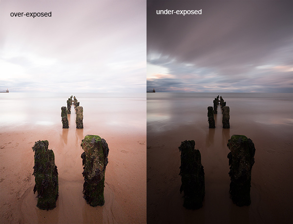
    Original files

    You want to combine the sky and the sea in the underexposed image with much of the foreground in the overexposed image. To do this, you need to find a way of selecting the sky and the sea (i.e., the blown out areas) in the overexposed shot. Once you’ve done that you just need to replace it with the sky and sea of the darker exposure.

    Steps in Photoshop For Blending Exposures

    1. Install the Photoshop Action set

    Instructions on how to install actions can be found here: Get Creative With Photoshop Actions

    2. Import your two images into Photoshop

    Bring both images into Photoshop as layers, placing the underexposed image on top. Align the images by selecting both of them on the layers panel, and going to Edit > Auto-Align Layers.

    3. Turn off the top layer

    Uncheck the eye on the layers panel next to the underexposed layer. This will make it invisible and ensure that the luminosity mask actions will run on the overexposed layer only.

    4. Run the Masking Action

    Go to your Actions panel, which looks like a Play button on the toolbar. Open it up and go to the set called JM Luminance Masks. Click on the arrow to the left of that. You will now see an option called Generate Luminance Masks. Select it and press the Play button at the bottom of the Actions panel to begin the process.
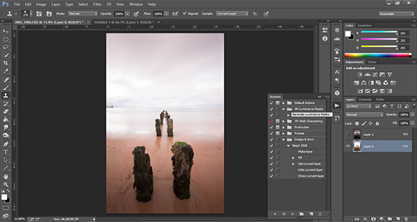
    Luminosity mask actions

    5. Add a Layer Mask to the Dark Underexposed Layer

    Now, check the eye next to the underexposed layer, so that it is visible again. Make sure that layer is selected, then go down to the bottom of the Layers panel and, while holding Alt (Option on a Mac), left click the Add a Mask icon. This will create a black layer mask on the underexposed layer, making it invisible again.

    6. View Luminosity Masks

    To see the Luminosity Masks that you’ve generated, go to your Channels palette, next to the Layers panel (if it is not showing go to: Window > Channels and it will appear). You’ll see 18 monochromatic channels, ranging from Brights 1-6, Darks 1-6, Midtones 1-6. Every one of these channels is a potential mask.
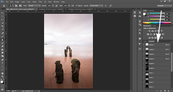
    Luminosity mask channels

    7. Comparing and Selecting a Luminosity Mask

    For this set of images, you only need to use one mask in order to blend the sky from the darker exposure into the overexposed image. In this instance, you’ll need to select Brights 3.
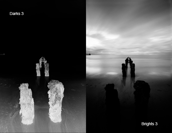
    Comparing Masks

    Just as with normal masking, the brighter the pixel the stronger the selection. In other words, in the image above, if you used Brights 3 you are selecting much of the sky and sea, but none of the foreground which is completely black. Conversely, if you selected Darks 3, for example, you would only be making a selection of the foreground sand and the poles that lead out to sea.

    When choosing the appropriate mask, you are looking to isolate different areas. Therefore, it’s important that the mask you choose has the greatest contrast between the areas you wish to select and the areas you wish to ignore.

    For example, if you were working on an image of a nice green field on sunny day, but the sky was blown out and you wished to exchange it with the sky from a darker exposure. You would run the luminosity mask actions and choose the mask where the field was black and the sky was white. This would ensure you would only select the sky and not the field in the foreground.

    To turn Brights 3 into an actual selection, you just need to hold Control (Command on a Mac) and click the left mouse button on the thumbnail of the Brights 3 channel. Marching ants will appear to indicate your selection. Press “Control + H” to hide the marching ants.

    8. Get Ready to Paint on the Mask

    Now switch back to your Layers panel and select the underexposed layer. Make sure you select the mask, and not the actual layer itself.

    9. Set up the Paint Brush Tool

    Choose the Paint Brush tool on the toolbar and make sure the foreground colour is set to white. Choose the correct brush size. This will depend entirely on the area you’re working with in a given image, but usually, a larger brush is better. A brush size of 2,000 pixels was used here. Set the opacity depending on the strength of the masking you wish to use. For example, with this image, you will mask the sky with an opacity of 100%, but the overexposed areas in the water and foreground will only be masked at 40% opacity. This is because you don’t want to darken the sea too much.

    10. Painting or Applying the Mask

    Now you’re ready to begin masking. Freely move your paint brush around the areas you wish to affect. Since you are masking with a luminosity mask selection you don’t have to worry about going over the edges. Try varying opacities in different places. Even if your brush opacity is set to 100%, you can still run your brush through certain areas a few times to strengthen the effect.

    By holding Alt (Option on a Mac) and clicking on the layer mask you’re working on, you can see exactly what the mask now looks like. The image below is the final layer mask after you’ve finished painting. Remember that white equals visible and black equals invisible. So the sky in this layer is completely visible, the sea is grey so it is partially visible. Since the foreground is black, which means invisible, you will be left with a foreground that is 100% from the overexposed layer below.
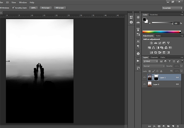
    Final Mask

    After a small contrast adjustment and a selective vignette added, here’s the final image along side the original overexposed image you were working with.
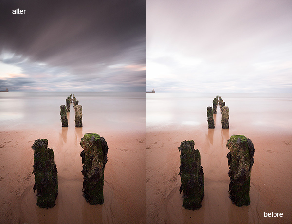
    Final images

    You now have a nicely balanced image with a good range of dynamic light and tones.

    Deleting the Luminosity Masks

    While working in Photoshop, the more layers you work on, the larger the demand on Photoshop and your system. Large workflows can seriously slow down your operating system. To ease the load, you should delete the luminosity masks once you’ve finished working with them.

    To do this, go back into your Channels palette and select Brights 1. Then hold down Shift and press your left mouse button on Brights 2 to select this too. Do the same with each luminosity mask below. Once all are selected, click your right mouse button on any of the selected masks and choose the Delete Channels option. This will remove the selected channels.

    Summary

    At first, luminosity masks seem complex and sometimes daunting, but in truth, this whole workflow took less than 5 minutes. After a little bit of practice you begin to get an intuitive sense of how to use these powerful tools, and once you do, you gain extensive control over your images that can change your photography forever.

    Have you tried this method of blending images, if so share your thoughts or images in the comments below. Or do you prefer the HDR tone-mapping process? Do you think HDR is dead or maybe it should be? Or perhaps you are somewhere in the middle in the 10 steps every HDR photographer goes through? What are your thoughts?

    Check out the newest dPS ebook – Loving Landscapes A guide to landscape photography workflow and post-production – a brand new dPS ebook by the authors of Living Landscapes

    The post Exposure Blending Using Luminosity Masks Tutorial by Jimmy McIntyre appeared first on Digital Photography School.


    Digital Photography School

  • Finding and Working with Available Light

    I don’t use a flash for my photography, it’s a personal preference. Available light, in its many forms, is both challenging and rewarding so I rarely find a need to turn to creative lighting.

    MWT_Avail_Light_2

    Natural light, golden hour

    What is ‘available light’?

    Let’s be clear on definitions first. As a street photographer my preferred source of light is sunlight, more specifically, natural light. Available and ambient light refer to any and all light sources the photographer did not introduce for their photograph; light bulbs, candles, fire, neon, to name a few.

    The available light around us is a great opportunity for our photography and photographers should be passionate about making best use of this light when capturing a photo.

    George Eastman said, “Light makes photography. Embrace light. Admire it. Love it. But above all, know light. Know it for all you are worth, and you will know the key to photography.”

    On a basic level we all recognise the beautiful sprawling vista before us looks wonderful bathed in the rays of the setting sun, and less so beneath an overcast grey sky. I refer to this as the quality of the light.

    What are the different qualities of light?

    Starting with the obvious, the sun, the qualities of its light are wildly variable.

    MWT_Avail_Light_5

    Natural light, sunset

    Direct sun

    The sun is warmer and softer at each end of the day. Shadows are long and also soft. These two periods, at sunrise and sunset, are referred to as the Golden Hour and many landscape photographers won’t recognise any other part of the day. Quick tip: when the skies are a glorious combination of oranges and reds, set your white balance to Sunny. Set to auto white balance, the camera often attempts to compensate for, what it believes are, overly warm tones.

    During the day when the sun is high, the light is bright and harsh and shadows will be short. The principal challenge here is how to properly expose where there is a massive range of exposure between areas of light and shadow.

    MWT_Avail_Light_4

    Harsh direct sun

    Indirect sun

    This covers areas of shade, reflected sunlight, side lighting through a window and that pallid grey diffuse light from cloud cover.

    MWT_Avail_Light_3

    Indirect sun from a side window

    Artificial light

    Ignoring light from the night sky, what remains to light our photography is artificial light. No less challenging to work with, artificial ambient lighting can vary in brightness from a candle to stadium lighting, and can be located on ground level to anywhere overhead. There could be multiple sources and, if all this wasn’t bad enough, some of those light sources could be moving!

    What is the quality and direction of light?

    MWT_Avail_Light_6

    Direct sun, nearly overhead casting short harsh shadows

    Direct overhead sunlight

    Taking a portrait in direct overhead sunlight is tough going. The light is bright and harsh, the shadows equally so. I’m a street photographer, so there’s no option to move subject(s). In this scenario I have to weigh up the contrasts between bright and dark areas, especially with faces. The subject’s clothes will affect the exposure, dark materials losing texture to the shadows more quickly. Backgrounds should be considered too. For example, a small portion of bright sky in the frame can horribly distract when the rest of the photo is a fairly balanced exposure.

    If you can move your subject, the effects of the direct sun can be mitigated when you consider placing the person next to a light coloured wall, or other reflective surface. Very much along the lines of a subtle fill using the reflected light. These light and shadow areas will all be softer and your subject won’t be squinting. Moving to a wholly shaded area will result in a flat lighting with little or no shadow. Yes, exposure will be easy but your image will take on a decidedly flat look.

    Open shade

    Open Shade, Combination Of Sun And Shade

    Open shade, combination of sun and shade

    These areas are great opportunities to introduce depth into your images with portions of direct sunlight as well as shadows cast from the shaded area, all within the frame. Trees are the obvious candidates for partially shaded areas, but also consider open doorways and alleys. The example above takes advantage of the shade cast by several umbrellas.

    Side light or window light

    Making use of light from the side, open windows or low sun late in the day, also generates images with a real sense of depth. The side lighting will reveal the smallest textures. The dynamic range of light to dark in these scenes is much reduced. Pay attention to the contrast play now on a more horizontal plane than you would see with overhead light sources.

    Diffuse light

    With little or no discernible direction, diffuse light from a shaded area or overcast sky introduces problems with colour temperature and a general lack of depth in images. I don’t let this bother my street photography, however this is a challenge for a scheduled shoot.

    I have generally been referencing available light from the sun. Working in environments with artificial light you are faced with the same factors, though problems can be amplified. Unnatural light frequently complicates exposures with off colour temperatures and much lower levels of light.

    On one occasion, I was commissioned to photograph an event where all the lighting was eye level and against the walls! There are only so many silhouette shots you can get away with and I spent a large part of the evening against a wall to be able to shoot with the light.

    How much light do you have to work with?

    MWT_Avail_Light_7

    Indoor artificial low light

    Whatever the quality and level of the light, reflective surfaces are useful to make the best of the ambient levels. For planned shoots, particularly with models, metallic reflectors are an excellent method of manipulating light onto a subject. Even nature photographers carry fold up reflector discs to reduce the silhouetting effects of shooting into the sun. No reflector, and no alternate light sources? I suggest white walls, shiny floors, glass surfaces.

    Low available light situations are challenging for photographers and this is one area where the right gear will enable you to take a better photograph. Capturing a well exposed image requires as much light as the sensor can get. Static subjects will allow a longer exposure. Events, concerts, parties, weddings all rely on photographers obtaining shots quickly. This means fast glass and, where needed, increased sensor sensitivity or ISO. I recommend a lens capable of f/2 for very low lit scenes. If you are shooting hand held, you will probably still need to increase your ISO to prevent a blurred exposure.

    It frustrates me terribly to see so many people constantly using their smart phone, however, the light from the screens always helps illuminate faces. It is precisely this kind of observation that will help you find light where you need it. 

    Notes on exposure

    Exposure is influenced by aperture, shutter speed and ISO and your camera’s metering programme will wiggle those three factors to attempt to capture an evenly exposed scene. In reality, you are the principal metering programme; your ability to see where the light falls, the points of reflection and those areas of dark shadow.

    My camera is set to spot metering and I pick an area of the scene to meter against and therefore influence the exposure. In bright sunlight, I might meter on the subject’s light coloured jacket to reduce the effects of the bright sun. At an event, I am likely to meter near to the ground to elevate overall exposure. Less commonly, and for balanced light situations, I will meter against the subject’s face. You will become more practiced with reading light levels and metering to control your exposures.

    Don’t be fooled into thinking Auto White Balance will save your scene. Also, shooting RAW affords you the maximum dynamic range your camera is capable of and, though White Balance is an attribute, you still need to consciously set it. Carry white balance cards and custom white balance!

    One final suggestion. Shoot RAW and set your camera to Black & White. Reviewing your images in monochrome will allow you to view only the luminosity in the scene and see where the light play is. You can set your image back to its original colour at a later stage.

    Where would your photography be without light?! There are so many situations to which only practise reveals the solution, so please discuss available light questions and issues in the comments and I will do my best to answer.

    The post Finding and Working with Available Light by Michael Walker-Toye appeared first on Digital Photography School.


    Digital Photography School

  • The Power of Post-processing for Landscape Photography

    Embracing the power of creative post-processing can transform your landscape photography from dull and lifeless, to lustrous and vibrant overnight!

    We’re acutely aware that the preceding statement reads suspiciously like the voiceover script for a ‘next generation, nano-organic hair care’ commercial, but it’s true – digital post-processing can be a transcendent experience for your landscape images.

    1 intro 001

    Sunset over the Mount Egmont from Wai-iti Beach, Taranaki Coast, New Zealand (by Sarah). Post-processing doesn’t always have to be complex to be effective. This image has received some basic adjustments to color, contrast and exposure to enhance its visual impact.

    Why we need to post-process our landscape images

    In the days of film photography we never performed any post-processing on our landscape images. Doing so entailed spending a small fortune on drum scanning and knowing someone with access to a supercomputer. Most landscape photographers were restricted to capturing everything in-camera and living with the results.

    That state of affairs meant we needed to make decisions in the field that had permanent repercussions;

    • Which film stock and ISO to use?
    • Which color filters to apply?
    • How to achieve perfect exposure?

    It is likely fair to assume that, for most dPS readers, film photography is either a distant memory or something that needs to be looked up on Wikipedia. We digital landscape photographers can gleefully wallow in the knowledge that RAW image capture and robust digital workflow allows us to make most of these decisions from the comfort of an office chair well after the time of capture.

    The problem with RAW capture is that it usually produces really, really bland and unappealing images straight from camera. If you want to maximize the visual impact and creative options contained within a RAW file you need to post-process your images. It’s that simple.

    2 before after

    Sunset at Gentle Annie Beach (by Todd) West Coast, South Island New Zealand. This scene has all the ingredients of a successful landscape image, interesting visual elements, motion, and a nice blend of textures throughout the scene. However, the RAW file delivers an image that is bland, cold and lacking in contrast. Some simple post-processing of a single image file in Adobe Lightroom has resulted in an image that is visually inviting and makes the most of the tonal and color data contained within the image file.

    2a intro 002

    Lake Matheson and the Southern Alps at dawn (by Todd). Three distinctly different results were achieved from this one (bleak looking) RAW file! Long gone are the days where your creativity is restrained by in-camera results.

    Two types of post-processing

    In our latest dPS eBook Loving Landscapes – a guide to landscape photography workflow and post-production we break down landscape photography post-production into two distinct approaches:

    • Single exposure post-processing
    • Multiple-exposure post-processing

    Let’s take a quick look at these two different approaches enhancing landscape photos.

    Single exposure post-processing

    As you will have figured from the name, this approach creates the finished image by processing a single image file. This is primarily accomplished within Lightroom and is the simplest approach to post-processing – if you read our first eBook, Living Landscapes, you will know that we love simplicity, particularly when it comes to post-processing!

    We always attempt to capture a scene in a single file if possible, as it reduces the time spent in front of a computer and introduces less technical barriers to creativity than are found in multiple exposure post-processing.

    3 se at 12

    Lake Alexandrina (by Sarah). Single exposure landscape photography offers huge creative scope. Combining in-camera single exposure techniques such as long exposure with post-processing (black & white conversion) can create results that are stunning.

    Multiple exposure post-processing

    Occasionally it is impossible, for technical or creative reasons, to achieve the desired result with a single image file. Cue multiple exposure workflow – where the final image results from processing and merging elements from two or more image files. Multiple exposure landscape photography is a significantly more complex approach – both in the field and during the post-processing workflow. We use a combination of Lightroom and Photoshop to combine multiple images into a single final result.

    One of the most common uses of multiple-exposure post-processing for landscape photography is exposure blending – where two or more exposures are combined to overcome high dynamic range in a scene.

    4 exposure blending

    The dynamic range of this high contrast scene (image above) exceeded the camera’s capabilities. Exposure blending allowed us to create a technically excellent result from two exposures. We detail three different approaches to exposure blending landscape scenes (including the making of this image) in Loving Landscapes.

    5 mi wf 16

    Misty sunrise at Castle Hill (By Sarah). HDR is another multiple exposure post-processing approach that resolves technical limitations as well as offering creative options.

    In addition to providing solutions to technical challenges, multiple exposure landscape photography allows creative options that are simply impossible to achieve in a single frame. A good example of this is the merging of ‘best elements’ from multiple shots of the same scene taken at different times. This allows us to composite different elements together to create an image that exceeds the results achievable in a single exposure.

    6 best elements

    Lake Pukaki (by Todd), merging best elements in this scene allowed us to combine the best sun starburst and clouds, with the most dramatic waves and shoreline from the field sequence (of over 20 images). Covering the sun in another frame also allowed us to minimize the appearance of lens flare on the cliff face.

    Give it a go!

    Post-processing opens up a world of creative opportunities that allow you to better express your vision of the world around you. The technology is there, it is easy to use and the results can be spectacular – why wouldn’t you want to post-process your images?

    Post-processing may seem a little overwhelming at first – and it can be – but you don’t require an art school diploma to start making dramatic improvements to your images. Our oft repeated advice is to keep it simple when you are starting out. Take the time to learn about the post-processing tools that affect the fundamental variables of photography: color, exposure and contrast and your images will improve dramatically.

    Once you have those mastered, start experimenting with more complex tasks in Lightroom’s wonderfully non-destructive editing environment (there is nothing that can’t be undone in Lightroom) before transitioning to the more complex realm of multiple exposure Photoshop.

    We hope that this has been of interest to you and we look forward to your feedback in the comments section.

    *Note: photo-puritans can still experience some of the old school ‘thrill’ of making a finished image in-camera by shooting in JPEG-only mode. All of the color, tone and quality decisions can be set by messing around in the bowels of your camera menu. These settings are then baked into the finished JPEG, leaving much less scope for post-processing than with RAW capture. Why anyone would choose to do this deliberately is unclear – apparently, some folks love a challenge.


    Check ou the newest dPS ebook – Loving Landscapes A guide to landscape photography workflow and post-production – a brand new dPS ebook by the authors of Living Landscapes

    The post The Power of Post-processing for Landscape Photography by Todd Sisson appeared first on Digital Photography School.


    Digital Photography School

  • The New Colossal Bundle with $10,063 worth of Top-Quality Resources – From $49

    Maybe you’ve heard of Inky Deals before. If you’re the kind of person who’s always on the hunt for massive deals, monster discounts and insane bundles, then you likely know all about Inky Deals. They’re the website that’s always putting out amazing resources on a regular basis for a very good price. And boy, oh boy, do we have a Continue Reading

    The post The New Colossal Bundle with $ 10,063 worth of Top-Quality Resources – From $ 49 appeared first on Photodoto.


    Photodoto

  • A New Photographer’s Guide to Composition

    Recently I wrote a New Photographer’s Guide to Camera Settings. Once you become comfortable with your camera settings, the next step is to learn the rules of good composition and design for your photography.

    So here are the 10 most important tips to take into account when framing your scene. Your guide to composition.

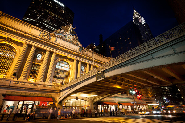
    Grand Central and Chrysler Building, NYC.

    Grand Central Terminal and Chrysler Building, NYC

    #1 How will the viewer’s eyes flow through the scene?

    I prefer to think about composition as if it is a game to please the eyes, and if you want to please the eyes, they need something to do and somewhere to go. When creating an image you want to think about the path that the viewers eyes will take through the scene, and whether this will be a fluid path or a jarring path.

    • Fluid Path – an image with leading lines, such as a road or stream, or an image with a foreground, middle ground, and background, which leads your eyes gradually from one level to the other.
    • Jarring path – an image with multiple, well spaced subjects for the eyes to bounce around between. Since there would be no lines leading between the objects in this type of image, they must be well spaced within the scene.

    If you look at the photo above, the eyes are led directly to the Grand Central statue in the top left one third line in the scene, particularly because most people read from top to bottom and left to right.   The eyes are then led over to the Chrysler Building Spire and down to the detailed bridge.  These three elements make a triangle shape to lead the eyes through, however, the bridge acts as a very important element of the composition, keeping the eyes from leaving the scene and leading them back into the image, where they can either head up towards the statue or down to the people and cars on the street.

    #2 Watch the Edge of your Images

    Continuing from tip #1 above , for an image to feel balanced the edges of the image should be balanced. The eyes have a natural tendency to want to fall off an image through its edges. By putting elements in the corners you stop and catch the attention of the eyes, pushing them back into the scene. This is why landscape images often have small branches of trees or foliage in the top corners of the sky, and why vignetting is commonly used.

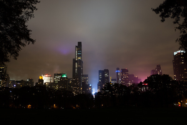
    Central Park South, NYC.

    Central Park South, NYC

    Notice the branches in the top corners that function to keep the eyes in the frame. The corner elements often work even more effectively when only part of them is showing.

    #3 Rule of Thirds Versus Centered Images

    The rule of thirds is more of a suggestion than a rule. I’ve seen people take it to the extreme, but there are so many instances where a centered or different composition is preferable.

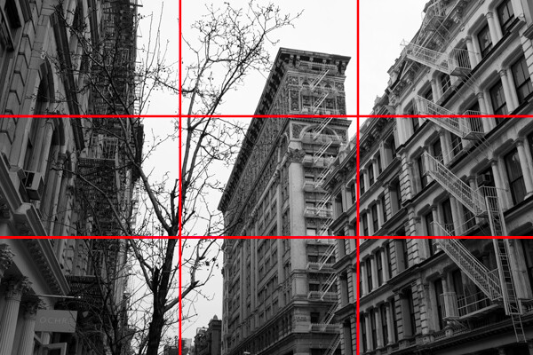
    The rule of thirds refers to placing your main subject, or subjects, at one of the four one-third intersections in your photo, which you will notice in the second image below. This feels more pleasing to the eyes and it also allows you to simultaneously focus on a foreground subject on one side, while having a significant amount of space for an interesting background to balance out the scene.

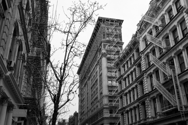
    Silk Exchange Building, NYC.

    Silk Exchange Building, NYC

    Rule of Thirds.

    Rule of thirds

    In the above photo, while not exactly on the one third line (it’s not a rigid rule), you can see the building is balanced out by the tree on the corresponding one third line. The buildings on the each edge act as leading lines and have the added purpose of acting as edge frames to keep the eyes within the scene.

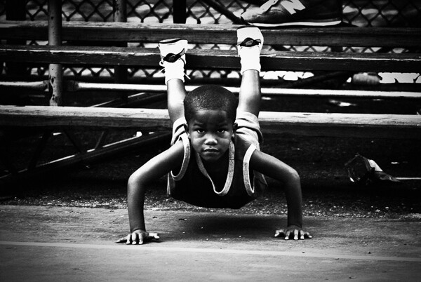
    However, don’t be afraid of placing your main subject in the center. A centered subject can block everything else out of the scene and make you focus only on the most important element. This works especially well with a strong facial expression or look in the eyes. In addition, this works for symmetrical scenes, which can feel extremely balanced.

    Rucker Park, NYC.

    Rucker Park, NYC

    #4 Horizontal – Vertical or Skewed

    Whether to capture an image horizontally, vertically, or slightly skewed is always a tough decision. There are many reasons to photograph both horizontally and vertically, however I often find that photographers have a tendency to rely more on one format.

    Horizontal images often feel more natural to look at because they mimic the way that our eyes see the world. They also allow you to to fit more elements into your image and they provide an easier format for the eyes to flow through the image.

    A vertical format can be beneficial when you want to get in closer and focus on a single subject or a tight area. It is a way to simplify your photo and get rid of any elements that might take attention away from your main subject.

    When you are creating a horizontal or vertical image you want to make sure that your lines are straight.  If they are slightly off, the image will not feel balanced. However, sometimes you will want to skew your subjects at an angle. Skewing your subjects so the scene is neither horizontal nor vertical adds interest and energy to the photo. It promotes a spontaneous feeling and the lack of balance can actually be a pleasing to the viewer.

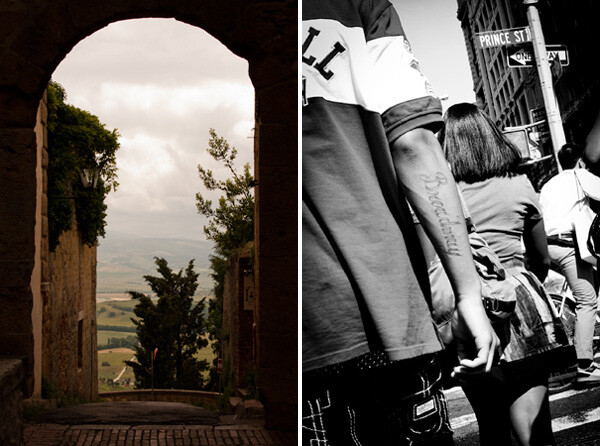
    4-vertical_vs_skewed2

    Tight, classic, vertical shot vs. energetic, skewed, detail shot

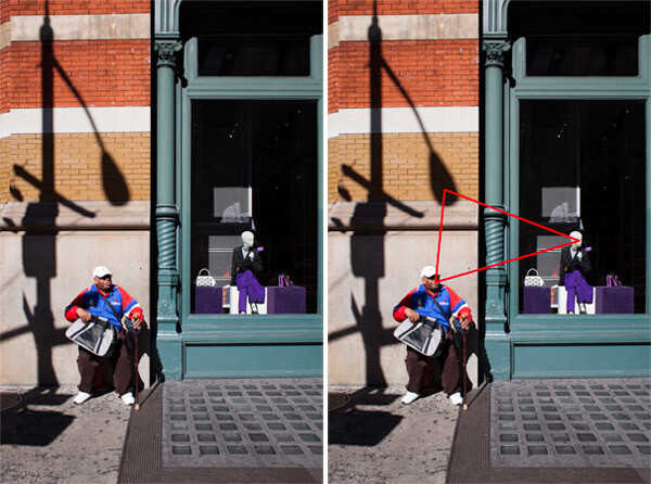
    #5 Triangles and the Number Three

    The triangular shape can be very important to good composition in photography. This does not refer to having the actual shape in an image but a relationship between three objects that create a triangle within the scene.

    As long as the three objects are able to balance each other out, this is pleasing to the eyes because it creates a constant path through the scene.

    5-Prada_Store2

    Prada store, SoHo, NYC

    #6 Perspective

    The height from which you shoot can be a significant factor in how your images appear. If you want to emphasize height and power in a scene, get low to the ground and tilt the camera slightly up. People will look more important and prominent, and objects like trees or mountains will look even larger.

    Shooting from a high camera angle on the other hand makes everything feel smaller and diminished in power. If the shooting height becomes extreme enough the image can even tend to take on an abstract and graphic feeling.

    When photographing people, always pay attention to the camera angle.  Sometimes raising or lowering the camera slightly can make a big difference.

    #7 Minimalist Versus Maximalist

    Minimalist refers to keeping a photograph very simple, such as an image with a single subject and a pleasing and calm background. This can create a very powerful and graphic design.  There is power in the simplicity.  Valerie Jardin, recently wrote a good article on minimalist photography.

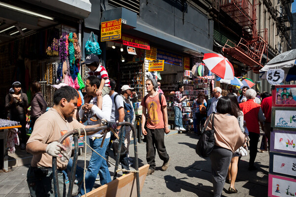
    Maximalist on the other hand refers to a chaotic image, with a lot of elements competing with, and playing off of each other. However, within the chaos there is balance. This type of image is very hard to create in a balanced way, but when it works it can be a delight for the eyes that allows a viewer to explore through the scene.

    Canal Street, NYC.

    Canal Street, NYC. Balance in the chaos

    The image above would not work if the subjects were not all spread out evenly throughout the scene.

    #8 Color

    Color is a vital aspect of design. A strong color on your main subject can add extra emphasis, while a strong color in an insignificant element can ruin the balance of a photo.

    There is a large trend these days towards strong and unrealistic colors in photography, similar to the movies or on instagram. Strong colors do a better job of catching our attention at first, but muted colors can be just as interesting and create just as much of a mood as strong colors, if not moreso.  Explore desaturating your images slightly.

    Each color has its own properties and ability to create mood within an image. A red tint can add a warm and energetic feeling to a photo, while a blue tint can make a scene seem either calm or cold and sterile. As portrait photographer Dan Winter’s states, “Green is an inherently calming and inviting color, and is tied to our natural surroundings.” Winters uses green for many of his portraits.

    Here are some ways that colors can play off each other to add balance:

    • Complementary colors (colors on the opposite side of the color wheel)
    • Analogous colors (colors next to each other on the color wheel)
    • Different colors in similar shades
    • The same color in different shades
    Spring and Bowery, NYC.

    Spring and Bowery, NYC

    #9 Getting Close and Filling the Frame

    This is a very important concept. Figure out what is significant in the frame, get close, and only capture that. Cut everything else out and envelope the main subject. If the most interesting part of a person is their eyes, then capture the eyes up close.

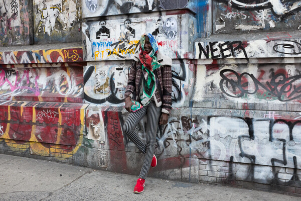
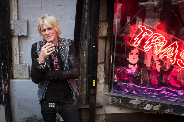
    Shop Owner, Trash and Vaudeville, NYC.

    Shop Owner, Trash and Vaudeville, NYC

    #10 Uniqueness and Breaking the Rules

    Learn these rules and practice them, but keep in mind that sometimes you must break the rules. Be unique whenever possible. There is nothing more pleasing to the eye than something that is different.

    Do you have any additional tips you’d like to add to this list? Please share in the comments, with example images if you have some.

    The post A New Photographer’s Guide to Composition by James Maher appeared first on Digital Photography School.


    Digital Photography School

  • Guide to Creative White Balance for Landscape Photography

    If you’ve been using a digital camera for any length of time, you’ve probably heard about White Balance. You may still be wondering exactly what it is, and how to use it; or you may be using it right now and be wondering how it can possibly be something “creative”.

    Creative white balance landscape photography

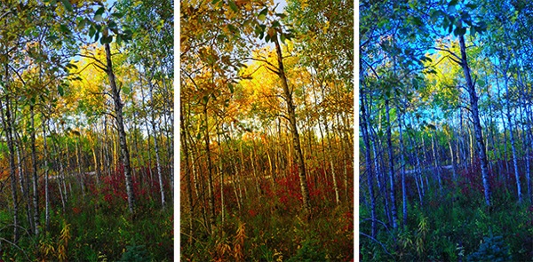
    Different white balance settings create different looks

    I’m going to show you some of my techniques for using White Balance to creatively enhance your landscape photography and with a few simple steps you can unlock the remarkable power of creative White Balance. Don’t worry, this is not a technical discussion, there are lots of references about that aspect of White Balance online. This article explains a simple shooting technique you can start using right now.

    The Color of Light

    Creative white balance landscape photography daylight

    Daylight setting

    Have you ever taken photos in an office, and been dismayed to see that your results had a sickly green cast to them? Or taken photos under cloudy, lifeless, skies only to see your images appear cold, flat and a little blue?

    This happens because light comes in a variety of colors. The reasons for these colors is a result of wavelengths of light and the light spectrum. But we’re not going to get into this too deeply here. Just know that all light has different colors, and even the sun has different colors at different times of the day. Every landscape photographer knows about the “sweet light” or the “magic hour” – the times around sunrise and sunset when the color of the light is perfect for photography.

    The crazy thing is that your eyes usually adjust to compensate for these color shifts, especially the subtle ones, so you won’t necessarily perceive these color differences, and in some cases your eyes are not as sensitive to color shifts as are the sensors in your camera. So you snap that office photo and the result isn’t as great as you had expected. Because of the color, those fluorescent bulbs cast a green pall over everything but you didn’t see it because your eyes “adjusted” the color for you.

    This is where your White Balance settings play an important role in correcting potential problems by adjusting the color of the light in the camera. It is really important when you’re taking images of people, because the skin tones will be unattractive and far from natural looking.

    But, if you are a landscape photographer, armed with the knowledge that light has color and your camera has a tool that can change the color of light, you can use this knowledge to do more creative landscape photography.

    White Balance for Landscape Photography

    Creative white balance landscape photography hicolour fluorescent daylight

    Fluorescent setting

    I shoot a lot of landscapes, in fact I pretty much ONLY shoot outdoors. Thankfully I almost never have to deal with those ugly green fluorescent lights. But what I do deal with are sunsets, sunrises, autumn colors, mountains, flowers, etc. – all those good things we find in nature.

    I noticed that sometimes my sunset images just didn’t pack the punch the way I SAW it at the location. Sure, I could go back to my computer and make adjustments. Or, without degrading any pixels, I could punch up my images in camera by purposely fooling it into using a different White Balance. In other words I don’t use White Balance to correct color casts, I use it to ADD color casts! I deliberately use the “wrong” White Balance setting.

    Landscapes created at sunset or sunrise, snow and winter scenes, and those with night sky dominating lend themselves well to creative White Balance techniques.

    Sunsets can become more warm, or more soothing, with violet overtones if you use the Cloudy White Balance setting. Autumn foliage pops with yellow and orange when you use Shade as your White Balance! The Aurora Borealis (Northern Lights) becomes a rich alien green, rolling through a deep royal blue sky, by changing your White Balance setting to Incandescent or Tungsten. Please note, that you use these settings regardless of actual light colour.

    Creative white balance landscape photography hicolour fluorescent daylight

    Fluorescent daylight camera setting

    Creative white balance landscape photography customA3 M3

    Custom white balance setting A3 M3

    Creative white balance landscape photography auto

    Auto white balance setting

    Creative white balance landscape photography direct sun

    Daylight white balance setting

    Creative white balance landscape photography shade

    Shade white balance setting

    How to use Creative White Balance

    To use creative White Balance, there are just a few things to understand about using White Balance in general.

    Since White Balance is designed to correct color casts, the setting on your camera will compensate, or change the light, to be the opposite of the shooting situation. In other words, incandescent lights are too warm (orange), so changing your White Balance setting to Incandescent or Tungsten will add a blueish tinge. The light in the shade is blueish, so changing the White Balance setting on your camera to Shade adds warmth, orange and red.

    To get creative with White Balance you’ll need to find the dial or menu for changing your White Balance settings. Most cameras have presets for Flash, Shade, Cloudy, Incandescent (Tungsten), Fluorescent, Sunny (or Daylight), and Auto.

    Look for the ICONS – a cloud (cloudy), a house (shade), a sun (full sunlight), a fluorescent bulb – long and skinny (fluorescent), an old school light bulb (incandescent or tungsten), a lightning bolt (flash), and AUTO or A for automatic.

    Next you’ll need to know how to set your White Balance for a specific type of shot. The best way is to experiment by trying all of your White Balance settings for the same scene. So if you want to ramp up your warm colors, say in an autumn scene or sunset, change your White Balance to Shade, Flash, and Cloudy! Compare your results.

    Shooting the night sky or the Aurora Borealis, change to Tungsten or Incandescent to make the colors cooler, make that Aurora really pop! The added blue tones give the night sky a rich royal blue tone, while the green light of the Aurora turns an eerie alien glowing green.

    Here’s a handy chart I made for you – so you can literally “dial it in”. All you need to do is change your settings according to the type of landscape scene, using the chart. This will give you a great place to start.

    Chart

    Supercharge your Creative White Balance

    Depending on your camera, you may also be able to fine tune and supercharge your custom White Balance once you find one that provides the boost you like.

    In Nikon DSLRs you may see this graph that enables you to make your own custom White Balance presets. It’s typically in your shooting menu under the White Balance tab. Consult your camera manual to see if your camera has this option, and how to apply it.

    2customWB1

    1customWB

    Custom white balance in camera

    By selecting a specific color balance presets, you can ramp up the warmth and impact for sunrise and sunset, as well as boost the coolness for winter snow landscapes.

    Easy Experimentation

    If you shoot RAW, and can’t switch White Balance in the field, you can also easily adjust your White Balance in post-production. Lightroom, Photoshop, Nikon Capture and most other image editing programs have a RAW White Balance setting. Nikon shooters note that you’ll get the best results adjusting RAW [NEF] White Balance if you use Nikon Capture, as Nikon encrypts its White Balance “formula”. Other software can only read parts of the White Balance data so your results may not be as high impact as they could be.

    If you have some landscape sunset or sunrise shots on your computer, give creative White Balance a try right now. Here are few of my Lightroom White Balance edits so you can see how much control you have over the drama and mood of your lighting.

    Creative white balance landscape photography auto

    Auto white balance in Lightroom

    Creative white balance landscape photography cloudy custom

    Cloudy custom white balance in Lightroom

    Creative white balance landscape photography auto adjustments 2

    Auto white balance adjustment in Lightroom

    Creative white balance landscape photography auto adjustments3

    Auto white balance adjustment in Lightroom

    Do you have some other tips you can share on using White Balance creatively? Please tell us about them in the comments below and share your images as well.

    For some other landscape photography tips try some of these articles:

    • 5 Steps to Help you Take Better Landscape Photos
    • 10 Most Common Mistakes in Landscape Photography – and How to Overcome Them
    • So you Want to Shoot Landscapes? [Top 12 dPS Landscape articles from 2013]
    • Living Landscapes – A Guide To Stunning Landscape Photography – a dPS ebook
    • Loving Landscapes A guide to landscape photography workflow and post-production – a brand new dPS ebook by the authors of Living Landscapes

    The post Guide to Creative White Balance for Landscape Photography by Alex Morrison appeared first on Digital Photography School.


    Digital Photography School

  • A Guide to Landscape Photography Workflow and Post-Processing

    NewImageToday is an exciting day at dPS HQ because we’re releasing an eBook that has been asked for many times by readers – LOVING Landscapes, a Guide to Landscape Photography Workflow and Post-Processing by Todd and Sarah Sisson.

    Early in 2013 we looked at our growing library of photography eBooks and realised that we had a big hole to fill – we were yet to publish a Landscape Photography eBook.
    We began the hunt for a photographer to create a guide.

    After much searching we came across the photography of husband and wife team Todd and Sarah Sisson and fell in love with their images. We began to talk to Todd about creating an eBook with us and mid last year released a guide to Landscape photography called LIVING Landscapes.

    The eBook was a huge success and became one of our fastest selling eBooks ever.

    That first eBook from Todd and Sarah received some amazing reviews and we still get positive feedback about it almost a year later. But alongside the praise was a request – a request for a guide to post processing landscape photos.

    While the first eBook touches on some post production techniques it was not the place for comprehensive teaching on the topic – so… we began to talk with Todd and Sarah about a followup eBook that explored the topics of Workflow and Post Processing.

    What they produced in LOVING Landscapes is pretty amazing. Inside you’ll find over 200 pages of practical information that leads you through 12 chapters of advice to help you bring the images that you take to life with a little post processing love.

    Here’s the table of contents which will give you a feel for what’s covered.

    NewImage

    What I LOVE about this eBook is that it is packed with heaps of actionable information that you can apply immediately to the photos you’ve already taken.

    Alongside that information are inspirational examples of the techniques in practice.

    You’ll come away not only inspired but informed and ready to apply what you’ve learned.

    NewImage

    An Ideal Companion Bundle or a Great Standalone Guide

    With the launch of Loving Landscapes we now feel like we’ve got a great complete guide to both ‘taking’ and ‘processing’ beautiful landscapes.

    These eBooks are designed to be useful separately if you’re just interested in one of those topics – but together they also make an incredibly comprehensive guide through the whole topic of creating beautiful landscape images.

    Grab Your Copy Today and Save 33%

    Our Loving Landscapes eBook will retail for $ 29.99 but as a limited time Early Bird Special you can pick up a copy today for just $ 19.99 USD (33% off).

    If you want to pick up both Living Landscapes and Loving Landscapes eBooks together you can bundle them together today for the special price of just $ 39.99 (normally $ 59.99 so today it’s also 33% off).

    Want more information about this eBook? Get the full lowdown here.

    The post A Guide to Landscape Photography Workflow and Post-Processing by Darren Rowse appeared first on Digital Photography School.


    Digital Photography School