Category: Photography

  • Finding Great Subjects to Photograph Close to Home

    You don’t need to take expensive and exotic trips to make good images. So if staying at home is more your thing then a few simple ideas can help you create beautiful images. What you might view as commonplace and bland can still be photographed in an imaginative and skillful way to produce an image that shows a far more striking aspect of the subject or scene. I am not suggesting you get all creative with software manipulation either. I am suggesting explore your imagination and creativity; perhaps push your technical boundaries a little and this will further enhance your photographic skill.
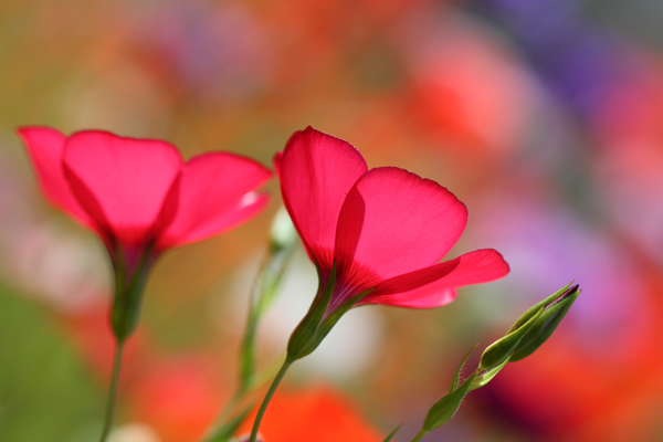
    flowers-home

    The ability to take an everyday scene and construct from it a superb image will require your application of some or all of the following:

    • vision to see the various elements that might be included in an image
    • concentration and time to develop the idea and assimilate all the components
    • awareness to recognize the potential of a color, shape and form
    • observation to study the scene and time enough to mentally collate the aspects of the image and to try them out in camera
    • willingness to try something new

    This skill of making the mundane magnificent is not dependent on the type of camera and lens you use, it works with anything. My particular interest is nature and wildlife, but the skill can readily be applied to most of your chosen genres of photography.

    Getting started

    To start you should be looking for a spark or catalyst to kick off the mental process. This can be anything that takes your fancy such as color, shape, pattern or motion.

    Once you have selected your particular environment, and isolated some elements for a composition, then take some time to arrange and rearrange them in your mind. Walk around, kneel, lie down and test different perspectives. Work the opportunity and let the image evolve, don’t rush it. You may get a few strange looks in certain circumstances, but that is the price you pay.

    Something simple like a field of rapeseed (or field of other flowers or crops depending on where you live) is a common, beautiful, bright yellow sight which also heralds the arrival of summer. The endless fields of yellow can be monotonous, but they can provide you with a colorful subject in their own right, or a backdrop for a smaller subject. You can use the color, the size of the field and the detail of individual flowers. Look about for a subject, choose a perspective and include other elements such as: blue sky, clouds, a tree, a car, a sunrise or sunset, or all of the above. Let the image unfold.

    Finding subjects close to home

    The images here are all taken this year, with this article in mind, all within a couple of miles of my house. This is to demonstrate that there is much on our doorsteps that might keep our photographic needs satisfied, well some of them at least.

    Choose any patch of grass on a dewy morning and have a look for a good collection of dew drops and try a backlit shot. The sparkles and perfect shapes of the droplets make an intriguing subject. Here I have turned the image into a black and white just to emphasize the shape and patterns, but often you’ll want to keep the lovely green of the grass.
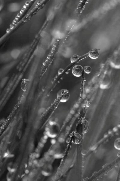
    001 Dewy Morning in the Grass

    Garden birds are probably the most accessible wildlife for you budding nature photographers. With some simple skills you can go beyond just taking a record shot, but can create lovely images. Place a bird feeder in a good position, with a decent background, and a thoughtfully placed perch and sit back and wait. Change the perch and change the background at will and you have a whole suite of different images available to you.
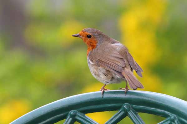
    002 Robin on Chair

    A sunrise over a meadow may be a regular occurrence in your home patch, but to make it a little different get down low in the vegetation. Here I have obstructed the sun with a tree at the edge of the meadow, and thus broken the sunlight up into many light sources coming through the foliage. The background is formed by selecting an aperture that provides sizeable circles of confusion (out of focus light sources) behind the subject. The subject is just a few seeding grass heads, but you can turn the simple into the stunning by constructing an image.
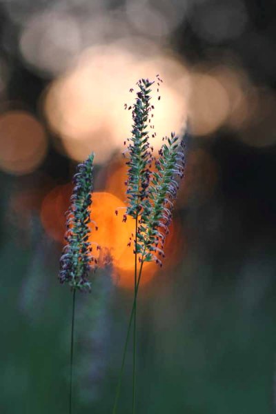
    003 Meadow Sunrise

    Vast fields of cultivated crops can provide you with a wonderful opportunity. A bright yellow rapeseed field for example. Look for something to isolate within the vast swathe of yellow that provides a point of interest in an image full of color. Sometimes it is simply a color that can spark your thinking, but spotting a dewy web provides a focus for the image. Prowling the edge of the fields on a bright and sunny day will also yield a lot of insect life, which could become your whole new world.
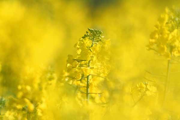
    004 Rapeseed Field

    You can choose a different day and different weather to change your image. On a foggy day dewdrops collect on spider webs and can give you an abstract view of the rapeseed field. The spark here was the pattern effect of the drops and then the gorgeous yellow background.
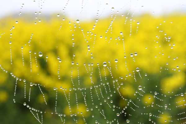
    005 Rapeseed Field Dewdrops

    This image was created by using a long lens that can accommodate a lot of foreground (has a lot of reach and you can stay back from the subject) and can throw the background and foreground out of focus with a shallow depth of field, while filling the frame. If you shoot into the sun, then the sunlight passing through the green foliage will bring out the bright, and almost luminous, green of the leaf with which you can compose the foreground and background. The spark was the beautiful color of the backlit green foliage, completely different from the front-lit color.
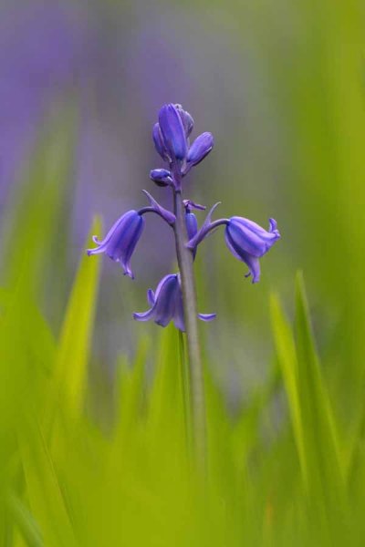
    006 Garden Bluebell

    Sometimes simplicity is the only catchword you need to remember. Find a patch of wildflowers, pick the most concentrated spot and shoot away, picking various subjects. The color and the profusion will give you all you need to create an intriguing and colorful image.
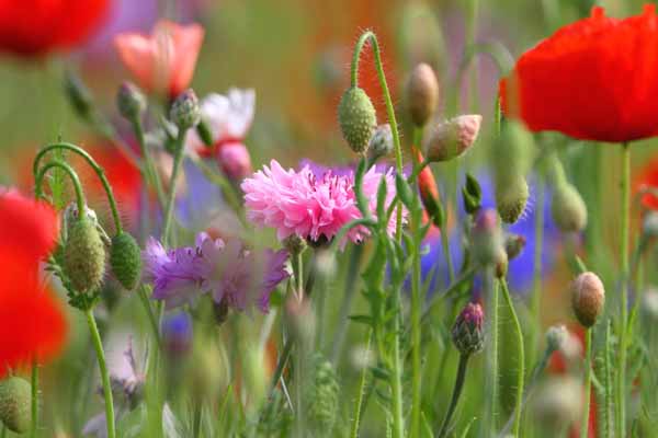
    007 Summer Flowers

    Spring and summer are obviously the prime times for encountering wildlife, and therefore photographic subjects for your nature images are abundant. Unless you live in the tropics, the winter season can be a lot more mundane, so you are probably going to have to work harder. Colorful weeds and insects are always a feature of summer. Putting them together works a treat, although it may take some patience.

    008 Dandelion and Ladybird

    It is not all about your hands and knees or the hedgehog perspective, so a few leading lines and an old barn will give you a far superior image to a snapshot of endless cultivated fields. Throw in a few colorful wildflowers in the foreground, a dark stormy sky and the farm fields you drive past routinely may take on a new perspective.
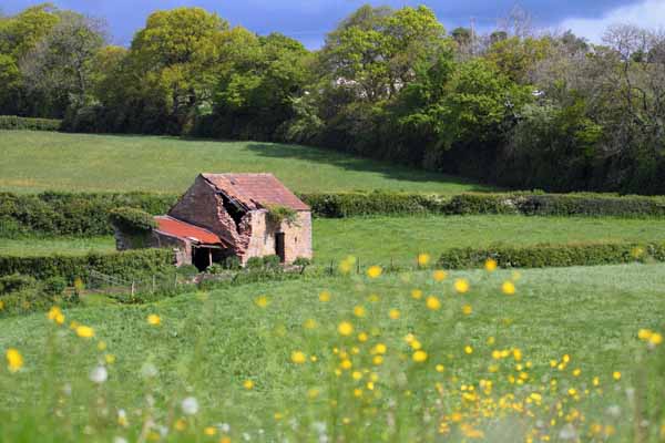
    009 Old Barn in Fields

    A very sparse little patch of flowers, with color being their only redeeming quality, can still provide you with a good opportunity. This technique is purely an in-camera one and utilizes controlled motion of the lens. Slow the shutter speed (low light, low ISO, dull weather or a combination) and zoom in or out by hand while the shutter is open gives the resulting motion blur. This can be used in a variety of ways and once you start your imagination may take hold. If you don’t have a zoom do the same with your prime lens but twist the camera in your hands.
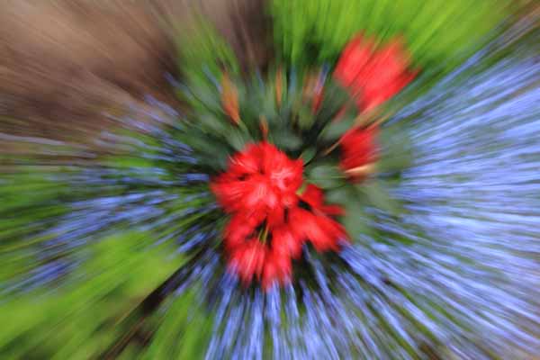
    010 Flower Burst

    So just to show you that you can make great images close to home with a little effort.

    Do you have any other tips or tricks for finding ordinary things and making great photos? Please share in the comments below.

    The post Finding Great Subjects to Photograph Close to Home by Richard Taylor appeared first on Digital Photography School.
    Digital Photography School

  • Using Depth of Field as a Compositional Tool

    In a scene like this, you want all the trees in focus, a deep depth of field is necessary

    In a scene like this, you want all the trees in focus, a deep depth of field is necessary

    There are many written and unwritten “rules” in Photography. Mostly, they are guidelines, I am not sure that there are rules about any art form, but some guidelines help us out. You have probably heard of the rule of thirds as it relates to composition. You have heard about the golden mean for composition, but have you thought about how depth of field affects your composition?

    Composition is one of the easiest techniques to use to improve your images, it is also one of the most overlooked. You may never think about it, but perhaps you really should. Your composition can make a mediocre image strong, just by moving your camera.

    Composition has been used by painters for hundreds of years. Many of our current composition tools come from the art world. The master painters worked out how people look at a painting and put a system together that would cause people to stare into their paintings. They used techniques like leading lines, S-curves, symmetry and pattern, repetition and other techniques, to make their paintings more dramatic and compelling. Something they also used was perspective. Perspective gave a three dimensional feel to the painting and made a two dimensional scene seem three dimensional. Leonardo da Vinci mastered this technique and used it to great effect in some of his masterpieces, most notably, The Last Supper and the Mona Lisa. In some ways, Leonardo used depth of field to compose his paintings.

    A deep depth of field emphasises the large vista of the scene

    A deep depth of field emphasizes the large vista of the scene

    1. What is depth of field?

    Depth of field is the transition from sharp focus to soft, out of focus areas in the image. The zone of sharp focus, and how much is in focus, is known as the depth of field. You will hear photographers speak of a shallow depth of field or a deep depth of field. The latter means that most or all of the image is in sharp focus. A shallow depth of field means that a small portion of the image is in focus.

    How does this work? If you are photographing a landscape scene, you will likely want all of that scene to be in sharp focus. This is called a deep depth of field, and means that the whole scene is in focus. This is good for some forms of photography. At other times you will want only a small portion of your overall image to be in focus. For example, in a close up shot of a flower, you will want the flower to be in focus and everything else to be softly out of focus, this is called a shallow depth of field.

    In a city scene, a deep depth of field is good as you want everything in focus.

    In a city scene, a deep depth of field is good as you want everything in focus.

    2. How does depth of field impact your image?

    You have seen images where the one part of the flower is in super sharp focus and the rest is soft and blurry. Some portrait shots also look like this, the person is in sharp focus and the background is out of focus. Why would you want to do that?

    The biggest reason is that your eye will naturally go to whatever is in focus in a photograph. So, if you are shooting a wedding and you have a photo of the bride and groom, but they are out of focus and the people behind them are in focus, where do you think viewers will look? They will look at the people behind the couple of course. We assume that if something is out of focus, that we aren’t supposed to look at it. So you can use shallow depth of field to force your viewer to look at your subject. Make sure that whatever your subject is (flower, rock, insect, bride etc) that it is sharp and in focus. If the rest of the image is out of focus, that part of the image will stand out and people will immediately look there.

    Everything in focus makes this scene compelling

    Everything in focus makes this scene compelling

    3. How do I get a shallow depth of field?

    Depth of field is determined by the aperture setting on your camera. Your aperture setting is called the F-Stop. Technically speaking, the F-Stop is the focal ratio of the lens. It is the ratio of the lens’s focal length to the diameter of the entrance pupil. Technical, I know, but not critical.

    What is critical is that you need to know how the “F” number works. The basic rule of thumb is as follows, the lower the number (i.e. f/2.8, f/4) the shallower the depth of field or only a small amount of your image will be in focus. If you have a higher number (i.e. f/8, f11) the more of your image will be in focus. So if you want the look of having a small part of your image in focus then use an F-Stop of 2.8 or 4.  If you have a lens that goes down to f/2.8 or even f/4 give this a try:

    • Set your camera in manual mode
    • Put your camera on a tripod so that it will be easy to take the shots without moving the camera
    • Focus on a flower or something that will be perfectly still
    • Compose your image, get in as close as you can
    • Set your aperture to f/2.8 and take a shot
    • Then set your aperture to f/4, take a second shot,
    • Then f/5.6 and take a third shot
    • Then two final images, one at f/8 and one at f/11
    • Adjust the shutter speed accordingly to make sure you expose them all correctly

    Now take a look at the images, what you will notice is that the f/2.8 image will have a small part of the image in focus, the f/8 and f/11 images will have most of the scene in focus.  This now becomes a compositional choice. You can decide on every image what should be in focus and what can be blurred.

    Shallow depth of field isolates the grass and makes it the focal point

    Shallow depth of field isolates the grass and makes it the focal point

    4. How is this a compositional tool?

    As a photographer you have the ability to determine what you want people to look at. By using a shallow depth of field and having only part of the scene in focus, you will make sure that there is no doubt about what the subject is and where you want your viewers to look. A deep depth of field is also important in some images. In landscape photography, you will want a deep depth of field, a shallow depth of field in a landscape image might be confusing. Use your depth of field to determine where you want your viewers to look. Once again, with lots of practice and seeing the results, depth of field will be come an invaluable compositional tool.

    I find that the most well known “rules” of composition are a good place to start. Once I have a scene set up, I then think about what I want to be in focus and what I want out of focus, or more precisely, what is my subject or focal point. From there I look at exposure, light, etc., and then I make the image. For me, depth of field has become an important creative tool that I use as often as I can to define my subject. Let me know what you think? Do you use depth of field as a compositional tool or not? If not, will you try it out? Let me know your comments below.

    A shallow depth of field isolates the leaves from the soft background

    A shallow depth of field isolates the leaves from the soft background


    The post Using Depth of Field as a Compositional Tool by Barry J Brady appeared first on Digital Photography School.

    Digital Photography School

  • How to use Monochrome Preview to Compose Better Color Photos

    You may have heard it said that when you change the way you see – the things you see begin to change. Legendary American documentary photographer and photojournalist, Dorothea Lange once said that “The camera is an instrument that teaches people how to see without a camera.” In this article we are going to use our camera to learn how to see.

    Become color blind

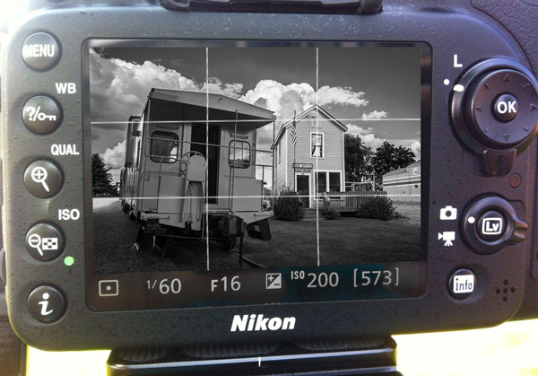
    When it comes to photography, color can attract your eye so readily that it can often disguise poor composition. Black and white photography depends totally on composition, so in order to compose images more effectively you may need to become color blind. This article is going to explore how to view your images without color, learning to see the light and shapes in your subjects. Fortunately, these days most digital cameras have a black and white or monochrome shooting mode. In this mode the live preview (and replay) on your camera’s LCD will appear black and white, but your RAW file will still retain all color information. Using this method is meant to be used as an exercise to help you learn to see your compositions more clearly.

    LCD preview of this colorful image is composed using rule of third grid in Black and White

    LCD preview of this colorful image is composed using rule of third grid in black and white

    DSC_7496-Edit

    Camera settings:

    • Set your file type to RAW (This is a must!)
    • Set White Balance
    • Set your Picture Control (Nikon) or Picture Styles (Canon) to Monochrome
    • Set your exposure with whichever method you normally use
    • Turn on your Live View
    • Turn on rule of third grid lines on your preview
    • Use the black and white preview in Live View on your LCD to compose your image, paying special attention to the entire image for tones, shapes, lines and textures. Remember also to use all of the usual rules of composition, such as the rule of thirds, etc.
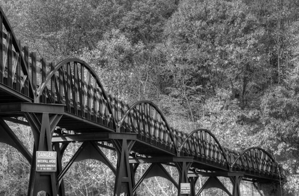
    In Black and White it becomes easier to see how this bridge draws the views eye into the mage

    In black and white it becomes easier to see how this bridge draws the views eye into the image.

    8101686232_48c1bbc3da_o

    Tripod use is not a requirement for this system, but is helpful for two reasons: first of all, it frees up your hands to experiment with your camera controls and secondly, (and most importantly) it slows you down to allow you to analyze every aspect of your image.

    Removing color from your preview makes it easier to see the shapes, lines, textures and tones and allows you to concentrate on your composition.

    Don’t expect to get everything perfect in camera. Post-production is your friend! Even the great Ansel Adams produced most of his magic in the darkroom. But of course you want to get it as close as you can in camera. Be especially sure you get the white balance set as accurately as possible, because when shooting in RAW, white balance and exposure are the only camera settings that are retained by your RAW file. However, the white balance can be corrected in your RAW processing.

    It is recommended that since you will be viewing a monochrome image on your LCD that you check your histogram to ensure that your image is properly exposed.

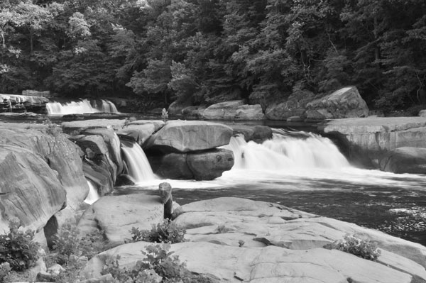
    DSC_0216-2bw

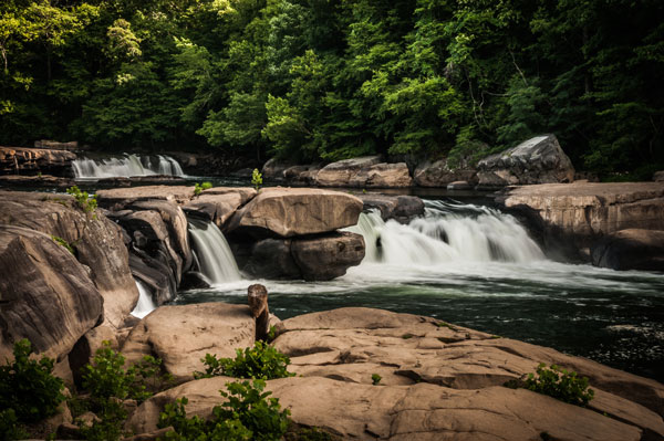
    Here we can see how the rocks in the foreground lead the viewer’s eye to the waterfalls.

    DSC_0216

    As mentioned at the beginning of the article, your image will be previewed on your LCD in black and white, but your RAW file will record color. If you should choose to shoot in RAW + JPG mode your RAW file will be recorded in color but your JPG will record only black and white.

    Don’t panic when you see a monochrome preview upon importing your RAW files into Lightroom (or whatever you use for post-processing). As soon as you click on the image you will get a color preview.

    There are many methods of creating black and white images and most photographers will agree that it is best to start with a color file. Therefore, another use for this preview method comes into play if you are shooting an image that you know you will later be converting to black and white. You’ll get a good preview of how your image may appear later upon converting your RAW file to black and white, and will know right away whether your image will be effective in black and white.

    One disadvantage with this method that is worth mentioning is that using the Live View mode will drain your batteries faster.

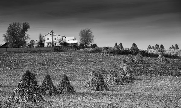
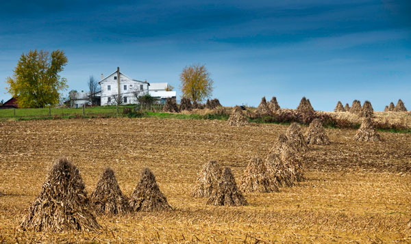
    As you can see in this preview, that this image could also make a great black and white with lots of textures and a very interesting subject

    This image could also make a great black and white with lots of textures and a very interesting subject

    8146529877_619ce3dd53_o

    This method is great for landscape, architectural, and abstract photography where it is so important to see tones, shapes and lines for composition. Yes, there are some obvious times when color may play an important part of your images such as in the fall where the colors may become your subject, but every method has its exceptions.

    Try this experiment. First, shoot your scene as you would do normally with color preview. Then shoot it again with a black and white preview. You might be surprised with the difference in your results.

    Give it a try, please share your results in the comments below.

    The post How to use Monochrome Preview to Compose Better Color Photos by Bruce Wunderlich appeared first on Digital Photography School.


    Digital Photography School

  • Creatively Recolor Photos with Color Tables in Photoshop

    Photoshop-color-tables-opener

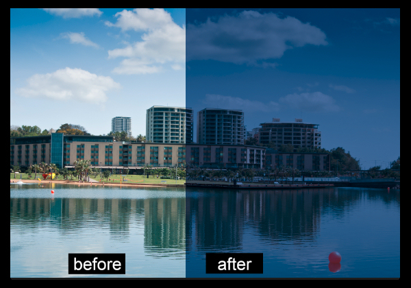
    If you’re looking to use some creative enhancements on your photos in Photoshop CS6 or CC then the new Color Lookup adjustment is one to consider. The Color Lookup adjustment is used to remap the colors in an image to a set of colors that comes pre-configured and stored inside a color table file. Color Tables are used primarily with film but they are also useful for applying creative coloring to photos.

    You don’t need to know anything about color tables to use this feature, as is a default set of color tables in Photoshop that you can use. Better still, if you like the effects and you subscribe to the Creative Cloud you can grab more color tables from the Adobe Speed Grade application, store them in the Photoshop PresetDLUTs folder, and use them inside Photoshop.

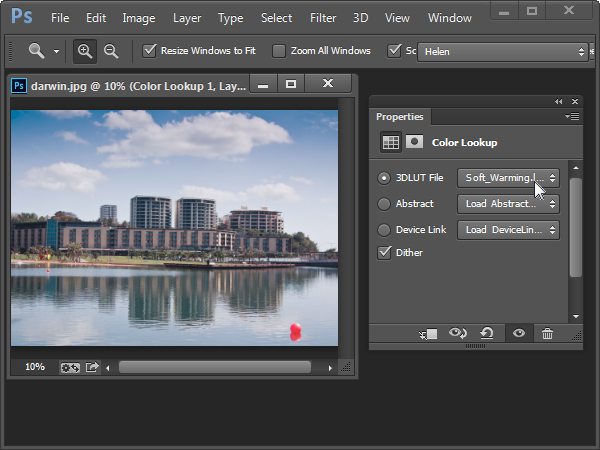
    To see the Color Lookup adjustment at work open a photo and choose Layer > New Adjustment Layer > Color Lookup. This opens the Color Lookup dialog where you will find three settings; 3DLUT File, Abstract and Device Link. Select one of the options from one of the dropdown lists to see it at work. When you do this, the colors in the photo will be remapped.

    For example the Soft_Warming.Look in the 3DLUT collection warms up the image.

    Photoshop-color-tables-img1

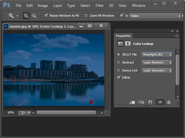
    The Moonlight.3DL option gives the image the look of being shot on a moonlit night.

    Photoshop-color-tables-img2

    You can experiment to see which of the options you like.

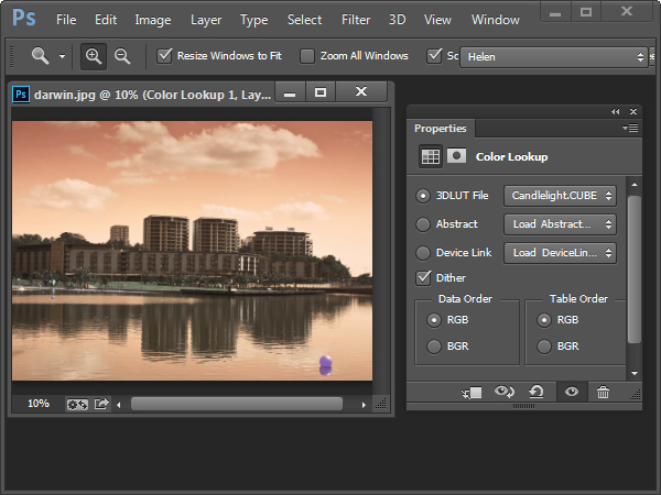
    Some of the options open up additional Data Order and Table Order settings which let you create different effects. The Device Link collection on a Mac includes some additional options which are not available on a PC.

    Photoshop-color-tables-img3

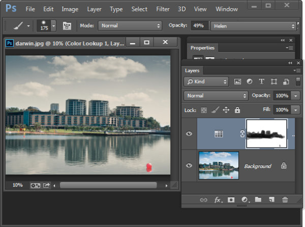
    Like any other Adjustment Layer the Color Lookup option has a mask you can use to mask out the effect on selected areas of the image. You do this by selecting the mask and then paint on the image with black or grey to remove the effect from that area of the image. Paint with white to bring it back.

    Photoshop-color-tables-img4

    You can also use a blend mode to blend the Color Lookup adjustment into the image layer below and reduce its opacity if desired.

    Here is a video tutorial for the Color Table Adjustment Layer. It includes details of how to find and use the .Look files shipped with Speed Grade in Photoshop:

    If you haven’t tried this technique before give it a go and show us what you come up with. For more Photoshop tutorials check these:

    • Ten Go-to Editing Tips for Using Photoshop
    • 5 Photoshop Tools to Take Your Images from Good to Great
    • 3 Easy Steps Using Photoshop to Making your Images POP
    • 5 Easy Photoshop Tips for Beginners

    The post Creatively Recolor Photos with Color Tables in Photoshop by Helen Bradley appeared first on Digital Photography School.

    Digital Photography School

  • How to Make Instagram Filters in Photoshop: Nashville & 1997

    We all love the web for its ability to let you communicate with other people in various ways. That’s why Instagram’s so famous today. It’s our way to share visual stories of our lives with people around us. Instagram’s so popular not just because of the sharing option, but because of a set of gorgeous filters you can apply to Continue Reading

    The post How to Make Instagram Filters in Photoshop: Nashville & 1997 appeared first on Photodoto.


    Photodoto

  • Discussion – Camera Firmware Update Causes Third Party Batteries to Fail

    Recently we ran an article on – Updating your Camera’s Firmware – What is it and Why it’s Important. Funny thing is, I had never updated mine on any camera up to that point. As I edited and read the article I figured, yeah I guess I should do that. So I went ahead and updated the firmware on my Canon 5D Mark III.

    Battery Failure

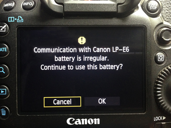
    What happened is that my Canon batteries continued to work just fine. I went away to Oregon for 3.5 weeks and took three batteries with me – should be plenty right? Wrong! One ran down so I went to switch and got an error message on the screen that looks like this (excuse the iPhone photo, it’s hard to take a photo OF your camera).

    battery-error

    Okay so now what? I was afraid to just choose “OK” not knowing if doing so would then somehow damage my camera. I wasn’t prepared to take that risk. So I chose “Cancel” which basically caused the battery to be ignored and therefore the camera to have no power.

    LP-E6 battery alternative

    So I was left with one other third party battery, and one Canon battery for my trip. I hadn’t tested them before I left home (I use them all the time but lesson learned, don’t do what I did – test all gear before you go away anywhere) and apparently the Canon battery is completely dead. Not even the charger recognizes it. Nothing – nada – el zippo!

    I had one battery left for the duration of my trip, one off-market one that didn’t produce the error. Luckily I have a handy charger that is portable (can charge batteries without being plugged in long as you charge it up first) and we weren’t out and about for long enough for me to fully drain it on any given day.

    Cause and points for discussion

    I did some digging on the internet and found that this is a common issue and that Canon has built that into the firmware update – aha! I knew the cause now – but what is the logic here? Apparently Canon wants you to only use their batteries and limit or eliminate the off-market ones.

    It raises these questions for discussion

    So tell me – what do you think about this?  Have you been affected by this firmware update too? I’m personally not crazy about being forced to use a given product, or the fact it killed my existing battery. Or did it really? What if I choose “OK” and it’s just fine but Canon just wants to freak me out, to which end they succeeded!

    Why would one off-market brand get singled out and not work, when the other did just fine? Did the firmware update somehow affect my Canon battery too? It was fine last time I used it. Makes me wonder.

    Do you use third party batteries? If you don’t, do you even care one way or the other?

    But also let’s think about this, where does it end? What about filters, lenses, flashes? Will that mean that soon we may not be able to buy a Sigma or Tamron lens to fit? Or use a Hoya filter or a Metz flash?

    How do you feel about this new policy? Tell me in the comments below. Let’s talk about this!


    Disclaimer: this site does not advocate the use of third party of off-market batteries or products, do so at your own risk. 

    The post Discussion – Camera Firmware Update Causes Third Party Batteries to Fail by Darlene Hildebrandt appeared first on Digital Photography School.

    Digital Photography School

  • Demystifying White Balance

    White Balance (WB) is one of the most challenging camera settings for beginners to learn. White Balance can also be difficult to fix later when you are shooting in JPG format. In this post I’m going to discuss what WB is and how to use it properly when shooting JPGs. I am a food photographer, but keep in mind the WB principals apply the same way, to anything you are shooting.

    01White Balance Eggs

    The image on the left has a cooler, or bluer, color temperature than the image on the right.

    White Balance is one of the most important camera settings because it hugely affects how the colors look in your photos. The White Balance setting is used to tell the camera what type of lighting you are using for your shot, or in what type of scenario you are shooting. White Balance, also known as color temperature, is measured in degrees Kelvin, so I will be referencing that as well. The main reason White Balance is so hard to grasp is because our eyes are so good at filtering light, and our eyes make everything look “normal” under almost any lighting condition. We don’t see the blue or yellow sunlight. It just looks like white light. As you learn more about light and its color temperature, you will start to actually see these slight differences throughout the day.

    Where to find the White Balance camera setting

    Not all cameras access the WB setting in the same way. Some have a little button on the body of the camera with a “WB” under it, while other cameras make you access this setting in the camera menu. Below is how to find the WB menu for the Canon 5D Mark II. In most Canons the WB menu is located here.

    02White Balance camera menu 1

    The White Balance is inside the camera settings menus on most cameras.

    03White Balance Menu

    Here are all the WB settings available for the Canon. Yours make looks slightly different.

    If you can’t find your White Balance setting, look it up in your manual or google it for your camera model. If you are having a hard time finding it, make sure you are on the “Manual” camera mode setting, or one of the other modes that your camera will allow you to adjust the WB. Depending on your camera, certain modes will lock you out of the WB menu.

    What the WB setting icons represent

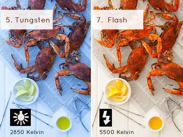
    To make things easier, camera manufacturers have come up with some standard icons that represent the most common lighting scenarios. When you set your camera to one of these settings, you are setting it to a specific color temperature, or degrees Kelvin. Depending on your camera, you might only have the first six settings. Advanced cameras have settings 8 and 9.

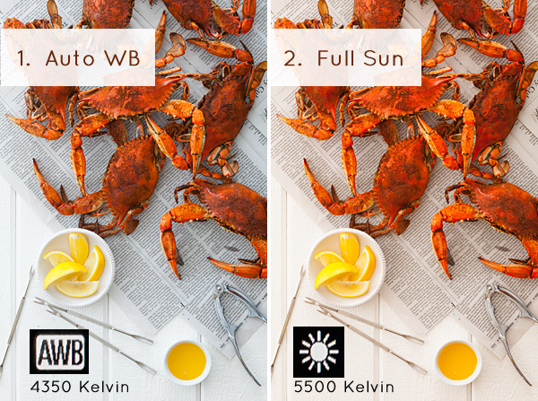
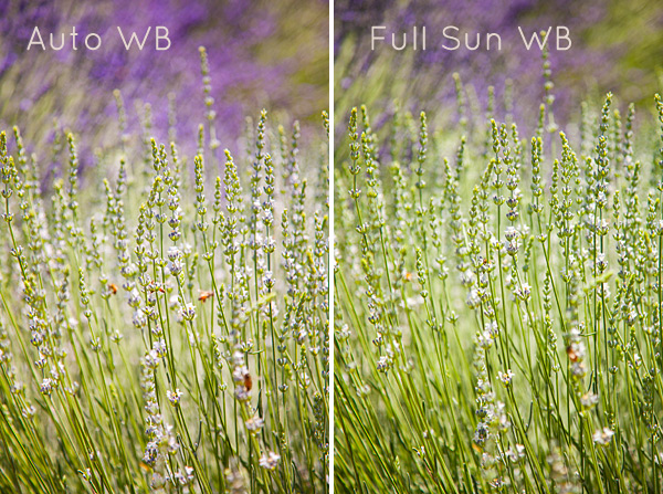
    1. Auto White Balance (AWB) – the camera will analyze the light in the scene that you are shooting, and pick a setting for you. Depending on your camera it will be set anywhere between 2,000 and 10,000 degrees Kelvin.
    2. Full Sun – this is for a bright sunny day, hardly any clouds, with a blue sky, and you are shooting in direct sunlight. Degrees Kelvin will be in the 5000-5500 range.04White Balance 1
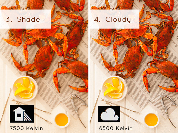
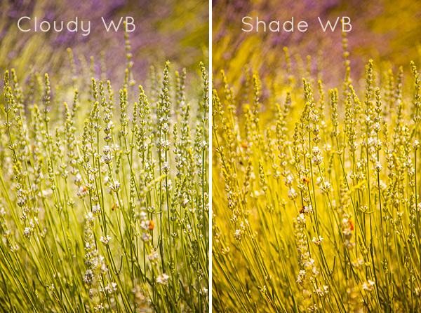
    3. Open Shade – the icon is showing a house with shade on the right side. This setting is for when you are taking a picture in the shade, no direct sun, and the sky is blue. This blue sky is actually color contaminating your shot. This setting will “warm” up your shot to counteract the blue light that is coming into your scene. Degrees Kelvin will be 7000-7500.
    4. Cloudy Day – this setting is for when you are shooting on a day when the sky is white with cloud coverage – no blue sky is coming through, the light is very neutral so you don’t need to counteract any blue light contamination. Degrees Kelvin will be 6000-6500.05White Balance 2
    5. Tungsten Light – this is your standard household light bulb, or studio hot lights. Degrees Kelvin will be 2800-3200.
    6. Fluorescent – this type of light is generally found in commercial spaces. It has a wild array of different colors and temperatures, and some cameras will have multiple choices in this category. Fluorsescent light also makes images look very green so this setting counteracts that by adding a magenta (pinkish) color to balance the shot. Degrees Kelvin is around 3400-3800 – please note – I did not take a shot with the Fluorescent setting because it would just be flaming magenta.
    7. Flash or Strobe Light – this type of light is emulating daylight so usually this setting is the same as full sun and sets the camera to 5000-5500 degrees. If you have a pop-up flash, your camera might change to this setting automatically.06White Balance 3
    8. Custom White Balance – this option is for creating a custom setting for your scene by photographing a white card (or a grey card), having the camera analyze the light on that card, and then setting your camera to this new custom color temperature number.
    9. Manually Set Degrees Kelvin – this setting is for the shooter who fully understands WB and wants to manually control the color temperature in camera.

    Numbers 8 and 9 are more advanced, for those shooters who are making custom WB settings to either neutralize light that might be mixed colors, or to use the WB setting creatively. I use number 9 all the time to warm up my food images. I always like to set this to a “warm” setting. So if I am shooting in daylight (and depending on the time of day), I might put my setting at 7000 or 7500 degrees Kelvin to really warm up the shot, as I am always shooting in open shade, using natural light at my studio.

    For those of you who are just starting out here in Digital Photography School, it’s very important to learn about your camera’s White Balance setting when shooting only JPGS. As I’ve mentioned above, adjusting the White Balance on JPG images can be challenging and not nearly as easy as RAW files. It simply doesn’t look as nice as when you tweak RAW files. Below you can see the difference in Lightroom between the White Balance adjustments for JPG versus RAW files. It’s on the very top with “Temp” and “Tint”. When you shoot JPGS, you are limited to a slider (left image below) that goes from blue to yellow with a scale range that does not relate to the actual color temperature in degrees Kelvin. On the right side, you can see that the “Temp” scale has degrees Kelvin right next to it so you can easily customize your images.

    07Lightroom WB Setting

    The image on the left is the editing tab for JPG files and the one on the right is the editing tab for RAW files.

    Your assignment, should you choose to accept it

    If you are still shooting JPGS, I suggest you give yourself an assignment to really get a feel for White Balance. This assignment is going to be called:

    Natural Light White Balance Bracket Test

    A bracket is a range of images of the same subject where each image has a setting that has changed. Figure out a shot you can take, preferably on a tripod to make this easier, when you have some time to do this. It doesn’t have to be a studio shot. This could be a landscape or a portrait taken outside. Figure out what your exposure should be. Then find where your White Balance setting is in your camera and take the same shot several times, each time changing the WB setting on your camera – TAKE NOTES. The point here is to learn what each setting looks like. Make notes of where you are shooting, the time of day, and your camera exposures.

    Now, for your bracket test – shoot in the following WB settings: Auto, Full Sun, Shade, and Cloudy. Download your files and have a look – which color do you like the best? Make a note of that for future reference. Try to bracket with different shots too. While you are learning photography, if you are shooting a scene that has mixed lighting or it’s just a moment you are capturing at an event or something, then the Auto WB setting will probably be fine for that. I do use Auto a lot if I’m shooting at a farm or something similar where I just don’t have time to fiddle with it.

    A few precautions

    I have to mention something here – when shooting outside it can be extremely hard to see your camera’s LCD screen, so you might not even see the difference on the LCD when you take the pictures with the different WB settings. You HAVE to look at these on the computer you edit your files on. Here’s the other thing that’s a total drag. Your camera’s LCD screen is very inaccurate for color and many times for exposure too, especially when you are looking at it outside in daylight. It’s very hard to know if you have the correct exposure or not. I’m assuming that you haven’t learned about your camera’s histogram yet for judging exposure, so until then, for this assignment, try to do this in a situation where you can download your files right away to make sure your exposures are good.

    Do some test shots, download, adjust if needed, then shoot your bracket. After downloading your image, name each shot the WB setting it was taken in so you don’t get confused. This is why you took your notes. Some software will tell you what your settings are. If you don’t know whether yours does this or not – write down your info so you can just look up your shot number with your notes. Your assignment should look something like this:

    08Lav Test 1

    09Lav Test 2

    When I took these shots above, it was a bright sunny day with a blue sky and white billowy clouds. Time of day was about 2:45 P.M. I prefer the “Full Sun”, or daylight WB. Now, keep in mind that with shots like these, the “correct” color balance can be very subjective and some people might like the warmer shots and some people might like the cooler shots. I think we can all agree that the shot taken in “Shade” is way too yellow for this scene. Until you learn how to edit RAW files, here is what I suggest you do. Set your WB to Auto if you are still nervous about this, OR match the WB to the lighting condition of your scene. If you have time with the shot, take a bracket of your settings.

    What I always suggest to new students is to set your camera, if possible, to shoot in JPG and RAW files. The camera will actually create two images of the same exact shot, one as a JPG and the other as a RAW file. They will have the same image number, with a different file extension. Work on the JPG for now, then when you learn how to edit RAW files, you will have these to go back to, and you will be so happy that you did that. On Canon bodies, the menu settings to change the file format look like these below. Notice I am also picking the largest file size I can for each file type. I always do that in case I ever want to print anything.

    Canon Quality Menu

    Canon Quality Menu

    Alright, now go out there, play with the White Balance and see what it does. Get control of that camera and take your photography to the next level.

    The post Demystifying White Balance by Christina Peters appeared first on Digital Photography School.


    Digital Photography School

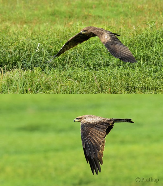
  • Bird Photography Tips – How to Make Your Bird Photographs Stand Out

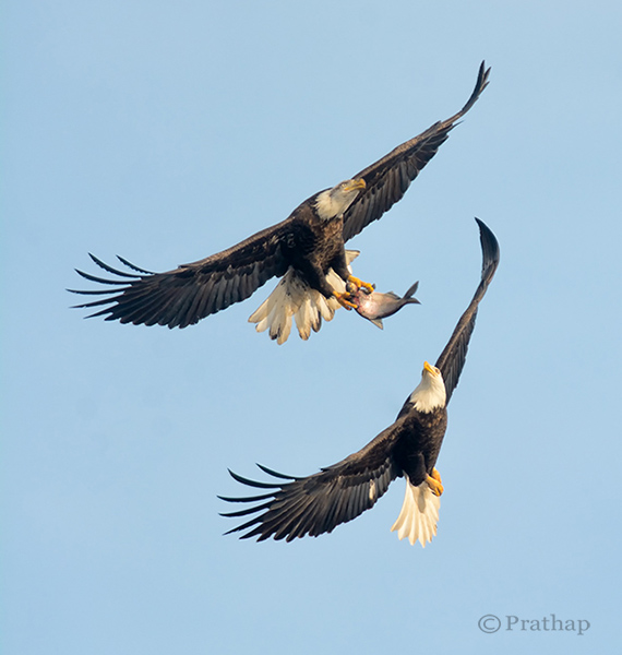
    Have you ever been disappointed when browsing through the bird photographs in your own portfolio? I was, in fact many times! Even today I get disappointed to see several of my own bird photographs and keep thinking why did I take that photograph in the first place?

    In most cases, the reason for failure of not appealing bird photographs is the boring or distracting background.

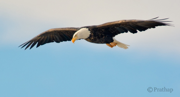
    Nature Photography Simplified Bird Photography Bald Eagle Fight In Flight

    Take a look at your portfolio again and see if the culprit is the background. You will be surprised, shocked, and probably start thinking why did I take this photograph? What was in my mind?

    The reason is very simple. It’s our natural behaviour. We are accustomed seeing only what we want to see. Imagine a situation like this. You have your camera and a decent telephoto lens, when you see a magnificent bird like a Bald Eagle perching on a lone tree.
    What do you do? You will most likely start capturing photographs in burst mode. Don’t you? We all do! The urge to capture the beauty, and the fear of losing that opportunity doesn’t allow us to think. Unless. . .

    By following these very simple bird photography tips, and making a few changes before you press the shutter, you will be able to create bird photographs that stand out.

    Your Background Makes the Picture

    Remember that we see our world different than the Camera. We tend to see only what we want to see. Meaning, we are so tuned to looking at the world using filters. Our brain passes only the information which is very important to us filtering out all the unimportant things. So, we see only the bird and its beauty, but don’t see the background, or the distracting elements in the background.

    But the camera doesn’t filter, it records everything that it sees.

    No matter how beautiful the bird is, you have to make sure that the background is either clean, or interesting enough that it will complement the bird, which is your main subject of interest.

    Nature Photography Simplified Bird Photography Eagle Flight Distracting vs Clean Background

    Use Your Legs

    Do you use your legs when you are photographing? Does this question sound crazy? Think again. Once you get to see the bird, it is a common tendency to capture it immediately. In that urge to capture, you generally forget to move around.

    In order to get a clean and appealing background you have to move around sometimes, or rather most of the time. But remember to move very slowly. Most of the time moving just few feet to the left, right, forward or backward will give wonderful results.

    Nature Photography Simplified Bird Photography Bald Eagle Flight

    After all you are not a tripod!

    Patience Always Pays Off

    There is no substitute for patience when it comes to achieving anything worthwhile in your life. It is no different in the case of bird photography.

    Why do we want to always move? Why can’t we sit in one place for several minutes to hours?

    If you think deeper about it, you will understand that we are almost always restless. Also, we believe in the future or something that is non-existent. Learn to live in the present. Learn to embrace what is there in front of you. Rather than moving on in search of the next bird, spend time with the bird in front of you.

    I would recommend you to spend hours to days in succession. You will fall in love with the bird and ultimately with nature. Patience is the key to making great photographs of any bird.

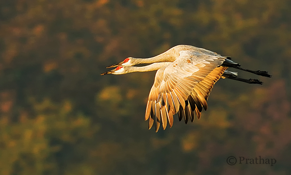
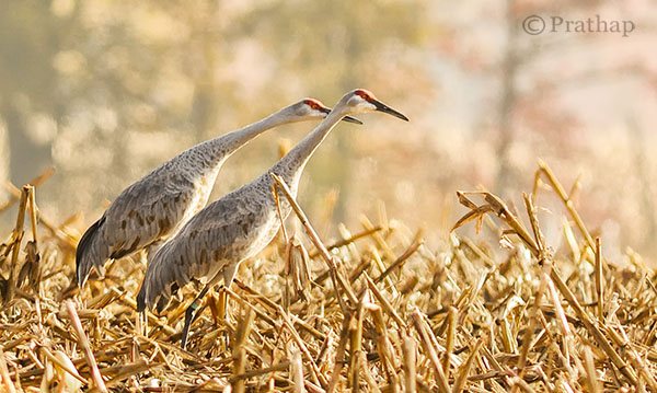
    Nature Photography Simplified Sandhill Cranes Pair In Flight Jasper Pulaski Fish And Wildlife Refuge Indiana

    Use Depth of Field (DOF) to Your Advantage

    Depth of Field plays a major role in making your bird photographs look beautiful. By using DOF you can either isolate the subject from its background by using shallow DOF, or give importance to both the bird and its background by using deep DOF.

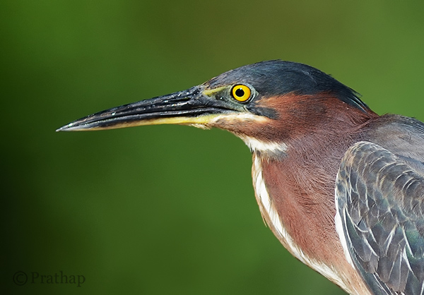
    If the background does not convey anything about bird’s habitat, then using larger apertures like f/2.8, f/4, f/5.6 yields a pleasing bokeh in the background helping the bird to stand out in the frame.

    Nature Photography Simplified Bird Photography Green Heron Portrait Bokeh Effect

    Otherwise, including the habitat by using smaller apertures like f/8, f/11, etc., helps to narrate a story to the viewer.

    Nature Photography Simplified Sandhill Cranes In Jasper Pulaski Fish And Wildlife Refuge Medaryville Indiana

    Fill the Frame

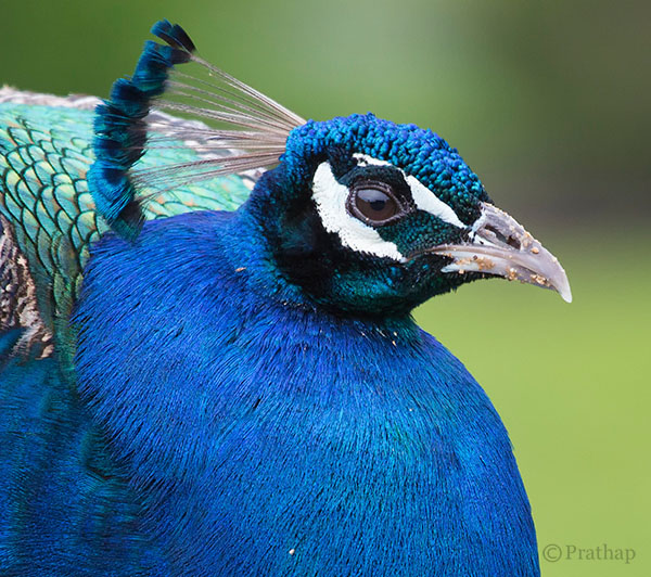
    If you go through the bird photographs across the net, you will find that the majority of bird photographs will have the bird filling the frame.

    Nature Photography Simplified Bird Photography Peacock Portrait

    There are three main reasons for filling the frame with the bird:

    1. Most of the times, it’s all about the bird and its beauty. So, there is no reason why something else should be occupying the frame.
    2. The bird will be lost in the frame if it occupies only a part of the frame. Unless it is in its habitat, or there is a directional light illuminating it more than anything else in the frame.
    3. Filling the frame with the bird avoids any distractions in the background which is usually the case.

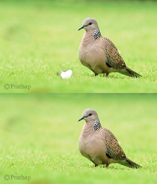
    Remove Distractions in Post-Processing

    This is a debatable topic for sure. Is it ethical or unethical? It depends really.

    Are you sharing it only on social media sites? It shouldn’t bother you much. If you feel that removing distraction makes it a more pleasing image, it should be fine. However, it should not be overdone. Also, you should never do that if you are submitting your images to competitions or bird ID sites or any other place where it is not allowed.

    You should always try to achieve a distraction free image in the field. But, that is not always possible. My suggestion is to remove only the distractions that are by no means possible to remove in the field. Things like a tiny branch running across the bird, bright elements like aluminum foils, papers, etc., could be removed as they don’t contribute to the final result.

    Nature Photography Simplified Bird Photography Beautiful Dove Background After Removing Distraction In Background

    Cropping is another way to remove distractions and recompose the scene. It is an essential tool for the bird photographer since it is not always possible to have the longest telephoto lens.

    Conclusion

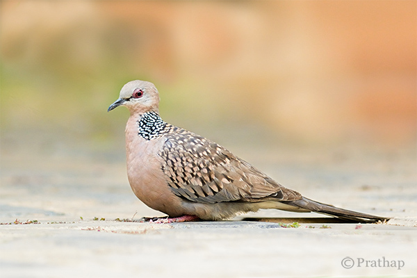
    Keep the background clean and make the bird stand out in the frame

    Nature Photography Simplified Bird Photography Dove Clean Background

    You will make excellent photographs by following the above simple tips on bird photography. Now go out and shoot. That’s the best tip I can give if you want to seriously improve you bird photography, enjoy!

    The post Bird Photography Tips – How to Make Your Bird Photographs Stand Out by Prathap DK appeared first on Digital Photography School.

    Digital Photography School

  • 10 Things Google Should Consider in Launching a Standalone Photo Sharing Service

    Google used to have a standalone photo sharing service. It was called Picasa. I never really liked it. It wasn’t a very social site. I thought Flickr was a lot better.

    Today’s news out of Bloomberg is that Google is looking to spin off Google Photos from Google+. Maybe it’s true, maybe it’s not. You never know. The timing of Friday afternoon stories and leaks always makes you wonder. Usually when companies want to push something they release it more like Tuesday mornings or make a big deal about it at I/O or something.

    Whatever the case, photos has been one of the highlight use cases for G+. Many photographers have flocked to the site and I think it’s done a pretty good job with photos overall.

    *If* Google is going to launch a standalone photo service though, they should really go all out. I worry that they’ll launch something less than fully baked — it will generate a bit of initial excitement and then lack stickiness.

    With that in mind, here are 10 suggestions that I’d give Google in launching a standalone photo sharing service.

    1. Flickr has raised the bar by giving everyone a full terabyte of high res photos. Flickr made one big mistake with this offering though. *Private* high res photos are of very little value to a photo social network. Public photos are *very* valuable to a photo social network. Public photos are worth more to a social network than the cost to store the photos. Flickr just gave everyone a terabyte without distinguishing the visibility of the photos. Google should offer at the launch either unlimited or 2TB of high res public photo storage with every account. This will get great press and attention.

    Go big or go home I say. Nobody can maintain cheaper enterprise storage than Google, and it’s only going to get cheaper in the future. Don’t be blinded by the open-ended liability of high storage limits. Public photos on the web are only going to get more valuable in the future and storage is only going to get cheaper.

    2. Partner with photographers to sell their photos. Flickr just leaked something like this earlier this week. Partnering with photographers to sell photos is not just about stock photos as revenue (although the stock photography market is in fact a multi-billion dollar market ripe for disruption). This is about attracting the sorts of high quality photographers to your network because they will be *paid* for participating through photo sales. By providing photographers an avenue to sell their stuff and make real money, you endear them to your network. Tie the visibility of their work, in part, to their level of activity on the network — not directly, but just float that out there so that photographers feel like the more active they are on the network, the more $ $ $ they may make.

    3. Create a super light weight mobile client like Instagram. Make it so simple. Tap/tap to +1, like, fave, whatever. Really dumb it down. Just something to follow your friends’ stuff and favorite it without all the other clutter of G+/Facebook getting in the way.

    4. Build an intelligent way to organize albums by keywords. Manual album management sucks big time. Let me build albums by keywords (this will also encourage more keywording which is valuable organizational metadata for Google to have). Study what Jeremy Brooks has done with SuprSetr and build something like that but even more intuitive and easy to understand and use.

    5. Build intelligent groups for photographers to hang out in on the photo network. Unfortunately Google got one thing very wrong with communities in G+, which is why communities never took off. They refused to bump threads based on new comments. This ensures that all threads die quickly. It’s the longevity of conversations that fuel community interaction. Refusing to bump threads based on comments makes large groups completely chaotic and unusable. Why invest in a conversation that will be completely buried and dead in 24 hours and that I’ll never be able to find again? Let me mark conversations as favorites and feed all my favorite conversations to me in a feed ordered by recent comments/activity.

    6. Go mosaic big time. On the web, give users a huge wall of photos with infinite scroll to just scroll through and +1. Code the site so that if you are hovering over any photo and press the “f” key it +1s it. Lubricate social activity on the web. Social activity begets social activity. The more you make it easy for people to like/fave/+1 stuff and the faster you make it, the more you get. The more people get, the better they feel about the network.

    7. Spend some serious money the first year on community management / evangelism. Hire a whole bunch of photo community managers and partner with influencers all over the world. Require community managers to host at least 2 photowalks a month in their geographic region. Require them to spend 10 hours a week inside of social groups interacting with photographers on the new site. Bombard your users with interaction from Google Community Managers. Make sure Googlers are using the site to share their photos, especially visible senior management. Keep track of how many +1s, comments and other interactions Googlers have with photos on the network and make sure Googlers know that this matters.

    8. Open some fine art physical galleries. These can be used to host meetups and gallery shows for G+ photographers. You can also sell physical prints and DVDs of photo series from these galleries. Social photographers love doing shows with their work. Digital displays make doing temporal shows easier than ever. The ego boost a photographer gets when they are showing their work in a group show is substantial. Capitalize on this to draw the finest photographers in the world to your network.

    9. The Nik Software stuff from Google is really good. Snapseed is the best mobile photo editing software out there. Analog Efex Pro 2 really is some of the best photo processing software I’ve used in years. Google could create something as good as Lightroom, maybe even better. Build this into the site for processing but also give people the ability to download the software to their computers for when they don’t want to work in the cloud and want to work locally. Sell this software for $ 99 with a six week free trial. Users who upload at least 5 photos on different days to the new photo network for six weeks should be given a promotion code to get the software for free.

    10. Prioritize Google Photos photographs in Google Image Search. Create a button that photo buyers can click in Google Image Search to show photos available for licensing. Leverage the power of Google Image Search to both drive traffic back to photos in the social network and sales through the social network.

    That’s all for now.


    Thomas Hawk Digital Connection

  • Weekly Photography Challenge – Golden

    The collection of images this week that I rounded up were on the theme “golden”.

    That is a bit open for interpretation. So let’s do just that, shall we, and make it this week’s photography challenge as well.

    Weekly Photography Challenge – Golden

    So what does that mean to you? What do you imagine in your head at the mention of the word? Do you take it literally and think of the color gold? How about an award or trophy? There’s so many ways to go with this – let’s see where you take it.

    Here’s a few more ideas to get you started:

    By Hartwig HKD

    By Justin Brown

    By Daniel Stark

    By dorena-wm

    By Ansel Edwards

    By luz rovira

    By Justin Hee

    By Mark Freeth

    By Nick Kenrick

    By Clint McMahon

    Show use your Golden photos

    Simply upload your shot into the comment field (look for the little camera icon in the Disqus comments section as pictured below) and they’ll get embedded for us all to see or if you’d prefer upload them to your favourite photo sharing site and leave the link to them. Show me your leading lines using pathways and roads in this week’s challenge.

    The post Weekly Photography Challenge – Golden by Darlene Hildebrandt appeared first on Digital Photography School.

    Digital Photography School