Category: Photography

  • Basic Portrait Processing in Lightroom

    Over the past few years I have learned a great deal about doing portraits, especially of young kids. I think it’s because I get so much enjoyment out of these types of shoots that I end up doing them more, though at some point it hardly seems fair because I wonder if I’m having more fun than the children whose pictures I am taking.

    While each session is unique, I have developed my own style (which, in many ways, will always be a work in progress as I continue to learn new things) when it comes to both the shooting and editing process, and I thought it might help those who are new to this type of photo session to see a few examples along with an explanation of the creative choices I made along the way. I do all my edits in Lightroom, and while I sometimes need to do some more in-depth adjustments in Photoshop, 98% of all the pictures I give to clients don’t need anything more than what Lightroom can do. If you don’t have this software, I highly recommend it!

    DSC_8127

    Get it in camera first

    Before I get to the editing portion of this piece, I need to clarify one thing: no amount of editing can make up for initial on-location mistakes, which is why it’s so critical to get the initial picture as good as you can right from the beginning. This involves things like choosing a good place to take the photos, finding the right time of day, and communicating with your subjects (and their parents, if you are working with kids). Along with that are your own creative choices such as your aperture and focal length, the composition of your shot, the angle from which you choose to shoot, the lighting manipulation you use, and a host of other elements that have an enormous impact on the final outcome of any given photo session.

    Of course if you work in a studio you have much greater control over some of these items, but at the end of the day a poorly-shot initial photo will remain exactly that, no matter how much you try to edit it in Lightroom or Photoshop. I say all this to make sure you understand that editing tools are not a magical cure-all to make all your pictures shine. And the best way to make sure your photos are as good as they can be from the beginning is to focus not on the editing, but on basics like exposure, lighting, framing, and composition. It also helps to shoot in RAW, not JPEG, in order to maximize the amount of data you can work with on each individual photograph.
    DSC_6792-original

    Basic portrait processing in Lightroom

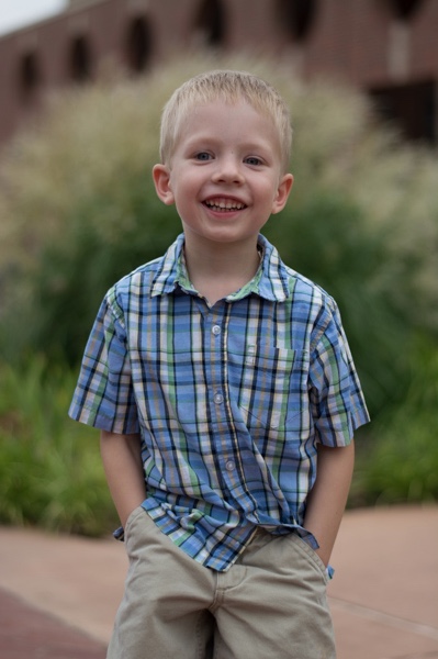
    I shot this picture with my Nikon D7100 at 50mm, f/1.8, ISO 200. Since the sun was setting and I was not working with off-camera strobes, my lighting options were a bit limited. I had his father stand behind me with my Neewer 43-inch reflector to capture a bit more of the available light. (If you don’t have one of these, I recommend getting one. They are quite cheap and a fantastic addition to any camera setup.)
    histogram

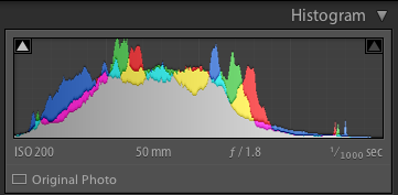
    The initial photo was a bit underexposed, as shown in the histogram as well.

    I also chose to frame the child with the green bush in the background, and of the half-dozen images I got of this particular pose I liked this one in which he was not quite looking at the camera. Often when working with kids I have found that the best images are a bit more candid as opposed to posed, but again, this is a creative choice you will have to make for yourself. Finally, I made sure to shoot this in RAW to take advantage of as much data as possible in order to correct some things back at my computer. Right away you probably noticed that the image is a bit too dark, which was the first thing I fixed in Lightroom.

    A quick look at the histogram showed me that overall I got things pretty good in camera, but to make it look a bit better I increased the exposure by 1.2 stops, as well as cropped it a bit to focus the viewer’s attention on the boy’s face without the distracting red building in the background.
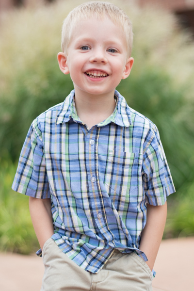
    DSC_6792-2

    First edits: Cropped and increased the exposure by 1.2 stops.

    So far so good, but there’s still a lot of work that needs to be done. While the overall brightness was better, the colorization was still a bit off. The initial white balance settings determined by my camera were 4900K and -9 tint, but I wanted something a bit warmer so I increased the temperature to 5700K and changed the tint to -7.
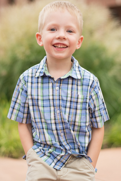
    DSC_6792-3

    Second edits: adjust white balance and tint.

    I liked this much better, but there were still some things that needed fixing. Now that the overall photo was properly exposed, there were some parts that were a bit too bright which was handled by lowering the highlights slider by -19. After that I increased the saturation to +6 and added +4 contrast as well.
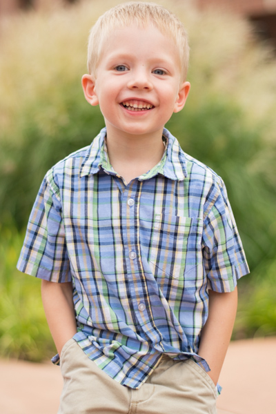
    DSC_6792-4

    Third edits: lower highlights, increase saturation and contrast.

    I was much happier with this, but it’s important to remember that all of the changes you make to a photo in post-production are based on your own creative ideas and there is no right or wrong way to do things. Some people like images that are desaturated, some prefer selective coloring (i.e. one part is colorized or over-saturated while the rest of the image is more black-and-white), others use cropping to achieve different effects. The sky really is the limit. One thing I like to do from time to time is add a subtle vignette effect (using Post Crop Vignette at -26, Highlight Priority), which I did here to result in the final image I gave to the client.
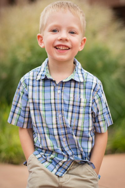
    DSC_6792-5

    Final edits: add a bit of an edge vignette, other minor color adjustments.

    You might look at this and think the colorization is a bit off, or the vignette should be stronger, or the entire framing should be different, but the beautiful part of photography is that we all have our own opinions on how to do things. I was happy and so were my clients, which is all that matters to me.
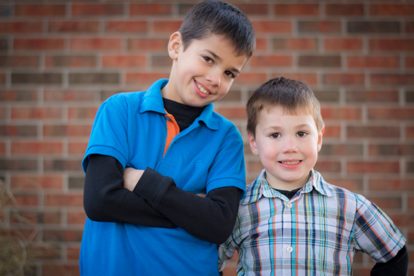
    DSC_1776

    In this photo I used the Brush tool to selectively desaturate the orange strip on the boy’s shirt, and the Radial Filter to add a more precise vignette.

    I do think it’s important to maintain a sense of reality in photos, though, and not let the editing get out of hand. It’s easy to feel like an all-powerful genie when you start playing around with the tools in Lightroom, Photoshop, or other editing software, but my rule of thumb when editing is to try to make the final image represent what I saw, when I initially took the photo. In the above image, for example, the orange strip on the boy’s shirt was a bit distracting, so I was able to selectively desaturate it quite a bit with Lightroom’s Adjustment Brush tool. This, along with other edits similar to the ones described above, resulted in a photo that my client was quite pleased with.

    My point is that it’s great to have these editing tools available but If I start to lean too heavily on the saturation, bump up the clarity to absurd levels, or making dozens of small changes with the brush tool, I usually end up with photos that bear little resemblance to the original and come across as emotionless and empty.

    What about you? What style have you developed over the years, and what approach do you use when you sit down to edit? Post your thoughts in the comments section below.

    googletag.cmd.push(function() {
    tablet_slots.push( googletag.defineSlot( “/1005424/_dPSv4_tab-all-article-bottom_(300×250)”, [300, 250], “pb-ad-78623” ).addService( googletag.pubads() ) ); } );

    googletag.cmd.push(function() {
    mobile_slots.push( googletag.defineSlot( “/1005424/_dPSv4_mob-all-article-bottom_(300×250)”, [300, 250], “pb-ad-78158” ).addService( googletag.pubads() ) ); } );

    The post Basic Portrait Processing in Lightroom by Simon Ringsmuth appeared first on Digital Photography School.


    Digital Photography School

  • What TechCrunch Gets Wrong About Ello…

    Pardon My Whiskers Mr. Mingus
    Photograph of the hippest hipster cat around, Mr. Mingus, by hipster Daniel Krieger

    Writing for TechCrunch, Josh Constine penned a hit piece yesterday announcing the end of Ello. I was disappointed to see TechCrunch, a publication that I long viewed as being supportive of the start up community, using their pulpit to tear one down. Not only do I think Josh got a lot of the story on Ello wrong, but the dramatic tone of his article was unnecessarily disparaging and that is disappointing.

    I’m not sure how much Josh uses Ello, but I use it every day and it’s currently my favorite social network.

    I thought I’d take a few minutes to address some of the things that Josh said about Ello and add my own commentary.

    1. Josh says: “Here in September gone in September, Ello hoped to dethrone Facebook by … not having ads.”

    I’m curious about Josh’s comments saying Ello hoped to “dethrone” Facebook. Nowhere have I ever seen the founders of Ello saying that they hope to “dethrone” Facebook. In fact, the founders have gone out of their way to say that Ello and Facebook are two entirely different things. Ello is a social network and Facebook is an advertising network.

    If you pull up Ello’s mission statement, does it say that their goal in life is to “dethrone” Facebook?

    On the “What is Ello” page, Ello states:

    “Ello is a simple, beautiful, and ad-free social network created by a small group of artists and designers. We originally built Ello as a private social network. Over time, so many people wanted to join Ello that we built a public version of Ello for everyone to use.”

    Huh? So why the wild hyperbole from TechCrunch stating that Ello hoped to dethrone Facebook? If Ello got even 1/10th of 1% of the users that Facebook has it would be an absolute home run. Facebook is a multi billion dollar advertising network. Ello is a fun place to hang out and share things in an ad free environment with interesting people.

    2. Josh says: “But while hipsters had fun hating on Zuck’s creation for a few days, they all went back to it and promptly ditched Ello.”

    What’s with the dig about “hipsters?”

    Maybe I’m a hipster, maybe I’m not a hipster?

    I’m just a photographer looking to share my photos on a cool platform and I’m still using Ello everyday, just like I did when I joined it.

    Is Brian Nelson a “hipster” (they won’t let him share his fine art nude photographs on Facebook by the way, warning NSFW)? Is my photographer friend David Seibold a hipster? Is JC Little a hipster? Is foalsi a hipster? Is Greg Poulos a hipster? Is Japanese photographer ruylopez a hipster? Is Jessica Greene a hipster? Is Toby Harriman a hipster? Is dutch a hipster? Is my Italian friend Nicola Cocco a hipster? Is writer, journalist and photographer Marcus Hammerschmitt a hipster? Is Ugo Cei a hipster? Is Brad Sloan a hipster? Is Portuguese street photographer Ricardo Porto a hipster?

    I know my friend Daniel Krieger is *definitely* a hipster — he shoots for the NY Times, lives in Brooklyn, used to have a moustache, drinks fine bourbon and has the coolest cat named Mr. Mingus. The thing is though, all of these people are still on Ello and still posting every day. Josh on the other hand made two posts on the site and then bolted. One of his two posts is of this hipster looking avatar with a moustache, beard and long hair that I guess is supposed to be him?

    Is the hipster criticism just because a few of the Ello founders have beards? Whatever case, the “hipsters” haven’t “promptly ditched Ello.” I could easily come up with a few hundred more interesting talented people I follow on Ello that pretty much post every day.

    3. Josh says: “Beating Facebook at its own game is like punching a wall 1.35 billion bricks thick. ”

    Huh, who said anything about “beating Facebook at its own game?” Lots of people who use Ello also use Facebook. I know I do. Why does everything have to be about “beating” Facebook. Is that just for the clicks? Ello isn’t even playing Facebook’s game. How can they “beat” them in an advertising game that they are not even playing in?

    4. Josh says: “So as soon as people realized they could either post to their few smug friends who joined Ello, or everyone they know on Facebook, they dropped Ello on its face.”

    Why would Josh think that people who use Ello are “smug?” I’ve met some really cool and interesting people on Ello. I’ve made some great new friends and reconnected with some old ones. The mixture of people is like a really nice bar where people generally speaking are nice and thoughtful and creative and intelligent and interesting. Maybe Josh needs to spend more time actually researching Ello before labeling the community there as “smug” and saying that they “dropped Ello on it’s Face.”

    I mean, I hate to say it, but I think Josh’s hipster TechCrunch article on Ello is actually way, way, way, way more “smug” than the people who are actually using Ello as a fun community every single day.

    5. Josh says: “No one I follow has posted in three months, so I doubt they’re checking the site either. ”

    So wait, because Josh’s 22 hipster friends on Ello aren’t using it nobody else could possibly be? Maybe he should do a little more research because many of the 778 friends I’m following on there are using it every single day.

    I thought Josh’s take on Ello was pretty myopic and one sided.

    Look, here’s the thing about Ello. Ello is not trying to be Facebook. Ello is not trying to beat Facebook. Ello is not trying to play a game of horse basketball with Facebook on the Facebook basketball courts. Ello is Ello. Ello doesn’t need billions of users. Ello doesn’t need creepy ads that follow you around the internet. Ello doesn’t need you to pay them to have your “sponsored” posts shown to your friends.

    Ello just is a cool place where interesting, intelligent, creative people are hanging out and being all friendly like. Photography there looks better than on any other network on the web. The interface is easy and clean. The folks running the show actually give a damn and care about the place and participate and are transparent about where they are headed with the network. If you haven’t tried Ello yet, check it out. You might find it the friendly sort of place you might like to hang out. You can find me on Ello here.

    Some good comments about this article here.


    Thomas Hawk Digital Connection

  • Weekly Photography Challenge – Dance

    Earlier I shared a bunch of elegant images of the world of dance.

    Dance is an art form just like photography. It take discipline and endurance to be a dancer. Can you relate as a photographer? Each is a passion, something which needs practice to perfect. Dance is picturesque and often is partnered with photography as the are symbiotic – they work well together.

    Michael Dunn

    By Michael Dunn

    Weekly photography challenge – dance

    Now it’s your turn. Do you know a dancer? Can you approach the local dance school to offer to take some photos for them? Maybe even something less formal like your own children dancing just for the fun of it?

    Here are a few ideas:

    Garry Wilmore

    By Garry Wilmore

    Stefanos Papachristou

    By stefanos papachristou

    Tiziano L. U. Caviglia

    By Tiziano L. U. Caviglia

    Paul Cox

    By Paul Cox

    Felix Padrosa Photography

    By Felix Padrosa Photography

    Chris JL

    By Chris JL

    Dixie Lawrence

    By Dixie Lawrence

    John Curley

    By john curley

    Share your dance images here:

    Simply upload your shot into the comment field (look for the little camera icon in the Disqus comments section) and they’ll get embedded for us all to see or if you’d prefer upload them to your favourite photo sharing site and leave the link to them. Show me your best images in this week’s challenge. Sometimes it takes a while for an image to appear so be patient and try not to post the same image twice.

    googletag.cmd.push(function() {
    tablet_slots.push( googletag.defineSlot( “/1005424/_dPSv4_tab-all-article-bottom_(300×250)”, [300, 250], “pb-ad-78623” ).addService( googletag.pubads() ) ); } );

    googletag.cmd.push(function() {
    mobile_slots.push( googletag.defineSlot( “/1005424/_dPSv4_mob-all-article-bottom_(300×250)”, [300, 250], “pb-ad-78158” ).addService( googletag.pubads() ) ); } );

    The post Weekly Photography Challenge – Dance by Darlene Hildebrandt appeared first on Digital Photography School.


    Digital Photography School

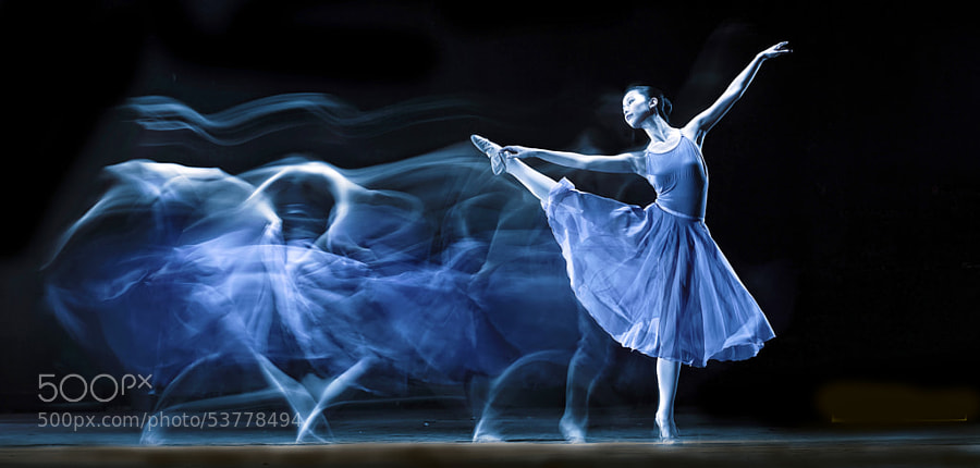
  • 27 Elegant Images of the World of Dance

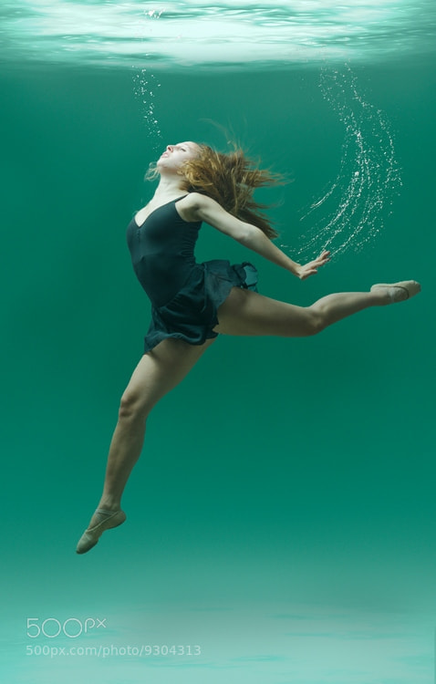
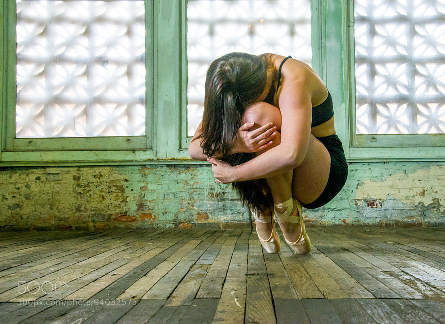
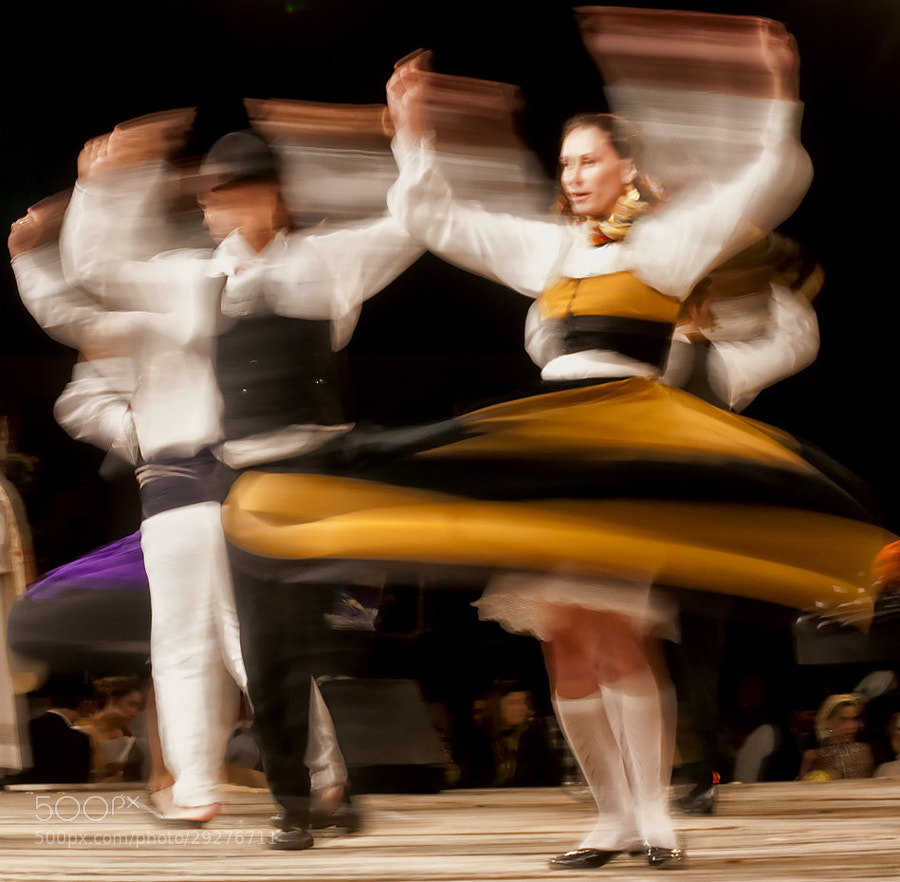
    Last week we looked at magical images of music, this week let’s explore the world of dance!

    Dancers have a lot of passion and determination. It takes a lot of work and practice to be a good dancer, even more to be great. Hmm, sound familiar? Just like anything – the more you do it, the better chance you have of improvement.

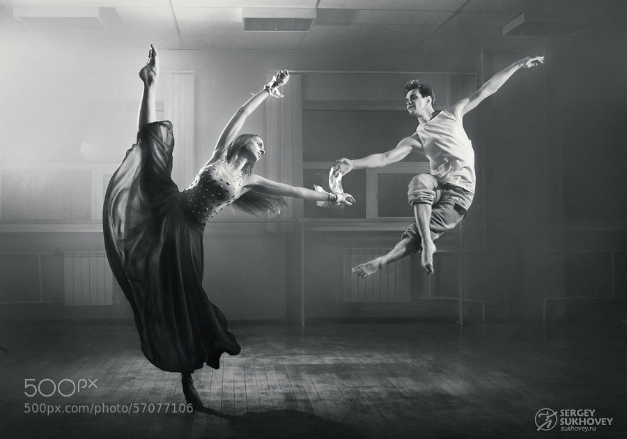
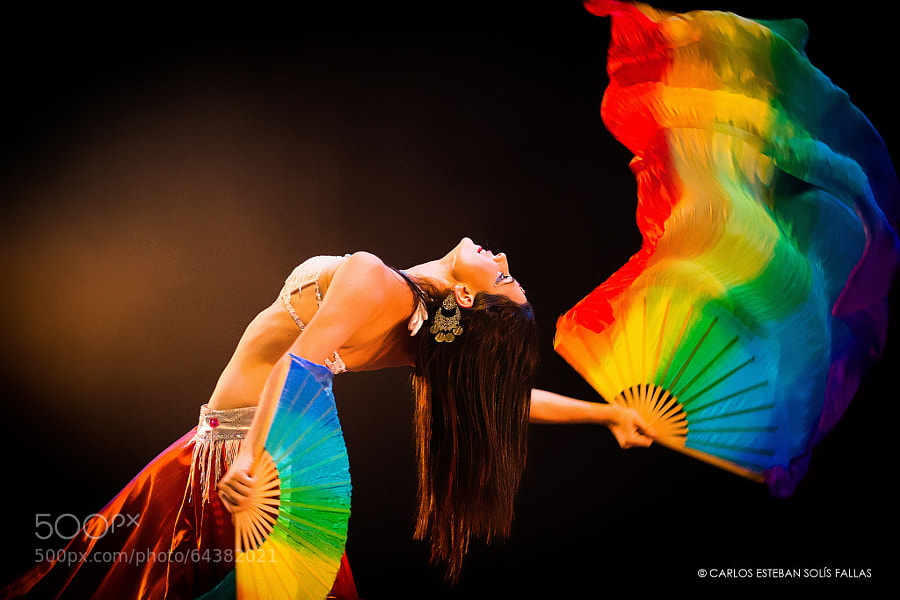
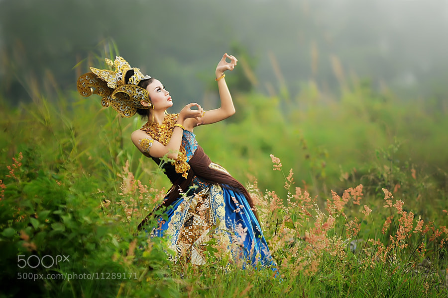
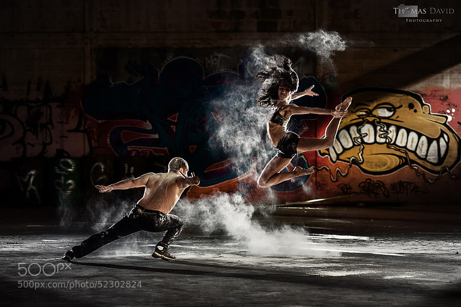
    I’ve always silently envied dancers. They move with such grace, flow, elegance. Not to mention how fit and strong they always look. Photography of dancers is the same – when done well! This set of images of dancers spoke to me on both levels – the power of the dancer, and the skill and artistry of the photographer.

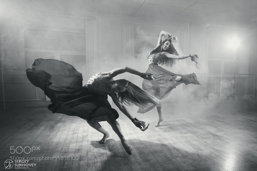
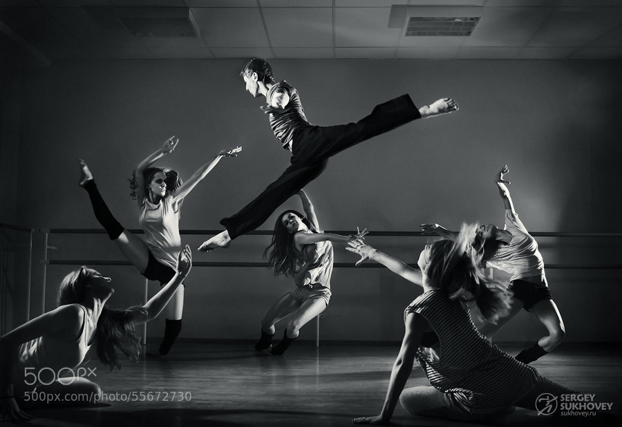
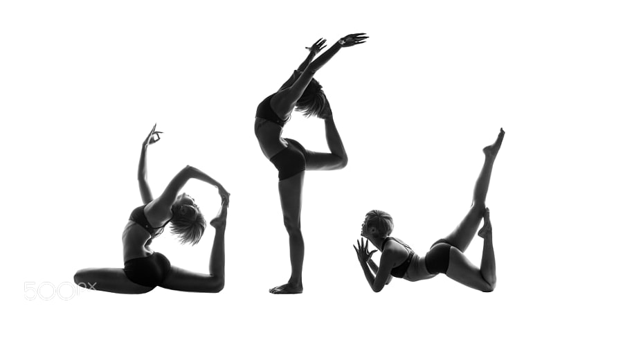
    Photograph ACTION by Sergey Sukhovey on 500px

    ACTION by Sergey Sukhovey on 500px

    Photograph Civetta by Mark Crislip on 500px

    Civetta by Mark Crislip on 500px

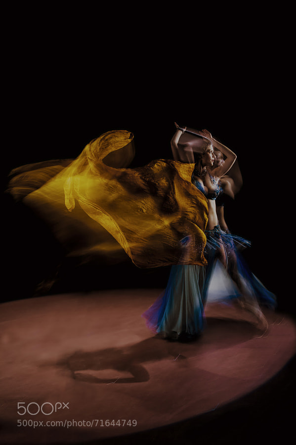
    Photograph Bellydancer by Carlos Esteban Solís Fallas on 500px

    Bellydancer by Carlos Esteban Solís Fallas on 500px

    Photograph Style contemporer Dance by iwan kristiana on 500px

    Style contemporer Dance by iwan kristiana on 500px

    Photograph Dust and Dance by Thomas David on 500px

    Dust and Dance by Thomas David on 500px

    Photograph Ballerina by Yongki RS on 500px

    Ballerina by Yongki RS on 500px

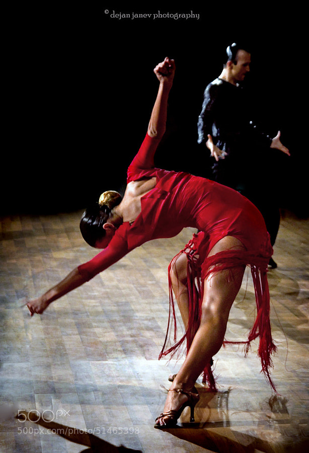
    Photograph The end of tango by Dejan Janev on 500px

    The end of tango by Dejan Janev on 500px

    Photograph ACTION by Sergey Sukhovey on 500px

    ACTION by Sergey Sukhovey on 500px

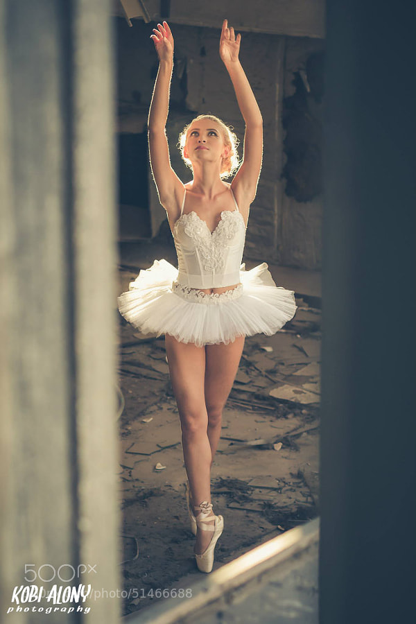
    Photograph White Swan by Kobi Alony on 500px

    White Swan by Kobi Alony on 500px

    Photograph Out of the green by Tomer Jacobson on 500px

    Out of the green by Tomer Jacobson on 500px

    Photograph the curvature of spacetime by Aufik (A) on 500px

    the curvature of spacetime by Aufik (A) on 500px

    Photograph Light As A Feather - Artistic Looks At Dance Through Photography by scottgserio on 500px

    Light As A Feather – Artistic Looks At Dance Through Photography by scottgserio on 500px

    Photograph Turn turn by Jeronimo Lomba on 500px

    Turn turn by Jeronimo Lomba on 500px

    Photograph Gujarat Tribal Dance by Ivon Murugesan on 500px

    Gujarat Tribal Dance by Ivon Murugesan on 500px

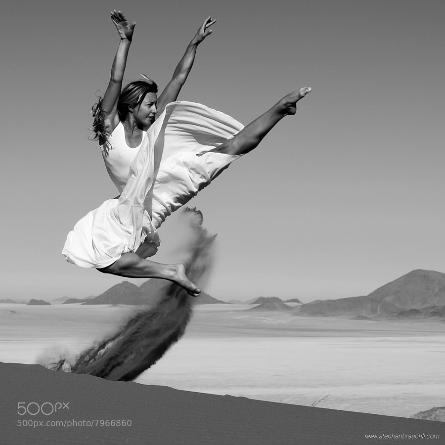
    Photograph Dune Danse - Flight by Stephan Brauchli on 500px

    Dune Danse – Flight by Stephan Brauchli on 500px

    Photograph New Year Celebration by Richard Snyder on 500px

    New Year Celebration by Richard Snyder on 500px

    Photograph Bouba Jallow by Rafa? Bojar on 500px

    Bouba Jallow by Rafa? Bojar on 500px

    Photograph TANGO by Peter Marosi on 500px

    TANGO by Peter Marosi on 500px

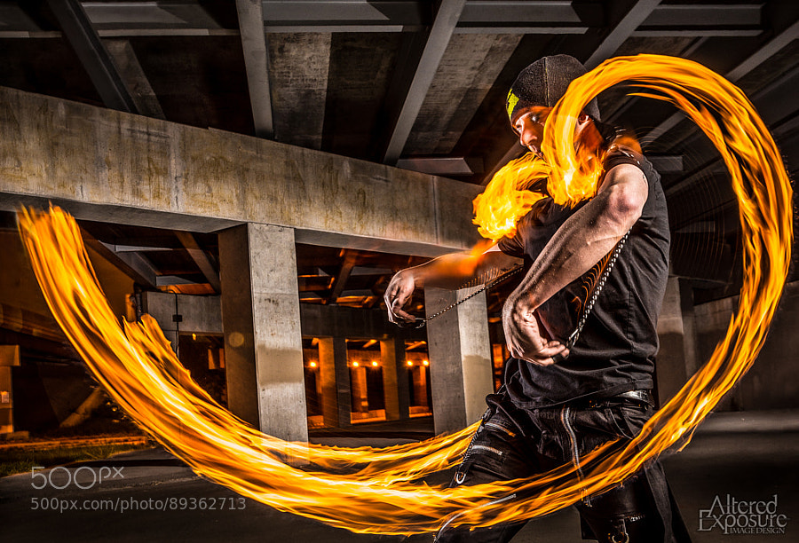
    Photograph Steve, the fire-meister Crop by Jesse Mount on 500px

    Steve, the fire-meister Crop by Jesse Mount on 500px

    Photograph Fire Dancer by David Benard on 500px

    Fire Dancer by David Benard on 500px

    Photograph Fire Staff by Jenny Zhang on 500px

    Fire Staff by Jenny Zhang on 500px

    Photograph Belly Dancer by gunes demir on 500px

    Belly Dancer by gunes demir on 500px

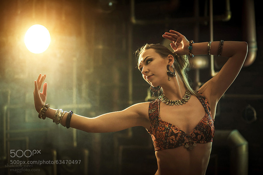
    Photograph Dancing with light by Shakilov Neel on 500px

    Dancing with light by Shakilov Neel on 500px

    Photograph ACTION by Sergey Sukhovey on 500px

    ACTION by Sergey Sukhovey on 500px

    Photograph Ballet by Lorena Gellini on 500px

    Ballet by Lorena Gellini on 500px

    Photograph Body Of Art by Dave Brosha on 500px

    Body Of Art by Dave Brosha on 500px

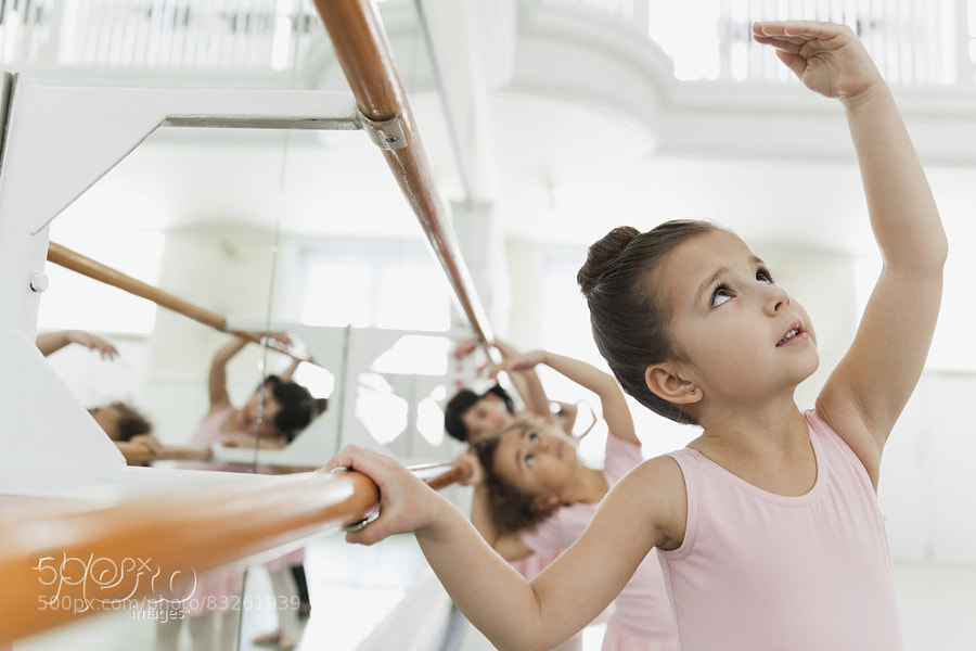
    Photograph Children practicing ballet poses in ballet studio by Hero Images  on 500px

    Children practicing ballet poses in ballet studio by Hero Images on 500px

    googletag.cmd.push(function() {
    tablet_slots.push( googletag.defineSlot( “/1005424/_dPSv4_tab-all-article-bottom_(300×250)”, [300, 250], “pb-ad-78623” ).addService( googletag.pubads() ) ); } );

    googletag.cmd.push(function() {
    mobile_slots.push( googletag.defineSlot( “/1005424/_dPSv4_mob-all-article-bottom_(300×250)”, [300, 250], “pb-ad-78158” ).addService( googletag.pubads() ) ); } );

    The post 27 Elegant Images of the World of Dance by Darlene Hildebrandt appeared first on Digital Photography School.


    Digital Photography School

  • A Beginner’s Guide to Working With Flash Off-Camera

    FF HeroBW

    I spent the first three years of my photography career avoiding the use of speedlights off-camera because I couldn’t wrap my head around the concepts and science behind them. I tried to cover it up saying things like “I’m a natural light photographer.” or “I really don’t like the aesthetics of flash photography.”

    But then, I reluctantly invested in a flash for my first Nikon. This was the 90s, pre-digital, pre-autofocus, and pre-TTL. I had to calculate how much flash to use via a chart on the top of the flash. The formula was complicated, but if you knew how to split an atom, you were pretty much set.

    Each shoot I went on that required flash was preceded by a sleepless night filled with anxious dreams about turning up to the shoot naked. And the thought of having to use flash also had a mild to moderate laxative effect on me.

    Luckily those days are long gone and shooting flash has never been easier. In this tutorial, I’ll show you the quick and easy steps I take to shoot portraits using off-camera speedlights.

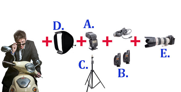
    The Gear Essentials

    A. Speedlights:

    I use speedlights most often when I’m travelling and need light portable flashes, when I’m working on location without access to power, or when I’m working in small, confined locations where studio flashes would be too powerful or cramped.

    I work with two Canon 580EX IIs. A great alternative if you are looking to save a few bucks is the Yongnuo YN-560 II. It has a very similar look to the Canon 580EX II and Nikon’s SB speedlight series.

    B. Remote Triggers:

    Remote triggers allow you to fire speedlights when they’re not mounted on your camera and are essential when using flash off-camera.

    The cheapest and most reliable way to fire your speedlight off-camera is using a sync cord — basically you connect your speedlight to your camera via a long cable. The drawbacks of using a cable are that it reduces the distance you can be away from your flash, and can create a tripping hazard. Having said that, I still carry a couple of spare sync cables in my kit because remote triggers do fail from time to time, and the cords have saved my butt on a few occasions.

    The next option is cheaper infrared triggers. They do the job of setting your flash off remotely, but they’re sensitive to bright sunlight and external factors such as alert lights on emergency vehicles and forklifts, etc., so they can go off without warning. I started out with a $ 30 set of triggers and used them for a couple of years before trading up to PocketWizards, which I’ve been using for the last eight years. A good entry level flash trigger is the YONGNUO RF-602 (approximatel $ 30).

    Fill Flash Diagram 1W

    C. Light Stands:

    There are three options when it comes to mounting speedlights off-camera:

    1. First, you can use a light stand. Light stands vary in price from $ 20 to $ 200+ dollars, depending on the make and construction.
    2. Second, you can use a GorillaPod and mount your speedlight to a door or place it on top of something near your model.
    3. Third, you can mount your speedlight to an extension pole (or monopod) and have someone hold the light above your model. I like to do this because it gives me more options when shooting, and it also means there aren’t any light stands in the way of my shot.

    D. Light Shapers:

    Using a speedlight as a bare light source creates a very hard style of lighting similar to harsh sunlight. This looks great in certain situations, but I prefer to soften and control the light source by using a small or medium soft box over the flash unit. This creates a much softer, more flattering and realistic-looking light source.

    A good one to start with is the LumiQuest Mini Softbox. It attaches to your speedlight with Velcro and folds flat for easy storage.

    E. Camera with Hot Shoe Mount:

    You will need a Camera that works in manual mode with a hot shoe mount.  The hot shoe mount is just a sexier way of saying that little square bit of metal on top of the camera that an external flash or wireless trigger slides into.

    The Way

    I used to believe that great portraits needed artificial lighting regardless of the environment. I often added two or three lights to my portrait shoots because I thought anything less was lazy or unprofessional. I actually felt guilty when I shot with natural light because I thought it was cheating.

    Fortunately, I’ve gotten over that false notion and now understand that finding great light and being able to use it are learned skills, so is knowing when to use fill-flash in a portrait.

    Nowadays, whenever I set up portrait shoots, I always look for opportunities to use great natural lighting first. It’s the most beautiful and flattering light for portraits, so if it ain’t broke, no need to fix it.

    Having said that, there are many occasions when natural lighting is only just okay or even complete caca — and sometimes a portrait needs more mood or drama than the available light can provide.

    The following is an example of how I used flash off-camera to light a heavily backlit image. My objective was to create an image that looked naturally lit. This technique can be used for any portrait that requires fill-flash using off-camera flash.

    Daylight 001 Daylight 800ISO 001

    Flash on camera 002

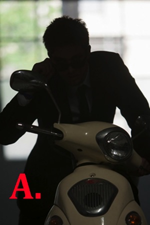
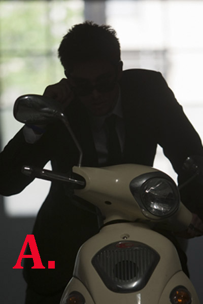
    A. Here you can see that my model was heavily backlit, which makes a great silhouette, but not such a great portrait.

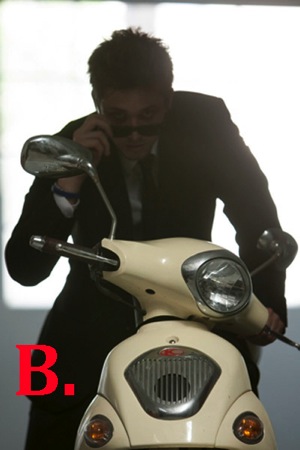
    B. I attempted to correct the lighting by increasing my ISO, which overexposed the background and brings more detail to the motorbike, but leaves the model’s skin tone flat, dull and underexposed. It also added extra noise in the blacks. At this stage, I could also have used a reflector to bounce light back onto the model to help create a better skin tone.

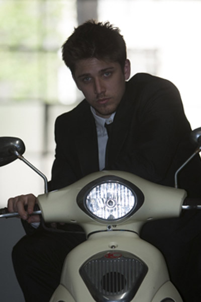
    C. A quick fix to this problem would be to shoot flash on-camera using TTL, which uses the camera’s metering system to calculate the correct amount of light needed to create the portrait.

    As you can see in my example, the Canon 580EX II did an okay job of lighting my model, given I was about five meters (16′) away using a 200mm lens.

    The thing I don’t like about using flash on-camera for portraits is that it tends to make them look unnatural and have flat, lit look. By using my flash off-camera, I can control the direction and amount of light going onto my model to achieve a more natural look.

    FF Diagram

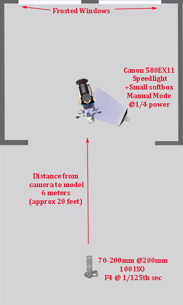
    Here’s a bird’s eye view of my setup

    My speedlight was positioned approximately one meter (three feet) from the model. I set it at a 45 degree angle because I wanted to make my model look like he was lit from the side.

    I was working with a 70-200mm zoom lens set at a focal length of 200mm because I wanted to blur all the details in the background and work within a narrow focal range.

    My camera was approximately six meters (twenty feet) from my model.

    My ISO was set at 100 at f/4. I was working at f/4 rather than wide open at f/2.8 because I find it very difficult to make the eyes look sharp at f/2.8, at that distance, and in that extreme lighting condition.

    Setting up the Gear

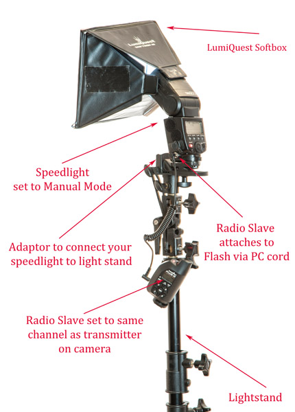
    580EX+Lumiquest+stand 1

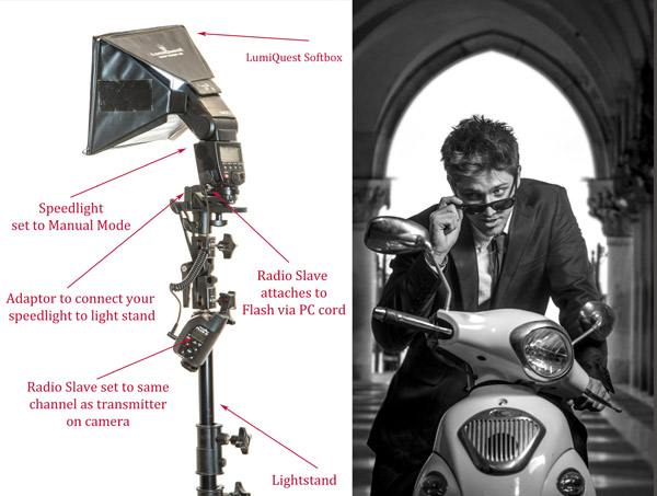
    Setting up speedlights and radio slaves

    For this motorbike model shoot, I mounted my speedlight to a light stand via an adaptor and used a small LumiQuest Softbox to soften and shape my light.

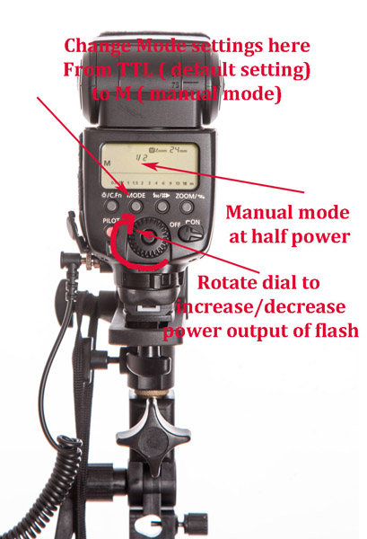
    580EX+Power

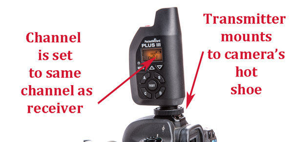
    PocketWizard+camera 1

    To manually adjust the flash output of your speedlight, first switch the setting from its default of TTL to M (manual mode). As a general guide, I start with the following settings:

    • Full sun: 1/1 (full)
    • I would use a power setting of 1/1 (full) if you are shooting in full sun and need f/16 or higher.
    • If you are shooting wide open at f/2.8 or f/4, start at around 1/16th-1/32 power.

    The above diagram is based on Canon’s 580EX II. For any other camera, check your manual for instructions on how to increase and decrease power. It should be very similar.

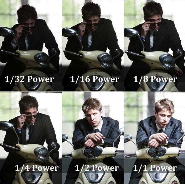
    Fill Flash  001

    • Flash at 1/32 power is underexposed, skin tone looks muddy and there’s no detail in the blacks.
    • Flash set at 1/16th power is starting to look better.
    • Flash set at 1/8th power is looking good, but I prefer a slightly brighter skin tone.
    • Flash set at ¼ power is the correct reading for the look I was going for.
    • Flash set at ½ power gives a slightly overexposed skin tone, which is perfect for most portraits as it is a very flattering light (no model will ever tell you they love seeing all the detail in their pores and skin tone).
    • Flash set at full power is overexposed—there’s very little detail in the skin tone and the blacks are too light (gray).

    A Step-by-Step Guide to How I Lit This Shot:

    Daylight 001

    Caption: My ambient reading was 4 at 1/125th second.

    1. Take an ambient reading to determine correct exposure for the background. In this case, my ambient reading was f/4 at 1/125th and ISO 100. This exposure will now remain fixed. I will next add light to create a nice skin tone.
    2. I ask myself if adding flash will improve or detract from the shot. In this case, the answer is a definite yes, it will improve my shot.
    3. I bring in my flash and set it up as per the diagrams above.
    4. The quickest and easiest way to figure out the best settings is to use a light meter (If you don’t have a light meter, you can still work with off-camera flash. It will just take a bit longer to work out your exposure). I believe the light meter is an essential tool in good portrait photography and would never leave home without one. When you use a light meter you know you have most accurate readings, and lighting becomes really easy.
      I suggest you set up your lights per the diagram, start at a power setting of 1/32, and gradually increase your power in small increments (1/32, 1/16, 1/8, ¼, etc.) until you get the desired results.
    5. Set your light meter to non-sync and press the button on the side of the meter. The non-sync button will flash on and off indicating it’s ready. If you don’t have an assistant, I suggest taking a radio slave off-camera and using it to test fire your flash so you can take a reading. Hold the meter in front of your subject’s face and point the sensor dome towards the camera.
    6. Keep increasing or decreasing the amount of light until you have it a half stop, to one stop over the ambient setting.
    7. If you want a clean, beauty-style shot with lots of shadow detail, add +1 stop of fill-flash and shoot at your ambient meter settings.

    This is something I strongly urge you to practice with as many patient friends, family, and pets as possible so you can build up your confidence and really get to know your equipment.

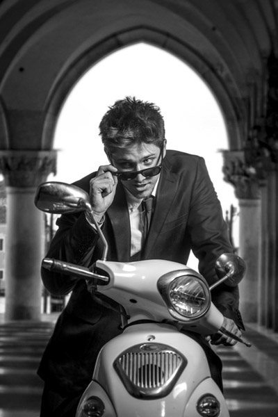
    Here’s the final image, the new background is from a shoot I did in St Marks Square, Venice last year. I merged the two images together using Photoshop.

    FF FINAL BW

    Glauco Junior Solleri, Vespa courtesy Glow Studios

    What are your experiences of working with off-camera flash? I’m keen to hear about the flashes, modifiers and flash triggers you rate highly and anything you’d like to add to the discussion.

    googletag.cmd.push(function() {
    tablet_slots.push( googletag.defineSlot( “/1005424/_dPSv4_tab-all-article-bottom_(300×250)”, [300, 250], “pb-ad-78623” ).addService( googletag.pubads() ) ); } );

    googletag.cmd.push(function() {
    mobile_slots.push( googletag.defineSlot( “/1005424/_dPSv4_mob-all-article-bottom_(300×250)”, [300, 250], “pb-ad-78158” ).addService( googletag.pubads() ) ); } );

    The post A Beginner’s Guide to Working With Flash Off-Camera by Gina Milicia appeared first on Digital Photography School.


    Digital Photography School

  • How to Use Triangles to Improve Your Portraits Composition

    Do you ever look at a picture and absolutely love it, but you don’t know why? There are a lot of elements that can go into a great shot, but the hardest thing to see/ easiest thing to pick up on are triangles, which are leading lines that frame your subject, drawing your eye deeper into their inner lives. The Continue Reading

    The post How to Use Triangles to Improve Your Portraits Composition appeared first on Photodoto.


    Photodoto

  • Tips for Better Composition of Seascape Photographs

    I do not believe that in photography there are absolute rules of composition, but it is undeniable that certain compositions work better than others.

    Why? Probably because our brain is the result of millions of years of evolution, and as in two dots and a line we recognize a face (you don’t believe me? Have a look here.), in the same way we recognize some images as more pleasant to look at than others.

    So let’s look at a few tricks to keep in mind during your next visit to the seaside.

    Start following rules

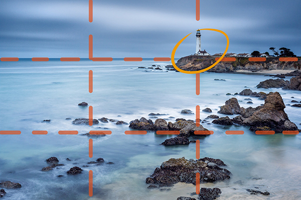
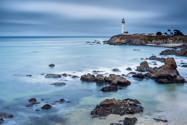
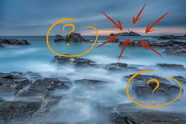
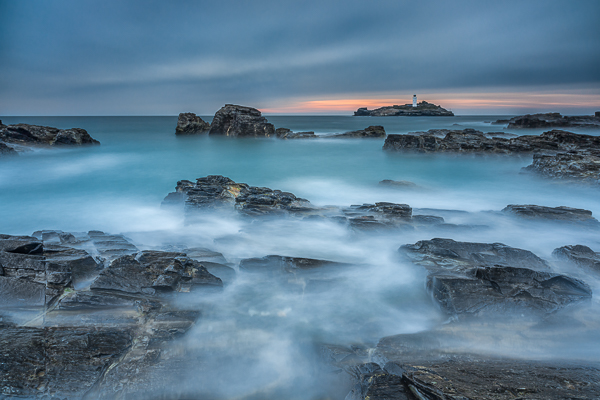
    Before trying to break rules, try to follow them. Start with the Rule of Thirds: divide your image into nine equal parts by two equally spaced horizontal lines and two equally spaced vertical lines. Then place important compositional elements along these lines or their intersections. The result will be that your photo becomes more balanced. In a seascape shot, for example try to put a Lighthouse on one of the vertical lines and the horizon on one of the horizontal ones.

    1 post

    Important elements (the lighthouse and the horizon) are positioned along the lines and at the intersections

    1 ante

    Choose the leading actor

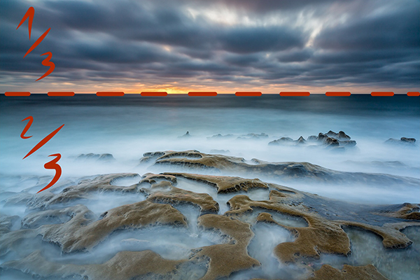
    If you follow the Rule of Thirds, you’ll never again put the horizon in the middle of your image, and that’s a great thing unless you have a perfect symmetrical reflection.

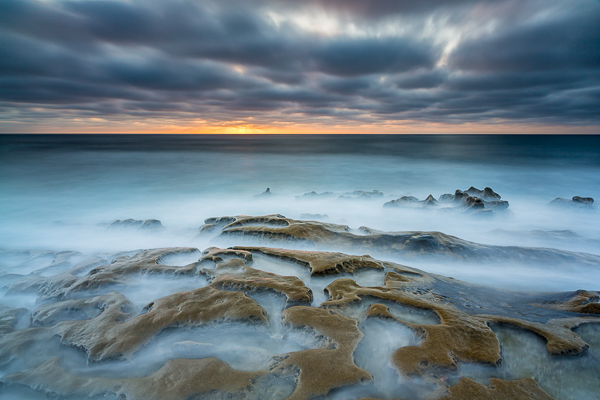
    Decide next if the leading actor of your seascape is the sky or the sea, and place the horizon line accordingly. For example if the leading actor is the sea, the image portion under the horizon line will be 2/3 of the whole image.

    2 post

    The rock formation in the foreground is really interesting with this tide. I wanted to emphasize it and so I give ? o the image to the sea in this the image.

    2 ante

    Check the horizon

    There is nothing more annoying than seeing a crooked horizon. Use the built-in level of your camera, or for few cents buy an external hot shoe level (the yellow one with an air bubble inside). Why? Because every time you fix the horizon in post-production you will lose a portion of the image. Finally, remember that if you publish an image with a crooked horizon, the horizon will be the leading actor of your image.

    Choose your focal length wisely

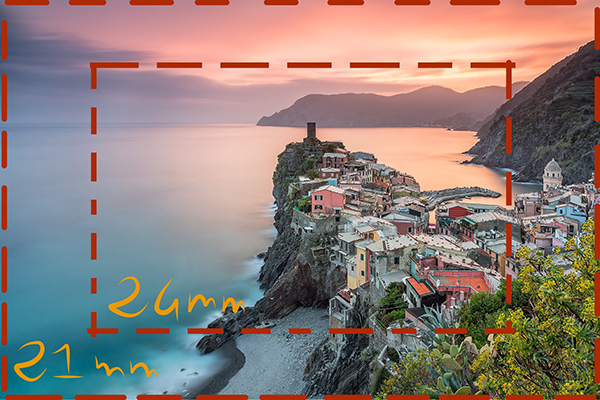
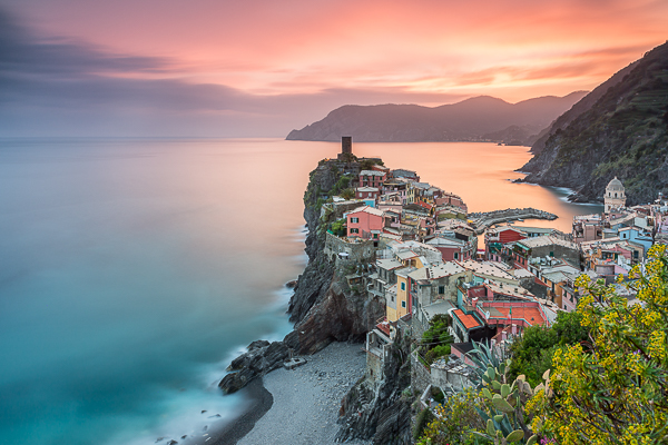
    Sometimes you might believe that a certain focal length is perfect for the scene you have in front of your eyes. Think wider! If you’re using a 24mm lens, try with an 18mm or a 21mm lens – don’t be lazy. Remember that in post-production you can always crop your 21mm image to a 24mm image, but you’ll never be able to do the opposite.

    3 post

    A 21mm lens was perfect here as it let me put inside the frame the spring flowered plant on the bottom right.

    3 ante

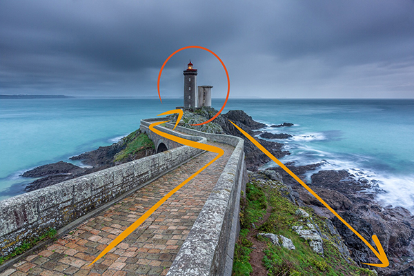
    Use leading lines

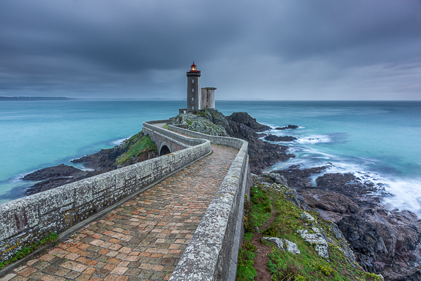
    An image is like a book, and to really enjoy it you should be able to read it from the begin to the end. To do that, try to use lines and curves to guide the eyes through a path. You can use a road or the natural line of the coast for example. Keep in mind that you should avoid interrupting that path because it’s like skipping a line in a book; you lose the sense of the story that you’re telling. Also try to avoid lines that guide the eyes of the reader outside the image. You want attention given to what is inside the image, not to what is outside.

    4 post

    I used the road to drive the eye of the viewer from the margin of the image to the main character.

    4 ante

    Avoid straight objects in the margin

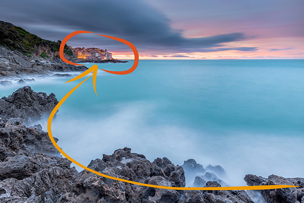
    One common problem of wide angle lenses is the perspective distortion when the camera is not aligned perpendicularly to the subject. In other words buildings like lighthouses appear to be falling if you (correctly) place one according to the rule of thirds. Well, the bad news is that there is no an universal solution. The best one is obviously to buy a lens with excellent optical quality, but they are very expensive and in any case the perfect lens does not exist. So we need to correct the distortion in post-production. There are a thousand ways to do that, but most of them require an image crop. For that reason, if you have a straight object in your frame, don’t put it exactly on a vertical line of the Rule of Thirds, but slightly closer to the image center. In that way, after correcting the distortion, your lighthouse will be nearer the vertical line of the third.

    5 post

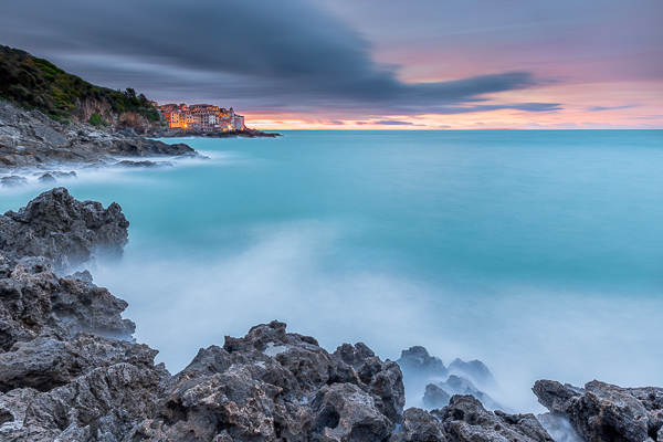
    If I had put the small village too close to the frame edge, it would be affected by perspective distortion and to correct it in post production probably I would have lost the nice leading line with a crop.

    5 ante

    Add dimension and scale

    When I started taking seascape pictures, I was a purist: no humans or human artifacts were allowed inside my frame. If humans are still not allowed to join, sometimes I think it’s a good idea to put some artifacts in my composition. The main reason is that even if you exactly the dimensions of the rock formations in front of you, viewers of your image may have no idea if they have never visited that place. When you look at a image, your brain tries immediately to define the dimensions comparing the unknown to something known – help it and use something like a lighthouse, bridge, church to give an idea of scale. A reef is even more beautiful if it is perceived as high and massive.

    6 New
    The lighthouse give a dimension to the other rocks in the image (try to cover the lighthouse with your finger.)

    6 ante

    Use negative space

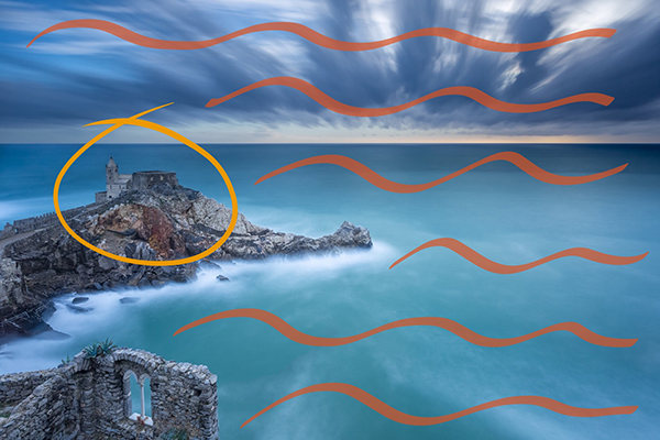
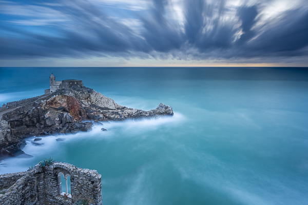
    I’m a big fan of using negative space. But what exactly is that? Easy – it is nothing but the space around, and between, the subject of an image. Yes, basically they are “the” nothing. So, how can that be useful? Negative space is perfect to emphasize the subject. A lonely church on the top of a cliff is even more brave if it seems that it challenges the vastness of the sea.

    7 post

    This old church reminded me a solitary sentinel who scrutinizes the sea.

    7 ante

    Have fun

    Finally, remember that every rule is made to be broken. If the horizon is not perfectly in one third because the sky lacks of clouds, put it above the upper horizontal line of rule of thirds. If you need to put a lighthouse near the margin of the frame to use leading lines, just do it.

    The real goal of a picture is not to follow the rules, but to arouse emotions in the viewer. Keep this in mind and there is no composition that can overcome you.

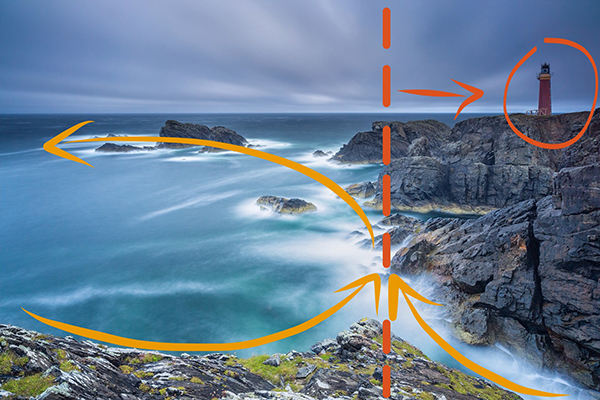
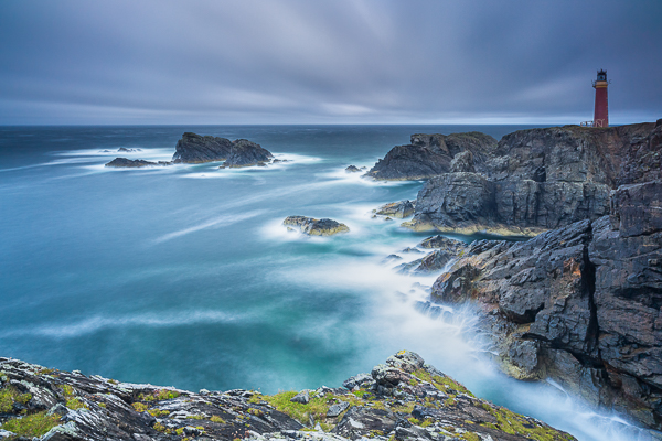
    8 post

    The lighthouse is on the right vertical line of rule of thirds. Unfortunately I didn’t have a wider lens with me and I had to put it there in order to use leading lines in the foreground and not to cut the nice wave trails in the upper left side of the image.

    8 ante

    googletag.cmd.push(function() {
    tablet_slots.push( googletag.defineSlot( “/1005424/_dPSv4_tab-all-article-bottom_(300×250)”, [300, 250], “pb-ad-78623” ).addService( googletag.pubads() ) ); } );

    googletag.cmd.push(function() {
    mobile_slots.push( googletag.defineSlot( “/1005424/_dPSv4_mob-all-article-bottom_(300×250)”, [300, 250], “pb-ad-78158” ).addService( googletag.pubads() ) ); } );

    The post Tips for Better Composition of Seascape Photographs by Francesco Gola appeared first on Digital Photography School.


    Digital Photography School

  • 8 Quotes From Master Photographer Ansel Adams and How You to Apply Them to Your Photography

    The technology of photography has been evolving at a very rapid rate. Most of our cameras are almost obsolete by the time we purchase them! But one thing about photography hasn’t changed over the years and that is the art of photography. We can learn so much about the that from the masters of yester-years. Ansel Adams was one of these great masters, best known for his iconic black and white images of the American West. Let’s review some quotes from Mr. Adams and consider how we might apply them to modern day photography.

    This image was part of a digital display that ran alongside the temporary exhibition, Ansel Adams: Photography from the Mountains to the Sea on at the National Maritime Museum, Greenwich from 9 November 2012 - 28 April 2013.

    This image by Bruce Wunderlich was part of a digital display that ran alongside the temporary exhibition, Ansel Adams: Photography from the Mountains to the Sea on at the National Maritime Museum, Greenwich from 9 November 2012 – 28 April 2013.

    “Expressions without doctrines, my photographs are presented as ends in themselves, images of the endless moments in the world.”

    You surely have heard the expression, “A picture paints a thousand words.” Ansel thought of his images as expressions of how he felt in the moment he released the shutter. These expressions require no words of explanation. He was also quoted as saying “A true photograph need not be explained, nor can it be contained in words.” Likewise, we should look for moments in the world around us worthy of a captured image, which affects us emotionally before we click the shutter.

    “Twelve significant photographs in any one year is a good crop.”

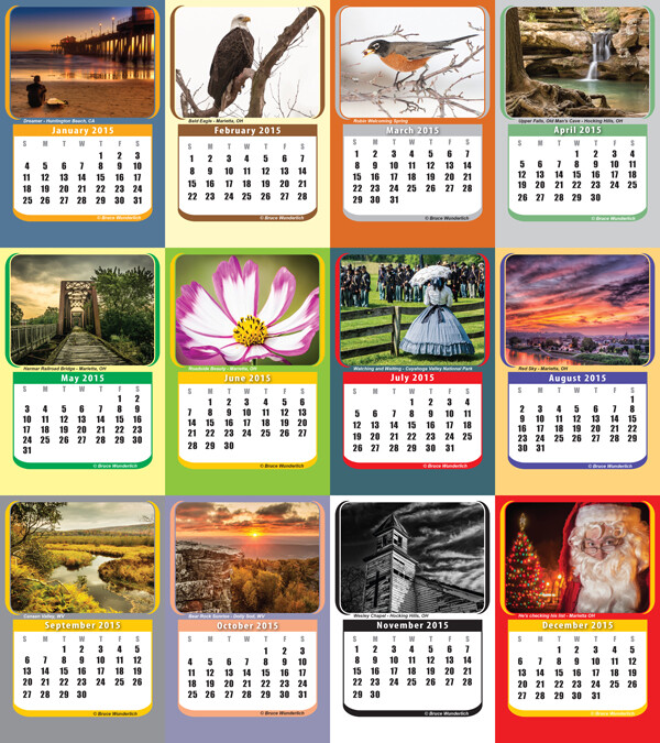
    It is always a good idea to keep your portfolio up-to-date. A yearly inventory of your work, examining what you captured well and what you need to improve upon will help keep you focused on your artistic expressions. Photographers with digital technology have the tools to take many more images than Adams could with film and plates, so here’s a suggestion: Perhaps the number 12 suggests aiming for one memorable image each month. Take these most significant images and create a calendar featuring your art that you can give to friends. Regardless, keep your favorite images, your “crop”, organized and ready to share.

    My 2014  "crop" in my 2015 desk calendar

    2014 “crop” presented in a 2015 desk calendar.

    “Sometimes I do get to places just when God’s ready to have somebody click the shutter.”

    One favorite story about Ansel Adams centers around the circumstances of one of his most iconic images, “Moon rise over Hernandez”. As he was driving from what was described as a very unsuccessful day of shooting in New Mexico, suddenly Ansel pulled the car off the road when he saw the now famous subject. The light was changing so quickly that he was only able to get one exposure before the light was gone. Never think a day of shooting is a waste, that iconic image might just be around the next bend.

    “There are no rules for good photographs, there are only good photographs.”

    In a statement for a 1932 exhibit in San Francisco, Ansel listed his two “rules” of photography:

    1. The completed image must directly reflect how the subject appeared in the camera.
    2. He had to see the finished photograph in his mind before the shutter was released.

    One of the most important things Ansel Adams left with us was this principle of pre-visualization. This mental vision of what he was expecting to communicate with the images he created is what makes them so prominent even today, some three decades after his death. We see too many photographers out in today’s world just aiming and shooting, not taking the time to think about the subjects before them and how the resulting image will speak to (or not) the viewers of the image.

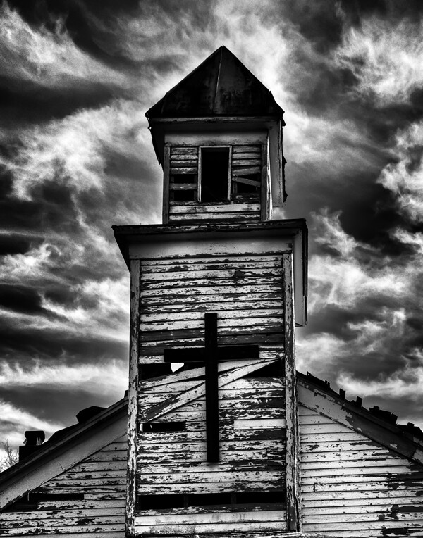
    Using Ansel's previsionalization method, When approaching this image I immediately visualizied this image as a black and white by adding a polarzing filter I was able to make the blue sky more saturated which can in handing later during processing to create dark and contrasting sky. I also intentionally under-exposed the image to ensure that the white boards of the abandon church are not to bright, to help convey the abandon feeling of theimage.

    Using Ansel’s pre-visualization method when approaching this shot, I immediately visualized this image as a black and white. By adding a polarizing filter, I was able to make the blue sky more saturated which helped later during processing to create a dark and contrasting sky. I also intentionally underexposed the image to ensure that the white boards of the run-down church would not appear too bright, to help convey the abandoned feeling.

     “Ask yourself, “Why am I seeing and feeling this? How am I growing? What am I learning?” Remember: Every coincidence is potentially meaningful. How high your awareness level is determines how much meaning you get from your world. Photography can teach you to improve your awareness level.”

    What a powerful quote! “Every coincidence is potentially meaningful”. To develop the creative eye that it takes to create great photos we need to be on the constant lookout for unexpected opportunities. So, must we carry our camera at all times? How many times have you come across a great scene only to find you do not have your camera ready and available? It happens to all of us, but don’t get caught up in the fact that you don’t have your camera with you. Instead, use this opportunity to think about the shot and visualize how you would have shot it, how you would compose it, and what camera settings and filters you might have used to capture the scene. Even though you may have missed the shot, you can use this as a learning experience to be prepared in the future.

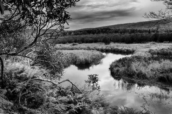
    By studying the images of great photographers of the past and present we can learn how to approach our own images. This image, captured in the Canaan Valley Resort State Park in West Virginia, reminded me of Ansel's image The Tetons and Snake River.

    By studying the images of great photographers of the past and present we can learn how to approach our own images. This image, captured in the Canaan Valley Resort State Park in West Virginia, reminded me of Ansel’s image The Tetons and Snake River.

     “The machine-gun approach to photography – by which many negatives are made with the hope that one will be good – is fatal to serious results.”

    With the new digital age of photography it is so easy to take the “spray and pray” approach to photography, but we must learn to slow our approach and think about every piece of the image that we are capturing. One way to take a more deliberate approach with a landscape shoot is to place your camera on a tripod, which will allow you to concentrate more on the composition of your image. There are plenty of situations where the machine-gun approach to photography can be helpful, for example, action subjects such as sports or wildlife, but in other areas this approach can be fatal.

    “A photograph is never finished until I burn the corners.”

    Ansel considered it important to keep the viewer’s eye in the frame of his images, so he would burn (darken) any light areas near the edges of the image. These adjustments were quite time-consuming and tedious to produce in the darkroom of Adams’ era. Today, however, we can easily accomplish these steps in Photoshop or Lightroom. Be careful not to overdo it, as these changes should be made in a way that is completely imperceptible to the viewer of the image.

    “I am sure the next step will be the electronic image, and I hope I shall live to see it. I trust that the creative eye will continue to function, whatever technological innovations may develop.”

    Many fans of Adams’ photography ask, “Would Ansel Adams have shot digital?” This quote indicates he would have! Ansel was never overly concerned about the process of taking photos as much as he was about the creative experience and how a photograph made him feel. Ansel Adams would not only be shooting digital, but also he would be a Photoshop guru, probably working closely with Adobe to develop and improve the photographer’s experience.

    Where do we go from here?

    So in conclusion, has photography changed over the years? Yes, the process has changed, but the art of photography remains the same. By studying the guiding principles of great photographers of previous generations, like Ansel Adams, we can sharpen our skills to become the best photographers of our day. Please leave a comment below: What is your favorite photographer’s quote and how has it inspired you?

    googletag.cmd.push(function() {
    tablet_slots.push( googletag.defineSlot( “/1005424/_dPSv4_tab-all-article-bottom_(300×250)”, [300, 250], “pb-ad-78623” ).addService( googletag.pubads() ) ); } );

    googletag.cmd.push(function() {
    mobile_slots.push( googletag.defineSlot( “/1005424/_dPSv4_mob-all-article-bottom_(300×250)”, [300, 250], “pb-ad-78158” ).addService( googletag.pubads() ) ); } );

    The post 8 Quotes From Master Photographer Ansel Adams and How You to Apply Them to Your Photography by Bruce Wunderlich appeared first on Digital Photography School.


    Digital Photography School

  • How to Capture Fantastic Photos in Low Light

    It is a simple, unavoidable fact that light is necessary for photography. Life, however, doesn’t restrict itself to times when the sun is bright and plentiful. Unless you only shoot in a controlled environment, chances are you’re going to want to takes photos when the lighting is less than ideal. You are not powerless, though. It is possible to make Continue Reading

    The post How to Capture Fantastic Photos in Low Light appeared first on Photodoto.


    Photodoto

  • How to Crop Like a Boss in Photoshop

    I have a habit of shooting for the crop (see my previous article ‘No Telephoto lens No Problem – Shoot for the crop‘) which often means that my final vision is a 4:2 proportion, or even a 4:1 panorama style image, instead of the most common 3:2 that is the default for most digital cameras.

    With Photoshop’s latest crop tool this has never been easier, so let me show you how to crop like a boss!

    How to crop like a boss in Photoshop

    Step 1 – Load the Crop Tool in Photoshop

    With your image open in Photoshop, press the ‘C’ button on your keyboard. This loads the crop tool; you’ll know this by the appearance of the marquee (square) which has been drawn around your image. You can now begin to draw the crop shape you want simply by dragging the corners of the crop marquee, but I’m going to show you a cleaner way to do this.

    How to Crop in Photoshop CC

    Step 2 – Choose an Aspect Ratio

    If you want to keep your existing aspect ratio but simply want a smaller crop you can hold down the shift key while dragging one of the corners of the marquee. But, what if you want to get creative and want a different aspect ratio?

    We do this by clicking in the very first drop down menu in the crop tool properties (usually displayed at the top under your main Photoshop menu).

    Photoshops Crop Tool

    For now I’ll specify an aspect ratio of 2:1 and I do this by entering the number 2 in the ‘width’ box and the number 1 in the ‘height’ box.

    2:1 Ration in Photoshop crop tool

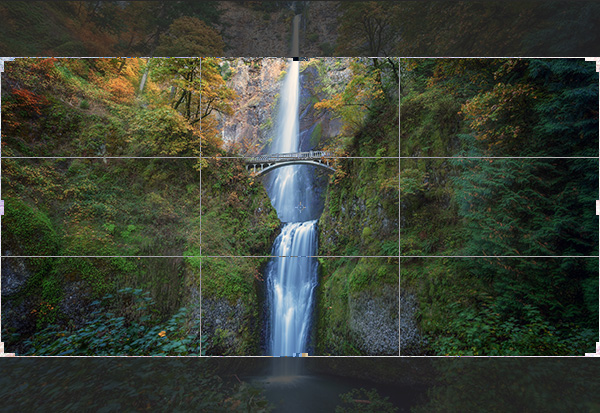
    I’ve also specified the ‘Rule of Thirds’ grid (image below) because it closely matches the grid that I use on my camera when shooting. There are several to choose from, pick a grid that works for you.

    Rule of Thirds grid in Photoshops crop tool

    What About Custom Sizes?

    You may decide that you’d rather not conform to an industry norm so you’re free to crop to a custom size and ratio. Either leave the aspect ratio boxes empty or press Clear if you’ve already played around. You can then drag the marquee tool to whatever size or shape you like. If however, you intend to send your image to a print lab, you’ll discover that they charge more for custom sizes so it’s often a good idea to choose the closest aspect ratio to your artistic vision. I just saved you $ $ $ $ , you’re welcome.

    Step 3 – Place the Crop

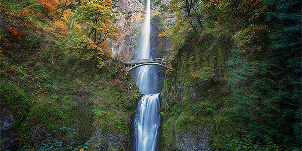
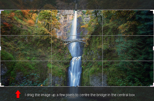
    The really cool thing about Photoshop crop tool is that now you’ve specified your aspect ratio you can then move the image around within those crop constraints. All I do is click on the image and drag to position. In this case all I’m doing is dragging the image slightly higher so that the bridge is perfectly centred in the middle box of the grid.

    Drag Photoshops crop tool to place your crop

    Step 4 – Now Experiment

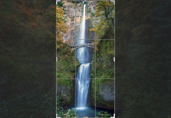
    Before you decide to apply the crop, it’s worth playing around a little to see if you can spot a better composition. For fun, I’m going to reverse the aspect ratio by entering 1 in the width box and 2 in the height box. This gave me a crop like this:

    Vertical Crop in Photoshop

    Step 5 – Apply the Crop

    When you’re happy with the crop you’ve found, it’s time to apply it. You need to decide on whether or not you’d like to commit to this crop or if you’d like to keep the ‘cropped’ pixels. There’s a checkbox entitled ‘Delete Cropped Pixel’ which is ticked by default. Simply apply the crop by hitting ‘enter’ on your keyboard.

    Delete cropped pixels

    If you uncheck this box it doesn’t really crop your image, it just displays the cropped version while you view it in Photoshop. This is called ‘non-destructive’ editing.

    With this option, you can save the image after you’ve cropped and although you’ll be looking at the cropped version in Photoshop, the original is still intact. If you want to recall the original (uncropped) image, just open the image file, load the crop tool and then enter the original aspect ratio to revert back to its original crop state (3:2 in most cases).

    Confused? Yeah, it sounds kind of silly if you’re not used to Photoshop logic. I personally prefer to have the ‘Delete Cropped Pixel’ checked and then I simply save the cropped image as a separate TIFF file, leaving the original image unsaved and untouched. That’s just good old fashioned file keeping.

    To Cancel the Crop

    If you get nervous and want out of the crop tool, just hit your ESC key repeatedly until the crop tool vanishes. You can also press the M key to go back to the ‘Rectangular Marquee Tool’ which cancels the crop tool quicker.

    How to Use Aspect Ratios

    There’s a brilliant article by Elliot Hook called Aspect Ratios in Landscape Photography where he explains all of the standard aspect ratios that most print labs can handle. Try some of the ones that he mentions to see if they work for your image crops.

    Try it with Your Images

    I’d love to see some great examples of images that you have cropped using this technique. I often say that you can learn a lot about composition simply from carefully cropping existing images to create new compositions. It’s fun and easy to get busy with the crop tool and now you’ve learned how to crop like a boss!

    googletag.cmd.push(function() {
    tablet_slots.push( googletag.defineSlot( “/1005424/_dPSv4_tab-all-article-bottom_(300×250)”, [300, 250], “pb-ad-78623” ).addService( googletag.pubads() ) ); } );

    googletag.cmd.push(function() {
    mobile_slots.push( googletag.defineSlot( “/1005424/_dPSv4_mob-all-article-bottom_(300×250)”, [300, 250], “pb-ad-78158” ).addService( googletag.pubads() ) ); } );

    The post How to Crop Like a Boss in Photoshop by Gavin Hardcastle appeared first on Digital Photography School.


    Digital Photography School