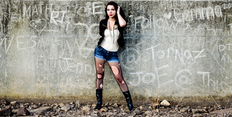
Category: Photography

  • Options and Choices for Photographers To Help You Avoid Injury

    Have you been noticing little aches and pains lately, especially around your arms and back? If you do a decent amount of photography, your camera may be the culprit. While photography is largely seen as a hobby or art form, make no mistake about the fact that lugging gear around can be serious physical activity, especially as you accumulate more gear over time.

    Consider this: a Canon 5D Mark III body only weighs 1.9 lbs (860 grams), and a Canon 70-200 f/2.8 telephoto lens weighs 3.28 lbs (1.49 kg). Combine the two, and you’ve got over 5 lbs of gear to tote, not to mention the added weight of extra lenses, tripods, lighting gear, etc. As a result, it’s not uncommon for longtime photographers to develop chronic pain in their backs, wrists, shoulders, and arms due to the stress of carrying so much gear. The bottom line is that being a photographer can slowly, but surely, lead to chronic injuries over time if you don’t take proper precautions. Here are a few tips to help keep your body in top shape while toting camera gear around, and avoid injury.
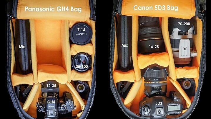
    Dave Dugdale

    By Dave Dugdale

    Choose the right gear

    If you’re just starting out in photography or considering replacing your current camera gear, keep in mind that there are many smaller, lighter camera systems that may be easier on your body. Mirrorless cameras from camera manufacturers such as Sony and FujiFilm (as well as Olympus and Panasonic) are becoming renowned by both amateurs and professionals for their superior image quality and significantly smaller camera bodies and lenses. Depending on your photography needs and budget, you may want to invest in smaller, more ergonomic gear, that won’t weigh your body down.
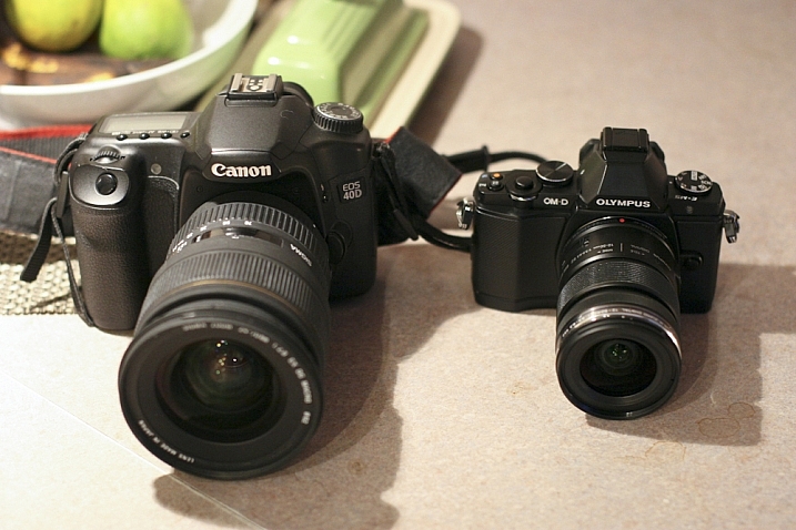
    Peter Anderson

    By Peter Anderson

    Select the best bag and accessories

    Camera bags come in all flavors today, ranging from messenger bags, backpacks, and even stylish purses. While fashion can certainly impact your camera bag choice, be sure to also consider how comfortable that bag will be in the long run. Medical professionals often recommend selecting bags with symmetrical designs that equally distribute the weight across your body. This usually means opting for a backpack, or rolling bag with wheels, to move large amounts of equipment from one photo shoot to the next. If you choose a bag that will be carried on your shoulders or some part of your body, be sure not to overload it with too much gear. As a rule of thumb, a truly ergonomic bag you carry on your body should not weigh more than 10 percent of your body weight, and you should not carry a heavy bag for longer than 20 minutes at a time.
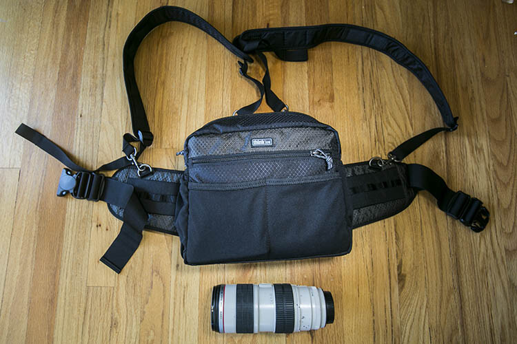
    Think Tank Changeup Bag photographer ergonomics

    While actively shooting, consider investing in camera accessories that will help alleviate camera weight in the long run. Some options include monopods for sports or wildlife photographers, ergonomic camera or wrist straps, and holster or belt pack systems (like the ThinkTank one shown above). In summary, choose one or several accessories that will help distribute your gear’s weight between your hips and shoulders so that one part of your body doesn’t bear the bulk of the burden.

    Practice good ergonomics while shooting

    1. Correct your posture

    One of the leading causes of injury among photographers is poor posture. If you plan to spend long hours at a photo shoot, keep the following posture tips in mind:

    • First, always make sure to protect your lower back by keeping your pelvis in a neutral position and your core muscles (abs, side, and back) taut.
    • Secondly, make sure your knees are slightly bent (not locked) and your feet are spread at least shoulder-width apart, forming a wide base of support, not unlike the legs of a tripod.
    • Finally, always be mindful of your shoulders, making sure they are dropped down and pulled back, and keep your chin tucked in. These two posture tips will help avoid common neck and back pain as well as headaches that commonly arise among photographers.
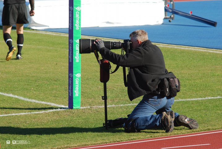
    DeusXFlorida (7,110,780 Views) - Thanks Guys!

    By DeusXFlorida

    2. Take frequent stretching breaks

    When you have a moment to rest during a shoot, don’t just sit down. Remove your gear, and stretch your muscles and joints.Rotate your head in a clockwise and counterclockwise motion to stretch out your neck. Do the same movement with your hips to loosen your lower back. Reach high into the sky and rotate your arms like a windmill to reach your shoulders and upper back. Finally, do some squats and lunges to keep your quadriceps and legs supple. Above all, remember to not just focus on your arms and wrists. If you’re a photographer who likes to shoot from every possible angle, this means you’re likely squatting, kneeling, bending, and rotating nearly every part of your body to get those shots. As a result, pay equal attention to stretching out all the major muscle groups in your whole body.
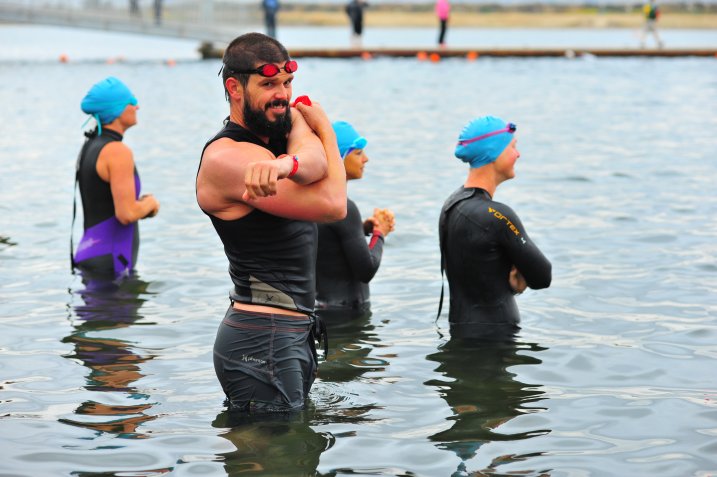
    Chris Hunkeler

    By Chris Hunkeler (stretch often)

    Don’t forget about post-processing ergonomics

    Good posture and ergonomics shouldn’t be forgotten once you’ve put the camera down. Considering all of the time you spend in front of your computer, offloading memory cards, sorting and editing photos; you’ll want to make sure your work station is also suited for maximizing your posture. Suggested accessories include a standup desk, computer monitor risers, ergonomic mouse and keyboard, and foot stools to elevate and correct your posture while in a seated position.

    Take care of your body as well as you take care of your gear. You can replace a broken camera, but not a broken you. If you have any other tips for avoiding injuries please share in the comments below.

    googletag.cmd.push(function() {
    tablet_slots.push( googletag.defineSlot( “/1005424/_dPSv4_tab-all-article-bottom_(300×250)”, [300, 250], “pb-ad-78623” ).addService( googletag.pubads() ) ); } );

    googletag.cmd.push(function() {
    mobile_slots.push( googletag.defineSlot( “/1005424/_dPSv4_mob-all-article-bottom_(300×250)”, [300, 250], “pb-ad-78158” ).addService( googletag.pubads() ) ); } );

    The post Options and Choices for Photographers To Help You Avoid Injury by Suzi Pratt appeared first on Digital Photography School.


    Digital Photography School

  • All 7 Photography Deals are Back – But only until Friday!

    Photography resources

    It’s been another huge dPS mid year sale and we hope you’ve enjoyed it as much as we have sharing it with you.

    Over 7 days, 7 amazing photography deals were released, 24 hours at a time.

    But did you miss a deal you’d love to have?

    Well, we’d like to give you one last chance before they’re gone for good (it’s about helping you with your photography, after all).

    So until Friday, all 7 deals are back!

    • Deal #1: Living & Loving Landscapes ebooks – $ 10 each
    • Deal #2: 60% OFF Photography Concentrate’s Incredibly Important Composition Skills
    • Deal #3: 100 Hacking Photography Lightroom presets for $ 10!
    • Deal #4: Our Photo Magic ebook – just $ 7
    • Deal #5: 70% OFF Photoshop Artistry: Fine Art Grunge Composition course
    • Deal #6: Jay & Varina Patel’s Focus Collection – 50% OFF
    • Deal #7: Our Portraits ebooks $ 7… or 5 for $ 21!

    This is the last time we’ll email you about this sale and we simply can’t extend the deals any further than Friday (they’re just too good).

    So act quickly or you’ll miss out!

    googletag.cmd.push(function() {
    tablet_slots.push( googletag.defineSlot( “/1005424/_dPSv4_tab-all-article-bottom_(300×250)”, [300, 250], “pb-ad-78623” ).addService( googletag.pubads() ) ); } );

    googletag.cmd.push(function() {
    mobile_slots.push( googletag.defineSlot( “/1005424/_dPSv4_mob-all-article-bottom_(300×250)”, [300, 250], “pb-ad-78158” ).addService( googletag.pubads() ) ); } );

    The post All 7 Photography Deals are Back – But only until Friday! by Darren Rowse appeared first on Digital Photography School.

    Digital Photography School

  • 4 Tips to Help you Decide Between Black and White or Color for your Image

    Why do black and white photographs speak to us? In nature, colors are meant to attract, and cause things to catch our attention. Still, even without color, black and white images are a mainstay of our craft, and are powerful representations of the artistic spirit.

    Half Color

    There are many differing opinions when it comes to black and white photography. Some photographers love it, and shoot black and white exclusively, while other photographers absolutely shun the notion and shoot only in color. Then you have the majority of our lot who fall somewhere in between the love and hate poles. Luckily, the digital imaging age allows photographers to decide after the fact whether our images make us happier in full color, or in black and white. However, this ease of conversion can become somewhat of a problem because it is in fact so simple to switch from color to black and white, that it can cause conflicting feelings about which route to take. While there is really no absolute magic formula to determine the best choice for your particular image, there are some guidelines that you can follow to make your decision a little easier.

    Here are four tips to help you decide if an image will be more appealing in black and white than in color.

    Black and white or color?

    #1 Does color have a large impact on the image?

    This may seem like an easy judgment to make, but it is not always so simple. Color can be a fickle thing, and can either add to, or unintentionally detract interest from a photograph. Ask yourself, “does this image rely exclusively on color or are there other interesting aspects that can be emphasized?” Just how nice would it be to look at as a colorless rainbow? This not to say that all colorful objects and scenes won’t do well as black and white, but as a general rule most highly or diversely colored subjects should remain just that – colorful.

    Silhouette
    This image really had nothing to say in the way of color, so I made use of the heavy backlighting to create a strong contrast with the subject.

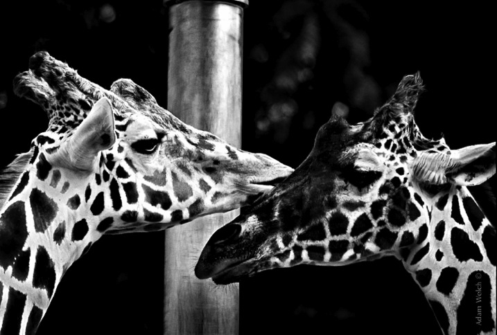
    Two Giraffes
    The original image didn’t have a lot going on as far as color, so I choose to convert it to black and white to really make the patterns pop.

    The opposite of this usually proves to be true also. When you have an inherently bland scene or subdued colors, the image will usually do well when converted to black and white and this leads us to tip #2.

    #2 Are there interesting light or contrasts?

    This is where new photographers tend to encounter a little bit of difficulty because seeing good light or contrasts usually requires quite a bit of pre-visualization. Don’t worry! Developing an eye takes, well, some developing. The more you force yourself to look past what is readily apparent, the more you will learn to almost see in black and white.

    When you remove color from the photographic equation, you are left with only differences in tone; lights and darks. These differences are what truly make good black and white images, and the differences in light and shadow bring contrast to the photograph. So, when you see that a given scene or subject presents the opportunity to exploit stark contrasts and unique lighting or shadow, it might be a great opportunity to try black and white. Take a look at this image of the leaf of a house plant.

    Plant Leaf

    I used a single flash behind the leaf to really bring out the contrasts within. Ordinarily these details might have gone unnoticed, and the black and white treatment really compliments the lighting.

    The great Ansel Adam’s said that he; “could convey a greater sense of color with well executed black and white images using only light, shadow, and even subtleties in texture to express the qualities of the photo”. It’s that last variable, texture, that brings us to tip #3.

    #3 Are there interesting textures?

    When we think of texture, we can easily describe it in terms of how things feel physically, when we perceive them through our sense of touch. Texture in photography, however, can be a little more challenging to put into words. Texture in a photograph has to be perceived with our eyes and then we determine if it’s smooth, rough, or coarse. Transforming the tactile tangible into a visually tangible image takes practice and a trained eye, and this is where working in black and white can be the best choice. Examples of textures that work well for black and white photos are wood, metals and stone, even plants and human skin. Directional lighting (light from largely one source coming from the side) compliments, and helps emphasize textures.

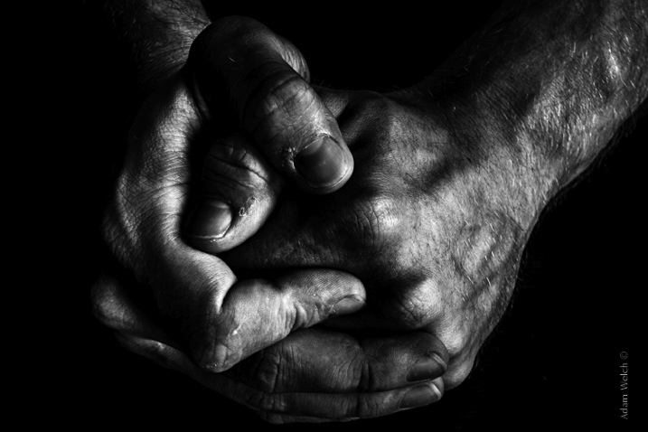
    This image was made with natural lighting coming in directly from one side. This really brings out the texture, imperfections, and grittiness of the photograph.

    Hands

    This last tip goes beyond the physical attributes of an image and delves into the feelings we want to convey through a photograph. This is where black and white photography can really shine.

    #4 What is the mood you want to create?

    Have you ever looked a photograph, and been immediately struck by how the photograph felt? This is often referred to as the mood of a photo. It could be a bleak and rainy street scene, or an image of a warm and welcoming sunset. In any case, using black and white is a good way to convey a sense of mood in your photography. Admittedly, black and white usually imparts dark, bleak, somber, or an etherial overtone to a photograph, but that does not mean that it doesn’t work well for more upbeat images. Convert some of your landscapes to black and white to see how the mood can change. Experiment with black and white portraits which can portray your subject with a more stoic and brooding persona.

    This photo of a hot day on Boston Common had lots of differences in lighting, along with some great coloring especially in the sky. Still, I chose black and white because it simply felt better to me, and matched what I saw in my mind more closely.

    Boston Common

    Keep in mind that you may run into some different terms if you decide to work more with black and white photography. These terms are usually interchanged, but in reality they are not all the same. It will help you to understand the differences in each so you can know what to expect.

    Monochrome

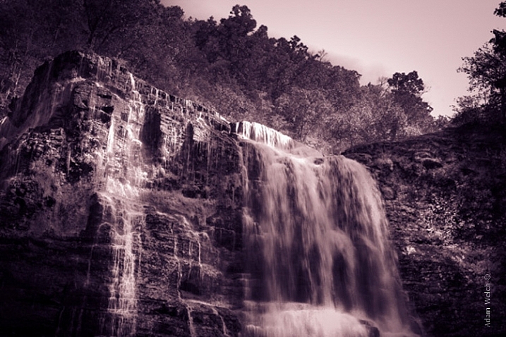
    Monochrome simply means varying shades of only one color are used to make an image. This is often thought of as black and white (which are technically monochromatic) but in reality any color can be used. Sepia toned photographs are a good example of images which are monochrome.

    This is an example of a monochromatic photograph that is not black and white.

    Sepia Waterfall (2)


    Grayscale

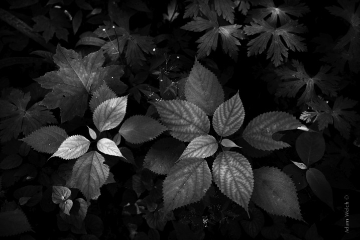
    The term grayscale is another one that gets thrown around to label black and white images. Though not completely incorrect, grayscale images use only varying shades of gray (256 to be exact), and no other color. Grayscale can be a very bland when no other edits are used because it tends to leave the entire photo as middle gray. Notice how bland and uninteresting the below image looks when it’s converted to grayscale.

    Grayscale

    True Black and White

    As I have said, black and white images are indeed monochromatic but not all monochrome images are black and white. True black and white photos use only black and white to produce the image although the majority still use a mix of gray tones.

    This is the same image as above after it has been further processed to be closer to a true black and white photo. The differences in tones become becomes more apparent, and the photo becomes much more pleasing.

    True BW

    Black and white photography has been a staple genre since literally the inception of photography, and has evolved into a high art-form. Of course there are some people who simply do not like black and white images and prefer everything in color. Still, black and white photography is something that should not be discounted, and certainly not underestimated in terms of artistic expression. Today’s processing software makes converting color images to black and white nearly effortless, so use these tips and give it a try!

    googletag.cmd.push(function() {
    tablet_slots.push( googletag.defineSlot( “/1005424/_dPSv4_tab-all-article-bottom_(300×250)”, [300, 250], “pb-ad-78623” ).addService( googletag.pubads() ) ); } );

    googletag.cmd.push(function() {
    mobile_slots.push( googletag.defineSlot( “/1005424/_dPSv4_mob-all-article-bottom_(300×250)”, [300, 250], “pb-ad-78158” ).addService( googletag.pubads() ) ); } );

    The post 4 Tips to Help you Decide Between Black and White or Color for your Image by Adam Welch appeared first on Digital Photography School.


    Digital Photography School

  • A Brief Guide to Lightroom Mobile and Lightroom Web

    Lightroom mobile and Lightroom web

    As you are aware, there are two ways to buy Lightroom.

    The first is to buy a perpetual license, which means that you pay a set one-off fee to use the software for as long as you want. The second way is to subscribe to Adobe’s Creative Cloud Photography plan. With this, you pay a monthly fee that allows you to use Lightroom CC, Photoshop CC, Lightroom mobile and Lightroom web for as long as you keep up the subscription.

    The subscription plan is somewhat controversial, and I know from comments on previous articles that some of you don’t like it. However, as it gives you access to Lightroom mobile and Lightroom web (as well as Photoshop CC) it’s worthwhile exploring the benefits of this licensing model.

    Photoshop needs no introduction, but Lightroom mobile and Lightroom web are less well known. So let’s take a look at what they do, and how you can use them in your workflow.

    Note: Lightroom mobile is now available for most Android and iOS smart phones and tablets. Up to date operating systems may be required.

    Lightroom mobile helps you synchronize photos on your mobile device

    In Lightroom CC you can synchronize any Collection with Lightroom mobile.

    Lightroom mobile and Lightroom web

    The lightning bolt icons on the left indicate these Collections are synchronized with Lightroom mobile.

    Synchronized Collections appear on your mobile device (internet connection required) and you can download them for offline viewing.

    Lightroom mobile and Lightroom web

    Synchronized Collections created in Lightroom CC are immediately available for viewing in Lightroom mobile.

    One practical application of this is that you can create a Collection containing your best photos to show people interested in viewing your portfolio. You can add or remove photos in Lightroom CC, and the updates are automatically pushed to Lightroom mobile. Very little work is required on your part, as most of the process is automated.

    Lightroom mobile and Lightroom web

    Lightroom mobile doesn’t require much storage space on your mobile device

    Unless you have a device with a lot of storage space you probably don’t have room to store hundreds of full-size JPEG or Raw files in addition to what’s already on there.

    Lightroom mobile works around that by using Smart Previews; a compressed preview of your photo that measures 2540 pixels along the longest edge. Crucially, Smart Previews are only a fraction of the size of a JPEG or Raw file (around 2%).

    When you synchronize a Collection with Lightroom mobile, Lightroom CC generates Smart Previews of the photos it contains (if they don’t exist already) and uploads them to Adobe Cloud.

    In turn, Lightroom mobile accesses Adobe Cloud and downloads the Smart Previews when they are required. They are cached and can be deleted when you need to free up memory. This system ensures you can use Lightroom mobile on devices without much spare storage space.

    Lightroom mobile and Lightroom web

    This Collection contains 37 photos yet only takes up 54.6Mb of my device’s storage space.

    You can also download Smart Previews to your device and store them to enable off-line viewing and editing. This requires more storage space (although not a lot), but doing so both speeds up Lightroom mobile, and lets you view and edit photos without an internet connection. If you have a device with 64GB or 128GB storage, you have space for tens of thousands of Smart Previews.

    Note: Lightroom mobile can be set to use a wi-fi connection only, so it doesn’t consume mobile bandwidth.

    Lightroom mobile lets you Flag and rate images

    If you use the Lightroom Library module to view images you will be aware that even on fast systems it’s not always as fast as you would like. Viewing images in Lightroom mobile is much faster. There’s virtually no delay in previewing images as long as you have enabled offline editing.

    This means you can view photos and assign Flags or Ratings very quickly, greatly speeding up the amount of time it takes to view images from a shoot, and decide which ones to process.

    Any changes you make to metadata, including Flags and Ratings, are automatically updated in Lightroom CC (internet connection required).

    Lightroom mobile and Lightroom web

    Lightroom mobile lets you process photos

    Yes, you can process your photos in Lightroom mobile as well. All edits are synchronized with Lightroom CC. However, you don’t have the full functionality of Lightroom’s Develop module. But you can carry out the following:

    • All the adjustments available in the Basic panel
    • Cropping images
    • Apply one of 42 built-in presets
    • Add a vignette
    • Adjust Tone Curves
    • Use the Color/B&W adjustment tool

    Note: Most mobile devices are not colour calibrated, so critical processing work should be carried out on a computer with a calibrated monitor.

    Lightroom mobile and Lightroom web

    Lightroom mobile synchronizes photos taken with your mobile device, with Lightroom CC

    You can create a Lightroom mobile Collection that automatically populates with photos taken with, or added to your mobile device. Lightroom mobile uploads them to Adobe Cloud when you go online, and when you open Lightroom CC it downloads them and saves them on your computer. This works with JPEG, PNG and video files but not Raw files.

    Lightroom web lets you make photos available for online viewing

    When you synchronize a Collection with Lightroom mobile you can also make it available for public viewing. Lightroom generates a unique link for you to share with people so they can view the Collection in a web browser. Viewer’s logged in with an Adobe ID can comment on photos and mark favourites.

    Lightroom mobile and Lightroom web

    Lightroom web lets you access your photos from a web browser

    Log in to the Adobe Lightroom website using your Adobe ID to access all your synchronized Collections. You can assign flags and ratings, make comments, mark images as favourites, and view essential metadata such as exposure settings. However, you can’t carry out any processing. You can also download a large JPEG file (generated from the Smart Preview).

    Lightroom mobile and Lightroom web

    Lightroom mobile as a backup

    You may be wondering if you can use Lightroom mobile to edit or view photos taken in the field. The answer is you can, but with restrictions. The major one is that you can’t import Raw files into Lightroom mobile, even if they have been downloaded from your camera to your mobile device.

    But you can import JPEG files. This is the workflow. It’s not as straightforward as it could be, but it works.

    • Shoot Raw+JPEG in-camera
    • Download all the photos to your mobile device
    • Import the JPEG files into Lightroom mobile
    • Assign Flags and Ratings, or process images in Lightroom mobile
    • When you get home, import the Raw files into Lightroom CC without changing the name. Meanwhile the JPEGS are synchronized via the Adobe Cloud
    • Use John Beardsworth’s Syncomatic plug-in to synchronize the changes you made to the JPEG files with their Raw equivalents

    Your turn

    Do you use Lightroom mobile or Lightroom web? What do you use them for? I’d love to know – please tell us in the comments.


    The Mastering Lightroom CollectionMastering Lightroom ebooks

    My Mastering Lightroom ebooks will help you get the most out of Lightroom. They cover every aspect of the software from the Library module through to creating beautiful images in the Develop module. Click the link to learn more or buy.

    googletag.cmd.push(function() {
    tablet_slots.push( googletag.defineSlot( “/1005424/_dPSv4_tab-all-article-bottom_(300×250)”, [300, 250], “pb-ad-78623” ).addService( googletag.pubads() ) ); } );

    googletag.cmd.push(function() {
    mobile_slots.push( googletag.defineSlot( “/1005424/_dPSv4_mob-all-article-bottom_(300×250)”, [300, 250], “pb-ad-78158” ).addService( googletag.pubads() ) ); } );

    The post A Brief Guide to Lightroom Mobile and Lightroom Web by Andrew S. Gibson appeared first on Digital Photography School.

    Digital Photography School

  • The Essence of a Great Portrait

    If you find portrait photography difficult, then you’re not alone. Interacting with another person at the same time as using a complex camera, and combining the two activities to make a pleasing image isn’t easy. There’s a lot to think about, even if you’re already familiar with your camera and have put in some good preparation time.

    DSCF0048

    Aside from the lighting, the background, the composition, the pose and the expression, there is also the question of what even makes a pleasing image. Will the subject like the way they look, which is their best side, is their hair perfect, what’s the best angle to shoot from for their particular shape of face? Your subject might have other things to do, a meeting to go to or kids that need to be picked up from school. Landscapes usually tend to be more patient models.

    A great portrait isn’t all about making somebody look beautiful though. You could photograph the most immaculate, styled, posed model in a wonderful location in beautiful light, but it wouldn’t necessarily make a good portrait if it doesn’t tell the viewer anything. People aren’t perfect, and a portrait should be more about leading towards an element of truth, more about the person being photographed.

    DSCF9654

    As photographers, we are in some ways, freed by our limitations. We can only only capture moments, glimpses. A single expression can never tell the whole story of a person in all their complexity, so we are free from the obligation of trying to do so. But it can hint at who a person is in reality. It can suggest a story, and it’s those subtle hints and suggestions that can make a portrait more intriguing.

    It can help if you know the person, or at least a little about them. It helps not only in thinking about what you might want to show in the photograph, but also in your interaction with them. If you know something about their interests, their views, their hobbies, what’s going on in their lives at the moment, you’re more likely to be able to understand their perspective. You might aim to help them relax, or discuss a passion of theirs that might stir an emotion that animates their features.

    DSCF9903

    Here are three other exercises you can try:

    1. Use your camera screen rather than the viewfinder. Sometimes the camera inevitably gets in the way. Holding a box in front of your face isn’t the best way to interact with someone, so try a different way. Keep the camera ready, glance at the screen for composition, but watch your subject and their expressions and reactions, watch for the moment you want to capture.

    DSCF3931

    2. Distract your subject. Not many people are immediately comfortable being photographed. It’s difficult to ignore a camera being pointed at you, so sometimes a distraction can help. You could try providing another point of focus, suggesting something else to look at or think about. A prop can work well too, especially if it’s in keeping with the portrait. An object of some sort to take attention away from the camera.

    3. Wait. Sometimes we try too hard to make something happen, and instead of going searching we have to let it come to us. Wait for a few moments and see what happens. Something will change,a pose, an expression, and you might be more pleased with the results.

    DSCF4682

    There is no formula for a great portrait, other than patience, practice, determination, and probably a slice of good fortune too. But there are also a whole lot of very good, honest, storytelling, memorable and joyful portraits to be made along the way. Remember that you’re making a portrait of a person, and people have imperfections. Some of the greatest portraits have even looked awkward or uncomfortable; not to attempt to demean or embarrass, but to be real. People that program electronic drum machines include tiny imperfections in the rhythms they create because they sound more natural, more pleasing to the ear, more like real drummers. You might try to make the perfect portrait but it’s likely that it’s exactly the imperfections that might make it great.

    googletag.cmd.push(function() {
    tablet_slots.push( googletag.defineSlot( “/1005424/_dPSv4_tab-all-article-bottom_(300×250)”, [300, 250], “pb-ad-78623” ).addService( googletag.pubads() ) ); } );

    googletag.cmd.push(function() {
    mobile_slots.push( googletag.defineSlot( “/1005424/_dPSv4_mob-all-article-bottom_(300×250)”, [300, 250], “pb-ad-78158” ).addService( googletag.pubads() ) ); } );

    The post The Essence of a Great Portrait by Alastair Arthur appeared first on Digital Photography School.


    Digital Photography School

  • Your Money or Your Photographs! Ransomware and How to Survive an Online Stickup

    ATTENTION! Your PC is blocked due at least one of the reasons specified below. The warning is dire. You’ve been “caught” doing something illegal. Your photos and other data have been locked away from you because it’s “evidence” against you. But don’t worry, if you pay the “fine,” all will be released and you’re off the hook. Don’t pay and, Continue Reading

    The post Your Money or Your Photographs! Ransomware and How to Survive an Online Stickup appeared first on Photodoto.


    Photodoto

  • Examples of Perspective Change for More Dynamic Images

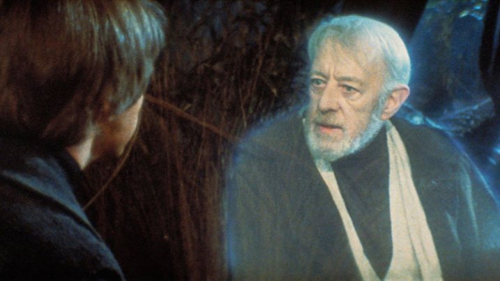
    There’s a line in Return of the Jedi that has always struck me as particularly insightful, especially considering its inclusion in a movie filled with a two-ton slug-shaped bounty hunter and a planet full of fighting teddy bears. In a conversation with his former mentor Obi-Wan Kenobi, newly-minted Jedi Knight Luke Skywalker asks his sensei if Darth Vader is indeed his father. When Obi-Wan confirms the awful truth, Luke asks why his teacher had formerly lied to him, telling him instead that Darth Vader “betrayed and murdered your father.”

    Luke Skywalker and Obi-Wan Kenobi discussing the importance of perspective.

    Luke Skywalker and Obi-Wan Kenobi discussing the importance of perspective.

    “What I told you was true,” Kenobi calmly replies, “from a certain point of view.” Incredulous, Luke balks at this assertion and wonders aloud how his mentor can claim such a relativistic stance on what is, in his mind, clearly a black-and-white issue. With a dose of characteristic zen Kenobi explains to his pupil, “Luke, you’re going to find that many of the truths we cling to depend greatly on our own point of view.”

    Perspective and Photography

    Without wading too deep into philosophical waters I just want to point out that this concept, also known as perspective, is critically important in photography, as well as cinematic space operas. Learning to shoot photos from different perspectives is a way of not only shaking up the status quo, but injecting new life into what might otherwise be dull, boring, or entirely pedestrian pictures. To illustrate how perspective changes can radically alter a picture, here are three examples that will hopefully give you an idea of some things to try if you want to breathe new life into your own photography.

    Perspective in Nature

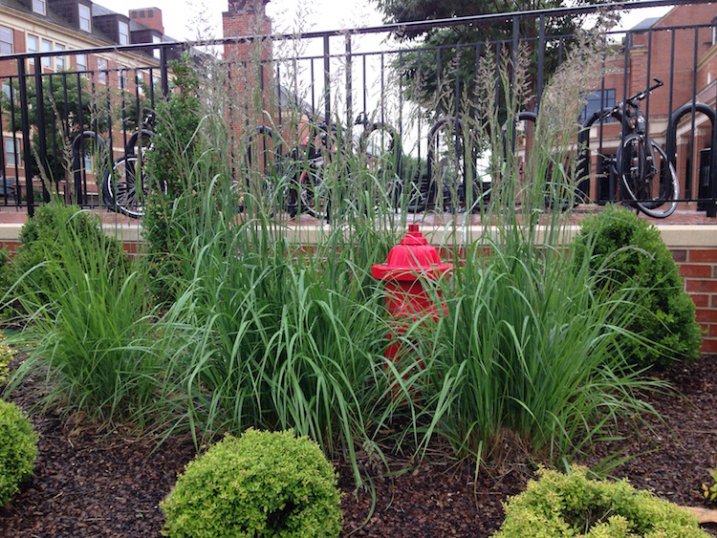
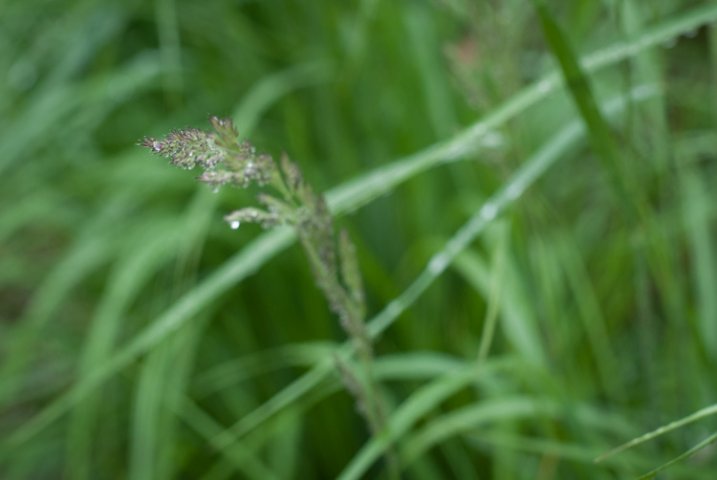
    grass-full

    Not a very photogenic location unless you look at it from a few different perspectives.

    This is a fairly common scene you might find in any city: a fire plug with some tufts of grass sprouting clumps of purple seeds. It may not seem all that special, and indeed it’s the kind of scene I would probably pass by in pursuit of a more interesting picture. Look what happens with just a bit of perspective change, though:

    grass

    Looking down and focusing on one strand of grass yields an entirely different picture.

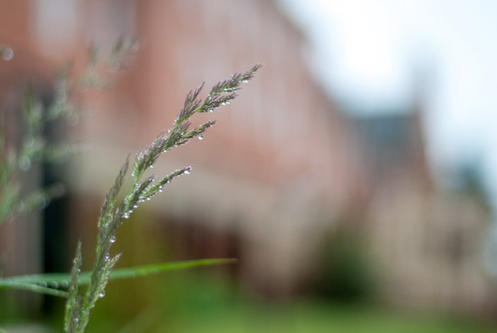
    By getting up close with one of the stalks of grass and focusing on its purple seeds dripping, and slightly bent with fresh rain, I now have an entirely new picture of the same exact scene. This little perspective change results in a photograph that is much more intimate and reveals details that were invisible in the initial photo. Background elements such as the out-of-focus grass still give the impression that this stalk is part of a much larger scene though we also lose a few things too: the bicycles and other buildings are gone, which means the picture is much more isolated than the first one and lacking a larger context. Neither picture is inherently better, but both are quite different, even though they contain the same subject. One final perspective shift results in an entirely different picture yet again.

    grass-building

    Re-framing the same piece of grass makes for a new, and much more interesting image.

    Now the same stalk of grass as the previous version (literally the exact same one and not a different piece of grass on the same plant) is given an entirely new context and the picture here is quite different. It has a much more urban feel with brick buildings instead of green grass in the background, and it feels more majestic and powerful overall. To get this picture I had to get out of my comfort zone a little by kneeling down and contorting my body, but the extra effort resulted in a photo that I like quite a lot. Perspective changes like this can add entirely new dimensions to a picture, and even change its whole meaning, and all it takes is a few seconds of extra work before you click the shutter.

    Perspective in Architecture

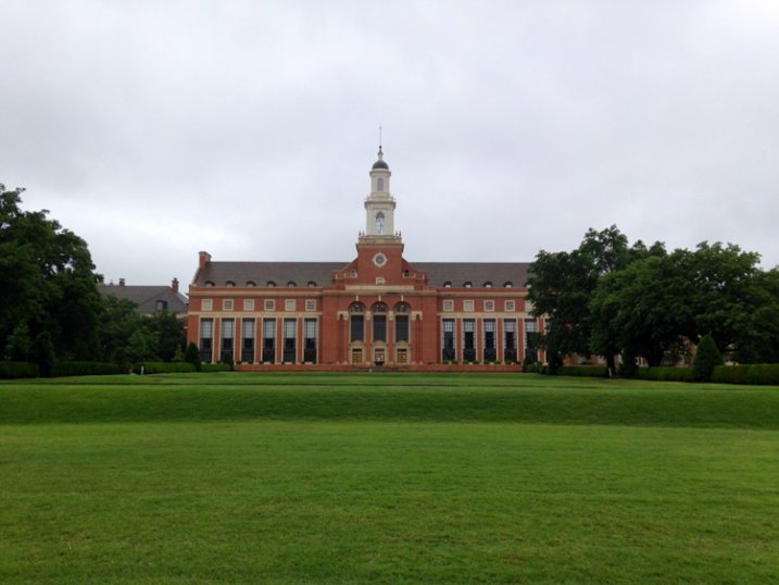
    For another example of how perspective can alter a picture here’s a shot I took of the Edmon Low Library on the campus of Oklahoma State University in the midwest United States:

    library-far

    This perspective shows the Low Library within a larger context, sitting between trees and at the end of a grassy open mall.

    It’s an interesting shot but virtually identical to hundreds if not thousands of other pictures you might find on a simple Google Images search. Watch what happens when I change perspective just a bit by walking closer:

    library-medium

    This perspective isolates the library itself, and imparts a feeling of scale and grandeur on the viewer that was missing in the first shot.

    To get this picture I walked about a hundred yards down the lawn which isolated the building from its environment, and now the picture is much more constrained: it’s about the building itself, not the building in relation to the surrounding campus features. The picture is similar but subtly different, and its overall meaning has been changed by taking a very short walk (and as a bonus, getting a bit of exercise in the process). Watch what happens with one final change in perspective:

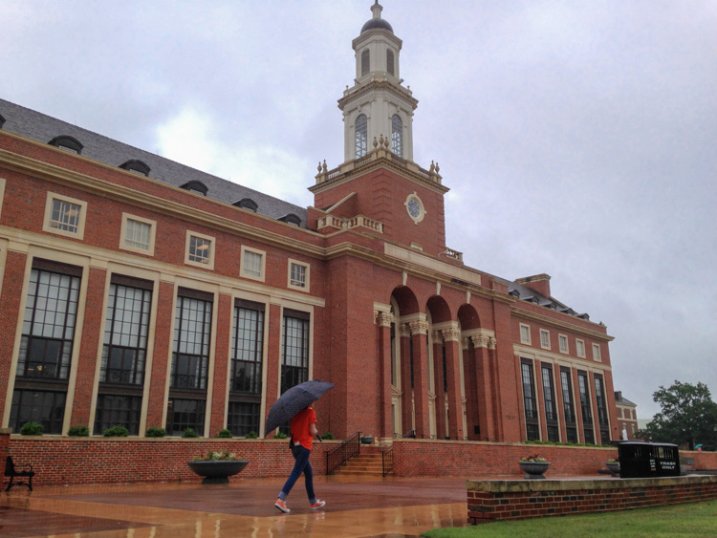
    library-close

    Finally we see the same building, on the same day, but in a much more dynamic and interesting context.

    It’s still the same library, but the picture has changed dramatically from the first shot. Instead of a static image of a building surrounded by green spaces, this now shows the library in a whole new context. The imposing bell tower looms large over the veranda, and the student walking past adds a new dynamic element, to what was formerly a rather boring picture. Showing the building from this angle as it recedes into the background, illustrates how it is part of a much larger campus, and overall I find this a much more interesting image.

    Working with People

    Looking at buildings and nature is one thing, but changing perspective when taking pictures of people can blow the doors wide open when it comes to creating pictures that are new, interesting, and much more impactful. To illustrate this, here are a few photos of my nephew skipping rocks at the beach on a recent family vacation.

    My nephew practicing his rock-skipping technique.

    My nephew practicing his rock-skipping technique.

    There’s nothing particularly wrong with this photo but there’s nothing especially interesting about it either. To get this picture I stood on the beach with my camera while he skipped rocks, and did put in much effort to take perspective into account. It’s a decent snapshot that more or less captures the scene, but watch what happened when I changed my perspective:

    photography-perspective-skipping-rocks-front-side

    The same scene as above, but far more interesting with the background activity and low angle of view.

    The scene has been drastically improved simply by walking 20 feet down to the beach, and crouching down to my nephew’s eye level. There’s now a sense of action and movement, and you can also see the intense concentration on the boy’s face as he winds up to skip a rock. In addition to these alterations you now have a sense of context; you see where the subject is in relation to his surroundings. By changing perspective I am able to show the rest of the beach, which includes some of his cousins and my brother having fun in the background. Here’s one final perspective change that alters the picture even more:

    photography-perspective-skipping-rocks-front

    That rock went sailing, and skipped a half dozen times.

    This one is all about my nephew with nothing else except the beach to provide a sense of context and is, in my opinion, the best of the bunch. You see him alone, along with the same intense expression as in the previous photograph but without any distracting background elements. To get this picture I waded into the water and crouched down until my camera was just a few inches above the surface. It was more difficult to get this shot, and certainly would have been easier if my camera had an articulating LCD screen, but the payoff was well worth it. Compare this to the initial shot, and you will see a massive difference just from a little work on my part to change perspective.

    Hopefully these examples give you a few things to ponder the next time you are out with your camera. It takes a little more work to shoot things from different perspectives, but you may find yourself with new creative possibilities and new ways of looking at your subjects and the world around you.

    What are your favorite tips and tricks for finding and exploring new photographic perspectives? Share your thoughts in the comments below.

    googletag.cmd.push(function() {
    tablet_slots.push( googletag.defineSlot( “/1005424/_dPSv4_tab-all-article-bottom_(300×250)”, [300, 250], “pb-ad-78623” ).addService( googletag.pubads() ) ); } );

    googletag.cmd.push(function() {
    mobile_slots.push( googletag.defineSlot( “/1005424/_dPSv4_mob-all-article-bottom_(300×250)”, [300, 250], “pb-ad-78158” ).addService( googletag.pubads() ) ); } );

    The post Examples of Perspective Change for More Dynamic Images by Simon Ringsmuth appeared first on Digital Photography School.

    Digital Photography School

  • Deal: Portraits eBooks $7 Each [or $21 for the Whole Set of 5 eBooks]

    Wow, we’re already up to our final offer of the sale — how the week has flown!

    You’re going to love this lucky last deal, it’s BIG…

    Our best-selling Portraits ebooks by the amazing Gina Milicia only $ 7 each!

    portraits

    Covering all aspects of portrait photography, the ebooks on offer are:

    • Portraits: Making the Shot
    • Portraits: Lighting the Shot
    • Portraits: Striking the Pose
    • Portraits: After the Shot (plus 12 FREE Lightroom presets)

    And at just $ 7 each, you save an incredible 65%!

    Can’t stop at one?

    4You can pick up each Portraits ebook separately for $ 7, or…

    Grab the whole set for an amazing $ 21!

    Tens of thousands of photographers from all around the world have significantly improved their portrait photography with this series, and this is your chance to own them all.

    We’ll even include our 14 Recipes for Amazing Portraits ebook as an added bonus, too.

    So that’s 5 great dPS ebooks and close to $ 90 worth of value!

    Individual Portraits titles, or the whole set plus bonus ebook. Whichever you decide, just be sure to get in before the deal ends in 24 hours’ time!

    googletag.cmd.push(function() {
    tablet_slots.push( googletag.defineSlot( “/1005424/_dPSv4_tab-all-article-bottom_(300×250)”, [300, 250], “pb-ad-78623” ).addService( googletag.pubads() ) ); } );

    googletag.cmd.push(function() {
    mobile_slots.push( googletag.defineSlot( “/1005424/_dPSv4_mob-all-article-bottom_(300×250)”, [300, 250], “pb-ad-78158” ).addService( googletag.pubads() ) ); } );

    The post Deal: Portraits eBooks $ 7 Each [or $ 21 for the Whole Set of 5 eBooks] by Darren Rowse appeared first on Digital Photography School.


    Digital Photography School

  • Adding an Off-Camera Flash to Create a Winning Image

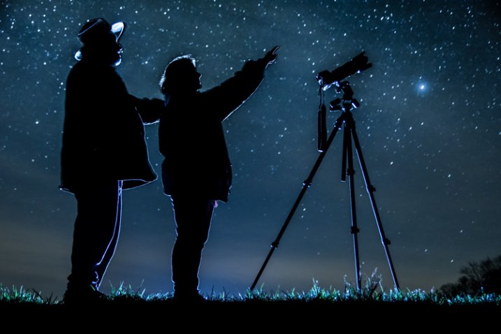
    Star_gazers

    This image, titled “Star Gazers”, won Grand Prizes at the 2015 Shoot the Hills photo competition. Held in the Hocking Hills region near Logan, Ohio, this competition takes place the 3rd weekend every April. 160 photographers from several states participated this year.

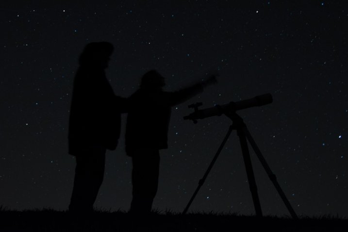
    I initially came up with the idea for this shot over a year earlier, but my first attempt at the image failed miserably. (see below)

    DSC_3387

    What mistakes did I make?

    If I would have checked the histogram I would have seen that all of the image was extremely under-exposed with all the data pushed up against the left side of the histogram.

    If I had checked the histogram I would have noticed that the image was extremely under-exposed with all the data pushed up against the left side of the histogram.

    1. The image was under-exposed, because I failed to check the histogram. In the dark the image looked great on the LCD on the back of the camera!
    2. With the long exposure (30 seconds) there was no way for the subjects in the image to remain still enough to avoid blurring.

    The Solutions

    1. The solution for the exposure was simple. First I turned down the brightness of the camera’s LCD screen. Then I used the histogram to determine my exposure.
    2. The length of exposure time was the main problem I had with this first attempt at capturing the image I had planned. It is nearly impossible for a live model to stand still for 30 seconds to prevent blurring. An off-camera flash was added behind the models to create the rim lighting in order to freeze their movement. Adding this flash was the major difference-maker from my earlier attempt of this image.

    Other Factors to Consider

    Sometimes it takes some trial and error to achieve the results you are looking for in an image. Improvisation may be required when unforeseen issues change shooting conditions. Many factors need to fall together for it to be possible to create an image such as this one. After waiting until 2 a.m. for the clouds to clear, it was finally time to capture the image I had pre-visualized nearly a year earlier.  Because the cloud cover remained near the horizon, it became necessary to change the angle of view to capture the higher, clearer sky. This adjustment also made it necessary to change the focal length from the 18mm I had planned to 50mm. One of the rules of the Shoot the Hills photo competition is that all images must be submitted straight out of the camera, so getting everything right in the camera is a must. Here are some additional factors required to capture such an image:

    The Weather

    • Clear starry night – Probably the single most important factor to create this image is a clear starry night.
    • Dark sky – Find a dark sky, away from the lights of the city. There are dark sky maps on the internet.
    • Moonless night (or after the moon has set) – The light from the moon will fade out (overpower) many of the dimmer stars.

    The Exposure

    Histogram for the final winning. Notice how the histogram stretches back almost into the mid-tones, with a little info clear back into the highlights which is the stars and the rim lighting.

    Histogram for the final winning shot. Notice how the histogram stretches back almost into the mid-tones, with a little info clear back into the highlights, which represent the stars and rim lighting.

    I wanted to keep the shutter speed at 30 seconds for two reasons. First, that is the longest shutter speed most cameras allow without having to set them to bulb, and manually doing a timed exposure. Secondly, I didn’t want the stars to become extremely blurry. Using the histogram, I determined my exposure with my focal length at 50mm to be;  aperture at f/5 and ISO set to 2000, which I had predetermined was the highest ISO I could use, and still be able to minimize the amount of digital noise. As mentioned earlier, do not rely on the camera’s LED screen to determine exposure. In fact, in the dark the LED screen will look really bright when the image is actually extremely underexposed. To remedy this problem, turn the brightness down on you LED screen, if this setting is available. But always use the histogram to get the best exposure setting. If the histogram is all pushed over to the left side, the image is going to be underexposed.

    Remote Triggers

    Since I was also one of the subjects in the images, I used one remote to begin the exposure, and another to trigger the flash.

    White Balance

    After experimenting with several preset white balances I decided to set a custom white balance of 2560 Kelvin, to give the image a cool blue colored sky.

    Focusing

    Focusing a camera in the dark is one of the most challenging parts of creating a night shot under the stars. Here are some tips to set focus for night images:

    • Pre-focus before it gets dark. This is the easiest way to focus for a night shot, and after the focus is set, turn off the auto-focus so it doesn’t change.
    • Shine a bright flash light on the subject to allow the camera to focus, and as in the method above, after attaining focus, turn off the auto-focus.
    • Use live view to focus manually on a light.
    • Use back button focusing to preset focus

    For this image I used back button focusing, and a flash light to set my focus.

    The Logistics

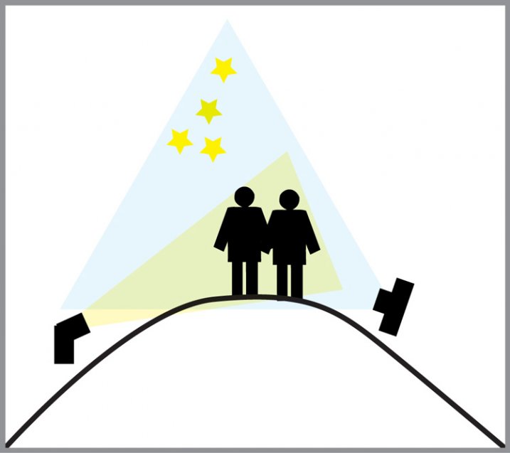
    The setup for this shot was at the top of a steep hill which came to a point. With the subjects at the very top, the camera was placed on a tripod below, and aimed upward at the subjects and the starry sky in the background. The off-camera flash was placed on a tripod on the other side of the hill and aimed upward at the subjects. The flash and tripod had to be placed low enough on other side of the hill, so that the actual flash did not show in the image.

    layout

    Conclusion

    Henry Ford once said that “Failure is the opportunity to begin again more intelligently.”  When an image idea fails, take a look at what went wrong and then look for solutions to improve the image, return to the scenario and try it again. From my first unsuccessful attempt to capture star-gazers, the need to freeze the subjects and prevent the blurring, led me to try the off-camera flash technique. The back-lighting and a year’s experience made all the difference between a failed shot and a winner!

    googletag.cmd.push(function() {
    tablet_slots.push( googletag.defineSlot( “/1005424/_dPSv4_tab-all-article-bottom_(300×250)”, [300, 250], “pb-ad-78623” ).addService( googletag.pubads() ) ); } );

    googletag.cmd.push(function() {
    mobile_slots.push( googletag.defineSlot( “/1005424/_dPSv4_mob-all-article-bottom_(300×250)”, [300, 250], “pb-ad-78158” ).addService( googletag.pubads() ) ); } );

    The post Adding an Off-Camera Flash to Create a Winning Image by Bruce Wunderlich appeared first on Digital Photography School.

    Digital Photography School

  • The First 3 Photoshop Blend Modes You Need to Understand

    Photoshop can be extremely intimidating to learn, but once you start to get a grasp on some of the tools it has to offer, you’ll wonder how you ever processed photographs without it. If there’s one area of Photoshop that is both extremely confusing, and yet, extremely powerful when harnessed properly, it’s got to be the collection of blend modes. While this article won’t cover all of the options available within Photoshop, it should give you a good place to start your journey into using Photoshop blend modes.

    Photoshop blend modes: a few basics to get you startedphotoshopblendmodes

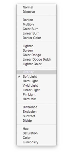
    • Photoshop blend modes are found in a drop down menu at the top of the layers panel (it defaults to “Normal”)
    • There are 27 different options to choose from, including the default “Normal” blend mode.
    • Adobe has organized these 27 blend modes into six different categories
      • Normal – Contains blend modes that don’t actually blend the layer being selected. (Normal shows the layer, and the dissolve layer essentially just removes pixels from the top layer as you reduce the opacity this effect is increased).
      • Darken – These blend modes use 100% white as a neutral, they have an overall darkening effect on images.
      • Lighten – Here Photoshop is using 100% black as a neutral, they have an overall lightening effect on images.
      • Overlay – In the Overlay mode Photoshop is blending the top layer and bottom layer together in a way that adds contrast. The effect of this changes based on the opacity of the layer, and the type of blend mode selected.
      • Difference – The difference set can be referred to as the inversion group, as these blend mode options are often used to either cancel colors of the layer below it, or to invert them.
      • Hue – Here Photoshop allows you to get very creative with the HSL of the layers in question.
    • When you apply a blend mode to a layer, it takes the effect of the given blend mode and it is applied to the layer directly below it within Photoshop.

    To simplify the process of trying to learn all 27 blend modes at once below, let’s learn about the three most versatile blend modes Photoshop has to offer.

    The first three Blend Modes you need to learn

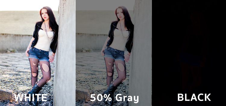
    In all the example photographs below I’ll be using two layers to demonstrate the different effects of each of the three blend modes. The top layer is simply a white, gray, black layer and the bottom layer is the same image placed under those three colors.

    3-tones

    White, gray, black layer.

    Multiply Blend Mode

    This blend mode falls within the “Darken” group and therefore it is considering 100% white a neutral. The basic math behind how this blend mode works is that the dark pixels of the background layer are multiplied with those of the foreground layer and combined. Therefore the result you end up with is an overall darkening of the image, as the dark pixels within both layers become more significant while the light pixels are essentially removed.

    blend-modes-multiply


    As you can see in the 50% gray layer, the darker pixels from the gray foreground layer are helping to darken the layer below it.

    This blend mode is great for creating shadows or removing bright pixels from an underlying layer. It can be used in conjunction with a curves adjustment layer to add additional darkness to a layer. By effecting the dark end of the curve this can become really handy when trying to emphasize shadows, or darken an image.

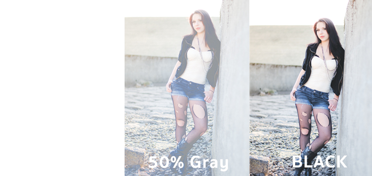
    Screen Blend Mode

    As mentioned above, the lighten group sets black as neutral and therefore when we use the screen blend mode the black layer has no effect, 100% white stays as white and the 50% gray is somewhere in the middle.

    blend-modes-screen


    In a similar mathematical method to the Multiply blend mode the screen blend mode is multiplying the light pixels of both the foreground and background layers to achieve the final blend. As you can see in the above example, at 50% gray the light pixels are made even lighter as the bright pixels of the gray layer are multiplied with those of the layer below it.

    The Screen blend mode is therefore great for removing darkness from an image or can even be used to create soft glow effects around a subject.

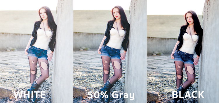
    Soft Light Blend Mode

    Here the formula used by Photoshop is essentially both that of the Multiply and Screen blend modes, then that effect is divided by two. What this means is that you’ll be darkening the dark pixels and lightening the light pixels, and then dividing the end result by two (or 50% of full strength). What ends up happening is an overall increase in contrast of the image

    As a result, the Soft Light blend mode, is a great way to add a bit of contrast to an image. For an even stronger effect – use the Overlay blend mode.

    blend-modes-softlight


    One of the best techniques for using this technique is to duplicate your layer and apply the Soft Light blend mode to that layer. You’ll se an instant increase in contrast which can then be fine tuned with the opacity slider of your duplicated layer.

    An example of Photoshop blend modes in action

    photoshopblendmodes1

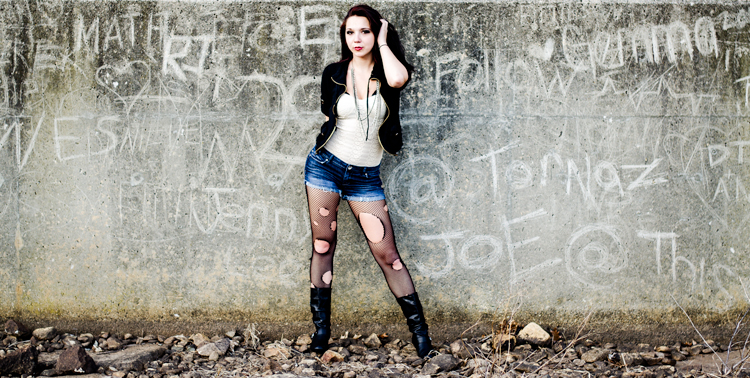
    Original – (placed as Full Size 750 x 378)

    The original image was a bit on the flat side, so by duplicating this layer, and changing it Soft Light blend mode, you’ll notice an increase in contrast. This higher contrast look works well with the rocks, and graffiti wall behind the model.

    photoshopblendmodes2

    Duplicated with Soft Light blend mode

    To take it a step further, a Curves Adjustment Layer was added above the duplicate layer and the blend mode was set to multiply. A layer mask was then applied to this Curves layer to reveal it only over the model’s upper body and face. By applying this small adjustment you’ll notice a bit more definition in the face and shadows.

    photoshopblendmodes3

    Curves adjustment + Multiply blend mode added to model’s face and upper torso to add definition and shadow detail.

    These three Photoshop Blend modes are just the beginning, but the key to learning a program the size and depth of Photoshop, is to take it in bite sized pieces or you’ll get frustrated and give up quickly. I hope that by focusing your attention to just these three blend modes you’ll be able to digest the program a bit easier.

    googletag.cmd.push(function() {
    tablet_slots.push( googletag.defineSlot( “/1005424/_dPSv4_tab-all-article-bottom_(300×250)”, [300, 250], “pb-ad-78623” ).addService( googletag.pubads() ) ); } );

    googletag.cmd.push(function() {
    mobile_slots.push( googletag.defineSlot( “/1005424/_dPSv4_mob-all-article-bottom_(300×250)”, [300, 250], “pb-ad-78158” ).addService( googletag.pubads() ) ); } );

    The post The First 3 Photoshop Blend Modes You Need to Understand by John Davenport appeared first on Digital Photography School.

    Digital Photography School